A good Ghost website makes a publication’s promise clear and gives readers an easy way to find, sample and follow its work. Start with the editorial relationship before choosing a theme or subscription layout.
These twenty public properties show several ways to organize publishing: corporate engineering blogs, institutional journals, independent newsrooms, specialist magazines and author-led sites. Each has an official Ghost Explore listing that links to the named property. The association does not extend automatically to an organization’s main application, store, donation processor or other websites.
The screenshots record the actual public opening views on November 3, 2026. They are useful for studying hierarchy, archive discovery and membership language. They do not show the private editor, email deliverability, paid account behavior or business results. Those require a separate implementation plan and an approved test workflow.
Before the examples
What makes good Ghost website development in 2026?
Make the editorial promise specific
Explain the subject, voice and expected reading experience in ordinary language. A broad invitation to subscribe tells a new reader little. Show a representative article or issue, identify the people responsible for the work, and make the archive available before asking for a longer relationship.
Give posts a dependable structure
Plan titles, excerpts, authors, tags, feature images and publication dates as editorial decisions. Ghost themes use templates and helpers to render that information. Test an article without an image, a long headline and several authors before approving a design that only works for an ideal sample.
Free signup, paid membership, donations and product purchases are different actions. Label them accurately and make their consequences understandable. Preserve a route to public work, clear access markers for restricted articles and a useful explanation when a reader reaches a membership boundary.
The collection · 20 examples
20 Ghost website examples worth studying
Compare how each publication introduces its purpose and balances the lead story, archive and subscription route. The first five are specific publishing properties from recognizable organizations; they are not claims about every system those organizations operate.
We start with five recognizable brands or organizations: Cloudflare Blog, Y Combinator Blog, Kickstarter Blog, MIT — The Public Interest Technologist, Buffer Resources. Each attribution applies to the named website property, not every product or website belonging to its organization. This is a curated reading sequence, not a measured ranking.
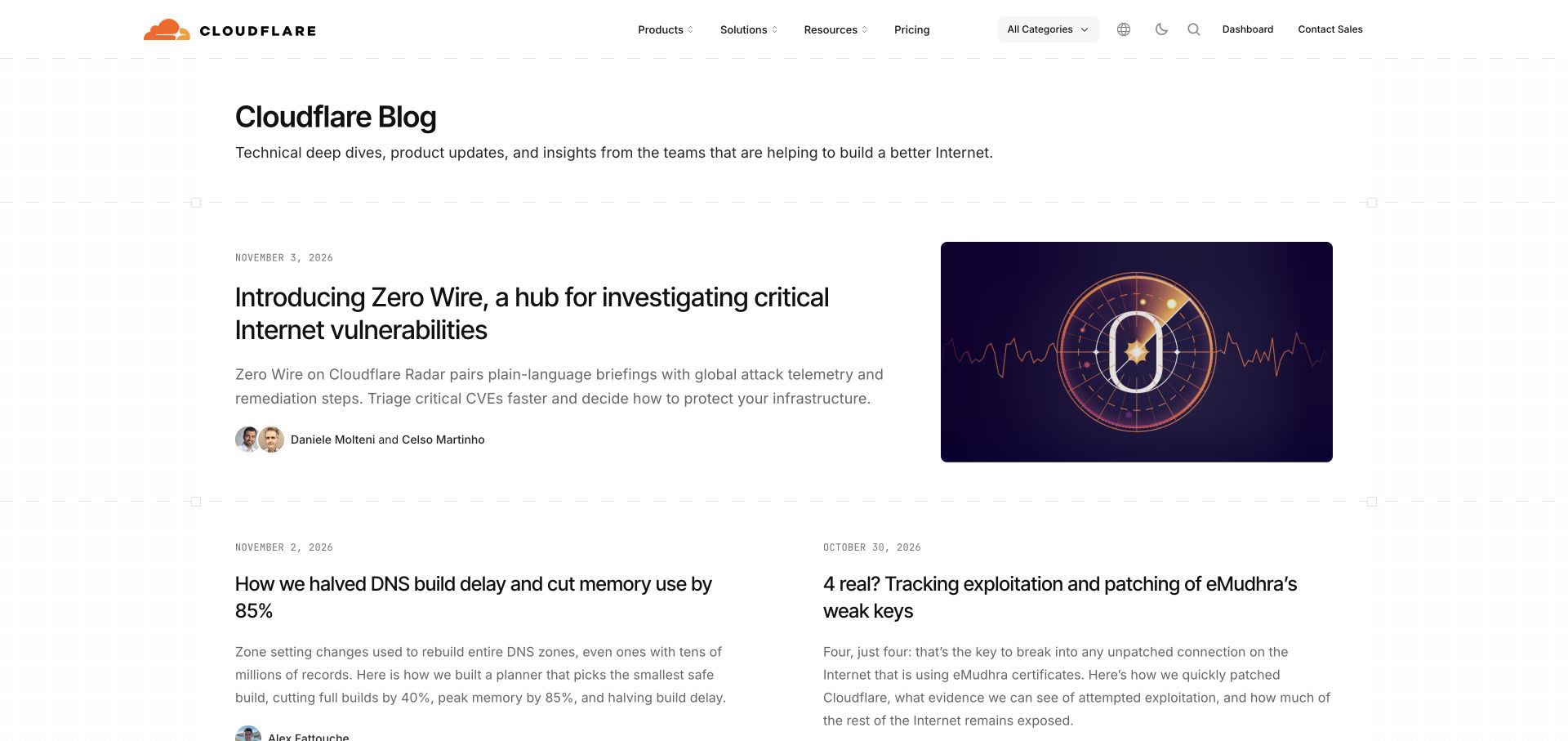
Cloudflare’s blog gives a technical article almost the entire first content row. A clear publication title and short description establish the purpose before the featured headline, summary, author portraits and diagram appear. Below it, smaller stories retain dates and excerpts instead of becoming an image-only gallery. The corporate header remains available, but it does not turn every article card into a sales panel. Ghost’s own directory identifies this blog property; that attribution does not describe Cloudflare’s other products.
What you can learn
Plan an article model that gives authors, dates, summaries and technical illustrations independent roles. A useful editorial feed should still work when an article has no striking photograph. Keep product navigation recognizable while allowing readers to follow a technical subject across several posts.
Pros
The featured article has enough explanatory text to help a reader judge its relevance before opening it.
Author portraits and dates make the publishing activity visible without overwhelming the story hierarchy.
Cons & considerations
Long technical headlines need tested wrapping in cards and narrow layouts.
A large corporate navigation can compete with category discovery if every business link receives equal weight.
Public source checked November 3, 2026. References may be embedded or legacy—not a complete backend inventory.
Platform source: Official Ghost Explore publication profile. Official Ghost Explore profile links directly to this named publication. This is documentary evidence of its Ghost publishing association, not an independent inventory of every current backend, application, commerce or email component. Platform evidence is separate from the direct website screenshot and is not a complete current infrastructure audit.
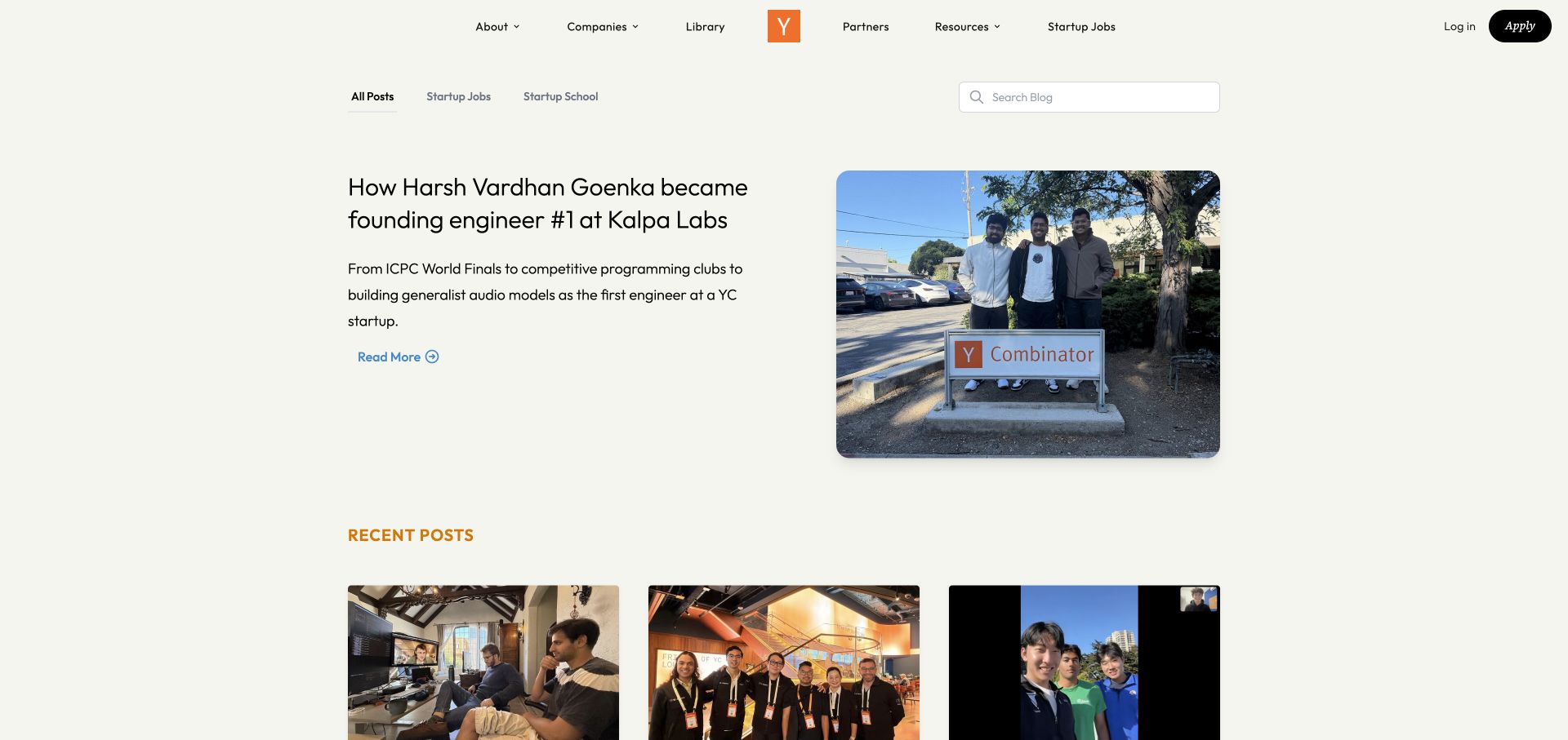
Y Combinator’s blog pairs a founder story with a large team photograph, then introduces recent posts below. The orange identity sits in the middle of a restrained header, while the blog itself offers a short category row and a dedicated search field. The composition gives the lead story room without isolating it from the wider archive. The official Ghost listing points specifically to this blog, so the example concerns publishing rather than applications, company databases or the accelerator’s internal systems.
What you can learn
Give a blog its own discovery tools even when it shares the main organization’s visual identity. Separate a lead-story slot from the chronological list, and define how editors choose and replace that feature. A compelling photograph should complement a descriptive headline, not substitute for one.
Pros
The blog search is visible alongside a deliberately short set of content categories.
A substantial excerpt explains the founder story before the reader commits to the article.
Cons & considerations
The generous lead area pushes several recent posts below the opening viewport.
Readers seeking a specific operational topic may need more taxonomy than the three prominent category choices provide.
Public source checked November 3, 2026. References may be embedded or legacy—not a complete backend inventory.
Platform source: Official Ghost Explore publication profile. Official Ghost Explore profile links directly to this named publication. This is documentary evidence of its Ghost publishing association, not an independent inventory of every current backend, application, commerce or email component. Platform evidence is separate from the direct website screenshot and is not a complete current infrastructure audit.
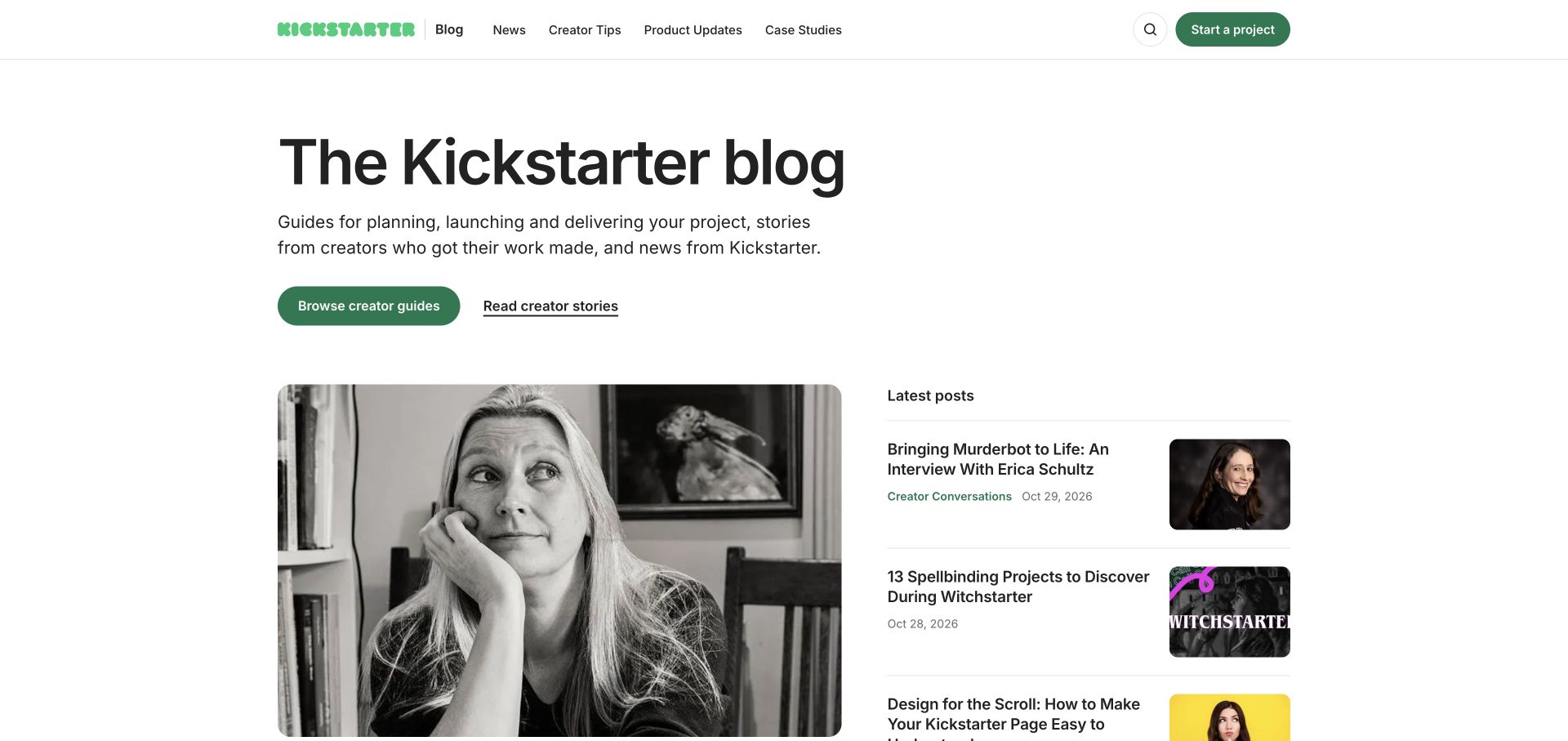
Kickstarter’s blog opens with a plain explanation of its editorial purpose and two different routes: creator guides and creator stories. Below that introduction, a large portrait-led feature sits next to a compact list of latest posts. News, product updates and case studies remain separate navigation choices. This is a useful Ghost reference because the archive serves several reading intentions without pretending that every article has the same job. The platform association applies to the updates publication shown.
What you can learn
Organize a mixed editorial program around the reader’s reason for arriving. Someone planning a project needs durable guidance, while a returning creator may want product changes or a story from a peer. Model those categories consistently and maintain useful landing pages rather than relying on dates alone.
Pros
The introductory buttons distinguish learning a process from browsing community stories.
The sidebar exposes fresh posts while the main feature retains a strong photographic identity.
Cons & considerations
A long introduction and large feature can delay access to older practical resources.
The relationship between guides, tips and case studies needs consistent editorial definitions to prevent overlapping categories.
Visible tech stack
Referenced on the public page
Ghost
Public source checked November 3, 2026. References may be embedded or legacy—not a complete backend inventory.
Platform source: Official Ghost Explore publication profile. Official Ghost Explore profile links directly to this named publication. This is documentary evidence of its Ghost publishing association, not an independent inventory of every current backend, application, commerce or email component. Platform evidence is separate from the direct website screenshot and is not a complete current infrastructure audit.
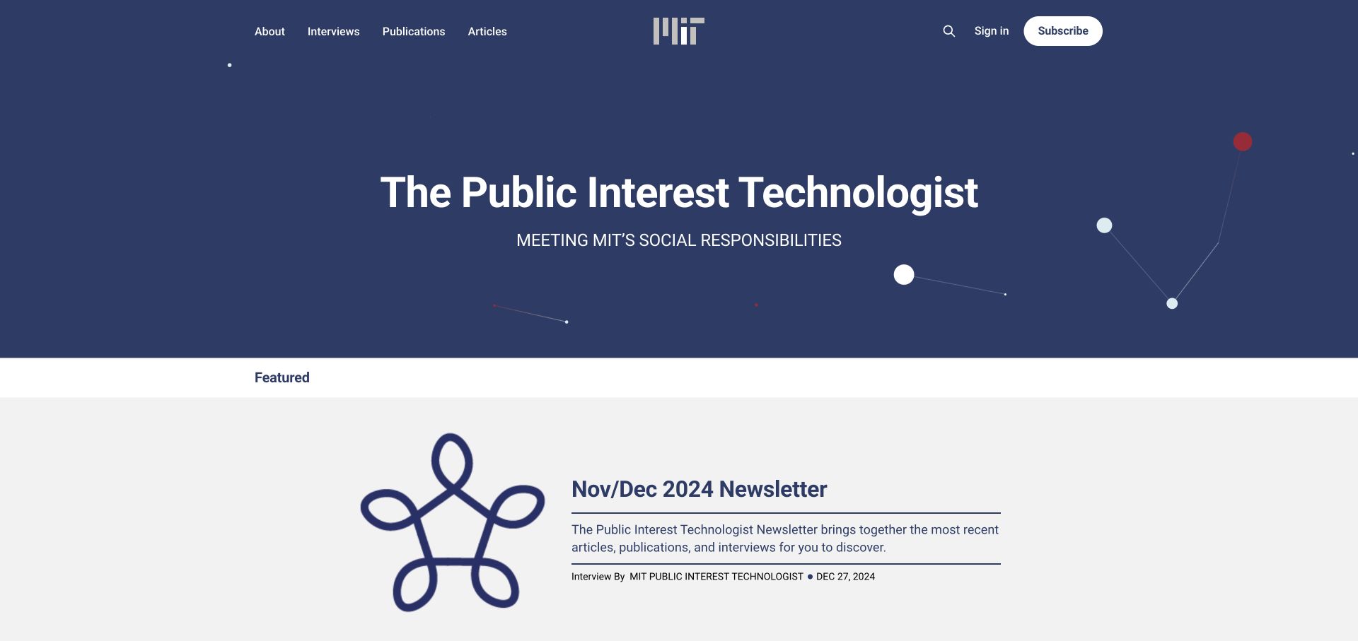
MIT’s Public Interest Technologist uses a deep blue introductory field, a centered institutional mark and a concise publication title. Interviews, publications and articles are separate header destinations, with sign-in and subscription controls on the other side. The featured item below carries a clear newsletter edition rather than being presented as a timeless homepage claim. Ghost’s listing identifies this specific MIT publication. The visible older edition is retained as an editorial observation, not relabeled as newly published material.
What you can learn
For a specialist institutional journal, distinguish format from subject. A newsletter edition, interview and report may share authors or themes but need different descriptions and archive expectations. Preserve publication dates visibly and decide how an inactive feature should be replaced or explained during ongoing maintenance.
Pros
The publication has a distinct identity while remaining visibly connected to MIT.
Format-based navigation gives readers several meaningful routes beyond a chronological feed.
Cons & considerations
The large introductory banner leaves limited room for the featured item in the first screen.
An older newsletter in the lead position can make the publishing cadence unclear without contextual explanation.
Public source checked November 3, 2026. References may be embedded or legacy—not a complete backend inventory.
Platform source: Official Ghost Explore publication profile. Official Ghost Explore profile links directly to this named publication. This is documentary evidence of its Ghost publishing association, not an independent inventory of every current backend, application, commerce or email component. Platform evidence is separate from the direct website screenshot and is not a complete current infrastructure audit.
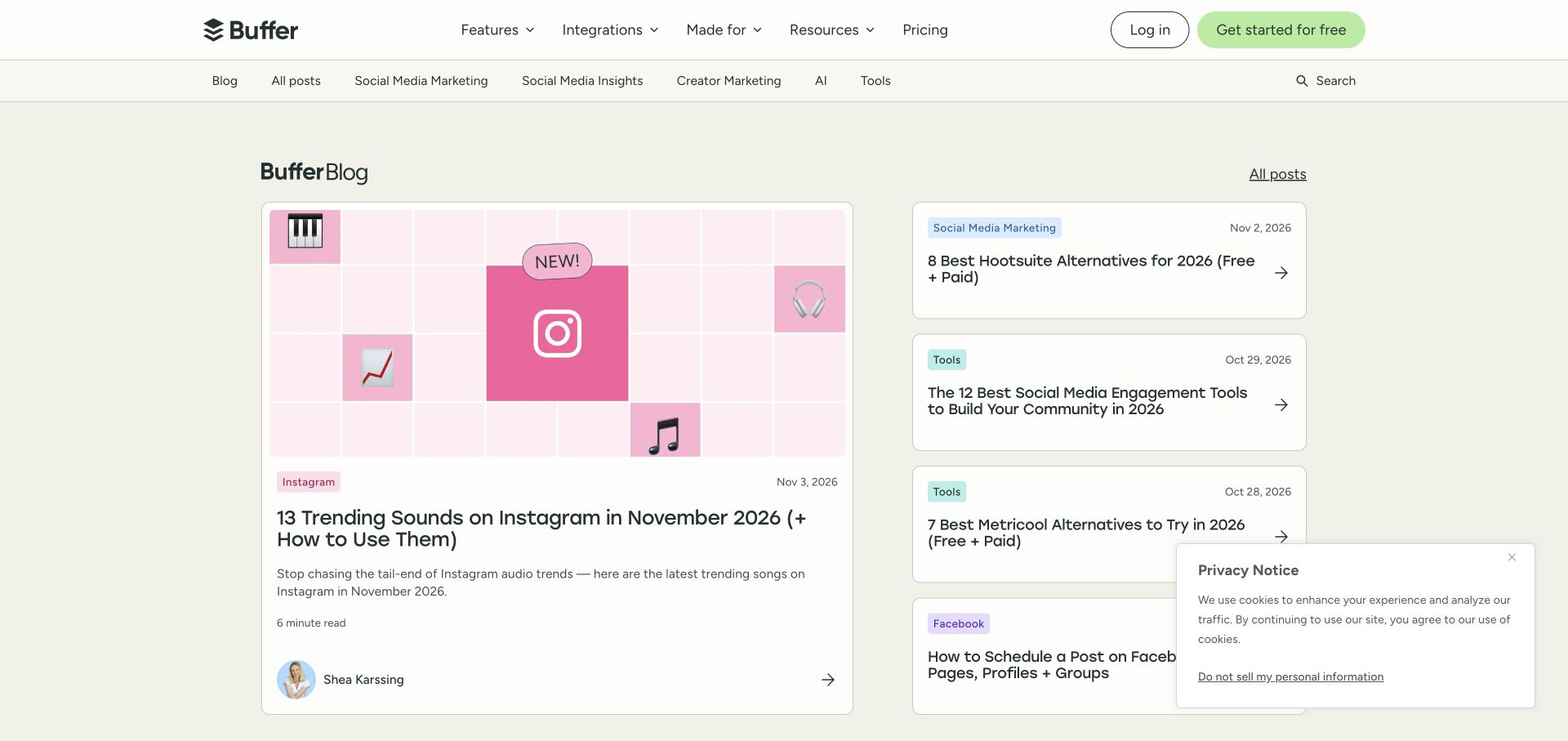
Buffer keeps its product navigation above a second navigation devoted to the blog. A large illustrated article occupies the left side, while a stack of smaller text cards surfaces other recent resources. Category labels, dates, reading time and an author portrait supply useful context around the lead piece. The pale background and colored labels give the archive a recognizable visual system without making every card identical in emphasis. Ghost’s directory points to the resource publication, not the application interface.
What you can learn
Treat editorial navigation as a separate layer from the product’s sales navigation. Define which metadata helps readers choose a piece, and keep category names stable enough to support a growing archive. Use one prominent article to establish priority while maintaining a scannable route to recent alternatives.
Pros
The lead article combines visual identity with category, date, reading time and author information.
Text-focused secondary cards give several resources visibility without requiring a unique image for each one.
Cons & considerations
Two navigation rows consume useful vertical space on smaller screens.
The privacy notice overlaps part of the secondary list in the captured view and needs an unobstructed dismissal path.
ReactAssociated with Next.js; not independently observed
Public source checked November 3, 2026. References may be embedded or legacy—not a complete backend inventory.
Platform source: Official Ghost Explore publication profile. Official Ghost Explore profile links directly to this named publication. This is documentary evidence of its Ghost publishing association, not an independent inventory of every current backend, application, commerce or email component. Platform evidence is separate from the direct website screenshot and is not a complete current infrastructure audit.
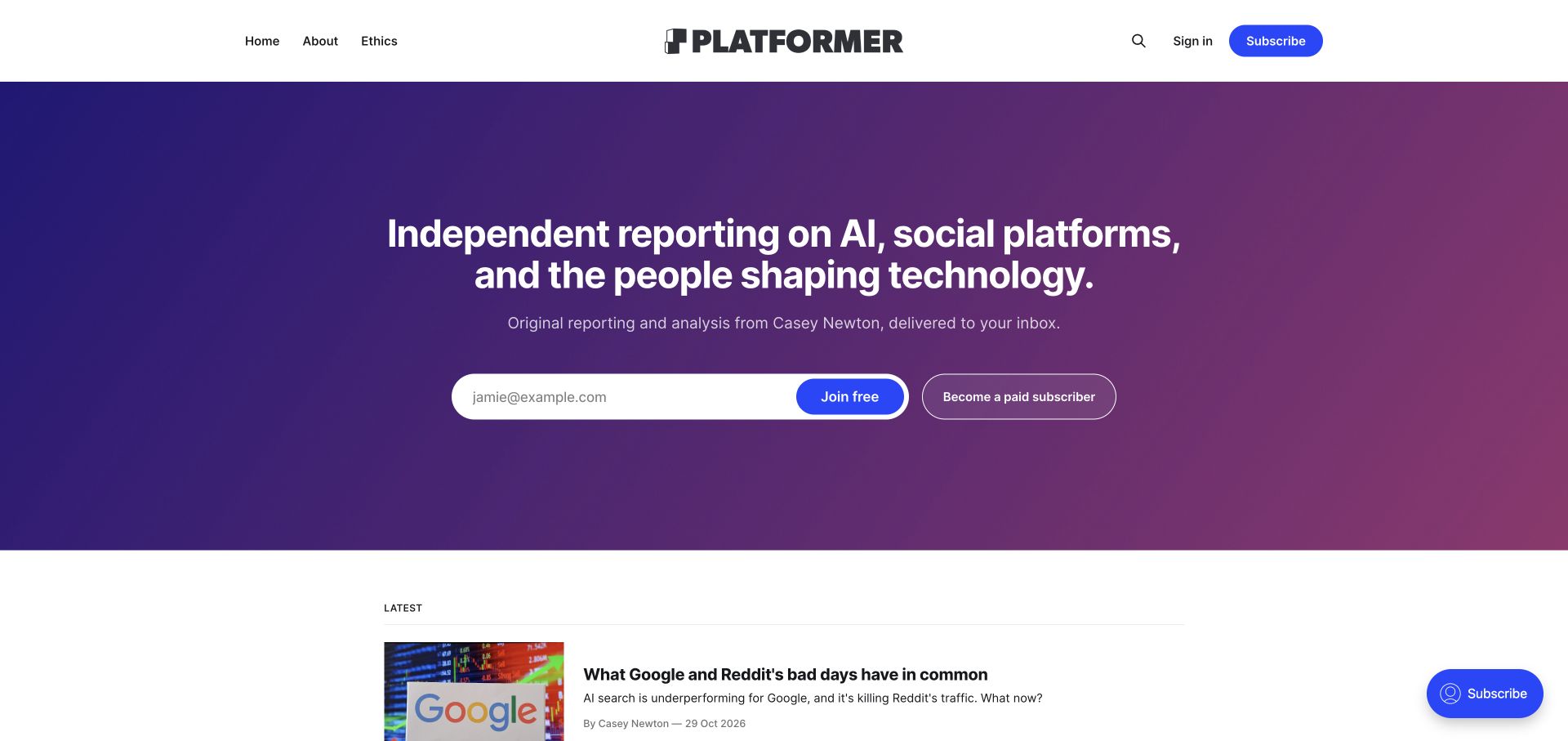
Platformer places its editorial promise in a broad purple gradient panel below a compact masthead. The author’s role is named directly, and free registration is visually distinguished from becoming a paid subscriber. The latest reporting starts beneath the membership introduction, while About and Ethics are available in the header. This Ghost example shows how a publication can make its business model visible without replacing its identity with a generic pricing table. The screenshot does not establish subscription performance or access entitlements.
What you can learn
Write the editorial promise before arranging subscription controls. Explain who creates the work, what subjects it covers and how a free relationship differs from a paid one. Keep a visible route to sample reporting so visitors can evaluate the writing before deciding whether to join.
Pros
Free and paid participation have separate, clearly labeled actions in the same introductory area.
The header makes editorial background and ethics available alongside the ordinary homepage route.
Cons & considerations
The tall membership introduction postpones the first article until near the bottom of the viewport.
A broad promise needs supporting examples so a new reader can judge the actual reporting style.
Public source checked November 3, 2026. References may be embedded or legacy—not a complete backend inventory.
Platform source: Official Ghost Explore publication profile. Official Ghost Explore profile links directly to this named publication. This is documentary evidence of its Ghost publishing association, not an independent inventory of every current backend, application, commerce or email component. Platform evidence is separate from the direct website screenshot and is not a complete current infrastructure audit.
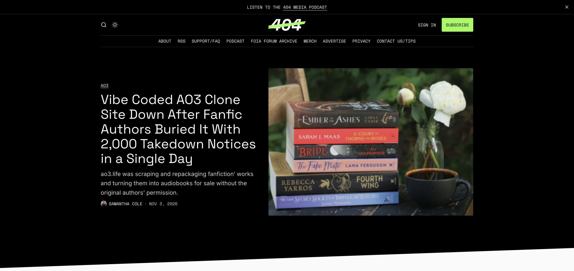
404 Media uses a black opening surface, a bright green identity accent and an oversized lead headline beside a substantial story image. A narrow navigation row includes archives, podcast information, support and a tips route, so the publication’s operating functions remain visible. Author and date information sit below the summary instead of being hidden inside a card hover. The design gives one story clear priority while the official Ghost profile provides the publishing-platform association for this property.
What you can learn
Define the newsroom’s utility routes as carefully as the article template. A reader may arrive to find an old story, understand membership or send a tip rather than read the newest headline. Keep those purposes legible and separate, especially when a visually dominant feature sets the tone.
Pros
The lead story has a strong hierarchy of category, headline, summary and byline.
Support, archive and tips links are visible without requiring a subscription interaction.
Cons & considerations
The long lead headline produces a dense block that needs deliberate mobile typography.
A thin row of many utility links can become difficult to scan or operate at narrow widths.
Public source checked November 3, 2026. References may be embedded or legacy—not a complete backend inventory.
Platform source: Official Ghost Explore publication profile. Official Ghost Explore profile links directly to this named publication. This is documentary evidence of its Ghost publishing association, not an independent inventory of every current backend, application, commerce or email component. Platform evidence is separate from the direct website screenshot and is not a complete current infrastructure audit.
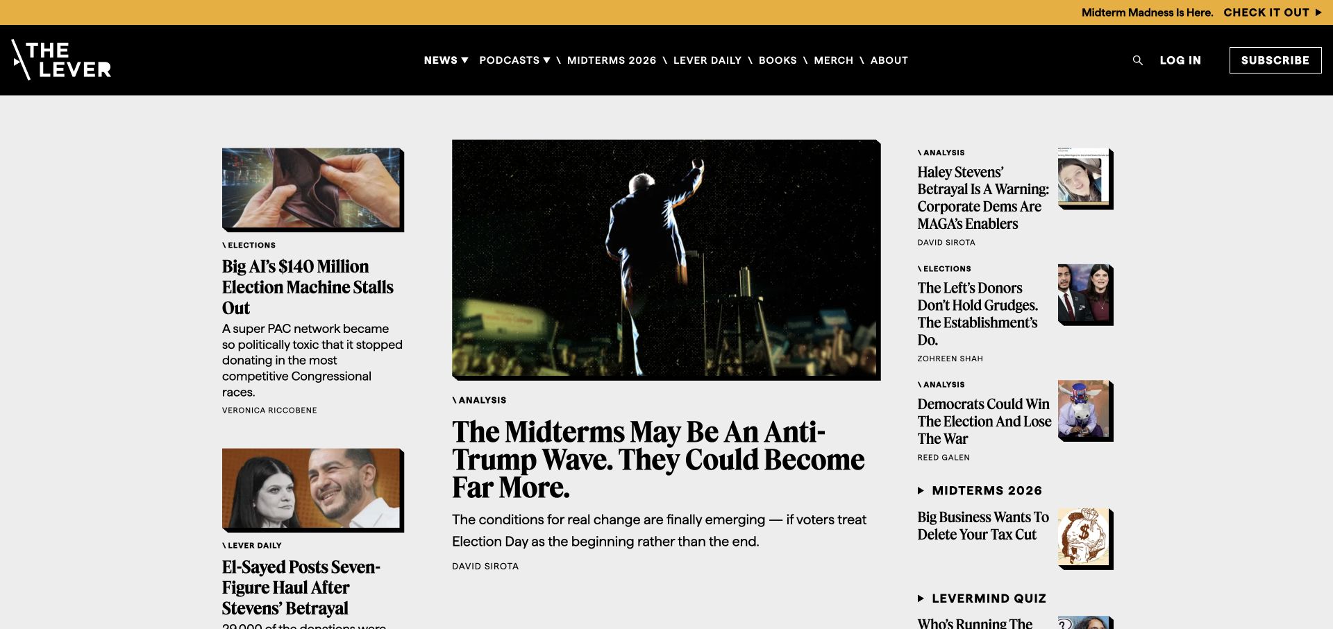
The Lever arranges its opening as a newspaper-like spread: a large central lead, smaller stories to the left and a compact analysis column to the right. A dark header carries the publication mark, topical navigation and a subscription route, while a separate announcement strip promotes a current editorial package. The mix of serif headlines and short metadata labels gives each story a recognizable role. The Ghost attribution concerns this publication; no inference is made about its other business tools.
What you can learn
Use a limited set of editorial slots with defined responsibilities. A lead, secondary feature and compact list can all be useful if editors know which story belongs in each. Design with unusually long headlines and missing thumbnails so the hierarchy survives the normal variety of newsroom material.
Pros
Several stories are visible at once without giving every headline the same visual weight.
Bylines and section labels remain attached to the stories they describe.
Cons & considerations
Three simultaneous columns create a complex reading order that must be simplified deliberately on phones.
The announcement bar and large navigation can compete with the most important editorial content.
Public source checked November 3, 2026. References may be embedded or legacy—not a complete backend inventory.
Platform source: Official Ghost Explore publication profile. Official Ghost Explore profile links directly to this named publication. This is documentary evidence of its Ghost publishing association, not an independent inventory of every current backend, application, commerce or email component. Platform evidence is separate from the direct website screenshot and is not a complete current infrastructure audit.
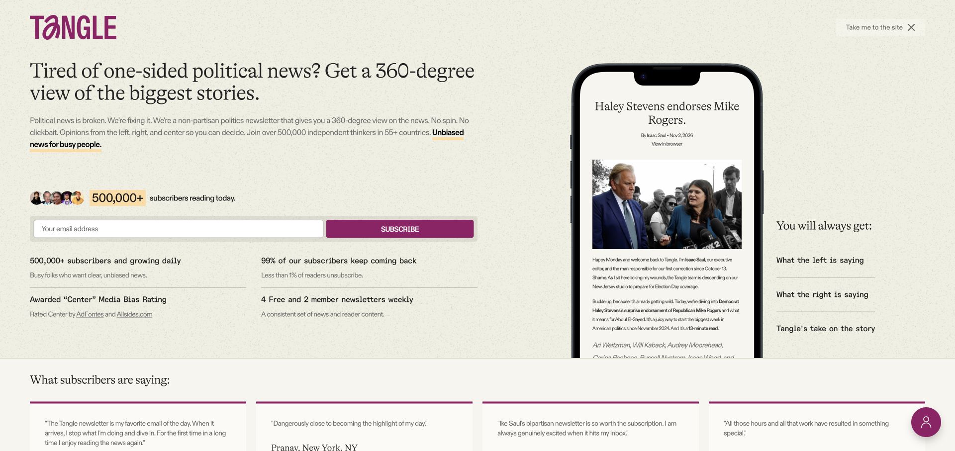
Tangle’s opening subscription view explains the publication’s format next to a phone-shaped sample of an issue. A large serif statement, short supporting copy and a single email field create a clear sequence. The page also offers a visible route into the site for people who want to browse before subscribing. Benefits and publisher-supplied social proof appear below the primary action. Ghost’s current directory supplies the platform relationship; the promotional figures shown are not independently measured in this review.
What you can learn
Show what a recurring publication actually delivers, not just a promise to send useful emails. Pair a readable sample with a concise description of the format and frequency. Preserve an obvious escape into the archive so the subscription introduction does not trap readers who are still evaluating the work.
Pros
The sample issue makes the editorial format more concrete than a signup form alone would.
A clearly visible route lets readers continue to the publication without entering an email address.
Cons & considerations
A full-screen subscription introduction delays ordinary browsing for returning or undecided visitors.
Dense claims and small supporting text around the form can dilute the central editorial proposition.
Public source checked November 3, 2026. References may be embedded or legacy—not a complete backend inventory.
Platform source: Official Ghost Explore publication profile. Official Ghost Explore profile links directly to this named publication. This is documentary evidence of its Ghost publishing association, not an independent inventory of every current backend, application, commerce or email component. Platform evidence is separate from the direct website screenshot and is not a complete current infrastructure audit.
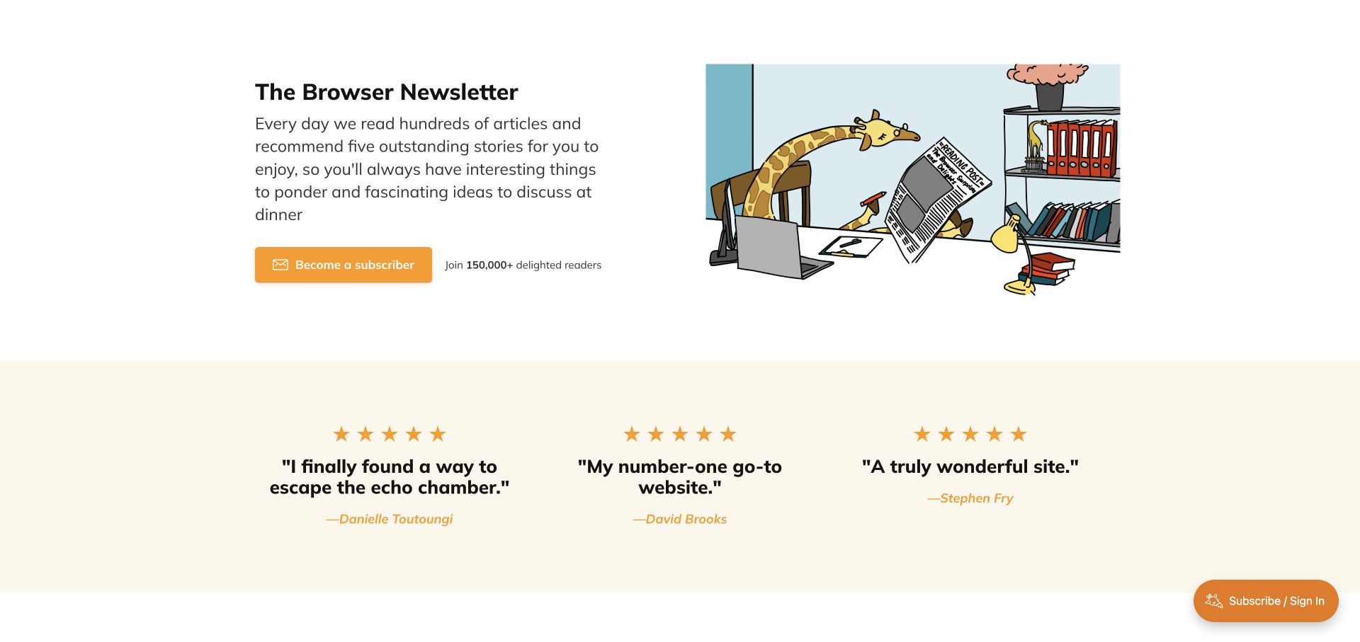
The Browser explains its service in a short text block beside a playful reading illustration. The orange subscription button is the strongest action, while a pale testimonial band follows the introduction. The composition is much closer to a focused publication landing page than a busy news feed. It establishes the idea of editorial selection before asking visitors to browse individual recommendations. The official Ghost profile identifies the publication; quoted praise and audience figures remain the publisher’s own promotional material.
What you can learn
A curation product needs to explain the selection process and the reader’s expected experience. Use an example or sample edition to complement a concise promise, then connect membership to clear access details. An appealing illustration can establish tone, but the value still needs to be understandable in plain text.
Pros
A single colored action makes the intended next step easy to distinguish from supporting copy.
The illustration gives the publication a welcoming personality without requiring a large photographic archive.
Cons & considerations
Testimonials take substantial space before a reader sees the actual editorial selections.
A generic subscription action needs clear downstream explanation of frequency, price and available sample content.
Public source checked November 3, 2026. References may be embedded or legacy—not a complete backend inventory.
Platform source: Official Ghost Explore publication profile. Official Ghost Explore profile links directly to this named publication. This is documentary evidence of its Ghost publishing association, not an independent inventory of every current backend, application, commerce or email component. Platform evidence is separate from the direct website screenshot and is not a complete current infrastructure audit.
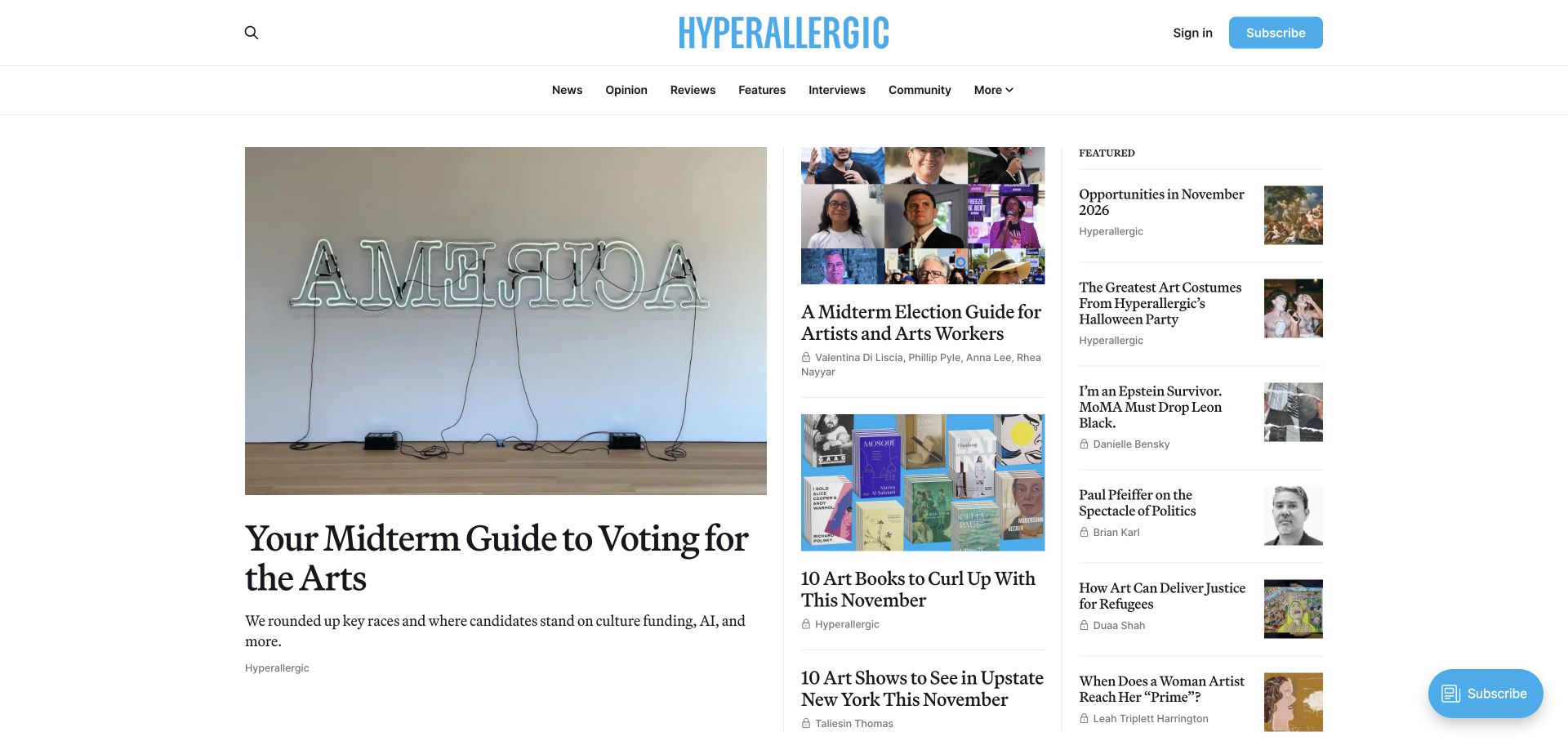
Hyperallergic combines a large image-led lead story with a middle column of additional coverage and a narrower featured list. The pale blue masthead and subscription controls give the mostly white layout a consistent accent. News, opinion, reviews and interviews are distinct navigation choices. Small lock markers appear beside some stories, making access differences visible in the archive. Ghost’s directory identifies this publication, while the review concerns the visible editorial organization rather than membership conversion or the merits of its coverage.
What you can learn
Give different editorial formats stable labels and decide how restricted articles are signposted before a reader opens them. A feature list can surface useful resources independently of the chronological lead. Keep artwork credits, descriptive captions and image alternatives part of the publishing model rather than treating them as optional finishing touches.
Pros
The lead, secondary stories and featured list provide several levels of editorial emphasis.
Content types and access markers help readers interpret the archive before opening an article.
Cons & considerations
A three-column arrangement needs a clear reading order when it collapses on smaller screens.
Mixed image proportions and long headlines can make secondary cards feel uneven without consistent spacing.
Public source checked November 3, 2026. References may be embedded or legacy—not a complete backend inventory.
Platform source: Official Ghost Explore publication profile. Official Ghost Explore profile links directly to this named publication. This is documentary evidence of its Ghost publishing association, not an independent inventory of every current backend, application, commerce or email component. Platform evidence is separate from the direct website screenshot and is not a complete current infrastructure audit.
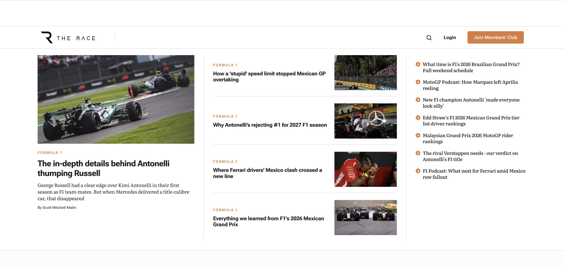
The Race gives a motorsport photograph and lead summary a substantial left column, then presents a central sequence of smaller stories and a right-hand headline list. Category labels repeat consistently, and a members’ club action remains in the header. The captured page demonstrates a publication that expects readers to scan several updates in one visit. Its Ghost profile supplies the platform association. The image and headlines are observed editorial content, not a basis for judging sporting results or commercial performance.
What you can learn
For a rapid publishing schedule, build a reliable hierarchy between the lead, recent stories and compact updates. Decide whether a list is chronological or editorially selected and label it accordingly. Use consistent metadata and predictable image crops so readers can compare several pieces without learning a different card layout each time.
Pros
The opening offers several reading options while maintaining a visibly larger lead story.
Short category labels provide orientation across both illustrated and text-led items.
Cons & considerations
The dense collection of headlines can overwhelm visitors unfamiliar with the sport or publication.
A large empty advertising or header region can reduce the content visible above the fold.
Public source checked November 3, 2026. References may be embedded or legacy—not a complete backend inventory.
Platform source: Official Ghost Explore publication profile. Official Ghost Explore profile links directly to this named publication. This is documentary evidence of its Ghost publishing association, not an independent inventory of every current backend, application, commerce or email component. Platform evidence is separate from the direct website screenshot and is not a complete current infrastructure audit.
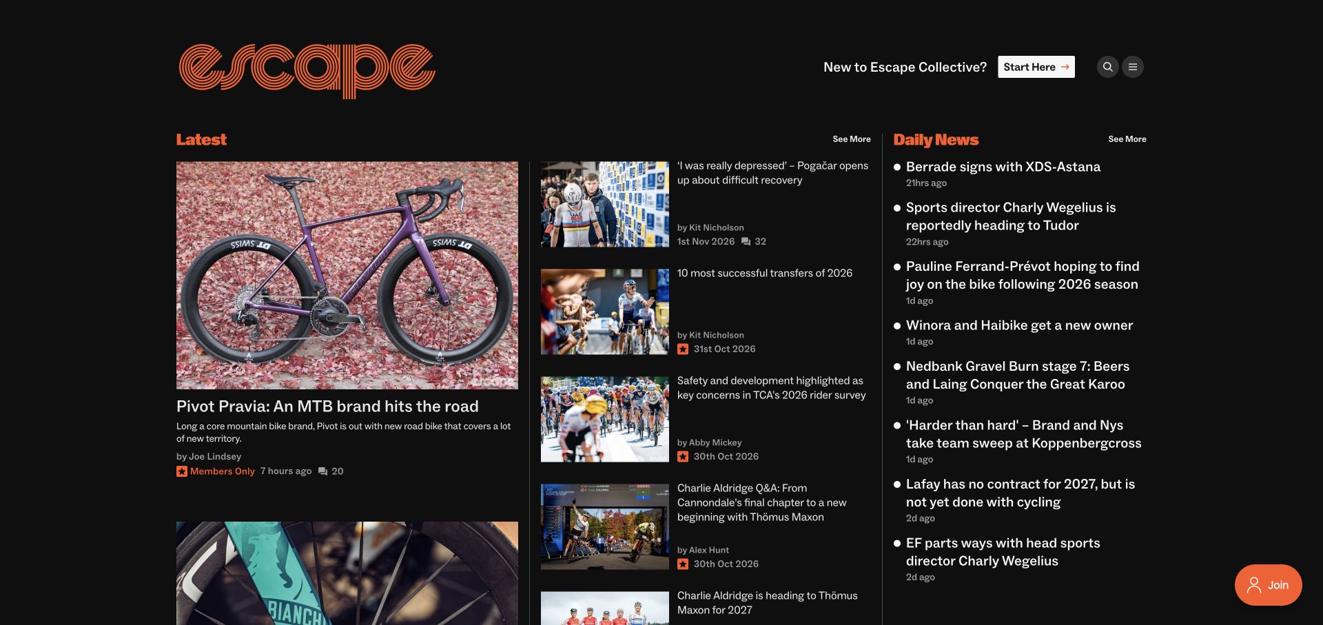
Escape Collective uses a dark background, orange identity and several parallel editorial columns. A large cycling feature leads the latest section, while shorter stories and a separate daily-news list provide alternatives. A Start Here route explicitly welcomes new readers, and member-only labels appear beside relevant items. The page makes the publication’s mix of reporting and community membership visible without requiring a sign-in. Ghost’s directory confirms the named publication relationship, not the operation of any separate event or commerce service.
What you can learn
Give newcomers an orientation route when an archive assumes specialist knowledge. Separate brief updates from longer features so each can retain useful metadata and an appropriate reading density. Make access labels consistent across card types, and preserve a meaningful public preview instead of using membership as a substitute for editorial explanation.
Pros
A Start Here action recognizes that new readers need context beyond the newest headline.
Daily news and larger features have distinct visual roles in the same opening view.
Cons & considerations
Multiple narrow columns require careful reordering and spacing on mobile screens.
Small dates and comment counts can lose legibility against a dark surface if the type becomes too subdued.
Public source checked November 3, 2026. References may be embedded or legacy—not a complete backend inventory.
Platform source: Official Ghost Explore publication profile. Official Ghost Explore profile links directly to this named publication. This is documentary evidence of its Ghost publishing association, not an independent inventory of every current backend, application, commerce or email component. Platform evidence is separate from the direct website screenshot and is not a complete current infrastructure audit.
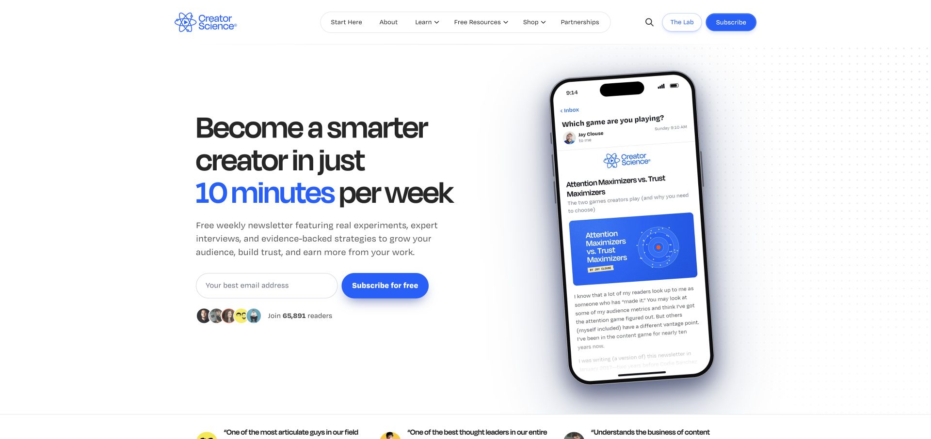
Creator Science pairs a large typographic promise with a tilted phone preview of an email. The blue accent connects the highlighted time commitment, subscription action and product identity. Navigation distinguishes learning resources, a shop and the separate Lab, while the main email form remains short. The layout turns an abstract newsletter into a visible recurring product. Its official Ghost profile supports the publication attribution; the screenshot does not verify audience size, learning outcomes or the systems behind the community.
What you can learn
Explain the reading commitment and show a representative issue before expanding the page with testimonials or products. Keep free publishing, paid community and shopping destinations conceptually separate. A visitor should understand which relationship an email signup creates without assuming that every action grants the same access.
Pros
The sample email shows the format readers can expect instead of relying only on promotional language.
Free subscription and the separate Lab destination are visually distinguishable in the header.
Cons & considerations
The large phone mockup can compete with the actual signup explanation on narrow screens.
Several resource and commerce categories need clear destinations so the publication does not feel like an undifferentiated funnel.
Public source checked November 3, 2026. References may be embedded or legacy—not a complete backend inventory.
Platform source: Official Ghost Explore publication profile. Official Ghost Explore profile links directly to this named publication. This is documentary evidence of its Ghost publishing association, not an independent inventory of every current backend, application, commerce or email component. Platform evidence is separate from the direct website screenshot and is not a complete current infrastructure audit.
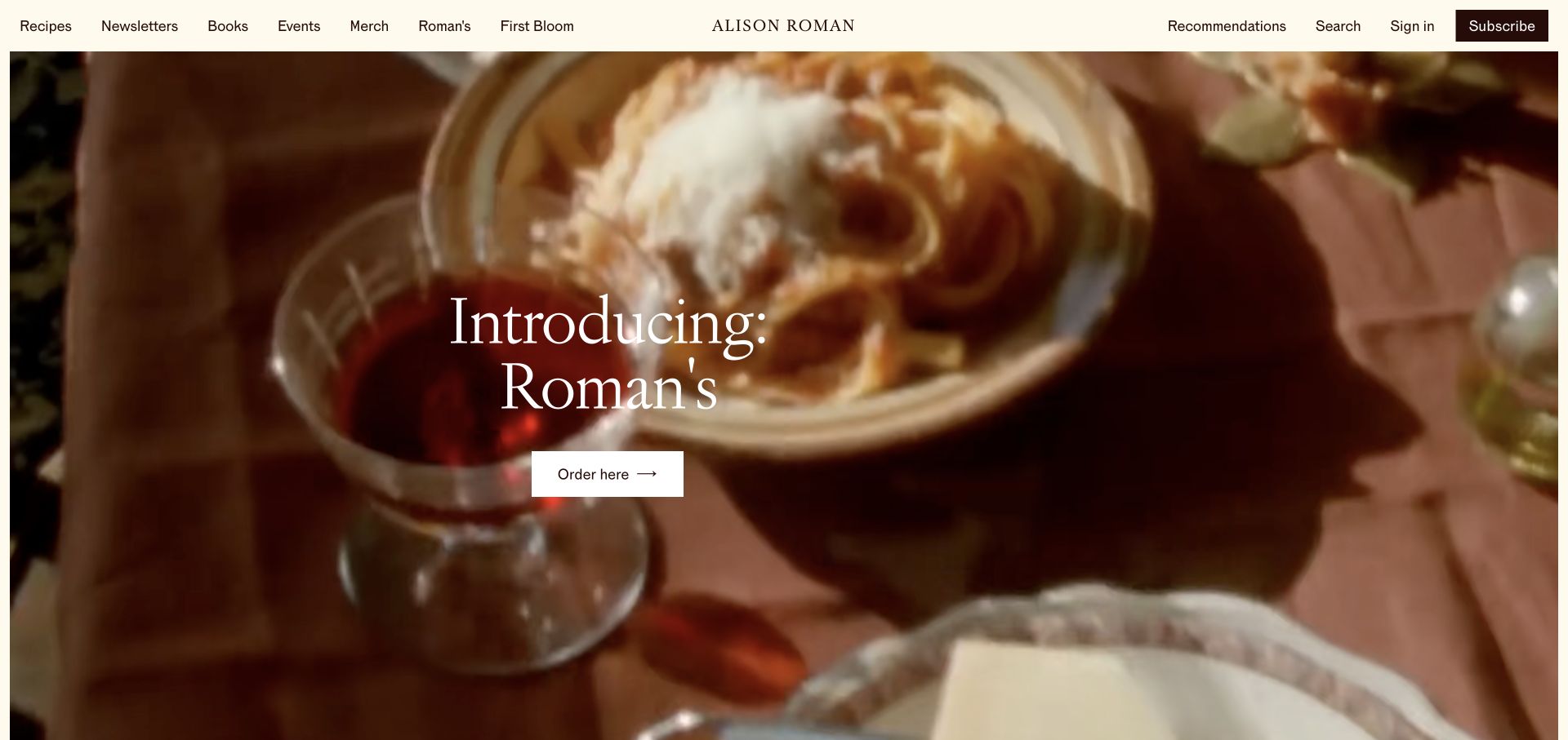
Alison Roman’s site presents a broad food-focused image beneath a restrained cream navigation bar. The opening promotes a current venture with a large serif title and a simple ordering route, while recipes, newsletters, books and events remain available across the header. The author’s name stays centered between the content and account navigation. Ghost’s directory identifies the public publishing property. The presence of an ordering link is not evidence that Ghost itself processes or fulfills the purchase.
What you can learn
An author brand can unite several activities if the information architecture explains their differences. Keep recipes and newsletter archives durable even when a seasonal announcement takes over the homepage. Define where a campaign leads and which external service owns orders, memberships or event registration before designing a shared visual shell.
Pros
The header exposes the main editorial archives even when the homepage features a separate venture.
A restrained navigation treatment lets the food imagery and serif typography carry the identity.
Cons & considerations
A campaign-led opening gives little immediate evidence of the newsletter’s format or recent writing.
Text over moving or changing imagery needs a dependable readable treatment across frames and screen sizes.
Public source checked November 3, 2026. References may be embedded or legacy—not a complete backend inventory.
Platform source: Official Ghost Explore publication profile. Official Ghost Explore profile links directly to this named publication. This is documentary evidence of its Ghost publishing association, not an independent inventory of every current backend, application, commerce or email component. Platform evidence is separate from the direct website screenshot and is not a complete current infrastructure audit.
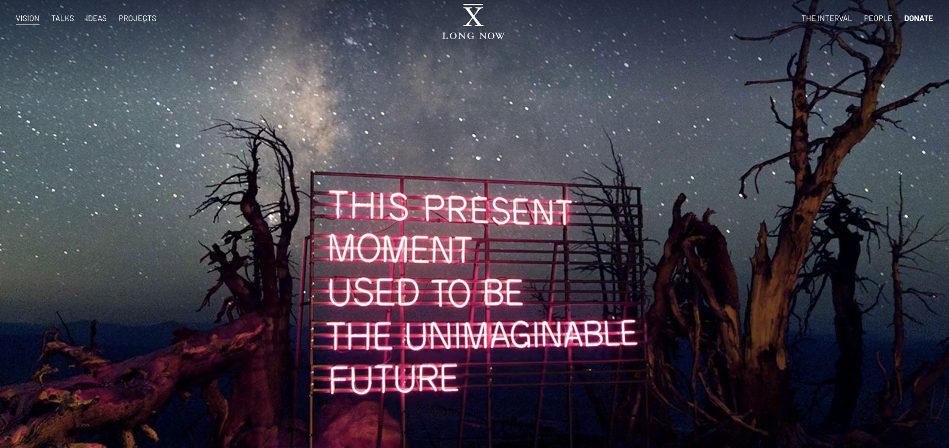
Long Now opens with a full-screen photograph of an illuminated statement beneath a starry sky. A centered mark and small white navigation links remain around the edges, with routes for vision, talks, ideas and projects. The opening establishes an intellectual mood before presenting a conventional article list. Ghost’s current directory links to this property. That relationship is documentary publishing evidence, not proof that every project, donation process or event system uses the same implementation.
What you can learn
Use a dramatic opening only when the next routes explain the organization’s work concretely. Preserve a clear distinction between editorial ideas, recorded talks and projects that have their own history. Store meaningful image captions and alternative text alongside the asset, since the visual statement should not be the only way to understand the organization.
Pros
The photographic opening creates a distinctive setting for an otherwise spare institutional interface.
A small set of named routes distinguishes editorial reading from projects and organizational background.
Cons & considerations
The first screen offers limited plain-language context for a visitor unfamiliar with the organization.
Fine white navigation over a detailed photograph needs contrast checks for every chosen image.
Public source checked November 3, 2026. References may be embedded or legacy—not a complete backend inventory.
Platform source: Official Ghost Explore publication profile. Official Ghost Explore profile links directly to this named publication. This is documentary evidence of its Ghost publishing association, not an independent inventory of every current backend, application, commerce or email component. Platform evidence is separate from the direct website screenshot and is not a complete current infrastructure audit.
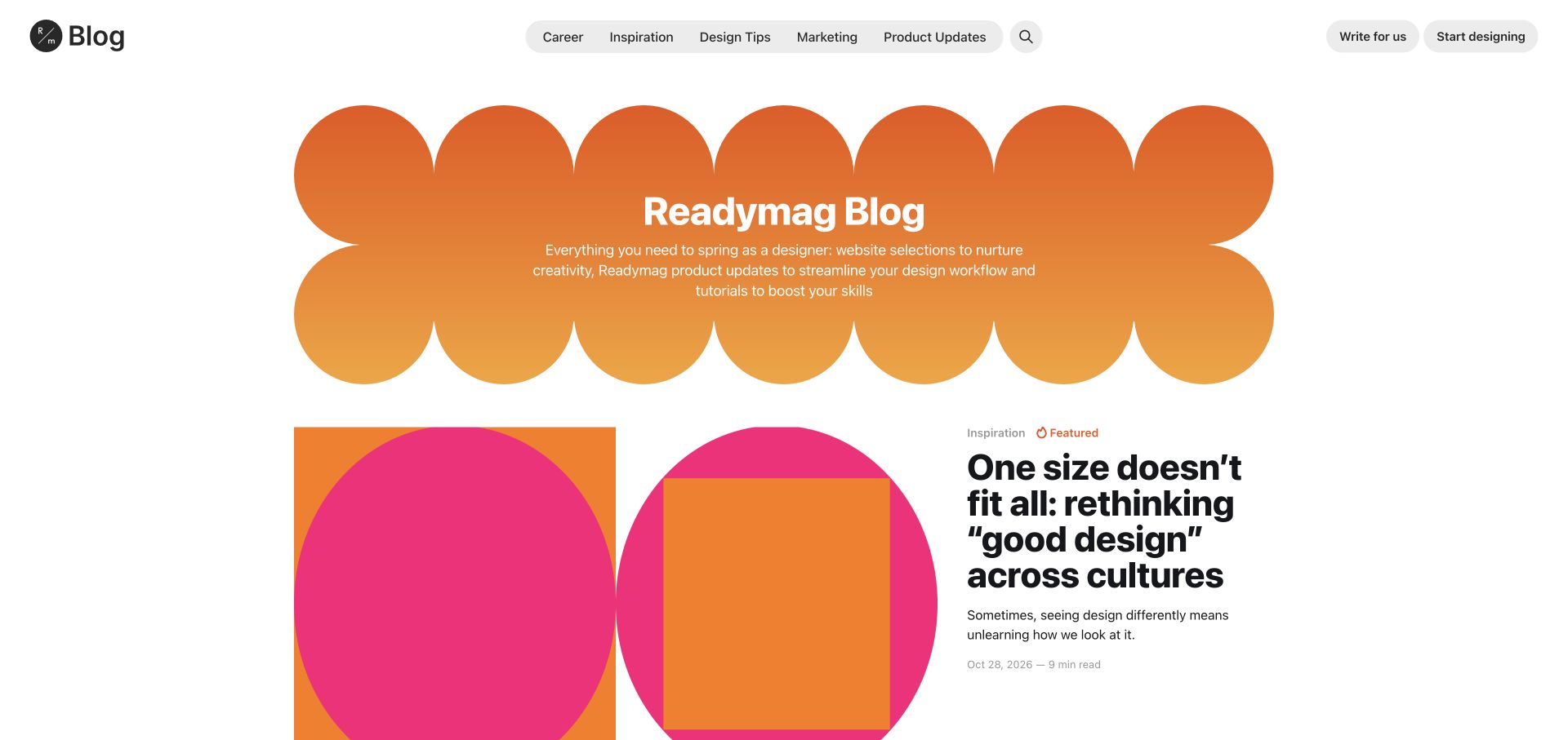
Readymag’s blog uses a scalloped orange gradient banner and bright geometric artwork to establish an expressive identity. The header remains compact and separates career, inspiration, design tips, marketing and product updates. A featured article sits beneath the introduction with a category, date and reading-time label. The design illustrates how a publishing property can look closely related to a creative product without inheriting its entire application interface. Ghost’s official profile applies to the blog shown, not Readymag’s visual website builder.
What you can learn
Give a product publication enough visual character to attract its audience while preserving a predictable article model. Category, date and reading time should survive changes in campaign artwork. Keep the route back to the product distinct from the route for contributing to the publication, because those actions serve different visitors.
Pros
Stable category navigation balances the more playful shapes and colors in the main content.
The featured article retains practical metadata rather than depending on its illustration alone.
Cons & considerations
The large decorative introduction reduces the room available for additional articles above the fold.
Highly saturated artwork needs a consistent system so future contributions do not create a visually fragmented archive.
Public source checked November 3, 2026. References may be embedded or legacy—not a complete backend inventory.
Platform source: Official Ghost Explore publication profile. Official Ghost Explore profile links directly to this named publication. This is documentary evidence of its Ghost publishing association, not an independent inventory of every current backend, application, commerce or email component. Platform evidence is separate from the direct website screenshot and is not a complete current infrastructure audit.
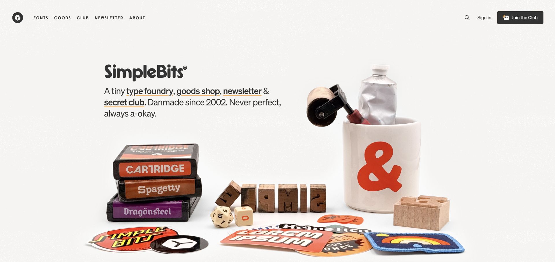
SimpleBits places a concise introduction over a carefully arranged still life of printed goods, type specimens and studio objects. Navigation names fonts, goods, a club and a newsletter as separate destinations, with a prominent club action at the opposite edge. The opening feels personal and specific because the imagery reflects the actual range of work. Ghost’s directory identifies the site’s publishing association. That does not establish which service handles product checkout, licensing or delivery.
What you can learn
For a maker’s site, explain the different kinds of participation without flattening them into one call to action. A newsletter, a membership and a purchased product have different expectations. Keep those destinations explicit and use original product photography to connect the editorial voice with the objects being offered.
Pros
The introductory sentence explains the mix of activities in direct, approachable language.
Navigation separates the newsletter and club from tangible goods and type products.
Cons & considerations
A broad photographic composition may need a different crop to keep important objects visible on phones.
Visitors seeking recent writing must continue beyond the product-led opening or use the newsletter route.
Public source checked November 3, 2026. References may be embedded or legacy—not a complete backend inventory.
Platform source: Official Ghost Explore publication profile. Official Ghost Explore profile links directly to this named publication. This is documentary evidence of its Ghost publishing association, not an independent inventory of every current backend, application, commerce or email component. Platform evidence is separate from the direct website screenshot and is not a complete current infrastructure audit.
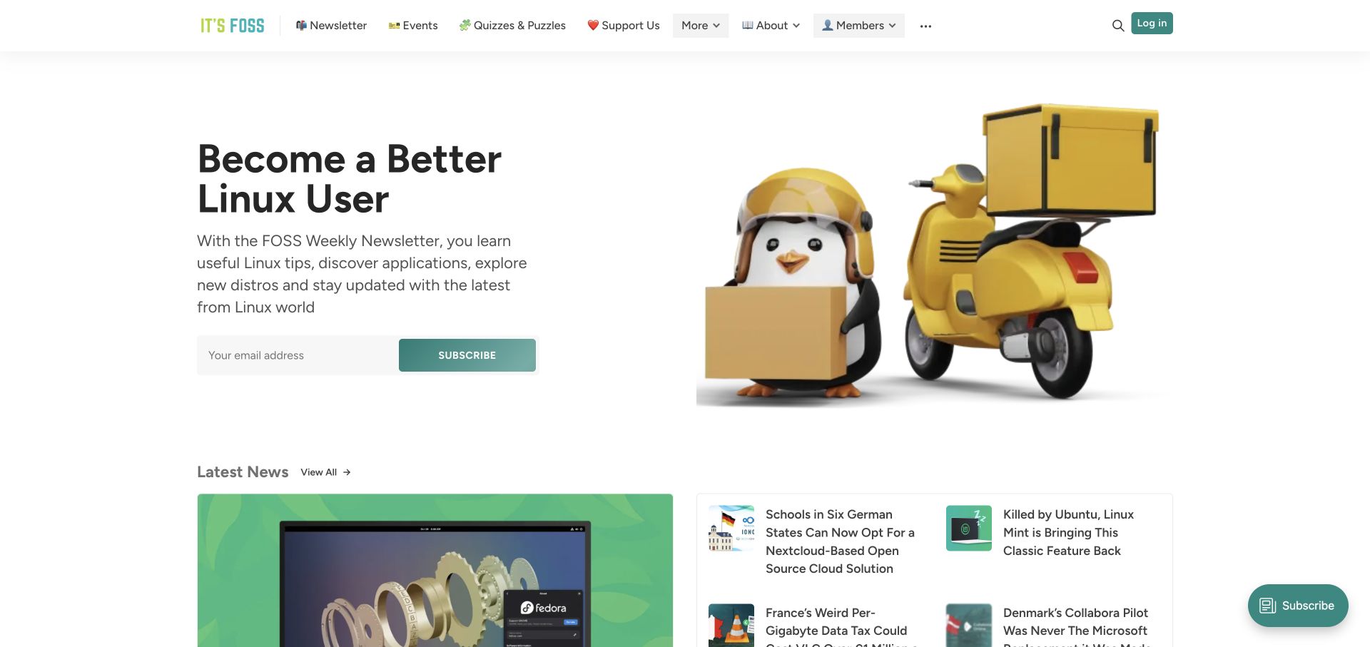
It’s FOSS introduces its newsletter through a clear learning benefit, a short explanation and a friendly Linux-themed illustration. A compact email form sits beside the image, while the latest-news area begins directly below. The header also exposes events, quizzes, support and membership routes. The page balances an ongoing learning relationship with a conventional news-reading path. Ghost’s current directory confirms the publication association; this review does not audit the technical instructions or the subscriber claims on the site.
What you can learn
Let visitors understand both the recurring newsletter and the public archive. A clear learning promise helps a first-time reader, but current articles should remain easy to find without submitting a form. Keep support and membership labels distinct from ordinary subscription so users can understand which actions involve a different commitment.
Pros
The introduction explains the newsletter’s subject and expected value in concrete language.
Recent news remains visible beneath the signup area instead of being entirely hidden behind it.
Cons & considerations
Several compact menu labels and icons can be difficult to prioritize on small screens.
A large illustration and newsletter pitch may slow readers who arrive primarily for a specific tutorial.
Public source checked November 3, 2026. References may be embedded or legacy—not a complete backend inventory.
Platform source: Official Ghost Explore publication profile. Official Ghost Explore profile links directly to this named publication. This is documentary evidence of its Ghost publishing association, not an independent inventory of every current backend, application, commerce or email component. Platform evidence is separate from the direct website screenshot and is not a complete current infrastructure audit.
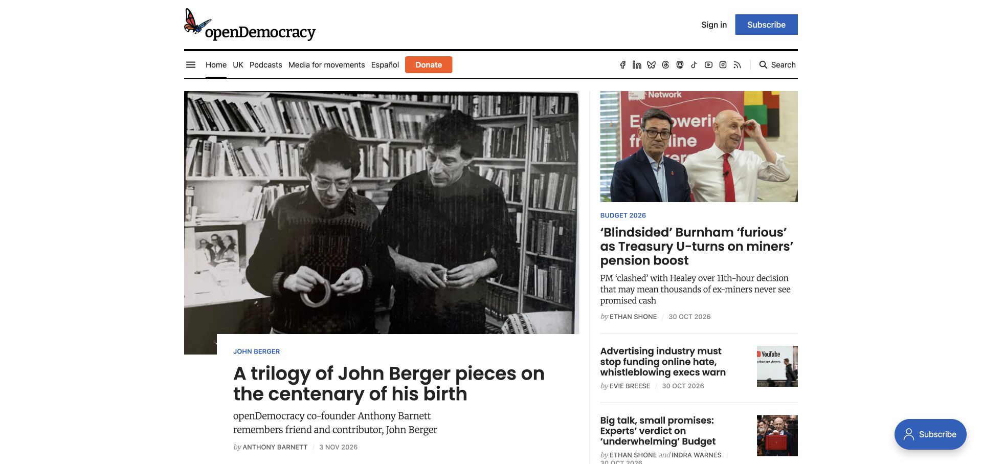
openDemocracy combines a prominent photographic lead with a smaller right-hand sequence of news stories. Its masthead sits above a navigation row containing topical destinations, language access, donation and search. Sign-in and subscription have a different position from donation, making those relationships visibly separate. Category labels, summaries and bylines remain attached to the story cards. The Ghost listing identifies this publication, while the review makes no claim about its editorial conclusions, fundraising results or internal operations.
What you can learn
Keep the publication’s support options understandable without allowing them to replace the reading experience. Distinguish donations, subscriptions and account access in wording and placement. When a large lead overlaps its photograph, test long titles and responsive cropping so the editorial hierarchy remains clear after the featured story changes.
Pros
The large lead and smaller news list offer two useful levels of editorial emphasis.
Donation, subscription and search are visible as separate tasks around the publication identity.
Cons & considerations
A long navigation row mixes topics, language and support actions that need deliberate grouping on mobile.
Overlapping text and image treatments require testing with varied headline lengths and photographic focal points.
Public source checked November 3, 2026. References may be embedded or legacy—not a complete backend inventory.
Platform source: Official Ghost Explore publication profile. Official Ghost Explore profile links directly to this named publication. This is documentary evidence of its Ghost publishing association, not an independent inventory of every current backend, application, commerce or email component. Platform evidence is separate from the direct website screenshot and is not a complete current infrastructure audit.
Choose a theme, a custom publication, or a separate frontend
Begin with an appropriate publication theme
Evaluate the theme against actual editorial needs: long-form articles, multiple authors, recurring newsletters, topic archives and member-only work. Ask an editor to replace the lead feature and publish an awkwardly long title. A visual preference is insufficient if routine changes require developer intervention.
Customize when the editorial system needs a distinct hierarchy
A custom theme can create a magazine front page, specialist sections or an author’s mixed publishing identity. Specify the content model and responsive rules before drawing every variation. Maintain a small vocabulary of article cards so the archive remains consistent as different editors contribute.
Use a separate frontend for a concrete requirement
Ghost’s Content API exposes published content for other website implementations. A separate frontend adds responsibility for routing, previews, access behavior and deployments. Confirm how newsletters and memberships will work in that architecture instead of assuming a headless website reproduces every native publishing feature.
Plan the archive, newsletter and reader relationship together
Inventory the publication before migration
Record old article URLs, author profiles, tags, images and existing access rules. Decide which content remains public and which archive pages deserve a maintained introduction. Map redirects explicitly so an old shared article does not disappear behind a newly designed homepage.
Rehearse an issue from draft to correction
Use a realistic article with links, images, captions and several headings. Preview the web presentation and newsletter separately. Define who approves sending, how a correction is handled and which parts of an email cannot be changed after delivery. Keep genuine subscriber data out of casual QA.
Assign ownership for editorial quality, member support, billing integrations, domain configuration and software maintenance. A clear public design does not prove the back office is ready. Document the recovery process for a failed send, broken integration or unintended access change before launch.
A useful handover demonstration
Ask the actual team to carry out its routine job: publish a realistic update, correct a mistake, preview a narrow screen, and identify who owns an integration failure. For a library or frontend framework, also ask who maintains the content source and deployment. A polished screenshot does not answer those operational questions.
Beyond the screenshot
Ghost publication launch and maintenance checklist
Confirm the publication promise, author identities and recurring content categories.
Test long titles, missing images, multiple authors and old articles in the chosen theme.
Check public, free-member and paid-member labels in an approved test environment.
Preview web articles and newsletter emails as separate reading experiences.
Map legacy article, author and tag URLs with explicit redirects.
Check keyboard navigation, focus, image alternatives and narrow-screen reading.
Explain subscription, donation and commerce actions without mixing their meanings.
Assign owners for corrections, member support, delivery failures and ongoing updates.
Keep image permissions, captions and source records alongside the editorial assets.
Test with real content, a keyboard, a small screen, slow or failed requests, and the people who will maintain the system. These are planning checks, not an accessibility, security, performance, or search-ranking certification.
Sources & editorial method
How this Ghost collection was reviewed
We visited twenty public properties linked from official Ghost Explore profiles, captured their actual rendered pages and wrote original composition reviews. The profile source establishes an attributed Ghost publishing relationship for the named property; it is not an independent audit of its current complete backend. Screenshots and profile records were collected separately. Subscriber numbers, testimonials and performance claims visible on source sites are not independently verified here.
Every image is an unmodified capture from the actual website, with its source and capture date. Some captures are reused from our shared catalog; their dates remain the original capture dates. None comes from a vendor gallery or a generated reconstruction. Moving imagery and live content can change.
Technology attribution uses public page assets or metadata, official platform documentation, or a cited first-party project case study. Documentary and framework-relationship evidence is identified where used; it is not a complete current backend inventory. A CMS image CDN alone does not establish a full CMS deployment. A library’s presence does not prove which individual controls use it, and a platform label does not establish AI authorship.
The composition notes, lessons, pros and tradeoffs are original editorial observations. We have not measured conversion, traffic, security, performance or accessibility conformance. Website owners retain their brands and imagery; these examples are not our client portfolio. Written, Edited and Curated are independent records, not dates advanced by a build. See our editorial standards or suggest a correction.
Questions worth asking
Ghost website development FAQs
Does a Ghost example have to look like a standard blog?
No. The examples include magazine layouts, institutional publications, creator sites and business resource libraries. Choose the structure around your actual editorial formats and archive, then decide how much theme customization is justified.
Should the homepage lead with articles or a signup form?
That depends on the reader’s first task. A new publication may need to explain its promise and show a sample, while an established newsroom may need immediate access to current coverage. Keep a clear route between introduction and archive either way.
Does Ghost manage every service shown on these sites?
No. The evidence applies to the named publishing property. Stores, donations, events, applications and other corporate systems can be separate. Identify the owner of each integration in your own project.
Can the screenshots establish subscription performance?
No. They show design and public content at the recorded capture time. They do not reveal revenue, conversion, deliverability or the quality of the private editorial workflow.
Is a separate frontend necessary?
Only when a specific requirement and a maintainable operating model justify it. Compare the same requirement with a suitable Ghost theme, and make preview, membership and deployment responsibilities explicit before choosing.
Borrow a useful editorial pattern, then test it with your own stories, readers and publishing routine. The best design is one your team can keep accurate and coherent after launch.