An Angular website needs more than a recognizable component library. Its routes, information hierarchy, form states, and service boundaries should help people finish a task without understanding the application underneath.
This collection covers the actual named public properties, with direct captures and specific Angular evidence. An Angular component on a careers page is not evidence that the entire company website uses Angular. Likewise, a public tracking or banking entry screen does not reveal the implementation of a protected account or transaction system.
Use each example to isolate a decision: how a dense header is organized, how a search begins, how documentation introduces a complex product, or how an application explains its next step. The screenshot is an observation of one state, not a test of every interaction or proof of a business outcome.
Before the examples
What makes good Angular website development in 2026?
Make routes reflect a visitor's task
Start with meaningful destinations and understandable labels, then define the application's transitions. An important state should have a useful URL where appropriate, with predictable refresh, back-button, and direct-entry behavior. Include a missing record and a failed request in the route plan; neither should leave a visitor looking at an unexplained empty shell.
Specify the states that the first screenshot cannot show
A form brief should include empty, partial, invalid, submitting, failed, and successful states. Agree which information must remain after a failed request and how errors are explained next to the relevant control. Choose the form architecture deliberately and test server-side validation separately. A consistent visual library cannot decide the meaning of an error or the safe handling of a retry.
Angular supports client rendering, prerendering, and server rendering. Evaluate the relevant tradeoffs for your public content and interactive application rather than selecting one mode because a reference uses Angular. Test direct requests, meaningful initial content, loading behavior, and the transition into interaction in the actual deployment.
The opening five show Citi, HP Support, Capital One, Epic Games Documentation, and UPS Tracking. Later examples include developer products, public services, learning environments, and a specifically scoped embedded careers interface. Reviews stay within the public surfaces captured.
We start with five recognizable brands or organizations: Citi, HP Support, Capital One, Epic Games Product Documentation, UPS Tracking. Each attribution applies to the named website property, not every product or website belonging to its organization. This is a curated reading sequence, not a measured ranking.
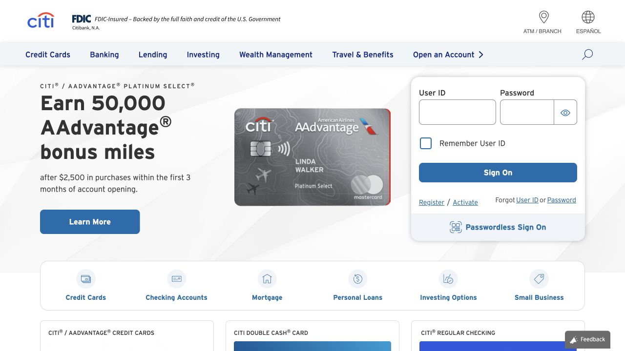
Citi’s public homepage pairs a credit-card promotion with a prominent account-entry panel. Its blue-and-white header separates product families from branch, language, and search utilities, while a broad row of category shortcuts starts below the hero. The promotional card image and large offer text are visually distinct from the user-ID and password fields. Public HTML identifies modern Angular on this exact property. The review remained signed out; the sample card artwork is marketing content, not a customer account or financial recommendation.
What you can learn
A component-based public shell can support acquisition and account access without mixing their responsibilities. Keep sign-in labels, recovery links, and error states independent from campaign content. Model the category shortcuts as reusable navigation, and ensure an unavailable promotional service never prevents an existing customer from reaching the account route.
Pros
Product discovery and account access occupy clearly different visual zones.
Category shortcuts provide a practical alternative to the featured campaign.
Cons & considerations
The first view contains many competing product and account decisions.
Large numerical offers need readable qualifying context when resized or changed.
Visible tech stack
Referenced on the public page
Angular
Public source checked November 3, 2026. References may be embedded or legacy—not a complete backend inventory.
Platform source: Observed first-party page or linked application asset. The public HTML declares ng-version="21.2.25". Platform evidence is separate from the direct website screenshot and is not a complete current infrastructure audit.
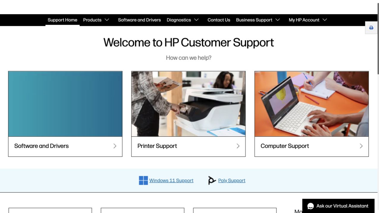
HP Support begins with a direct welcome and three large task cards: software and drivers, printer help, and computer help. Photography distinguishes the device-oriented routes, while a plain gradient marks the software path. A black support navigation bar separates products, diagnostics, contact, business support, and account destinations. Additional Windows and Poly support links form a lighter secondary band. The public page declares a modern Angular version. No product identifier, support query, or account information was supplied during this visual review.
What you can learn
Build a support entry around the decisions a person can make confidently before asking for detailed identifiers. Angular components can keep task cards, alerts, and product selectors consistent, but the navigation vocabulary should remain plain. Provide a useful path for visitors who do not know their model number, and preserve context when they move from a general hub to device-specific help.
Pros
The first choices are understandable without specialist troubleshooting knowledge.
Device photography helps distinguish otherwise similar support destinations.
Cons & considerations
Large cards give limited detail about what happens after the first click.
Several support and account categories need a clear compact-screen navigation strategy.
Public source checked November 3, 2026. References may be embedded or legacy—not a complete backend inventory.
Platform source: Observed first-party page or linked application asset. The public HTML declares ng-version="20.3.29". Platform evidence is separate from the direct website screenshot and is not a complete current infrastructure audit.
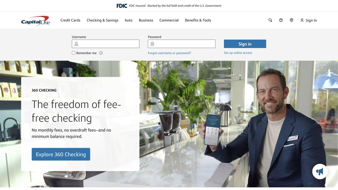
Capital One’s public page places a horizontal sign-in strip between its main navigation and a large checking-account campaign. A white content card sits over a lifestyle photograph, with a blue product-exploration action near the bottom. The header uses plain product-family labels and small search, help, location, and account utilities. Regulatory identity occupies a separate narrow top band. The HTML declares modern Angular. The account fields were left empty, and the review does not evaluate financial products, campaign claims, or authentication security.
What you can learn
Separate stable customer utilities from replaceable campaign modules when defining an Angular shell. Each should be able to load, fail, and change without taking over the other’s space. Keep account recovery available, make the product action a normal destination, and test long campaign copy against both the image crop and the persistent customer controls.
Pros
Existing customers can identify an account route before reading the campaign.
The white copy panel protects the product message from photographic variation.
Cons & considerations
The account strip reduces space available to the first campaign.
A lifestyle photograph does not itself explain detailed account terms or eligibility.
Visible tech stack
Referenced on the public page
Angular
Amazon CloudFrontDelivery / hosting signal
Public source checked November 3, 2026. References may be embedded or legacy—not a complete backend inventory.
Platform source: Observed first-party page or linked application asset. The public HTML declares ng-version="21.2.25". Platform evidence is separate from the direct website screenshot and is not a complete current infrastructure audit.
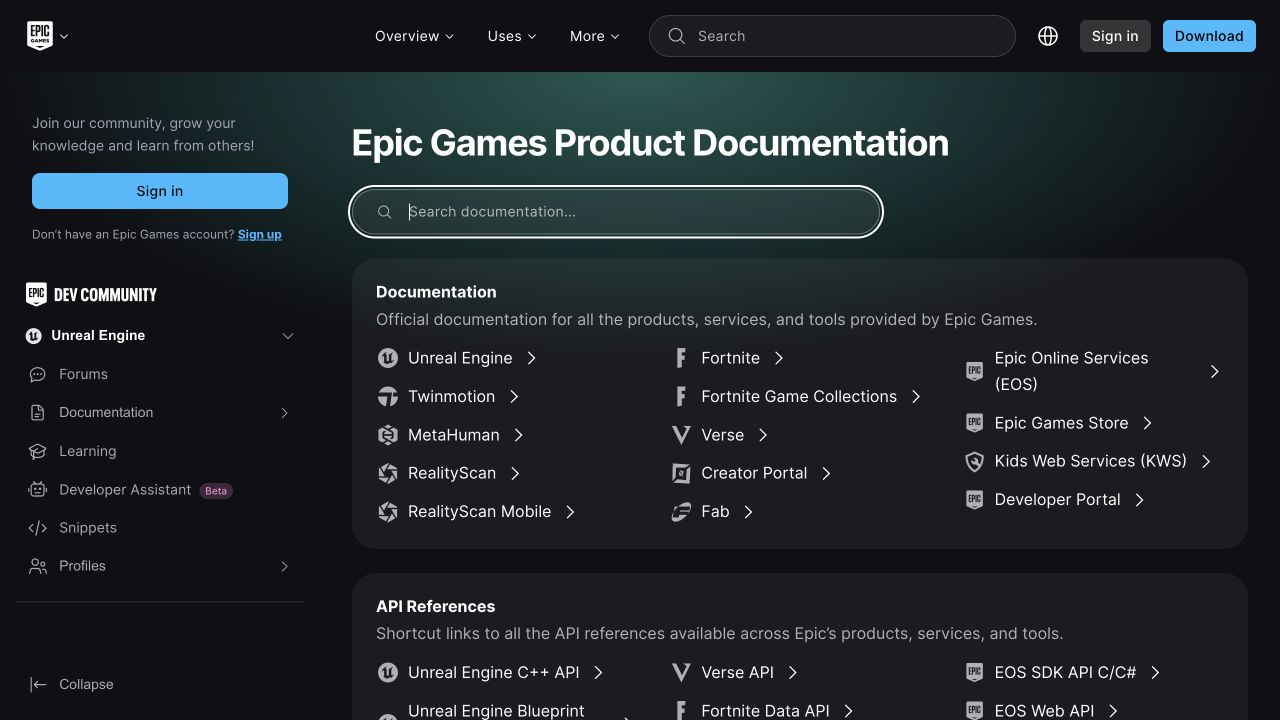
Epic Games Product Documentation uses a dark shell with a left-hand community navigation and a broad product directory in the main column. A large search field sits directly below the title. The first grouped panel lists documentation families, while a second begins to separate API references. Product marks help distinguish Unreal Engine, Fortnite, MetaHuman, and related tools without changing the common row treatment. Its public HTML identifies modern Angular and hydration markers. The selected property is documentation, not an observation of Epic’s games or private developer accounts.
What you can learn
Use reusable directory components to present related products without flattening everything into one long article tree. Preserve a strong page title, a specific search purpose, and normal deep links. In an Angular implementation, navigation state and selected product context should survive predictable transitions without making the documentation unreadable before client behavior initializes.
Pros
Product documentation and API references have separate grouped surfaces.
The persistent sidebar offers community and learning routes outside the directory.
Cons & considerations
Multiple searches need clear scope to avoid confusing global and documentation queries.
The dense left navigation leaves less space for content at intermediate widths.
Visible tech stack
Earlier / documented evidence
Angular
Earlier cited evidence retained; no current scan result. References may be embedded or legacy—not a complete backend inventory.
Platform source: Observed first-party page or linked application asset. The public HTML declares ng-version="21.2.5" with server-rendering hydration attributes. Platform evidence is separate from the direct website screenshot and is not a complete current infrastructure audit.
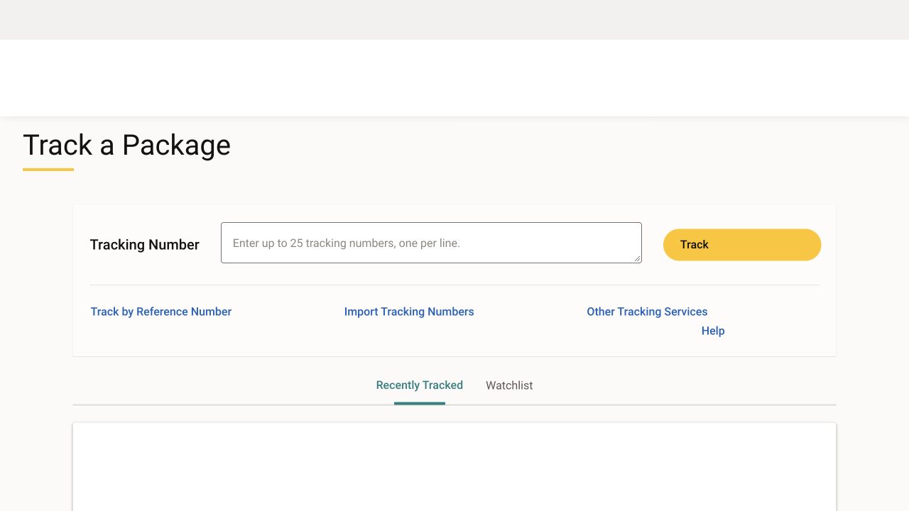
UPS Tracking presents a large page title above one broad entry panel. The tracking-number label, multiline field, and yellow action form a clear horizontal sequence, with instructions indicating that several numbers can be entered. Alternative tracking methods and help links sit beneath a rule instead of becoming competing primary buttons. Recently tracked and watchlist tabs begin below the form. The page links an Angular application bundle with a version marker. This capture is the empty public entry state; no tracking number or shipment information was entered.
What you can learn
An Angular operational form should preserve clear field labels, useful input guidance, and a stable result area while requests are pending. Design empty, invalid, partial-success, and service-unavailable states explicitly. Keep the alternative methods available without resetting entered data, and never infer that a visually simple form guarantees private shipment information is properly protected.
Pros
The yellow action is easy to distinguish from the alternative-method links.
The field guidance explains the supported multiline input format before submission.
Cons & considerations
The initial result area offers limited context until a visitor performs a task.
The wide horizontal field arrangement needs deliberate reflow on a phone.
Visible tech stack
Earlier / documented evidence
Angular
Earlier cited evidence retained; no current scan result. References may be embedded or legacy—not a complete backend inventory.
Platform source: Observed first-party page or linked application asset. The public tracking page loads this Angular application bundle, which contains the ng-version runtime marker and version 18.2.13. Platform evidence is separate from the direct website screenshot and is not a complete current infrastructure audit.
PepsiCo Careers uses a full-width employee photograph behind a large brand statement, with a rounded two-part search surface across the lower hero. Role and location fields remain visually distinct, and a compact header provides career areas, locations, student information, and company-life routes. Candidate-dashboard and language controls occupy the utility side. Angular evidence here is deliberately narrow: the official page loads an Angular-based job-search component bundle. It does not establish that every part of the careers website uses Angular.
What you can learn
Embedding an Angular task component in a broader publishing page requires an explicit boundary. Keep the search labels meaningful before enhancement, define loading and unavailable states, and align its visual tokens with the host page. Preserve role and location context as visitors navigate into results instead of treating the search box as a decorative hero element.
Pros
The search surface connects employer storytelling to an immediate practical task.
Role and location inputs reflect two understandable ways to narrow vacancies.
Cons & considerations
Very large promotional lettering can compete with the operational search.
An embedded component needs reliable fallbacks when its separate bundle fails.
Public source checked November 3, 2026. References may be embedded or legacy—not a complete backend inventory.
Platform source: Observed first-party page or linked application asset. The official careers page loads this job-search component bundle, which contains Angular’s ng-version runtime. This establishes an embedded Angular component, not that the entire careers page is an Angular application. Platform evidence is separate from the direct website screenshot and is not a complete current infrastructure audit.
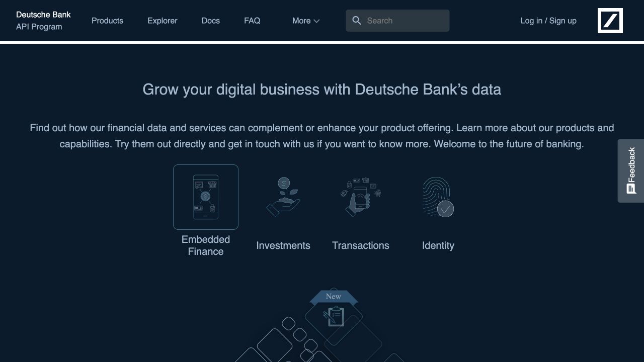
Deutsche Bank’s developer portal uses a dark navy identity, a compact documentation-oriented header, and a centered introduction to its API program. Four line-art categories distinguish embedded finance, investments, transactions, and identity. Search and account access remain in the header, while a feedback tab stays at the side. After rejecting optional cookies, the public introduction was visible without accepting the developer-portal terms or signing in. The page loads a first-party Angular bundle. This association applies to the portal, not the bank’s other systems.
What you can learn
An Angular API portal should distinguish public evaluation content, sandbox access, and production enrollment. Shared components can keep documentation, product status, and capability navigation aligned, but they should not make consent a prerequisite for understanding the offering. Preserve ordinary documentation links and label examples as test data before any operation can access real customer information.
Pros
The capability categories translate a broad API program into concrete domains.
Documentation and exploratory resources are visible before account creation.
Cons & considerations
Low-contrast line illustrations provide little detail at small sizes.
The broad introduction still requires deeper product pages to explain access conditions.
Public source checked November 3, 2026. References may be embedded or legacy—not a complete backend inventory.
Platform source: Observed first-party page or linked application asset. The public page loads this Angular application bundle, which contains the ng-version runtime marker and version 19.2.18. Platform evidence is separate from the direct website screenshot and is not a complete current infrastructure audit.
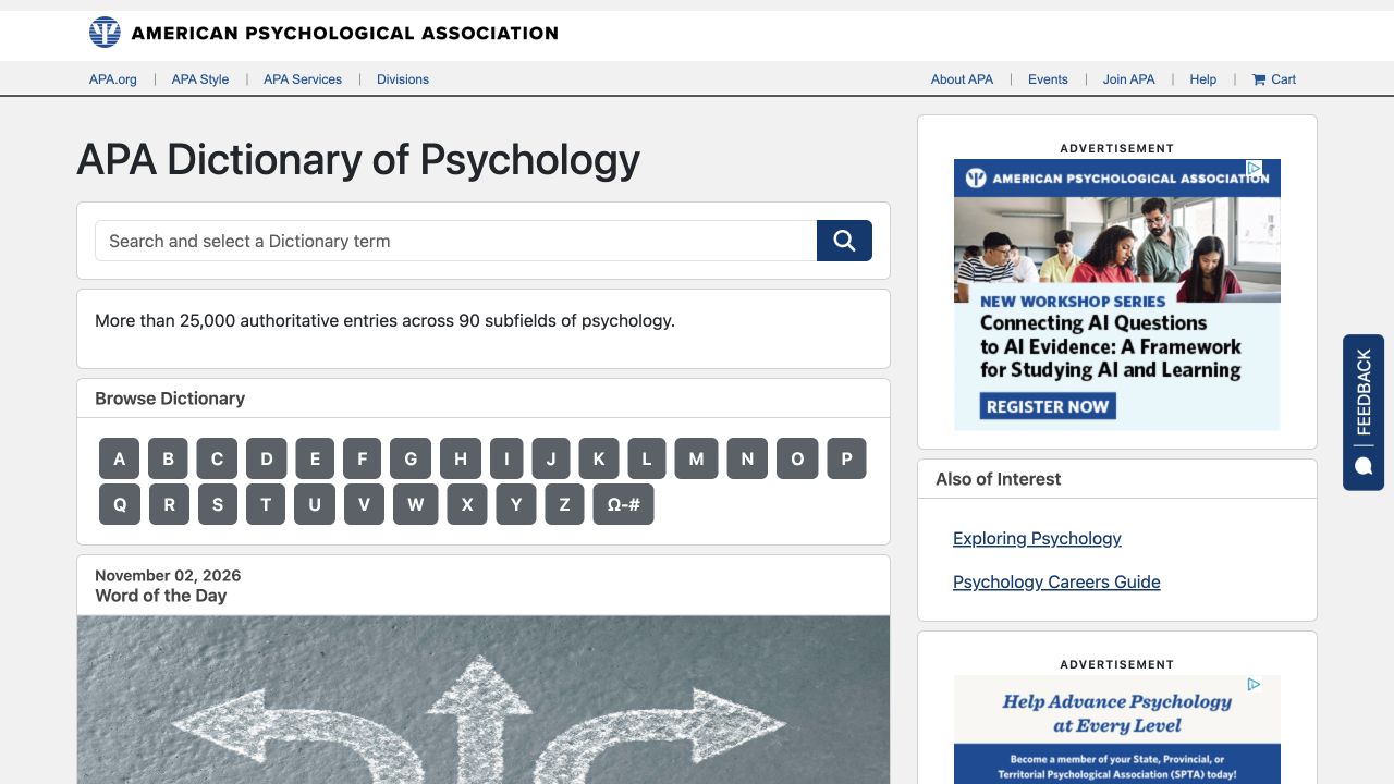
The APA Dictionary of Psychology places its title and search field at the top of a restrained gray-and-white reference layout. A short coverage statement sits above a large alphabetical keyboard, giving readers an alternative to knowing the exact term. A word-of-the-day module begins underneath, while advertisements and related reading occupy the right column. Institutional utility links remain in a separate narrow header. The page links an Angular bundle with a version marker; no psychological term or personal information was submitted.
What you can learn
A reference interface benefits from predictable component states more than elaborate decoration. In Angular, build search, alphabetical navigation, definitions, and related terms as clear connected routes. Retain meaningful URLs for individual entries, identify loading and empty results, and ensure advertising changes cannot move the search field or replace the reader’s position during lookup.
Pros
Alphabetical browsing supports readers who do not have an exact search phrase.
The institutional identity and page-specific task hierarchy are visually separate.
Cons & considerations
Advertisements compete with reference material in the right-hand column.
A large letter grid needs suitable touch targets and keyboard behavior.
Visible tech stack
Referenced on the public page
Google Fonts
Amazon CloudFrontDelivery / hosting signal
Earlier / documented evidence
Angular
Public source checked November 3, 2026. References may be embedded or legacy—not a complete backend inventory.
Platform source: Observed first-party page or linked application asset. The public page loads this Angular application bundle, which contains the ng-version runtime marker and version 20.2.1. Platform evidence is separate from the direct website screenshot and is not a complete current infrastructure audit.
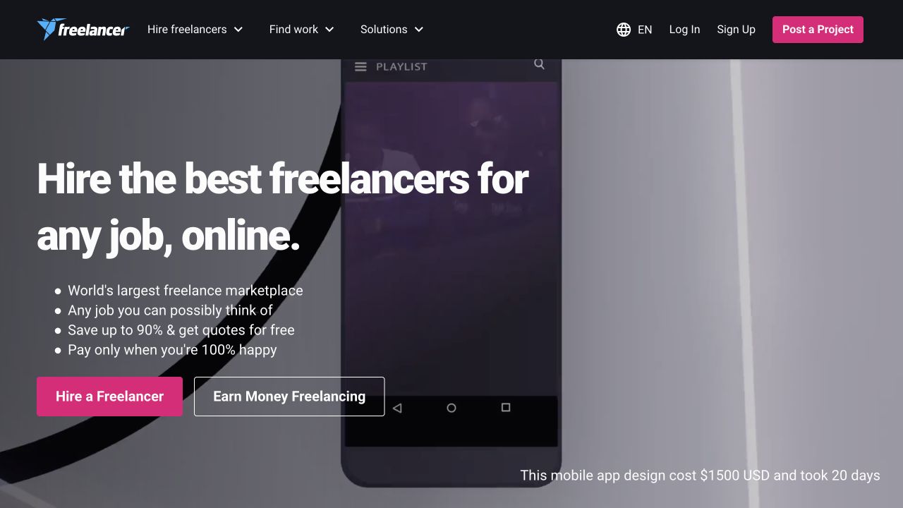
Freelancer opens with large white hiring language over a darkened project demonstration. A short bulleted explanation leads to a bright pink hiring action and a quieter outlined earning route. The dark header separates hiring, finding work, and business solutions, while account and project-posting controls remain visible to the right. A small caption contextualizes the featured demonstration. The captured page was in English and its HTML declares modern Angular. The review did not post a project, contact a freelancer, or test marketplace claims.
What you can learn
An Angular marketplace shell should make audience context explicit before introducing complicated account or project flows. Keep the two starting paths distinct in routing, copy, and analytics. Campaign examples can change independently, but account state, search context, and navigation should remain stable. Explain sample work as illustrative rather than implying identical cost or timing for every project.
Pros
The hiring and earning routes are visible together but have different weights.
The demonstration gives the broad marketplace statement a concrete visual reference.
Cons & considerations
Multiple acquisition actions compete across the header and hero.
A moving project background needs a still alternative and dependable contrast.
Visible tech stack
Referenced on the public page
Angular
Google Fonts
nginxReported response header
Public source checked November 3, 2026. References may be embedded or legacy—not a complete backend inventory.
Platform source: Observed first-party page or linked application asset. The public HTML declares ng-version="20.3.30". The captured language is recorded separately; it does not affect the framework association. Platform evidence is separate from the direct website screenshot and is not a complete current infrastructure audit.
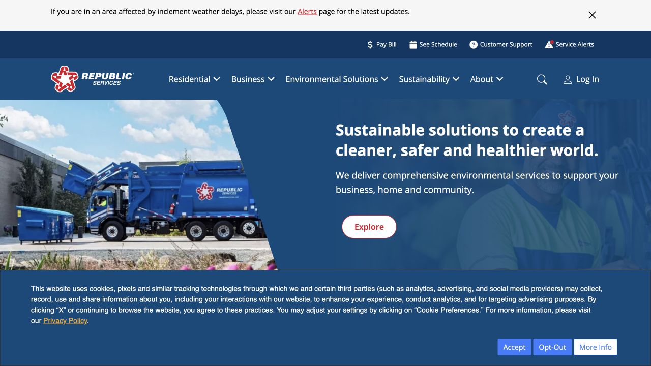
Republic Services places bill payment, schedules, customer support, and service alerts in a utility row above its main audience navigation. The blue hero combines service imagery with a plain explanation of environmental services and a contrasting exploration action. A weather-related notice has its own top band. The captured consent panel occupies the lower portion of the screen. Public HTML identifies modern Angular on this website. No address, customer account, payment information, or service inquiry was entered during the review.
What you can learn
A service-oriented Angular shell needs to preserve routine tasks even while campaigns and alerts change. Separate location-specific state from general brand content and make alert scope understandable. Treat address entry and account access as deliberate transitions, with useful empty and unavailable states, rather than allowing a broad marketing carousel to own the entire customer journey.
Pros
Routine customer tasks are visible before the broader company story.
The alert band has a separate purpose from the main navigation.
Cons & considerations
Stacked alerts, utilities, navigation, and consent leave less room for content.
A broad sustainability message needs a clear next step toward specific services.
Visible tech stack
Referenced on the public page
Angular
Amazon CloudFrontDelivery / hosting signal
Public source checked November 3, 2026. References may be embedded or legacy—not a complete backend inventory.
Platform source: Observed first-party page or linked application asset. The public HTML declares ng-version="17.3.9". Platform evidence is separate from the direct website screenshot and is not a complete current infrastructure audit.
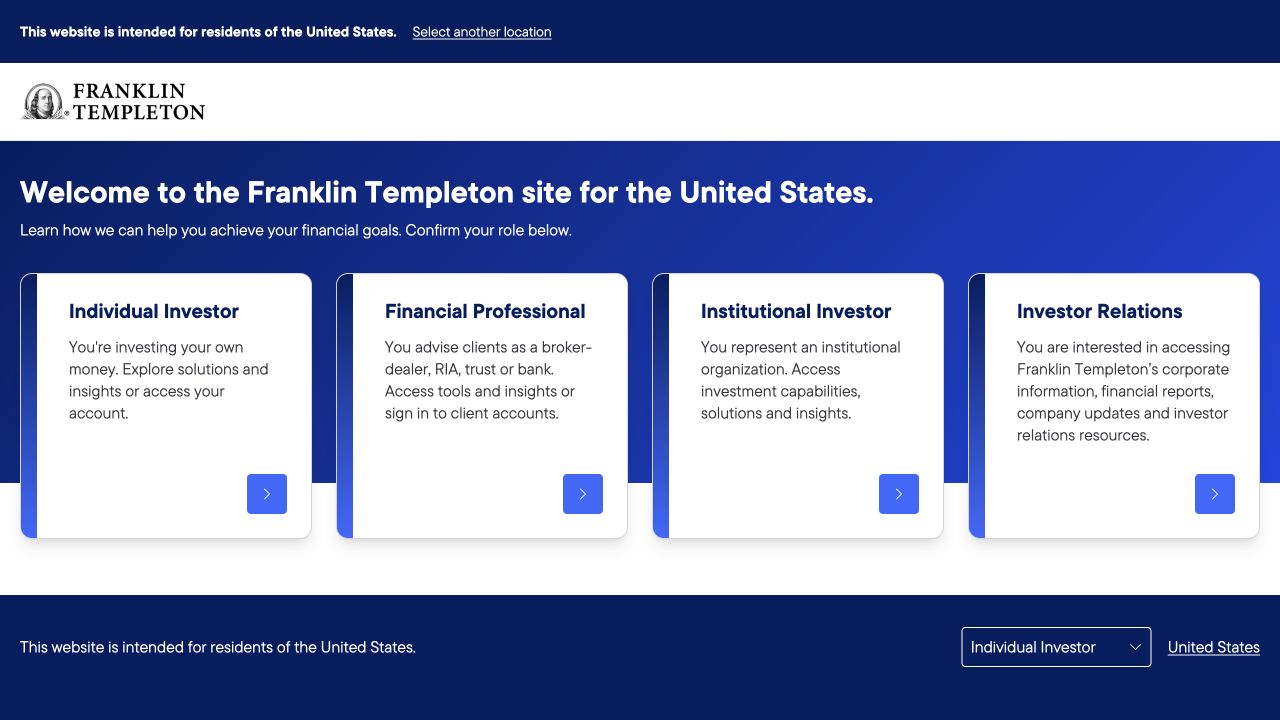
Franklin Templeton’s public entry page asks visitors to choose a role before presenting deeper content. Four consistent white cards distinguish individual investors, financial professionals, institutions, and investor relations. Each explains the audience in a short paragraph and places the action in the same lower corner. A location notice and institutional identity provide context above the blue field. Optional cookies were rejected without selecting an investment role. The page links an Angular application bundle; this observation does not assess products or authenticated account experiences.
What you can learn
When role changes the available content, represent that choice clearly in the information architecture rather than disguising it as personalization. Angular components can enforce a consistent card structure, but the chosen audience should remain visible and changeable later. Preserve public corporate and support routes, and avoid treating a casual selection as legal attestation or proof of investor status.
Pros
Each role is explained instead of relying on financial-industry labels alone.
The repeated action position makes the four choices easy to compare.
Cons & considerations
Visitors must make an additional decision before reaching substantive content.
Role-specific routes need a simple way back when someone chooses incorrectly.
Public source checked November 3, 2026. References may be embedded or legacy—not a complete backend inventory.
Platform source: Observed first-party page or linked application asset. The public page loads this Angular application bundle, which contains the ng-version runtime marker and version 19.2.15. Platform evidence is separate from the direct website screenshot and is not a complete current infrastructure audit.
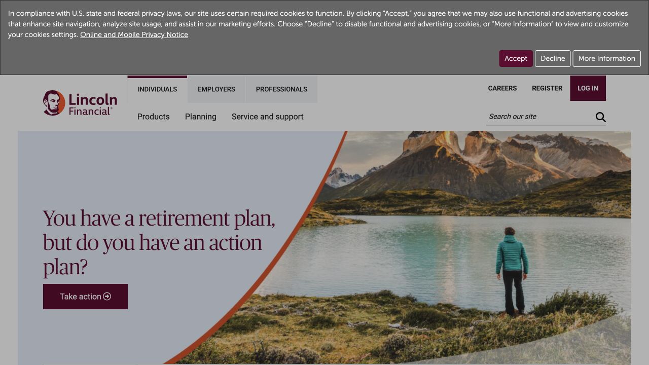
Lincoln Financial separates individuals, employers, and professionals in a persistent audience navigation above product, planning, and service links. The hero uses a curved division between a large serif question and a mountain-lake photograph. A burgundy action echoes the institutional identity, while site search and account utilities remain in the header. The captured privacy notice appears across the upper edge. A first-party application bundle identifies Angular. The review stayed on the public individuals page and did not provide financial or account information.
What you can learn
For an Angular site serving several audiences, make the current context visible without trapping someone inside it. Keep campaign composition separate from shared navigation and disclosure components. Test how the curved image treatment behaves with longer guidance titles, and provide ordinary content destinations rather than making a broad planning question the only route into useful information.
Pros
Audience and topic navigation are separated into understandable layers.
The solid text area protects readability independently of the landscape photograph.
Cons & considerations
Several navigation layers and a privacy band create a tall opening.
An aspirational campaign image supplies little immediate detail about the planning process.
Public source checked November 3, 2026. References may be embedded or legacy—not a complete backend inventory.
Platform source: Observed first-party page or linked application asset. The public page loads this application bundle, which contains Angular’s ng-version runtime marker. No runtime version is inferred from the marketing content. Platform evidence is separate from the direct website screenshot and is not a complete current infrastructure audit.
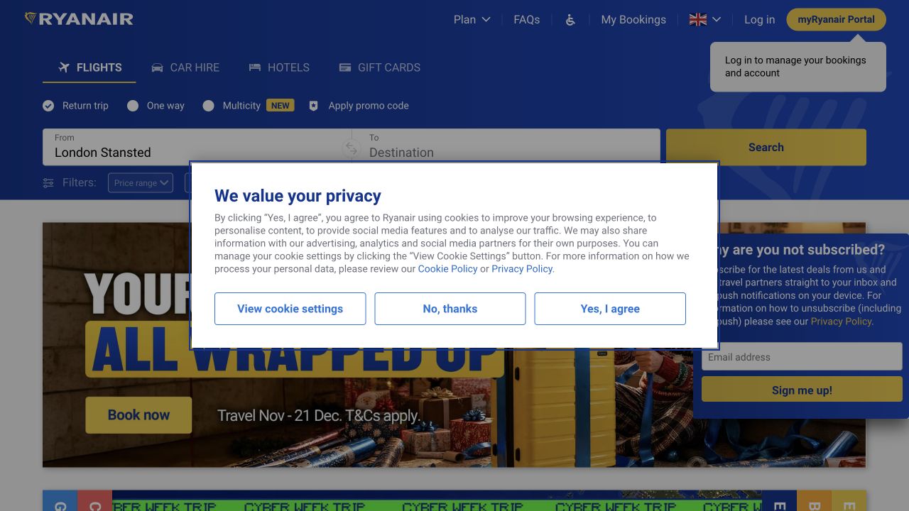
Ryanair places flight, car, hotel, and gift-card modes inside its recognizable blue-and-yellow shell. The opening flight surface distinguishes trip type, origin, destination, and search, with booking management and account utilities above. Promotional content begins below the functional panel. The captured privacy dialog overlays the center and an email promotion occupies the right, illustrating how additional interfaces can compete with the main task. The page links a modern Angular bundle. No destination, travel date, passenger information, booking, or subscription was submitted.
What you can learn
Model a travel-search component around explicit dependencies and recoverable state. Angular can coordinate selected mode and field validity, but users still need understandable labels, errors, and a predictable back path. Delay promotional overlays until they do not obstruct essential controls, and preserve completed fields when a visitor changes one part of the search.
Pros
Travel modes and trip types are visibly grouped before the main search.
Booking-management utilities remain outside the new-booking form.
Cons & considerations
Consent and subscription overlays substantially compete with the flight task.
Dense horizontal controls need a carefully sequenced narrow-screen layout.
Visible tech stack
Referenced on the public page
Amazon CloudFrontDelivery / hosting signal
Earlier / documented evidence
Angular
Public source checked November 3, 2026. References may be embedded or legacy—not a complete backend inventory.
Platform source: Observed first-party page or linked application asset. The public page loads this Angular application bundle, which contains the ng-version runtime marker and version 21.2.22. Platform evidence is separate from the direct website screenshot and is not a complete current infrastructure audit.
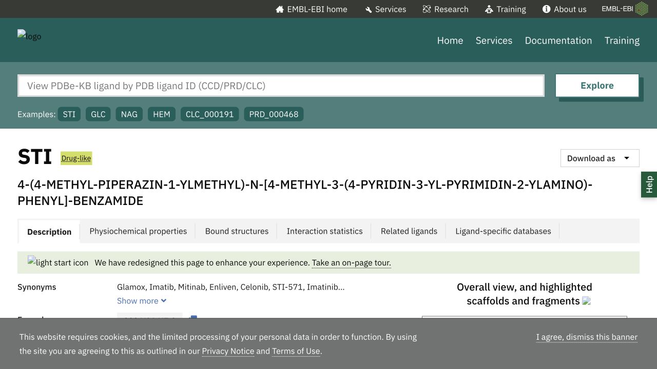
EMBL-EBI’s PDBe chemical-component page presents a large ligand identifier and a long systematic name beneath a direct record-lookup field. Example identifiers help explain the expected format. Tabs distinguish description, physicochemical properties, structures, statistics, and related resources, while download and help controls remain nearby. The capture includes a few unavailable image assets, but the scientific record and navigation are readable. Public HTML declares modern Angular on this exact property. No new identifier was submitted and no scientific interpretation is inferred from the visual review.
What you can learn
An Angular research interface should preserve canonical identifiers, meaningful deep links, and text alternatives even when diagrams fail. Treat each detail panel as a coherent information view, keep units and provenance explicit, and avoid resetting the selected record during navigation. Plan long names and dense tables as normal content, not edge cases discovered after launch.
Pros
The canonical identifier remains prominent above the detailed record.
Distinct tabs separate very different kinds of scientific information.
Cons & considerations
Long technical names require careful wrapping on small screens.
Unavailable image assets reduce the usefulness of visual summaries in the captured state.
Visible tech stack
Referenced on the public page
Angular
Google Fonts
ExpressReported response header
Public source checked November 3, 2026. References may be embedded or legacy—not a complete backend inventory.
Platform source: Observed first-party page or linked application asset. The public scientific-reference page declares ng-version="20.2.4". Platform evidence is separate from the direct website screenshot and is not a complete current infrastructure audit.
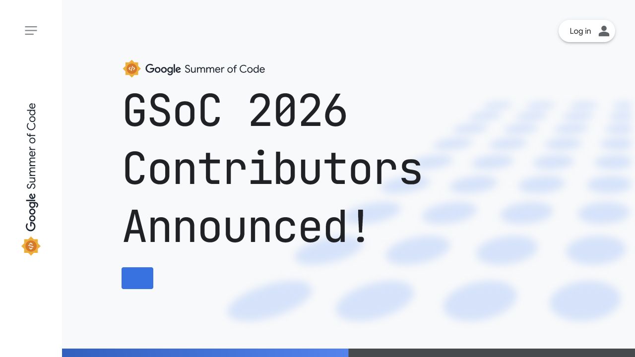
Google Summer of Code uses a pale background and exceptionally large monospaced announcement type. The program identity sits above the message, while a narrow left rail holds a vertical brand treatment and a menu control. A small login action remains at the upper right. The captured 2026 phase announces contributors rather than presenting a generic application campaign. Public HTML identifies modern Angular. The review concerns this official program website only, not Google’s broader services, and no program application or account login was attempted.
What you can learn
A recurring-program Angular site should separate durable navigation from phase-dependent content. Model deadlines, applications, selected participants, and archive editions explicitly so the homepage can change without breaking older links. Keep the current year and program state in meaningful text, and provide a clear permanent explanation for visitors arriving outside the active application period.
Pros
The current program phase is communicated in the first large message.
The stable identity leaves room for a changing annual announcement.
Cons & considerations
Very large type postpones the practical program explanation until below.
A menu-only navigation makes important destinations less immediately discoverable.
Visible tech stack
Referenced on the public page
Angular
Google Analytics
Google Fonts
Public source checked November 3, 2026. References may be embedded or legacy—not a complete backend inventory.
Platform source: Observed first-party page or linked application asset. The public HTML declares ng-version="16.2.12". Platform evidence is separate from the direct website screenshot and is not a complete current infrastructure audit.
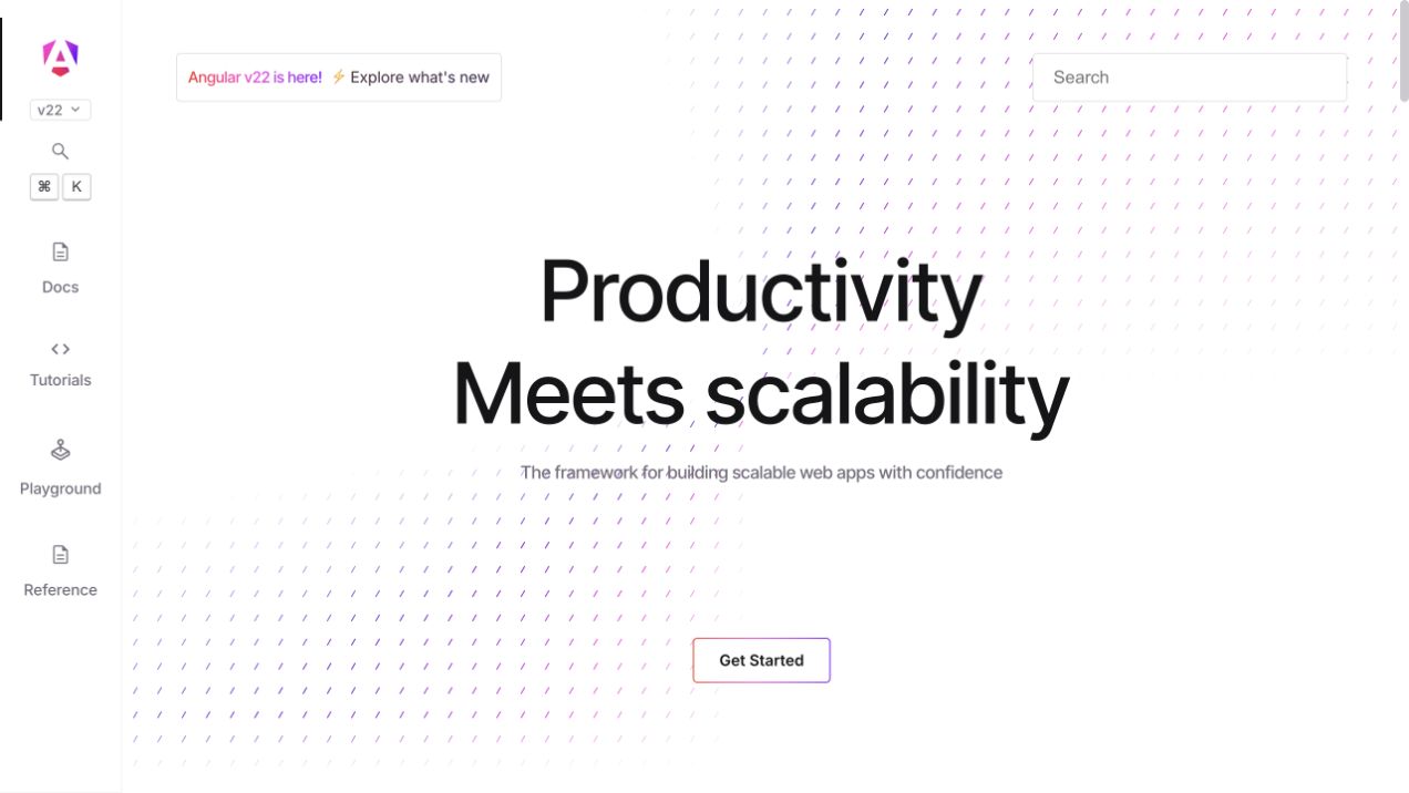
Angular’s own website places a centered product statement over a subtle pink-and-purple dash pattern. A left rail distinguishes documentation, tutorials, playground, and reference, with version and search controls near the identity. A separate search surface appears in the main top area, while an outlined starting action anchors the introduction. The public HTML declares Angular directly; the association is not inferred only from the project name. The capture shows the public homepage, not a completed tutorial or a tested playground session.
What you can learn
Use the framework’s own example to distinguish navigation modes rather than making every reader enter the same linear course. An Angular shell can reuse search and version controls across routes, but page titles, deep links, and selected navigation should still be meaningful without animation. Keep the decorative pattern separate from essential introductory content.
Pros
Learning and reference tasks have distinct persistent destinations.
Version context is visible beside the documentation identity.
Cons & considerations
A very spacious introduction delays concrete application examples.
Two search entry points need consistent behavior and clearly communicated scope.
Visible tech stack
Referenced on the public page
Angular
Google Fonts
Public source checked November 3, 2026. References may be embedded or legacy—not a complete backend inventory.
Platform source: Observed first-party page or linked application asset. The framework’s own public website declares ng-version="22.2.4+sha-b23d79d". Platform evidence is separate from the direct website screenshot and is not a complete current infrastructure audit.
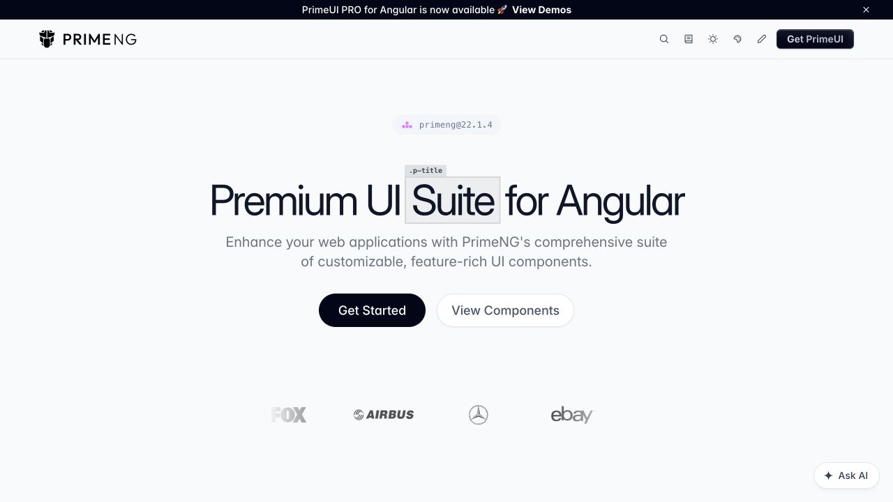
PrimeNG centers a large component-suite introduction on a light gray canvas. An annotated treatment around one headline word hints at the design-system tooling, while a version pill sits above. Setup and component browsing are separate actions below the supporting copy. A compact header includes search, documentation-oriented utilities, and a product action; a darker announcement strip remains independent above it. The public page declares modern Angular. Customer marks are visible supporting material, not evidence that each linked company homepage uses the same framework.
What you can learn
A component-library Angular website should make version, installation, and individual component routes easy to distinguish. Reuse a consistent demonstration frame, but explain interaction and accessibility states in the actual reference. Keep premium-product announcements separate from core setup so a newcomer can understand what is available before choosing an account or commercial option.
Pros
Installation and component exploration are presented as different starting tasks.
The small version indicator gives technical readers immediate release context.
Cons & considerations
The initial view demonstrates little actual component behavior.
Multiple product and announcement labels require a clear core-versus-additional offering distinction.
Public source checked November 3, 2026. References may be embedded or legacy—not a complete backend inventory.
Platform source: Observed first-party page or linked application asset. The public HTML declares ng-version="22.2.3". Platform evidence is separate from the direct website screenshot and is not a complete current infrastructure audit.
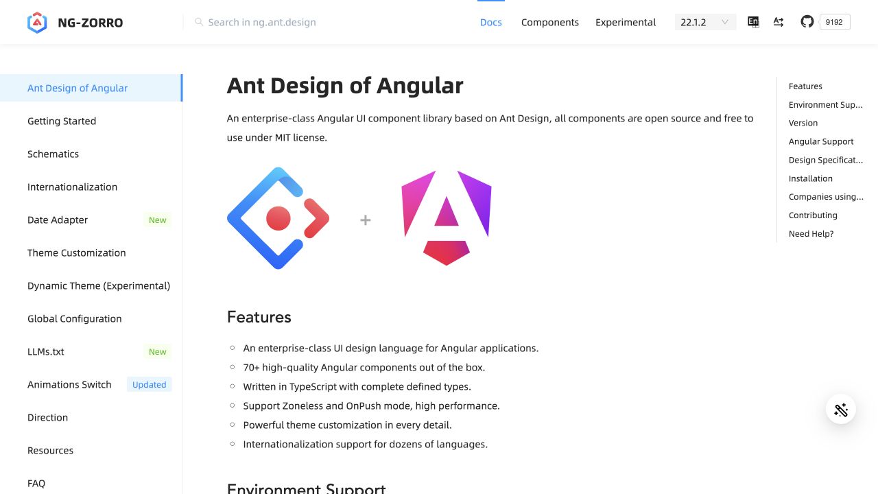
NG-ZORRO’s captured page uses a three-column documentation structure rather than a marketing hero. A long left sidebar lists setup, configuration, language, and theming topics. The central introduction pairs the library and Angular marks above a concise feature list, while a narrow right-hand contents column points to later sections. Search, version, language, and direction controls stay in the header. Modern Angular is declared in the public HTML. The visible feature claims belong to the project’s documentation and were not independently benchmarked here.
What you can learn
A documentation-heavy Angular site benefits from shared navigation components that preserve active section and version context. Keep the main article readable when sidebars collapse, use real heading anchors, and label settings such as language and direction clearly. A long feature list should lead to precise examples rather than leaving implementation choices in a single introductory paragraph.
Pros
The right contents list supports quick movement within a long document.
Version and language context remain available above the article.
Cons & considerations
Two sidebars can squeeze the central reading area at intermediate widths.
A long setup menu may overwhelm readers before they choose their first task.
Visible tech stack
Referenced on the public page
Angular
Google Analytics
Public source checked November 3, 2026. References may be embedded or legacy—not a complete backend inventory.
Platform source: Observed first-party page or linked application asset. The public HTML declares ng-version="22.1.0". Platform evidence is separate from the direct website screenshot and is not a complete current infrastructure audit.
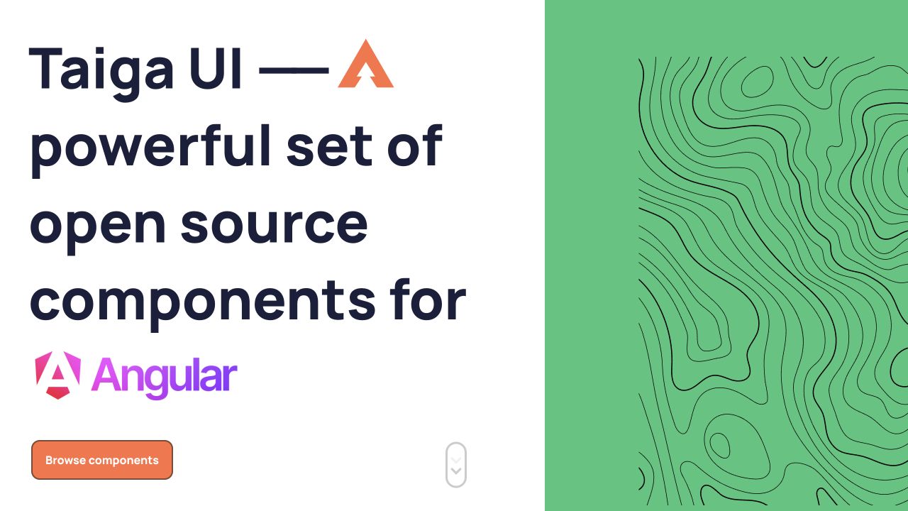
Taiga UI divides the captured opening into a large white text area and a green field of thin topographic contours. Heavy dark type and prominent Angular branding explain the component-library context, with an orange browsing action near the bottom. The heading consumes much of the available height, creating a deliberately poster-like introduction rather than a dense documentation shell. Modern Angular is directly declared in the public HTML. The review concerns the library’s own public property and does not test every component or accessibility claim.
What you can learn
A distinctive Angular marketing section can remain simple if its only task is to lead into documentation. Keep the long display heading in a sensible document order, provide a reliable component link, and test its scaling with zoom. Treat the topographic artwork as decoration and preserve contrast without relying on a particular desktop split.
Pros
The split composition gives the library a recognizable visual identity.
One clear browsing action avoids a crowded initial decision.
Cons & considerations
The very large title postpones concrete component examples.
The desktop split requires careful reflow so decoration does not crowd content.
Visible tech stack
Referenced on the public page
Angular
Google Fonts
Public source checked November 3, 2026. References may be embedded or legacy—not a complete backend inventory.
Platform source: Observed first-party page or linked application asset. The public HTML declares ng-version="19.2.25". Platform evidence is separate from the direct website screenshot and is not a complete current infrastructure audit.
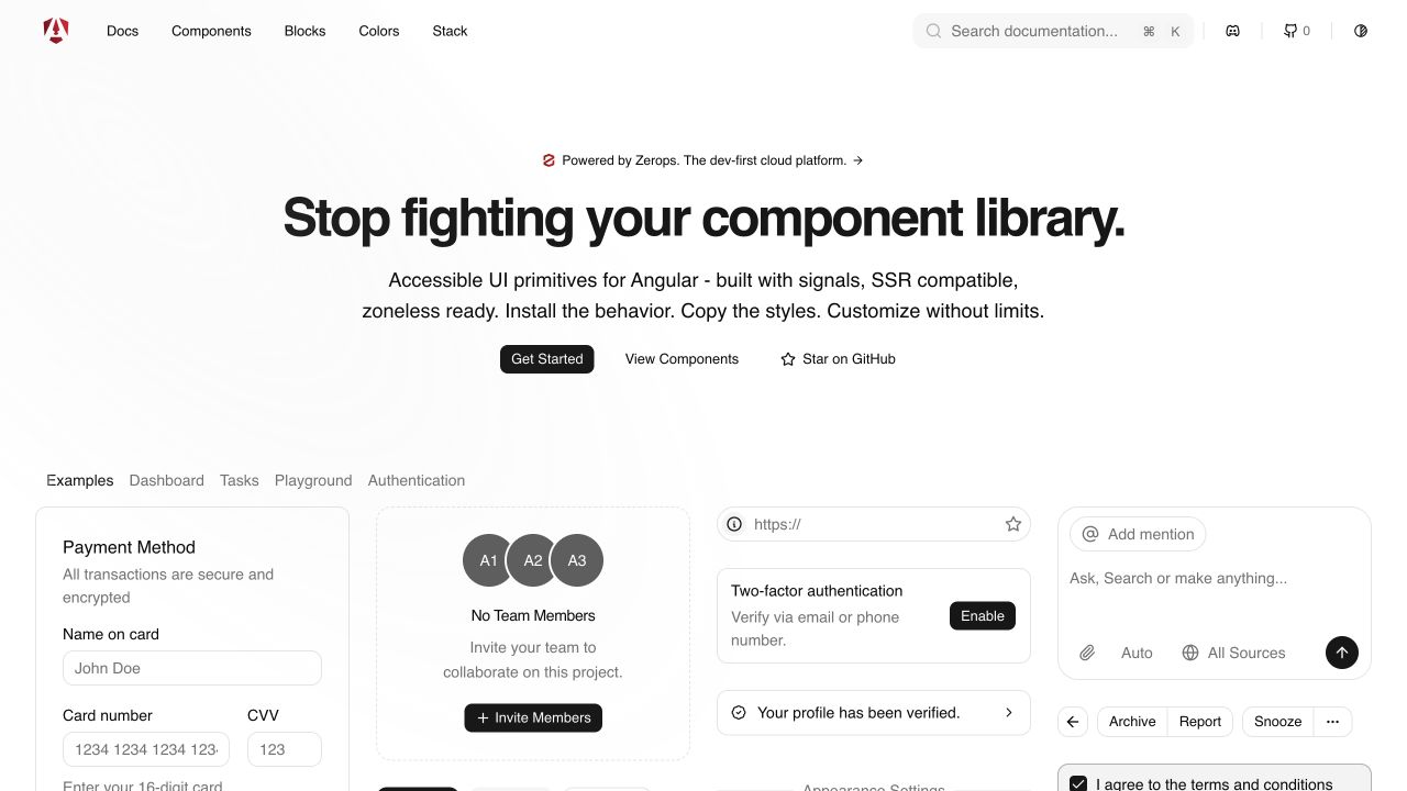
spartan uses a restrained monochrome shell with direct routes to documentation, components, blocks, colors, and stack information. A centered introduction and three modest actions lead into a specimen gallery. Payment fields, team invitations, authentication controls, a prompt box, and utility buttons share a consistent border and spacing vocabulary. A sponsorship line is kept separate above the headline. Public HTML declares modern Angular. The gallery uses illustrative interface content; no payment, invitation, authentication, or prompt action was performed during this review.
What you can learn
An Angular component collection should show relationships between primitives while keeping demonstrations distinguishable from real forms. Reuse meaningful labels and state treatments, provide direct reference routes, and document which behavior a consumer owns after copying a pattern. A polished specimen is only an initial state, not proof that every error, focus, or responsive interaction is complete.
Pros
The gallery shows composed surfaces instead of isolated decorative controls.
The main navigation reflects concrete implementation decisions such as blocks and colors.
Cons & considerations
Many small specimens can become visually overwhelming on a narrow screen.
Illustrative forms need clear context so visitors do not mistake them for real tasks.
Public source checked November 3, 2026. References may be embedded or legacy—not a complete backend inventory.
Platform source: Observed first-party page or linked application asset. The public HTML declares ng-version="21.2.16". Platform evidence is separate from the direct website screenshot and is not a complete current infrastructure audit.
A public content site with selected interactive tools
Keep editorial structure and direct navigation clear before adding application behavior. If a calculator, search, or other tool is the unusual requirement, describe that boundary and its failure behavior. Assign ownership for content updates separately from application changes. Do not make an ordinary information page depend on an unexplained loading screen merely to match a technical preference.
A task-focused application with a consistent shell
For a multi-step service or data-heavy interface, establish stable navigation, page titles, progress, cancellation, and recovery. Reuse components for repeated semantics and behavior, not only matching corners and colors. Test representative routes with real data and realistic permissions. The public examples suggest useful interface patterns; they do not demonstrate the safety of a protected workflow.
An embedded interface within a larger property
Define the host page, the embedded component, and the service supplying its data as separate responsibilities. Decide how keyboard focus, resizing, navigation, analytics consent, and unavailable data behave at the boundary. A detected Angular component supports an attribution to that component—not a claim that its surrounding CMS or every corporate site uses the same framework.
From references to requirements
Plan beyond the happy-path application screen
Build a route-and-state specimen
Choose a few representative tasks and list their meaningful states before styling them. Include a long result, no results, an expired link, a slow request, an invalid field, and a saved record that another person changed. Review the language with someone outside the development team. The specimen should expose uncertainty and recovery requirements while changes are still inexpensive.
Verify the boundary between server output and interaction
If using server rendering, check the actual initial HTML and hydration behavior rather than assuming the configuration is complete. Angular's hydration guidance describes reusing the server-rendered document on the client. Test third-party widgets, early clicks, and content changes for mismatches or layout disruption. Framework support is a starting point, not a measurement of your site's user experience.
Document which team owns routes, APIs, content, authentication, deployment, and dependency updates. Agree how the public interface explains a service outage without exposing private details. Preserve a tested rollback and an accessible support route. A component system is easier to maintain when the team knows which behavior is shared and which belongs to an individual task.
A useful handover demonstration
Ask the actual team to carry out its routine job: publish a realistic update, correct a mistake, preview a narrow screen, and identify who owns an integration failure. For a library or frontend framework, also ask who maintains the content source and deployment. A polished screenshot does not answer those operational questions.
Beyond the screenshot
An Angular website acceptance checklist
Check direct entry, refresh, back navigation, and meaningful page titles.
Verify initial public content and the chosen rendering strategy.
Test empty, loading, partial, failed, and successful task states.
Keep entered information recoverable when a legitimate request fails.
Review keyboard focus, labels, errors, and narrow-screen navigation.
Confirm server-side permissions and validation independently of client controls.
Test third-party components and any server-to-client hydration boundary.
Document API, content, dependency, deployment, and incident owners.
Measure the actual deployment and retain a tested rollback process.
Test with real content, a keyboard, a small screen, slow or failed requests, and the people who will maintain the system. These are planning checks, not an accessibility, security, performance, or search-ranking certification.
Sources & editorial method
How this Angular collection was reviewed
Attributions use public Angular markers or owner-linked application assets for the named property. Embedded and relationship evidence is qualified explicitly. Captures are from actual public pages, not vendor artwork, logged-in accounts, or completed transactions. The collection does not infer every corporate system, framework version, accessibility conformance, or performance result from those observations.
Every image is an unmodified capture from the actual website, with its source and capture date. Some captures are reused from our shared catalog; their dates remain the original capture dates. None comes from a vendor gallery or a generated reconstruction. Moving imagery and live content can change.
Technology attribution uses public page assets or metadata, official platform documentation, or a cited first-party project case study. Documentary and framework-relationship evidence is identified where used; it is not a complete current backend inventory. A CMS image CDN alone does not establish a full CMS deployment. A library’s presence does not prove which individual controls use it, and a platform label does not establish AI authorship.
The composition notes, lessons, pros and tradeoffs are original editorial observations. We have not measured conversion, traffic, security, performance or accessibility conformance. Website owners retain their brands and imagery; these examples are not our client portfolio. Written, Edited and Curated are independent records, not dates advanced by a build. See our editorial standards or suggest a correction.
Questions worth asking
Angular website development FAQs
Does an Angular marker describe the whole website?
Not necessarily. It can identify a specific application or embedded component. Each example preserves the property and evidence scope instead of extending one marker to every page or system owned by the organization.
Is Angular only appropriate for dashboards?
No. It can support public websites and other applications. The practical question is whether its application model, rendering choices, team skills, and maintenance responsibilities suit the work your visitors need to do.
Does Angular automatically make a site search-friendly?
No. Check the deployed page's initial content, crawlable destinations, metadata, canonical URLs, and response behavior. Rendering options provide implementation choices, not an automatic search outcome.
Can a screenshot prove that a form or tracking tool works?
No. These reviews describe visible entry states. Actual behavior needs authorized functional testing, including validation, permissions, errors, retries, and the service behind the interface.