Framer can support a distinctive marketing presence, but a good reference should also explain hierarchy, content reuse, and the next visitor task. Motion is one part of that work, not its purpose.
The examples identify the named Framer property using live page evidence or a cited project source. A marketing site using Framer does not mean the company’s application, payment system, or internal tools use it.
Keep the initial brief concrete: which pages must exist, who changes them, which content repeats, and where an inquiry or signup goes. Those decisions make the visual exploration more useful.
Before the examples
What makes good Framer website development in 2026?
Preserve the message when the animation stops
Write the heading, explanation, and next action as a complete static introduction. Then add transitions that support the hierarchy. Check still frames, reduced motion, and slower devices before accepting a dramatic desktop presentation.
Turn recurring content into a deliberate model
Use Collections and fields for content that repeats, such as projects or articles. Define the required text, media, dates, and destinations before styling every item. A reusable detail layout should handle the least glamorous real entry as well as the hero example.
A searchable or filtered collection needs clear labels, an understandable empty result, and a sensible default order. Framer documents dynamic CMS filters; choose controls that match the field and test the resulting experience rather than adding filtering as decoration.
Look at how these Framer pages frame a product, person, or organization before deeper browsing. The opening five are recognizable brands or public figures, but the association is still limited to the named property.
We start with five recognizable brands or organizations: Miro marketing homepage, (RED), Mixpanel marketing website, Cal.com marketing website, Karlie Kloss. Each attribution applies to the named website property, not every product or website belonging to its organization. This is a curated reading sequence, not a measured ranking.
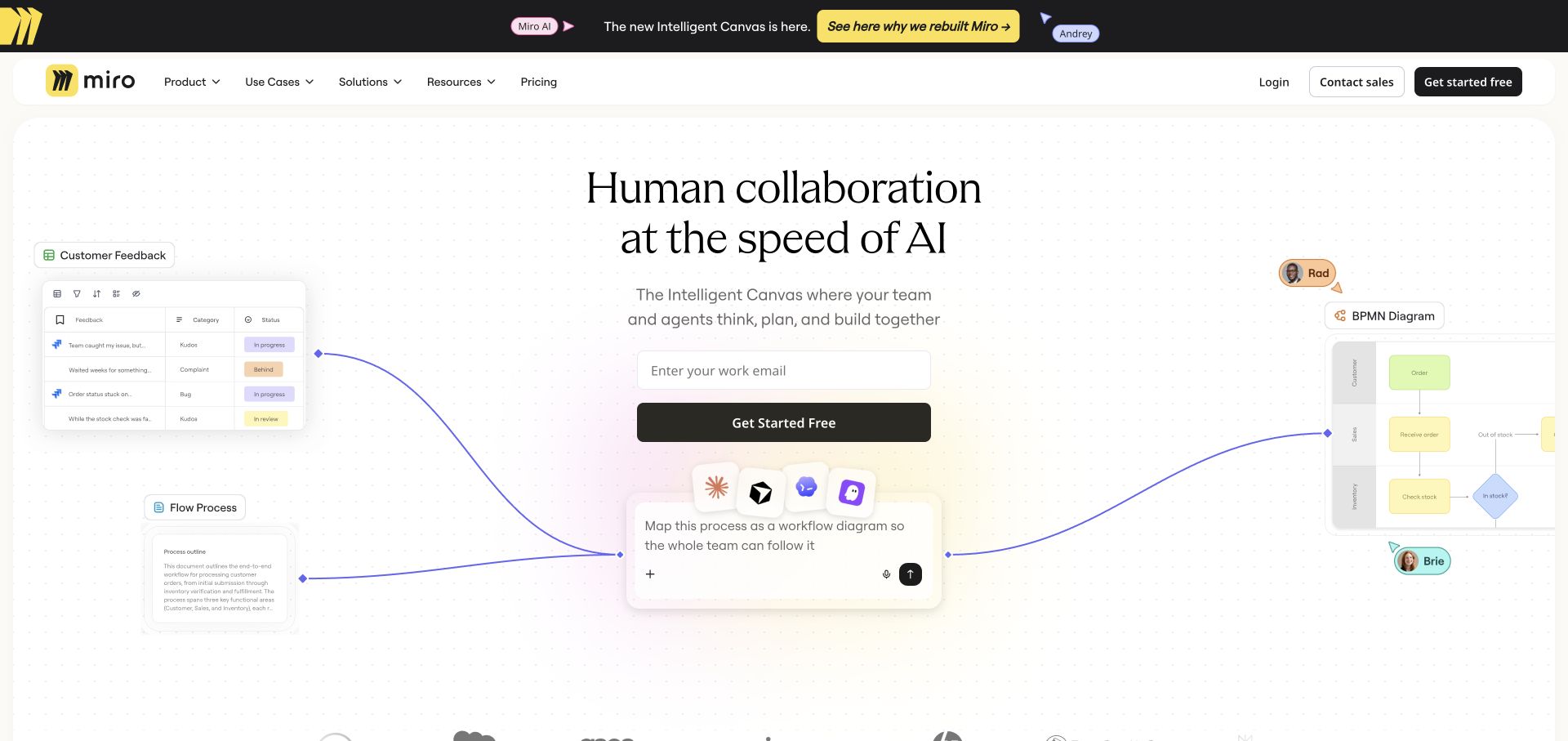
Miro surrounds a centered proposition and email field with small interface fragments: feedback on the left, a process diagram on the right, and a prompt beneath the action. Curving connectors make these separate pieces read as one workspace. The dotted background quietly supplies the visual grammar of a canvas without turning the whole page into an application. The public homepage exposes a Framer generator; that is evidence for this marketing surface, not for the collaborative editor behind the login.
What you can learn
Use the product’s own organizing principle to arrange a marketing page. Here, connections communicate collaboration before a visitor reads a feature list. Keep the actual sign-up control unmistakably different from illustrative interface fragments, and ensure the same explanation still works when the surrounding graphics stack on a phone.
Pros
The central email field and dark action stay easy to locate among the demonstrations.
The narrow announcement strip separates a timely launch from the more durable product proposition.
Cons & considerations
Small labels in the edge illustrations need closer inspection than the main message.
A wide canvas composition requires deliberate reordering at narrow widths rather than simple shrinking.
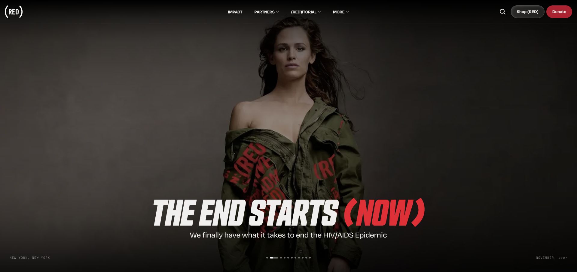
(RED) uses a full-bleed campaign portrait beneath a dark navigation bar. Large condensed lettering anchors the lower part of the image, with a red parenthetical accent connecting the campaign to the identity. Small place and date captions make the image feel like part of an editorial archive rather than anonymous decoration. Shop and Donate are separate controls in the upper-right corner. Framer metadata supports the public site’s platform association, but does not establish how donation processing or partner stores are implemented.
What you can learn
Give a campaign a recognizable visual voice while preserving a plain route to the action. The portrait can change without forcing the navigation or contribution routes to change. A mission-led site should also explain the mechanism behind the action; this homepage continues into a numbered account of how shopping and donations support the work.
Pros
The two contrasting action buttons make shopping and direct giving distinct choices.
Image captions provide useful editorial context without competing with the campaign headline.
Cons & considerations
The photographic opening postpones practical explanation until the visitor scrolls.
Text over changing campaign imagery requires contrast checks for every image, not only this frame.
Visible tech stack
Referenced on the public page
Framer
Google Analytics
Google Fonts
Public source checked November 3, 2026. References may be embedded or legacy—not a complete backend inventory.
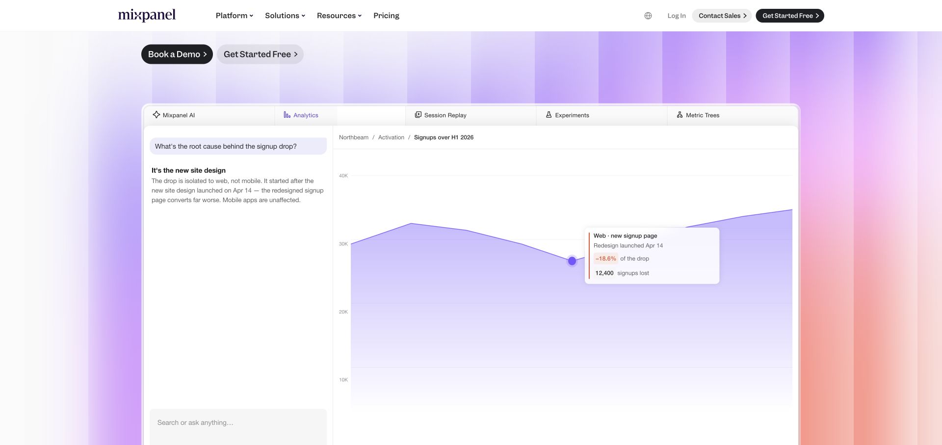
The captured homepage view shows Mixpanel’s demonstration panel after the opening copy: a chat-like explanation on the left and a large analytical chart on the right. Tabs across its top name the different product areas, while the real site navigation and acquisition actions remain above. Purple-to-pink vertical color bands give the demonstration a recognizable setting without obscuring its white working surface. The panel is a public marketing demonstration, not evidence of a customer’s live analytics or of the product’s backend implementation.
What you can learn
A software story can show a question, the resulting analysis, and the next action in one bounded frame. Keep demonstration data visibly part of the example and retain an alternative text explanation. Framer’s generator verifies this marketing page, while any claim about the analytics engine needs separate product documentation.
Pros
Named product tabs give visitors a map of a broad feature set.
The large chart and adjacent explanation make a workflow easier to follow than disconnected feature icons.
Cons & considerations
The full demonstration occupies substantial vertical space before later content appears.
Animation-dependent stories need a useful static state for readers who do not follow every transition.
Visible tech stack
Referenced on the public page
Framer
Sentry
nginxReported response header
Public source checked November 3, 2026. References may be embedded or legacy—not a complete backend inventory.
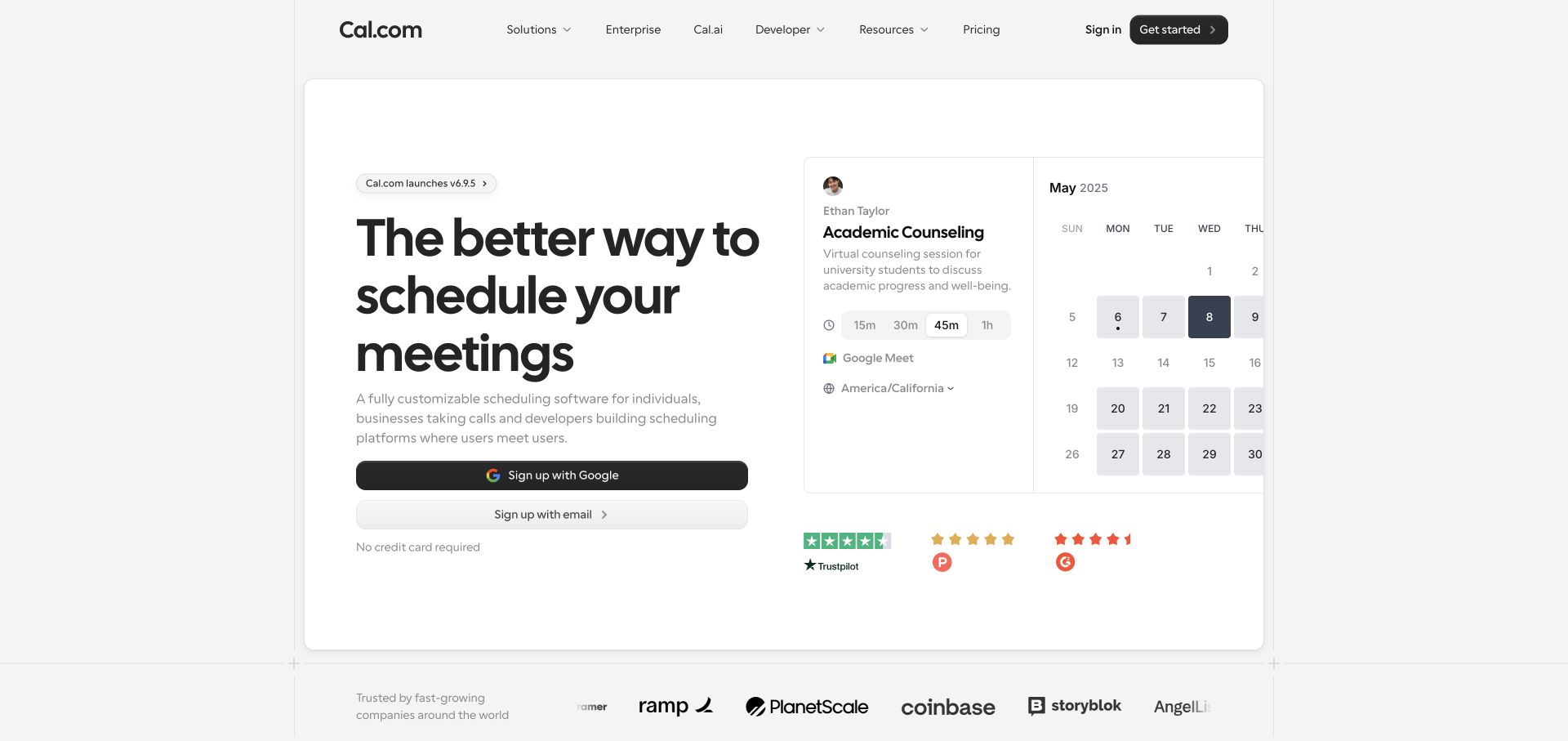
Cal.com places its scheduling proposition and two registration routes on the left of a bordered white panel. On the right, a calendar demonstration previews a meeting type, duration choices, and available dates. This makes the category understandable without requiring a video. Muted grays, rounded controls, and thin dividing lines reflect the restrained interface being promoted. The preview is public demonstration content, not a booking or saved user calendar. Framer metadata identifies the marketing website; it should not be read as a claim that the scheduling service itself runs on Framer.
What you can learn
Put the first recognizable product task next to the promise. A sample booking screen provides context while registration remains an explicit choice. For your own site, keep sample dates and fictional demonstration details from looking like real availability, and label alternate sign-up paths according to what actually happens next.
Pros
The paired Google and email routes make the registration options explicit.
A framed preview creates a clear boundary between illustrative product content and the actual page.
Cons & considerations
The calendar crop leaves some detail outside the panel.
Review badges add reassurance but cannot substitute for an explanation of plan limits.
Karlie Kloss’s official site divides its story into Fashion, Impact, and Media. The captured fashion section uses a brown label band above a wide monochrome portrait; the next olive band introduces impact work. Small links identify relevant destinations instead of adding conventional card furniture. The opening is intentionally sparse, so this capture shows the more informative chapter transition rather than an empty introductory frame. Current Framer generator metadata verifies this site, replacing the outdated assumption that an old Wix showcase still describes its present build.
What you can learn
A short set of chapters can organize a complicated public profile more coherently than a long biography. Make each chapter’s label and destination useful even before imagery loads. A quiet presentation can feel distinctive, but it should not force every reader to discover content through a lengthy animated introduction.
Pros
Consistent colored bands make changes of subject easy to recognize.
The restrained captions allow the portrait and linked organizations to carry the story.
Cons & considerations
The sparse first screen delays an overview of the person’s work.
The unusually large image crops and scroll pacing need careful adaptation for smaller screens.
Visible tech stack
Referenced on the public page
Framer
Public source checked November 3, 2026. References may be embedded or legacy—not a complete backend inventory.
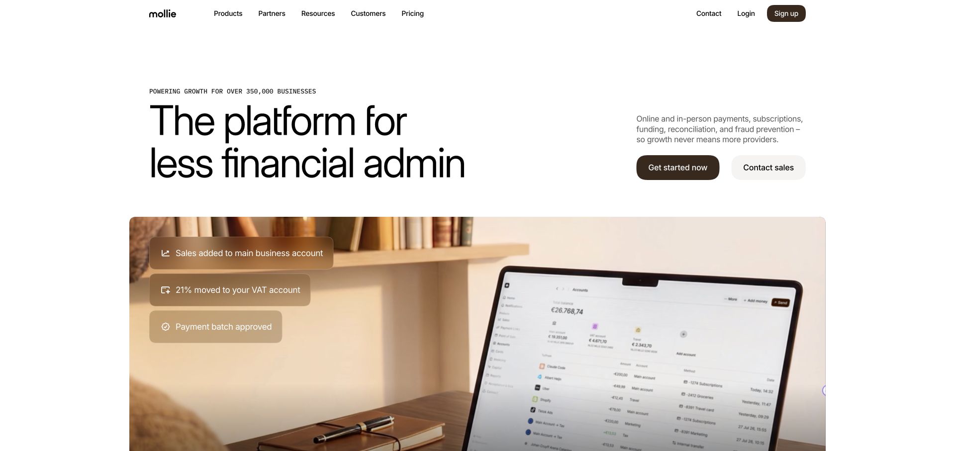
Mollie keeps the first half of its headline fixed while cycling through the kind of work the platform supports. In the captured frame, financial administration is paired with a large lifestyle photograph containing payment-status overlays. A short paragraph and two buttons sit in a separate right-hand column, so the changing headline does not have to carry every explanation. The Framer generator is observable on this marketing page. Neither that metadata nor the illustrative account screen proves anything about the regulated payment infrastructure or actual customer balances.
What you can learn
When one platform serves several jobs, vary one part of the story inside a predictable layout. The explanation and next steps should remain understandable without waiting for the rotation to complete. Use interface overlays sparingly: they should clarify what the photograph demonstrates rather than make illustrative figures look like audited evidence.
Pros
The two routes distinguish immediate onboarding from a sales conversation.
The consistent headline frame connects several services without an oversized list of competing cards.
Cons & considerations
A visitor may see only one benefit before scrolling, so the supporting paragraph must stand alone.
Broad platform language still needs service-specific detail further down the journey.
Visible tech stack
Referenced on the public page
Framer
Google Fonts
Public source checked November 3, 2026. References may be embedded or legacy—not a complete backend inventory.
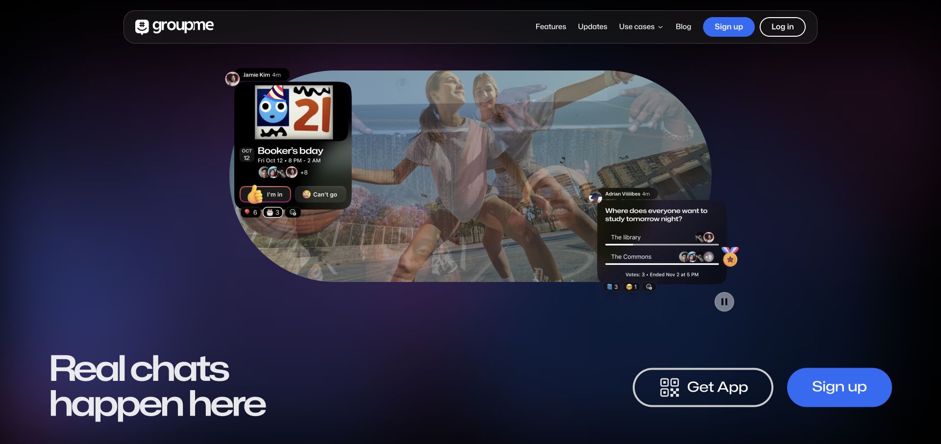
GroupMe uses a dark gradient setting, a rounded montage, and floating chat and event illustrations. Its lower-left headline is large and short, balanced by a Get App control with a QR motif and a separate sign-up action. The header repeats account entry without overwhelming the social narrative. These conversations are promotional examples embedded in the public homepage, not messages from a signed-in account. Framer metadata supports the marketing-site association only; the messaging application and its delivery infrastructure are separate questions.
What you can learn
Show the situation a product helps create, then show enough interface to explain its role. Event responses and a small poll tell a more concrete story than a generic claim about connection. Because motion changes the composition, choose stable text and actions that remain legible across frames, with a meaningful still image available when playback is paused.
Pros
Download and browser registration are visibly separate paths.
The combination of people and familiar message shapes makes the intended use easy to grasp.
Cons & considerations
The animated montage can compete with the controls at its edges.
The emotional opening leaves feature comparisons and moderation questions for later content.
Visible tech stack
Referenced on the public page
Framer
Google Fonts
Amazon CloudFrontDelivery / hosting signal
Public source checked November 3, 2026. References may be embedded or legacy—not a complete backend inventory.
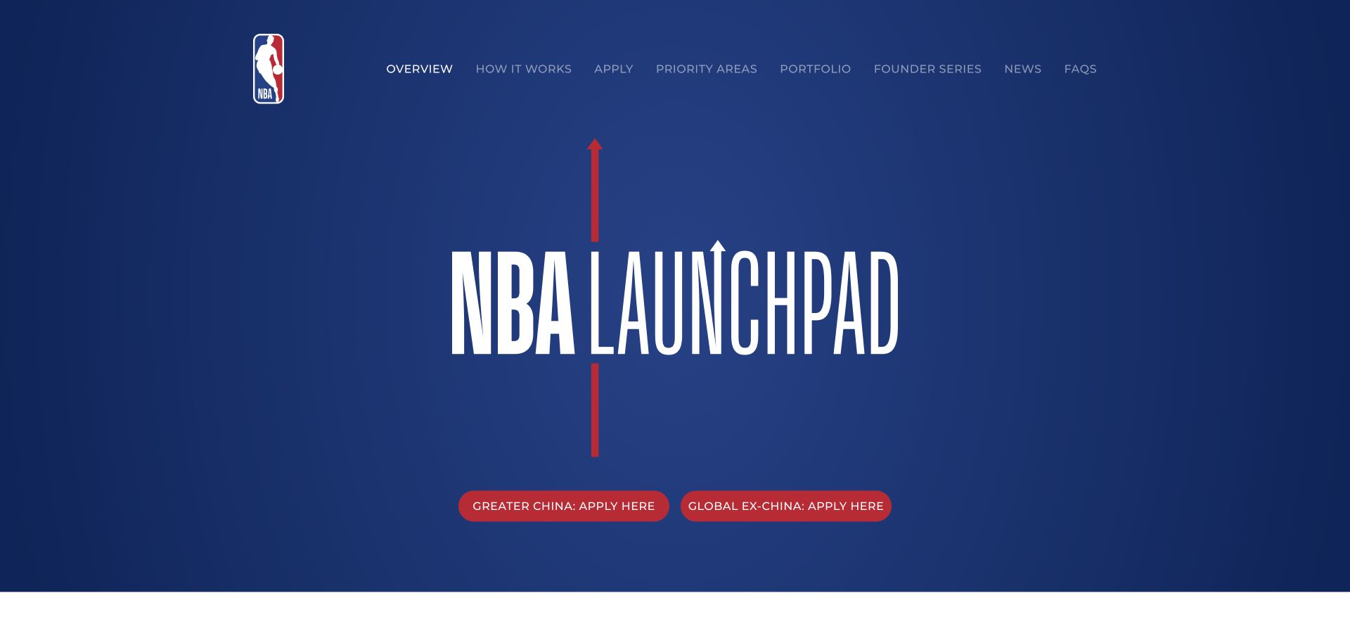
NBA Launchpad uses a blue field, a compact league identity, and very tall lettering for the program name. Red controls distinguish the Greater China application route from the global route. The navigation is a practical program index: how it works, priorities, portfolio, news, and FAQs. This is the league’s Launchpad property, not evidence that NBA.com as a whole uses Framer. Its public generator provides the platform evidence for this specific site. The visible application period should be checked independently before treating the buttons as an open invitation.
What you can learn
A branded program can use the parent identity for recognition while keeping its own information architecture. Put eligibility distinctions at the decision point, not deep inside an application. A reusable site structure should also have a clear closed-period state so an expired round does not appear to be accepting submissions.
Pros
The two regional application controls communicate a meaningful operational distinction.
The concise navigation names the information applicants are likely to need before proceeding.
Cons & considerations
The expansive title screen leaves the program explanation below the fold.
Date-sensitive application buttons need active editorial maintenance between program rounds.
Visible tech stack
Referenced on the public page
Framer
Google Fonts
Public source checked November 3, 2026. References may be embedded or legacy—not a complete backend inventory.
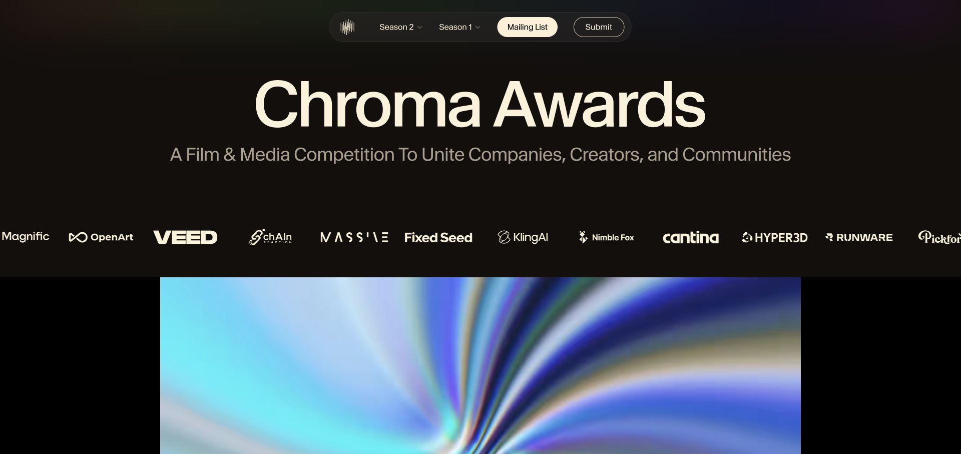
Chroma Awards opens with an oversized cream title against a nearly black background. A narrow floating navigation groups past seasons, the mailing list, and submission access. A horizontal row of partner identities separates the introduction from a large colorful media area. The composition establishes the competition’s creative character while leaving room for work to be the main attraction. Live Framer metadata verifies the page’s public publishing platform; the sponsor row and competition claims are statements on the site, not independently verified results.
What you can learn
Build a competition page around three editorial layers: what it is, which season a visitor is viewing, and how to see or submit work. A restrained palette around the media helps very different entries coexist. Keep deadlines, judging criteria, and participation terms available as text rather than hiding essential conditions inside a cinematic presentation.
Pros
The season navigation gives returning visitors a clear way to orient themselves.
The neutral dark frame makes the colorful media area feel intentional rather than visually noisy.
Cons & considerations
The title and sponsor area use considerable space before practical details appear.
A moving logo strip can be harder to inspect than a stable partner list.
Visible tech stack
Referenced on the public page
Framer
Google Analytics
YouTube
Cookiebot
Public source checked November 3, 2026. References may be embedded or legacy—not a complete backend inventory.
Designed by Plaid gives the design organization its own visual stage: a deep blue background, a luminous oversized wordmark, and a row of team photographs entering along the lower edge. The thin wave lines reinforce a sense of connected work without copying a financial dashboard. The page’s text includes a roster of people and disciplines, making this a team-facing editorial property rather than Plaid’s main product website. A current Framer generator provides direct platform evidence for this separate domain only.
What you can learn
A team site can depart from the corporate sales layout when its purpose is to explain who makes the work. Connect the expressive opening to specific people, roles, and useful links. Keep the team roster maintainable as staff change, and avoid making an animation the only way a visitor can learn what the page represents.
Pros
The distinctive identity differentiates a design-culture destination from a product landing page.
Visible team photography introduces people rather than relying entirely on abstract brand graphics.
Cons & considerations
The enormous wordmark offers little explanation to an unfamiliar visitor.
A separate domain needs onward links so visitors do not confuse its purpose with the main service.
Visible tech stack
Referenced on the public page
Framer
Google Fonts
YouTube
Public source checked November 3, 2026. References may be embedded or legacy—not a complete backend inventory.
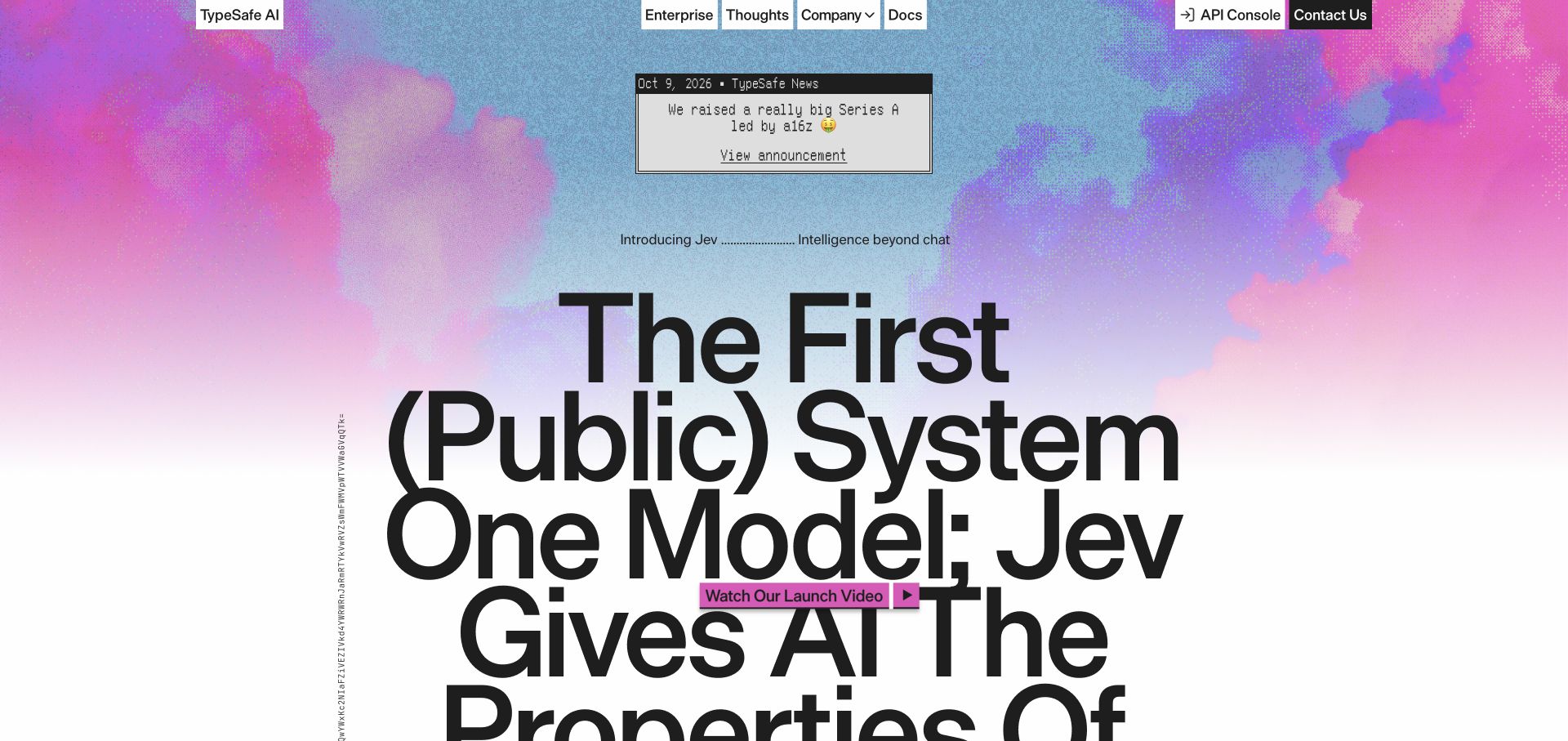
TypeSafe AI combines a grainy pastel sky, enormous black typography, and a small window-like announcement panel. Plain rectangular navigation labels feel closer to software controls than polished marketing pills. A launch-video control overlaps the headline area, while the longer page contains diagrams, model comparisons, and explanatory sections. The current Framer generator establishes the site association; the model’s speed, cost, and intelligence claims require their linked methodology and are not validated by this design review.
What you can learn
Visual novelty works best when paired with a serious explanatory layer. A technical audience may enjoy the desktop-inspired details, but should still be able to locate documentation, company information, and the central product explanation. Make long claims readable as ordinary text and give comparison material enough context to be evaluated rather than using typography as a substitute for evidence.
Pros
The announcement panel clearly separates a dated update from the main product story.
Documentation and enterprise destinations remain explicit despite the experimental visual style.
Cons & considerations
The large headline extends beyond the first viewport and takes time to read in full.
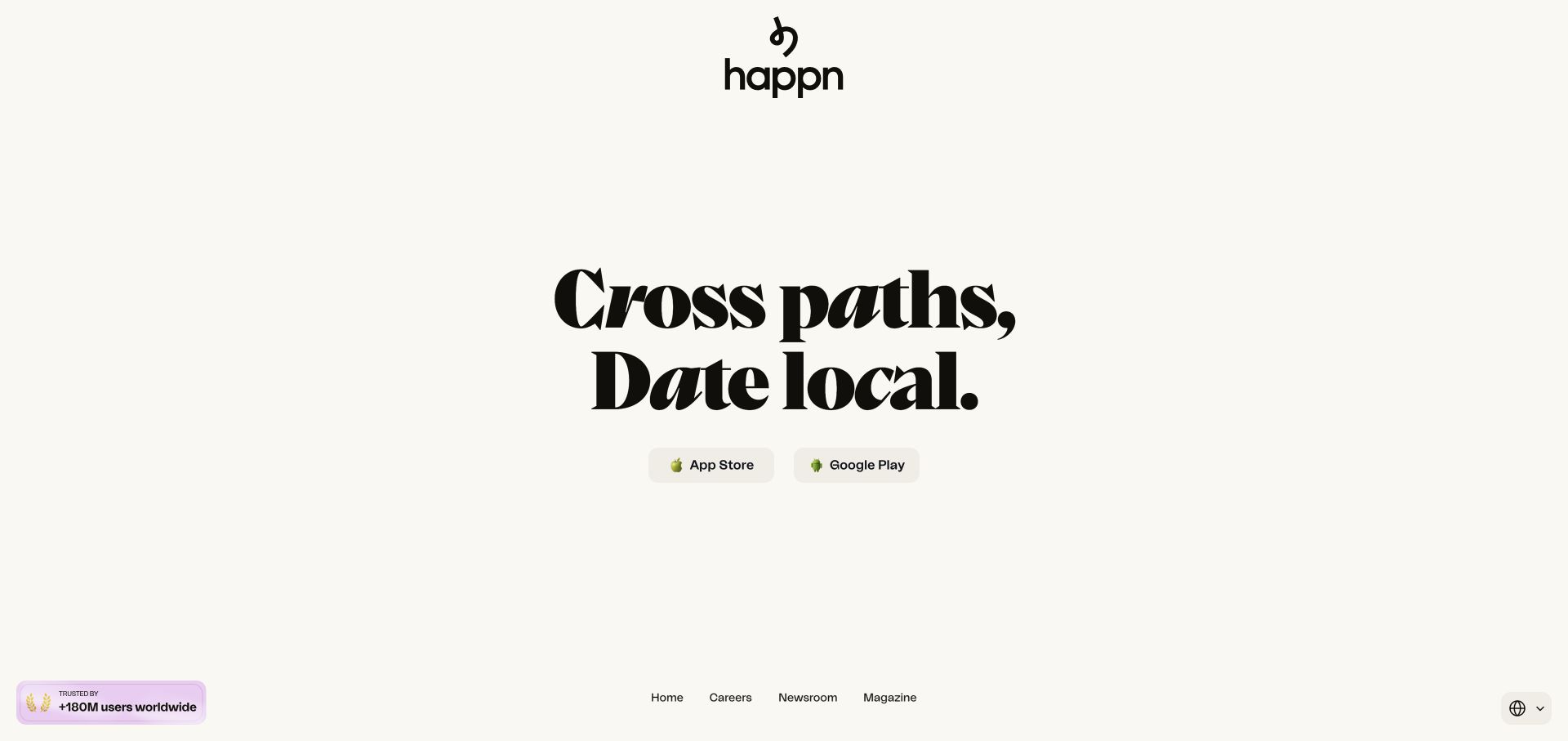
happn uses a warm off-white canvas, a centered identity, and a two-line black display headline. App Store and Google Play buttons sit immediately underneath, while small corporate navigation and language controls occupy the bottom edge. The page does not need a dense interface screenshot to communicate that it is a dating app. Its current Framer metadata identifies this public marketing site, not the application’s matching systems, location processing, or safety implementation.
What you can learn
If a proposition is genuinely simple, a short landing page can organize itself around one decision. Distinct store destinations remove ambiguity about what happens next. The tradeoff is editorial: a poster-like page still needs credible routes to safety information, support, pricing context, and the company behind the service. Those routes should remain usable without depending on oversized desktop typography.
Pros
The paired store buttons make the primary action concrete rather than generic.
A minimal color palette and one dominant type treatment create an immediately recognizable hierarchy.
Cons & considerations
The first screen provides little product detail for visitors comparing alternatives.
Bottom-edge navigation is less conventional and may be overlooked by a first-time visitor.
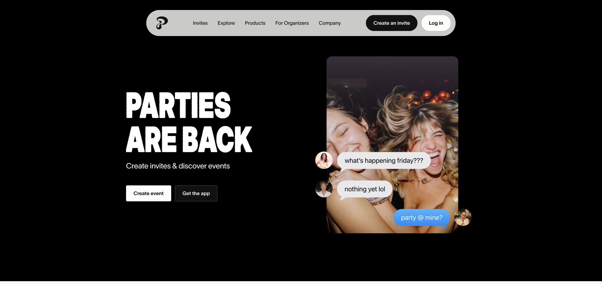
Partiful pairs rough-edged white lettering with a tall party photograph on a black background. Chat bubbles layered over the photograph turn a social exchange into the explanation of the product. A large pale navigation capsule contains the product map, while the main Create event control remains separate from downloading the app. Framer metadata verifies the marketing page. The demonstration conversation is public promotional content, not an actual private event thread, and it does not establish the technology behind invitation delivery or RSVP storage.
What you can learn
A concrete social scenario can introduce a tool faster than a feature inventory. Keep the illustration tied to a recognizable action, then let the page explain the steps. For an event product, distinguish creating an invitation from installing an app so guests and organizers do not assume the same requirements apply to both.
Pros
The two primary routes distinguish starting an event from getting the mobile application.
The human photograph and message overlays explain the social context without a long opening paragraph.
Cons & considerations
The slang-led opening may suit casual events better than formal institutional audiences.
Layered chat graphics need a clear reading order when the two-column hero collapses.
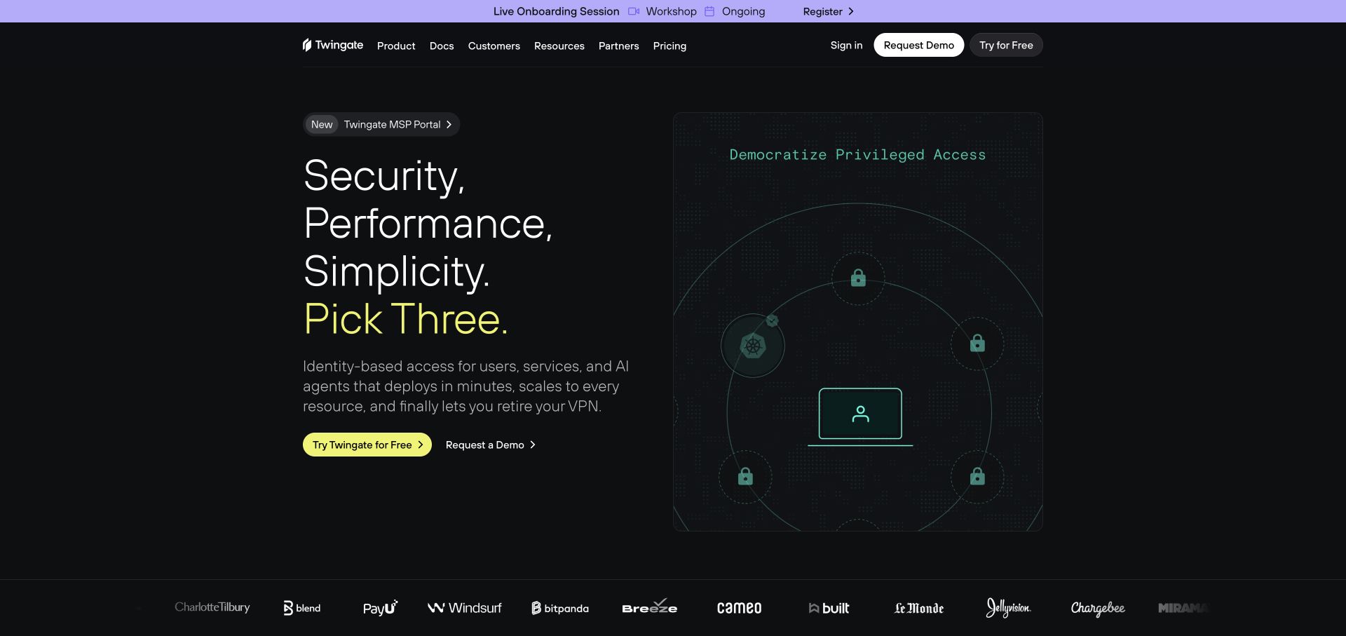
Twingate sets a stacked white headline beside a dark, diagram-like panel. A lime accent marks the main trial action and one emphasized phrase, while purple supplies the announcement strip and illustration details. The right-hand graphic represents identity-based access conceptually instead of presenting an unreadably dense console screenshot. The public page exposes Framer metadata; that tells us how this marketing surface is published, not whether the security product achieves the performance or protection claims elsewhere on the page.
What you can learn
Use a conceptual illustration when the actual interface would obscure the buying question. Then provide documentation, architecture, and technical examples for readers who need to evaluate implementation. A two-route action system can serve self-directed trial users and teams needing a demo without pretending those journeys have identical requirements.
Pros
The lime action stands apart from the dark technical illustration.
Documentation and product destinations remain available directly in the header.
Cons & considerations
The dark illustration’s subtle lines and small labels need stronger scrutiny at reduced sizes.
A conceptual hero still needs concrete implementation evidence later in the page.
Visible tech stack
Referenced on the public page
Framer
Google Fonts
Public source checked November 3, 2026. References may be embedded or legacy—not a complete backend inventory.
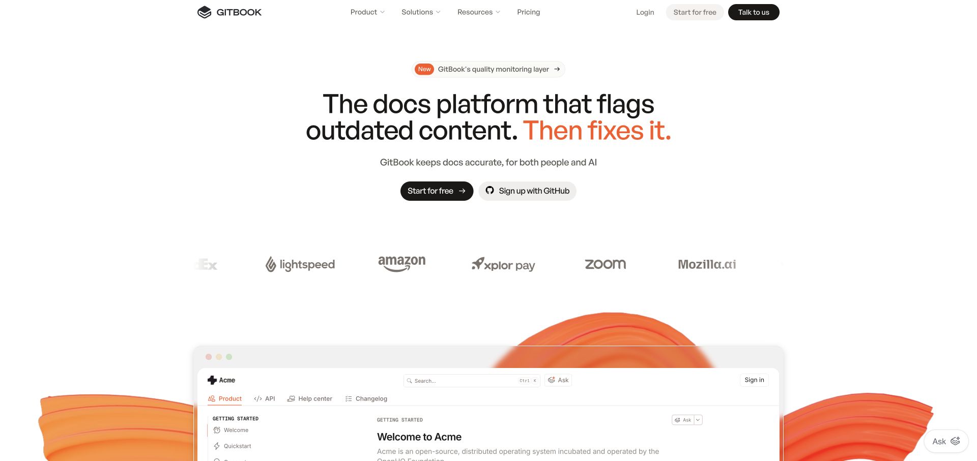
GitBook centers a concise proposition, an orange emphasis, and two registration controls above a large documentation preview. A pale customer-logo row bridges the space between the copy and the example. The preview’s sidebar, search, and content heading make the product category recognizable before a reader studies individual features. Framer metadata identifies the marketing website. It does not mean that published customer documentation, Git synchronization, or the GitBook application itself shares the same implementation.
What you can learn
Use a product’s most familiar working surface as an explanatory anchor. The preview should be large enough to convey structure without asking readers to decipher every line. Keep marketing-page navigation separate from the interface inside the illustration, and make sure claims about content accuracy or AI behavior are supported by product explanations rather than inferred from a polished demo.
Pros
The orange phrase gives the central benefit a clear visual emphasis.
The framed preview connects a broad promise to recognizable documentation components.
Cons & considerations
The substantial white space and logo strip delay the detailed preview on shorter screens.
A simulated documentation interface can create competing navigation cues unless its boundaries stay clear.
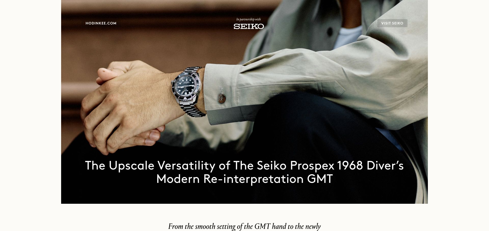
The reviewed Hodinkee Studio property opens a Seiko partnership feature with an enormous wristwatch photograph. The publication link, partnership identification, and outbound Seiko control sit over the image, while a long centered title leads into a narrower text column. Off-white gutters preserve the feel of a designed editorial page rather than an all-purpose shop. Framer generator metadata supports this particular sponsored feature; it should not be generalized to Hodinkee’s main publication or to Seiko’s broader website.
What you can learn
Treat a sponsored story as a clearly scoped publication. Declare the partnership, establish the subject visually, and then give the article a comfortable reading measure. A focused microsite can have fewer navigation options than a magazine homepage, provided readers can still identify the publisher, understand the commercial relationship, and reach the featured brand deliberately.
Pros
Partnership labeling makes the commercial context visible in the opening composition.
The large product photograph gives the article an immediate and specific subject.
Cons & considerations
The image-led first screen leaves most substantive product discussion below the fold.
Long titles over photographs require robust cropping and contrast across responsive sizes.
Visible tech stack
Referenced on the public page
Framer
Google Analytics
Google Fonts
Public source checked November 3, 2026. References may be embedded or legacy—not a complete backend inventory.
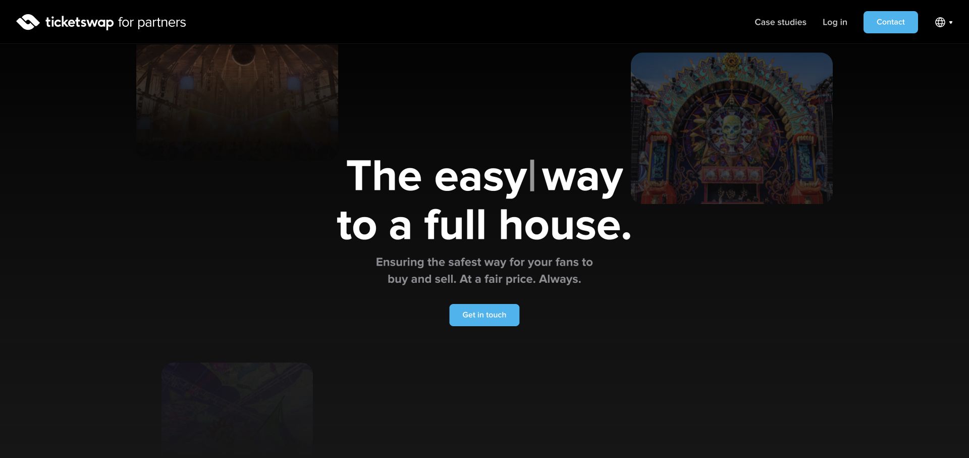
TicketSwap’s partner property keeps a black background, blue contact controls, and a centered headline surrounded by small event photographs. The identity explicitly says it is for partners, while Case studies and Contact are the most prominent navigation choices. The hero’s rotating word is part of a stable message about filling venues. Framer metadata identifies this partner-facing site, not TicketSwap’s consumer marketplace, transaction handling, or ticket-validation systems.
What you can learn
Separate audiences when their questions and next steps differ. Organizers need partnership examples and an appropriate sales contact, not simply the same entry point as ticket buyers. Keep the headline meaningful at every animated state, and connect broad promises to named case studies so readers can evaluate what a partnership actually involves.
Pros
The partner descriptor makes the property’s audience clear immediately.
A short navigation keeps case-study research and the sales route easy to find.
Cons & considerations
The small, darkened photographs contribute atmosphere more than detailed evidence.
The animated headline and broad benefit need practical explanation before a serious organizer can assess fit.
Visible tech stack
Referenced on the public page
Framer
Google Fonts
Public source checked November 3, 2026. References may be embedded or legacy—not a complete backend inventory.
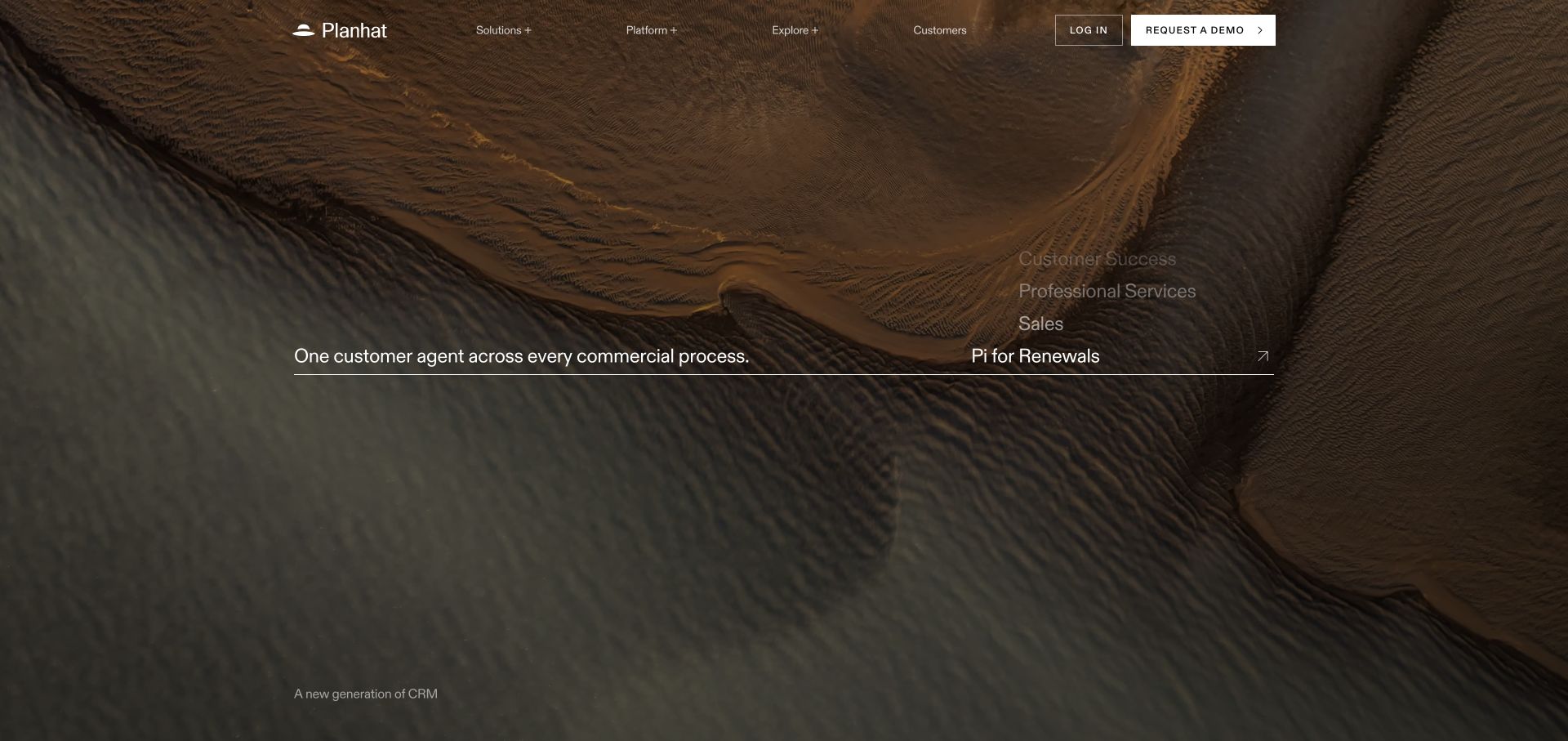
Planhat places a thin white navigation over a full-bleed aerial landscape. A horizontal rule joins a short proposition on the left with rotating commercial use cases on the right. The result feels more like an editorial title sequence than a standard dashboard-led SaaS hero. Its current Framer generator verifies the marketing site. The landscape and animation are brand devices, not demonstrations of the CRM application or evidence for the customer-outcome claims found later on the page.
What you can learn
An expressive opening can distinguish a business platform, but it still needs a precise explanatory handoff. A rotating list can connect several teams to one product without placing every department in a row of cards. Make the static sentence complete, and follow it with concrete screens, workflows, and audience-specific detail rather than expecting atmosphere to explain the service.
Pros
A consistent, restrained header remains visible against the expansive image.
The rotating role list suggests the range of audiences without adding multiple competing buttons.
Cons & considerations
The opening offers limited product detail to a visitor unfamiliar with the brand.
White type over varied landscape footage requires a reliable contrast treatment in every frame.
Visible tech stack
Referenced on the public page
Framer
Google Fonts
Public source checked November 3, 2026. References may be embedded or legacy—not a complete backend inventory.
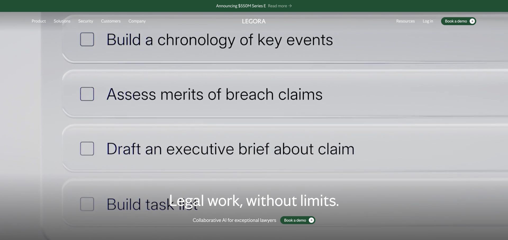
Legora uses a full-screen video-like sequence of legal tasks beneath a fine white navigation. In the captured frame, large checklist rows describe research and drafting activities, while a short proposition and green demo button remain near the bottom. The announcement strip is visually distinct from that persistent acquisition route. Current Framer metadata identifies this public marketing page, not the underlying legal research system, its models, or the reliability of its legal output.
What you can learn
A specialist audience should recognize the work before being asked to evaluate a new tool. Show tasks with enough specificity to establish relevance, then provide product detail and safeguards elsewhere. Keep the real demo action separate from illustrated task controls, and ensure the proposition remains understandable if a reader pauses the sequence or arrives midway through it.
Pros
Task-oriented imagery provides a more concrete subject than an abstract AI illustration.
The repeated green demo treatment connects header navigation with the main hero action.
Cons & considerations
The changing background can make the compact white navigation harder to inspect.
A cinematic preview cannot replace clear documentation of limitations and review responsibilities.
Visible tech stack
Referenced on the public page
Framer
Google Fonts
Cookiebot
Public source checked November 3, 2026. References may be embedded or legacy—not a complete backend inventory.
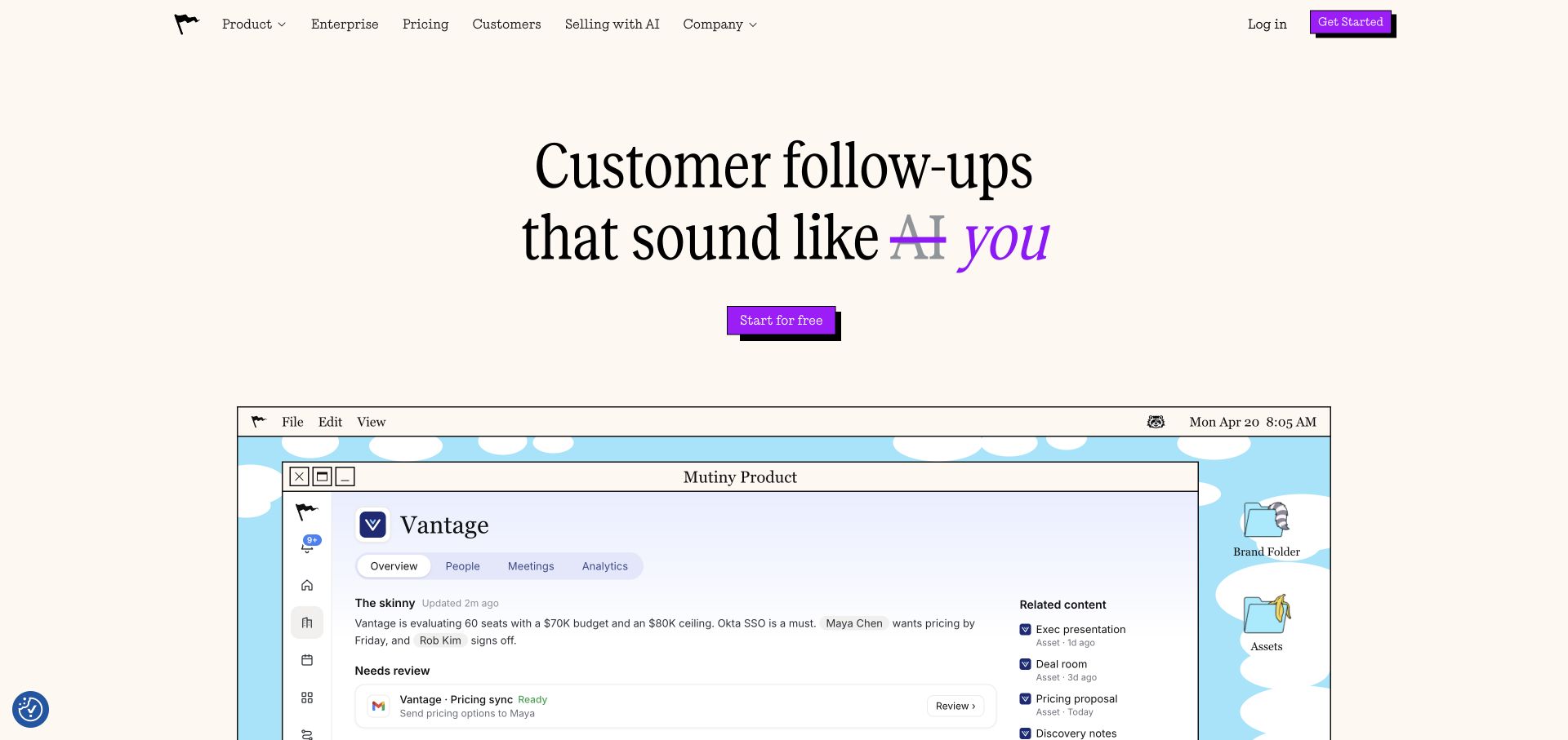
Mutiny uses a warm off-white page, a large serif headline, and bright purple rectangular controls with offset shadows. A crossed-out AI phrase changes the emphasis toward the user’s own voice. Below it, a nostalgic desktop frame contains a modern account-workspace demonstration, including folders and a central client panel. The content is a public product example, not a live customer account. Framer metadata verifies the marketing page, but does not establish how its assistant, email integration, or customer data processing works.
What you can learn
A familiar visual metaphor can make a new AI workflow less abstract. Keep the metaphor subordinate to a specific job and an unmistakable action. The contrast between playful presentation and serious business information works best when the page later explains permissions, review steps, and operational boundaries in straightforward language.
Pros
The purple action treatment is consistent across the header and central call to action.
The framed workspace gives the promise a concrete object without requiring an immediate sign-in.
Cons & considerations
The decorative desktop frame consumes space that could otherwise show more of the workflow.
The clever headline needs supporting detail so readers understand the actual product scope.
Visible tech stack
Referenced on the public page
Framer
Google Fonts
CookieYes
Public source checked November 3, 2026. References may be embedded or legacy—not a complete backend inventory.
Choose a marketing site, a CMS library, or a connected frontend
Start with a focused marketing system
A small set of well-resolved page and section patterns can support a coherent launch. Set boundaries for typography, imagery, and calls to action so routine edits do not require a fresh design decision every time.
Use reusable CMS pages for an expanding library
Model the repeatable parts and make optional content intentional. Framer’s conditional CMS layouts can vary a template according to fields; test every supported variation and make sure an omitted image does not leave an unexplained gap.
Treat custom components and external systems as owned work
If the site needs a custom interaction, booking service, authenticated product, or payment journey, name its owner and failure behavior. A visual site builder does not remove the need to understand the systems connected to it.
From references to requirements
Plan reusable sections, content states, and handover
Design against an awkward content sample
Use long headlines, different image ratios, missing optional content, and a short description. Check the mobile order independently of the desktop canvas. Reusable design is demonstrated by these variations, not by duplicated perfect cards.
Separate a preview from a working product
If a hero shows a sample dashboard or tool, make its purpose clear. A visitor should know which controls are illustrations and which perform real actions. Keep signups and inquiries on predictable, labeled paths.
Give the owner a repeatable release routine
Demonstrate adding an item, correcting an error, reviewing a draft, publishing, and recovering from a bad change. Record access, domains, integrations, and the ongoing responsibilities for any custom code.
A useful handover demonstration
Ask the actual team to carry out its routine job: publish a realistic update, correct a mistake, preview a narrow screen, and identify who owns an integration failure. For a library or frontend framework, also ask who maintains the content source and deployment. A polished screenshot does not answer those operational questions.
Beyond the screenshot
A Framer launch review
Review every breakpoint with real, varied content.
Confirm that the static message survives disabled or reduced motion.
Test CMS detail variations and missing optional fields.
Check filters, empty results, and understandable reset controls.
Verify keyboard access, focus visibility, and menu closure.
Follow every signup, booking, and inquiry destination through confirmation.
Map redirects and review metadata for individual pages.
Hand over publishing access and a documented maintenance routine.
Test with real content, a keyboard, a small screen, slow or failed requests, and the people who will maintain the system. These are planning checks, not an accessibility, security, performance, or search-ranking certification.
Sources & editorial method
How this Framer collection was reviewed
The collection uses direct captures and public Framer generator or asset evidence, supplemented where necessary by attributed first-party project sources. A Framer signal is a platform association, not evidence that AI created the design or copy.
Every image is an unmodified capture from the actual website, with its source and capture date. Some captures are reused from our shared catalog; their dates remain the original capture dates. None comes from a vendor gallery or a generated reconstruction. Moving imagery and live content can change.
Technology attribution uses public page assets or metadata, official platform documentation, or a cited first-party project case study. Documentary and framework-relationship evidence is identified where used; it is not a complete current backend inventory. A CMS image CDN alone does not establish a full CMS deployment. A library’s presence does not prove which individual controls use it, and a platform label does not establish AI authorship.
The composition notes, lessons, pros and tradeoffs are original editorial observations. We have not measured conversion, traffic, security, performance or accessibility conformance. Website owners retain their brands and imagery; these examples are not our client portfolio. Written, Edited and Curated are independent records, not dates advanced by a build. See our editorial standards or suggest a correction.
Questions worth asking
Framer website development FAQs
Does a Framer website mean it was made by AI?
No. A platform signal cannot establish authorship. A person may use a builder manually, use assistance for part of a project, or combine several workflows.
Can Framer manage a project or article library?
Its CMS supports repeatable content and connected layouts. Test your actual fields, relationships, editorial workflow, and current project constraints before committing.
Should a marketing site imitate a product application?
Only where it helps explain the product. Keep illustrative controls distinct from real account actions and do not imply that the public marketing stack identifies the application backend.
Is custom code a reason to avoid a visual builder?
Not automatically. The important questions are who owns the code, how it is tested, and whether the added complexity is justified by a real visitor or business need.