Hugo examples are useful because they show how much a website can accomplish with a well-organized document system. The strongest references make a large body of information understandable, whether the visitor is reading technical documentation, learning about a nonprofit, or arranging a local service.
This collection includes public properties with explicit Hugo generator metadata or official build documentation. Documentation sites are named as documentation sites; the association does not extend automatically to an organization’s product, account application, or other domains. The range of designs also makes clear that Hugo does not impose one visual style.
Start the project brief with the content people need and the people responsible for keeping it correct. A static publishing approach can simplify delivery, but it still requires decisions about editing, preview, search, forms, redirects, and maintenance. The examples provide design references, not proof of a complete operating model.
Before the examples
What makes good Hugo website development in 2026?
Make the content hierarchy visible to a first-time reader
List the major page families and give each a distinct purpose. A tutorial, reference entry, project announcement, and service page should not be indistinguishable cards simply because they use the same template. Test the navigation with a reader who does not know internal product names. Keep section introductions short and useful, then provide direct links for people who already know where they are going.
Treat metadata as an editorial contract
Hugo front matter provides metadata that can describe content and influence its published structure. Decide which fields an editor must supply and what each means before a large import. Titles, descriptions, dates, authors, and relationships should have consistent expectations. Review missing and unusually long values, and make a deliberate distinction between a creation date and a substantive update. The template cannot repair an ambiguous editorial policy by itself.
Keep related content and media maintainable together
Hugo page bundles can group content with associated resources. That is useful when an article or project page owns its photographs, diagrams, or downloadable files. Establish file naming, alt text, source attribution, and replacement practices before the library grows. Ask what happens when a page moves or is removed. A clean published layout is easier to sustain when its source content has a predictable home.
Compare how each property introduces a subject, divides a library, and makes the next task obvious. The captures document the named public page at the stated date; generator and repository evidence remain separate from visual judgments.
We start with five recognizable brands or organizations: Docker documentation, Kubernetes, Datadog documentation, Let’s Encrypt, DigitalOcean documentation. Each attribution applies to the named website property, not every product or website belonging to its organization. This is a curated reading sequence, not a measured ranking.
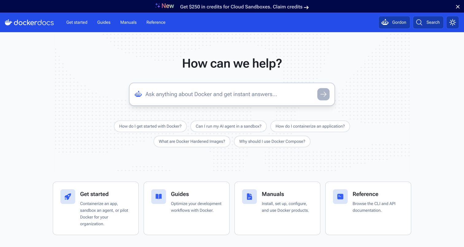
Docker’s documentation landing page centers a help prompt above four evenly sized cards for getting started, guides, manuals, and reference material. The blue header makes the documentation identity obvious without requiring a large decorative hero. A compact announcement strip and a lower news section give recent material separate places in the hierarchy. The help field also offers suggested questions, while the four cards remain ordinary browsing routes. Docker’s public documentation repository describes a Hugo build; that evidence concerns this documentation property, not Docker’s commercial application or all of its websites.
What you can learn
Provide both search and a short, meaningful map of the library. A visitor who cannot phrase a precise query should still know whether to choose a tutorial, conceptual guide, or reference entry.
Pros
Four parallel cards explain the purpose of each content family.
The documentation identity remains visible in a compact, consistent header.
Cons & considerations
An AI-oriented help field needs a dependable route to original documentation.
Announcements and news can crowd the landing page if their editorial priority is unclear.
Public source checked November 3, 2026. References may be embedded or legacy—not a complete backend inventory.
Platform source: Official website build documentation. Docker’s official documentation repository describes building docs.docker.com with Hugo. The association is scoped to the documentation website, not Docker’s product runtime. Platform evidence is separate from the direct website screenshot and is not a complete current infrastructure audit.
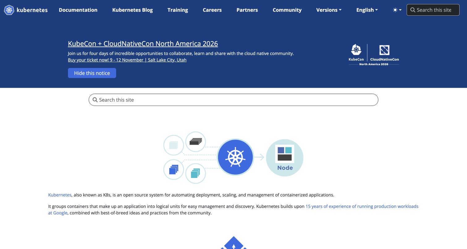
Kubernetes uses a deep blue navigation and announcement area above a broad search field and a small explanatory diagram. The introductory copy is presented as readable paragraphs with contextual links, rather than being broken into a collection of decorative marketing cards. Documentation, training, partners, and community have visible entry points across the top. The captured event notice is substantial, demonstrating how community activity can compete with the evergreen introduction. The official website repository identifies its Hugo and Docsy implementation. This association is specific to the public website, not the technology running a Kubernetes cluster.
What you can learn
Keep the basic definition and documentation route easy to locate even when the project has a busy events calendar. Give temporary notices an owner and an expiry plan so they do not permanently dominate the opening.
Pros
Conventional navigation exposes several distinct community and learning tasks.
Linked introductory paragraphs provide useful context without forcing a guided tour.
Cons & considerations
The event notice occupies a large part of the opening viewport.
Search appears in more than one place, which requires a consistent result experience.
Public source checked November 3, 2026. References may be embedded or legacy—not a complete backend inventory.
Platform source: Official website build documentation. The official Kubernetes website repository describes its Hugo and Docsy website build. The association concerns kubernetes.io, not Kubernetes cluster software. Platform evidence is separate from the direct website screenshot and is not a complete current infrastructure audit.
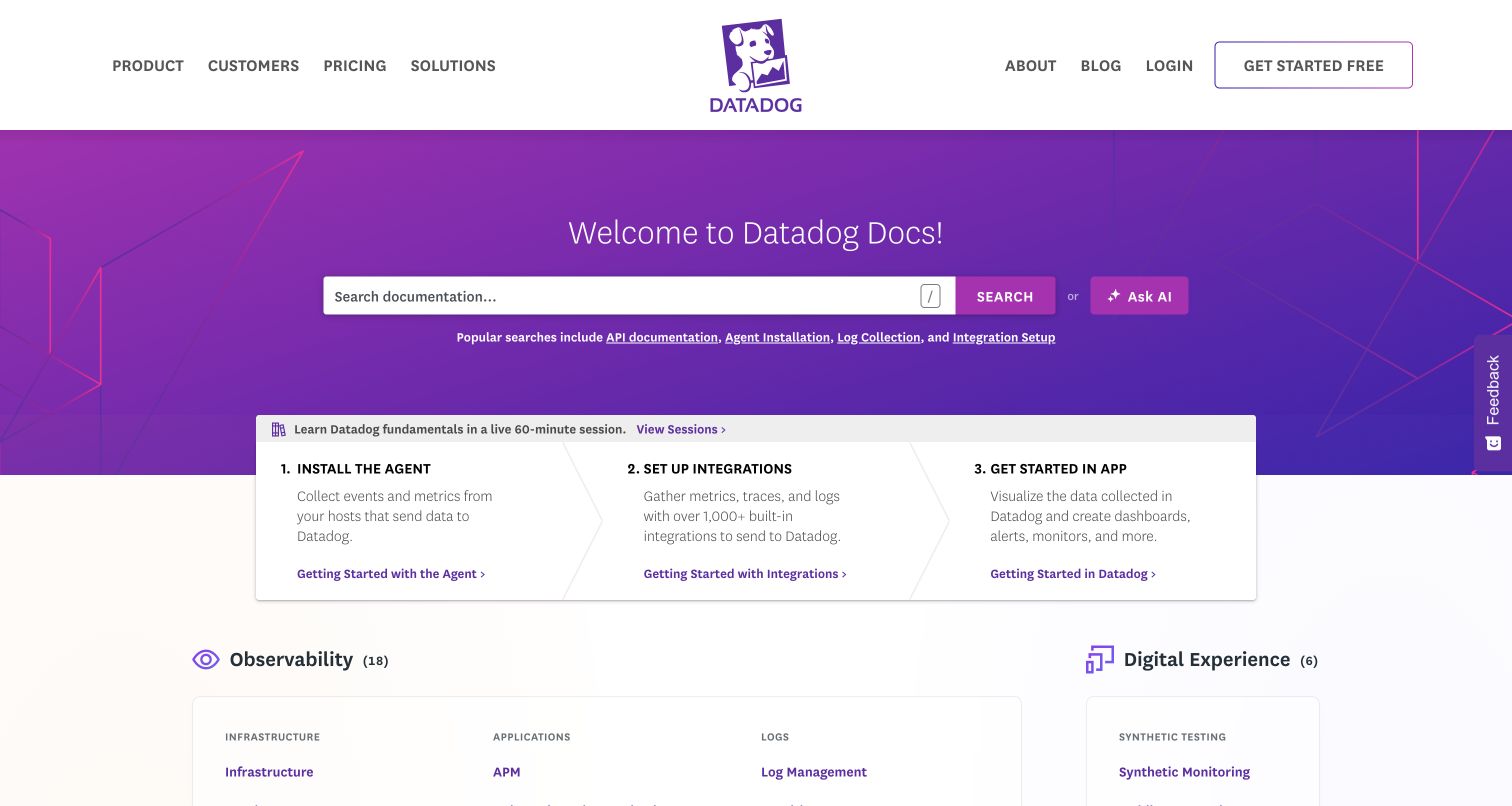
Datadog’s documentation page places a wide search field in a purple banner and follows it with three numbered onboarding panels. Installation, integration setup, and use inside the application form a clear sequence before the larger category directory begins. The centered logo and broad corporate navigation connect the resource to the wider brand, while the distinct documentation greeting establishes its immediate purpose. Popular search links provide concrete alternatives to the empty field. Datadog’s official documentation repository states that the site is published with Hugo; this does not identify the architecture of its authenticated observability product.
What you can learn
Use a short onboarding sequence to explain the order of work, then give returning visitors direct access to the full library. Keep the numbered path separate from optional training or commercial announcements.
Pros
Three numbered steps make the initial setup journey easy to understand.
Popular queries help visitors recognize useful documentation terminology.
Cons & considerations
Corporate navigation consumes space that experienced documentation users may not need.
A large category catalog needs consistent naming and ongoing maintenance as products change.
Visible tech stack
Referenced on the public page
Hugo
Google Analytics
Amazon CloudFrontDelivery / hosting signal
Public source checked November 3, 2026. References may be embedded or legacy—not a complete backend inventory.
Platform source: Official website build documentation. Datadog’s official documentation repository states that the Markdown content is published with Hugo. This evidence is scoped to docs.datadoghq.com, not the authenticated Datadog application. Platform evidence is separate from the direct website screenshot and is not a complete current infrastructure audit.
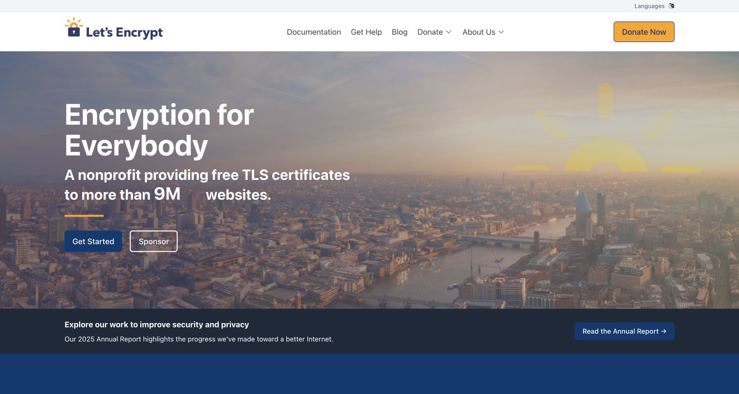
Let’s Encrypt opens with a city photograph, a plain mission statement, and separate actions for getting started and sponsoring the organization. A golden donation button remains in the header, while documentation and help are conventional navigation choices. The dark strip beneath the hero promotes an annual report and introduces institutional accountability without replacing the practical starting route. This is a public-facing nonprofit composition rather than a software documentation template. The homepage declares Hugo in its generator metadata, and the official website repository also documents Hugo as its build system.
What you can learn
Separate the journey of someone trying to use a service from the journey of someone supporting its mission. The two paths can share a photograph and identity while keeping different verbs, destinations, and supporting explanations.
Pros
Mission language makes the organization’s purpose immediately understandable.
Getting started, sponsorship, and donation have distinct visible entry points.
Cons & considerations
White text over a broad photograph needs careful contrast and crop review.
Large changing usage figures should remain readable and retain clear supporting context.
Public source checked November 3, 2026. References may be embedded or legacy—not a complete backend inventory.
Platform source: Direct public page generator metadata. Public page HTML checked on November 3, 2026 UTC declares Hugo 0.162.0. This identifies Hugo as a page generator for this named public property, not a full infrastructure inventory or the implementation of the product it describes. Platform evidence is separate from the direct website screenshot and is not a complete current infrastructure audit.
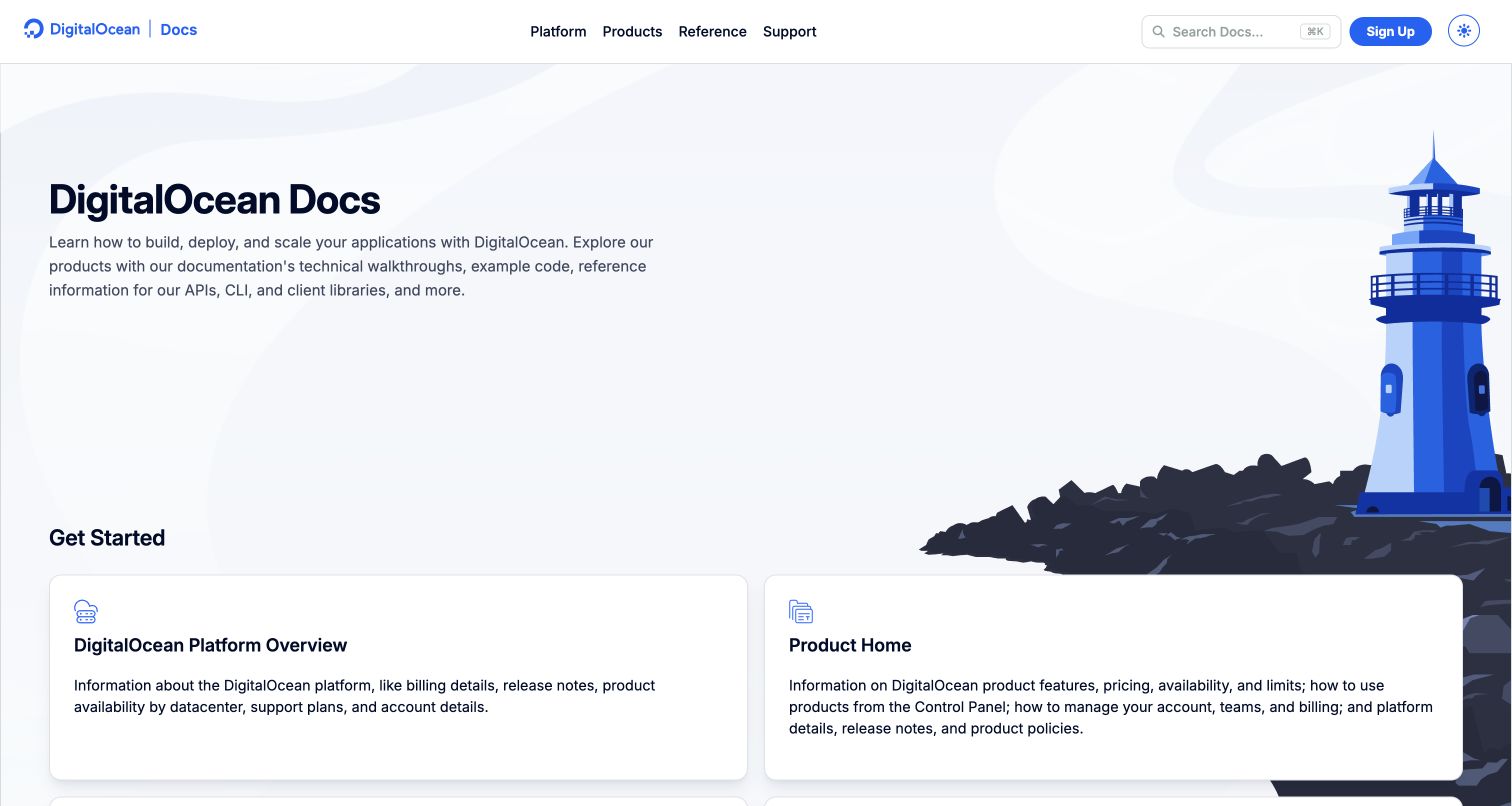
DigitalOcean’s documentation homepage combines a lighthouse illustration with a compact explanation of the resource and two large starting cards. The image occupies the right edge while the heading and description retain a clear left alignment. Platform information and product information are separated into cards with descriptive text, helping readers distinguish account-level questions from feature-level work. The top bar keeps reference, support, search, and sign-up available without turning the page into a sales hero. The current public HTML declares Hugo; this evidence applies to the documentation property rather than the cloud control panel.
What you can learn
Make the first navigation choices describe the kind of problem a reader has. Decorative illustration can establish identity, but the card descriptions should do the work of explaining which path contains the answer.
Pros
Two broad entry cards distinguish platform administration from individual products.
The restrained illustration gives the page character without covering the copy.
Cons & considerations
The spacious opening postpones some detailed links below the first viewport.
Long card descriptions need careful line-length and stacking treatment on smaller screens.
Public source checked November 3, 2026. References may be embedded or legacy—not a complete backend inventory.
Platform source: Direct public page generator metadata. Public page HTML checked on November 3, 2026 UTC declares Hugo 0.166.0. This identifies Hugo as a page generator for this named public property, not a full infrastructure inventory or the implementation of the product it describes. Platform evidence is separate from the direct website screenshot and is not a complete current infrastructure audit.
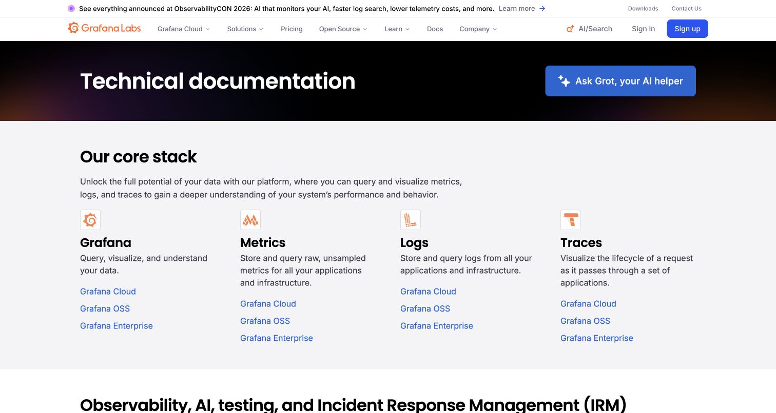
Grafana’s documentation landing page introduces a four-column core-stack directory below a dark title band. Grafana, metrics, logs, and traces each receive a short explanation and links for cloud, open-source, and enterprise routes. Orange icons connect the columns to the brand without replacing readable category names. The prominent AI-help action is visually separate from the conventional directory. This structure makes the product family visible before requiring a search. Grafana’s own writers’ toolkit documents Hugo generation for its documentation; the association is scoped to those pages and does not describe the dashboard application.
What you can learn
When a product has several delivery editions, expose the distinction consistently within each category. Keep the category explanation above the edition links so newcomers can identify the subject before choosing an implementation path.
Pros
Repeated edition links provide a predictable comparison across product areas.
Short category descriptions add meaning beyond product names and icons.
Cons & considerations
Many parallel links can overwhelm readers who do not yet know their edition.
A large AI-help action should preserve an obvious route to maintained source material.
Public source checked November 3, 2026. References may be embedded or legacy—not a complete backend inventory.
Platform source: Official website build documentation. Grafana’s official writers’ toolkit explains that its documentation website is generated with Hugo. This documented relationship is limited to the documentation property; it does not attribute the dashboard application or all grafana.com sections to Hugo. Platform evidence is separate from the direct website screenshot and is not a complete current infrastructure audit.
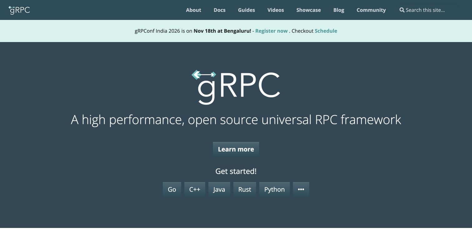
gRPC uses a restrained dark teal hero with a large wordmark, a concise framework description, and a separate row of language buttons. The first general action leads to an overview, while the language choices offer more specific starting points. A narrow event strip sits beneath the main navigation and remains distinct from the permanent explanation. The result has little visual complexity: most of the work comes from hierarchy, spacing, and clear labels. Current homepage metadata identifies Hugo as the page generator, which supports the website association without implying that the RPC framework itself depends on Hugo.
What you can learn
Organize a technical onboarding path around the decision the visitor can actually make. If language determines the next tutorial, make that choice explicit instead of sending everyone through the same long introduction.
Pros
Language choices create direct routes for visitors with known technical requirements.
The uncluttered hero makes the basic project category easy to identify.
Cons & considerations
A broad performance description still needs detailed documentation and context.
Additional languages behind an overflow control need an equally discoverable path.
Public source checked November 3, 2026. References may be embedded or legacy—not a complete backend inventory.
Platform source: Direct public page generator metadata. Public page HTML checked on November 3, 2026 UTC declares Hugo 0.99.1. This identifies Hugo as a page generator for this named public property, not a full infrastructure inventory or the implementation of the product it describes. Platform evidence is separate from the direct website screenshot and is not a complete current infrastructure audit.
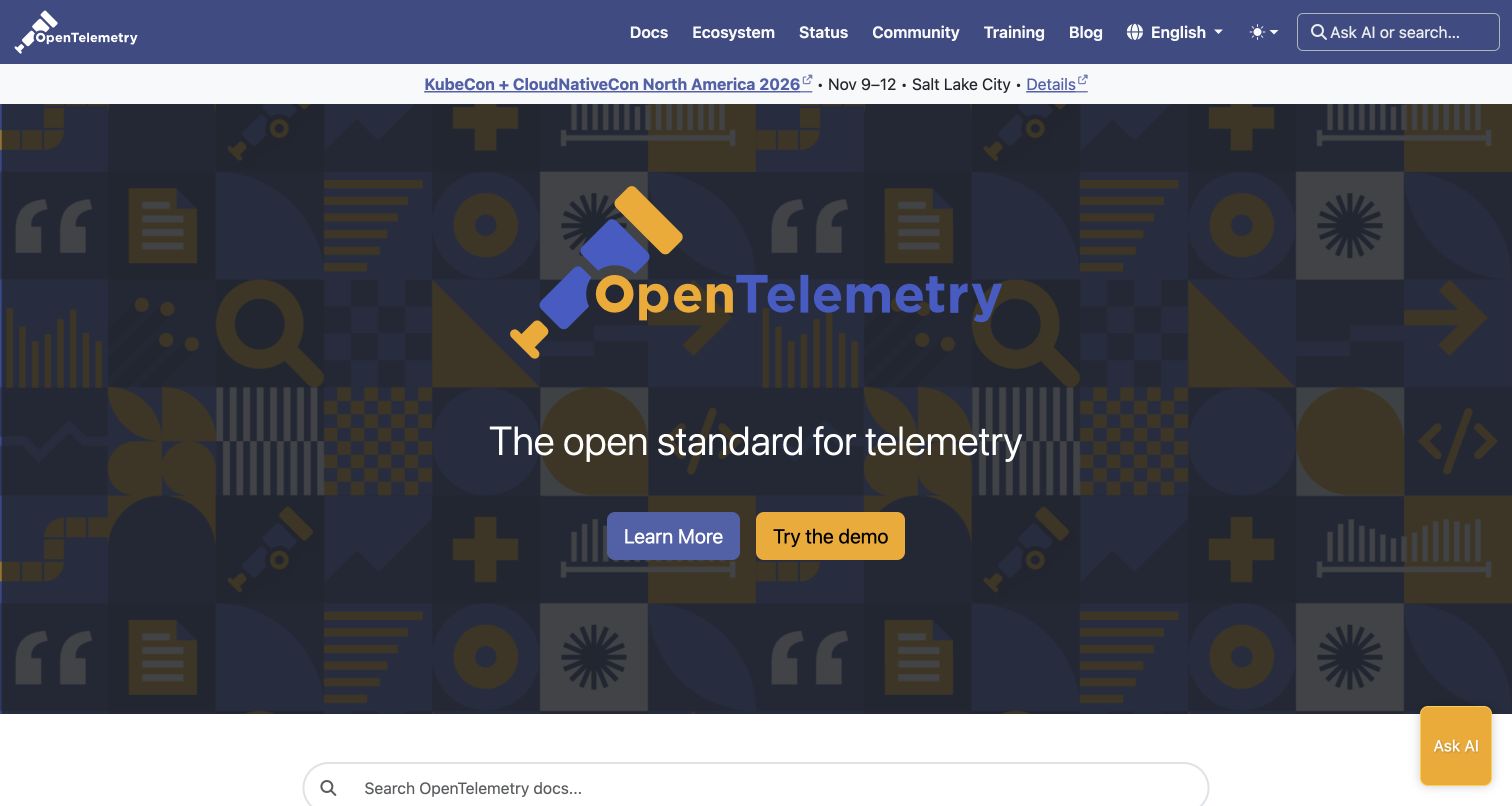
OpenTelemetry centers its telescope mark and a short statement over a dark geometric background. Two contrasting buttons offer learning and demonstration, while search begins in a separate lighter region below. The navigation exposes documentation, ecosystem, status, community, training, and blog sections, giving different audiences clear destinations. The event notice is compact enough to remain secondary to the project identity. The page declares Hugo, and the project’s own site documentation explains its Hugo and Docsy build. This evidence concerns the public information website, not the implementation language of telemetry tools.
What you can learn
A broad ecosystem benefits from a short introduction followed by clearly differentiated next steps. Keep a demonstration separate from reference material so visitors understand whether they are exploring a concept or looking for an authoritative answer.
Pros
Contrasting actions distinguish explanation from a hands-on demonstration.
The navigation exposes ecosystem and project status alongside documentation.
Cons & considerations
The patterned background requires restraint so the central statement remains legible.
A very short proposition leaves technical scope and limitations for subsequent sections.
Public source checked November 3, 2026. References may be embedded or legacy—not a complete backend inventory.
Platform source: Direct public page generator metadata. Public page HTML checked on November 3, 2026 UTC declares Hugo 0.166.0. This identifies Hugo as a page generator for this named public property, not a full infrastructure inventory or the implementation of the product it describes. Platform evidence is separate from the direct website screenshot and is not a complete current infrastructure audit.
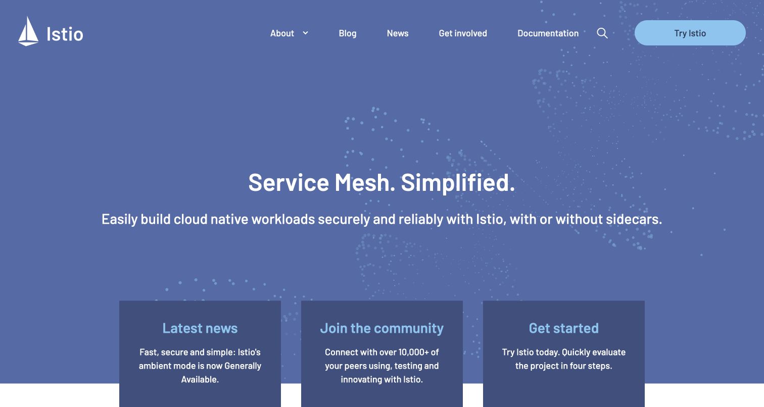
Istio presents a centered service-mesh statement on a blue field with subtle dotted patterns. The top navigation keeps documentation and a prominent trial route visible, while three dark panels begin at the bottom of the hero for news, community, and getting started. The cards give different visitor intentions distinct places without overloading the main headline. A small sailboat mark establishes identity with little decorative overhead. The current page contains Hugo generator metadata, and official contribution instructions describe the Hugo website build; this is evidence about the information site rather than the service-mesh runtime.
What you can learn
Use the hero to establish the category, then let a small set of cards route different audiences. Keep news and community content from becoming prerequisites for someone who already wants installation or reference instructions.
Pros
A compact main statement leaves room for distinct secondary journeys.
Documentation remains directly accessible from the persistent navigation.
Cons & considerations
A broad simplicity claim needs concrete examples and limitations further down.
Cards starting near the fold require careful height and wrapping checks on smaller screens.
Public source checked November 3, 2026. References may be embedded or legacy—not a complete backend inventory.
Platform source: Direct public page generator metadata. Public page HTML checked on November 3, 2026 UTC declares Hugo 0.157.0. This identifies Hugo as a page generator for this named public property, not a full infrastructure inventory or the implementation of the product it describes. Platform evidence is separate from the direct website screenshot and is not a complete current infrastructure audit.
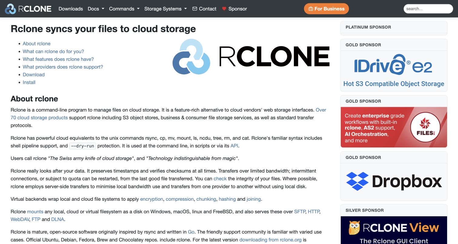
Rclone places a functional page heading, a short linked contents list, and explanatory paragraphs beside a sponsor column. The design resembles a readable reference document more than a campaign landing page. Its navigation includes downloads, commands, storage systems, contact, and sponsorship, reflecting practical tasks for existing users. A large logo and sponsor graphics supply most of the visual contrast. Current source metadata names Hugo as the generator for this public page. That association is separate from the command-line program, and the design review does not verify the technical claims within its descriptive copy.
What you can learn
For an established utility, a useful contents list and precise section names may be more valuable than a large abstract hero. Keep sponsorship visually distinct from documentation so readers can tell project guidance from commercial promotion.
Pros
The linked contents list helps visitors jump to specific questions quickly.
Task-oriented navigation matches common download and command-reference needs.
Cons & considerations
The dense paragraphs can be difficult to scan without additional subheadings.
Large sponsor graphics compete with the main explanation in the opening view.
Visible tech stack
Referenced on the public page
Hugo
Public source checked November 3, 2026. References may be embedded or legacy—not a complete backend inventory.
Platform source: Direct public page generator metadata. Public page HTML checked on November 3, 2026 UTC declares Hugo 0.159.0. This identifies Hugo as a page generator for this named public property, not a full infrastructure inventory or the implementation of the product it describes. Platform evidence is separate from the direct website screenshot and is not a complete current infrastructure audit.
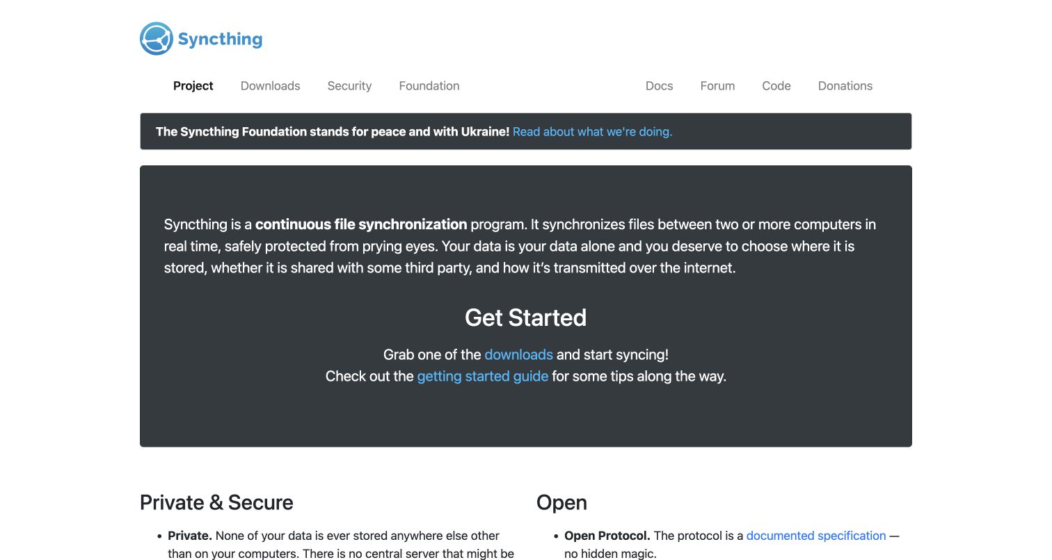
Syncthing uses a narrow centered page, a restrained blue identity, and a large charcoal panel containing its main explanation and starting links. Navigation is divided into practical project routes and supporting resources, with generous space between the two groups. Below the panel, paired headings begin a more detailed explanation of privacy and openness. The page relies on readable prose rather than a product mockup. Its current generator metadata identifies Hugo. The website’s statements about synchronization and privacy remain the project’s own claims, and this review concerns their presentation rather than an independent security assessment.
What you can learn
Explain the task and the next action in the same bounded area. A short, direct introduction can work well for a utility when downloads and guidance are visibly linked and do not require interpreting a decorative interface illustration.
Pros
The contained hero keeps the explanation and starting links together.
Separate resource links accommodate users seeking documentation or source code.
Cons & considerations
The opening paragraph is long enough to need careful narrow-screen review.
A prominent organizational notice can interrupt the primary adoption journey.
Public source checked November 3, 2026. References may be embedded or legacy—not a complete backend inventory.
Platform source: Direct public page generator metadata. Public page HTML checked on November 3, 2026 UTC declares Hugo 0.169.0. This identifies Hugo as a page generator for this named public property, not a full infrastructure inventory or the implementation of the product it describes. Platform evidence is separate from the direct website screenshot and is not a complete current infrastructure audit.
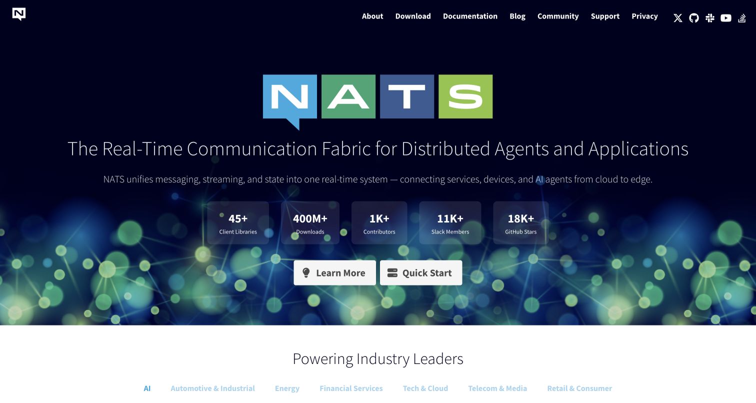
NATS places a colorful block-letter identity over a dark network-themed background, followed by a broad communication-platform statement. A row of compact statistics sits between the explanation and two white actions for learning and quick start. The main navigation stays on one line and gives documentation a direct destination. The next white section begins an industry-oriented credibility layer. Current public metadata declares Hugo as the site generator. The displayed adoption and community numbers belong to the project; this review neither independently verifies those values nor uses them to infer website effectiveness.
What you can learn
Make the technical category and practical starting route clear before presenting scale indicators. If numeric proof is included, assign someone to maintain its source and date so a polished row does not become stale background decoration.
Pros
Two simple actions separate general exploration from an immediate quick start.
A compact metric row groups supporting information without creating several new sections.
Cons & considerations
Thin text on a detailed dark background needs contrast review at smaller sizes.
A broad platform statement may need a concrete example to orient less technical readers.
Public source checked November 3, 2026. References may be embedded or legacy—not a complete backend inventory.
Platform source: Direct public page generator metadata. Public page HTML checked on November 3, 2026 UTC declares Hugo 0.80.0. This identifies Hugo as a page generator for this named public property, not a full infrastructure inventory or the implementation of the product it describes. Platform evidence is separate from the direct website screenshot and is not a complete current infrastructure audit.
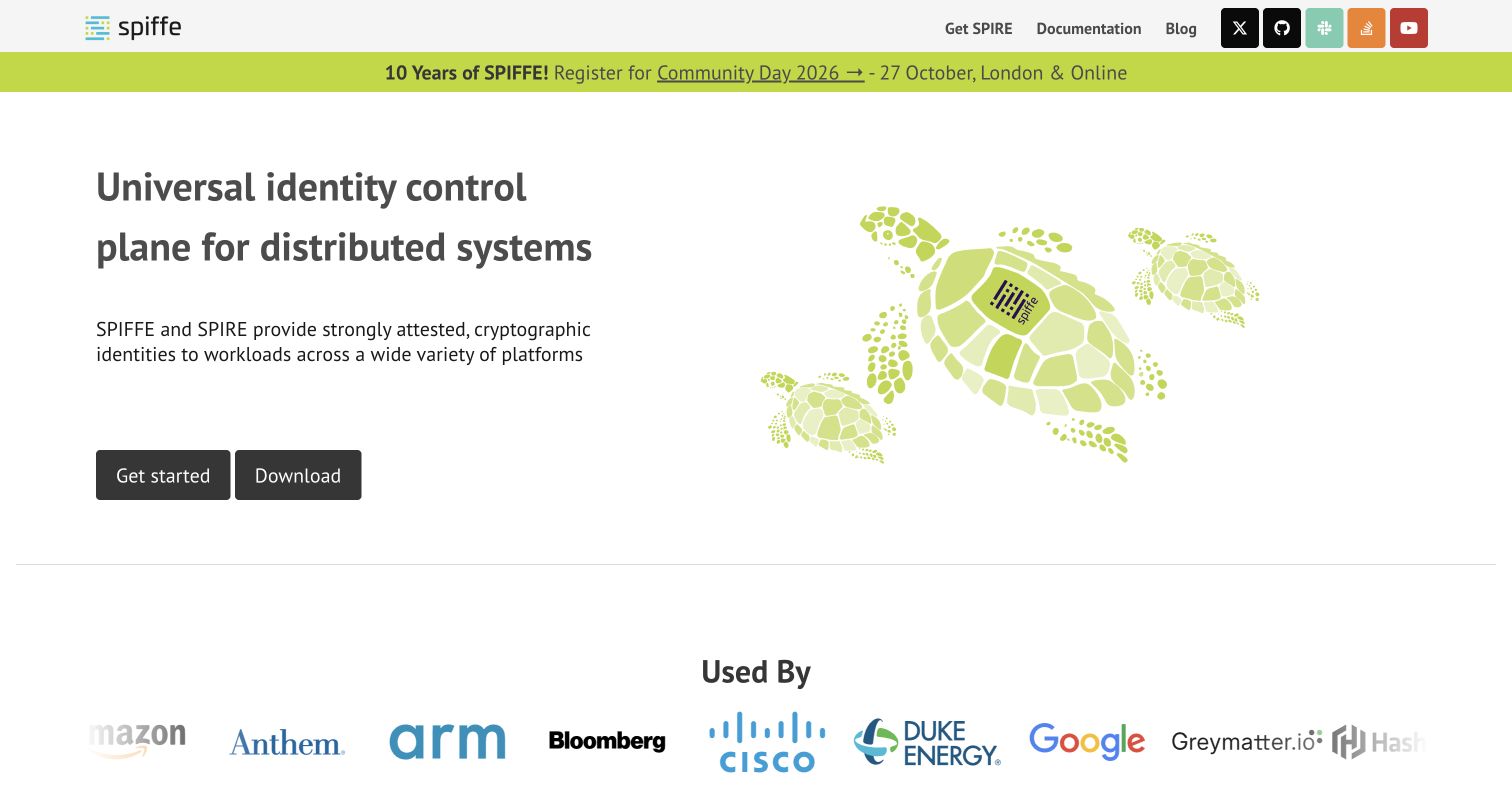
SPIFFE pairs a substantial technical headline with a family of green turtle illustrations. The white background and restrained two-column layout leave the main explanation readable, while dark buttons offer getting started and downloading. A bright event strip and a lower adopter-logo row provide separate community and credibility layers. The upper navigation is compact, with implementation, documentation, and blog links beside social destinations. The current public page identifies Hugo in generator metadata. The named adopter marks are presented by the site and should not be interpreted as evidence about those organizations’ own website technology.
What you can learn
Use an illustration to make an abstract technical subject memorable while allowing the adjacent copy to define it. Keep implementation terminology explained and make the first practical action more obvious than peripheral social links.
Pros
The illustration adds identity without obscuring the technical explanation.
Learning and download actions are clearly grouped beneath the introduction.
Cons & considerations
Specialist terminology can create a high entry barrier for unfamiliar visitors.
A long adopter-logo row needs clear relationship context and current attribution.
Public source checked November 3, 2026. References may be embedded or legacy—not a complete backend inventory.
Platform source: Direct public page generator metadata. Public page HTML checked on November 3, 2026 UTC declares Hugo 0.163.3. This identifies Hugo as a page generator for this named public property, not a full infrastructure inventory or the implementation of the product it describes. Platform evidence is separate from the direct website screenshot and is not a complete current infrastructure audit.
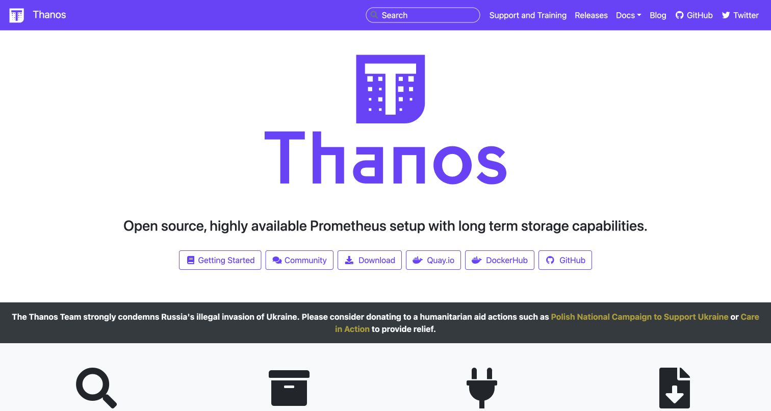
Thanos gives its purple mark and name considerable space, then places a one-sentence product description above six outlined action buttons. Getting started, community, downloads, container registries, and source code are visible together. The purple header repeats the identity while supplying search and documentation. Beneath the hero, a dark organizational notice separates the introduction from a row of feature icons. The homepage declares Hugo in its generator metadata. That page-level signal identifies the website build and does not describe the monitoring software’s own runtime or storage architecture.
What you can learn
Expose genuine distribution choices without assuming that every visitor understands the difference. Group installation destinations under an explanation or a primary getting-started route so newcomers can choose confidently while experienced users retain direct links.
Pros
Several practical download and source destinations are immediately available.
A consistent purple accent connects branding, navigation, and interface controls.
Cons & considerations
Six similarly styled buttons create competing actions for first-time visitors.
The large wordmark pushes technical explanation and supporting detail lower on the page.
Public source checked November 3, 2026. References may be embedded or legacy—not a complete backend inventory.
Platform source: Direct public page generator metadata. Public page HTML checked on November 3, 2026 UTC declares Hugo 0.101.0. This identifies Hugo as a page generator for this named public property, not a full infrastructure inventory or the implementation of the product it describes. Platform evidence is separate from the direct website screenshot and is not a complete current infrastructure audit.
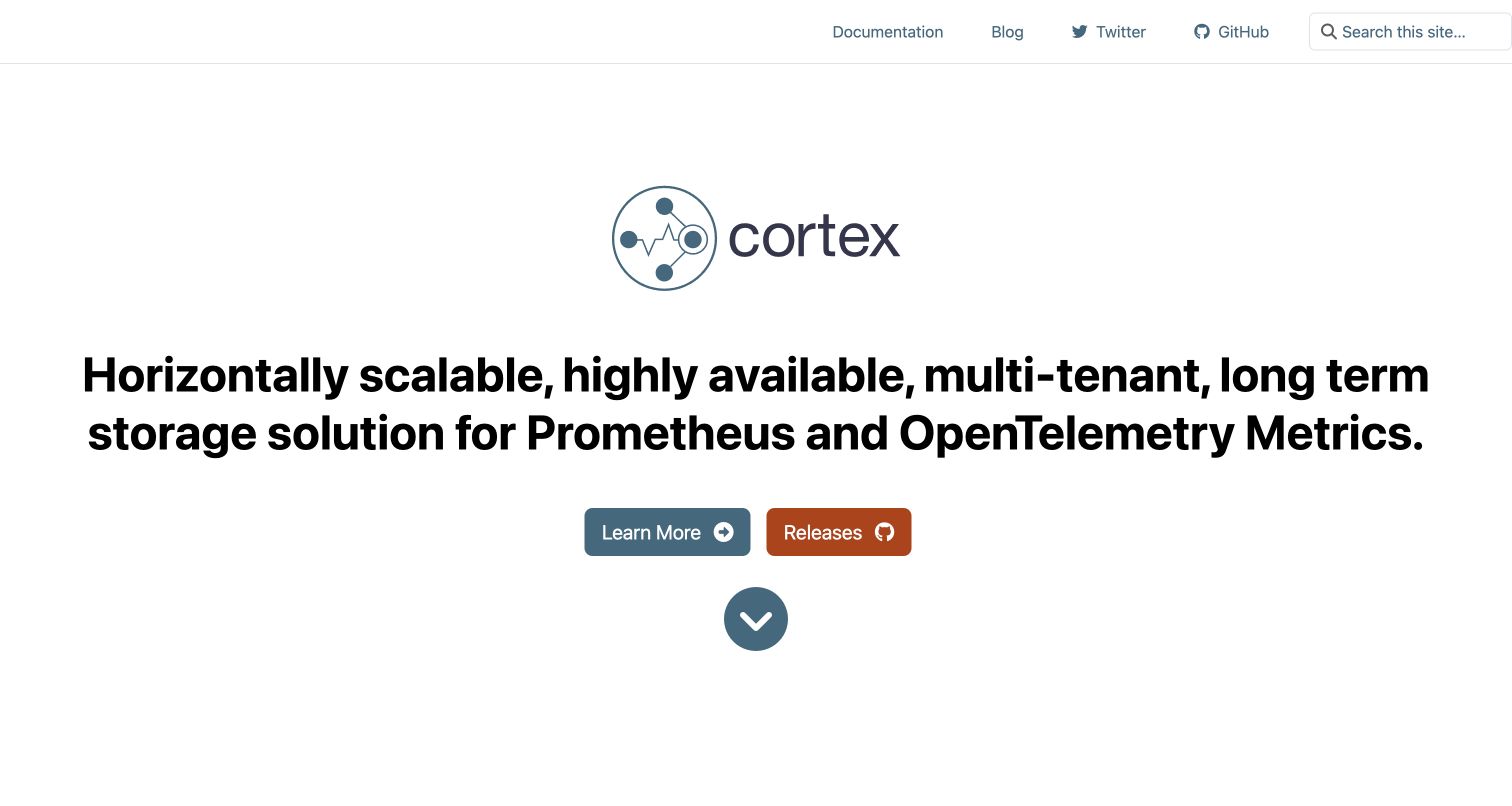
Cortex uses an almost entirely white opening with a centered project mark, a large descriptive headline, and two contrasting buttons. The headline states the technical purpose in detail rather than relying on a vague campaign phrase. Documentation, blog, social, source, and search sit in a minimal top bar. A large downward arrow suggests that more explanation follows, while the first screen remains visually sparse. The public HTML declares Hugo as its generator. This supports a website-level relationship and is not evidence that the underlying metrics-storage system is implemented with the same tool.
What you can learn
A precise technical headline can be a useful shortcut for an expert audience. Balance that precision with a short explanatory path for readers who recognize the problem but do not yet understand every term in the project description.
Pros
The two-button arrangement keeps learning and release access distinct.
Minimal surrounding decoration leaves the technical proposition easy to locate.
Cons & considerations
The long specialist headline is demanding for readers outside the target audience.
Large unused areas may delay supporting examples without adding useful orientation.
Public source checked November 3, 2026. References may be embedded or legacy—not a complete backend inventory.
Platform source: Direct public page generator metadata. Public page HTML checked on November 3, 2026 UTC declares Hugo 0.164.0. This identifies Hugo as a page generator for this named public property, not a full infrastructure inventory or the implementation of the product it describes. Platform evidence is separate from the direct website screenshot and is not a complete current infrastructure audit.
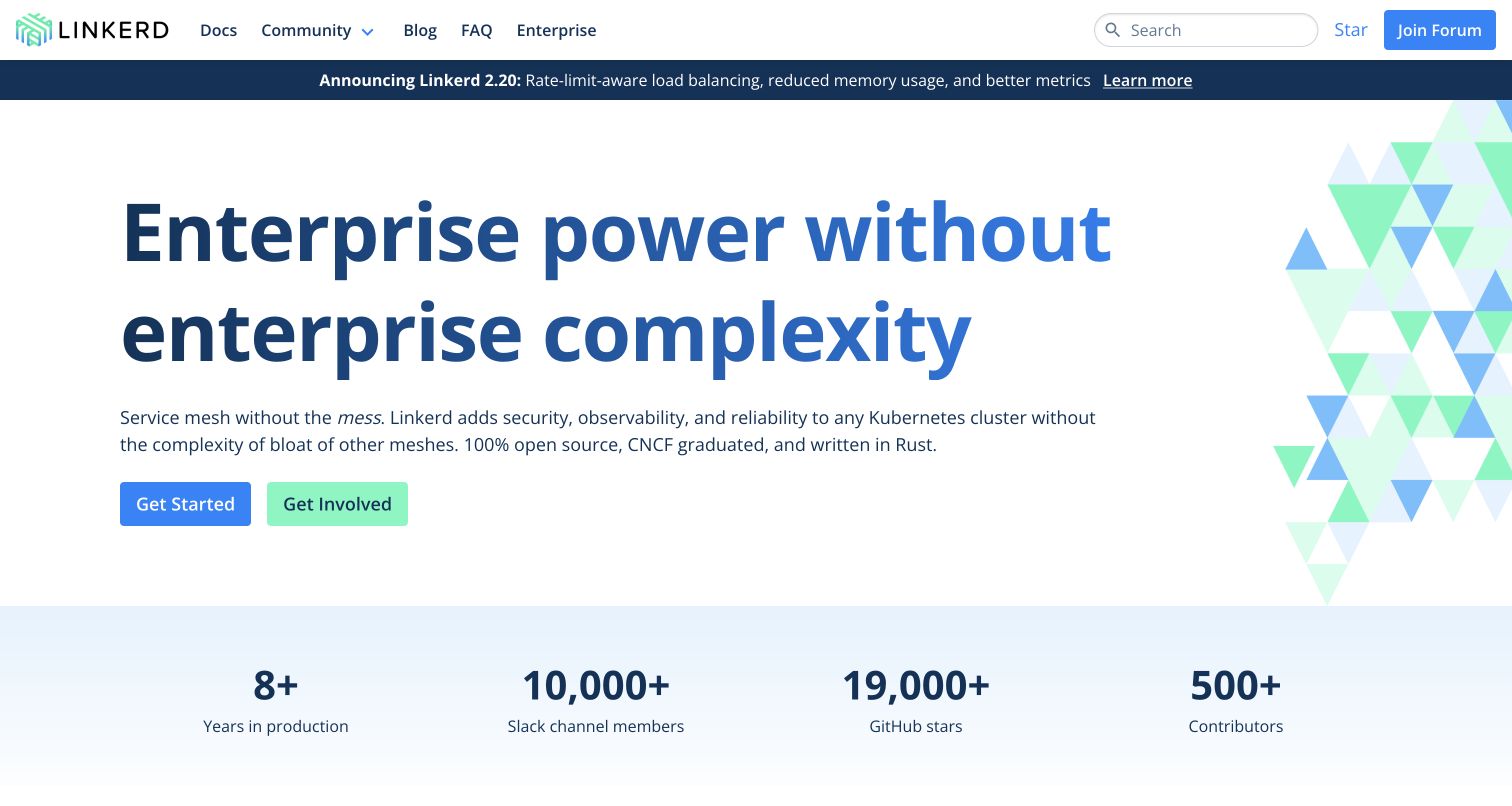
Linkerd leads with a very large blue headline and a brief technical paragraph, keeping its triangular illustration along the right edge. A release strip sits above the hero, while getting started and getting involved appear as two distinct buttons beneath the explanation. A pale metrics band begins below the main composition. The navigation includes documentation, community, blog, FAQ, and enterprise information without burying search. Current generator metadata names Hugo for the public page. The headline’s claims about simplicity and the displayed community figures are the project’s presentation, not independently measured outcomes in this review.
What you can learn
Distinguish using the project from helping develop it. Clear adoption and contribution routes allow the homepage to serve a community without forcing both audiences through the same introductory material or commercial information.
Pros
Adoption and participation receive separate, clearly labeled actions.
The restrained illustration preserves a strong reading area for the main copy.
Cons & considerations
The oversized headline needs careful wrapping on narrow and enlarged-text views.
Community metrics need maintained sources and should not substitute for practical examples.
Public source checked November 3, 2026. References may be embedded or legacy—not a complete backend inventory.
Platform source: Direct public page generator metadata. Public page HTML checked on November 3, 2026 UTC declares Hugo 0.158.0. This identifies Hugo as a page generator for this named public property, not a full infrastructure inventory or the implementation of the product it describes. Platform evidence is separate from the direct website screenshot and is not a complete current infrastructure audit.
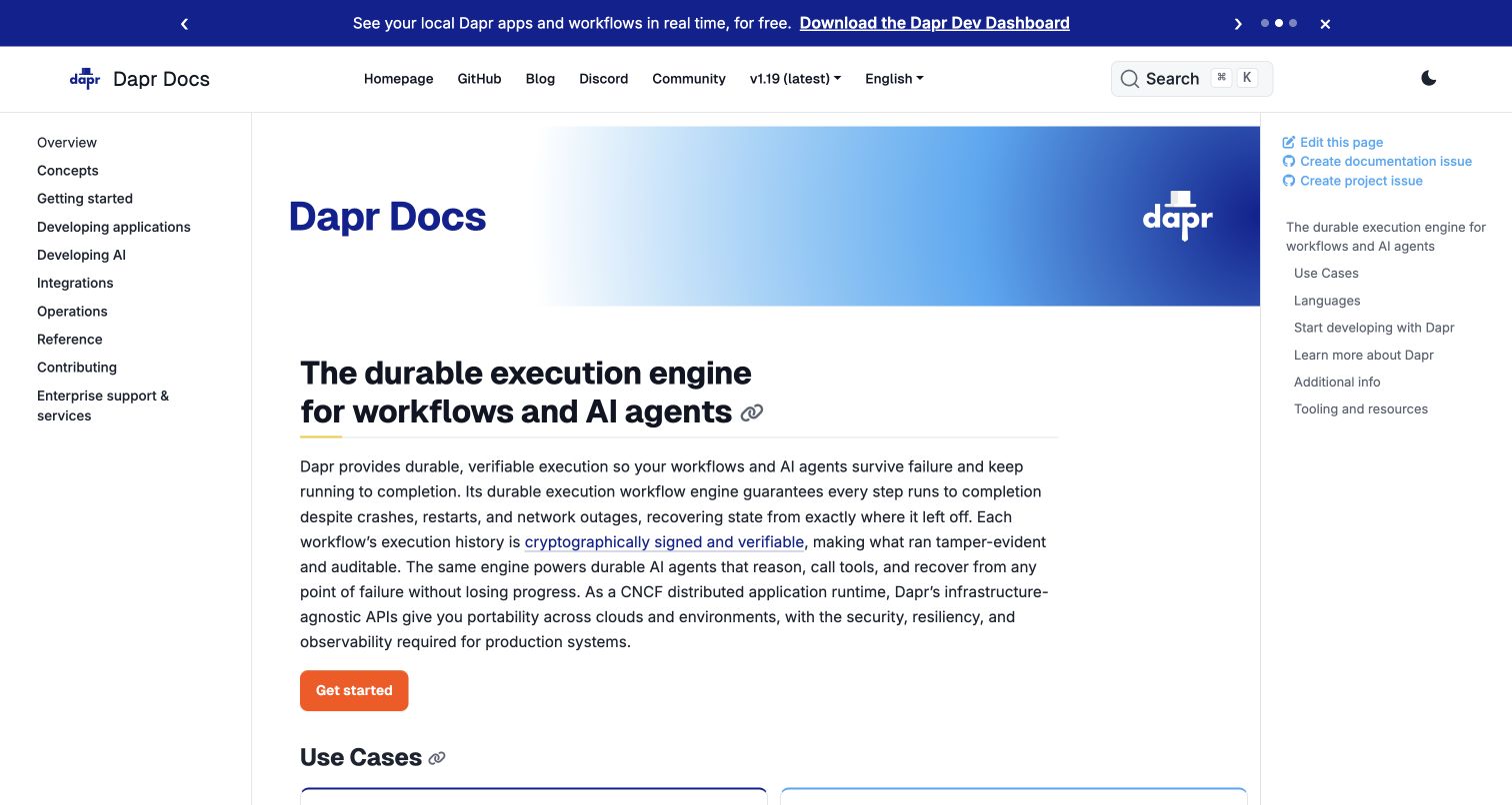
Dapr’s documentation uses a three-column layout: a broad section tree on the left, the document in the center, and page links plus contribution actions on the right. A blue gradient title banner identifies the resource before the main explanation begins. Version and language selectors remain near the top, and an orange starting action stands apart from the cooler surrounding palette. The captured page also contains a separate announcement strip. Its public metadata identifies Hugo. The review concerns documentation organization and does not independently validate the product’s technical guarantees or describe its runtime.
What you can learn
Separate navigation through the library from navigation within a page. Make the selected version visible and preserve a clear contribution route, especially when readers may discover an error while following a detailed technical procedure.
Pros
Global and local navigation provide different useful levels of orientation.
Version selection and page-contribution links remain visible within the reading shell.
Cons & considerations
Three columns need a carefully designed collapse order on smaller screens.
Long introductory paragraphs can postpone the first concrete task for new readers.
Public source checked November 3, 2026. References may be embedded or legacy—not a complete backend inventory.
Platform source: Direct public page generator metadata. Public page HTML checked on November 3, 2026 UTC declares Hugo 0.147.9. This identifies Hugo as a page generator for this named public property, not a full infrastructure inventory or the implementation of the product it describes. Platform evidence is separate from the direct website screenshot and is not a complete current infrastructure audit.
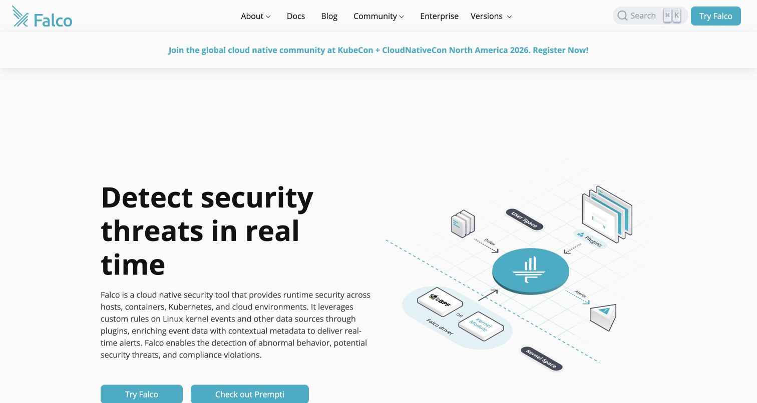
Falco uses a two-column hero with a large black headline on the left and an isometric systems diagram on the right. The diagram connects the central project mark to sources and outputs, adding explanatory value beyond a decorative illustration. Teal controls and the brand mark provide a consistent accent, while the top navigation separates documentation, community, enterprise information, versions, and search. A compact event notice appears below the header. Current homepage metadata identifies Hugo as the generator; the association concerns the public website and is separate from the security tooling described by the page.
What you can learn
Use a diagram when it can explain the boundaries of a system more directly than another paragraph. Give it a text equivalent and make its small labels readable in the final responsive layout, not only in a large design presentation.
Pros
The adjacent diagram gives the technical description a concrete visual structure.
A limited accent color makes primary actions recognizable across the page.
Cons & considerations
Small diagram labels may lose meaning when the image is reduced on phones.
The spacious upper area pushes some action controls toward the viewport edge.
Public source checked November 3, 2026. References may be embedded or legacy—not a complete backend inventory.
Platform source: Direct public page generator metadata. Public page HTML checked on November 3, 2026 UTC declares Hugo 0.154.5. This identifies Hugo as a page generator for this named public property, not a full infrastructure inventory or the implementation of the product it describes. Platform evidence is separate from the direct website screenshot and is not a complete current infrastructure audit.
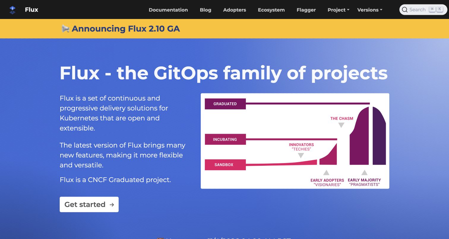
Flux places a large white project heading on a blue background and divides the supporting area into explanatory text and an ecosystem diagram. A bright yellow release announcement sits directly beneath the dark navigation. The white getting-started button is easy to identify at the bottom of the text column, while documentation, adopters, ecosystem, project, and version routes remain available above. The diagram presents the project’s own maturity context rather than a product interface. The current public HTML declares Hugo. That identifies this information website’s generator, not the implementation of its delivery controllers.
What you can learn
When community status matters to the story, explain its meaning beside the evidence instead of relying on a badge alone. Keep the next practical step visible so institutional context does not become an obstacle to learning how the project works.
Pros
The split layout gives contextual evidence its own readable area.
Documentation and ecosystem routes are distinct in the primary navigation.
Cons & considerations
A maturity diagram requires explanation for readers unfamiliar with its categories.
The release banner and large hero compete for the first portion of the screen.
Public source checked November 3, 2026. References may be embedded or legacy—not a complete backend inventory.
Platform source: Direct public page generator metadata. Public page HTML checked on November 3, 2026 UTC declares Hugo 0.122.0. This identifies Hugo as a page generator for this named public property, not a full infrastructure inventory or the implementation of the product it describes. Platform evidence is separate from the direct website screenshot and is not a complete current infrastructure audit.
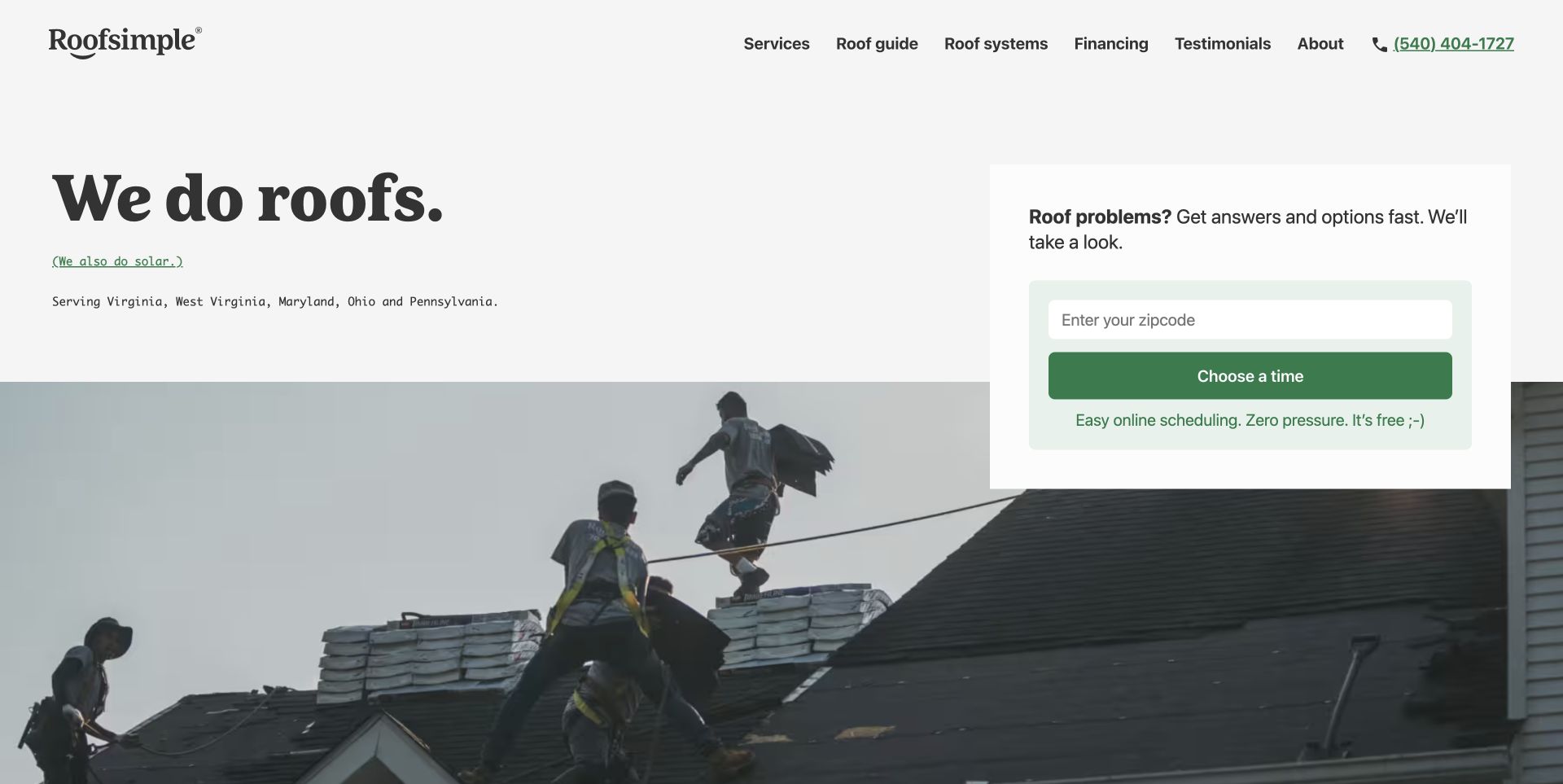
Roofsimple opens with an oversized serif service statement, a short region description, and a scheduling panel on the right. A photograph of people working on a roof begins below the copy and gives the service a concrete setting. The panel asks for a ZIP code before offering a time-selection action, while the header retains service information, financing, testimonials, and a telephone route. The actual capture is retained from November 1, 2026; current source checked on November 3 declares Hugo. This association does not identify the scheduling service or establish that submitted inquiries are delivered successfully.
What you can learn
Keep a service-area check close to the booking action and explain what happens next. A static publishing system can support this presentation, but the form still needs separately verified validation, delivery, failure handling, and ownership.
Pros
The service statement is immediate and supported by relevant working imagery.
Phone and scheduling routes accommodate different contact preferences.
Cons & considerations
The ZIP-code field needs an explicit persistent label and useful error treatment.
An overlapping panel requires careful stacking so neither the action nor the photograph becomes confusing.
Public source checked November 3, 2026. References may be embedded or legacy—not a complete backend inventory.
Platform source: Direct public page generator metadata. Public page HTML checked on November 3, 2026 UTC declares Hugo 0.149.0. This identifies Hugo as a page generator for this named public property, not a full infrastructure inventory or the implementation of the product it describes. Platform evidence is separate from the direct website screenshot and is not a complete current infrastructure audit.
Choose the publishing arrangement around the people doing the work
Use a straightforward content site for stable public information
A project homepage, nonprofit resource, or service website often needs readable pages more than application state. Define the important URLs and content templates before choosing a theme. Include a realistic detail page, a missing page, a long title, and a page with no image in design review. A simple architecture should make routine corrections easier, not require an expert to remember undocumented build steps.
Design documentation as a navigable library
Documentation needs more than a prominent search box. Plan section navigation, page navigation, versions, languages, related topics, and contributor feedback together. Decide which version a direct link should open and how outdated material is labeled. Keep product marketing separate enough that someone following a procedure can stay oriented. Test whether a reader can find the next step without starting over from the homepage.
Add an editing interface only after demonstrating the workflow
Some teams are comfortable reviewing content files in a repository; others need a browser-based editor. Choose around actual responsibilities and publishing frequency. Demonstrate drafting, media replacement, preview, review, publication, and correction using representative content. The presence of Hugo in a public page does not reveal its CMS or approval process, so do not promise an editing experience based on the visual reference alone.
From references to requirements
Plan the services around the generated pages
Make search a maintained part of the content system
Specify which pages enter the search index, when it updates, how versions are separated, and what an empty result looks like. Test synonyms, misspellings, product abbreviations, and an obsolete term from the previous website. Keep an ordinary navigation path available for readers who cannot form a useful query. If a third-party search or AI service is added, document its ownership, data boundary, failure state, and route back to the original page.
Treat forms and accounts as separate operational responsibilities
Generated pages can present a contact or scheduling interface, but an actual submission needs a service that validates, processes, and reports the result. Define delivery, abuse controls, retry behavior, and ownership. Review the form with a test destination rather than sending real inquiries during design review. A polished success message must represent a known outcome, and an error should help the visitor recover without losing their information.
Rehearse the real build and release process
Pin the intended toolchain, document how content triggers publication, and keep a rollback path. Hugo’s deployment documentation describes several hosting arrangements, but the chosen environment still needs explicit configuration and ownership. Verify a normal update and an urgent correction from source to public URL. Include redirects, canonical links, image delivery, and a meaningful not-found response in release review rather than considering a successful build sufficient.
Ask the actual team to carry out its routine job: publish a realistic update, correct a mistake, preview a narrow screen, and identify who owns an integration failure. For a library or frontend framework, also ask who maintains the content source and deployment. A polished screenshot does not answer those operational questions.
Beyond the screenshot
A Hugo launch checklist for a maintainable content library
Define page families, section names, URL rules, and required metadata.
Review long headings, missing images, optional fields, and realistic content volumes.
Keep related media, attribution, and text alternatives organized with their pages.
Demonstrate draft preview, review, publication, correction, and rollback.
Test search indexing, version boundaries, empty results, and conventional browsing.
Verify form handling and external service failures in an appropriate test environment.
Check keyboard navigation, small screens, zoom, contrast, and responsive images.
Document build versions, hosting ownership, redirects, backups, and ongoing maintenance.
Test with real content, a keyboard, a small screen, slow or failed requests, and the people who will maintain the system. These are planning checks, not an accessibility, security, performance, or search-ranking certification.
Sources & editorial method
How this Hugo collection was reviewed
Nineteen examples were captured directly in a browser on November 3, 2026 UTC; Roofsimple retains its original November 1 capture. Each image was visually reviewed. Hugo associations come from generator metadata in the named public page or first-party website build documentation checked on November 3. Reviews assess observable design choices and do not certify product claims, accessibility, performance, or the organization’s complete technology stack.
Every image is an unmodified capture from the actual website, with its source and capture date. Some captures are reused from our shared catalog; their dates remain the original capture dates. None comes from a vendor gallery or a generated reconstruction. Moving imagery and live content can change.
Technology attribution uses public page assets or metadata, official platform documentation, or a cited first-party project case study. Documentary and framework-relationship evidence is identified where used; it is not a complete current backend inventory. A CMS image CDN alone does not establish a full CMS deployment. A library’s presence does not prove which individual controls use it, and a platform label does not establish AI authorship.
The composition notes, lessons, pros and tradeoffs are original editorial observations. We have not measured conversion, traffic, security, performance or accessibility conformance. Website owners retain their brands and imagery; these examples are not our client portfolio. Written, Edited and Curated are independent records, not dates advanced by a build. See our editorial standards or suggest a correction.
Questions worth asking
Hugo website development FAQs
Is Hugo only suitable for developer documentation?
No. The collection also includes nonprofit and service websites. The relevant question is whether the publishing and interaction requirements fit the delivery model. Hugo does not dictate the site’s audience, visual style, or content subject.
Can a Hugo site include search or a contact form?
Yes, through an appropriate implementation or integration. Those features still need explicit data handling, failure behavior, maintenance, and verification. Generating a page containing a form is different from reliably processing its submissions.
Will editors have to change source files?
That depends on the workflow built for the project. Some teams use repository-based editing; others add a content interface. Ask to try a complete publishing task before deciding whether the arrangement fits the team.
Does a Hugo generator tag prove the whole organization uses Hugo?
No. It is evidence about the named public page. A documentation subdomain may use a different system from the marketing site or product. The source notes keep those boundaries visible.