Tailwind CSS is a styling approach, not a predetermined website aesthetic. These examples range from institutional photography to text-heavy infrastructure pages; the useful question is how their spacing, hierarchy, states, and content rules stay coherent.
The collection uses the official Tailwind CSS Showcase to associate each named public property with the technology. A showcase listing is attributed evidence, not a claim that every current style, page, or corporate product uses Tailwind. Screenshots come from the actual websites rather than showcase thumbnails.
Choose references for specific decisions: a long navigation, a clear product comparison, an image overlay, or a reusable editorial grid. Then test those decisions against your own content and audience. A utility framework will not supply the information architecture, accessible interaction, or editorial judgment for you.
Before the examples
What makes good Tailwind CSS website development in 2026?
Define a vocabulary before repeating utilities
Choose typography, spacing, color, radius, and breakpoint rules from real content examples. Tailwind theme variables can connect those decisions to utility classes. Document the purpose of the tokens so a later contributor understands when a compact card or larger heading is appropriate.
Include hover, focus-visible, disabled, invalid, loading, selected, and reduced-motion states in the component brief. Tailwind variants provide ways to express conditional styles, but someone still needs to choose meaningful behavior and test it with a keyboard and assistive technology.
Keep the content understandable without decoration
Write headings, useful labels, explanatory text, and normal destinations before choosing animated media or elaborate backgrounds. Several examples succeed with very little illustration. A dark surface or gradient is a design choice, not evidence that a page was built with AI or that it performs well.
The collection · 20 examples
20 Tailwind CSS website examples worth studying
Study how each property organizes recurring surfaces and decisions. The examples are independently observed openings, not a ranking of speed, accessibility conformance, conversion, or implementation quality.
We start with five recognizable brands or organizations: NASA Jet Propulsion Laboratory, OpenAI, Microsoft .NET, The Verge, Shopify. Each attribution applies to the named website property, not every product or website belonging to its organization. This is a curated reading sequence, not a measured ranking.
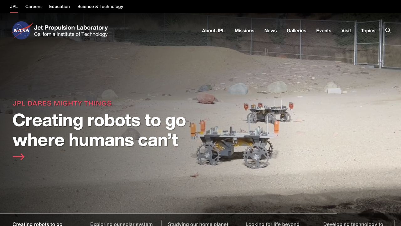
NASA JPL opens on a rover moving through a testing landscape, with a short mission-led statement anchored at the left. Its institutional identity remains readable above the image, while a separate black utility strip distinguishes careers, education, and science resources. The lower edge introduces several alternative research stories in a horizontal band. Red accents give the current story a recognizable emphasis without turning the entire interface into a space-themed illustration. The official Tailwind showcase names this specific JPL property.
What you can learn
Use a shared spacing and typography system to keep a large institutional navigation stable while the featured mission changes. A utility-first stylesheet can support that consistency, but the photograph, overlay, and headline still need independent contrast checks. Preserve ordinary links to mission information when video is paused or unavailable.
Pros
The utility strip separates institutional audiences from the main editorial navigation.
The image shows actual work instead of an abstract science graphic.
Cons & considerations
Navigation over moving imagery needs dependable contrast across every frame.
The large opening delays detailed mission information until visitors continue.
Vue.jsFramework dependency association; not independently observed
Earlier cited evidence retained; no current scan result. References may be embedded or legacy—not a complete backend inventory.
Platform source: Official Tailwind CSS Showcase. The official Tailwind CSS Showcase names this public property. Platform evidence is separate from the direct website screenshot and is not a complete current infrastructure audit.
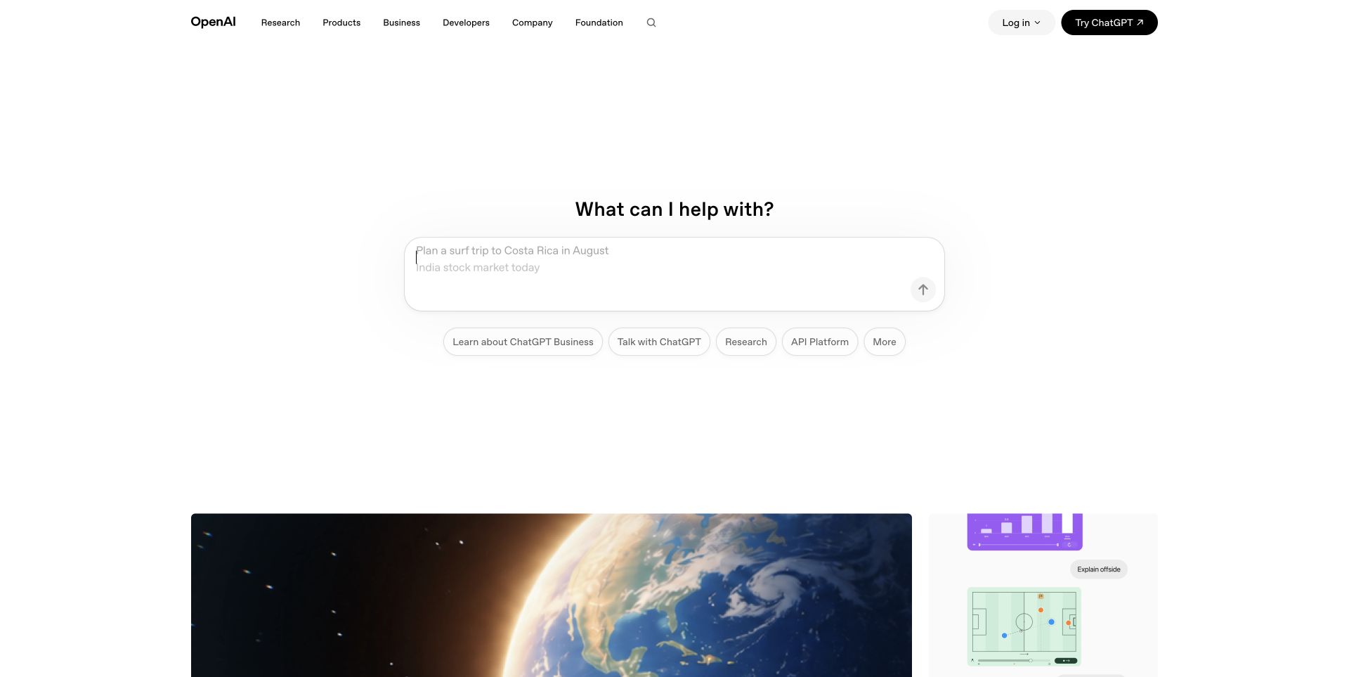
OpenAI centers an invitation to ask for help above a broad rounded prompt field. A small row of topic and product pills gives visitors alternatives without filling the page with competing cards. The white navigation shell keeps research, business, developers, and company routes distinct, with account actions at the opposite edge. Editorial imagery begins below the spacious introduction. Tailwind’s official showcase associates this public website with the framework; the capture is not a private ChatGPT conversation or account screen.
What you can learn
The reusable pattern is an unusually small set of surface, border, and action rules around one dominant task. Decide which controls really initiate a product experience and which simply navigate to information. Keep useful explanatory text and normal links available for visitors who do not want to start by entering a prompt.
Pros
The central field makes the intended first interaction unmistakable.
Audience-specific navigation remains available outside the conversational entry point.
Cons & considerations
Large empty areas provide little immediate context for an unfamiliar visitor.
Suggested prompts and product links need clear destinations to avoid ambiguous expectations.
Earlier cited evidence retained; no current scan result. References may be embedded or legacy—not a complete backend inventory.
Platform source: Official Tailwind CSS Showcase. The official Tailwind CSS Showcase names this public property. Platform evidence is separate from the direct website screenshot and is not a complete current infrastructure audit.
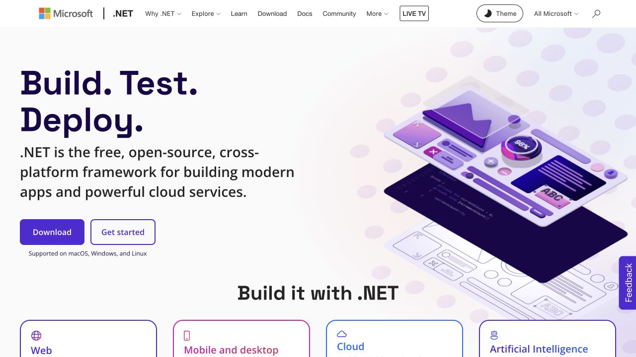
Microsoft’s .NET website pairs a three-line purple headline with a layered illustration of application surfaces. The left-hand description explains the platform before two distinct actions offer downloading or getting started. The Microsoft and .NET identities share a compact header, with learning, documentation, community, and theme controls kept above the introduction. Four application-category cards begin immediately below it. The selected property is the official .NET website featured by Tailwind, not a claim that Microsoft’s entire web estate uses one stylesheet.
What you can learn
Borrow the transition from a simple platform statement to concrete application categories. Tailwind tokens can make the buttons, borders, and category cards consistent while allowing different illustrations. Keep the first decision about visitor intent rather than forcing a newcomer to choose an operating system before understanding what the framework is for.
Pros
Download and learning actions serve different stages of evaluation.
The application cards make the broad platform description more concrete.
Cons & considerations
The layered illustration contains small details that lose meaning on phones.
A long ecosystem navigation requires careful grouping as more resources appear.
Public source checked November 3, 2026. References may be embedded or legacy—not a complete backend inventory.
Platform source: Official Tailwind CSS Showcase. The official Tailwind CSS Showcase names this public property. Platform evidence is separate from the direct website screenshot and is not a complete current infrastructure audit.
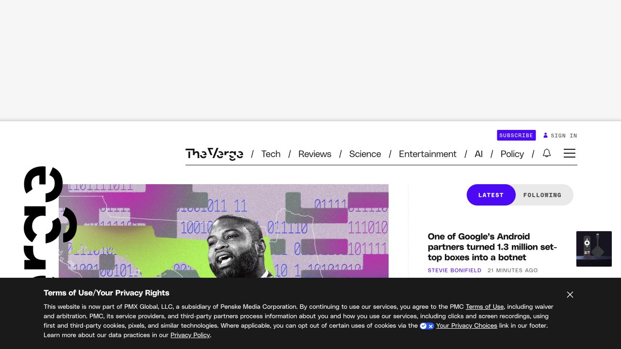
The Verge uses a distinctive masthead and very heavy display typography to distinguish its editorial identity from a generic news grid. A horizontal topic menu sits above the lead image, while a separate latest-news column begins on the right. Purple subscription and active-state accents stand out against an otherwise restrained black-and-white shell. The captured first view includes a large advertising reserve and a privacy notice, both of which affect how much journalism is immediately visible. Tailwind’s showcase names the publication itself.
What you can learn
Treat advertising, consent, subscription, and editorial content as one layout problem rather than separate late additions. Reusable utility classes can help align modules, but they cannot determine which module deserves the first viewport. Test representative article lengths and empty advertising states before approving a publication’s shared homepage template.
Pros
Topic navigation and the latest stream provide different browsing routes.
A distinctive type system gives repeated news modules a recognizable identity.
Cons & considerations
The large reserved area reduces immediately visible editorial content.
Consent messaging can obscure the lead story on a shorter display.
ReactAssociated with Next.js; not independently observed
Public source checked November 3, 2026. References may be embedded or legacy—not a complete backend inventory.
Platform source: Official Tailwind CSS Showcase. The official Tailwind CSS Showcase names this public property. Platform evidence is separate from the direct website screenshot and is not a complete current infrastructure audit.
Shopify’s captured homepage layers large lightweight white type over a darkened portrait. The introduction and short supporting copy occupy the lower left, with a white free-start action directly beneath them. Its main navigation stays compact across the top, and an additional agent-oriented starting control sits at the lower right. The photographic treatment creates a campaign mood rather than demonstrating a merchant dashboard. Tailwind’s official showcase names Shopify’s marketing property, not every independent store built on the commerce platform.
What you can learn
A campaign-driven Tailwind implementation benefits from a stable header and a small set of reliable overlay styles. Keep content order independent of the photograph, test unusually light image frames, and provide a static alternative to moving media. The evaluation journey should not depend on recognizing the person or understanding the campaign context.
Pros
The trial action remains close to the main value statement.
A limited number of header destinations prevents the campaign becoming a sitemap.
Cons & considerations
The first view explains little about everyday merchant operations.
Image-led contrast requires more care than applying one dark overlay universally.
Public source checked November 3, 2026. References may be embedded or legacy—not a complete backend inventory.
Platform source: Official Tailwind CSS Showcase. The official Tailwind CSS Showcase names this public property. Platform evidence is separate from the direct website screenshot and is not a complete current infrastructure audit.
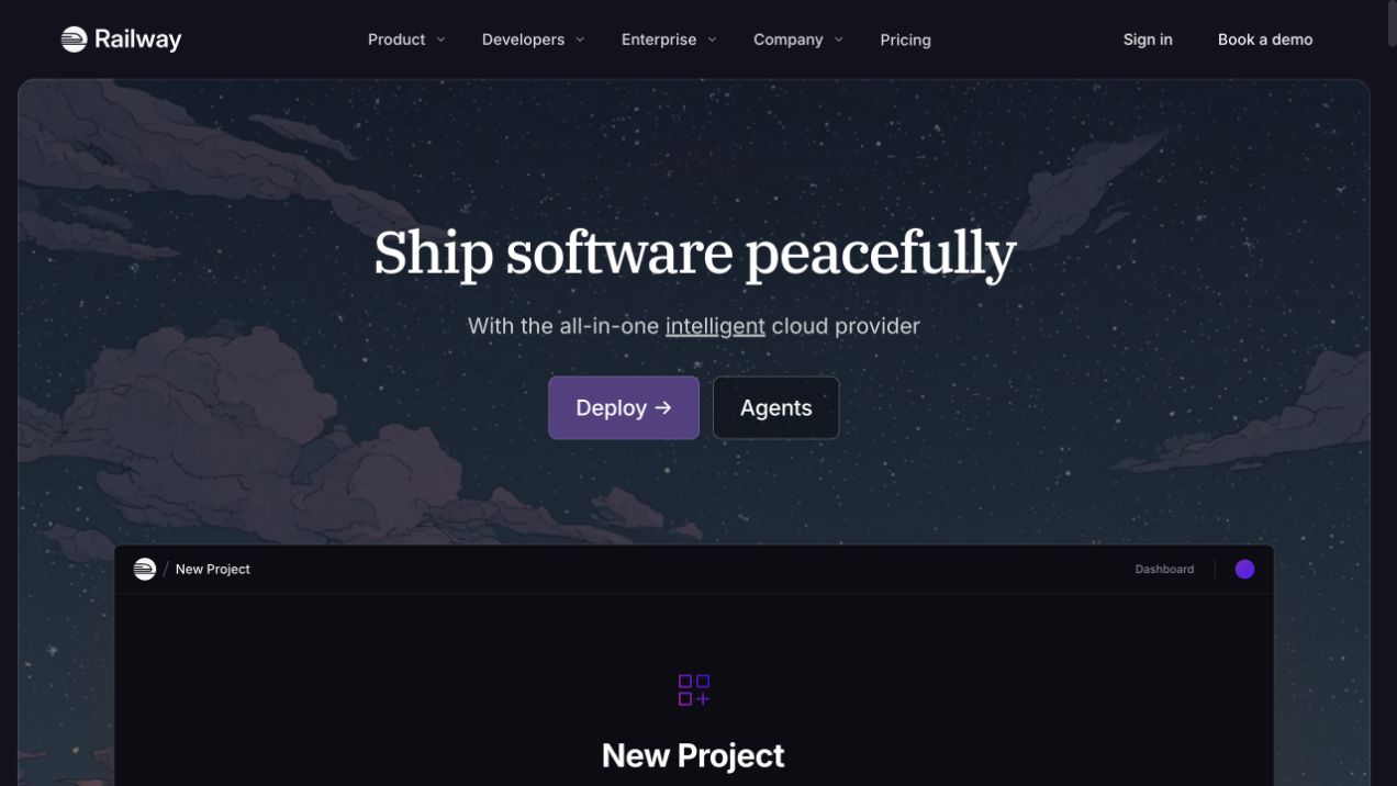
Railway places a centered serif introduction over an illustrated nighttime sky. A purple deployment action and a quieter agents link sit beneath the short explanation, while a dark new-project preview begins in the same rounded scene. The header separates product, developers, enterprise, company, and pricing without adding a second utility row. The composition deliberately contrasts the calm landscape with the operational interface below it. The exact public Railway website is named in the official Tailwind showcase.
What you can learn
The useful lesson is to create a consistent frame before introducing detailed product screenshots. Shared spacing, border, and color tokens can connect illustration and interface without forcing them into identical styling. Make the deployment route an ordinary link, retain a clear description outside animation, and ensure the preview has a useful initial state.
Pros
The single purple primary action stands out from the dark environment.
The product preview connects an atmospheric headline to a real task.
Cons & considerations
The introductory illustration occupies space that could explain supported workloads.
Dark interface details need stronger contrast when the preview is scaled down.
Public source checked November 3, 2026. References may be embedded or legacy—not a complete backend inventory.
Platform source: Official Tailwind CSS Showcase. The official Tailwind CSS Showcase names this public property. Platform evidence is separate from the direct website screenshot and is not a complete current infrastructure audit.
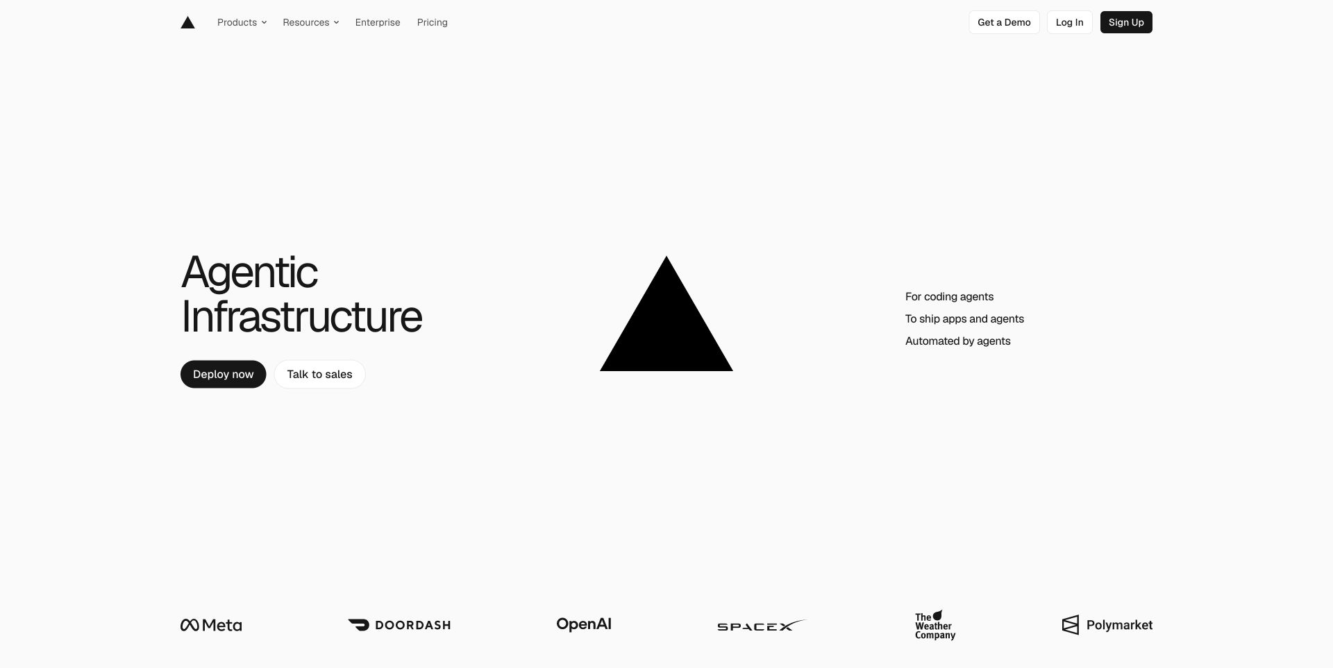
Vercel’s captured homepage divides an expansive white canvas into three parts: an infrastructure statement with two actions, a large black triangle, and a compact supporting list. A row of recognizable customer marks begins at the bottom. The thin header gives product, resource, enterprise, and pricing routes their own places, while account controls stay to the right. Tailwind’s official showcase names this public property. The image provides an example of restrained composition rather than evidence about customers’ infrastructure or business results.
What you can learn
Utility-first CSS does not require a dense card grid or a familiar gradient hero. Establish a few layout primitives and use them to create a deliberate relationship between text, brand shape, and supporting evidence. Reserve more complex components for sections where interaction helps someone understand the offering, rather than adding motion to fill whitespace.
Pros
The primary deployment and sales routes have visibly different roles.
The brand mark supplies a focal point without requiring a large photograph.
Cons & considerations
A broad infrastructure phrase needs more concrete explanation below.
The large decorative center leaves less room for first-time product education.
Public source checked November 3, 2026. References may be embedded or legacy—not a complete backend inventory.
Platform source: Official Tailwind CSS Showcase. The official Tailwind CSS Showcase names this public property. Platform evidence is separate from the direct website screenshot and is not a complete current infrastructure audit.
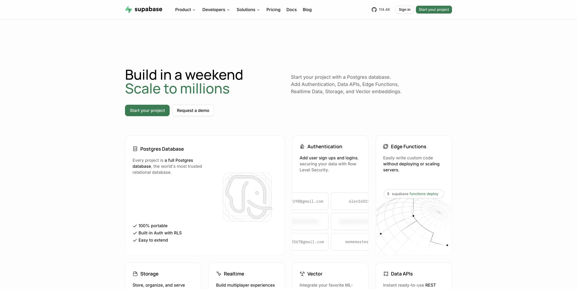
Supabase pairs a black-and-green two-line statement with a plain-language capability description on the right. The next row is already visible: a wide database card sits beside smaller authentication and edge-function cards. Their quiet borders and pale diagrams share a consistent visual grammar without making each item identical in size. Documentation and pricing remain direct header destinations. Tailwind’s official showcase names this public marketing property; the pictured capability cards do not establish how the service’s backend is implemented.
What you can learn
A utility-based design system should encode relationships, not just repeat rectangles. Use consistent text and surface tokens while allowing the primary capability a larger area. Keep each card’s heading and explanation meaningful without the decorative diagram, and connect it to a specific evaluation or documentation destination instead of sending every route to signup.
Pros
The larger database card communicates hierarchy within the product family.
Short explanatory copy stays visible alongside each capability label.
Cons & considerations
The subtle diagrams can become indistinct when reduced to mobile width.
A broad capability grid can delay details about practical limits and pricing.
Public source checked November 3, 2026. References may be embedded or legacy—not a complete backend inventory.
Platform source: Official Tailwind CSS Showcase. The official Tailwind CSS Showcase names this public property. Platform evidence is separate from the direct website screenshot and is not a complete current infrastructure audit.
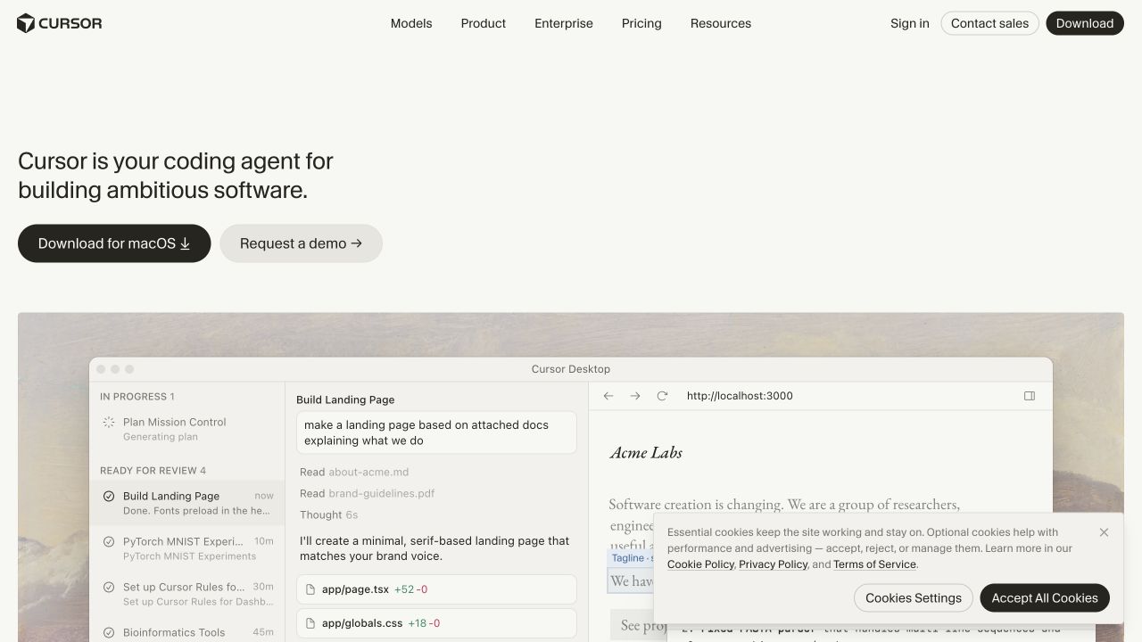
Cursor’s homepage uses a quiet off-white canvas and a small left-aligned product statement instead of an oversized slogan. Downloading and requesting a demo are separate actions beneath it. A wide desktop interface then shows a project sidebar beside a website preview, grounding the introduction in an observable workflow. The compact header preserves product, model, enterprise, pricing, and resource routes. The capture includes a consent panel over the demonstration. Tailwind’s showcase associates the named public Cursor property with the framework.
What you can learn
Borrow the emphasis on a stable product frame rather than decorative interface fragments. A shared utility vocabulary can keep controls and spacing coherent, but the demonstration needs its own responsive crop and explanatory context. Keep download behavior distinguishable from an ordinary navigation link, and ensure privacy controls do not permanently cover the crucial example.
Pros
The demonstration connects the product description to a recognizable working surface.
Self-service download and sales evaluation have separate visual treatments.
Cons & considerations
Small interface details become difficult to read in a reduced screenshot.
The opening gives limited explanation before asking an unfamiliar visitor to download.
Public source checked November 3, 2026. References may be embedded or legacy—not a complete backend inventory.
Platform source: Official Tailwind CSS Showcase. The official Tailwind CSS Showcase names this public property. Platform evidence is separate from the direct website screenshot and is not a complete current infrastructure audit.
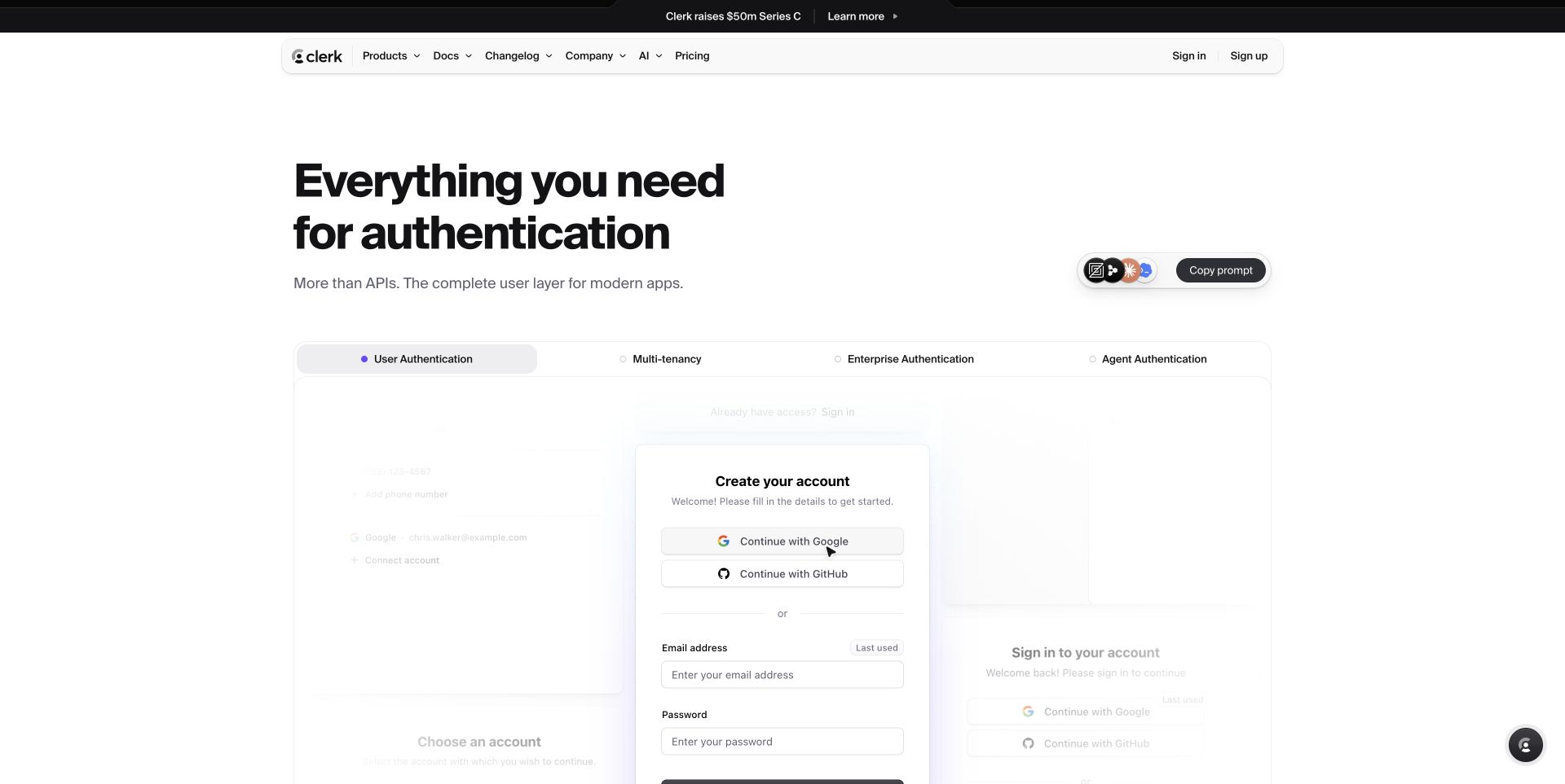
Clerk uses a heavy black product statement above a broad authentication specimen. A horizontal tab row distinguishes user, multi-tenant, enterprise, and agent authentication, while a sample account-creation card sits within a softer field of related interfaces. The rounded header and restrained purple accent create a consistent family of surfaces. A small prompt-copy control sits apart from the main explanation. The official Tailwind showcase names this marketing website; no live registration or private identity data was entered during review.
What you can learn
A shared utility system can make a marketing specimen feel related to the product without embedding its actual account flow. Establish consistent selected, inactive, focus, and disabled treatments, then check them independently of the attractive initial state. Give the visitor a clear documentation route and label illustrative account content so it cannot be mistaken for an actual signup.
Pros
The tabs give related identity workflows a comparable common frame.
The central specimen is more concrete than a list of abstract security claims.
Cons & considerations
Faded neighboring cards can look broken or unavailable without context.
Small utility controls compete with the core explanation before evaluation begins.
Public source checked November 3, 2026. References may be embedded or legacy—not a complete backend inventory.
Platform source: Official Tailwind CSS Showcase. The official Tailwind CSS Showcase names this public property. Platform evidence is separate from the direct website screenshot and is not a complete current infrastructure audit.
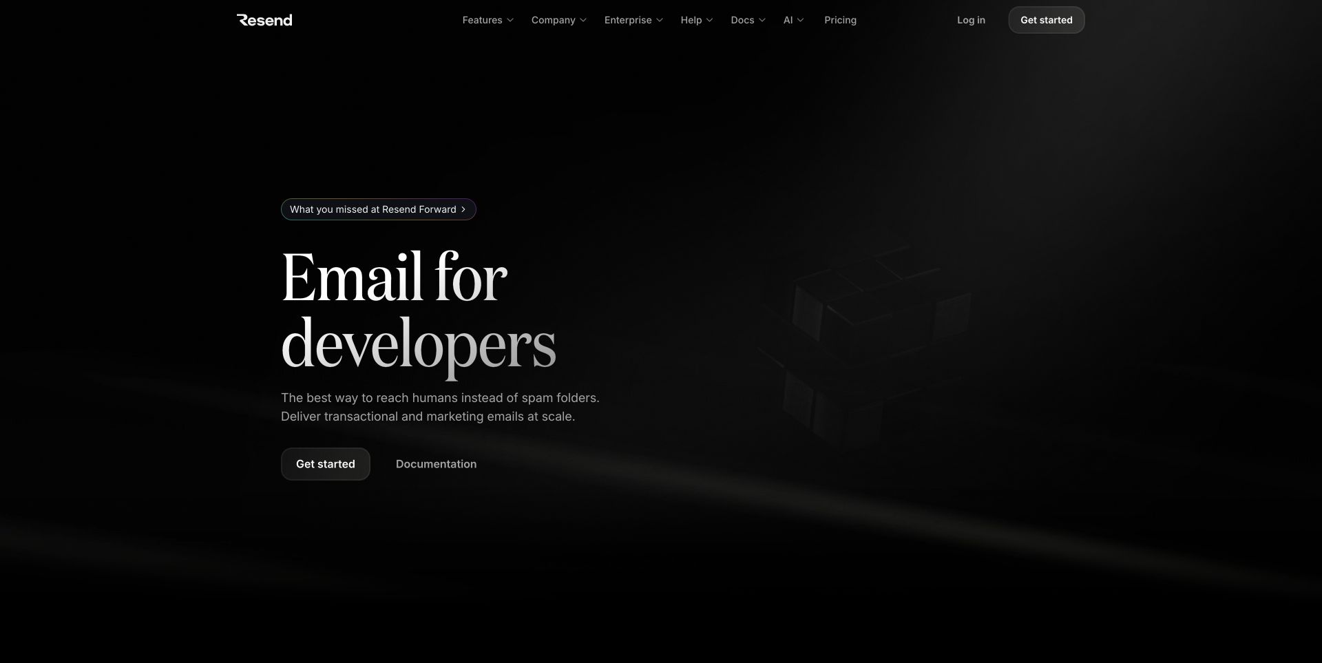
Resend places a large white serif statement at the left of a near-black introduction. A quiet dimensional illustration fills the opposite side without competing with the words. Getting started and documentation are paired below a short explanation, with a small event-recap pill above. The header groups features, company, enterprise, help, documentation, AI, and pricing. Tailwind’s official showcase identifies this public marketing property. The visual review does not evaluate delivery rates, operational reliability, or the effectiveness of the email product.
What you can learn
A reusable Tailwind system can support editorial typography just as readily as application cards. Define the hierarchy of announcement, heading, supporting copy, and action before adding a dark illustration. Keep technical documentation as a clear parallel route, and verify secondary-text contrast instead of assuming the dramatic black background makes every element easy to read.
Pros
Documentation is available beside the first product-starting action.
The restrained palette makes the introduction the clearest focal point.
Cons & considerations
The low-contrast illustration communicates atmosphere more than product detail.
A growing header taxonomy needs grouping to remain usable on smaller screens.
Public source checked November 3, 2026. References may be embedded or legacy—not a complete backend inventory.
Platform source: Official Tailwind CSS Showcase. The official Tailwind CSS Showcase names this public property. Platform evidence is separate from the direct website screenshot and is not a complete current infrastructure audit.
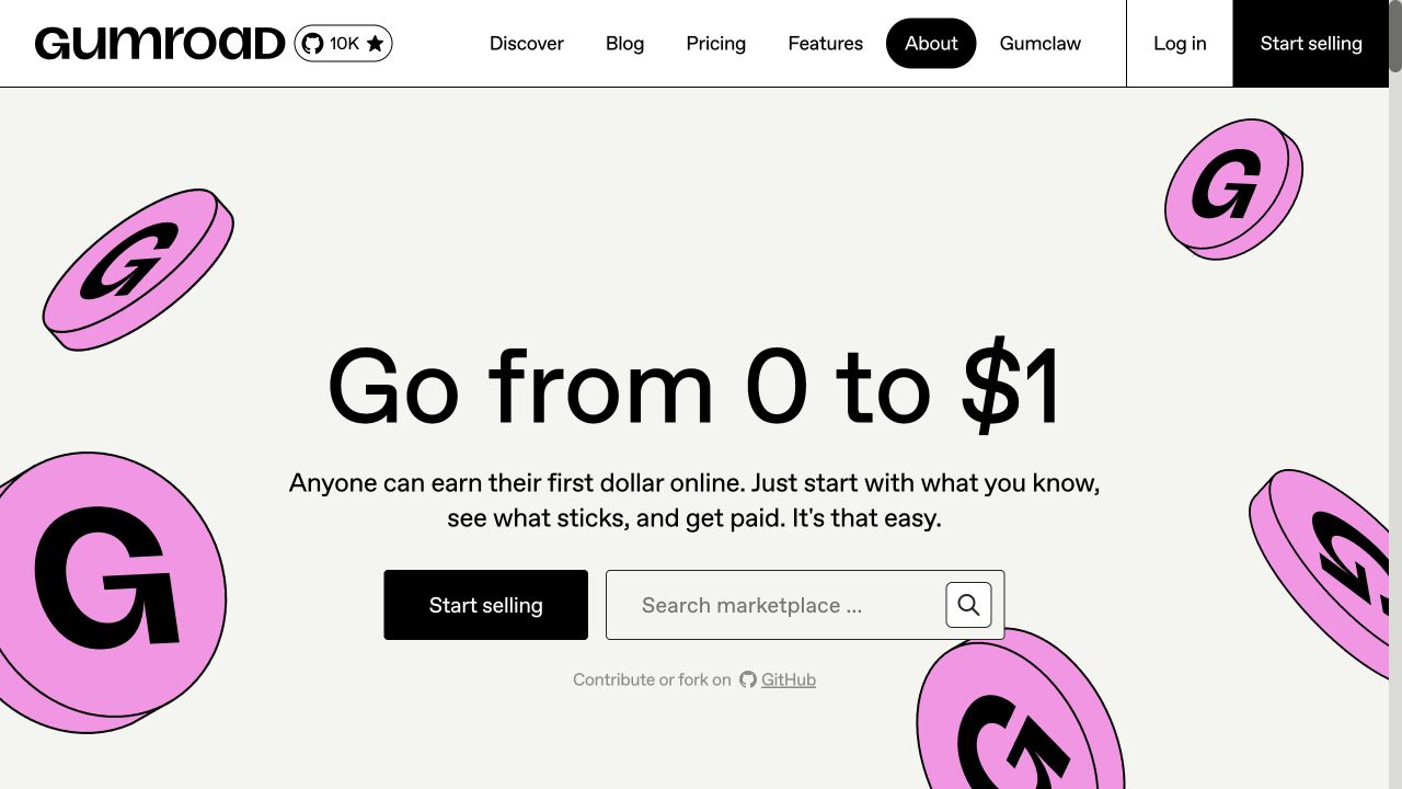
Gumroad uses black outlines, large straightforward type, and floating pink coin graphics around a centered introduction. A prominent selling action sits beside a marketplace search field, acknowledging that visitors may arrive as either creators or buyers. The top navigation preserves discovery, pricing, features, company information, and account routes. Its cream background and strong shapes create a distinct identity without intricate product rendering. The official Tailwind showcase names this public property; no marketplace search or signup was submitted in the review.
What you can learn
The transferable pattern is an intentional split between two audiences in the same opening. Build reusable action and form primitives with a clear hierarchy, but do not make every visitor pass through the seller journey. Check how decorative objects crop at narrow widths so they remain background accents rather than obstacles around the search field.
Pros
Seller and buyer routes are both visible at the first decision.
The graphic palette is memorable without depending on detailed imagery.
Cons & considerations
Large decorative coins occupy considerable space around practical controls.
A very short promise leaves operational questions for later sections.
Public source checked November 3, 2026. References may be embedded or legacy—not a complete backend inventory.
Platform source: Official Tailwind CSS Showcase. The official Tailwind CSS Showcase names this public property. Platform evidence is separate from the direct website screenshot and is not a complete current infrastructure audit.
Mux centers a bold stencil-like video introduction within a pale gridded page. A small illustrated product announcement appears above it, while documentation and sales actions sit below the short explanation. The same fine rules divide header items and the customer-mark strip, creating continuity across very different content types. The captured consent panel covers part of the lower introduction. Tailwind’s official showcase associates the named Mux website with the framework; the capture does not test any video API or account functionality.
What you can learn
Borrow the consistent structural grid rather than copying the distinctive typeface alone. A utility-first implementation should coordinate border positions, section gutters, and action sizes across breakpoints. Keep code-oriented documentation accessible from the opening, and verify that consent interfaces leave enough of the product explanation visible for a first-time visitor to understand the page.
Pros
The repeated rules create a coherent system from header to supporting proof.
Developer documentation is presented as a first-class evaluation route.
Cons & considerations
The unusual display letterforms require careful sizing for readability.
The initial consent overlay can hide the primary actions on shorter screens.
Public source checked November 3, 2026. References may be embedded or legacy—not a complete backend inventory.
Platform source: Official Tailwind CSS Showcase. The official Tailwind CSS Showcase names this public property. Platform evidence is separate from the direct website screenshot and is not a complete current infrastructure audit.
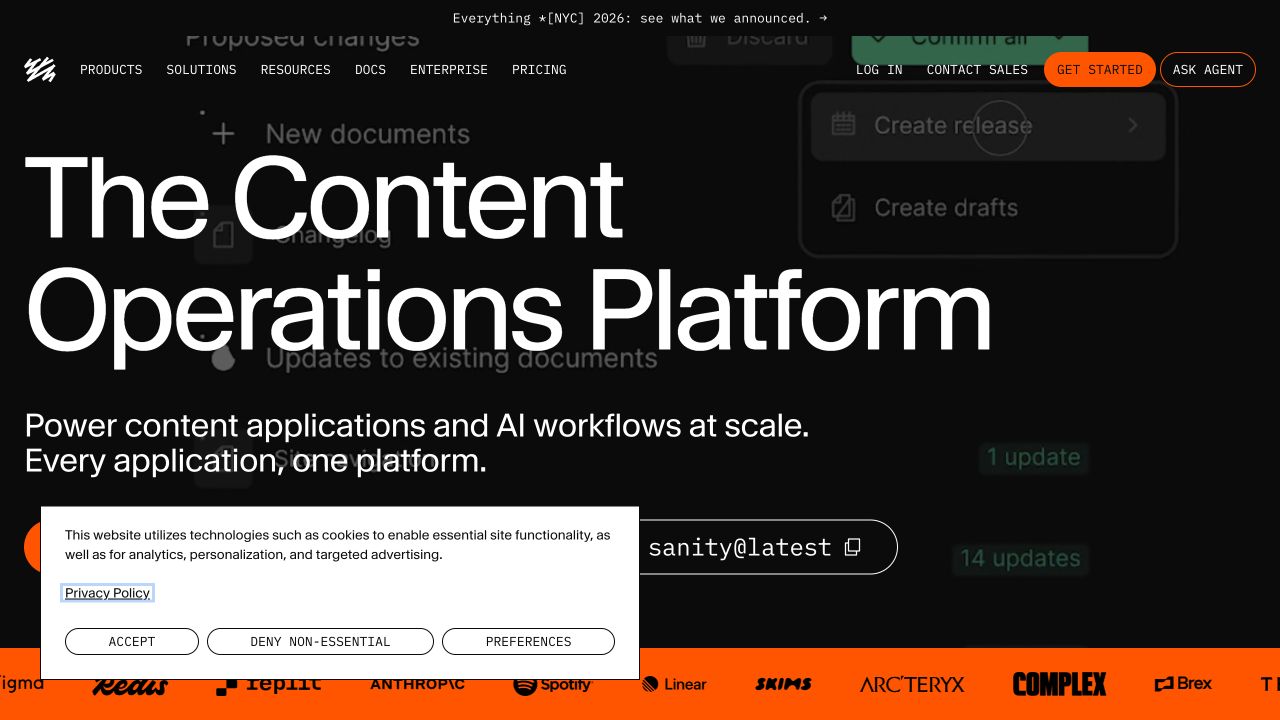
Sanity uses extremely large white text over a darkened content-workflow interface. Orange accents identify the starting control and the customer-mark band along the bottom. A compact uppercase navigation separates products, solutions, resources, documentation, enterprise, and pricing. A command-style installation control adds a developer route beside the business-oriented introduction. The captured consent notice partially overlays the lower actions. Tailwind’s official showcase names this public property; interface imagery is illustrative context rather than a tested content-management session.
What you can learn
An adaptable utility system should separate essential reading content from background application imagery. Give the heading a sensible maximum size, maintain a solid contrast treatment, and make command controls recognizable as copies rather than submissions. Decide how sales, self-service, and technical evaluation paths coexist before increasing the number of promotional elements around the hero.
Pros
The installation route acknowledges a technical audience beside the broad platform story.
Orange accents provide a consistent action and supporting-band identity.
Cons & considerations
The oversized title occupies most of the first view.
Background interface detail adds little when darkened heavily behind readable text.
Public source checked November 3, 2026. References may be embedded or legacy—not a complete backend inventory.
Platform source: Official Tailwind CSS Showcase. The official Tailwind CSS Showcase names this public property. Platform evidence is separate from the direct website screenshot and is not a complete current infrastructure audit.
Wealthfront uses a saturated purple field, an exceptionally large yield figure, and a contrasting italic comparison line. A tilted phone and card illustration give the financial proposition a familiar physical context. The header separates cash, investing, borrowing, and learning, while an additional home-lending announcement has its own pale banner above. A wide privacy notice occupies the bottom of the captured view. Tailwind’s official showcase names the public website; rates shown in this dated image are not current financial recommendations.
What you can learn
Design tokens should coordinate marketing figures with their necessary explanatory context, not just make the number larger. In a Tailwind build, keep disclosures readable, allow claims to change without breaking the layout, and test what remains visible after consent and announcement bands appear. Treat financial copy as governed content with a named review owner.
Pros
The product image connects an abstract financial benefit to a familiar interface.
The navigation uses understandable customer tasks rather than internal product codes.
Cons & considerations
Several stacked bands substantially reduce the available introductory space.
Prominent numeric claims require clear context that can be obscured below the fold.
ReactAssociated with Next.js; not independently observed
Public source checked November 3, 2026. References may be embedded or legacy—not a complete backend inventory.
Platform source: Official Tailwind CSS Showcase. The official Tailwind CSS Showcase names this public property. Platform evidence is separate from the direct website screenshot and is not a complete current infrastructure audit.
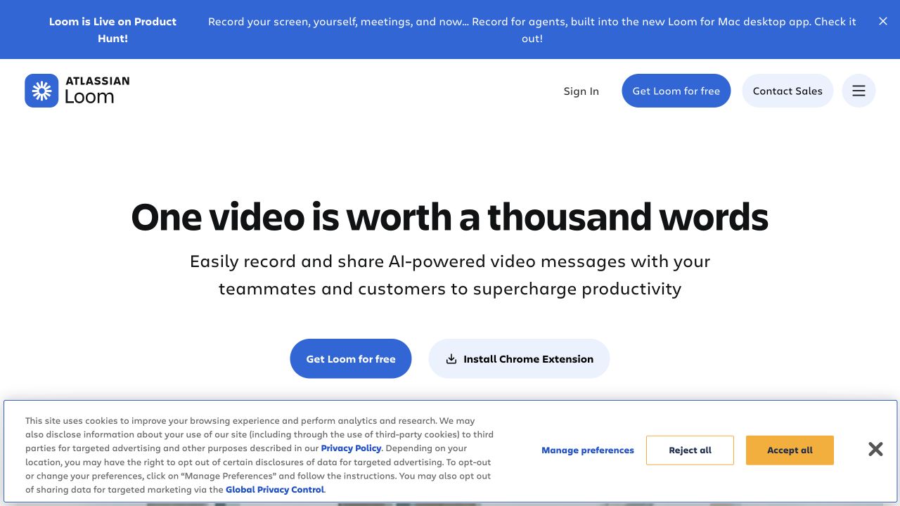
Loom’s captured homepage is a spacious white introduction with a large centered statement and a short supporting explanation. A blue free-start action sits beside a lighter browser-extension installation route. The Atlassian Loom identity appears in the upper left, while sales, account, and menu controls remain at the right. A blue product-announcement strip is separate from the permanent header. The consent band occupies the lower view. Tailwind’s official showcase names Loom’s public property; recording and installation were not initiated.
What you can learn
A utility system can make a simple page feel deliberate through consistent spacing, line length, and action variants. Keep installation choices explicit about their destination and preserve the product explanation before any media loads. Rehearse the first viewport with both an announcement and a consent banner present, not only the uncluttered design mockup.
Pros
The two starting options describe distinct actions rather than vague exploration.
The short introduction can be understood without watching a demonstration.
Cons & considerations
A broad benefit statement leaves specific recording workflows unexplained initially.
The combination of announcement and consent bands makes the first view taller.
ReactAssociated with Next.js; not independently observed
Public source checked November 3, 2026. References may be embedded or legacy—not a complete backend inventory.
Platform source: Official Tailwind CSS Showcase. The official Tailwind CSS Showcase names this public property. Platform evidence is separate from the direct website screenshot and is not a complete current infrastructure audit.
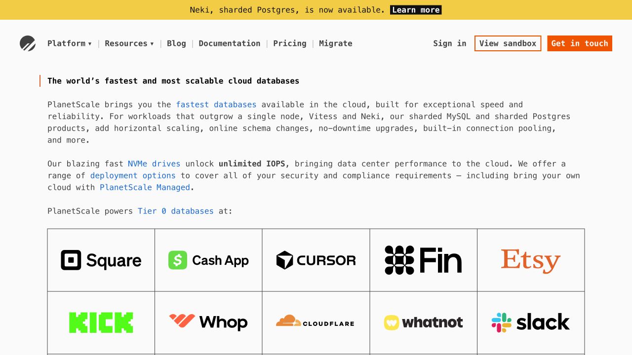
PlanetScale uses a monospaced typographic treatment, restrained orange actions, and a yellow product-announcement band. Several explanatory paragraphs introduce database offerings before a large customer-logo grid begins. Fine borders connect the grid to the straightforward navigation, which includes documentation, pricing, and migration. Unlike many software references, the opening spends substantial space on technical context rather than a dashboard image. The official Tailwind showcase associates this exact public property with the framework; the visible marketing claims are not independently benchmarked here.
What you can learn
Borrow the willingness to explain the product before adding visual spectacle. Utility classes can maintain a coherent reading width, border rhythm, and inline-link treatment across technical copy. Distinguish claim, supporting documentation, and action clearly, and ensure the mobile version preserves comfortable line lengths instead of shrinking an already dense desktop paragraph.
Pros
Documentation and migration are explicit navigation destinations.
The text-first opening gives concrete architecture context before decorative media.
Cons & considerations
Long introductory paragraphs demand more reading effort than a short summary.
A large customer grid can push practical evaluation details further down.
Public source checked November 3, 2026. References may be embedded or legacy—not a complete backend inventory.
Platform source: Official Tailwind CSS Showcase. The official Tailwind CSS Showcase names this public property. Platform evidence is separate from the direct website screenshot and is not a complete current infrastructure audit.
Algolia’s deep-blue introduction puts a stacked white capability statement at the left and a person holding a laptop on the right. Code-like text and an agent-assistant treatment connect the photograph to the technical offering. The header distinguishes company utilities from product navigation, with a search field and two prominent evaluation actions. The captured privacy and chat interfaces cover portions of the lower hero. Tailwind’s official showcase names this public property; no search query, chat message, or account action was submitted.
What you can learn
Treat support widgets, site search, promotional messaging, and the hero as a coordinated interaction budget. Shared Tailwind tokens can align their shapes, but visual consistency does not reduce the number of decisions. Establish one dominant next step, keep secondary controls quiet, and test overlay collisions at the smallest supported viewport.
Pros
The human image gives an abstract search platform a relatable focal point.
Business utilities are visually separated from the main product routes.
Cons & considerations
Multiple overlays obscure a substantial part of the first impression.
Several equally prominent evaluation controls can dilute the primary decision.
Public source checked November 3, 2026. References may be embedded or legacy—not a complete backend inventory.
Platform source: Official Tailwind CSS Showcase. The official Tailwind CSS Showcase names this public property. Platform evidence is separate from the direct website screenshot and is not a complete current infrastructure audit.
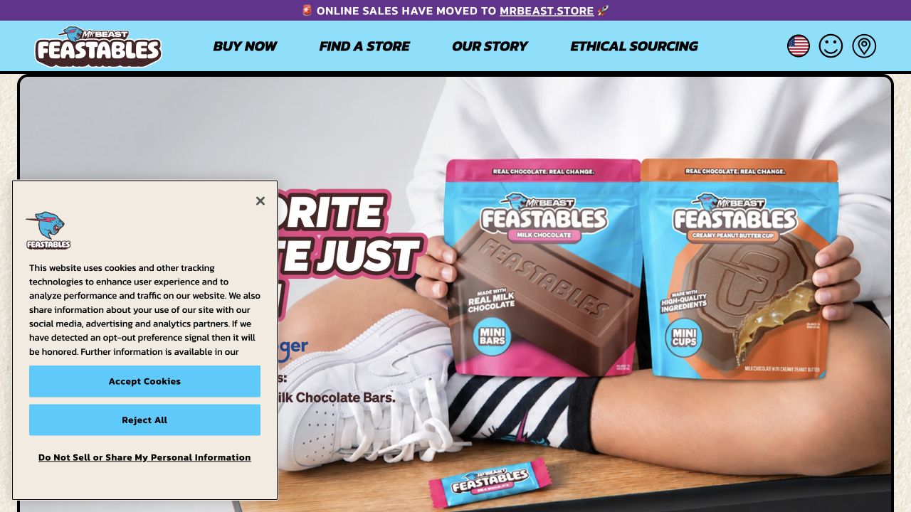
Feastables uses a cyan navigation band and a large lifestyle photograph of brightly packaged chocolate products. Heavy outlined type and the packaging palette create a playful visual identity, while buying, store finding, brand story, and sourcing remain simple top-level choices. A narrow purple announcement explicitly says online sales have moved to another store. The captured consent panel overlays the lower left of the photograph. Tailwind’s official showcase names Feastables; the separate merchant destination was not visited or tested.
What you can learn
Borrow the consistency between packaging, navigation, and campaign lettering without treating the photograph as the entire content model. A utility-first system should leave enough editable space for product and retailer announcements. Make outbound buying routes explicit, and check that decorative type remains readable when a campaign image or product assortment changes.
Pros
The real packaging communicates the product category immediately.
Store finding and ethical sourcing are easy to locate in the main navigation.
Cons & considerations
A consent panel obscures much of the promotional copy in the capture.
Shopping on a separate property introduces a transition that needs clear explanation.
Public source checked November 3, 2026. References may be embedded or legacy—not a complete backend inventory.
Platform source: Official Tailwind CSS Showcase. The official Tailwind CSS Showcase names this public property. Platform evidence is separate from the direct website screenshot and is not a complete current infrastructure audit.
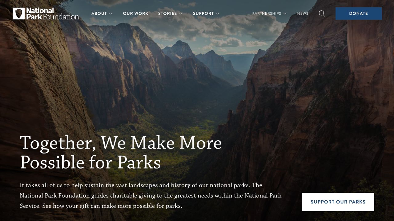
The National Park Foundation fills its opening with a dramatic canyon photograph, darkened enough for a large serif appeal at the lower left. A short explanatory paragraph gives the organization’s role, while a pale support action sits opposite it. The white identity and compact navigation stay above the landscape, with a blue donation control at the upper right. Tailwind’s official showcase names this public foundation website; the imagery and interface review do not establish donation outcomes or campaign effectiveness.
What you can learn
A shared utility system should make a photo-led appeal resilient across different landscapes and text lengths. Define reliable overlays, readable paragraph widths, and an accessible action color before expanding the campaign library. Keep institutional context in actual text, not only the photograph, and preserve clear routes for people seeking information rather than making an immediate gift.
Pros
The opening explains the foundation’s role beside the emotional appeal.
Support actions remain visible in both the header and the main introduction.
Cons & considerations
Overlay navigation must remain legible across changing landscape imagery.
The large image postpones specific program detail until later sections.
Visible tech stack
Earlier / documented evidence
Tailwind CSS
Earlier cited evidence retained; no current scan result. References may be embedded or legacy—not a complete backend inventory.
Platform source: Official Tailwind CSS Showcase. The official Tailwind CSS Showcase names this public property. Platform evidence is separate from the direct website screenshot and is not a complete current infrastructure audit.
Choose the right boundary between utilities and components
Use utilities directly for genuinely one-off composition
A campaign section can compose existing tokens without a new abstraction for every wrapper. Keep the document structure readable and ensure the unusual layout still behaves with long text, missing media, and a narrow viewport.
Extract components when behavior and meaning repeat
Repeated navigation items, form controls, cards, and consent interfaces benefit from a shared component that owns semantics and state. Reuse the rule rather than copying a long class string into twenty places and hoping future fixes stay synchronized.
Adopt a component library only after checking ownership
Review its keyboard behavior, styling escape hatches, update policy, license, and dependency model. Decide whether your team owns copied components or receives changes from a maintained package. Tailwind compatibility alone does not answer those operational questions.
From references to requirements
Plan the styling system around publishing and maintenance
Build a representative content specimen
Include a short and long title, dense navigation, tables, an error message, a no-image card, a dark section, and a real form. Test these together before declaring the token system complete; the polished homepage is only one consumer.
Keep class generation predictable
Tailwind scans source files for class names. Use complete, statically detectable class names and explicit mappings for variants instead of constructing partial class strings from arbitrary content. Record the source locations and generation rules in the handover.
Review visual differences across a small set of important templates whenever shared tokens change. Assign ownership for dependencies and browser support, and keep a tested rollback path. A compact CSS output does not eliminate regressions caused by a global token change.
A useful handover demonstration
Ask the actual team to carry out its routine job: publish a realistic update, correct a mistake, preview a narrow screen, and identify who owns an integration failure. For a library or frontend framework, also ask who maintains the content source and deployment. A polished screenshot does not answer those operational questions.
Beyond the screenshot
A Tailwind CSS checklist beyond attractive utility classes
Define a small documented set of type, space, color, and surface tokens.
Check representative long content and missing-media states.
Verify focus-visible, selected, disabled, invalid, and loading presentations.
Use complete class names that the source scanner can detect.
Test navigation, consent, chat, and announcement overlays together.
Check dark sections, image overlays, and secondary-text contrast.
Review keyboard use, reduced motion, zoom, and narrow viewports.
Assign component ownership and a visual regression review routine.
Test with real content, a keyboard, a small screen, slow or failed requests, and the people who will maintain the system. These are planning checks, not an accessibility, security, performance, or search-ranking certification.
Sources & editorial method
How this Tailwind CSS collection was reviewed
Platform association comes from Tailwind’s official showcase and applies to the exact named public properties. Direct desktop captures supply the visual observations. The collection does not infer a current version, every CSS rule, full stack, AI authorship, or performance results from the appearance of a website.
Every image is an unmodified capture from the actual website, with its source and capture date. Some captures are reused from our shared catalog; their dates remain the original capture dates. None comes from a vendor gallery or a generated reconstruction. Moving imagery and live content can change.
Technology attribution uses public page assets or metadata, official platform documentation, or a cited first-party project case study. Documentary and framework-relationship evidence is identified where used; it is not a complete current backend inventory. A CMS image CDN alone does not establish a full CMS deployment. A library’s presence does not prove which individual controls use it, and a platform label does not establish AI authorship.
The composition notes, lessons, pros and tradeoffs are original editorial observations. We have not measured conversion, traffic, security, performance or accessibility conformance. Website owners retain their brands and imagery; these examples are not our client portfolio. Written, Edited and Curated are independent records, not dates advanced by a build. See our editorial standards or suggest a correction.
Questions worth asking
Tailwind CSS website development FAQs
Do Tailwind websites all look the same?
No. The framework provides styling utilities rather than one fixed theme. The examples show very different type, color, density, imagery, and content strategies. Similarity usually comes from reused design choices or component defaults, not the mere presence of Tailwind.
Is a Tailwind website necessarily built with React?
No. Tailwind is a CSS tool and can be used with many frontend approaches. This collection only names separately supported technologies; a Tailwind showcase association does not establish React, a CMS, or a hosting provider.
Can nontechnical staff edit a Tailwind website?
That depends on the CMS and editing interface provided by the implementation. Request a demonstration of changing a real page, not just a promise that the stylesheet is flexible. Styling utilities do not provide an editorial interface.
Does a showcase listing prove the entire current stack?
No. It supports an attributed association with the named property. A redesign can change implementation details, and a company can run many unrelated properties. The review keeps that qualification separate from the directly observed screenshot.
Borrow a coherent rule, not a pile of classes. Start with the decisions your content needs, then build the smallest styling and component system that keeps those decisions consistent.