An Astro reference is most useful when you study what stays simple. Clear routes, readable content, and carefully chosen interactive areas can matter more than a spectacular opening animation. The framework is a delivery choice, not a visual style.
This collection considers named public properties associated with Astro through official project sources and documented platform evidence. A corporate homepage, a campaign, and a documentation site can use different systems even when they belong to the same organization. The notes keep that scope visible.
Use the examples to write a better brief: what should a visitor understand immediately, which task actually needs JavaScript, and how will an editor publish the next page? The right amount of interactivity comes from those answers, not from copying the busiest reference.
Before the examples
What makes good Astro website development in 2026?
Let meaningful HTML carry the first explanation
Start by writing the page as a readable document: one main heading, useful section names, normal links, and a clear next step. A decorative reveal should not be the only way essential copy appears. Ask to inspect the initial page and a slow connection before approving animation work. A content-first framework does not excuse missing structure, difficult language, or a hero that explains nothing.
Draw an interaction boundary around each real task
Separate a product configurator, filtered directory, or calculator from the text and images surrounding it. Astro’s islands model provides a way to hydrate selected interactive components rather than treating every page as one client application. In the brief, name each island’s inputs, loading state, failure behavior, and owner. Do not add several UI frameworks merely because the integration list makes that possible.
Design the content model before collecting screenshots
List the recurring things the team publishes: products, locations, articles, staff, or projects. Give each a stable URL and a small set of fields with sensible optional states. Astro content collections can organize and validate structured content, but the organization still has to decide what an editor is responsible for. A missing image, incomplete introduction, or unusually long title should be an expected case.
Compare the permanent reading and navigation system around the changing imagery. The captures show the named public page, not a private editor, a performance audit, or the organization’s complete infrastructure.
We start with five recognizable brands or organizations: Porsche United States, Cloudflare public website, IKEA Global, Unilever Global, Microsoft Fluent 2 design system. Each attribution applies to the named website property, not every product or website belonging to its organization. This is a curated reading sequence, not a measured ranking.
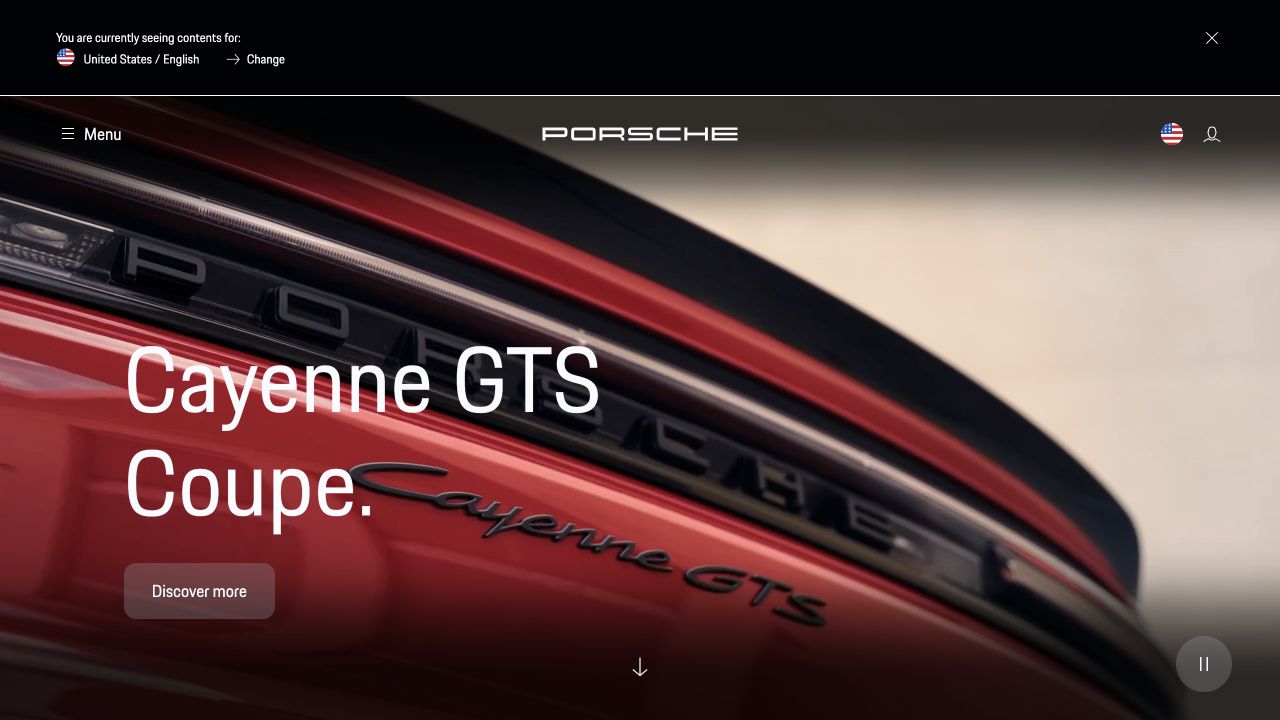
Porsche’s United States homepage places a close view of a red vehicle behind exceptionally large white model lettering. The centered wordmark, quiet menu control, and small account utilities keep the image dominant. One translucent discovery link anchors the lower left; a pause control and downward cue remain separate. A country banner occupies its own dark strip above the navigation. Astro’s showcase links Porsche’s public property; this regional capture does not identify the software inside a configurator or dealership system.
What you can learn
Borrow the separation between stable navigation and a replaceable model campaign. An Astro page can deliver that content shell while selectively adding media controls, but the reference is a design observation, not a measured loading-speed result. Specify a readable still image and link treatment before approving video.
Pros
The car detail supplies a strong focal point without extra decorative panels.
The primary discovery action stays next to the model name.
Cons & considerations
An unfamiliar visitor sees little range information in the initial screen.
Moving close-ups require contrast checks across more than one frame.
Public source checked November 3, 2026. References may be embedded or legacy—not a complete backend inventory.
Platform source: Official Astro showcase / first-party project source. Astro's official showcase links the named Porsche public website public property. This is an attributed platform association, not a claim about a specific version, backend, or every corporate system. Platform evidence is separate from the direct website screenshot and is not a complete current infrastructure audit.
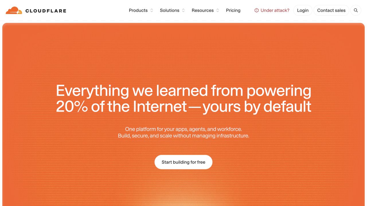
Cloudflare uses a large orange rounded panel beneath a compact white header. Its central statement spans two lines, followed by a short platform explanation and a single white starting action. A faint dotted texture adds depth without introducing an application screenshot or unrelated illustration. Products, solutions, resources, and pricing remain straightforward top-level routes; sales and account controls are grouped to the right. Astro’s official showcase attributes this public marketing website to Astro, not Cloudflare’s customer dashboard or all hosted services.
What you can learn
A content-first framework does not require a visually quiet brand. Keep the introductory claim, supporting explanation, and first action independently editable, and let a small reusable set of spacing rules establish hierarchy. Test the long headline at narrow widths before adding animated backgrounds or further promotional layers.
Pros
The saturated hero is immediately recognizable and easy to scan.
The header preserves direct routes to pricing and product detail.
Cons & considerations
The broad proposition leaves individual use cases for a later step.
A very large text panel can delay practical proof below the fold.
Public source checked November 3, 2026. References may be embedded or legacy—not a complete backend inventory.
Platform source: Official Astro showcase / first-party project source. Astro's official showcase links the named Cloudflare public website public property. This is an attributed platform association, not a claim about a specific version, backend, or every corporate system. Platform evidence is separate from the direct website screenshot and is not a complete current infrastructure audit.
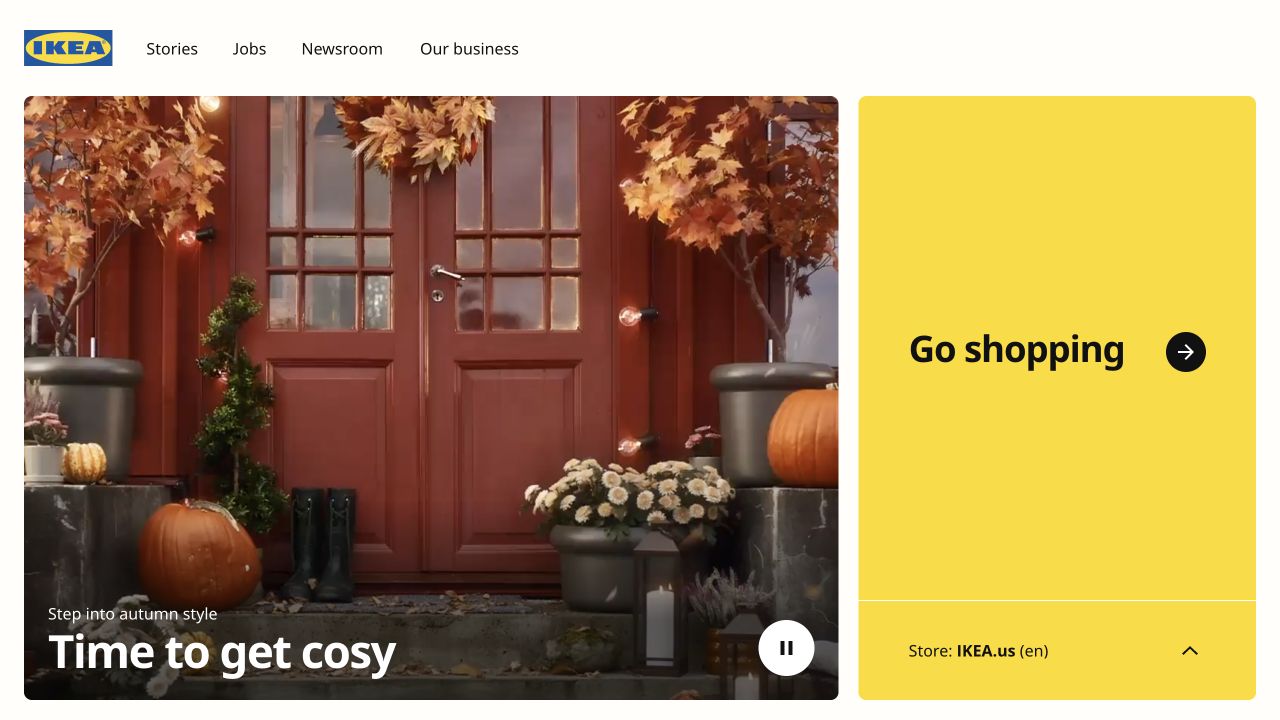
IKEA Global divides the first view into a wide seasonal photograph and a narrower yellow shopping panel. The image shows a decorated front door with a short caption near its lower edge. Beside it, the shopping destination receives unusually generous space, a strong black label, and a visible regional store indicator. A small logo and four editorial navigation links form the header. This is the global property linked by Astro’s showcase; it is not evidence that every country store shares its implementation.
What you can learn
Treat global orientation as a real user task rather than a hidden footer setting. A mostly editorial Astro shell can guide visitors toward the appropriate transactional property without pretending to contain the entire store. Keep region selection understandable and ensure seasonal media never hides the shopping route.
Pros
Editorial exploration and shopping have clearly different visual homes.
The selected country store is visible before leaving the global site.
Cons & considerations
The large seasonal image reveals little about the available product range.
Separate global and local experiences need careful language and destination labels.
Public source checked November 3, 2026. References may be embedded or legacy—not a complete backend inventory.
Platform source: Official Astro showcase / first-party project source. Astro's official showcase links the named IKEA Global public property. This is an attributed platform association, not a claim about a specific version, backend, or every corporate system. Platform evidence is separate from the direct website screenshot and is not a complete current infrastructure audit.
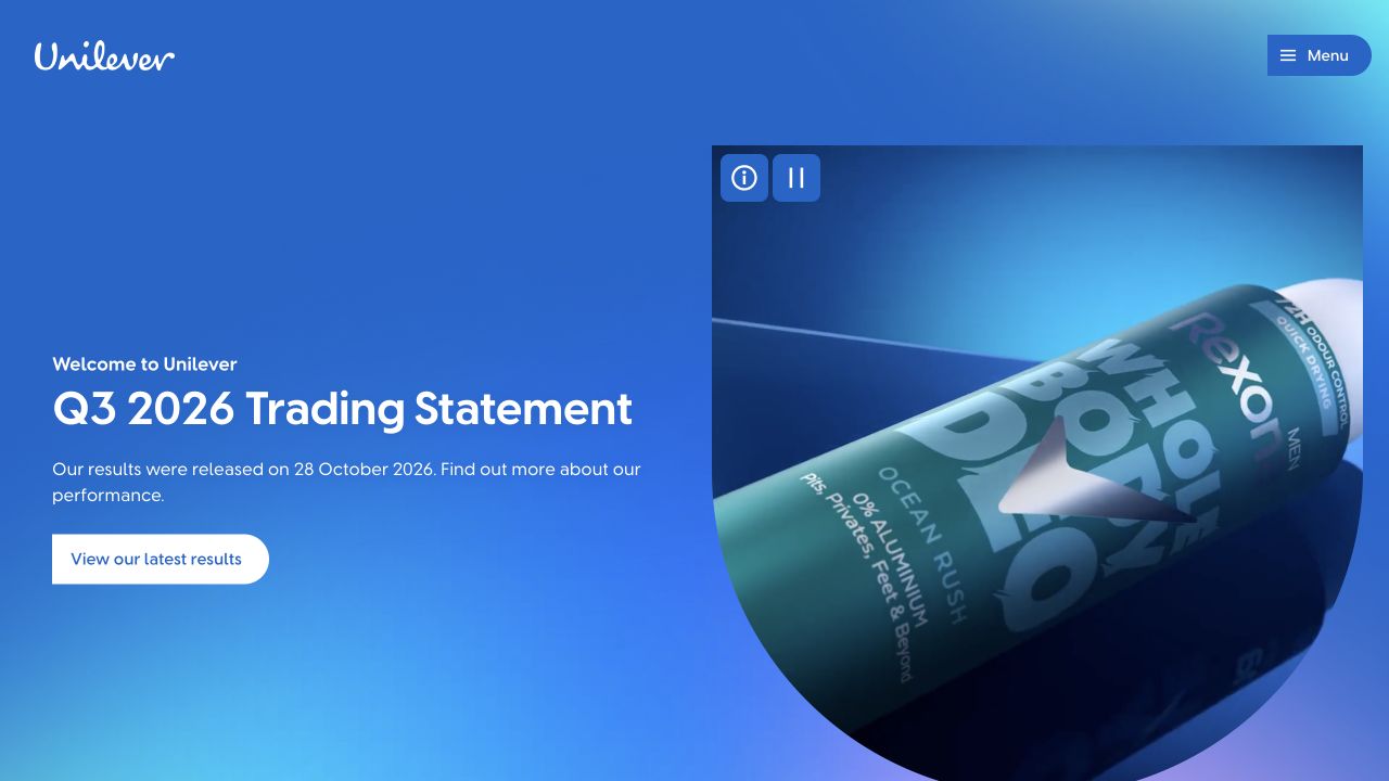
Unilever’s blue gradient hero places the latest trading announcement on the left and a close product-video frame on the right. White type, a small welcoming label, and a pill-shaped results action create a simple reading sequence. The familiar script identity stays in the upper left while most navigation sits behind a compact menu. Visible information and pause controls acknowledge the moving media. Astro’s showcase associates the public corporate property with Astro; the example says nothing about individual product-brand websites.
What you can learn
Make time-sensitive corporate content an explicit content model: announcement title, publication context, destination, and supporting media should change without altering the layout. The screenshot demonstrates that governance need, not an audited financial or performance outcome. Preserve a useful headline and ordinary results link when the video cannot play.
Pros
The announcement has a clear destination rather than an ambiguous exploration link.
Recognizable packaging connects corporate information to familiar products.
Cons & considerations
A collapsed menu conceals the breadth of corporate audiences initially.
A video-led composition needs a considered static and reduced-motion alternative.
Visible tech stack
Earlier / documented evidence
Astro
Earlier cited evidence retained; no current scan result. References may be embedded or legacy—not a complete backend inventory.
Platform source: Official Astro showcase / first-party project source. Astro's official showcase links the named Unilever Global public property. This is an attributed platform association, not a claim about a specific version, backend, or every corporate system. Platform evidence is separate from the direct website screenshot and is not a complete current infrastructure audit.
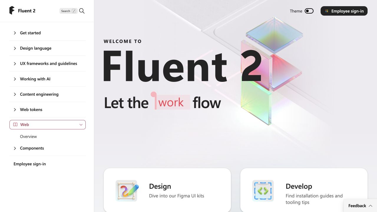
Microsoft’s Fluent 2 website keeps a substantial reference sidebar visible next to a playful introductory canvas. Large black lettering and translucent colored cubes establish the design language, while two rounded cards begin separate design and development paths below. Search, theme controls, and employee sign-in are positioned outside the main introduction. The left rail distinguishes general guidance from platform-specific components. Astro’s official showcase and case-study program identify this Fluent property, not Microsoft’s entire web estate or the applications built with Fluent components.
What you can learn
Documentation needs both an inviting entry and a dependable location system. Use shared Astro layouts to preserve reference navigation as individual pages change, and isolate interactive controls instead of turning the whole manual into an application. Test long sidebar labels and keyboard traversal with real documentation content.
Pros
Design and development receive distinct starting points within one visual system.
Persistent navigation makes the reference structure visible immediately.
Cons & considerations
The wide rail consumes substantial horizontal space on a desktop viewport.
The decorative introduction pushes practical component details further down.
Visible tech stack
Referenced on the public page
Astro
Public source checked November 3, 2026. References may be embedded or legacy—not a complete backend inventory.
Platform source: Official Astro showcase / first-party project source. Astro's official showcase links the named Microsoft Fluent 2 design system public property. This is an attributed platform association, not a claim about a specific version, backend, or every corporate system. Platform evidence is separate from the direct website screenshot and is not a complete current infrastructure audit.
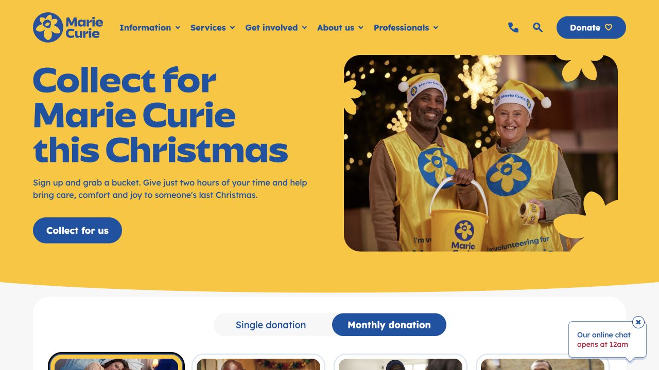
Marie Curie uses its yellow-and-blue identity across a split campaign hero. Oversized text introduces a Christmas volunteering appeal on the left, with a short explanation and a blue action underneath. A real volunteer photograph fills the right side, framed by rounded edges and flower-shaped cutouts that echo the logo. Donation and information routes remain available in the header, and donation options begin below the hero. Astro’s showcase names this public charity website; no donation or volunteer form was submitted during review.
What you can learn
The reusable pattern is a campaign model with a specific action, audience, and image, not simply a large charitable slogan. An Astro implementation should keep fundraising, volunteering, and practical support destinations distinct. Test whether a returning visitor seeking urgent information can bypass the seasonal appeal just as easily.
Pros
The photograph shows people participating rather than a generic stock symbol.
Brand-shaped framing gives a conventional split layout a distinctive identity.
Cons & considerations
The strong seasonal headline may outweigh everyday support information.
A floating chat element can compete with donation content near the viewport edge.
Visible tech stack
Referenced on the public page
Astro
Public source checked November 3, 2026. References may be embedded or legacy—not a complete backend inventory.
Platform source: Official Astro showcase / first-party project source. Astro's official showcase links the named Marie Curie public property. This is an attributed platform association, not a claim about a specific version, backend, or every corporate system. Platform evidence is separate from the direct website screenshot and is not a complete current infrastructure audit.
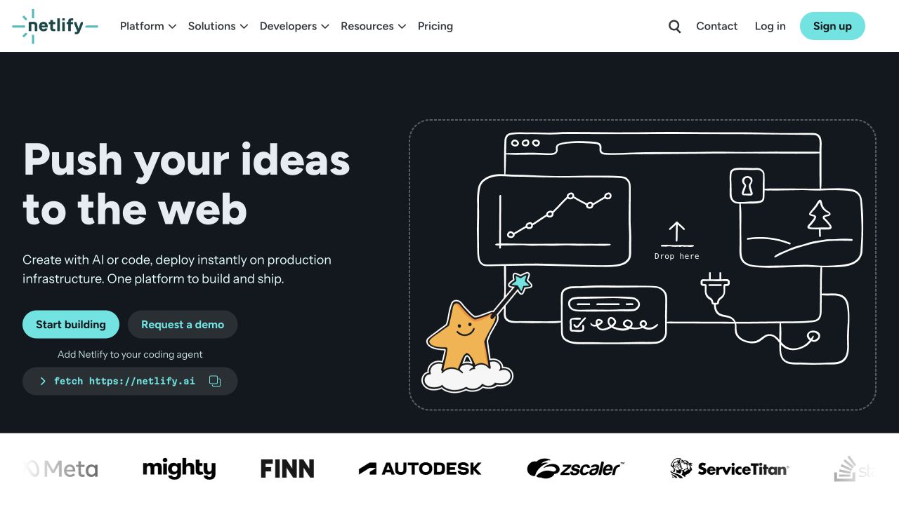
Netlify places a bold two-line headline and a brief explanation on a dark introductory panel. Two differently weighted actions distinguish starting a project from requesting a demo. A command-style developer control appears below them, while a hand-drawn browser illustration occupies the right half. The white header groups platform, solution, developer, and resource routes, and customer marks begin just below the hero. Astro’s official showcase names Netlify’s public website; the deployment console and any user projects are outside this review.
What you can learn
Offer technical and commercial evaluation paths without making them look interchangeable. A copyable command needs different semantics and feedback from a navigation link. Astro can keep the explanatory shell straightforward while an isolated control handles copying; design the no-JavaScript reading experience and the copy-success state separately.
Pros
Self-service and demonstration actions have clear visual priority differences.
The illustration explains connected website surfaces without a dense dashboard.
Cons & considerations
Several adjacent starting routes can still create hesitation for newcomers.
The first screen gives little detail about operational limits or pricing.
Public source checked November 3, 2026. References may be embedded or legacy—not a complete backend inventory.
Platform source: Official Astro showcase / first-party project source. Astro's official showcase links the named Netlify public website public property. This is an attributed platform association, not a claim about a specific version, backend, or every corporate system. Platform evidence is separate from the direct website screenshot and is not a complete current infrastructure audit.
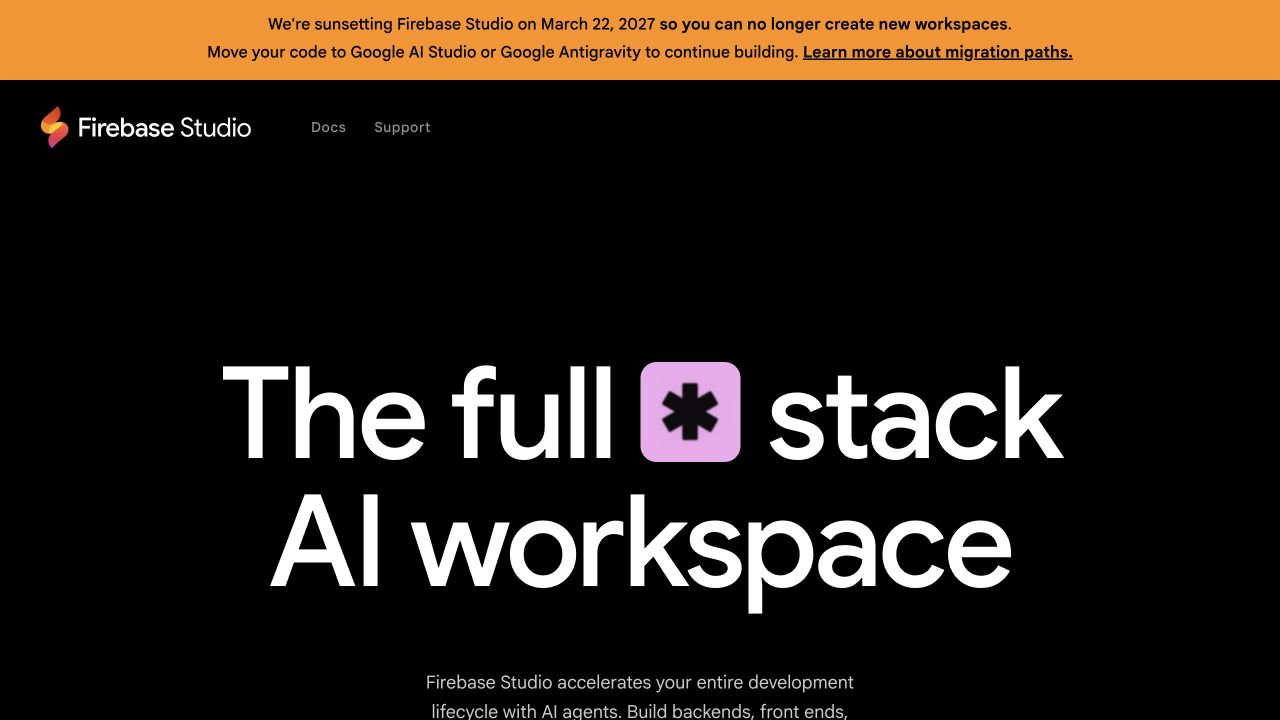
Firebase Studio’s public page combines a black canvas, very large white typography, and a compact navigation row. A colored symbol interrupts the headline to create a distinctive visual signature without an elaborate illustration. An orange notice above the page explicitly describes the announced product sunset and directs visitors toward migration information. That notice materially changes the first impression and is part of the captured design, not an omission to crop away. Astro’s showcase names the public Studio property rather than its workspace application.
What you can learn
Plan a landing page’s retirement state before a product reaches it. Content architecture should allow an important lifecycle notice to override acquisition messaging, preserve documentation routes, and remain understandable on small screens. This is an example of public communication design; it is not a recommendation to adopt a product marked for retirement.
Pros
The lifecycle notice is prominent before visitors encounter promotional messaging.
A minimal header keeps documentation and support destinations recognizable.
Cons & considerations
The oversized introduction provides little functional detail in the first view.
Old acquisition language can conflict with a new migration-focused visitor need.
Public source checked November 3, 2026. References may be embedded or legacy—not a complete backend inventory.
Platform source: Official Astro showcase / first-party project source. Astro's official showcase links the named Firebase Studio public website public property. This is an attributed platform association, not a claim about a specific version, backend, or every corporate system. Platform evidence is separate from the direct website screenshot and is not a complete current infrastructure audit.
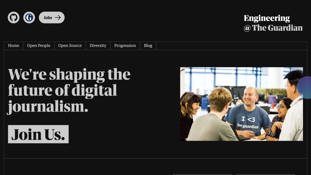
The Guardian Engineering website uses a black background, heavy serif headlines, and fine table-like rules. Its opening pairs a statement about digital journalism with a candid team photograph, followed by a large recruitment action. GitHub, the publication, and jobs have their own compact utility group above a row of culture-related navigation. The approach feels connected to a newsroom rather than a generic developer startup. Astro’s showcase identifies this engineering subdomain specifically; it does not attribute the main news publication to Astro.
What you can learn
A small editorial site can borrow the parent organization’s typographic character while giving its own audience a clearer structure. Keep culture, open source, progression, and vacancies as separate content destinations. In an Astro build, prioritize readable articles and ordinary outbound links before introducing decorative cursor effects or elaborate page transitions.
Pros
The team photograph gives the recruitment proposition a credible human context.
Fine rules connect navigation and content into a recognizable editorial system.
Cons & considerations
Very heavy display type can become cumbersome with longer translated headlines.
The recruitment emphasis may overshadow visitors seeking technical articles or repositories.
Visible tech stack
Referenced on the public page
Astro
Public source checked November 3, 2026. References may be embedded or legacy—not a complete backend inventory.
Platform source: Official Astro showcase / first-party project source. Astro's official showcase links the named The Guardian Engineering public property. This is an attributed platform association, not a claim about a specific version, backend, or every corporate system. Platform evidence is separate from the direct website screenshot and is not a complete current infrastructure audit.
Michelin’s captured corporate homepage presents a digital vehicle illustration against a nearly black background. Large italic white lettering and a blue information action sit on the left, while the illustration extends behind them. Corporate navigation and the white Michelin identity remain above; language, share information, and search form a separate utility layer. Pagination and pause controls reveal that this is one of several rotating stories. Astro’s showcase associates Michelin’s corporate website with Astro, not every retail, restaurant-guide, or tire-service property.
What you can learn
When a carousel carries corporate storytelling, each slide must be a complete readable composition with its own destination and accessible pause behavior. An Astro shell can keep the navigation and fallback content stable. Do not make access to essential investor or support information depend on waiting for the correct slide to appear.
Pros
The technical illustration makes an abstract industrial topic visually concrete.
Carousel controls are separate from the slide’s main information action.
Cons & considerations
Rotating stories complicate the hierarchy of the first screen.
Navigation and text contrast must work across every background, not just this frame.
Visible tech stack
Referenced on the public page
Astro
Public source checked November 3, 2026. References may be embedded or legacy—not a complete backend inventory.
Platform source: Official Astro showcase / first-party project source. Astro's official showcase links the named Michelin Group public property. This is an attributed platform association, not a claim about a specific version, backend, or every corporate system. Platform evidence is separate from the direct website screenshot and is not a complete current infrastructure audit.
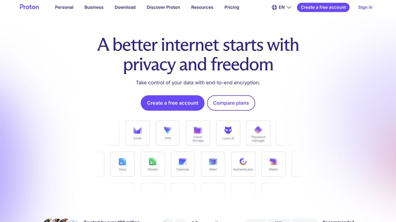
Proton’s public homepage centers a large dark-purple statement above a concise explanation and two account-evaluation actions. Beneath them, a grid of small product cards turns the broad privacy proposition into recognizable services, including mail, storage, and calendar tools. Soft color glows provide depth while the surrounding white canvas stays restrained. The header separates personal and business audiences from downloads, resources, and pricing. Astro’s official showcase names this public marketing property; the private mail and account applications were not inspected.
What you can learn
Connect an umbrella claim to concrete product choices before the visitor must navigate elsewhere. For an Astro implementation, model the product family as reusable content rather than embedding labels inside a decorative image. Keep account creation, plan comparison, and individual product discovery distinct so the page can serve different readiness levels.
Pros
Product cards make an otherwise abstract privacy claim more tangible.
The two central actions distinguish starting from comparing options.
Cons & considerations
Small product labels can become difficult to scan on narrow displays.
The first view cannot explain the practical differences between all services.
Visible tech stack
Referenced on the public page
Astro
Vite
Public source checked November 3, 2026. References may be embedded or legacy—not a complete backend inventory.
Platform source: Official Astro showcase / first-party project source. Astro's official showcase links the named Proton public website public property. This is an attributed platform association, not a claim about a specific version, backend, or every corporate system. Platform evidence is separate from the direct website screenshot and is not a complete current infrastructure audit.
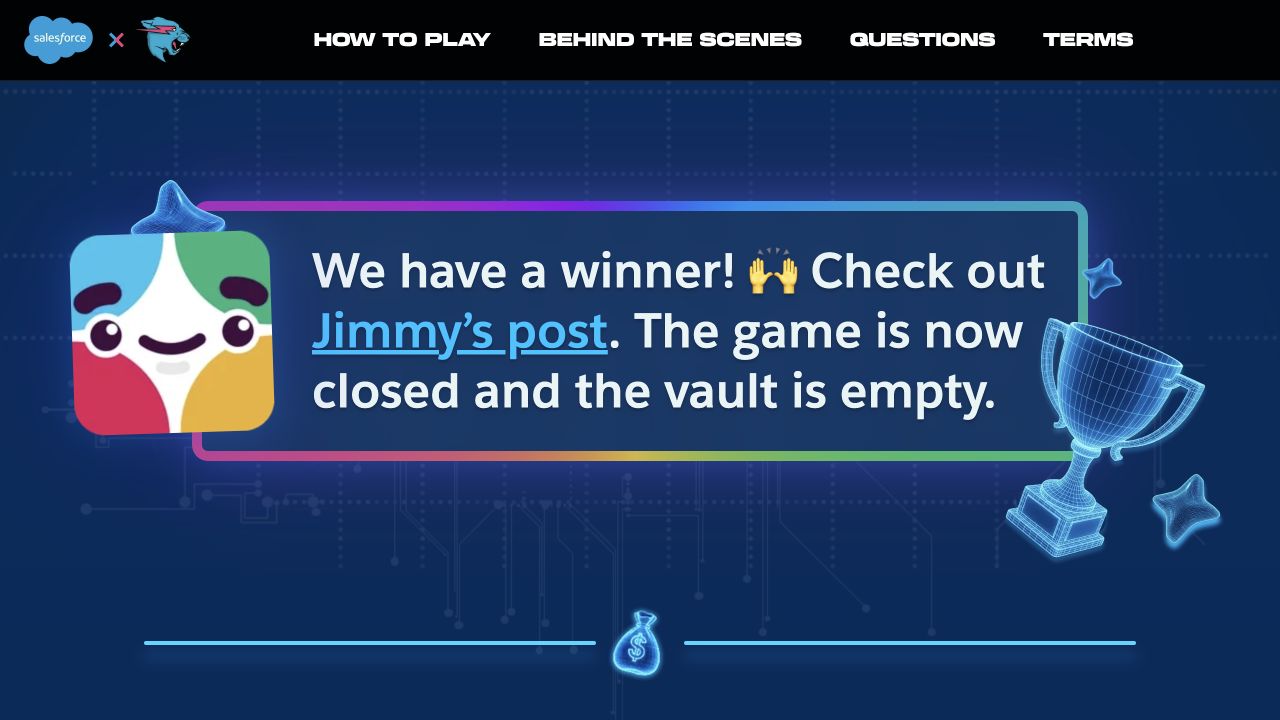
The Salesforce and MrBeast campaign page uses a dark blue technical backdrop, colorful character artwork, and a highly visible winner announcement. A black header keeps rules, instructions, and behind-the-scenes material separate from the main campaign panel. The current opening explicitly communicates that the game has closed instead of preserving a misleading participation prompt. Decorative trophies and circuit-like lines reinforce the event identity. Astro’s showcase links this specific Salesforce subdomain; it does not establish the implementation of Salesforce’s main site or software products.
What you can learn
Build an ending into the campaign content model: status, outcome, archived rules, and a useful next destination should replace the original conversion task. Astro suits a durable public archive, but event mechanics and integrations need their own engineering decisions. Never copy an expired prize message into a live participation interface.
Pros
The campaign status is impossible to confuse with an active invitation.
Rules and explanatory destinations remain available after the event.
Cons & considerations
Large decorative artwork leaves limited room for detailed context initially.
Event-specific language provides little orientation to visitors arriving without prior knowledge.
Visible tech stack
Earlier / documented evidence
Astro
Earlier cited evidence retained; no current scan result. References may be embedded or legacy—not a complete backend inventory.
Platform source: Official Astro showcase / first-party project source. Astro's official showcase links the named Salesforce and MrBeast campaign public property. This is an attributed platform association, not a claim about a specific version, backend, or every corporate system. Platform evidence is separate from the direct website screenshot and is not a complete current infrastructure audit.
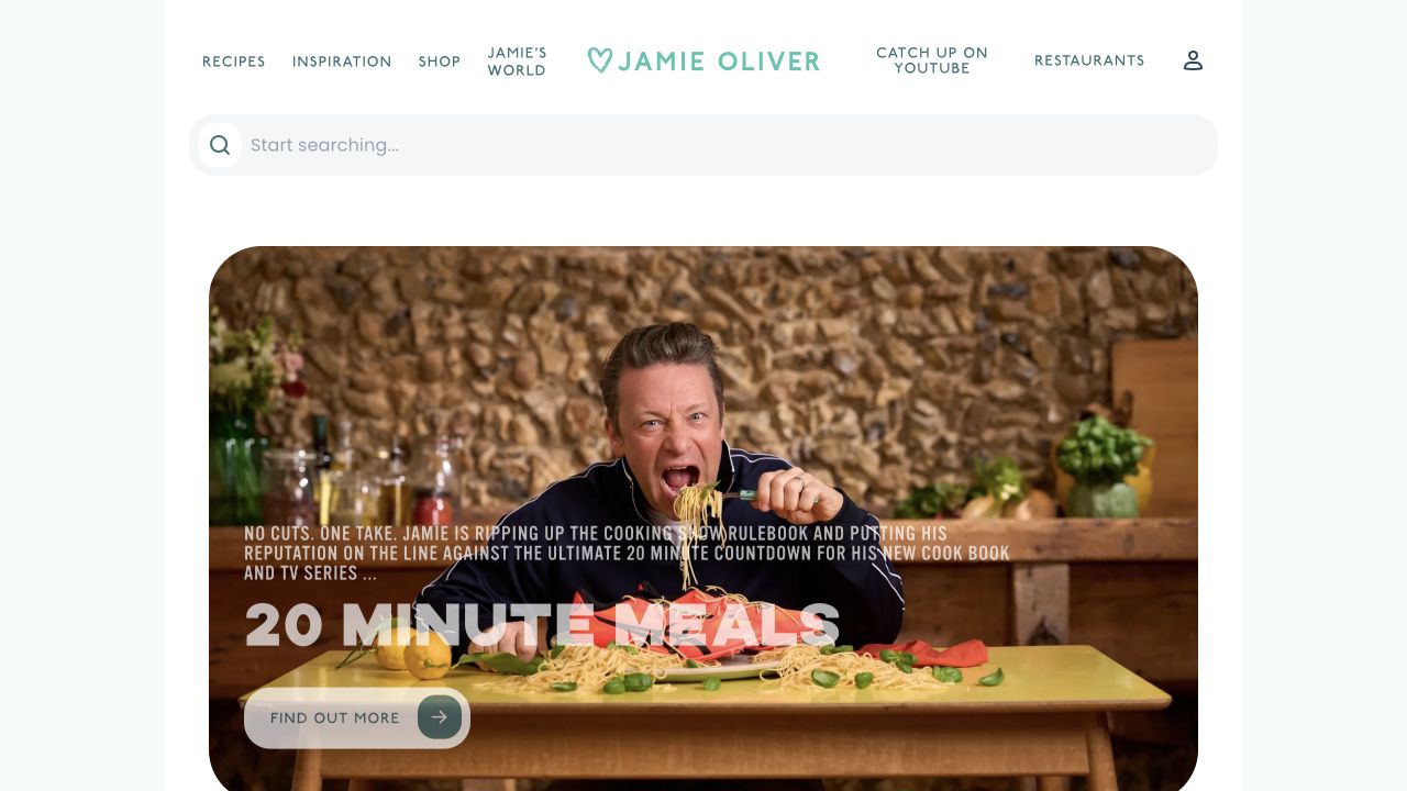
Jamie Oliver’s website places a broad search field immediately below a compact centered brand header. The featured campaign uses a large rounded image of Jamie at a table, with short overlaid text, a prominent series title, and a quieter discovery control. Pale mint accents and generous white margins soften the busy food photograph. Recipes, inspiration, shops, restaurants, and video destinations remain recognizable top-level choices. Astro’s showcase names this public editorial property; purchasing and account workflows were not tested.
What you can learn
A personality-led campaign should not prevent a returning visitor from finding a recipe. Keep search and content categories in a consistent shell while books, television series, and seasonal features rotate. In Astro, recipe detail, search interfaces, and commerce links can have different responsibilities without forcing every page into the same interactive model.
Pros
Search receives prominent placement before the promotional image.
Rounded media and restrained brand accents create a coherent editorial tone.
Cons & considerations
Text laid over a busy food photograph requires careful contrast treatment.
Several commercial and editorial destinations can stretch the header on smaller screens.
Earlier cited evidence retained; no current scan result. References may be embedded or legacy—not a complete backend inventory.
Platform source: Official Astro showcase / first-party project source. Astro's official showcase links the named Jamie Oliver public property. This is an attributed platform association, not a claim about a specific version, backend, or every corporate system. Platform evidence is separate from the direct website screenshot and is not a complete current infrastructure audit.
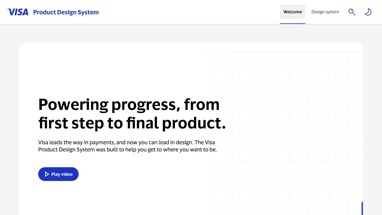
Visa’s Product Design System uses a simple white header with separate welcome and design-system destinations. A broad introductory panel places a large black statement on the left and a lightly gridded media area on the right. The play control remains distinct from navigation, while theme and search utilities stay at the upper edge. The capture shows the introductory surface rather than a component demo. Astro’s official showcase identifies this design-system property, not Visa’s payment networks, consumer site, or every implementation using its components.
What you can learn
Separate a system’s welcome story from its working reference. A developer should be able to bypass the introductory video and reach components, tokens, and guidelines directly. When building an Astro documentation shell, keep media optional and ensure the primary explanatory copy still forms a complete introduction when third-party video is unavailable.
Pros
Welcome and reference destinations are distinguished in the permanent header.
The text-first introduction remains understandable without playing media.
Cons & considerations
A reserved video area can appear visually sparse before media loads.
Practical component links require additional navigation beyond the initial introduction.
Public source checked November 3, 2026. References may be embedded or legacy—not a complete backend inventory.
Platform source: Official Astro showcase / first-party project source. Astro's official showcase links the named Visa Product Design System public property. This is an attributed platform association, not a claim about a specific version, backend, or every corporate system. Platform evidence is separate from the direct website screenshot and is not a complete current infrastructure audit.
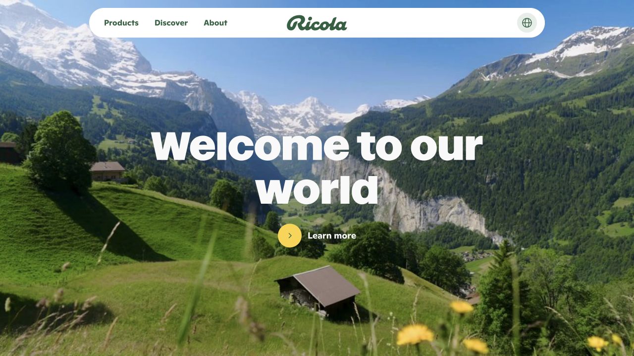
Ricola’s Canadian homepage fills the opening with an Alpine landscape and places a rounded white navigation bar above it. The green wordmark anchors the center, with only a few content categories and a language control surrounding it. Very large white introductory lettering occupies the landscape, followed by a yellow circular action paired with a short label. The image carries most of the brand story before a product is shown. Astro’s showcase associates the named Ricola public property with Astro, not all regional commerce or distribution systems.
What you can learn
Provenance can be a useful organizing idea when it is genuinely part of the brand. Keep landscape media as an enhancement to editable text and meaningful destinations rather than baking the entire introduction into a video. An Astro page should retain navigation, a still-image fallback, and clear content when motion or media loading is restricted.
Pros
The small floating header leaves the landscape visually uninterrupted.
The yellow action provides a consistent focal point against green scenery.
Cons & considerations
The introductory message gives little immediate detail about specific products.
Full-screen landscape media needs carefully selected crops across device sizes.
Public source checked November 3, 2026. References may be embedded or legacy—not a complete backend inventory.
Platform source: Official Astro showcase / first-party project source. Astro's official showcase links the named Ricola Canada public property. This is an attributed platform association, not a claim about a specific version, backend, or every corporate system. Platform evidence is separate from the direct website screenshot and is not a complete current infrastructure audit.
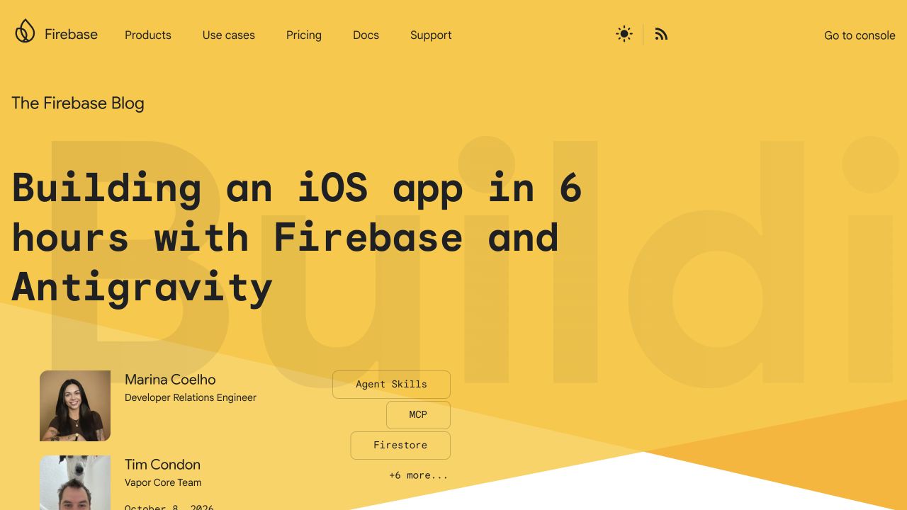
The Firebase Blog opens with a warm yellow feature area and very large monospaced article lettering. Author portraits, names, and a stack of topic chips sit beneath the title, making the featured piece feel like an authored publication rather than an anonymous release feed. The header connects the blog to Firebase products, documentation, support, and the console. A theme control and RSS route acknowledge repeat readers. Astro’s showcase names this blog specifically; it is separate from the Firebase product console and documentation infrastructure.
What you can learn
Model authors, topics, dates, and article destinations as first-class editorial data. Astro content templates can preserve that structure while the feature changes, and selected interactive controls can remain isolated. Avoid a homepage headline style so large that ordinary multi-line technical titles become unreadable or push all metadata beyond a phone’s first screen.
Pros
Named authors and portraits make editorial ownership visible immediately.
Topic chips communicate the technical scope of the lead article.
Cons & considerations
The oversized title requires substantial scrolling before the article list.
Product and publication navigation need clear separation for first-time readers.
Visible tech stack
Referenced on the public page
Google Analytics
Google Fonts
Firebase client
Earlier / documented evidence
Astro
Public source checked November 3, 2026. References may be embedded or legacy—not a complete backend inventory.
Platform source: Official Astro showcase / first-party project source. Astro's official showcase links the named Firebase Blog public property. This is an attributed platform association, not a claim about a specific version, backend, or every corporate system. Platform evidence is separate from the direct website screenshot and is not a complete current infrastructure audit.
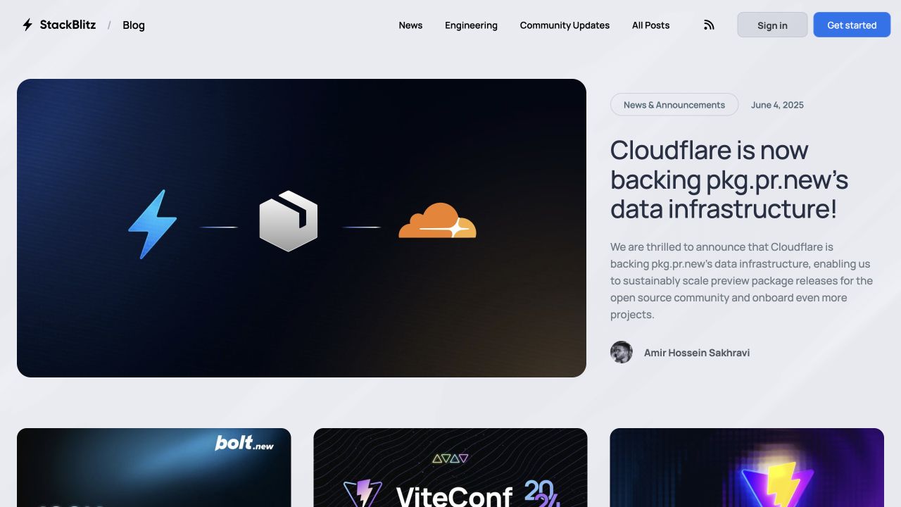
The StackBlitz Blog pairs a wide rounded feature graphic with a narrower title-and-summary column. A category pill, publication date, and author portrait establish the story’s context before readers open it. The pale background gives a dark technical illustration room to stand out, while additional article cards begin below. News, engineering, community updates, and the archive have clear header destinations alongside RSS. Astro’s official showcase identifies this blog property, not StackBlitz’s browser development environment or every project created inside it.
What you can learn
A useful editorial homepage makes the archive discoverable even when one feature receives strong emphasis. Define image ratios, title lengths, author records, and category rules before building the Astro templates. Keep important metadata as real text, and test a feature without an illustration so the design does not depend on perfect artwork for every post.
Pros
The feature combines concise context with visible author and date information.
Archive and category links support visitors looking beyond the current story.
Cons & considerations
A wide lead illustration can dominate a short article title.
A static feature needs editorial upkeep to avoid making the publication seem abandoned.
Public source checked November 3, 2026. References may be embedded or legacy—not a complete backend inventory.
Platform source: Official Astro showcase / first-party project source. Astro's official showcase links the named StackBlitz Blog public property. This is an attributed platform association, not a claim about a specific version, backend, or every corporate system. Platform evidence is separate from the direct website screenshot and is not a complete current infrastructure audit.
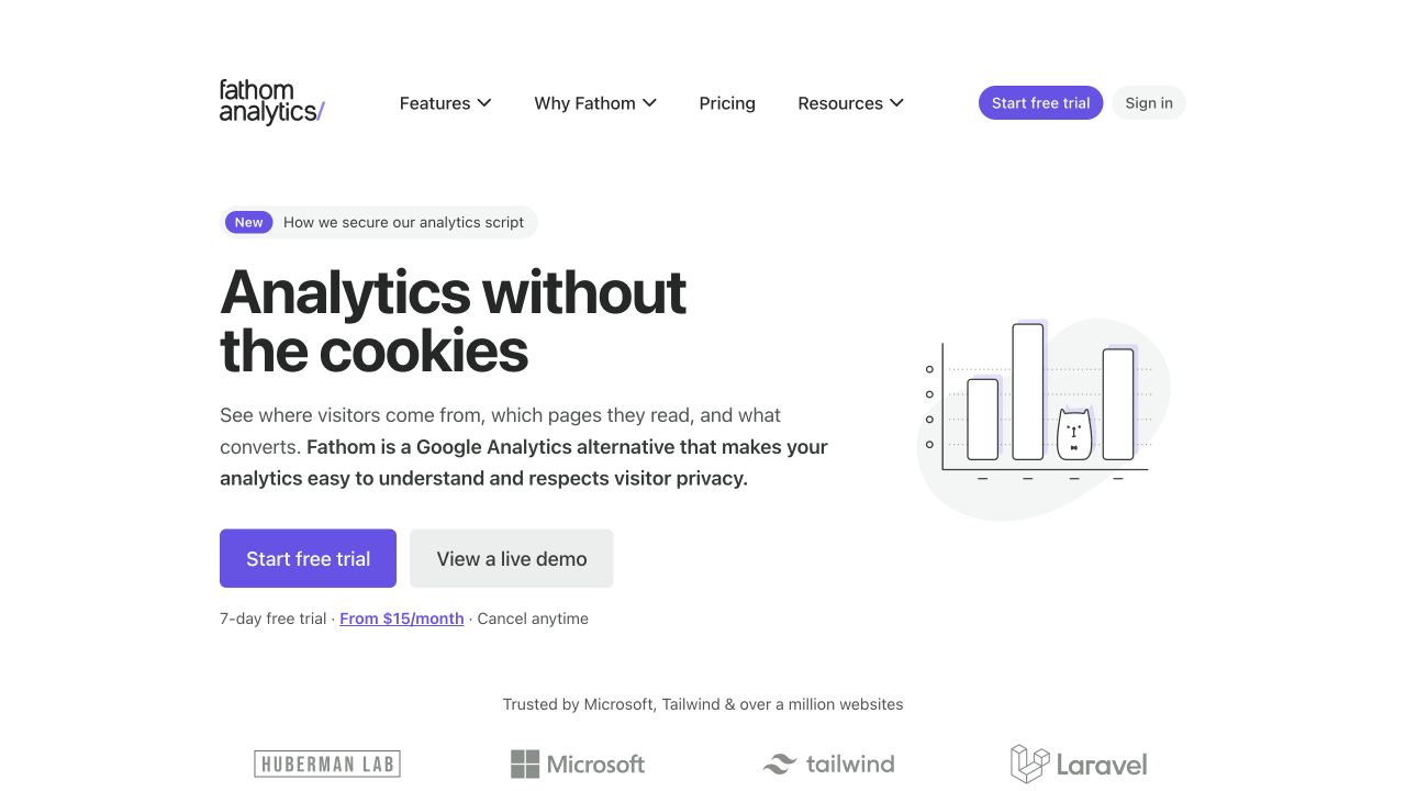
Fathom Analytics uses a narrow, spacious white layout with a left-aligned headline and a small line illustration to the right. Its supporting paragraph explains the product category and audience in direct terms. A purple trial action sits beside a quieter live-demo route, followed by short pricing and trial context. Customer marks begin below the introduction rather than competing with it. Astro’s showcase names the marketing website; the live analytics application and its data handling were not independently audited during this visual review.
What you can learn
A restrained Astro page can still explain a commercial product thoroughly if the content order is deliberate. Put category, benefit, evaluation options, and material trial context together. Treat the demo destination as a useful alternative to registration, and avoid importing decorative application code when a small illustration and ordinary links adequately explain the next step.
Pros
The demo route supports evaluation without immediately requesting an account.
Trial context appears next to the primary action rather than in distant fine print.
Cons & considerations
The simple illustration shows little about everyday reporting workflows.
The narrow composition offers less immediate breadth for visitors comparing advanced capabilities.
Public source checked November 3, 2026. References may be embedded or legacy—not a complete backend inventory.
Platform source: Official Astro showcase / first-party project source. Astro's official showcase links the named Fathom Analytics public property. This is an attributed platform association, not a claim about a specific version, backend, or every corporate system. Platform evidence is separate from the direct website screenshot and is not a complete current infrastructure audit.
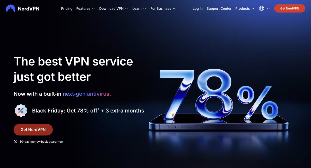
NordVPN’s captured promotion places a very large metallic discount graphic beside white product messaging on a dark blue field. A smaller campaign line, red purchase action, and guarantee context create a clear offer sequence. The header retains pricing, downloads, business, and support destinations beyond the temporary promotion. A native screenshot crop excludes the visitor-specific status strip above the navigation; the page content was not reconstructed. Astro’s showcase identifies NordVPN’s public website, not its VPN clients, account service, or underlying network.
What you can learn
Treat offer amounts, eligibility notes, and campaign timing as governed content rather than decorative artwork alone. An Astro implementation should keep those details editable and readable outside the promotional image. Check the ordinary product journey after the campaign ends, and never interpret a captured discount as a currently available price or an independent security assessment.
Pros
The purchase route is easy to distinguish from informational navigation.
The campaign uses a coherent dark palette and limited accent colors.
Cons & considerations
The dominant discount can overshadow practical product differentiation.
Time-sensitive claims and oversized graphics require ongoing editorial and mobile-layout checks.
Visible tech stack
Earlier / documented evidence
Astro
Earlier cited evidence retained; no current scan result. References may be embedded or legacy—not a complete backend inventory.
Platform source: Official Astro showcase / first-party project source. Astro's official showcase links the named NordVPN public website public property. This is an attributed platform association, not a claim about a specific version, backend, or every corporate system. Platform evidence is separate from the direct website screenshot and is not a complete current infrastructure audit.
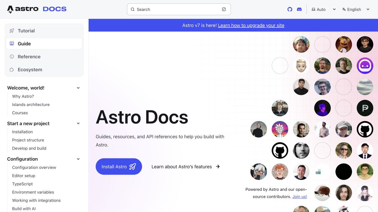
Astro’s documentation gateway places a searchable header above a persistent left navigation and an open introductory canvas. The main panel combines a concise title, two starting routes, and a collage of contributor portraits. Tutorial, guide, reference, and ecosystem categories are separated from the deeper topic tree. Theme and language choices remain in the header, while a release notice has its own colored strip. The maintained documentation repository provides first-party implementation context for this specific site, not a third-party customer example.
What you can learn
Documentation needs a durable content hierarchy before it needs a decorative landing illustration. In Astro, share navigation and article layouts while keeping search, theme, and version notices understandable as separate controls. Test deep links and long topic trees, and make sure the introductory page does not become the only route to installation instructions.
Pros
Major documentation modes are distinguished before the detailed topic list.
Contributor imagery gives an open-source reference a visible community identity.
Cons & considerations
A deep sidebar can be demanding for readers unfamiliar with framework terminology.
Release announcements add another layer that must stay current and accessible.
Public source checked November 3, 2026. References may be embedded or legacy—not a complete backend inventory.
Platform source: Official Astro showcase / first-party project source. Astro's maintained documentation repository is the first-party source for the documentation website; the association concerns the documentation surface, not a customer project. Platform evidence is separate from the direct website screenshot and is not a complete current infrastructure audit.
Choose the smallest architecture that supports the real work
Prerender stable public content
A brochure, reference library, or documentation collection often starts with content that does not vary for every visitor. Establish how a content change triggers a build, who can preview it, and how quickly corrections must appear. Test the largest expected content set rather than only three demonstration pages. Static output still needs redirect, error, search, and form plans; it is not an absence of operational work.
Render on demand when the response genuinely varies
An account-specific view or frequently changing response may need server execution. Describe that requirement precisely before changing the whole site’s delivery model. Astro’s on-demand rendering uses a compatible adapter; its configuration depends on the deployment target. Make responsibility for runtime costs, caching, logs, secrets, and rollback explicit instead of assuming a static hosting arrangement will cover a dynamic feature.
Choose a CMS around people and workflow: who drafts, reviews, translates, schedules, and corrects content? Demonstrate a realistic update from entry to published page. Keep the content provider replaceable through a documented model where practical. An attractive Astro website does not reveal whether its editors use files, a hosted CMS, or a custom application, so avoid promising an identical editing experience from a screenshot.
From references to requirements
Brief the publishing and operational details together
Rehearse one complete editorial change
Ask a real editor to create a page, add a related item, replace an image, preview a draft, and fix an incorrect link. Note each handoff between the content system and deployment. Include an urgent correction and a rollback in the rehearsal. Define what happens when the publishing webhook fails or an upstream service is unavailable; a green build is not the same thing as correct content.
Treat forms as a server-side responsibility
A contact form needs validation, abuse controls, delivery handling, and a truthful confirmation. Astro Actions can support server-side handling, including native form submission on appropriately rendered pages. Specify the destination and failure behavior before choosing a polished success animation. Keep credentials out of browser code, and ensure a lost network response cannot silently create duplicate work or falsely report that an email was delivered.
Measure representative pages, not the framework name
Set a practical budget for images, scripts, fonts, and third-party embeds, then test an ordinary detail page as well as the homepage. Review narrow screens, keyboard operation, long content, and reduced motion. Record laboratory results separately from real-user measurements. A site’s presence in this collection does not establish its Core Web Vitals, accessibility conformance, or the business value of copying it.
A useful handover demonstration
Ask the actual team to carry out its routine job: publish a realistic update, correct a mistake, preview a narrow screen, and identify who owns an integration failure. For a library or frontend framework, also ask who maintains the content source and deployment. A polished screenshot does not answer those operational questions.
Beyond the screenshot
An Astro launch checklist beyond a fast-looking homepage
Identify which pages are prerendered, which run on demand, and why.
List every hydrated island and its loading, empty, failure, and keyboard states.
Validate actual content records, including optional images and long headings.
Rehearse draft preview, publishing, an urgent correction, and rollback.
Exercise form validation, abuse controls, retry behavior, and real delivery errors.
Map legacy URLs and return genuine redirects and not-found responses.
Check responsive images, font loading, reduced motion, and third-party weight.
Document adapter configuration, runtime ownership, secrets, backups, and maintenance.
Test with real content, a keyboard, a small screen, slow or failed requests, and the people who will maintain the system. These are planning checks, not an accessibility, security, performance, or search-ranking certification.
Sources & editorial method
How this Astro collection was reviewed
The examples pair direct browser captures of the named websites with attributed official Astro showcase, project, or first-party evidence. A documented platform association is not a complete live runtime inventory. Visual reviews discuss observable composition and practical tradeoffs; they do not infer conversion rates or certify performance.
Every image is an unmodified capture from the actual website, with its source and capture date. Some captures are reused from our shared catalog; their dates remain the original capture dates. None comes from a vendor gallery or a generated reconstruction. Moving imagery and live content can change.
Technology attribution uses public page assets or metadata, official platform documentation, or a cited first-party project case study. Documentary and framework-relationship evidence is identified where used; it is not a complete current backend inventory. A CMS image CDN alone does not establish a full CMS deployment. A library’s presence does not prove which individual controls use it, and a platform label does not establish AI authorship.
The composition notes, lessons, pros and tradeoffs are original editorial observations. We have not measured conversion, traffic, security, performance or accessibility conformance. Website owners retain their brands and imagery; these examples are not our client portfolio. Written, Edited and Curated are independent records, not dates advanced by a build. See our editorial standards or suggest a correction.
Questions worth asking
Astro website development FAQs
Is Astro only for simple websites?
No. The useful distinction is the work a page performs, not its apparent size. A large content library can benefit from a mostly document-based approach, while one small authenticated feature may need a runtime and careful state handling.
Do Astro pages have to use React or Vue?
No. Choose a client framework only for an interaction that benefits from it. An Astro project can also use normal HTML, CSS, and browser scripts; mixing frameworks introduces ownership and consistency questions that belong in the brief.
Does an Astro website guarantee a high speed score?
No. Large media, unnecessary hydration, fonts, and third-party scripts can still make a page slow. Test the finished implementation and representative devices rather than treating the framework name as a measurement.
Can editors update an Astro website without changing code?
They can if the project includes a suitable editing and publishing workflow. Ask for a demonstration with actual content. The screenshot cannot tell you which CMS, preview system, permissions, or approval process the site uses.