Squarespace references are most useful when they show a sustainable content rhythm: clear navigation, consistent imagery, and practical information that is easy to maintain. A beautiful opening is only the beginning.
These examples identify the selected Squarespace websites, not every activity or corporate system belonging to the people and organizations shown. Their imagery, budgets, and editorial resources are not interchangeable with yours.
Begin with the job: publish work, explain services, sell a defined catalog, promote events, or help someone visit. Then choose the content structure and visual treatment that support it.
Before the examples
What makes good Squarespace website development in 2026?
Distinguish a one-off page from a collection
A custom introduction and a repeatable article, event, product, or project are different content jobs. Squarespace distinguishes layout pages from collection pages; use the appropriate structure rather than hand-assembling every new entry.
A cinematic reference can rely on unusually strong photography. Define image ratios, minimum useful crops, captions, and a fallback for new material. A consistent, achievable image system usually ages better than one exceptional launch photograph.
Put practical information on a predictable route
Hours, location, availability, booking, shipping, or project context should not be hidden behind an atmospheric introduction. Make the page useful to someone returning with a specific question as well as someone encountering the brand for the first time.
The collection · 20 examples
20 Squarespace website examples worth studying
Compare the treatment of portfolios, public personalities, organizations, and visitor-facing businesses. These are examples of the named public properties, not proof that their complete operations run inside Squarespace.
We start with five recognizable brands or organizations: Pixar Animation Studios, David Bowie, Tony Hawk, Jeff Bridges, Eleven Madison Park. Each attribution applies to the named website property, not every product or website belonging to its organization. This is a curated reading sequence, not a measured ranking.
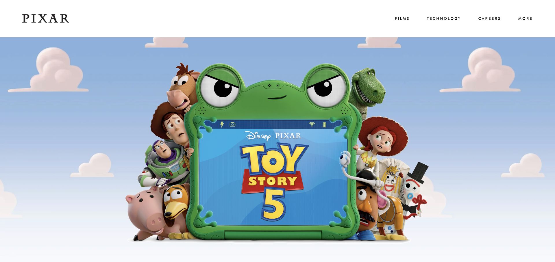
Pixar places a very quiet white navigation bar above a nearly uninterrupted film image. The Toy Story artwork supplies the personality, scale, and focal point; the surrounding page does not compete with it through decorative cards or multiple sales messages. Films, technology, and careers remain plain text routes in the header. This is a useful Squarespace example because the site feels unmistakably like the studio without needing a dashboard-like homepage or a complicated introductory animation.
What you can learn
Build the content hierarchy around the assets you actually own. A managed website platform can carry a highly distinctive brand when art direction, crop selection, and navigation priorities are deliberate.
Pros
The narrow header preserves room for the current film artwork while keeping key institutional routes visible.
A restrained page shell lets successive release campaigns change the homepage character without changing the entire navigation system.
Cons & considerations
The first viewport relies heavily on recognition of the pictured release rather than explanatory copy.
An image-led approach needs strong fallback descriptions and thoughtful crops when adapted for smaller screens.
Visible tech stack
Referenced on the public page
Squarespace
Adobe Fonts
OneTrust
Public source checked November 3, 2026. References may be embedded or legacy—not a complete backend inventory.
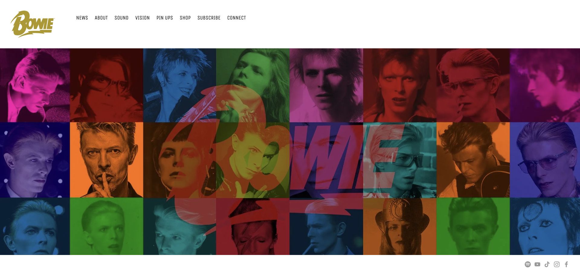
A gold Bowie wordmark anchors the white header, while condensed navigation names different kinds of material: news, sound, vision, and shopping. Below it, a saturated collage fills the screen with repeated faces and oversized lettering. Squarespace runtime is visible on this official artist property, but the interesting design work is the editorial relationship between the archive categories and the rotating visual identity.
What you can learn
Use a stable set of content destinations underneath changing campaign artwork. For an artist archive, the CMS should help editors distinguish durable biography and recordings from temporary announcements. Platform choice alone will not create the collage, organize rights, or determine which release deserves the front page.
Pros
The compact masthead maintains a recognizable anchor above visually busy campaign artwork.
Navigation labels separate listening, viewing, news, and commerce instead of placing every item in a generic gallery.
Cons & considerations
The opening collage gives little descriptive context to someone unfamiliar with the current campaign.
A large archive can outgrow a short top-level menu unless search and internal relationships are maintained.
Visible tech stack
Referenced on the public page
Squarespace
Adobe Fonts
Public source checked November 3, 2026. References may be embedded or legacy—not a complete backend inventory.
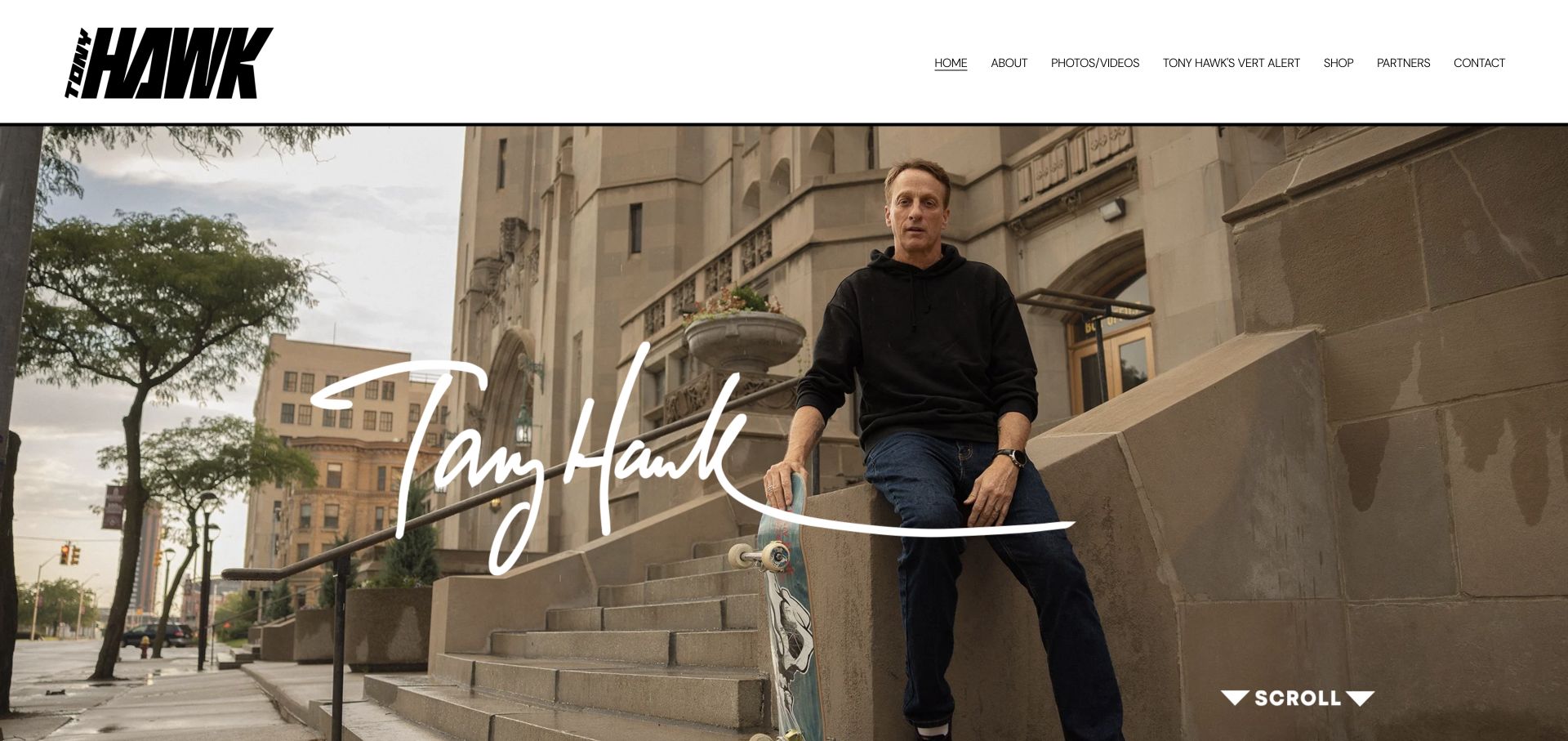
Tony Hawk’s homepage pairs a sharply angled black wordmark with a full-width photograph and a large white signature. The neutral header is deliberately simple, allowing the portrait and recognizable lettering to dominate. Compact navigation offers more specific routes than the hero itself, including biographical and commercial material. Squarespace runtime confirms the platform behind this distinctive public hub.
What you can learn
Treat the website as an editorial hub for a person, not as a single undifferentiated biography. Plan a few stable page types for work, background, and current projects, then use photography and typography to express personality. A signature or logo should complement readable names and navigation rather than become the only way to understand the page.
Pros
The strong wordmark and signature create continuity between the header and the photographic hero.
The public hub gives visitors distinct routes without forcing all interests into one long homepage narrative.
Cons & considerations
The initial screen communicates personality more readily than the purpose of each linked project.
Large portrait crops and overlaid lettering need separate consideration on narrow screens and unusual aspect ratios.
Visible tech stack
Referenced on the public page
Squarespace
Public source checked November 3, 2026. References may be embedded or legacy—not a complete backend inventory.
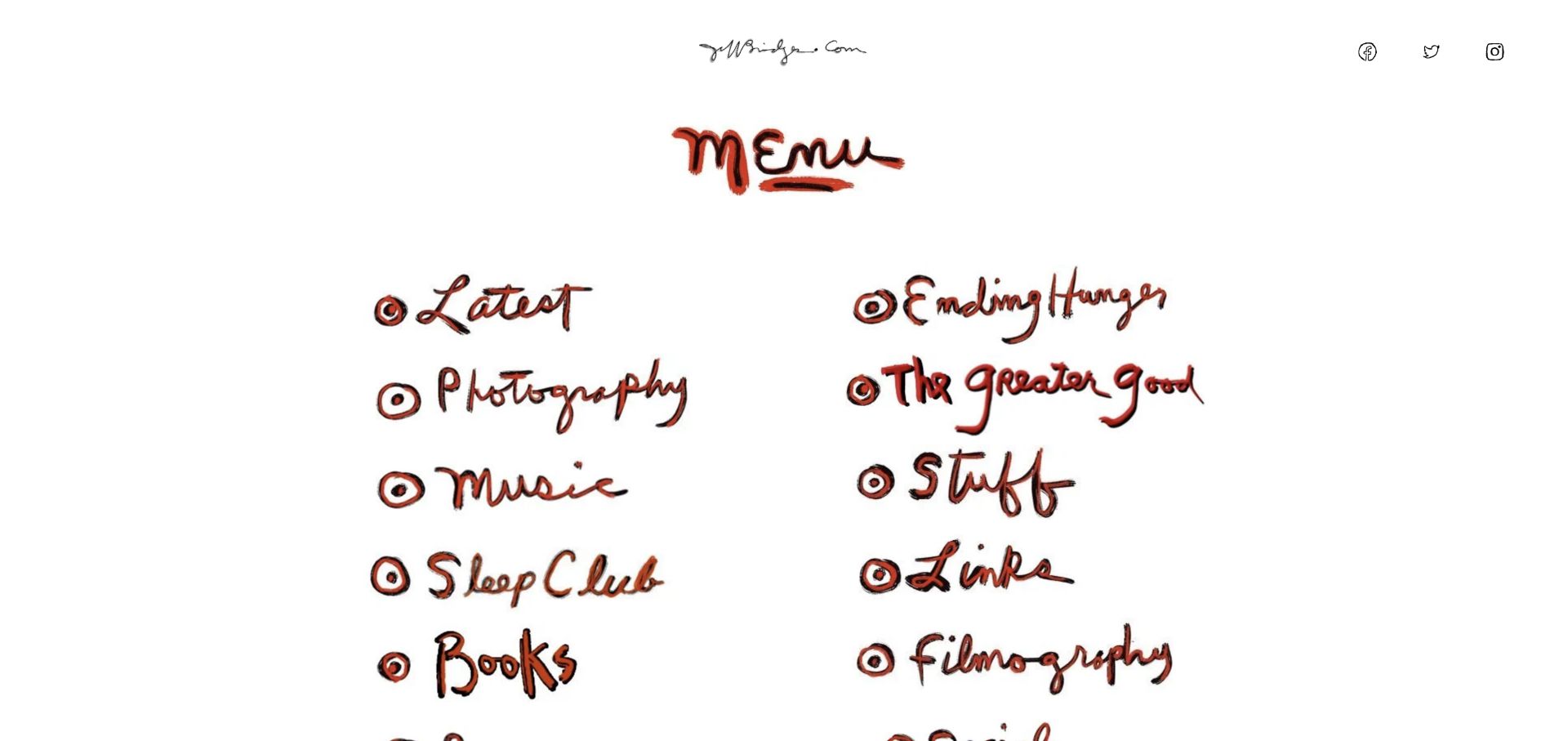
The main-menu page uses a white canvas, handwritten identity, and illustrated link treatments rather than a conventional corporate hero. Photography, music, books, filmography, and charitable interests are presented as separate destinations. The hand-made marks are the organizing visual language, not a decorative accent added to stock cards. Reviewing the actual main-menu route is important here: the opening gateway and this useful directory are different pages, and the screenshot shows the latter.
What you can learn
Squarespace can provide the publishing shell while original artwork supplies the navigation character. Keep a text-based content inventory alongside expressive image links so that future additions remain understandable.
Pros
The illustrated directory makes a broad set of interests feel coherent without forcing them into one professional category.
Two-column grouping gives repeat visitors a compact way to find a specific branch of the archive.
Cons & considerations
Artwork-based labels need meaningful text alternatives and clear focus treatments when used as navigation.
A separate introductory gateway can add an extra step for visitors who simply want the directory.
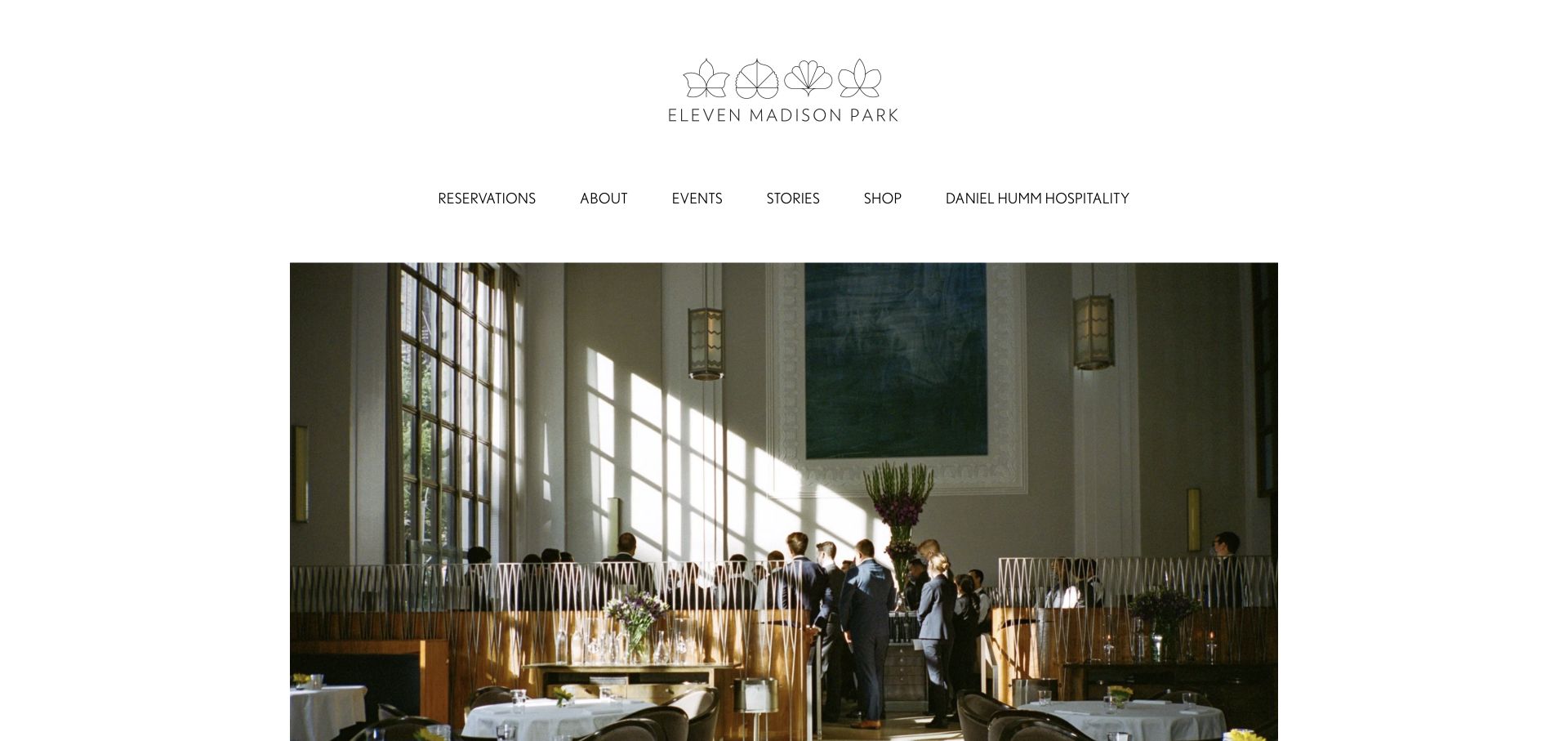
Eleven Madison Park gives its centered emblem and navigation generous white space before introducing a carefully bounded dining-room photograph. The page avoids filling the entire viewport with competing booking prompts. Reservations, background, events, and stories each receive a clear place in the header. This managed-platform presentation avoids advertising the underlying template.
What you can learn
Separate the editorial website from the systems that handle operational tasks. The visible Squarespace assets support the public-site attribution, but do not establish how reservations, inventory, or restaurant operations work. Design a consistent handoff to those destinations, and give editors a small set of dependable image and text treatments.
Pros
The bounded image and broad margins give the dining-room photograph the character of an editorial spread.
Reservation and events routes are visible without overwhelming the brand presentation.
Cons & considerations
The deliberately sparse first screen provides limited practical information for someone comparing dining options quickly.
This art direction depends on high-quality photography; changing the CMS will not substitute for a strong image library.
Visible tech stack
Referenced on the public page
Squarespace
Adobe Fonts
Public source checked November 3, 2026. References may be embedded or legacy—not a complete backend inventory.
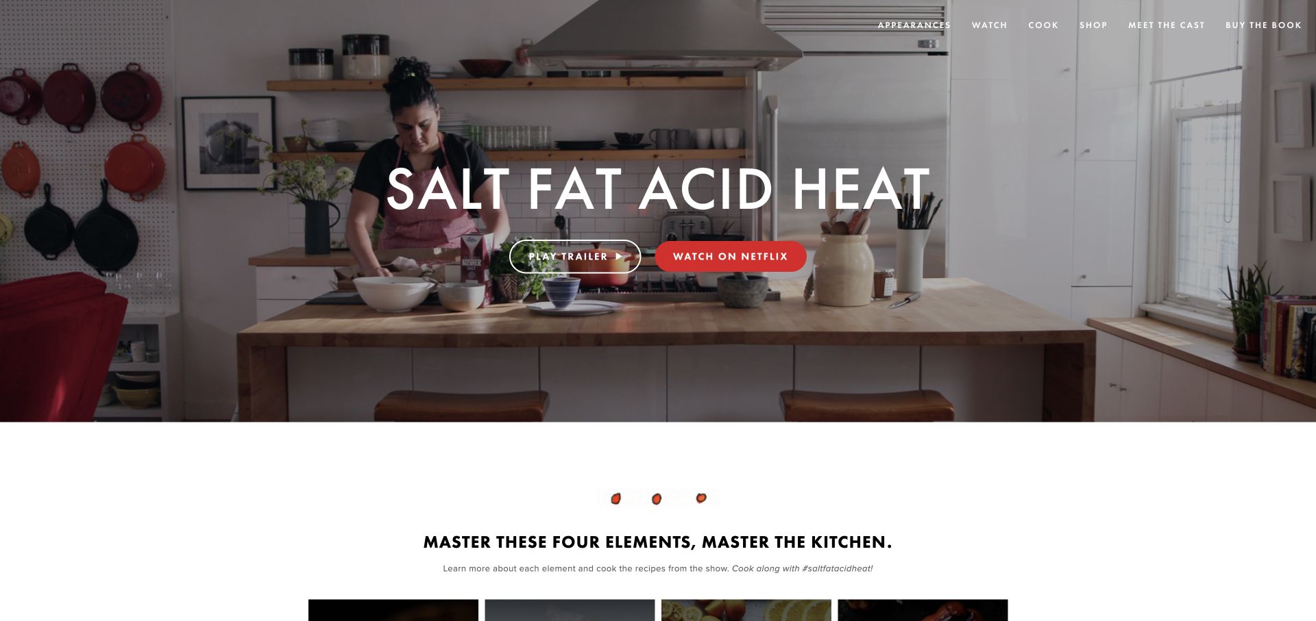
Salt Fat Acid Heat uses a kitchen photograph as the stage for a large centered title and two distinct video actions. The thin white navigation connects appearances, cooking, cast information, shopping, and the book. Illustrated elements further down the page extend the visual language beyond the hero. It joins several kinds of media without recreating a streaming service.
What you can learn
Choose content groups around the audience’s next activity: watch, cook, read, or attend. Squarespace can host the explanatory pages while specialist services handle playback or book purchases. Preserve clear handoffs to those outside services.
Pros
The paired trailer and viewing buttons distinguish a short preview from the destination for the full series.
The navigation accommodates practical cooking content alongside the commercial book and television material.
Cons & considerations
The large photographic introduction delays the detailed recipes and explanatory material until further down the page.
Multiple outside destinations require clear labels so visitors understand when they are leaving the companion site.
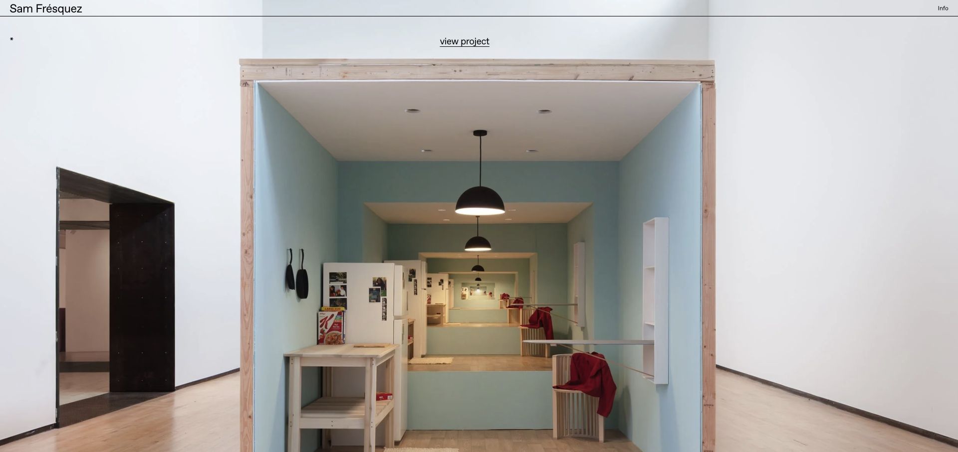
Sam Frésquez opens with a plain typographic name and a short information link above a very large installation photograph. A small project title and a restrained project-view link do the explanatory work around the image. The composition is closer to a digital exhibition wall than a service-business funnel. The original work and generous spacing supply personality within the Squarespace runtime.
What you can learn
For an artist portfolio, define a repeatable project structure before adding elaborate page effects. A title, image sequence, contextual text, and a predictable return path can be enough. Preserve those fields in the CMS even when the visible design is sparse, so that an archive can grow without becoming a folder of disconnected photographs.
Pros
The first project receives substantial space rather than competing with a grid of tiny thumbnails.
Minimal navigation keeps the viewer’s attention on the artwork and its physical presentation.
Cons & considerations
Small captions demand careful sizing and contrast, especially when the same layout is viewed on a phone.
A highly visual index needs enough written context to support visitors researching a specific work or medium.
Visible tech stack
Referenced on the public page
Squarespace
Public source checked November 3, 2026. References may be embedded or legacy—not a complete backend inventory.
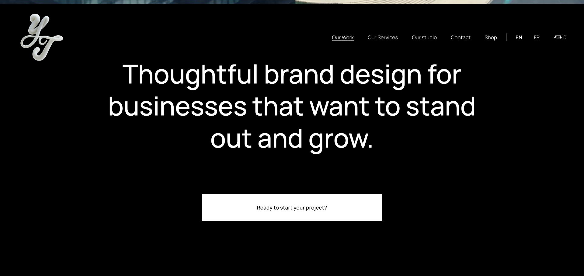
The captured section sits below the opening film: a black canvas, thin white navigation, a metallic monogram, and a very large centered studio statement. An oversized white enquiry button then gives the introduction a definite destination. The page demonstrates considerable visual range within a Squarespace publishing shell. It is not an unmodified template preview.
What you can learn
Separate the permanent studio description from the changing film and project content. That lets a small editorial team update its work without repeatedly redesigning the page’s core message. When opening media carries much of the mood, make the next section useful on its own so the page still communicates when a visitor skips or cannot play that media.
Pros
The centered statement makes the studio’s positioning a large, unmistakable part of the page.
A simple high-contrast button creates a strong next action after the editorial introduction.
Cons & considerations
The opening media and oversized type make this a less efficient model for information-dense service catalogs.
A film-led introduction requires careful fallback content and attention to how much content appears before the first substantive text.
Visible tech stack
Referenced on the public page
Squarespace
Public source checked November 3, 2026. References may be embedded or legacy—not a complete backend inventory.
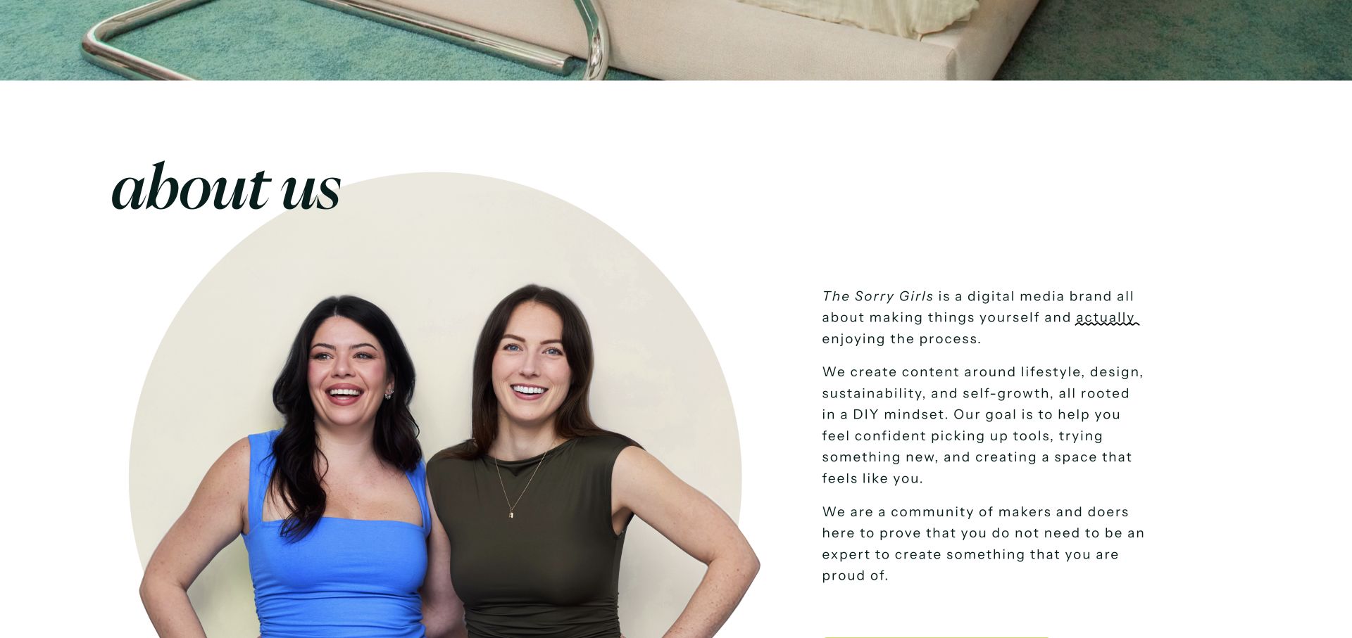
The photographed about section pairs a rounded portrait composition with a substantial paragraph column and an oversized italic heading. Deep green typography, hand-drawn underlining, and generous white space carry the identity beyond the navigation. The homepage also offers routes for collaborations, courses, space submissions, and shopping. Our screenshot deliberately shows this substantive section below the opening media rather than an unloaded video frame, making the example useful for studying actual page content.
What you can learn
Give a creator brand a content structure that survives changes in social platforms. An about section should explain the editorial point of view, while courses, shopping, and collaboration requests need their own clearly named destinations.
Pros
The image-and-copy pairing communicates the brand’s editorial character without relying entirely on a video.
Distinct navigation routes acknowledge viewers, potential partners, and customers as different audiences.
Cons & considerations
The long introduction needs careful paragraph rhythm to remain comfortable on narrow screens.
A media-heavy opening can postpone this useful explanatory content for visitors seeking an immediate overview.
Visible tech stack
Referenced on the public page
Squarespace
Public source checked November 3, 2026. References may be embedded or legacy—not a complete backend inventory.
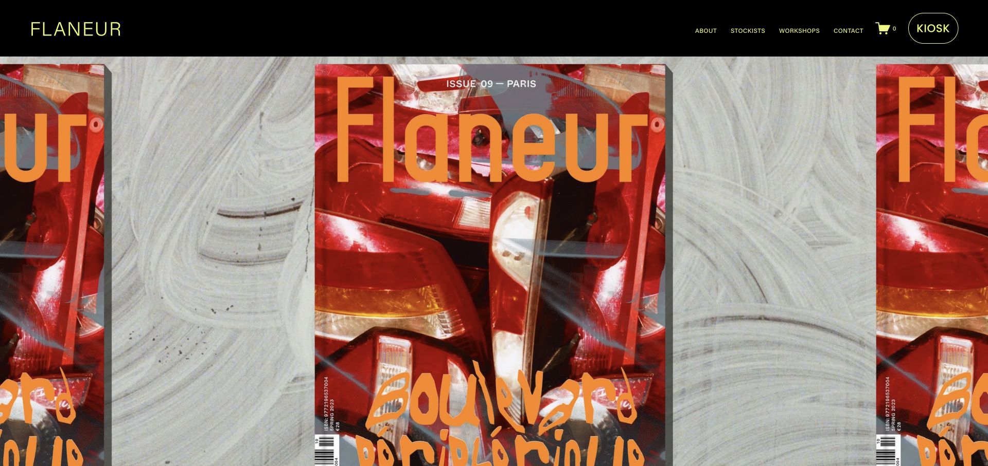
Flaneur places a spare neon wordmark and a small set of publishing-related links on a black header. The latest issue then occupies almost the whole first viewport as repeated, tightly cropped cover artwork. A conspicuous kiosk link and a simple cart indicator reveal the commercial layer without turning the page into a conventional product grid. Subsequent issue information gives the artwork an editorial context rather than leaving it as an unexplained banner.
What you can learn
Use the CMS to connect an issue’s cover, description, contributors, and purchase destination as related content. A publication’s visual identity can come from the object it sells, but the website still needs readable text and stable routes for stockists, workshops, and contact.
Pros
The cover supplies an immediately recognizable color palette and visual subject for the homepage.
The kiosk and stockist routes distinguish direct online purchasing from finding the publication elsewhere.
Cons & considerations
A nearly full-screen cover image does not tell a new visitor much about the magazine until they scroll.
Repeated artwork crops need attention so essential issue information remains available outside the image itself.
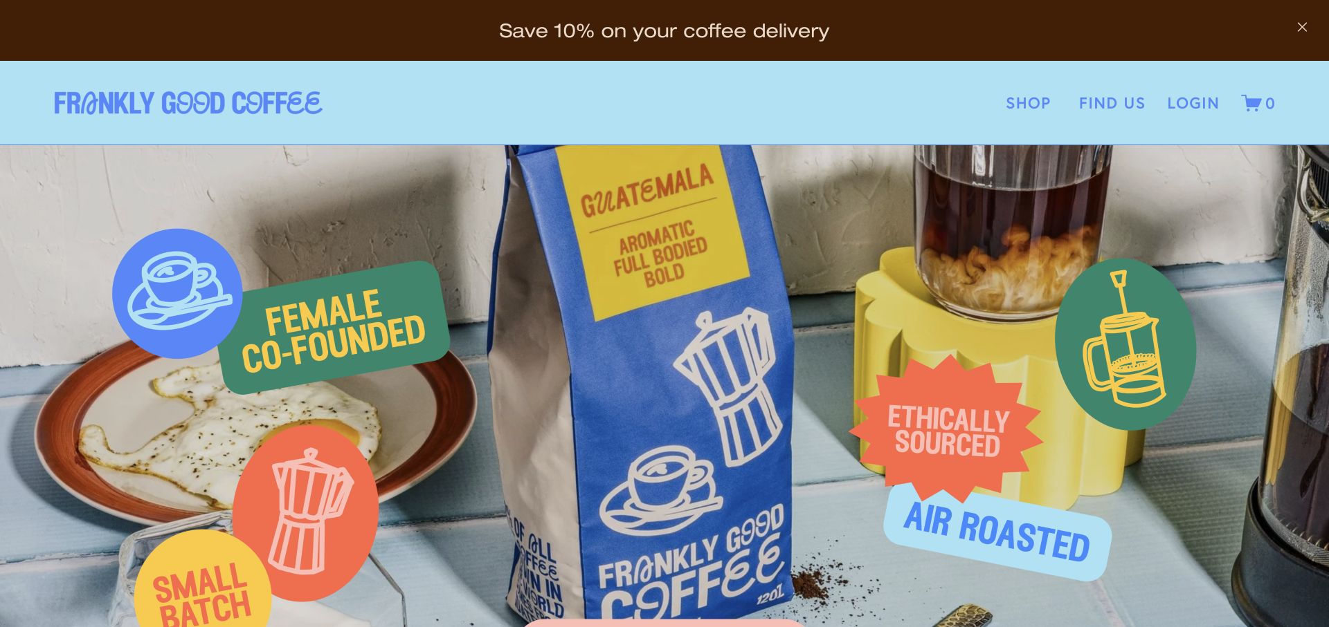
Frankly Good Coffee layers bright sticker-like illustrations over a product photograph, then repeats the same blues, greens, and playful lettering in the header. Shop, location information, account access, and a cart are readily recognizable. Product listings and a subscription offer appear further down the page. The branded Squarespace storefront still depends on original photography and packaging.
What you can learn
Choose a visual language that works across packaging, product cards, announcements, and promotional overlays. Then decide which message deserves priority rather than giving every promotion equal screen space. Our capture dismisses the ordinary newsletter popup so the actual homepage can be evaluated; that popup still matters when planning a less interrupted shopping journey.
Pros
Packaging colors and illustrated labels connect the hero photograph with the rest of the interface.
The catalog includes subscription and single-purchase routes without requiring visitors to infer the difference.
Cons & considerations
The announcement strip, large hero, and promotional popup can compete for attention if shown together.
Playful mixed-case headings are distinctive but should be balanced with straightforward product names and practical buying details.
Visible tech stack
Referenced on the public page
Squarespace
Adobe Fonts
Public source checked November 3, 2026. References may be embedded or legacy—not a complete backend inventory.
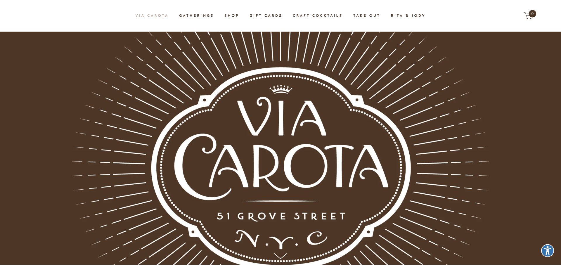
Via Carota’s opening screen is largely a decorative brown wordmark and address treatment surrounded by white space. The top navigation is more functional, naming gatherings, shopping, gift cards, cocktails, takeout, and the people behind the restaurant. This contrast is the useful pattern: the central artwork establishes identity while a separate text layer handles visitor tasks.
What you can learn
Keep decorative typography and operational information in separate but coordinated layers. A restaurant can reuse its printed identity online without making every task depend on reading a logo image. In the CMS, treat menus, gathering information, and product links as maintained content, not as small pieces of text permanently baked into a banner graphic.
Pros
The large wordmark gives the restaurant a distinctive first impression without an elaborate animation.
Specific navigation labels expose several visitor intentions instead of hiding everything under a generic menu button.
Cons & considerations
Practical information occupies less visual space than the decorative identity in the first screen.
A broader commercial ecosystem needs clear handoffs so dining, takeout, and product shopping do not feel interchangeable.
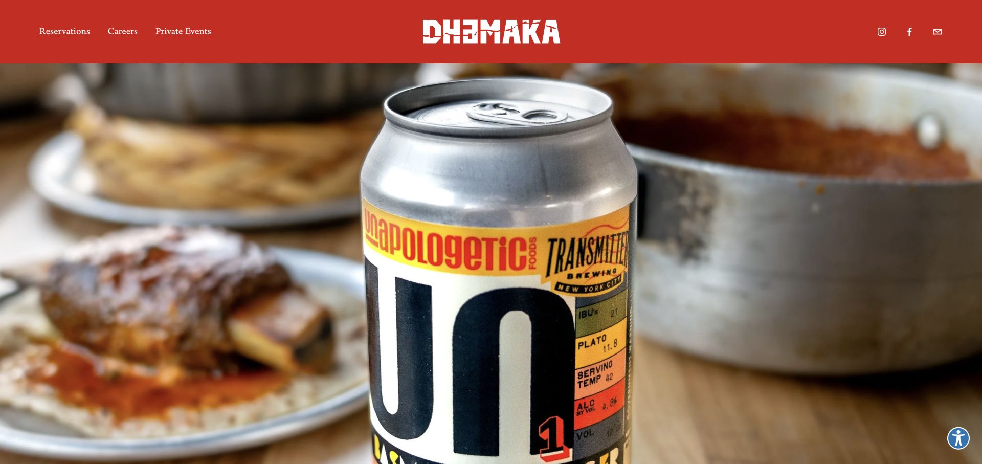
Dhamaka combines a saturated red navigation strip, a white central wordmark, and an edge-to-edge table photograph. Reservations, careers, and private events appear as compact text links rather than a collection of oversized buttons. The food image provides specificity and appetite appeal without an extended introductory paragraph. Squarespace scripts identify the platform; photography and editorial choices make it distinctive.
What you can learn
Start by identifying the few actions a restaurant website must support, then make those actions stable as photography changes. Keep menu, location, and booking information as editable, searchable content elsewhere in the structure rather than assuming a striking image answers every visitor question.
Pros
The red header remains a clear brand anchor above the busy table photograph.
The short navigation avoids making routine restaurant tasks compete with a large amount of promotional copy.
Cons & considerations
The photographic first screen leaves detailed menu and visit-planning information for later exploration.
A full-bleed crop requires checking that the food and table details still work at mobile proportions.
Visible tech stack
Referenced on the public page
Squarespace
Adobe Fonts
Public source checked November 3, 2026. References may be embedded or legacy—not a complete backend inventory.
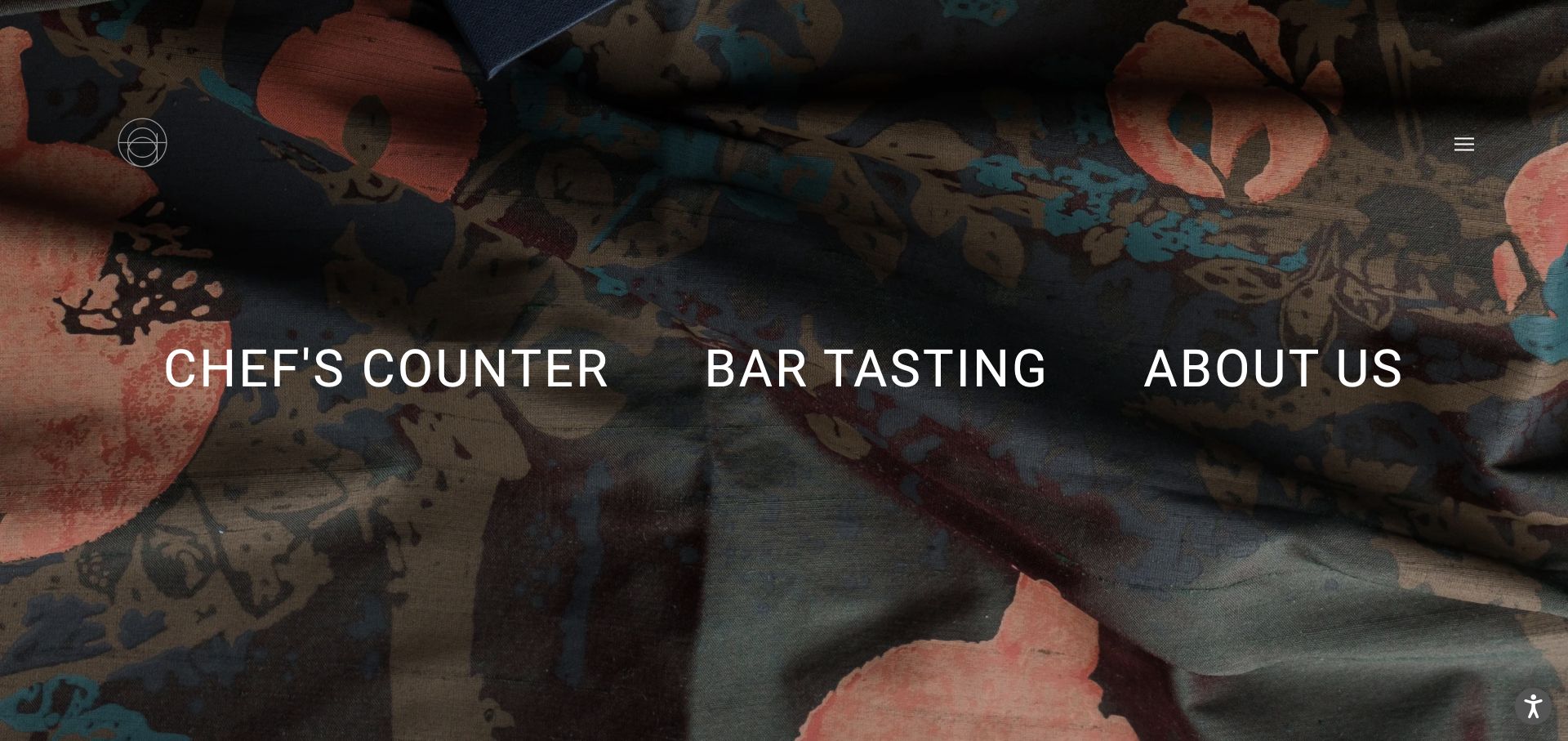
Atomix places three large white experience links over a darkened textile-like background. A small monogram and a restrained menu control occupy the corners, leaving the choice itself as the main content. The page is not trying to tell the entire restaurant story in the first screen. Instead, it turns the homepage into a routing decision. This Squarespace site supports an unusually spare routing model.
What you can learn
Model each experience as its own destination with the details, booking rules, and imagery it needs. A visually simple homepage works only when those subsequent pages answer practical questions. Keep the routing labels readable text, and avoid treating a decorative background as the sole source of meaning. Visible platform assets do not verify the systems behind bookings.
Pros
The three destinations make choosing an experience the obvious task.
The textured background provides atmosphere without adding a competing set of promotional messages.
Cons & considerations
Visitors unfamiliar with the restaurant may need more context before understanding the difference between the offerings.
Large side-by-side labels need a deliberate mobile arrangement rather than simply shrinking to fit.
Visible tech stack
Referenced on the public page
Squarespace
Adobe Fonts
Public source checked November 3, 2026. References may be embedded or legacy—not a complete backend inventory.
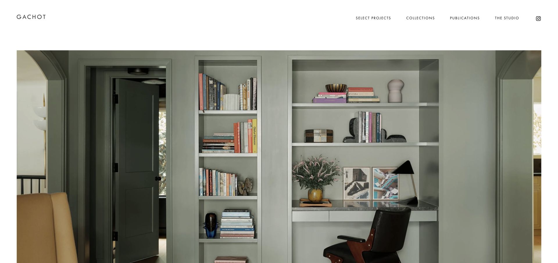
Gachot uses a letter-spaced wordmark, a slim horizontal navigation, and a broad interior photograph contained by white margins. The header distinguishes selected projects, collections, publications, and the studio rather than treating every image as an identical portfolio item. The restrained layout lets material, lighting, and objects provide the visual detail. It is an instructive Squarespace example precisely because the surrounding site structure stays quiet while the project content does the expressive work.
What you can learn
Define separate content types or repeatable layouts for projects, products, and editorial coverage. They may share visual styling, but visitors use them for different purposes. A managed CMS supports updates, but image selection, descriptions, and photographic rights still require care.
Pros
Broad margins make the project photograph feel intentional rather than like a generic background banner.
The navigation gives publications and collections a different role from the selected-project archive.
Cons & considerations
The understated first screen offers little explanation of the studio’s services or suitability for a particular commission.
An image-led portfolio needs enough written project context to support visitors evaluating scope rather than atmosphere alone.
Visible tech stack
Referenced on the public page
Squarespace
Adobe Fonts
Public source checked November 3, 2026. References may be embedded or legacy—not a complete backend inventory.
The MBDS homepage overlays a very large white abbreviation on close-up sculptural imagery, with a small menu label in the opposite corner. There is no conventional row of service cards competing with the image. The photograph emphasizes texture and form, making the opening feel more like a design publication than a standard agency introduction.
What you can learn
Use a recognizable identity and a consistent image treatment to create continuity across project updates. The CMS should preserve meaningful titles, project context, and routes into the archive even when the opening screen is deliberately abstract. A beautiful crop can establish mood, but it should lead somewhere concrete for a visitor evaluating work or making an enquiry.
Pros
The large abbreviation is immediately legible against the dark photographic area.
The minimal interface gives material texture and photographic detail room to define the first impression.
Cons & considerations
An abstract close-up does not immediately explain the range or location of the studio’s work.
Collapsing navigation behind a small menu adds a discovery step for visitors seeking a specific project category.
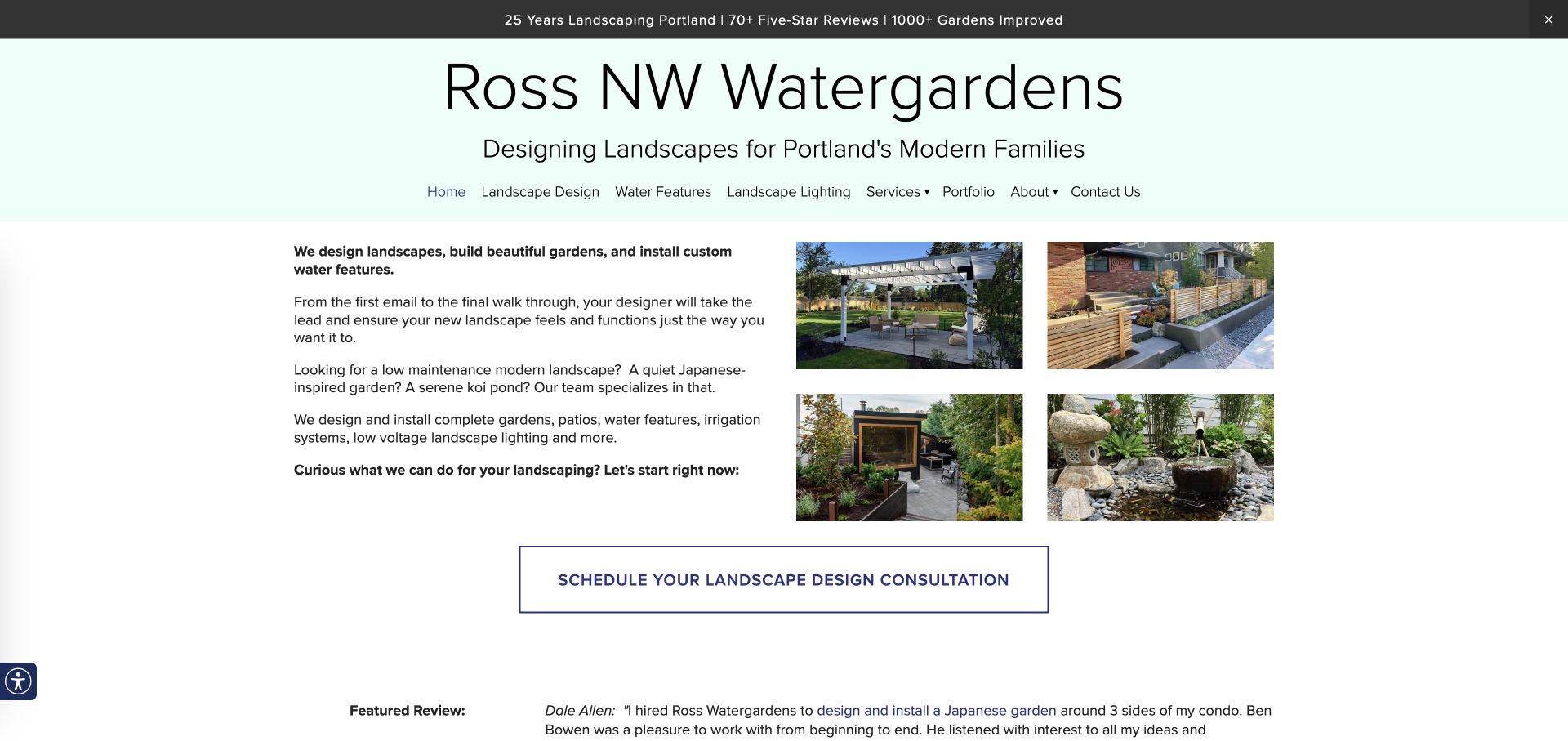
Ross NW Watergardens takes a markedly different Squarespace approach from the image-led studios in this collection. A large name and service-area statement sit above explicit service navigation. The main content pairs several short explanatory paragraphs with four project photographs, then introduces a wide outlined consultation button. The layout prioritizes a visitor who wants to understand what the company does, not just admire a single landscape image.
What you can learn
Use the platform’s repeatable text and image sections to answer buying questions in a predictable order. For a local service business, service names, areas served, project types, and the enquiry process deserve maintained text rather than being hidden inside imagery. The lesson is content completeness and routing, not independently verified business results.
Pros
Explicit service labels and local positioning make the business scope easier to understand before contacting it.
The four-image grouping shows varied landscape work without a full-screen slideshow.
Cons & considerations
The large masthead and announcement strip occupy substantial space before the core service explanation.
Dense paragraphs and several navigation categories need careful mobile spacing to avoid feeling like an unstructured list.
Visible tech stack
Referenced on the public page
Squarespace
Google Analytics
Adobe Fonts
Public source checked November 3, 2026. References may be embedded or legacy—not a complete backend inventory.
Land Morphology uses a rust-colored circular monogram, a compact text navigation, and an exceptionally wide-spaced opening statement. The first photograph begins below a large area of white space, creating a deliberate pause between the identity and the project imagery. Portfolio, firm, blog, and contact are separate destinations. The design is a useful example of using a managed publishing system for an editorial practice website rather than filling the page with every available section type.
What you can learn
Create a small set of durable page roles before choosing visual effects. A clear portfolio structure, an editable firm introduction, and a separate article archive are more valuable than a homepage that accumulates disconnected blocks. Keep the statement and project captions as real text.
Pros
A consistent rust accent links the monogram and wordmark without competing with the landscape photography.
The short navigation distinguishes portfolio research from firm information and editorial reading.
Cons & considerations
The broad white introduction means the first project image is only partly visible in the captured viewport.
Very wide letter spacing can become awkward when the headline wraps on smaller screens.
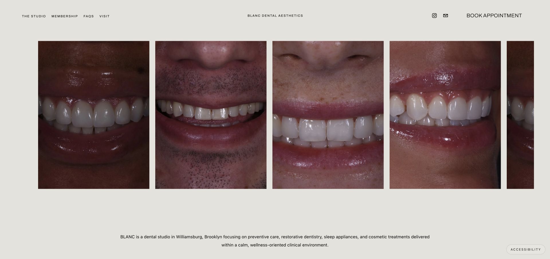
Blanc Dental Aesthetics uses a muted background and a horizontal sequence of tightly cropped smile photographs. A small centered name sits between informational links and a prominent appointment route. The page’s lower introductory text supplies the practice context that the image sequence does not communicate alone. This Squarespace attribution does not concern clinical records or treatment outcomes.
What you can learn
Separate expressive presentation from practical healthcare information. A website can be visually distinctive while still needing clear service descriptions, location details, patient guidance, and a dependable booking handoff. Manage photography permissions and text alternatives explicitly; a gallery should never be treated as proof of an individual clinical outcome. Keep those requirements in the content workflow rather than assuming a platform supplies them automatically.
Pros
The horizontal photo sequence creates a recognizable composition without relying on a conventional smiling-person hero.
The appointment destination remains visible alongside informational navigation.
Cons & considerations
Close-up imagery may not reassure every visitor and needs supporting explanations of the practice and services.
Small navigation type and a wide image sequence require careful handling on narrow screens.
Visible tech stack
Referenced on the public page
Squarespace
Adobe Fonts
Public source checked November 3, 2026. References may be embedded or legacy—not a complete backend inventory.
Smile Design Manhattan places its name and a compact row of informational links over a large photograph of a clinical setting. A central emblem and a rounded contact action form the main focal point. The subdued image overlay keeps the white interface elements distinct from the photograph, but the opening contains relatively little explanatory text.
What you can learn
A sparse homepage still needs a plan for the information that sits behind it. Separate service explanations, provider details, practical visit information, and contact choices into clear destinations rather than letting a single conversational button carry the entire journey. When adapting this pattern, test whether visitors can understand the practice without interacting with a widget or relying on the photograph.
Pros
The central contact action is easy to distinguish from the quieter informational links.
A consistent overlay gives the emblem and navigation a common visual treatment across the image.
Cons & considerations
The initial screen offers limited detail about services, location, or who a consultation is intended for.
A very short top-level menu can leave important patient questions dependent on further exploration.
Visible tech stack
Referenced on the public page
Squarespace
Public source checked November 3, 2026. References may be embedded or legacy—not a complete backend inventory.
Build the information architecture with normal pages and suitable collections first. Test navigation and editing with actual content before adding code to reproduce a reference’s unusual details.
Use a portfolio structure when projects need repeatable detail
Decide what every project needs: description, role, image sequence, credits, and a next step. Squarespace’s portfolio documentation is version-specific; confirm the intended site version and features rather than assuming an older developer example applies.
Custom CSS and injected scripts have different purposes and support boundaries. Record each change, test it after platform changes, and name a maintainer. Avoid disguising a fragile custom application as a simple template adjustment.
Ask the owner to add an event or project, replace an image, correct the contact information, and preview a phone. If the workflow is confusing during handover, it will not improve when the designer is unavailable.
Separate native features from connected services
For bookings, commerce, donations, newsletters, and member access, document the destination and account owner. Check the whole journey rather than assuming a visible button establishes the receiving system or its capabilities.
Budget for the content, not only the page assembly
List photography, writing, captions, accessibility review, migration, and routine updates. A recognizable personality’s site may have a large content operation behind a visually spare homepage.
A useful handover demonstration
Ask the actual team to carry out its routine job: publish a realistic update, correct a mistake, preview a narrow screen, and identify who owns an integration failure. For a library or frontend framework, also ask who maintains the content source and deployment. A polished screenshot does not answer those operational questions.
Beyond the screenshot
Before publishing a Squarespace redesign
Test collection entries with different title and image lengths.
Review mobile navigation, image crops, and reading order.
Check practical contact, visit, and booking information.
Verify every connected form and confirmation destination.
Review keyboard focus, contrast, captions, and motion.
Inventory custom CSS, scripts, and their maintainers.
Map old URLs and check redirects and page metadata.
Hand over business-owned access and an editing demonstration.
Test with real content, a keyboard, a small screen, slow or failed requests, and the people who will maintain the system. These are planning checks, not an accessibility, security, performance, or search-ranking certification.
Sources & editorial method
How this Squarespace collection was reviewed
Examples use direct website screenshots and public Squarespace runtime or configuration signals. A documented site association does not imply that every connected commerce, booking, or business system uses the same platform.
Every image is an unmodified capture from the actual website, with its source and capture date. Some captures are reused from our shared catalog; their dates remain the original capture dates. None comes from a vendor gallery or a generated reconstruction. Moving imagery and live content can change.
Technology attribution uses public page assets or metadata, official platform documentation, or a cited first-party project case study. Documentary and framework-relationship evidence is identified where used; it is not a complete current backend inventory. A CMS image CDN alone does not establish a full CMS deployment. A library’s presence does not prove which individual controls use it, and a platform label does not establish AI authorship.
The composition notes, lessons, pros and tradeoffs are original editorial observations. We have not measured conversion, traffic, security, performance or accessibility conformance. Website owners retain their brands and imagery; these examples are not our client portfolio. Written, Edited and Curated are independent records, not dates advanced by a build. See our editorial standards or suggest a correction.
Questions worth asking
Squarespace website development FAQs
Can a Squarespace site look distinctive?
Yes, but the useful question is whether its identity can be maintained with your real content. Typography, photography, spacing, and editorial restraint often matter more than unusual effects.
Are all Squarespace tutorials applicable to my site?
No. Check the version, editor, and current feature documentation. Legacy developer-platform techniques are not automatically features of a newer site.
Should I add code to match a reference exactly?
Only when the result serves a concrete need and someone can maintain it. A close visual match is not worth a confusing editing workflow or fragile navigation.
Will this replace every business tool?
Not necessarily. Inventory the actual booking, payment, newsletter, and customer-management systems and test their connections separately.