A good Shopify website connects a clear brand story to accurate product information and a usable buying journey. Study the product discovery and service details as closely as the campaign photography.
These examples are references for storefront decisions, not evidence that one theme or app stack will reproduce a brand’s business. The collection identifies the named Shopify property; fulfillment, accounting, and other corporate systems are outside the review.
Start with your catalog and buying questions: what varies, what needs explaining, what is frequently unavailable, and what makes a customer hesitate? Those answers are more useful than choosing a homepage animation first.
Before the examples
What makes good Shopify website development in 2026?
Treat product data as part of the interface
Write representative products before designing the template. Include an awkwardly long name, several variants, a sold-out option, dimensions, care information, and shipping restrictions. A template that only works with one beautiful sample product is not a finished commerce system.
Give merchants useful editing boundaries
Shopify themes organize presentation through layouts, templates, sections, and blocks. Decide which pieces a merchant should reorder and which rules must stay consistent. A flexible editor should help someone publish a useful campaign without breaking the product hierarchy.
Make buying information easier to find than decoration
Use recognizable category labels, readable prices, clear variant states, and a visible route to delivery and returns information. Show the practical difference between products before asking shoppers to compare lifestyle imagery. Do not infer conversion performance from a polished storefront.
The collection · 20 examples
20 Shopify website examples worth studying
Look for recurring commerce patterns: stable category navigation, campaign modules, product education, and clear shopping actions. The direct captures show an opening view, not a checkout or fulfillment audit.
We start with five recognizable brands or organizations: Gymshark storefront, Allbirds storefront, SKIMS storefront, Mattel Creations storefront, Kylie Cosmetics storefront. Each attribution applies to the named website property, not every product or website belonging to its organization. This is a curated reading sequence, not a measured ranking.
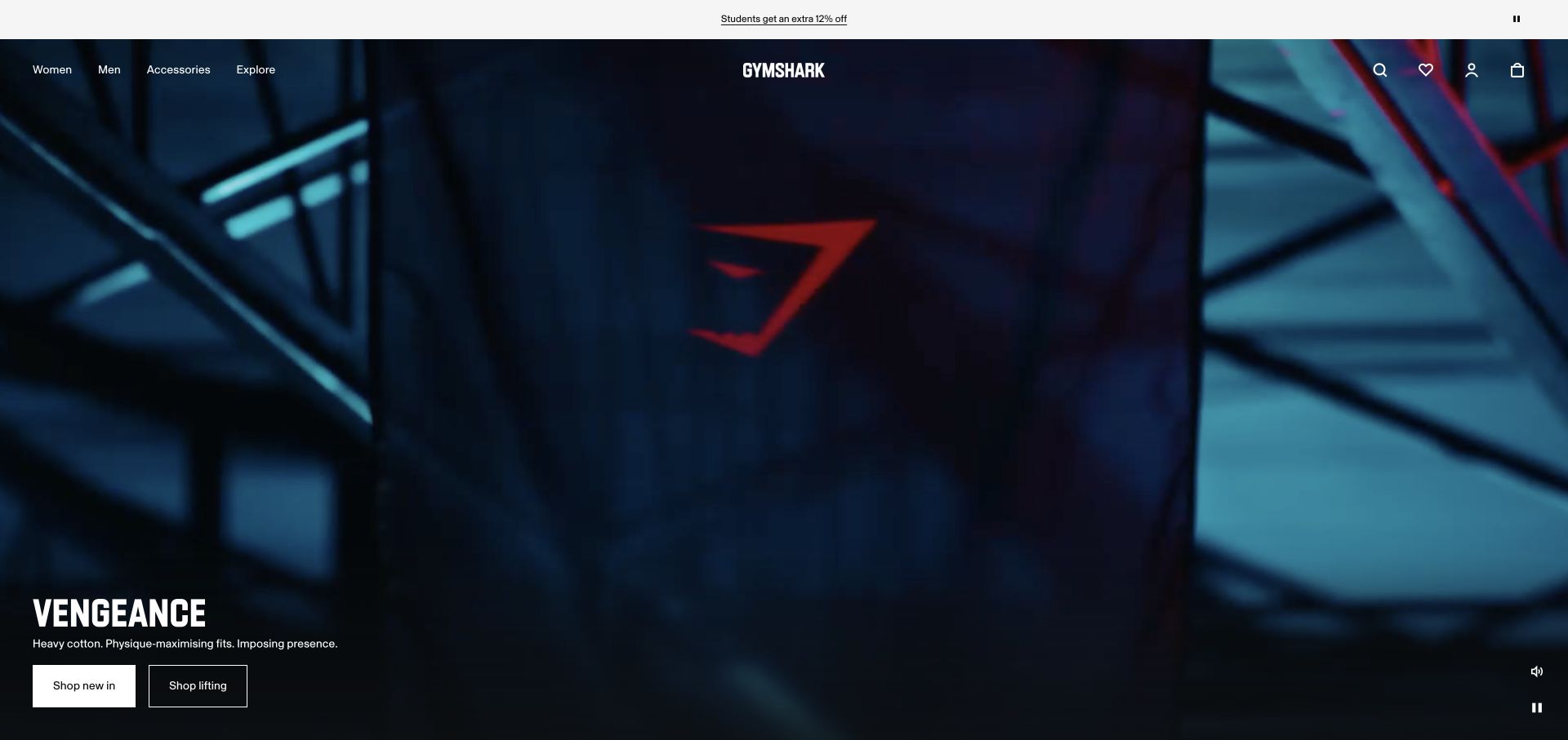
Gymshark opens with a dark training campaign, a centered white identity, and compact audience navigation at the upper left. Search, favorites, account, and bag utilities remain at the opposite edge. The campaign name and two shopping routes sit in the lower-left corner, leaving most of the screen to moving imagery; sound and pause controls are visible separately. Shopify’s official case study documents the commerce association, while the reviewed frontend exposes Next.js assets. This is not evidence that the current page is a standard Shopify theme.
What you can learn
Separate the storefront shell from the campaign module and from the commerce integration. A custom frontend must preserve accurate product destinations, bag behavior, and useful fallbacks while media changes. Borrow the stable hierarchy, not the assumption that a large retailer’s architecture is necessary for a smaller catalog.
Pros
The two campaign actions distinguish new arrivals from a specific shopping category.
Media controls have a separate place from the commerce utilities.
Cons & considerations
Dark moving footage needs a meaningful still presentation.
The highly atmospheric opening postpones product details and comparison until a later step.
ReactAssociated with Next.js; not independently observed
Public source checked November 3, 2026. References may be embedded or legacy—not a complete backend inventory.
Platform source: Shopify’s official Gymshark migration case study. Vendor-documented Shopify commerce association. Live capture shows a Next.js storefront; backend completeness and the continued extent of the historical integration are not independently established. Platform evidence is separate from the direct website screenshot and is not a complete current infrastructure audit.
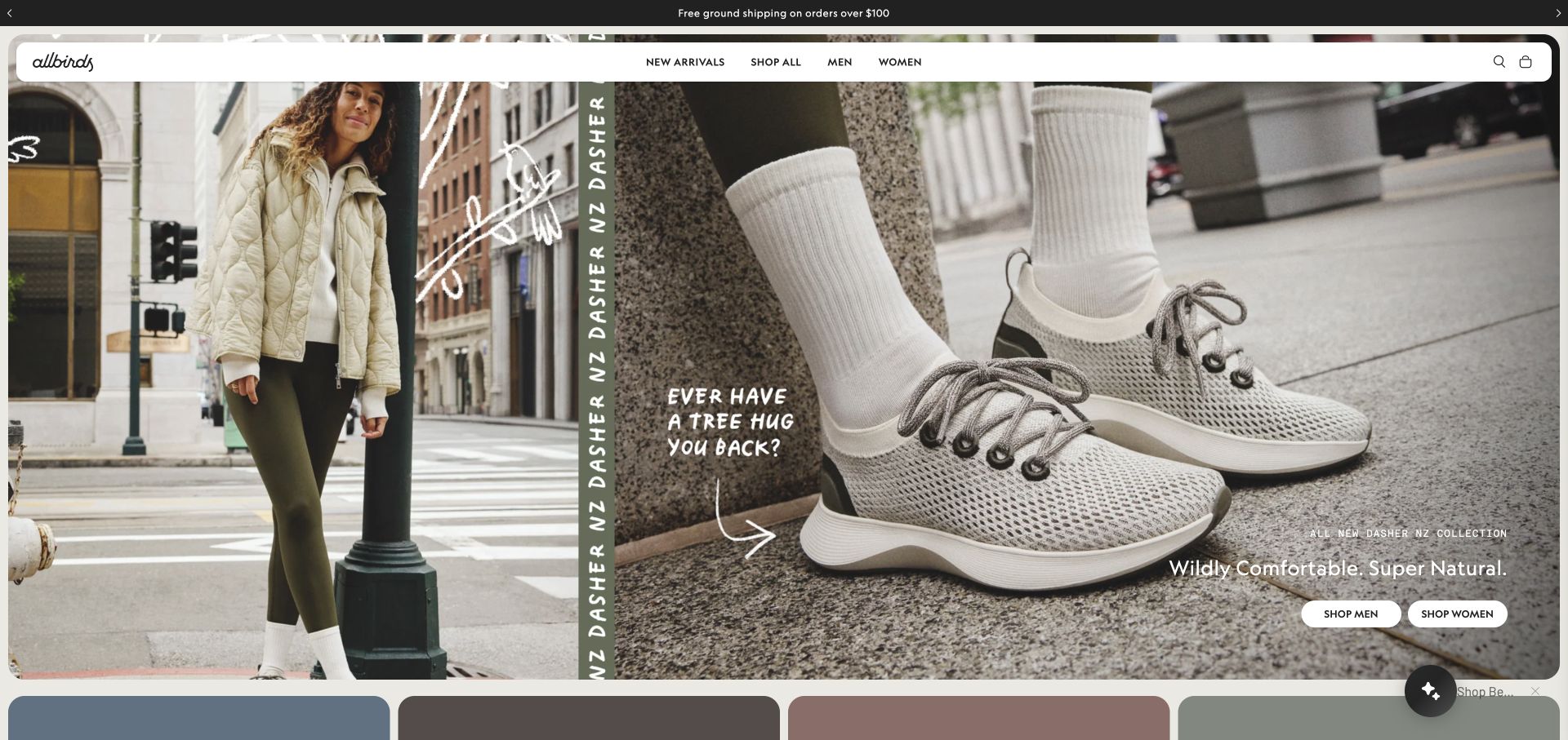
Allbirds combines a street-level lifestyle photograph with a much closer shoe view, separated by a narrow vertical product-name strip. Hand-drawn annotations give the campaign an informal editorial voice. A rounded white navigation bar remains readable over the imagery, with product categories centered and search and bag controls at the edge. Two shopping actions divide the campaign by audience. Public Shopify storefront signals support the commerce association; the screenshot does not identify the theme, conversion performance, or every connected retail system.
What you can learn
Treat a campaign as a replaceable merchandising module inside a stable storefront shell. Define the image pairs, product destination, audience labels, and mobile crop together. Keep the actual product name and category routes available as text so a visually expressive composition does not become the only way to understand or reach the range.
Pros
The two image scales connect brand atmosphere with the physical product.
A solid navigation surface separates essential shopping controls from the campaign.
Cons & considerations
Annotations baked into artwork can become difficult to read on smaller screens.
Several campaign elements need deliberate stacking rather than a single responsive image crop.
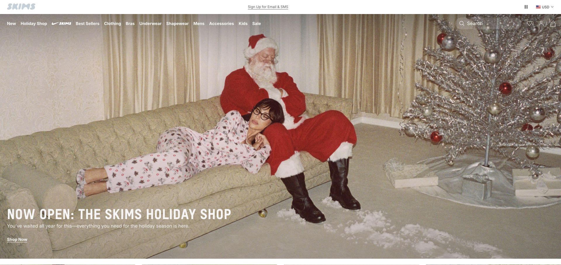
SKIMS places a seasonal lounge scene beneath a compact white identity strip and a wide navigation row. Product families, a holiday destination, collaborations, and sale access share the header, with search and bag utilities at the edge. A large white campaign title and a simple shopping link occupy the lower-left part of the photograph. The public page exposes Shopify storefront signals. That evidence concerns the selected commerce property, not the identities of the people pictured, the exact theme, or the implementation of fulfillment and customer systems.
What you can learn
Keep a Shopify campaign’s editorial voice separate from the catalog taxonomy. A merchant should be able to replace the seasonal scene without losing stable collection routes. Review whether the menu still works when another launch is added, and keep important product-family names understandable without relying on campaign familiarity.
Pros
The campaign has one clear shopping destination rather than several competing hero buttons.
Product families remain visible above the seasonal story.
Cons & considerations
A long category row needs a deliberate mobile grouping.
White navigation over photography requires checks across every image and moving frame.
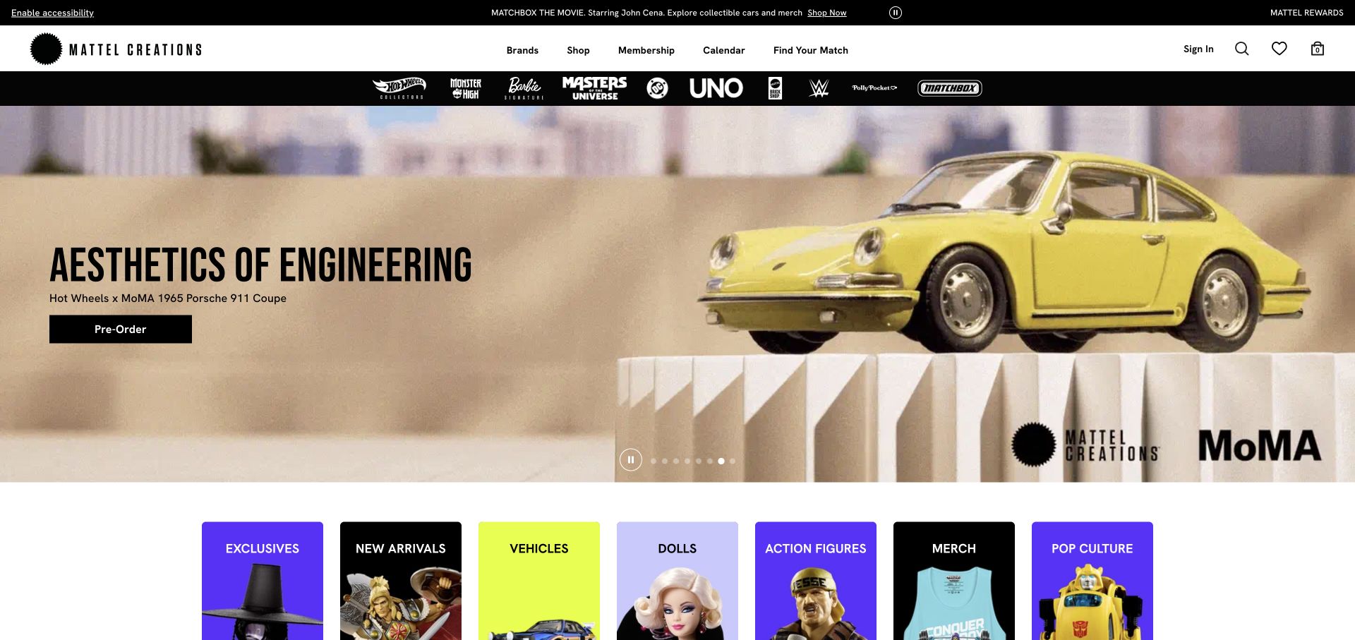
Mattel Creations uses a black-and-white commerce header, a separate row of franchise marks, and a broad collectible-product campaign. In the captured frame, a model car and collaboration identity sit beside a preorder action. Colored product-category tiles begin directly underneath, offering another route into the assortment. A calendar and membership destination add tasks beyond ordinary browsing. Shopify storefront signals identify the commerce association, not the inventory allocation rules, membership implementation, or timing of future releases.
What you can learn
Model a launch as more than an image and button. Preorder status, product availability, release dates, and any eligibility conditions need coordinated ownership. For a Shopify catalog with recognizable sub-brands, give franchise browsing and product-type browsing clear, separate roles instead of assuming every shopper starts with the same vocabulary.
Pros
Franchise marks and category tiles provide different ways into a varied catalog.
The campaign’s preorder action states a more specific task than generic shopping.
Cons & considerations
Several navigation layers consume substantial space before the product content.
Date-sensitive releases and membership conditions require precise ongoing updates.
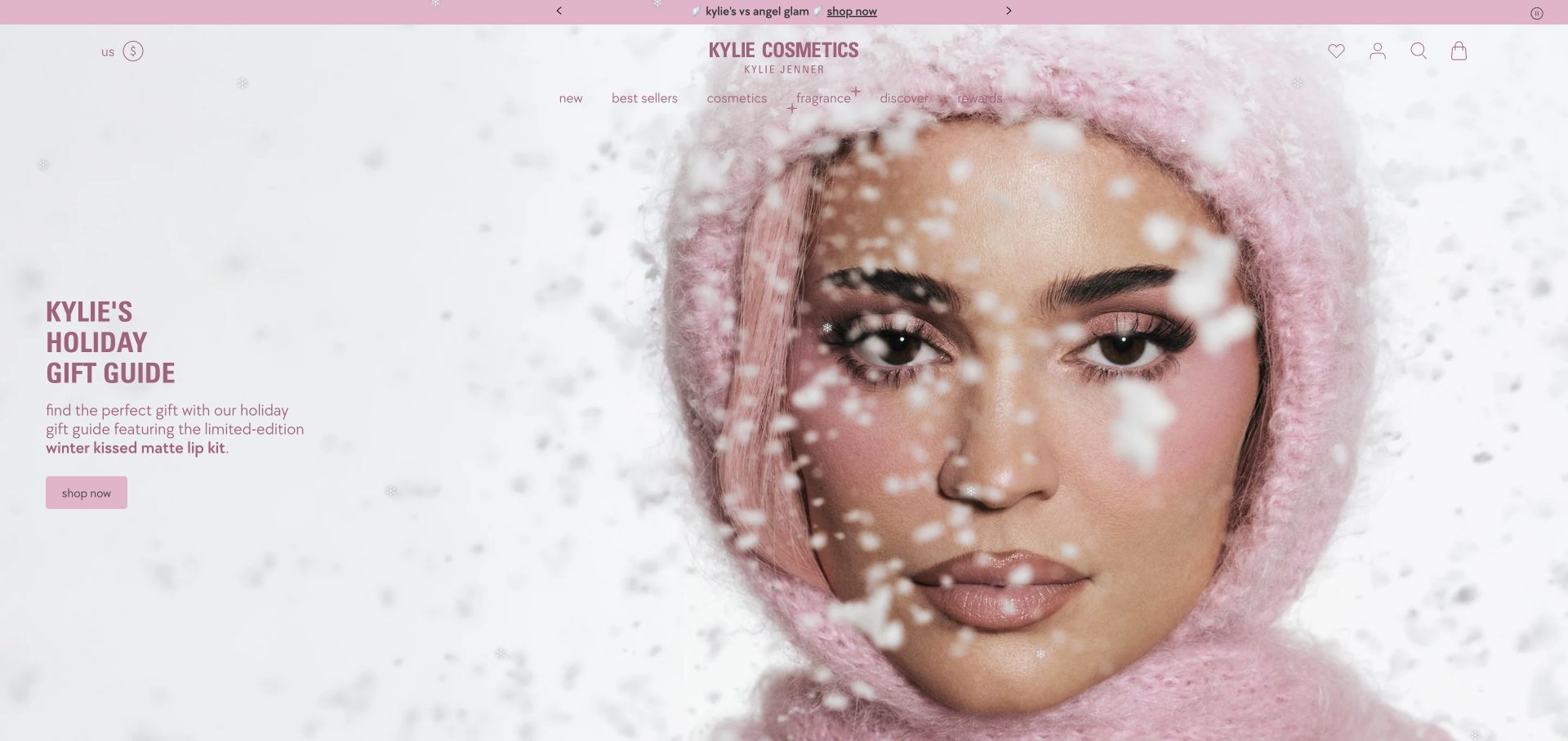
Kylie Cosmetics uses a pale winter campaign portrait with pink typography and a restrained left-hand gift-guide introduction. The centered identity, fine-line utility icons, navigation labels, and promotional strip share the same palette. A compact shopping button links the seasonal story to its destination rather than placing a product grid over the photograph. Public Shopify storefront assets support the platform association. The image is campaign material, not evidence about the pictured person’s identity, product effectiveness, or the complete commerce and fulfillment setup.
What you can learn
A seasonal Shopify section needs an editorial lifecycle as well as a strong launch image. Store the headline, supporting text, destination, and offer period in a maintainable structure. Test a campaign with a different image focal point and retire outdated messages consistently across the announcement strip, homepage, and linked collection.
Pros
The campaign palette connects the header and hero without introducing extra decorative systems.
The gift-guide route gives the portrait a clear merchandising purpose.
Cons & considerations
Fine pink text needs careful contrast review against pale media.
Seasonal imagery and launch messages require ongoing updates after the promotion ends.
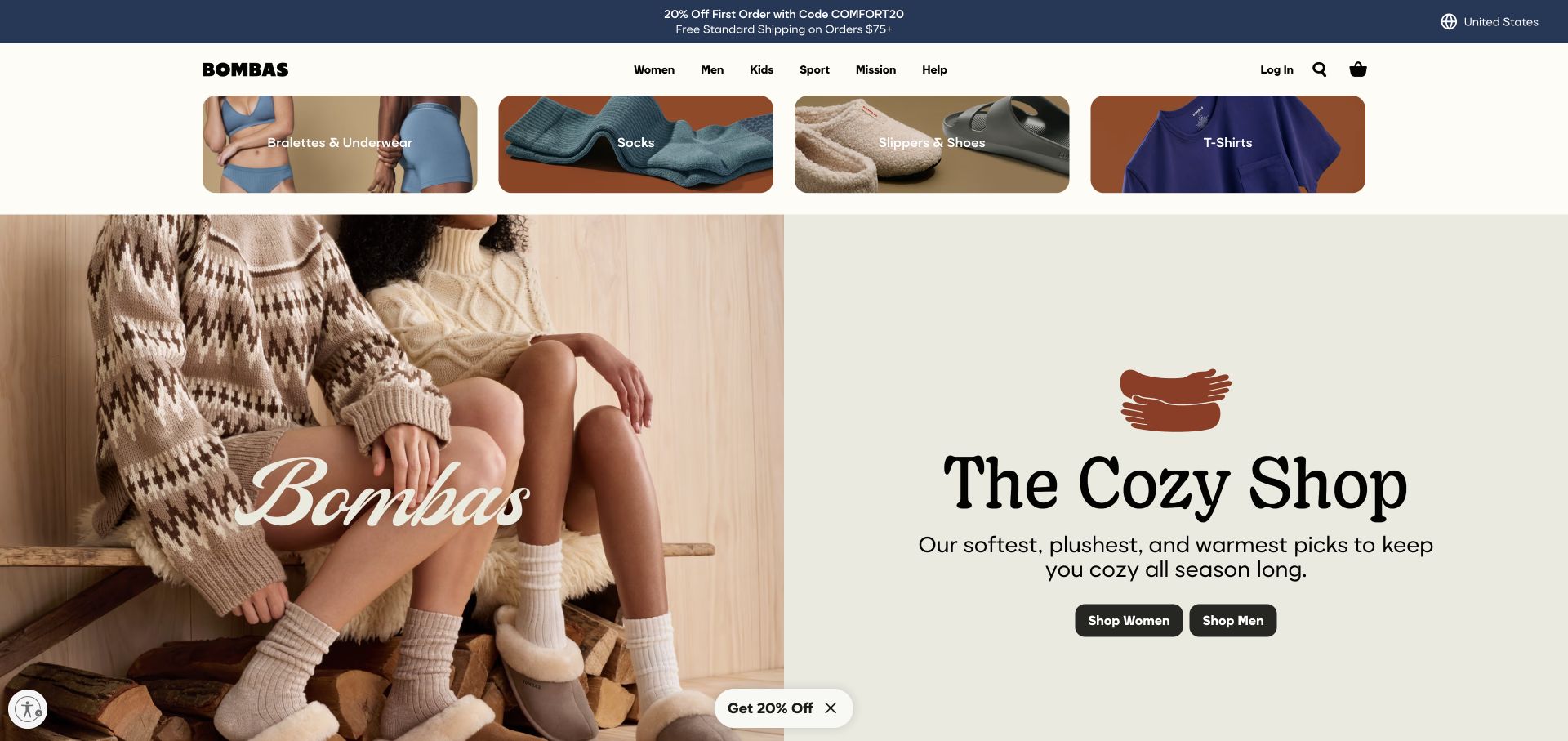
Bombas places four photographic category shortcuts directly beneath a compact navigation header. Socks share that row with underwear, slippers, and shirts, broadening the assortment before the main campaign begins. The seasonal introduction then splits between a warm product scene and a pale panel with a large serif title, short explanation, and two audience actions. A collapsed discount control remains near the lower edge. Public Shopify storefront signals identify the commerce association, not the exact theme, customer data model, or results of the promotion.
What you can learn
Use reusable category shortcuts to explain a catalog’s breadth without forcing every product family into the hero copy. In a Shopify implementation, define image crops, labels, and collection destinations as a coordinated set. Test the relationship between promotions and ordinary shopping so an overlay does not obscure important navigation or product information.
Pros
The image shortcuts make several product families visible immediately.
Campaign copy sits on a stable pale surface rather than over a busy photograph.
Cons & considerations
The extra category row pushes the main campaign further down the page.
Discount prompts and repeated promotional strips can interrupt a straightforward browsing journey.
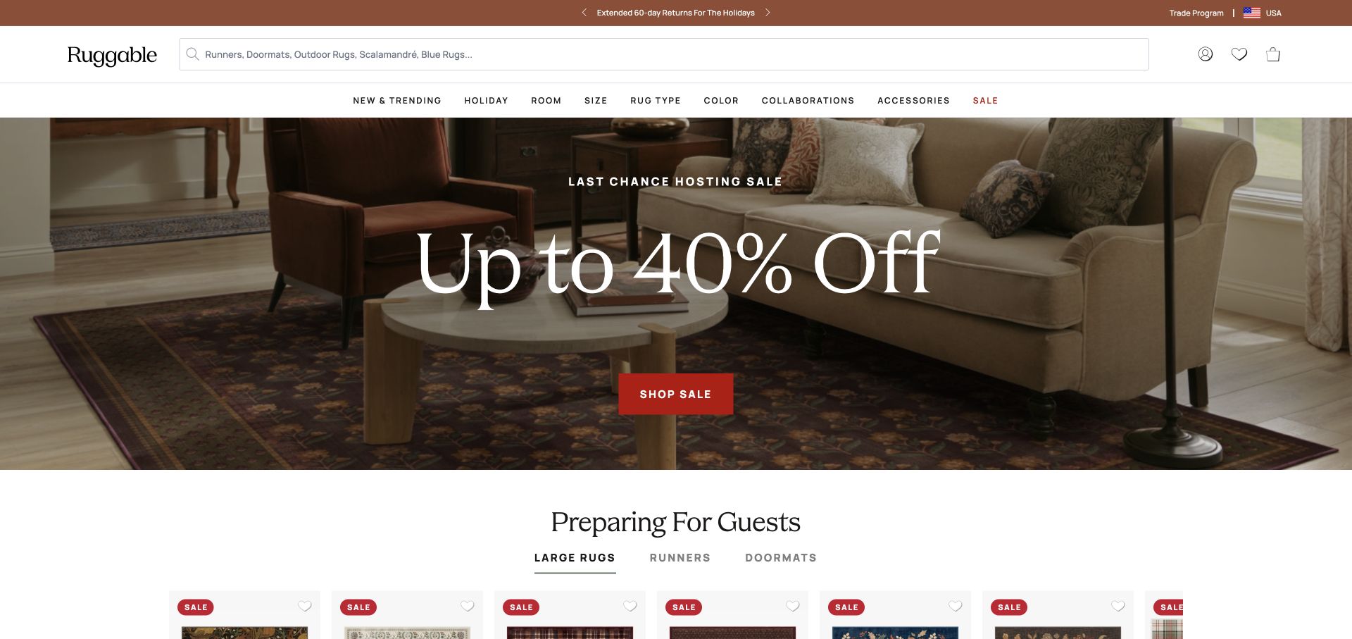
Ruggable gives search a large share of the header, with a second navigation row organized around room, size, rug type, color, and related categories. A room-setting campaign and oversized sale message fill the opening, followed immediately by a tabbed product area. This puts a broad merchandising story beside several more precise ways to shop. The source records Shopify storefront evidence and a Next.js frontend, a useful reminder that the commerce platform and visible presentation layer can be different parts of a build.
What you can learn
Design the catalog vocabulary before polishing the campaign. Attribute labels and filters should reflect information the merchant can maintain consistently for every product. For a separate frontend, explicitly test search, variant data, pricing freshness, and bag handoffs rather than assuming the platform association makes those integrations complete.
Pros
Search and attribute-based categories offer alternatives to browsing a campaign.
The next product section begins within the initial page view.
Cons & considerations
Two navigation rows and utility content need careful prioritization on phones.
Prominent discounts require accurate terms and consistent pricing after the next click.
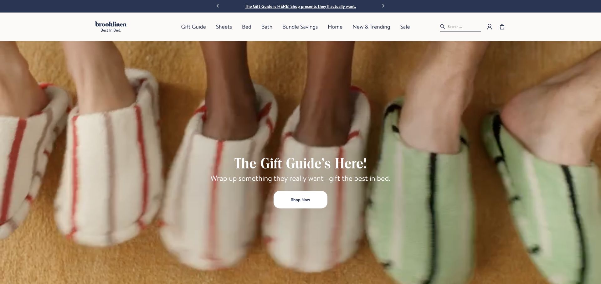
Brooklinen places a close-up moving product scene beneath a white category header and navy announcement strip. The campaign copy and rounded white shopping action sit centrally over the imagery. Sheets, bedding, bath, bundles, and other catalog routes remain visible in a conventional horizontal navigation, with search and account utilities at the opposite edge. The photograph provides texture while the header supplies the durable shopping structure. Shopify storefront signals identify the commerce association, not the exact theme, inventory process, or operation of every connected service.
What you can learn
A gift-led campaign should be an optional entry point rather than a replacement for the catalog. In a Shopify implementation, define reusable campaign content and stable collection destinations separately. Check how the headline reads over different frames and provide a useful still image so motion is not necessary to understand the offer.
Pros
The category header preserves direct routes for shoppers who already know what they need.
Tactile close-up imagery connects the campaign with the kind of products being sold.
Cons & considerations
Centered white text depends on contrast throughout the moving scene.
Seasonal gift messaging needs a consistent replacement plan across campaign surfaces.
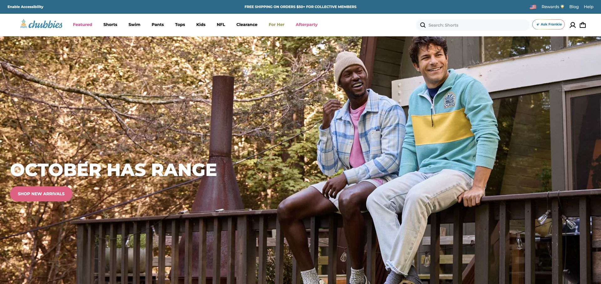
Chubbies uses an outdoor seasonal photograph, a large low-positioned headline, and a pink new-arrivals action. A white navigation bar contrasts with the image, while a blue utility strip carries shipping and membership messages. Clothing families, collaborations, search, account, and bag controls compete for a long horizontal header. Public Shopify storefront evidence supports the platform association. The campaign is a dated visual observation, not a claim that its seasonal message remains current or that every promotional and customer-service feature runs inside Shopify.
What you can learn
Give a broad apparel catalog a controlled vocabulary and a clear distinction between permanent families and temporary collaborations. A merchant should be able to add or retire a campaign without changing the entire navigation. Test long labels, a crowded mobile menu, and direct collection entry instead of judging only the lifestyle photograph.
Pros
The campaign action is visually distinct from the ordinary category links.
Search remains visible beside a substantial product taxonomy.
Cons & considerations
Numerous utility and promotional controls can make the header feel crowded.
Date-sensitive campaign copy needs active review as the season changes.
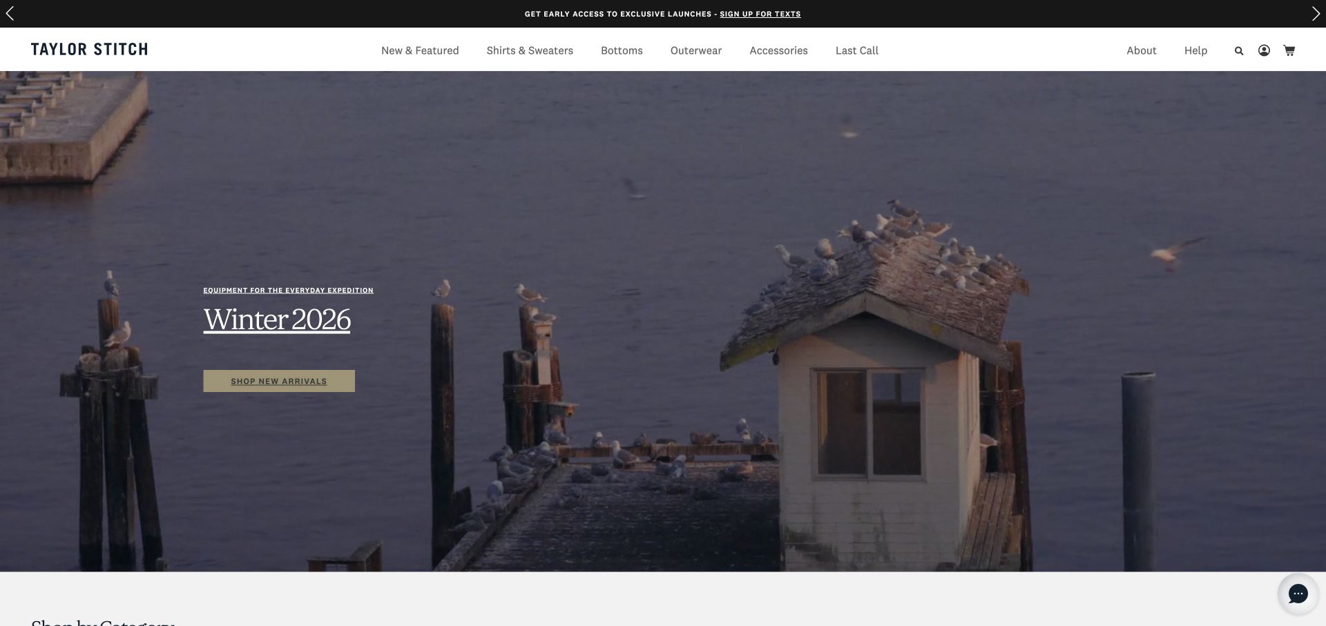
Taylor Stitch uses a harbor scene rather than an isolated product photograph to introduce its seasonal collection. Small white campaign text and a muted shopping control sit toward the left, while the solid header retains shirts, outerwear, accessories, and other familiar categories. A narrow announcement strip is visually separate above. The resulting mood is quieter than a crowded sale grid, but requires the next steps to supply product detail. Public Shopify storefront evidence supports the commerce association without identifying the theme or every integrated retail service.
What you can learn
A Shopify campaign can establish tone without explaining the whole catalog. Keep its destination and product references explicit, and preserve normal collection navigation for a returning shopper. Test the same section with different media brightness and a still fallback so the editorial treatment does not make the shopping action difficult to locate.
Pros
The solid header gives category navigation a consistent contrast surface.
Seasonal creative is distinct from the permanent assortment structure.
Cons & considerations
The atmospheric image supplies little immediate product comparison.
Small campaign text and a subdued action need careful contrast and phone-scale review.
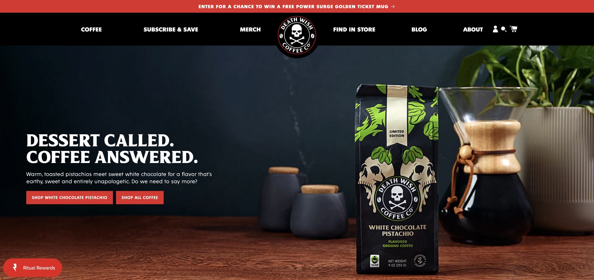
Death Wish Coffee combines a dark product photograph with a centered skull identity and heavy white navigation. Red accents repeat in the announcement strip, shopping buttons, and rewards control. The campaign introduces a packaged flavor beside brewing equipment, with one action for that product and another for the wider coffee range. Subscription and store-finding routes remain separate in the header. Public Shopify storefront signals support the platform association without establishing subscription-provider details, physical retail inventory, or the full fulfillment stack.
What you can learn
Use packaging and product context to make a launch specific, then preserve a route for shoppers who want the broader catalog. In a Shopify build, keep the product reference, campaign text, and availability synchronized. If subscriptions or rewards use connected tools, document their ownership and test their separate states rather than treating them as decorative header features.
Pros
The product photograph clearly relates to the named campaign rather than generic brand imagery.
Product-specific and catalog-wide actions offer different shopping paths.
Cons & considerations
Several red promotional elements can compete for attention.
The broad navigation needs a simpler arrangement when the central logo and utilities compress.
Hiut Denim pairs a portrait-led clothing photograph with a monochrome plant close-up inside a broad campaign frame. A short product name crosses the lower part of the composition. Above it, the large central identity is balanced by only three main routes—shopping, story, and guides—with search and bag controls on the other side. The restrained navigation makes the editorial categories conspicuous. Public Shopify storefront signals support the platform association, not the identity of the person pictured, the product’s technical claims, or the exact theme implementation.
What you can learn
For a focused Shopify catalog, a small navigation can leave room for useful product education and brand context. Define where fit, materials, care, and product destinations belong before making the opening sparse. Keep the campaign name readable outside the image, and demonstrate how a different product story reuses the same section.
Pros
The short navigation gives editorial guides a distinct role beside shopping.
Two image treatments create interest without adding a large collection of promotional controls.
Cons & considerations
The sparse opening leaves specific product evaluation to later pages.
Text crossing a divided image needs careful responsive positioning and contrast.
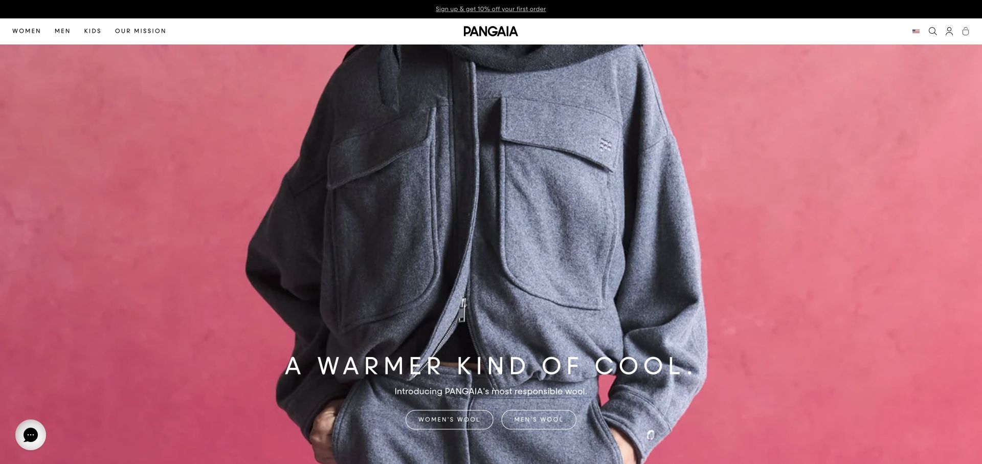
PANGAIA places a close-up garment against a saturated pink background, using a widely spaced white campaign heading and two outlined collection actions near the lower edge. The narrow white masthead centers the identity and keeps audience categories and a mission route distinct. A dark promotional strip sits above, outside the main photograph. Public Shopify storefront signals establish the commerce association. The material and responsibility language belongs to the brand’s campaign; this review does not verify environmental claims, sourcing, or product performance.
What you can learn
A material-led Shopify campaign should connect its visual story to maintained product information and supporting explanations. Make collection destinations, material descriptions, and any substantiation separate content responsibilities. Test the same template with longer copy and different garment crops so the elegant opening does not depend on one unusually clean image.
Pros
A limited header gives the campaign a clear visual frame.
The two collection actions make audience-specific browsing explicit.
Cons & considerations
Fine outlined controls and white text need contrast checks against the image.
Broad material claims require detail beyond the campaign headline.
Ugmonk’s homepage shows a desktop product in use, with a restrained serif introduction and one warm yellow shopping action. A white header separates starter kits, cards, accessories, and journals, while a pale announcement strip introduces a different launch. A muted row of publication marks bridges the campaign and product content below. The composition explains context before showing many purchase choices. Public Shopify storefront evidence supports the commerce association; the publication marks are displayed site claims, not independently verified endorsements or business results.
What you can learn
For a compact catalog, organize the relationship between the starter product and its supporting items before adding promotional modules. A reusable Shopify campaign should make the demonstrated object and its destination unambiguous. Maintain launch announcements separately so a new accessory does not obscure the main system a first-time shopper needs to understand.
Pros
The in-use image supplies context for an otherwise unfamiliar physical product.
The short category list reflects relationships within the assortment.
Cons & considerations
A broad lifestyle message still needs concrete product explanation further down the page.
Moving media and publication marks should not displace practical buying details.
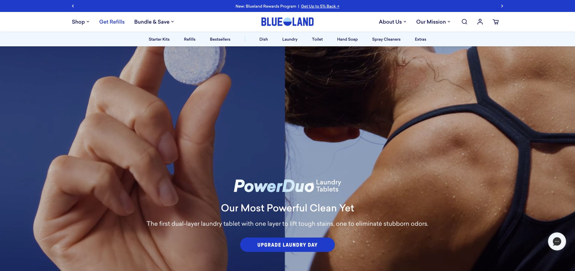
Blueland uses a split product-use scene and a saturated blue palette to introduce a laundry-tablet campaign. A prominent blue action anchors the lower copy, while two header levels distinguish shopping, refills, bundles, brand information, and specific household categories. A rewards announcement occupies its own strip above. The public page exposes Shopify storefront signals. That does not verify the campaign’s cleaning or environmental claims, establish subscription behavior, or identify every service behind rewards and repeat ordering.
What you can learn
For a Shopify consumables store, define the relationship between starter products and refills before designing promotions. Returning customers should not have to rediscover the introductory system each time they reorder. Maintain bundle contents, refill compatibility, and product destinations together, and test how a launch campaign coexists with the ordinary household categories.
Pros
Refills receive a distinct navigation route rather than being hidden in a general catalog.
The blue identity stays coherent across navigation, campaign, and action.
Cons & considerations
Two category layers and a rewards strip can crowd the header.
A forceful product claim still needs accessible detail and appropriate supporting evidence.
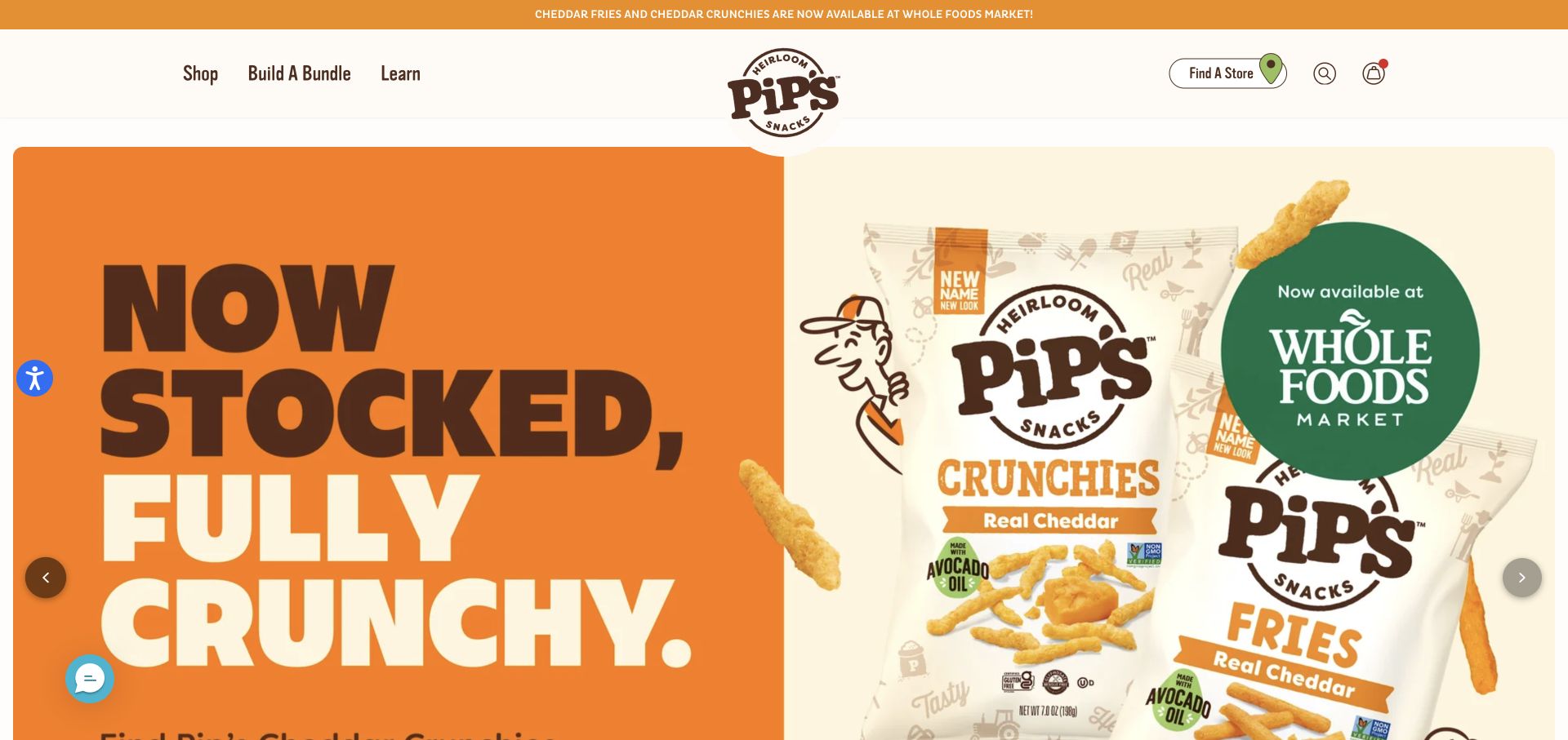
Pip’s Snacks pairs an oversized orange headline with snack packs and a green retailer badge inside a broad rounded carousel. A cream masthead separates shopping, bundle building, and learning from a store-finding action, search, and bag utilities. The narrow orange announcement repeats the retail story above. This is a product-led campaign rather than a comparison grid. Public Shopify storefront signals support the commerce association, not the accuracy of live retail stock or the implementation of bundle configuration.
What you can learn
Separate direct purchasing, bundle configuration, and finding a physical retailer into distinct maintained journeys. A Shopify campaign carousel should keep those routes available while its story changes. Test every slide’s destination, image crop, pause behavior, and static alternative rather than assuming a visually consistent frame makes every campaign equally useful.
Pros
Bundle building and store finding have explicit labels instead of being hidden in a general menu.
The masthead supplies a stable contrast surface around changing media.
Cons & considerations
A large rotating story delays product comparison and can be skipped before its message is clear.
Carousel controls need understandable keyboard, touch, and reduced-motion behavior.
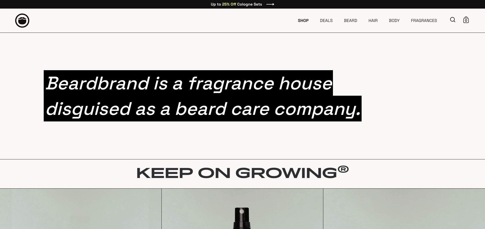
The captured Beardbrand section replaces the expected lifestyle hero with a large italic positioning statement on black text bands. It reframes the brand around fragrance while the header retains practical beard, hair, body, and fragrance categories. A separate oversized brand line divides this explanation from product imagery beginning below. The monochrome treatment makes the words the main visual subject. Shopify storefront signals identify the commerce association, but do not establish the exact theme, sales performance, or whether the framing changes how customers perceive the brand.
What you can learn
A Shopify content section can explain a category relationship rather than immediately presenting a discount. Keep that explanation separate from the product data and preserve direct shopping routes for returning visitors. Test the statement at phone width and ensure the next product area makes the broader positioning concrete rather than leaving it as a slogan.
Pros
The statement has a clear visual priority without relying on another large photograph.
Product-family navigation remains practical beside the broader brand story.
Cons & considerations
The expansive text section delays specific product comparison.
Very large italic lines need careful wrapping and readable spacing on narrow screens.
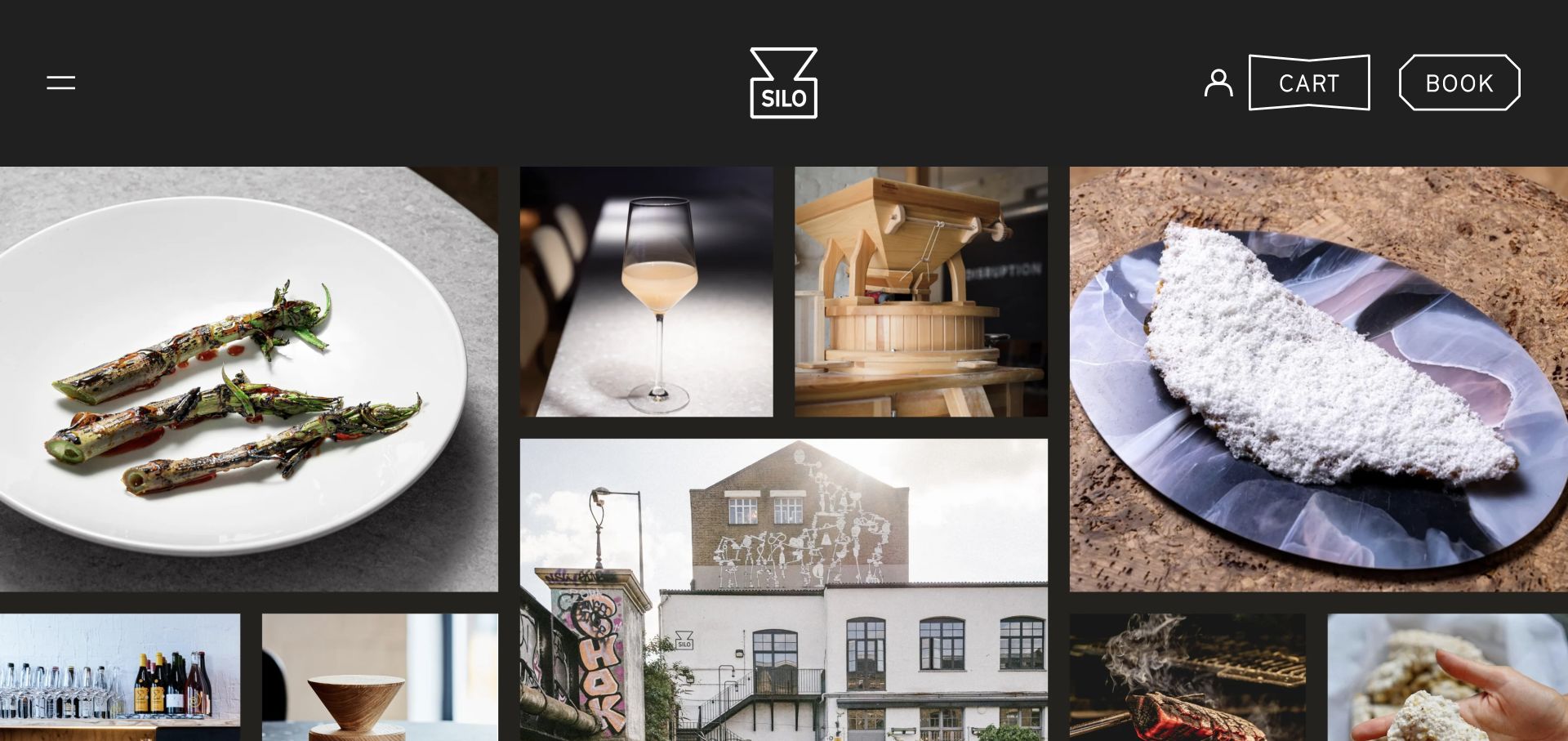
Silo’s public homepage uses a dark canvas, a centered line-drawn identity, and a collage of plated food, a drink, equipment, and the building. Large image differences create a process-oriented story instead of a conventional product grid. Account, cart, and booking controls occupy the top edge, with distinctive outlined shapes around the commercial actions. The preserved public source identifies Shopify storefront assets. That establishes a commerce association on the named website, not the implementation of reservations or the restaurant’s operational systems.
What you can learn
A Shopify-powered public site does not have to look like a standard retail catalog. Preserve a clear distinction between reserving an experience and buying a product, while giving editorial images meaningful context and destinations. A broad image collage should lead to maintained information rather than become a substitute for menus, practical visit details, or product descriptions.
Pros
The collage connects different aspects of the business without identical card treatments.
Cart and booking actions are explicitly different controls.
Cons & considerations
Minimal visible text makes the imagery harder to interpret without further browsing.
The dense collage needs a simpler sequence and useful captions at small sizes.
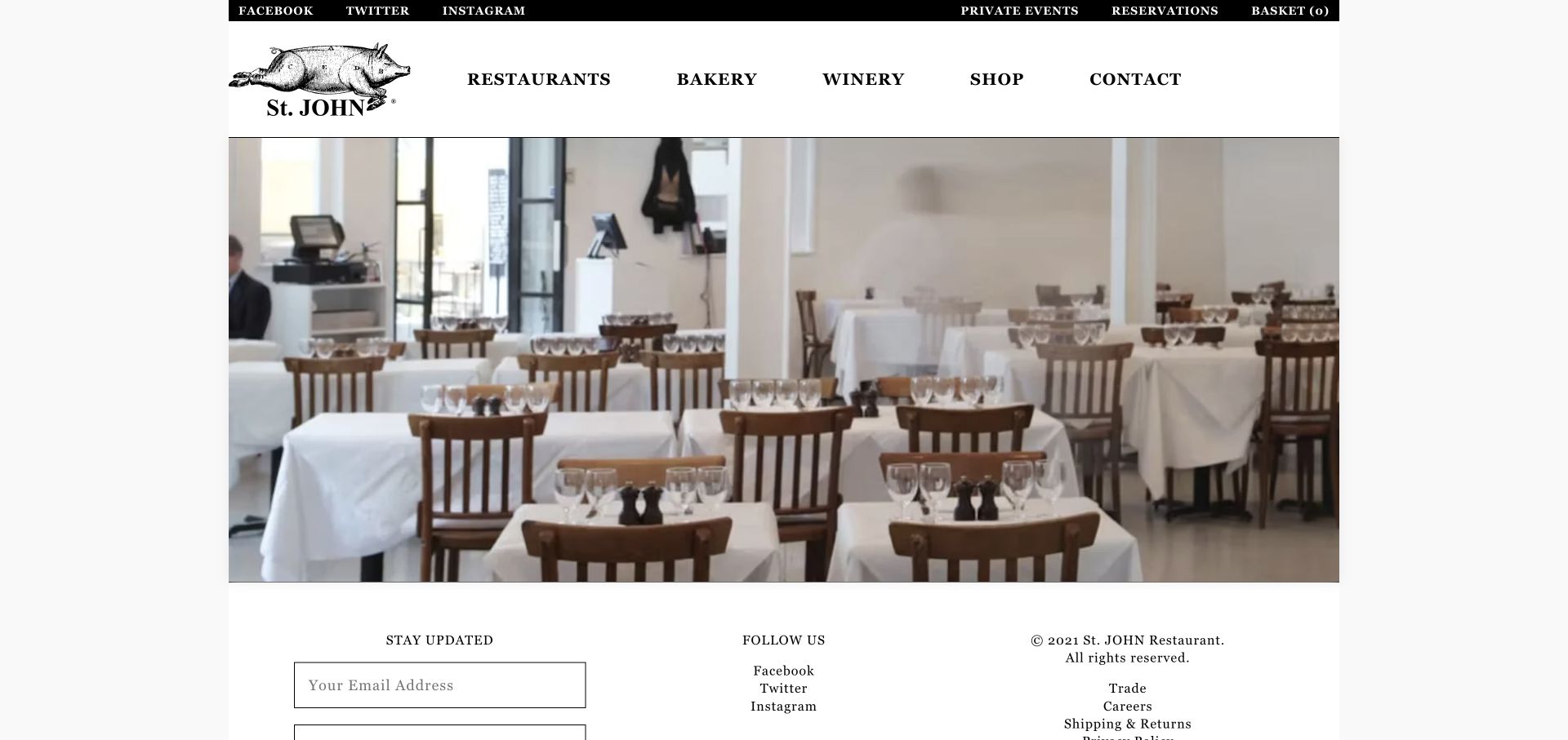
St. JOHN uses an illustrated pig identity, bold serif navigation, and a broad dining-room photograph on a white page. Restaurants, bakery, winery, shop, and contact are explicit categories, while reservations and a basket indicator sit in a slim dark utility strip. A simple newsletter and information footer begins beneath the image, giving the page a compact, almost print-like structure. Preserved Shopify storefront evidence supports the commerce association, not the implementation of restaurant reservations, mailing systems, or the complete business backend.
What you can learn
For a hospitality site with a Shopify commerce layer, define the different visitor intentions before adding a retail-style homepage. A reservation, a bakery inquiry, and a merchandise purchase need different destinations even if they share typography. Keep product data and practical dining information editable in the appropriate places rather than forcing both into one generic template.
Pros
The navigation distinguishes several real business activities using direct labels.
Reservation and basket controls remain separate in the utility strip.
Cons & considerations
The sparse photographic opening provides little explanation for an unfamiliar visitor.
Small utility text and a compact page frame need deliberate phone-scale review.
Psycle uses a full-width exercise film, small centered identity, and a low-positioned introduction with one getting-started action. A compact menu control sits at the opposite corner from buying, booking, account, and bag utilities. White typography and a small lime accent give the opening a restrained identity. The preserved source exposes Shopify storefront evidence, but that does not establish how classes are scheduled, where member data is stored, or which services operate the booking handoff. The photograph is not evidence of any individual training outcome.
What you can learn
A commerce-enabled service website should distinguish purchasing access from reserving a particular appointment or class. Specify those destinations and their error states separately in the Shopify brief. Keep the introductory content understandable without watching the film, and make the full range of services discoverable through a conventional menu rather than motion alone.
Pros
Buying and booking are visibly different header actions.
The restrained copy leaves the service demonstration room without a crowded feature grid.
Cons & considerations
White controls depend on contrast across every moving frame.
A collapsed navigation adds a step before visitors can compare the available formats.
Choose a theme, a custom theme, or a separate frontend
Adapt a theme when the commerce model is conventional
List the changes a suitable theme cannot handle before commissioning a replacement. Test those gaps against real products and content. A focused adaptation can preserve familiar merchant controls while giving the store a distinctive visual system.
Build a custom theme when reusable merchandising is the main need
Define the section library, product templates, content ownership, and upgrade process together. Demonstrate how a promotion looks after an editor changes the copy or removes an image. Custom code needs a named maintainer, not just a launch handover.
Separate the frontend only for a specific operational reason
A headless storefront introduces frontend deployment, preview, caching, and integration responsibilities. Ask which requirement justifies that ownership and how it will be tested. A large brand using a custom approach does not make it the right starting point for a smaller catalog.
From references to requirements
Plan the catalog, merchant workflow, and integrations
Map the complete product journey
Connect search or category entry to product evaluation, variant selection, bag, checkout, order confirmation, and support. Include unavailable stock, invalid discounts, and interrupted payment states in the brief. Identify where an app or separate system owns each step.
Rehearse a campaign update
Ask the merchant to create a collection, change a feature, preview a long headline, and remove an expired offer. Theme-dependent sections and blocks can support reusable editing, but the actual controls need to match the team’s routine work.
For reviews, subscriptions, email, search, analytics, and shipping, record the business purpose, data shared, recurring owner, and removal consequences. Avoid accumulating overlapping tools simply because every reference site appears to have a different feature.
A useful handover demonstration
Ask the actual team to carry out its routine job: publish a realistic update, correct a mistake, preview a narrow screen, and identify who owns an integration failure. For a library or frontend framework, also ask who maintains the content source and deployment. A polished screenshot does not answer those operational questions.
Beyond the screenshot
A Shopify launch checklist beyond the homepage
Exercise products with many variants, unavailable options, and long content.
Check collection sorting, search, empty results, and mobile filters.
Verify price, discount, delivery, tax, and returns language with the business.
Test the actual checkout and order messages in the appropriate test workflow.
Review keyboard focus, errors, motion, and responsive media.
Map old product and collection URLs before migration.
Assign app, catalog, domain, and deployment access to the business.
Document campaign editing, rollback, and ongoing maintenance ownership.
Test with real content, a keyboard, a small screen, slow or failed requests, and the people who will maintain the system. These are planning checks, not an accessibility, security, performance, or search-ranking certification.
Sources & editorial method
How this Shopify collection was reviewed
The collection pairs direct storefront captures with public Shopify signals or attributed official Shopify and first-party sources. A storefront association does not establish its theme, checkout plan, complete app inventory, or corporate backend.
Every image is an unmodified capture from the actual website, with its source and capture date. Some captures are reused from our shared catalog; their dates remain the original capture dates. None comes from a vendor gallery or a generated reconstruction. Moving imagery and live content can change.
Technology attribution uses public page assets or metadata, official platform documentation, or a cited first-party project case study. Documentary and framework-relationship evidence is identified where used; it is not a complete current backend inventory. A CMS image CDN alone does not establish a full CMS deployment. A library’s presence does not prove which individual controls use it, and a platform label does not establish AI authorship.
The composition notes, lessons, pros and tradeoffs are original editorial observations. We have not measured conversion, traffic, security, performance or accessibility conformance. Website owners retain their brands and imagery; these examples are not our client portfolio. Written, Edited and Curated are independent records, not dates advanced by a build. See our editorial standards or suggest a correction.
Questions worth asking
Shopify website development FAQs
Does a famous Shopify store mean I should copy its layout?
No. Borrow a useful pattern, such as persistent category navigation or clear variant states. Its merchandising budget, catalog, and customer familiarity may be very different from yours.
Do I need a headless store?
Only if a specific requirement and a maintainable operating model justify it. Compare that requirement with a theme-based implementation before accepting the extra frontend responsibilities.
Can staff change the homepage themselves?
They can use the controls provided by the chosen theme and implementation. Request a demonstration with a real campaign rather than assuming every area is editable.
Are the examples’ conversion rates known?
No. The reviews describe visible composition and supported technology associations. They do not establish sales, speed, accessibility conformance, or conversion results.