A good Swiper implementation starts with a reason for the sequence. If the visitor has only one useful message to understand, adding motion and hidden items can make the page less clear rather than more capable.
The twenty example properties referenced Swiper resources in the public audit. Their captures show varied editorial and commercial compositions, but a library reference does not identify which exact component is initialized or verify its settings. We did not execute interaction audits of every slide, control, and device state.
Use the examples to ask better design questions: what deserves a direct destination, what should remain static, which items are hidden initially, and what the page communicates when movement is unavailable. An implementation needs those answers before choosing effects, breakpoints, or autoplay.
Before the examples
What makes good Swiper website development in 2026?
Justify the sequence with a visitor task
Write the purpose of every item before making a carousel. Different products, editorial reports, or project records may benefit from a compact collection, but equally important information should not become discoverable only by waiting. Consider a static lead plus an ordinary index when that communicates the hierarchy more honestly.
Choose behavior and controls explicitly
Swiper documents separate modules and options for navigation, pagination, keyboard-related behavior, autoplay, accessibility assistance, and responsive layouts. Their availability does not mean a site has configured them appropriately. Specify actual labels, stopping behavior, focus expectations, and the useful default state for this particular collection, then test the implementation.
A booking action, active search field, donation form, or emergency contact should not become harder to use because surrounding media advances. Keep key text and destinations meaningful independently of a slide’s appearance. Test missing imagery, a single remaining item, an empty collection, and a reduced-motion or non-script experience rather than treating the default multi-item demo as the whole specification.
The collection · 20 examples
20 Swiper website examples worth studying
Compare corporate reporting, automotive campaigns, creative portfolios, job discovery, nonprofit publishing, hospitality, retail assortments, and software introductions. The recurring question is whether a sequence supports the actual task or merely occupies the opening.
We start with five recognizable brands or organizations: Carlsberg Group, Mazda USA, IDEO, PepsiCo Careers — embedded search, United Nations Development Programme. Each attribution applies to the named website property, not every product or website belonging to its organization. This is a curated reading sequence, not a measured ranking.
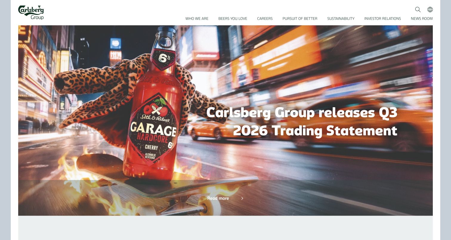
Carlsberg Group places a timely reporting headline over colorful beverage photography beneath a restrained corporate header. The scene gives the organization a tangible product identity, while navigation remains suited to investors, employees, journalists, and partners rather than an ordinary checkout. A Swiper resource was referenced publicly. That signal does not identify which individual feature is initialized by the library or verify the behavior of every rotating region.
What you can learn
Decide whether the reporting task needs several slides before adopting a slider. A current statement should have a stable direct destination and remain discoverable without waiting for an automatic transition. Give any sequence an explicit editorial order and expiry process, with useful controls and a static alternative. Test a long financial headline and a missing image so the campaign still explains its subject rather than becoming an empty branded background.
Pros
The product scene gives the corporate story a specific visual context.
Corporate navigation stays distinguishable from a consumer shopping interface.
Cons & considerations
Time-sensitive reporting needs visible dates and a dependable archive destination.
A changing feature must not require a reader to wait for the relevant statement to return.
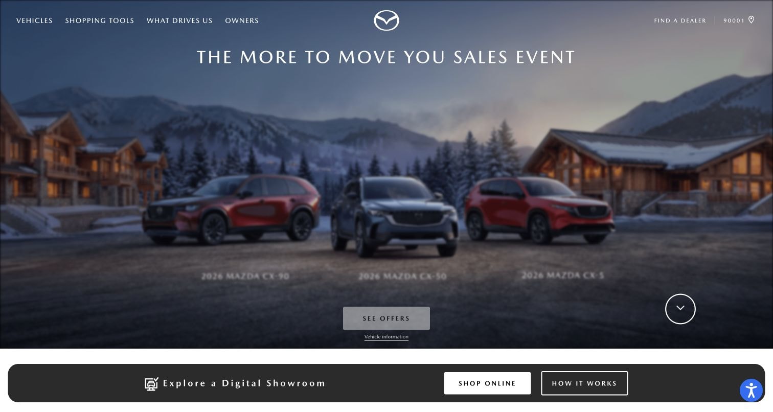
Mazda USA gives a seasonal vehicle campaign a broad photographic stage. Restrained upper navigation separates vehicle research, shopping, and ownership, while a dealer locator acknowledges a local next step. Small offer copy sits within the scene, with another discovery band below. A public Swiper reference establishes a library association, not proof that every promotion or vehicle selector is powered by it.
What you can learn
Treat each campaign as a complete message with an actual destination, not merely another background image. Keep offer conditions and dealer context readable without automatic movement, and provide a clear way to stop any changing content. Test a long model name, a more detailed offer, and reduced motion on a phone. Maintain ownership resources independently so a seasonal feature cannot crowd out the practical task of an existing driver.
Pros
The vehicle scene and restrained text create a coherent promotional field.
Shopping and ownership remain different permanent routes.
Cons & considerations
Small offer text needs enough room for practical conditions and dates.
Several vehicles within a single image can become hard to distinguish when the crop narrows.
IDEO places a workshop photograph beneath a charcoal header, with its block-letter identity, compact menu control, and outlined contact action. Fluorescent accents and a patterned overlay provide character without introducing a dashboard-style introduction. The public page referenced Swiper. This does not prove a specific photographed activity, participant identity, project outcome, or the initialization and behavior of an individual slider on the page.
What you can learn
Keep a project image and its explanatory destination together as content. If several scenes rotate, make their order and labels useful rather than treating movement as a substitute for a coherent introduction. Test a still-only version, a long project caption, and controls reachable without a pointing device. Maintain readable practice and contact routes around the feature so someone with a specific brief can continue without interpreting an entire visual sequence first.
Pros
The workshop image communicates a concrete working setting.
The header gives the expressive scene a clear organizational frame.
Cons & considerations
A compact menu can postpone useful explanation of the practice's services and work.
Patterned overlays need contrast checks when photographs and captions change.
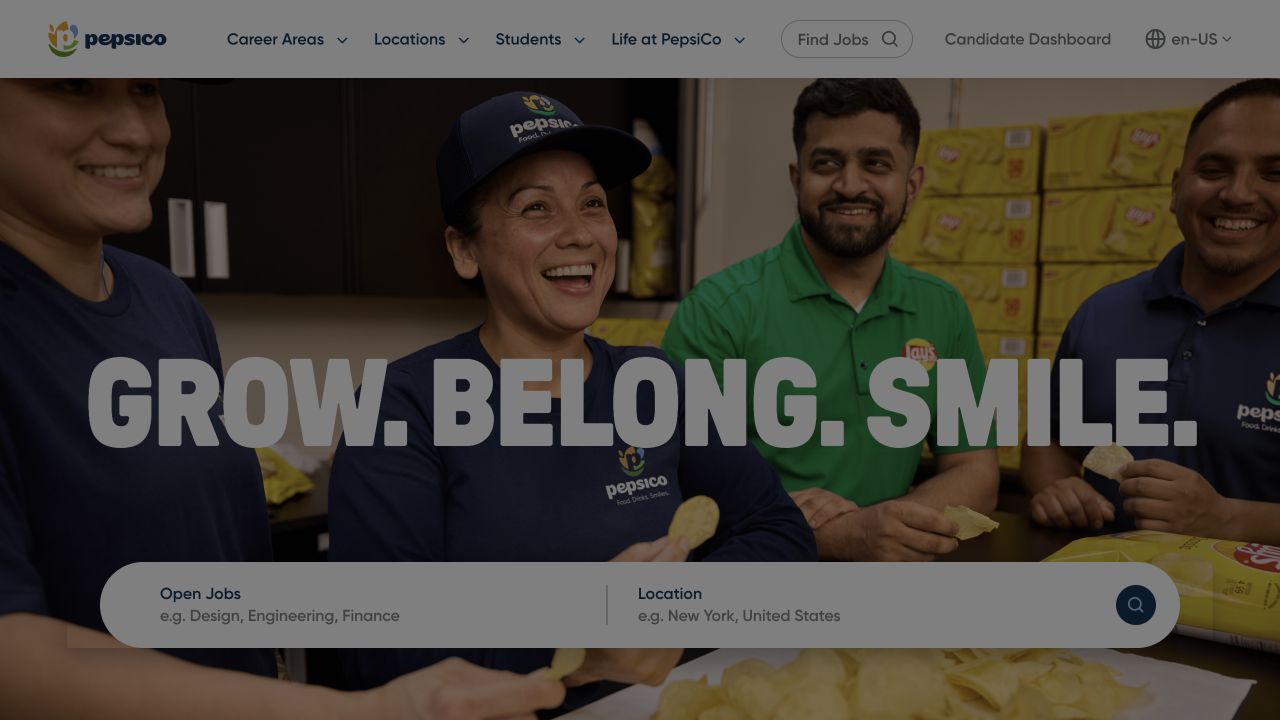
PepsiCo Careers places a large employer statement over an employee photograph and locates role and location search across the lower hero. Career areas, locations, student information, and company-life routes remain in the header, with account and language utilities separate. Swiper resources were observed on this public property. The evidence does not describe applicant tracking or establish that every recruitment component uses the same library.
What you can learn
Keep search and selected location stable when campaign media changes. A person entering a job query should not lose focus, input, or context because a slide advances. Test an expired vacancy and an unavailable search provider as well as the intended branded opening. Separate the campaign's editorial sequence from the candidate's task, and provide conventional career-area links so the site remains useful without interpreting a changing set of recruitment slogans.
Pros
Role and location are separate fields within the main discovery surface.
Employer storytelling and candidate-account access have different visual positions.
Cons & considerations
Large overlaid slogans can compete with the useful search inputs.
Campaign movement must not interrupt typing or obscure an active search control.
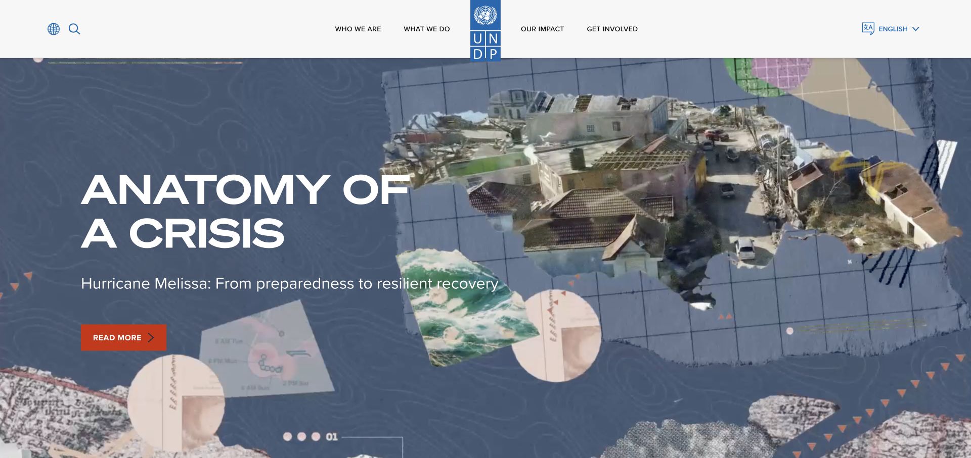
UNDP centers its tall blue identity in a white navigation band above a large editorial canvas. The captured feature combines map textures, photography, a short title, and a contrasting reading action. Global and language utilities remain separate from the main organizational categories. The public page referenced Swiper, but the presence of a library does not establish its settings, accessibility behavior, or which visible sequence it controls.
What you can learn
Give every campaign a direct article destination, meaningful title, and intentional place in the reading order. Test the feature with a longer translated headline and no moving imagery. If it rotates, make position and pause controls understandable and preserve keyboard focus. Keep the organizational categories usable outside the sequence so a visitor researching a specific development topic does not have to wait through an editorial presentation to find relevant material.
Pros
The feature's collage connects the broad subject to a specific editorial item.
Language and global navigation remain recognizable outside the campaign.
Cons & considerations
Expressive artwork can reduce space for a longer translated title.
Rotating stories need clear timing and stopping behavior rather than movement alone.
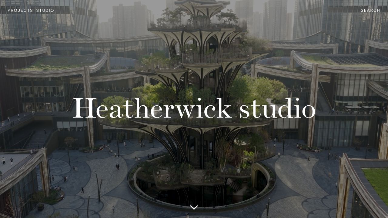
Heatherwick Studio overlays a large serif identity on an immersive architectural scene. The small set of initial navigation choices gives the project imagery substantial room. A Swiper reference was observed among the public resources, but this does not attribute the scene itself, its animation, or every project transition to that library. The visual reference concerns one captured opening state.
What you can learn
Before adding a project slider to a similar site, identify what each item helps someone understand. Maintain a readable project name and destination independent of the image, and make the archive available without traversing the entire sequence. Test reduced motion, a missing slide, a very different photograph, and a long title. The same navigation and meaningful content should remain available when the expressive opening becomes a single still.
Pros
The large identity anchors an otherwise ambitious image-led introduction.
Compact navigation leaves the architectural scene visually legible.
Cons & considerations
An immersive opening can delay project facts for a visitor with a concrete brief.
A sequence of striking images needs enough labeling to distinguish projects rather than blend them together.
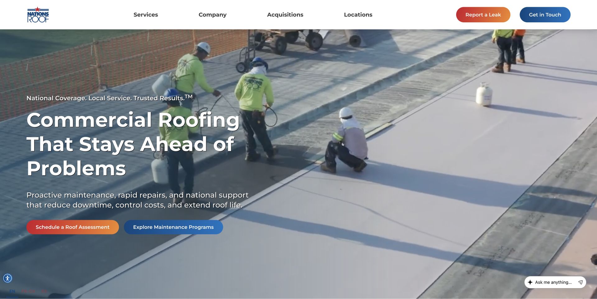
Nations Roof shows a crew working on a commercial roof beside a prevention-oriented introduction. The header distinguishes reporting a leak from general contact, and the hero offers assessment and maintenance routes. The photograph retains open space around the text. A Swiper resource was referenced on the public page, not demonstrated as the implementation of each action or a tested maintenance-request workflow.
What you can learn
Keep urgent reporting available outside any rotating feature. A leak-reporting visitor should not have to wait for the relevant campaign, while a planned-maintenance buyer may need more context before making contact. Model assessment and maintenance items as separate content records with clear destinations. Test long facility terminology, a missing crew image, and the page without slider enhancement, preserving the distinction between immediate operational help and longer-term service evaluation.
Pros
Urgent leak reporting has a different visible role from general contact.
The crew scene gives the commercial service a concrete working context.
Cons & considerations
Several assessment and service actions need clear consequences rather than merely different colors.
A broad prevention statement still needs supported service scope and geographic detail nearby.
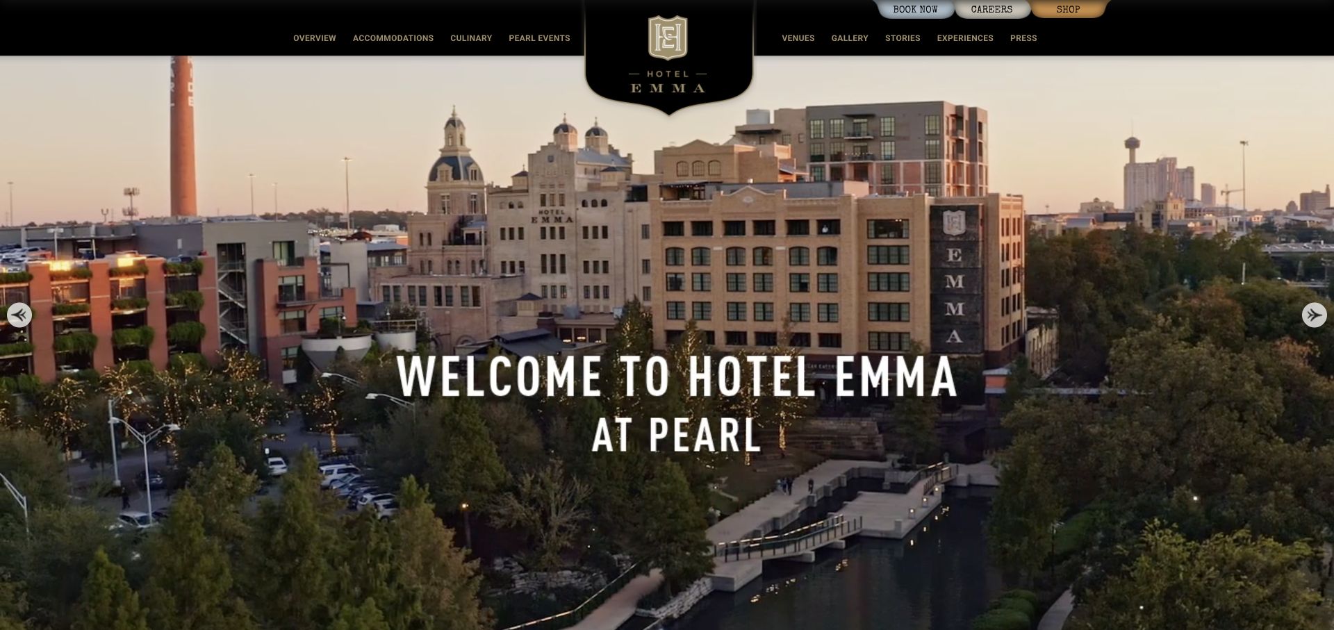
Hotel Emma combines a black-and-gold masthead, central crest, and panoramic district view. Condensed white lettering locates the property, while accommodations, dining, venues, and stories remain familiar navigation categories. Small booking and utility controls sit above. Swiper resources were observed publicly; the capture does not establish which media region uses them or verify reservation availability, interaction timing, or every slider setting.
What you can learn
A hotel can use several images to explain place, but each should have a clear editorial purpose and a usable still state. Keep booking and accommodation information available outside the image sequence. Test a dark interior, a bright exterior, longer event names, and controls on a small screen. Preserve captions and project context as real text rather than relying on a sequence of beautiful scenes to explain where the property is and how a guest should continue.
Pros
The district image communicates setting beyond an isolated bedroom photograph.
The historic graphic identity coexists with recognizable guest destinations.
Cons & considerations
A panoramic scene requires thoughtful crops to preserve useful context on mobile.
Small upper booking controls should not become subordinate to the decorative crest.
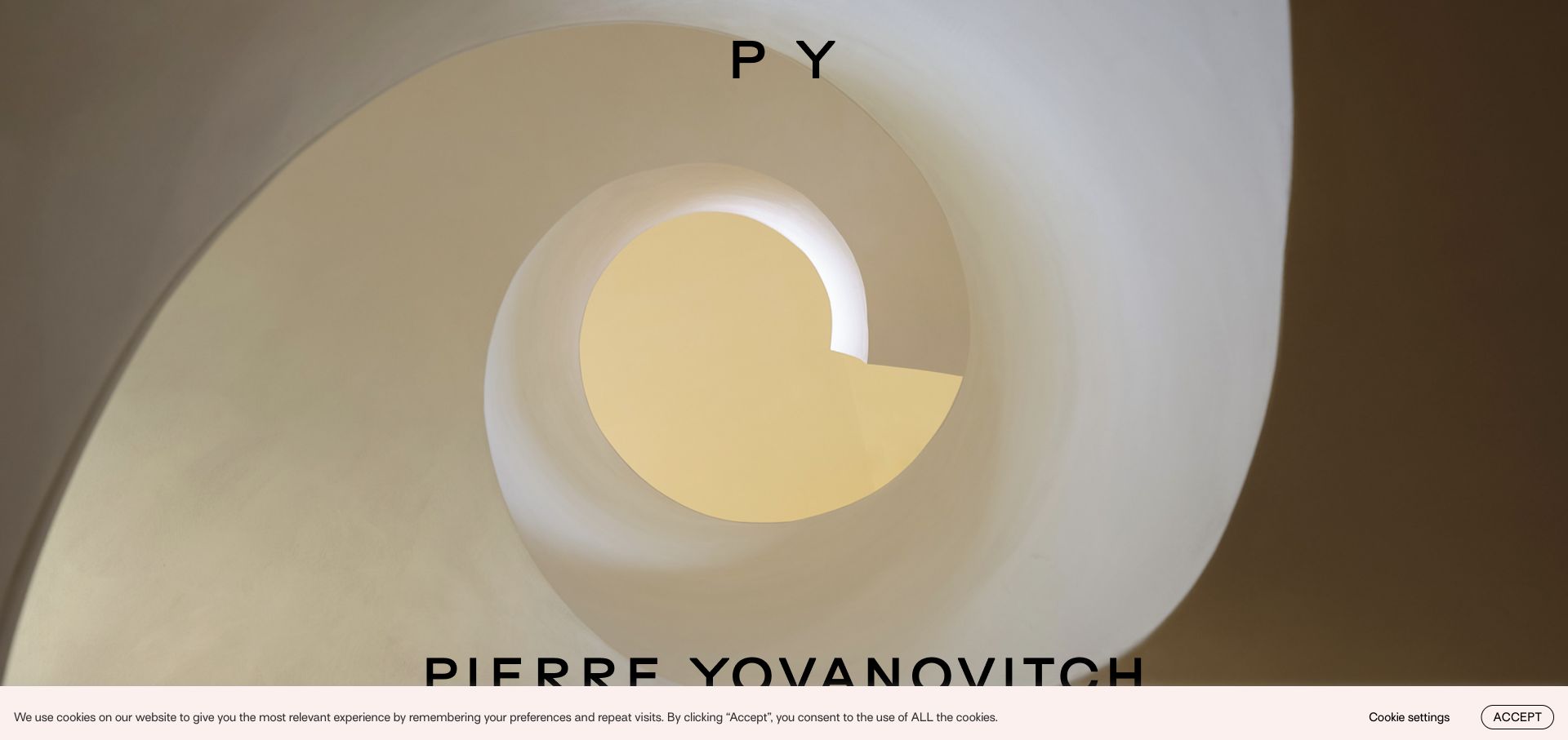
Pierre Yovanovitch opens with a curved interior view, a compact monogram near the top, and the full name along the lower edge. Light and warm surfaces carry the image instead of a conventional furnished-room overview. Project and furniture exploration sit in the broader interface. The public page referenced Swiper, but a resource reference does not establish the mechanics or accessibility of every image transition.
What you can learn
If using a comparable project sequence, attach a meaningful project label and destination to each visual. Distinguish furniture shopping from practice work rather than assuming a visitor recognizes the subject from an abstract architectural detail. Test the same framing with an image that has very different contrast and proportions. Offer a direct index and a static alternative, so the opening's carefully curated rhythm is optional rather than a required obstacle to practical exploration.
Pros
The unusual viewpoint gives the practice a specific spatial signature.
A restrained identity leaves the form and light of the photograph easy to study.
Cons & considerations
An abstract detail may not explain the range of work to an unfamiliar visitor.
Image sequences need project labels that remain readable over varied tones and crops.
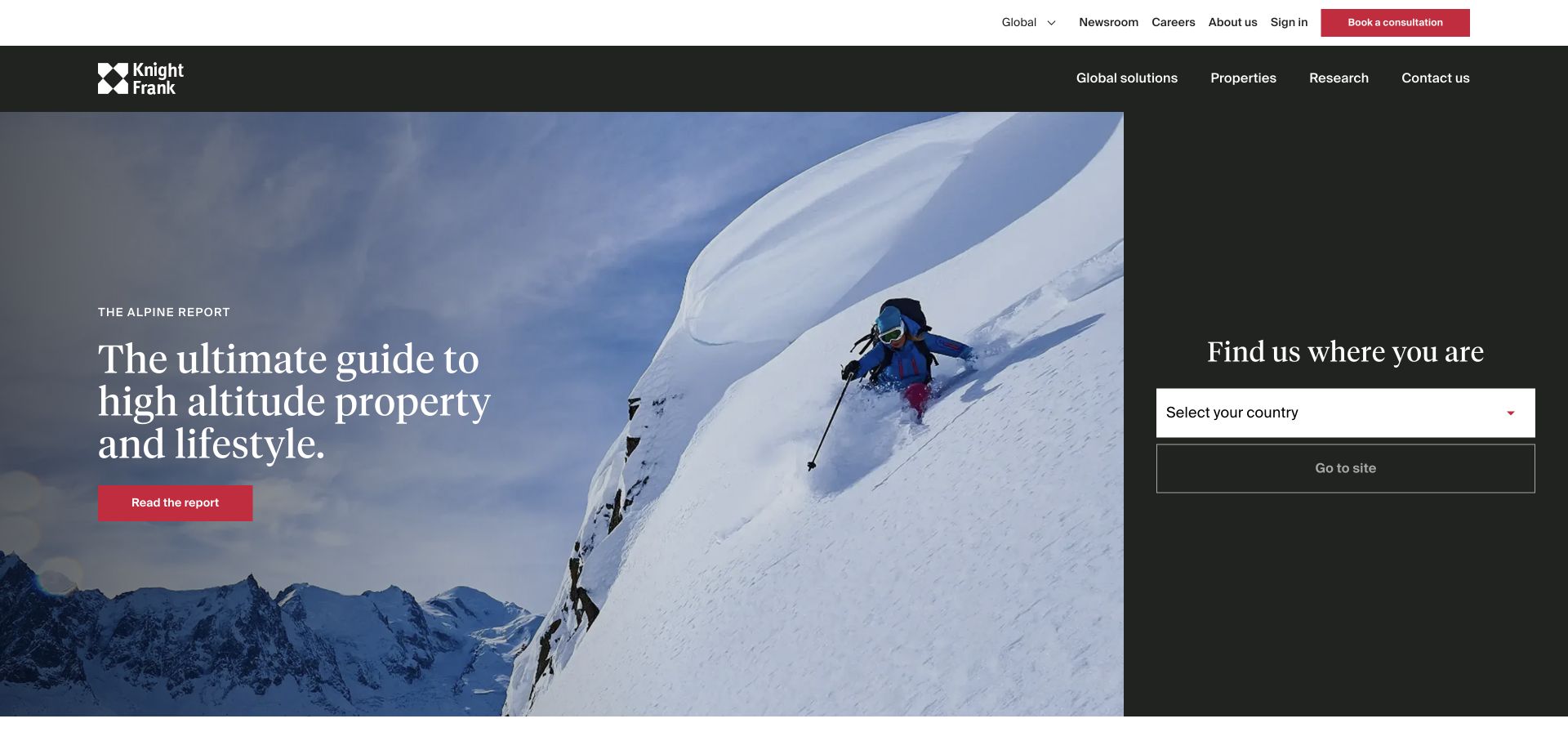
Knight Frank splits its opening between an Alpine property-market report and a narrow country-selection panel. A serif headline gives the report an editorial character, while the adjoining form asks where the visitor needs help. Global solutions, property, research, and contact remain in the header. Swiper was referenced publicly, not established as a complete description of the report feature or a local listing application.
What you can learn
Keep the country selection stable and independently usable if campaign stories change. A reader looking for a local office should not have to follow an unrelated research feature first. Give reports direct URLs, meaningful dates, and an intentional archive position. Test a long country name, a translated title, and a missing campaign image so any visual sequence cannot obscure the practical geographic choice that defines the next part of the visit.
Pros
The split layout acknowledges that global research and local service are different tasks.
Country selection remains a visible alternative to the featured report.
Cons & considerations
A narrow selection panel needs enough room for long labels and error messages.
A striking market report should not imply that its information represents every local listing market.
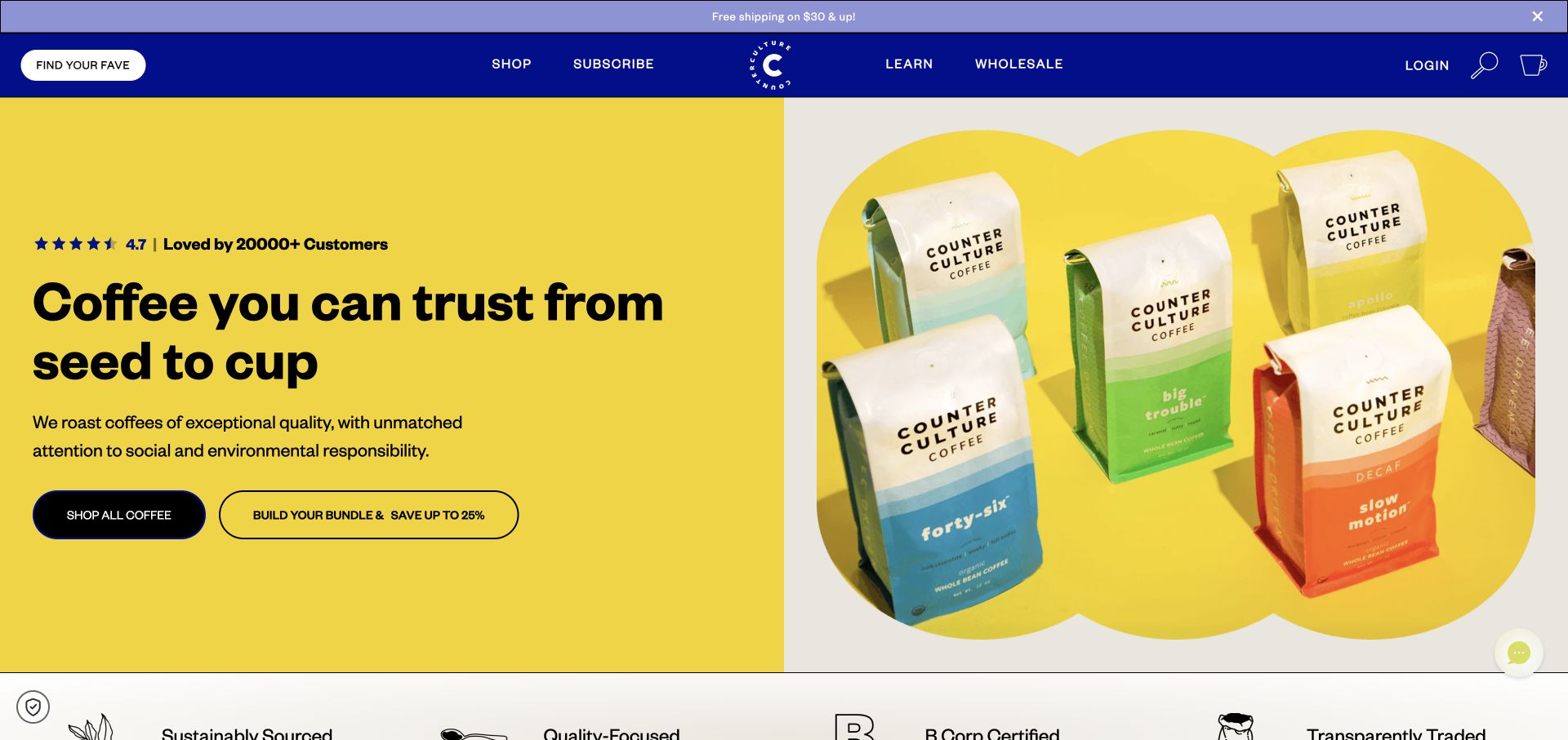
Counter Culture pairs a strong blue header and yellow campaign field with white coffee bags and colorful labels. Finding a favorite, shopping, subscribing, and learning are distinct entrances. Product information later includes roast, tasting, and caffeine distinctions. Public Swiper resources establish an association, not proof that any particular product sequence is initialized by the library or that its sourcing and certification statements have been independently verified.
What you can learn
A product carousel should preserve the facts needed to compare items, not merely cycle through package photographs. Keep names, prices, and relevant coffee distinctions readable as the layout changes. Test one item, many items, unavailable stock, and a product with a long origin name. Provide a plain category destination so a visitor is not forced to swipe a narrow horizontal list just to understand the full assortment.
Pros
The packaging palette provides a recognizable campaign system.
The continuing catalog offers more useful distinctions than product imagery alone.
Cons & considerations
A bright feature can delay access to the detailed comparison a returning shopper needs.
Horizontal product collections require an obvious continuation and a non-swipe alternative.
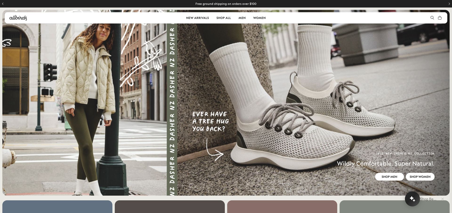
Allbirds combines a street-level photograph with a closer shoe view and a narrow product-name strip. Hand-drawn annotation adds a casual voice, while the white navigation surface keeps categories and utilities separate from the image. Two audience actions continue the story. A Swiper reference was observed in public resources, but the review does not attribute every visual region or guarantee the behavior of the campaign's changing states.
What you can learn
Define each slide as a complete content record with a readable product identity, approved image pair, and useful destination. Test the annotations and actions on a small screen without automatic movement. Keep search, category navigation, and bag access independent of the campaign. If a feature has only one meaningful message, consider whether a static composition communicates it more clearly than adding a sequence solely because the slider library is available.
Pros
The two image scales provide complementary product context.
A distinct navigation surface keeps commerce tasks legible over busy creative material.
Cons & considerations
Handwritten annotation may become difficult to read in narrower crops.
Audience actions need clear labels and destinations when the campaign's product changes.
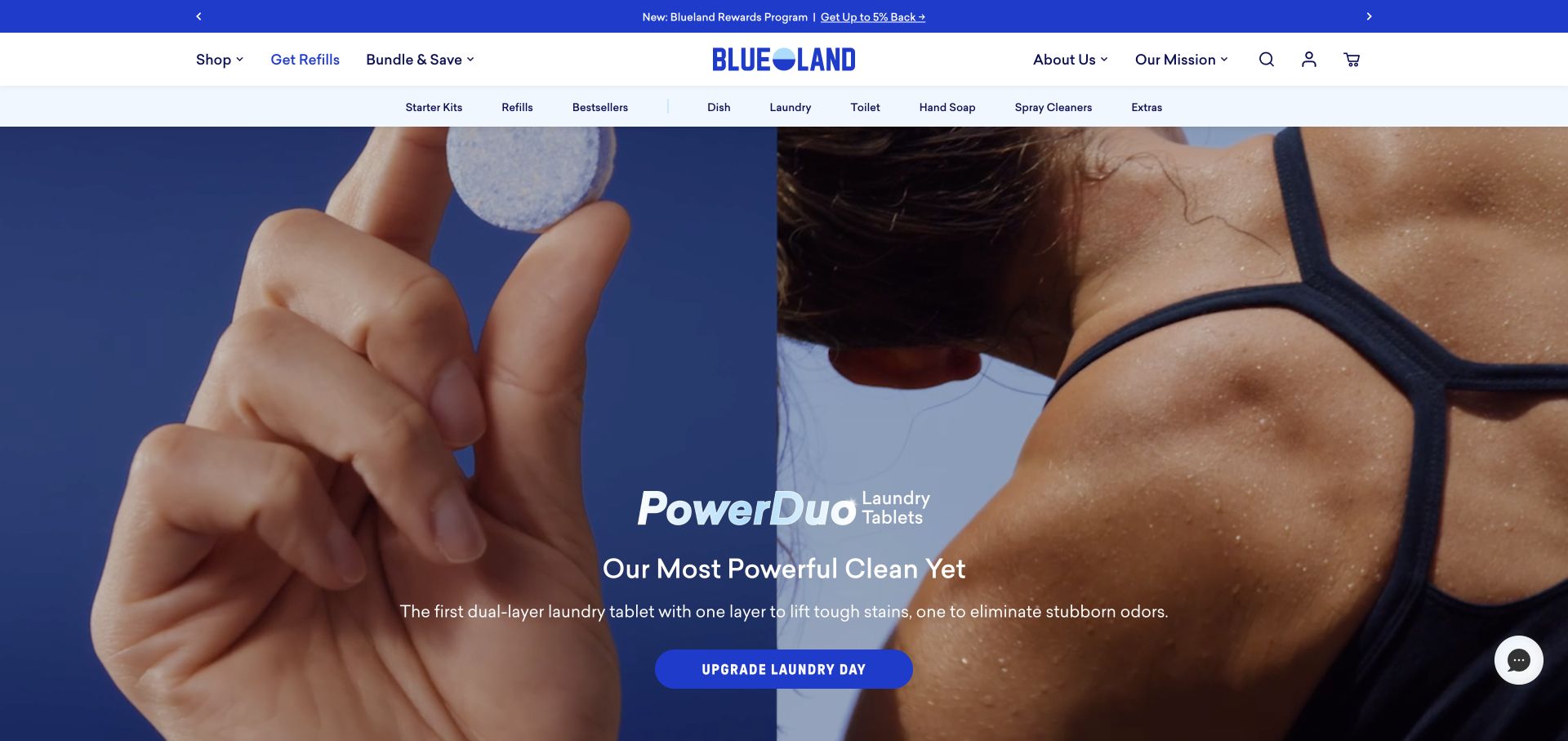
Blueland introduces a laundry-tablet campaign with a split product-use scene and saturated blue. A strong action anchors the copy, while the header distinguishes shopping, refills, bundles, brand information, and household categories. A rewards announcement sits above. Swiper resources were referenced publicly, not as proof of each sequence's implementation, recurring-order behavior, or the accuracy of cleaning and environmental claims.
What you can learn
Keep the distinction between a starter item, refill, and bundle visible in any product slider. A campaign image should not be the only place that explains which format is offered. Test a long product name, an unavailable refill, and a single-card state. Keep claims linked to maintained supporting detail, and ensure a keyboard or non-swipe visitor can reach the same useful products without relying on the motion of the promotional scene.
Pros
The campaign shows the product in use rather than only displaying a package.
Refills and bundles have explicit roles in the shopping navigation.
Cons & considerations
Several announcement and navigation layers can compete with the main product message.
Similar package imagery makes clear product-format labels especially important in compact collections.
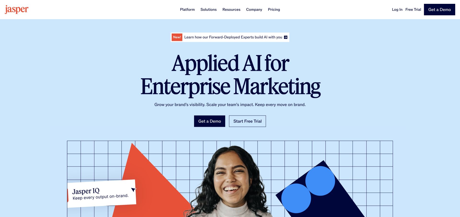
Jasper places a dark serif proposition on a pale blue field, with an announcement label and two rectangular evaluation actions. A collage and labeled product panel begin below, while geometric artwork adds character without surrounding the headline with many callouts. The public page referenced Swiper. This establishes a component association, not a finding about model architecture, agent behavior, or the operation of every visual sequence.
What you can learn
Keep the product proposition and evaluation routes understandable without an animated collage. If several examples are presented, identify what each demonstrates and provide readable labels rather than interchangeable screenshots. Test a long enterprise use case, a missing image, and a reduced-motion state. An attractive sequence should lead to a more specific product explanation, not become the evidence for claims about what the software can reliably accomplish.
Pros
The simple color field gives the product statement a clear first role.
Two evaluation actions form a manageable decision before the more complex imagery.
Cons & considerations
Abstract product imagery needs specific context to avoid implying capabilities it does not explain.
An announcement above the hero requires an expiry plan and enough space for longer text.
Checkout.com centers a tall white proposition and compact supporting text within a nearly black field. Rounded photographs form loose surrounding columns, and a blue commercial action anchors the center. A floating navigation and narrow announcement have separate roles. Swiper was referenced in the public resources, but this does not identify the payments network or prove how each photographed or animated panel is implemented.
What you can learn
Make a collage or sequence supplementary to a complete product explanation. Each image should have a reason to be present, while essential claims and commercial destinations remain stable. Test missing images, long translated copy, and motion disabled without changing the order in which the reader understands the message. Keep operational payments claims under appropriate review rather than treating the polish of a rotating marketing presentation as supporting technical evidence.
Pros
The centered copy and blue action establish a clear visual hierarchy.
The floating navigation remains distinct from the surrounding photographic composition.
Cons & considerations
Loose image columns can become difficult to arrange without obscuring copy on small screens.
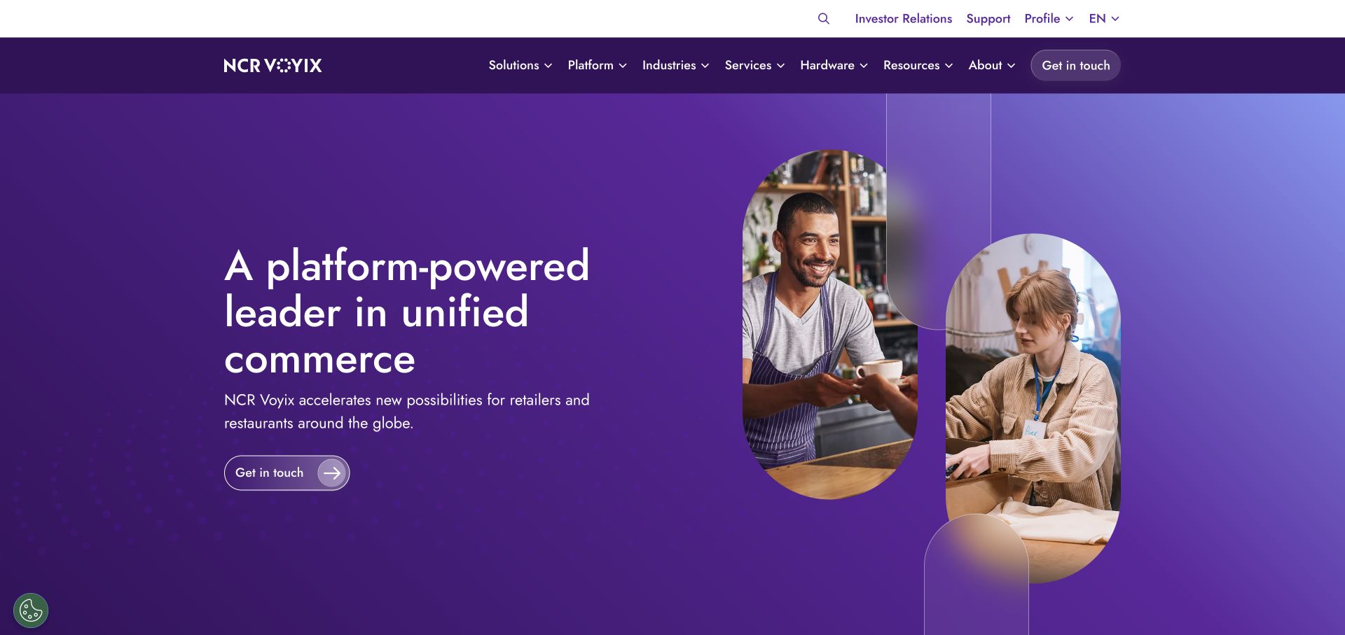
NCR Voyix pairs a purple gradient statement and outlined action with a large arch-shaped photograph of service workers. Curved outlines echo the image, while products, solutions, industries, services, hardware, and resources remain distinct navigation entries. A public Swiper reference supplies a library association only; it does not describe operational point-of-sale software, payment handling, or the initialization of every marketing component.
What you can learn
When presenting several offerings in a sequence, keep their product-family identities explicit. A visitor should be able to go directly to hardware or an industry page without waiting for a relevant slide. Test long enterprise names and a missing feature photograph, and maintain a simple directory beneath the campaign. The visual system should help explain the portfolio rather than turn several materially different commercial products into a row of nearly identical promotional cards.
Pros
The image frame and repeated curves create coherence without another content column.
Explicit catalog entrances recognize that the company serves several types of inquiry.
Cons & considerations
A wide portfolio navigation needs disciplined grouping on mobile.
A broad unified-commerce proposition requires specific examples to make product differences clear.
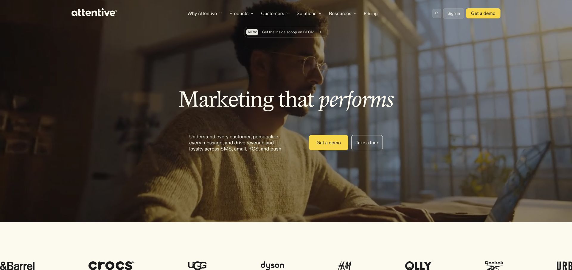
Attentive overlays a cream serif headline on a warm film frame of someone using a phone. A narrow announcement sits above the proposition, with a short explanation and separate demonstration and tour actions below. A customer-mark strip begins afterward. Swiper was observed among public resources, not as verification of a particular campaign result, recipient conversation, AI feature, or the implementation of each moving panel.
What you can learn
Give a demo sequence explicit labels and a meaningful order rather than relying on motion to suggest product sophistication. Keep the difference between a guided tour and a commercial demonstration clear, including the information each requests. Test a video-free version, a longer claim, and the page with the announcement removed. Customer marks should remain supporting context, not replace the explanation of what an illustrated product interaction actually shows.
Pros
The filled and outlined actions distinguish two ways to evaluate the software.
Warm photography and serif type establish a coherent tone around the proposition.
Cons & considerations
Text over moving footage needs contrast checks beyond the ideal captured frame.
A customer-mark strip can imply more than it explains unless the surrounding context is clear.
Typeform introduces forms and automation through large expressive lettering on a dark purple field. A short explanation and bright trial action sit below, with pricing in the header and an announcement strip above. Capability cards begin to distinguish several product ideas. Swiper resources were observed publicly, but this does not establish which examples use the library or describe the form editor, customer data, or payment integrations.
What you can learn
Keep each capability explanation accessible as a direct destination if it also appears in a horizontal sequence. A new visitor should not have to wait for a relevant example or decipher an animation to understand the product range. Test long descriptions, one remaining card, and a reduced-motion view. Keep the actual signup and pricing routes stable around the visual storytelling, and distinguish public examples from forms that would collect real respondent information.
Pros
The strong typography creates an identifiable product personality.
A short explanation and clear trial action provide a practical continuation.
Cons & considerations
Expressive type needs space for less convenient translated headlines.
Several newly named capabilities require clear differences rather than equally emphatic promotional cards.
Sydney places a study invitation over student photography, followed by course discovery and subject choices. International information, applications, fees, and scholarships supply practical continuation, while broader research navigation remains in the header. Swiper references were observed publicly. The capture does not establish which feature uses them or verify the behavior of applications, course availability, or every moving component on the university website.
What you can learn
If several study campaigns rotate, make each readable and directly reachable without waiting. Keep the course finder and practical guidance outside the feature's timing and focus behavior. Test a long program name, an expired announcement, and missing imagery after a release. An undergraduate, doctoral applicant, or international visitor should retain a recognizable next step even when the current student photograph and campaign message are not relevant to their particular evaluation.
Pros
The aspirational introduction leads into concrete study and practical-information routes.
Different audience questions are acknowledged beyond a single recruitment slogan.
Cons & considerations
Large student imagery can delay useful detail on a short screen.
Campaign copy needs an honest relationship to current program and application information.
charity: water places a giving panel over a field photograph, with monthly and one-time choices and visible amount controls. The page continues into an explanation of water's relationship with several aspects of community life and supporting project material. Swiper was referenced among public resources. That does not verify the donation workflow, impact claims, or the settings of any particular carousel.
What you can learn
Keep giving amounts, frequency, focus, and validation stable when surrounding images or stories change. A person interacting with a form should not lose context because a feature advances. Give each project story its own date and direct destination, and retain a meaningful text explanation when media is unavailable. Test the public donation handoff with approved fictional data rather than using the presence of a polished campaign sequence as proof that a payment or confirmation is correctly handled.
Pros
Frequency and amount choices make the requested commitment concrete.
The giving action connects to a longer explanation rather than standing alone.
Cons & considerations
A form over photography needs reliable contrast for every image and state.
Urgent giving controls should not obscure the context and evidence needed to evaluate the request.
Choose a static composition, an optional collection, or a genuinely sequenced experience
Prefer a static lead when hierarchy is clear
A single important announcement can have a complete title, explanation, image, and destination without a slider. Supporting stories can follow as ordinary links or cards. This avoids hiding equally useful information and gives the editorial team a simple clear decision about what actually leads.
Use a compact collection with an ordinary alternative
A product or project row can offer exploratory browsing, but preserve a meaningful index or category route. Give every item a readable identity and direct destination. Check the partially visible next item, the last item, and a keyboard-only visit so the collection does not depend exclusively on a swipe gesture.
Use automatic change only for a defended purpose
Document why timing is useful and how a visitor stops or avoids it. Do not reset a person’s focus or interrupt an active input when the feature changes. Test the actual content pace and media combinations, not only a library demo, and review the result with people responsible for accessibility and editorial priorities.
From references to requirements
Plan item records, interaction states, and editorial maintenance
Model each item as a complete piece of content
Use a stable identifier, title, useful destination, approved imagery, and any date or expiry condition. Keep promotional placement separate from the underlying article or product record. An editor should be able to remove an expired feature without deleting its archive destination or breaking a control that assumes a fixed number of items.
Test the awkward states deliberately
Include one item, many items, no items, a long title, slow media, and a failed image. Exercise keyboard, focus, touch, and visible control labels on a small screen. Preserve useful text before optional interaction code initializes. Check what happens when a visitor is reading or typing while the surrounding content would otherwise change.
Keep the implementation maintainable
Record the package version, imported modules, styles, initialization point, and component owner. Limit effects to the task rather than adding every available feature. Recheck the full page after updates: a slider can work in isolation while conflicting with a menu, form, nested scroll area, or another component’s controls.
A useful handover demonstration
Ask the actual team to carry out its routine job: publish a realistic update, correct a mistake, preview a narrow screen, and identify who owns an integration failure. For a library or frontend framework, also ask who maintains the content source and deployment. A polished screenshot does not answer those operational questions.
Beyond the screenshot
Slider and sequenced-content acceptance checklist
Write a visitor-centered reason for using a sequence instead of a static layout.
Give every item a readable identity, direct destination, and maintained content record.
Keep booking, search, forms, and urgent tasks independent of automatic progression.
Define controls, labels, focus expectations, and any stopping behavior explicitly.
Test keyboard, touch, a narrow viewport, and reduced or unavailable motion.
Exercise empty, single-item, long-content, failed-image, and slow-loading states.
Provide a useful non-swipe route into the full collection.
Assign an owner for library updates, campaign order, expiry, and ongoing page-level checks.
Test with real content, a keyboard, a small screen, slow or failed requests, and the people who will maintain the system. These are planning checks, not an accessibility, security, performance, or search-ranking certification.
Sources & editorial method
How this Swiper collection was reviewed
All twenty official properties had a Swiper resource reference in the public audit. Five recognizable organizations lead the reading sequence. The original screenshot dates remain attached to the actual captures. We do not attribute a specific visible control or effect to Swiper solely from resource presence, and have not certified interaction behavior, performance, or accessibility conformance.
Every image is an unmodified capture from the actual website, with its source and capture date. Some captures are reused from our shared catalog; their dates remain the original capture dates. None comes from a vendor gallery or a generated reconstruction. Moving imagery and live content can change.
Technology attribution uses public page assets or metadata, official platform documentation, or a cited first-party project case study. Documentary and framework-relationship evidence is identified where used; it is not a complete current backend inventory. A CMS image CDN alone does not establish a full CMS deployment. A library’s presence does not prove which individual controls use it, and a platform label does not establish AI authorship.
The composition notes, lessons, pros and tradeoffs are original editorial observations. We have not measured conversion, traffic, security, performance or accessibility conformance. Website owners retain their brands and imagery; these examples are not our client portfolio. Written, Edited and Curated are independent records, not dates advanced by a build. See our editorial standards or suggest a correction.
Questions worth asking
Swiper website development FAQs
Does a Swiper resource mean the homepage hero uses it?
Not necessarily. The file may support another component, be part of a shared bundle, or no longer control the visible feature. Resource presence establishes an association. Identifying a specific initialized instance requires a separate appropriate inspection.
Is autoplay necessary for a professional-looking website?
No. Start with the reading and discovery task. A static feature or manually explored collection may communicate the hierarchy more clearly. If automatic change is justified, define timing, stopping, focus, and non-moving alternatives instead of relying on default behavior.
What happens when there is only one item?
Decide that state deliberately. Controls, spacing, looping assumptions, and the relationship to the next section may need different behavior. A campaign system should not require an editor to invent another feature merely to preserve the original layout.
Does enabling an accessibility module finish the accessibility work?
No. The actual content, labels, focus behavior, controls, motion, contrast, and surrounding page still need review and testing. A library feature can assist an implementation but does not certify the completed experience or remove the need for context-specific decisions.
Borrow the editorial judgment, not the motion. Keep every useful message understandable and reachable even when the sequence becomes one still image and an ordinary list.