Good Nuxt websites make a complex underlying experience feel understandable. A consistent navigation shell, predictable page transitions, and clear information states are more useful references than an unexplained animation or an impressive brand name.
The examples are named public properties with documented Nuxt associations. A brand may use Nuxt for one regional store, developer resource, or marketing site while using different systems elsewhere. The collection does not attribute a complete corporate stack from a single page.
Before choosing a visual direction, separate public reading, catalog exploration, account work, and third-party transactions. Those journeys may share a design system without sharing the same data freshness, authentication, or rendering requirements. Make that distinction part of the brief.
Before the examples
What makes good Nuxt website development in 2026?
Make the route structure understandable before adding transitions
Describe the important page families and the way visitors move between them. A route should have a clear title, a useful direct link, and a sensible empty or missing state. Nuxt provides routing conventions, but file names alone do not create a good information architecture. Rehearse direct arrival, refresh, browser Back, and a link opened in a new tab, not only a perfect journey from the homepage.
Keep data ownership separate from visual components
Identify where product details, editorial copy, account data, and availability come from. Give each source a responsible owner and a freshness requirement. A reusable card should receive clear data rather than discovering business rules in several unrelated places. Design what a visitor sees while a request is pending, when it fails, and when the result is genuinely empty; those states are part of the interface.
Preserve a stable reading and navigation shell
Headers, account entry points, selected categories, and page context should not jump unexpectedly when a route changes. Review the layout with long translated labels and missing media. If a page uses a large campaign canvas, give its content and controls stable space. The benefit of shared Vue components comes from predictable behavior and maintenance, not simply moving the same decorative code into a component file.
The collection · 20 examples
20 Nuxt website examples worth studying
Look at how each public property organizes routes, repeated modules, and practical next steps. Treat the selected region or subdomain as the example; a Nuxt association does not identify its CMS, payment system, hosting provider, or every application owned by the brand.
We start with five recognizable brands or organizations: Nintendo UK, NASA Jet Propulsion Laboratory, Microsoft Edge Developer, Prada UK, Adyen public website. Each attribution applies to the named website property, not every product or website belonging to its organization. This is a curated reading sequence, not a measured ranking.
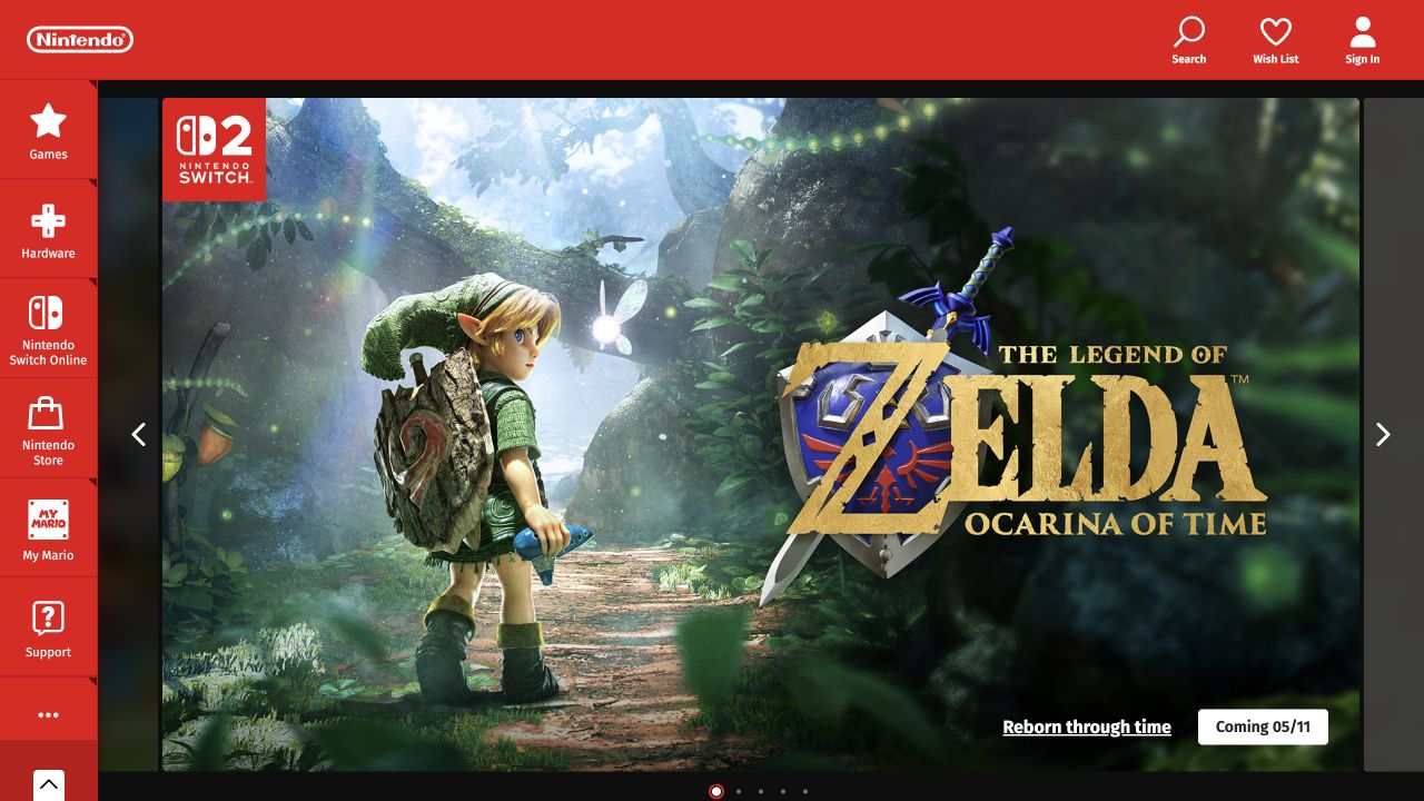
Nintendo’s UK homepage places vivid game artwork inside a dark carousel frame, surrounded by the company’s familiar red navigation. A vertical category rail keeps games, hardware, online services, store, and support visible while the feature changes. Search, wish list, and account utilities form a compact upper-right group. The captured slide has a short announcement and a clear date-oriented destination instead of a paragraph of promotional copy. Nuxt’s official showcase links this European public property, not an authenticated Nintendo account or every regional storefront.
What you can learn
For a Nuxt campaign shell, keep catalog navigation independent of the rotating feature and make each slide a meaningful link with readable text. Route transitions and interactive navigation should not remove keyboard orientation. Plan how the page behaves when media is paused, and preserve ordinary support access outside the promotional journey.
Pros
The category rail keeps useful destinations visible beside large campaign art.
Minimal slide copy lets familiar imagery communicate the entertainment proposition.
Cons & considerations
A rotating feature can hide a visitor’s desired announcement until another slide.
The dense red shell needs a deliberate compact-screen navigation strategy.
Vue.jsAssociated with Nuxt; not independently observed
Public source checked November 3, 2026. References may be embedded or legacy—not a complete backend inventory.
Platform source: Official Nuxt showcase. Nuxt's own showcase links this named Nintendo UK property. The association applies to this public experience, not its product runtime, payment systems, or every website owned by the organization. Platform evidence is separate from the direct website screenshot and is not a complete current infrastructure audit.
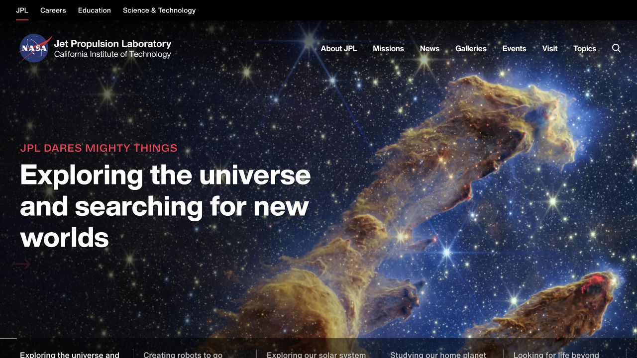
NASA JPL uses a dramatic space image across its first view, with a large white mission statement anchored on the left. A small red eyebrow and thin red accents add editorial hierarchy without competing with the photograph. Institutional utilities sit in a black strip above the NASA/JPL identity and the main subject navigation. Several alternative stories appear along the lower edge. Nuxt’s official showcase specifically names the JPL property; NASA’s main website and operational scientific systems are not attributed to Nuxt here.
What you can learn
A large Nuxt information site benefits from separating organizational audiences, subject navigation, and current stories. Reusable layouts should preserve those layers on every route rather than rebuilding the header per campaign. Validate readable image overlays, real link labels, and a useful still-image state; visual drama alone says nothing about measured performance or accessibility.
Pros
Distinct navigation layers serve institutional and public-interest audiences.
The image makes an expansive scientific subject immediately tangible.
Cons & considerations
White navigation over complex imagery requires robust contrast across all features.
The large lead story postpones detailed research links until visitors continue.
Vue.jsFramework dependency association; not independently observed
Earlier cited evidence retained; no current scan result. References may be embedded or legacy—not a complete backend inventory.
Platform source: Official Nuxt showcase. Nuxt's own showcase links this named NASA Jet Propulsion Laboratory property. The association applies to this public experience, not its product runtime, payment systems, or every website owned by the organization. Platform evidence is separate from the direct website screenshot and is not a complete current infrastructure audit.
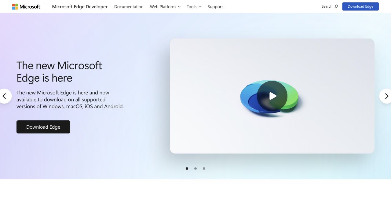
Microsoft Edge Developer pairs a short product introduction with a large rounded video preview on a pale gradient. A dark download action gives the text column a clear endpoint, while carousel arrows and small pagination dots identify other featured messages. The compact header preserves documentation, web-platform, tool, and support destinations beside the Microsoft identity. The design feels like an entry point into a developer ecosystem rather than a browser settings screen. Nuxt’s showcase links this specific developer property, not the Edge application or Microsoft’s broader website estate.
What you can learn
Keep the promotional introduction separate from technical reference navigation in a Nuxt layout. Downloads, documentation, and video playback are different actions and need accurate labels and states. A carousel should retain visible controls and sensible focus behavior, and the product explanation should remain complete without requiring visitors to play the demonstration.
Pros
The technical documentation route remains visible above the marketing feature.
A restrained gradient separates the product preview from the reading column.
Cons & considerations
Carousel controls add complexity to an otherwise simple introduction.
A large video preview provides little detail before the visitor chooses to play it.
Visible tech stack
Earlier / documented evidence
Nuxt
Earlier cited evidence retained; no current scan result. References may be embedded or legacy—not a complete backend inventory.
Platform source: Official Nuxt showcase. Nuxt's own showcase links this named Microsoft Edge Developer property. The association applies to this public experience, not its product runtime, payment systems, or every website owned by the organization. Platform evidence is separate from the direct website screenshot and is not a complete current infrastructure audit.
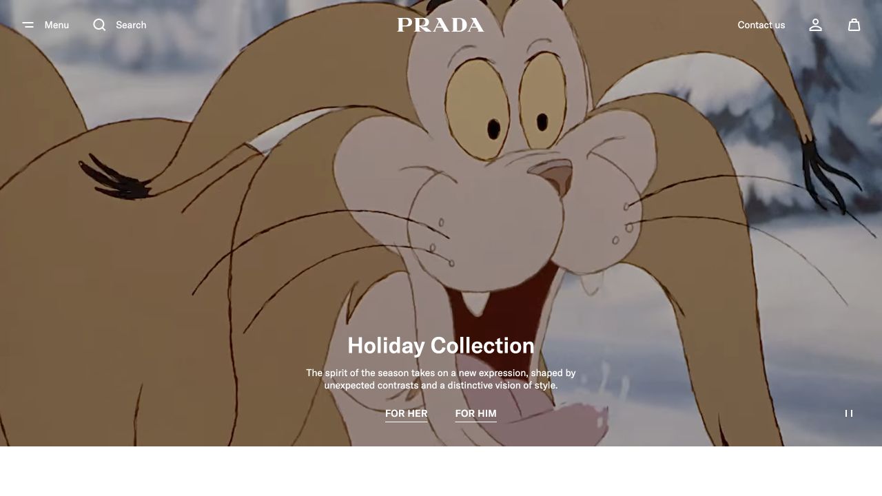
Prada’s UK storefront uses a full-width illustrated holiday film beneath a light overlay navigation. The centered wordmark remains dominant, while menu, search, contact, account, and shopping-bag utilities occupy the edges. A compact collection title and two audience destinations sit near the bottom of the image. A visible pause control acknowledges the animated campaign. Nuxt’s official showcase links this public UK property; its payment processing, customer account service, and every Prada regional experience are outside the implementation claim.
What you can learn
A Nuxt storefront can support immersive campaigns without hiding essential shopping utilities. Keep the collection destinations as ordinary links, reserve a readable text area independent of the film, and define loading and still-image states. Do not let route transitions or autoplay media become prerequisites for reaching categories, contact details, or a product.
Pros
The minimal header preserves important shopping utilities without crowding the campaign.
Audience-specific collection links provide a concise next step.
Cons & considerations
Campaign animation can distract visitors who arrived with a specific product in mind.
Text and icons over changing artwork need careful contrast and motion testing.
Visible tech stack
Earlier / documented evidence
Nuxt
Earlier cited evidence retained; no current scan result. References may be embedded or legacy—not a complete backend inventory.
Platform source: Official Nuxt showcase. Nuxt's own showcase links this named Prada UK property. The association applies to this public experience, not its product runtime, payment systems, or every website owned by the organization. Platform evidence is separate from the direct website screenshot and is not a complete current infrastructure audit.
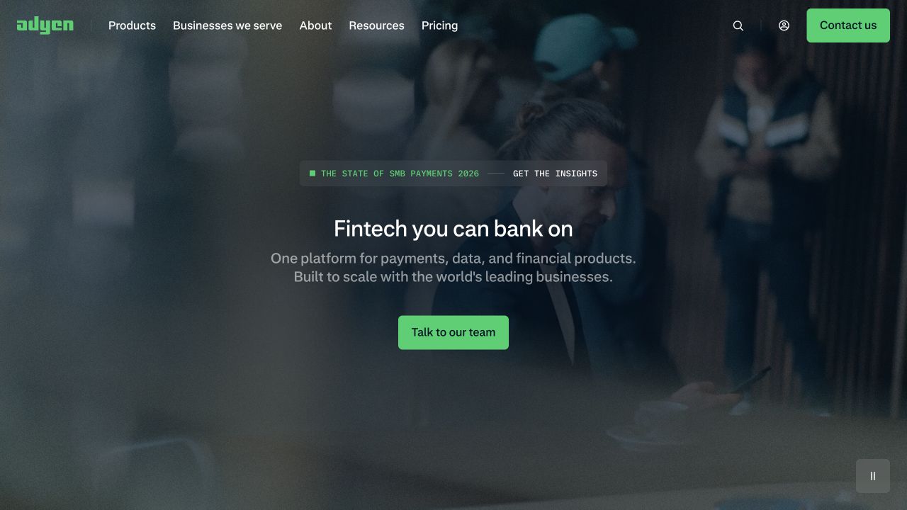
Adyen places a centered fintech proposition over a darkened photograph of people in a business setting. The introduction uses only a short headline, two supporting lines, and a green team-contact action. A small research announcement is visually separated above it. The header keeps products, audiences, resources, pricing, and login accessible, using the same green accent for the contact destination. Nuxt’s official showcase names the public marketing property; the payment platform, merchant dashboard, and security controls were not evaluated in this visual review.
What you can learn
The useful Nuxt pattern is a stable enterprise shell around editable campaign and audience content. Keep the sales action unambiguous while preserving documentation and pricing paths for independent evaluation. Image overlays should be tested against the actual media sequence, and promotional research links should not displace the core platform explanation on smaller screens.
Pros
A limited action set keeps the sales-oriented introduction easy to scan.
The green accent connects brand identity and primary navigation actions.
Cons & considerations
The broad platform description postpones concrete product differentiation.
Darkened lifestyle media supplies atmosphere but little operational proof.
Vue.jsAssociated with Nuxt; not independently observed
Public source checked November 3, 2026. References may be embedded or legacy—not a complete backend inventory.
Platform source: Official Nuxt showcase. Nuxt's own showcase links this named Adyen public website property. The association applies to this public experience, not its product runtime, payment systems, or every website owned by the organization. Platform evidence is separate from the direct website screenshot and is not a complete current infrastructure audit.
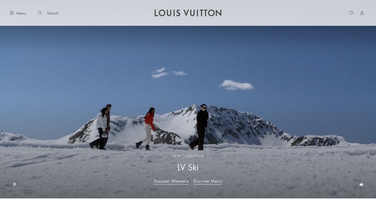
Louis Vuitton’s international site uses a snow-covered collection film beneath a spacious white header. Menu and search sit at the left, the centered wordmark anchors the page, and account-related controls stay at the right. Small collection lettering and two underlined audience links occupy the lower center. Separate media controls appear near the edges instead of competing with the collection label. Nuxt’s official showcase links this international public experience; the association is scoped to that property, not an enterprise-wide commerce architecture audit.
What you can learn
For a Nuxt storefront, separate regional orientation, campaign media, and category navigation into explicit responsibilities. Keep the selected locale visible without forcing an unexpected region change. The still-image and reduced-motion experience should retain the same collection destinations, and page transitions should never reset focus unpredictably or obscure product navigation.
Pros
The generous header gives brand identity and shopping utilities distinct space.
Collection destinations remain real text over the campaign image.
Cons & considerations
The first view offers little product detail beyond the seasonal mood.
Localization prompts can interrupt visitors before they understand the selected region.
Visible tech stack
Earlier / documented evidence
Nuxt
Associated dependencies
Vue.jsFramework dependency association; not independently observed
Earlier cited evidence retained; no current scan result. References may be embedded or legacy—not a complete backend inventory.
Platform source: Official Nuxt showcase. Nuxt's own showcase links this named Louis Vuitton international website property. The association applies to this public experience, not its product runtime, payment systems, or every website owned by the organization. Platform evidence is separate from the direct website screenshot and is not a complete current infrastructure audit.
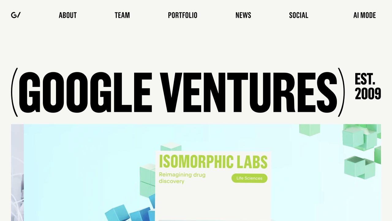
GV’s homepage uses extremely condensed black typography on an off-white background. Its full Google Ventures name dominates the opening, with an establishment date set beside it. A compact row of uppercase navigation connects about, team, portfolio, news, social channels, and an AI-oriented mode. A colorful portfolio story begins directly below the giant identity block. Nuxt’s official showcase links this public GV website; the example does not attribute Google Search, private investment tools, or every Alphabet property to Nuxt.
What you can learn
Use a Nuxt layout to coordinate editorial portfolio stories without treating the homepage as a static image. A typographic identity can carry considerable personality, but the underlying content needs real headings, sensible reading order, and predictable links. Keep unusual modes optional and make portfolio access equally clear through ordinary navigation.
Pros
A distinctive type treatment establishes identity without a decorative logo wall.
Portfolio storytelling follows the organizational name immediately.
Cons & considerations
The enormous wordmark leaves little introductory context in the first screen.
Condensed display type and animated stages need careful mobile and reduced-motion treatment.
Vue.jsFramework dependency association; not independently observed
Public source checked November 3, 2026. References may be embedded or legacy—not a complete backend inventory.
Platform source: Official Nuxt showcase. Nuxt's own showcase links this named GV (Google Ventures) property. The association applies to this public experience, not its product runtime, payment systems, or every website owned by the organization. Platform evidence is separate from the direct website screenshot and is not a complete current infrastructure audit.
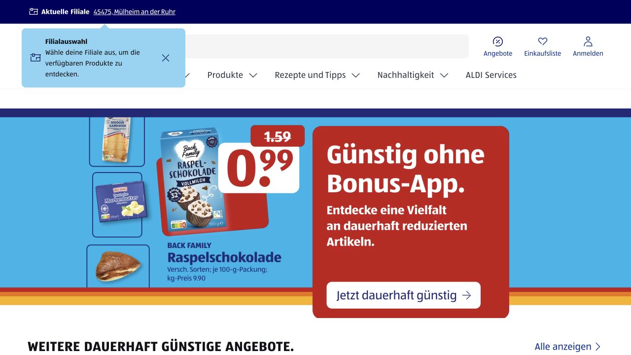
ALDI SÜD’s German public website places location, search, account, and shopping-list tasks above a broad product-category row. The captured campaign uses bright blue and red panels, real packaged goods, and an oversized price to make the offer easy to understand. An explanatory store-selection callout is visible near the header, while additional offers begin below the feature. Nuxt’s official showcase names this specific German ALDI SÜD property, not every ALDI country organization or its internal stock systems.
What you can learn
A Nuxt retail experience should model store context as application state rather than decorative copy. Preserve the relationship between location, availability, and promotional content without implying that every visitor sees identical offers. Keep the product campaign independently editable, and make search, account access, and shopping-list controls understandable before users commit to an interaction.
Pros
Search and local-store context are integrated into the primary site shell.
Real packaging and clear price hierarchy make the campaign concrete.
Cons & considerations
Several stacked navigation layers consume substantial vertical space.
Location callouts can obscure header controls if their dismissal is not obvious.
ReactAssociated with Next.js; not independently observed
Vue.jsFramework dependency association; not independently observed
Public source checked November 3, 2026. References may be embedded or legacy—not a complete backend inventory.
Platform source: Official Nuxt showcase. Nuxt's own showcase links this named ALDI SÜD Germany property. The association applies to this public experience, not its product runtime, payment systems, or every website owned by the organization. Platform evidence is separate from the direct website screenshot and is not a complete current infrastructure audit.
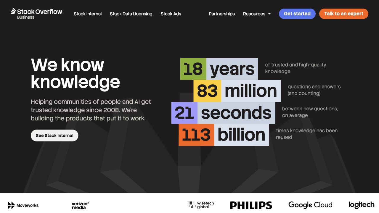
Stack Overflow’s corporate website uses a dark background, a concise left-hand knowledge statement, and large colored statistical blocks on the right. Each figure is paired with a plain-language label, making the composition more informative than a detached wall of numbers. The business identity and navigation explicitly distinguish internal knowledge, licensing, advertising, and partnerships. Customer marks begin beneath the introduction. Nuxt’s official showcase names this corporate property, not the separate question-and-answer site, authenticated products, or the validity of the displayed marketing statistics.
What you can learn
An enterprise Nuxt layout should explain the relationship between a familiar parent brand and a newer commercial offering. Model evidence labels alongside their figures, and preserve a clear route to the actual product. Do not let animated counters substitute for readable explanations, and assign an owner to keeping every numerical claim current.
Pros
Statistics have adjacent context rather than relying on isolated impressive figures.
The business navigation clarifies several distinct commercial offerings.
Cons & considerations
Large figures can outweigh the practical explanation of the product.
The first view requires further browsing to understand implementation and evaluation details.
Vue.jsAssociated with Nuxt; not independently observed
Public source checked November 3, 2026. References may be embedded or legacy—not a complete backend inventory.
Platform source: Official Nuxt showcase. Nuxt's own showcase links this named Stack Overflow corporate website property. The association applies to this public experience, not its product runtime, payment systems, or every website owned by the organization. Platform evidence is separate from the direct website screenshot and is not a complete current infrastructure audit.
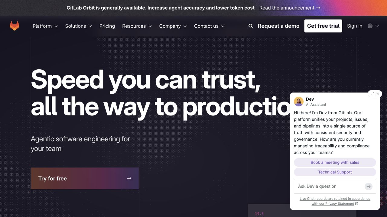
GitLab’s public marketing page combines oversized white lettering with a dark technical texture and a warm-to-purple primary action. A narrow announcement strip sits above a full enterprise navigation, with demo, trial, account, and search routes kept visible. The captured page also displays a sales-assistant panel over the lower right, illustrating how support overlays compete with the hero. Nuxt’s official showcase links this marketing property; it is not the same evidence as GitLab’s authenticated product implementation or its source-code hosting application.
What you can learn
In a Nuxt marketing shell, establish an interaction budget for announcements, chat, navigation, and acquisition controls. Shared styling does not eliminate the cognitive cost of several simultaneous invitations. Keep the core proposition readable when overlays appear, preserve a simple dismissal, and distinguish a trial route from a sales conversation and an existing-customer login.
Pros
Trial and demo destinations acknowledge different evaluation preferences.
A strong type hierarchy creates a recognizable enterprise introduction.
Cons & considerations
The chat panel obscures part of the opening composition.
Several acquisition routes and the announcement compete for initial attention.
Vue.jsFramework dependency association; not independently observed
Public source checked November 3, 2026. References may be embedded or legacy—not a complete backend inventory.
Platform source: Official Nuxt showcase. Nuxt's own showcase links GitLab's public marketing property. This does not establish the implementation of the authenticated GitLab application or every corporate system. Platform evidence is separate from the direct website screenshot and is not a complete current infrastructure audit.
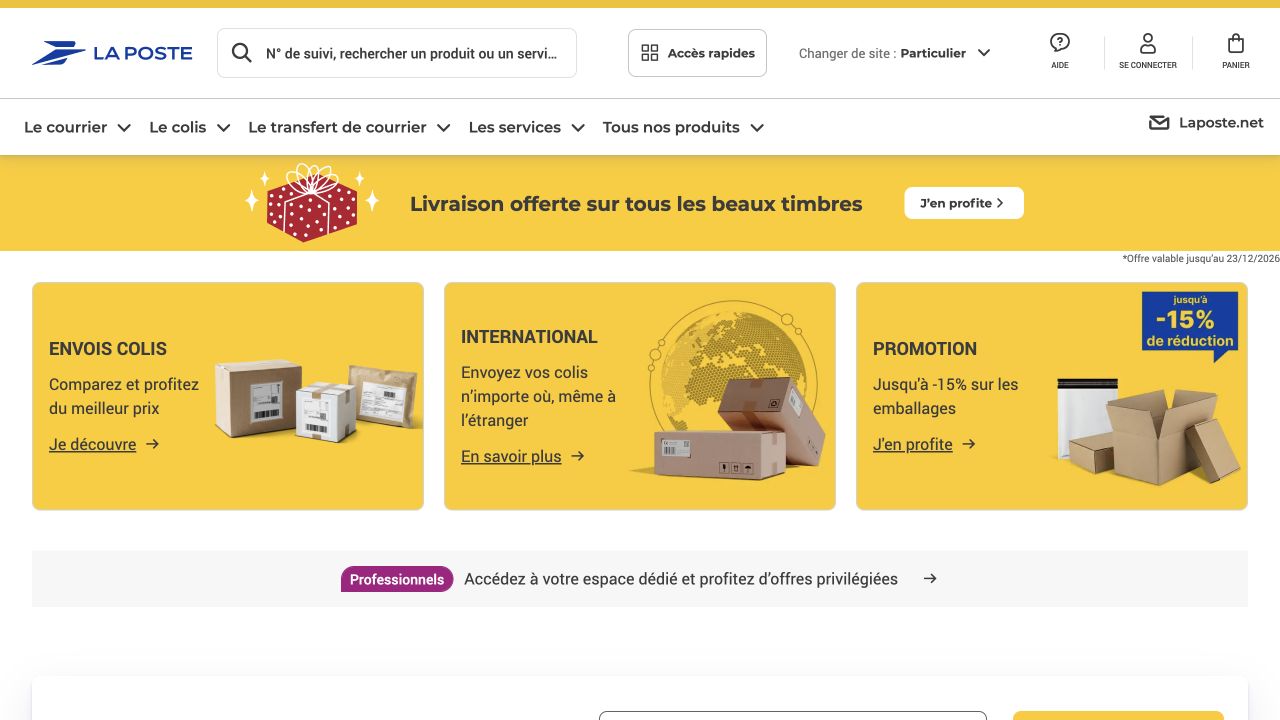
La Poste’s French public site combines a wide search entry, account utilities, and a horizontal service menu with a yellow promotional strip. Three equally sized cards introduce parcel shipping, international delivery, and packaging offers using simple objects and short labels. A separate business-audience band sits beneath them, while tracking content begins further down. The layout prioritizes recognizable services over a cinematic brand introduction. Nuxt’s official showcase names the public La Poste property, not every banking, logistics, or authenticated account service.
What you can learn
Design Nuxt routes around recurring user tasks and explicit audience changes. Tracking, shopping, professional services, and account access need different states and destinations even when they share one header. Reusable cards should permit plain-language labels and useful fallback content, and promotion banners must not bury the core transactional task on short screens.
Pros
The service cards communicate concrete jobs instead of abstract brand promises.
Business visitors receive a distinct route without dominating consumer navigation.
Cons & considerations
Multiple header and promotional bands delay the tracking interface.
Dense utility icons need reliable accessible names and generous touch targets.
Visible tech stack
Referenced on the public page
Nuxt
Vite
Associated dependencies
Vue.jsAssociated with Nuxt; not independently observed
Public source checked November 3, 2026. References may be embedded or legacy—not a complete backend inventory.
Platform source: Official Nuxt showcase. Nuxt's own showcase links this named La Poste property. The association applies to this public experience, not its product runtime, payment systems, or every website owned by the organization. Platform evidence is separate from the direct website screenshot and is not a complete current infrastructure audit.
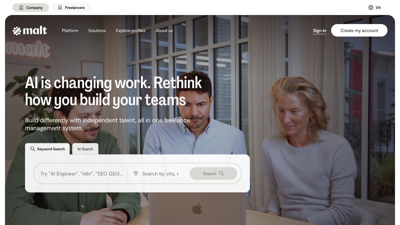
Malt’s homepage separates company and freelancer audiences in a small top utility row, then places its main navigation over a rounded workplace photograph. A left-aligned statement and short explanation introduce the service, while a large search module offers keyword and AI-oriented modes. Skill and location inputs give the page a practical starting point beyond the brand message. Nuxt’s official showcase associates this public website with Nuxt; no talent search, registration, or private marketplace workflow was submitted or tested during the review.
What you can learn
For a Nuxt marketplace shell, define audience, search mode, and location as explicit states with understandable transitions. Keep explanatory content available before a query, and make the difference between standard search and assisted search visible without assuming either is inherently better. Validate keyboard flow and empty results independently from the polished landing page.
Pros
Audience choices are separated from the main product navigation.
The search module turns a broad marketplace proposition into a concrete task.
Cons & considerations
A wide multi-part form needs careful reflow on phones.
Photographic backgrounds can reduce contrast around navigation and explanatory text.
Visible tech stack
Earlier / documented evidence
Nuxt
Earlier cited evidence retained; no current scan result. References may be embedded or legacy—not a complete backend inventory.
Platform source: Official Nuxt showcase. Nuxt's own showcase links this named Malt property. The association applies to this public experience, not its product runtime, payment systems, or every website owned by the organization. Platform evidence is separate from the direct website screenshot and is not a complete current infrastructure audit.
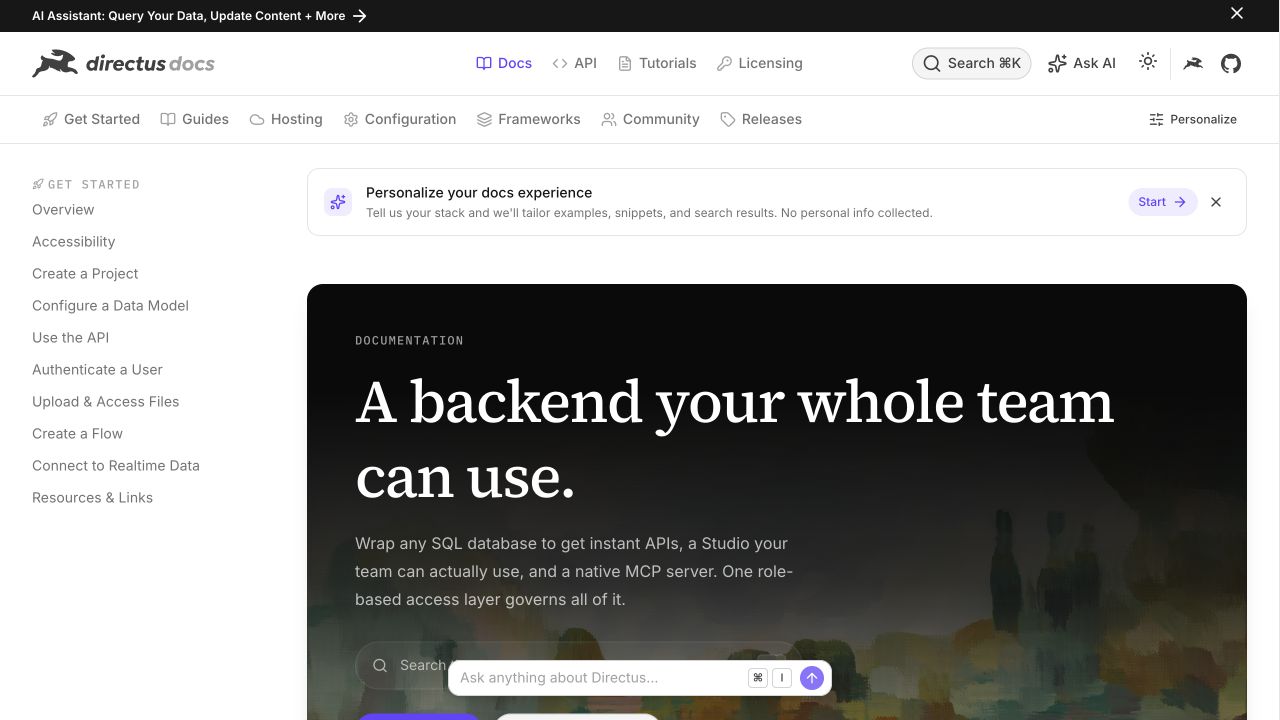
Directus documentation combines a compact global header, a second topic navigation row, and a persistent left-hand guide list. The main opening panel uses a dark image-backed introduction and a large serif heading, with search and assistant controls nearby. A small personalization banner explains that examples can be tailored, while standard documentation routes remain visible. Nuxt’s official showcase points specifically to this documentation property; it does not establish that the Directus application, every customer project, or its marketing homepage shares the same implementation.
What you can learn
A Nuxt documentation site can offer contextual help without making personalization a prerequisite for reading. Preserve stable article URLs, ordinary search, clear topic groups, and a predictable sidebar. Treat assistant answers and tailored examples as additional interfaces with their own loading and failure states, not replacements for a maintainable written reference.
Pros
The topic structure is visible across both broad and detailed navigation.
Personalization is presented as an optional layer over conventional documentation.
Cons & considerations
Several simultaneous search and assistant entry points may confuse new readers.
Promotional and personalization banners reduce space for the actual reference content.
Vue.jsAssociated with Nuxt; not independently observed
Public source checked November 3, 2026. References may be embedded or legacy—not a complete backend inventory.
Platform source: Official Nuxt showcase. Nuxt's own showcase links this named Directus documentation property. The association applies to this public experience, not its product runtime, payment systems, or every website owned by the organization. Platform evidence is separate from the direct website screenshot and is not a complete current infrastructure audit.
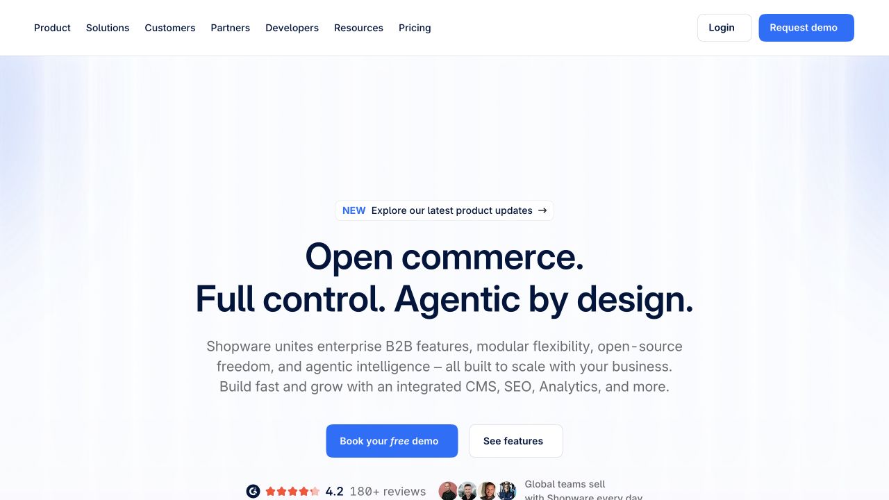
Shopware’s public homepage uses a centered headline, a substantial explanatory paragraph, and two clear evaluation actions on a pale background. A small product-update announcement appears above the introduction, while ratings and customer context begin beneath the buttons. The header separates products, solutions, customers, partners, developer material, resources, and pricing, keeping login and demonstration access at the far edge. Nuxt’s official showcase names this public property; that evidence does not identify the rendering framework of independent Shopware stores or its administrative application.
What you can learn
A Nuxt marketing layout should separate platform explanation from the much more specific merchant experience it describes. Use reusable text and proof modules with controlled line lengths, and keep developer resources available alongside sales routes. Test the introduction with ordinary-length content rather than relying on short slogans and an unusually wide desktop viewport.
Pros
Feature exploration and a sales demonstration are visibly different actions.
The restrained opening gives the platform explanation room to be read.
Cons & considerations
A long paragraph can be demanding before a concrete product example appears.
The broad navigation requires careful grouping on smaller displays.
Vue.jsFramework dependency association; not independently observed
Public source checked November 3, 2026. References may be embedded or legacy—not a complete backend inventory.
Platform source: Official Nuxt showcase. Nuxt's own showcase links this named Shopware public website property. The association applies to this public experience, not its product runtime, payment systems, or every website owned by the organization. Platform evidence is separate from the direct website screenshot and is not a complete current infrastructure audit.
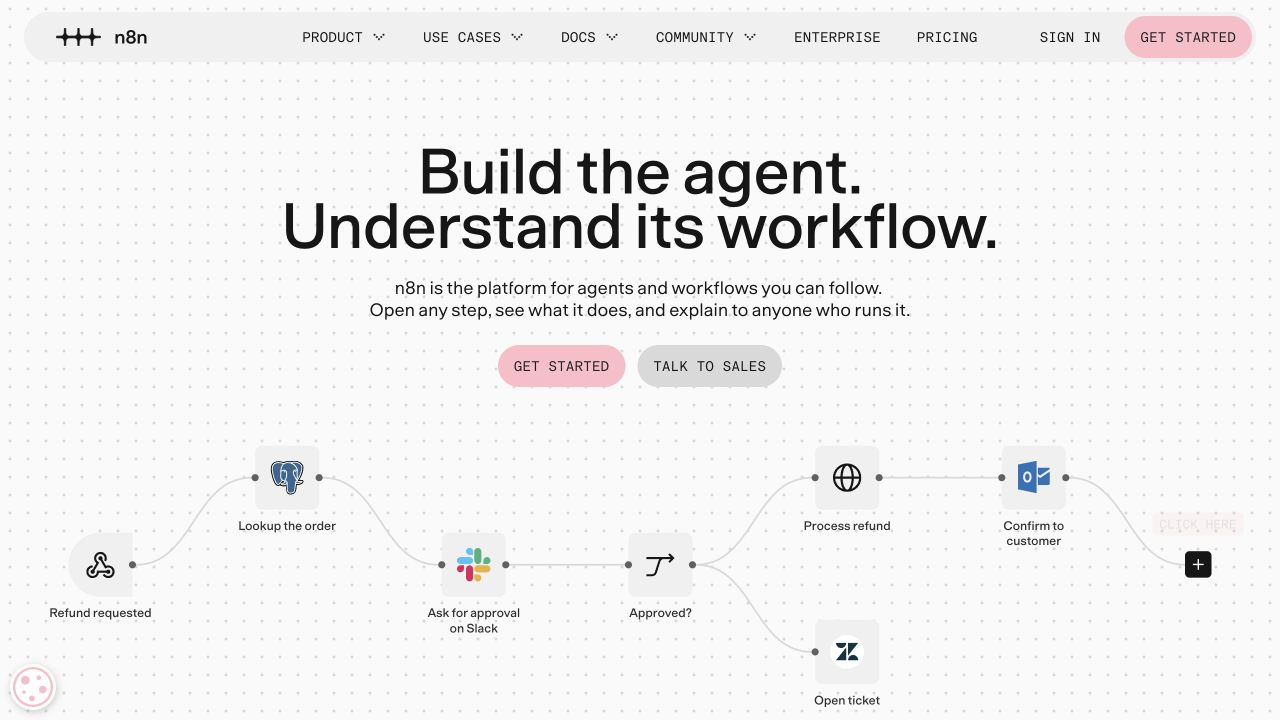
n8n’s homepage places a large centered statement above a workflow illustration on a lightly dotted canvas. Pink and gray action treatments distinguish starting from contacting sales. The lower visual uses recognizable service nodes, arrows, and a decision branch, making automation feel like a sequence of concrete steps rather than a decorative dashboard. A compact rounded navigation keeps product, use cases, documentation, community, enterprise, and pricing together. Nuxt’s official showcase names this marketing property, not the n8n editor application or any connected customer workflow.
What you can learn
For a Nuxt product story, a meaningful diagram can explain relationships more effectively than a screenshot full of tiny controls. Keep an equivalent text description, ensure animation is optional, and avoid implying the illustrated workflow has been executed. Separate public explanatory assets from any live demo that would connect accounts or process user data.
Pros
The workflow graphic reveals a sequence and a decision instead of generic interface boxes.
Documentation remains a first-class navigation destination.
Cons & considerations
Small node labels can lose meaning on narrow screens.
An animated product story needs a useful paused and reduced-motion state.
Vue.jsFramework dependency association; not independently observed
Public source checked November 3, 2026. References may be embedded or legacy—not a complete backend inventory.
Platform source: Official Nuxt showcase. Nuxt's own showcase links this named n8n public website property. The association applies to this public experience, not its product runtime, payment systems, or every website owned by the organization. Platform evidence is separate from the direct website screenshot and is not a complete current infrastructure audit.
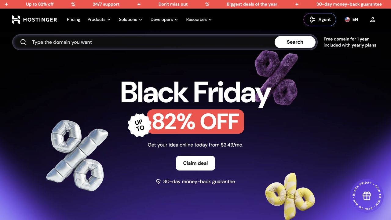
Hostinger’s public homepage combines a black header, an unusually broad domain-search field, and a large seasonal offer on a purple gradient. Three-dimensional percentage symbols echo the central promotional figure, while a single pale action anchors the campaign. A thin animated deal strip adds another layer above the navigation. Product, solution, developer, and resource routes remain present despite the promotion. Nuxt’s official showcase links this public website; the hosting control panel, checkout, and website-building application were not inspected or attributed from this capture.
What you can learn
In a Nuxt commerce shell, keep the visitor’s practical domain task independent of the current promotional story. Model campaign terms and expiry as content with a responsible owner, and preserve a useful route when no offer is active. Search submission, account navigation, and acquisition actions need distinct labels, predictable states, and mobile-friendly spacing.
Pros
Domain search offers a direct task route above the campaign.
The dark palette connects header, media, and primary offer coherently.
Cons & considerations
Multiple promotional layers can overwhelm service differentiation.
Large offer graphics and moving strips need careful motion and compact-screen testing.
Visible tech stack
Earlier / documented evidence
Nuxt
Associated dependencies
Vue.jsFramework dependency association; not independently observed
Earlier cited evidence retained; no current scan result. References may be embedded or legacy—not a complete backend inventory.
Platform source: Official Nuxt showcase. Nuxt's own showcase links this named Hostinger public website property. The association applies to this public experience, not its product runtime, payment systems, or every website owned by the organization. Platform evidence is separate from the direct website screenshot and is not a complete current infrastructure audit.
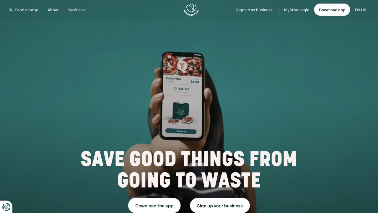
Too Good To Go’s United States homepage places a phone demonstration and a large mission statement on a deep teal background. Two pale buttons distinguish downloading the app from signing up a business. The centered identity is flanked by food discovery, information, and business-account routes rather than a large product-feature menu. The real app image makes the service tangible while the headline establishes its purpose. Nuxt’s showcase links this public property; the mobile application, merchant onboarding, and surplus-food availability were not independently evaluated.
What you can learn
A Nuxt marketplace introduction should distinguish its two-sided audience before presenting detailed features. Keep download and business registration destinations explicit, provide a readable static media alternative, and separate geographic discovery from account actions. The public shell can explain the service clearly without initiating location access, searching nearby inventory, or submitting a registration form.
Pros
The two principal audience actions remain visible together.
The phone demonstration connects the mission statement to a recognizable product.
Cons & considerations
A video-led opening requires deliberate crops and readable still frames.
The large mission headline leaves practical eligibility and location details for later.
Visible tech stack
Earlier / documented evidence
Nuxt
Earlier cited evidence retained; no current scan result. References may be embedded or legacy—not a complete backend inventory.
Platform source: Official Nuxt showcase. Nuxt's own showcase links this named Too Good To Go public website property. The association applies to this public experience, not its product runtime, payment systems, or every website owned by the organization. Platform evidence is separate from the direct website screenshot and is not a complete current infrastructure audit.
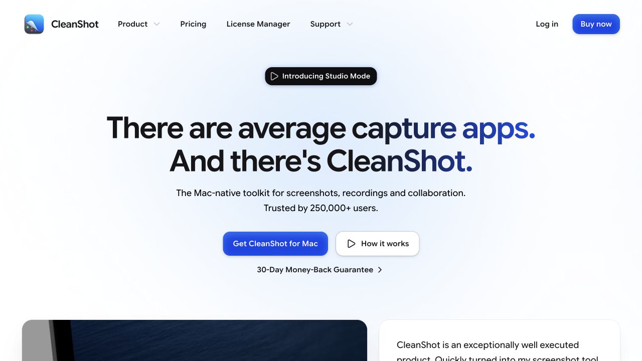
CleanShot’s homepage uses a centered product proposition against a subtle blue glow. A small feature announcement sits above the headline, and a concise description identifies the Mac application before two contrasting actions offer acquisition or explanation. The header keeps pricing, license management, support, login, and buying separate. Product media and a review begin beneath the generous introduction. Nuxt’s official showcase names the public CleanShot website; it does not claim that the native Mac application or cloud service is implemented with Nuxt.
What you can learn
For a Nuxt software storefront, the web shell should answer platform, purpose, purchase path, and support needs before sophisticated media takes over. Give existing customers a license-management route distinct from acquisition. Model announcements as replaceable content, and ensure demonstration controls communicate playback rather than looking like a second checkout action.
Pros
Platform context is stated before the main purchase decision.
License management acknowledges existing customers in the primary navigation.
Cons & considerations
The spacious hero postpones detailed product evidence below the fold.
Several purchase-related controls require consistent destination and pricing language.
Visible tech stack
Referenced on the public page
Nuxt
Vite
Google Fonts
Amazon CloudFrontDelivery / hosting signal
Associated dependencies
Vue.jsFramework dependency association; not independently observed
Public source checked November 3, 2026. References may be embedded or legacy—not a complete backend inventory.
Platform source: Official Nuxt showcase. Nuxt's own showcase links this named CleanShot X property. The association applies to this public experience, not its product runtime, payment systems, or every website owned by the organization. Platform evidence is separate from the direct website screenshot and is not a complete current infrastructure audit.
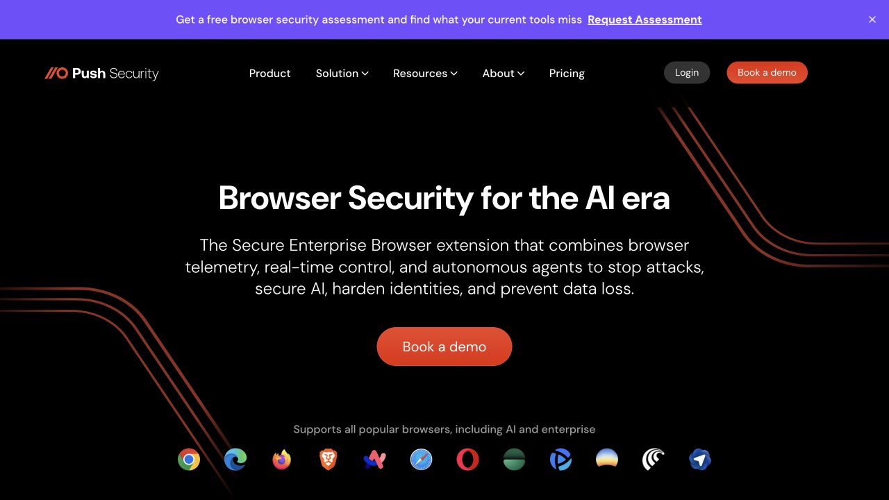
Push Security uses a black canvas, white centered text, and restrained red curved lines to introduce its browser-security offering. A red demo action anchors the main explanation, while supported-browser marks provide context near the bottom. A separate purple assessment banner sits above the navigation with its own dismissal. The header retains product, solution, resource, company, pricing, and account routes. Nuxt’s official showcase associates the public website with Nuxt; this visual review is not an audit of the security extension, telemetry handling, or advertised protection.
What you can learn
An enterprise Nuxt shell should keep an optional assessment campaign distinguishable from the product’s normal evaluation route. Make each data-collection destination explicit before a visitor commits, and preserve navigation when banners are dismissed. Use editable explanatory text rather than relying on browser marks or animated lines to communicate the scope of a security product.
Pros
The assessment campaign has a distinct visual band and dismissal control.
The main proposition is readable without watching a product demonstration.
Cons & considerations
The broad security description leaves technical deployment details for another page.
Assessment and demo invitations can compete for the same visitor’s attention.
Vue.jsAssociated with Nuxt; not independently observed
Public source checked November 3, 2026. References may be embedded or legacy—not a complete backend inventory.
Platform source: Official Nuxt showcase. Nuxt's own showcase links this named Push Security property. The association applies to this public experience, not its product runtime, payment systems, or every website owned by the organization. Platform evidence is separate from the direct website screenshot and is not a complete current infrastructure audit.
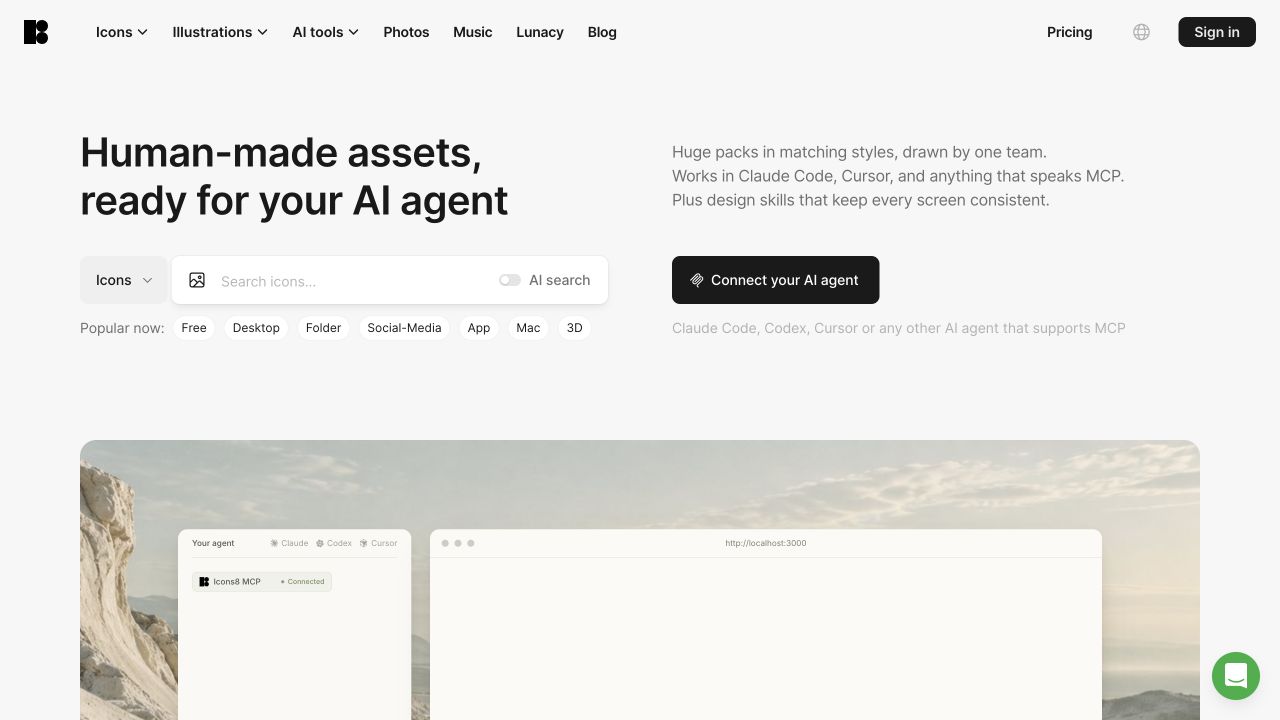
Icons8’s current homepage divides its introduction between a large asset proposition on the left and a short workflow explanation on the right. A category selector and broad search field support direct browsing, while a dark integration action offers a different starting point. Small popular-search chips provide helpful examples without requiring a query. A large demonstration area begins below the introduction, and navigation keeps several asset types distinct. Nuxt’s official showcase names this public property, not every design application, API, or third-party editor integration.
What you can learn
A Nuxt catalog should preserve conventional browsing while introducing new integration routes. Treat search category, query, and assisted-search mode as explicit states with understandable results. Keep integration documentation separate from consent or account access, and ensure examples are useful when the large demonstration media has not loaded or cannot play.
Pros
Search chips show practical starting queries without crowding the main field.
Manual browsing and integration setup are visually different paths.
Cons & considerations
The broad catalog still requires strong result filtering beyond the homepage.
A large demonstration region can appear empty during initial media loading.
Vue.jsFramework dependency association; not independently observed
Public source checked November 3, 2026. References may be embedded or legacy—not a complete backend inventory.
Platform source: Official Nuxt showcase. Nuxt's own showcase links this named Icons8 property. The association applies to this public experience, not its product runtime, payment systems, or every website owned by the organization. Platform evidence is separate from the direct website screenshot and is not a complete current infrastructure audit.
Choose rendering and integrations by page responsibility
Start with a public content experience when the task is reading
A marketing, documentation, or editorial site needs useful content at direct URLs before it needs elaborate navigation effects. Decide which pages can be prepared ahead of time and how content changes reach production. Nuxt supports different rendering approaches, but the project still needs explicit preview, redirect, error, and search behavior. Make an ordinary detail page part of design approval, not an afterthought following the hero.
Use an application approach for persistent, meaningful state
A logged-in workspace, booking journey, or complex configurator may need state that survives a route change. List which information belongs in the URL, in a temporary interface state, and on the server. Avoid putting private or authoritative business data into a convenient client store merely to simplify a demo. Define session expiry, interrupted tasks, permission errors, and recovery alongside the successful path.
Treat commerce and external services as explicit boundaries
A storefront may use Nuxt for presentation while another service owns catalog data, search, payments, or fulfillment. Document the boundary for each. Test inaccurate inventory, changed prices, regional restrictions, and a delayed checkout handoff. A recognizable retailer’s homepage is not evidence that copying its frontend will reproduce its operational capabilities or make a custom storefront appropriate for a smaller business.
From references to requirements
Plan the failure cases before they become launch surprises
Agree a route-by-route content and freshness map
For every important template, record the source of its data, who may edit it, how quickly it must change, and whether it differs by visitor. This map turns an abstract rendering conversation into a concrete operating plan. Include cache invalidation and rollback. Do not let a page with personalized information accidentally inherit a public caching rule because its layout resembles a marketing page.
Rehearse data delays and incomplete responses
Use realistic slow, empty, partial, and failing responses during review. Keep the visitor informed without replacing the entire page with a spinner. Where a user submits something, preserve entered information on a recoverable failure and distinguish acceptance from final completion. Decide how duplicate requests are handled. These are product decisions as much as code details, and should not be postponed until a form first fails in production.
Make the deployment target part of the specification
Nuxt’s server and build output can support several deployment models; the chosen target changes operational responsibilities. Review the actual hosting configuration, environment variables, runtime limits, logs, and rollback procedure. Confirm which party owns each account and who receives failure alerts. A handover should explain how to restore a working release, not just where the source repository is located.
Ask the actual team to carry out its routine job: publish a realistic update, correct a mistake, preview a narrow screen, and identify who owns an integration failure. For a library or frontend framework, also ask who maintains the content source and deployment. A polished screenshot does not answer those operational questions.
Beyond the screenshot
A Nuxt acceptance checklist for the complete journey
Review direct URL entry, refresh, browser Back, and missing routes.
Record data ownership, freshness, rendering, and caching for each page family.
Exercise pending, empty, partial, failed, and expired-session states.
Keep authoritative permissions and transaction validation on the server.
Test language, region, currency, and unusually long content where applicable.
Check keyboard navigation, focus after route changes, and reduced motion.
Verify contact or checkout handoffs in an appropriate test environment.
Document environment settings, publication, monitoring, rollback, and maintenance owners.
Test with real content, a keyboard, a small screen, slow or failed requests, and the people who will maintain the system. These are planning checks, not an accessibility, security, performance, or search-ranking certification.
Sources & editorial method
How this Nuxt collection was reviewed
The collection uses direct captures from the named public properties, with official Nuxt showcase links and first-party evidence kept separate from the images. A showcase association is attributed, not presented as a full current infrastructure audit. Reviews assess visible design choices and scope their lessons to the selected experience.
Every image is an unmodified capture from the actual website, with its source and capture date. Some captures are reused from our shared catalog; their dates remain the original capture dates. None comes from a vendor gallery or a generated reconstruction. Moving imagery and live content can change.
Technology attribution uses public page assets or metadata, official platform documentation, or a cited first-party project case study. Documentary and framework-relationship evidence is identified where used; it is not a complete current backend inventory. A CMS image CDN alone does not establish a full CMS deployment. A library’s presence does not prove which individual controls use it, and a platform label does not establish AI authorship.
The composition notes, lessons, pros and tradeoffs are original editorial observations. We have not measured conversion, traffic, security, performance or accessibility conformance. Website owners retain their brands and imagery; these examples are not our client portfolio. Written, Edited and Curated are independent records, not dates advanced by a build. See our editorial standards or suggest a correction.
Questions worth asking
Nuxt website development FAQs
Is Nuxt a different framework from Vue?
Nuxt builds a broader website and application structure around Vue. Choosing it is also a decision about routing, rendering, data handling, and deployment conventions, rather than a separate visual style that a visitor will recognize.
Should every Nuxt page be server-rendered?
No single answer fits every project. Map the actual page responsibilities and freshness needs, then choose the supported delivery arrangement that your team can operate. Do not decide from the homepage’s appearance alone.
Will Nuxt automatically solve search visibility?
No. Rendering is only one part of discoverability. Useful content, correct status codes, canonical URLs, accessible navigation, internal links, and ongoing publishing decisions still require deliberate implementation and verification.
Can I use a CMS with Nuxt?
Yes, but the editing model is a separate design decision. Specify content fields, draft preview, publication timing, localization, and failure handling. A frontend framework does not by itself supply a complete editor experience.