Next.js references can reveal a useful frontend pattern, but they do not answer every architecture question. Plan the content model, server and client boundaries, preview, and operating responsibilities together.
The examples associate the named properties with Next.js through public bundles or attributed official project sources. They do not imply that every product, subdomain, CMS, or hosting contract belonging to a brand uses the same stack.
Study the user-facing job first: explaining a product, finding a location, browsing a catalog, or reading documentation. Then ask what the implementation must do to make that journey reliable.
Before the examples
What makes good Next.js website development in 2026?
Render useful content before adding optional interaction
A visitor needs headings, navigation, and meaningful content, not a blank stage waiting for an animation. Review the actual rendered page and its failure states. Choose rendering behavior according to the content’s freshness and visitor task.
Make the server and client boundary intentional
The App Router provides distinct server and client component roles. Identify where browser state or interaction is required, and keep unrelated data and presentation concerns out of that boundary where practical.
Titles, descriptions, social previews, and canonical decisions need ownership and sensible defaults. Next.js provides metadata APIs, but the project must still supply accurate values and test how each public route is represented.
Look at the range of public tasks rather than treating these sites as one prescribed visual style. An official showcase entry and a live bundle signal are attributed separately when available.
We start with five recognizable brands or organizations: OpenAI public website, Hulu welcome page, LG USA storefront, Target storefront, Sonos US storefront. Each attribution applies to the named website property, not every product or website belonging to its organization. This is a curated reading sequence, not a measured ranking.
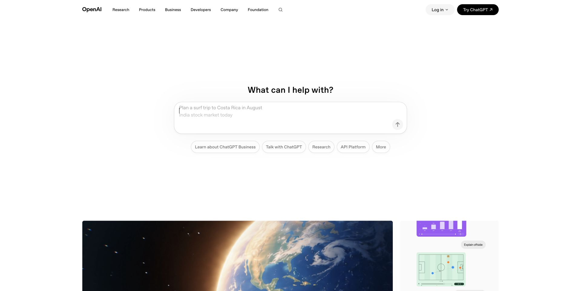
OpenAI’s public homepage leads with a centered question field rather than a traditional company statement. Rounded topic shortcuts below connect the prompt area with business information, research, and the API platform. A spare horizontal header keeps organizational sections visible, while a large image-led editorial grid starts lower in the view. Login and trying ChatGPT remain distinct controls. The public page loads Next.js bundles and appears in the framework’s official showcase; the capture does not include a private conversation or test a submitted prompt.
What you can learn
A Next.js landing page can combine an interactive entry point with ordinary navigable content. Keep important research and product pages available as links even when the prompt interface fails, and make it clear when a submission moves into a different product. Plan a useful initial document rather than requiring every visitor to begin a conversation.
Pros
The shortcuts offer routes for visitors who do not want to type a question.
Editorial imagery provides a visible continuation below the interactive opening.
Cons & considerations
The prompt interface can obscure the organization’s broader purpose for an unfamiliar visitor.
A large field needs clear submission, loading, and failure behavior beyond its attractive empty state.
Earlier cited evidence retained; no current scan result. References may be embedded or legacy—not a complete backend inventory.
Platform source: Official Next.js showcase. The official Next.js showcase features this named website; the captured public page also exposes Next.js assets. Platform evidence is separate from the direct website screenshot and is not a complete current infrastructure audit.
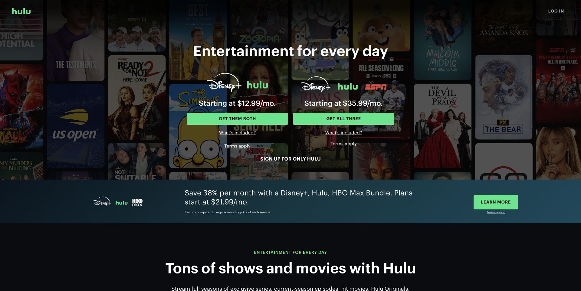
Hulu’s welcome page places two bundle options side by side over a darkened collage of entertainment artwork. Green selection buttons share a consistent width, while inclusions and terms are separate text controls beneath each option. A smaller Hulu-only route recognizes visitors who do not want a bundle. The next horizontal promotion is separated from the following content-library introduction. Next.js assets are visible on this public acquisition page, which is also associated with the official showcase; no subscription or playback flow was completed.
What you can learn
Model subscription options as structured, comparable content in a Next.js build. Keep price, inclusions, eligibility, and destination together so campaign changes cannot detach a headline from its terms. Preserve a plain route to the single product, and render the essential comparison before interactive enhancements or promotional overlays appear. Framework choice does not establish the clarity of a subscription offer.
Pros
Aligned option blocks make the two primary packages easy to compare visually.
Terms and a non-bundle path are available near the main decisions.
Cons & considerations
The busy artwork requires substantial darkening to support readable text.
Competing bundle promotions can make the simplest subscription route less prominent.
Visible tech stack
Earlier / documented evidence
Next.js
Earlier cited evidence retained; no current scan result. References may be embedded or legacy—not a complete backend inventory.
Platform source: Official Next.js showcase. The official Next.js showcase features this named website; the captured public page also exposes Next.js assets. Platform evidence is separate from the direct website screenshot and is not a complete current infrastructure audit.
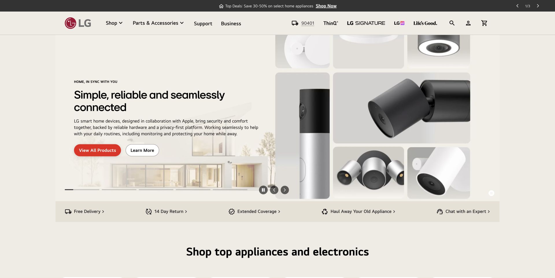
LG’s US storefront uses a warm neutral background and a split campaign: explanatory copy and actions on the left, a mosaic of product close-ups on the right. The solid header exposes shopping, accessories, support, business, search, account, and bag controls. A separate utility strip introduces current deals, while delivery, returns, coverage, and expert contact form a distinct row below the hero. The page exposes Next.js bundles and page data; this evidence applies to the captured US storefront rather than every regional or corporate property.
What you can learn
A Next.js commerce architecture should distinguish regional operational content from replaceable campaign blocks. Preserve support and fulfillment routes while hero media changes, and define where availability, locale, and delivery details come from. An initial render should provide useful navigation even before a carousel initializes or location-aware details finish resolving.
Pros
Shopping and support are both explicit primary routes.
The practical service row separates fulfillment considerations from the campaign narrative.
Cons & considerations
Several header brands and utilities create a fairly dense first view.
A broad connected-product campaign still needs clear links to individual product comparisons.
Visible tech stack
Referenced on the public page
Next.js
Associated dependencies
ReactAssociated with Next.js; not independently observed
Public source checked November 3, 2026. References may be embedded or legacy—not a complete backend inventory.
Platform source: Official Next.js showcase. The official Next.js showcase features this named website; the captured public page also exposes Next.js assets. Platform evidence is separate from the direct website screenshot and is not a complete current infrastructure audit.
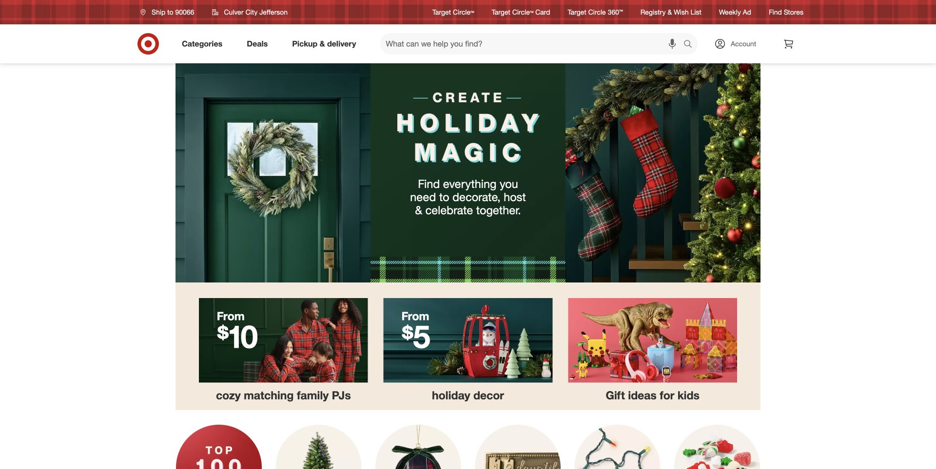
Target gives the center of its white header to a large search field, with categories, deals, pickup, account, and cart arranged around it. A red utility row provides location and loyalty context separately. The captured seasonal campaign is an inset green-and-plaid composition with three smaller category panels beneath, followed by circular merchandising routes. Its assets identify a Next.js top-of-funnel frontend, and the official showcase lists Target. This is a public storefront observation, not a test of stock, checkout, or personalized account behavior.
What you can learn
For a Next.js catalog, treat search, store context, and campaign content as different concerns. A seasonal homepage should remain useful when someone ignores the promotion and searches directly. Render meaningful category links early, then progressively enhance search suggestions and local availability with explicit loading and failure states rather than letting the entire navigation wait on them.
Pros
Search receives more visual space than secondary merchandising links.
The utility row keeps fulfillment context separate from product-category browsing.
Cons & considerations
Seasonal panels can dominate the first view for shoppers with unrelated needs.
Location-aware controls need unambiguous state so visitors know which store or region applies.
Visible tech stack
Referenced on the public page
Next.js
Associated dependencies
ReactAssociated with Next.js; not independently observed
Public source checked November 3, 2026. References may be embedded or legacy—not a complete backend inventory.
Platform source: Official Next.js showcase. The official Next.js showcase features this named website; the captured public page also exposes Next.js assets. Platform evidence is separate from the direct website screenshot and is not a complete current infrastructure audit.
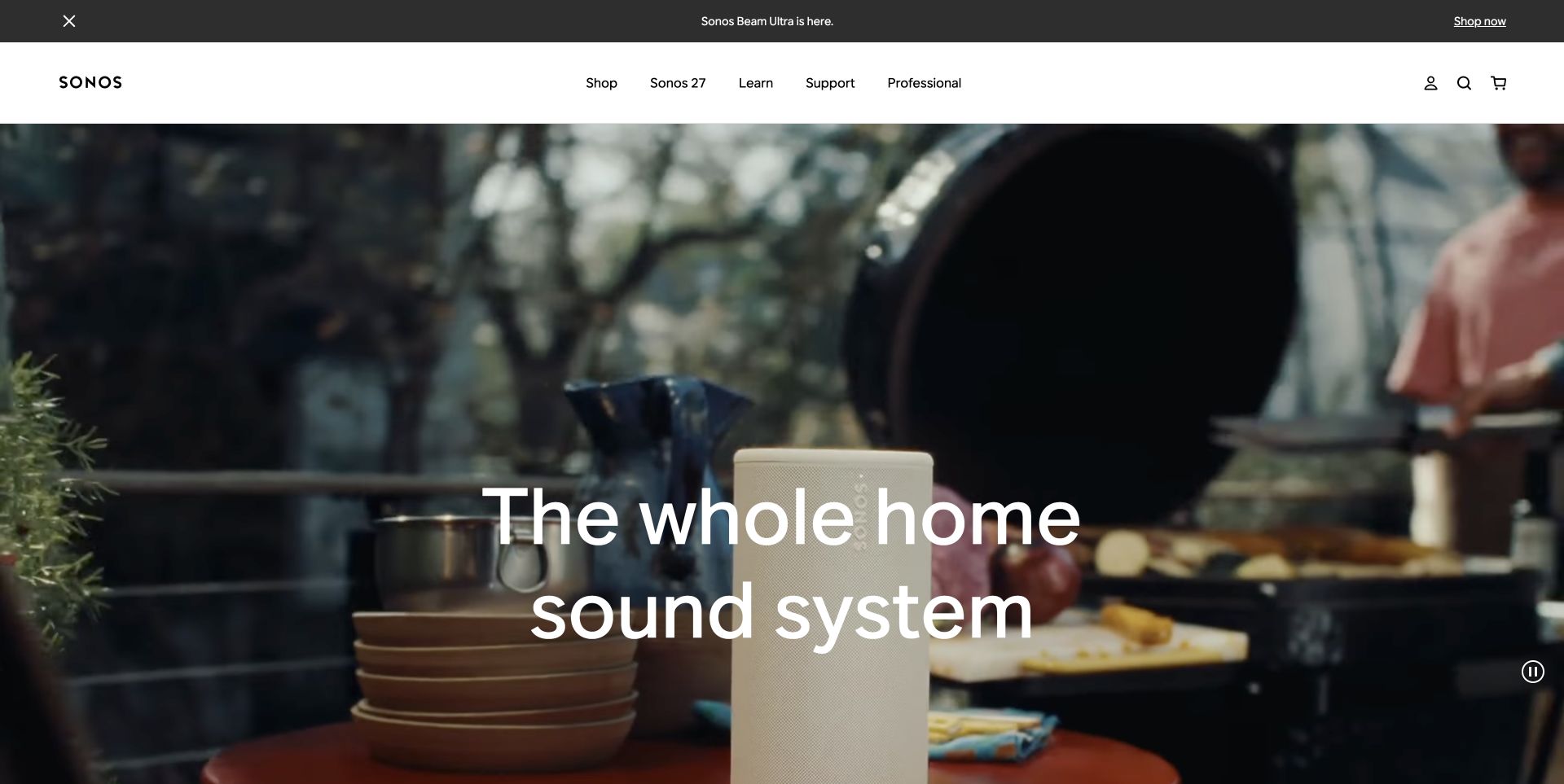
Sonos uses an edge-to-edge domestic scene with a large centered two-line introduction. A speaker appears in the foreground, so the film communicates product context rather than becoming an unrelated lifestyle background. The stable white navigation names shopping, learning, support, and professional routes, with account, search, and bag controls at the right. A thin product-launch strip sits above. Current public assets identify Next.js, complementing the official platform association; this review does not evaluate audio quality or any connected-device software.
What you can learn
A Next.js storefront can support rich product media while keeping the useful page shell independently available. Reserve the media area’s dimensions, provide a clear still fallback, and load interactive product exploration only when needed. Keep support and learning accessible throughout the journey, because an established customer may arrive with a setup question rather than a purchase intention.
Pros
The solid navigation remains distinct from the changing film.
The product is visible in context instead of being represented only by an abstract claim.
Cons & considerations
The full-height scene delays a detailed product comparison.
Large white text over changing footage needs reliable contrast across every frame.
ReactAssociated with Next.js; not independently observed
Public source checked November 3, 2026. References may be embedded or legacy—not a complete backend inventory.
Platform source: Official Next.js showcase. The official Next.js showcase features this named website; the captured public page also exposes Next.js assets. Platform evidence is separate from the direct website screenshot and is not a complete current infrastructure audit.
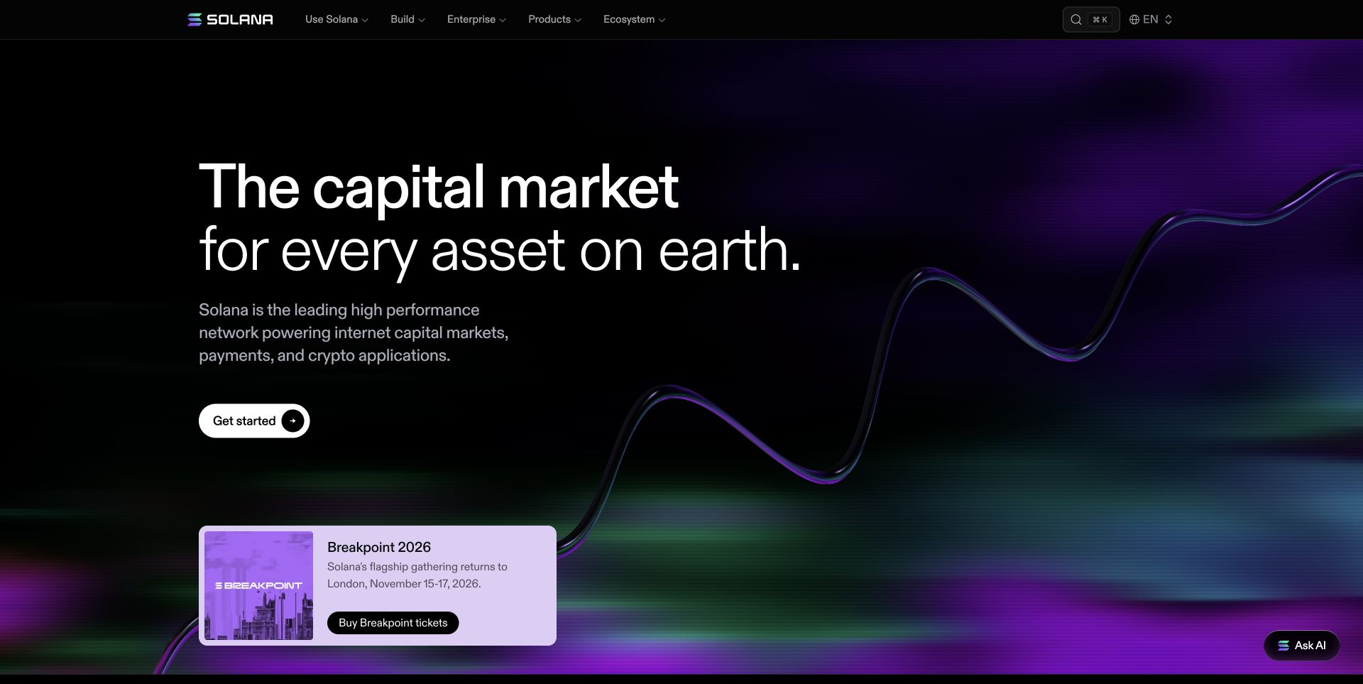
Solana’s public homepage combines a black background, a large two-weight headline, and a purple-green dimensional line running behind the composition. A small filled starting action is separated from a lavender event card near the lower edge. The compact header groups use, building, enterprise, product, and ecosystem routes with search and language controls. A floating assistant is secondary to those visible links. Next.js bundles identify the public frontend; the visual review does not validate network, financial, or investment claims made elsewhere on the site.
What you can learn
An ecosystem homepage built with Next.js should distinguish enduring navigation from news that changes frequently. Give events and announcements their own content model, define expiry behavior, and keep core documentation reachable without an assistant. Decorative graphics can load progressively without delaying the initial headline and route list; an attractive animation is not evidence of platform capability.
Pros
The event card is visually separate from the permanent platform introduction.
Builder and enterprise routes are distinguishable in the main navigation.
Cons & considerations
A broad opening statement needs supporting explanations for unfamiliar visitors.
Assistant, event, and starting actions can compete if each becomes equally prominent.
Visible tech stack
Earlier / documented evidence
Next.js
Earlier cited evidence retained; no current scan result. References may be embedded or legacy—not a complete backend inventory.
Platform source: Observed public page assets. The reviewed page loads public /_next/static/ JavaScript assets. This identifies its Next.js frontend, not its CMS, hosting contract, or every corporate property. Platform evidence is separate from the direct website screenshot and is not a complete current infrastructure audit.
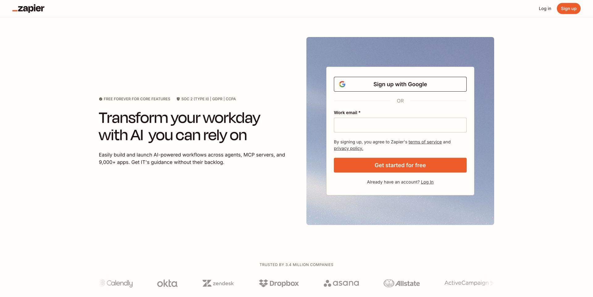
The captured Zapier landing page pairs a left-aligned introduction with a large white signup panel on a muted blue textured background. Google signup and a work-email field are alternatives in the same card, with the terms links placed above the orange action. The header is deliberately limited to identity, login, and signup, while a customer-mark row starts below. The official showcase’s older landing route redirects here, and current public bundles identify Next.js. No form was completed and no account was created.
What you can learn
Treat a Next.js campaign landing page as a scoped experience, not automatically a replacement for the full information site. Keep form validation and error handling independent of decorative media, provide clear account versus login routes, and preserve a way to review relevant product information before committing. Never confuse a visible compliance badge with an independent verification of the implementation.
Pros
The signup alternatives are grouped into one clearly bounded surface.
The restrained header keeps the acquisition page focused.
Cons & considerations
Visitors needing detailed product comparison have few visible exploration routes.
Placing signup beside a broad AI promise requires strong supporting explanation beyond the initial card.
ReactAssociated with Next.js; not independently observed
Public source checked November 3, 2026. References may be embedded or legacy—not a complete backend inventory.
Platform source: Observed public page assets. The reviewed page loads public /_next/static/ JavaScript assets. This identifies its Next.js frontend, not its CMS, hosting contract, or every corporate property. Platform evidence is separate from the direct website screenshot and is not a complete current infrastructure audit.
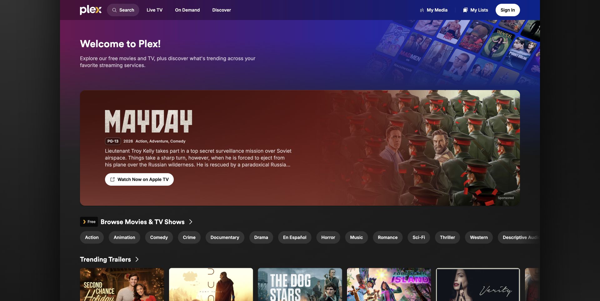
Plex’s public discovery page feels like an application rather than a company brochure. A purple-blue welcome panel sits above a wide sponsored movie feature, followed by genre chips and a row of trailer cards. Search, live television, on-demand browsing, and discovery remain in a compact header, while personal media and list utilities sit near sign-in. The current discovery surface loads Next.js assets. This example concerns that public web property, not every Plex application or a completed streaming session.
What you can learn
A Next.js media catalog needs stable, linkable routes beneath rich browsing controls. Keep sponsored placements distinguishable from the regular library, and explain when a title leads to a different provider. Genre filters and horizontal rails should enhance a useful initial content view, with a sensible reading order and predictable back navigation rather than replacing the page with an opaque client-only state.
Pros
Genre chips expose specific ways into the catalog immediately.
The sponsored feature is labeled separately from ordinary browsing content.
Cons & considerations
A very large paid feature can push the free catalog below the first view.
Several horizontal rails need careful keyboard and narrow-screen behavior.
Earlier cited evidence retained; no current scan result. References may be embedded or legacy—not a complete backend inventory.
Platform source: Observed public page assets. The reviewed page loads public /_next/static/ JavaScript assets. This identifies its Next.js frontend, not its CMS, hosting contract, or every corporate property. Platform evidence is separate from the direct website screenshot and is not a complete current infrastructure audit.
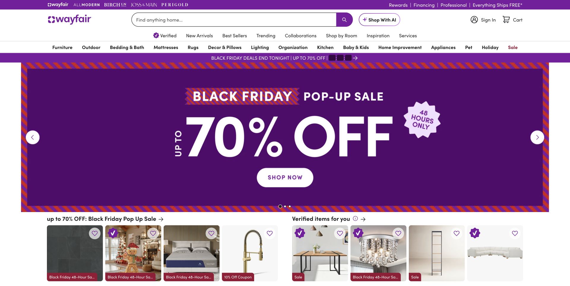
Wayfair places a broad search field between its logo and account utilities, with a separate AI-shopping action beside it. Several navigation rows distinguish house brands, editorial shopping routes, and room or product categories. The captured purple sale panel dominates the center, while product rails begin directly underneath. The public storefront loads Next.js bundles from its asset domain. This confirms the visible frontend surface, not the commerce system, promotional accuracy, product quality, or the architecture of every related brand site.
What you can learn
In a Next.js retail build, preserve the stable taxonomy while merchandising modules change independently. Product cards need consistent title, image, and destination behavior whether they appear in a sale rail or an editorial collection. Make filters and search states shareable where useful, and keep the page’s essential browsing routes available before any recommendation request or optional shopping assistant resolves.
Pros
Search remains prominent despite the large amount of merchandising navigation.
Product rails provide a concrete continuation immediately after the sale panel.
Cons & considerations
Several navigation layers create substantial visual density.
Large discount typography can overshadow ordinary category exploration and product detail.
ReactAssociated with Next.js; not independently observed
Public source checked November 3, 2026. References may be embedded or legacy—not a complete backend inventory.
Platform source: Observed public page assets. The reviewed page loads public /_next/static/ JavaScript assets. This identifies its Next.js frontend, not its CMS, hosting contract, or every corporate property. Platform evidence is separate from the direct website screenshot and is not a complete current infrastructure audit.
Under Armour’s US storefront places two large campaign images side by side beneath a black commerce header. The captured golf scene pairs an on-course photograph with changing close-up imagery, condensed white messaging, and one rounded shopping control. Search, favorites, bag, and account utilities remain distinct from product-category navigation. Shipping and short-lived offer messages occupy narrow bands above the campaign. The page exposes Next.js assets; this is a frontend observation and does not verify the clothing’s performance or the terms of any current discount.
What you can learn
A Next.js campaign can join contextual photography with a product detail while preserving a specific catalog destination. Model that route explicitly instead of sending every campaign to an identical generic listing. Keep discount and shipping content independently maintainable, reserve image space to avoid disruptive movement, and ensure that the first useful shopping controls are available before visual entrance effects finish.
Pros
Contextual and close-up imagery explain different aspects of the same campaign.
The dark header protects navigation contrast independently of the photographs.
Cons & considerations
Multiple offer strips increase the vertical weight of the opening.
Large campaign images delay product-level facts and comparison options.
ReactAssociated with Next.js; not independently observed
Public source checked November 3, 2026. References may be embedded or legacy—not a complete backend inventory.
Platform source: Observed public page assets. The reviewed page loads public /_next/static/ JavaScript assets. This identifies its Next.js frontend, not its CMS, hosting contract, or every corporate property. Platform evidence is separate from the direct website screenshot and is not a complete current infrastructure audit.
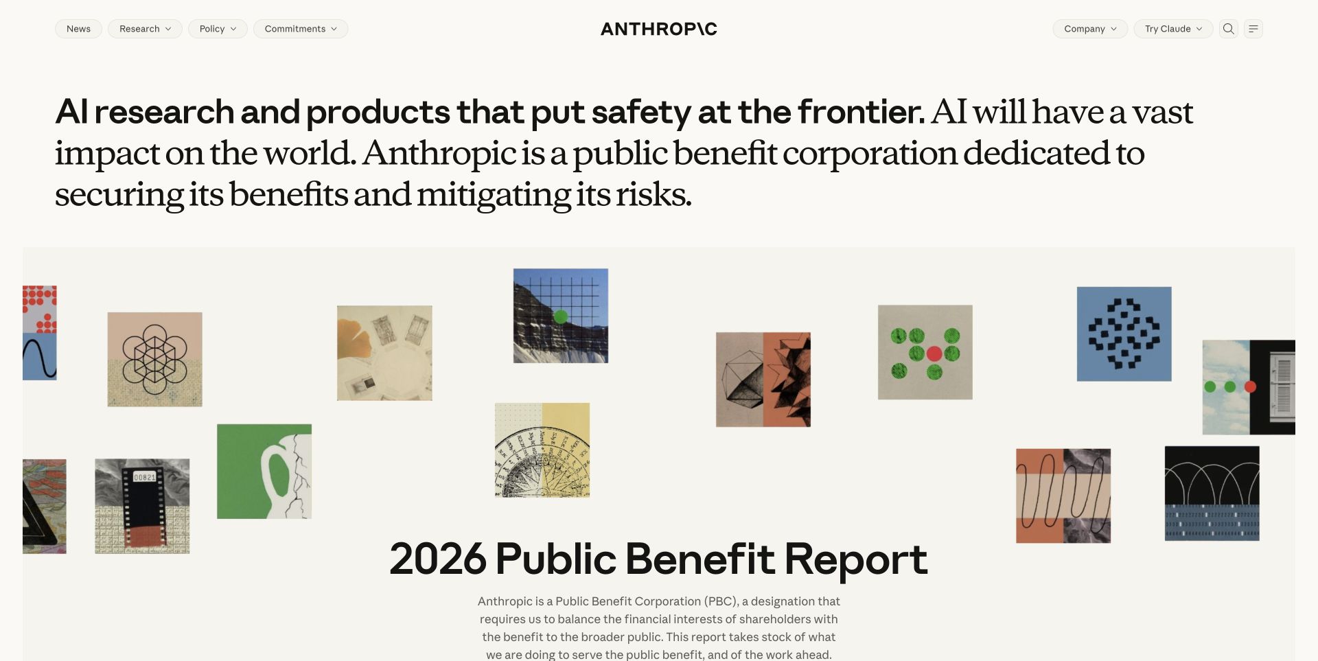
Anthropic’s public page begins with a substantial typographic statement that mixes bold sans-serif text and a contrasting serif continuation. Small pill-shaped navigation items sit at the edges around a centered wordmark. The next large editorial feature uses a loose collage of geometric and archival-looking images above a report title and paragraph. The warm off-white canvas makes the composition feel closer to a publication than a software dashboard. Current Next.js assets identify the public frontend, without establishing the backend of its separate products.
What you can learn
A Next.js editorial system should model reports, research, and organizational pages as meaningful content rather than one-off hero layouts. Preserve readable heading order when typography changes within a sentence, and give every feature a durable destination. Let decorative collages load after useful text, while keeping the core navigation and current publication available in the initial reading experience.
Pros
The page establishes an institutional voice without relying on a generic product mockup.
The editorial feature has enough space for a title and explanatory context.
Cons & considerations
The long opening statement can be demanding to scan.
Small pill controls need explicit labels and clear focus treatment.
Public source checked November 3, 2026. References may be embedded or legacy—not a complete backend inventory.
Platform source: Observed public page assets. The reviewed page loads public /_next/static/ JavaScript assets. This identifies its Next.js frontend, not its CMS, hosting contract, or every corporate property. Platform evidence is separate from the direct website screenshot and is not a complete current infrastructure audit.
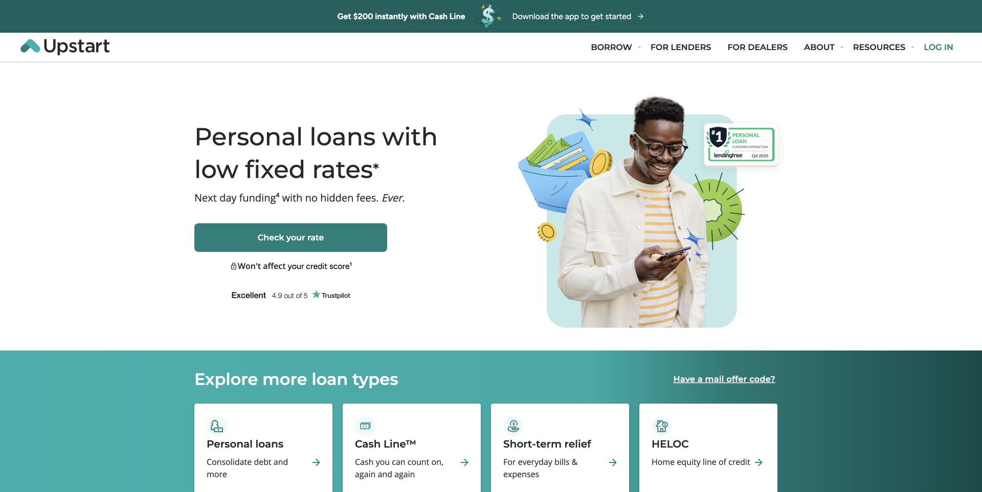
Upstart uses a white split hero: a short product introduction and large teal rate-check action on the left, a portrait-and-illustration composition on the right. Qualification notes and a review badge sit near the action rather than inside the image. A teal lower section introduces different loan categories with separate cards. The navigation distinguishes borrowers, lenders, dealers, and resources. Public Next.js bundles identify this marketing frontend. The screenshot is not an evaluation of rates, eligibility, credit effects, or financial suitability.
What you can learn
In a Next.js financial-service build, keep reviewed offer content, footnotes, and application handoffs tightly connected. A reusable campaign should not allow a changing headline to lose its limitations. Render essential qualifications alongside the action, then make any move into a sensitive application workflow explicit. Do not infer trustworthiness or compliance from a polished component system or a public framework signature.
Pros
The main action is visually distinct from the alternative product cards.
Audience groups are explicitly separated in the navigation.
Cons & considerations
Prominent headline claims depend on qualifications that need readable placement.
App promotions and review badges can compete with the information needed to evaluate the next step.
Earlier cited evidence retained; no current scan result. References may be embedded or legacy—not a complete backend inventory.
Platform source: Observed public page assets. The reviewed page loads public /_next/static/ JavaScript assets. This identifies its Next.js frontend, not its CMS, hosting contract, or every corporate property. Platform evidence is separate from the direct website screenshot and is not a complete current infrastructure audit.
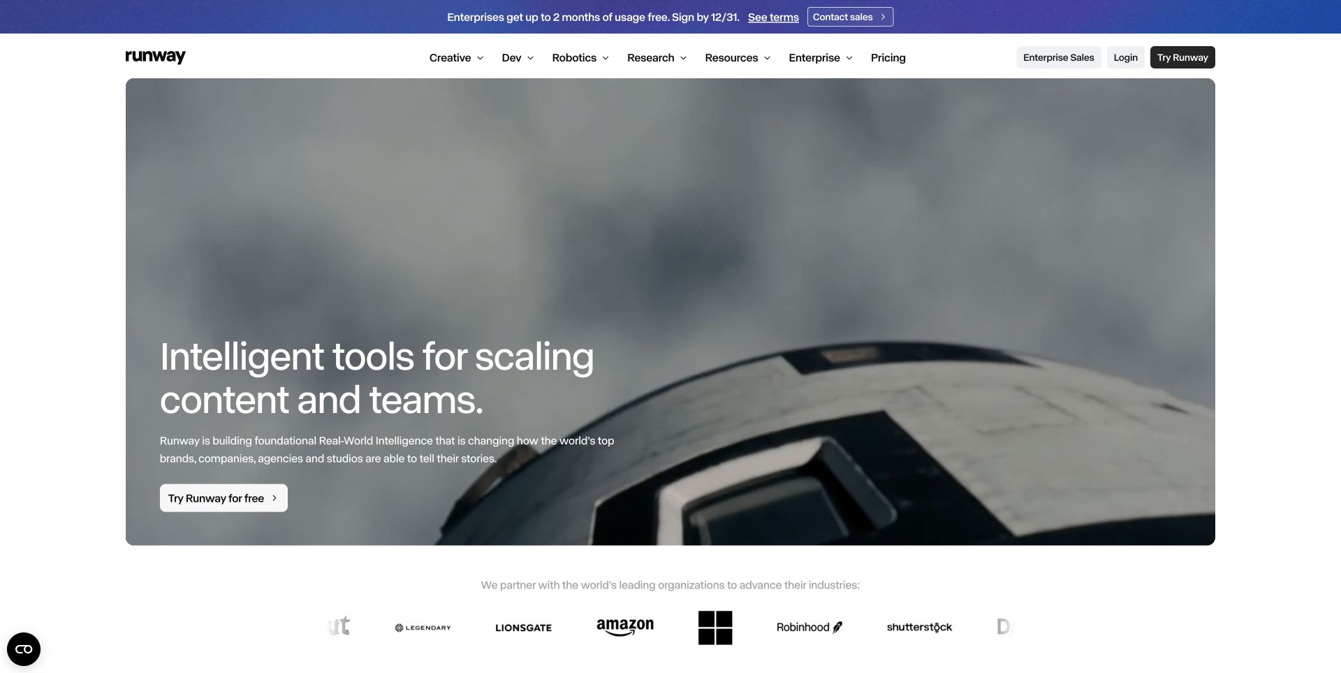
Runway’s public marketing page uses a wide rounded film inset on a white canvas. A large lower-left introduction and one white trial control sit over the scene, while the solid header provides creative, development, robotics, research, enterprise, and pricing routes. A separate blue enterprise promotion occupies the top band; partner marks begin beneath the film. The former runwayml.com entry redirects to this current domain, where public Next.js bundles are visible. No generation workflow or authenticated application was used for this review.
What you can learn
A Next.js implementation should keep demonstration media independent of the navigational and editorial shell. Provide a useful still frame, preserve dimensions before the film loads, and make pricing or API information available without starting a trial. Keep enterprise promotions separately governed so their dates and eligibility do not silently become part of the permanent product introduction.
Pros
The inset film leaves the navigation on a stable readable background.
Pricing and developer-oriented routes remain visible beside creative-product categories.
Cons & considerations
The broad category set may require explanation for an unfamiliar visitor.
A large motion-led opening can delay specific capability comparisons.
Public source checked November 3, 2026. References may be embedded or legacy—not a complete backend inventory.
Platform source: Observed public page assets. The reviewed page loads public /_next/static/ JavaScript assets. This identifies its Next.js frontend, not its CMS, hosting contract, or every corporate property. Platform evidence is separate from the direct website screenshot and is not a complete current infrastructure audit.
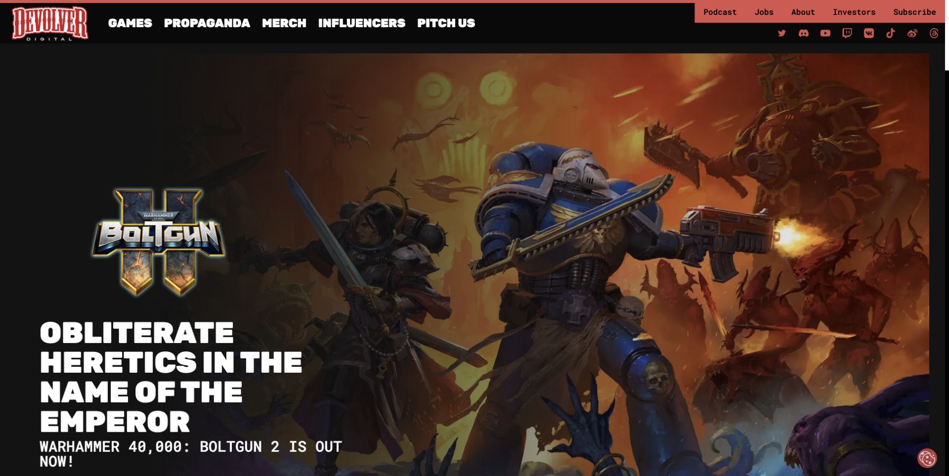
Devolver Digital uses a black-and-red publisher header with large category labels and a smaller utility strip for corporate destinations. The captured campaign is dominated by game artwork, its own logo, and oversized white promotional type. This lets the featured game have a different identity without replacing the publisher’s navigation. Merchandise, news, creator, and pitch routes remain visible. The public page loads Next.js bundles. The observation concerns the publisher website, not the technology used to build or run any featured game.
What you can learn
A Next.js publisher site benefits from a structured campaign model that can accommodate different art, typography, and release states. Give every featured title a durable detail route, preserve metadata outside artwork, and define sensible fallbacks for missing trailers or delayed assets. Keep corporate and business-submission routes separate from the browsing journey so one campaign does not take over the whole information architecture.
Pros
The publisher shell remains recognizable around very different game artwork.
Distinct browsing and business-oriented routes coexist in the header.
Cons & considerations
Large promotional text can crowd supporting information near the viewport edge.
A broad utility and social row adds considerable density to the opening.
Visible tech stack
Earlier / documented evidence
Next.js
Earlier cited evidence retained; no current scan result. References may be embedded or legacy—not a complete backend inventory.
Platform source: Observed public page assets. The reviewed page loads public /_next/static/ JavaScript assets. This identifies its Next.js frontend, not its CMS, hosting contract, or every corporate property. Platform evidence is separate from the direct website screenshot and is not a complete current infrastructure audit.
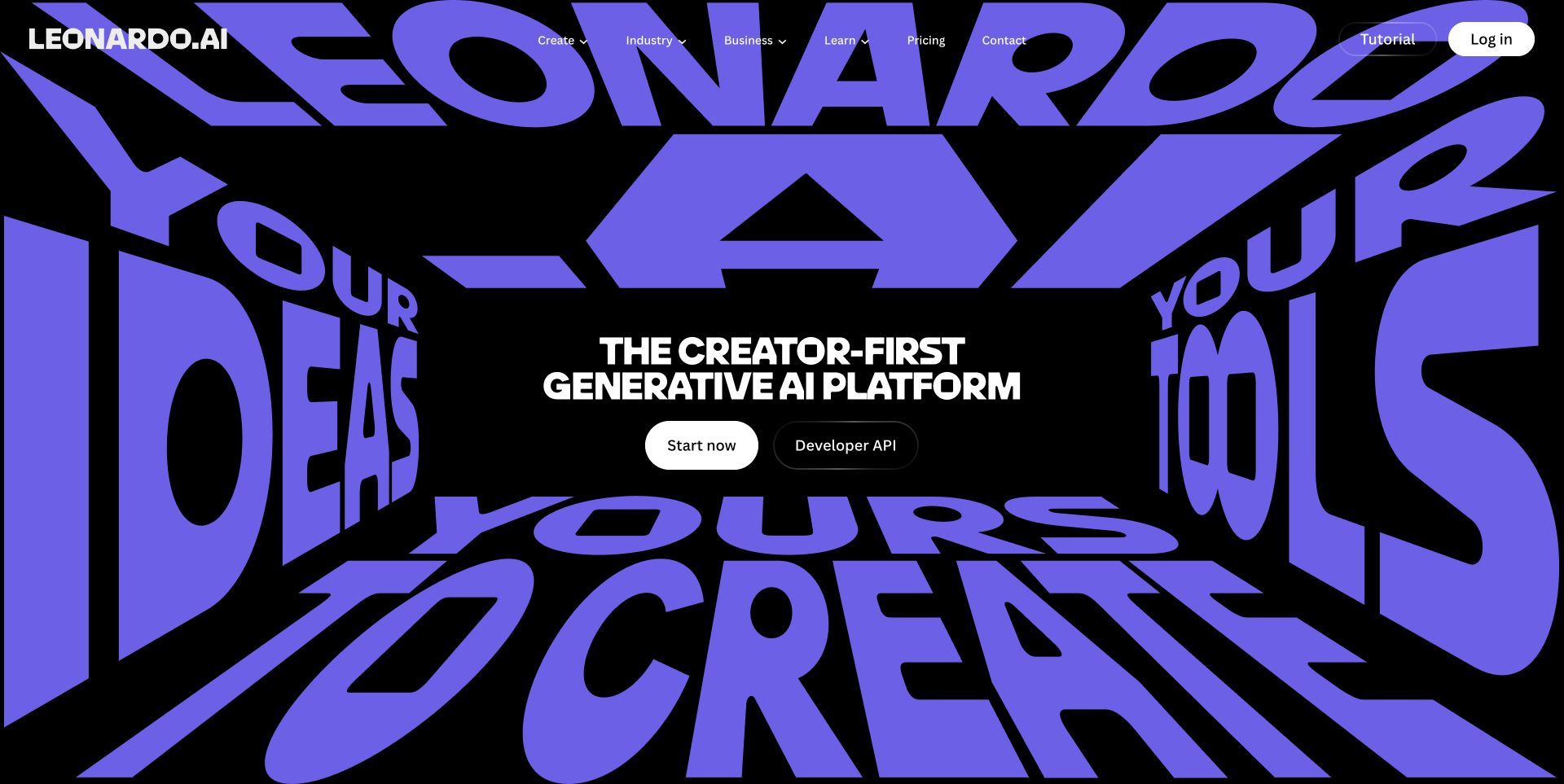
Leonardo’s public homepage uses enormous purple lettering arranged like the walls of a three-dimensional room. The central black space holds a short white introduction and two contrasting controls for starting the product and reaching its API. A compact navigation crosses the top with creation, industry, business, learning, and pricing routes. The visual identity is typographic rather than a gallery of generated images in the first view. Its current public page exposes Next.js bundles; the review does not test generation output or the separate logged-in application.
What you can learn
A Next.js site can make a distinctive introductory composition without binding essential navigation to a complex scene. Keep the central heading and entry links in ordinary document structure, supply a static fallback, and load deeper demonstrations on demand. The developer route deserves its own clear destination rather than being treated as another variation of the consumer signup button.
Pros
The self-service and API actions recognize genuinely different visitor tasks.
A limited black, white, and purple palette gives the opening a consistent identity.
Cons & considerations
Large perspective lettering can overwhelm the actual product explanation.
Full-screen branding delays practical examples and may need a simpler mobile composition.
Visible tech stack
Earlier / documented evidence
Next.js
Earlier cited evidence retained; no current scan result. References may be embedded or legacy—not a complete backend inventory.
Platform source: Observed public page assets. The reviewed page loads public /_next/static/ JavaScript assets. This identifies its Next.js frontend, not its CMS, hosting contract, or every corporate property. Platform evidence is separate from the direct website screenshot and is not a complete current infrastructure audit.
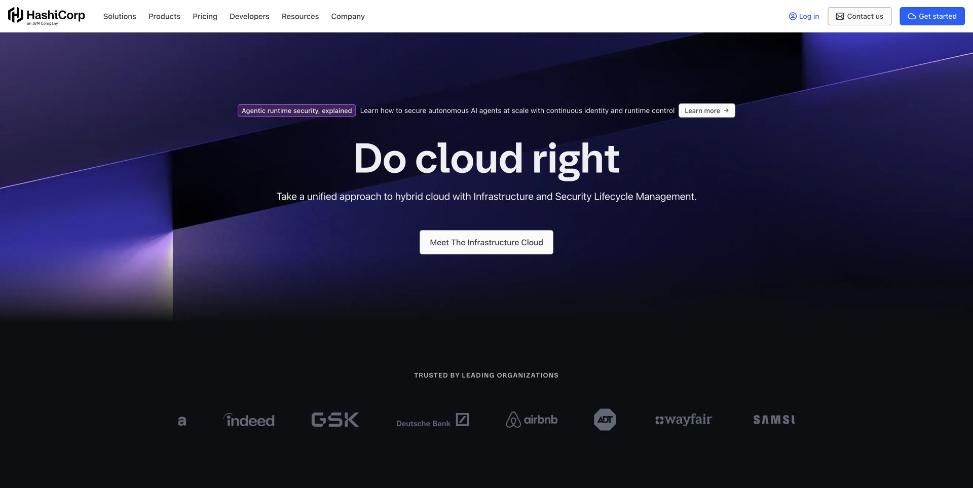
HashiCorp uses an abstract purple architectural background behind a centered platform introduction and a single large exploration action. A small announcement row sits above the headline without becoming the main title. The solid white header exposes solutions, products, pricing, developers, resources, and company information, with account and getting-started controls at the right. Customer marks form a quieter band below the hero. The page declares Next.js and loads its public bundles, identifying this corporate frontend rather than the implementation of any infrastructure product.
What you can learn
A Next.js platform website should make the path from broad messaging to specific product documentation short and predictable. Shared navigation can remain stable across product and editorial routes, but each destination needs its own useful title, metadata, and initial content. Keep abstract media optional, and avoid making a sales form the only way to understand a technical capability or its limitations.
Pros
Developer resources and pricing are direct top-level navigation items.
The solid header stays readable independently of the abstract hero imagery.
Cons & considerations
A broad cloud message requires product-specific explanations below.
Several competing header actions need clear priority on narrower layouts.
Earlier cited evidence retained; no current scan result. References may be embedded or legacy—not a complete backend inventory.
Platform source: Observed public page assets. The reviewed page loads public /_next/static/ JavaScript assets. This identifies its Next.js frontend, not its CMS, hosting contract, or every corporate property. Platform evidence is separate from the direct website screenshot and is not a complete current infrastructure audit.
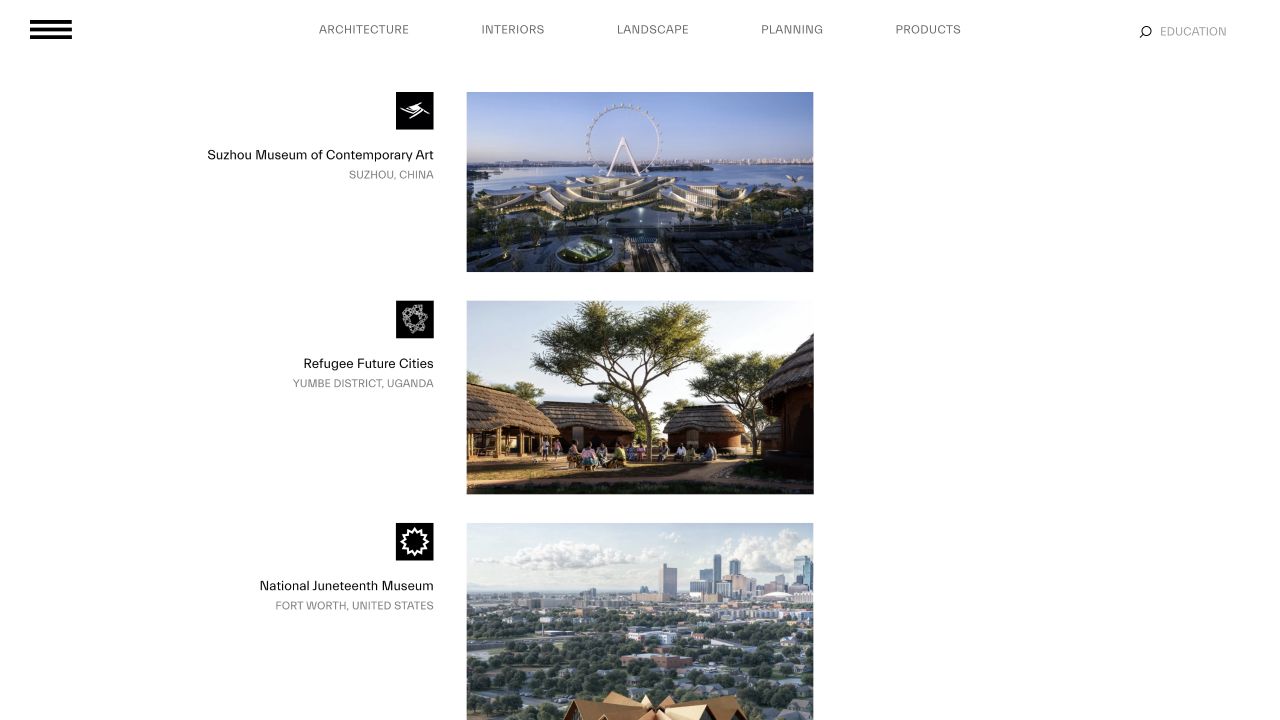
BIG’s reviewed homepage presents a repeated project index on a white canvas. Small identifying graphics, project names, and locations align beside consistently sized images, while discipline links stretch across the top. The relatively narrow content area creates a deliberate rhythm rather than filling every available pixel with a full-screen photograph. Public Next.js assets were recorded with the November 1 capture. The existing screenshot and its original date are retained here; the lesson changes from architectural taste to how a structured frontend can expose an archive.
What you can learn
In a Next.js portfolio, represent projects as records with stable slugs, names, locations, and intentional image crops. Render useful index entries before any optional filtering enhancement, and preserve browsable links for every project. A framework can support a large archive, but the taxonomy should reflect actual content rather than speculative categories that remain empty.
Public source checked November 3, 2026. References may be embedded or legacy—not a complete backend inventory.
Platform source: Observed public page assets. The reviewed page loads public /_next/static/ JavaScript assets. This identifies its Next.js frontend, not its CMS, hosting contract, or every corporate property. Platform evidence is separate from the direct website screenshot and is not a complete current infrastructure audit.
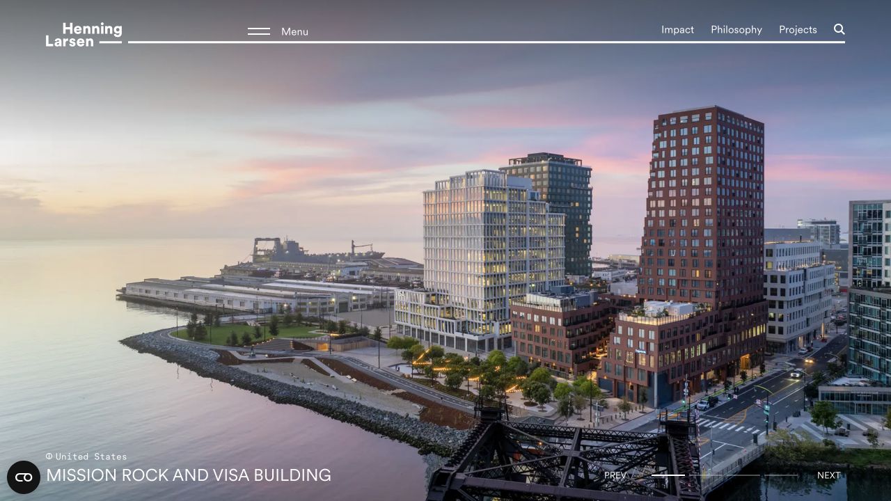
Henning Larsen’s retained November 1 capture uses one large waterside project image with a fine white navigation rule across the top. The wordmark and menu sit at the left; impact, philosophy, projects, and search remain directly available on the right. A project title and geographic label appear near the lower edge, with visible carousel controls opposite them. The recorded public page exposed Next.js bundles and page data. The same direct-browser image is reused, with an original technology-oriented review rather than copied industry commentary.
What you can learn
A Next.js editorial portfolio should preserve the identity of the displayed project as media changes. Keep titles, places, and detail links as structured text, not baked into an image. Define a useful initial slide and a nonmoving fallback, while giving project detail pages durable URLs and meaningful initial content independent of the homepage carousel.
Pros
The project image is labeled with a name and location.
Direct project and research-related routes remain visible beside the collapsed menu.
Cons & considerations
White controls need contrast protection against every image.
A full-view carousel delays the breadth of the archive until visitors continue.
Visible tech stack
Referenced on the public page
Next.js
Earlier / documented evidence
FrontifyAsset delivery only
Associated dependencies
ReactAssociated with Next.js; not independently observed
Public source checked November 3, 2026. References may be embedded or legacy—not a complete backend inventory.
Platform source: Observed public page assets. The reviewed page loads public /_next/static/ JavaScript assets. This identifies its Next.js frontend, not its CMS, hosting contract, or every corporate property. Platform evidence is separate from the direct website screenshot and is not a complete current infrastructure audit.
Dishoom’s retained November 1 homepage capture places a wide inset food-preparation film on an almost black page. Centered serif text sits over the media, while the top navigation separates exploring, cafés, menus, shopping, and festivities. A table-booking control is isolated at the right beside account and bag utilities. The composition leaves generous dark margins rather than turning the film into an edge-to-edge background. Recorded public scripts and styles identify Next.js; the capture date is preserved rather than presented as a new screenshot.
What you can learn
A Next.js hospitality site should distinguish editorial content from location-specific operational information and commerce. Give cafés, menus, and booking destinations stable routes with useful initial content. Let the brand film enhance the introduction without delaying practical tasks, and keep any sound optional. Shared page components should not accidentally apply one location’s hours or reservation rules to another.
Pros
Menus, location discovery, shopping, and booking are separate visible tasks.
The inset media treatment leaves room for a stable surrounding interface.
Cons & considerations
The atmospheric opening provides little practical location information immediately.
Text over film requires a consistent readable fallback when media changes or fails.
Public source checked November 3, 2026. References may be embedded or legacy—not a complete backend inventory.
Platform source: Observed public page assets. The reviewed page loads public /_next/static/ JavaScript assets. This identifies its Next.js frontend, not its CMS, hosting contract, or every corporate property. Platform evidence is separate from the direct website screenshot and is not a complete current infrastructure audit.
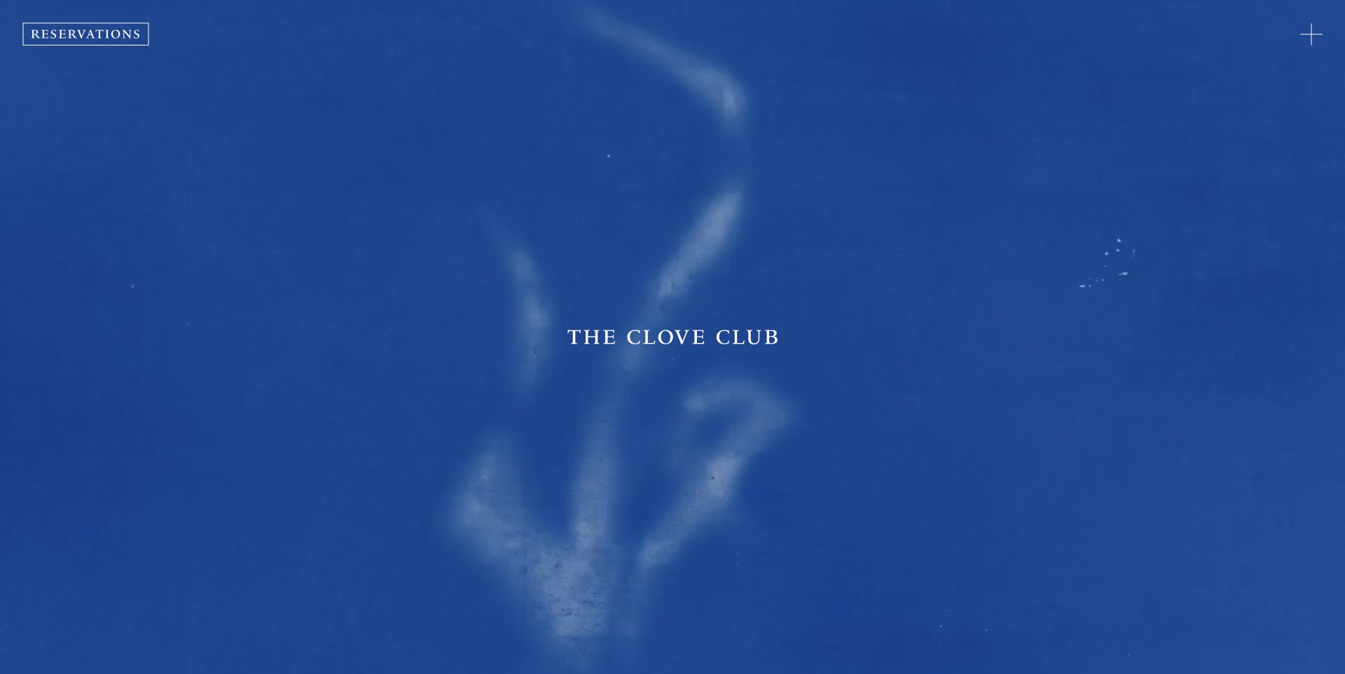
The Clove Club’s homepage is unusually spare: a textured moving blue field, a centered serif name, an outlined reservations link at the upper left, and a small opening-menu control at the opposite corner. The restraint makes the brand identity and booking route clear, but provides almost no explanatory copy in the first view. The new November 2 capture is a direct view of that loaded composition, not a vendor gallery image. Public Next.js bundles and serialized page data identify its frontend.
What you can learn
A minimal Next.js experience still needs an informative document underneath the visual opening. Keep the restaurant’s location, menus, and practical details available through ordinary linked routes, and make reservations usable without waiting for motion. The framework should support clear page titles, shareable destinations, and sensible loading behavior rather than being used to turn a small information site into an opaque animation.
Pros
The reservation action is isolated and clearly labeled.
The limited visual vocabulary creates a distinctive identity without interface clutter.
Cons & considerations
The first view leaves essential context such as location unexplained.
An almost empty header relies heavily on the menu being recognizable and usable.
Public source checked November 3, 2026. References may be embedded or legacy—not a complete backend inventory.
Platform source: Observed public page assets. The reviewed page loads public /_next/static/ JavaScript assets. This identifies its Next.js frontend, not its CMS, hosting contract, or every corporate property. Platform evidence is separate from the direct website screenshot and is not a complete current infrastructure audit.
Use a content-led website architecture for publishing
Define the CMS or content source, route structure, preview, and publishing triggers. A mostly editorial site should not inherit unnecessary application complexity just because the framework can support it.
Separate live application data from editorial content
For interactive tools or commerce, decide which data must be fresh, what can be cached, and what happens when a service fails. The UI should communicate uncertainty rather than presenting stale information as a completed transaction.
Review framework conventions against your project
Use the current documentation for routing and rendering choices. Do not combine snippets from different router approaches without understanding their assumptions. Record the chosen conventions in the handover.
Name who edits a record, where the draft appears, who approves it, and how the public page changes. Include correction, unpublishing, and cache invalidation in the demonstration rather than showing only a successful first publish.
Test representative routes and failures
Include a long article, a missing record, a slow upstream service, a broken image, and a form validation error. Check navigation and focus after client-side transitions as well as on a direct page load.
Assign infrastructure and dependency ownership
Document environment configuration without putting secrets in client code or public previews. Name the owners of hosting, domains, monitoring, framework updates, integrations, and rollback. Public Next.js assets do not establish where a site is hosted.
A useful handover demonstration
Ask the actual team to carry out its routine job: publish a realistic update, correct a mistake, preview a narrow screen, and identify who owns an integration failure. For a library or frontend framework, also ask who maintains the content source and deployment. A polished screenshot does not answer those operational questions.
Beyond the screenshot
Before launching a Next.js website
Verify public routes by direct navigation and internal links.
Review rendered headings, metadata, and canonical decisions.
Test preview, publishing, unpublishing, and stale content handling.
Exercise slow, failed, empty, and missing-data states.
Check keyboard focus after route changes and dialogs.
Review media, motion, and narrow-screen layouts.
Confirm that server-only configuration stays out of browser output.
Document deployment, dependency updates, recovery, and account ownership.
Test with real content, a keyboard, a small screen, slow or failed requests, and the people who will maintain the system. These are planning checks, not an accessibility, security, performance, or search-ranking certification.
Sources & editorial method
How this Next.js collection was reviewed
Direct captures accompany observed Next.js public assets or cited official platform and first-party project sources. Evidence is limited to the named property and does not establish router version, CMS, cloud provider, security, or performance outcomes.
Every image is an unmodified capture from the actual website, with its source and capture date. Some captures are reused from our shared catalog; their dates remain the original capture dates. None comes from a vendor gallery or a generated reconstruction. Moving imagery and live content can change.
Technology attribution uses public page assets or metadata, official platform documentation, or a cited first-party project case study. Documentary and framework-relationship evidence is identified where used; it is not a complete current backend inventory. A CMS image CDN alone does not establish a full CMS deployment. A library’s presence does not prove which individual controls use it, and a platform label does not establish AI authorship.
The composition notes, lessons, pros and tradeoffs are original editorial observations. We have not measured conversion, traffic, security, performance or accessibility conformance. Website owners retain their brands and imagery; these examples are not our client portfolio. Written, Edited and Curated are independent records, not dates advanced by a build. See our editorial standards or suggest a correction.
Questions worth asking
Next.js website development FAQs
Is every Next.js website hosted on Vercel?
No such conclusion follows from a Next.js signal. Hosting is a separate fact that needs its own evidence.
Does Next.js replace a CMS?
No. You still need a content source and an editorial workflow appropriate to the team, whether that is a CMS, repository content, or another system.
Should everything be a client component?
No. Choose the boundary according to browser interaction and the architecture. Follow the current framework documentation and test the resulting behavior.
Can we identify the complete stack from these screenshots?
No. A screenshot shows presentation. Public assets and attributed sources provide limited technology evidence, not a comprehensive infrastructure inventory.