React is a UI library, not a CMS or a complete website operating model. These examples are useful when they show a coherent component system and understandable visitor tasks—not simply because a React association exists.
Some examples directly expose React assets; others establish the relationship through Next.js or another documented React framework. Each entry explains that distinction. A company’s public marketing page does not reveal the implementation of its authenticated application.
Plan the content source, routing, rendering, deployment, and ownership alongside the interface. Those decisions remain necessary even when the component system is exceptionally polished.
Before the examples
What makes good React website development in 2026?
Build components around meaning and state
Identify the reusable content and interaction patterns before splitting the page into small files. React’s component and data-flow model is useful when repeated controls share predictable behavior; it does not decide the information architecture for you.
Choose the surrounding application architecture deliberately
React’s documentation distinguishes framework-based projects from building an application setup yourself. Compare the routing, rendering, data, and deployment requirements rather than assuming a client-rendered single page is the default for every website.
A working interface needs loading, empty, error, success, disabled, and recovery states as appropriate. Keep normal links and semantic controls underneath custom styling. A screenshot of a dashboard does not demonstrate its actual account behavior.
The collection · 20 examples
20 React website examples worth studying
Compare marketing pages, documentation systems, storefronts, and UI-library presentations. React is sometimes evidenced through its framework relationship; that evidence is stated rather than presented as an independently inspected backend.
We start with five recognizable brands or organizations: Figma marketing website, Stripe Docs: Get started, Netflix Jobs, Nike storefront, Notion marketing website. Each attribution applies to the named website property, not every product or website belonging to its organization. This is a curated reading sequence, not a measured ranking.
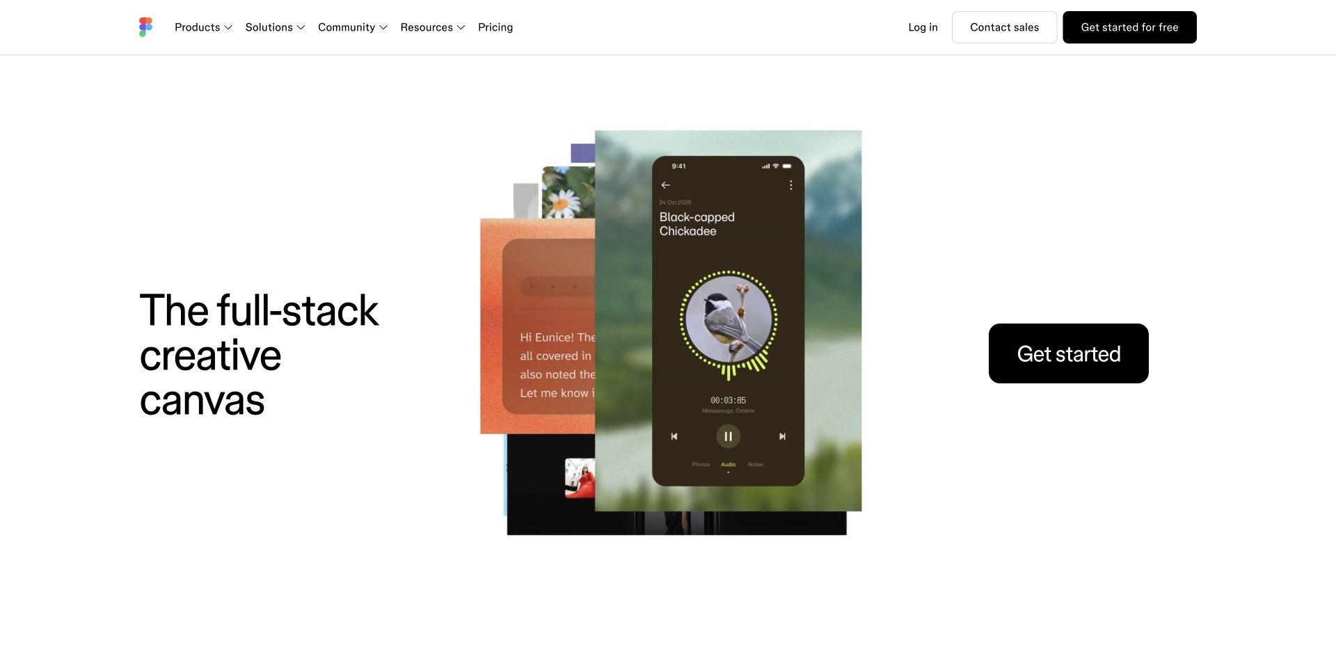
Figma’s public homepage uses a remarkably spare white shell around a layered product montage. A large three-line introduction sits on the left, animated interface imagery occupies the center, and an oversized black getting-started control balances the right. Products, solutions, community, and resources are grouped above instead of becoming separate hero buttons. The changing media demonstrates a breadth of creative surfaces without changing the location of the main navigation. Current public assets identify a Next.js frontend, so the React connection here is through that framework.
What you can learn
Borrow the separation between stable interface and replaceable demonstration. In a React build, a reusable media module should preserve its dimensions while examples change, and the content should still make sense when motion is paused or unavailable. Treat each product route as a real destination rather than making one animation explain the entire suite.
Pros
The navigation distinguishes product exploration from sales and account actions.
Generous spacing gives a dense interface montage room without burying the introduction.
Cons & considerations
The opening depends on large moving assets that need a useful still fallback.
Several creative capabilities remain unexplained until visitors continue beyond the broad opening.
Platform source: Observed public page assets. The reviewed page loads Next.js assets. React is identified through Next.js, a React framework; this is a framework relationship, not a separate claim about an independently inspected React bundle. Platform evidence is separate from the direct website screenshot and is not a complete current infrastructure audit.
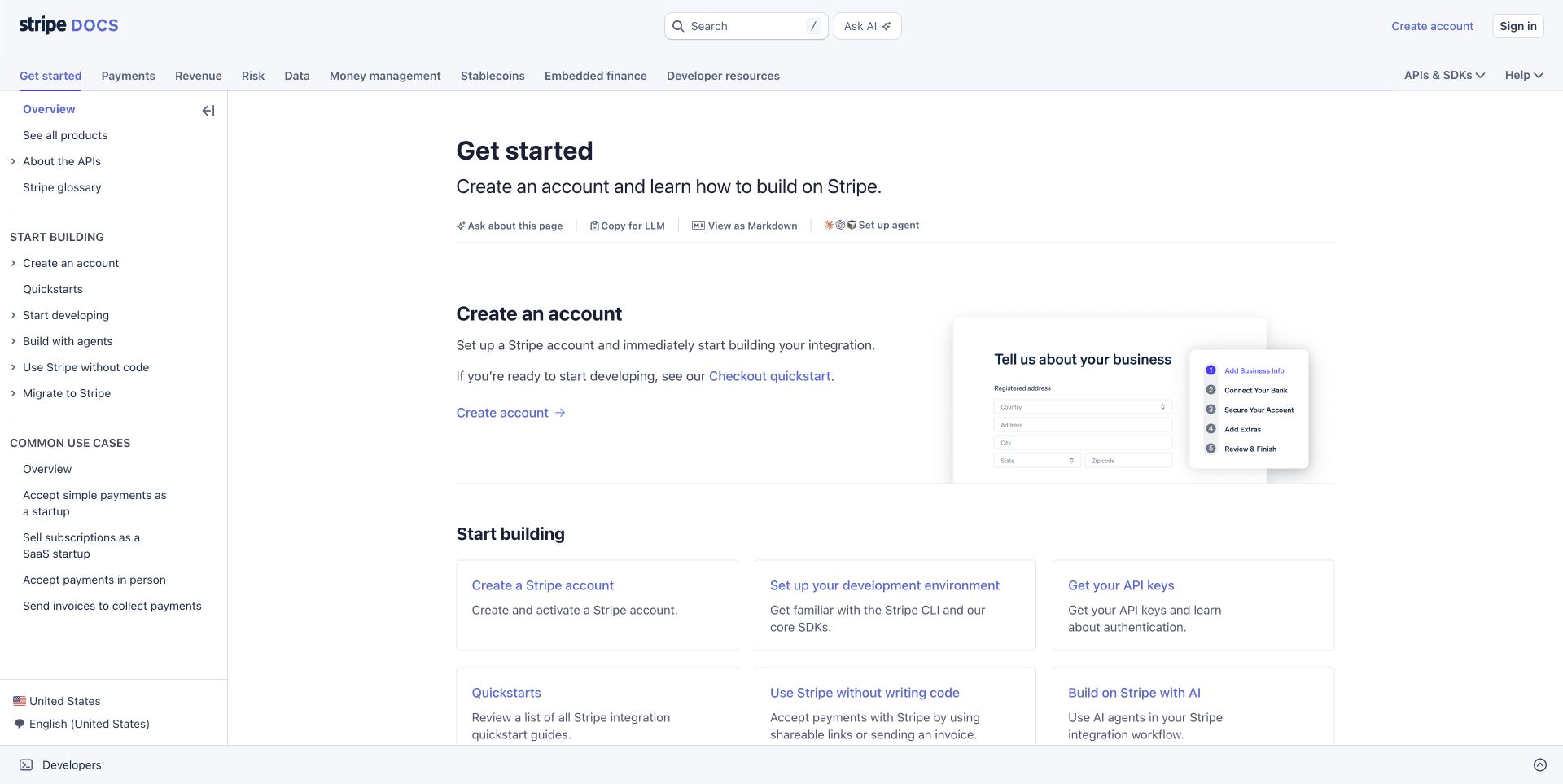
Stripe’s Get started page is an instructional interface rather than a marketing hero. A horizontal product taxonomy sits above a left-hand task tree, with the main reading column beginning well inside the page. Search and an assistant control remain in the top bar, while small page utilities offer alternative ways to consume the document. The opening combines a concise explanation, a setup illustration, and a grid of next steps. A named React bundle is publicly linked, and Stripe’s engineering article explains its React documentation approach.
What you can learn
React components are particularly useful when repeated documentation controls must remain consistent across many pages. Preserve normal headings and navigable links underneath those conveniences. Keep the active section, document title, and next task understandable without opening an assistant, and distinguish instructional examples from any controls that execute real account operations.
Pros
Product-level navigation and task-level navigation have separate places in the layout.
The next-step cards offer concrete routes instead of a single vague onboarding button.
Cons & considerations
Multiple navigation layers can leave a relatively narrow reading area on smaller screens.
Page-copy and assistant utilities should not visually outweigh the instructions they support.
Visible tech stack
React
Platform source: Official platform or first-party project source. The documentation page directly loads /docs-statics-srv/assets/react.8ee8edafeb54fe7856cb.js. Stripe’s Markdoc engineering article also describes its React documentation renderers. Platform evidence is separate from the direct website screenshot and is not a complete current infrastructure audit.
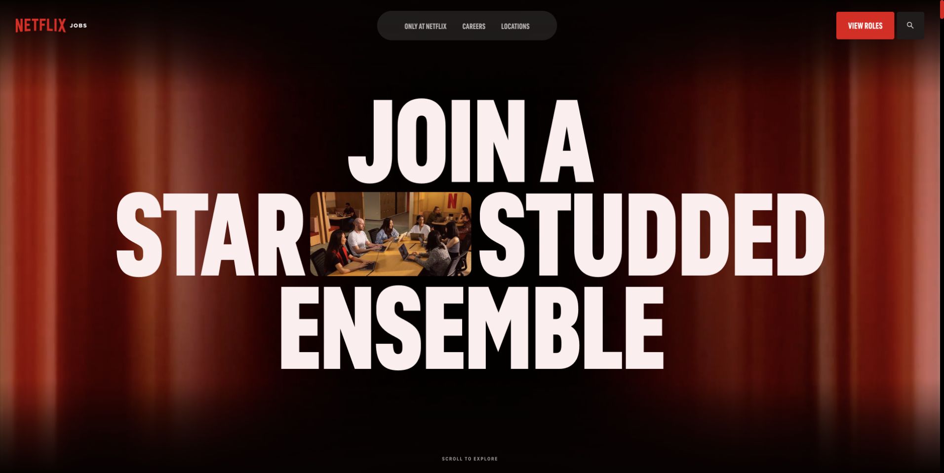
Netflix Jobs uses enormous condensed cream lettering over a dark red cinematic background. A small meeting scene interrupts the central word treatment, creating a visual focal point without adding a conventional card grid. The careers identity stays at the upper left; a rounded navigation capsule sits centrally and the red roles control remains at the opposite edge. This is the public recruiting property, not a sample of the streaming application. Its Next.js assets support the React association through the framework.
What you can learn
A React implementation can make a dramatic composition modular without tying the essential careers navigation to animation progress. Keep the roles link as a normal destination, provide sensible document order underneath the visual typography, and supply a reduced-motion presentation. Brand expression is useful only if a visitor who already knows their goal can bypass it.
Pros
The roles action is isolated with the brand’s red accent.
The smaller image breaks up the headline and prevents the opening becoming type alone.
Cons & considerations
The opening gives little immediate detail about job categories or locations.
Very large animated typography needs careful scaling to avoid crowding shorter viewports.
Platform source: Official Next.js showcase. The official showcase links specifically to jobs.netflix.com; the live careers page also loads /_next/static/ bundles. React association is through Next.js, not the Netflix streaming application. Platform evidence is separate from the direct website screenshot and is not a complete current infrastructure audit.
Nike’s captured storefront puts a monochrome sports photograph beneath a solid two-level commerce header. The lower-left campaign copy uses condensed white type and a small white shopping pill, while search, favorites, and bag controls remain in predictable positions above. Audience and product families are separate from the help and account utility row. Carousel controls are visible at the image edge. Public scripts directly name React and React DOM; the page also exposes Next.js assets and appears in its official showcase.
What you can learn
The transferable React lesson is a persistent commerce shell surrounding campaign components with different media and copy. Keep search and bag state independent from promotional slide changes. Give each campaign a useful link and accessible controls, and never require a shopper to wait for a rotating headline before they can reach a product category.
Pros
The solid header protects important commerce controls from photographic contrast changes.
The shopping action is placed directly beside the campaign explanation.
Cons & considerations
A full-height campaign delays specific products until the next section.
An autoplay carousel needs understandable pause controls and a practical nonmoving alternative.
Platform source: Official Next.js showcase. The reviewed page loads Next.js assets. React is identified through Next.js, a React framework; this is a framework relationship, not a separate claim about an independently inspected React bundle. Platform evidence is separate from the direct website screenshot and is not a complete current infrastructure audit.
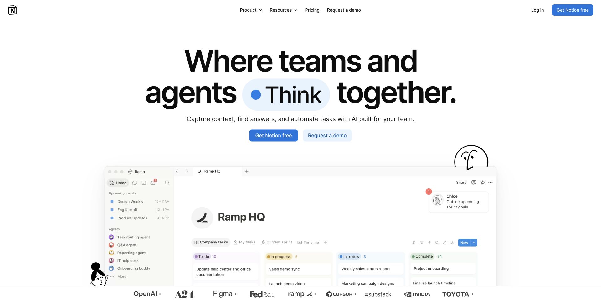
Notion’s marketing homepage combines a centered, very large headline with a blue-highlighted changing word. Two neighboring actions separate self-service signup from a sales conversation. Beneath them, a broad sample workspace introduces familiar sidebar, board, and agent elements, framed by simple black illustrations. A compact header groups products and resources while preserving pricing and account routes. The public page carries Next.js bundles and serialized page data, so its React classification is scoped through that frontend framework rather than the private workspace product.
What you can learn
A component-based page can reuse the same demonstration frame as the product story evolves. Preserve a meaningful static heading while decorative words change, and make the example’s purpose explicit. If the preview is illustrative rather than an interactive trial, do not style its controls as though they will operate the visitor’s actual workspace.
Pros
Signup and demo actions have different visual weights and clearly different purposes.
The interface preview adds concrete product context to a broad headline.
Cons & considerations
A changing word can distract from reading if the transition is too frequent.
The large preview may require a tighter crop to remain informative on a phone.
Platform source: Official Next.js showcase. The reviewed page loads Next.js assets. React is identified through Next.js, a React framework; this is a framework relationship, not a separate claim about an independently inspected React bundle. Platform evidence is separate from the direct website screenshot and is not a complete current infrastructure audit.
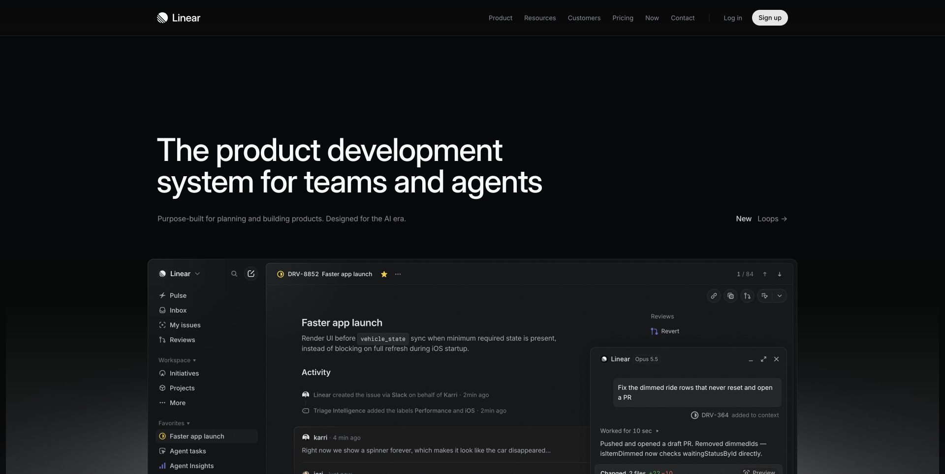
Linear uses a near-black page, fine rules, and subdued navigation around a large left-aligned introduction. A restrained new-feature link sits opposite the supporting copy rather than becoming another large button. The broad product preview underneath shows a sidebar, issue detail, and an agent conversation in the same dark visual system. Rounded corners and thin borders distinguish its layers without introducing a separate marketing illustration style. The public marketing page links Next.js bundles, establishing the React relationship through that framework.
What you can learn
A React marketing system can share visual tokens with a product while keeping the demonstration a separate, safe component. Make the preview understandable as an example, give it a stable loading state, and keep the surrounding heading available before animations initialize. Reuse typography and spacing conventions rather than importing an entire authenticated application into the homepage.
Pros
The product preview demonstrates a specific workflow instead of a generic laptop mockup.
The quiet palette creates continuity between the promotional page and sample application.
Cons & considerations
Subtle dark borders and secondary text can be hard to distinguish.
Entrance animations need a resilient fallback so the first view does not remain empty.
Platform source: Observed public page assets. The reviewed page loads Next.js assets. React is identified through Next.js, a React framework; this is a framework relationship, not a separate claim about an independently inspected React bundle. Platform evidence is separate from the direct website screenshot and is not a complete current infrastructure audit.
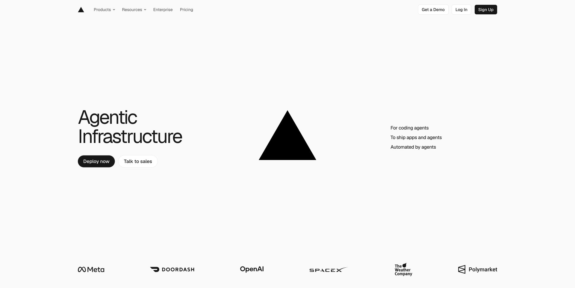
Vercel’s captured marketing page divides the introduction into three broad areas: a short headline and paired actions, a large black triangle, and three small explanatory lines. The white canvas and limited palette make the logo itself the principal image. Navigation remains compact above, while a row of customer marks begins at the bottom. Deploying and contacting sales are distinct actions. The public page loads its own Next.js marketing bundles; this supports the React relationship without establishing which infrastructure every customer uses.
What you can learn
The useful component lesson is that a technology page does not need an elaborate interactive hero to establish hierarchy. Build the introduction from simple semantic pieces, keep decorative brand geometry separate from meaningful text, and make action variants consistent across the site. Add interaction only when it helps someone evaluate a capability rather than merely displaying frontend complexity.
Pros
Self-service deployment and sales contact are clearly distinguished.
The spare composition remains legible without depending on product screenshots.
Cons & considerations
The broad infrastructure message needs specific supporting examples below.
A large decorative mark consumes space that a less familiar product might need for explanation.
Platform source: Observed public page assets. The reviewed page loads Next.js assets. React is identified through Next.js, a React framework; this is a framework relationship, not a separate claim about an independently inspected React bundle. Platform evidence is separate from the direct website screenshot and is not a complete current infrastructure audit.
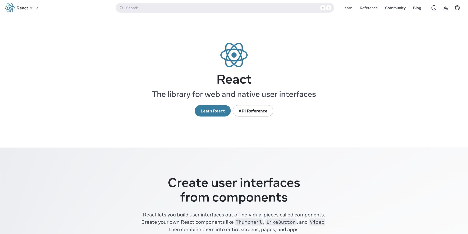
React’s own site centers its familiar blue mark above a short library description and two contrasting actions. Learning and API reference are deliberately different destinations. A very wide search control dominates the header, alongside learning, reference, community, and blog links. The next section begins with an explanation of components rather than a customer-logo wall. The public page exposes Next.js assets and page data, so the implementation example is React through Next.js, separate from the instructional claims made by the documentation.
What you can learn
Organize a React documentation experience around reader intention before adding clever navigation behavior. A learning path needs sequence and context, while a reference page needs fast lookup and stable deep links. Shared components can keep search, code examples, and section navigation consistent, but should not erase the distinction between a tutorial and a precise API entry.
Pros
The two opening actions reflect genuinely different reading tasks.
Search is prominent without replacing the visible information architecture.
Cons & considerations
The very sparse opening does not demonstrate an application immediately.
A wide desktop search needs thoughtful adaptation rather than simply shrinking beside every navigation item.
Platform source: Observed public page assets. The reviewed page loads Next.js assets. React is identified through Next.js, a React framework; this is a framework relationship, not a separate claim about an independently inspected React bundle. Platform evidence is separate from the direct website screenshot and is not a complete current infrastructure audit.
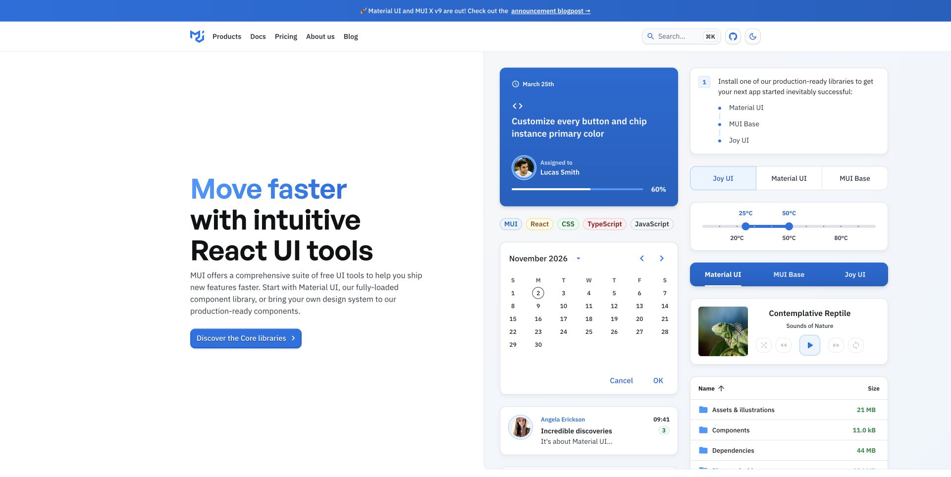
MUI pairs a blue-accented introduction with a dense arrangement of interface examples: calendar, task card, tabs, media control, and file list. Each specimen uses the same rounded surfaces and spacing, making the library’s visual vocabulary visible before a visitor reads the documentation. The header keeps products, docs, pricing, and company information separate; search and appearance controls sit at the far end. Its public Next.js assets support the React frontend association, not a claim about every illustrated component’s behavior.
What you can learn
When presenting a React library, show the relationships between components rather than one isolated button. A coherent specimen area can explain density, alignment, and states. Still distinguish live demonstrations from static illustrations, provide a direct documentation route, and avoid treating an attractive initial state as proof that all keyboard, error, and narrow-screen interactions are complete.
Pros
The examples show how small components work together in larger application surfaces.
The introduction remains on a clean background independent of the specimen gallery.
Cons & considerations
Many small examples can become visual noise if they all animate.
The broad library message needs a clear distinction between free core tools and additional products.
Platform source: Observed public page assets. The reviewed page loads Next.js assets. React is identified through Next.js, a React framework; this is a framework relationship, not a separate claim about an independently inspected React bundle. Platform evidence is separate from the direct website screenshot and is not a complete current infrastructure audit.
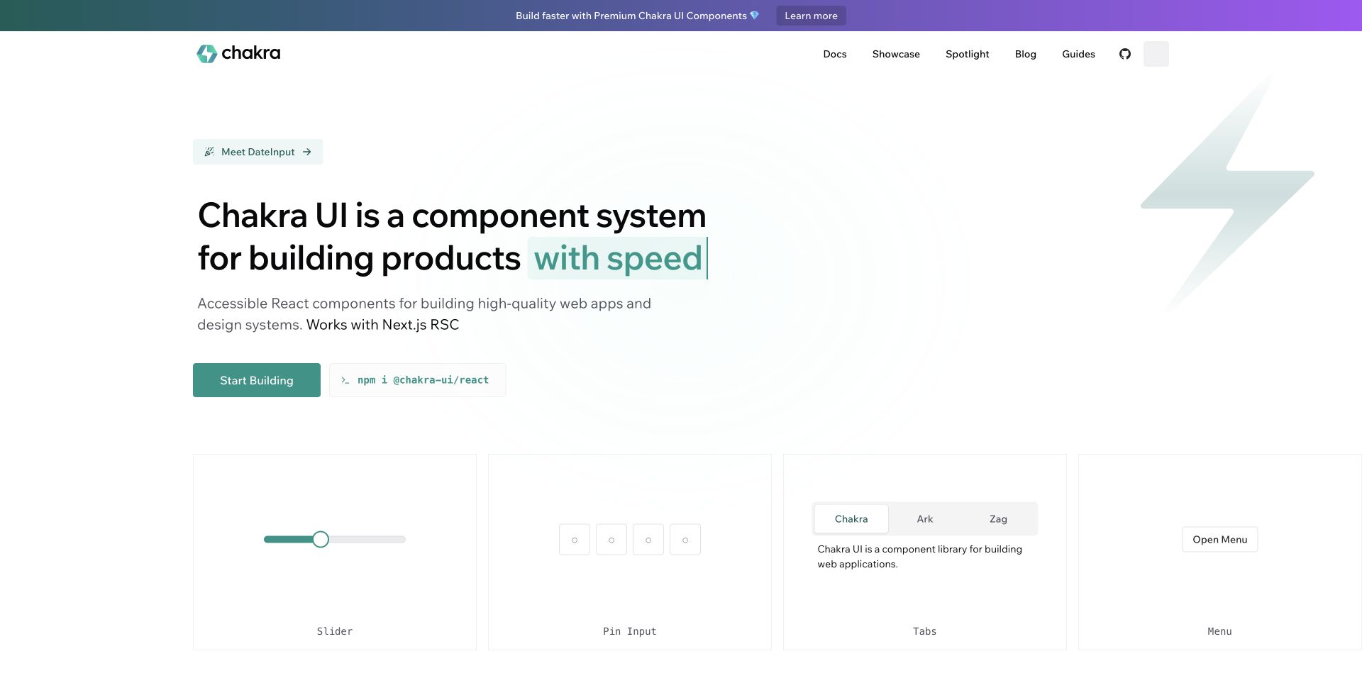
Chakra UI places a short product explanation and teal building action beside a copyable installation command. A pale lightning shape provides identity without competing with the text. Beneath the introduction, four evenly sized panels demonstrate a slider, pin entry, tabs, and menu. A slim gradient announcement bar is visually separate from the main documentation navigation. The page’s Next.js assets establish its React relationship through the framework; the component specimens provide observable design context, not an independent accessibility certification.
What you can learn
For a React component system, put a small, reversible first step near the explanation. Installation and documentation should remain available independently of a rotating headline. Give every specimen a consistent frame and label, then let focused documentation explain states, composition, and limitations rather than trying to make the homepage itself a complete component explorer.
Pros
The installation command and starting route make the developer’s next step concrete.
The specimen row establishes a regular layout for comparing different controls.
Cons & considerations
A changing headline can create unnecessary reading motion.
The premium announcement and several resource links need restraint to preserve the primary learning route.
Platform source: Observed public page assets. The reviewed page loads Next.js assets. React is identified through Next.js, a React framework; this is a framework relationship, not a separate claim about an independently inspected React bundle. Platform evidence is separate from the direct website screenshot and is not a complete current infrastructure audit.
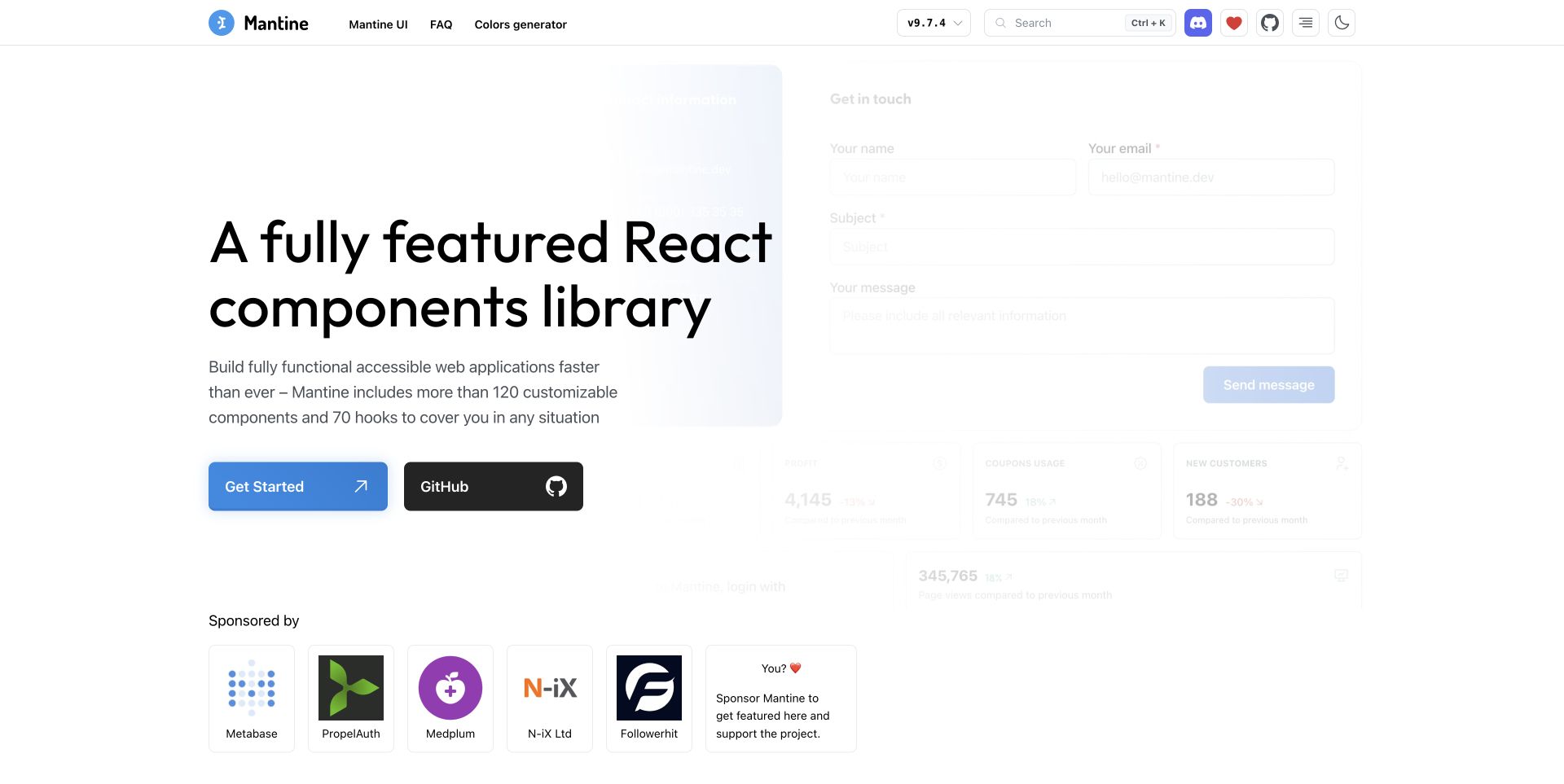
Mantine’s homepage uses a very large two-line introduction over a lightly faded collage of forms and dashboard elements. Blue marks the documentation action, while a dark GitHub button gives repository access separate emphasis. The header exposes version choice, search, community links, and appearance controls. Sponsor tiles begin below the introductory block rather than being merged into the main promise. The page directly loads Next.js bundles and page data, so the React association here follows the framework rather than assumptions about the pictured interface.
What you can learn
A React library site can treat version selection as part of the persistent reading shell, not a detail buried in the footer. Preserve the visitor’s chosen documentation context when navigating. Keep example applications visually subordinate to the explanatory text, and make it clear when sponsor tiles are support relationships rather than endorsements or evidence of library quality.
Pros
Documentation and repository access have distinct, plainly labeled actions.
Version selection is visible where returning developers expect it.
Cons & considerations
The faded application collage offers limited detail for evaluating individual controls.
A growing set of community icons can crowd a compact header on smaller screens.
Platform source: Observed public page assets. The reviewed page loads Next.js assets. React is identified through Next.js, a React framework; this is a framework relationship, not a separate claim about an independently inspected React bundle. Platform evidence is separate from the direct website screenshot and is not a complete current infrastructure audit.
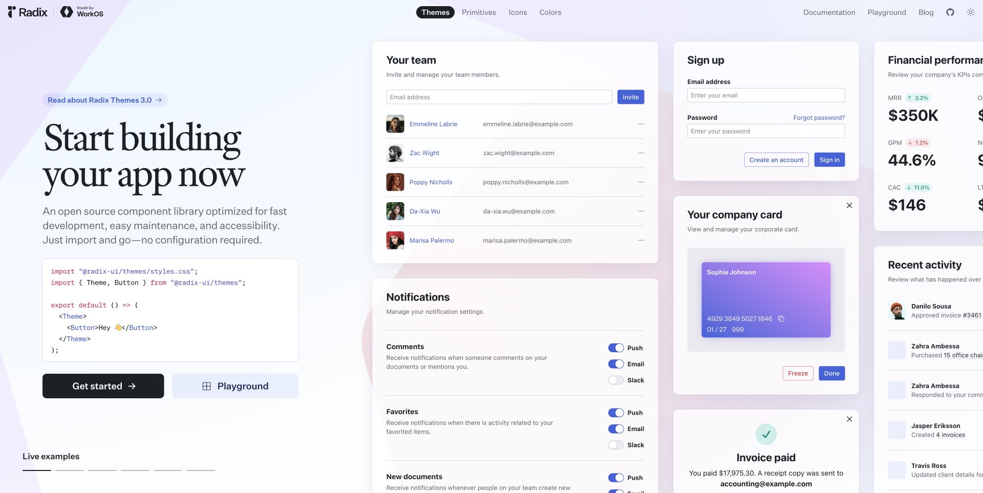
Radix places a serif introduction and short code example on the left, with a wall of sample application cards filling the remaining space. Team management, signup, notification toggles, payment details, and activity previews demonstrate repeated spacing and surface conventions. The pastel geometric background connects the examples without requiring a separate illustration. Themes, primitives, icons, and colors occupy a central navigation. Public Next.js bundles establish the React relationship; the sample names and financial values are demonstrative interface content, not customer results.
What you can learn
A React design-system presentation can connect a tiny implementation example to the larger surfaces it supports. Keep the code concise enough to understand, label examples clearly, and offer a dedicated playground for deeper exploration. Reusable components should preserve predictable behavior across every specimen, but a homepage gallery is not a substitute for reviewing accessibility and interaction states in documentation.
Pros
Code and composed interface examples are visible together.
The navigation distinguishes several related but different design-system resources.
Cons & considerations
Wide specimen walls can hide important examples beyond the viewport edge.
Dense sample interfaces need a simpler presentation when space is limited.
Platform source: Observed public page assets. The reviewed page loads Next.js assets. React is identified through Next.js, a React framework; this is a framework relationship, not a separate claim about an independently inspected React bundle. Platform evidence is separate from the direct website screenshot and is not a complete current infrastructure audit.
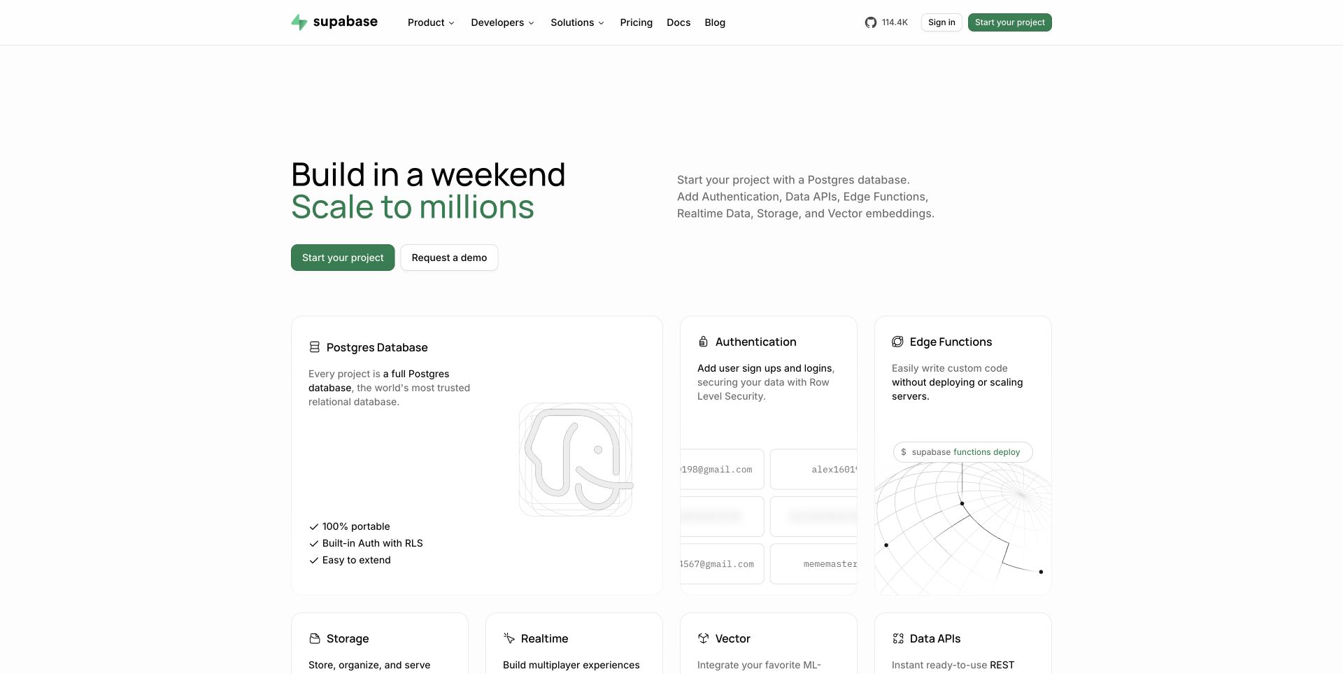
Supabase uses a restrained white page, a two-line black-and-green introduction, and a short description opposite it. Immediately below, a large database card is accompanied by smaller authentication and function cards; additional capabilities begin on the next row. Each surface combines a plain label, explanatory copy, and a subdued diagram. The header groups product, developer, and solution routes while keeping documentation and pricing explicit. Its public marketing page loads Next.js assets, establishing React through that framework rather than proving anything about the platform’s own backend.
What you can learn
A React marketing grid can mirror the visitor’s mental model of a platform without exposing internal implementation details. Build cards with consistent headings and link behavior, but allow genuinely important categories different sizes. Make supporting diagrams optional, preserve meaningful text when imagery fails, and connect every capability to concrete documentation rather than an undifferentiated signup destination.
Pros
The card hierarchy communicates a primary database offering alongside related services.
Descriptions remain readable rather than disappearing into an abstract infrastructure illustration.
Cons & considerations
Several large cards can push evaluation details far down the page.
Subtle gray diagrams may provide little value at small sizes or reduced contrast.
Platform source: Observed public page assets. The reviewed page loads Next.js assets. React is identified through Next.js, a React framework; this is a framework relationship, not a separate claim about an independently inspected React bundle. Platform evidence is separate from the direct website screenshot and is not a complete current infrastructure audit.
Resend uses a near-black canvas with a large white serif introduction at the left and a subtle dark dimensional illustration to the right. A small event recap pill sits above the headline, while getting started and documentation are paired below the supporting copy. The navigation includes features, company, enterprise, help, docs, AI, and pricing. The visual approach is more editorial than a conventional infrastructure diagram. Its public Next.js assets support the React relationship, while email delivery outcomes are not evaluated by this design review.
What you can learn
A React homepage can be sophisticated without making every section interactive. Establish a small set of reusable typography, action, and illustration patterns, then let documentation provide implementation depth. Keep faint decorative media outside the essential reading path and avoid relying on the aesthetic of a developer brand to establish reliability, deliverability, or operational suitability.
Pros
Documentation is available directly beside the primary starting action.
The limited palette makes the large text the clearest focal point.
Cons & considerations
The very dark illustration may communicate little beyond atmosphere.
A broad menu needs careful grouping as the product and resource library expand.
Platform source: Observed public page assets. The reviewed page loads Next.js assets. React is identified through Next.js, a React framework; this is a framework relationship, not a separate claim about an independently inspected React bundle. Platform evidence is separate from the direct website screenshot and is not a complete current infrastructure audit.
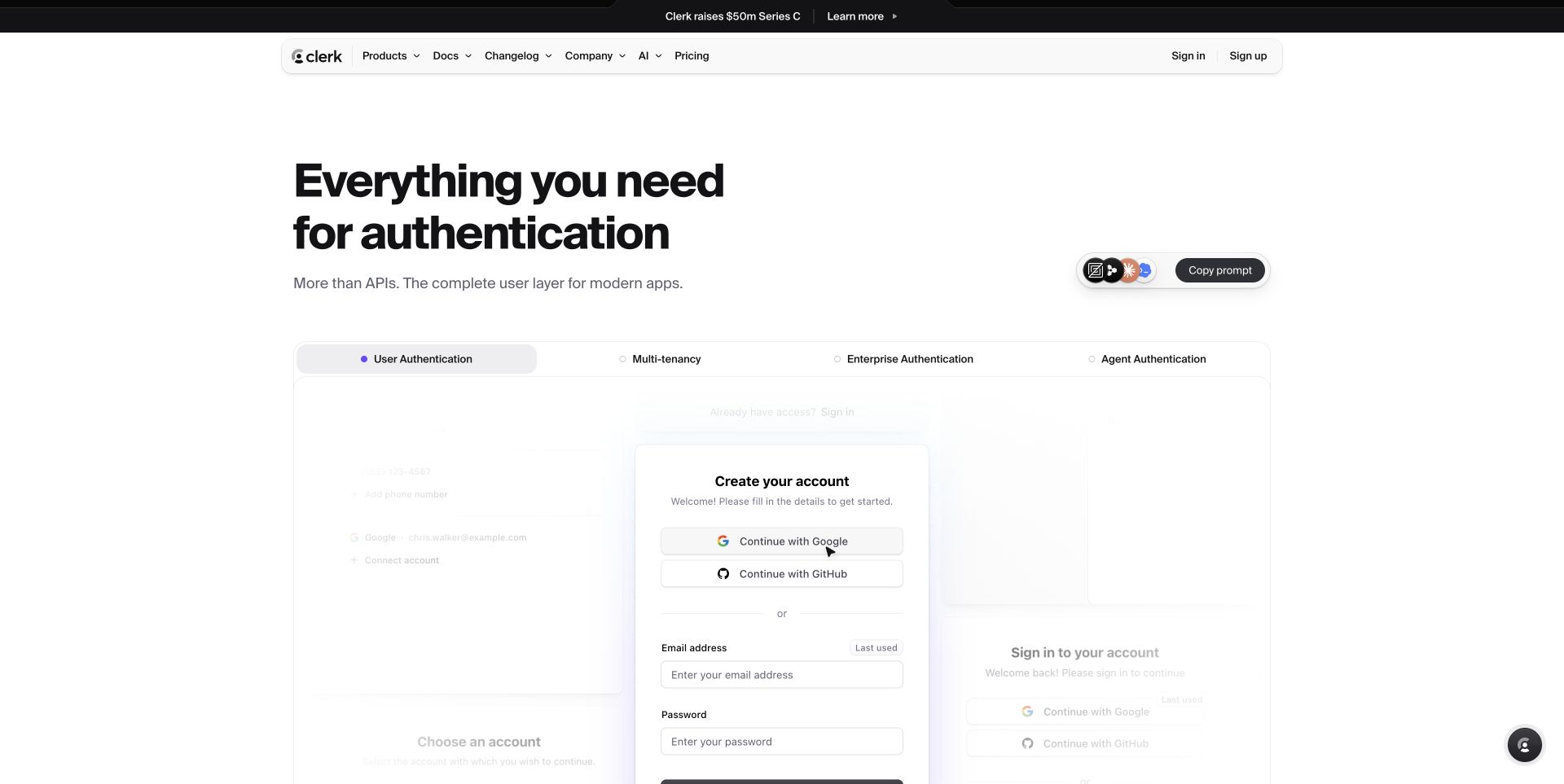
Clerk’s public marketing page puts a bold left-aligned introduction above a wide tabbed demonstration. User, multi-tenant, enterprise, and agent authentication appear as distinct categories in the same frame. The initial sample surface shows account-creation elements, with neighboring examples faded into the background. A small prompt-copy control is separated from the main explanation, while a rounded navigation bar stays above. The page loads Next.js bundles, supporting React through the framework; the example account controls are not evidence that a live signup flow was tested.
What you can learn
Use shared React components to compare related workflows in a stable frame. Keep tab names specific, preserve layout when the selected example changes, and make keyboard focus and selected state clear. A visual demo should never be confused with the visitor’s own authentication surface, and marketing copy should link to implementation and security documentation instead of implying that interface polish proves protection.
Pros
The tab labels distinguish use cases that could become one vague feature list.
The demonstration uses a consistent visual frame rather than unrelated screenshots.
Cons & considerations
Faded surrounding examples can look inactive without explanation.
Announcement and prompt-copy controls add choices before a visitor has explored the product.
Platform source: Observed public page assets. The reviewed page loads Next.js assets. React is identified through Next.js, a React framework; this is a framework relationship, not a separate claim about an independently inspected React bundle. Platform evidence is separate from the direct website screenshot and is not a complete current infrastructure audit.
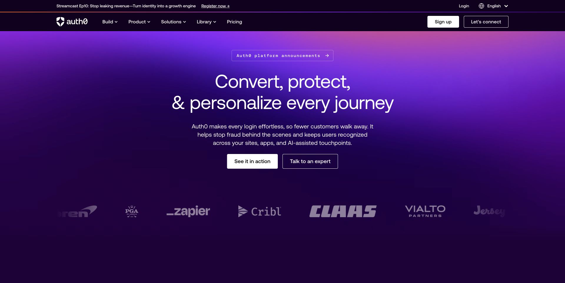
Auth0 opens with a full-width purple gradient, a centered multiline headline, and a short explanatory paragraph. Two contrasting actions distinguish trying the product from speaking to an expert. A narrow announcement control sits above the title, while customer marks form a quieter supporting band below. The dark header separates build, product, solutions, resources, and pricing. Public Next.js bundles and page data establish its React relationship through that framework; the review does not test the security or effectiveness of the identity product.
What you can learn
A React page serving several audience types should keep its top-level decision simple even if the later content becomes highly segmented. Reuse clear action variants and a consistent section frame for capability comparisons. Preserve plain routes to documentation and pricing, and make sure animated entrance effects never leave the core explanation or evaluation controls temporarily inaccessible.
Pros
Trial and expert-contact actions are visibly different next steps.
The gradient establishes identity without obscuring the main text.
Cons & considerations
Broad outcome-oriented language needs supporting product detail below.
Multiple announcement and utility bands make the opening header relatively tall.
Platform source: Observed public page assets. The reviewed page loads Next.js assets. React is identified through Next.js, a React framework; this is a framework relationship, not a separate claim about an independently inspected React bundle. Platform evidence is separate from the direct website screenshot and is not a complete current infrastructure audit.
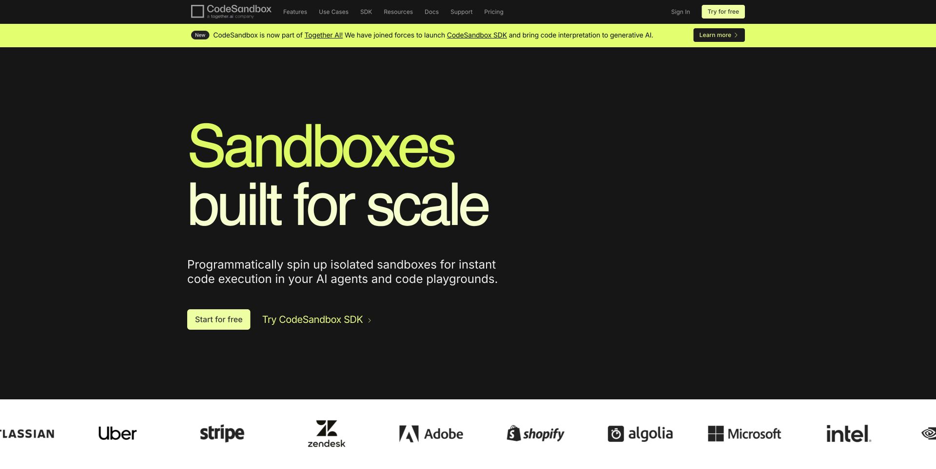
CodeSandbox uses lime display type on a dark surface, with a compact explanation and two neighboring actions beneath. One starts a free environment; the other leads to SDK documentation. A bright acquisition and product-announcement strip is separate from the stable top navigation. A customer-mark band begins below the hero, using a white background to change the pace. Public Next.js bundles establish the React association through that framework, without making any claim about the architecture of the actual sandbox runtime.
What you can learn
A React marketing shell can support a changing product story while preserving the distinction between trying a tool and integrating an API. Keep announcement content replaceable without moving documentation and pricing. Treat sample statistics and customer marks as separately sourced content, and ensure decorative text animations settle into a readable heading rather than making visitors wait for the main explanation.
Pros
The SDK route is not hidden behind the general free-start action.
The announcement strip has its own visual zone rather than interrupting the introductory paragraph.
Cons & considerations
A large animated headline needs a reliable fallback before scripts finish.
Strong announcement and hero colors can compete if both carry long messages.
Platform source: Observed public page assets. The reviewed page loads Next.js assets. React is identified through Next.js, a React framework; this is a framework relationship, not a separate claim about an independently inspected React bundle. Platform evidence is separate from the direct website screenshot and is not a complete current infrastructure audit.
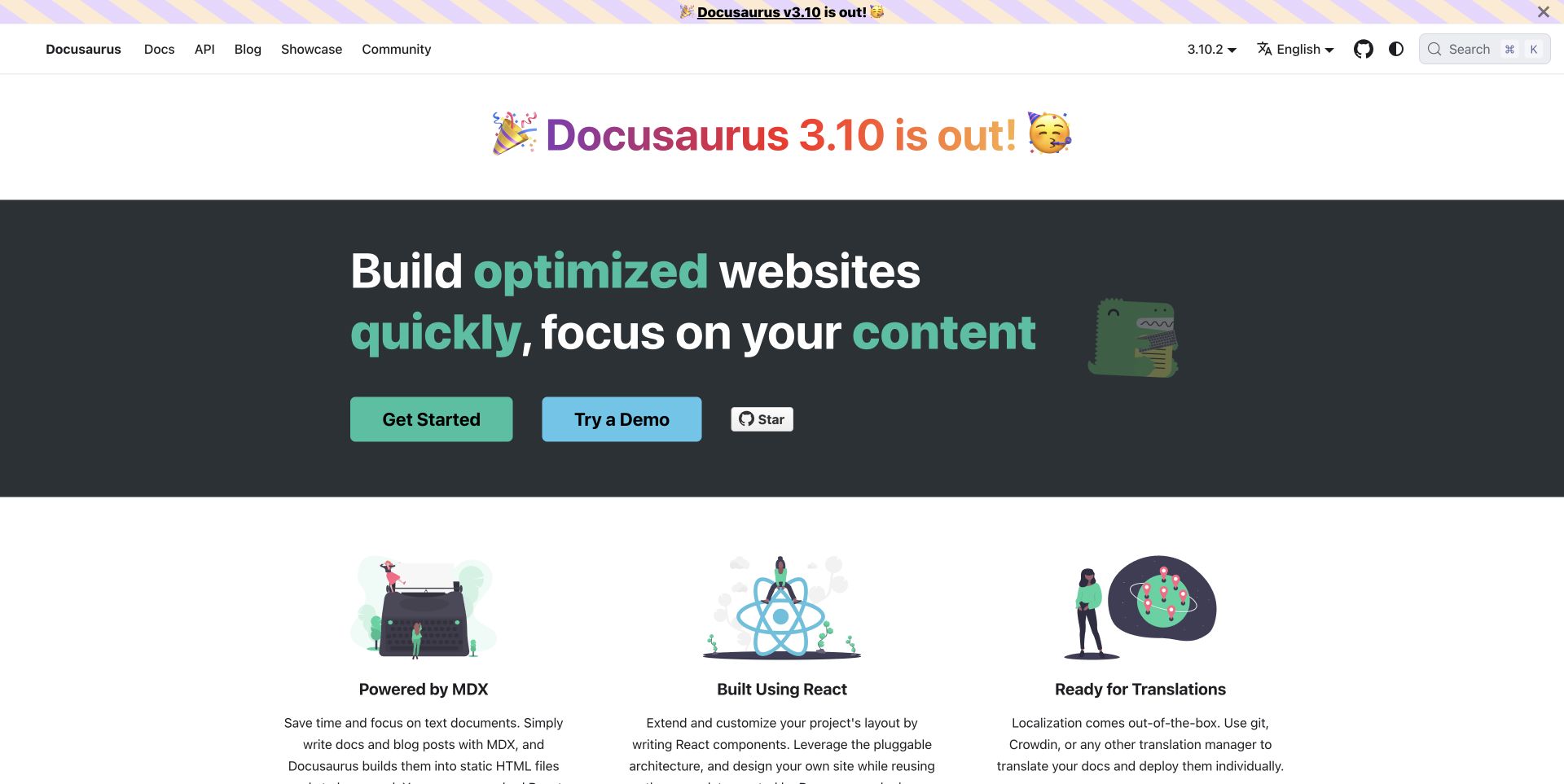
Docusaurus uses a prominent release announcement above a dark gray hero with green-highlighted words. A large getting-started button and a blue demo button sit together beneath the introduction, with repository support nearby. The following white section introduces content, React composition, and translation through three illustrated columns. Its generator identifies Docusaurus, and the site explicitly describes the React-based framework. This establishes the framework relationship rather than inferring React solely from an arbitrary root element or the presence of JavaScript.
What you can learn
A React-powered documentation site should explain the authoring model as clearly as the frontend technology. Show how readers start, how maintainers write content, and where examples can be explored without setup. Keep release announcements separate from enduring instructions, and preserve versioned deep links so an update to the marketing homepage does not make older implementation guidance impossible to locate.
Pros
The first two actions distinguish learning the setup from exploring a demonstration.
The following columns connect writing, components, and translation into one explanation.
Cons & considerations
Repeated release banners can push the permanent product introduction downward.
Large broad claims still need concrete documentation about configuration and maintenance tradeoffs.
Visible tech stack
React
Docusaurus
Platform source: Official platform or first-party project source. The public generator identifies Docusaurus, and the homepage explicitly describes its React-based framework. React association is through Docusaurus, not an independently inspected React bundle. Platform evidence is separate from the direct website screenshot and is not a complete current infrastructure audit.
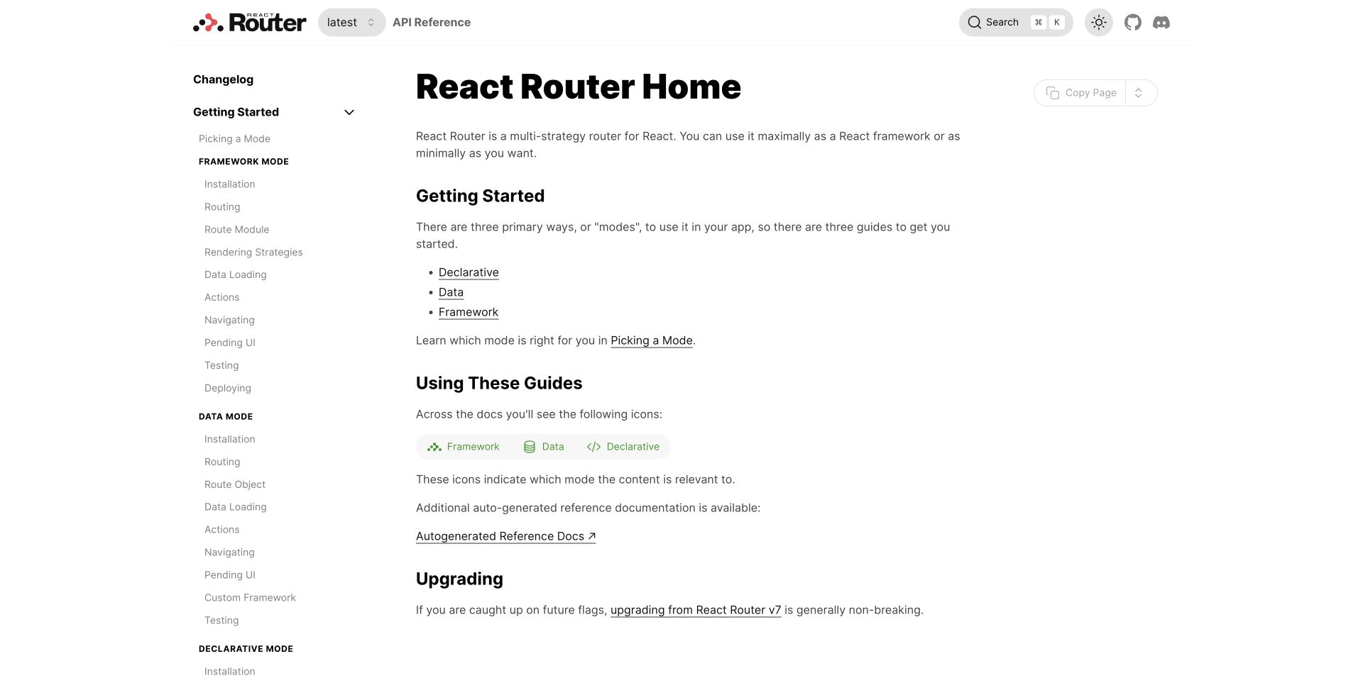
React Router’s documentation page uses a compact brand and version selector above a long left-hand navigation. The main column introduces three modes with plain links, followed by a small visual legend that recurs through the guides. Search and appearance controls remain at the upper right, while copying the page is a secondary utility. The public page preloads named React DOM and JSX runtime assets alongside route modules. This is evidence for the captured documentation surface, not simply an assumption based on the product’s name.
What you can learn
When a React framework supports several modes, model that distinction in both content and navigation. Shared components can display relevant-mode indicators consistently, but the written introduction should still explain the choice. Keep migration guidance and current reference easy to tell apart, maintain stable page URLs, and avoid requiring a visitor to understand every mode before reaching one useful setup path.
Pros
The mode legend explains recurring documentation markers.
Version context is visible beside the brand rather than hidden in settings.
Cons & considerations
The long sidebar can overwhelm a newcomer before they choose a mode.
Small utility controls need enough contrast to remain distinguishable from inactive text.
Visible tech stack
React
React Router
Platform source: Observed public page assets. The documentation page has public modulepreload links to /assets/react-dom-BRBZS0sB.js and /assets/jsx-runtime-C-dPSQ1O.js, alongside React Router entry and route modules. Platform evidence is separate from the direct website screenshot and is not a complete current infrastructure audit.
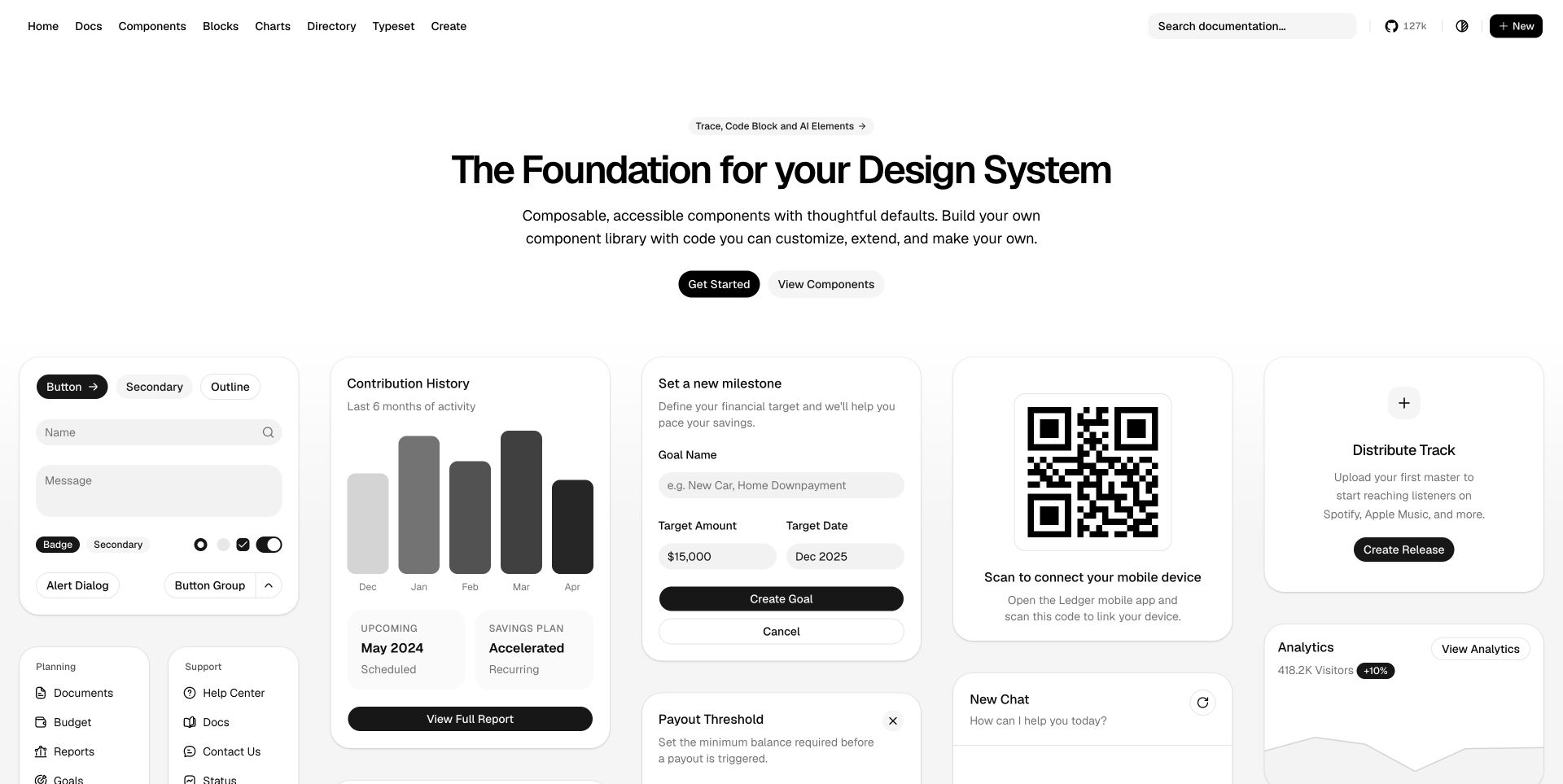
shadcn/ui centers a compact introduction and two small actions above a broad collection of monochrome interface specimens. Buttons, forms, chart bars, a QR panel, and application cards share soft gray surfaces and black action controls. The navigation provides direct access to components, blocks, charts, and related resources rather than hiding everything under one docs menu. Public Next.js bundles establish its React relationship through the framework. The sample financial and activity content belongs to illustrative interface specimens, not measured outcomes from a customer application.
What you can learn
A React component resource can demonstrate a coherent system while leaving room for downstream customization. Organize examples by the decisions developers actually make: primitive, composed block, or complete pattern. Keep specimen interactions clearly separated from real submission destinations, and use the documentation to explain ownership and maintenance rather than suggesting that copying a polished card completes an application.
Pros
The gallery shows repeated visual rules across several kinds of application surface.
Direct component and block routes let experienced visitors bypass the introduction.
Cons & considerations
Many neighboring specimens can create an overwhelming opening on a narrow screen.
Very small paired actions may need more weight when surrounded by a large gallery.
Platform source: Observed public page assets. The reviewed page loads Next.js assets. React is identified through Next.js, a React framework; this is a framework relationship, not a separate claim about an independently inspected React bundle. Platform evidence is separate from the direct website screenshot and is not a complete current infrastructure audit.
Use components for repeatable website presentation
A content-led site can still benefit from a shared navigation shell, cards, media modules, and forms. Decide how editors supply the content and how pages remain useful before client-side interactions initialize.
Give application behavior a distinct boundary
Search, account tools, configurators, and editing experiences need state and data contracts. Avoid coupling a promotional animation to authentication, payment, or other operational state. Keep illustrative product previews clearly separate from real controls.
Use a framework where it solves the surrounding work
For a Next.js implementation, understand the server and client component boundary rather than making every component client-side by habit. The architecture must match the interaction and deployment requirements.
Plan content, states, and ownership around the components
Agree on a representative state inventory
Choose one real form, one long article, one data-heavy view, and one failure case. Review them on a narrow screen and with a keyboard. Do not accept a component library as complete because its default visual states look consistent.
Define the content and integration contracts
Specify where text, images, navigation, and structured data originate. Name the owner of each API, preview workflow, and deployment. React alone does not provide a publishing interface for nontechnical staff.
Set observable acceptance checks
Define what will be tested for reading order, loading behavior, forms, metadata, and critical journeys. Measure the actual build if speed or reliability is a requirement; do not infer those outcomes from a framework logo.
A useful handover demonstration
Ask the actual team to carry out its routine job: publish a realistic update, correct a mistake, preview a narrow screen, and identify who owns an integration failure. For a library or frontend framework, also ask who maintains the content source and deployment. A polished screenshot does not answer those operational questions.
Beyond the screenshot
A React website launch checklist
Review component variants with realistic content.
Exercise loading, empty, error, and recovery states.
Check normal links, headings, form labels, and keyboard focus.
Test narrow screens and reduced motion.
Verify metadata and public content in the rendered output.
Separate illustrative previews from real account operations.
Document API, CMS, deployment, and dependency ownership.
Provide a tested release and rollback routine.
Test with real content, a keyboard, a small screen, slow or failed requests, and the people who will maintain the system. These are planning checks, not an accessibility, security, performance, or search-ranking certification.
Sources & editorial method
How this React collection was reviewed
The collection distinguishes direct React assets from a documented framework relationship. Next.js is a React framework; observing its public bundles supports that relationship but does not identify an organization’s private application, CMS, or full infrastructure.
Every image is an unmodified capture from the actual website, with its source and capture date. Some captures are reused from our shared catalog; their dates remain the original capture dates. None comes from a vendor gallery or a generated reconstruction. Moving imagery and live content can change.
Technology attribution uses public page assets or metadata, official platform documentation, or a cited first-party project case study. Documentary and framework-relationship evidence is identified where used; it is not a complete current backend inventory. A CMS image CDN alone does not establish a full CMS deployment. A library’s presence does not prove which individual controls use it, and a platform label does not establish AI authorship.
The composition notes, lessons, pros and tradeoffs are original editorial observations. We have not measured conversion, traffic, security, performance or accessibility conformance. Website owners retain their brands and imagery; these examples are not our client portfolio. Written, Edited and Curated are independent records, not dates advanced by a build. See our editorial standards or suggest a correction.
Questions worth asking
React website development FAQs
Is React a CMS?
No. A React interface can consume content from a CMS or another source, but editorial modeling, preview, and publishing still need their own implementation.
Does React mean a website is a single-page application?
Not necessarily. Rendering and routing depend on the architecture and framework. The public examples should not be classified by that assumption alone.
Why include Next.js sites in a React guide?
Next.js is a React framework. Each relevant example explains that relationship so it is not confused with an independently inspected React bundle or complete backend audit.
Does a React implementation guarantee better performance?
No. Media, data requests, rendering, client code, caching, and implementation choices all matter. Measure the actual visitor journey.