Vite is build tooling, not a visual style, a CMS, or a production hosting provider. The useful reference is the interface and release problem a team is solving—not the assumption that a shared tool creates a shared result.
These named public properties exposed supported Vite-related build references during the source review. That does not establish an organization’s complete development toolchain, its framework version, every application it operates, or whether a particular feature was written with AI.
A designer can learn from how a large catalog, institutional publication, or software product explains its next step. A development team must separately decide how that interface receives content, produces a release, handles deep links, and remains usable when a request or dynamically loaded module fails.
Before the examples
What makes good Vite website development in 2026?
Separate the development experience from the deployed website
Specify the production artifact and hosting contract before approving a deployment plan. Vite’s build documentation describes generating a production bundle; the surrounding framework and application architecture still determine rendering and runtime behavior. A successful local preview is not a production acceptance test.
A client-side interface, a server-rendered application, and a generated publication have different content and operational requirements. Write down what must be available on the first response, which routes need direct entry, and where data is fetched. Do not infer the right architecture from a Vite signature on a large brand’s website.
Design loading and release boundaries deliberately
Test a slow content request, a failed route, and a visitor who leaves a tab open through a deployment. Keep useful navigation and error explanations available. Coordinate content changes and release ownership so that a new page does not depend on an unpublished schema or an asset removed by another team.
The collection · 20 examples
20 Vite website examples worth studying
Compare how recognizable organizations introduce products, content, and tasks across these public properties. The observations concern the captured interface; the Vite evidence identifies a build-related association rather than a complete application architecture.
We start with five recognizable brands or organizations: Nintendo UK, GitLab public marketing website, Adyen public website, ALDI SÜD Germany, La Poste. Each attribution applies to the named website property, not every product or website belonging to its organization. This is a curated reading sequence, not a measured ranking.
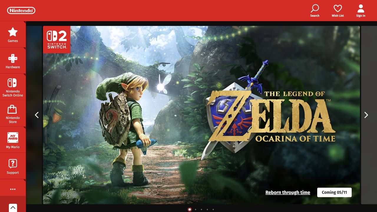
Nintendo UK's opening places vivid game artwork within its recognizable red navigation system. A vertical category rail keeps hardware, games, online services, store, and support available around the campaign, while account and search utilities remain separate. A Vite-associated build artifact was observed on this public property. It does not identify the technology behind a Nintendo account, console service, or every regional storefront.
What you can learn
For a similar frontend, test production builds against a changing release calendar rather than a single perfect hero. Include different image ratios, long game names, expired announcements, and direct links to older releases. Version the built assets and preserve a useful fallback while a campaign loads. Keep the global navigation independently understandable so a failed feature does not remove access to support or product information.
Pros
Persistent category navigation does not disappear when the promoted game changes.
Brand color gives a coherent frame to very different campaign artwork.
Cons & considerations
Large game imagery needs explicit responsive and unavailable-media behavior.
Hardware, games, and online-service routes need persistent labels beyond the artwork of the current featured release.
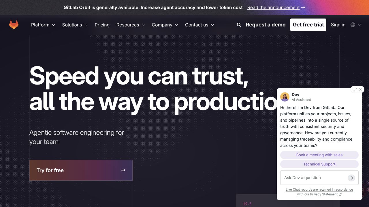
GitLab's public homepage uses oversized white lettering over a dark technical field, with a warm-to-purple primary action. Enterprise navigation, demo, trial, and account destinations remain above it. An assistant panel also occupies part of the captured opening. The observed Vite signal concerns public frontend artifacts, not GitLab's source-hosting application, customer projects, or the implementation of every linked product surface.
What you can learn
Build a production acceptance set that includes the assistant absent, unavailable, and expanded as well as its intended state. Confirm that demo and trial routes remain usable without optional integrations. Check chunk-loading failures and deployment mismatches before launch; a browser receiving old HTML and new assets should have an intentional recovery path. Keep the marketing implementation's responsibilities distinct from those of the authenticated development platform.
Pros
Commercial actions remain recognizable beside the strong product proposition.
The dark visual system gives the technical subject a consistent frame.
Cons & considerations
An assistant overlay can compete with the primary introduction.
Demo, trial, account, and assistant routes need distinct expectations rather than several competing ways to start.
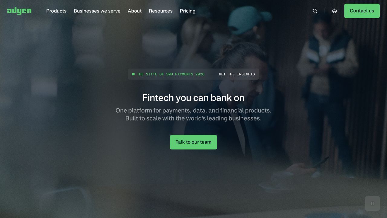
Adyen places a compact payments proposition over a darkened business photograph. A green team-contact action echoes the accent in the header, while a small research announcement remains separate. Products, audiences, pricing, resources, and login have distinct routes. Vite-related public build evidence was observed, but this reference does not evaluate merchant dashboards, payment processing, or the security of financial transactions.
What you can learn
Keep the initial marketing document useful while richer visual assets arrive. Test long translated headlines, low-contrast photographs, and an absent announcement without changing the primary action's meaning. Treat contact, documentation, and merchant login as different handoffs in the route plan. A build-tool choice should support a maintainable release process; it is not evidence that the visible marketing site shares the payment platform's critical operating architecture.
Pros
The short introduction and contact action make the enterprise proposition easy to locate.
Research news has a distinct position rather than becoming a second full campaign.
Cons & considerations
Text over photography requires review for each crop and language.
The short fintech proposition needs concrete product and audience detail after the atmospheric opening.
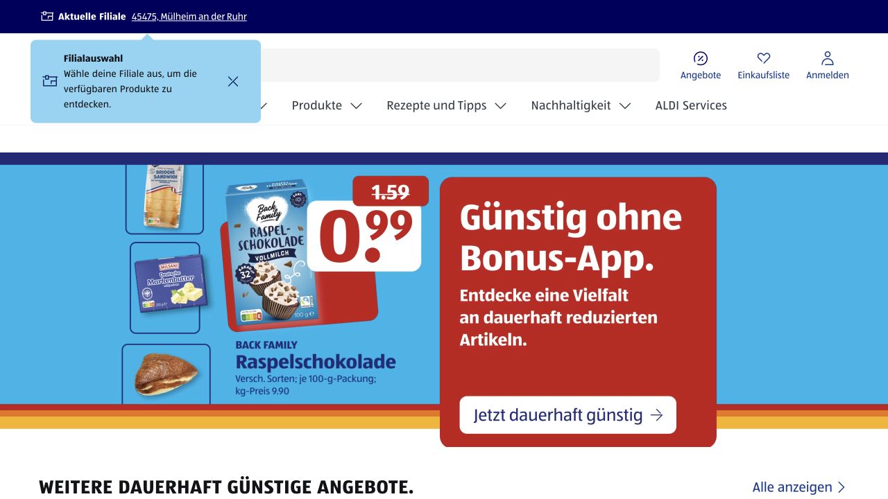
ALDI SÜD's German property puts store choice, search, account, and shopping-list tasks above a broad product navigation. The captured offer uses packaged goods, large price typography, and bright contrasting panels. More offers follow below. A Vite build signal was observed on this particular public website, not established for every ALDI organization, inventory system, or regional digital service.
What you can learn
Test real merchandising extremes in the production build: long product names, unavailable offers, different price formats, and a missing store selection. Keep regional context explicit when a user shares or revisits a URL. Decide which content must be delivered in the initial document and which depends on a selected location. A successful build should not be treated as proof that offer dates and local availability are accurate.
Pros
Practical shopping utilities remain visible above the changing offer.
The featured price and product are presented together rather than as detached decoration.
Cons & considerations
Regional selection and promotion dates introduce states beyond a static hero.
Store selection and current offer conditions need understandable states before a visitor relies on a promotional price.
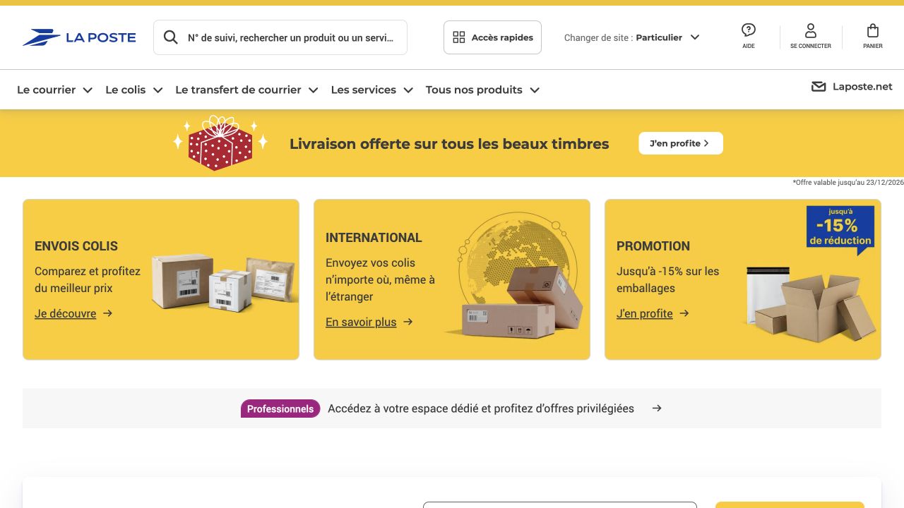
La Poste's French public page uses search and account utilities above a compact service menu. Yellow promotional areas and three object-led cards introduce shipping, international delivery, and packaging. A separate business-audience band acknowledges another visitor group. The observed Vite artifact concerns this public surface; it is not evidence about every postal, financial, tracking, or account service accessible through the brand.
What you can learn
Organize frontend tests around service entrances, not only component snapshots. Check tracking links, location changes, unavailable providers, and direct entry to a service explanation. Preserve enough information before a handoff for the visitor to know what system is opening next. Keep build-time public configuration separate from credentials or private service endpoints, and review the shipped artifact rather than assuming environment variables are automatically server-only.
Pros
The service cards use tangible objects and concise task labels.
Business visitors have a separate route without replacing consumer navigation.
Cons & considerations
Several services may introduce different account and transaction boundaries.
Tracking and business services need clear destinations that do not compete with the three featured retail cards.
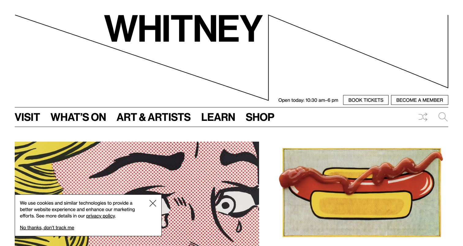
The Whitney's large wordmark sits above exhibition imagery and a compact visitor navigation. Hours, ticketing, and membership are close to the top, while additional programming continues below. The graphic identity is assertive without making every control unfamiliar. Vite-associated evidence was observed in the public frontend sample; ticketing operations and authenticated membership systems were not inspected.
What you can learn
Make the production fixture set include ordinary operational changes: a closed day, a long exhibition title, a sold-out notice, and missing imagery. The visual system should tolerate those states without hiding visit information. Keep exhibition records independent of their featured placement and versioned assets independent of frequently changing text. Confirm that essential hours and ticket destinations remain useful when optional interaction code fails.
Pros
Operational visiting information has a clear place beside the distinctive identity.
Exhibition imagery introduces actual programs rather than a generic institutional slogan.
Cons & considerations
Strong typographic proportions need testing with translations and unusually long labels.
Hours and ticketing context should remain useful when the featured exhibition artwork or admission campaign changes.
Visible tech stack
Referenced on the public page
Vite
Fathom Analytics
Mailchimp
Public source checked November 3, 2026. References may be embedded or legacy—not a complete backend inventory.
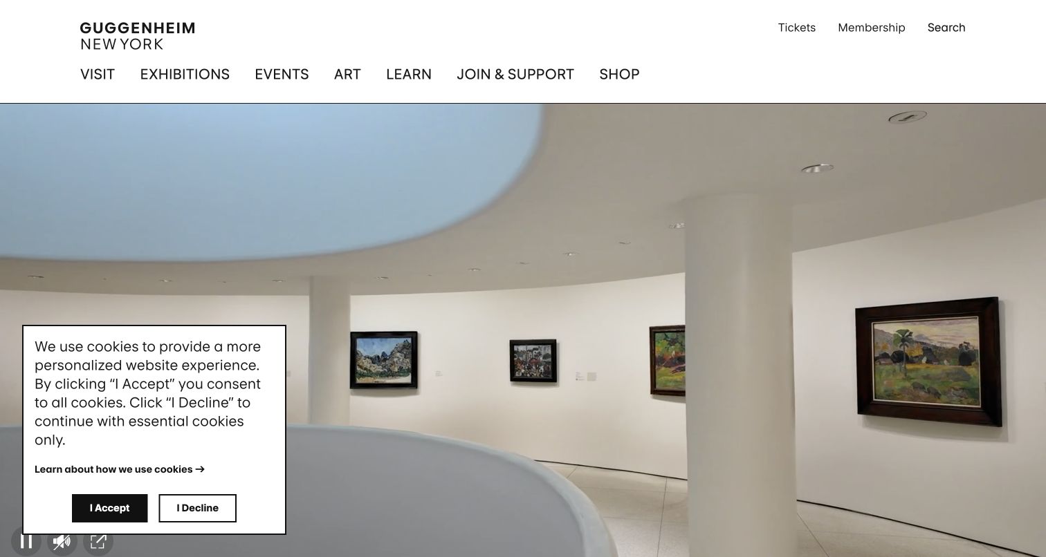
The Guggenheim leads with the interior of its distinctive building beneath a restrained header. Ticket and membership routes sit near exhibition and event navigation, while individual program records continue below. The image establishes place, but the information structure still needs separate exhibitions and dates. A Vite-associated artifact was observed on the sampled public property, not within ticketing or museum management software.
What you can learn
Use production fixtures that distinguish architectural identity from a current exhibition. A change to the opening photograph should not alter program URLs or admission information. Test a media-free view, unavailable tickets, and an exhibition crossing its closing date. Keep cookie interfaces and other overlays from becoming accidental prerequisites for understanding the visit. The toolchain can deliver the interface, but editorial and operational ownership still determine whether its information stays useful.
Pros
The building photograph gives the museum an immediate and specific sense of place.
Ticket and program entrances remain recognizable around the image-led introduction.
Cons & considerations
Overlay panels can occupy an important part of the opening view.
The architectural introduction must still lead promptly to a named exhibition and its practical visiting details.
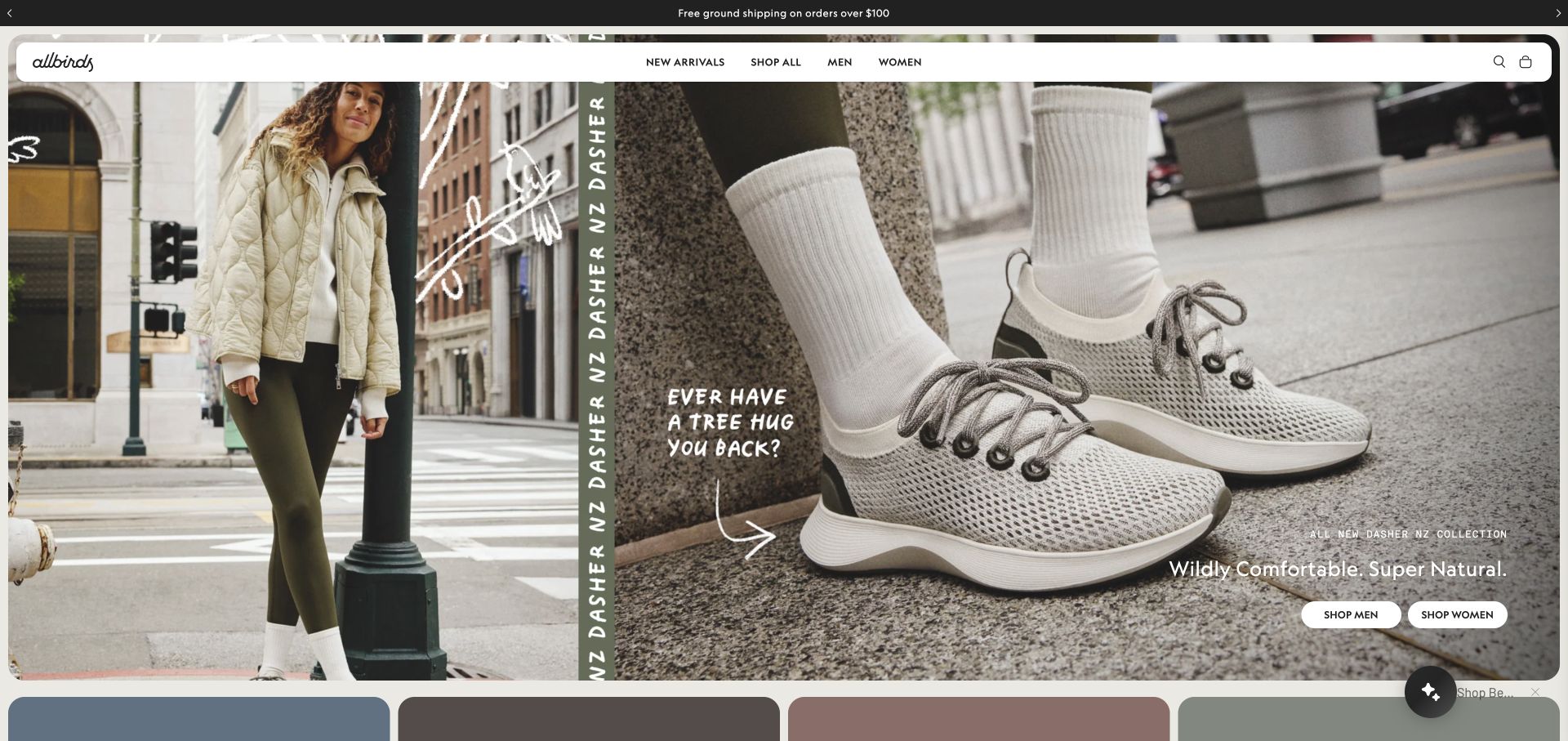
Allbirds pairs a street-level lifestyle photograph with a closer shoe view and a narrow product-name strip. Hand-drawn annotations add an informal voice, while the rounded white header keeps categories, search, and bag controls readable. The public sample included a Vite-associated build signal alongside storefront evidence. This does not establish the exact theme, every retail integration, or the implementation of checkout.
What you can learn
Test a production campaign with both unfamiliar and established products. The image pairing should still explain what is being sold when annotations, names, or audience actions change. Keep the catalog's stable links independent from the feature's visual arrangement. Rehearse an asset rollback and a failed interactive module so the basic product and navigation remain available instead of leaving a blank campaign field.
Pros
The close-up and in-use photographs offer complementary product context.
A distinct navigation surface remains readable over busy campaign imagery.
Cons & considerations
Annotations and audience-specific actions need attention at narrow widths.
Product names and audience actions need enough explanation beyond the campaign's informal handwritten annotations.
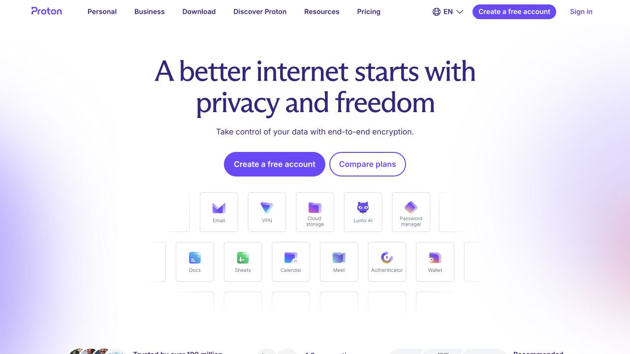
Proton's public homepage centers a privacy-oriented statement above two evaluation actions and a grid of named product cards. Soft color fields add depth while the surrounding canvas remains restrained. Personal and business audiences have separate routes in the header. Vite-related public artifacts were observed, but the mail, storage, calendar, and account applications themselves were not evaluated through this marketing reference.
What you can learn
Treat each product card as a maintained destination with a defined role, not merely a decorative logo tile. Test the initial document, product links, and registration handoff when optional effects or a chunk fail. Audit public build configuration so private endpoints or credentials are not accidentally embedded. Product privacy claims require appropriate evidence and review; they do not follow from the frontend's visual calm or its choice of build tool.
Pros
Named product cards translate the broad promise into concrete service categories.
Personal and business navigation acknowledges different evaluation journeys.
Cons & considerations
A suite-level promise still needs useful product-specific explanation.
The suite's small product cards need clear names and purposes rather than relying on icons to explain each service.
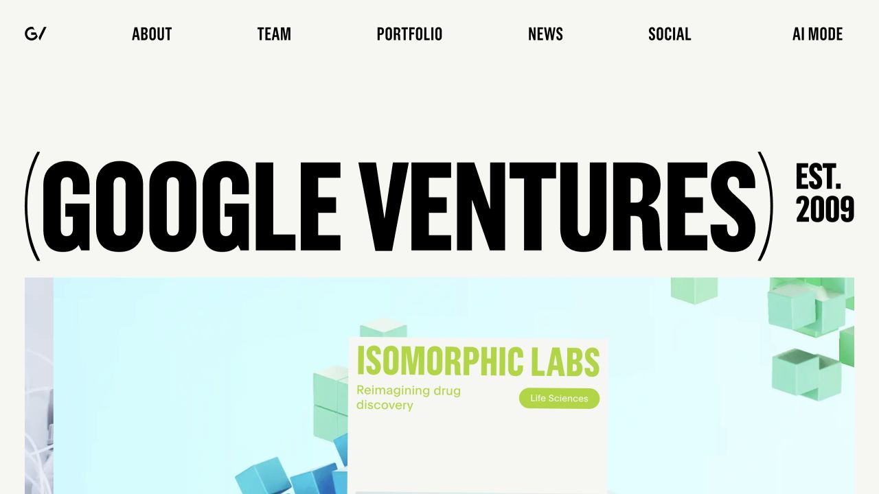
GV uses extremely condensed black typography on an off-white field, making the Google Ventures identity the opening's dominant element. A compact row connects company, people, portfolio, and news destinations. A colorful portfolio story begins immediately below. A Vite artifact was observed on this public site; the observation does not describe Google Search, private investment tooling, or every Alphabet property.
What you can learn
Evaluate the production design with content that is less convenient than the featured example. Try long portfolio names, a missing company image, and a headline that wraps several times. Keep company identity and editorial feature data separate so a new story does not require altering the navigation frame. Verify direct links and asset references after deployment, rather than judging the build only by the homepage's highly controlled typography.
Pros
The oversized identity creates an unmistakable starting point.
Portfolio and team information have concise, explicit routes in the surrounding navigation.
Cons & considerations
Extreme typographic proportions need careful small-screen and long-content testing.
The portfolio feature needs a readable company identity and destination beneath the oversized parent-brand wordmark.
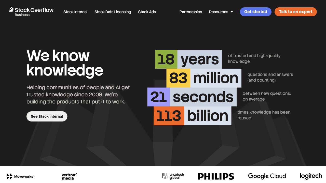
Stack Overflow's corporate site pairs a concise knowledge statement with large colored statistics. Explanations sit beside the figures, and the header separates internal knowledge, licensing, advertising, and partnerships. Customer marks continue below. The Vite artifact was observed on this corporate property, not established as the implementation of the public question archive or an authenticated commercial workspace.
What you can learn
Include alternative product propositions and stale or missing numerical evidence in the content fixture set. Each statistic needs a maintained label and source, independent of how the build renders it. Distinguish the real site navigation from any product illustration and test handoffs into separate applications. Use the build process to enforce repeatable delivery, not to imply that familiar public and corporate surfaces necessarily share a complete frontend architecture.
Pros
The statistics are accompanied by explanations rather than presented as context-free counters.
Commercial destinations distinguish several different business audiences.
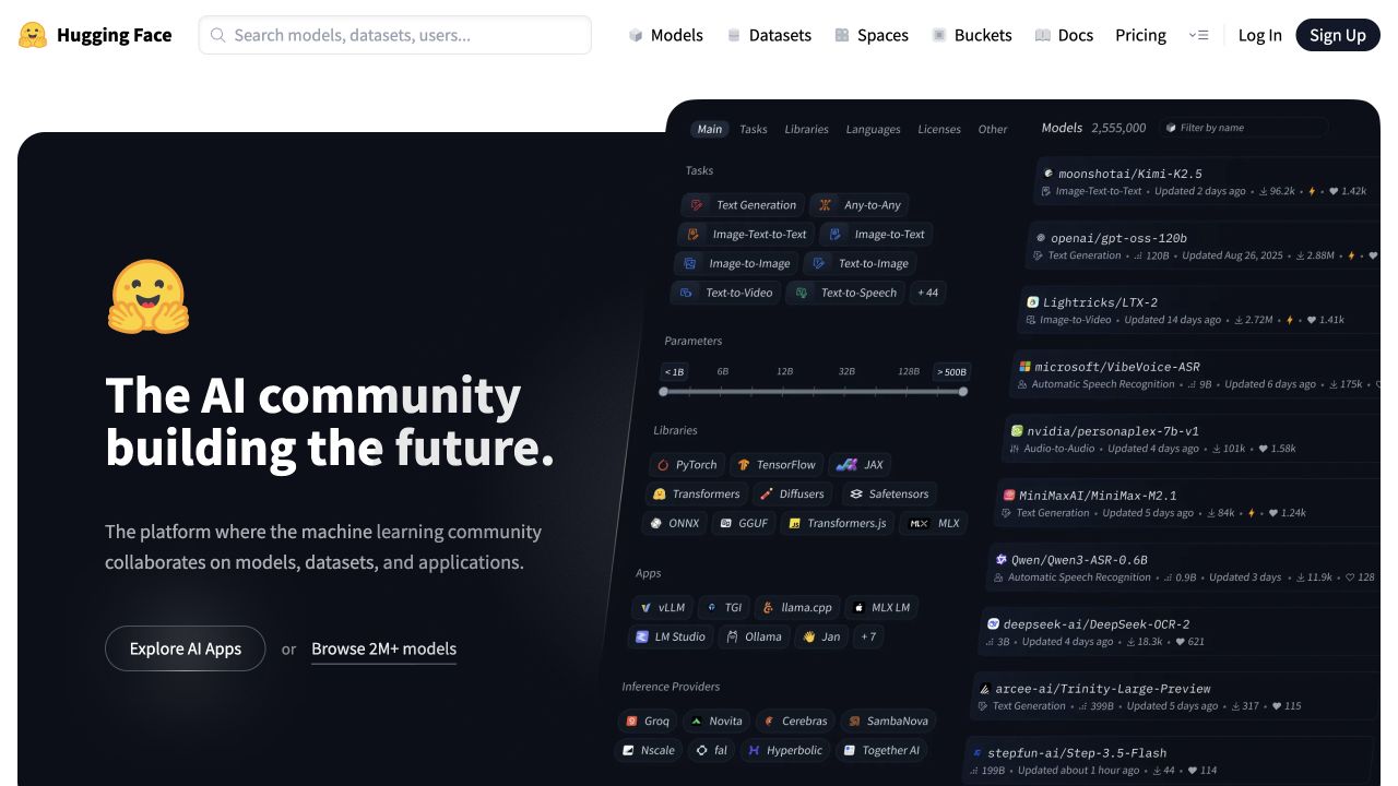
Hugging Face puts a dark community statement beside a technical interface specimen while keeping search, models, datasets, spaces, and documentation in a white header. The familiar yellow identity balances the dense technical subject. Vite-related evidence belongs to the sampled public frontend; individual hosted models, spaces, downloads, or account areas introduce responsibilities beyond this single view.
What you can learn
Test the public shell with long resource names, removed items, and unavailable embedded applications. Model a public resource link separately from any authenticated action, and keep error states understandable without the marketing introduction. Inspect the production artifact for unintended configuration exposure. A platform can combine several independently delivered surfaces, so document which routes the chosen frontend project actually owns before claiming a unified toolchain.
Pros
The search and resource vocabulary remain visible above the expressive introduction.
The interface specimen gives visitors a concrete sense of the platform's subject.
Cons & considerations
Resource discovery and execution can involve different access and delivery contexts.
Models, datasets, and hosted applications need clear distinctions when a visitor follows the public discovery routes.
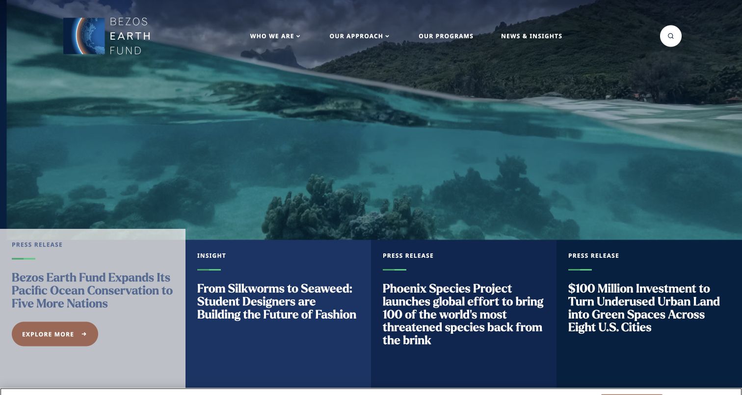
Bezos Earth Fund places several substantial story panels along the lower edge of an environmental photograph. Labels distinguish press releases from an insight piece, and the header separates approach, programs, and news. The image is expressive, but the panels give it concrete editorial destinations. A Vite artifact was observed in public delivery, not as evidence about grant-management or research systems.
What you can learn
Keep content type, date, and destination attached to each feature record. A production test should include one missing image, a long research title, and an expired announcement. Preserve program pages when the featured news changes, and ensure a direct article visit does not depend on arriving through the visual homepage. Environmental or funding-impact claims need their own substantiation; neither the photograph nor the build tool independently validates them.
Pros
Format labels help readers distinguish reporting and interpretive content.
The lower story panels connect the broad environmental image to specific material.
Cons & considerations
Multiple large overlays can compete for attention in a constrained viewport.
Story formats and dates must remain readable within the dense group of lower-edge feature panels.
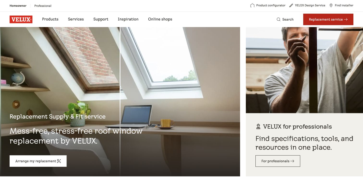
VELUX UK divides its introduction between a large replacement-window scene and a smaller professional-information panel. Audience selection and practical project tools sit above the main navigation, with restrained red actions in the visual field. The public response exposed a Vite-associated artifact. That observation does not mean every VELUX regional website, specification tool, or customer system uses the same build configuration.
What you can learn
Create consumer and professional fixture journeys before choosing how much interface behavior to ship. A replacement inquiry and a technical specification lookup need different useful destinations. Keep the audience context visible across a handoff, and test a long product identifier and missing technical document. Release and rollback checks should cover both panels so updating one campaign cannot silently break the less visually dominant professional task.
Pros
The split composition gives two materially different audiences visible entrances.
Practical project tools have a permanent place outside the campaign photograph.
Cons & considerations
A split layout needs a clear mobile reading order.
Consumer replacement and professional specification information need different useful continuations beyond their shared image treatment.
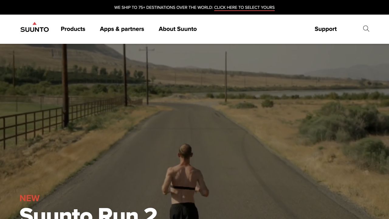
Suunto places outdoor product imagery beneath a clean white header for products, apps, the brand, and support. A narrow service strip and shipping-destination notice add practical context without replacing the campaign. The sampled public page exposed Vite-related build evidence. Device firmware, mobile applications, customer accounts, and every commerce service are outside the scope of that observation.
What you can learn
Plan the frontend around the relationship between the device, its companion software, and ongoing support. Include older models, unavailable accessories, long specification tables, and a failed app-store handoff in the production checks. Keep regional commerce context separate from stable support documents. A campaign update should not break a setup guide that an existing owner reaches from a saved link or a package insert.
Pros
Product, app, and support routes communicate the wider ownership journey.
The outdoor setting explains use context before detailed specifications appear.
Cons & considerations
Regional shipping and service notices add content states beyond the visual campaign.
Physical-device campaigns need a clear relationship to companion software and support for older products.
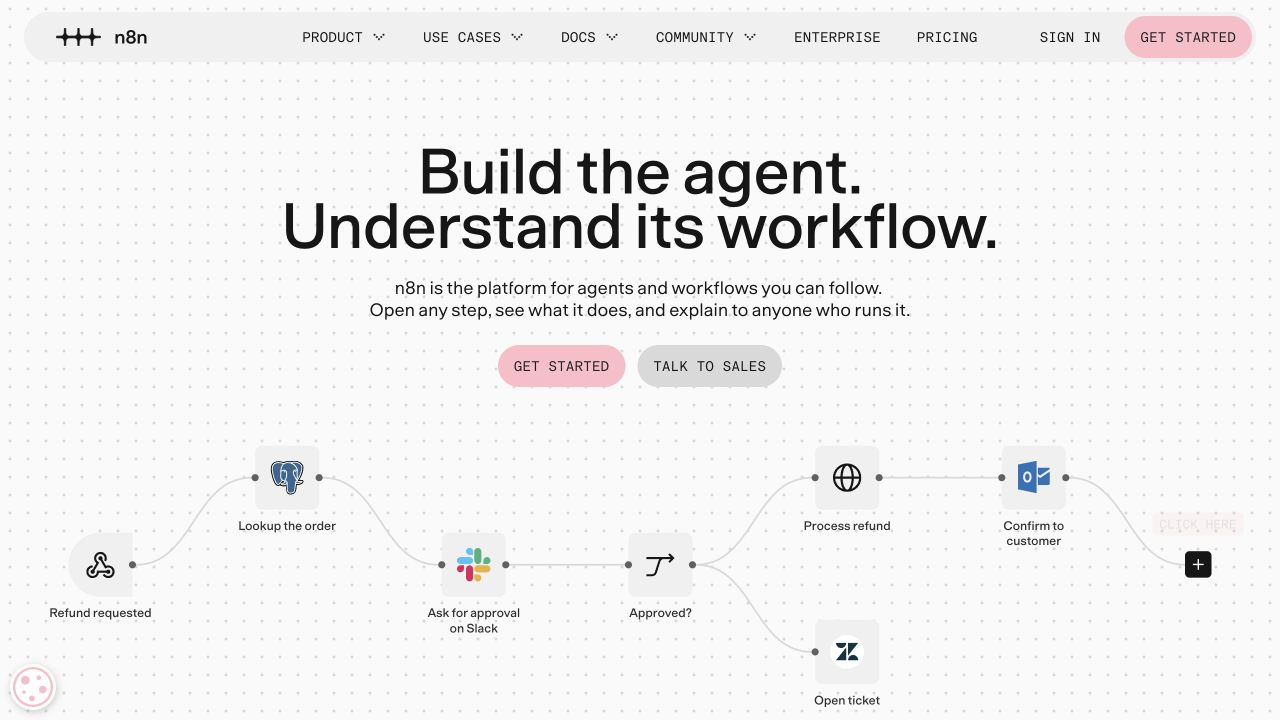
n8n centers a short statement above a workflow illustration with recognizable service nodes, a branch, and connecting paths. A lightly dotted field supports the diagram without competing with it. Starting and sales-contact controls differ visually, while documentation and community remain in the rounded header. Vite evidence was observed on this public property, not inside a customer's workflow or connected application credentials.
What you can learn
Test the explanatory diagram as content, including a static fallback and a narrow viewport. Keep any demonstration data clearly distinct from real customer connections. Review the shipped configuration so credentials and privileged integration URLs cannot enter public assets. Establish which pages the marketing build owns and which belong to the automation editor, then test that handoff instead of assuming the public example proves a working integration.
Pros
Concrete nodes and a branch explain automation more specifically than an abstract dashboard.
Starting and enterprise evaluation receive visibly different actions.
Cons & considerations
A complex illustration needs a readable text explanation and small-screen alternative.
The workflow illustration needs plain explanation so a newcomer can understand its sequence without decoding every service icon.
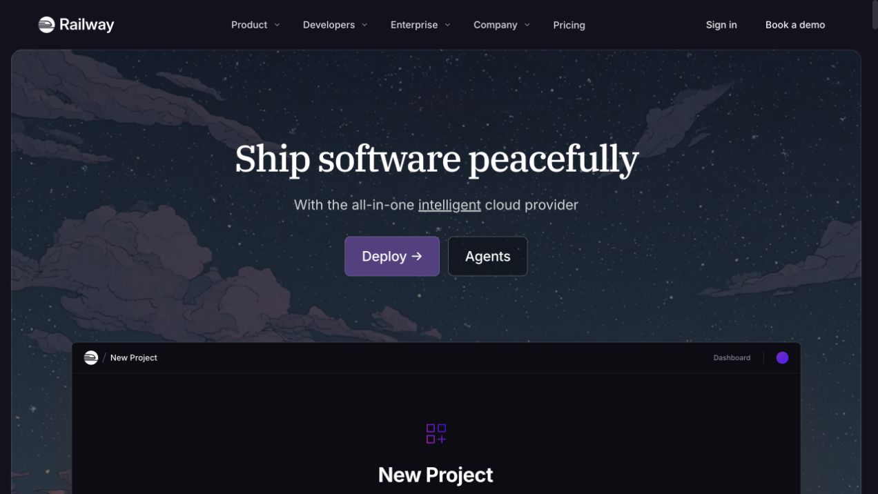
Railway places a centered serif introduction over an illustrated night sky. A purple deployment action and a quieter agents link sit above the beginning of a new-project preview. The same scene connects the brand message with a recognizable working surface. A Vite artifact was observed in this public website, not established as the implementation of customer deployments or Railway's infrastructure control plane.
What you can learn
Keep the illustrative product preview useful without confusing it with a live project. Production fixtures should include an unavailable image and a long translated proposition, while the true deployment destination remains explicit. Verify that account or console handoffs do not depend on optional animation. Inspect the final assets and route behavior after release; a peaceful visual metaphor cannot demonstrate operational reliability or secure handling of deployment secrets.
Pros
The product preview gives the atmospheric illustration a practical point of reference.
Primary and secondary actions remain distinct within the restrained opening.
Cons & considerations
A public preview may look like an operational interface unless framed clearly.
A deployment action and an agents route need clear differences beneath the otherwise unified illustrated scene.
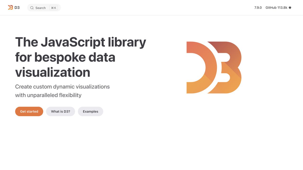
D3 pairs a heavy left-aligned statement with its large orange-and-yellow emblem. The introduction offers separate routes to get started, understand the library, and inspect examples. Search, version, and repository utilities remain compact. Vite-related evidence concerns the public documentation experience; it does not mean a visualization built with D3 requires this site's complete framework or build stack.
What you can learn
Organize production checks around both a first explanation and a direct API lookup. Verify deep links, version context, code formatting, and unavailable interactive examples. Keep the explanatory article useful before optional examples execute. A developer library and the tooling used to publish its documentation are different architectural subjects, so preserve that distinction when choosing dependencies for a project inspired by this interface.
Pros
The three learning routes recognize different levels of familiarity.
The compact header keeps version and repository context available without a commercial menu.
Cons & considerations
Interactive examples need a usable explanation when scripts cannot run.
Example browsing and API reference should remain recognizable choices for readers who already understand the introductory proposition.
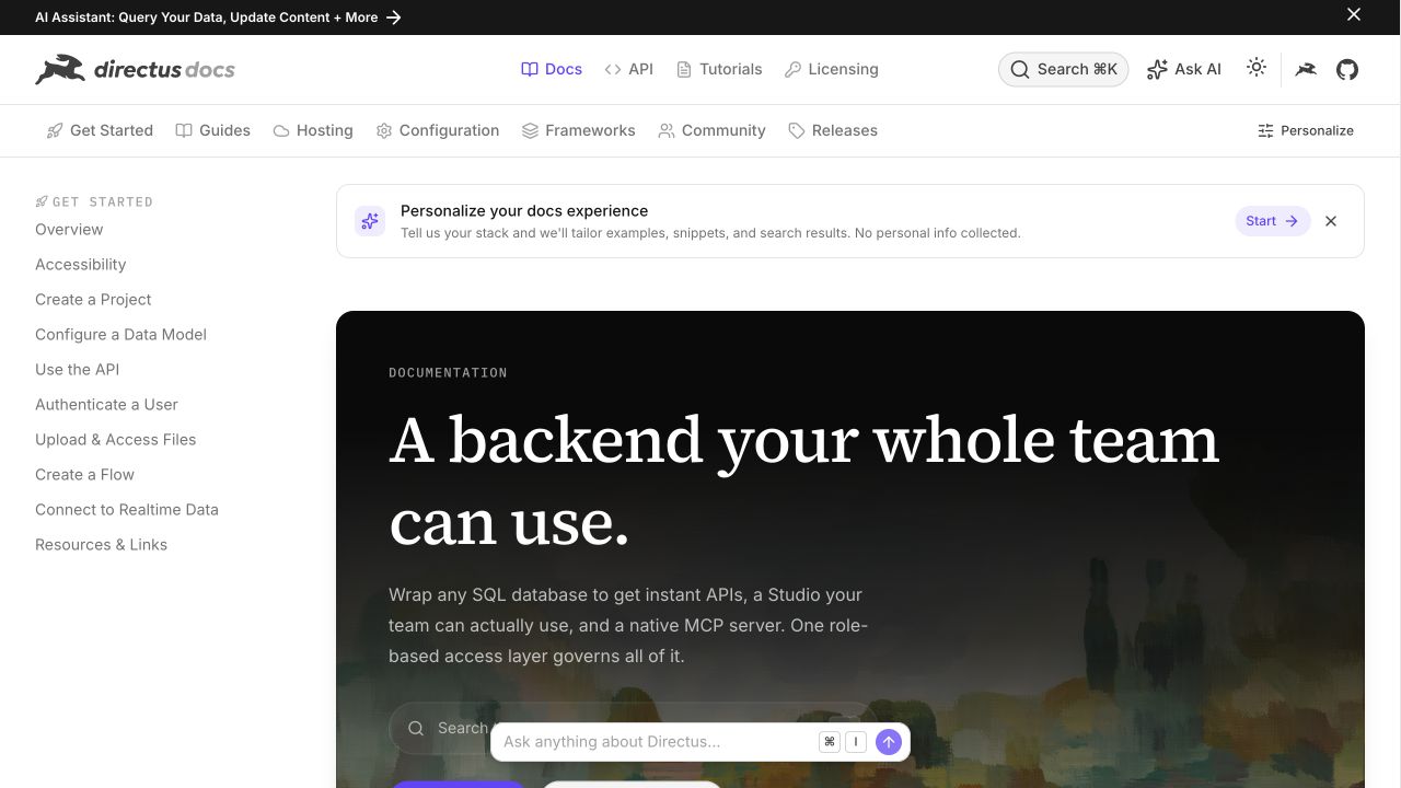
Directus documentation combines a global header, topic navigation, and a persistent guide list. A dark introductory panel anchors the main column, with search and assistant controls nearby. A banner introduces example personalization while ordinary guide routes remain available. The Vite artifact belongs to the sampled documentation property, not necessarily to Directus applications, customer projects, or its separate marketing pages.
What you can learn
Test the default documentation without personalization or an assistant as well as the enriched state. Keep version, topic, and guide identifiers stable across a release. Review which example settings are safe to store or expose in a public document, and provide a clear reset path. Build acceptance should include direct deep links and a failed optional feature, not only the controlled welcome page shown in the capture.
Pros
The persistent guide list supports a visitor arriving with a specific technical question.
Optional assistance sits beside conventional documentation routes rather than replacing them.
Cons & considerations
Multiple navigation layers can consume much of a small viewport.
Personalization and assistant controls need enough explanation that they do not obscure the ordinary guide list.
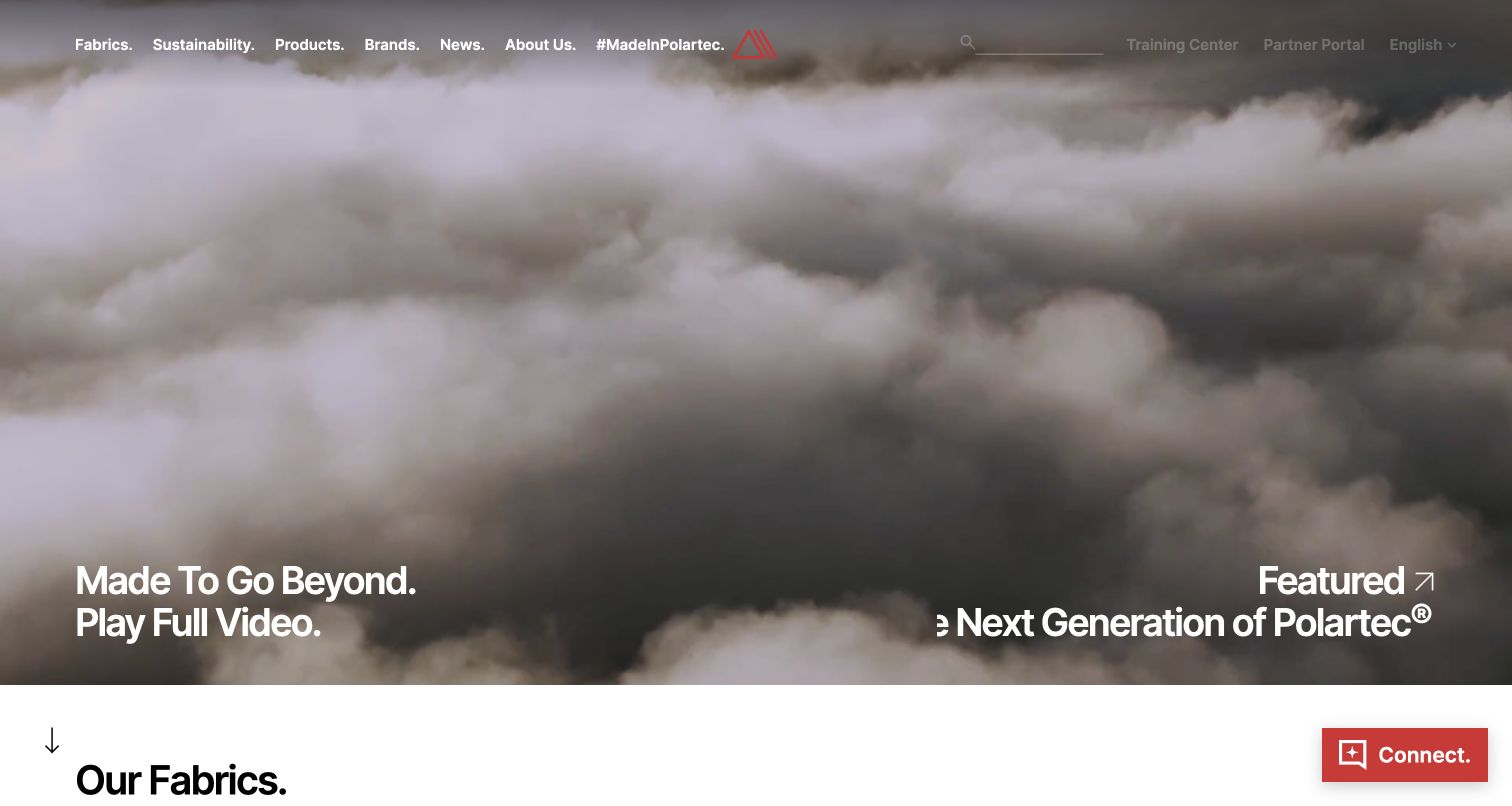
Polartec introduces an outdoor-material campaign through moving imagery and a large feature title. Fabrics, sustainability, products, partner brands, and news remain explicit header destinations, while the fabric collection begins below. A Vite-related public artifact was observed on this website. The visual reference does not independently verify material performance, environmental claims, or the systems used by manufacturing partners.
What you can learn
Create fixtures that connect the visual feature to actual fabric records, documentation, and qualified technical claims. Test a direct specification link, an unavailable film, and a long material name before release. Keep campaign media replaceable without altering the underlying product taxonomy. Assign an appropriate reviewer to performance and sustainability statements so a repeatable frontend build does not turn unsupported copy into an apparently authoritative technical resource.
Pros
The permanent navigation connects the campaign to concrete material and partner categories.
A transition into the fabric range gives the opening a useful continuation.
Cons & considerations
Media-led presentation needs readable technical detail and a non-moving alternative.
Material and sustainability topics need specific supporting records rather than relying on the emotion of outdoor footage.
Choose the application model before the build configuration
Use a focused static or multipage approach when it fits
For content with limited runtime interaction, define the page output, navigation, content source, and update process clearly. A small amount of client code may be enough. Include nested URLs and asset locations in the hosting brief instead of building only a polished root page.
Build a client application for a genuine interactive task
If the visitor needs a workspace, a complex configurator, or changing application state, plan routes, session boundaries, errors, and recovery together. Keep public explanatory content distinguishable from the authenticated product. Decide how a direct link to a deep screen reaches the intended destination.
Use an integrated rendering framework for its actual responsibilities
A framework can add routing, rendering, content, and deployment conventions around tooling. Evaluate those responsibilities and the team’s ability to maintain them. Record which framework or adapter owns the production runtime so an operator is not handed an unexplained folder of compiled files.
From references to requirements
Prepare a production brief that survives the first redesign
Define a reproducible release
Record the supported toolchain, dependency lockfile, build command, artifact, and required configuration. Validate the production output with representative content and keep a working release available for recovery. Distinguish a temporary preview from an environment that receives real visitor requests.
Test routes and asset paths under the real deployment prefix
A website hosted below a path prefix has different URL requirements from a root-domain deployment. Exercise direct entry, refresh, internal links, and dynamically loaded assets at the intended location. Vite documents the base-path setting and asset rewriting; test your actual application rather than assuming every constructed URL is rewritten automatically.
Identify which configuration is public browser input and which belongs only to protected server processes. Keep credentials out of frontend artifacts. For content from a CMS or API, document preview, schema changes, request failures, and the team responsible when content and frontend releases no longer agree.
A useful handover demonstration
Ask the actual team to carry out its routine job: publish a realistic update, correct a mistake, preview a narrow screen, and identify who owns an integration failure. For a library or frontend framework, also ask who maintains the content source and deployment. A polished screenshot does not answer those operational questions.
Beyond the screenshot
Vite website production checklist
Record the framework, content source, production runtime, and build responsibilities separately.
Build from the approved dependency lockfile and validate the actual output.
Test root and deep routes through navigation, direct entry, refresh, and back.
Check asset URLs under the intended domain and deployment prefix.
Review browser-delivered configuration and exclude server credentials.
Exercise slow data, failed requests, and old tabs surviving a new release.
Review content, metadata, keyboard access, motion, and responsive media in production mode.
Document content updates, deployment ownership, diagnostics, and rollback.
Test with real content, a keyboard, a small screen, slow or failed requests, and the people who will maintain the system. These are planning checks, not an accessibility, security, performance, or search-ranking certification.
Sources & editorial method
How this Vite collection was reviewed
The examples use supported public Vite build references recorded on the named source property. A marker may identify one delivered bundle or a portion of a larger system. It does not establish a complete toolchain, framework version, internal application architecture, or AI authorship. Actual captures and primary documentation are kept separate from original planning advice.
Every image is an unmodified capture from the actual website, with its source and capture date. Some captures are reused from our shared catalog; their dates remain the original capture dates. None comes from a vendor gallery or a generated reconstruction. Moving imagery and live content can change.
Technology attribution uses public page assets or metadata, official platform documentation, or a cited first-party project case study. Documentary and framework-relationship evidence is identified where used; it is not a complete current backend inventory. A CMS image CDN alone does not establish a full CMS deployment. A library’s presence does not prove which individual controls use it, and a platform label does not establish AI authorship.
The composition notes, lessons, pros and tradeoffs are original editorial observations. We have not measured conversion, traffic, security, performance or accessibility conformance. Website owners retain their brands and imagery; these examples are not our client portfolio. Written, Edited and Curated are independent records, not dates advanced by a build. See our editorial standards or suggest a correction.
Questions worth asking
Vite website development FAQs
Is Vite a CMS or a hosting service?
No. It is build tooling that can be used within different website and application setups. Content management, production hosting, and runtime behavior need their own implementation and ownership decisions.
Does a Vite signal prove a site uses React?
No. Look for separate framework evidence. The guide does not promote an ordinary tooling relationship into proof of every library or rendering choice.
Can we deploy the local development server?
Use the production deployment process appropriate to the framework and hosting environment. Treat development and preview workflows as different from serving the public application, and test the built output before launch.
Does Vite mean the website was created by AI?
No. Vite is used in both human-led and AI-assisted workflows. Tooling alone cannot identify who wrote or reviewed a website’s code.