WordPress does not have a single look. A quiet architecture portfolio, an expressive artist's site, and a busy newsroom can use the same publishing platform while solving very different design problems.
This collection brings together 22 examples with screenshots, original observations, practical lessons, and pros and cons. The point is not to find a theme that imitates a famous website. It is to understand the decisions worth borrowing: the way work is organized, the hierarchy of a story, the balance between atmosphere and utility, and the structure that makes updates manageable.
A note on the images: All 22 screenshots were captured directly from the actual websites on November 1, 2026—not copied from WordPress Showcase. Each image links to its source page. Live content and moving imagery can change; the date identifies the capture, not when the design launched.
Before the examples
What makes good WordPress website development in 2026?
The public page and the editing experience are two halves of the same design. A beautiful homepage is not enough if the next project, location, or article is difficult to publish. Likewise, a flexible editor is not helpful if its output gives visitors no clear place to start. Look for a system that supports both jobs.
A clear content model
Projects, services, people, articles, products, and locations are not interchangeable. Decide which information belongs to each, what should be reusable, and which relationships matter. A project might appear on a service page and in an archive without needing two separately maintained descriptions. Build the structure before adding a large number of visual options.
A hierarchy that survives real content
Try a long title, an imperfect photo crop, a missing optional image, and an old article without all the new fields. The layout should still make sense. A good system tells editors what a component is for and handles normal variation without asking them to adjust spacing, colors, and type sizes every time they publish.
Editing freedom with useful boundaries
WordPress's templates define page structures, while patterns can package repeatable groups of blocks. Neither automatically guarantees a good editing experience. Use them to encode decisions your team should not have to remake, while leaving room for the content that actually needs to vary.
A dependable visitor journey
Navigation, search, forms, booking links, and product details need as much attention as the opening screen. The right design helps someone understand where they are, find the relevant evidence, and take a useful next step. A cinematic portfolio and a public information library will need different journeys, even if they share a CMS.
The collection · 22 examples
22 WordPress websites worth studying
Start with five recognizable organizations: NASA, Rolling Stone, Disney Experiences, Meta Newsroom, and The Harvard Gazette. Then compare smaller studios, publishers, and cultural sites for ideas you can adapt. This is a reading sequence, not a measured ranking. The pros describe useful patterns; the considerations explain the tradeoffs. None of these websites is presented as our client work.
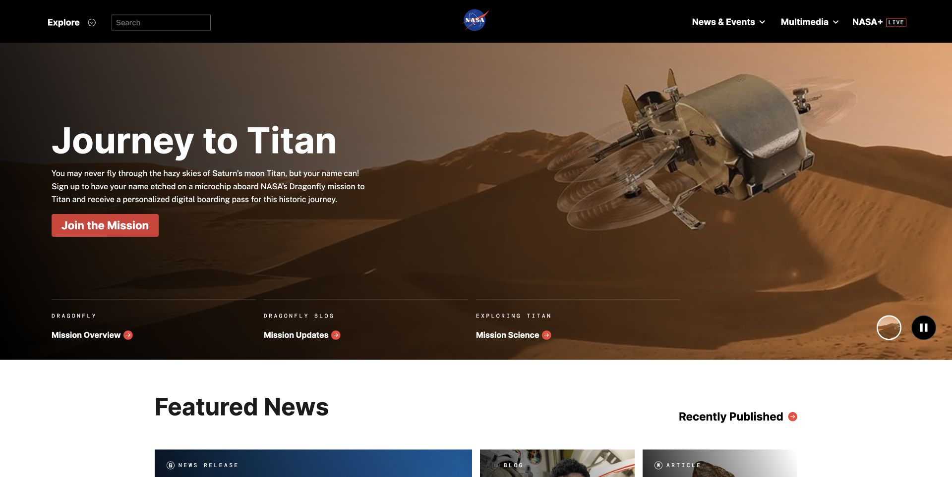
NASA's current homepage leads with Journey to Titan and a large Dragonfly mission visual, while search and Explore provide routes beyond that featured story. The quieter Featured News area begins immediately below. The development lesson is not simply to make one impressive campaign page: it is to let a changing editorial lead coexist with dependable access to a large public information library.
What you can learn
Separate the job of the homepage from the job of the archive. An editor should be able to promote an important story without changing how visitors find evergreen topics. Model stories, destinations, and supporting media as reusable content, then decide which small collection of those records belongs on the front page.
Pros
Visible search and a broad exploration route offer alternatives to following the featured editorial story.
The strong lead image and quieter news section create a recognizable change in emphasis as the page continues.
Cons & considerations
This level of content breadth needs a real taxonomy and editorial ownership; a large menu alone cannot organize an archive.
Layered text, imagery, and video controls need testing with changing content, small screens, and reduced-motion preferences.
Visible tech stack
WordPress
Platform source: WordPress.org Showcase. Platform evidence is separate from the direct website screenshot and is not a complete current infrastructure audit.
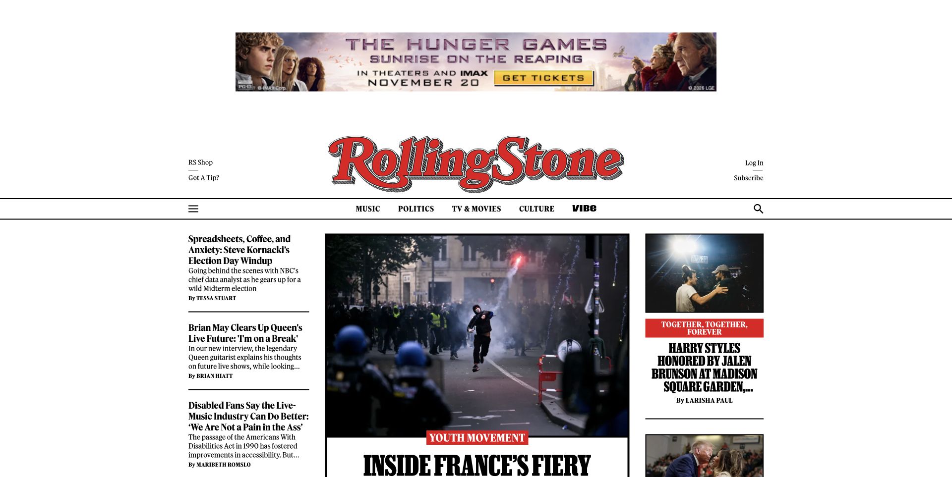
The Rolling Stone reference has an unmistakable masthead, a dominant central feature, and supporting stories in narrower columns. It shows why a publishing CMS is only part of the design: the real system is the repeatable relationship between image, category, headline, summary, and author. The official Showcase identifies WordPress; it does not make this layout an off-the-shelf theme that another publisher can install.
What you can learn
Make the hierarchy work with real editorial edge cases: long headlines, missing images, several authors, breaking stories, and sponsored content. A reusable story card needs more than a perfect demo image and a short sample title. Define the rules for when a story earns the lead position and what happens when it changes.
Pros
A clear lead story has more visual weight than supporting coverage, so readers do not have to interpret equal-sized cards.
The masthead and typographic hierarchy preserve a publication identity across a content-heavy page.
Cons & considerations
A three-column news layout is demanding on small screens and needs an explicit sequence of story priority.
Subscriptions, advertising, and recommendations can compete with reading; their behavior needs to be evaluated separately from the screenshot.
Visible tech stack
WordPress
Platform source: WordPress.org Showcase. Platform evidence is separate from the direct website screenshot and is not a complete current infrastructure audit.
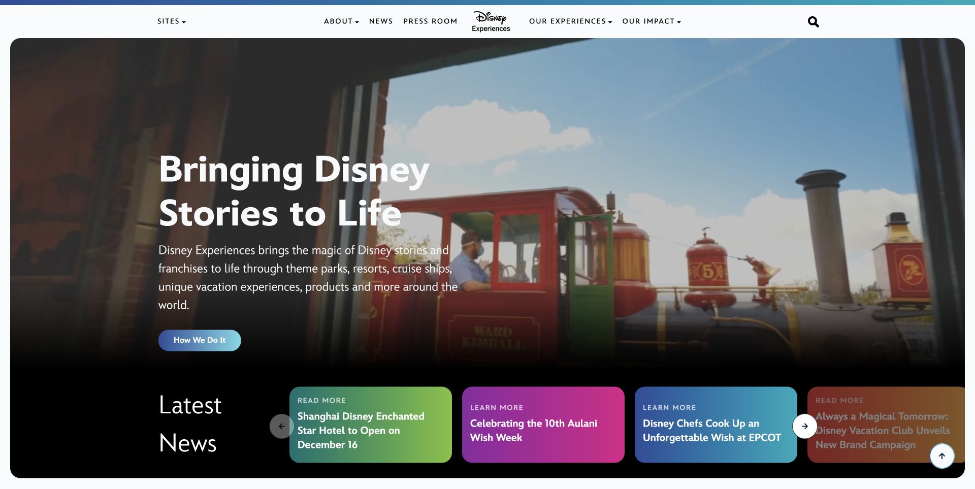
Disney Connect now redirects to Disney Experiences, shown in this live capture. A castle photograph, a simple introduction, and a contrasting strip of news cards connect a broad portfolio to current stories. The current page exposes WordPress core assets; the earlier Disney Connect Showcase listing is a separate historical source. Neither establishes the technology behind every Disney website or product.
What you can learn
Define a common vocabulary of components before handing a large publishing system to several teams. Give each component a clear purpose and sensible constraints, then let the content supply the variation. Consistency is easier to maintain when editors assemble approved patterns instead of reproducing brand rules manually on every page.
Pros
A short introduction gives context to the atmospheric opening rather than asking the photograph to explain the organization alone.
Repeated news cards provide a consistent route from a broad brand introduction to specific current stories.
Cons & considerations
A custom component system needs documentation, ownership, and ongoing testing as both the brand and publishing needs change.
A wide news carousel needs usable controls, sensible keyboard behavior, and a clear small-screen treatment beyond what this capture can verify.
Visible tech stack
WordPress
Platform source: Disney Experiences (current WordPress assets). Platform evidence is separate from the direct website screenshot and is not a complete current infrastructure audit.
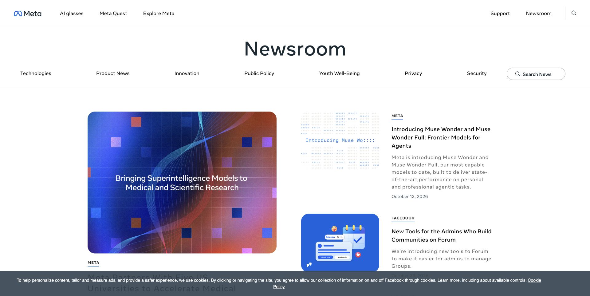
Meta Newsroom's reference groups a large lead story with smaller updates carrying product labels, summaries, and dates. The hierarchy is relatively quiet, letting each story's image provide its color. The platform attribution here applies to the cited newsroom property, not Facebook, Instagram, or every Meta product. That distinction matters whenever a technology roundup uses a large company's name as shorthand for a particular publishing site.
What you can learn
Keep product, subject, publication date, and story format as structured information. Those fields can support filtering and consistent cards without asking editors to recreate labels in body copy. Separate time-sensitive announcements from evergreen reference information so a useful resource does not disappear solely because newer news has arrived.
Pros
Dates, summaries, and product labels allow readers to assess relevance before opening a story.
A larger lead and smaller supporting entries create hierarchy without giving every update a separate visual identity.
Cons & considerations
A corporate product taxonomy can be difficult for unfamiliar visitors; human-readable topics may also be necessary.
Newsroom technology should not be generalized to a company's apps, store, or entire infrastructure.
Visible tech stack
WordPress
Platform source: WordPress.org Showcase. Platform evidence is separate from the direct website screenshot and is not a complete current infrastructure audit.
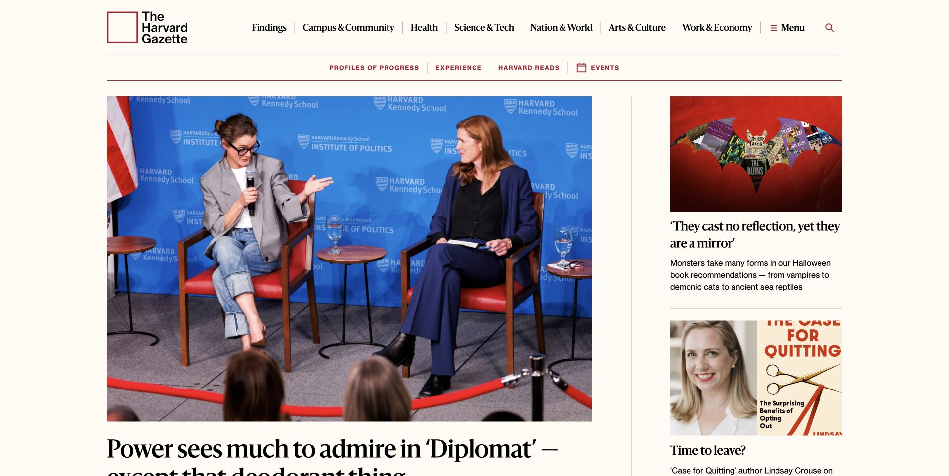
The Harvard Gazette reference pairs a large lead story with smaller supporting stories, restrained red rules, and explicit subject labels. It feels like one publication even though the content spans many topics. WordPress.org documents its use of custom blocks and patterns; the useful lesson is not to recreate its exact block count, but to give editors a shared visual vocabulary.
What you can learn
Create a handful of story-card and article-header patterns that handle genuinely different editorial jobs. Make the relationship between a lead, a supporting story, a category, and a series clear. Editors should choose the emphasis appropriate to the story rather than rebuild the publication's hierarchy from scratch on every page.
Pros
Distinct story sizes communicate editorial priority without assigning every card an equally loud visual treatment.
Category labels, summaries, and consistent type styles give readers useful context before they open an article.
Cons & considerations
A dense topic navigation can overwhelm a smaller publication that does not have enough material in each section.
Custom editorial components need documentation and ongoing ownership; otherwise small exceptions can erode consistency.
Visible tech stack
WordPress
Platform source: WordPress.org Showcase. Platform evidence is separate from the direct website screenshot and is not a complete current infrastructure audit.
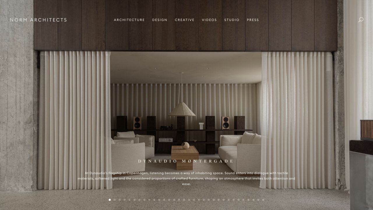
Norm Architects is a useful antidote to the idea that choosing WordPress means accepting a recognizable template aesthetic. The reference view gives carefully selected photography room to establish a mood, with the interface kept secondary. The visible Divi theme-family paths tell us something about the implementation, but the visual identity comes from the images, proportions, and editing decisions—not the name of the builder.
What you can learn
Write the content rules before choosing a page builder. Decide how many projects belong on the opening page, what each needs to say, and which image crops are acceptable. Consistent restraint is easier to maintain when editors have a small set of deliberate options rather than unlimited styling controls.
Pros
A restrained presentation gives the project photography a clear role instead of competing with decorative interface elements.
The example demonstrates that a theme or builder family does not dictate a single finished visual identity.
Cons & considerations
A photography-led design depends on a strong, consistently prepared image library; weak crops become conspicuous.
A quiet interface still needs explicit project labels and a discoverable contact route, especially for visitors unfamiliar with the practice.
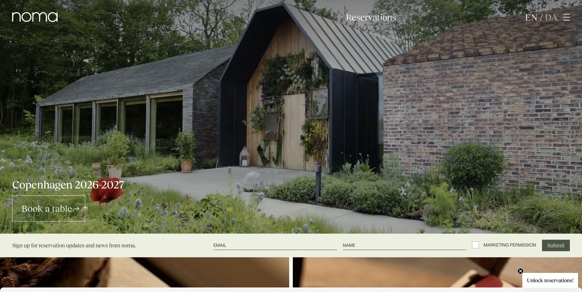
Noma's reference opens on the restaurant environment rather than a generic collection of food cards. The photograph carries much of the identity, while a seasonal introduction and reservations route give it a practical purpose. The WordPress lesson is that a homepage can be editorially distinctive without making every section a new component. Photography, seasonal copy, and a dependable action can do most of the work.
What you can learn
Treat the seasonal message, hero image, booking destination, and supporting links as separate pieces of content. A restaurant team should be able to replace a seasonal campaign without accidentally losing its reservation link or changing the site-wide navigation. Always check what remains useful when a visitor does not read the whole opening.
Pros
The environment photograph communicates the character of the experience before the visitor starts reading.
A recognizable reservations action gives the atmospheric opening a concrete destination rather than leaving it as a moodboard.
Cons & considerations
White text over photography needs a contrast check for every replacement image, not just the original design.
Seasonal wording and booking availability can age quickly; the site needs an owner for time-sensitive content.
Visible tech stack
WordPress
Platform source: WordPress.org Showcase. Platform evidence is separate from the direct website screenshot and is not a complete current infrastructure audit.
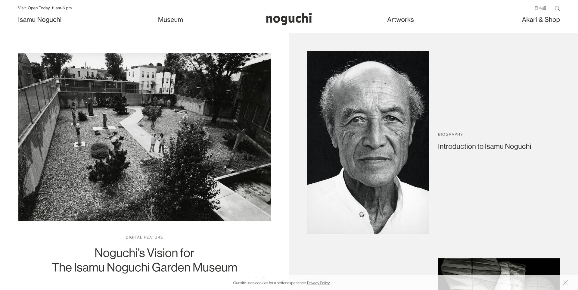
The Noguchi Museum reference balances an evocative view of the space with biography and collection material. Its header separates the artist, the museum, artworks, and the shop, while an operational status line answers a more immediate question. This is useful inspiration for WordPress sites that need to support both leisurely discovery and a practical visit, rather than making those audiences share one undifferentiated feed.
What you can learn
Keep operational facts in a reusable place instead of repeating them manually in decorative sections. Then build editorial pages around the collection and the institution's story. A visitor looking for opening information should not have to decode the same immersive experience as someone researching an artist's life.
Pros
Named routes separate institutional, collection, and shopping tasks before the reader enters the deeper content.
Large images and generous space let the artwork and museum environment provide the visual identity.
Cons & considerations
A split editorial composition needs a considered mobile reading order rather than simply shrinking both columns.
Hours and closure messages are operational content and require a reliable update process independent of editorial publishing.
Visible tech stack
WordPress
Platform source: WordPress.org Showcase. Platform evidence is separate from the direct website screenshot and is not a complete current infrastructure audit.
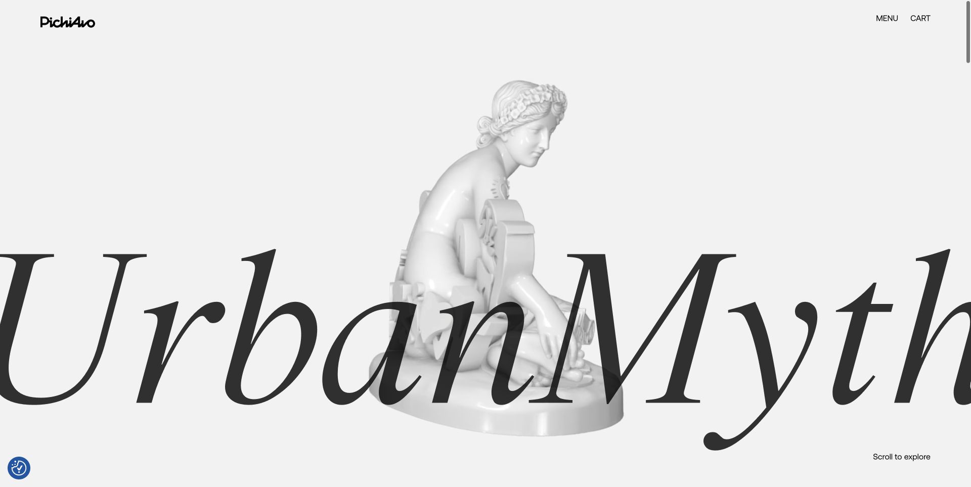
PichiAvo's current opening sets oversized UrbanMyth lettering against a pale sculptural figure and an unusually restrained background. The small logo, menu, and cart leave most of the screen to that artistic statement. The contrast between monumental type and sculpture creates the identity; the screenshot does not establish the animation implementation or a particular plugin. Borrow the relationship between the work and the interface, not an assumed tool list.
What you can learn
Separate brand expression from essential tasks. An optional playful interaction can reinforce an artist's identity, while work details, enquiries, and purchasing still need conventional routes. Build a useful static version first; extra movement should enrich that version rather than become the only way to understand or navigate it.
Pros
The opening connects the site's visual treatment to the artists' work rather than applying an unrelated template personality.
A small number of utility controls avoids making the whole interface compete with the artwork.
Cons & considerations
Large moving or overlapping type may be harder to read on small screens and needs deliberate alternative states.
Interactive embellishments require keyboard, touch, and reduced-motion testing beyond what a reference screenshot can demonstrate.
Visible tech stack
WordPress
Platform source: WordPress.org Showcase. Platform evidence is separate from the direct website screenshot and is not a complete current infrastructure audit.
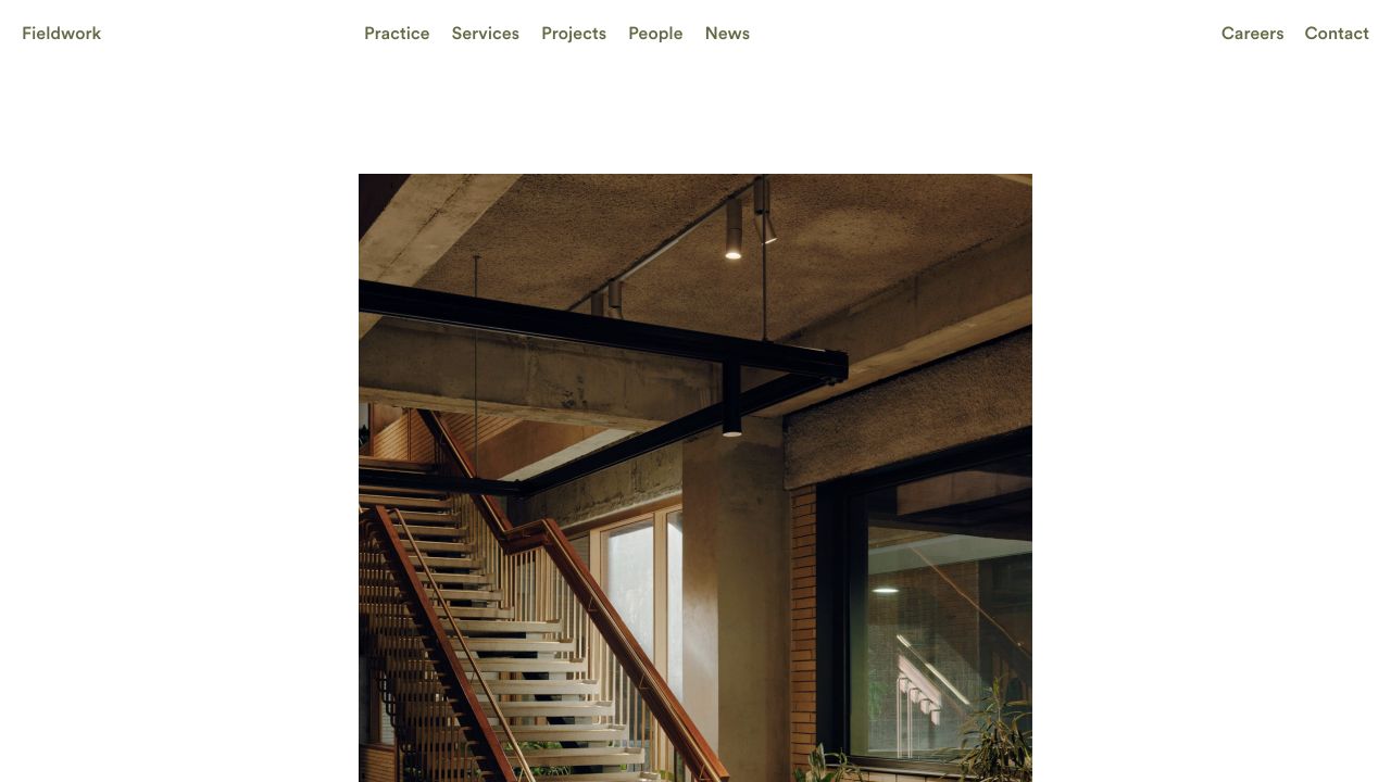
Fieldwork makes a useful WordPress reference for a business whose website must explain an approach as well as show finished work. The existing architecture review records a direct WordPress generator and a named EMPATHY theme path. That named directory should not be confused with a theme recommendation: it tells us about the implementation, not whether a reader can buy the same design or editing system.
What you can learn
Turn the service explanation and project archive into connected content. A service page should be able to draw from relevant project records, while each project can explain the role the practice played. Editors then maintain the work once instead of copying a short version into several unrelated pages.
Pros
A clear service route helps visitors connect the practice's visual work to the kind of help they need.
The site is a useful example of a branded professional-services presence rather than a generic WordPress blog.
Cons & considerations
A named theme path does not reveal the quality or flexibility of the editing experience behind the public pages.
Service and project relationships become less useful if categories are overly broad or assigned inconsistently.
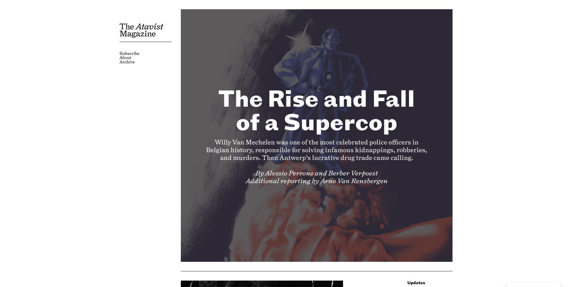
The Atavist Magazine reference gives one story the room usually reserved for a whole homepage campaign. Its illustration, headline, introductory text, and byline form a deliberate cover, while the publication's navigation stays compact. This is a valuable contrast to card-heavy WordPress inspiration: a publishing system can support slower, more focused storytelling rather than continuously adding more competing article links.
What you can learn
Build a dependable article foundation, then allow a limited number of expressive openings. Reading width, body typography, image captions, credits, and navigation should remain consistent even when a story has its own visual direction. The editor needs room to tell the story without becoming responsible for rebuilding the site's basic reading behavior.
Pros
One dominant narrative invitation creates a clear starting point instead of distributing attention across many equal teasers.
The visible byline and short introduction establish the story as editorial work rather than a purely decorative image.
Cons & considerations
Story-specific art direction adds production effort and is not a realistic expectation for every routine update.
An understated archive route may need more emphasis for repeat readers seeking a particular earlier story.
Visible tech stack
WordPress
Platform source: WordPress.org Showcase. Platform evidence is separate from the direct website screenshot and is not a complete current infrastructure audit.
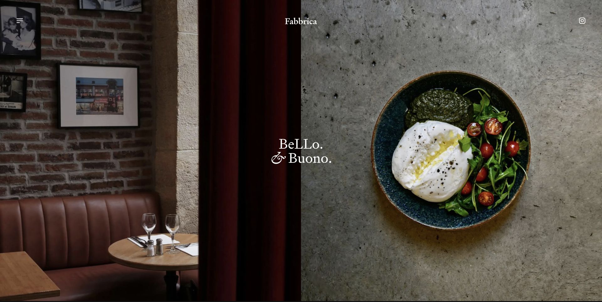
Fabbrica's reference pairs a photograph of the dining room with a close view of the food. The effect is specific to the business: it communicates the setting and the experience without filling the opening with a long marketing paragraph. Its restrained controls and short statement make this an approachable example of how custom visual direction can matter more than the number of homepage sections.
What you can learn
Give each image a job. One can explain the space, another the product, and a third the people or service. In WordPress, create an editing pattern that preserves those roles when photos change. Do not turn every image slot into a generic upload field with no guidance about crop, subject, or accompanying text.
Pros
Two complementary photographs introduce the environment and the food instead of repeating nearly identical hero imagery.
The simple composition gives the restaurant a distinctive character with relatively little interface decoration.
Cons & considerations
An atmospheric opening should still lead quickly to locations, menus, and reservations for visitors ready to act.
Split-image layouts can lose their balance when one replacement photo is much brighter or more detailed than the other.
Visible tech stack
WordPress
Platform source: WordPress.org Showcase. Platform evidence is separate from the direct website screenshot and is not a complete current infrastructure audit.
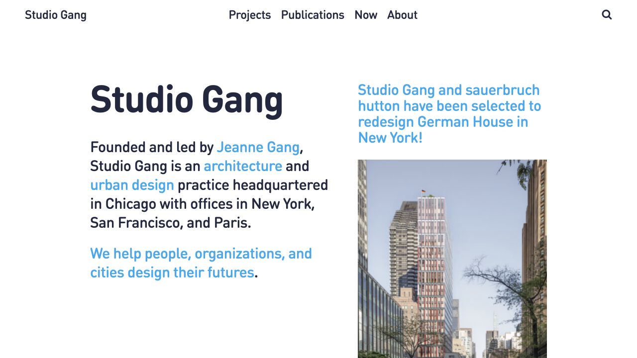
Studio Gang's reviewed homepage brings the practice's position, its projects, and its wider publishing activity into one narrative. WordPress core and theme paths provide direct platform evidence, with a Vimeo player integration also visible. The lesson for development is a content-model one: projects, people, publications, and news deserve their own structures even when a homepage brings them together visually.
What you can learn
Do not store every kind of content as a loosely formatted page just because the CMS allows it. Define what makes a project different from a news item or publication, then design ways to relate them. This makes a story-led homepage easier to update without turning the archive into a collection of inconsistent page layouts.
Pros
The practice is explained in language rather than leaving visitors to infer its purpose from photography alone.
Distinct publishing and project routes support both narrative exploration and more targeted research.
Cons & considerations
Long narrative sequences need a direct alternative for visitors who arrive looking for one known project.
Combining multiple content types on the homepage requires deliberate editorial choices to avoid a confused chronological feed.
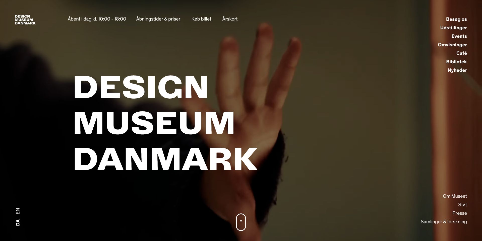
Designmuseum Danmark's reference puts a large typographic identity over a rich image while keeping opening information and ticket-related utilities near the top. The main subject routes remain visible on the right. WordPress.org also documents a WooCommerce ticketing integration. That source is evidence for the documented reference, not a test of the museum's current checkout or a recommendation to copy its commerce setup unchanged.
What you can learn
Design the essential visit information as part of the system, not as a late addition around an impressive hero. Tickets, opening times, language choices, exhibitions, and shop content have different owners and update cycles. Make those responsibilities explicit before connecting the CMS to any booking or commerce workflow.
Pros
Practical utilities sit alongside the visual identity instead of disappearing until the footer.
The bold type and exhibition imagery communicate an institution with a strong design perspective.
Cons & considerations
A long edge-aligned navigation needs a different, equally clear treatment on narrow screens.
Ticketing and commerce introduce operational and support requirements that a visual design review does not verify.
Platform source: WordPress.org Showcase. Platform evidence is separate from the direct website screenshot and is not a complete current infrastructure audit.
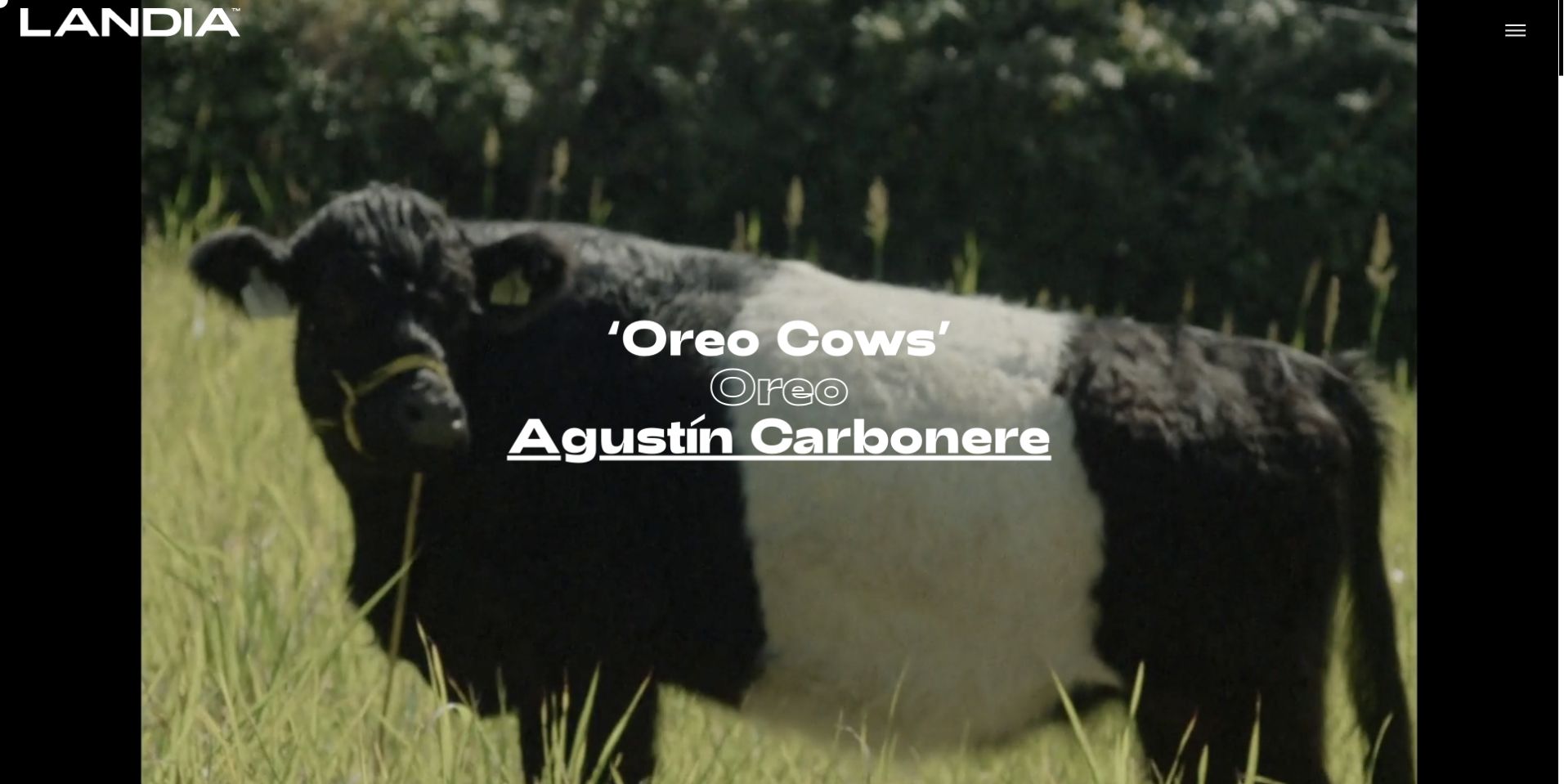
Landia's current US homepage opens with an edge-to-edge film scene and centered project, client, and director labels. The large wordmark and small menu leave the production itself in charge of the visual identity. This is a reminder that WordPress is not limited to article grids: a body of work and its credits can support a cinematic presentation. The captured frame shows the composition, not measured playback performance or motion accessibility.
What you can learn
Model each production as content with a title, client, credits, poster, and media destination. A designer can then change how that work is presented without rebuilding the archive. Provide a useful poster and text label before video starts, and keep the project route understandable when playback is unavailable.
Pros
Short project and client labels add useful context without competing heavily with the film imagery.
Repeated large work panels give the portfolio a coherent structure despite variation between individual productions.
Cons & considerations
Video-first presentation can be expensive in data and attention; loading and playback behavior need separate testing.
A minimal interface should still give someone seeking a director or office a quick route rather than requiring a long visual browse.
Visible tech stack
WordPress
Platform source: WordPress.org Showcase. Platform evidence is separate from the direct website screenshot and is not a complete current infrastructure audit.
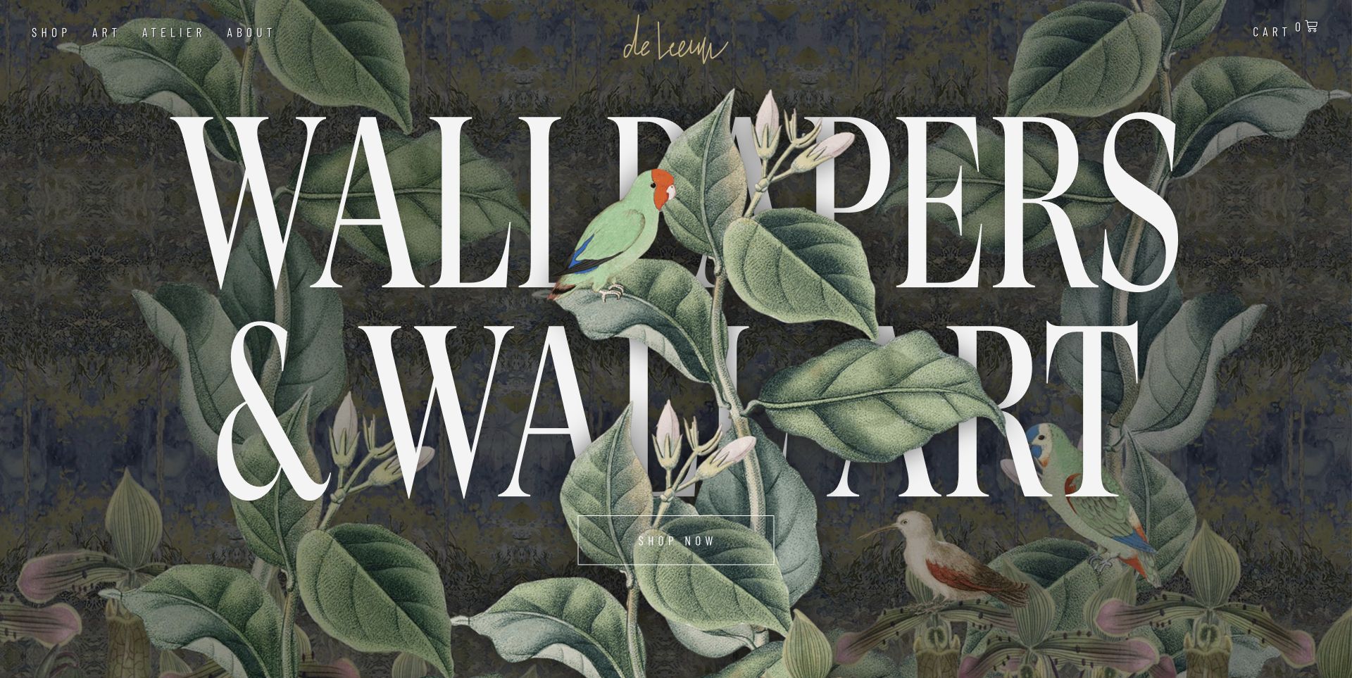
Steffie de Leeuw's reference makes the artwork the interface's visual foundation: botanical imagery, large lettering, and a direct shop route are layered into a strong opening. It is useful inspiration for a WordPress project that combines an artist's story with commercial content. The reference does not establish a particular commerce plugin, so no checkout platform is inferred from the visible cart or shop wording.
What you can learn
Keep the relationship between art and product clear. Visitors may want to discover the artist, examine the work, or buy a specific item. Those journeys can share a visual identity without sharing identical page structures. Design product information and purchasing states as carefully as the immersive introductory composition.
Pros
The artwork creates an immediate, distinctive identity instead of being confined to small thumbnails inside a generic layout.
Visible Art, Atelier, About, and Shop routes distinguish discovery from purchasing.
Cons & considerations
Large type layered with intricate artwork needs careful contrast and crop decisions across screen sizes.
A compelling hero cannot substitute for usable product details, delivery information, and a well-tested purchase journey.
Visible tech stack
WordPress
Platform source: WordPress.org Showcase. Platform evidence is separate from the direct website screenshot and is not a complete current infrastructure audit.
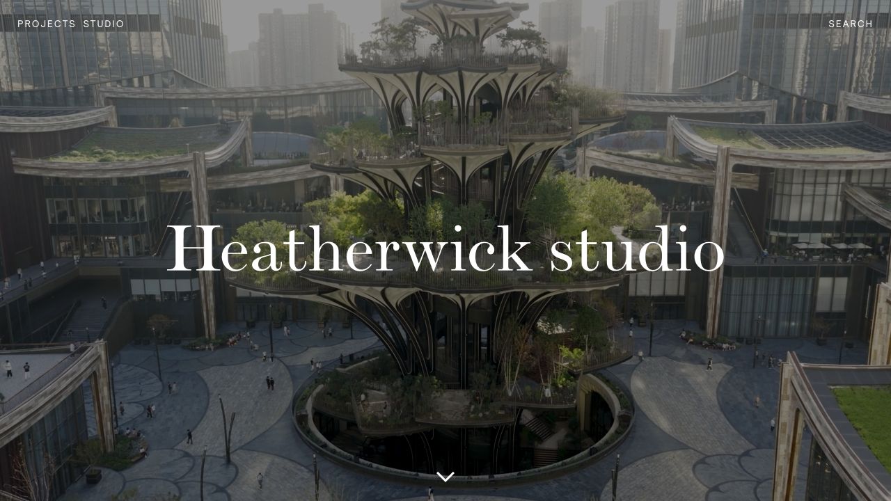
Heatherwick Studio's architecture review records WordPress theme and API paths alongside Swiper and AOS asset references. The public-facing lesson is more important than that library list: a plain-language design position can connect very different kinds of work. An implementation should let editors make those connections deliberately instead of relying on an automatically sorted grid to explain the whole organization.
What you can learn
Build relationships between an idea and the projects that demonstrate it. A topic or principle can then have a curated set of examples without duplicating the underlying records. Keep any carousel or animated layer optional to the explanation; a visitor should still reach the same work through a straightforward archive.
Pros
A clear design position gives context to a broad body of work rather than expecting photographs to explain it alone.
Separating work types from studio information creates a useful distinction between evidence and organizational background.
Cons & considerations
A broad menu takes ongoing editorial maintenance and should not be copied by a business with only a few pages.
Visible animation-library assets do not establish the quality of the motion experience or its reduced-motion alternatives.
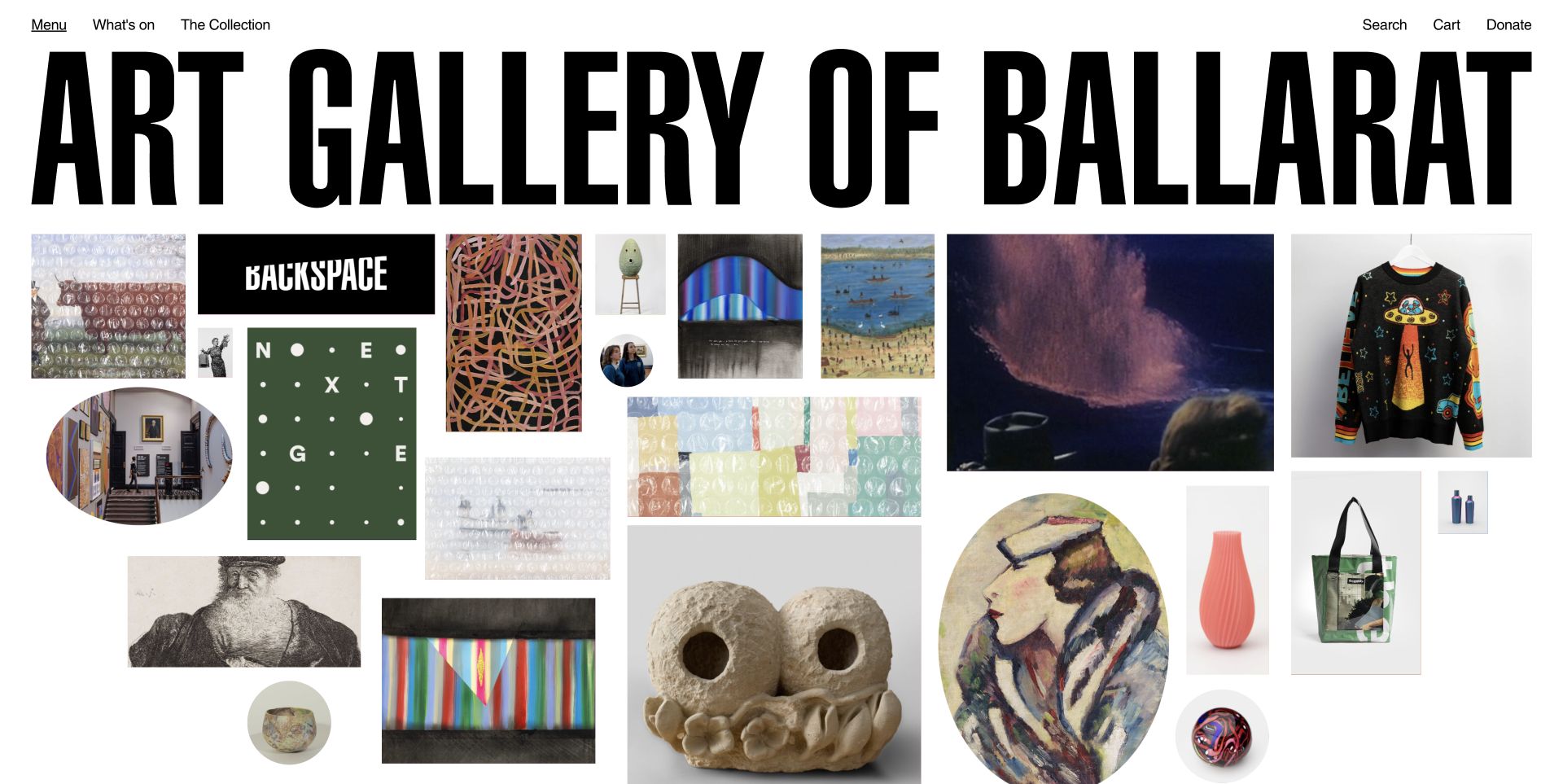
The Art Gallery of Ballarat reference uses a large wordmark above an irregular wall of artwork, objects, portraits, and activities. The variety is the point: the opening feels like a collection to explore rather than a conventional sequence of promotional cards. The official Showcase describes title cards on hover; that makes the example especially useful for thinking about equivalent information on touch and keyboard interfaces.
What you can learn
Do not confuse visual variety with unstructured content. Each tile still needs a meaningful label, destination, image description, and relationship to a collection or event. A WordPress content model can provide that consistency even when the front-end arrangement is intentionally playful. Decide the non-hover interaction before committing to a desktop-only visual treatment.
Pros
The varied visual field conveys the breadth of the collection without reducing every object to the same crop.
Basic search, donation, and visiting information provide practical counterpoints to the exploratory presentation.
Cons & considerations
Small irregular tiles need a deliberate mobile alternative and sufficiently usable interaction targets.
Information revealed only by hover would need equivalent focus and touch behavior; a screenshot does not confirm that behavior.
Visible tech stack
WordPress
Platform source: WordPress.org Showcase. Platform evidence is separate from the direct website screenshot and is not a complete current infrastructure audit.
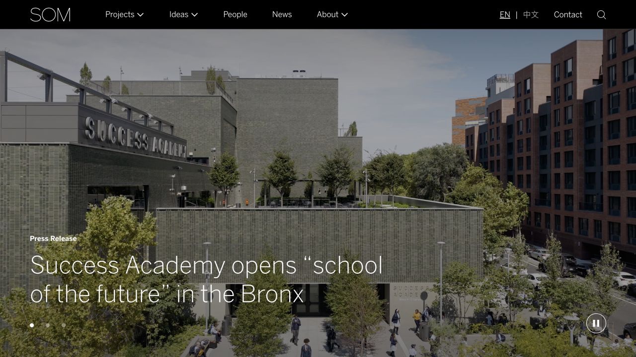
SOM's reviewed public page exposes WordPress core, API, and named theme paths, with a WP Engine response signal. Its relevance here is the scale of the publishing problem: projects and practice information need more organization than a small brochure site. Seeing a large institution use WordPress is not a reason to copy its full information architecture; it is a reason to plan content relationships before designing filters.
What you can learn
Start with the questions an archive must answer. Which projects belong to a service, place, or type? Which fields need a controlled vocabulary, and which need editorial writing? Build the smallest consistent model that supports those questions. A filter only becomes useful when the underlying records are complete and consistently categorized.
Pros
The example broadens WordPress inspiration beyond small blogs and simple single-service business pages.
A structured project archive can give different audiences routes into the same maintained body of work.
Cons & considerations
A sophisticated archive needs accurate content operations; adding filter controls does not fix inconsistent records.
Public hosting and plugin signals do not prove search quality, response speed, or the internal editorial workflow.
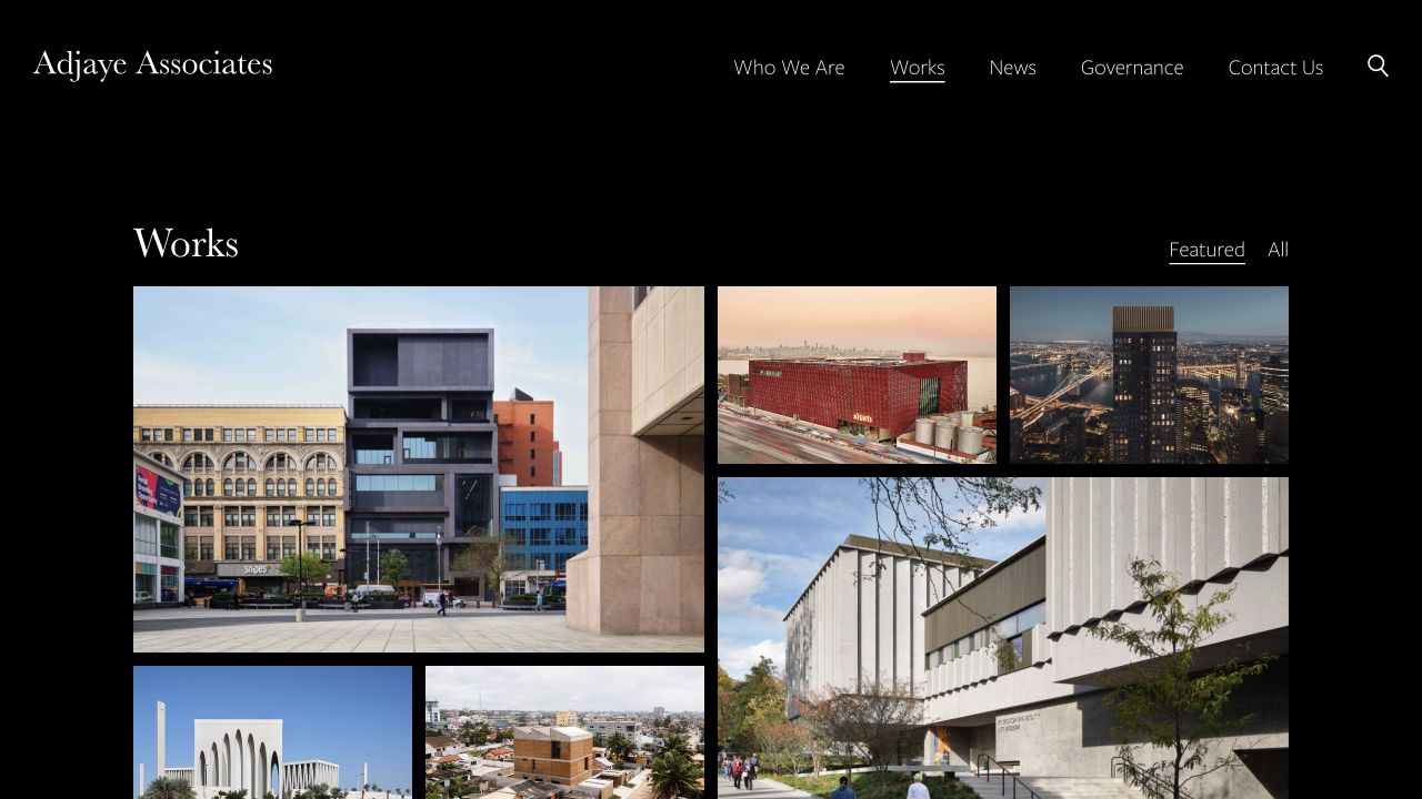
Adjaye Associates provides another directly evidenced WordPress implementation, with theme and core block-library asset paths visible in the reviewed page. The important distinction is between the publishing platform and the visual system built on it. A named theme directory is not proof of a commercially available theme, and it does not reveal how much editorial freedom, maintenance effort, or custom development the finished site requires.
What you can learn
When using a portfolio as a development reference, describe the behaviors you want rather than asking for its theme. Specify project facts, image sequencing, archive labels, and editing responsibilities. Those requirements are useful to a developer; an unsupported guess about a theme's commercial name is not.
Pros
The project-led format gives a practice a way to demonstrate its identity through actual work rather than stock promotional imagery.
Direct WordPress asset evidence makes this a more grounded platform example than a visual guess based on appearance.
Cons & considerations
A visual reference cannot tell you whether the content model or editing interface would suit your own team.
A portfolio with varied commissions needs enough descriptive context for prospective clients to identify the most relevant work.
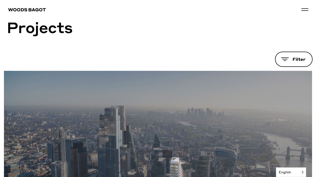
Woods Bagot's reviewed implementation includes WordPress core and theme paths alongside Vimeo embeds. It is a useful reminder that a project website may need to publish both durable case studies and richer media without making them the same content type. The CMS choice does not remove the need to decide when a film explains something more effectively than an image, caption, or short written account.
What you can learn
Give media a clear editorial purpose and a fallback. Store poster images, captions, credits, and supporting project text alongside video destinations. An editor should be able to add a film without leaving a blank or confusing section when the embed is unavailable, blocked, or not appropriate to play in the visitor's setting.
Pros
Project material and richer media can share an identifiable practice-wide presentation rather than becoming disconnected microsites.
The visible platform evidence supports a specific WordPress attribution without guessing at the complete infrastructure.
Cons & considerations
Third-party video adds playback, privacy, loading, and accessibility considerations beyond the CMS itself.
A large-practice structure needs careful prioritization so the most relevant work does not disappear inside organizational complexity.
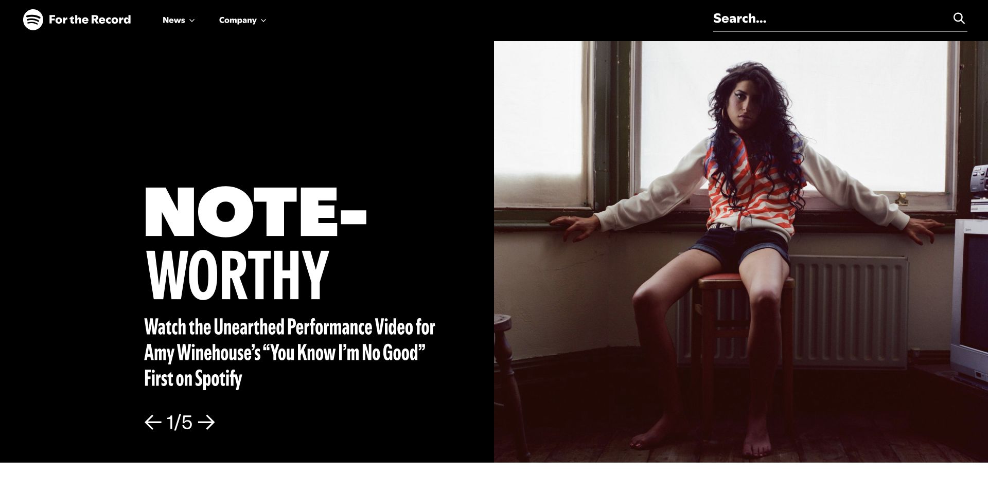
Spotify's For the Record homepage pairs an oversized editorial headline with a large artist photograph against a black opening panel. Compact News and Company menus share the header with prominent search, while a numbered carousel identifies the featured story's position. The contrast with the smaller stories below is useful to study: one publishing system can give a lead real emphasis without making every announcement into a competing campaign.
What you can learn
Treat featured placement as an editorial decision separate from the underlying article record. A team should be able to promote a story, replace its artwork, and move it back into the archive without rebuilding either page. Keep categories and search useful for repeat visitors who want a known announcement rather than the current cover story.
Pros
The split composition gives one story visual priority while retaining a recognizable publication identity.
Visible search and compact topic routes provide alternatives to browsing the featured carousel.
Cons & considerations
A carousel can hide later stories; controls, focus handling, and a usable non-moving reading path need separate testing.
Very large display type requires careful handling of long headlines and narrow-screen crops.
Visible tech stack
WordPress
Platform source: WordPress.org Showcase. Platform evidence is separate from the direct website screenshot and is not a complete current infrastructure audit.
These examples do not imply that every business needs custom development. Choose the simplest approach that supports your real content, editing team, and maintenance capacity. Before comparing options, ask someone to demonstrate how a normal editor would publish a complete page with your actual material.
A supported theme for a focused site
A well-chosen theme can suit a straightforward business site, publication, or portfolio. Evaluate the templates you will actually use: service, project, article, search, and contact. Check whether the design still works when the demo images and short sample titles are replaced. A theme is a starting system, not a substitute for content preparation.
A block-based build for a reusable design system
A block-based approach can give editors a consistent set of compositions without making every page identical. Define recurring patterns such as a project introduction, a service-and-proof section, or a story header. Decide which design choices should be fixed, which should be selectable, and which content should be drawn from shared records instead of entered twice.
A page builder when its workflow fits the team
A visual builder can be useful when the people maintaining the site understand its conventions and need that degree of page composition. Test the ordinary maintenance jobs, not just the initial design freedom. Ask how global changes, reusable sections, responsive settings, exports, and a future change of builder will be handled. The Norm Architects example is evidence of a visible builder family, not a claim that choosing that builder recreates its design.
A custom theme for specific requirements
A custom theme can support a distinctive interface or a tightly defined publishing workflow. Its value should be clear in the requirements: a structured archive, reusable relationships, a specific design system, or a complex integration. Ask who owns the source, how updates are tested, and how an unfamiliar developer would maintain it. Custom does not automatically mean faster, more secure, or easier to edit.
A separate frontend only when it solves a real problem
Using WordPress as a content source for a separate frontend can be appropriate for some applications and publishing systems. It also makes previewing, search, forms, routing, and deployment separate design and engineering decisions. Do not add that split solely because a reference site uses an elaborate stack. A conventional WordPress build may be the more understandable and maintainable answer.
The demo worth asking for
Ask the proposed editor to add a real project or article, attach the right categories, replace an image, preview a narrow screen, correct a typo, and publish an update. Then change one global element. That short exercise often reveals more about suitability than a list of installed plugins or a beautiful front-page mockup.
From references to requirements
How to plan your own WordPress website
1. Describe the visitor's task
Write down what a visitor needs to accomplish, not only what the business wants to promote. A homeowner comparing services, a reader seeking an earlier article, and a museum visitor looking for opening times need different paths. Choose a primary journey and identify the pages and facts it depends on.
2. Inventory the content before designing around it
List existing URLs, content types, images, documents, forms, and integrations. Mark what should stay, be combined, be rewritten, or be retired. Record who owns each area and which information changes frequently. If you are migrating a site, preserve the URL inventory so redirects can be planned rather than guessed at launch.
3. Turn three references into specific lessons
A useful brief might ask for Harvard Gazette's clear editorial hierarchy, Noguchi's separation of visitor information from collection exploration, and Fieldwork's connection between services and projects. Explain the relevant behavior, not just the visual similarity. Use your own identity, writing, and licensed images; the example websites are not asset libraries.
4. Define the smallest useful set of templates
Design the content that repeats most often first. For a service business that may be a service page and a case study. For a publisher it may be an article, topic archive, and search results page. Include the awkward states: empty results, missing optional media, long names, form errors, and a genuinely small screen.
5. Make ownership and ongoing cost visible
Separate the one-time build from hosting, paid software, content production, support, and future changes. Record who controls the domain, accounts, source code, licenses, backups, and analytics access. A useful proposal explains how the site will be operated after handover, not only what the launch will look like.
6. Test with the people who will use and edit it
Have someone outside the project try the primary visitor task without a walkthrough. Then have the real editor publish realistic content. Observe where they hesitate or invent a workaround. Those moments are evidence for refining the system before a much larger content migration makes changes more expensive.
Beyond the screenshot
A useful launch is more than an attractive homepage
Check the actual journeys
Follow every important route on a phone and with a keyboard: the menu, search, service information, enquiry form, booking destination, and any checkout. Verify error messages and real delivery of a test enquiry with the site owner's approval. A success message alone does not establish that an email reached the right person.
Review the publishing basics
Check page titles, headings, descriptions, image alternatives, canonical URLs, indexing settings, and redirects. Confirm that staging's privacy settings are not carried into a public launch. WordPress does not guarantee rankings or traffic; a technically sound site still needs relevant content and a reason for someone to choose it.
Assign maintenance, rather than assuming it
WordPress, themes, plugins, hosting, and integrations need an agreed approach to updates, testing, recovery, and access. The official WordPress security handbook is a useful starting point for understanding that responsibility. Keep a tested recovery plan and an owner for renewals and service failures. A list of installed tools is not a maintenance plan.
Revisit the content and the references
Remove outdated claims, review old booking or download links, and check that contact and location information is correct. When using this guide as inspiration, visit the original sites as well: live designs change, and a dated capture records one view rather than promising that the interface will stay the same.
Sources & editorial method
How this WordPress collection was put together
Every screenshot comes from a direct visit to the named website. Platform attribution is a separate check: it uses visible WordPress assets or metadata, or an individual listing in the official WordPress Showcase. Seven examples also appear in our architecture website design guide. The platform sources do not supply the images and are not complete current inventories of plugins, hosting, or backend systems. Disney Connect now redirects to Disney Experiences; the pictured destination exposes current WordPress assets. Major-brand attribution applies only to the named property, not every product belonging to its organization.
The comments on composition, hierarchy, and design tradeoffs are our original editorial observations of the reference views. We have not measured sales, search traffic, accessibility conformance, security, or page speed for these examples. A screenshot does not prove keyboard behavior, editorial usability, or the success of a business outcome.
Only supported technology labels are shown. A visible WordPress label is not a theme recommendation, and a corporate newsroom does not establish the technology used by the company's other products. Missing evidence is left out rather than filled with guesses.
Written, edited, and curated dates are separate records. Rebuilding the site does not advance them automatically. Screenshots and brands belong to their respective owners and are used here as attributed editorial references on Website Unpacked. See our editorial standards or send a correction.
Questions worth asking
WordPress website development FAQs
Can WordPress be used for more than blogs?
Yes. The documented examples here include portfolios, institutional websites, cultural collections, restaurants, and publications. That range does not mean WordPress is the best answer to every application. Match the platform to the content, workflow, integrations, and support capacity you actually need.
Can I install the same theme as one of these sites?
Not necessarily. A named theme directory may identify a custom implementation, and an exposed builder family does not include the site's art direction, content, photography, or custom work. No commercially available theme is inferred unless a reliable source explicitly identifies it.
Do I need a developer to create a good WordPress website?
A supported theme can suit a simple site if you have time to prepare content, learn the editor, and test the result. A developer becomes more useful when you need a distinctive design system, structured relationships, migration, integrations, or a workflow that a standard setup does not handle cleanly. Define the jobs before deciding how much custom work is justified.
Is WordPress automatically good for SEO?
No platform guarantees search results. Content relevance, site structure, accessible rendering, useful internal links, indexing controls, and sensible ongoing publishing all matter. A plugin can help manage some fields, but it cannot supply missing expertise or make an unclear website answer a visitor's question.
Are these all current 2026 screenshots?
Yes. All 22 images were captured directly from the actual websites on November 1, 2026. They are not WordPress Showcase images. Each caption links to the captured page. Headlines, photography, video frames, and designs can change afterward, so visit the source site when preparing your own brief.
Does a WordPress signal mean a website was made with AI?
No. WordPress is a publishing platform, not evidence of AI authorship. Our website AI-builder signal checker explains the difference between platform clues and supported builder attributions. Even an attribution cannot prove who wrote all of a site's code or content.
One last note
Choose the system. Make the design your own.
Use these examples to explain the experience you want—not to request a clone. A clear brief connects the design people see with the publishing work your team needs to do.