Vercel is a deployment and delivery platform. A useful Vercel website project starts with the pages people need, the content team’s editing work and a clear account of which systems own dynamic behavior.
The 20 examples below have current Vercel response-header evidence on the exact public routes pictured. They span stores, software marketing, publishing and cultural catalogs. Their layouts are references for communication and navigation; a shared delivery platform does not make their business systems or implementation choices equivalent.
Study the boundary between the public page and its next action. A campaign can be mostly reusable content while a cart, account or application depends on other services. The brief should describe that boundary before a framework or hosting feature becomes the centerpiece of the project.
Before the examples
What makes good Vercel website development in 2026?
Define the page types before the deployment settings
Inventory the homepage, product or service pages, editorial records, search, forms and account handoffs. For each, state what is public, what changes frequently and what depends on a visitor. This makes the visual design and delivery requirements concrete without assuming every route needs the same rendering or caching strategy.
Give preview and production different jobs
Vercel distinguishes local, preview and production environments. Use that separation to review content and behavior before a public release, with appropriate test services and access controls. Confirm the actual project configuration rather than assuming a generated URL is private or that a preview automatically uses harmless data.
Vercel documents response headers such as x-vercel-id and x-vercel-cache. They are useful evidence about a particular response. They do not identify a complete application architecture, prove that every route uses the same platform or measure the quality of the visitor experience.
Compare how the same delivery platform supports different public tasks. The screenshots show composition and navigation; the separately recorded response observations establish the scoped Vercel association.
We start with five recognizable brands or organizations: Sonos US storefront, Under Armour US storefront, Notion marketing website, Zapier public signup landing page, Intercom marketing website. Each attribution applies to the named website property, not every product or website belonging to its organization. This is a curated reading sequence, not a measured ranking.
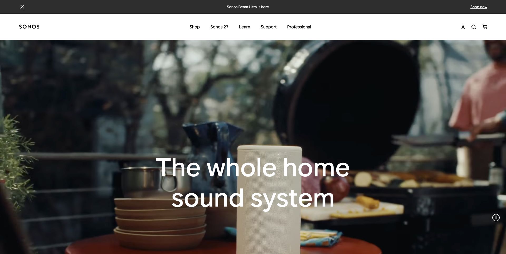
Sonos uses a full-width domestic scene to explain a sound system through its setting. The short heading sits over the photograph, while the shop, support and professional routes remain in a slim white header. This makes the first screen feel like a product introduction rather than a specification sheet. The useful development question is how to keep that campaign surface easy to replace while preserving stable shopping destinations. The observed Vercel response identifies the delivery layer for this public route; it does not establish how the cart, stock records or audio services operate.
What you can learn
Treat the hero and the buying system as separate responsibilities. Preview new photography with the real text and navigation, then check that a campaign release does not disturb product URLs or regional shopping routes.
Pros
The room scene gives the product an understandable everyday context before technical detail.
Compact navigation retains obvious routes for shoppers, owners and professional audiences.
Cons & considerations
Overlay text must remain legible across every selected crop, especially on narrow screens.
A cinematic opening still needs a clear path to prices, compatibility and product comparisons.
ReactAssociated with Next.js; not independently observed
Public source checked November 3, 2026. References may be embedded or legacy—not a complete backend inventory.
Platform source: Observed public HTTP response. On 2026-11-03, an HTTP HEAD request to https://www.sonos.com/en-us/home returned status 200 at https://www.sonos.com/en-us/home with x-vercel-id: sfo1:sfo1:sfo1::fra1::8zg6v-1793718582880-936231e9c749. Vercel delivery for this response; not a complete application or corporate backend inventory. Platform evidence is separate from the direct website screenshot and is not a complete current infrastructure audit.
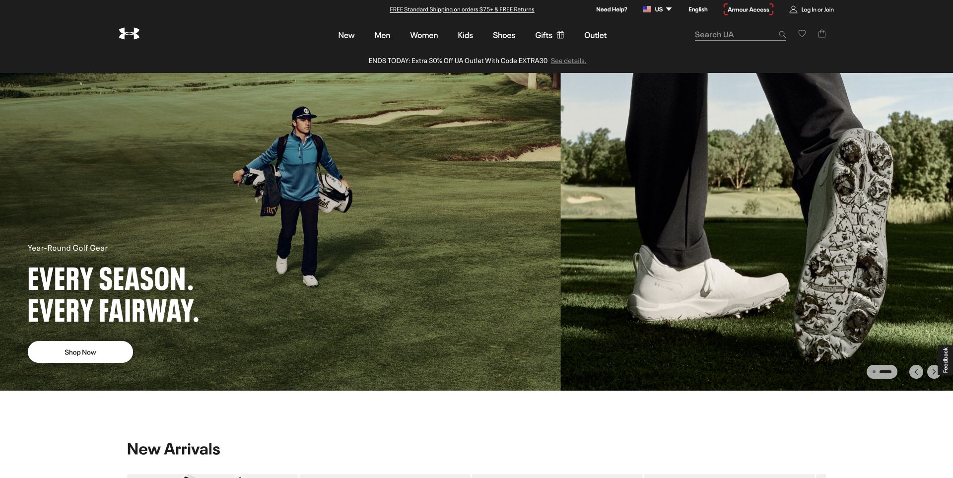
Under Armour pairs an athlete on a golf course with a close view of footwear. A concise campaign headline and a shop button sit inside that visual, while the dark header retains the broad product categories. The beginning of a new-arrivals section is visible immediately below, helping the page move from aspiration into inventory. For a Vercel project, this is a useful example of a campaign page that has to coexist with a larger commerce system. The response headers identify Vercel on the pictured route, not the business systems behind product availability or checkout.
What you can learn
Build a release checklist around the transition from hero to merchandise. Test campaign destinations, product grids and regional links together, using realistic inventory states rather than approving a screenshot of the hero alone.
Pros
Two complementary photographs connect the sporting context with a specific product detail.
The category header remains recognizable even when the campaign creative changes.
Cons & considerations
Seasonal creative can become stale quickly if its links or featured stock change independently.
Motion and alternate slides need meaningful text and controls beyond the captured first frame.
ReactAssociated with Next.js; not independently observed
Public source checked November 3, 2026. References may be embedded or legacy—not a complete backend inventory.
Platform source: Observed public HTTP response. On 2026-11-03, an HTTP HEAD request to https://www.underarmour.com/en-us/ returned status 200 at https://www.underarmour.com/en-us/ with x-vercel-id: sfo1::iad1::5vljr-1793718583063-68ea17adb0b8. Vercel delivery for this response; not a complete application or corporate backend inventory. Platform evidence is separate from the direct website screenshot and is not a complete current infrastructure audit.
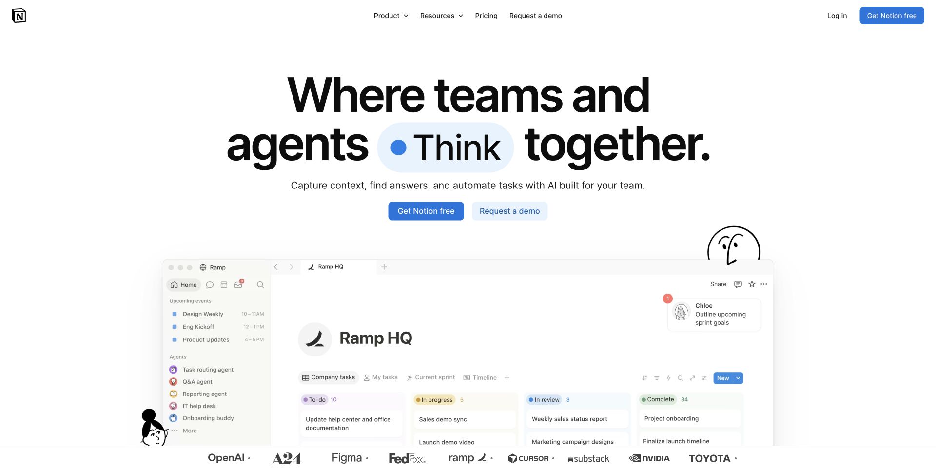
Notion puts its proposition above a large workspace illustration and a pair of actions. The restrained header leaves room for the product scene, and recognizable customer marks appear beneath it. This is a practical reference for translating an abstract collaboration tool into a concrete screen a visitor can inspect. The image does not prove the full editing experience, but it establishes the kind of work being discussed. Fresh response headers show both Vercel and Cloudflare signals, illustrating why a public website can have several delivery layers without either one describing its entire application architecture.
What you can learn
Choose a product state that explains the main task, then make that state part of preview review. Keep the trial and sales routes stable while teams iterate on positioning, illustrations and customer proof.
Pros
The workspace image gives the headline a visible object rather than relying on abstract decoration.
Separate self-service and sales actions accommodate different levels of purchase readiness.
Cons & considerations
A dense product screenshot can lose its explanatory value when scaled to a phone.
Customer marks should lead to meaningful proof where permission and supporting material exist.
Public source checked November 3, 2026. References may be embedded or legacy—not a complete backend inventory.
Platform source: Observed public HTTP response. On 2026-11-03, an HTTP HEAD request to https://www.notion.com/ returned status 200 at https://www.notion.com/ with x-vercel-id: sfo1::pdx1::8sztx-1793718581874-b807e55f9ee4. Vercel delivery for this response; not a complete application or corporate backend inventory. Platform evidence is separate from the direct website screenshot and is not a complete current infrastructure audit.
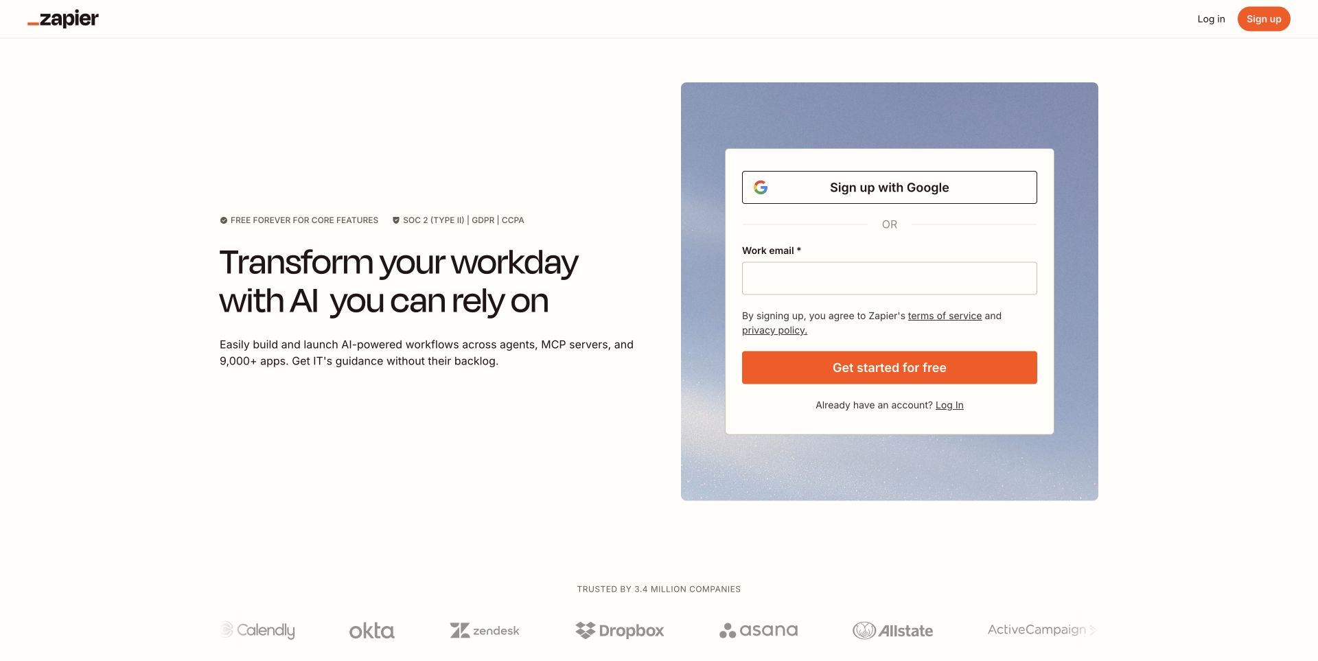
Zapier's captured landing page places the explanation on the left and account entry on the right. The limited navigation keeps attention on the immediate decision, while a customer-logo row provides a quieter second layer. Its form appears as a distinct card rather than blending into the marketing copy. This composition is useful when a public page hands visitors into a separate account workflow. The Vercel header observation applies to this landing route. No account was created, so the review makes no claim about authentication, onboarding completion or the systems handling submitted information.
What you can learn
Review the public page and the account handoff as connected but independently testable steps. Use approved test environments for form behavior, and make privacy, error handling and alternative sign-in routes part of implementation acceptance.
Pros
The adjacent explanation gives context at the point where a visitor considers signing up.
A single card makes the account-entry area easy to distinguish from supporting content.
Cons & considerations
A focused page offers fewer exploratory paths for visitors who still need detailed product information.
The apparent simplicity of a form must not hide validation, accessibility or recovery requirements.
ReactAssociated with Next.js; not independently observed
Public source checked November 3, 2026. References may be embedded or legacy—not a complete backend inventory.
Platform source: Observed public HTTP response. On 2026-11-03, an HTTP HEAD request to https://zapier.com/s/home returned status 200 at https://zapier.com/s/home with x-vercel-id: pdx1::iad1::wgr2g-1793718583038-ad1b0dcd12de. Vercel delivery for this response; not a complete application or corporate backend inventory. Platform evidence is separate from the direct website screenshot and is not a complete current infrastructure audit.
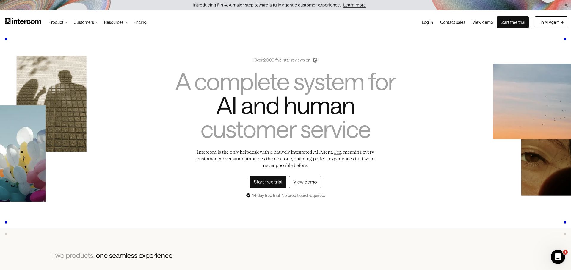
Intercom surrounds a centered service proposition with a small number of cropped images. The copy has ample space, and trial and demo actions sit directly beneath it. The navigation provides product, customer and resource routes without turning the hero into a dashboard. For a deployment platform guide, the interesting lesson is that visual restraint still requires careful coordination between editorial releases, sales journeys and product entry points. The recorded Vercel response supports a delivery association for this public page; it is not evidence about the customer-support application's infrastructure or the behavior of its AI features.
What you can learn
Give each action a distinct destination and success condition. During preview review, check the relationship between the current promise, the relevant product page and the receiving sales or trial workflow before approving the release.
Pros
The centered hierarchy gives the proposition and primary actions a clear reading order.
Supporting imagery adds character without competing with the main explanatory sentence.
Cons & considerations
Broad claims need nearby detail so readers can understand the actual product boundaries.
A spacious desktop layout must be checked for excessive scrolling when images stack on mobile.
ReactAssociated with Next.js; not independently observed
Public source checked November 3, 2026. References may be embedded or legacy—not a complete backend inventory.
Platform source: Observed public HTTP response. On 2026-11-03, an HTTP HEAD request to https://www.intercom.com/ returned status 200 at https://www.intercom.com/ with x-vercel-id: sfo1::iad1::wrqfq-1793718584177-a2364858b636. Vercel delivery for this response; not a complete application or corporate backend inventory. Platform evidence is separate from the direct website screenshot and is not a complete current infrastructure audit.
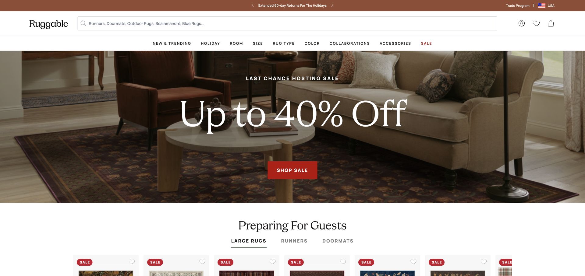
Ruggable places a sale message over a furnished-room photograph, then begins a product-led section below. A prominent search field and several product categories remain available in the header. The page demonstrates the tension between a temporary offer and a catalog that shoppers need to use throughout the year. Its public response exposes Vercel alongside Cloudflare, a reminder that application delivery and edge handling can be layered. Nothing in the screenshot identifies which layer owns pricing, personalization or cart state. Those questions should be resolved in the project architecture rather than inferred from a brand example.
What you can learn
Keep promotion fields separate from durable category records. Before a campaign deploy, verify offer terms, landing destinations and the fallback state after the promotion ends, including visitors arriving directly at an older campaign URL.
Pros
The room photograph connects the merchandise with a plausible domestic setting.
Search and category navigation remain available alongside the promotional headline.
Cons & considerations
A large discount message can overshadow practical information about sizes, materials and care.
Repeated offer labels require coordinated expiry rules so different sections do not contradict one another.
ShopifyDocumented platform association; current media delivery observed
Associated dependencies
ReactAssociated with Next.js; not independently observed
Public source checked November 3, 2026. References may be embedded or legacy—not a complete backend inventory.
Platform source: Observed public HTTP response. On 2026-11-03, an HTTP HEAD request to https://ruggable.com/ returned status 200 at https://ruggable.com/ with x-vercel-id: sfo1::vthk6-1793718577173-d74995f912b4. Vercel delivery for this response; not a complete application or corporate backend inventory. Platform evidence is separate from the direct website screenshot and is not a complete current infrastructure audit.
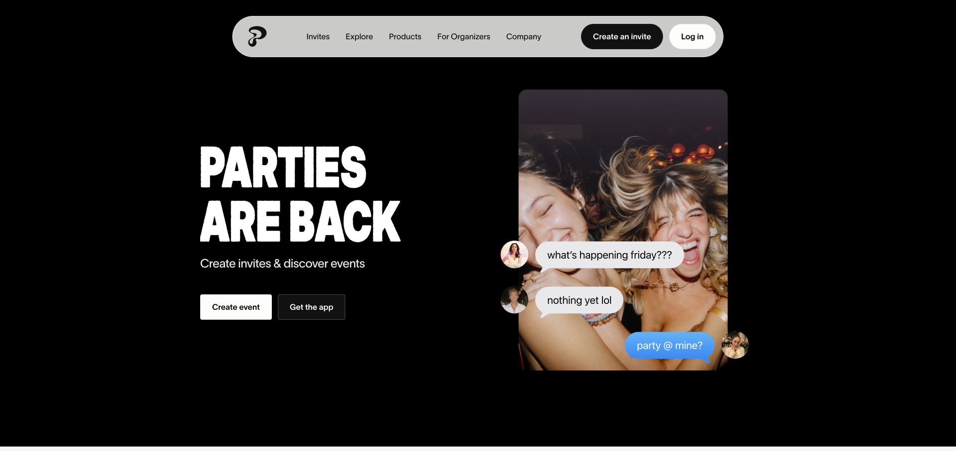
Partiful combines a dark background, an emphatic headline and a compact event-card composition. The floating light navigation stands apart from the hero, and creating an event is offered as a clear next step. The scene communicates social activity without requiring an interactive product demo in the opening viewport. For a Vercel build, the useful pattern is a public marketing surface that remains understandable before the visitor enters a more stateful application. Response headers support the pictured page's Vercel delivery, but they do not reveal how invitations, guest lists or notifications are stored and processed.
What you can learn
Separate public explanation from authenticated event operations. Preview the marketing composition at several widths, then verify that creating an event has an explicit handoff, a useful loading state and an accessible path back to information.
Pros
The event-card image makes the product's purpose concrete without a lengthy feature list.
A high-contrast navigation capsule remains easy to locate against the dark visual field.
Cons & considerations
Oversized display type can crowd supporting copy if translations or device widths change.
An energetic first screen still needs clear information about privacy, sharing and invitation behavior.
Public source checked November 3, 2026. References may be embedded or legacy—not a complete backend inventory.
Platform source: Observed public HTTP response. On 2026-11-03, an HTTP HEAD request to https://partiful.com/ returned status 200 at https://partiful.com/ with x-vercel-id: sfo1::rsqlg-1793718579261-70522cb4eb6a. Vercel delivery for this response; not a complete application or corporate backend inventory. Platform evidence is separate from the direct website screenshot and is not a complete current infrastructure audit.
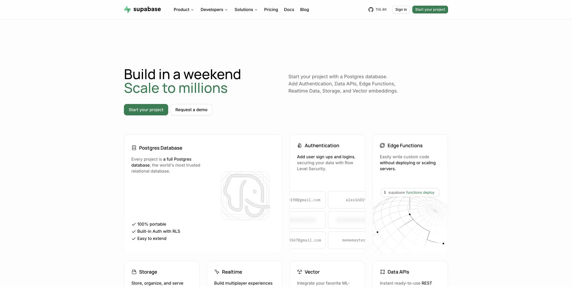
Supabase pairs a compact opening promise with a grid of product capabilities. Database, authentication and function-related areas appear as separate cards, giving the visitor several concrete entry points. The mostly white canvas and restrained green accent keep the number of offerings from becoming visually noisy. This is a useful development reference for a platform whose documentation and product pages change at different rates. The observed Vercel response concerns the marketing page shown here. It does not imply that customer databases, authentication services or every Supabase application run on the same hosting layer.
What you can learn
Model capabilities as reusable records with clear owners. A preview should expose missing descriptions, broken documentation links and inconsistent terminology before a marketing release reaches visitors comparing the platform's individual services.
Pros
Capability cards let experienced readers find a relevant subsystem without following a forced narrative.
The concise opening leaves room for specific features close to the top of the page.
Cons & considerations
A modular grid needs consistent detail levels so some cards do not become vague placeholders.
Technical audiences still need limitations and operational requirements beyond a benefit-led marketing description.
Public source checked November 3, 2026. References may be embedded or legacy—not a complete backend inventory.
Platform source: Observed public HTTP response. On 2026-11-03, an HTTP HEAD request to https://supabase.com/ returned status 200 at https://supabase.com/ with x-vercel-id: sfo1::rzrnf-1793718582418-9071e10fccaa. Vercel delivery for this response; not a complete application or corporate backend inventory. Platform evidence is separate from the direct website screenshot and is not a complete current infrastructure audit.
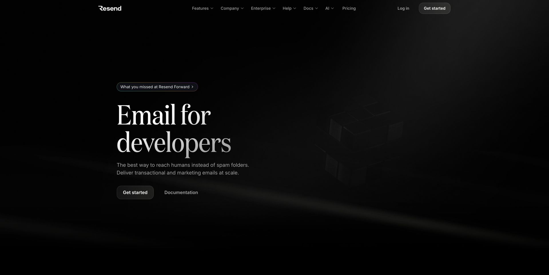
Resend uses a dark canvas, a short serif headline and a restrained pair of actions. Most of the opening viewport is atmospheric space, so the proposition carries more responsibility than a conventional feature grid. The navigation offers routes into the product, company and documentation without demanding immediate commitment. For a Vercel website, this shows how a small marketing shell can serve a technical service while its operational interface remains elsewhere. The headers verify delivery of the public route only; they do not establish anything about email delivery infrastructure, message acceptance or the service's reliability.
What you can learn
Use the concise homepage as an entry point, not the whole explanation. Keep documentation, pricing and setup guidance easy to reach, and review those destinations alongside each change to the main promise or call to action.
Pros
A short proposition makes the intended developer audience apparent within the first screen.
The limited action set avoids competing requests for attention at the initial decision point.
Cons & considerations
Dark atmospheric artwork needs a useful fallback when animation or rich media is unavailable.
Minimal copy can leave evaluation questions unanswered unless practical documentation is clearly connected.
Public source checked November 3, 2026. References may be embedded or legacy—not a complete backend inventory.
Platform source: Observed public HTTP response. On 2026-11-03, an HTTP HEAD request to https://resend.com/ returned status 200 at https://resend.com/ with x-vercel-id: sfo1::iad1::9jb8k-1793718582608-199c447c2c62. Vercel delivery for this response; not a complete application or corporate backend inventory. Platform evidence is separate from the direct website screenshot and is not a complete current infrastructure audit.
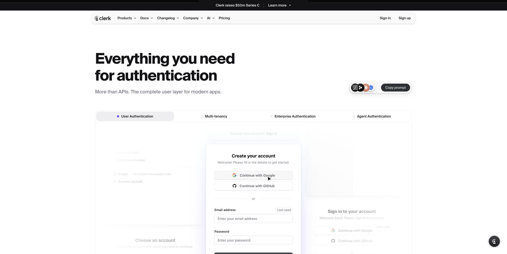
Clerk places its authentication proposition above a group of interface examples. The white layout and visible account-style cards make the subject more tangible than a generic security illustration would. Product, documentation and pricing routes remain in the header, with a separate account action. The page is a useful reference for showing a developer tool through recognizable states while keeping the public explanation distinct from actual authentication. Its Vercel headers identify delivery of this marketing route. The review does not test the displayed sign-in components or infer the security properties of an installed Clerk integration.
What you can learn
Treat illustrative forms as content and real forms as applications. Clearly distinguish the two in implementation, and review keyboard behavior, labels and privacy requirements in an approved test flow before publishing any interactive account example.
Pros
Familiar interface cards help explain the product category without requiring prior platform knowledge.
Documentation remains available beside commercial and product-navigation routes.
Cons & considerations
Small interface text can become unreadable when several sample cards are compressed into mobile layouts.
A convincing demonstration must not accidentally collect real credentials or imply unsupported security guarantees.
Public source checked November 3, 2026. References may be embedded or legacy—not a complete backend inventory.
Platform source: Observed public HTTP response. On 2026-11-03, an HTTP HEAD request to https://clerk.com/ returned status 200 at https://clerk.com/ with x-vercel-id: sfo1::ggb68-1793718582532-b01854f9859c. Vercel delivery for this response; not a complete application or corporate backend inventory. Platform evidence is separate from the direct website screenshot and is not a complete current infrastructure audit.
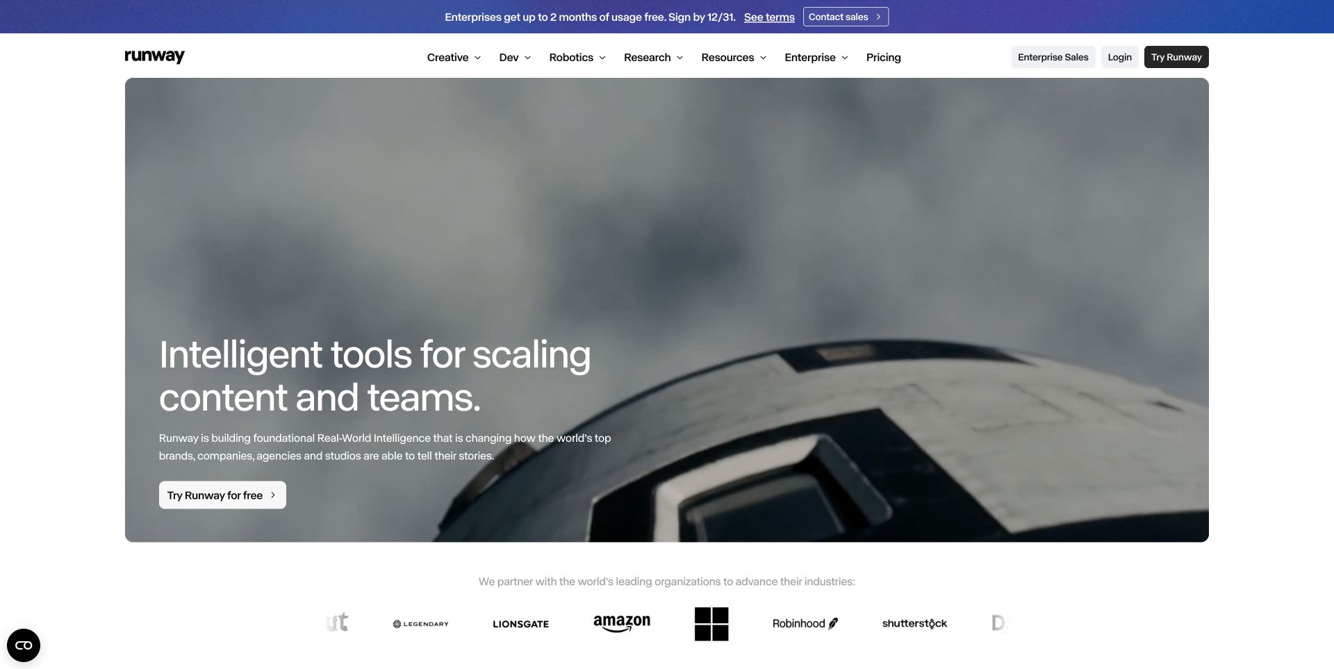
Runway's captured page uses a broad cinematic image behind its principal message and trial action. A short navigation bar and a separate announcement strip frame the scene, while customer marks begin below it. The layout lets creative output carry much of the explanation, which suits a tool whose results are visual. For a Vercel implementation, that places particular weight on media preparation and fallback behavior. The current response signals Vercel delivery of the marketing route; the screenshot does not establish how generation jobs, model inference or stored creative projects are executed behind the product.
What you can learn
Set a media budget before polishing the hero. Review the poster frame, text contrast and reduced-motion treatment in deployment previews, and keep product information available when video loading is slow or disabled.
Pros
The visual example gives an immediate sense of the work the product is intended to support.
The first action stays close to the headline rather than depending on a later section.
Cons & considerations
A cinematic hero can delay understanding if visitors need concrete workflow or pricing details first.
Campaign and announcement layers need coordination so multiple messages do not compete for the same attention.
Public source checked November 3, 2026. References may be embedded or legacy—not a complete backend inventory.
Platform source: Observed public HTTP response. On 2026-11-03, an HTTP HEAD request to https://runway.com/ returned status 200 at https://runway.com/ with x-vercel-id: sfo1::tbc4j-1793718583229-11bd2c760575. Vercel delivery for this response; not a complete application or corporate backend inventory. Platform evidence is separate from the direct website screenshot and is not a complete current infrastructure audit.
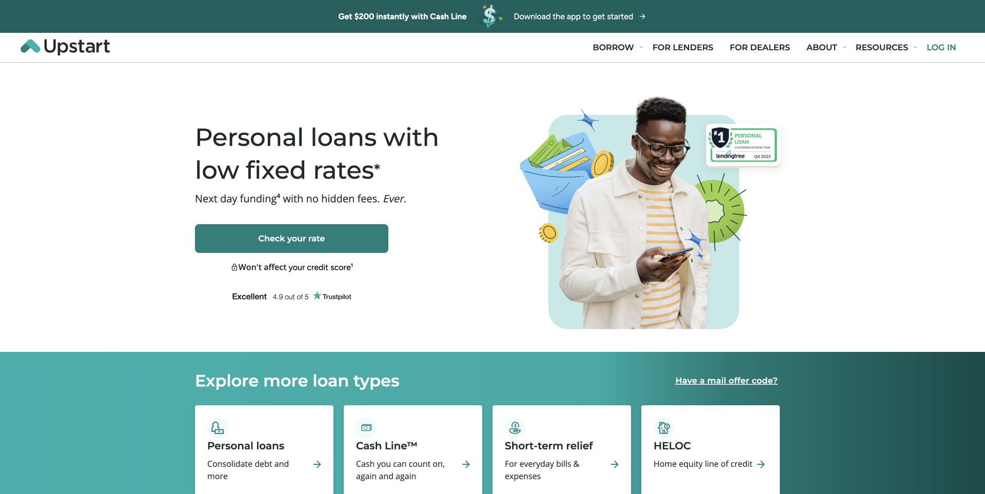
Upstart introduces a loan category with concise copy, an illustration and a prominent next step. Additional loan types begin in a colored section below, creating a transition from a focused opening into a broader product menu. The design makes a complex service appear approachable, but that visual simplicity should not be confused with the details of eligibility or an application. The recorded public response contains Vercel and Cloudflare signals. Those observations concern delivery of this route, not lending decisions, financial outcomes or the systems that process an applicant's personal information.
What you can learn
Keep the public comparison journey distinct from sensitive application steps. Preview disclosures and product links with the exact campaign copy, and validate forms through an approved test process without submitting real personal or financial details.
Pros
The primary product and next step are identifiable before the visitor reaches the broader menu.
A separate category section gives alternative needs a visible route instead of hiding them in navigation.
Cons & considerations
Short marketing copy can leave important qualifications too far from a consequential action.
Illustrations should support comprehension without making complex eligibility conditions appear guaranteed or automatic.
Earlier cited evidence retained; no current scan result. References may be embedded or legacy—not a complete backend inventory.
Platform source: Observed public HTTP response. On 2026-11-03, an HTTP HEAD request to https://www.upstart.com/ returned status 200 at https://www.upstart.com/ with x-vercel-id: sfo1::iad1::xzcgd-1793718583147-c01bc362b09d. Vercel delivery for this response; not a complete application or corporate backend inventory. Platform evidence is separate from the direct website screenshot and is not a complete current infrastructure audit.
Ace & Tate fills the opening with a paired portrait composition and keeps the category navigation compact. The visible collection action sits near the lower edge, allowing the photography to establish the brand before more detailed shopping information appears. The composition is a useful reference for a storefront that needs to publish editorial collections while preserving practical buying routes. Both Vercel and Cloudflare appear in the route's response headers. This layered delivery evidence does not reveal how prescriptions, stock availability, appointments or checkout are handled, and the review makes no claim about those untested workflows.
What you can learn
Make editorial collection pages share dependable commerce links with the rest of the store. During preview review, check image crops, category labels and the route from an evocative photograph to a specific item or service.
Pros
The paired portraits provide visual variety without adding several competing content blocks.
Simple category navigation remains visible above a highly photographic first screen.
Cons & considerations
A quiet collection action may be overlooked by visitors expecting a more explicit shopping prompt.
Large portrait crops require deliberate mobile composition so products and faces retain their intended emphasis.
ReactAssociated with Next.js; not independently observed
Public source checked November 3, 2026. References may be embedded or legacy—not a complete backend inventory.
Platform source: Observed public HTTP response. On 2026-11-03, an HTTP HEAD request to https://www.aceandtate.com/us returned status 200 at https://www.aceandtate.com/us with x-vercel-id: sfo1::vdkrm-1793629354410-591b46a096ef. Vercel delivery for this response; not a complete application or corporate backend inventory. Platform evidence is separate from the direct website screenshot and is not a complete current infrastructure audit.
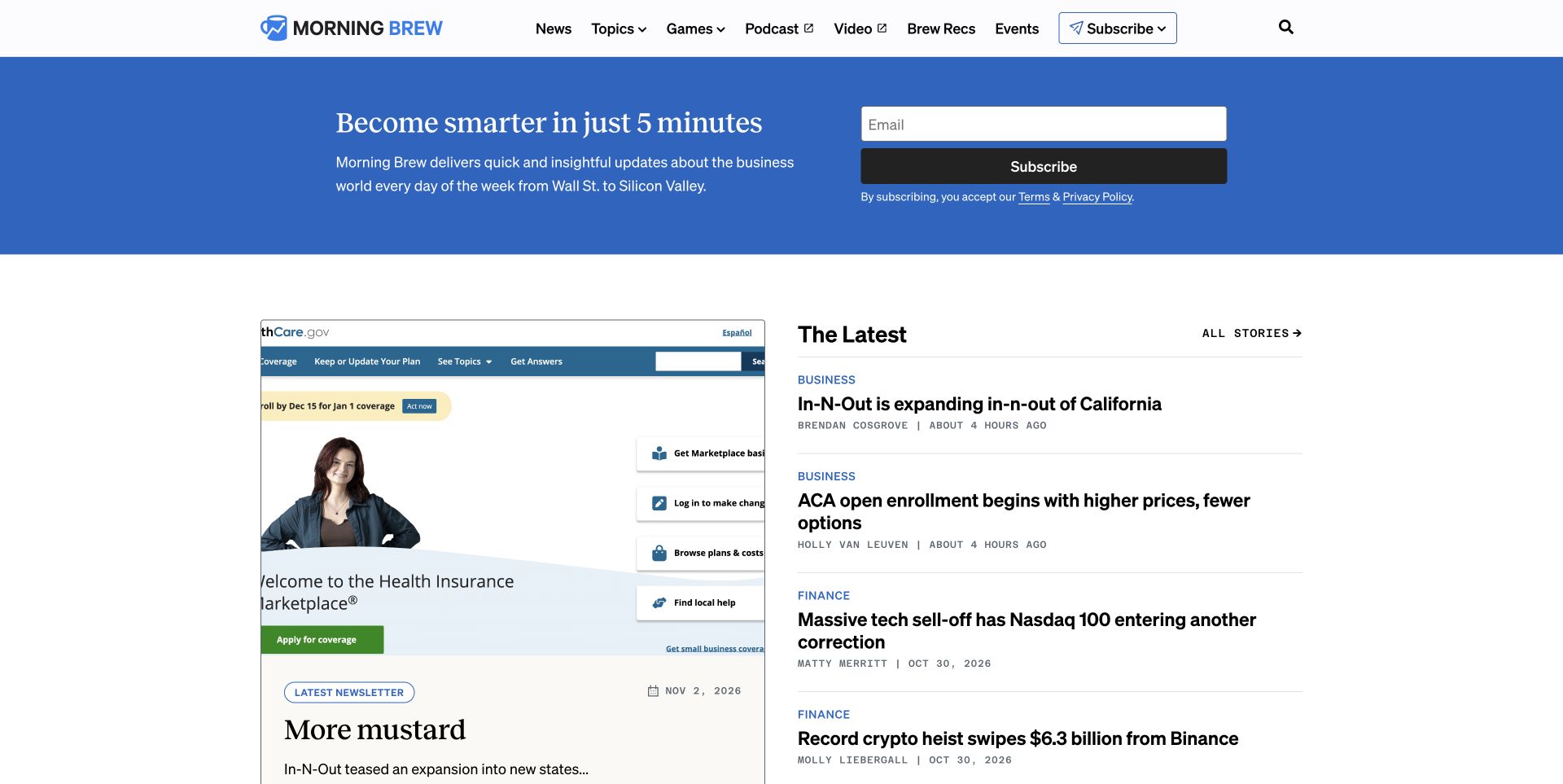
Morning Brew places an email-subscription strip above a two-column editorial area. The lead item receives a visual preview, while a nearby latest-news list offers several direct reading choices. This is a practical publishing pattern because acquisition and immediate content value appear in the same screen. For a Vercel project, the important distinction is between a public article index and the separate system that processes subscriptions. The observed response contains Vercel and Cloudflare signals for the pictured route. It does not reveal mailing-list infrastructure or verify the performance of the subscription form.
What you can learn
Define which content can be cached and how urgent edits become visible. Preview article titles, image proportions and subscription messages together, and keep a useful reading path for visitors who choose not to provide an address.
Pros
The latest-news list gives returning readers a compact way to identify new material.
Subscription is contextualized by visible editorial content rather than presented as the only useful action.
Cons & considerations
A lead story and several headlines require clear dates and ownership as the index changes.
Newsletter entry needs accessible labels, consent language and failure feedback beyond its compact visual treatment.
ReactAssociated with Next.js; not independently observed
Public source checked November 3, 2026. References may be embedded or legacy—not a complete backend inventory.
Platform source: Observed public HTTP response. On 2026-11-03, an HTTP HEAD request to https://www.morningbrew.com/ returned status 200 at https://www.morningbrew.com/ with x-vercel-id: sfo1::cle1::xgjcc-1793718584876-c7dc5aa848ca. Vercel delivery for this response; not a complete application or corporate backend inventory. Platform evidence is separate from the direct website screenshot and is not a complete current infrastructure audit.
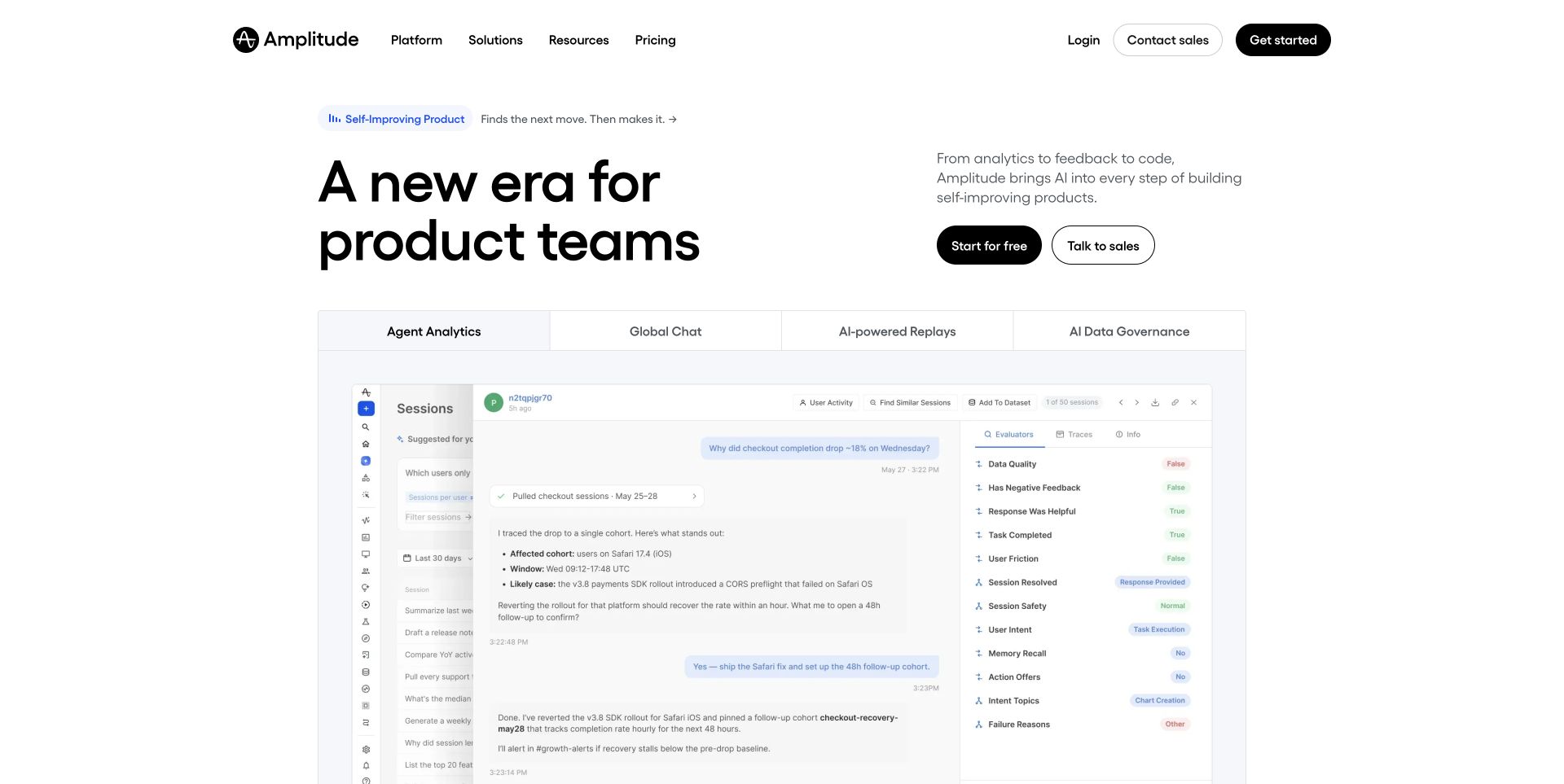
Amplitude balances a short left-aligned headline with a more detailed explanation and action pair to the right. Below, multiple interface panels introduce the product family through actual-looking work areas. The composition makes breadth visible without filling the opening with a long checklist. This is useful for a Vercel marketing build where product positioning and interface imagery need to be reviewed as one release. The recorded Vercel response identifies a delivery relationship for the public route. It does not show which analytics services process customer events or validate any results implied by marketing language.
What you can learn
Maintain a versioned set of approved product images alongside the copy they explain. Check previews for mismatched labels, obsolete interface states and links that send users to a different product than the one pictured.
Pros
Several interface panels communicate a suite of related capabilities rather than a single isolated feature.
The split text arrangement gives supporting context room without diminishing the main headline.
Cons & considerations
Dense interface screenshots can become decorative when reduced below a useful reading size.
A broad product story needs clear boundaries so prospects understand which capabilities require separate setup.
SanityDocumented platform association; current media delivery observed
Public source checked November 3, 2026. References may be embedded or legacy—not a complete backend inventory.
Platform source: Observed public HTTP response. On 2026-11-03, an HTTP HEAD request to https://amplitude.com/ returned status 200 at https://amplitude.com/ with x-vercel-id: pdx1::sfo1::2rpkx-1793718585239-83f2b865ceed. Vercel delivery for this response; not a complete application or corporate backend inventory. Platform evidence is separate from the direct website screenshot and is not a complete current infrastructure audit.
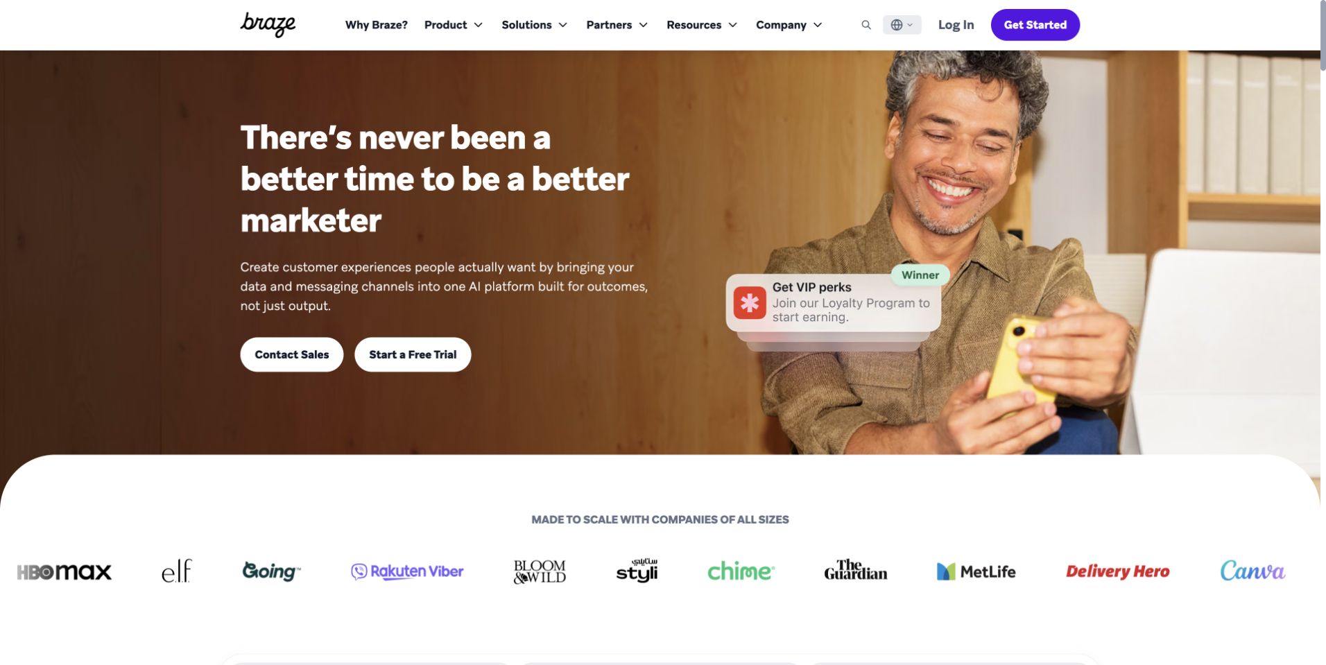
Braze combines a warm portrait, a prominent headline and a small interface-style notification within the hero. A row of customer marks sits on a curved white section immediately below, creating a clear shift from campaign creative into proof. The page is a useful reference for software marketing that wants to feel human while still indicating a concrete product context. Its response exposes both Vercel and Cloudflare signals. That supports a scoped delivery observation for this public page, without proving which services send customer messages or run campaign logic inside the Braze product.
What you can learn
Review the human story and product claim together. A deployment preview should preserve the hierarchy between headline, actions, interface illustration and customer proof, while checking that every logo and cited example has current supporting permission and context.
Pros
Warm photography gives the software proposition a recognizable human setting.
The customer strip begins near the hero, providing an obvious route toward further proof.
Cons & considerations
Small simulated notifications need adequate contrast and may lose meaning on narrow screens.
Customer marks alone cannot explain the scale, scope or outcome of each organization's relationship.
SanityDocumented platform association; current media delivery observed
Public source checked November 3, 2026. References may be embedded or legacy—not a complete backend inventory.
Platform source: Observed public HTTP response. On 2026-11-03, an HTTP HEAD request to https://www.braze.com/ returned status 200 at https://www.braze.com/ with x-vercel-id: sfo1::z9nr5-1793718585730-5790a0d25a6b. Vercel delivery for this response; not a complete application or corporate backend inventory. Platform evidence is separate from the direct website screenshot and is not a complete current infrastructure audit.
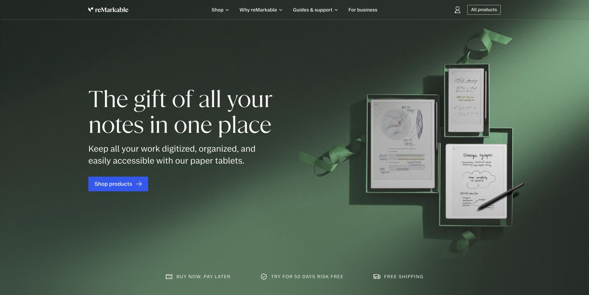
reMarkable presents several devices against a deep green background with a concise gift-oriented headline. The principal shopping action uses a contrasting color, while the header keeps products, offers and support within reach. The scene demonstrates how a product family can remain visually coherent without separate cards for every item. In a Vercel build, campaign imagery and product destinations still need independent maintenance. The public response identifies Vercel for this storefront route. It does not establish the services responsible for inventory, order processing or synchronization between a purchased device and its companion software.
What you can learn
Prepare the campaign as a replaceable layer over stable product records. Test seasonal copy, image crops and shopping destinations in preview, then define what appears when the campaign ends or a featured device is unavailable.
Pros
A limited color palette keeps attention on the devices and their physical form.
The contrasting shopping action remains easy to locate within the otherwise restrained composition.
Cons & considerations
Seasonal gift language needs an expiry plan so the page does not become dated.
A visual product family still needs accessible comparison details for visitors evaluating functional differences.
SanityDocumented platform association; current media delivery observed
Associated dependencies
ReactAssociated with Next.js; not independently observed
Public source checked November 3, 2026. References may be embedded or legacy—not a complete backend inventory.
Platform source: Observed public HTTP response. On 2026-11-03, an HTTP HEAD request to https://remarkable.com/ returned status 200 at https://remarkable.com/ with x-vercel-id: sfo1::mjf6z-1793718586559-f81348de3014. Vercel delivery for this response; not a complete application or corporate backend inventory. Platform evidence is separate from the direct website screenshot and is not a complete current infrastructure audit.
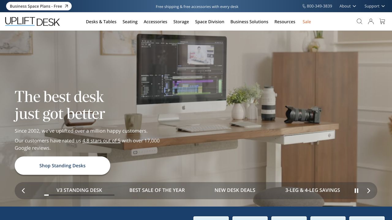
UPLIFT Desk uses a furnished workspace to show a desk in context, with a large headline and a shopping action over the photograph. The header offers several product and business-oriented categories, while a strip of additional offers sits along the bottom of the hero. This is useful for studying a configurable product that must support both inspiration and detailed selection. The observed response contains Vercel delivery headers for the pictured route. It does not identify the configuration engine, stock system or checkout provider, all of which need their own operational and interaction testing.
What you can learn
Separate the promotional stage from configuration logic. Preview the hero with the real category structure, then test the path into product options using representative sizes, accessories and unavailable combinations in an approved non-purchasing environment.
Pros
The room scene helps visitors understand the product's scale and possible use.
Business and resource routes remain visible for buyers who need more than a standard product page.
Cons & considerations
Several offer messages can compete with the main explanation and create visual crowding.
A configurable product requires clear option dependencies that cannot be evaluated from the homepage alone.
ReactAssociated with Next.js; not independently observed
Public source checked November 3, 2026. References may be embedded or legacy—not a complete backend inventory.
Platform source: Observed public HTTP response. On 2026-11-03, an HTTP HEAD request to https://www.upliftdesk.com/ returned status 200 at https://www.upliftdesk.com/ with x-vercel-id: sfo1::iad1::8jph6-1793718589496-df2e415d965d. Vercel delivery for this response; not a complete application or corporate backend inventory. Platform evidence is separate from the direct website screenshot and is not a complete current infrastructure audit.
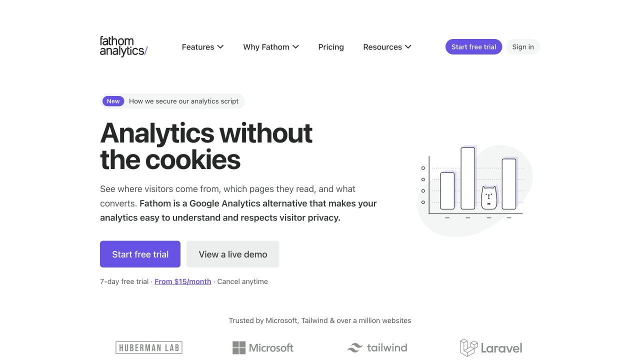
Fathom leads with a concise analytics proposition and a small line-style chart illustration. Trial and live-demo actions sit together, while pricing and resources remain in the header. The restrained design gives the visitor two different ways to continue: investigate the interface or begin an account journey. For a Vercel website, the useful pattern is a public explanation that links to a concrete demonstration without making the homepage itself a complex application. The response headers support Vercel delivery of this route; they do not independently verify privacy claims or reveal the service's event-processing architecture.
What you can learn
Give the demonstration its own acceptance criteria and data boundaries. Keep sample data clearly identifiable, check the connection from marketing claims to documentation, and review the trial handoff separately from the public content release.
Pros
The live-demo route supports evaluation before a visitor commits to starting a trial.
A compact illustration reinforces the subject without displacing the explanatory copy.
Cons & considerations
Privacy-oriented language needs precise supporting documentation rather than relying on the visual tone.
A sparse opening must still provide enough context for readers comparing practical features and limitations.
Public source checked November 3, 2026. References may be embedded or legacy—not a complete backend inventory.
Platform source: Observed public HTTP response. On 2026-11-03, an HTTP HEAD request to https://usefathom.com/ returned status 200 at https://usefathom.com/ with x-vercel-id: sfo1::6gbb6-1793718596429-c8aee10771bc. Vercel delivery for this response; not a complete application or corporate backend inventory. Platform evidence is separate from the direct website screenshot and is not a complete current infrastructure audit.
A24's saved homepage is dominated by a film image and an oversized title, with a small ticket action beside the story. The header stays sparse, offering film, television, music, shop and other routes without distracting from the current release. This is a strong reference for a catalog whose homepage changes around editorial events while the archive must remain discoverable. The fresh response identifies Vercel delivery of the public homepage. It does not prove which systems manage ticket availability, streaming, memberships or merchandise, and those destinations should be assessed independently of the campaign's visual impact.
What you can learn
Treat each featured release as a content package with its own artwork, title, destinations and end state. Preview the largest typography at narrow widths and retain a stable route into older work after the campaign changes.
Pros
A single release creates a clear editorial focus instead of presenting the entire catalog at once.
Compact navigation preserves alternative discovery paths for visitors interested in another part of the brand.
Cons & considerations
Very large titles can cover important parts of the image or wrap awkwardly on mobile.
External ticket and retail destinations need explicit labeling and ongoing checks as availability changes.
ReactAssociated with Next.js; not independently observed
Public source checked November 3, 2026. References may be embedded or legacy—not a complete backend inventory.
Platform source: Observed public HTTP response. On 2026-11-03, an HTTP HEAD request to https://a24films.com/ returned status 200 at https://a24films.com/ with x-vercel-id: sfo1::iad1::srt6w-1793718605412-1d4ae8471bac. Vercel delivery for this response; not a complete application or corporate backend inventory. Platform evidence is separate from the direct website screenshot and is not a complete current infrastructure audit.
Choose the public experience before adding application complexity
A content-led marketing site
Use a small, coherent set of page templates and a content source the team can maintain. Specify previews for campaign copy, long titles and missing media. Keep account, sales and support destinations explicit so the website remains useful even when its main role is to introduce a separate product.
A storefront connected to an existing commerce system
Map catalog content, price and stock, cart state and checkout ownership independently. The public frontend may have a distinct release cycle, but it must respect the business rules of the commerce system. Test representative product states and service failures rather than treating a beautiful hero as a finished store.
An application with public and private routes
Describe authentication, user data, authorization and recovery behavior before designing a shared shell. Identify which parts can be cached publicly and which require request-specific treatment. A framework can help organize these concerns, but the team still owns the data boundaries and operational decisions.
From references to requirements
Plan content releases, data boundaries and recovery
Rehearse the actual publishing task
Have an editor change a real feature, inspect its preview at narrow widths and follow the linked destination. Record which changes require a code release and which are managed in a CMS. A usable handover includes correcting a mistake and removing an expired campaign, not just publishing the ideal first page.
Write a response-level caching plan
Classify public documents, versioned assets and personalized responses. Vercel has distinct cache-control mechanisms; understand which layer consumes each header before copying a configuration. Verify behavior on representative routes and define how a content correction becomes visible.
Identify the tested source and deployment, who can promote it and the last known good release. Check canonical domains, redirects, assets and important handoffs after publication. Keep an owner for external services so a successful frontend deploy is not confused with proof that every integration works.
A useful handover demonstration
Ask the actual team to carry out its routine job: publish a realistic update, correct a mistake, preview a narrow screen, and identify who owns an integration failure. For a library or frontend framework, also ask who maintains the content source and deployment. A polished screenshot does not answer those operational questions.
Beyond the screenshot
A Vercel website release checklist
List public pages, private routes and external service handoffs.
Use representative content, including long headings and unavailable products.
Confirm preview access and test-service configuration before sharing a URL.
Check keyboard navigation, focus, responsive media and reduced-motion behavior.
Validate route-specific cache behavior and correction propagation.
Test forms and account handoffs with approved test data only.
Check canonical URLs, redirects, sitemap entries and important asset responses.
Record the tested deployment, rollback reference and ongoing service owners.
Test with real content, a keyboard, a small screen, slow or failed requests, and the people who will maintain the system. These are planning checks, not an accessibility, security, performance, or search-ranking certification.
Sources & editorial method
How this Vercel collection was reviewed
We reviewed 20 distinct public website properties using existing direct, unmodified browser captures and fresh successful HTTP response observations on November 3, 2026. Each selected route exposed x-vercel-id; supporting response headers are retained in the research records. Original screenshot dates remain unchanged. Some responses also show another delivery layer. This is route-level delivery evidence, not a complete hosting, framework, commerce or application inventory, and no private account or transaction was exercised.
Every image is an unmodified capture from the actual website, with its source and capture date. Some captures are reused from our shared catalog; their dates remain the original capture dates. None comes from a vendor gallery or a generated reconstruction. Moving imagery and live content can change.
Technology attribution uses public page assets or metadata, official platform documentation, or a cited first-party project case study. Documentary and framework-relationship evidence is identified where used; it is not a complete current backend inventory. A CMS image CDN alone does not establish a full CMS deployment. A library’s presence does not prove which individual controls use it, and a platform label does not establish AI authorship.
The composition notes, lessons, pros and tradeoffs are original editorial observations. We have not measured conversion, traffic, security, performance or accessibility conformance. Website owners retain their brands and imagery; these examples are not our client portfolio. Written, Edited and Curated are independent records, not dates advanced by a build. See our editorial standards or suggest a correction.
Questions worth asking
Vercel website development FAQs
Does a Vercel header mean the whole company runs on Vercel?
No. It supports an association for the observed public response. Other routes, APIs, accounts and business systems can use different services.
Does Vercel determine how the website looks?
No. The visual system, content model and interaction design remain implementation choices. The examples demonstrate different decisions on a shared delivery platform.
Is a deployment preview automatically private?
Do not assume that it is. Review the project’s deployment-protection scope, intended reviewers and data connections before sharing it.
Can a cached page still depend on other services?
Yes. A public document can link to or embed behavior backed by separate systems. Identify those dependencies and their failure states rather than assuming one cache result explains the full experience.
Were the examples measured for speed or conversion?
No. These are original visual reviews with scoped public technology evidence. They are not performance, security, accessibility or commercial-outcome audits.