The useful Svelte reference is not simply a page with less interface chrome. It is a website whose information, interactive states, and data boundaries remain understandable as the visitor moves beyond its first screen.
These examples connect actual public captures to specific Svelte or SvelteKit evidence. The relationship is kept narrow: an island rendered with Svelte is not described as an entire SvelteKit application, and a particular public report is not evidence for every product its publisher operates.
Some selected reports are explicitly their 2025 editions. Their edition labels remain unchanged even though this collection was curated in 2026. Review the structure, explanations, navigation, and presentation decisions rather than treating an older dataset as a current measurement.
Before the examples
What makes good Svelte website development in 2026?
Make the content useful before the interaction
Begin with the labels, explanation, and sensible default state. A chart or product interface should communicate what it is showing and where its information comes from. Decide what remains understandable while data is loading or an interaction is unavailable. A distinctive visual treatment should not be the only way to understand a category, value, or next step.
Separate Svelte components from application architecture
Svelte supplies the component layer; SvelteKit adds application concerns such as routing and rendering choices. Define whether your project needs a whole application or a focused component within another site. Record who owns the content source, host document, data service, and deployment. The right boundary is a project decision, not something that can be copied from a screenshot.
SvelteKit offers page-level rendering options, including prerendering and server or client rendering behavior. Decide what can be generated ahead of time and what depends on the request. Test the deployed initial page, stale data, and unavailable services. A framework option does not establish that a particular website is fast, accessible, or correctly indexed.
The opening five are Apple Music's public page, Hugging Face, the Stack Overflow Developer Survey 2025, Yelp's Top 100 2025, and Mullvad VPN. Later examples expand into publishing, data, component libraries, developer workspaces, and creative tools, with the attribution kept specific to each named property.
We start with five recognizable brands or organizations: Apple Music, Hugging Face, Stack Overflow Developer Survey 2025, Yelp Top 100 Places to Eat 2025, Mullvad VPN. Each attribution applies to the named website property, not every product or website belonging to its organization. This is a curated reading sequence, not a measured ranking.
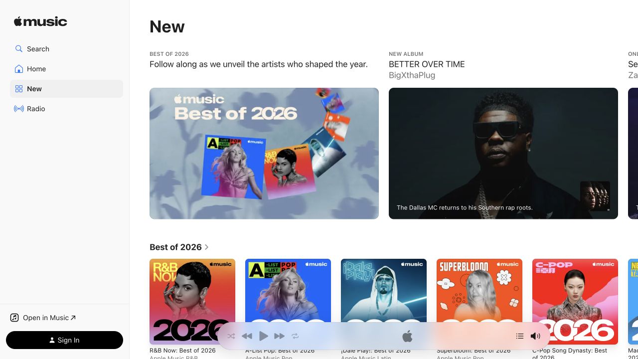
Apple Music’s public New page keeps a narrow navigation sidebar beside a broad editorial feed. Large feature cards occupy the first row, with smaller playlist artwork beginning underneath. The white shell and restrained red accents let release imagery supply most of the color. A playback strip remains at the lower edge while public navigation and sign-in controls stay separate. The HTML contains direct Svelte hydration markers. This capture is the unsigned public discovery page, with no personal library, playback history, or account data displayed.
What you can learn
A Svelte interface can keep player controls and navigation stable while editorial content changes around them. Give artwork cards meaningful text destinations, preserve focus as rows update, and avoid using image position as the only indication of selection. Make public discovery distinguishable from actions that require an account or initiate playback.
Pros
The stable sidebar separates discovery modes from the changing editorial features.
Consistent artwork frames make varied releases easy to scan.
Cons & considerations
Wide horizontal rows can hide additional items beyond the visible edge.
Persistent player controls consume space even before a visitor starts listening.
Visible tech stack
Earlier / documented evidence
Svelte
Public source checked November 3, 2026. References may be embedded or legacy—not a complete backend inventory.
Platform source: Observed first-party page or linked application asset. The public Apple Music HTML contains Svelte HEAD boundaries and data-svelte-h hydration attributes. Platform evidence is separate from the direct website screenshot and is not a complete current infrastructure audit.
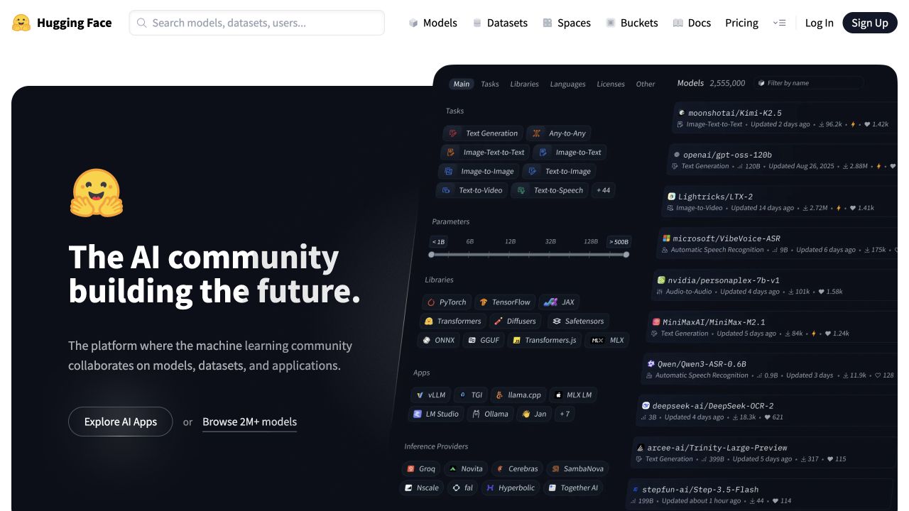
Hugging Face pairs a dark community introduction with a large angled specimen of models, filters, and technical categories. The familiar yellow identity provides a warm contrast to the technical interface. A white header keeps search, models, datasets, spaces, documentation, and account routes available above the dark area. Two introductory actions distinguish exploring applications from browsing models. Public HTML includes Svelte hydration components, including the header. This supports the named public property rather than asserting the implementation of every hosted model or application.
What you can learn
The useful Svelte pattern is a stable discovery shell around content that can change rapidly. Keep resource types explicit in routes and labels, preserve search context, and let the promotional specimen remain illustrative rather than requiring it to function as a complete live catalog. Explain the first step for readers unfamiliar with the platform’s technical vocabulary.
Pros
The header offers direct resource routes outside the broad community introduction.
The specimen gives an abstract collaboration message concrete product context.
Cons & considerations
Small angled interface details are difficult to interpret at reduced sizes.
Several technical categories may overwhelm a newcomer before they choose a task.
Public source checked November 3, 2026. References may be embedded or legacy—not a complete backend inventory.
Platform source: Observed first-party page or linked application asset. The public HTML includes SVELTE_HYDRATER components for the page header and other interfaces. Platform evidence is separate from the direct website screenshot and is not a complete current infrastructure audit.
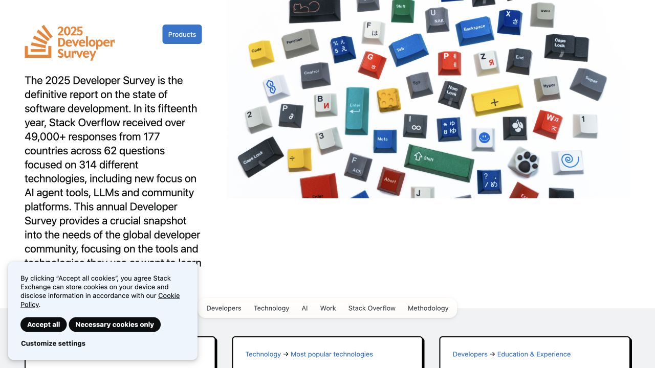
The Stack Overflow Developer Survey 2025 opens with a narrow explanatory column beside a large arrangement of colorful keyboard keys. The edition appears explicitly in the identity, while a compact topic bar separates developers, technology, AI, work, community, and methodology. Summary cards begin below the introductory scene. The captured privacy notice overlays the lower left. Public assets identify SvelteKit on this 2025 survey property, establishing its Svelte relationship; the capture does not represent a 2026 report or the entire Stack Overflow question-and-answer website.
What you can learn
A Svelte research publication should model edition, methodology, question, and chart as durable content relationships. Preserve meaningful deep links when interactive filters change, label survey years prominently, and provide readable text or tabular alternatives to graphics. Keep the framing sample and response context attached to results rather than letting an attractive chart imply universal representativeness.
Pros
The edition identity makes the report’s date hard to confuse.
Methodology receives its own navigation destination beside topical findings.
Cons & considerations
The introductory paragraph is dense within a narrow column.
Decorative artwork and privacy messaging delay the first visible findings.
Public source checked November 3, 2026. References may be embedded or legacy—not a complete backend inventory.
Platform source: Observed first-party page or linked application asset. The public survey site loads /2025/_app/immutable/ SvelteKit assets; its framework relation is scoped to this survey property. Platform evidence is separate from the direct website screenshot and is not a complete current infrastructure audit.
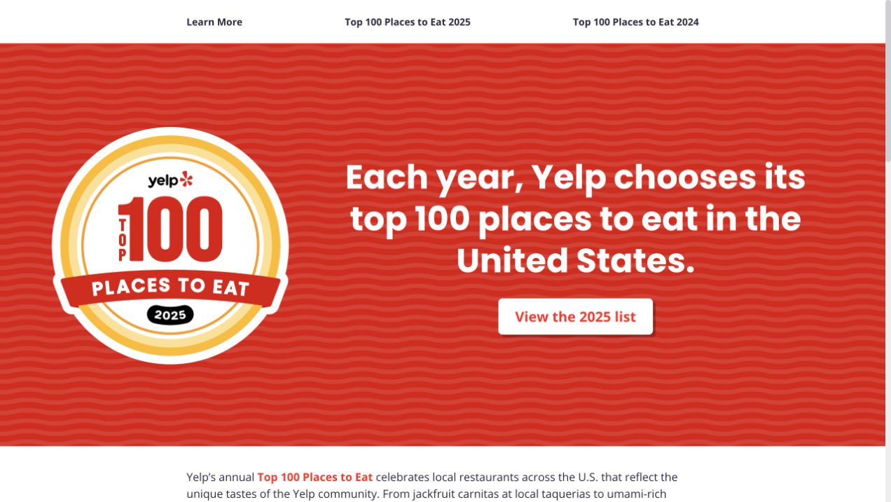
Yelp’s Top 100 Places to Eat 2025 uses a large badge beside a short introduction on a patterned red field. One pale action points to the 2025 list. A minimal white navigation bar distinguishes learning about the feature from the 2025 and 2024 editions, and a more detailed explanation begins below. The year is part of both the badge and the destination. SvelteKit assets and Svelte hydration boundaries identify this dedicated public feature, not Yelp.com as a whole or a newly issued 2026 ranking.
What you can learn
A Svelte editorial microsite can remain intentionally small when the main task is reaching a specific collection. Keep edition labels in actual text, maintain archive routes, and distinguish the introduction from the externally hosted list. Reuse the campaign frame without silently replacing old editions or making every annual collection compete for the same undated URL.
Pros
The primary action names the exact edition visitors will reach.
The simple navigation preserves a visible route to the previous collection.
Cons & considerations
The oversized badge occupies space that could preview collection content.
Moving to the main list on another property creates an additional navigation step.
Public source checked November 3, 2026. References may be embedded or legacy—not a complete backend inventory.
Platform source: Observed first-party page or linked application asset. The public ranking property loads SvelteKit _app/immutable assets and contains Svelte HEAD hydration boundaries. Platform evidence is separate from the direct website screenshot and is not a complete current infrastructure audit.
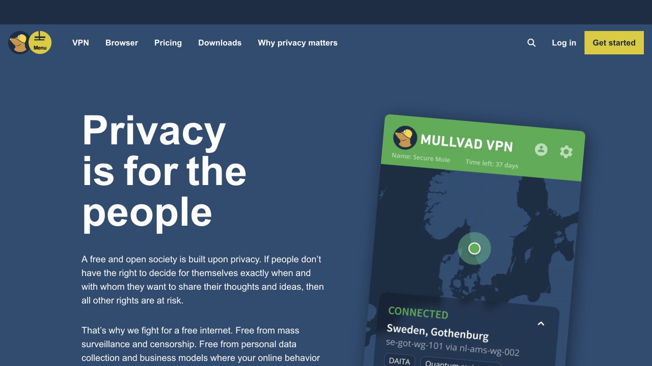
Mullvad’s public homepage uses a muted blue background, a large white principles-led heading, and a tilted application image. Yellow marks distinguish the menu and starting action from ordinary navigation. The supporting paragraphs explain the organization’s privacy position, while VPN, browser, pricing, downloads, and further reading remain direct header routes. Public SvelteKit assets identify the frontend relationship on this property. The illustration contains sample application content; the review did not open a private VPN account, establish a connection, or test privacy protections.
What you can learn
The transferable Svelte lesson is to keep principle, product, and evaluation routes connected but distinct. Reuse a stable navigation shell while technical information grows, and keep the product image illustrative rather than implying a verified connection. Treat security and privacy claims as separately documented content, never as conclusions drawn from an attractive blue interface.
Pros
Pricing and downloads remain accessible outside the broad principles statement.
The application image gives the introductory position a tangible product context.
Cons & considerations
Long introductory paragraphs require commitment before practical feature comparison.
The angled screenshot makes small interface details less readable.
Visible tech stack
Referenced on the public page
SvelteKit
nginxReported response header
Earlier / documented evidence
Svelte
Public source checked November 3, 2026. References may be embedded or legacy—not a complete backend inventory.
Platform source: Observed first-party page or linked application asset. The public homepage loads SvelteKit _app/immutable assets, including named header and navigation components. Platform evidence is separate from the direct website screenshot and is not a complete current infrastructure audit.
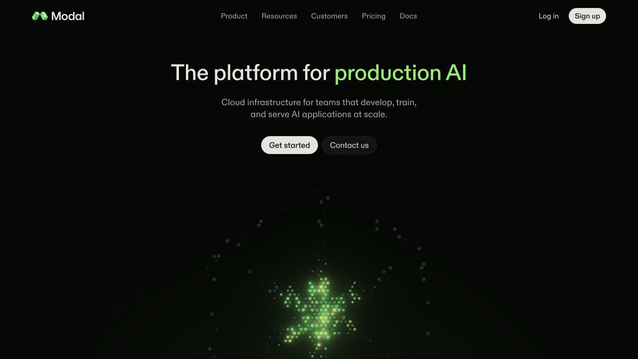
Modal uses a nearly black background with a short centered platform statement, highlighting its AI focus in green. Two actions distinguish getting started from contacting the company. A particle-like green field occupies the lower introduction, while a compact header retains product, resources, customers, pricing, and documentation routes. The page’s public SvelteKit assets establish the Svelte relationship for this marketing property. The visual review does not assess GPU availability, runtime performance, pricing claims, or any authenticated application environment.
What you can learn
A Svelte marketing page can separate lightweight introductory content from a richer visual module. Preserve a meaningful heading and real action links before decorative code initializes, reserve stable space for the effect, and supply reduced-motion behavior. Keep documentation and pricing available without forcing a visitor through a product signup or an animated product story.
Pros
The two primary routes reflect self-service and sales-led evaluation.
The compact header preserves technical documentation as an obvious destination.
Cons & considerations
The abstract visual explains little about actual operational workflows.
Very dark secondary text and decoration require careful contrast decisions.
Public source checked November 3, 2026. References may be embedded or legacy—not a complete backend inventory.
Platform source: Observed first-party page or linked application asset. The public page loads SvelteKit _app/immutable assets and page components. Platform evidence is separate from the direct website screenshot and is not a complete current infrastructure audit.
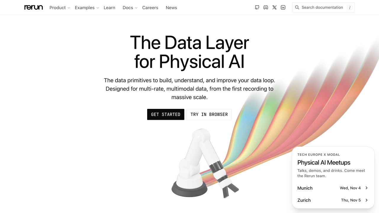
Rerun pairs a centered data-platform introduction with a robotic-arm illustration releasing broad colored streams. Black and outlined starting actions distinguish documentation-oriented setup from a browser trial. A thin header groups product, examples, learning, and documentation, while a small event panel occupies the lower right. The restrained white canvas keeps the colorful physical-world motif readable. Public SvelteKit assets identify the frontend on this marketing property; the underlying robotics data system and any customer deployments were not evaluated.
What you can learn
Use Svelte components to keep the promotional illustration, event content, and evaluation routes independently maintainable. The domain metaphor should support a written explanation rather than replace it. Give the trial a clearly defined destination, preserve ordinary documentation links, and make event panels removable without changing the main hero’s dimensions or reading order.
Pros
The robot image connects the product’s data language to its intended domain.
A browser-trial route is distinct from the setup documentation path.
Cons & considerations
Specialist vocabulary still needs accessible examples for unfamiliar readers.
An event panel can compete with the introductory illustration on smaller screens.
Public source checked November 3, 2026. References may be embedded or legacy—not a complete backend inventory.
Platform source: Observed first-party page or linked application asset. The public page loads SvelteKit _app/immutable assets and named header components. Platform evidence is separate from the direct website screenshot and is not a complete current infrastructure audit.
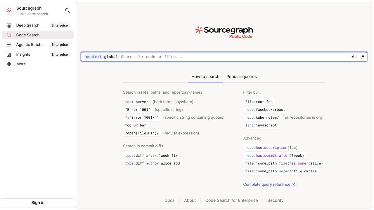
Sourcegraph’s public code-search page centers a wide query field in a quiet application shell. A persistent left navigation distinguishes code search from other product areas, with enterprise labels clarifying several routes. The empty state includes examples for text, repository, language, and advanced queries, while a complete reference link remains below. The page loads SvelteKit assets on this exact public search property. No query was submitted, and the review did not inspect private repositories, signed-in history, or any enterprise workspace.
What you can learn
An effective Svelte search interface should make its syntax discoverable before returning an error. Keep selected scope visible, make query state shareable through a meaningful URL, and preserve the input while results load. Use an empty state to teach one practical next action without turning the search surface into an unrelated promotional landing page.
Pros
Examples explain how the structured query field differs from ordinary site search.
The persistent shell makes the current public-search context visible.
Cons & considerations
Advanced syntax can still feel intimidating to a first-time user.
Several enterprise destinations are visible before a visitor performs the basic task.
Visible tech stack
Earlier / documented evidence
Svelte
Earlier cited evidence retained; no current scan result. References may be embedded or legacy—not a complete backend inventory.
Platform source: Observed first-party page or linked application asset. The public search entry page loads SvelteKit assets under /.assets/_sk/_app/immutable/. No code search query was submitted. Platform evidence is separate from the direct website screenshot and is not a complete current infrastructure audit.
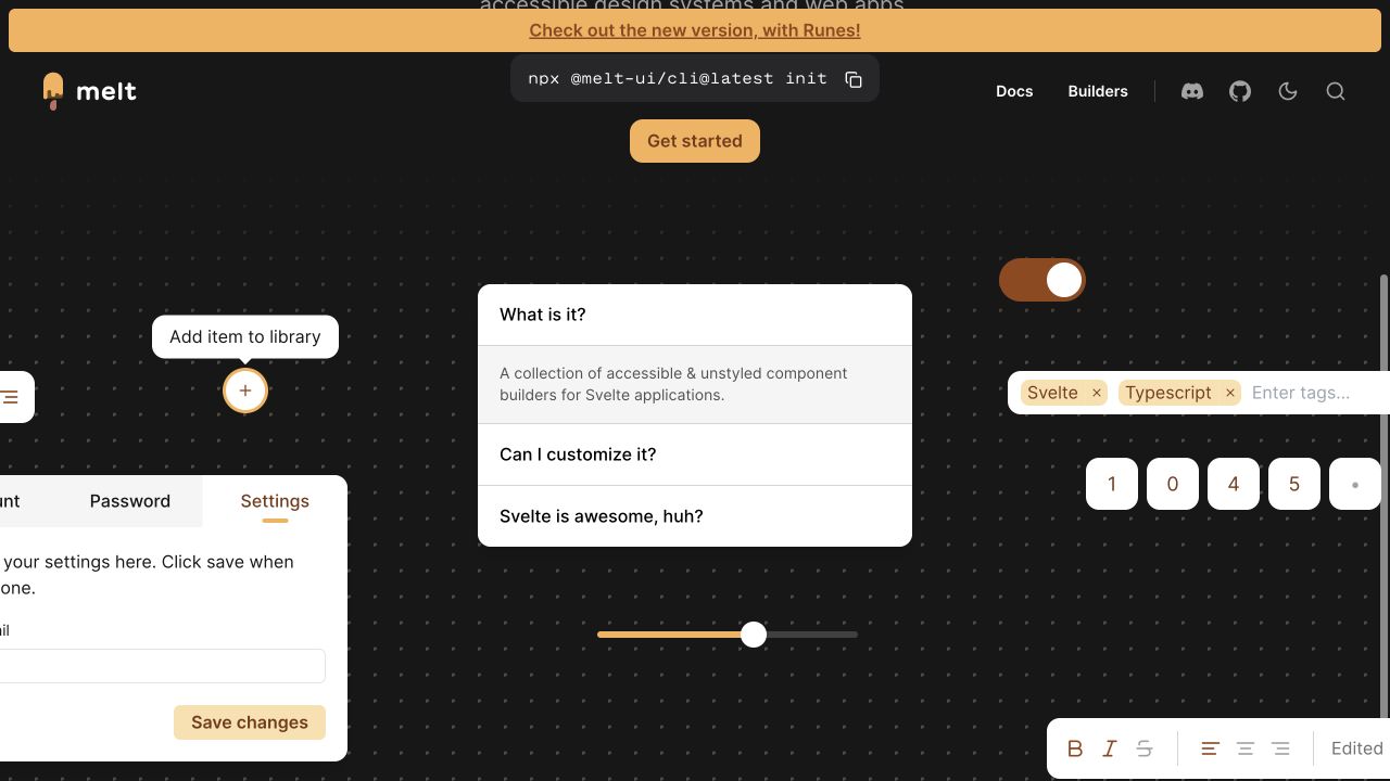
Melt UI’s captured page shows a dark dotted canvas filled with example interfaces: an accordion, a slider, a switch, tags, tabs, number fields, and text controls. Warm amber accents connect active states and the installation route. A small command surface and getting-started action sit near the upper area, with documentation and builder navigation above. The capture is a public specimen view, not a submitted settings form. Public SvelteKit assets establish the Svelte relationship on this exact property.
What you can learn
A Svelte component showcase should make demonstrated behavior distinguishable from real account settings. Use coherent focus and selected-state treatments, preserve accessible labels, and document the consumer’s styling responsibilities. A dramatic specimen wall can explain breadth, but each component still needs its own focused reference and a usable presentation when there is no room for the surrounding examples.
Pros
The range of specimens demonstrates related interaction patterns in one visual system.
Warm accents help distinguish active elements from the dark backdrop.
Cons & considerations
Large surrounding specimens can crop awkwardly at the viewport edges.
Many simultaneous controls can distract from understanding one component’s behavior.
Public source checked November 3, 2026. References may be embedded or legacy—not a complete backend inventory.
Platform source: Observed first-party page or linked application asset. The public documentation site loads SvelteKit _app/immutable assets and component styles. Platform evidence is separate from the direct website screenshot and is not a complete current infrastructure audit.
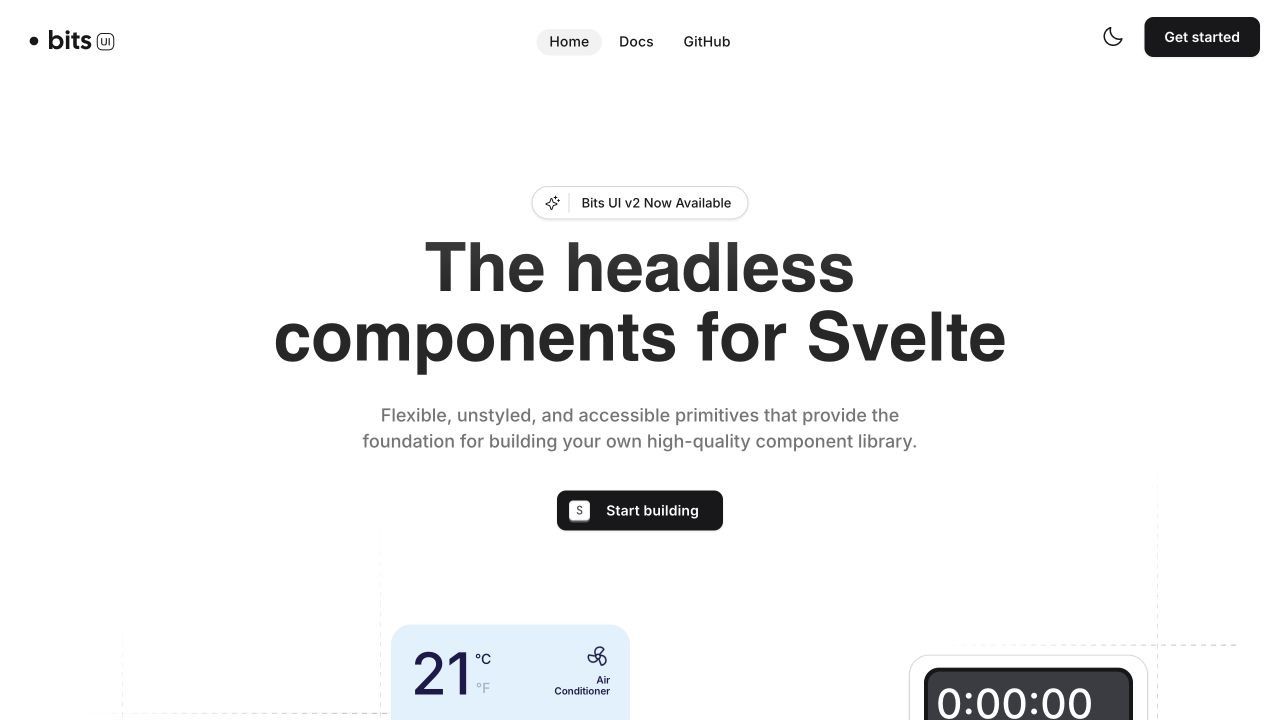
Bits UI uses a spacious white page, very large black introductory type, and a restrained release announcement. The short supporting description explains the unstyled-primitives approach before a single starting action. A temperature-control specimen and a timer begin below, hinting at practical interface composition without occupying the entire opening. The compact header keeps home, documentation, repository, appearance, and setup controls distinct. Public SvelteKit entry assets identify the frontend relationship. No specimen controls or repository actions were changed during the visual review.
What you can learn
The useful Svelte pattern is a simple editorial explanation leading into independently understandable components. Keep documentation and release context easy to locate, but separate styling flexibility from behavior guarantees. For each specimen, document keyboard interaction, labels, focus, and disabled states instead of assuming a polished default appearance communicates what the library actually provides.
Pros
The introduction explains the library’s role before showing implementation detail.
The starting action remains clear within a deliberately limited palette.
Cons & considerations
The large heading leaves little room for examples in the first view.
Sparse initial specimens cannot explain the full range of supported behaviors.
Public source checked November 3, 2026. References may be embedded or legacy—not a complete backend inventory.
Platform source: Observed first-party page or linked application asset. The public documentation site preloads SvelteKit _app/immutable entry and chunk modules. Platform evidence is separate from the direct website screenshot and is not a complete current infrastructure audit.
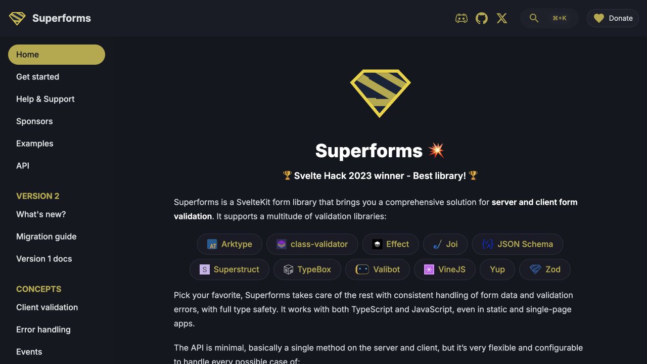
Superforms uses a dark documentation shell with yellow identity and active-state accents. A persistent left sidebar distinguishes setup, support, examples, API, version changes, and conceptual topics. The main introduction explains the form-library purpose and displays a row of validation-library names before continuing into detailed text. Repository, search, community, and donation controls sit above. Public SvelteKit assets identify the site’s Svelte relationship. The capture is documentation only; no user form, validation payload, or donation was submitted.
What you can learn
A Svelte form-library website should distinguish client convenience from authoritative server validation in both writing and examples. Keep version and migration context visible, use real reference links for supported adapters, and organize error handling as a first-class topic. The documentation shell should remain readable when code examples and explanatory tables grow much longer than the homepage introduction.
Pros
Version and migration routes are visible in the same persistent navigation.
The introduction connects the library to concrete validation ecosystems.
Cons & considerations
A long conceptual sidebar can overwhelm readers before their first setup.
Dense prose and many library badges require careful mobile grouping.
Public source checked November 3, 2026. References may be embedded or legacy—not a complete backend inventory.
Platform source: Observed first-party page or linked application asset. The public documentation site loads SvelteKit _app/immutable assets and named layout components. Platform evidence is separate from the direct website screenshot and is not a complete current infrastructure audit.
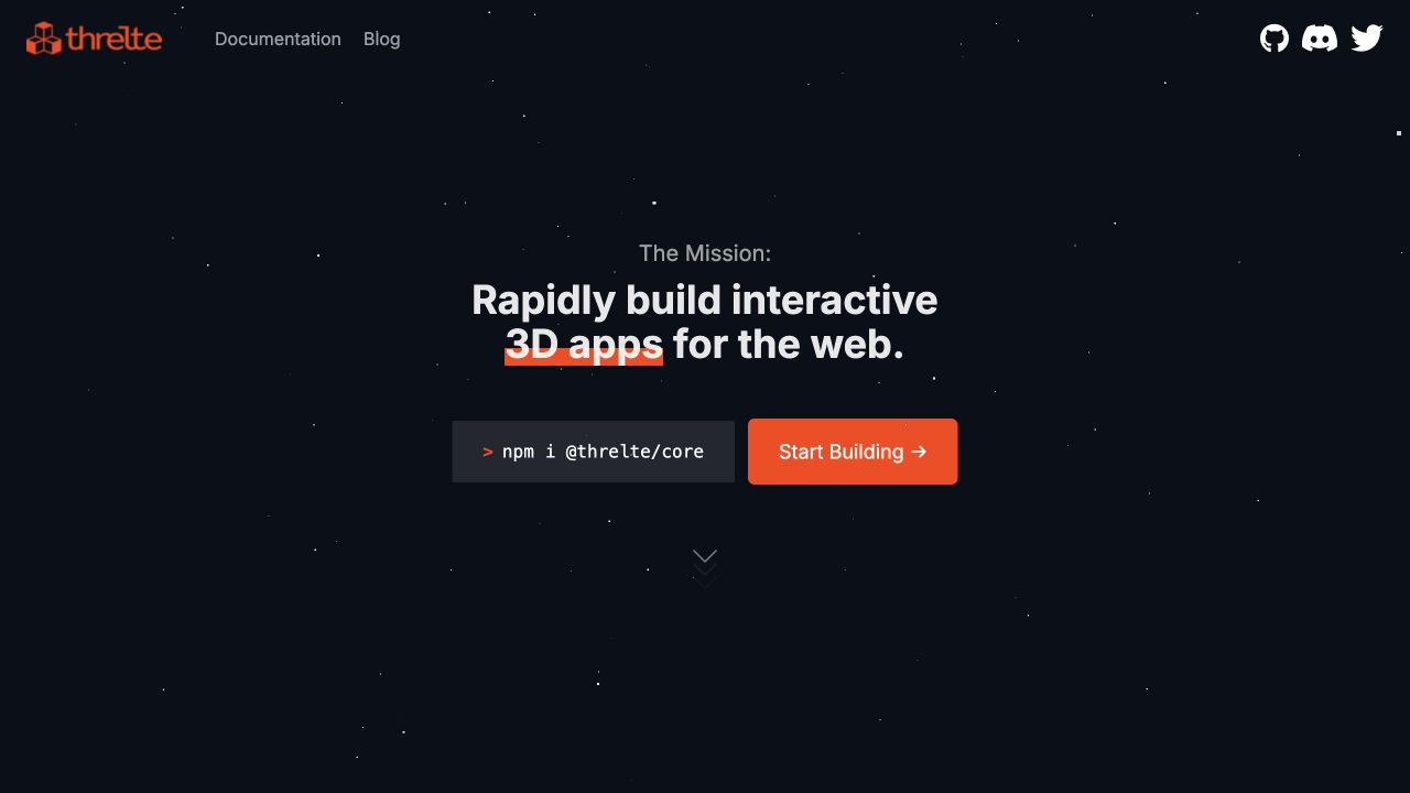
Threlte’s loaded public opening places a short mission statement in a dark star-like scene, with an installation command and a bright orange starting action beneath it. The orange identity, documentation, blog, and community links remain in a quiet header. The screenshot captures a useful textual state rather than an empty initialization frame. This property is an explicit mixed-stack example: its HTML embeds Svelte components through Astro’s Svelte renderer, including the hero wrapper. It is not classified as a wholly SvelteKit-based website.
What you can learn
The transferable lesson is a clear boundary between an editorial host and interactive Svelte islands. Preserve a useful heading and setup link while rendering initializes, and make the visual module disposable when motion or graphics support is limited. Keep framework and renderer relationships explicit so the implementation brief does not confuse a few interactive components with the entire site architecture.
Pros
The installation command and starting route remain close to the introduction.
The quiet header lets the visual identity avoid competing with many utilities.
Cons & considerations
The sparse opening gives little indication of finished example applications.
Graphics initialization needs a robust fallback rather than leaving an empty dark canvas.
Public source checked November 3, 2026. References may be embedded or legacy—not a complete backend inventory.
Platform source: Observed first-party page or linked application asset. The public page declares Astro islands whose renderer-url is /_astro/client.svelte.B0YDF7oC.js, including MobileMainNav and HeroWrapper. This establishes Astro-hosted Svelte components, not SvelteKit. Platform evidence is separate from the direct website screenshot and is not a complete current infrastructure audit.
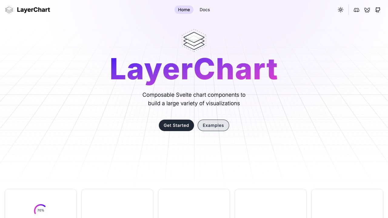
LayerChart places a large purple-gradient identity over a pale perspective grid. A short centered description explains the composable-chart purpose, followed by distinct setup and example actions. Several chart-card previews begin below, using consistent light borders and frames. Home, documentation, appearance, and community utilities remain in a compact header. Public SvelteKit assets establish the Svelte relationship for this website. The visual review does not verify the numerical correctness, accessibility, or runtime behavior of every chart represented in the catalog.
What you can learn
A Svelte chart-library presentation should connect an attractive specimen to its data model and reference documentation. Keep example URLs stable, preserve selected settings when moving between demonstrations, and offer text or table alternatives for meaningful values. Decorative perspective and gradients can establish identity, but they should not become part of the actual chart’s scale or reading instructions.
Pros
Example browsing is available directly beside the setup route.
A consistent card frame makes different chart forms feel part of one library.
Cons & considerations
The large identity delays the useful chart specimens until the lower edge.
Small preview charts cannot demonstrate detailed interaction or accessible alternatives.
Public source checked November 3, 2026. References may be embedded or legacy—not a complete backend inventory.
Platform source: Observed first-party page or linked application asset. The public documentation site loads SvelteKit _app/immutable component and layout assets. Platform evidence is separate from the direct website screenshot and is not a complete current infrastructure audit.
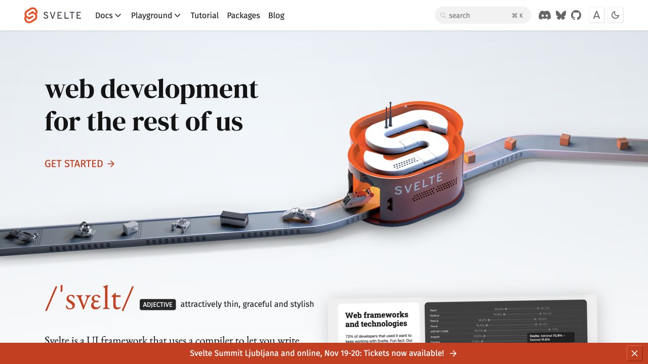
Svelte’s homepage places a large serif introduction beside a dimensional machine bearing the project mark. A conveyor-like scene connects small objects through the illustration, giving the compiler theme a physical metaphor. Documentation, playground, tutorial, packages, and blog routes remain in a simple white header, with search and display controls at the right. A separate event announcement sits along the lower edge. Public SvelteKit assets establish the framework relationship; the visual metaphor itself is not treated as implementation evidence.
What you can learn
A Svelte framework homepage can be expressive while keeping learning destinations ordinary and predictable. Separate decorative scene components from the document outline, preserve a meaningful heading before graphics load, and make reduced-motion behavior intentional. Event announcements should be replaceable without changing the permanent tutorial, documentation, or reference routes that external resources depend on.
Pros
The illustration gives the project’s compilation model a memorable visual metaphor.
Learning and exploratory routes are directly available in the header.
Cons & considerations
A large dimensional scene needs a practical fallback for constrained devices.
The event banner reduces space available to the next explanatory section.
Public source checked November 3, 2026. References may be embedded or legacy—not a complete backend inventory.
Platform source: Observed first-party page or linked application asset. The framework’s own public website loads SvelteKit _app/immutable assets and declares its SvelteKit bootstrap. Platform evidence is separate from the direct website screenshot and is not a complete current infrastructure audit.
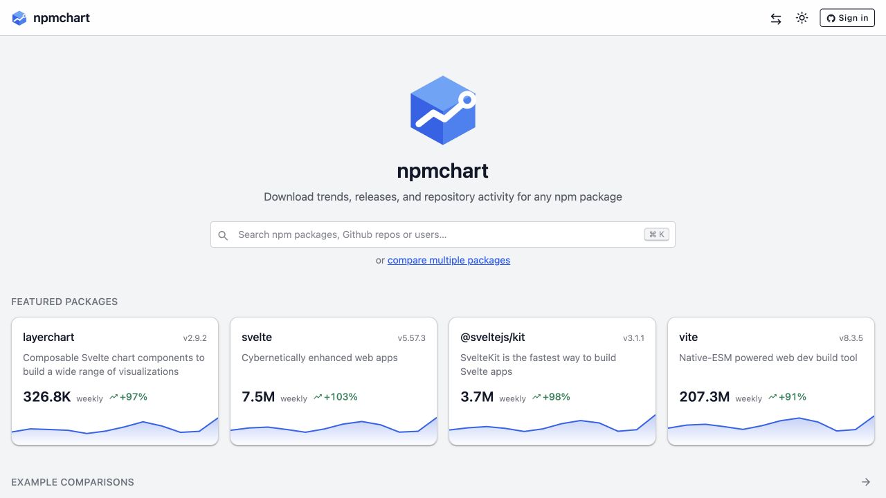
npmchart centers its identity, a concise purpose statement, and a wide search field on a light gray canvas. A separate comparison route sits directly below the field. Featured package cards begin underneath, each using the same structure for description, version, weekly count, percentage, and small trend line. The header remains minimal, with a comparison utility, appearance control, and account route. Public SvelteKit assets identify the property’s Svelte relationship. Counts in the dated screenshot are interface content, not verified measures of package quality.
What you can learn
A Svelte data utility should make metric definitions and comparison context as clear as the cards themselves. Preserve useful package URLs, explain time windows, and distinguish loading data from zero values. Keep search and comparison as related but different tasks, and avoid letting a convenient popularity figure imply reliability, security, or suitability for a particular project.
Pros
The comparison link is visible before a visitor chooses a package.
Consistent metric cards make the featured examples easy to scan.
Cons & considerations
Prominent download figures can invite conclusions they do not support.
Small trend previews need a fuller accessible view for meaningful comparison.
Visible tech stack
Earlier / documented evidence
Svelte
Earlier cited evidence retained; no current scan result. References may be embedded or legacy—not a complete backend inventory.
Platform source: Observed first-party page or linked application asset. The public page loads SvelteKit _app/immutable assets and named chart/layout styles. Platform evidence is separate from the direct website screenshot and is not a complete current infrastructure audit.
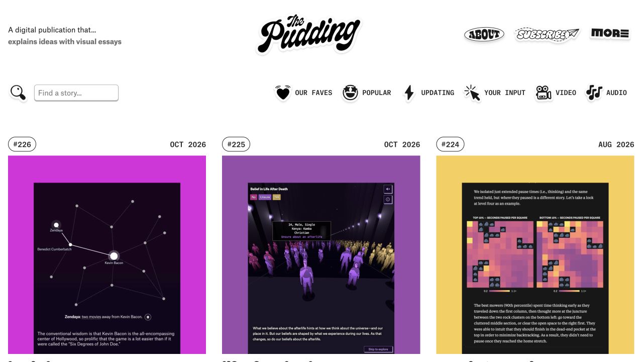
The Pudding uses a playful black-and-white masthead above a three-column story index. Each story has a large colorful visual specimen, a small issue marker, and a visible publication month. Search sits to the left of a row of illustrated filters for favorites, popularity, updates, participation, video, and audio. The overall shell remains restrained enough for individual essays to have distinct palettes. Public SvelteKit assets identify the publication homepage, not necessarily every independently produced essay or embedded interactive.
What you can learn
A Svelte editorial index can share discovery behavior without forcing all stories into the same visual identity. Keep publication dates, titles, formats, and destinations meaningful outside the thumbnails. Preserve filter state and readable empty results, and let individual visual essays own their interaction only after a visitor chooses to enter them.
Pros
The uniform index frame accommodates stories with very different visual styles.
Format and editorial filters provide alternatives to chronological browsing.
Cons & considerations
Large screenshots can delay the actual story title below the visible edge.
Playful filter icons need equally clear text labels and selected states.
Visible tech stack
Referenced on the public page
SvelteKit
Amazon CloudFrontDelivery / hosting signal
Earlier / documented evidence
Svelte
Public source checked November 3, 2026. References may be embedded or legacy—not a complete backend inventory.
Platform source: Observed first-party page or linked application asset. The public editorial homepage loads SvelteKit _app/immutable assets and story-list component styles. Platform evidence is separate from the direct website screenshot and is not a complete current infrastructure audit.
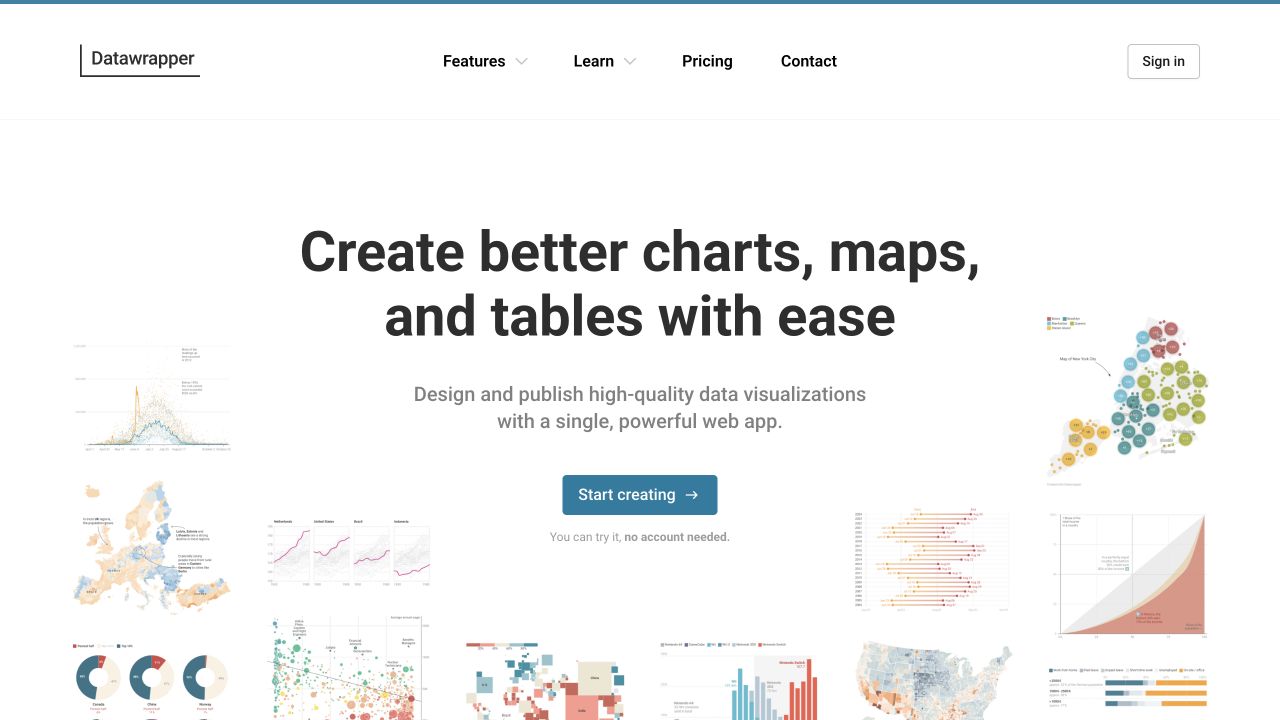
Datawrapper centers a plain product statement above a blue starting action, with chart, map, and table specimens arranged around the edges and lower section. The white canvas and restrained typography keep the central explanation separate from the colorful example outputs. A short note clarifies that the first trial does not require an account. The header preserves features, learning, pricing, contact, and sign-in routes. Public SvelteKit assets establish the Svelte association on the marketing property, not the implementation of every published visualization.
What you can learn
A Svelte marketing system can show a varied output catalog without importing the entire editor into its homepage. Make each specimen understandable as an example, keep a useful still presentation, and distinguish exploring the product from creating an account. Connect evaluation claims to concrete documentation, especially for data formats, embedding, accessibility, and ongoing publication responsibilities.
Pros
The example variety makes the product category clear before detailed reading.
Learning and pricing remain direct routes outside the central starting action.
Cons & considerations
Small peripheral charts cannot communicate their underlying data or methodology.
The output montage needs careful cropping so it does not crowd mobile text.
Public source checked November 3, 2026. References may be embedded or legacy—not a complete backend inventory.
Platform source: Observed first-party page or linked application asset. The public marketing website loads SvelteKit _app/immutable assets and named interaction components. Platform evidence is separate from the direct website screenshot and is not a complete current infrastructure audit.
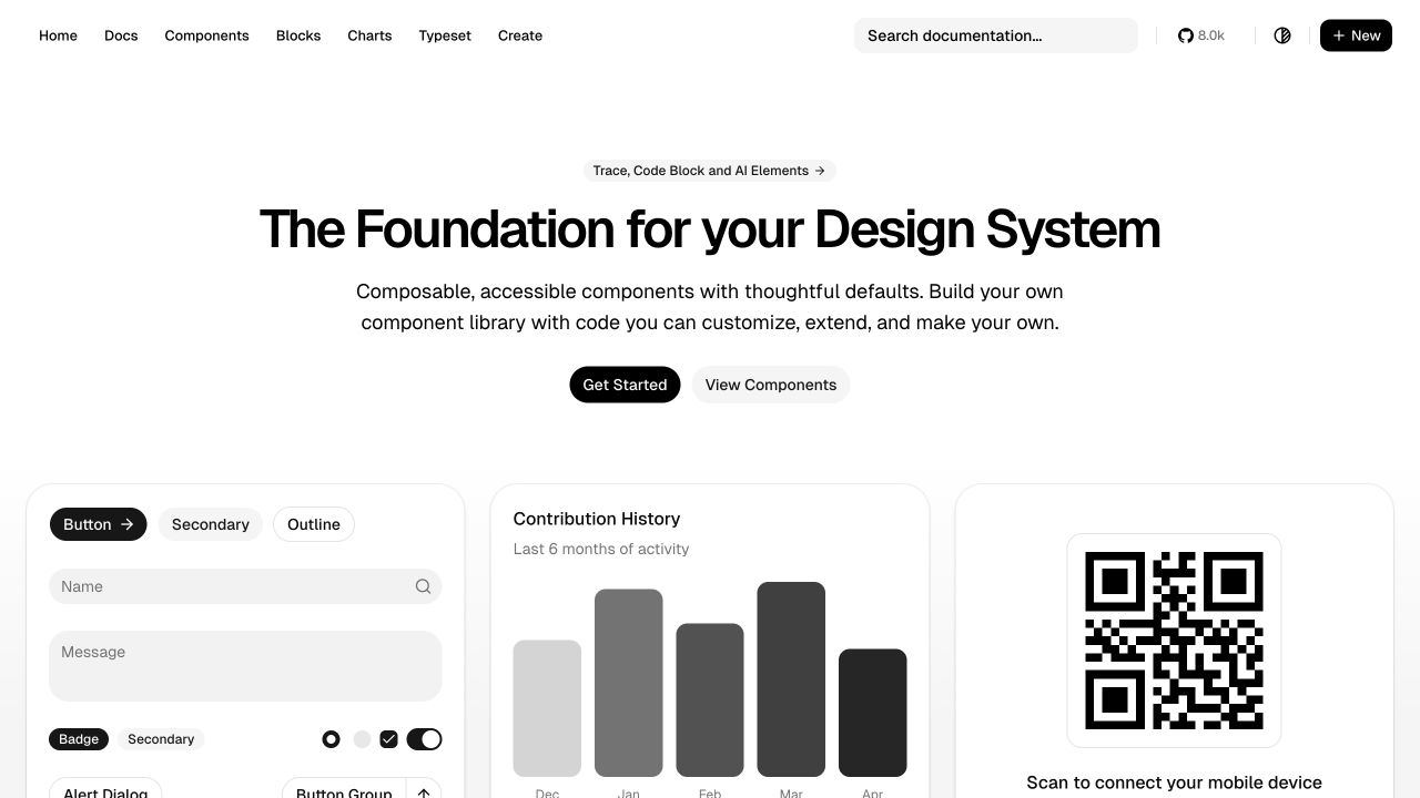
shadcn-svelte uses a centered introduction above large monochrome specimen cards. Buttons, input fields, a contribution chart, and a QR panel demonstrate repeated border, radius, and spacing conventions. The header distinguishes documentation, components, blocks, charts, typesetting, and creation tools, while search stays prominent on the right. Setup and component browsing are separate actions beneath the description. Public SvelteKit entry assets establish the website’s Svelte relationship. The displayed specimen content is illustrative; no form, QR destination, or account-related control was used.
What you can learn
A Svelte component resource should make the difference between primitive, composed block, and application task explicit. Keep specimen interactions safe and clearly labeled, and document what a consumer owns after adopting the code. Reuse a coherent visual frame, but test actual error, focus, and responsive states instead of treating the polished gallery as a finished product specification.
Pros
The specimens show how small controls combine into larger useful surfaces.
The navigation provides direct routes for different levels of composition.
Cons & considerations
A broad specimen wall can become crowded on narrower screens.
Example forms and codes need context so visitors do not treat them as real tasks.
Public source checked November 3, 2026. References may be embedded or legacy—not a complete backend inventory.
Platform source: Observed first-party page or linked application asset. The public component-documentation website preloads SvelteKit _app/immutable entry and chunk modules. Platform evidence is separate from the direct website screenshot and is not a complete current infrastructure audit.
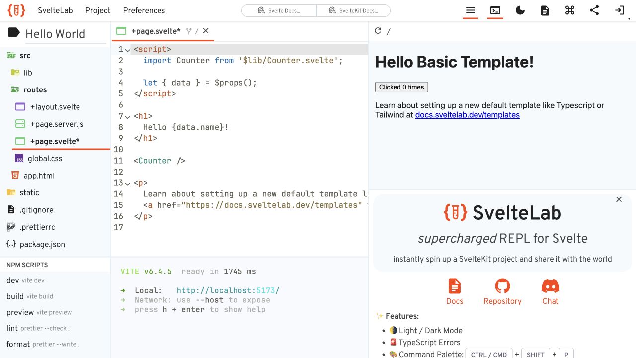
SvelteLab’s loaded public page is an editor rather than a conventional homepage. A file tree sits on the left, syntax-highlighted Svelte code occupies the middle, and a basic rendered page appears to the right. A terminal region shows the default development environment, while an introductory panel explains the tool in the preview area. Project and preference menus remain in the top strip. Public SvelteKit bootstrapping identifies the frontend relationship. The review used the default public example without editing, sharing, importing a repository, or signing in.
What you can learn
A Svelte workspace needs explicit boundaries between editor state, execution output, and the rendered application. Keep loading and failed-start states understandable, preserve the user’s files, and label introductory panels so they do not masquerade as application output. Documentation should explain what stays local, what is shared, and which actions create persistent projects before a visitor takes them.
Pros
Code and rendered output are visible together in a concrete default example.
The file tree shows the surrounding project structure rather than one isolated snippet.
Cons & considerations
A multi-pane workspace is difficult to use at small widths.
Environment initialization can leave an empty page without a strong loading explanation.
Public source checked November 3, 2026. References may be embedded or legacy—not a complete backend inventory.
Platform source: Observed first-party page or linked application asset. The public browser-development website declares a __sveltekit bootstrap variable. Platform evidence is separate from the direct website screenshot and is not a complete current infrastructure audit.
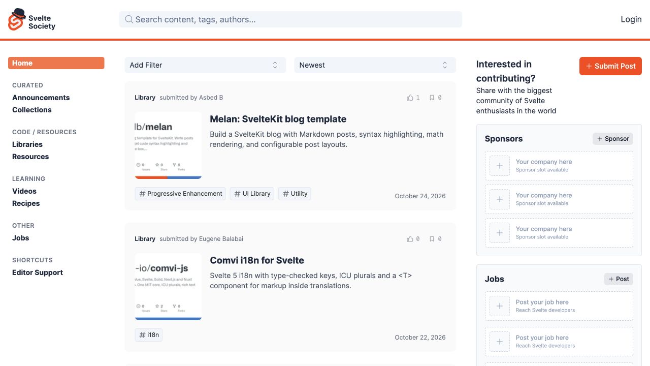
Svelte Society uses a three-column directory layout. A persistent left taxonomy separates curated announcements, libraries, resources, learning, jobs, and shortcuts. The central feed combines thumbnails, titles, descriptions, tags, submitter information, and dates, with filters and sorting above. The right side gives contribution and sponsorship routes their own area. Orange identity accents connect the selected navigation and submission action. Public SvelteKit assets identify the website. No resource, job, sponsorship, account, or community submission was created during the review.
What you can learn
A Svelte directory should model taxonomy, publication status, attribution, and filtering as structured content rather than a collection of manually styled cards. Keep resource links stable, preserve filter state in a shareable location, and distinguish curated content from sponsored placements. Test empty, outdated, and removed-resource states as carefully as the newest-item feed shown on the homepage.
Pros
Structured tags and visible dates make resource cards more informative.
Contribution actions are separate from the main browsing and filtering controls.
Cons & considerations
Three columns can make the central feed narrow on intermediate displays.
Several empty sponsor areas add visual space without helping resource discovery.
Visible tech stack
Earlier / documented evidence
Svelte
Earlier cited evidence retained; no current scan result. References may be embedded or legacy—not a complete backend inventory.
Platform source: Observed first-party page or linked application asset. The public community website loads _app/immutable assets and declares a __sveltekit bootstrap. Platform evidence is separate from the direct website screenshot and is not a complete current infrastructure audit.
A visualization, filter, or embedded tool can belong inside a broader publishing site. Specify the inputs, loading state, keyboard behavior, readable fallback, and ownership of any shared URL state. Keep the surrounding content independently understandable. The presence of one Svelte-rendered island does not imply that every route or backend uses the same architecture.
A complete public application
If the project needs several related routes and data-driven interactions, plan the application shell, direct-entry behavior, page titles, and error routes together. Define where data loads and what should refresh when a visitor moves between records. Keep private credentials and authorization in appropriate server-side boundaries; a convenient client component is not a substitute for those controls.
Start with real article and landing-page content, then identify the genuinely interactive requirements. Give editors a usable publishing interface and document the connection between publication and the public page. A small JavaScript footprint can be a goal, but measure the deployed content and media rather than treating a framework name as a performance certificate.
From references to requirements
Turn an appealing reference into a resilient Svelte website
Specify the data's meaning and visible context
For a report or directory, record the edition, time period, units, categories, source, and empty-state language. Keep that context visible near the result rather than assuming people arrived through the introduction. Test an unfamiliar visitor's interpretation before adding animation. A polished chart still needs a clear explanation of what its values mean and what they do not establish.
Make form outcomes explicit
Define required information, validation, submission, failure, and confirmation as separate states. SvelteKit form actions can handle POST submissions and support progressive enhancement. The actual implementation still needs appropriate server validation, abuse protection, authorization where relevant, and a truthful confirmation. Test slow or failed delivery without repeatedly triggering real transactions.
Ask the maintaining team to update a representative record, preview it, publish it, correct it, and identify the responsible service when something fails. Include dependency updates, environment configuration, monitoring, and rollback in that demonstration. A visually spare website can still have a complex operational boundary; keep that boundary documented and accessible to the people who own it.
A useful handover demonstration
Ask the actual team to carry out its routine job: publish a realistic update, correct a mistake, preview a narrow screen, and identify who owns an integration failure. For a library or frontend framework, also ask who maintains the content source and deployment. A polished screenshot does not answer those operational questions.
Beyond the screenshot
A Svelte website checklist beyond the opening view
Record whether each attribution concerns Svelte, SvelteKit, or an embedded component.
Test direct routes, page titles, back navigation, and unavailable records.
Confirm initial content and the intended page rendering options.
Keep report dates, units, sources, and edition labels explicit.
Review loading, empty, error, stale, and successful data states.
Test keyboard operation, readable labels, zoom, and narrow layouts.
Check form validation, recovery, delivery, and truthful confirmation.
Keep secrets and authorization outside public client data.
Demonstrate editorial updates, deployment, monitoring, and rollback.
Test with real content, a keyboard, a small screen, slow or failed requests, and the people who will maintain the system. These are planning checks, not an accessibility, security, performance, or search-ranking certification.
Sources & editorial method
How this Svelte collection was reviewed
Examples use direct public-page captures and specific Svelte or SvelteKit evidence. Framework relationships, embedded islands, and older report editions retain visible qualifications. Apple Music is represented only by a public entry page, not a personal library or account. Screenshots and interface notes do not certify interaction quality, accessibility, current data, full backend architecture, or business results.
Every image is an unmodified capture from the actual website, with its source and capture date. Some captures are reused from our shared catalog; their dates remain the original capture dates. None comes from a vendor gallery or a generated reconstruction. Moving imagery and live content can change.
Technology attribution uses public page assets or metadata, official platform documentation, or a cited first-party project case study. Documentary and framework-relationship evidence is identified where used; it is not a complete current backend inventory. A CMS image CDN alone does not establish a full CMS deployment. A library’s presence does not prove which individual controls use it, and a platform label does not establish AI authorship.
The composition notes, lessons, pros and tradeoffs are original editorial observations. We have not measured conversion, traffic, security, performance or accessibility conformance. Website owners retain their brands and imagery; these examples are not our client portfolio. Written, Edited and Curated are independent records, not dates advanced by a build. See our editorial standards or suggest a correction.
Questions worth asking
Svelte website development FAQs
Are Svelte and SvelteKit the same thing?
No. Svelte is the component framework; SvelteKit supplies broader application capabilities. Evidence for a Svelte component does not automatically establish a complete SvelteKit deployment.
Why include a 2025 report in a collection curated in 2026?
The report can still offer useful design lessons. Its original edition remains explicit, and the review does not relabel its data as a current 2026 measurement.
Does choosing Svelte guarantee a fast website?
No. Data access, media, third-party services, rendering choices, and implementation details still matter. Measure representative pages and interactions in the actual deployment.
Can a Svelte site have a normal editing workflow?
Yes, when a suitable CMS or other publishing interface is integrated. Request a demonstration of real edits, previews, publication, and correction; the component framework itself is not an editor for business staff.
Can a public capture reveal a protected application's behavior?
No. These examples stay within public, nonpersonalized pages. Protected account flows, transactions, and administrative systems require separate authorized testing.