JavaScript can enhance a public website with navigation, preferences, media controls, search, and demonstrations. The important design question is what each interaction does for the visitor, how its state is communicated, and what remains useful when it fails.
The twenty examples below are distinct public website properties whose delivered HTML declares executable JavaScript resources or executable inline scripts. That observation supports a script-layer association. It does not reveal the owner of every control, prove a server runtime, identify private application architecture, or demonstrate that a visible interaction works correctly.
The direct captures show an initial public state. No account was created, form submitted, software installed, donation made, or financial action performed. The reviews use visible affordances to identify design and implementation questions, keeping observed appearance separate from recommended testing. Reused screenshots preserve their original dates.
Before the examples
What makes good JavaScript website development in 2026?
Give every interaction a clear job
Describe the user’s intended action before choosing a library or animation. A menu reveals destinations, a preference control changes a local setting, a search submits a question, and a link navigates elsewhere. Similar visual styling should not hide those different responsibilities.
Specify states and transitions explicitly
List the starting state, loading state, success, empty result, recoverable error, and cancellation where relevant. Decide what changes in the document and how the change is communicated. Include keyboard focus and a way to leave an overlay in the behavior specification, not as a final polish task.
Keep a useful baseline and enhance deliberately
Preserve readable content and ordinary destinations wherever the task allows. Then add the interaction that improves a specific journey. JavaScript has its own loading and execution cost; an optional illustration or third-party widget should not unnecessarily prevent access to the page’s core information.
NASA, Microsoft .NET, Shopify, The Verge, and UNICEF open the collection as recognizable public properties. The remaining references show different combinations of disclosure navigation, preferences, search, demonstrations, and external entry routes. The commentary considers interaction responsibilities without claiming that an untested affordance passed a behavior audit.
We start with five recognizable brands or organizations: NASA, Microsoft .NET, Shopify, The Verge, UNICEF. Each attribution applies to the named website property, not every product or website belonging to its organization. This is a curated reading sequence, not a measured ranking.
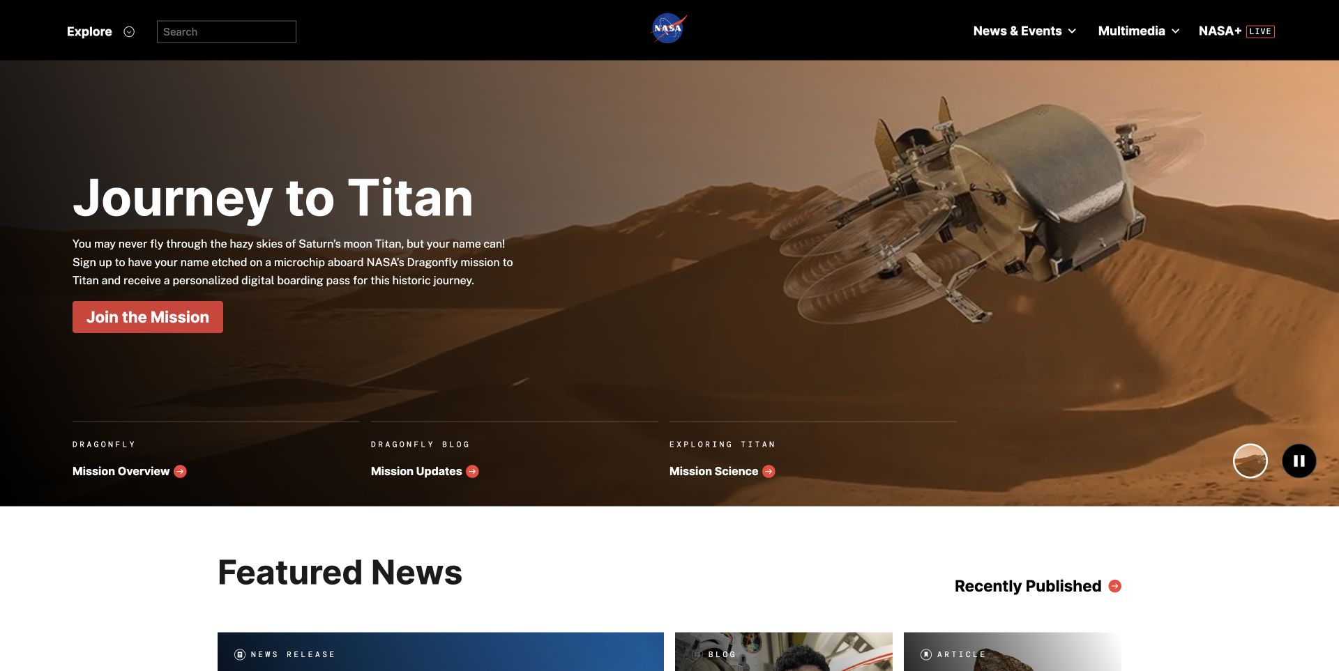
NASA’s captured opening includes a mission story, an action, three related links, and a visible pause control beside a circular media indicator. Search and expandable navigation remain in the solid header above the scene. Those affordances give the page more than one interaction responsibility: discovery, media, and onward reading. The public response declares executable JavaScript resources. That evidence establishes a script layer on the named page, but it does not identify the code responsible for every control or prove how those controls behave with assistive technology.
What you can learn
Use this reference to write an interaction inventory before choosing a library. Media needs an understandable stopped state, navigation needs reliable keyboard behavior, and search needs a useful failure response. Keep the mission headline and related destinations available independently of those enhancements, then test one interaction at a time under slow loading and script failure.
Pros
A visible pause affordance acknowledges that motion needs user control.
Supporting mission destinations provide alternatives to the main campaign action.
Cons & considerations
Several interaction types share the first screen and require separate testing.
An icon-only media control needs a clear accessible name and state.
Visible tech stack
JavaScript
Platform source: Observed first-party public HTML response. Observed executable JavaScript script resource references in the public HTML response. Script presence does not identify the owner of each visible control, a server runtime, or private product behavior. Platform evidence is separate from the direct website screenshot and is not a complete current infrastructure audit.
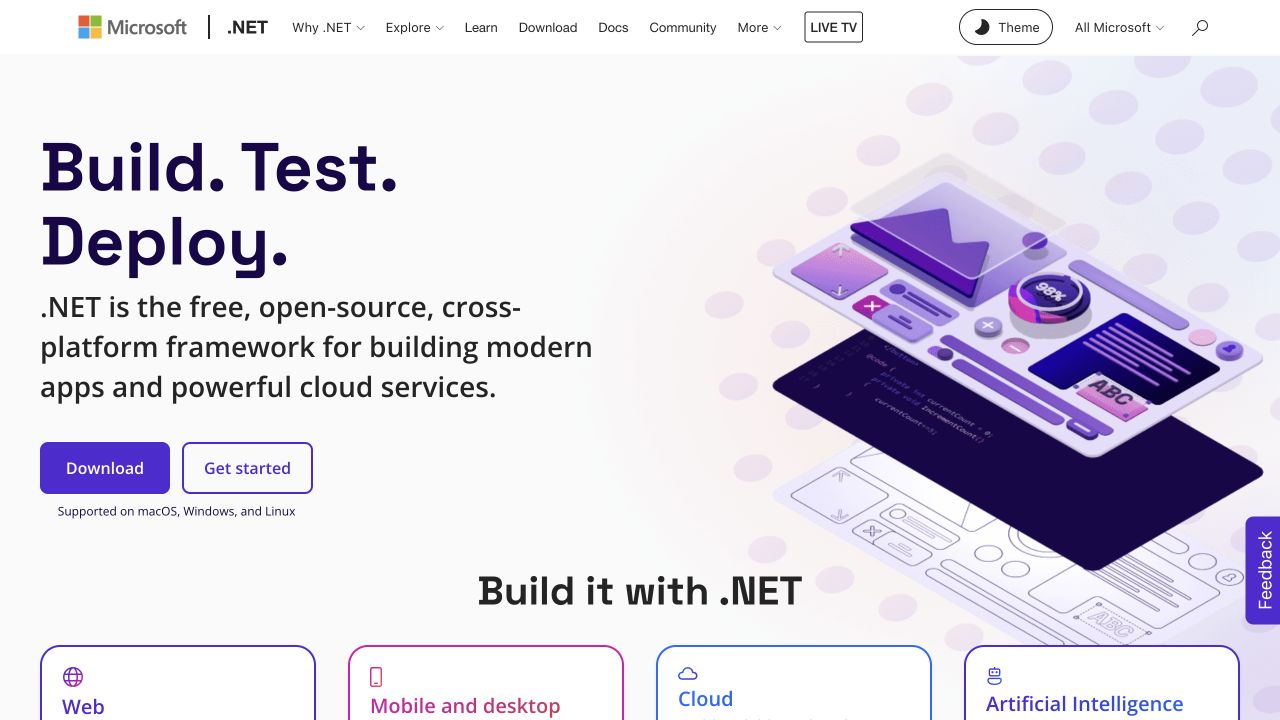
Microsoft’s .NET capture shows download and getting-started routes beneath a short introduction, with a theme control, search icon, and several disclosure indicators in the header. The large product illustration is secondary to those practical choices. Public JavaScript references are present in the response, including site and measurement resources; their presence does not establish that a particular visible control uses a particular library. The screenshot records the public default view and does not test a download, account, or installed application.
What you can learn
Separate local interface preferences from destinations that navigate elsewhere. A theme switch should have a meaningful current state and a documented persistence rule, while a download link should describe its destination. Ensure header disclosures do not depend on pointer hover alone, and preserve useful learning links when scripts arrive late or fail to initialize.
Pros
The opening offers both learning and downloading without conflating them.
The theme affordance is visible rather than buried in account settings.
Cons & considerations
The long utility row creates several keyboard and narrow-screen cases.
A screenshot cannot establish whether theme preference survives reloads or follows system settings.
Visible tech stack
JavaScript
Platform source: Observed first-party public HTML response. Observed executable JavaScript script resource references in the public HTML response. Script presence does not identify the owner of each visible control, a server runtime, or private product behavior. Platform evidence is separate from the direct website screenshot and is not a complete current infrastructure audit.
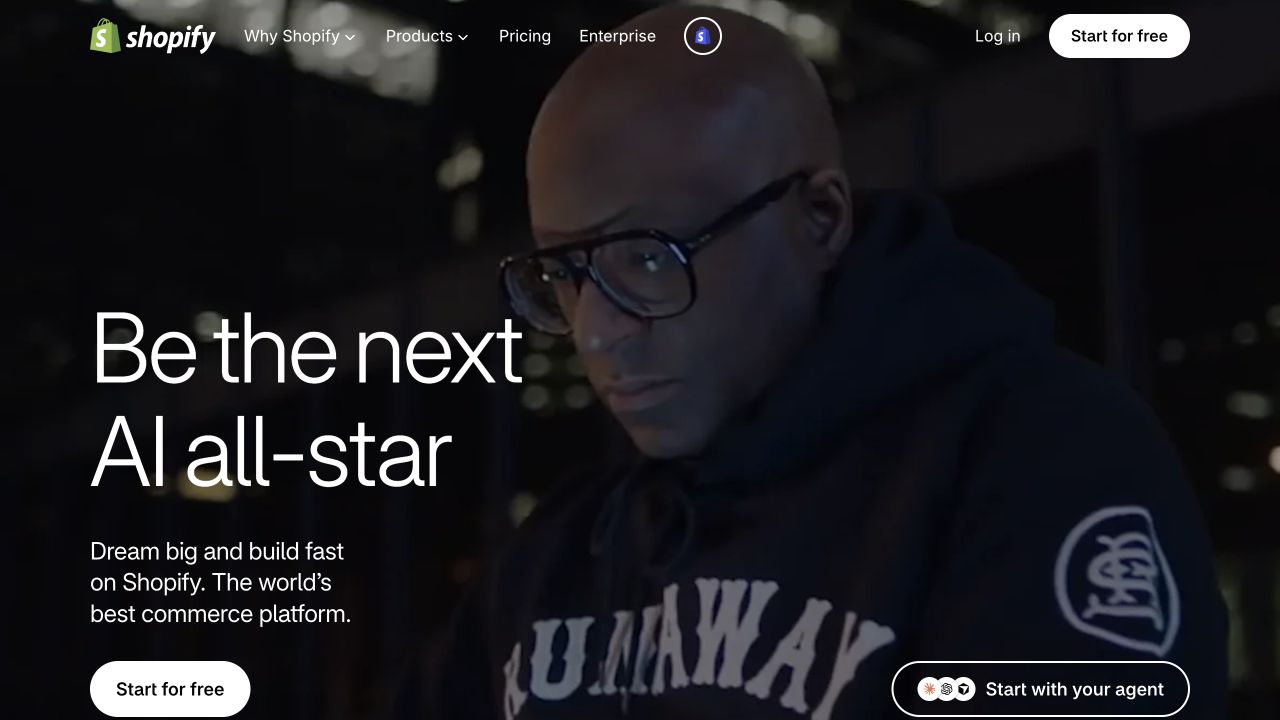
Shopify’s capture has a conventional free-start action, account access in the header, menu disclosures, and a separate agent-oriented starting route. A photographic campaign occupies most of the background. The fetched page contains executable inline scripts, including a module script, rather than only static document text. That supports a JavaScript association for the public page. It does not mean the photographed campaign, every merchant store, or the eventual onboarding flow shares one implementation, and none of those downstream flows was submitted.
What you can learn
Document the destination and expected transition for each starting control. A navigation link, a menu disclosure, and a control that opens another experience should not share an ambiguous label simply because their styling matches. Keep the campaign explanation understandable before enhancement, and handle unavailable media without losing the main action.
Pros
The standard starting action remains close to the campaign description.
Account access is separate from the main acquisition route.
Cons & considerations
Two different starting concepts can confuse visitors without contextual explanation.
Image-led motion and menu behavior add independent loading and focus-management requirements.
Visible tech stack
JavaScript
Platform source: Observed first-party public HTML response. Observed executable JavaScript inline script elements, including a module script in the public HTML response. Script presence does not identify the owner of each visible control, a server runtime, or private product behavior. Platform evidence is separate from the direct website screenshot and is not a complete current infrastructure audit.
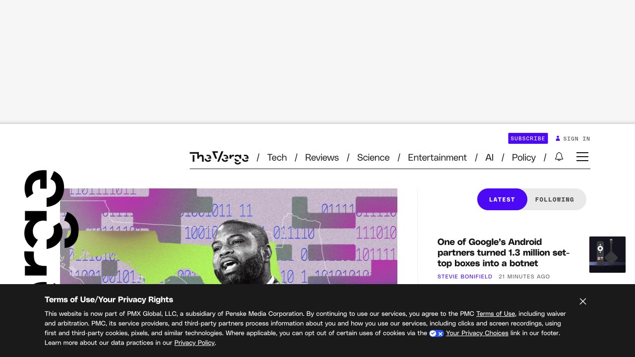
The Verge’s saved view includes subscription, sign-in, notification, navigation, and latest-versus-following controls around a prominent lead story. A privacy panel occupies the lower portion of the viewport. The public document references JavaScript assets, but the capture only records the initial page state. It does not demonstrate whether the following view requires an account, how preferences are stored, or how notification permission is requested. The design is useful because it makes the number of competing stateful features visible.
What you can learn
Create a state map for the reading experience before adding each enhancement. Distinguish navigation from a local view change, and make privacy choices understandable without sending the reader through an unrelated account journey. Preserve article links and titles when optional scripts are unavailable. Test how focus moves when an overlay closes and where it returns after a menu interaction.
Pros
Reader account controls remain distinguishable from the article content.
The latest stream provides a direct route into current coverage.
Cons & considerations
Several peripheral controls compete with the main reading task.
The large privacy interface can obscure content and needs careful focus behavior.
Visible tech stack
JavaScript
Platform source: Observed first-party public HTML response. Observed executable JavaScript script resource references in the public HTML response. Script presence does not identify the owner of each visible control, a server runtime, or private product behavior. Platform evidence is separate from the direct website screenshot and is not a complete current infrastructure audit.
UNICEF’s capture combines language selection, several disclosure-marked navigation groups, a search icon, and a sharing control around a large campaign photograph. Donation and press access remain separate destinations in the blue identity band. The live document references executable JavaScript, including the site’s public script resources. This review does not attribute any particular control to those files, test a donation, or infer the organization’s private systems. The visible design instead provides a concrete inventory of interactions that an institutional homepage must manage.
What you can learn
Give language selection, search, navigation, and sharing independent behavior specifications. A language choice should lead to a clear equivalent or explain when one is unavailable. Preserve ordinary links to research and campaign information, and make any sharing enhancement optional. Test keyboard entry and exit from each expanded navigation group before evaluating decorative motion.
Pros
Permanent information routes remain visible above the campaign.
Press and support destinations have distinct labels and positions.
Cons & considerations
Several disclosure groups require consistent keyboard and touch behavior.
The tall image leaves little first-screen room to explain the campaign’s next step.
Visible tech stack
JavaScript
Platform source: Observed first-party public HTML response. Observed executable JavaScript script resource references in the public HTML response. Script presence does not identify the owner of each visible control, a server runtime, or private product behavior. Platform evidence is separate from the direct website screenshot and is not a complete current infrastructure audit.
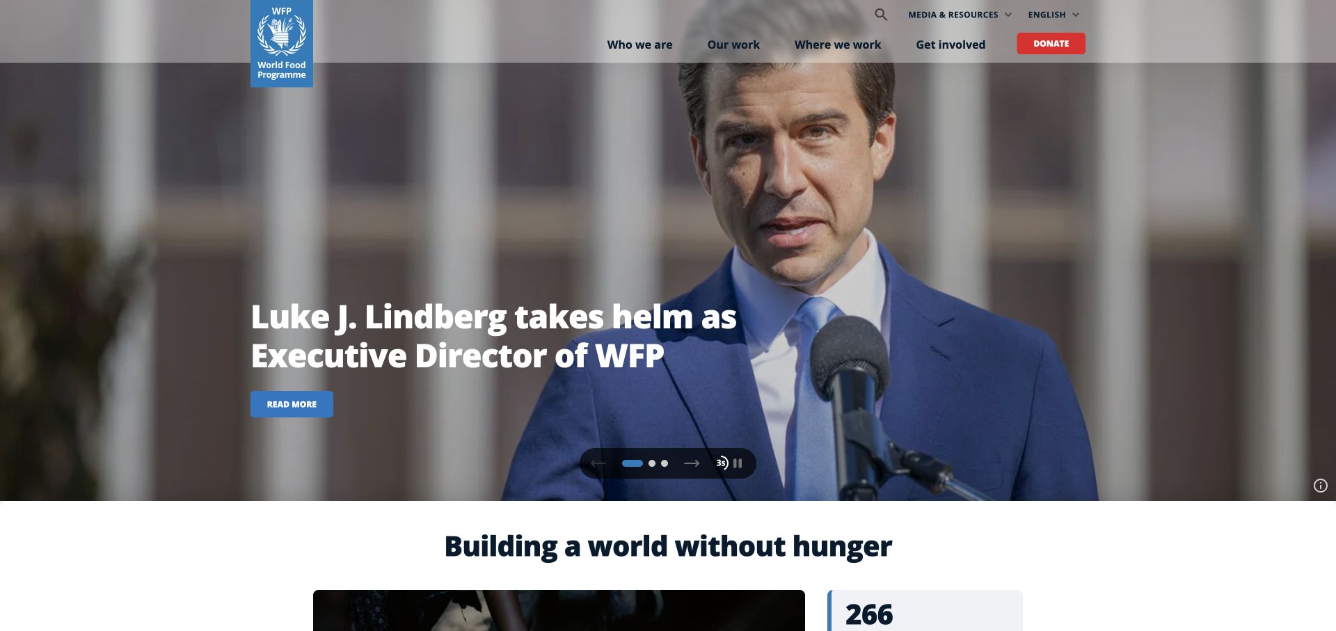
The World Food Programme capture shows arrows, position indicators, a timing cue, and a pause affordance grouped beneath a news headline. Search and language controls sit in the header, while the main campaign action remains inside the feature. The public response references JavaScript resources, including a video library and site assets. The image does not establish which resource controls the carousel, whether automatic advance is enabled for every visitor, or how the experience responds to reduced-motion preferences.
What you can learn
Define the feature’s state transitions before writing animation code. Decide what pauses advancement, how keyboard focus behaves when the active slide changes, and whether the chosen story can be linked directly. Keep each story’s heading and destination available as ordinary content, and provide a stable first slide if enhancement fails.
Pros
Related carousel controls are collected in one recognizable location.
The larger mission section follows the temporary news feature.
Cons & considerations
Timing and position icons need understandable labels and announced state.
Changing photography can alter contrast behind both navigation and story text.
Visible tech stack
JavaScript
Platform source: Observed first-party public HTML response. Observed executable JavaScript script resource references in the public HTML response. Script presence does not identify the owner of each visible control, a server runtime, or private product behavior. Platform evidence is separate from the direct website screenshot and is not a complete current infrastructure audit.
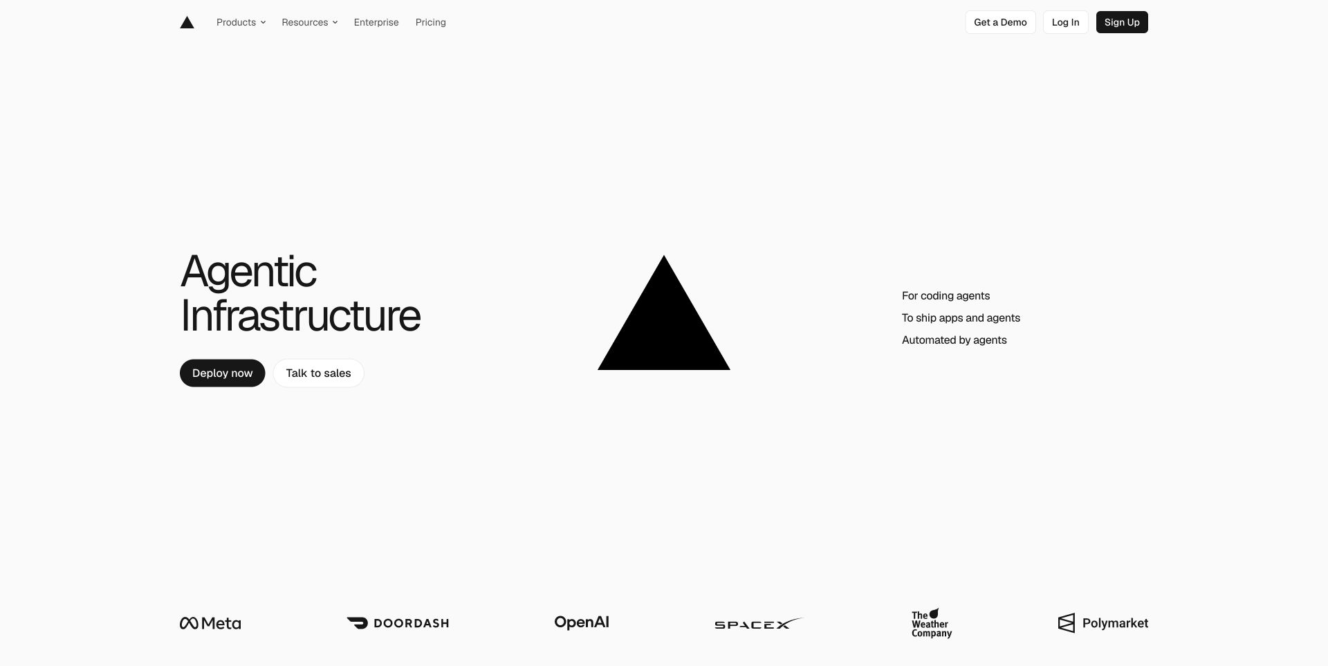
Vercel’s captured first screen is mostly text, geometry, and ordinary destinations. Product and resource labels show disclosure indicators, while deployment, sales, sign-in, and account creation remain separate actions. The public HTML references executable JavaScript bundles, yet the opening does not need a complex application-like presentation to explain its position. The screenshot does not test deployment or account behavior, and script presence is not evidence that every visual effect depends on JavaScript.
What you can learn
Use the sparseness as a prompt to question each interaction’s purpose. A menu may improve exploration, but the main explanation and its key destinations should remain robust without a fully initialized client. Keep account and deployment boundaries explicit, avoid running expensive visual effects merely to fill empty space, and test whether a failed optional script leaves the first useful action available.
Pros
The main evaluation choices are easy to distinguish visually.
The content is concise enough to remain understandable without a demonstration.
Cons & considerations
Sparse copy can leave visitors dependent on menus for practical detail.
A visually simple opening still requires testing its account and navigation transitions.
Visible tech stack
JavaScript
Platform source: Observed first-party public HTML response. Observed executable JavaScript script resource references in the public HTML response. Script presence does not identify the owner of each visible control, a server runtime, or private product behavior. Platform evidence is separate from the direct website screenshot and is not a complete current infrastructure audit.
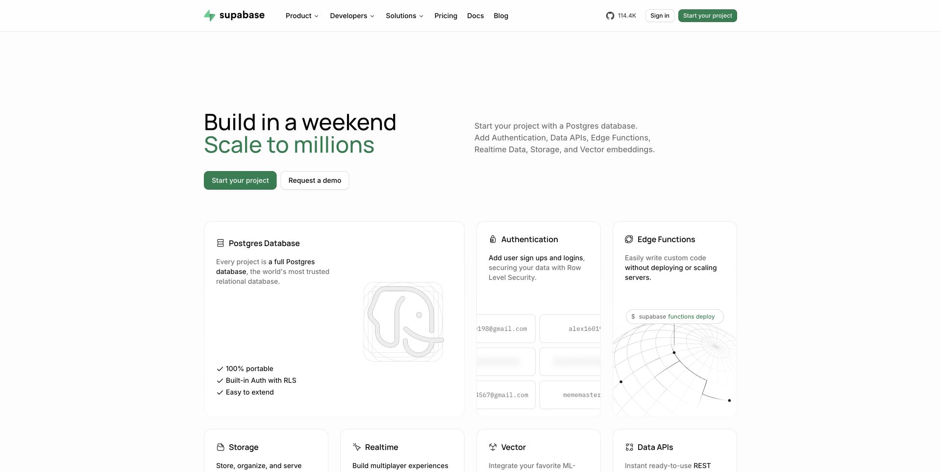
Supabase’s capture presents its capabilities as labeled cards beneath a short introduction. Product and developer navigation show disclosure indicators, while documentation, pricing, sign-in, and project creation have direct positions in the header. The page references JavaScript bundles in its public response. The observed product-card imagery does not establish that authentication, database access, or realtime behavior is being executed inside the marketing page; those private product functions were not tested.
What you can learn
Treat the homepage as a guide into capabilities, then document which destinations leave the explanatory surface. If cards gain hover or animated behavior, keep their titles and destinations usable by keyboard and touch. A project-creation route needs a clear account boundary, whereas documentation should remain a straightforward information route. Test failed enhancement without assuming that a familiar framework guarantees resilience.
Pros
Named cards reduce the ambiguity of a broad platform proposition.
Documentation is available independently of the project-starting action.
Cons & considerations
Many feature choices can increase decision effort for a newcomer.
Illustrated interfaces may be mistaken for live demonstrations unless their role is clear.
Visible tech stack
JavaScript
Platform source: Observed first-party public HTML response. Observed executable JavaScript script resource references in the public HTML response. Script presence does not identify the owner of each visible control, a server runtime, or private product behavior. Platform evidence is separate from the direct website screenshot and is not a complete current infrastructure audit.
Resend’s saved view emphasizes a concise product statement, documentation, and a starting action. Several header items indicate expandable navigation, while a small announcement offers another route above the headline. Executable JavaScript resources appear in the public response. The dark abstract object in the image is a visual observation only: this review does not assign its rendering to a particular script, canvas technique, or animation library. No email was sent and no account flow was initiated.
What you can learn
Make the developer’s information journey dependable before enhancing the atmosphere. Documentation links should have clear destinations, menus should retain keyboard access, and any decorative effect should be able to stop without removing the product explanation. Delay optional work when practical, and define a useful fallback for a background that cannot load on a constrained device.
Pros
A direct documentation route supports evaluation without account creation.
The small number of prominent actions keeps the first decision manageable.
Cons & considerations
Very dark decoration contributes little explanatory information in the capture.
Disclosure-rich navigation still requires focus and dismissal rules despite its quiet appearance.
Visible tech stack
JavaScript
Platform source: Observed first-party public HTML response. Observed executable JavaScript script resource references in the public HTML response. Script presence does not identify the owner of each visible control, a server runtime, or private product behavior. Platform evidence is separate from the direct website screenshot and is not a complete current infrastructure audit.
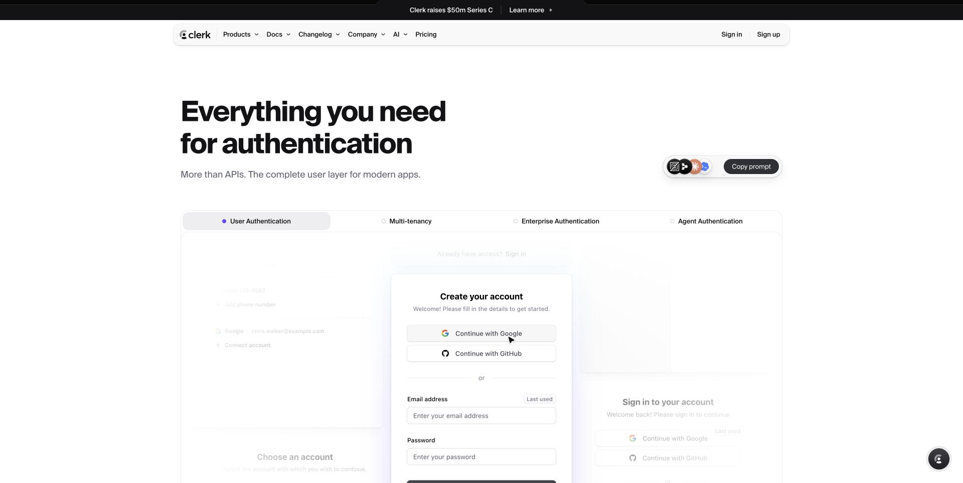
Clerk’s saved homepage includes a tab-like feature selector, a copy-prompt control, and a realistic account-form demonstration. The public response references executable JavaScript bundles, supporting a script-layer association for this marketing property. The presence of a sample account form does not mean its submission, social-provider buttons, or password handling were tested. This distinction matters because a demonstration can look nearly identical to a consequential sign-up interaction.
What you can learn
Label the demonstration and define which controls are interactive examples, which navigate to documentation, and which begin a real account flow. Tabs need a clear selected state and predictable keyboard behavior; copying needs an honest success or failure message. Keep sample data separate from real input and ensure an unavailable demonstration still leaves enough written explanation to evaluate the product.
Pros
Feature categories make a broad component offering easier to inspect.
The example connects the proposition to a recognizable user task.
Cons & considerations
A realistic form can create uncertainty about whether entered information will be submitted.
Several demonstration states require more testing than the initial screenshot reveals.
Visible tech stack
JavaScript
Platform source: Observed first-party public HTML response. Observed executable JavaScript script resource references in the public HTML response. Script presence does not identify the owner of each visible control, a server runtime, or private product behavior. Platform evidence is separate from the direct website screenshot and is not a complete current infrastructure audit.
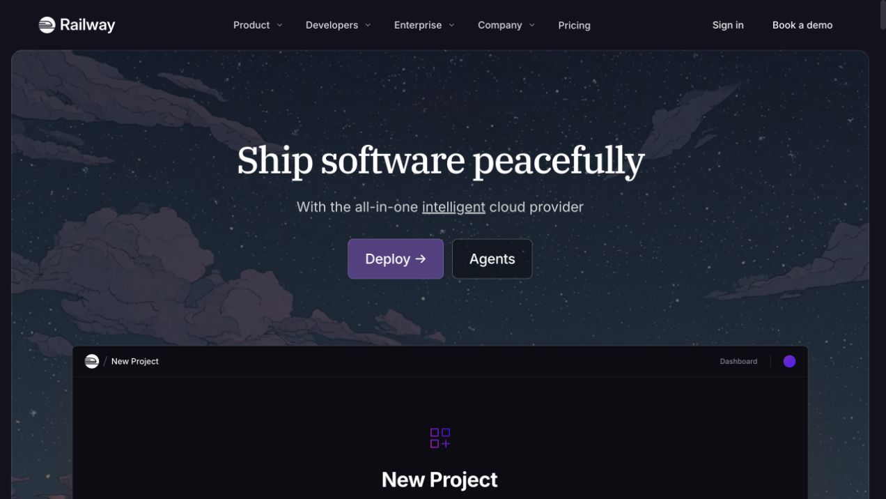
Railway’s capture places deployment and agent-oriented routes above a new-project preview. Product, developer, enterprise, and company labels indicate expandable navigation, while sign-in and demo access remain in the header. The fetched public page references an executable JavaScript asset. The project panel is treated here as a visual reference; this review does not create a project, connect a repository, or infer that the preview runs a real deployment workflow.
What you can learn
Specify whether a preview is illustrative, locally interactive, or connected to a service. Keep the distinction visible before visitors click controls that resemble operational actions. Navigation should remain useful while the illustration loads, and any animated scene needs a fallback that preserves the main explanation. Test the transition into authentication separately from the marketing page itself.
Pros
The preview gives a concrete setting to an otherwise broad deployment proposition.
Account access is kept outside the illustrated scene.
Cons & considerations
A realistic operational panel can imply capabilities that the preview does not actually provide.
The atmospheric opening occupies space that could explain prerequisites before starting.
Visible tech stack
JavaScript
Platform source: Observed first-party public HTML response. Observed executable JavaScript script resource references in the public HTML response. Script presence does not identify the owner of each visible control, a server runtime, or private product behavior. Platform evidence is separate from the direct website screenshot and is not a complete current infrastructure audit.
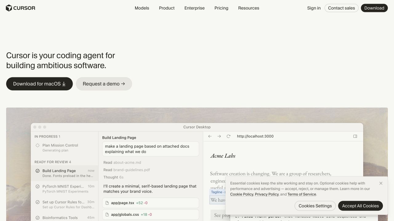
Cursor’s saved page shows a large product scene beneath a short introduction and an operating-system-specific download action. A second action offers a demonstration, while a consent panel overlays part of the scene. The public HTML references executable JavaScript bundles. This establishes scripting on the marketing property, not the implementation of the installed editor or the behavior of the pictured agent workflow. No download or account action was initiated for this review.
What you can learn
Keep installation, demonstration, and ordinary navigation distinct. If platform detection changes a download label, provide a visible alternative instead of assuming the detected device is the intended target. A consent panel needs a predictable dismissal and focus path, and the product explanation should survive when an optional demonstration or decorative script cannot load.
Pros
The download label communicates a specific destination expectation.
The product scene provides context before a visitor commits to installation.
Cons & considerations
Consent UI obscures some of the main visual explanation.
Detailed agent-interface imagery can imply behavior that a static marketing capture cannot verify.
Visible tech stack
JavaScript
Platform source: Observed first-party public HTML response. Observed executable JavaScript script resource references in the public HTML response. Script presence does not identify the owner of each visible control, a server runtime, or private product behavior. Platform evidence is separate from the direct website screenshot and is not a complete current infrastructure audit.
Gumroad’s capture pairs a marketplace search field with a prominent seller-starting action. The header contains discovery, pricing, features, account access, and other ordinary destinations. Its public response declares JavaScript resources, including site assets and a public animation component. That observation does not prove which individual decoration uses that component or how marketplace search behaves after submission. No product search, purchase, or account creation was performed.
What you can learn
Write separate interaction paths for a buyer searching the catalog and a creator starting to sell. Search needs a meaningful label, an empty-result state, and a recoverable error state. Decorative motion should not interfere with text entry or obscure focus. Preserve a clear discovery destination if the enhanced search experience is unavailable, and explain when a route requires an account.
Pros
Buyer search and seller onboarding are both visible immediately.
The seller action remains distinct from the search control.
Cons & considerations
Large decoration can distract from the text-entry task.
The initial promise offers little information about what follows account creation.
Visible tech stack
JavaScript
Platform source: Observed first-party public HTML response. Observed executable JavaScript script resource references in the public HTML response. Script presence does not identify the owner of each visible control, a server runtime, or private product behavior. Platform evidence is separate from the direct website screenshot and is not a complete current infrastructure audit.
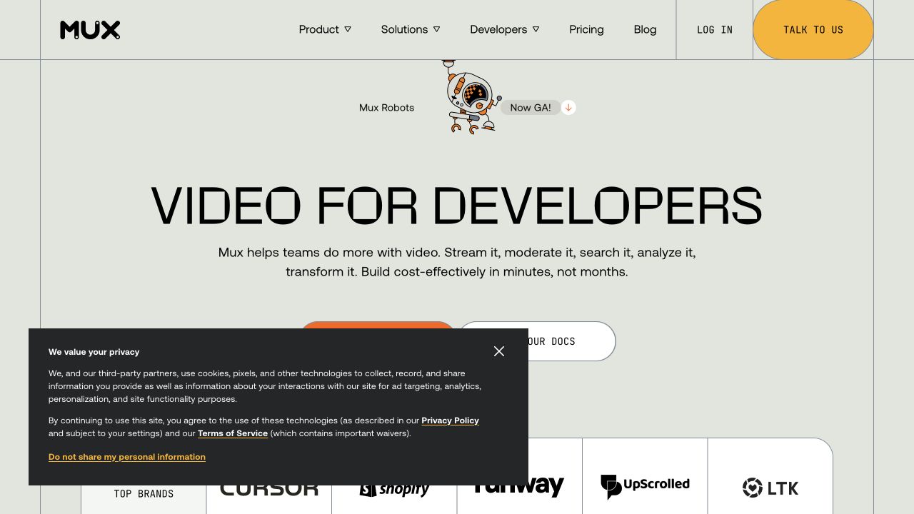
Mux’s captured opening presents developer documentation and a sales route beneath its proposition, with disclosure-marked navigation across the top. A product announcement appears above the headline, and a privacy panel covers part of the lower action area. The public response references executable JavaScript bundles. The review does not exercise a video API, start a sales conversation, or infer the implementation of the abstract brand effects from their appearance.
What you can learn
Treat documentation navigation, announcement dismissal, and privacy choices as separate interaction responsibilities. Each should remain understandable when the others are present. Keep the product explanation and documentation destination available before optional media or animation initializes. If a demonstration is added later, provide a useful initial frame and explicit playback controls rather than assuming autoplay communicates the product.
Pros
Developer documentation is presented as a primary evaluation route.
The announcement is visually separate from the permanent navigation.
Cons & considerations
The privacy panel obscures some of the main decision area.
Several disclosure menus require consistent opening, closing, and keyboard-focus behavior.
Visible tech stack
JavaScript
Platform source: Observed first-party public HTML response. Observed executable JavaScript script resource references in the public HTML response. Script presence does not identify the owner of each visible control, a server runtime, or private product behavior. Platform evidence is separate from the direct website screenshot and is not a complete current infrastructure audit.
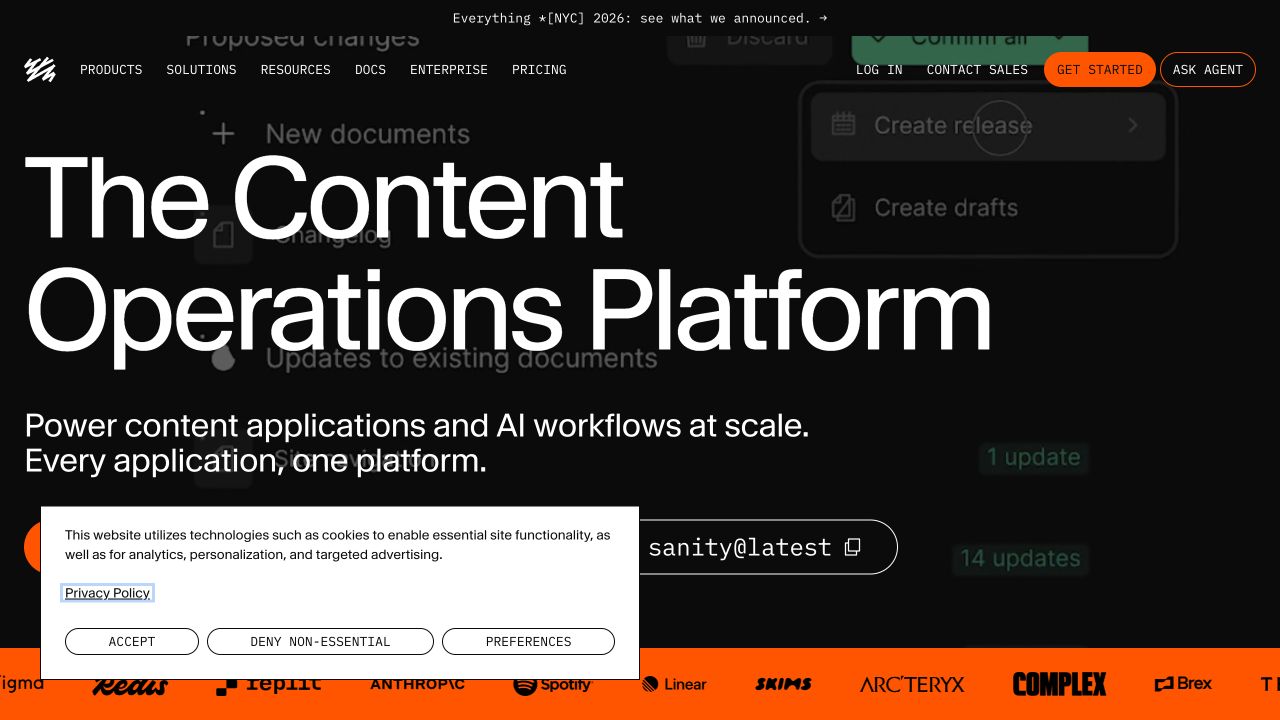
Sanity’s captured opening includes a starting action, a command-style installation control with a copy icon, an agent-oriented route, and conventional sales and account destinations. A white consent panel overlaps the lower-left controls. The public response references executable JavaScript and a cookie-banner stylesheet. This does not establish that the background product image is live or that any installation command was executed; the review concerns the public presentation and its visible affordances.
What you can learn
Give each starting mode a clear purpose before adding more controls. A copy action should report whether it succeeded and should not imply that copying installs anything. Consent choices need an independent state model, while navigation into an assisted experience should explain its destination. Keep written setup information available when optional interaction code fails.
Pros
The command-style control acknowledges a developer-oriented starting preference.
Sales and account routes are visibly separate from the main introduction.
Cons & considerations
Several competing starting modes can overwhelm an unfamiliar visitor.
The consent panel overlaps controls that already occupy limited vertical space.
Visible tech stack
JavaScript
Platform source: Observed first-party public HTML response. Observed executable JavaScript script resource references in the public HTML response. Script presence does not identify the owner of each visible control, a server runtime, or private product behavior. Platform evidence is separate from the direct website screenshot and is not a complete current infrastructure audit.
Wealthfront’s saved homepage combines a large promotional rate, a phone illustration, navigation disclosures, account access, and a prominent consent bar. The public response references executable scripts, including site and preference-management assets. This is evidence about the public page’s script layer only. No financial account was opened, no transaction was attempted, and the captured rate is not verified as a current offer or recommendation. The example is useful for considering how interface state affects access to explanatory text.
What you can learn
Keep disclosure, consent, and account transitions distinct from promotional content. A visitor should be able to understand qualifications without starting an account or enabling optional tracking. Test focus restoration after preferences close and preserve readable text when scripts load slowly. Any calculator or personalized result added later would require its own assumptions, error states, and review.
Pros
Account controls remain separate from the main promotional figure.
The consent bar exposes both acceptance and refusal choices.
Cons & considerations
The oversized figure can dominate the supporting explanation.
Fixed preference UI can cover information near the lower edge of the hero.
Visible tech stack
JavaScript
Platform source: Observed first-party public HTML response. Observed executable JavaScript script resource references in the public HTML response. Script presence does not identify the owner of each visible control, a server runtime, or private product behavior. Platform evidence is separate from the direct website screenshot and is not a complete current infrastructure audit.
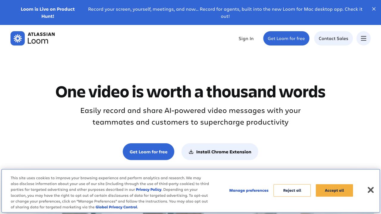
Loom’s capture offers a free-start action beside a clearly labeled browser-extension installation route. The header contains account, sales, and menu controls, with an announcement band above and a substantial consent panel below. Its public HTML references executable JavaScript resources. The capture does not test recording permissions, install an extension, or establish which scripts handle the two entry routes. Those actions have different consequences even when their button styles are closely related.
What you can learn
Explain the destination before initiating a transition. Installing an extension, navigating to a product, and opening a menu should have different labels and predictable behavior. Keep the public explanation usable without recording or account access. Rehearse keyboard order with both announcement and consent interfaces present, since overlays can alter the path to the main controls.
Pros
The extension action names the installation step explicitly.
The product explanation is readable without starting a recording.
Cons & considerations
The consent interface occupies substantial space near the primary controls.
A broad benefit statement does not explain the permissions needed for later recording workflows.
Visible tech stack
JavaScript
Platform source: Observed first-party public HTML response. Observed executable JavaScript script resource references in the public HTML response. Script presence does not identify the owner of each visible control, a server runtime, or private product behavior. Platform evidence is separate from the direct website screenshot and is not a complete current infrastructure audit.
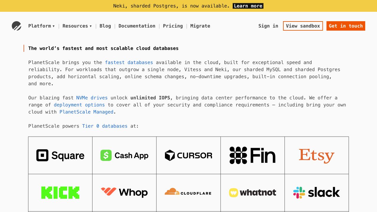
PlanetScale’s saved view is dominated by explanatory paragraphs and a customer grid, with product and resource disclosures, a sandbox route, and a contact action above them. The fetched HTML includes executable inline scripts and a module script. That evidence does not mean the visible paragraphs require client rendering or that the sandbox runs within this page. No sandbox workload, account, or contact request was created. The screenshot also does not validate the performance claims appearing in the copy.
What you can learn
Preserve the technical explanation as durable readable content and use enhancement only where it helps a specific task. Make a sandbox transition explicit about its destination and prerequisites. Navigation disclosures should not trap focus, and inline links should remain conventional destinations where possible. Test a blocked optional script to ensure that a reader can still reach documentation and migration information.
Pros
Documentation and migration are available as named routes.
The opening gives substantive context before asking for interaction.
Cons & considerations
Dense copy requires careful navigation and reading-width decisions.
A sandbox label alone may not explain what data or account access the next page needs.
Visible tech stack
JavaScript
Platform source: Observed first-party public HTML response. Observed executable JavaScript inline script elements, including a module script in the public HTML response. Script presence does not identify the owner of each visible control, a server runtime, or private product behavior. Platform evidence is separate from the direct website screenshot and is not a complete current infrastructure audit.
Algolia’s capture includes a search field, navigation disclosures, language choice, two evaluation actions, consent controls, and a chat prompt. Those surfaces share space with a large technical campaign image. The public response references executable JavaScript resources, but the screenshot cannot establish how the search and chat are implemented or which scripts are essential. No query or message was submitted. The visible collisions make this a useful reference for planning an interaction budget.
What you can learn
Choose the primary task and decide when secondary interfaces should appear. Search needs clear input, results, and failure states; chat needs an explicit entry and exit; consent needs independent choices. Test them together instead of validating each in isolation. Preserve documentation and ordinary navigation when an optional service is unavailable, and avoid allowing one overlay to conceal another control’s focused state.
Pros
Search is visible without opening a separate navigation panel.
Utility routes are grouped separately from the main product labels.
Cons & considerations
Several overlapping interfaces obscure the lower hero.
Multiple prominent actions make the intended first interaction less obvious.
Visible tech stack
JavaScript
Platform source: Observed first-party public HTML response. Observed executable JavaScript script resource references in the public HTML response. Script presence does not identify the owner of each visible control, a server runtime, or private product behavior. Platform evidence is separate from the direct website screenshot and is not a complete current infrastructure audit.
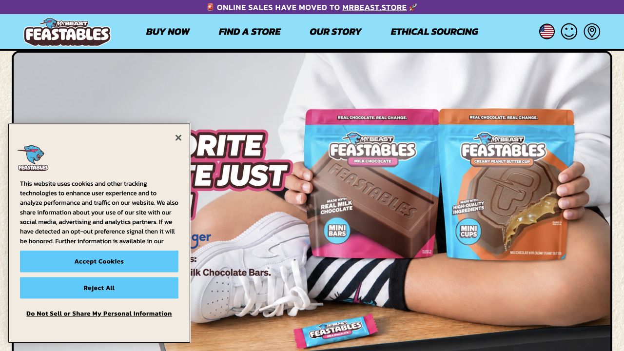
Feastables’ captured homepage announces that online sales have moved, while buying, store finding, story, and sourcing remain distinct navigation routes. The photograph supplies strong product recognition, and a privacy panel overlays the left side. The public response references executable JavaScript resources, including storefront and consent assets. The presence of those scripts does not establish that checkout occurs on this page or that every visible interaction shares one framework. No purchase, store search, or consent submission was performed for this review.
What you can learn
Explain an external buying transition before sending visitors away. Keep store finding and product information available independently of the commerce route, and ensure privacy controls do not conceal essential navigation. A location selector should state whether it changes content or leaves the site. Test the opening with optional scripts unavailable so the product and destination remain understandable.
Pros
The sales-move announcement reduces surprise about the buying destination.
Store finding and sourcing are named alongside purchase navigation.
Cons & considerations
Consent UI obscures part of the product campaign.
Multiple location and account-like icons need explicit accessible labels and predictable destinations.
Visible tech stack
JavaScript
Platform source: Observed first-party public HTML response. Observed executable JavaScript script resource references in the public HTML response. Script presence does not identify the owner of each visible control, a server runtime, or private product behavior. Platform evidence is separate from the direct website screenshot and is not a complete current infrastructure audit.
Choose an enhancement model that matches the page’s actual behavior
Add small enhancements to a document-led site
For a content site with a few menus, disclosures, and media controls, keep the underlying document useful and add narrowly scoped behavior. Record which elements each script owns and avoid multiple components competing for the same focus, scroll position, or open state.
Use shared components for repeated stateful patterns
A repeated tab set, dialog, combobox, or multi-step form benefits from consistent behavior and ownership. Reuse the tested interaction contract as well as its appearance. A visual clone that omits keyboard handling, labels, or failure states is not the same component.
Use an application architecture when the task requires it
Complex collaborative tools, personalized workspaces, and substantial client-side state may justify a broader architecture. Define routing, data ownership, loading boundaries, and recovery before committing. A marketing reference with a script bundle does not prove that your own site needs the same framework.
From references to requirements
Plan dependencies, loading, state, and testing before the first animation
Create a page-level interaction inventory
List every menu, search field, preference, chat widget, media control, demonstration, and account transition. Assign an owner and identify which controls are essential. Review the combined opening state so third-party overlays do not obscure each other or the main action.
Use explicit module and dependency boundaries
Keep related behavior together and make imports and public interfaces understandable. A module structure can clarify ownership, but it does not automatically solve duplicated dependencies or third-party failures. Record what each dependency contributes and how the page behaves if it is unavailable.
Distinguish a visual preview from a real operation
A sample account form, deployment panel, or financial illustration can look consequential even when it is only a demonstration. Label its role, use harmless example data, and make real transitions explicit. Never imply that copying a command executes it or that opening a preview completes an operation.
Test the failure path and the complete keyboard journey
Try a slow response, an empty result, a rejected request, a failed optional script, and an interrupted navigation where relevant. Verify the order of focus, visible state, dismissal, and recovery. Keep user-entered information when an ordinary recoverable failure should not erase it.
A useful handover demonstration
Ask the actual team to carry out its routine job: publish a realistic update, correct a mistake, preview a narrow screen, and identify who owns an integration failure. For a library or frontend framework, also ask who maintains the content source and deployment. A polished screenshot does not answer those operational questions.
Beyond the screenshot
A JavaScript launch checklist focused on dependable behavior
Identify the purpose and owner of every interaction on the page.
Distinguish ordinary links, local state changes, and consequential service actions.
Define loading, empty, error, success, cancellation, and retry behavior where applicable.
Verify keyboard operation, visible focus, accessible names, and state announcements.
Check how focus enters and leaves menus, dialogs, consent panels, and demonstrations.
Preserve useful content and navigation during delayed or failed enhancement.
Test announcements, consent, chat, and search together at narrow viewport sizes.
Keep decorative motion optional and respect the intended motion preferences.
Review dependencies, third-party scripts, and the information each integration receives.
Document monitoring, regression checks, and a recovery path for failed releases.
Test with real content, a keyboard, a small screen, slow or failed requests, and the people who will maintain the system. These are planning checks, not an accessibility, security, performance, or search-ranking certification.
Sources & editorial method
How this JavaScript collection was reviewed
First-party public HTML was inspected for executable script references or executable inline scripts; data-only JSON is not used as JavaScript execution evidence. The observed layer is limited to the named public property. Direct captures document visible initial states, not tested account, payment, installation, search, or private application workflows. Each review is newly written around interaction responsibilities and is distinct from the document-and-layout commentary in the HTML/CSS collection.
Every image is an unmodified capture from the actual website, with its source and capture date. Some captures are reused from our shared catalog; their dates remain the original capture dates. None comes from a vendor gallery or a generated reconstruction. Moving imagery and live content can change.
Technology attribution uses public page assets or metadata, official platform documentation, or a cited first-party project case study. Documentary and framework-relationship evidence is identified where used; it is not a complete current backend inventory. A CMS image CDN alone does not establish a full CMS deployment. A library’s presence does not prove which individual controls use it, and a platform label does not establish AI authorship.
The composition notes, lessons, pros and tradeoffs are original editorial observations. We have not measured conversion, traffic, security, performance or accessibility conformance. Website owners retain their brands and imagery; these examples are not our client portfolio. Written, Edited and Curated are independent records, not dates advanced by a build. See our editorial standards or suggest a correction.
Questions worth asking
JavaScript website development FAQs
Does loading JavaScript prove which framework a website uses?
No. A script reference establishes only the observed resource or execution layer. Framework claims require their own scoped evidence. A generic bundle name, visual style, or the presence of an analytics script is not a complete frontend or backend inventory.
Does every website need an application framework?
No. Choose from the required state, routing, data flow, publishing workflow, and maintenance capacity. Small document-led sites can often use focused enhancements. Larger applications need broader architecture, but the decision cannot be made from a homepage screenshot.
What should happen when an optional script fails?
The page should retain its essential information and useful destinations wherever feasible. Define a fallback for the affected feature and avoid making unrelated content depend on it. The exact response depends on whether the feature is decoration, convenience, or essential to the task.
Are the interactions in these examples fully tested?
No. The collection combines direct public captures with source observations. It identifies visible affordances and useful design questions, but it does not certify keyboard behavior, privacy implementation, account flows, or performance. Those require targeted testing with an appropriate scope.
Is a script called bootstrap evidence of the Bootstrap framework?
Not by itself. Bootstrapping is also a general term for initialization. This collection does not turn an initialization filename or a framework startup function into a claim that the separate Bootstrap UI framework is present.
Start with a clear interaction contract, keep the underlying information useful, and test what happens when the happy path breaks. The best enhancement makes a task easier without making the rest of the page harder to use.