The most useful Gatsby references show how a collection of pages becomes an understandable public experience. Clear navigation, purposeful media, and consistent templates matter more than recognizing a framework in the source. The implementation should serve the publishing task and remain maintainable after launch.
These examples have current public Gatsby generator metadata or Gatsby root markup supported by an official showcase association. Each example is scoped to the named property. A company may use a different system for its main site, documentation, commerce, and private application. Recognizable brands do not turn one page-level signal into a complete infrastructure claim.
The collection deliberately identifies preserved material, including legacy React documentation, the ECCO SS20 gateway, a Tinder campaign, and a dated ProPublica interactive. They are useful design references with limited scope, not evidence that their original campaigns, technical instructions, or commercial offers are current. Several historical showcase entries that now use other systems were excluded.
Before the examples
What makes good Gatsby website development in 2026?
Choose a content model before choosing a visual template
List the things the site publishes and the relationships among them: articles, products, authors, locations, lessons, or projects. Give each type a small, intelligible set of fields and a stable URL policy. Review the model with the people who will maintain it. Reusable React components are most useful when the underlying content responsibilities are consistent, rather than when every page requires a new exception.
Keep data queries aligned with page responsibilities
Gatsby page components can query data through GraphQL, with variables supplied for a particular page. Use that structure to make the relationship between a template and its content explicit. Define what happens when a field is missing, a related record is removed, or an upstream source changes. A successful query is not the same as useful copy; preserve editorial checks for titles, descriptions, links, and meaningful image alternatives.
Gatsby’s image plugin provides components for static and data-driven images and can generate responsive image variants. Decide which image belongs in each slot, what its crop should preserve, and how it behaves while loading. Keep the important explanation outside tiny interface screenshots. Review real files on representative devices rather than assuming that an image pipeline will compensate for an oversized or poorly chosen hero.
Compare page hierarchy, audience routes, and how each property gives its media useful context. The captures show public pages at the stated date. They do not establish private product behavior, conversion performance, or the continued validity of a retained campaign’s original call to action.
We start with five recognizable brands or organizations: Microsoft TypeScript, New Relic documentation, Affirm, British Museum Islamic World, Plenty of Fish. Each attribution applies to the named website property, not every product or website belonging to its organization. This is a curated reading sequence, not a measured ranking.
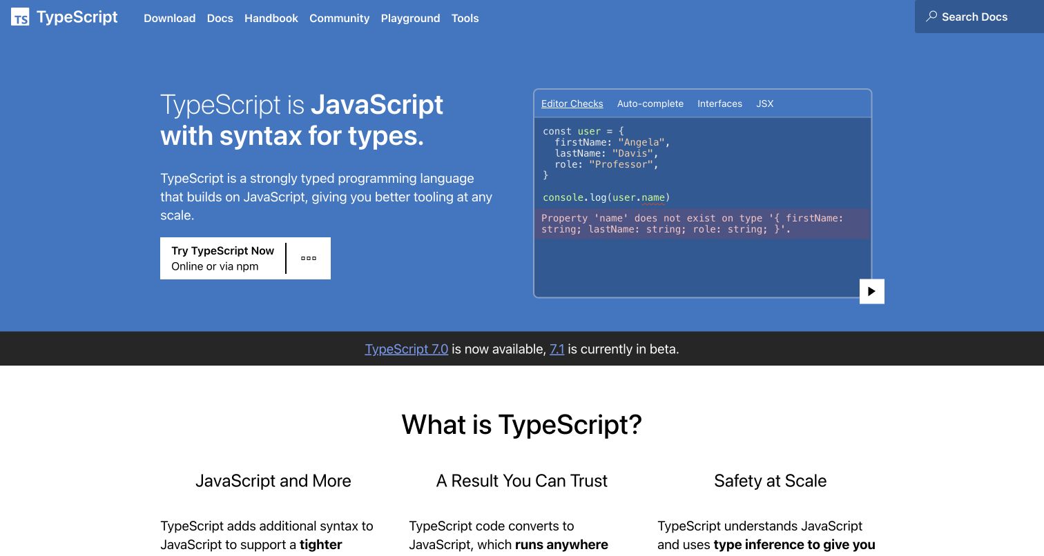
TypeScript pairs its short definition with a code demonstration inside a broad blue hero. The left side explains the relationship to JavaScript and offers a practical starting action; the right side shows an editor-style example with named tabs. A narrow release notice separates the opening from three introductory concepts below. Download, documentation, handbook, community, playground, and tools remain visible in the top navigation. Current public metadata identifies Gatsby on Microsoft’s TypeScript website. This evidence concerns the public information property and does not imply that the TypeScript compiler or all Microsoft websites use Gatsby.
What you can learn
Explain the basic idea before asking visitors to interpret a demonstration. Keep a conventional documentation route alongside an interactive example so both curious newcomers and returning developers can reach an appropriate next step.
Pros
Text and demonstration reinforce the same introductory concept.
Distinct documentation and playground links support different learning preferences.
Cons & considerations
Small code text needs careful treatment when the demonstration is reduced.
A changing release notice requires accurate links and a clear maintenance owner.
Public source checked November 3, 2026. References may be embedded or legacy—not a complete backend inventory.
Platform source: Direct public page generator metadata. Public page HTML checked on November 3, 2026 UTC declares Gatsby 5.16.1 in generator metadata. This association is limited to the named public website and is not a complete inventory of the organization’s software, hosting, or private applications. Platform evidence is separate from the direct website screenshot and is not a complete current infrastructure audit.
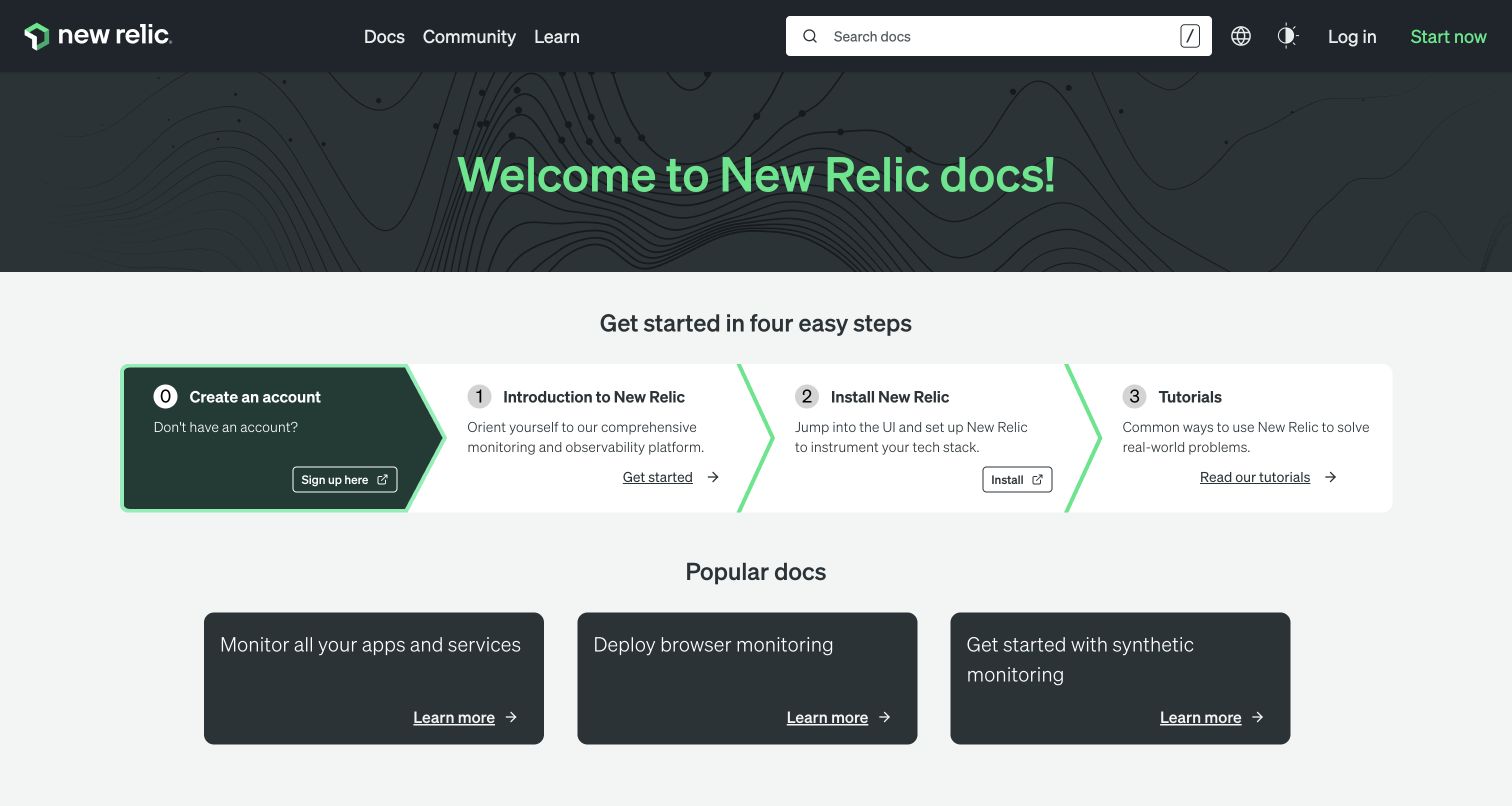
New Relic’s documentation page uses a dark patterned title band followed by a four-part setup sequence. The first panel receives a darker fill, while subsequent panels are linked visually by green chevrons. Below, three dark cards expose common documentation tasks. Search stays prominent in a compact header, with community and learning routes nearby. The current page declares Gatsby as its generator. That is a scoped association with the public documentation website, not a finding about the authenticated observability application or the architecture behind its customer data processing.
What you can learn
Use numbered steps to make a first-time journey understandable, but retain direct topic links for visitors who have already completed setup. Ensure that account creation is clearly identified as one possible stage rather than the only route into useful information.
Pros
The connected panels communicate an ordered introduction to the product.
Popular topic cards give returning readers a route around onboarding.
Cons & considerations
Four adjacent panels require careful stacking and reading order on small screens.
Several external application links should explain when the visitor is leaving documentation.
ReactAssociated with Gatsby; not independently observed
Public source checked November 3, 2026. References may be embedded or legacy—not a complete backend inventory.
Platform source: Direct public page generator metadata. Public page HTML checked on November 3, 2026 UTC declares Gatsby 4.25.9 in generator metadata. This association is limited to the named public website and is not a complete inventory of the organization’s software, hosting, or private applications. Platform evidence is separate from the direct website screenshot and is not a complete current infrastructure audit.
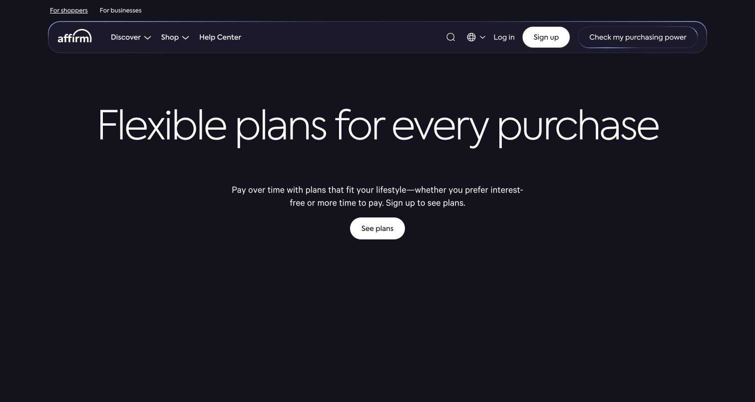
Affirm’s public homepage centers a large, light-weight headline on a nearly black background. A shorter explanatory paragraph and a white plan-viewing action sit beneath it with ample surrounding space. The rounded navigation distinguishes shopper and business audiences, while account entry and help remain accessible above the main message. The composition is intentionally sparse rather than a catalog of merchant logos or product screenshots. Current generator metadata identifies Gatsby for this public page. The observation does not establish the technology handling credit decisions, payment processing, account access, or any individual offer.
What you can learn
Keep audience selection and the next informational step clear when a service has several kinds of visitors. A simple hero still needs nearby, readable terms and explanations; visual restraint should not make important conditions difficult to discover.
Pros
One central action makes the opening hierarchy easy to understand.
Shopper and business routes distinguish different reasons for visiting.
Cons & considerations
Large empty areas can postpone practical details for comparison-focused visitors.
A broad financial proposition needs precise supporting conditions outside the short hero copy.
Visible tech stack
Earlier / documented evidence
Gatsby
Earlier cited evidence retained; no current scan result. References may be embedded or legacy—not a complete backend inventory.
Platform source: Direct public page generator metadata. Public page HTML checked on November 3, 2026 UTC declares Gatsby 4.25.9 in generator metadata. This association is limited to the named public website and is not a complete inventory of the organization’s software, hosting, or private applications. Platform evidence is separate from the direct website screenshot and is not a complete current infrastructure audit.
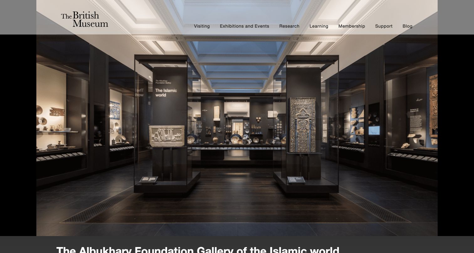
The British Museum’s Islamic world gallery microsite opens with a large photograph of display cases and the gallery interior. A translucent institutional header keeps the museum mark and practical visiting routes visible above the scene. The gallery title begins in a dark band immediately beneath the image, allowing the photograph to establish spatial context before the longer explanation. Current source metadata names Gatsby for this specific collection property. It is not evidence that the museum’s main website, ticketing service, research systems, or every exhibition microsite shares the same implementation.
What you can learn
Use a real interior photograph to orient visitors, then provide the collection name, location, and descriptive context in normal text. Keep institution-wide navigation recognizable while giving the individual gallery enough identity to stand on its own.
Pros
The photograph shows the actual gallery environment rather than an abstract promotional image.
Institutional navigation connects the microsite to broader visitor and learning tasks.
Cons & considerations
The large image pushes the principal gallery title toward the bottom edge.
A translucent header needs contrast checking against every chosen crop and image state.
Visible tech stack
Referenced on the public page
Gatsby
Associated dependencies
ReactAssociated with Gatsby; not independently observed
Public source checked November 3, 2026. References may be embedded or legacy—not a complete backend inventory.
Platform source: Direct public page generator metadata. Public page HTML checked on November 3, 2026 UTC declares Gatsby 2.0.18 in generator metadata. This is the Islamic world gallery microsite, not the British Museum’s main site, ticketing service, or every collection property. Platform evidence is separate from the direct website screenshot and is not a complete current infrastructure audit.
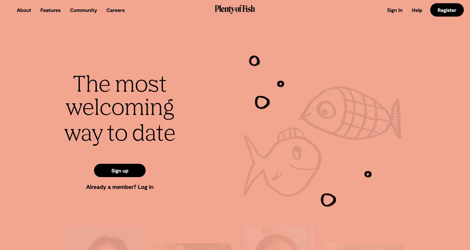
Plenty of Fish uses a peach-colored opening, a large serif statement, and a black sign-up control. A playful fish illustration occupies the opposite side, while the existing-member login link remains directly beneath the main action. The centered wordmark and separated navigation groups balance brand identity with account and help tasks. This is a public marketing view; no registration or member interaction was performed. The current page declares Gatsby in generator metadata. That evidence does not describe the private dating application, matching systems, moderation process, or any individual member’s experience.
What you can learn
Give new and returning visitors clearly different paths without making either difficult to find. A playful illustration can establish tone, but practical account and help links should remain readable when the artwork changes or disappears.
Pros
A strong black action stands out against the single warm background color.
An explicit existing-member link keeps returning visitors from entering registration unnecessarily.
Cons & considerations
A short brand statement leaves feature and service details for later sections.
Large illustrative space needs a useful fallback and careful narrow-screen arrangement.
ReactAssociated with Gatsby; not independently observed
Public source checked November 3, 2026. References may be embedded or legacy—not a complete backend inventory.
Platform source: Direct public page generator metadata. Public page HTML checked on November 3, 2026 UTC declares Gatsby 5.16.1 in generator metadata. This association is limited to the named public website and is not a complete inventory of the organization’s software, hosting, or private applications. Platform evidence is separate from the direct website screenshot and is not a complete current infrastructure audit.
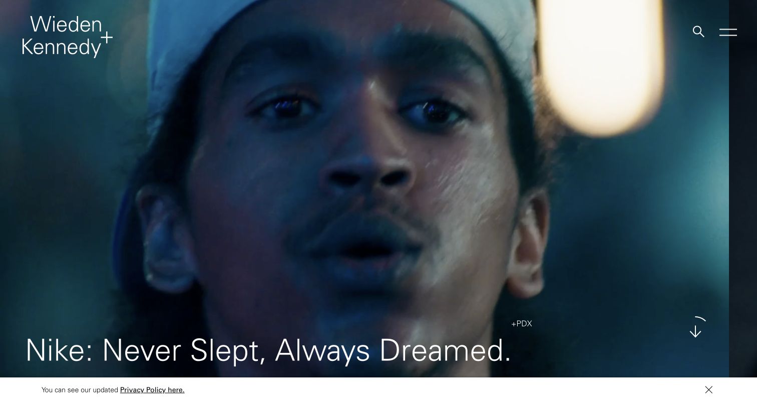
Wieden+Kennedy gives almost the entire opening to a campaign image, with a thin white agency mark at the upper left and search plus menu controls at the upper right. A large project title sits near the bottom edge, accompanied by a small office label and a downward cue. The photograph establishes a cinematic tone without a separate agency manifesto competing for attention. Current public metadata identifies Gatsby for the agency website. The campaign client shown in the image is the subject of the work, not evidence that the client’s own website uses Gatsby.
What you can learn
A portfolio can make one project the opening argument, provided the project title and navigation remain dependable. Give each image useful context and a normal destination so visitors can understand the work without relying on motion or guessing hidden controls.
Pros
A single dominant project establishes a clear visual priority.
The small office label adds context without overwhelming the campaign image.
Cons & considerations
White controls depend on sufficient contrast across changing media frames.
Minimal menu labeling can make service and contact information less immediately discoverable.
ReactAssociated with Gatsby; not independently observed
Public source checked November 3, 2026. References may be embedded or legacy—not a complete backend inventory.
Platform source: Direct public page generator metadata. Public page HTML checked on November 3, 2026 UTC declares Gatsby 3.15.0 in generator metadata. This association is limited to the named public website and is not a complete inventory of the organization’s software, hosting, or private applications. Platform evidence is separate from the direct website screenshot and is not a complete current infrastructure audit.
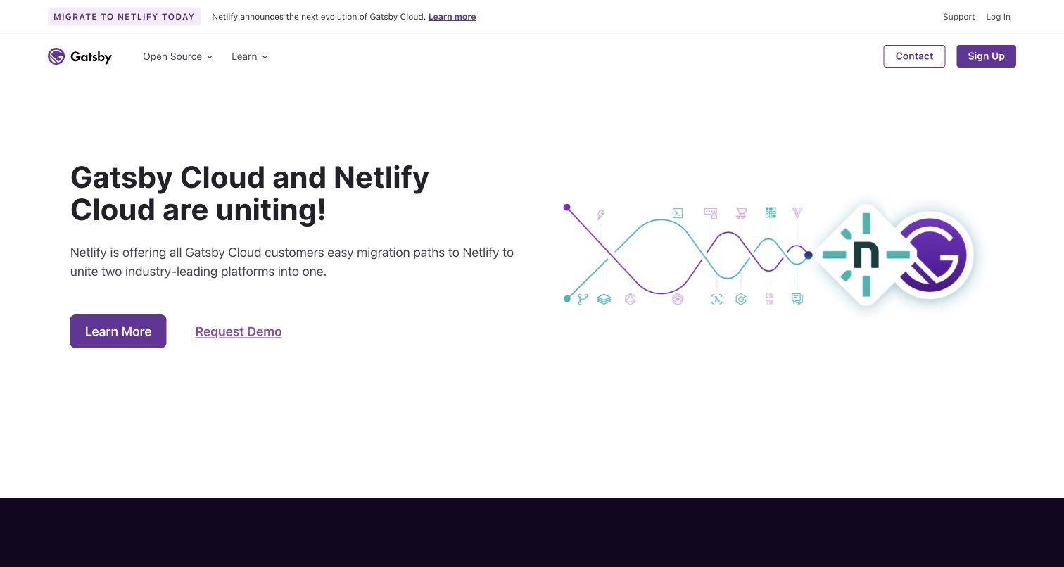
Gatsby’s own homepage leads with a message about Gatsby Cloud and Netlify, using a plain white layout, dark headline, and purple actions. A matching notice appears above the navigation, while open-source and learning routes remain separate from contact and sign-up. The composition makes the service-transition message the primary topic rather than presenting a generic framework feature list. Its public metadata identifies Gatsby. The page is useful as an example of communicating a platform change, but the wording should not be treated as a current hosting contract or proof of every capability available to a new project.
What you can learn
When a service changes, explain the practical next step where existing users will see it. Preserve access to documentation and open-source resources, and link to a maintained destination that can explain the details and dates of the transition.
Pros
The headline and primary action focus attention on one consequential message.
Learning and open-source navigation remain available beside the commercial routes.
Cons & considerations
Repeated transition messaging can dominate the page for visitors seeking framework basics.
A dated announcement needs a maintenance plan so the homepage remains clear over time.
ReactAssociated with Gatsby; not independently observed
Public source checked November 3, 2026. References may be embedded or legacy—not a complete backend inventory.
Platform source: Direct public page generator metadata. Public page HTML checked on November 3, 2026 UTC declares Gatsby 4.24.6 in generator metadata. This association is limited to the named public website and is not a complete inventory of the organization’s software, hosting, or private applications. Platform evidence is separate from the direct website screenshot and is not a complete current infrastructure audit.
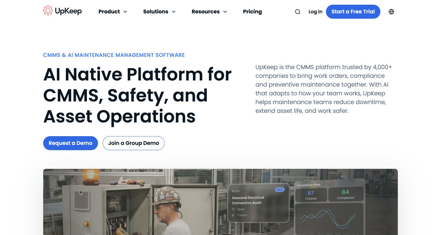
UpKeep divides its opening into a large product statement on the left and a more detailed explanation on the right. Two blue-accented demonstration actions sit beneath the headline, while an image of maintenance work and interface overlays begins below the text. The top navigation exposes product, solutions, resources, pricing, and account entry in a compact row. The current source declares Gatsby as the page generator. This association concerns the marketing website and does not identify the architecture of the maintenance application or verify the operational outcomes described in the page copy.
What you can learn
Explain the product category in ordinary language before using a large media panel to reinforce it. Distinguish different demonstration formats clearly so visitors understand whether they are requesting a private conversation or joining a shared session.
Pros
The two-column copy gives both a short proposition and a fuller explanation.
Relevant workplace imagery provides context for the software interface.
Cons & considerations
Specialist abbreviations can make the main statement difficult for unfamiliar visitors.
Several trial and demonstration routes need clear expectations and consistent labels.
Public source checked November 3, 2026. References may be embedded or legacy—not a complete backend inventory.
Platform source: Direct public page generator metadata. Public page HTML checked on November 3, 2026 UTC declares Gatsby 5.12.8 in generator metadata. This association is limited to the named public website and is not a complete inventory of the organization’s software, hosting, or private applications. Platform evidence is separate from the direct website screenshot and is not a complete current infrastructure audit.
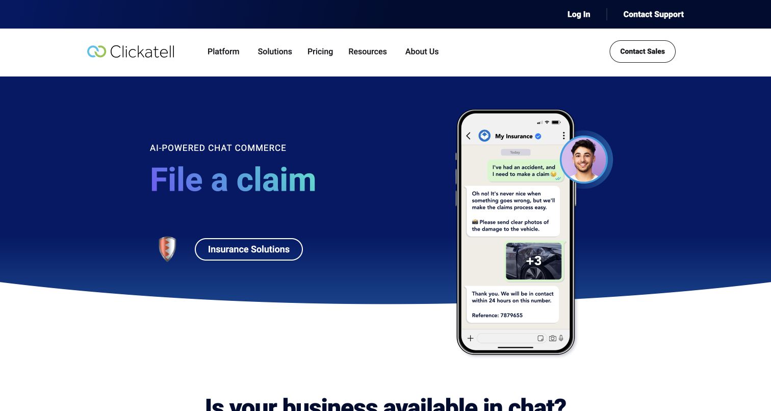
Clickatell’s captured hero presents an insurance-claim use case beside a phone-shaped conversation example. A deep blue background and gradient heading establish a strong brand field, while a white outlined action points to the relevant industry solution. The white main navigation separates platform, solutions, pricing, resources, and company information; support and login sit above it. The public page declares Gatsby in its generator metadata. The displayed conversation is marketing media, not a tested transaction, and it does not establish the technical implementation or reliability of a real insurance workflow.
What you can learn
Use one recognizable task to explain a broad platform, then make the route to detailed information explicit. Keep marketing demonstrations visually distinct from real controls and ensure their small text does not carry the only explanation of the product.
Pros
The task headline gives the abstract platform a concrete application.
Support and account routes are separated from solution discovery and sales.
Cons & considerations
Phone-sized example text can become unreadable when scaled down.
Rotating use cases need stable navigation and a useful static presentation when motion is reduced.
Public source checked November 3, 2026. References may be embedded or legacy—not a complete backend inventory.
Platform source: Direct public page generator metadata. Public page HTML checked on November 3, 2026 UTC declares Gatsby 5.13.7 in generator metadata. This association is limited to the named public website and is not a complete inventory of the organization’s software, hosting, or private applications. Platform evidence is separate from the direct website screenshot and is not a complete current infrastructure audit.
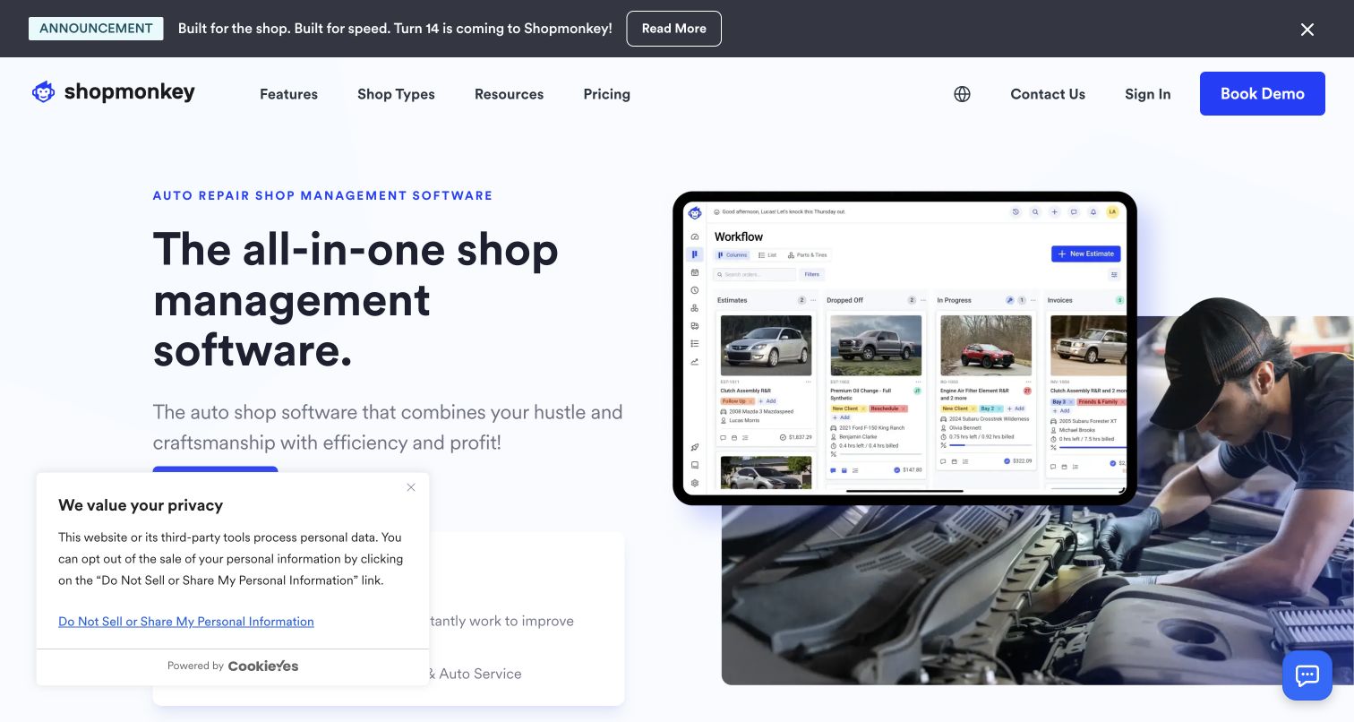
Shopmonkey pairs a direct shop-management headline with a large tablet interface layered over a photograph of automotive work. The image links the software to its intended setting, while the main navigation names features, shop types, resources, and pricing. A prominent blue demonstration action appears in the header, and a separate announcement band promotes a product update. Current public metadata declares Gatsby for the marketing page. The interface shown is an illustrative product view rather than an authenticated test, and this review does not verify the business claims or private application behavior.
What you can learn
Combine an interface example with recognizable working context when the audience is specialized. Keep the main task visible in the illustration, and use adjacent text to explain details that would otherwise become illegible on a smaller screen.
Pros
Workplace photography makes the software’s intended audience immediately recognizable.
The navigation distinguishes product features from the types of shops served.
Cons & considerations
Layered interface imagery can become visually dense on narrow displays.
Announcements and privacy notices need placement that preserves the main action and explanation.
Public source checked November 3, 2026. References may be embedded or legacy—not a complete backend inventory.
Platform source: Direct public page generator metadata. Public page HTML checked on November 3, 2026 UTC declares Gatsby 5.15.0 in generator metadata. This association is limited to the named public website and is not a complete inventory of the organization’s software, hosting, or private applications. Platform evidence is separate from the direct website screenshot and is not a complete current infrastructure audit.
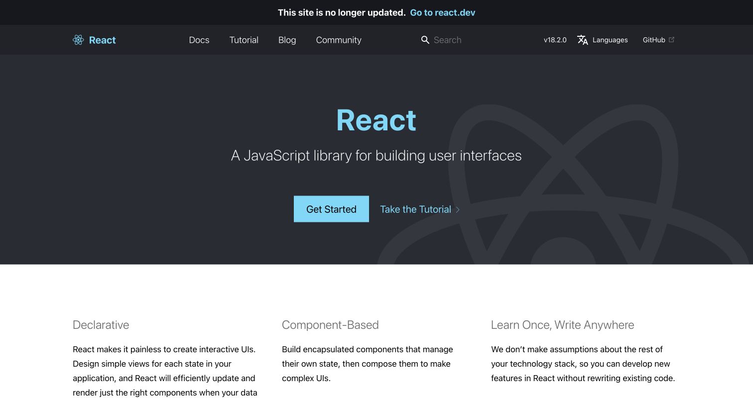
The legacy React documentation keeps its familiar dark hero, cyan identity, and separate getting-started and tutorial routes. A prominent top notice states that the site is no longer updated and links to the newer React resource. The lower white area begins three conceptual explanations, while documentation, tutorial, blog, and community remain in the header. The current legacy page declares Gatsby. This example is intentionally scoped to the preserved legacy documentation; it is not presented as evidence for the current react.dev website or as a recommendation to follow obsolete technical guidance.
What you can learn
Treat an archived resource as an intentional product state. Preserve useful historical links while clearly labeling maintenance status and giving readers a direct route to the current documentation before they invest time in an outdated procedure.
Pros
The maintenance notice is visible before the main documentation content.
Distinct tutorial and reference routes preserve the original learning structure.
Cons & considerations
Historical version information can confuse readers who arrive through search.
A preserved visual design should not imply that old instructions remain current or supported.
ReactAssociated with Gatsby; not independently observed
Public source checked November 3, 2026. References may be embedded or legacy—not a complete backend inventory.
Platform source: Direct public page generator metadata. Public page HTML checked on November 3, 2026 UTC declares Gatsby 2.32.13 in generator metadata. This is explicitly the preserved legacy.reactjs.org documentation, whose banner says it is no longer updated; it is not evidence for the current react.dev website. Platform evidence is separate from the direct website screenshot and is not a complete current infrastructure audit.
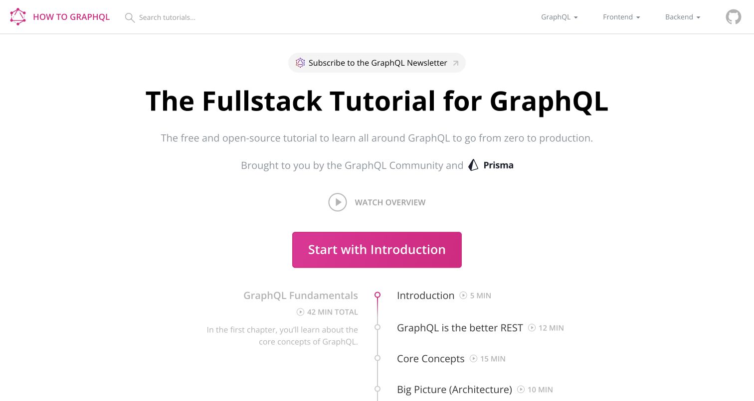
How to GraphQL uses a centered course statement, community attribution, and a large pink introduction button above a visible lesson timeline. Search and separate frontend, backend, and fundamentals choices sit in a restrained top bar. The timeline exposes lesson names and duration labels, giving the visitor a sense of scope before starting. The current page contains Gatsby root markup and is listed in Gatsby’s official showcase. This supports the public tutorial website association; it does not establish that every linked lesson, code example, or external learning tool remains technically current.
What you can learn
Show the shape of a course before asking someone to begin it. A clear sequence, estimated effort, and distinct tracks help learners choose a suitable route, provided the content also has visible maintenance and prerequisite information.
Pros
The lesson timeline makes the learning sequence concrete before entry.
Separate technical tracks support different backgrounds and implementation goals.
Cons & considerations
Light gray supporting text needs contrast review on ordinary displays.
Tutorial duration and technical examples require review as tools and dependencies change.
ReactAssociated with Gatsby; not independently observed
Public source checked November 3, 2026. References may be embedded or legacy—not a complete backend inventory.
Platform source: Direct public markup and official showcase. Public page HTML checked on November 3, 2026 UTC contains the Gatsby root markup id="___gatsby"; the exact public property is also listed in Gatsby’s official showcase. This association is limited to the named public website and is not a complete inventory of the organization’s software, hosting, or private applications. Platform evidence is separate from the direct website screenshot and is not a complete current infrastructure audit.
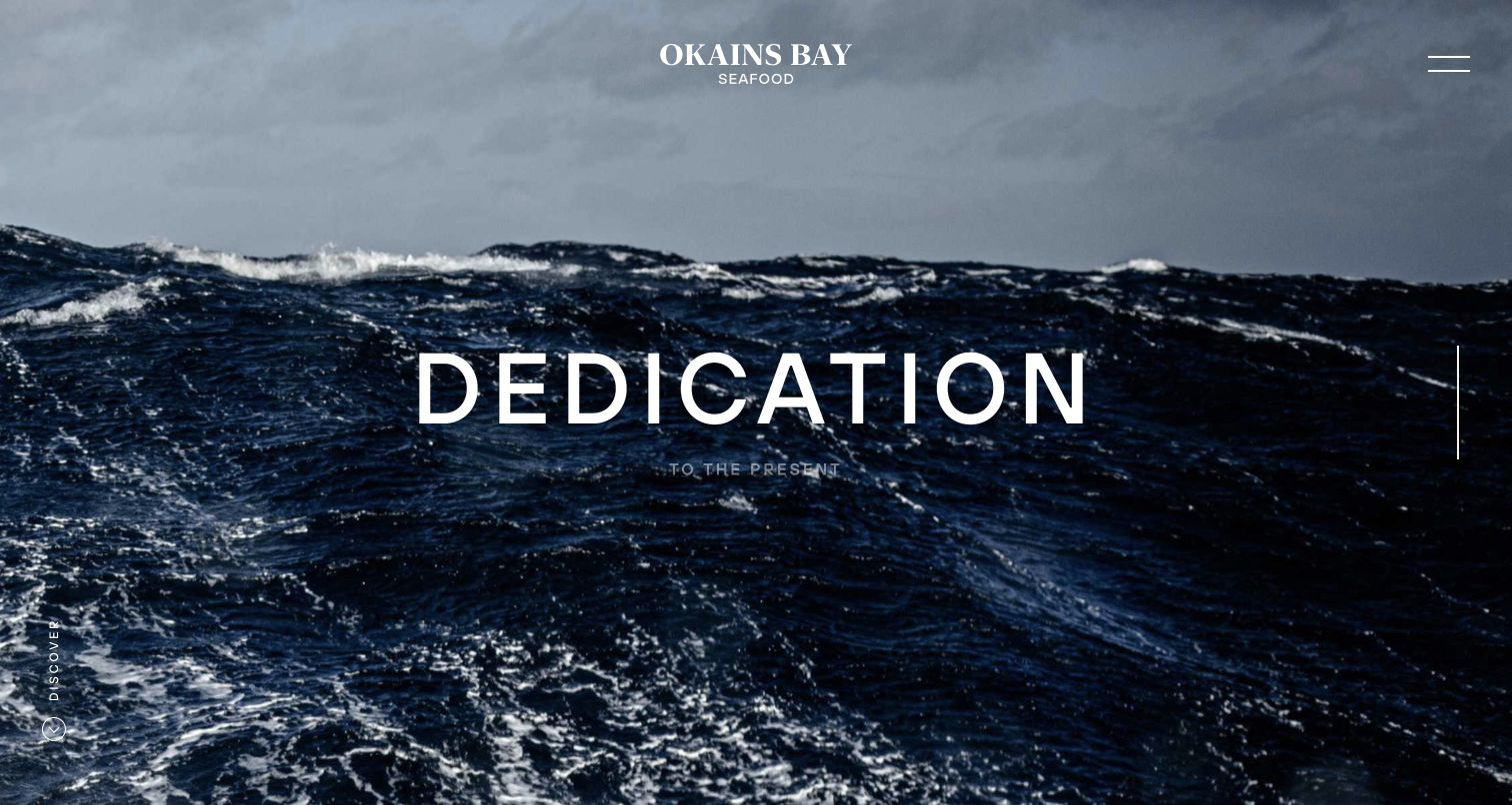
Okains Bay Seafood fills the opening with a close view of ocean waves beneath a gray sky. A centered white wordmark and a large thematic statement establish atmosphere, while a minimal menu control and a vertical discovery cue remain at the edges. The image communicates place and conditions before presenting detailed products or operations. Current source metadata identifies Gatsby for this public site. The composition is reviewed as brand storytelling; it does not independently establish sourcing practices, sustainability outcomes, or the accuracy of any operational indicators elsewhere on the website.
What you can learn
An atmospheric opening works best when visitors can still find a practical route to products and company information. Give the discovery cue a clear destination and ensure the main identity survives different video frames, image crops, and reduced-motion settings.
Pros
The ocean imagery creates a strong relationship between the brand and its setting.
Minimal typography gives the photograph a clear visual role.
Cons & considerations
Thematic language provides less immediate practical information than a descriptive introduction.
Small edge controls can be difficult to notice or operate on compact screens.
Public source checked November 3, 2026. References may be embedded or legacy—not a complete backend inventory.
Platform source: Direct public page generator metadata. Public page HTML checked on November 3, 2026 UTC declares Gatsby 2.15.15 in generator metadata. This association is limited to the named public website and is not a complete inventory of the organization’s software, hosting, or private applications. Platform evidence is separate from the direct website screenshot and is not a complete current infrastructure audit.
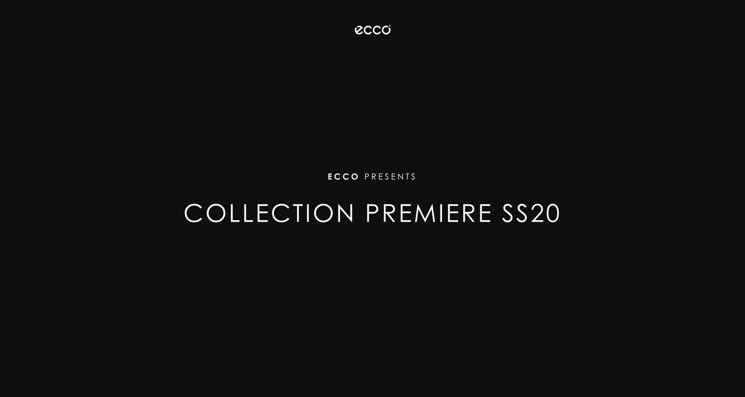
ECCO’s retained SS20 collection-premiere landing page uses a nearly black background, a small white brand mark, and widely spaced centered typography. The visible page contains very little navigation or explanatory copy, making the collection title the entire introduction. Its link leads toward a login route; that restricted area was not entered or reviewed. Current public metadata declares Gatsby for this named campaign property. This is a historical seasonal gateway, not a representation of ECCO’s current retail homepage, present collection, checkout, or complete technology stack.
What you can learn
A campaign gateway should communicate its audience, edition, and access expectations before asking visitors to proceed. If it remains public after the season ends, add a clear historical status and a useful route to current information rather than leaving context implicit.
Pros
The limited palette and centered type create an unambiguous visual focal point.
The season identifier distinguishes this collection from an evergreen brand homepage.
Cons & considerations
The sparse introduction gives unfamiliar visitors little explanation of access requirements.
A retained seasonal gateway can feel current unless its archival status is clearly stated.
ReactAssociated with Gatsby; not independently observed
Public source checked November 3, 2026. References may be embedded or legacy—not a complete backend inventory.
Platform source: Direct public page generator metadata. Public page HTML checked on November 3, 2026 UTC declares Gatsby 2.2.3 in generator metadata. This is the retained SS20 collection-premiere gateway only. The linked login area was not entered; it is not evidence for ECCO’s current retail site or current seasonal collection. Platform evidence is separate from the direct website screenshot and is not a complete current infrastructure audit.
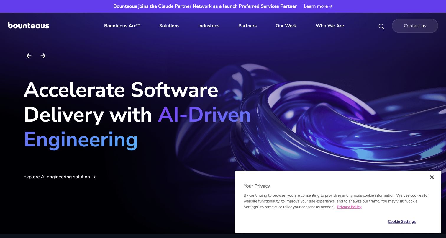
Bounteous uses a dark purple hero with oversized service language and a glossy abstract form occupying the right side. Small directional controls indicate a changing feature area, while the main navigation separates solutions, industries, partners, work, and company information. A bright announcement band introduces a partnership message above the header. The captured service action sits below the headline as a quieter text link. Current source metadata declares Gatsby for the public website. The design review concerns presentation and navigation, not an independent evaluation of the agency’s engineering claims or client outcomes.
What you can learn
Give a broad services business a concrete route from each featured proposition to supporting work. Abstract media can establish a visual identity, but it should not be the only evidence offered for a technical capability or business result.
Pros
The navigation separates services, audience categories, and evidence of prior work.
A constrained purple palette connects the header, imagery, and headline treatment.
Cons & considerations
Large abstract imagery explains little about the actual service process.
Multiple promotional layers can compete with the primary statement and contact route.
ReactAssociated with Gatsby; not independently observed
Public source checked November 3, 2026. References may be embedded or legacy—not a complete backend inventory.
Platform source: Direct public page generator metadata. Public page HTML checked on November 3, 2026 UTC declares Gatsby 2.32.13 in generator metadata. This association is limited to the named public website and is not a complete inventory of the organization’s software, hosting, or private applications. Platform evidence is separate from the direct website screenshot and is not a complete current infrastructure audit.
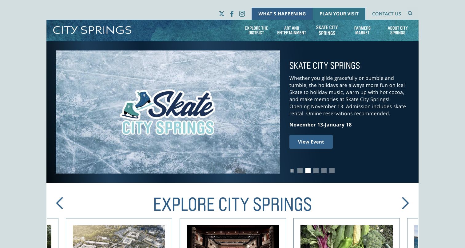
City Springs uses a contained blue layout with an event image on the left and practical details on the right. The captured seasonal skating feature includes a date range, short description, and event-viewing action. Carousel indicators and a pause control sit below the copy, while a second section begins a wider district directory. Visiting and event routes are prominent in the upper navigation. Current source metadata identifies Gatsby for the public site. The capture documents the displayed promotion; dates, availability, reservations, and accessibility arrangements require checking with the venue before planning a visit.
What you can learn
Give an event feature the information needed to judge relevance: what it is, when it happens, and where to find details. Preserve a stable district-navigation route so a seasonal promotion does not hide permanent visitor resources.
Pros
The event panel combines imagery with dates and a clear detail action.
A visible pause control acknowledges that the featured content changes.
Cons & considerations
Several navigation rows can become crowded on smaller displays.
Seasonal features need prompt updates so expired events do not remain the main introduction.
ReactAssociated with Gatsby; not independently observed
Public source checked November 3, 2026. References may be embedded or legacy—not a complete backend inventory.
Platform source: Direct public page generator metadata. Public page HTML checked on November 3, 2026 UTC declares Gatsby 2.32.13 in generator metadata. This association is limited to the named public website and is not a complete inventory of the organization’s software, hosting, or private applications. Platform evidence is separate from the direct website screenshot and is not a complete current infrastructure audit.
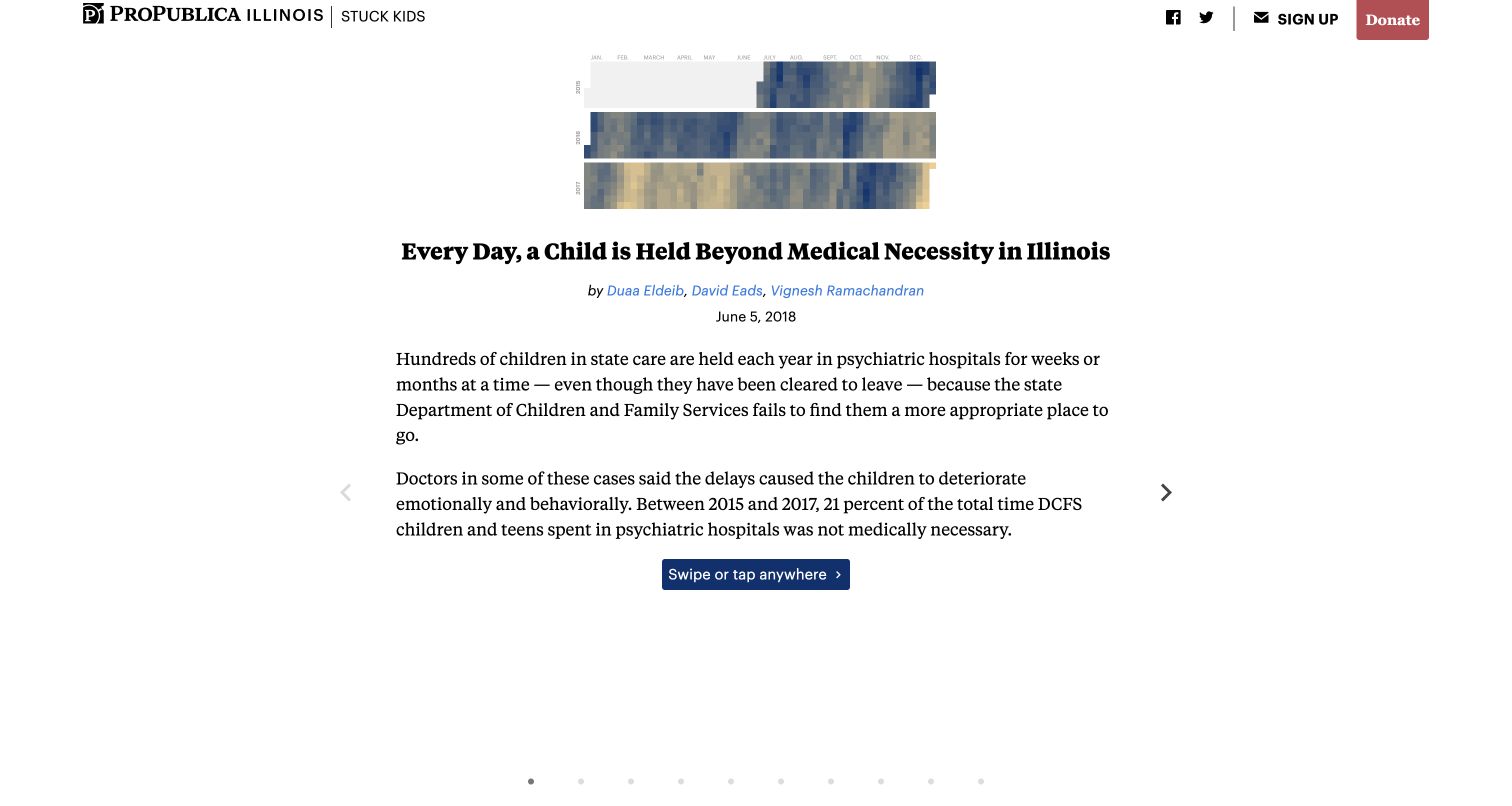
ProPublica’s Stuck Kids interactive opens with a compact calendar-like graphic above a centered headline, named authors, and a visible 2018 publication date. Two paragraphs introduce the investigation before a small progression control invites the reader to continue. Side arrows and a row of dots make the sequence apparent, while the publication masthead remains compact. The current page contains Gatsby root markup and appears in the official Gatsby showcase. This is a retained individual journalism project, not a claim about the whole ProPublica publishing stack or a current update to the reported events.
What you can learn
A guided narrative should establish authorship, date, and context before introducing interaction. Give readers a dependable way to understand the sequence and reach the underlying reporting, with alternatives for those who cannot use the preferred gesture.
Pros
Authorship and publication date provide essential context for a retained investigation.
The graphic and short introduction create a focused entry into a complex subject.
Cons & considerations
Gesture-oriented progression needs keyboard and assistive-technology review.
Small chart marks require clear explanation and a readable alternative at narrow widths.
ReactAssociated with Gatsby; not independently observed
Public source checked November 3, 2026. References may be embedded or legacy—not a complete backend inventory.
Platform source: Direct public markup and official showcase. Public page HTML checked on November 3, 2026 UTC contains the Gatsby root markup id="___gatsby"; the exact public property is also listed in Gatsby’s official showcase. This is the retained Stuck Kids interactive dated June 5, 2018, not all ProPublica properties or a current update to the reported events. Platform evidence is separate from the direct website screenshot and is not a complete current infrastructure audit.
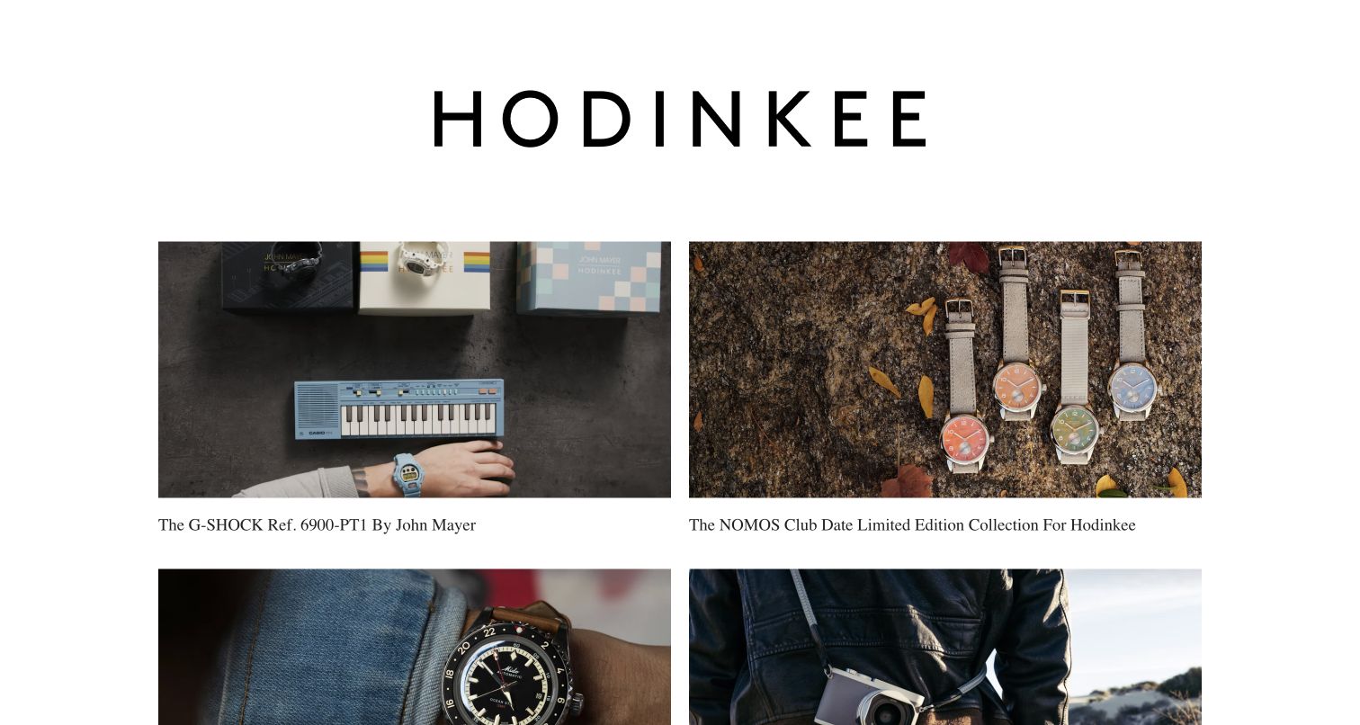
Hodinkee Limited places an oversized black wordmark above a simple two-column grid of watch photographs and serif product titles. The images do most of the descriptive work, with each tile linking to a named collaboration or edition. Generous white gutters keep the collection from feeling like a crowded shop category. The page includes older edition material, so it is useful as a retained product-story archive rather than evidence of present stock. Current generator metadata declares Gatsby for this limited-edition property, not necessarily Hodinkee’s main editorial site, commerce systems, or checkout.
What you can learn
A product archive benefits from consistent image proportions and informative titles. Make edition dates, availability, and the relationship to a current store explicit so a visually timeless grid does not imply that every featured object can still be purchased.
Pros
Large photographs allow individual products and collaborations to retain distinct character.
Simple captions and generous gutters keep the repeated grid easy to scan.
Cons & considerations
The oversized masthead delays access to the first row of product details.
An archive needs clear availability context to avoid resembling a current inventory list.
ReactAssociated with Gatsby; not independently observed
Public source checked November 3, 2026. References may be embedded or legacy—not a complete backend inventory.
Platform source: Direct public page generator metadata. Public page HTML checked on November 3, 2026 UTC declares Gatsby 3.15.0 in generator metadata. This is the Limited collection-story property, which includes older editions; it does not establish present inventory or the stack of Hodinkee’s separate main site and shop. Platform evidence is separate from the direct website screenshot and is not a complete current infrastructure audit.
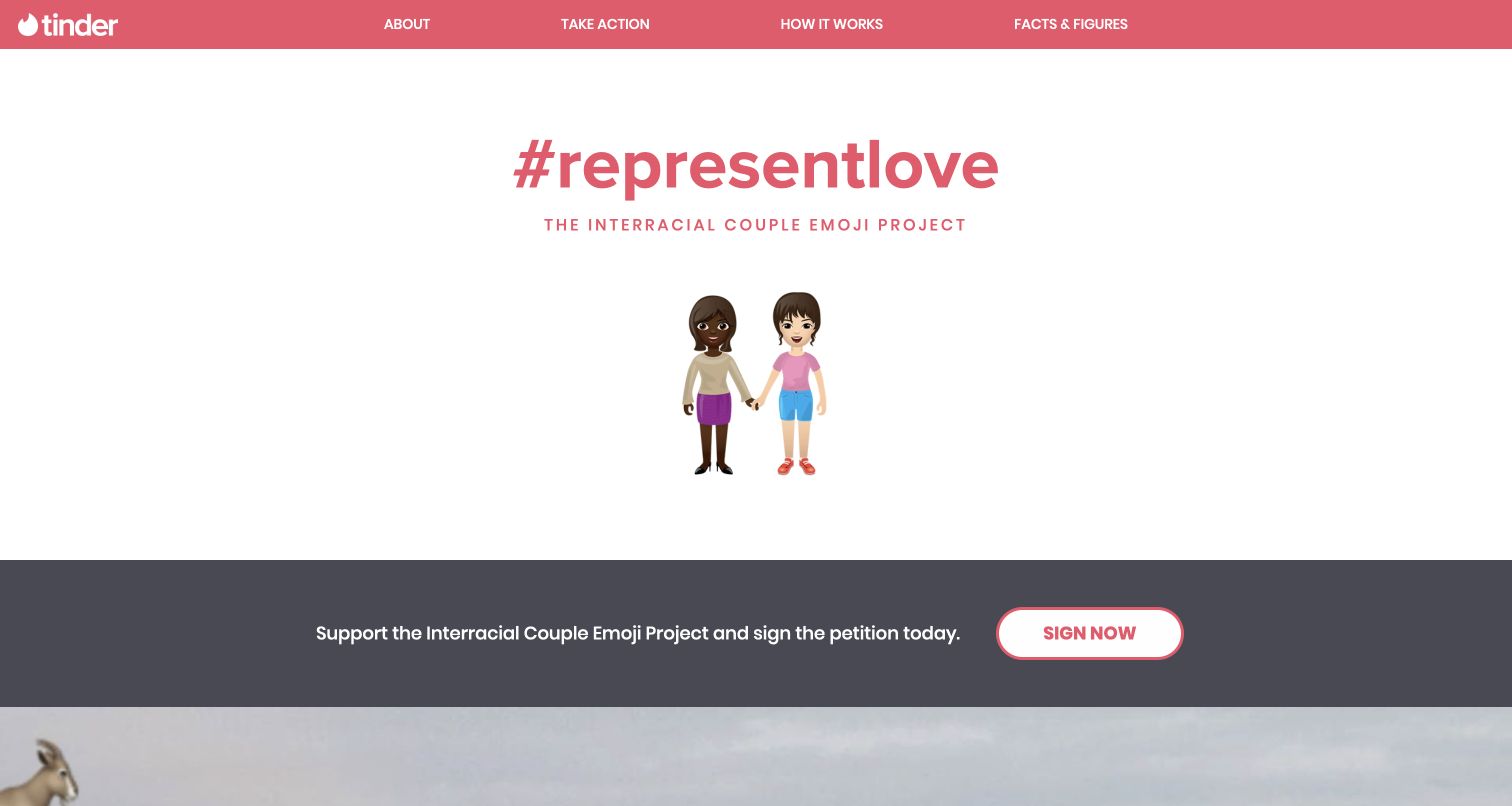
Tinder’s retained interracial-couple emoji campaign uses a coral header and hashtag above a centered pair of illustrated characters. A dark action strip separates the main image from the supporting sections and links to the original petition destination. About, action, explanation, and facts are visible as distinct navigation choices. The current page declares Gatsby in its generator metadata. This is a specific historical campaign property, not the main Tinder product, and the review does not claim that the petition is still active or that the page describes the present status of emoji standards.
What you can learn
Give a campaign one recognizable visual idea, then connect it to a clear explanation and documented status. A retained campaign needs an archival update so the original action language does not mislead visitors who arrive years after its launch.
Pros
A small set of colors makes the campaign identity immediately recognizable.
The separate action strip distinguishes participation from background information.
Cons & considerations
Historical petition language can appear current without an explicit status update.
A symbolic illustration still needs accessible text and supporting explanation of the campaign goal.
ReactAssociated with Gatsby; not independently observed
Public source checked November 3, 2026. References may be embedded or legacy—not a complete backend inventory.
Platform source: Direct public page generator metadata. Public page HTML checked on November 3, 2026 UTC declares Gatsby 3.0.2 in generator metadata. This is the retained Interracial Couple Emoji Project campaign, not Tinder’s primary website or dating application. The original petition status was not verified. Platform evidence is separate from the direct website screenshot and is not a complete current infrastructure audit.
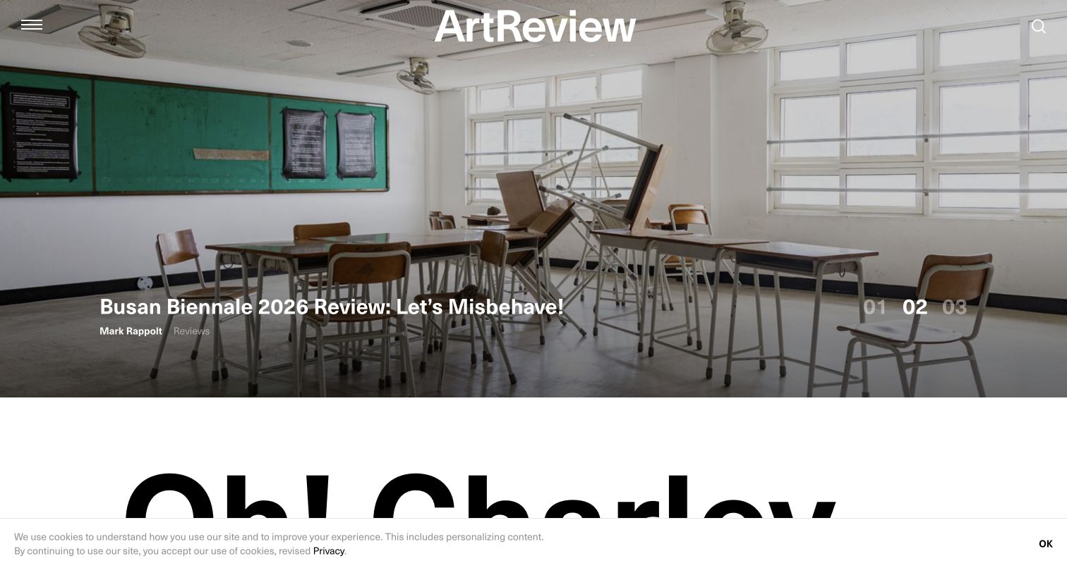
ArtReview uses a full-width exhibition photograph as its lead-story field, with the white masthead centered at the top and the story title near the lower edge. Author and category labels provide editorial context, while numbered slide controls indicate additional lead items. The next section begins with very large black typography on white, creating a sharp change of pace beneath the image. Current generator metadata identifies Gatsby for the public homepage. The reviewed composition is a particular editorial state and does not establish readership, subscription performance, or the implementation of the separate shop.
What you can learn
Let a strong lead image establish the publication’s subject while preserving the story title, author, and category as readable text. Review every replacement image against the same overlay rules rather than assuming one successful crop will generalize.
Pros
The photograph and editorial labels connect visual atmosphere with a specific story.
A clear white-to-black transition separates the hero from the next content section.
Cons & considerations
White overlay controls require consistent contrast across changing lead images.
Large secondary typography can compete with the lead story when both appear in one viewport.
ReactAssociated with Gatsby; not independently observed
Public source checked November 3, 2026. References may be embedded or legacy—not a complete backend inventory.
Platform source: Direct public page generator metadata. Public page HTML checked on November 3, 2026 UTC declares Gatsby 2.32.13 in generator metadata. This association is limited to the named public website and is not a complete inventory of the organization’s software, hosting, or private applications. Platform evidence is separate from the direct website screenshot and is not a complete current infrastructure audit.
Match the implementation to the publishing and interaction needs
Build a consistent public content experience
For a marketing or editorial website, begin with the ordinary detail pages people will actually read. Establish navigation, related content, search, and useful page metadata before polishing the homepage. Demonstrate direct arrival at a deep URL and a meaningful not-found response. A framework can supply conventions, but it does not decide which content is important or how a visitor should move through the library.
Make documentation version and maintenance status visible
Technical information has a lifecycle. Define how current, previous, and archived material are labeled and linked. Show the version in the reading interface and keep a route to the maintained equivalent where one exists. Preserve historical URLs carefully, but do not let their visual polish imply current support. The legacy examples in this collection are especially useful for discussing that distinction with an editorial team.
Separate interactive services from the public presentation
An account area, payment action, search service, or form may sit alongside generated pages while depending on a different backend. Document those boundaries and their failure behavior. Keep private information out of public page data and static assets. Test meaningful pending, error, and recovery states in an appropriate environment. A marketing screenshot of an application is not evidence that the website framework supplies that application’s capabilities.
From references to requirements
Make publication and maintenance part of the acceptance criteria
Test the production build, not only development preview
Gatsby’s documentation distinguishes its development process from the production build and the browser runtime. Use the actual production output when reviewing direct links, page transitions, fonts, images, and browser-only features. Include an upstream content failure and a missing optional field. A site that appears correct in a development server still needs a reproducible build, a verified deployment, and an understandable rollback procedure.
Rehearse a complete content change with the real editor
Create a page, replace an image, preview a draft, publish it, and correct a mistake. Record which system owns each step and how long it normally takes. Decide how editors learn that a build failed and how urgent corrections are handled. Include a content deletion and a changed URL in the rehearsal. This is more informative than promising that the team will find the CMS easy once the design is finished.
Verify the maintenance path before adopting a starter or plugin
Inventory the framework version, source plugins, image tools, runtime, and hosting arrangement the proposed project will actually use. Check current compatibility and maintenance information with the responsible vendors and repositories. Assign ownership for updates and broken integrations. Do not copy an old showcase implementation or a historical cloud-product announcement as if it were a current procurement recommendation. Keep the ability to export content and rebuild the site documented.
A useful handover demonstration
Ask the actual team to carry out its routine job: publish a realistic update, correct a mistake, preview a narrow screen, and identify who owns an integration failure. For a library or frontend framework, also ask who maintains the content source and deployment. A polished screenshot does not answer those operational questions.
Beyond the screenshot
A Gatsby review checklist for the complete publishing system
Define content types, relationships, required fields, and stable URL rules.
Test missing data, removed records, long titles, and realistic library size.
Review image crops, responsive output, placeholders, and useful text alternatives.
Check direct links, browser Back, page transitions, and real not-found behavior.
Make versions, publication dates, and archived status visible where they matter.
Demonstrate draft preview, publication, failed builds, urgent correction, and rollback.
Verify external forms, search, accounts, and transactions separately from public page rendering.
Document dependency compatibility, hosting ownership, maintenance, and content export.
Test with real content, a keyboard, a small screen, slow or failed requests, and the people who will maintain the system. These are planning checks, not an accessibility, security, performance, or search-ranking certification.
Sources & editorial method
How this Gatsby collection was reviewed
All twenty examples were captured directly in Chrome on November 3, 2026 UTC and visually reviewed after initial loading states resolved. Current public source was checked for explicit Gatsby generator metadata; the How to GraphQL and ProPublica examples combine Gatsby root markup with the official showcase listing. Preserved campaigns and legacy documentation are labeled by scope. Reviews are original observations of visible design and do not certify accessibility, performance, product outcomes, or complete infrastructure.
Every image is an unmodified capture from the actual website, with its source and capture date. Some captures are reused from our shared catalog; their dates remain the original capture dates. None comes from a vendor gallery or a generated reconstruction. Moving imagery and live content can change.
Technology attribution uses public page assets or metadata, official platform documentation, or a cited first-party project case study. Documentary and framework-relationship evidence is identified where used; it is not a complete current backend inventory. A CMS image CDN alone does not establish a full CMS deployment. A library’s presence does not prove which individual controls use it, and a platform label does not establish AI authorship.
The composition notes, lessons, pros and tradeoffs are original editorial observations. We have not measured conversion, traffic, security, performance or accessibility conformance. Website owners retain their brands and imagery; these examples are not our client portfolio. Written, Edited and Curated are independent records, not dates advanced by a build. See our editorial standards or suggest a correction.
Questions worth asking
Gatsby website development FAQs
Does a Gatsby example prove that a brand uses Gatsby everywhere?
No. A public marketing page, documentation subdomain, campaign, and private application can use different systems. Each example identifies the property observed and keeps that association separate from the wider organization.
Should I choose Gatsby because a recognizable company appears here?
Use the example to clarify design and publishing requirements, then evaluate the proposed implementation’s maintenance, compatibility, hosting, and editorial workflow. A recognizable name does not establish that the same architecture is appropriate for a different team.
Can Gatsby work with a separate content management system?
A project can connect content sources through an appropriate implementation. The important questions are the actual content model, preview behavior, publication process, permissions, and failure handling. A screenshot cannot reveal those details.
Why include retained campaigns and legacy documentation?
They illustrate useful design decisions and the responsibility to label historical material. Their source evidence remains scoped to the public property captured. They are not presented as current campaigns, current technical guidance, or proof of a brand’s present main-site stack.