Sanity is useful to study as a content system, not as a design theme. The most important work is connecting a clear schema, an understandable editing interface, and the frontend that visitors actually use.
The examples use attributed Sanity associations for the named properties. A Sanity image CDN URL alone is not evidence of a complete CMS deployment, and an organization’s content project does not reveal every part of its infrastructure.
Start with the information that should remain useful when the design changes: products, people, places, stories, categories, and their relationships. Then decide how editors and visitors encounter it.
Before the examples
What makes good Sanity website development in 2026?
Make the schema describe understandable content
Sanity Studio uses schemas to shape editing forms. Give fields meaningful names, useful validation, and a clear purpose. Avoid a schema made entirely of visual fragments that editors cannot distinguish without knowing the frontend implementation.
A reusable person, location, or article can appear in several contexts. Decide which documents represent durable entities and which control presentation. Schema design still requires editorial judgment; a flexible datastore does not make every structure equally maintainable.
Visual editing and draft presentation require frontend integration. Test what an editor sees before and after publication and keep draft access separate from ordinary public browsing. Do not confuse a promising Studio demo with a completed publishing workflow.
Study the named websites as frontend references while reading the attributed content-platform evidence separately. The opening brands establish recognizable context, not a claim that every one of their products uses the same CMS.
We start with five recognizable brands or organizations: PUMA US storefront, Figma marketing website, Lady Gaga, Morning Brew, Mejuri. Each attribution applies to the named website property, not every product or website belonging to its organization. This is a curated reading sequence, not a measured ranking.
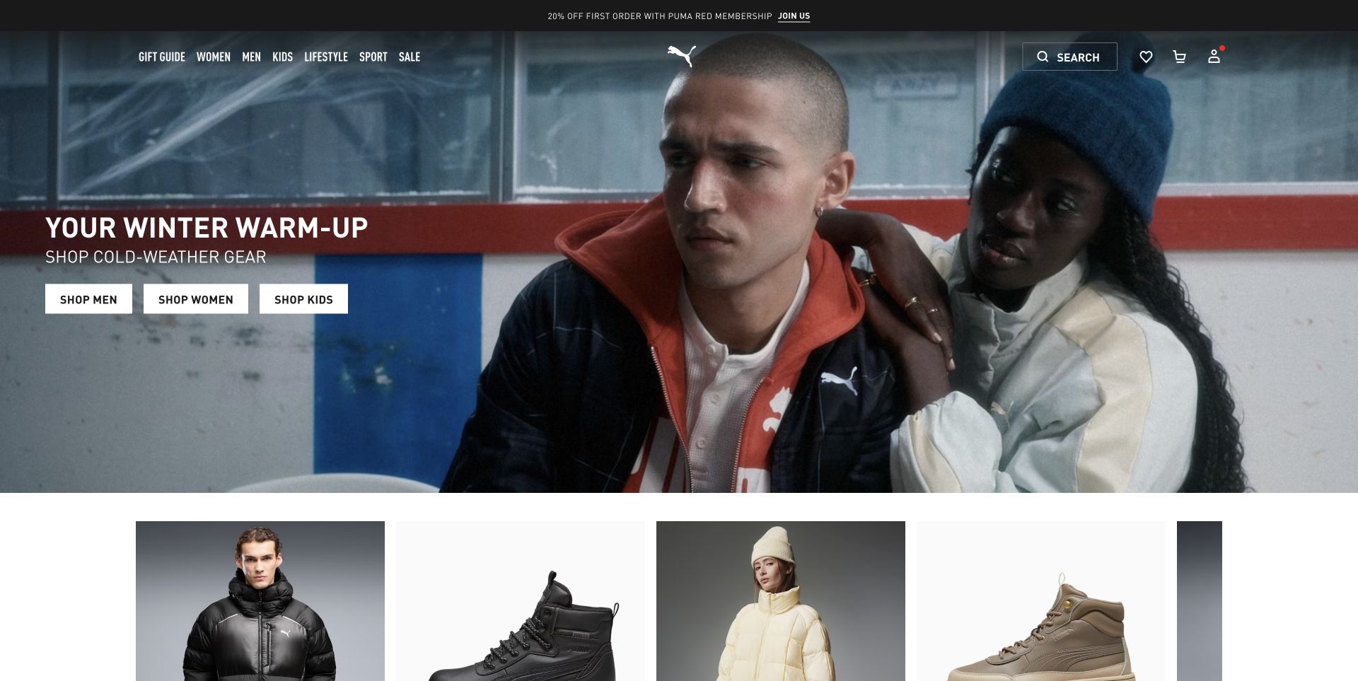
PUMA’s US storefront puts a cold-weather campaign behind a transparent navigation row. Condensed white headings, three audience-specific shopping controls, and the central cat mark connect the scene to the wider catalog. A narrow announcement strip has its own place above the navigation, while product imagery begins immediately below the campaign. That separation matters more than the cinematic crop: campaign messaging can change without requiring shoppers to relearn the browsing structure. The official Sanity story describes shared content across regional web and app experiences, rather than a single all-purpose commerce database.
What you can learn
For a Sanity storefront, model a campaign’s headline, media, destination, audience, and market independently of product records. Preview the actual regional composition and verify that linked collections are available before scheduling it. Reusable content needs validation and ownership, not unrestricted fields that can silently produce mismatched offers.
Pros
Audience-specific buttons make one seasonal campaign useful for several shopping intentions.
The announcement, campaign, and catalog occupy visibly distinct content layers.
Cons & considerations
Transparent navigation needs alternative contrast treatment for very different campaign photography.
Repeated membership or promotional overlays can interrupt the product story before browsing begins.
ReactAssociated with Next.js; not independently observed
Public source checked November 3, 2026. References may be embedded or legacy—not a complete backend inventory.
Platform source: Official platform or first-party project source. Sanity association is scoped to PUMA’s website and app marketing/e-commerce content across regional storefronts. The source is linked for its implementation description; no case-study performance figures are adopted as this review’s own findings. Platform evidence is separate from the direct website screenshot and is not a complete current infrastructure audit.
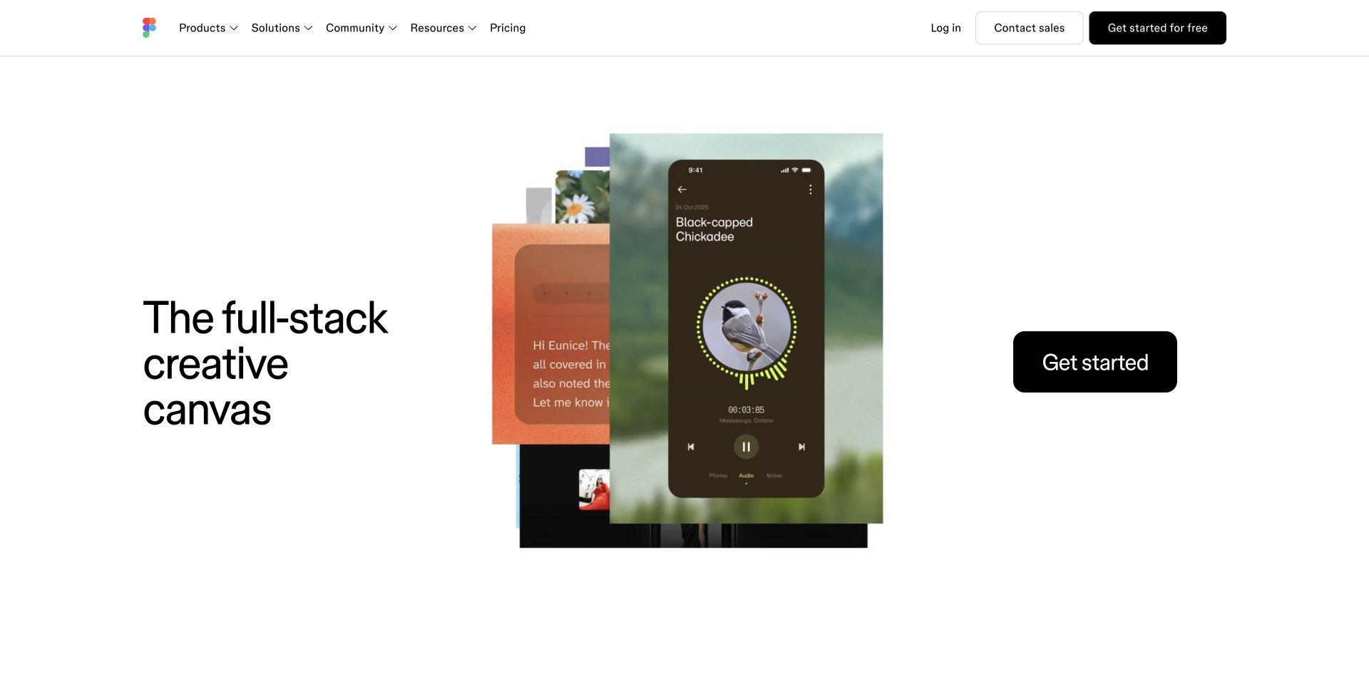
Figma’s public homepage combines a spacious white navigation shell with a layered demonstration of its creative products. Large introductory type, overlapping interface media, and a prominent dark action occupy separate zones rather than becoming one flattened promotional image. Product, solution, community, and resource destinations remain recognizable above the demonstration. The developer’s published Sanity project describes the marketing website and blog, including a modular editor experience; it is not evidence that the private Figma application is built on that CMS. The current page’s frontend assets identify a different revision from the older Gatsby project.
What you can learn
The Sanity lesson is to separate reusable product facts from campaign-specific compositions. Give editors suitable media slots and presentation choices, while keeping key destinations and localized product terminology consistent. Preview at the intended viewport and language, because translated headlines and tall interface imagery can change the balance of an otherwise reusable module.
Pros
Stable navigation supports frequent changes to the product demonstration.
Large media retains space beside a clear introduction.
Cons & considerations
A highly compositional hero needs preview rules beyond simple field completeness.
A case study of an older implementation should not be mistaken for a complete current stack audit.
Public source checked November 3, 2026. References may be embedded or legacy—not a complete backend inventory.
Platform source: Official platform or first-party project source. Sanity association is scoped to Figma’s public marketing website and blog, described by its developer Corey Ward; the older project mentions Gatsby, while the current page exposes Next.js assets. The source is linked for its implementation description; no case-study performance figures are adopted as this review’s own findings. Platform evidence is separate from the direct website screenshot and is not a complete current infrastructure audit.
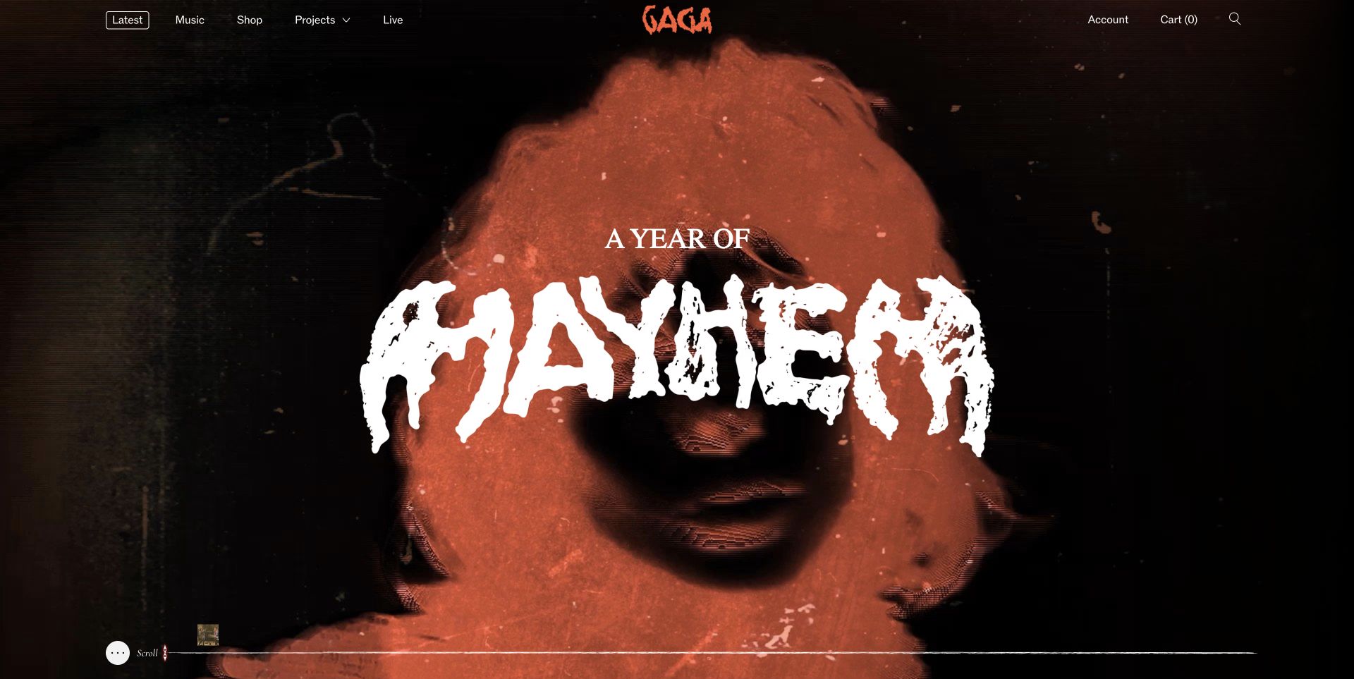
Lady Gaga’s current opening is a deliberately dark, grainy album-world composition. Oversized distressed lettering sits over a red-toned portrait, while a compact header keeps music, projects, live activity, and shop destinations visible. Account and cart utilities occupy the opposite edge, acknowledging that this is both an artist destination and an entry to commerce. The near-monochrome treatment feels specific to this release rather than like a generic musician template. Sanity’s official story documents the fan website’s content platform and its commerce integration; the screenshot alone would not establish that backend relationship.
What you can learn
A Sanity model for an artist should distinguish evergreen entities, such as releases and tour destinations, from temporary campaign skins. Allow a new visual world without breaking stable links or leaving obsolete dates in reused modules. Editors also need image and text previews against real artwork, not just a list of populated fields.
Pros
Typography, photography, and texture share a strong campaign identity.
Music and live destinations remain visible beside shopping and account tasks.
Cons & considerations
Small navigation can become visually subordinate to the much larger campaign lettering.
Dark artwork and fine text require careful fallback choices when new media is substituted.
SanityDocumented platform association; current media delivery observed
Public source checked November 3, 2026. References may be embedded or legacy—not a complete backend inventory.
Platform source: Official platform or first-party project source. Sanity association is scoped to Lady Gaga’s public fan website, campaign content, and connected commerce. The source is linked for its implementation description; no case-study performance figures are adopted as this review’s own findings. Platform evidence is separate from the direct website screenshot and is not a complete current infrastructure audit.
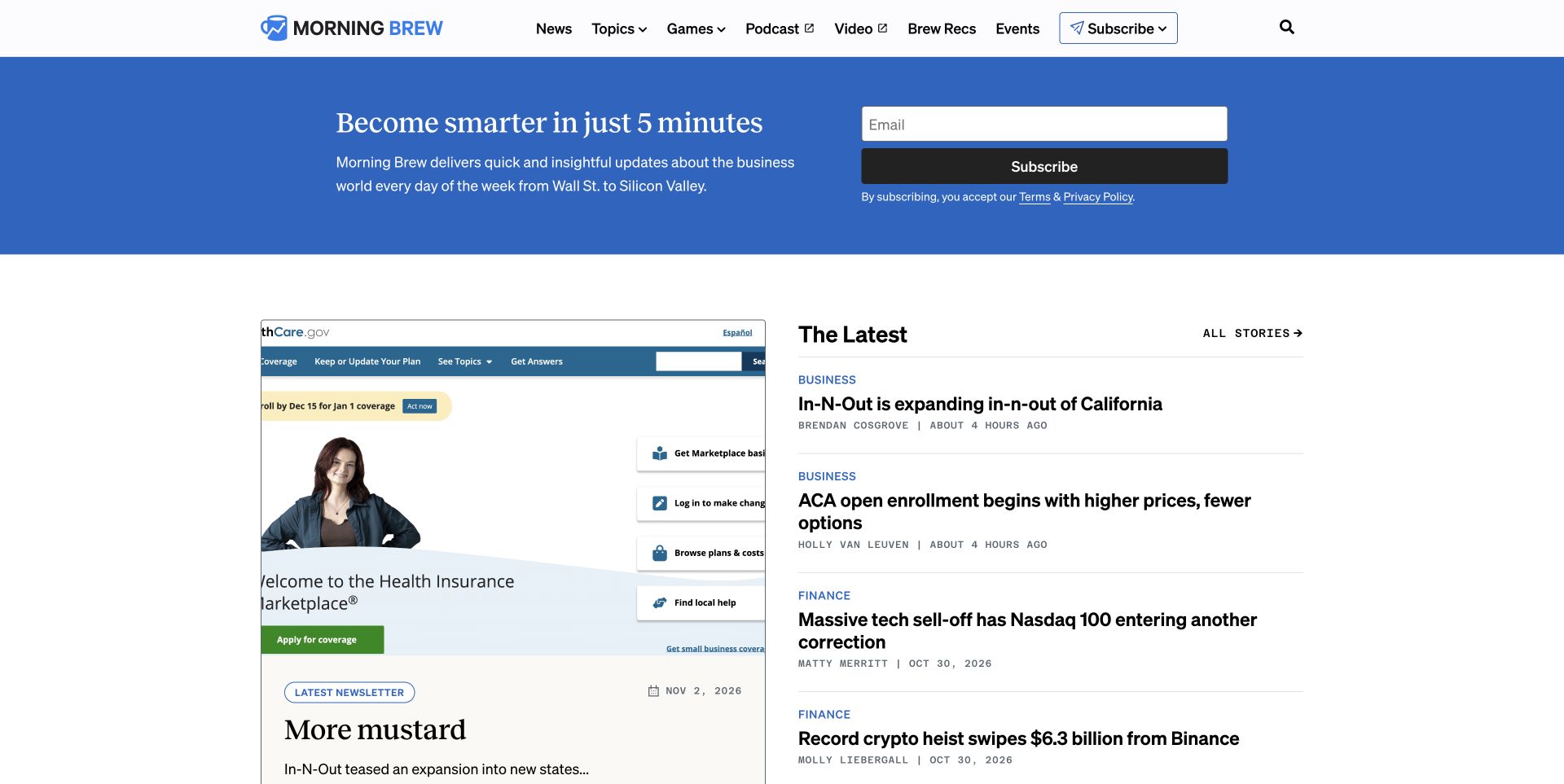
Morning Brew’s homepage leads with a blue newsletter signup band, then divides the reading area between the latest issue and a compact stream of stories. The issue card carries its own date and editorial title; adjacent stories use category labels and bylines rather than relying on thumbnails alone. A stable horizontal navigation accommodates topics, games, podcasts, and video without forcing those formats into identical cards. This is a useful distinction for a publication whose recurring newsletter and individual articles have different jobs. The official Sanity story supports the editorial-platform association across its publication brands.
What you can learn
In Sanity, model an issue separately from an article and reference stories where appropriate instead of duplicating their titles and authors. Publication dates, categories, contributor relationships, and sponsorship labels deserve explicit fields. A shared content platform should preserve those distinctions even when the homepage presents several formats together.
Pros
Dates and editorial metadata help distinguish a complete issue from an individual story.
The publication’s main subscription proposition is separate from the article listing.
Cons & considerations
The large signup area delays access to the first editorial items.
Dense headline lists need consistent hierarchy when several stories have long titles.
ReactAssociated with Next.js; not independently observed
Public source checked November 3, 2026. References may be embedded or legacy—not a complete backend inventory.
Platform source: Official platform or first-party project source. Sanity association is scoped to Morning Brew’s editorial content platform and publication websites. The source is linked for its implementation description; no case-study performance figures are adopted as this review’s own findings. Platform evidence is separate from the direct website screenshot and is not a complete current infrastructure audit.
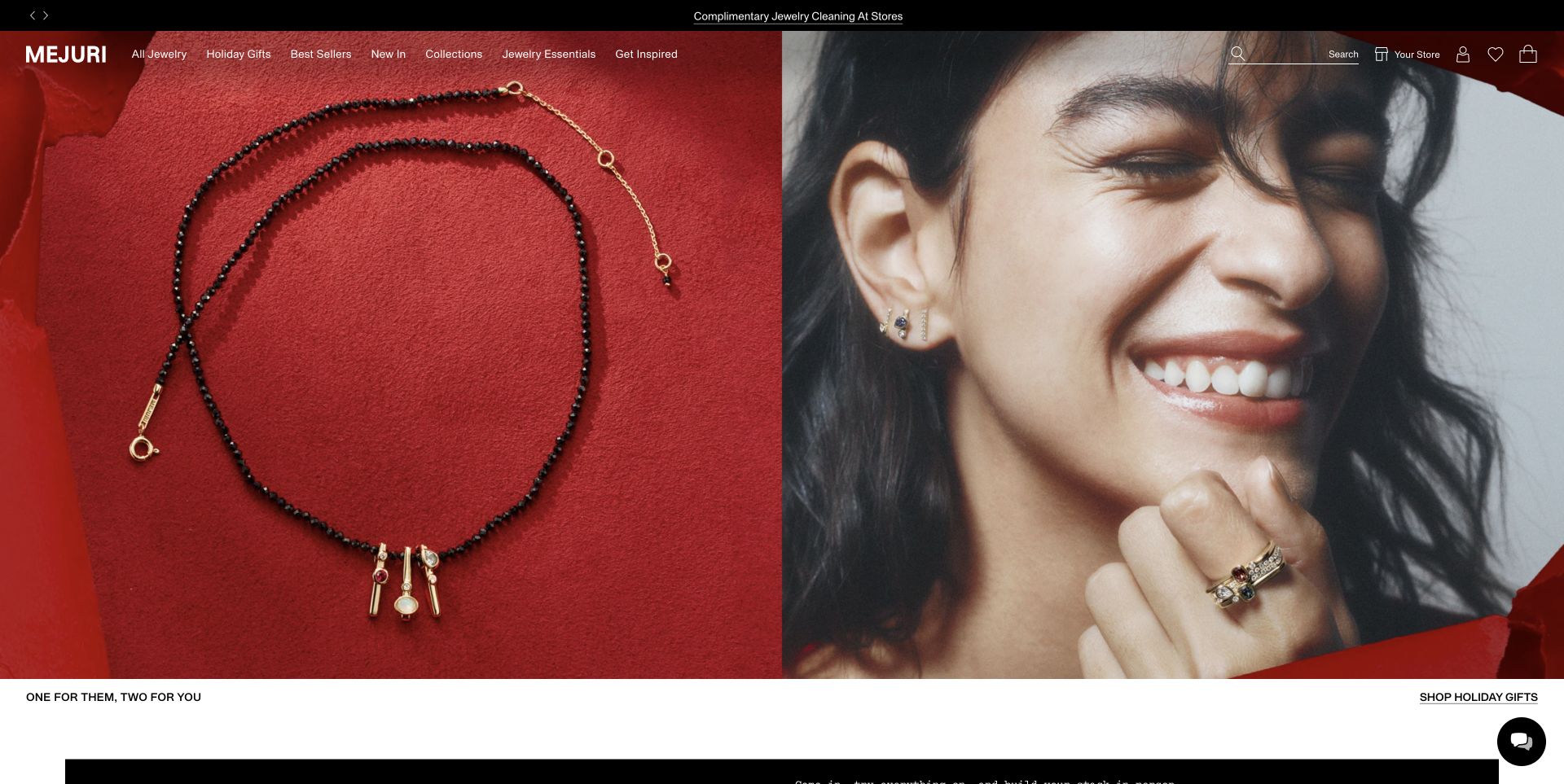
Mejuri’s holiday opening pairs a close product photograph with a large portrait against a saturated red setting. Navigation and shopping utilities sit lightly over the media, while the campaign caption and gift destination move into a slim white strip underneath. That composition lets the imagery carry the seasonal mood without baking every useful control into it. The following content introduces collections, stores, and services as distinct subjects rather than treating the entire business as one product grid. The official Sanity customer story documents reusable commerce content and website/app presentation, not a claim derived merely from an image CDN.
What you can learn
For a Sanity retail build, give editorial images meaningful product or collection references and maintain a separate accessible caption and destination. Model store and service information independently of seasonal campaigns. Preview transparent navigation over each image crop, including mobile, before editors publish a new composition.
Pros
Paired imagery shows product detail and styling context together.
A separate caption strip keeps the campaign destination readable outside the photograph.
Cons & considerations
Fine navigation over photography can lose clarity when media changes.
A large editorial opening postpones product pricing and comparison information for task-focused shoppers.
Visible tech stack
Earlier / documented evidence
Sanity
Earlier cited evidence retained; no current scan result. References may be embedded or legacy—not a complete backend inventory.
Platform source: Official platform or first-party project source. Sanity association is scoped to Mejuri’s commerce website/app content and reusable presentation modules. The source is linked for its implementation description; no case-study performance figures are adopted as this review’s own findings. Platform evidence is separate from the direct website screenshot and is not a complete current infrastructure audit.
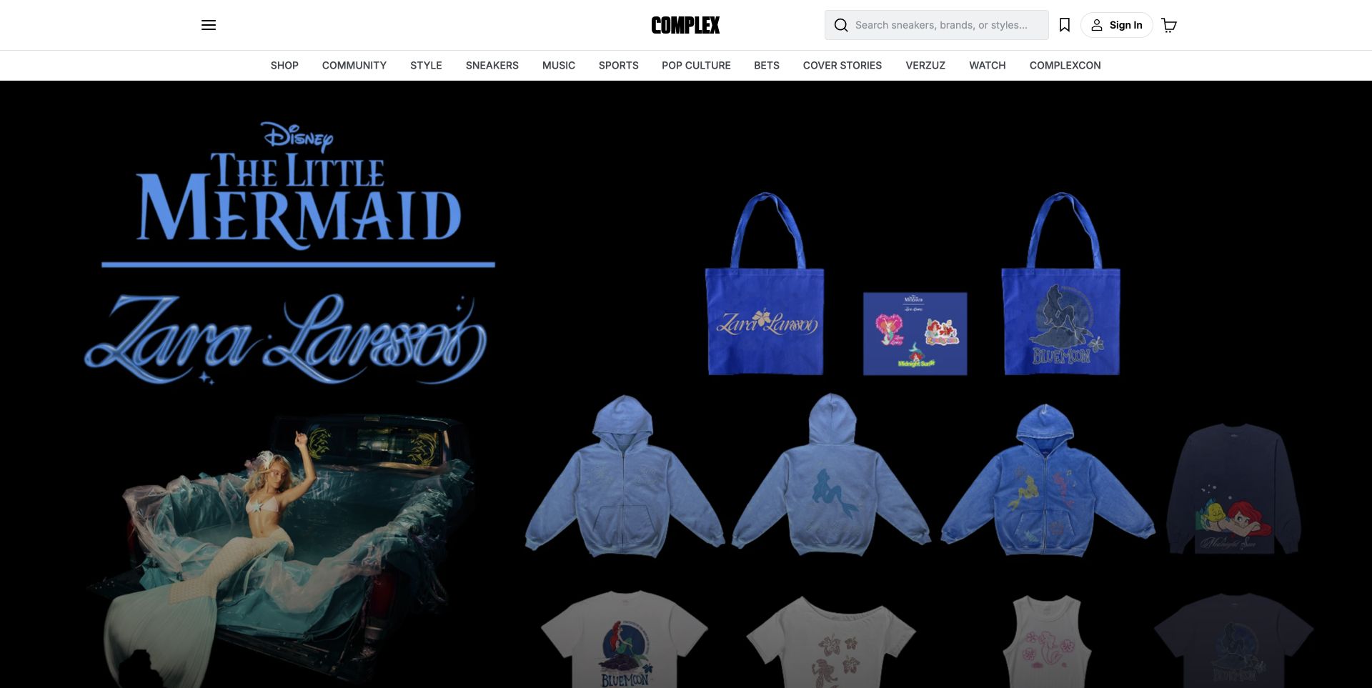
Complex’s header combines an editorial topic taxonomy with visible shopping, search, account, and cart tools. In the captured carousel frame, a music-and-entertainment collaboration becomes a full-width product collage on black, rather than a conventional news card. The white two-row navigation remains visually detached from that campaign artwork. This makes the site feel like an editorial destination with a retail layer, not simply a store with occasional blog posts. Sanity’s official story explicitly discusses articles and product associations, providing the CMS evidence that cannot be established by the visual design alone.
What you can learn
The useful Sanity pattern is a relationship between editorial entities and sellable items, rather than products pasted into rich text. Store collaboration identity, article context, release timing, and product references as separate information. A changing promotional carousel should not erase reliable topic navigation or obscure whether a visitor is following an article or a purchase path.
Pros
Editorial categories remain available around the commerce-led campaign.
Search and cart make the retail role explicit without replacing the publication identity.
Cons & considerations
A rotating campaign can push reporting below the first view.
Editorial and commercial links need clear labels in a shared content stream.
Earlier cited evidence retained; no current scan result. References may be embedded or legacy—not a complete backend inventory.
Platform source: Official platform or first-party project source. Sanity association is scoped to Complex’s articles, editorial workflow, and related commerce content. The source is linked for its implementation description; no case-study performance figures are adopted as this review’s own findings. Platform evidence is separate from the direct website screenshot and is not a complete current infrastructure audit.
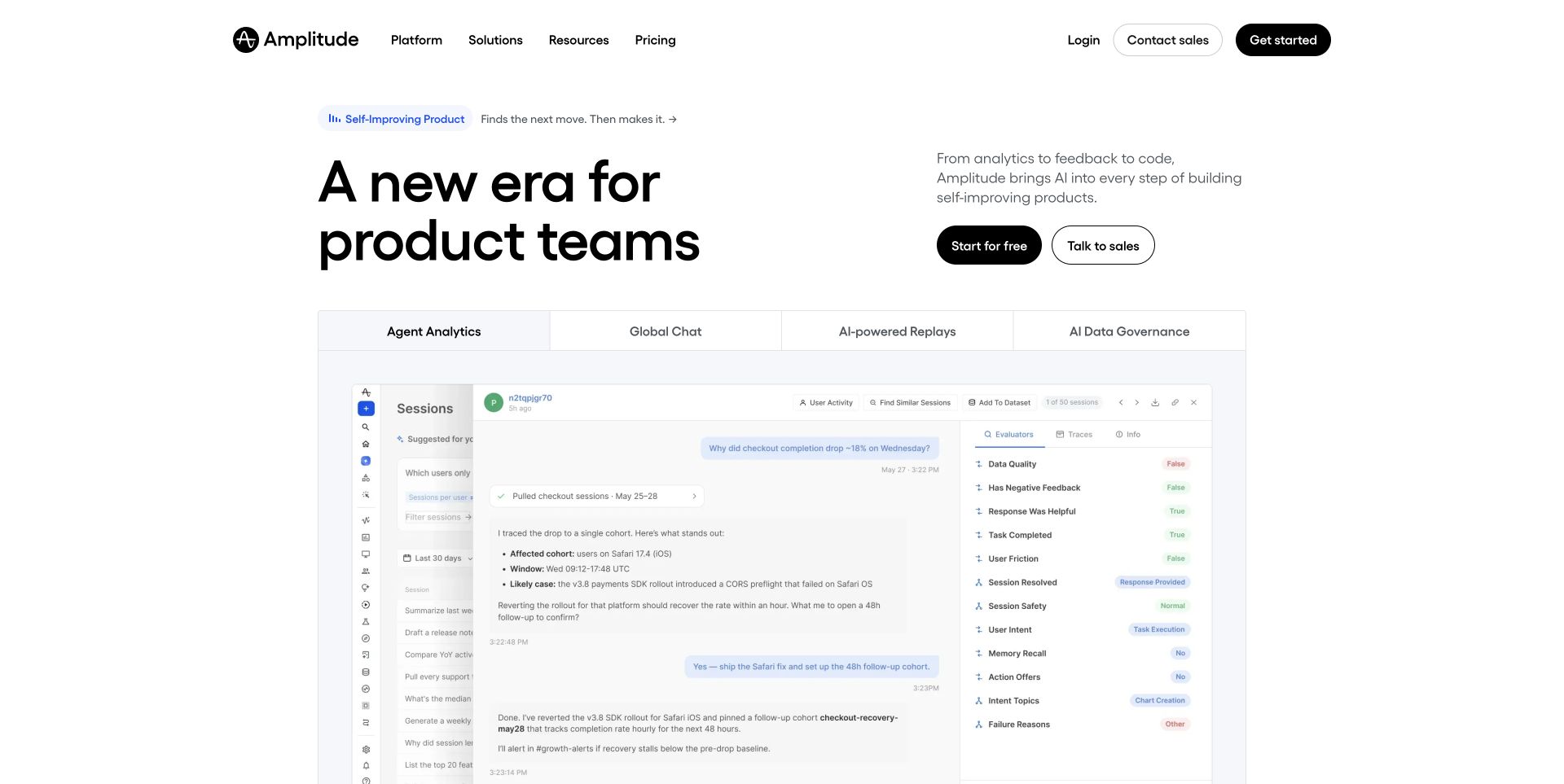
Amplitude’s homepage begins with a large left-aligned positioning statement and a shorter explanatory column with two distinct next steps. Beneath it, a wide framed demonstration uses a row of capability tabs to organize product imagery. The neutral header and generous spacing leave the demonstration as the main visual focus, rather than adding several competing promotional cards. The example is the public marketing site, not a review of the authenticated analytics application. Sanity’s customer story specifically covers marketing content and landing-page production, while the live page independently exposes Next.js frontend assets.
What you can learn
A Sanity content model can keep capability labels, demonstration media, explanatory copy, and destinations together as an intentional module. Provide fallbacks for a missing video or long translated label, and preserve ordinary links to deeper product explanations. Giving editors a tab component is useful only if its content relationships and empty states are also designed.
Pros
A clear hierarchy separates the proposition from the product demonstration.
Capability tabs provide a repeatable structure for related product narratives.
Cons & considerations
Tabs can hide explanations from visitors who never interact with the module.
The first view needs concrete context when broad platform language dominates the headline.
SanityDocumented platform association; current media delivery observed
Public source checked November 3, 2026. References may be embedded or legacy—not a complete backend inventory.
Platform source: Official platform or first-party project source. Sanity association is scoped to Amplitude’s public marketing website and landing-page content. The source is linked for its implementation description; no case-study performance figures are adopted as this review’s own findings. Platform evidence is separate from the direct website screenshot and is not a complete current infrastructure audit.
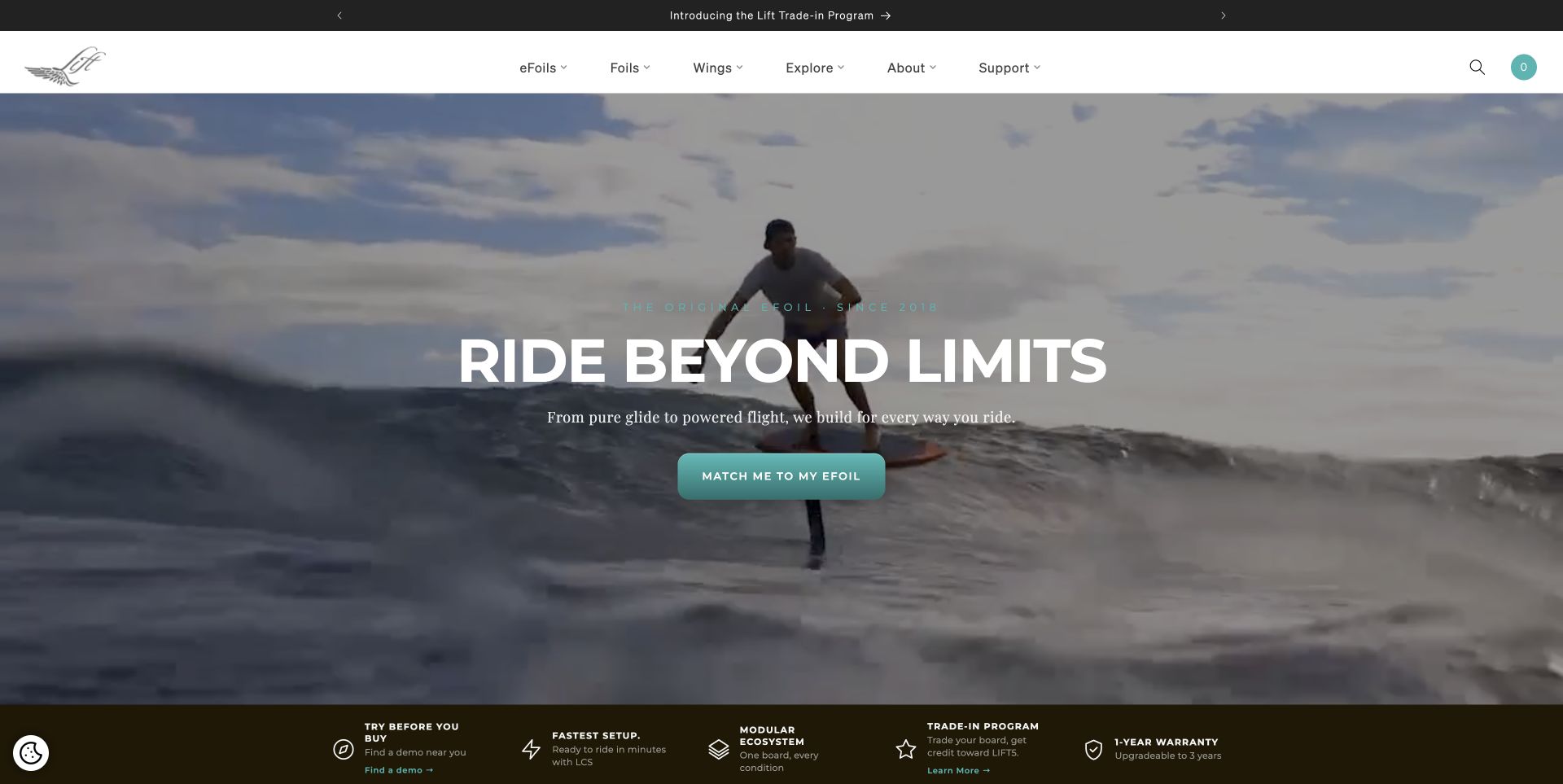
Lift Foils shows the product in use across a wide moving ocean scene, with a centered statement and a turquoise matching action. The white navigation above lists equipment families, exploration, support, and company information. A dark strip below the film introduces demo discovery, setup, product-system, trade-in, and warranty topics as separate supporting ideas. That move from experience to practical context is particularly relevant for unfamiliar equipment. The official Sanity case documents a composable storefront content layer; the current visual revision is captured directly, without assuming all integrations from that earlier architecture remain unchanged.
What you can learn
In Sanity, keep product education, compatibility, regional availability, and demo-location content distinct from campaign video. A matching journey should reference maintained product information instead of duplicating specifications inside a hero module. Film can introduce the experience, but configuration and support need useful text and linked routes when media is unavailable.
Pros
The product appears in context before technical detail.
Practical topics follow the immersive opening.
Cons & considerations
Very large video introduces a dependency that requires a credible still and text fallback.
A matching call to action may be unclear to visitors who first need a basic product explanation.
Public source checked November 3, 2026. References may be embedded or legacy—not a complete backend inventory.
Platform source: Official platform or first-party project source. Sanity association is scoped to Lift Foils’ documented composable storefront content layer; the live capture is a newer visual revision and does not independently confirm the historical Next.js integration. The source is linked for its implementation description; no case-study performance figures are adopted as this review’s own findings. Platform evidence is separate from the direct website screenshot and is not a complete current infrastructure audit.
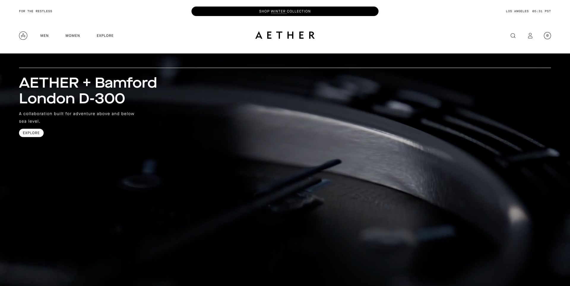
AETHER’s homepage gives a collaboration its own large dark visual stage. A restrained headline and small rounded exploration control occupy one edge, while close-up moving product imagery fills the rest. The white header centers a widely tracked wordmark and keeps audience categories and utility icons at the edges. A separate announcement pill sits above, avoiding the need to insert sale messaging directly into the campaign artwork. Sanity’s official case describes the storefront’s editorial and enriched product content alongside commerce. The reviewed page also exposes Next.js assets, but the CMS association comes from that implementation story.
What you can learn
For a Sanity shop, treat collaborations as structured campaigns that reference products, imagery, and editorial explanations without owning duplicate catalog records. Let a controlled module provide an unusual visual treatment while keeping shopping utilities predictable. Preview video frames and text contrast, and ensure promotional overlays do not stack into a barrier before the campaign can be seen.
Pros
The restrained interface lets product media set the campaign’s tone.
Announcement messaging is separated from the collaboration composition.
Cons & considerations
Small exploration controls may understate the next step.
Stacked privacy, newsletter, or event overlays can obscure a quiet opening.
SanityDocumented platform association; current media delivery observed
Associated dependencies
ReactAssociated with Next.js; not independently observed
Public source checked November 3, 2026. References may be embedded or legacy—not a complete backend inventory.
Platform source: Official platform or first-party project source. Sanity association is scoped to AETHER’s storefront storytelling and enriched product content. The source is linked for its implementation description; no case-study performance figures are adopted as this review’s own findings. Platform evidence is separate from the direct website screenshot and is not a complete current infrastructure audit.
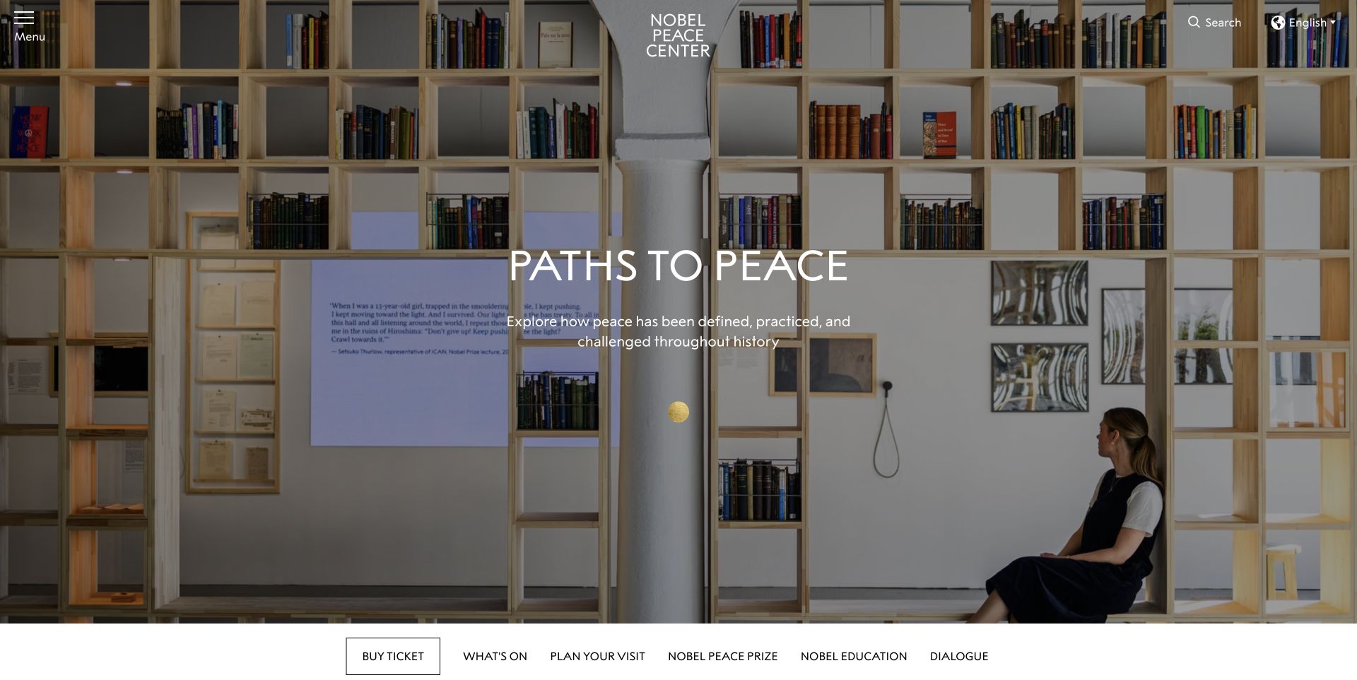
The Nobel Peace Center’s English homepage opens on an exhibition photograph with a simple centered title and description. Menu, search, and language utilities sit around the institution’s mark, while a row of practical destinations appears below the large image. The wider page distinguishes exhibitions, events, tours, news, and visiting information instead of compressing everything into generic articles. The official Sanity customer story specifically covers localized web content and related interactive installations. That makes it a useful content-model example, without turning the website screenshot into evidence about the museum’s entire technical infrastructure.
What you can learn
A Sanity institution site should model events and exhibitions separately, with explicit date ranges, venue relationships, and language variants. Ticket and visit destinations should remain reliable when an opening campaign changes. Reusing content across a website and physical display also requires clear ownership of short labels, image rights, and context-specific descriptions.
Pros
The exhibition image establishes context while practical visitor destinations remain nearby.
Language and search are separate visible tools rather than hidden editorial content.
Cons & considerations
A nearly full-screen introduction delays immediate access to opening hours and booking detail.
Text over exhibition photography needs deliberate contrast checks for every new campaign.
SanityDocumented platform association; current media delivery observed
Associated dependencies
ReactAssociated with Next.js; not independently observed
Public source checked November 3, 2026. References may be embedded or legacy—not a complete backend inventory.
Platform source: Official platform or first-party project source. Sanity association is scoped to the Nobel Peace Center’s localized website and interactive exhibition content. The source is linked for its implementation description; no case-study performance figures are adopted as this review’s own findings. Platform evidence is separate from the direct website screenshot and is not a complete current infrastructure audit.
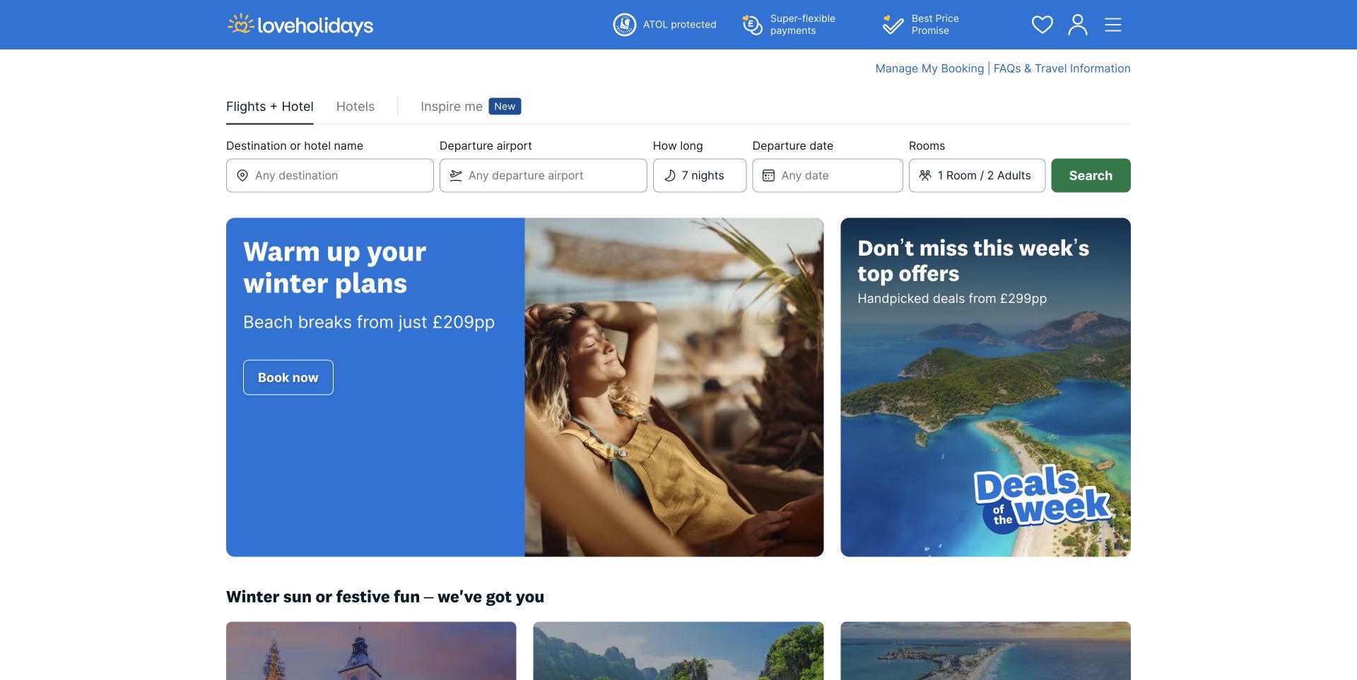
loveholidays puts the travel-search task before its promotional imagery. Separate fields identify destination, departure airport, duration, dates, and rooms, with package and hotel modes above. Beneath them, a wide seasonal campaign and a narrower offer card create a clear second layer of exploration. The blue brand header includes account and saved-item utilities without competing with the search form. Sanity’s official story documents localized destination/hotel content and market configuration, not the entire booking or pricing system. The review therefore concerns the public presentation and its content organization rather than reservation mechanics.
What you can learn
For Sanity, separate editorial destination facts from live inventory, price, and availability. Campaign records should reference markets and valid destinations explicitly, with expiry rules and suitable localized text. Keep inspiration usable before a search is submitted, but avoid presenting stored editorial copy as a guarantee that a particular fare or room is still available.
Pros
Search fields reflect distinct travel-planning decisions rather than one vague input.
Promotions sit below the main task.
Cons & considerations
A wide search row needs thoughtful grouping and labels when reduced to a mobile layout.
Short-lived travel offers require careful ownership and expiry handling across markets.
Visible tech stack
Earlier / documented evidence
Sanity
Earlier cited evidence retained; no current scan result. References may be embedded or legacy—not a complete backend inventory.
Platform source: Official platform or first-party project source. Sanity association is scoped to loveholidays’ localized hotel/landing-page content and market-specific website configuration. The source is linked for its implementation description; no case-study performance figures are adopted as this review’s own findings. Platform evidence is separate from the direct website screenshot and is not a complete current infrastructure audit.
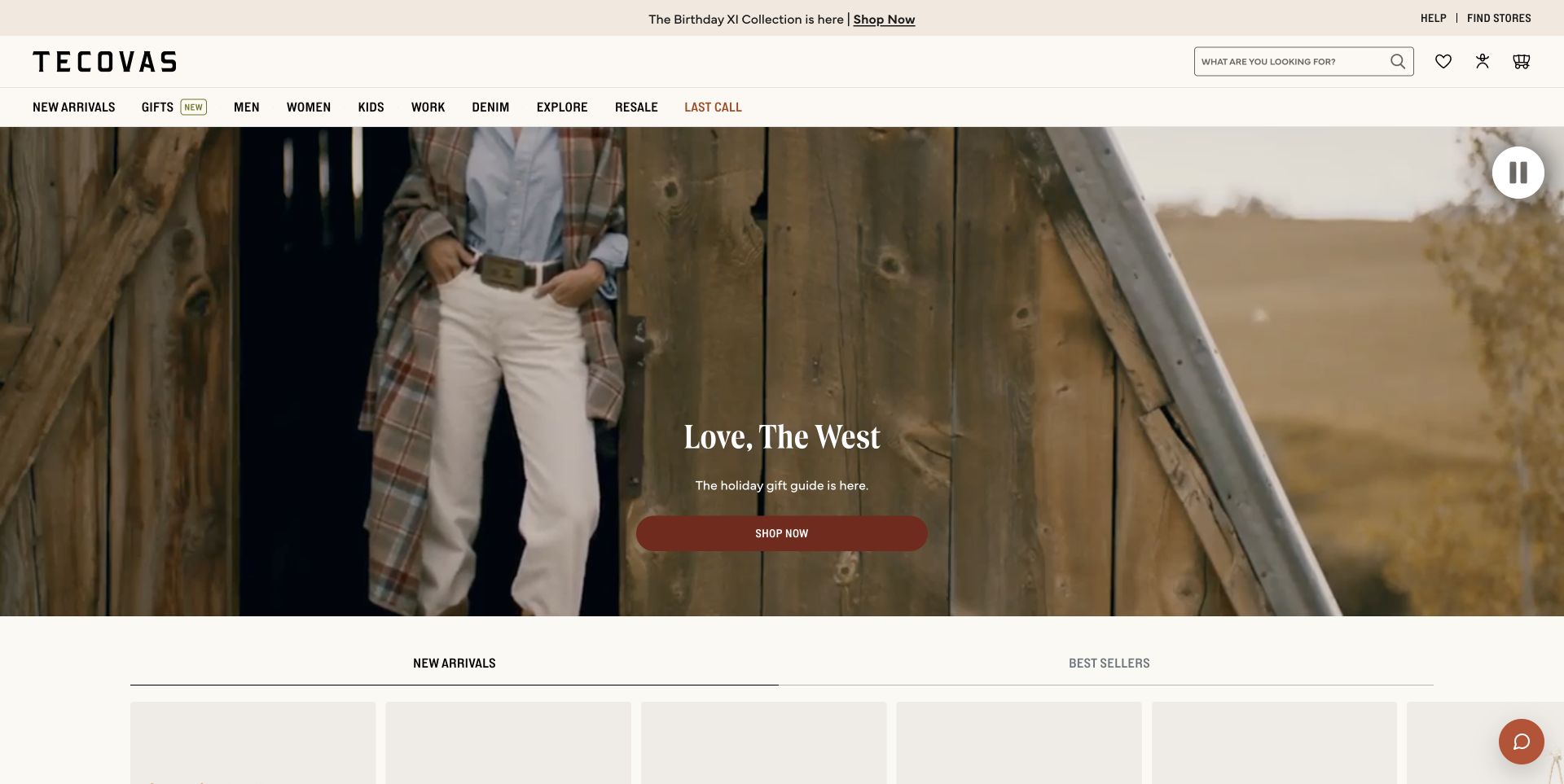
Tecovas combines a warm neutral navigation frame with a large seasonal film and a centered shopping action. Category links, a substantial search field, wishlist, account, and cart utilities establish the retail task before the film begins. Beneath the campaign, new-arrival and bestseller labels introduce a more conventional merchandising section. The contrast between an emotional opening and functional catalog structure is the useful idea, not the particular holiday imagery. Sanity’s official story documents the storefront’s content system with Shopify Hydrogen and merchandiser-controlled modules; the browser capture does not independently measure that editorial workflow.
What you can learn
A Sanity model should let a seasonal story point to maintained collections while product details remain connected to commerce records. Treat navigation, campaign text, media, and collection references as related but distinct responsibilities. Editors need previews and scheduling safeguards so a new campaign cannot leave yesterday’s caption or an unavailable collection behind.
Pros
Search and shopping utilities remain available outside the campaign.
Brand narrative leads toward named merchandising sections.
Cons & considerations
Large film imagery can delay useful product detail for shoppers with a specific item in mind.
Seasonal campaign copy and destination references must be updated together rather than independently.
Public source checked November 3, 2026. References may be embedded or legacy—not a complete backend inventory.
Platform source: Official platform or first-party project source. Sanity association is scoped to Tecovas’ merchandiser-controlled storefront content with Shopify Hydrogen. The source is linked for its implementation description; no case-study performance figures are adopted as this review’s own findings. Platform evidence is separate from the direct website screenshot and is not a complete current infrastructure audit.
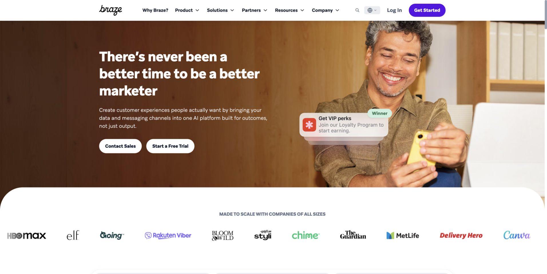
Braze’s public homepage uses a full-width scene with an oversized left-hand headline and an illustrative message overlay near a person holding a phone. Two white actions distinguish sales contact from a trial, while the header groups product, solution, partner, resource, and company routes. A rounded white transition introduces a customer-logo band beneath the image, giving the scene a clear endpoint rather than running into more layered artwork. The official Sanity story describes the marketing and learning content layer. It is not evidence about every part of the private customer-engagement product or its data systems.
What you can learn
For Sanity, model product explanations and learning resources so they can be referenced across solution pages without copy-paste drift. Keep calls to action contextual and validate which journey a reusable module supports. A public marketing image can illustrate a use case, but the surrounding text should make the real capability and destination clear.
Pros
Sales and trial routes are distinct from product exploration.
The curved transition separates the hero from customer evidence.
Cons & considerations
Broad positioning language needs concrete product explanation in the content that follows.
Human imagery with floating interface elements can become ambiguous without descriptive supporting copy.
SanityDocumented platform association; current media delivery observed
Public source checked November 3, 2026. References may be embedded or legacy—not a complete backend inventory.
Platform source: Official platform or first-party project source. Sanity association is scoped to Braze’s marketing and educational content layer, not its private engagement product. The source is linked for its implementation description; no case-study performance figures are adopted as this review’s own findings. Platform evidence is separate from the direct website screenshot and is not a complete current infrastructure audit.
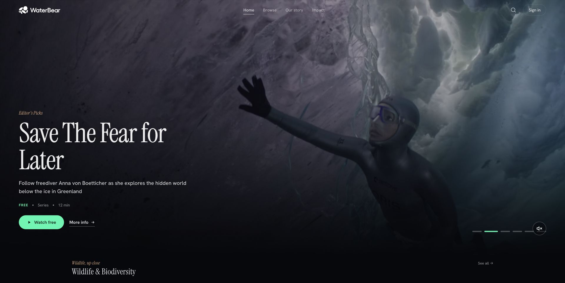
WaterBear’s public film catalog uses a large cinematic introduction with an editorial pick, short synopsis, duration, and separate watch and information destinations. Small slide indicators and a sound control acknowledge the moving media, while the beginning of a genre row appears below. The restrained navigation focuses on browsing, story, and impact rather than a dense retail-style taxonomy. This capture is the public catalog at /play, not the separate Framer marketing homepage. Sanity’s official case documents a unified platform for video and non-video content; that source does not independently verify every later player or homepage revision.
What you can learn
In a Sanity media model, films, contributors, collections, captions, and related editorial context should be separate reusable entities. Keep duration, availability, and synopsis information useful before playback. A cinematic featured slot also needs a meaningful still fallback and a browsing route that does not require registration merely to understand the catalog.
Pros
Synopsis and duration help visitors choose before playback.
Watch and information destinations support different levels of commitment.
Cons & considerations
A full-screen featured slot can hide the breadth of the catalog until scrolling.
Automatically changing artwork needs stable controls and should not make essential metadata transient.
Visible tech stack
Referenced on the public page
Google Analytics
Google Fonts
Firebase client
Earlier / documented evidence
Sanity
Public source checked November 3, 2026. References may be embedded or legacy—not a complete backend inventory.
Platform source: Official platform or first-party project source. Sanity association is scoped to WaterBear’s documented video/non-video content platform; the current public film catalog is shown, not the separate Framer marketing homepage. The source is linked for its implementation description; no case-study performance figures are adopted as this review’s own findings. Platform evidence is separate from the direct website screenshot and is not a complete current infrastructure audit.
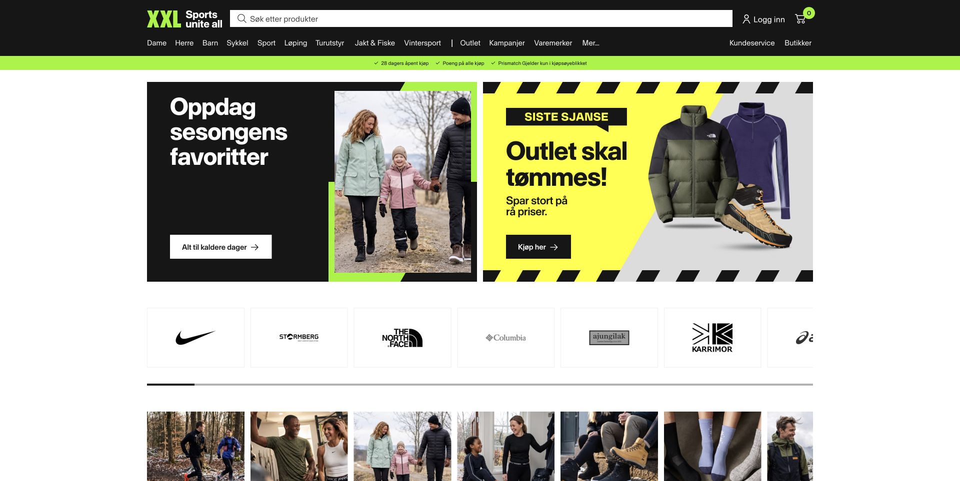
XXL Norway leads with a dark search-and-category header, a narrow lime service strip, and two prominent seasonal campaign tiles. The first view continues into a horizontal brand row and image-led category shortcuts, establishing several ways to enter a large sports catalog. Promotional typography is bold and compact, while the surrounding white canvas keeps the modules separated. The official Sanity case describes content integrated with XXL’s commerce platform and regional web experiences. Public Next.js assets identify the current frontend, but neither observation establishes the implementation of every inventory, account, or store system.
What you can learn
A Sanity retail model should give campaigns explicit destinations, market scope, dates, and image variants while preserving a stable category taxonomy. Brand references and product categories should be maintained as shared entities rather than repeatedly typed labels. That allows editorial promotions to change without silently fragmenting catalog navigation or mixing regional store information.
Pros
Search, categories, brands, and campaigns offer clearly different ways to begin browsing.
Strong module boundaries help organize a crowded seasonal merchandising surface.
Cons & considerations
Several competing offers can overwhelm a visitor who needs simple product guidance.
Horizontally scrolling content needs visible affordances so additional categories are not overlooked.
ReactAssociated with Next.js; not independently observed
Public source checked November 3, 2026. References may be embedded or legacy—not a complete backend inventory.
Platform source: Official platform or first-party project source. Sanity association is scoped to XXL’s regional retail website content integrated with its commerce platform. The source is linked for its implementation description; no case-study performance figures are adopted as this review’s own findings. Platform evidence is separate from the direct website screenshot and is not a complete current infrastructure audit.
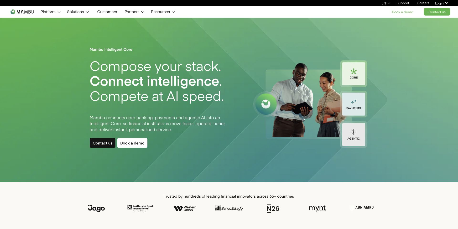
Mambu’s public marketing homepage combines a green gradient composition, a large three-line introduction, and a compact diagram beside people using a tablet. Core, payments, and agentic capabilities appear as separate visual units, with contact and demonstration routes underneath the explanatory copy. A contrasting white customer-logo band follows the hero, while the main header separates platform, solutions, customers, partners, and resources. Sanity’s customer story describes structured marketing content and web frontends. This association concerns the public website; it does not mean Sanity runs Mambu’s banking services or financial processing.
What you can learn
For a Sanity enterprise site, keep capability names, customer references, and solution-specific explanations reusable without turning every page into the same generic sales pitch. Give diagrams text alternatives and make their entity relationships explicit in the content model. Customer stories need their own evidence, permissions, and update ownership rather than being treated as decorative logos.
Pros
Related capabilities occupy distinct units rather than one undifferentiated image.
Commercial actions are separated from deeper informational navigation.
Cons & considerations
Abstract platform terminology may require more concrete explanation for first-time visitors.
Diagrammatic hero content needs an understandable text equivalent when its imagery is unavailable.
SanityDocumented platform association; current media delivery observed
Associated dependencies
ReactAssociated with Next.js; not independently observed
Public source checked November 3, 2026. References may be embedded or legacy—not a complete backend inventory.
Platform source: Official platform or first-party project source. Sanity association is scoped to Mambu’s structured marketing content and public web frontends, not its core banking service. The source is linked for its implementation description; no case-study performance figures are adopted as this review’s own findings. Platform evidence is separate from the direct website screenshot and is not a complete current infrastructure audit.
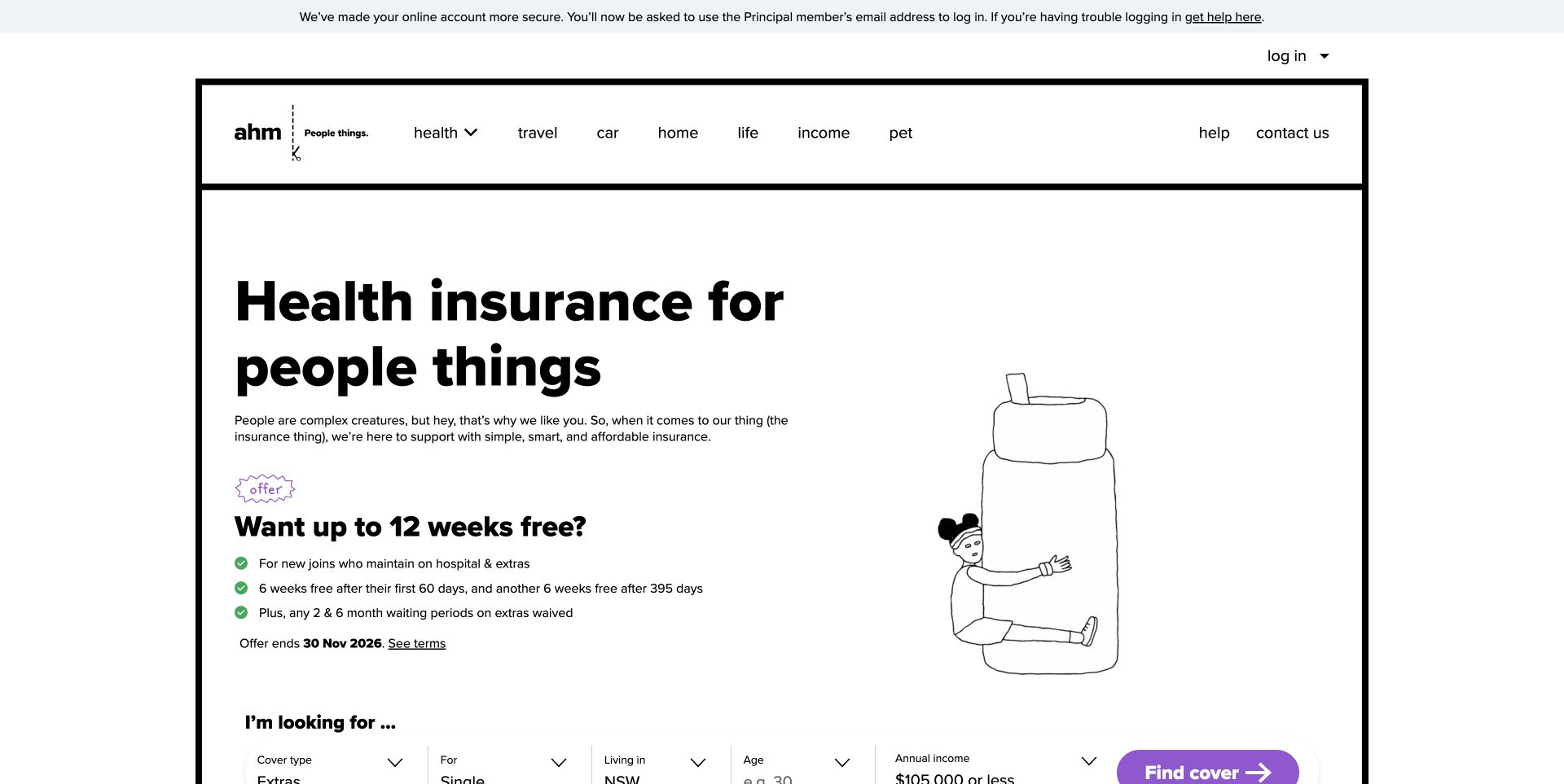
ahm’s public homepage uses a heavy black frame, oversized plain language, and a simple line-drawn character instead of a glossy lifestyle photograph. Product categories sit across the top, while the opening promotion includes a compact list of conditions and a separate terms destination. The beginning of a guided cover-selection row appears below the offer. The visual style is distinctive, but the more transferable idea is the separation between brand voice and specific product information. Sanity’s official case documents decoupled content management for web and app experiences, not the underlying insurance administration system.
What you can learn
For Sanity, product descriptions, eligibility wording, promotion dates, and legal conditions require explicit ownership and review steps. Reusing a campaign should never detach an offer from its qualifications. Keep educational content separate from any personalized quote, and treat changing regulatory or policy information as governed content rather than freely editable decorative copy.
Pros
Promotion qualifications sit near the offer rather than only in a distant footer.
The monochrome frame creates identity without large photographic assets.
Cons & considerations
A promotional opening can delay product comparison.
Oversized type and heavy framing need careful adaptation to smaller screens and longer wording.
SanityDocumented platform association; current media delivery observed
Associated dependencies
ReactAssociated with Next.js; not independently observed
Public source checked November 3, 2026. References may be embedded or legacy—not a complete backend inventory.
Platform source: Official platform or first-party project source. Sanity association is scoped to ahm’s decoupled content management for its public website and associated applications. The source is linked for its implementation description; no case-study performance figures are adopted as this review’s own findings. Platform evidence is separate from the direct website screenshot and is not a complete current infrastructure audit.
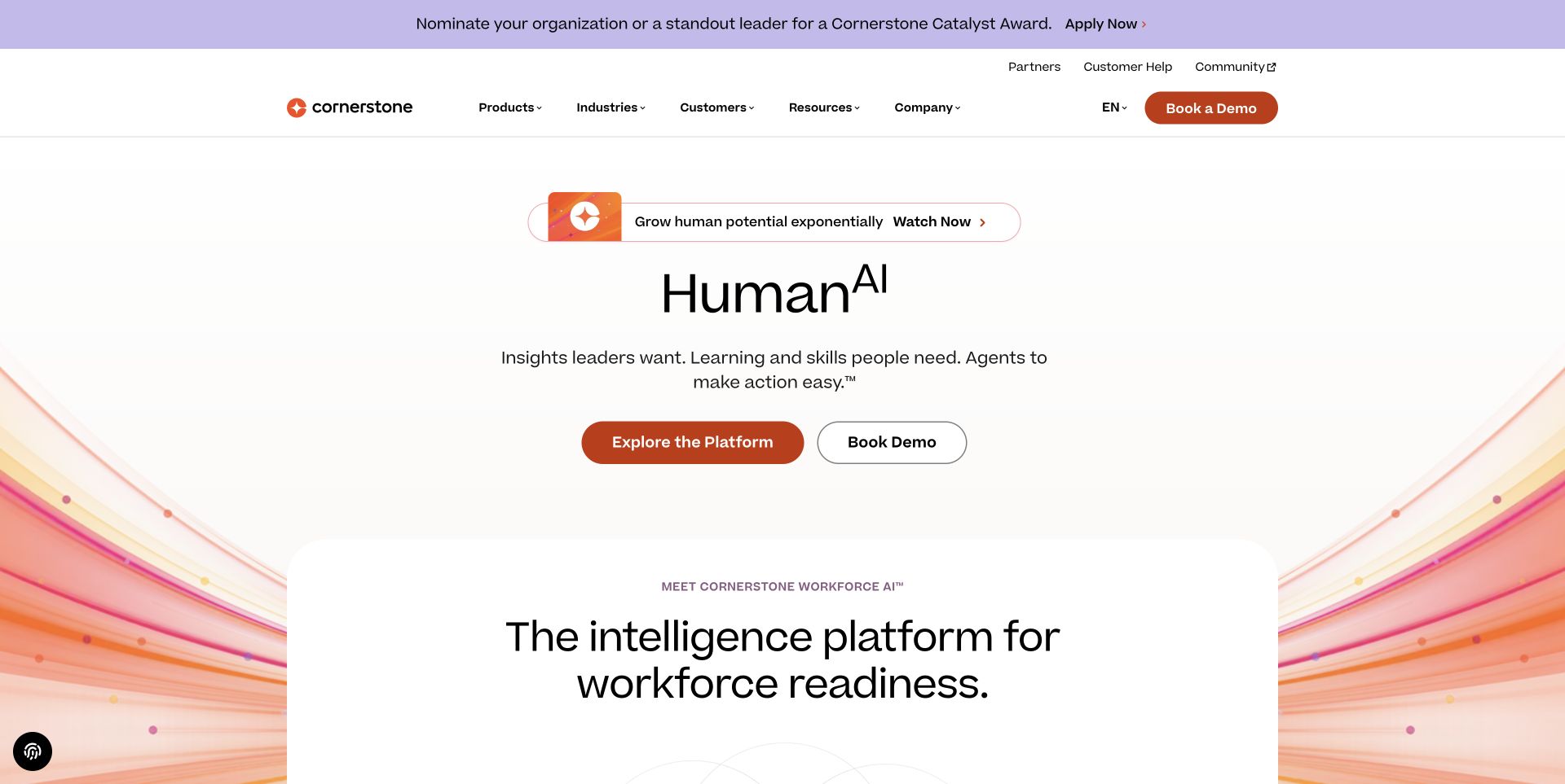
Cornerstone’s public homepage layers a narrow announcement strip, utility navigation, main product navigation, and a centered platform introduction. An outlined promotional capsule sits above the main headline, while orange-tinted graphic lines frame the lower content rather than becoming a separate full-screen image. A second large explanation begins within a rounded white panel. The official Sanity case specifically discusses multilingual web pages and translation-oriented editorial workflows. The captured page also exposes Next.js assets; neither source is evidence about the internal architecture of Cornerstone’s learning and workforce products.
What you can learn
A Sanity multilingual build should separate reusable product terminology from individual campaign wording, and make translation status visible before publishing. Distinguish a global announcement from a local promotion so one region cannot accidentally inherit irrelevant copy. Preview complete page compositions in each language, especially when short capsules and centered headlines depend on precise line lengths.
Pros
Announcement, utility, and main navigation have separate structural roles.
Restrained background graphics leave explanatory text as the primary content.
Cons & considerations
Several stacked introduction layers can postpone concrete product detail below the opening view.
Short promotional capsules and centered lines can become awkward when translated copy expands.
SanityDocumented platform association; current media delivery observed
Public source checked November 3, 2026. References may be embedded or legacy—not a complete backend inventory.
Platform source: Official platform or first-party project source. Sanity association is scoped to Cornerstone’s multilingual marketing web pages and editorial translation workflows. The source is linked for its implementation description; no case-study performance figures are adopted as this review’s own findings. Platform evidence is separate from the direct website screenshot and is not a complete current infrastructure audit.
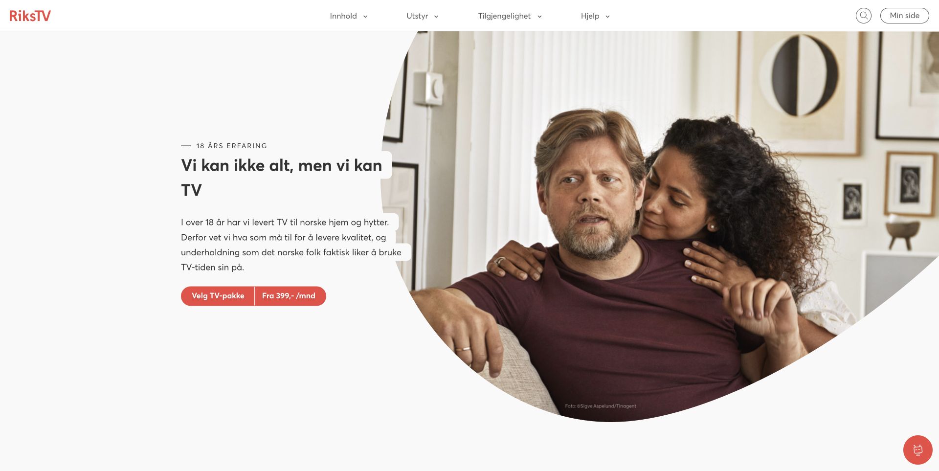
RiksTV’s homepage places its proposition on a large white field beside an oversized circular household photograph. A red package-selection control includes price context in a distinct segment, while a small experience label introduces the message above it. The slim navigation separates content, equipment, availability, and help, with search and account access at the far edge. This composition makes the service feel domestic without burying the commercial route. Sanity’s official customer story documents web content management and page-building workflows, not the broadcasting, entitlement, or payment systems behind the subscription.
What you can learn
In Sanity, keep package facts, service availability, equipment explanations, and campaign headlines as separate content responsibilities. A reusable hero should reference a maintained package rather than copy its price into unstructured text. Regional qualifications and current terms need a reliable route, especially when the headline and photograph can be changed independently by editors.
Pros
A simple split composition gives the proposition and the human scene distinct space.
Package selection is explicit and includes contextual information near the action.
Cons & considerations
The large photograph leaves limited room for immediate package comparison.
Price-related promotional copy needs strong governance to stay consistent with current package details.
Public source checked November 3, 2026. References may be embedded or legacy—not a complete backend inventory.
Platform source: Official platform or first-party project source. Sanity association is scoped to RiksTV’s documented web content/page-building workflows, not every streaming-delivery system. The source is linked for its implementation description; no case-study performance figures are adopted as this review’s own findings. Platform evidence is separate from the direct website screenshot and is not a complete current infrastructure audit.
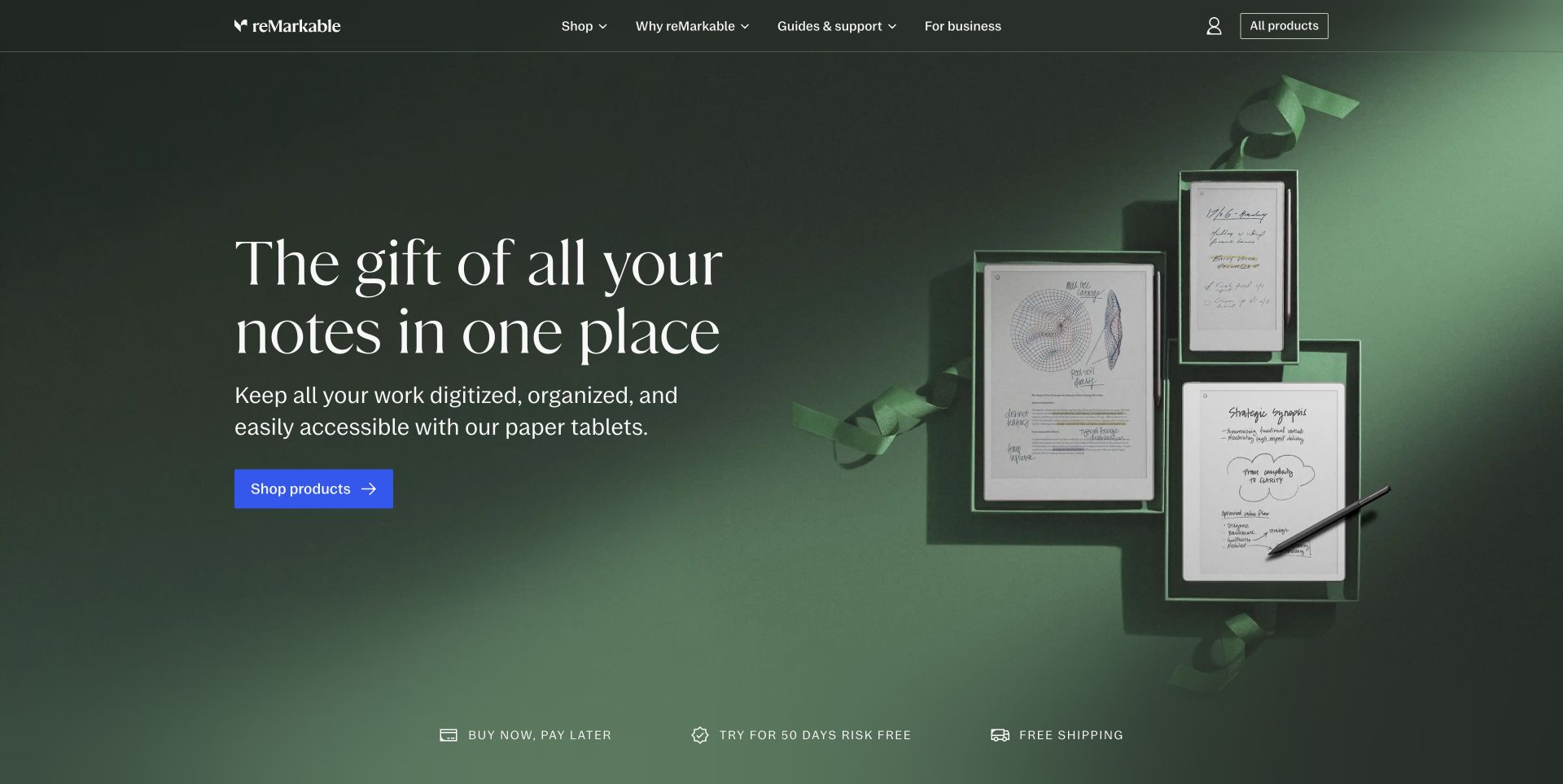
reMarkable’s storefront opening uses a deep green seasonal composition with several paper tablets arranged like gifts. A large serif statement sits on the left, followed by a practical product explanation and a bright blue shopping control. The dark header remains compact, separating shop, exploration, support, and business information. A small supporting strip beneath the hero introduces purchase-related topics without adding more competing buttons to the main scene. The official Sanity webinar explicitly describes the website’s composable commerce content experience with Next.js and Vercel; current public Next.js assets independently support the frontend association.
What you can learn
For Sanity, model product families and their explanatory content separately from temporary seasonal artwork. Let a campaign reference valid products and shared purchase information, while keeping support destinations stable. Text should still explain the device when visitors cannot see the full composition, and image variants need preview at both narrow and wide aspect ratios.
Pros
Product imagery shows a related family beside readable introductory copy.
Support and business routes stay distinct from seasonal shopping.
Cons & considerations
A gift-oriented opening may require additional context for visitors comparing technical specifications.
Large editorial typography needs controlled line lengths when copy or language changes.
SanityDocumented platform association; current media delivery observed
Associated dependencies
ReactAssociated with Next.js; not independently observed
Public source checked November 3, 2026. References may be embedded or legacy—not a complete backend inventory.
Platform source: Official platform or first-party project source. Sanity association is scoped to reMarkable’s website and composable commerce content experience. The source is linked for its implementation description; no case-study performance figures are adopted as this review’s own findings. Platform evidence is separate from the direct website screenshot and is not a complete current infrastructure audit.
Implement a complete workflow for one representative content type before expanding the schema. Include its index, detail page, related items, preview, correction, and removal behavior.
Build an editor interface around real work
Group fields and document types according to the team’s tasks. Ask an editor to locate a record and update it without coaching. Extensive Studio customization should remove confusion, not merely imitate a branded dashboard.
Plan schema changes as content migrations
A schema change does not automatically transform existing documents. Specify how records and frontend consumers change together, test a migration sample, and keep a recovery plan.
Name who maintains schemas, queries, Studio configuration, the public frontend, and integrations. A shared content platform does not remove the boundaries between those responsibilities.
Rehearse drafts and references
Create a record with linked content, preview it, change a related document, and check the public result after publishing. Include missing references and unpublished material so the frontend does not silently present an incomplete page.
Specify draft access and deployment behavior
Document how draft mode is enabled, who may see it, and how it ends. Review configuration against the current integration documentation and keep secrets out of browser-visible output.
Ask the actual team to carry out its routine job: publish a realistic update, correct a mistake, preview a narrow screen, and identify who owns an integration failure. For a library or frontend framework, also ask who maintains the content source and deployment. A polished screenshot does not answer those operational questions.
Beyond the screenshot
A Sanity website launch checklist
Test schemas with realistic long and incomplete records.
Review references, optional content, and deletion behavior.
Demonstrate editor navigation and field validation.
Verify draft preview, permissions, and public/draft separation.
Test publication, corrections, and frontend freshness.
Check page metadata, redirects, keyboard access, and small screens.
Rehearse schema and content migrations with recovery.
Document Studio, query, frontend, deployment, and integration owners.
Test with real content, a keyboard, a small screen, slow or failed requests, and the people who will maintain the system. These are planning checks, not an accessibility, security, performance, or search-ranking certification.
Sources & editorial method
How this Sanity collection was reviewed
Examples pair direct captures with official Sanity or first-party project associations. Media CDN observations are not promoted into CMS claims. Documentary evidence is attributed to its source and scope, rather than treated as a complete current backend inventory.
Every image is an unmodified capture from the actual website, with its source and capture date. Some captures are reused from our shared catalog; their dates remain the original capture dates. None comes from a vendor gallery or a generated reconstruction. Moving imagery and live content can change.
Technology attribution uses public page assets or metadata, official platform documentation, or a cited first-party project case study. Documentary and framework-relationship evidence is identified where used; it is not a complete current backend inventory. A CMS image CDN alone does not establish a full CMS deployment. A library’s presence does not prove which individual controls use it, and a platform label does not establish AI authorship.
The composition notes, lessons, pros and tradeoffs are original editorial observations. We have not measured conversion, traffic, security, performance or accessibility conformance. Website owners retain their brands and imagery; these examples are not our client portfolio. Written, Edited and Curated are independent records, not dates advanced by a build. See our editorial standards or suggest a correction.
Questions worth asking
Sanity website development FAQs
Is Sanity a frontend framework?
No. It supplies content infrastructure and editing tools; the public website frontend remains a separate implementation choice.
Does a Sanity image establish a Sanity CMS website?
Not by itself. The collection requires an explicit content-platform association or other sufficient evidence beyond image delivery.
Will schema changes update every existing document?
Not automatically. Plan content migrations, frontend compatibility, and a recovery procedure alongside schema changes.
Can editors preview a page before publishing?
A project can integrate draft preview and visual editing, but the workflow must be implemented and tested with its actual frontend and access boundaries.