These twenty public properties include identifiable Bootstrap CSS, JavaScript, or grid code. Their different designs show why a framework association is a starting point for inspection, not a complete explanation of a website.
The collection begins with the World Health Organization, United Nations, University of Washington, Apache Software Foundation, and American Red Cross. Each has current public-source evidence connecting the exact reviewed property to identifiable Bootstrap resources. The remaining examples span professional services, local businesses, architecture, and property marketing. Each review pairs a direct screenshot with an original discussion of layout, hierarchy, or interaction responsibilities.
Some properties include Bootstrap inside compiled stylesheets, some reference a named script bundle, and WHO exposes a Bootstrap Grid attribution. Those are different scopes of evidence. They do not prove that every visible component uses Bootstrap, that the whole organization shares one stack, or that the observed version is a recommendation for a new project. Older saved screenshots retain their original capture dates while source inspection has its own date.
Before the examples
What makes good Bootstrap website development in 2026?
Choose the page structure before the component inventory
Decide what the page must explain, what evidence supports it, and which action deserves priority. Then use containers, columns, spacing, and appropriate components to express those relationships. A collection of attractive cards is not a content strategy, and a familiar navbar does not establish an understandable information architecture.
Choose a small set of typography, color, spacing, and component decisions that reflect the site’s identity. Record where customization happens and which defaults remain. A coherent theme is easier to maintain than many unrelated overrides added to individual pages. Review representative content before treating the theme as complete.
A framework provides building blocks, but accessible outcomes depend on the markup, content, styling, and behavior you implement. Check names, labels, focus, contrast, keyboard operation, motion, and errors in the actual page. Neither a dependency name nor an accessibility widget proves that the finished experience works for everyone.
The first five institutional examples establish a recognizable opening. The later examples compare concrete patterns: editorial columns, image-led portfolios, service-routing panels, campaign surfaces, and enquiry forms. The reviews explain useful decisions and tradeoffs without inferring conversion results, service quality, or untested component behavior.
We start with five recognizable brands or organizations: World Health Organization, United Nations, University of Washington, Apache Software Foundation, American Red Cross. Each attribution applies to the named website property, not every product or website belonging to its organization. This is a curated reading sequence, not a measured ranking.
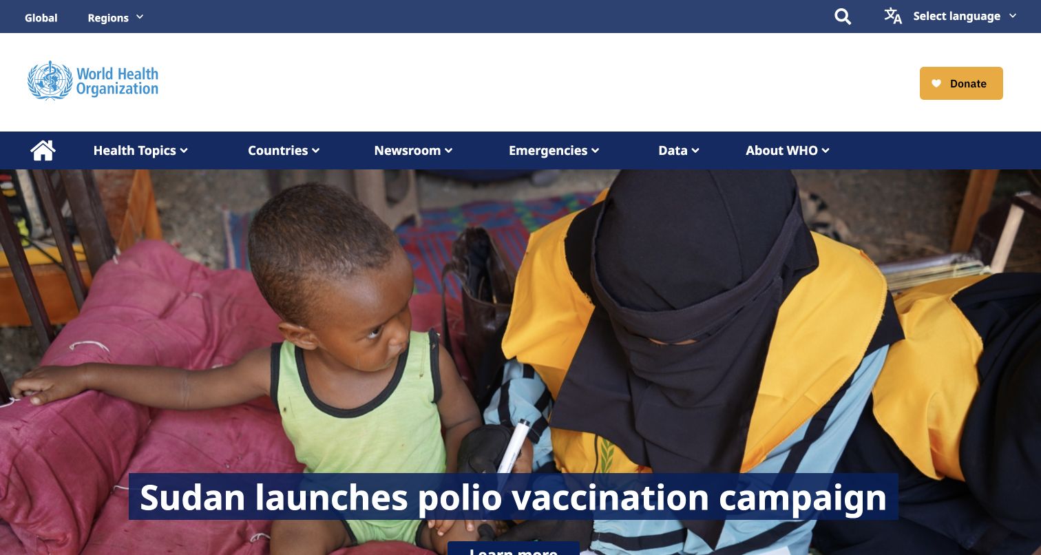
The World Health Organization homepage uses three header bands before the lead story: global utilities, institutional identity, and topic navigation. A documentary photograph gives the featured item context, while a dark blue title panel supplies a stable reading surface. The yellow donation control is distinct from informational navigation. Public stylesheets include Bootstrap attribution, supporting an association with this styling layer rather than every component or WHO service.
What you can learn
Use a framework grid to organize different navigation responsibilities without making every row equally loud. Establish which elements belong to global services, brand identity, and the current content hierarchy. A photograph can change between stories while the title surface, reading width, and route labels remain predictable for returning readers.
Pros
The separated header bands make the relationship between institutional identity and content categories easy to inspect.
The solid headline panel protects the lead story from changes in the photograph’s brightness or composition.
Cons & considerations
Several navigation bands consume substantial vertical space before the actual story begins, especially on smaller displays.
The large hero needs deliberate crop and title-length testing; this desktop capture does not establish responsive behavior.
Public source checked November 3, 2026. References may be embedded or legacy—not a complete backend inventory.
Platform source: Framework identification in a resource linked by the public page. Public HTML inspected on 2026-11-03 references a Bootstrap Grid stylesheet. The linked resource identifies Bootstrap Grid v4.1.3. This establishes the observed resource on this public property; it does not prove that every visible component uses Bootstrap, identify a private backend, or recommend the observed release. Platform evidence is separate from the direct website screenshot and is not a complete current infrastructure audit.
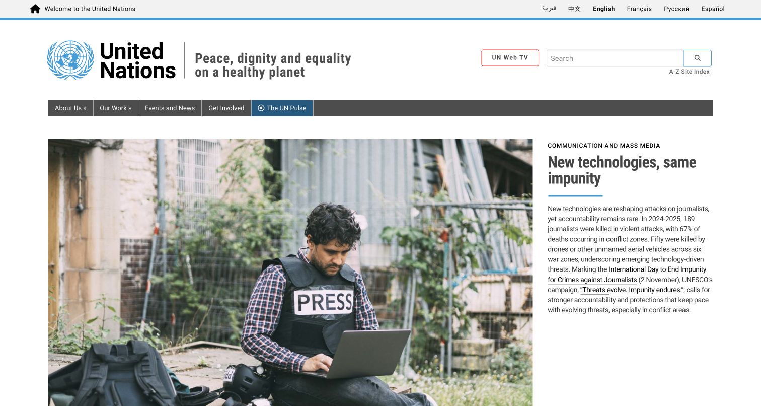
The United Nations homepage places its emblem, name, and mission statement in a generous identity band, with language choices above and navigation below. The lead story pairs a broad photograph with a narrower column containing a category, headline, and explanatory paragraph. Search remains separate from the article. The public page references identifiable Bootstrap stylesheet and script resources; that evidence does not extend to the organization’s other properties.
What you can learn
A familiar column system can support serious editorial work when the proportions follow the content. Give the image room to establish context, but reserve enough width for an informative headline and readable explanation. Keep global language and search controls outside the story so they retain a consistent institutional role.
Pros
The story category, headline, and description form a clear hierarchy beside a single strong documentary image.
Language options and search are visible without being mixed into the main article’s calls to action.
Cons & considerations
The identity and navigation areas create a long approach before readers reach the featured news content.
A narrow text column can become tall with translations; the layout needs real multilingual content during testing.
Public source checked November 3, 2026. References may be embedded or legacy—not a complete backend inventory.
Platform source: Framework identification in a resource linked by the public page. Public HTML inspected on 2026-11-03 references a stylesheet containing identifiable Bootstrap code. The linked resource identifies Bootstrap v3.4.1. This establishes the observed resource on this public property; it does not prove that every visible component uses Bootstrap, identify a private backend, or recommend the observed release. Platform evidence is separate from the direct website screenshot and is not a complete current infrastructure audit.
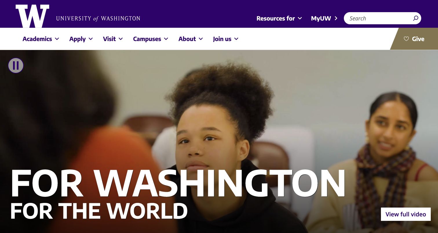
The University of Washington homepage surrounds a media feature with a purple identity bar and white navigation row. The oversized campaign statement anchors the image, while a visible pause control and separate full-video button acknowledge different viewing intentions. Giving receives its own gold segment. The page links identifiable Bootstrap assets, but the typography, color system, and media composition remain specific editorial choices.
What you can learn
Treat a framework as a layout foundation while maintaining a strong institutional system above it. Separate routine audience tasks from the campaign surface, and design media controls as part of the initial composition. Review the relationship between a changing video frame, the title, and every overlaid control rather than approving one attractive frame.
Pros
The purple, white, and gold header creates a recognizable structure without relying on generic component styling.
Visible pause and full-video controls distinguish background motion from an intentional deeper viewing experience.
Cons & considerations
A large moving hero can dominate the first viewport and postpone practical information for task-focused visitors.
White campaign text needs consistent contrast across the whole video; a single capture cannot verify every frame.
Public source checked November 3, 2026. References may be embedded or legacy—not a complete backend inventory.
Platform source: Framework identification in a resource linked by the public page. Public HTML inspected on 2026-11-03 references a stylesheet containing identifiable Bootstrap code. The linked resource identifies Bootstrap v4.6.2. This establishes the observed resource on this public property; it does not prove that every visible component uses Bootstrap, identify a private backend, or recommend the observed release. Platform evidence is separate from the direct website screenshot and is not a complete current infrastructure audit.
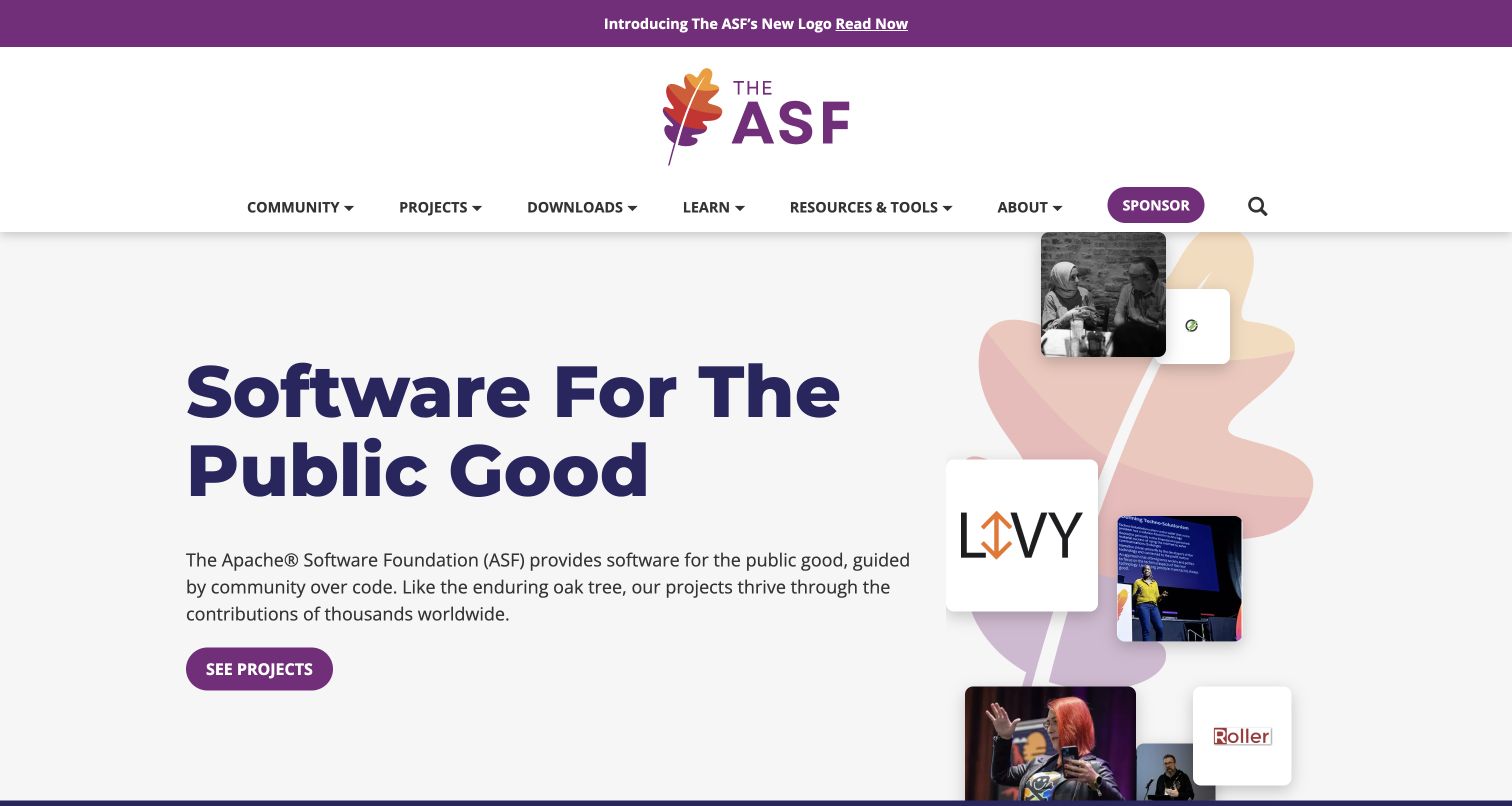
The Apache Software Foundation opens with an announcement strip, a centered identity area, and navigation organized around community and projects. Its statement uses large dark type on a light background, with a short explanation and prominent project link. A collage of project marks and people occupies the opposite side. Identifiable first-party Bootstrap files establish the framework association without explaining the collage’s implementation.
What you can learn
Use a stable two-part composition to connect a broad mission with concrete evidence of activity. The text side should explain what the organization contributes before the collage asks visitors to recognize individual projects. A reusable grid can carry that relationship while typography, imagery, and spacing give the foundation its own visual voice.
Pros
A concise mission statement and single primary project route give the opening a clear informational purpose.
The combination of project identities and people makes a large software ecosystem feel less abstract.
Cons & considerations
The tall announcement and identity area delays the main message and requires careful treatment at narrow widths.
A decorative collage can imply links or movement; interactive and purely illustrative elements need visibly different roles.
Public source checked November 3, 2026. References may be embedded or legacy—not a complete backend inventory.
Platform source: Framework identification in a resource linked by the public page. Public HTML inspected on 2026-11-03 references a stylesheet containing identifiable Bootstrap code. The linked resource identifies Bootstrap v3.4.0. This establishes the observed resource on this public property; it does not prove that every visible component uses Bootstrap, identify a private backend, or recommend the observed release. Platform evidence is separate from the direct website screenshot and is not a complete current infrastructure audit.
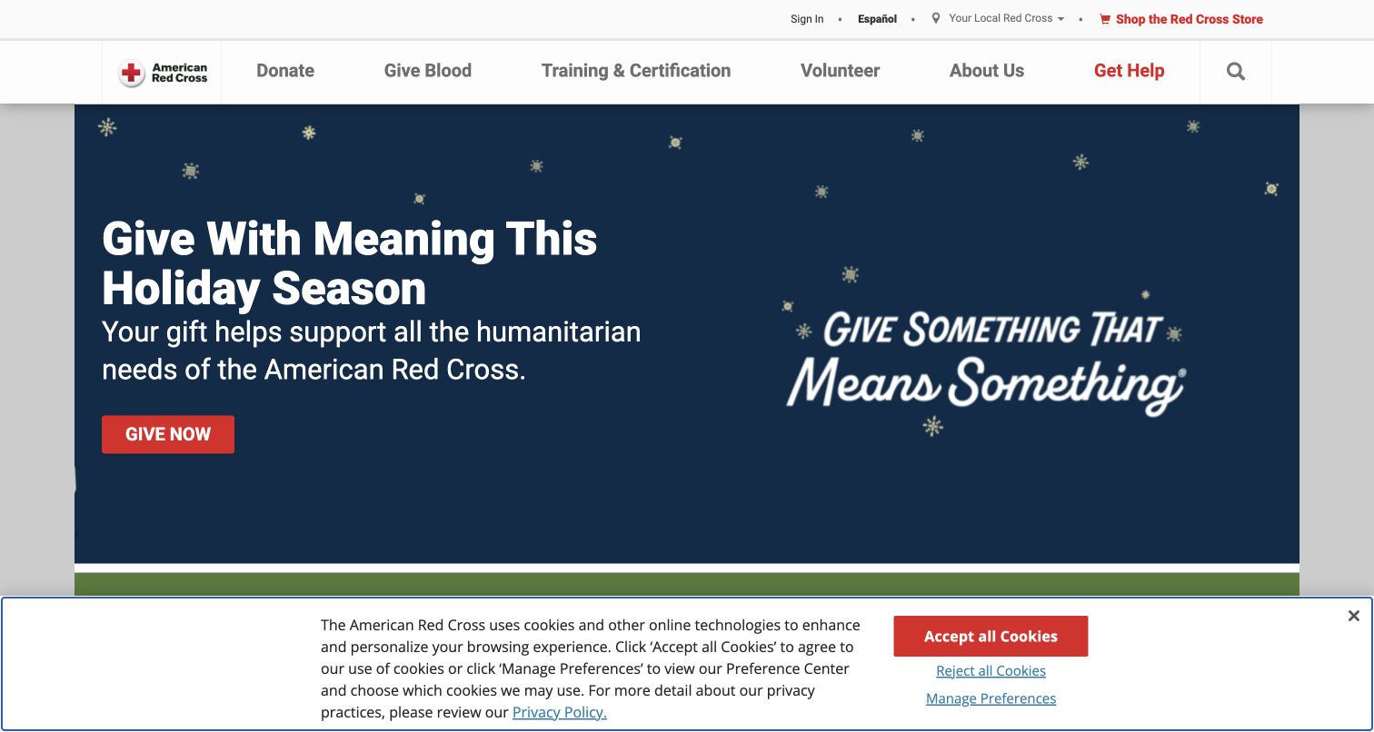
The American Red Cross homepage gives its core services a white navigation band while a seasonal campaign fills the main feature. White text and a red donation button stand out against dark blue artwork. A cookie preference panel occupies the bottom of the viewport and changes the available content area. The linked base stylesheet identifies Bootstrap, establishing a styling association without identifying every component’s implementation.
What you can learn
Keep temporary campaign art inside a stable service framework. Donation, training, volunteering, and help routes should remain understandable when the featured appeal changes. Include the consent interface in the actual composition review: it affects the space available to the campaign and must coexist with the primary action rather than arriving as an afterthought.
Pros
The campaign button uses the organization’s red accent while the surrounding service navigation remains visually calm.
The wide dark feature gives the headline and short explanation a reliable, high-visibility reading area.
Cons & considerations
The consent panel covers a substantial portion of the initial viewport and competes with the campaign surface.
Seasonal creative can quickly become stale, so publication dates and replacement ownership need a clear editorial process.
Visible tech stack
Earlier / documented evidence
Bootstrap
Earlier cited evidence retained; no current scan result. References may be embedded or legacy—not a complete backend inventory.
Platform source: Framework identification in a resource linked by the public page. Public HTML inspected on 2026-11-03 references a stylesheet containing identifiable Bootstrap code. The linked resource identifies Bootstrap v4.0.0-beta. This establishes the observed resource on this public property; it does not prove that every visible component uses Bootstrap, identify a private backend, or recommend the observed release. Platform evidence is separate from the direct website screenshot and is not a complete current infrastructure audit.
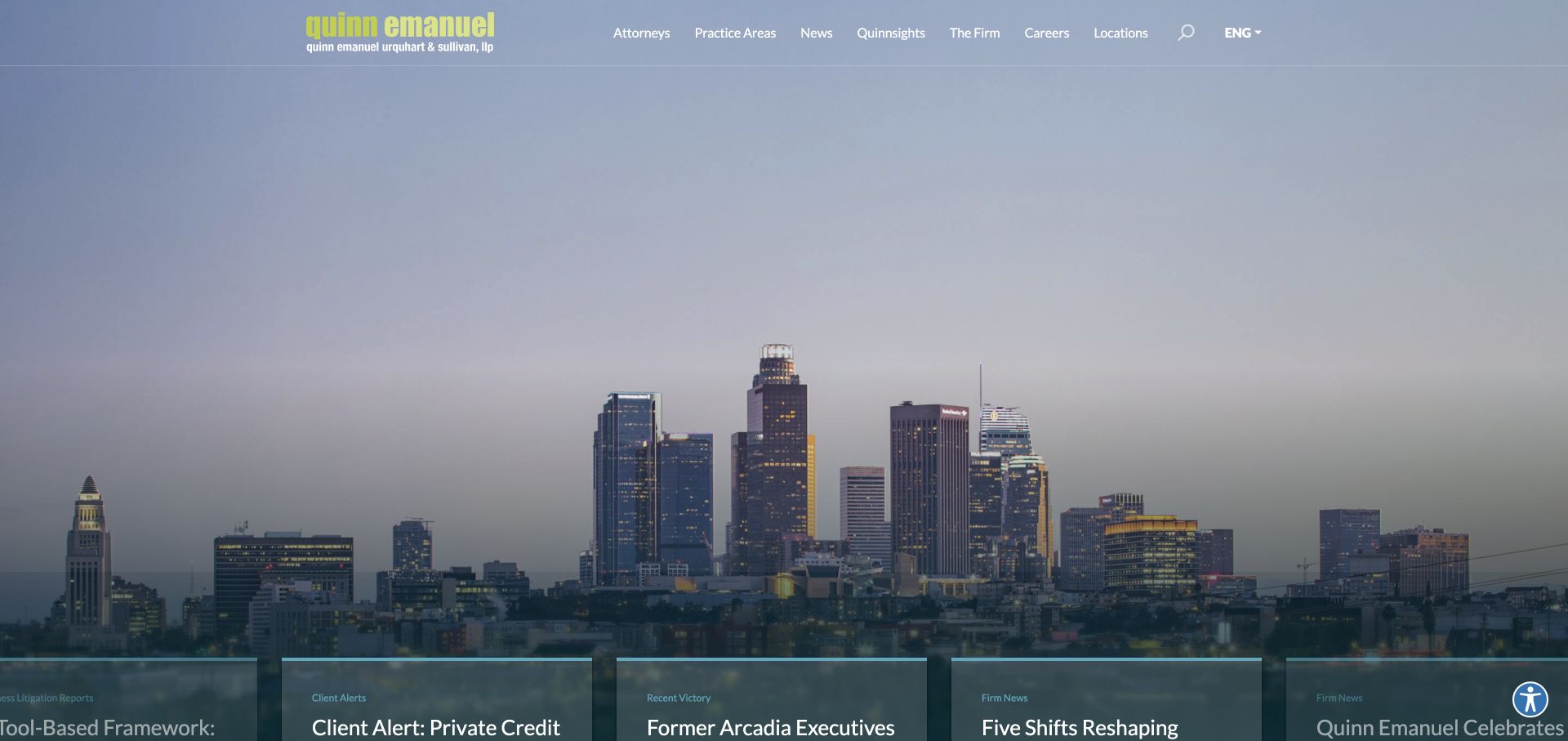
Quinn Emanuel’s captured homepage gives nearly the entire opening to a city skyline. A restrained header overlays the image, while an editorial card rail begins along the bottom edge. The yellow-green wordmark provides the strongest brand accent against the subdued photograph. Its public application stylesheet includes identifiable Bootstrap code; the evidence does not establish which components produce the skyline presentation or news rail.
What you can learn
A grid system can remain almost invisible in an image-led composition, but the content still needs a deliberate entry point. Decide whether the first visit should communicate location, expertise, or current work. If news cards provide that answer, give their titles enough room to establish meaning before the viewport cuts them off.
Pros
The large skyline creates a coherent visual atmosphere without competing panels or several simultaneous promotional messages.
A small set of professional navigation labels makes the top-level information architecture relatively easy to scan.
Cons & considerations
The opening image does little to explain the firm’s specialty before visitors reach the partially visible cards.
White navigation over changing imagery requires contrast checks, and the low card rail needs careful viewport-height testing.
Public source checked November 3, 2026. References may be embedded or legacy—not a complete backend inventory.
Platform source: Framework identification in a resource linked by the public page. Public HTML inspected on 2026-11-03 references a stylesheet containing identifiable Bootstrap code. The linked resource identifies Bootstrap v4.6.0. This establishes the observed resource on this public property; it does not prove that every visible component uses Bootstrap, identify a private backend, or recommend the observed release. Platform evidence is separate from the direct website screenshot and is not a complete current infrastructure audit.
Stark & Stark pairs a meeting photograph with a red panel containing its introduction and three service routes. A white header gives the logo, navigation, and telephone contact a clear home. The layout feels structured despite the image and panel’s different visual weight. The public vendor stylesheet identifies Bootstrap; that supports the styling association without establishing how each part of this hero was built.
What you can learn
Use columns to express two different jobs: the photograph introduces people, while the adjacent panel explains the offer and routes visitors onward. Let the category links behave as a coherent group with enough room for long labels. The useful reusable pattern is the relationship between evidence, explanation, and choices, rather than the red color alone.
Pros
The introductory copy and three service choices sit together, reducing the distance between explanation and next steps.
A solid header and solid text panel keep important labels independent from the busy meeting photograph.
Cons & considerations
The long introductory paragraph creates a dense block before the service categories become available to scan.
Chat and accessibility controls share the viewport edges; their combined behavior needs checking at reduced screen sizes.
Public source checked November 3, 2026. References may be embedded or legacy—not a complete backend inventory.
Platform source: Framework identification in a resource linked by the public page. Public HTML inspected on 2026-11-03 references a stylesheet containing identifiable Bootstrap code. The linked resource identifies Bootstrap v3.3.7. This establishes the observed resource on this public property; it does not prove that every visible component uses Bootstrap, identify a private backend, or recommend the observed release. Platform evidence is separate from the direct website screenshot and is not a complete current infrastructure audit.
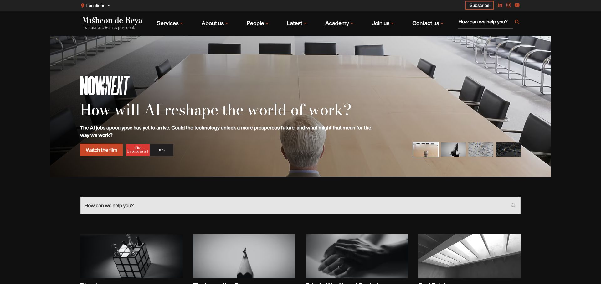
Mishcon de Reya uses a dark editorial shell, a cinematic feature, and a large search field beneath it. The headline, supporting sentence, and film action share the left side, while previews indicate additional material on the right. Content cards begin below the search. The public page references an identifiable Bootstrap script bundle, without establishing that it owns the film or carousel behavior.
What you can learn
A reusable component system should make different content modes legible. Distinguish a film action from a search field and from a standard article card, even when all three share a dark visual theme. Give the search route enough explanation to be useful, and preserve a stable position for it when featured editorial material rotates.
Pros
The film action is clearly separated from the explanatory headline and the general site-search entry below.
Consistent dark surfaces and restrained orange accents connect several content formats without making them visually identical.
Cons & considerations
Multiple search entry points and editorial previews can create competing routes before a visitor chooses a task.
The media feature requires dedicated keyboard, motion, and focus testing; the presence of a framework does not supply that evidence.
Public source checked November 3, 2026. References may be embedded or legacy—not a complete backend inventory.
Platform source: Framework identification in a resource linked by the public page. Public HTML inspected on 2026-11-03 references a Bootstrap JavaScript resource. The linked resource identifies Bootstrap v5.3.8. This establishes the observed resource on this public property; it does not prove that every visible component uses Bootstrap, identify a private backend, or recommend the observed release. Platform evidence is separate from the direct website screenshot and is not a complete current infrastructure audit.
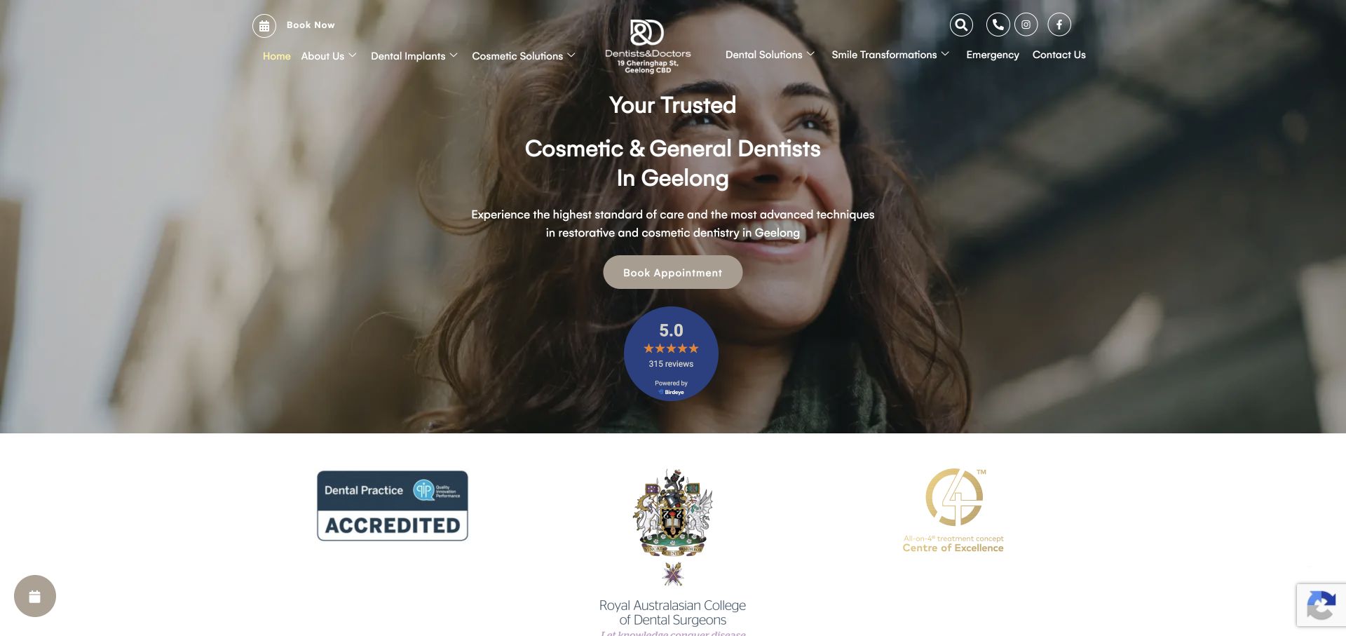
Dentists & Doctors places a centered service statement and appointment button over a portrait, then introduces a white accreditation band. Navigation surrounds a central logo and several utility icons. A review badge adds emphasis near the booking action. The theme links an identifiable Bootstrap stylesheet. This screenshot documents presentation; it does not verify treatment quality, review ratings, or displayed credentials.
What you can learn
When building a centered hero with a framework grid, define a narrow enough text measure and a clear sequence from service description to action to supporting evidence. Keep third-party badges and institutional marks from overwhelming that sequence. Test the complete header and hero together rather than reviewing the centered message in isolation.
Pros
The service category, location, and booking action are grouped closely enough to communicate a straightforward visitor path.
The separate white band gives accreditation imagery a calmer surface than the photographic hero behind the introduction.
Cons & considerations
The navigation, utility icons, review badge, and floating controls create several competing focal points in one opening.
Text over a portrait needs crop and contrast checks at narrow widths; visual polish alone does not establish usability.
Public source checked November 3, 2026. References may be embedded or legacy—not a complete backend inventory.
Platform source: Framework identification in a resource linked by the public page. Public HTML inspected on 2026-11-03 references a stylesheet containing identifiable Bootstrap code. The linked resource identifies Bootstrap v3.3.7. This establishes the observed resource on this public property; it does not prove that every visible component uses Bootstrap, identify a private backend, or recommend the observed release. Platform evidence is separate from the direct website screenshot and is not a complete current infrastructure audit.
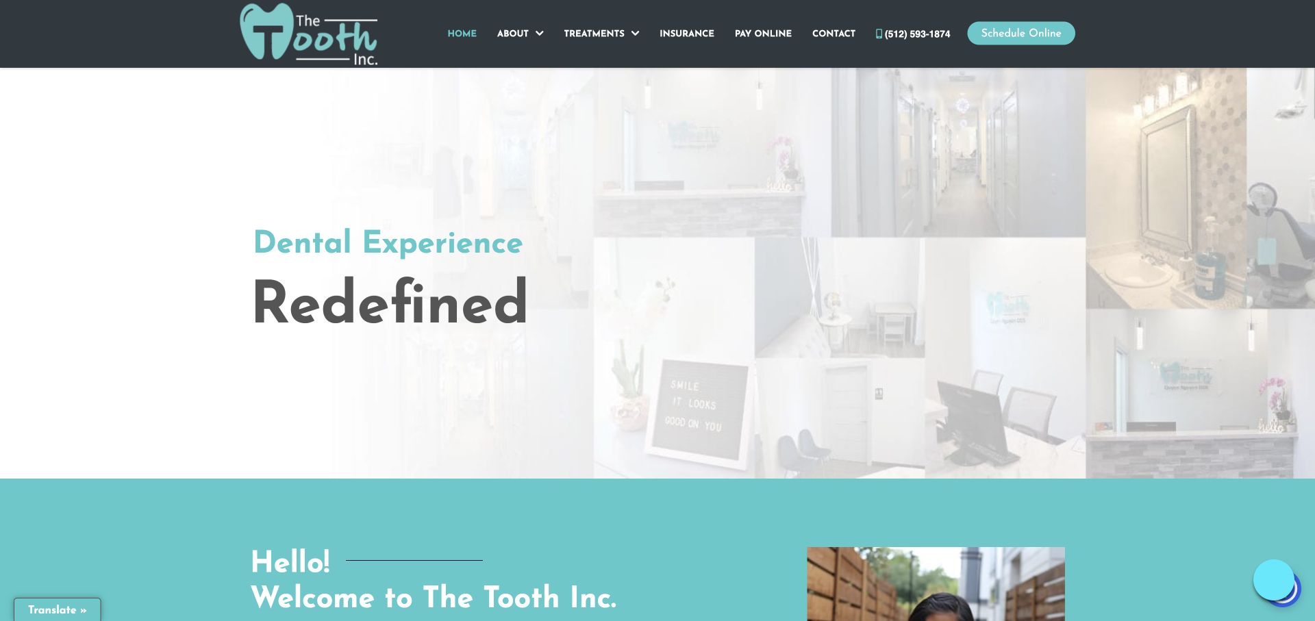
The Tooth Inc. uses a dark header with a turquoise logo, service navigation, telephone contact, and scheduling button. A pale interior collage supports a short oversized statement, followed by a turquoise welcome section. Insurance and payment remain visible in navigation instead of introductory copy. The public theme references identifiable Bootstrap CSS and JavaScript files, supporting the association for this property only.
What you can learn
A shared layout system is useful when a small site must support both new visitors and existing customers. Put practical repeat tasks in stable navigation, and reserve the hero for introduction. Treat the collage as supporting context, with enough visual separation that a large title remains readable without competing against many individual photographs.
Pros
Scheduling, telephone contact, insurance, and payment are visible as distinct tasks in a consistently styled top bar.
The turquoise welcome section provides a clear transition from the introductory image to more detailed content.
Cons & considerations
The very pale image treatment can make the interior collage feel indistinct and reduces its informational contribution.
Several small navigation items and floating widgets require careful spacing and focus treatment on compact displays.
Public source checked November 3, 2026. References may be embedded or legacy—not a complete backend inventory.
Platform source: Framework identification in a resource linked by the public page. Public HTML inspected on 2026-11-03 references a stylesheet containing identifiable Bootstrap code. The linked resource identifies Bootstrap v4.1.3. This establishes the observed resource on this public property; it does not prove that every visible component uses Bootstrap, identify a private backend, or recommend the observed release. Platform evidence is separate from the direct website screenshot and is not a complete current infrastructure audit.
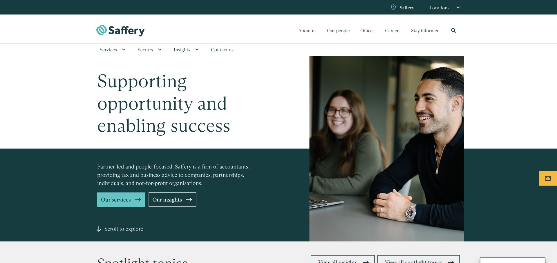
Saffery’s homepage splits its opening between text and a tall photograph. The statement begins on white, while the description and two actions sit on a deep green block below. The portrait crosses both surfaces, connecting the composition without enclosing everything in separate cards. Its compiled stylesheet contains Bootstrap identification; that does not attribute the custom typography or exact layout to a stock component.
What you can learn
Use a grid to align related content even when surfaces change behind it. The statement, explanation, and action group should feel like one sequence, while the photograph can cross a visual boundary to add continuity. Keep the service description concrete enough that an attractive positioning line does not have to explain the entire business alone.
Pros
The description and paired service and insight routes turn an abstract headline into a more useful introduction.
A restrained color system and persistent portrait create continuity across two different background surfaces.
Cons & considerations
Several navigation rows take substantial vertical space before the main introduction begins, especially for shorter viewports.
A photograph spanning text sections requires careful stacking rules so mobile reading order remains coherent and predictable.
Public source checked November 3, 2026. References may be embedded or legacy—not a complete backend inventory.
Platform source: Framework identification in a resource linked by the public page. Public HTML inspected on 2026-11-03 references a stylesheet containing identifiable Bootstrap code. The linked resource identifies Bootstrap v4.6.2. This establishes the observed resource on this public property; it does not prove that every visible component uses Bootstrap, identify a private backend, or recommend the observed release. Platform evidence is separate from the direct website screenshot and is not a complete current infrastructure audit.
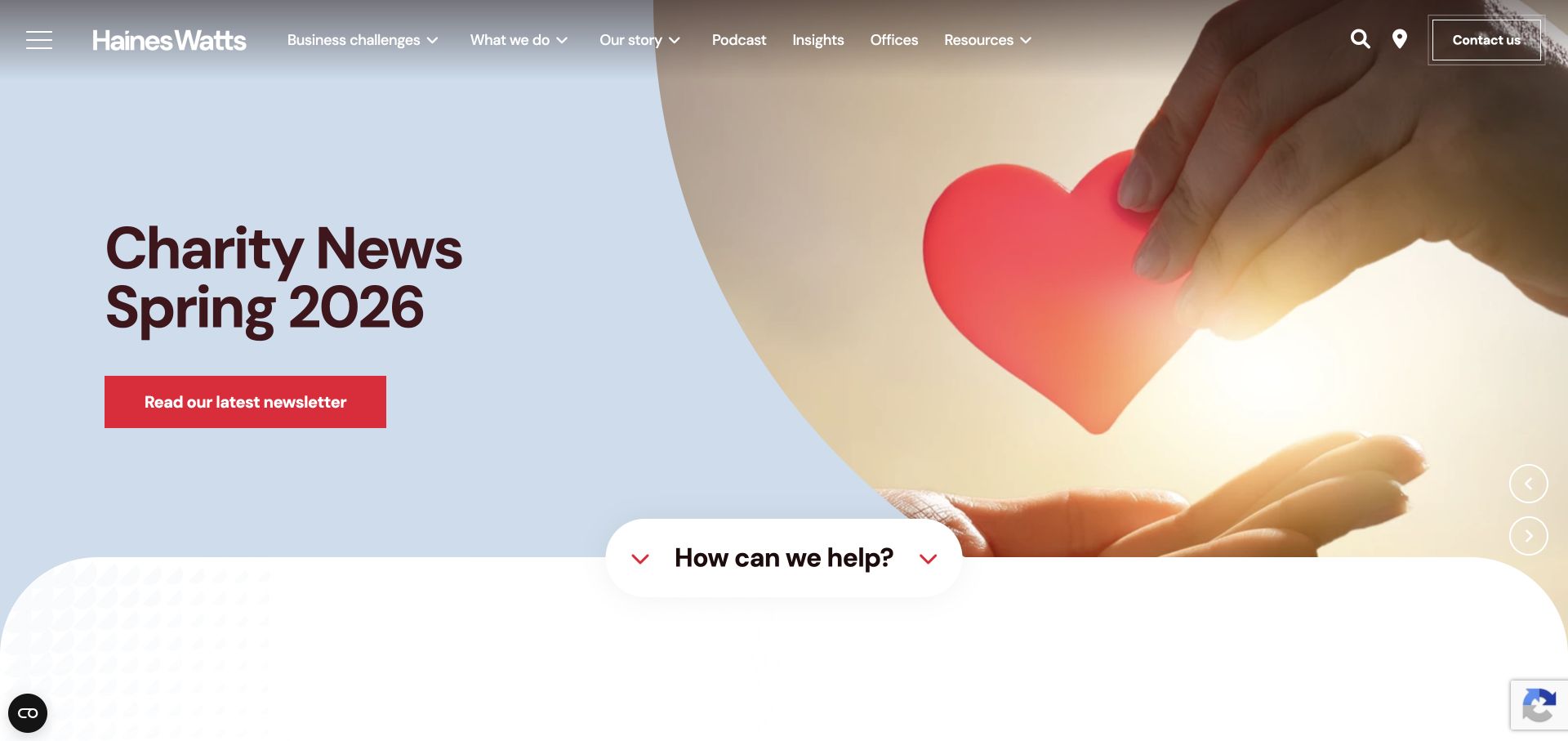
Haines Watts presents a publication feature with a headline on a pale curved surface and a photograph opposite. A red newsletter action gives the item a clear next step, while a lower assistance prompt introduces a service route. Navigation and carousel arrows remain visible. The page references an identifiable Bootstrap script bundle, without proving that it powers this slide presentation or its transitions.
What you can learn
When a homepage promotes timely editorial material, distinguish that campaign’s action from the site’s continuing service role. Design slide titles, dates, and buttons as a reusable content contract, then test long titles and different images. A lower assistance entry can provide continuity, but it should not visually collide with the changing feature above.
Pros
The pale title surface keeps the campaign wording readable without relying on a uniformly dark photograph.
A strong red action separates the newsletter route from the otherwise restrained navigation and image treatment.
Cons & considerations
A publication-focused opening may require an extra step before visitors understand the organization’s core service offer.
Carousel controls and the overlapping assistance prompt need testing with keyboard focus, smaller screens, and unusually long campaign titles.
Public source checked November 3, 2026. References may be embedded or legacy—not a complete backend inventory.
Platform source: Framework identification in a resource linked by the public page. Public HTML inspected on 2026-11-03 references a Bootstrap JavaScript resource. The linked resource identifies Bootstrap v4.3.1. This establishes the observed resource on this public property; it does not prove that every visible component uses Bootstrap, identify a private backend, or recommend the observed release. Platform evidence is separate from the direct website screenshot and is not a complete current infrastructure audit.
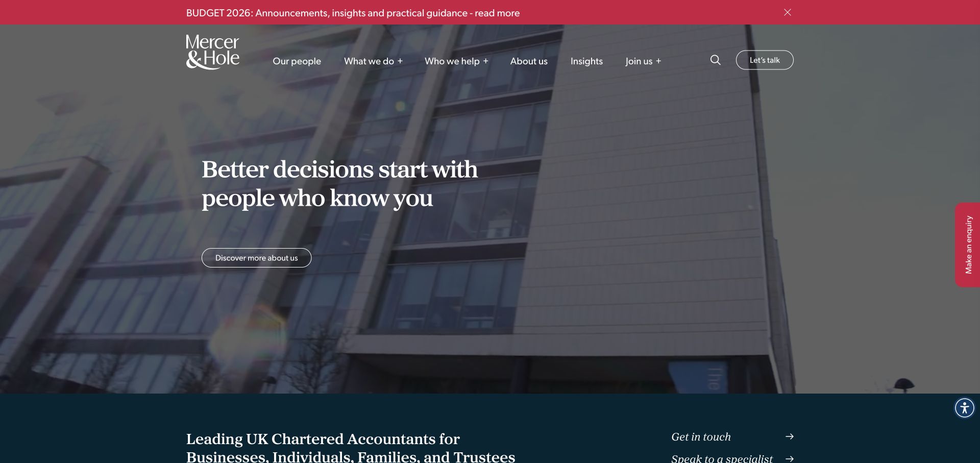
Mercer & Hole layers a relationship-focused statement and outline button over architectural imagery. A red announcement strip sits above the header, while an enquiry tab occupies the right edge. The next dark section begins to explain the firm’s audience. Its compiled stylesheet includes identifiable Bootstrap code, establishing a styling association without resolving how the announcement or enquiry interface was implemented.
What you can learn
Map the purpose of every contact route before adding it to a reusable page shell. A general introduction, an urgent announcement, and a persistent enquiry tab can all be useful, but they should not ask the same visitor to make three indistinguishable choices. Use the grid and spacing system to preserve hierarchy when these elements appear together.
Pros
The short headline leaves room for the architectural image and keeps the opening statement easy to scan.
The announcement strip uses a distinct accent surface, separating timely information from the enduring firm introduction.
Cons & considerations
The top contact button, main introduction action, and edge enquiry tab can compete without clearly differentiated expectations.
White text over a changing background needs contrast testing, and the vertical tab must remain usable on narrow screens.
Public source checked November 3, 2026. References may be embedded or legacy—not a complete backend inventory.
Platform source: Framework identification in a resource linked by the public page. Public HTML inspected on 2026-11-03 references a stylesheet containing identifiable Bootstrap code. The linked resource identifies Bootstrap v4.4.1. This establishes the observed resource on this public property; it does not prove that every visible component uses Bootstrap, identify a private backend, or recommend the observed release. Platform evidence is separate from the direct website screenshot and is not a complete current infrastructure audit.
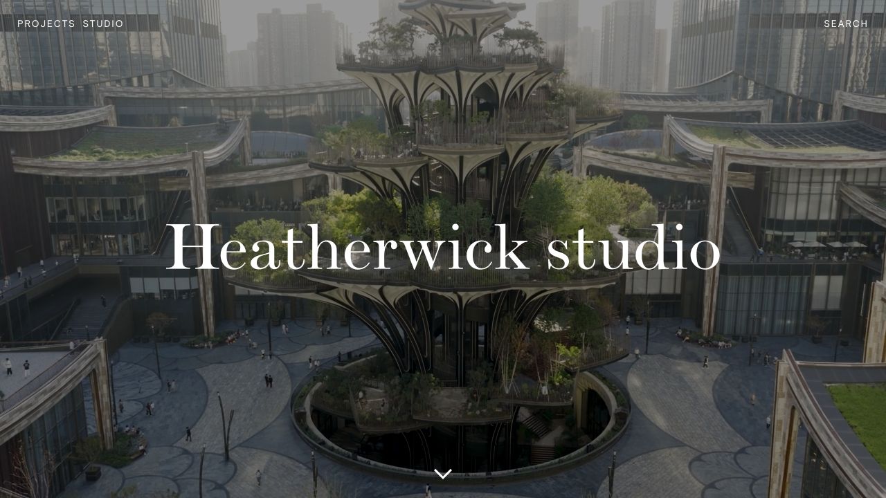
Heatherwick Studio’s saved opening is almost entirely a project image, with a large serif name across the center. Small navigation links occupy the upper corners and a downward indicator marks the route onward. The image supplies texture and spatial scale. The public stylesheet contains Bootstrap identification, establishing included framework code without suggesting that this bespoke portfolio uses a stock template.
What you can learn
A framework can support an editorial structure without exposing a familiar component catalogue. Begin with the amount of interface the content actually needs, then use shared spacing and responsive rules underneath. For an image-led portfolio, define how the central title, project crop, navigation, and scroll cue coexist across different aspect ratios before adding more decorative elements.
Pros
The restrained interface gives the architectural subject enough space to communicate scale and character immediately.
A clear central identity and a simple downward cue establish a readable starting point without multiple competing buttons.
Cons & considerations
Minimal navigation provides little context about services, location, or project categories for visitors arriving with a specific task.
The central title relies on the image treatment for contrast and may need a different arrangement on narrow screens.
Public source checked November 3, 2026. References may be embedded or legacy—not a complete backend inventory.
Platform source: Framework identification in a resource linked by the public page. Public HTML inspected on 2026-11-03 references a stylesheet containing identifiable Bootstrap code. The linked resource identifies Bootstrap v4.0.0-alpha.6. This establishes the observed resource on this public property; it does not prove that every visible component uses Bootstrap, identify a private backend, or recommend the observed release. Platform evidence is separate from the direct website screenshot and is not a complete current infrastructure audit.
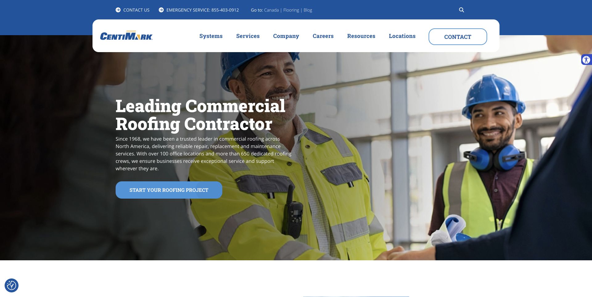
CentiMark combines a blue utility strip with a rounded white navigation panel overlapping the main image. A commercial roofing description and project action occupy the left, while people in work clothing provide context opposite. Emergency contact appears separately above. The page links an identifiable Bootstrap stylesheet, supplying framework evidence without establishing the implementation of every navigation or accessibility control.
What you can learn
A reusable header should distinguish urgent contact from ordinary research and project planning. Place those responsibilities in separate, predictable areas, then keep the hero’s description and action together. If the navigation floats across an image boundary, test its spacing, shadow, and overlap with realistic announcement text and with the longest menu labels.
Pros
Emergency contact and the primary project route have different positions, helping explain their different roles.
The solid white navigation panel protects the menu from the busy photograph and establishes a stable brand surface.
Cons & considerations
The utility strip and overlapping navigation consume significant space before the hero copy begins on smaller viewports.
The introductory paragraph is relatively dense for a photographic hero and needs a carefully controlled line length.
Public source checked November 3, 2026. References may be embedded or legacy—not a complete backend inventory.
Platform source: Framework identification in a resource linked by the public page. Public HTML inspected on 2026-11-03 references a stylesheet containing identifiable Bootstrap code. The linked resource identifies Bootstrap v5.1.0. This establishes the observed resource on this public property; it does not prove that every visible component uses Bootstrap, identify a private backend, or recommend the observed release. Platform evidence is separate from the direct website screenshot and is not a complete current infrastructure audit.
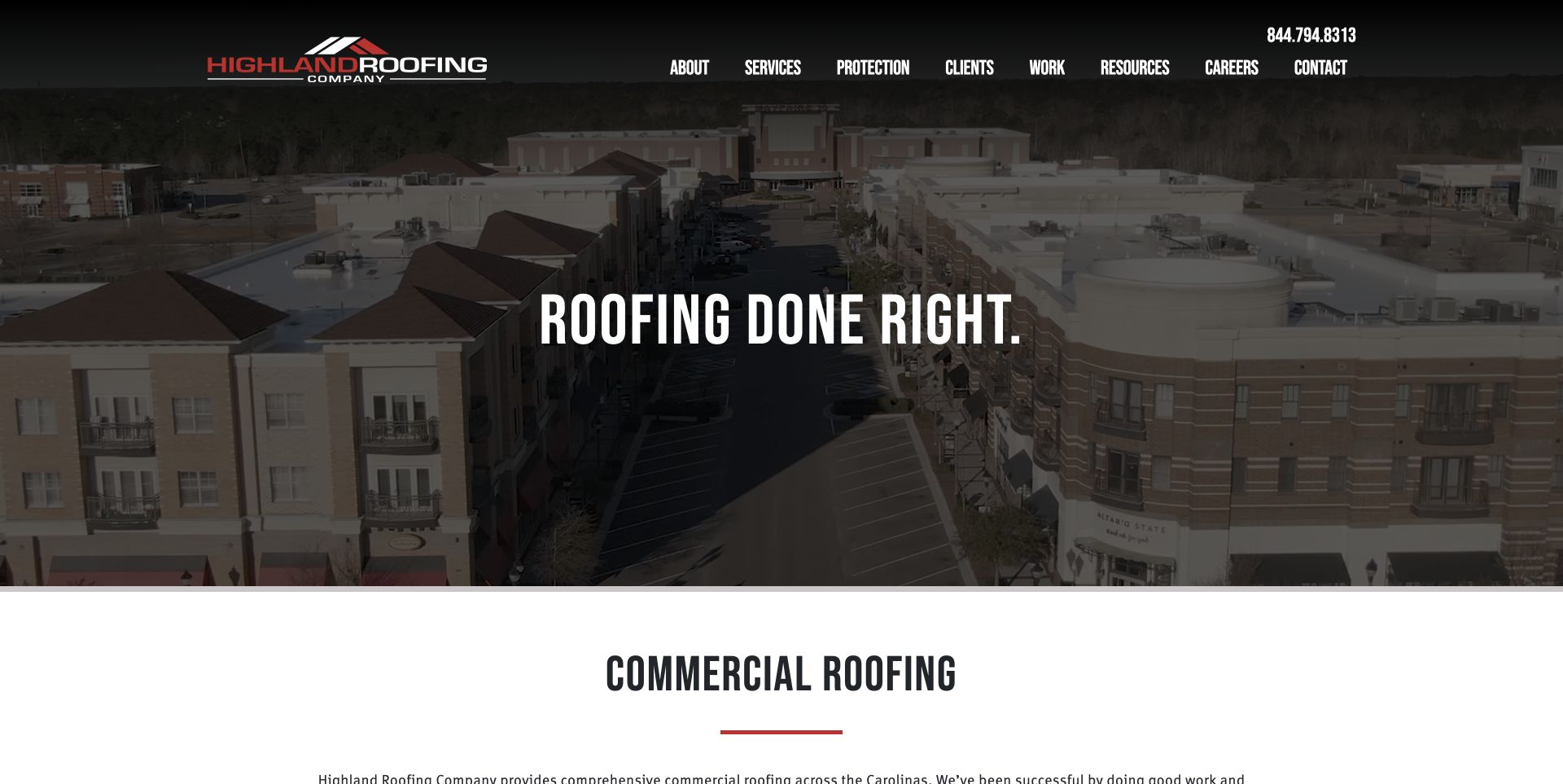
Highland Roofing uses a darkened aerial image, short uppercase statement, and compact dark header. The photograph conveys scale while the next white section introduces commercial roofing explicitly. Red accents connect the logo and section underline without competing with the image. The theme references an identifiable Bootstrap stylesheet, supporting a styling association rather than a claim about the entire application architecture.
What you can learn
A short hero slogan needs a concrete explanation close behind it. Use the grid and section rhythm to make that transition deliberate: image and positioning first, then service category and supporting copy. Choose the hero’s height so the next section provides a useful clue rather than disappearing completely below the first viewport.
Pros
The restrained headline and dark overlay avoid placing a long sales paragraph on top of a detailed aerial photograph.
The next section introduces a specific service category, giving the opening slogan more practical context.
Cons & considerations
The first feature offers no equally prominent action, so task-focused visitors depend on the header or continued scrolling.
Condensed uppercase navigation can become crowded, requiring careful spacing and wrapping decisions at intermediate screen widths.
Public source checked November 3, 2026. References may be embedded or legacy—not a complete backend inventory.
Platform source: Framework identification in a resource linked by the public page. Public HTML inspected on 2026-11-03 references a stylesheet containing identifiable Bootstrap code. The linked resource identifies Bootstrap v4.4.1. This establishes the observed resource on this public property; it does not prove that every visible component uses Bootstrap, identify a private backend, or recommend the observed release. Platform evidence is separate from the direct website screenshot and is not a complete current infrastructure audit.
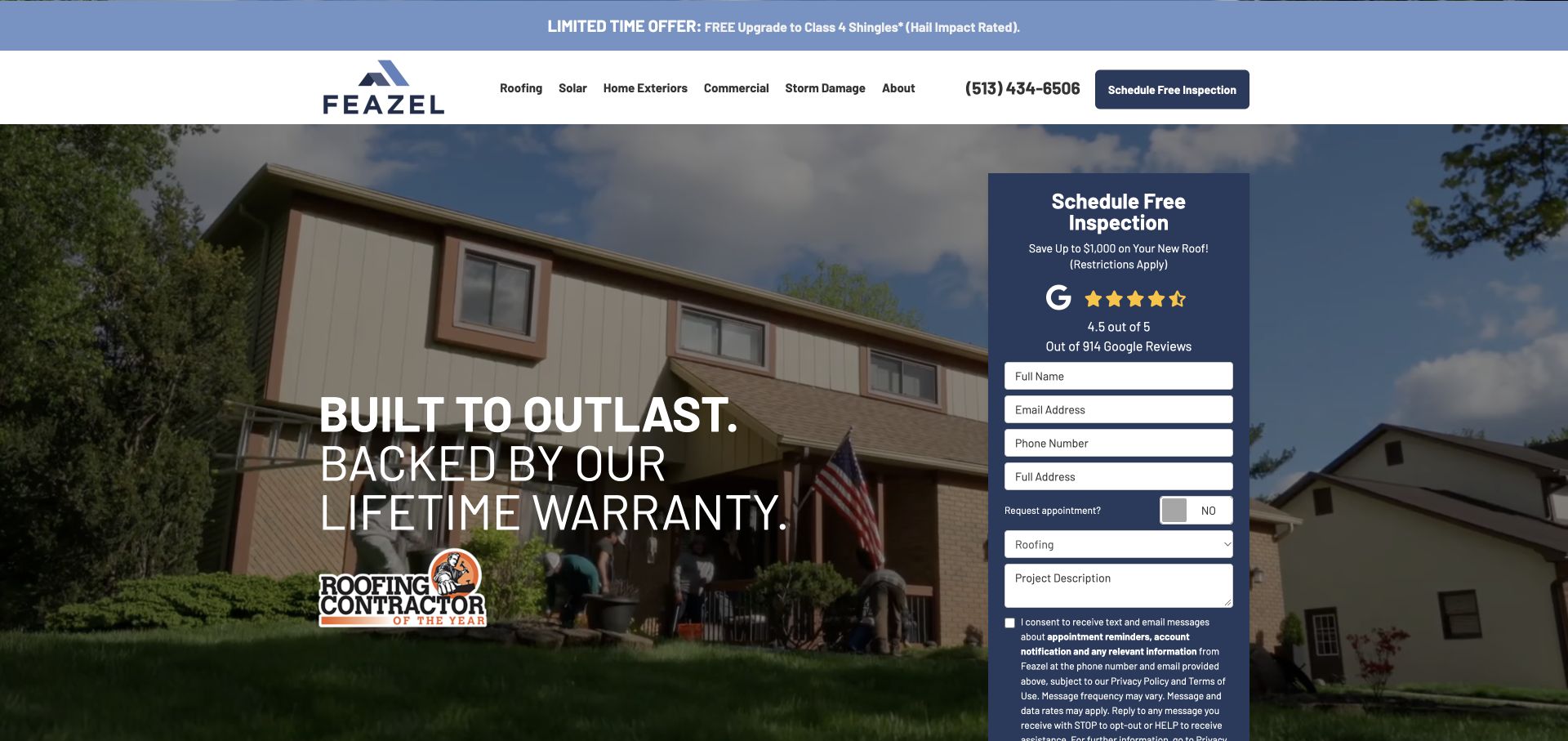
Feazel’s saved homepage places a warranty-oriented statement over a house photograph beside a tall blue enquiry panel. The panel combines a booking headline, reviews, contact fields, service selection, and consent copy. An offer strip and header action reinforce that direction. The page references an identifiable Bootstrap script bundle. No enquiry was submitted; offers, warranty terms, and processing remain unverified.
What you can learn
A grid can align a persuasive message with a form, but form length must be part of the composition from the beginning. Include labels, required-state guidance, consent language, errors, and confirmation in the design brief. Decide what information is necessary at first contact before using a narrow column simply because it fits beside the hero.
Pros
The enquiry panel is visually distinct from the photograph, providing a stable background for inputs and supporting information.
The header and main feature consistently direct visitors toward the same inspection-related purpose.
Cons & considerations
The tall form extends beyond the captured viewport, making the full commitment difficult to assess at a glance.
Promotional claims, review details, and consent text compete for limited space within an already narrow form column.
Public source checked November 3, 2026. References may be embedded or legacy—not a complete backend inventory.
Platform source: Framework identification in a resource linked by the public page. Public HTML inspected on 2026-11-03 references a Bootstrap JavaScript resource. The linked resource identifies Bootstrap v3.4.1. This establishes the observed resource on this public property; it does not prove that every visible component uses Bootstrap, identify a private backend, or recommend the observed release. Platform evidence is separate from the direct website screenshot and is not a complete current infrastructure audit.
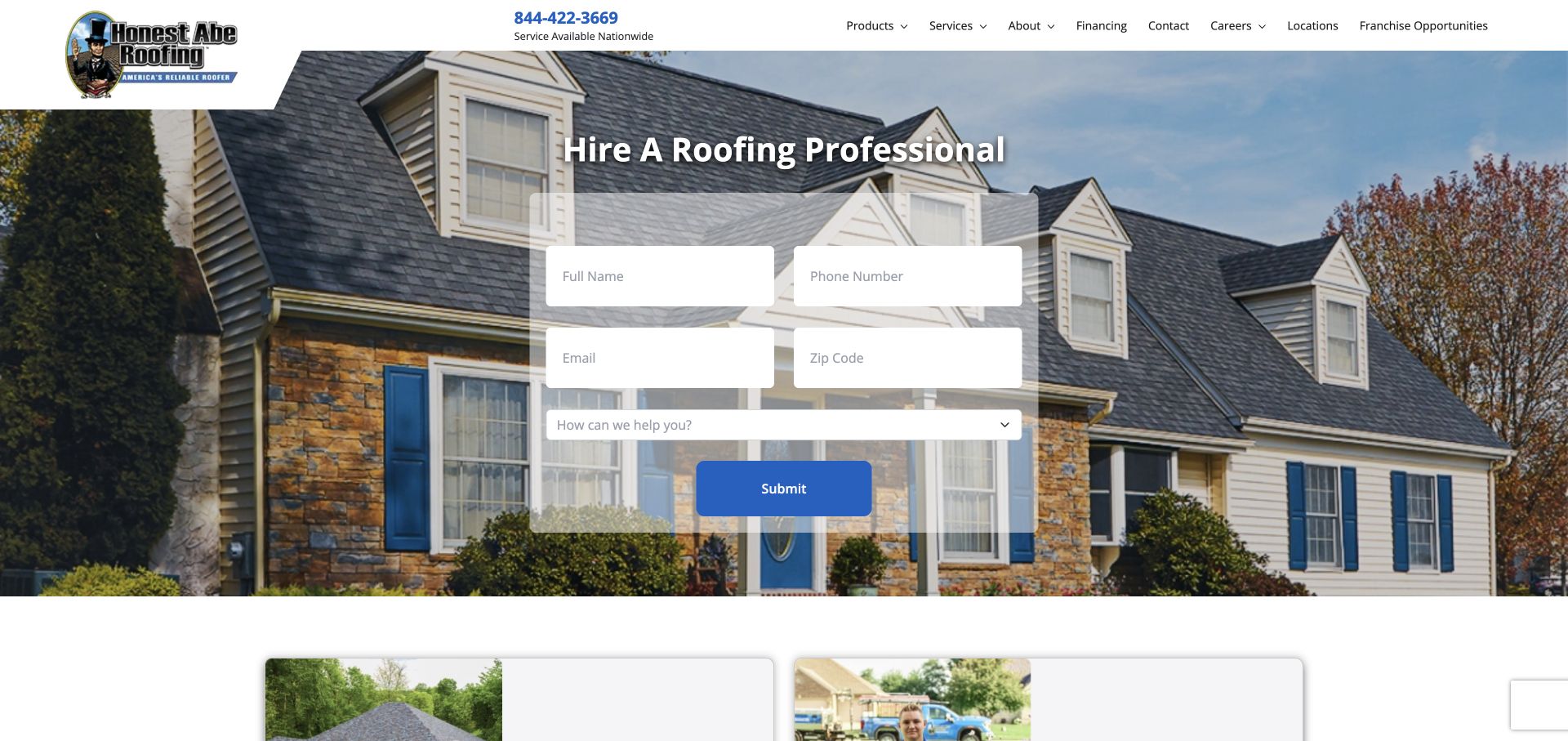
Honest Abe Roofing centers an enquiry form over a residential photograph. Two rows of contact fields lead into a service selector and blue submit button beneath the headline. The header retains telephone contact and company navigation as alternative routes. Public source links identifiable Bootstrap CSS and JavaScript. The form was observed without entering information or testing submission, validation, or follow-up.
What you can learn
When a form becomes the hero, its readability is the primary layout requirement. Give fields and labels a stable surface, then determine how paired columns collapse without changing the logical completion order. A familiar framework can supply structure, but the content must still explain what happens after submission and which details are actually required.
Pros
The short visible sequence makes the intended enquiry action immediately apparent without a separate promotional panel.
A telephone contact remains available in the header for visitors who prefer a different route.
Cons & considerations
The translucent form background allows detailed imagery to show through, increasing the importance of field and label contrast.
A generic submit label offers little explanation of the next step, and the screenshot cannot establish accessible validation behavior.
Visible tech stack
Earlier / documented evidence
Bootstrap
Earlier cited evidence retained; no current scan result. References may be embedded or legacy—not a complete backend inventory.
Platform source: Framework identification in a resource linked by the public page. Public HTML inspected on 2026-11-03 references a stylesheet containing identifiable Bootstrap code. The linked resource identifies Bootstrap v5.2.3. This establishes the observed resource on this public property; it does not prove that every visible component uses Bootstrap, identify a private backend, or recommend the observed release. Platform evidence is separate from the direct website screenshot and is not a complete current infrastructure audit.
Yellowstone Landscape uses an aerial property image to establish its commercial landscaping setting. A centered headline and supporting line overlay the photograph; the white header contains navigation, telephone contact, and a warm-colored quote action. The following section restates the service category. Its template stylesheet includes Bootstrap identification, documenting framework styling without claiming an entire publishing or lead-management system is Bootstrap-based.
What you can learn
Use a reusable grid to keep a large image-led statement centered and constrained, rather than letting it expand across every available pixel. Place the enduring enquiry action in a stable header when the hero image changes. Review the photograph as evidence of scale and context, and keep the service wording concrete enough to survive without that image.
Pros
The aerial view communicates the scale of the property setting more efficiently than several small decorative photographs.
The quote action has a distinct accent color and a predictable position beside the main navigation.
Cons & considerations
White text crosses a visually detailed image, so different crops and replacement photographs need explicit contrast review.
The hero emphasizes a broad promise; nearby service details must explain the actual scope and intended customer more precisely.
Public source checked November 3, 2026. References may be embedded or legacy—not a complete backend inventory.
Platform source: Framework identification in a resource linked by the public page. Public HTML inspected on 2026-11-03 references a stylesheet containing identifiable Bootstrap code. The linked resource identifies Bootstrap v4.5.0. This establishes the observed resource on this public property; it does not prove that every visible component uses Bootstrap, identify a private backend, or recommend the observed release. Platform evidence is separate from the direct website screenshot and is not a complete current infrastructure audit.
Hilton & Hyland’s captured homepage uses monochrome imagery and a sparse black navigation bar. A serif statement sits near the lower edge with a detail action beneath; search, contact, and menu icons occupy the upper right. Atmosphere precedes listings. Public source links identifiable Bootstrap assets through its provider, establishing those page resources without characterizing its listing systems or business processes.
What you can learn
A component framework need not dictate the tone of a brand presentation. Reduce the visible interface to the routes that matter, then use consistent spacing and type to make them legible. For a property site, decide how quickly visitors should move from an atmospheric introduction to actual inventory, and make that transition clearer than a generic detail label.
Pros
The monochrome treatment and restrained navigation create a consistent visual mood without several competing promotional elements.
Search and contact remain available in the header even while the main feature focuses on brand positioning.
Cons & considerations
The opening image does not show a property, so the inventory task may require an additional step.
Small icons and a generic detail action need clear accessible names and destinations; those behaviors are not proven by the capture.
Public source checked November 3, 2026. References may be embedded or legacy—not a complete backend inventory.
Platform source: Framework identification in a resource linked by the public page. Public HTML inspected on 2026-11-03 references a stylesheet containing identifiable Bootstrap code. The linked resource identifies Bootstrap v3.4.1. This establishes the observed resource on this public property; it does not prove that every visible component uses Bootstrap, identify a private backend, or recommend the observed release. Platform evidence is separate from the direct website screenshot and is not a complete current infrastructure audit.
Choose how much of Bootstrap the project actually needs
Use layout utilities for a document-led site
A small content site may mainly need consistent containers, columns, gaps, and alignment. Define the content order and breakpoint behavior before adding a large component surface. Include representative long headings and sparse content so the layout is tested beyond a polished homepage specimen.
Use shared components when behavior truly repeats
Navigation, disclosures, dialogs, and forms benefit from consistent implementation when they solve the same task across pages. Document each component’s states and ownership. Avoid loading multiple competing implementations of the same behavior, and verify how the selected component integrates with the rest of the page.
Integrate with an existing theme through clear ownership
A CMS theme or vendor bundle may already contain Bootstrap code. Inspect what is present before adding another copy. Record the resource, version evidence, customization boundary, and update owner. A framework banner inside a compiled file establishes included code; it does not by itself reveal every component that remains in active use.
From references to requirements
Plan the content, theme, interactions, and update process together
Build a content specimen before choosing exact proportions
Use actual navigation labels, headings, body copy, cards, notices, and forms. Include translations or unusually long labels where relevant. Determine when columns should stack from the needs of that content, then test intermediate widths as well as the conventional desktop and mobile views.
Specify shared surfaces and the exceptions they allow
Document the header, content container, hero, card, form, and footer roles. Establish how promotional strips, consent panels, chat controls, and enquiry tabs coexist. Several individually reasonable components can obscure each other when they appear together in the opening viewport.
Design complete form states before placing a form in the hero
Decide what information is necessary, how fields are labeled, what validation explains, and what happens after submission. Reserve room for consent language and errors instead of treating them as late additions. Verify the full sequence in an appropriate test environment; reviewing a public form does not require submitting a real enquiry.
Keep dependency evidence and upgrade decisions separate
Record the exact resource that establishes the framework association and distinguish its banner from unrelated cache parameters. Evaluate updates against the project’s actual dependencies and customizations. Do not copy an observed older release merely because a recognizable organization still serves code carrying that version label.
A useful handover demonstration
Ask the actual team to carry out its routine job: publish a realistic update, correct a mistake, preview a narrow screen, and identify who owns an integration failure. For a library or frontend framework, also ask who maintains the content source and deployment. A polished screenshot does not answer those operational questions.
Beyond the screenshot
A Bootstrap project checklist beyond the default component demo
Identify the exact Bootstrap resources and the parts of the site that own them.
Check for duplicated stylesheets, script bundles, or competing component implementations.
Document the theme’s typography, colors, spacing, and supported component variants.
Test real long headings, navigation labels, translations, and sparse content.
Verify column stacking and reading order at intermediate and narrow widths.
Check keyboard operation, focus movement, accessible names, and visible states.
Review contrast across representative photographs, video frames, and theme surfaces.
Include labels, validation, consent, and confirmation in every form specification.
Record update ownership and regression checks for shared styles and behavior.
Test with real content, a keyboard, a small screen, slow or failed requests, and the people who will maintain the system. These are planning checks, not an accessibility, security, performance, or search-ranking certification.
Sources & editorial method
How this Bootstrap collection was reviewed
Public homepage HTML was fetched and its referenced resources inspected for identifiable Bootstrap attribution or version banners. Evidence records preserve the exact asset URLs, inspection times, and response hashes. A named file alone was not sufficient where its content could not identify the framework. Five institutional screenshots were captured directly during this research; fifteen existing direct captures were visually reviewed and retain their original dates. Included grid or bundle code is a scoped association, not a complete runtime inventory. No real forms, donations, bookings, purchases, or account workflows were submitted.
Every image is an unmodified capture from the actual website, with its source and capture date. Some captures are reused from our shared catalog; their dates remain the original capture dates. None comes from a vendor gallery or a generated reconstruction. Moving imagery and live content can change.
Technology attribution uses public page assets or metadata, official platform documentation, or a cited first-party project case study. Documentary and framework-relationship evidence is identified where used; it is not a complete current backend inventory. A CMS image CDN alone does not establish a full CMS deployment. A library’s presence does not prove which individual controls use it, and a platform label does not establish AI authorship.
The composition notes, lessons, pros and tradeoffs are original editorial observations. We have not measured conversion, traffic, security, performance or accessibility conformance. Website owners retain their brands and imagery; these examples are not our client portfolio. Written, Edited and Curated are independent records, not dates advanced by a build. See our editorial standards or suggest a correction.
Questions worth asking
Bootstrap website development FAQs
Does every site here use the full Bootstrap framework?
The evidence is more specific than that. Some public pages reference named CSS and JavaScript files, while others include identifiable Bootstrap code within a compiled stylesheet or a grid resource. Each source note states the observed layer. The collection does not claim that every component or every organizational property uses Bootstrap.
Can a Bootstrap site have a distinctive visual identity?
Yes. The examples range from institutional editorial layouts to sparse portfolios and service forms. Typography, imagery, proportion, content, and custom theme decisions strongly influence the result. Those visible decisions are useful references even when the exact classes behind a component are not documented.
Is an old version banner a recommendation to use that version?
No. It records what an inspected public resource identifies. A new project or upgrade needs a separate dependency and compatibility decision. Cache-query parameters are also not reliable framework version evidence; inspect the resource and the project’s actual dependency records.
Does Bootstrap make a finished site accessible automatically?
No. Accessibility depends on implementation and content as well as the framework. Test labels, focus, keyboard interaction, contrast, motion, error handling, and the complete page experience. A screenshot or framework association cannot certify those behaviors.
Why do capture dates and evidence dates sometimes differ?
A direct screenshot records the visible page at its original capture time. A later source inspection records the assets served at that later time. Both dates are retained so readers can distinguish a visual reference from a current technical observation rather than treating them as one simultaneous audit.
Start with the content and visitor task, use the framework where it provides clear structure, and test the resulting page as a whole. The strongest reference is a specific decision you can explain and maintain, not a dependency name attached to a famous organization.