WooCommerce can sit inside a publication, a membership business, a manufacturer’s product library, or a conventional online shop. The useful question is not which example looks most expensive, but how its buying journey fits the surrounding content.
This collection reviews specific public properties with WooCommerce evidence or an attributed merchant association. A coffee brand may operate a WooCommerce merchandise shop and a separate drink-ordering application. A manufacturer may use different systems for home and commercial products. The named URL is the boundary of each example.
Before choosing a theme, write down what the store actually sells, what customers need to compare, and what happens after an order arrives. A distinctive storefront is most useful when the same system also handles realistic variants, stock changes, tax settings, service questions, and the team’s weekly publishing routine.
Before the examples
What makes good WooCommerce website development in 2026?
Make commerce belong to the content
Decide where product education ends and product selection begins. A recipe should link to a relevant appliance without turning into an unrelated campaign. A publication’s shop should retain enough familiar identity to feel like part of the same organization. Map these transitions before designing isolated page mockups.
Choose an editing model deliberately
WooCommerce supports classic themes and block themes, with different template and editing approaches. Prototype a product page, category, header, and promotion in the chosen model. Let the actual merchant make a change. Do not promise that every template area will be editable merely because the site runs on WordPress.
Use explicit labels for variations, price changes, availability, quantities, and delivery limits. Show the information that differentiates two products near their selection controls. Brand photography can establish context, but customers should not need to infer a product’s size or compatibility from a lifestyle image.
The collection · 20 examples
20 WooCommerce website examples worth studying
Compare how each storefront balances editorial content, categories, individual products, and support. The screenshots show a public opening view; neither checkout reliability nor conversion performance can be established from that view.
We start with five recognizable brands or organizations: Nutribullet, Polestar Additionals, Caribou Coffee, Nalgene, La Marzocco USA. Each attribution applies to the named website property, not every product or website belonging to its organization. This is a curated reading sequence, not a measured ranking.
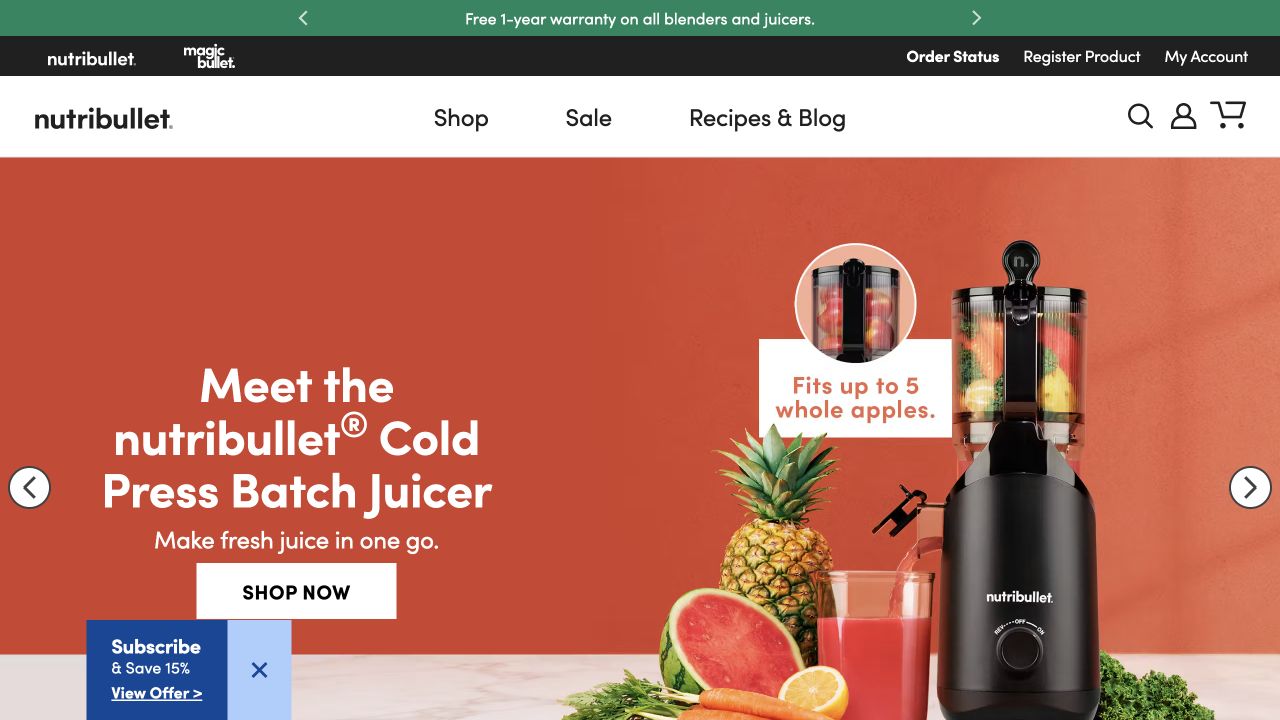
Nutribullet’s opening combines a clearly named juicer with an oversized product photograph, cut fruit, and a small capacity illustration. The orange campaign surface is distinct from the white shopping navigation above it. Shop, Sale, and Recipes & Blog provide a short primary menu, while order status and product registration sit in a separate utility strip. The image communicates the product category before the visitor needs to read its full name; the capacity callout adds a concrete reason to inspect it.
What you can learn
Pair the campaign promise with one visible product fact rather than surrounding it with several unrelated promotions. Keep ongoing support tasks in a predictable place outside the campaign. WooCommerce evidence applies to the public retail property; it does not explain the internals of product registration or every linked service.
Pros
A simple main menu preserves room for readable shopping and search controls.
The capacity illustration connects the lifestyle presentation to a practical product question.
Cons & considerations
A rotating campaign makes the first message depend on the frame a visitor sees.
The subscription promotion at the lower edge competes with the main shopping action.
Public source checked November 3, 2026. References may be embedded or legacy—not a complete backend inventory.
Platform source: Primary platform or implementation reference. Woo documents this storefront's WordPress and WooCommerce implementation. The association applies to the named public property; it is not a complete technology inventory or an edition/version audit. Platform evidence is separate from the direct website screenshot and is not a complete current infrastructure audit.
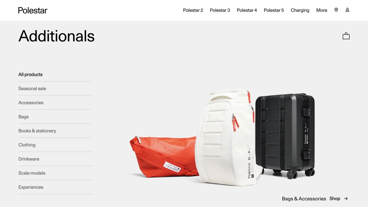
Polestar Additionals places its own catalog title beneath the familiar automotive navigation. A left-hand list names practical merchandise groups, including bags, clothing, books, and drinkware. The opening photograph shows several bags on a pale background rather than filling the screen with campaign copy. This keeps the merchandise itself central while retaining the parent brand’s sparse typography and generous spacing. The automotive links and merchandise shopping bag are visibly different parts of the same opening composition.
What you can learn
A secondary store can inherit identity without inheriting every buying task from the parent business. Name the store, expose its categories, and make the distinction between browsing merchandise and researching vehicles understandable. The documented WooCommerce association is this Additionals property, not a blanket claim about Polestar’s automotive websites.
Pros
The category rail makes the small merchandise range easy to understand immediately.
Neutral space lets differently colored products share a coherent visual setting.
Cons & considerations
Two layers of brand and shopping navigation require careful orientation on smaller screens.
The opening image does not expose prices or enough detail to compare individual bags.
Public source checked November 3, 2026. References may be embedded or legacy—not a complete backend inventory.
Platform source: Primary platform or implementation reference. Woo documents the named Polestar merchandise storefront and its 2024 WooCommerce rebuild. The association applies to the named public property; it is not a complete technology inventory or an edition/version audit. Platform evidence is separate from the direct website screenshot and is not a complete current infrastructure audit.
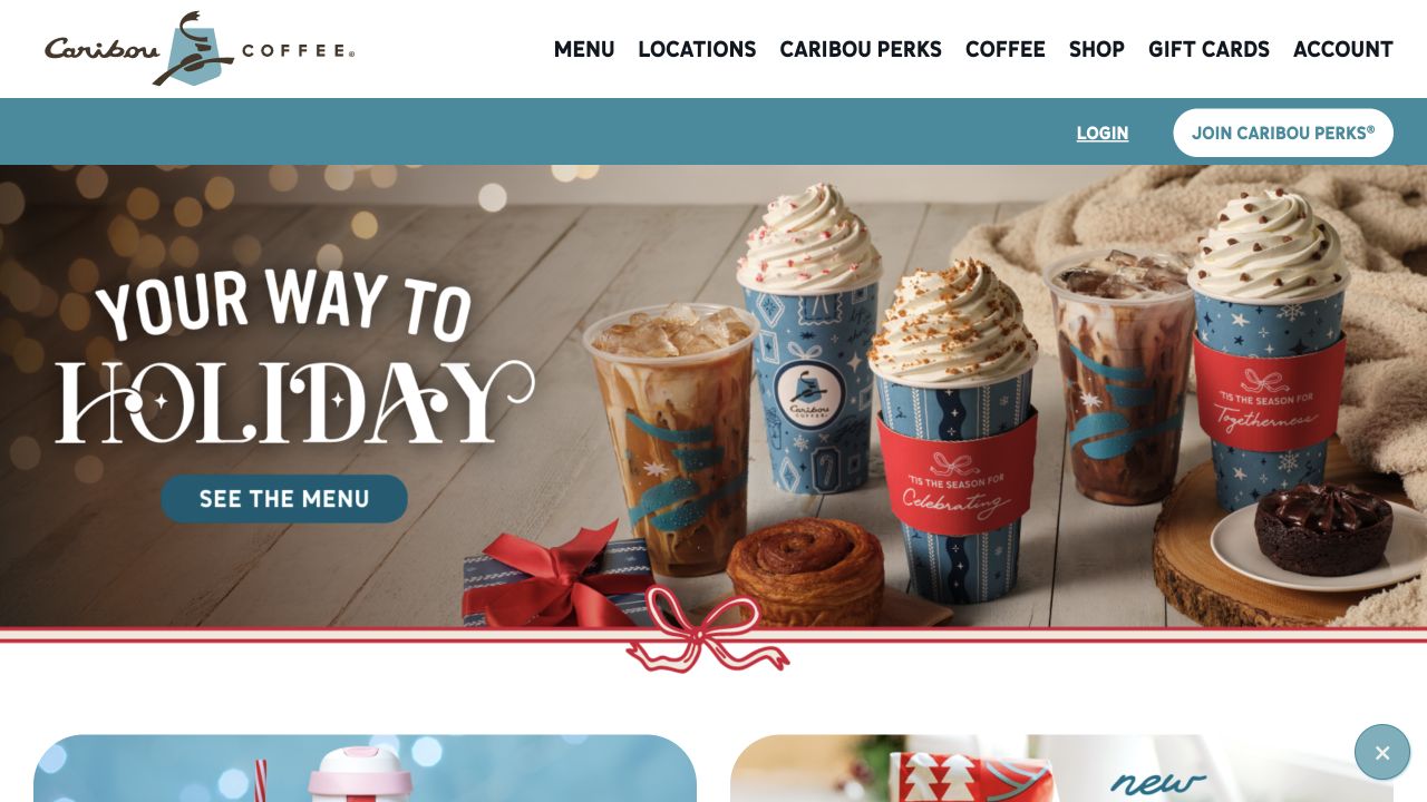
Caribou Coffee uses seasonal drink photography as the opening message, with a contrasting menu button on the left. Its white navigation explicitly separates Menu, Locations, Coffee, Shop, Gift Cards, and Account. A second teal strip handles loyalty membership rather than inserting those controls into the campaign image. The drinks and food establish an immediate café context, while the navigation preserves routes for people who came to buy packaged coffee or find a nearby location instead.
What you can learn
When a brand serves several kinds of intent, keep the stable task labels more literal than the campaign language. A visitor should not need to interpret a seasonal slogan to find a store or shop. Public WooCommerce evidence concerns this property; local drink ordering and the mobile application are separate systems outside this review.
Pros
Menu and location tasks are explicit rather than hidden behind a generic Explore label.
The loyalty strip separates membership actions from the main seasonal promotion.
Cons & considerations
The photographic opening gives little immediate guidance about the packaged-coffee catalog.
Large seasonal artwork needs its own responsive crop and readable alternative presentation.
Visible tech stack
Earlier / documented evidence
WooCommerce
Earlier cited evidence retained; no current scan result. References may be embedded or legacy—not a complete backend inventory.
Platform source: Primary platform or implementation reference. Woo identifies Caribou Coffee as a merchant; public retail property must be checked separately from its ordering app. Scope: Do not attribute order.cariboucoffee.com or the mobile app to WooCommerce. The association applies to the named public property; it is not a complete technology inventory or an edition/version audit. Platform evidence is separate from the direct website screenshot and is not a complete current infrastructure audit.
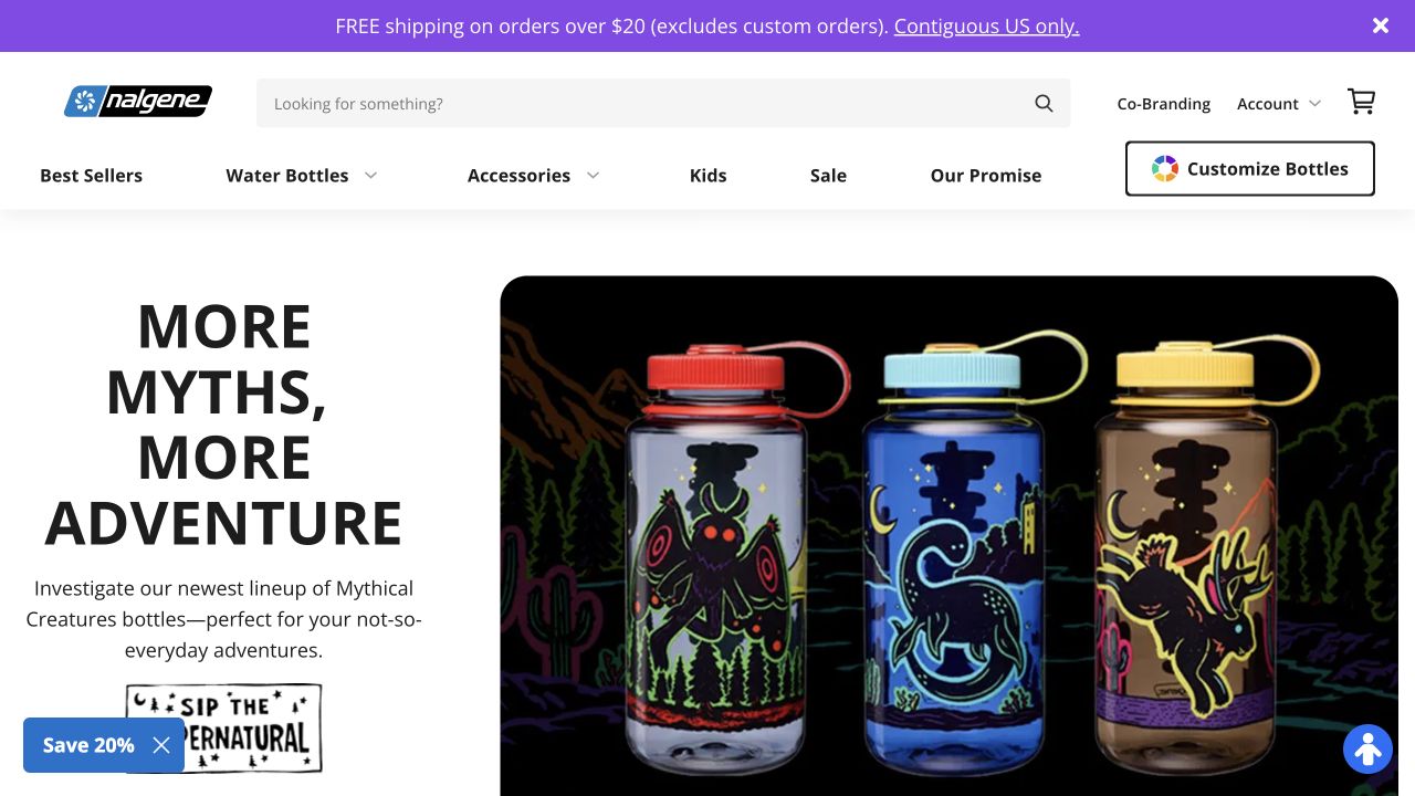
Nalgene gives its search field substantial space beside the logo, account controls, and cart. Below, Best Sellers, Water Bottles, Accessories, Kids, and Sale form an ordinary shopping vocabulary, with bottle customization promoted separately. The campaign pairs a short adventure-oriented heading with three brightly illustrated bottles on black. Product identity is obvious even though the photograph is promotional. The purple shipping strip and small newsletter tab add secondary offers without replacing the permanent category navigation.
What you can learn
A familiar product can carry imaginative artwork while its shopping controls stay conventional. Separate the specialized customization route from browsing standard items, and use the hero to introduce a collection rather than explain the entire catalog. Current public WooCommerce signals support this storefront’s association; they do not identify its customizer’s complete implementation.
Pros
The prominent search input offers an alternative to browsing many bottle variations.
Customization has its own labeled control instead of being buried inside a campaign.
Cons & considerations
The stacked campaign headline consumes considerable height beside the product photograph.
Multiple promotional surfaces can compete if shipping, newsletter, and seasonal messages all expand.
Public source checked November 3, 2026. References may be embedded or legacy—not a complete backend inventory.
Platform source: Primary platform or implementation reference. The current Woo homepage identifies Nalgene as a merchant; runtime/property check still needed. The association applies to the named public property; it is not a complete technology inventory or an edition/version audit. Platform evidence is separate from the direct website screenshot and is not a complete current infrastructure audit.
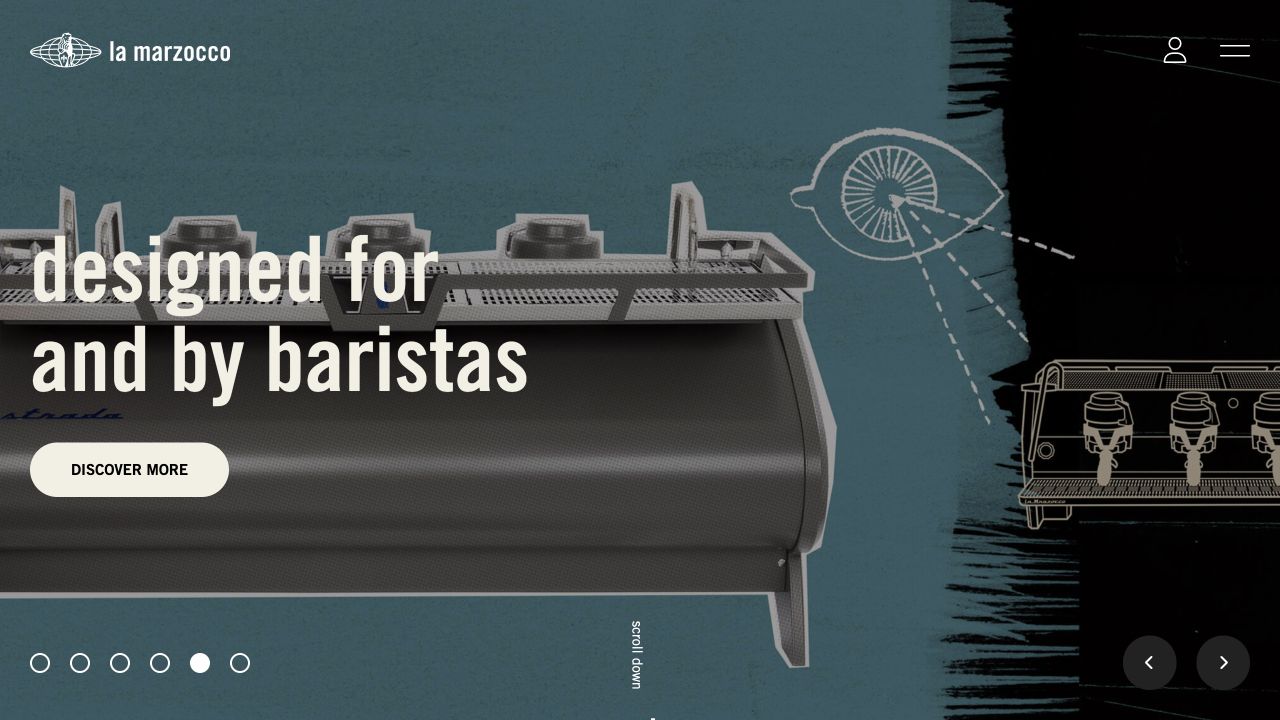
La Marzocco USA opens with an espresso machine against a textured blue-and-black composition, mixing photographic equipment with drawn technical detail. A large statement about baristas anchors the left side, followed by a plainly styled discovery button. The logo, account icon, and menu remain sparse at the top. Small carousel indicators and directional controls reveal that this is one campaign frame, rather than a permanent product comparison. The opening emphasizes professional identity more than a conventional product grid.
What you can learn
A manufacturer can establish expertise visually, then give visitors a clear route into practical specifications. Preserve that route when campaign artwork changes. The reviewed US property has WooCommerce evidence, but the distinct home-equipment store and other regional websites require their own evidence; a logo relationship alone does not identify their platforms.
Pros
Equipment photography and technical illustration share a coherent visual language.
The single discovery action is easy to locate within an otherwise expressive campaign.
Cons & considerations
Sparse navigation postpones the difference between home and commercial product paths.
Text layered over changing equipment imagery requires contrast checks across every carousel frame.
Public source checked November 3, 2026. References may be embedded or legacy—not a complete backend inventory.
Platform source: Primary platform or implementation reference. Woo's showcase links this named US La Marzocco property. Scope: The distinct home.lamarzoccousa.com store needs independent association if chosen instead. The association applies to the named public property; it is not a complete technology inventory or an edition/version audit. Platform evidence is separate from the direct website screenshot and is not a complete current infrastructure audit.
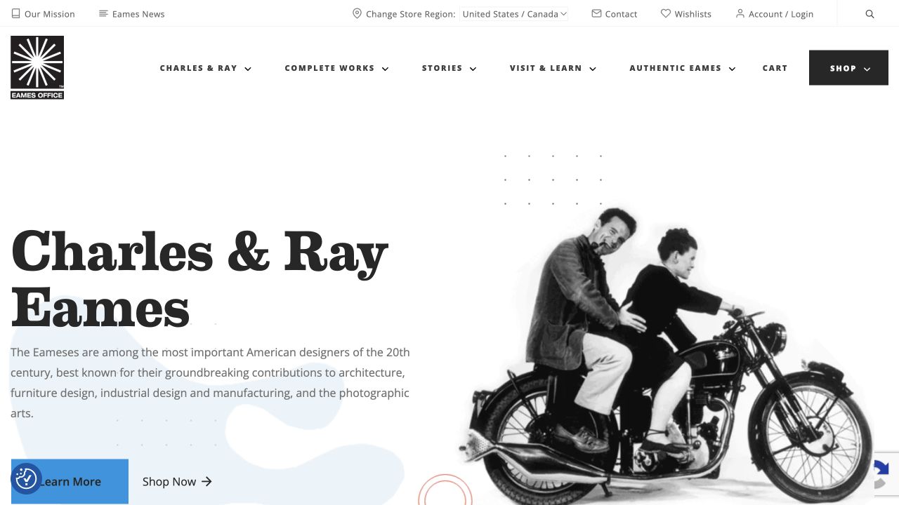
Eames Office combines a large serif introduction to Charles and Ray Eames with an archival motorcycle photograph. Shopping is available through both the main navigation and a secondary action beside the introductory copy. Above, utilities include store region, contact, wishlist, and account access. Complete Works, Stories, and Visit & Learn make the cultural material visible alongside commercial routes. The opening feels like an editorial institution that also sells products, rather than an anonymous store borrowing archival imagery.
What you can learn
Keep the reason an archive exists visible when adding commerce. A visitor interested in research should not be forced through the shop, and a shopper should not have to explore the whole archive first. The useful pattern is shared identity with distinct task routes; the screenshot does not establish how licensing or account systems operate.
Pros
Archive and shopping labels make different visitor intentions legible in the same header.
The historical photograph gives the introductory text a specific human reference.
Cons & considerations
The number of utility and primary links creates a dense opening navigation system.
Large introductory content delays visibility of actual merchandise and its prices.
Visible tech stack
Earlier / documented evidence
WooCommerce
Earlier cited evidence retained; no current scan result. References may be embedded or legacy—not a complete backend inventory.
Platform source: Primary platform or implementation reference. Woo's showcase lists the Eames Office website. The association applies to the named public property; it is not a complete technology inventory or an edition/version audit. Platform evidence is separate from the direct website screenshot and is not a complete current infrastructure audit.
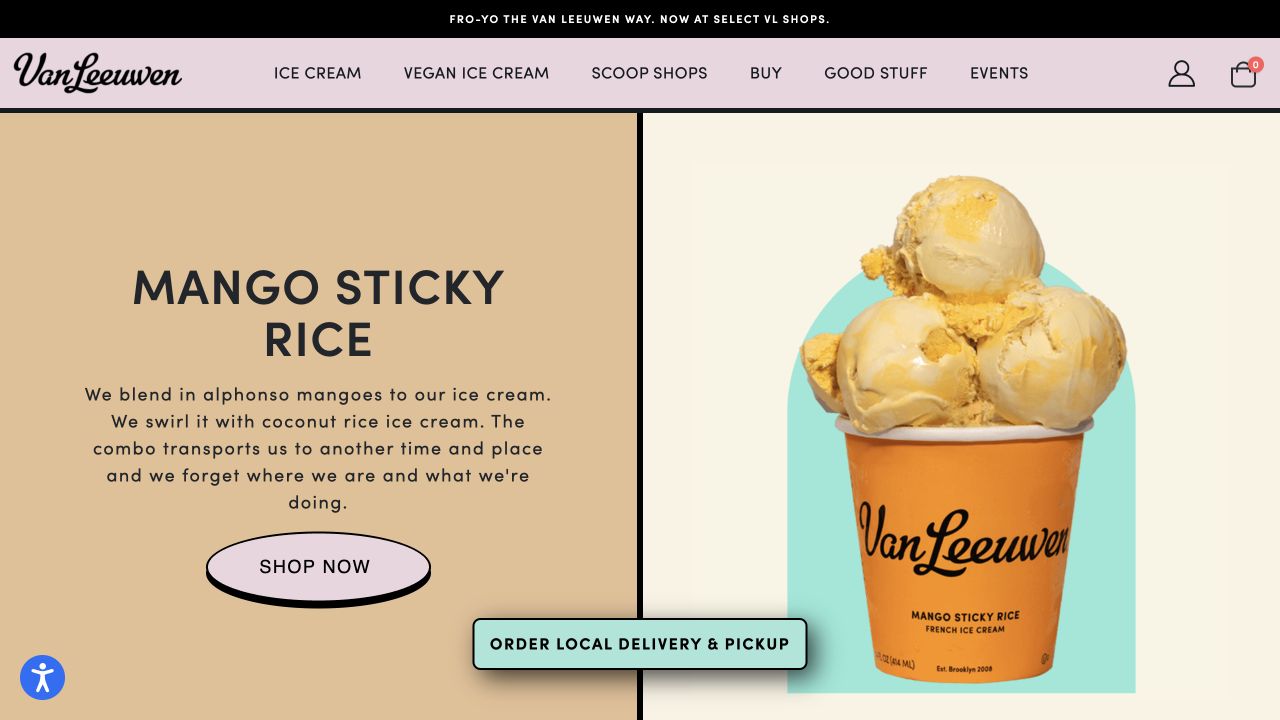
Van Leeuwen divides its hero into a text panel and a large photograph of an ice-cream pint. Heavy black rules, pastel surfaces, and rounded lettering connect the two halves. The featured flavor is named prominently, and the accompanying description explains its ingredients rather than relying only on a slogan. A lavender shopping button sits below. The header offers ice cream, vegan ice cream, scoop shops, and events, while a separate floating control names local delivery and pickup.
What you can learn
Give a food product a concrete description and distinguish shipped products from immediate local ordering. That distinction matters more than matching every button shape in the reference. WooCommerce signals identify the public store; the separate local-delivery destination should not be assumed to use the same ordering infrastructure.
Pros
The product photograph makes the packaging and flavor presentation unmistakable.
Vegan and conventional ranges receive explicit navigation labels rather than ambiguous collection names.
Cons & considerations
The floating local-order control overlaps the lower edge of the hero composition.
The large opening promotion postpones shipping conditions and price information until a deeper step.
Visible tech stack
Earlier / documented evidence
WooCommerce
Earlier cited evidence retained; no current scan result. References may be embedded or legacy—not a complete backend inventory.
Platform source: Primary platform or implementation reference. Woo's showcase explicitly links this ice-cream storefront. The association applies to the named public property; it is not a complete technology inventory or an edition/version audit. Platform evidence is separate from the direct website screenshot and is not a complete current infrastructure audit.
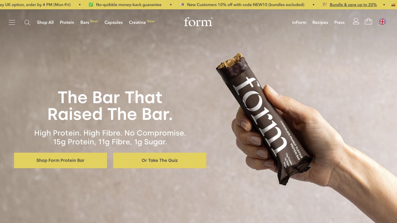
Form’s opening shows a hand holding a partially unwrapped protein bar against a quiet neutral background. The copy introduces the bar and immediately provides protein, fibre, and sugar quantities. Two yellow controls offer shopping and a quiz, while the header retains direct protein, capsules, creatine, and bundle routes. The centered wordmark is visually quieter than the product photograph. A moving benefits strip carries shipping and promotional details above the main navigation rather than distributing them across the hero.
What you can learn
Use the opening image to establish the product, then write measurable product facts nearby. Keep a direct shopping path available when offering a guided quiz. Public WooCommerce markers are present on this property alongside other third-party commerce-related text; that observation is not a claim that every regional store or service has one platform.
Pros
Specific nutrition quantities give the product story more substance than a benefit slogan alone.
The direct shop action and optional quiz support different levels of buyer familiarity.
Cons & considerations
White navigation over the photograph needs review against every campaign image.
The busy benefits strip introduces several offers before the main product story begins.
Public source checked November 3, 2026. References may be embedded or legacy—not a complete backend inventory.
Platform source: Primary platform or implementation reference. Woo's showcase explicitly links this nutrition storefront. The association applies to the named public property; it is not a complete technology inventory or an edition/version audit. Platform evidence is separate from the direct website screenshot and is not a complete current infrastructure audit.
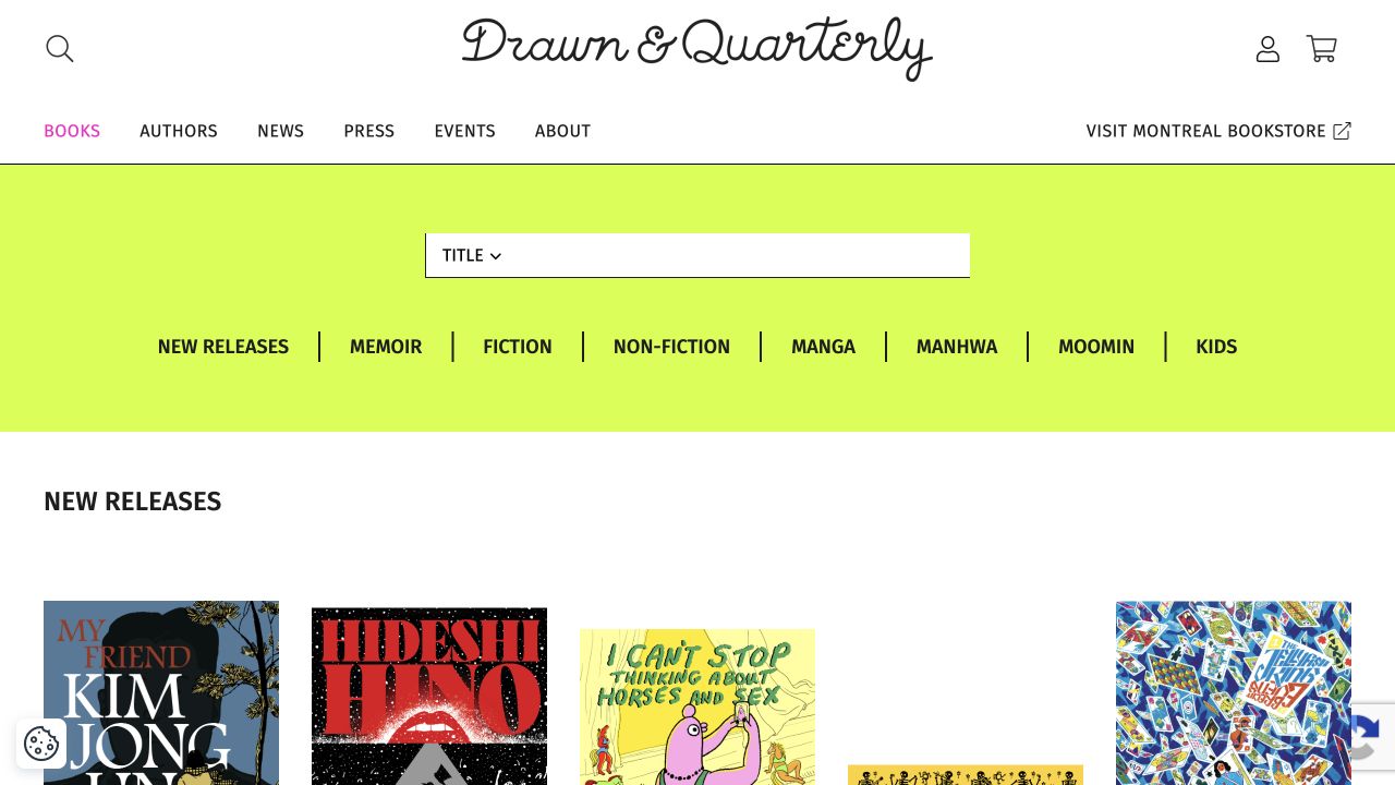
The captured Books page keeps Drawn & Quarterly’s handwritten wordmark above a narrow editorial navigation bar. A bright yellow-green catalog area contains a title control and a row of recognizable reading categories, including memoir, fiction, manga, and kids. Below, a New Releases heading introduces book covers in a spacious grid. The external Montréal bookstore link is distinguished from the publisher’s catalog. This is a useful commerce reference precisely because the organizing language belongs to reading, not a generic retail template.
What you can learn
Let a catalog’s subject matter determine its navigation. Titles, creators, reading categories, and release timing can be more useful than conventional lifestyle collections. The screenshot is the public Books catalog rather than a completed checkout, so it supports observations about discovery and composition, not claims about payment or fulfillment quality.
Pros
Genre labels give readers meaningful alternatives to searching for a known title.
The colorful catalog band makes the transition from institutional navigation to book discovery explicit.
Cons & considerations
The broad genre row needs a deliberate narrow-screen treatment to remain scannable.
Large cover imagery means a reader must continue downward for much of the item information.
Public source checked November 3, 2026. References may be embedded or legacy—not a complete backend inventory.
Platform source: Primary platform or implementation reference. Woo's showcase explicitly links this publisher's website. The association applies to the named public property; it is not a complete technology inventory or an edition/version audit. Platform evidence is separate from the direct website screenshot and is not a complete current infrastructure audit.
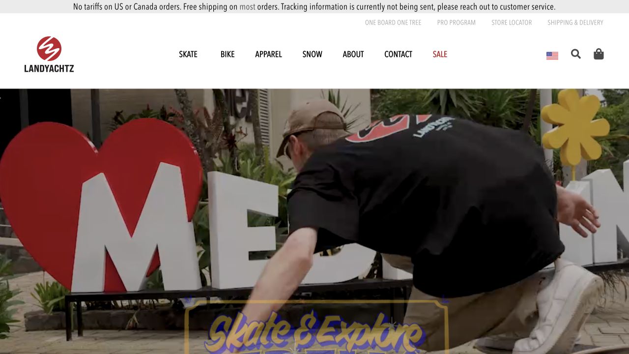
Landyachtz gives the top of the page to a practical shipping notice, utility links, and a white main navigation bar. Skate, Bike, Apparel, Snow, and Sale are clearly separated from the full-width lifestyle campaign below. The captured frame features a rider and skateboarding imagery rather than a product grid. Its large visual area establishes the activity and community associated with the brand, while search and cart remain recognizable in the header. The campaign is not mistaken for the whole shopping system.
What you can learn
An activity-led opening works better when equipment categories remain available without watching the campaign. Keep service alerts outside image artwork so their content can change independently. This direct view is useful for the relationship between stable navigation and lifestyle media, not as evidence that video or animation improves sales.
Pros
Short product-category labels make the permanent shopping routes easy to scan.
Shipping information sits in its own editable strip rather than being embedded in photography.
Cons & considerations
The oversized lifestyle frame does not immediately show equipment details or prices.
Several horizontal header layers leave less vertical room for useful content on smaller displays.
Public source checked November 3, 2026. References may be embedded or legacy—not a complete backend inventory.
Platform source: Primary platform or implementation reference. Woo's case study documents the store's migration from Shopify to WooCommerce. The association applies to the named public property; it is not a complete technology inventory or an edition/version audit. Platform evidence is separate from the direct website screenshot and is not a complete current infrastructure audit.
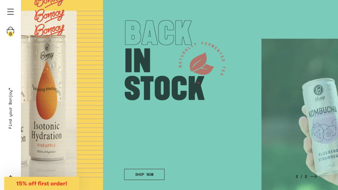
Bonsoy uses a narrow vertical navigation rail beside a large, colorful campaign carousel. The captured composition combines a cropped isotonic-drink package with a mint-green kombucha promotion. Condensed lettering, product packaging, and hand-held photography make the products feel related despite different backgrounds. A small shopping action sits within the campaign, while the bag and menu are isolated on the left. The design treats packaging as an identity system instead of adding a second unrelated visual language around the products.
What you can learn
Borrow the connection between package design and website color, not necessarily the unusual navigation. A distinctive campaign still needs clear product and shopping labels. The public page has WooCommerce signals, but neither the screenshot nor a vendor listing proves the contents of the cart or the details of subscription and fulfillment systems.
Pros
Packaging, typography, and campaign surfaces reinforce a recognizable product identity.
The shopping bag remains outside the rotating campaign rather than moving with it.
Cons & considerations
The narrow icon-led navigation requires more interpretation than visible category names.
Large cropped campaign panels can withhold essential product context near the screen edges.
Public source checked November 3, 2026. References may be embedded or legacy—not a complete backend inventory.
Platform source: Primary platform or implementation reference. Woo's showcase explicitly links this beverage brand's website. The association applies to the named public property; it is not a complete technology inventory or an edition/version audit. Platform evidence is separate from the direct website screenshot and is not a complete current infrastructure audit.
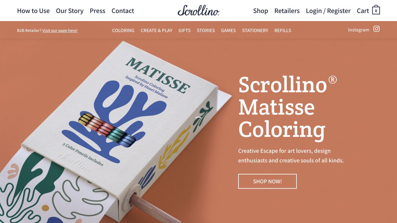
Scrollino’s opening pairs a close photograph of its boxed coloring product with a large, explicit product title. A warm orange background connects the packaging, pencil, and text into one campaign. The upper navigation includes How to Use and Our Story as well as Shop, Retailers, account, and cart. A second band names activity-oriented categories such as coloring, gifts, stories, and games. The product is unusual, but the shopping action is conventional and visible beside the introduction.
What you can learn
If visitors may not understand the object immediately, make product education a permanent route rather than hiding it in a campaign. Let the photograph explain scale and materials, then give the item a literal name. The opening image cannot establish whether customers understand the mechanism without visiting the usage explanation.
Pros
The close product photograph shows physical packaging and an interaction tool together.
How to Use is a first-class navigation item alongside commercial shopping routes.
Cons & considerations
Two broad navigation bands introduce many choices before the product explanation.
The campaign description remains general about the physical mechanism, so deeper explanation is still necessary.
Public source checked November 3, 2026. References may be embedded or legacy—not a complete backend inventory.
Platform source: Primary platform or implementation reference. Woo's showcase explicitly links this paper-product storefront. The association applies to the named public property; it is not a complete technology inventory or an edition/version audit. Platform evidence is separate from the direct website screenshot and is not a complete current infrastructure audit.
Cipher Skincare uses an almost empty off-white screen around a large metallic wordmark. Menu, search, login, and cart sit at the top edges, while Shop, Find Yours, About, and the mailing-list offer occupy the lower corners. There is no conventional product photograph or benefit-led headline in the captured opening. The wordmark’s reflective finish provides most of the visual interest. Shopping remains a visible text route, but the page asks the identity to do the work usually handled by product introduction.
What you can learn
Minimalism can provide a memorable brand moment when its task routes remain plain. For a less familiar brand, consider how quickly a visitor can establish what is sold and why it matters. Current public WooCommerce markers support the store association; they do not imply that the animation or product-finding workflow is standard platform behavior.
Pros
The few task labels are spatially separated and easy to locate within the uncluttered frame.
A single expressive element avoids competing photographic and typographic campaigns.
Cons & considerations
The opening gives little product or practical skincare context to an unfamiliar visitor.
Corner-based controls need a carefully planned reading order on narrow screens and with keyboards.
Public source checked November 3, 2026. References may be embedded or legacy—not a complete backend inventory.
Platform source: Primary platform or implementation reference. Woo's showcase explicitly links this skincare storefront. The association applies to the named public property; it is not a complete technology inventory or an edition/version audit. Platform evidence is separate from the direct website screenshot and is not a complete current infrastructure audit.
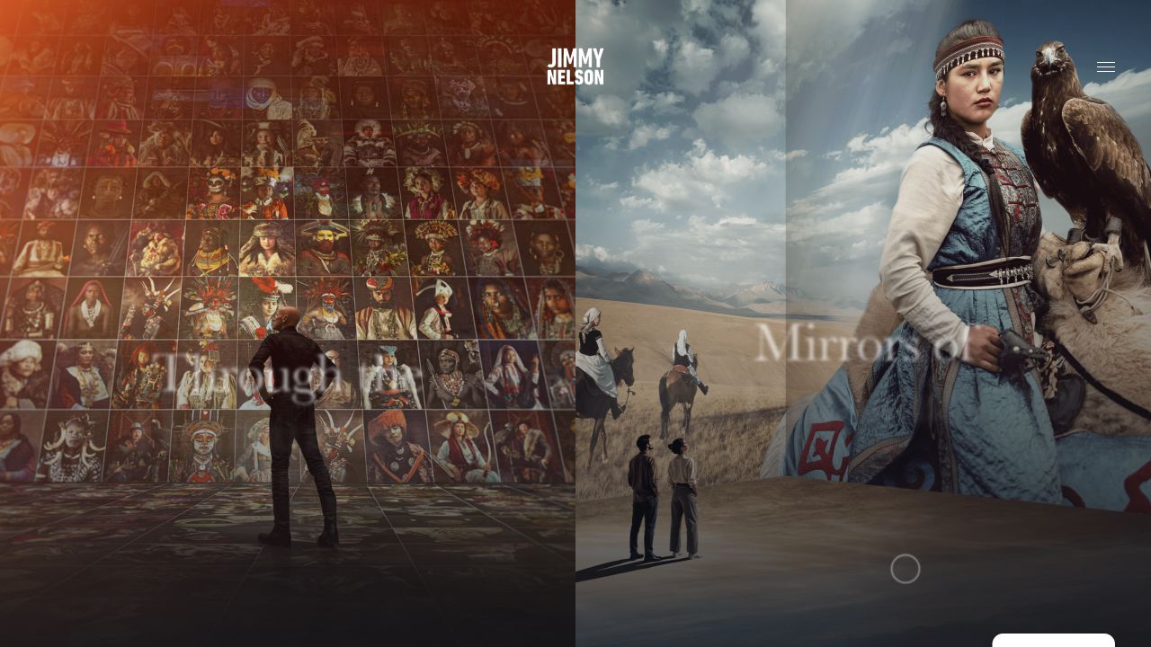
Jimmy Nelson’s homepage opens as a layered photographic environment rather than a familiar store grid. A small centered wordmark and a menu icon leave the imagery in control. The captured composition juxtaposes a wall of portraits, a landscape scene, and a large portrait with an eagle. Minimal overlaid labels connect these visual areas, but there is little shopping vocabulary in the opening frame. The public page contains WooCommerce markers; its initial experience is nonetheless an editorial presentation of photographic work.
What you can learn
A publication can lead with the work while allowing commerce to sit deeper in the experience. That is different from making a store’s buying route obvious on arrival. Decide which task is primary for your audience, then preserve a conventional alternative for people who want a specific book or product rather than exploration.
Pros
The photographic material establishes the subject and visual ambition immediately.
The restrained header avoids covering the work with a conventional promotional banner.
Cons & considerations
The store route is not obvious from the sparse opening controls alone.
An immersive layered composition needs a meaningful static and reduced-motion alternative for readers.
Public source checked November 3, 2026. References may be embedded or legacy—not a complete backend inventory.
Platform source: Primary platform or implementation reference. Woo's showcase explicitly links this photographer's publication storefront. The association applies to the named public property; it is not a complete technology inventory or an edition/version audit. Platform evidence is separate from the direct website screenshot and is not a complete current infrastructure audit.
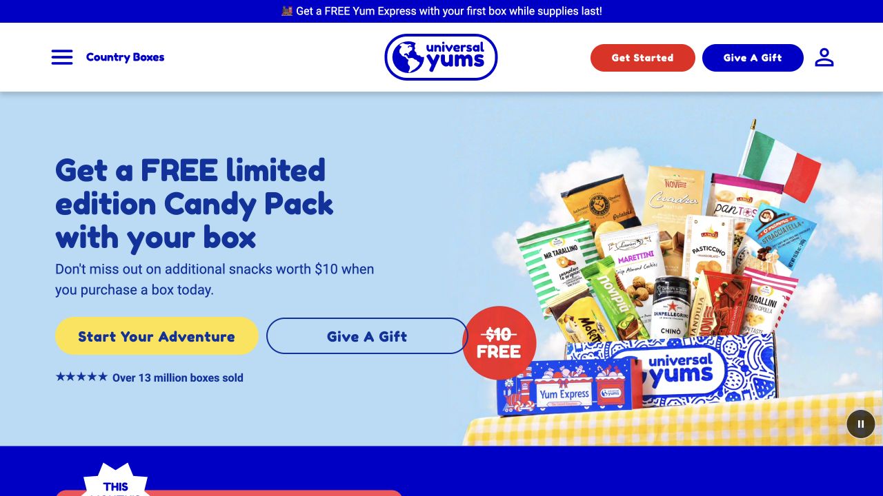
Universal Yums pairs a snack-box photograph with a prominent introductory offer on a light-blue surface. Two adjacent actions distinguish starting a subscription from giving a gift. The same distinction repeats in the header beside Country Boxes and the account icon. Illustrated lettering and brightly colored buttons match the product packaging without making the actions difficult to recognize. A small country flag and the visible assortment explain the product concept more quickly than a long paragraph about international discovery would.
What you can learn
Identify the important customer decision before asking visitors to configure the whole product. Subscription and gifting can share a brand story while needing different next steps and later forms. The public WooCommerce association does not establish the subscription extension, renewal rules, or cancellation experience; those require their own inspection.
Pros
Self-purchase and gift actions are labeled separately in both header and hero.
The product photograph shows an assortment and its box rather than an abstract lifestyle scene.
Cons & considerations
Several simultaneous promotional messages can make the permanent subscription proposition less clear.
The large opening assortment does not yet explain renewal timing or the ongoing price.
Visible tech stack
Earlier / documented evidence
WooCommerce
Earlier cited evidence retained; no current scan result. References may be embedded or legacy—not a complete backend inventory.
Platform source: Primary platform or implementation reference. Woo's showcase explicitly links this snack-subscription storefront. The association applies to the named public property; it is not a complete technology inventory or an edition/version audit. Platform evidence is separate from the direct website screenshot and is not a complete current infrastructure audit.
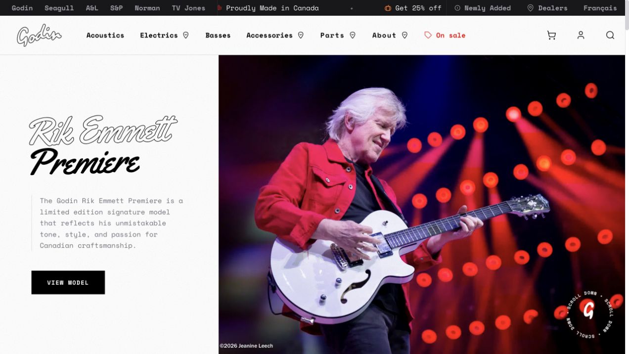
Godin’s captured campaign pairs a performer photograph with the name of a signature guitar and a brief product introduction. A black View Model button sits below the text on a pale panel, while the stage image occupies the larger right-hand area. Instrument categories, parts, accessories, and sale links stay visible above. A separate top strip identifies related brands and Canadian manufacturing. The composition gives the instrument cultural context without replacing a recognizable product route with a vague discovery slogan.
What you can learn
Use a professional association to introduce a specific model, then lead into specifications and suitability. Keep artist storytelling distinct from claims about what every buyer will achieve. WooCommerce evidence supports this public instrument property, not a claim about every related brand in the upper strip or the systems used by dealers.
Pros
The model-specific action connects the performer story to a concrete product destination.
Instrument categories and parts remain available outside the featured campaign.
Cons & considerations
The signature model receives most of the opening space before other ranges become visible.
Small utility text and several brand names require careful spacing on narrower displays.
Visible tech stack
Earlier / documented evidence
WooCommerce
Earlier cited evidence retained; no current scan result. References may be embedded or legacy—not a complete backend inventory.
Platform source: Primary platform or implementation reference. Woo's showcase explicitly links this musical-instrument website. The association applies to the named public property; it is not a complete technology inventory or an edition/version audit. Platform evidence is separate from the direct website screenshot and is not a complete current infrastructure audit.
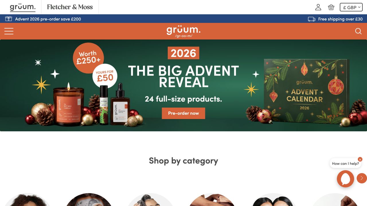
grüum’s homepage places a seasonal advent-calendar offer beneath an orange brand bar and a narrow benefits strip. Product bottles and the calendar package flank a centered headline and preorder action on a dark-green surface. Below that contained campaign, a Shop by Category heading immediately begins the everyday browsing experience. The top also distinguishes a companion brand and provides account, cart, currency, menu, and search controls. The seasonal artwork is expressive without becoming the only available organizing structure.
What you can learn
Give temporary promotions a defined place in the page, then return visitors to stable categories. This helps a customer who came for one familiar item avoid being forced through a gifting campaign. The reviewed public store exposes WooCommerce signals; private account behavior, promotion rules, and cross-brand data sharing are outside this opening-view review.
Pros
The campaign ends soon enough for the category section to appear in the same opening view.
The packaged calendar and individual products make the featured offer visually tangible.
Cons & considerations
The menu icon hides detailed product categories until another interaction.
Multiple top strips and a chat control add competition around an otherwise focused seasonal message.
Visible tech stack
Earlier / documented evidence
WooCommerce
Earlier cited evidence retained; no current scan result. References may be embedded or legacy—not a complete backend inventory.
Platform source: Primary platform or implementation reference. Woo's 2026 case study documents the merchant's decision to retain WooCommerce. The association applies to the named public property; it is not a complete technology inventory or an edition/version audit. Platform evidence is separate from the direct website screenshot and is not a complete current infrastructure audit.
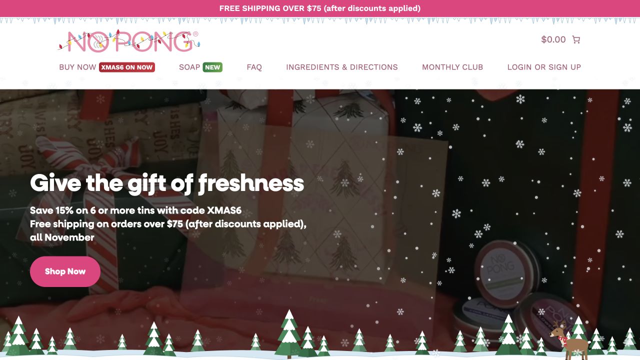
No Pong’s opening gives a straightforward product category a seasonal gift presentation. The photograph contains wrapped products and tins, with a short offer and a pink Shop Now button on the left. The logo and navigation stay on a white surface above, including ingredients, directions, FAQs, and the monthly club. A separate shipping strip states the order threshold. The campaign changes the shopping occasion without making the underlying product identity or support routes disappear.
What you can learn
For a small repeat-purchase range, keep ingredients, usage, and recurring-order information near the permanent shopping routes. Seasonal artwork can introduce gifting without forcing a new navigation model. The direct WooCommerce observation establishes the public storefront’s association, not the particular extension or operational process behind its monthly club.
Pros
The primary action is visually distinct from the darker seasonal product photograph.
Ingredients, directions, and FAQs remain explicit options rather than being buried under About.
Cons & considerations
Decorative seasonal elements occupy space that could otherwise introduce product differences.
The combination of shipping threshold, discount code, and gifting copy creates several conditions to read.
Visible tech stack
Earlier / documented evidence
WooCommerce
Earlier cited evidence retained; no current scan result. References may be embedded or legacy—not a complete backend inventory.
Platform source: Primary platform or implementation reference. Woo's 2026 case study documents this deodorant merchant's use of WooCommerce. The association applies to the named public property; it is not a complete technology inventory or an edition/version audit. Platform evidence is separate from the direct website screenshot and is not a complete current infrastructure audit.
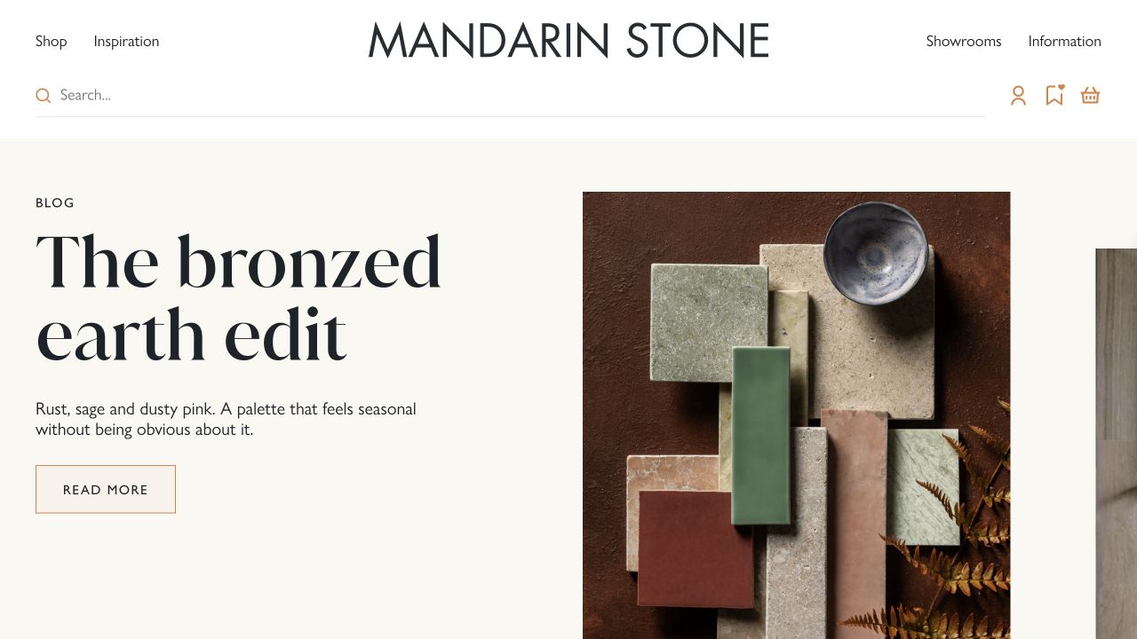
Mandarin Stone’s captured campaign pairs an editorial title with a carefully arranged palette of tile and stone samples. The pale page surface, large serif heading, and fine outlined button give the image room to communicate texture. Shop and Inspiration appear together in the header, with showrooms and information on the opposite side. A wide search field and separate account, wishlist, and basket controls remain above the campaign. The opening therefore connects a material-selection story to several practical ways of continuing.
What you can learn
Editorial content is valuable when it helps customers understand how products relate. Use recognizable samples and a clear path from the story into the relevant range. Do not mistake this composed photograph for proof of exact real-world color, surface finish, stock availability, or installation suitability; those need additional product information and samples.
Pros
The sample arrangement communicates combinations more concretely than a generic room photograph alone.
Shopping, inspiration, and showroom routes support different stages of a material purchase.
Cons & considerations
The editorial opening does not immediately expose individual sample names or prices.
A fine outlined action and muted interface details require contrast checks across devices.
Public source checked November 3, 2026. References may be embedded or legacy—not a complete backend inventory.
Platform source: Primary platform or implementation reference. Woo's showcase explicitly links this tile and stone storefront. The association applies to the named public property; it is not a complete technology inventory or an edition/version audit. Platform evidence is separate from the direct website screenshot and is not a complete current infrastructure audit.
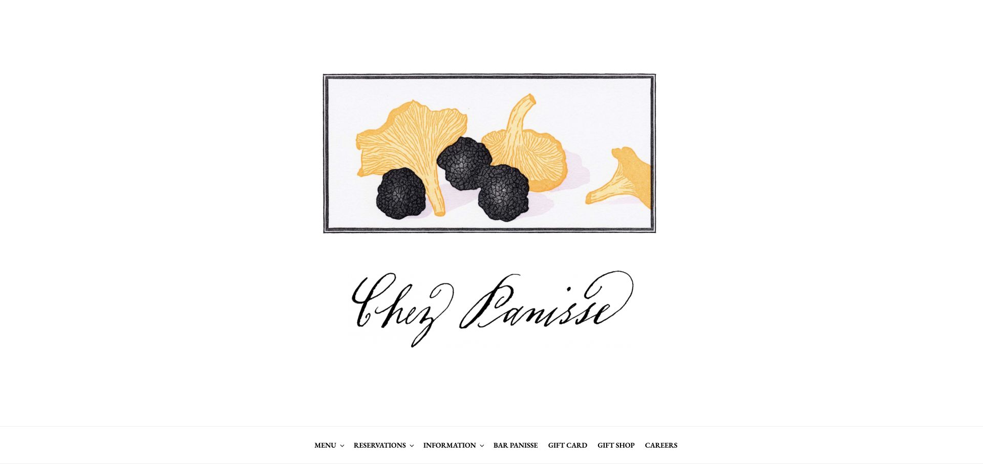
Chez Panisse’s captured opening is deliberately spare: a framed illustration of mushrooms sits above a large handwritten restaurant wordmark on white. A compact navigation row at the bottom provides menus, reservations, information, Bar Panisse, gift cards, and a gift shop. No product grid or promotional checkout language interrupts the identity. Public generator metadata and WooCommerce assets support the commerce association, but the opening presents a restaurant first. The distinction is useful when retail exists to support a broader organization rather than replace its purpose.
What you can learn
A secondary shop does not always need to dominate the homepage. Keep visit-related tasks explicit and give gifts their own understandable routes. A restrained identity-led opening can fit an established destination, while a less familiar business may need more immediate explanation of what it offers and where it is.
Pros
Gift cards and physical gifts have separate navigation labels alongside restaurant tasks.
Generous white space and a single illustration preserve a coherent institutional identity.
Cons & considerations
The opening provides little practical location or booking context until visitors use the navigation.
The large identity area postpones any view of retail products, prices, or delivery information.
Public source checked November 3, 2026. References may be embedded or legacy—not a complete backend inventory.
Platform source: Primary platform or implementation reference. Preserved direct observation identifies WooCommerce generator metadata and /plugins/woocommerce/ assets. The association applies to the named public property; it is not a complete technology inventory or an edition/version audit. Platform evidence is separate from the direct website screenshot and is not a complete current infrastructure audit.
Choose a theme strategy around the merchant’s work
Adapt a compatible theme for a conventional shop
Begin with a small set of real products and the integrations the business already uses. Evaluate the candidate theme against those requirements before styling it. A restrained adaptation can be an effective solution when the product model and buying process are familiar.
Build a custom theme when content and commerce need a shared system
Define reusable story modules, product cards, education sections, and campaign layouts together. Test the awkward cases: no product image, a long category description, discontinued stock, or an editor removing a section. Document which controls belong to the theme and which depend on a plugin.
Use a separate frontend only when its ownership is justified
A custom storefront may be appropriate for a specific channel or interaction requirement, but it creates additional preview, caching, deployment, and integration work. Describe the requirement a theme cannot satisfy and name the team responsible for the extra software. A famous headless example is not a reason by itself.
From references to requirements
Plan what happens around the purchase
Build a representative product-data set
Include variable products, missing images, unusually long names, unavailable combinations, and products with special shipping conditions. Work through the category and search experience with this data. Fix ambiguous attributes in the catalog rather than compensating for every inconsistency with custom page code.
List the integration contracts
For inventory, accounting, fulfillment, subscriptions, payments, and email, record the source of truth, direction of sync, responsible person, and expected delay. WooCommerce’s REST API supports reading and changing store data, but the API’s existence does not define how a particular business should reconcile a failed update.
Demonstrate an update on staging, restore a backup, and place a test order through the configured payment workflow. Check the active theme and extensions together, including their cart and checkout behavior. Agree who handles failures before an important trading period rather than discovering that responsibility during an outage.
A useful handover demonstration
Ask the actual team to carry out its routine job: publish a realistic update, correct a mistake, preview a narrow screen, and identify who owns an integration failure. For a library or frontend framework, also ask who maintains the content source and deployment. A polished screenshot does not answer those operational questions.
Beyond the screenshot
Before launching a WooCommerce website
Confirm the actual WordPress, theme, WooCommerce, and extension owners.
Test product attributes, variations, stock changes, and unavailable combinations.
Check mobile categories, search results, filters, and empty states.
Verify shipping, tax, payment, discount, and refund settings with the business.
Exercise cart notices, checkout errors, confirmations, and order emails.
Review keyboard access, image alternatives, contrast, and dialog behavior.
Rehearse staging updates, backups, restoration, and integration recovery.
Map old URLs and document ongoing catalog and campaign editing.
Test with real content, a keyboard, a small screen, slow or failed requests, and the people who will maintain the system. These are planning checks, not an accessibility, security, performance, or search-ranking certification.
Sources & editorial method
How this WooCommerce collection was reviewed
Examples pair direct website captures with public WooCommerce signals, official Woo merchant listings, or specific implementation accounts. A listing establishes an attributed association, not the current version, complete extension inventory, checkout provider, or platform behind every related brand property. Older associations are qualified rather than silently treated as a current technical audit.
Every image is an unmodified capture from the actual website, with its source and capture date. Some captures are reused from our shared catalog; their dates remain the original capture dates. None comes from a vendor gallery or a generated reconstruction. Moving imagery and live content can change.
Technology attribution uses public page assets or metadata, official platform documentation, or a cited first-party project case study. Documentary and framework-relationship evidence is identified where used; it is not a complete current backend inventory. A CMS image CDN alone does not establish a full CMS deployment. A library’s presence does not prove which individual controls use it, and a platform label does not establish AI authorship.
The composition notes, lessons, pros and tradeoffs are original editorial observations. We have not measured conversion, traffic, security, performance or accessibility conformance. Website owners retain their brands and imagery; these examples are not our client portfolio. Written, Edited and Curated are independent records, not dates advanced by a build. See our editorial standards or suggest a correction.
Questions worth asking
WooCommerce website development FAQs
Is every WordPress website a WooCommerce store?
No. WordPress can run a site without WooCommerce, and an organization may use WordPress for content while selling through another system. Look for property-specific evidence rather than treating the two names as interchangeable.
Can my team edit the whole store without a developer?
That depends on the theme, templates, permissions, and custom features provided. Ask the team to perform a real campaign update in a prototype; the platform name alone cannot answer that question.
Does using WooCommerce eliminate recurring costs?
No. Budget for the operating model: hosting, paid extensions where required, maintenance, payment fees, backups, integrations, and support. Compare complete ownership costs rather than the price of the core plugin alone.
Can a homepage review prove a store is fast or profitable?
No. These reviews discuss visible decisions and sourced platform associations. Performance, accessibility conformance, checkout reliability, and commercial results require separate testing or trustworthy measurements.