jQuery is a JavaScript library, not a website platform. These examples expose a public jQuery asset; that fact alone cannot tell us which menu, carousel, or form uses it.
The collection is a reference for maintaining and improving real websites with a jQuery dependency. It is not a recommendation to reproduce an old version or to add the library to a project that does not need it.
Borrow information hierarchy and interaction requirements from the examples. Decide how to implement them only after reviewing the existing code, plugins, CMS, and maintenance responsibilities.
Before the examples
What makes good jQuery website development in 2026?
Preserve the underlying page before enhancing it
Keep meaningful headings, links, labels, and content in a sensible document order. A menu or disclosure should improve access to information rather than make it available only after a fragile chain of scripts has loaded.
Inventory dependencies before upgrading
Record the core library, plugins, custom handlers, and CMS-managed scripts. The official upgrade guidance describes compatibility testing and jQuery Migrate as part of a staged process. Do not treat the version visible in a reference as a current recommendation.
Test keyboard opening and closure, focus return, repeated activation, validation errors, resizing, and slow loading. A control that works once with a mouse is not a complete interaction specification.
The collection · 20 examples
20 jQuery website examples worth studying
Every example has an observed jQuery asset or preserved source evidence. The reviews describe visible design patterns; they deliberately avoid assigning an individual control to the library without an implementation audit.
We start with five recognizable brands or organizations: The Harvard Gazette, The British Museum, Smithsonian Institution, UNICEF, UN World Food Programme. Each attribution applies to the named website property, not every product or website belonging to its organization. This is a curated reading sequence, not a measured ranking.
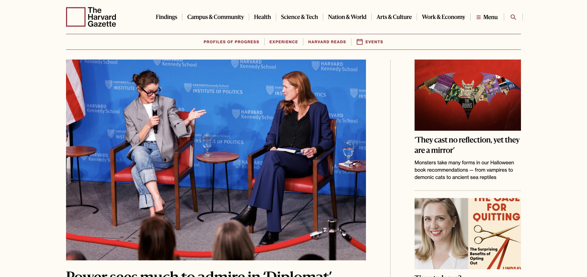
The Harvard Gazette uses a cream canvas, burgundy institutional identity, and several carefully separated navigation rows. A large event photograph leads the left side, while a narrower column introduces another story with its own image and headline. Rules and typographic scale establish a newspaper-like hierarchy without framing every item as a rounded card. The public page includes a named jQuery core script. That establishes a dependency on this news property, not which editorial controls use it or the implementation of Harvard’s other websites.
What you can learn
For an existing editorial site, protect the reading hierarchy while enhancing menus, story browsing, or other controls. Preserve direct links and useful headings underneath any script behavior. A dependency review should cover representative article and section pages as well as the homepage, because a stable masthead can hide very different templates below it.
Pros
The main and secondary stories have visibly different editorial weights.
Topic navigation remains separate from the headline and imagery.
Cons & considerations
Several navigation rows need a simpler narrow-screen arrangement.
Large story images can delay a text-first reader’s route to deeper coverage.
PHPCMS dependency association; runtime not independently observed
Earlier cited evidence retained; no current scan result. References may be embedded or legacy—not a complete backend inventory.
Platform source: Public jQuery core asset. The named page exposes this jQuery asset. Library presence does not identify which controls use it, establish a complete stack, or endorse the observed version. Platform evidence is separate from the direct website screenshot and is not a complete current infrastructure audit.
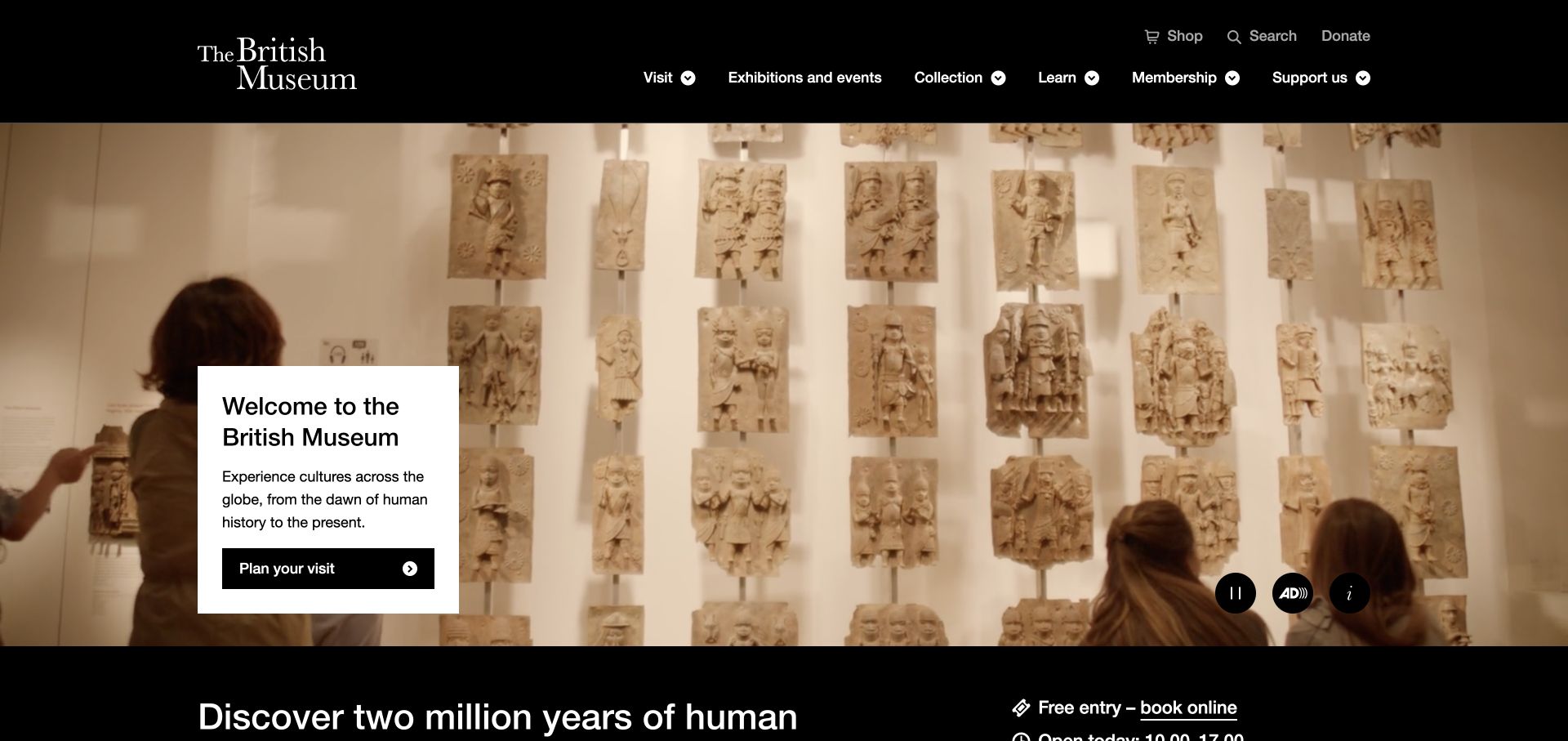
The British Museum places a black masthead above a broad moving gallery view. A solid white panel overlays the lower-left portion with a welcome, visit information, and a planning action, while media controls sit away from that text. The next dark section begins to introduce practical visitor information. This combination lets the building and collection setting establish atmosphere without putting every essential word directly over changing imagery. The page exposes a named jQuery core asset, but the capture does not assign the film controls or navigation to that library.
What you can learn
When improving a jQuery-dependent visitor site, start with the task and fallback rather than the effect. Keep opening times, planning destinations, and normal navigation accessible independently of the media. Specify pause behavior, keyboard focus, and the narrow-screen order before choosing an implementation or reusing an existing plugin.
Pros
An opaque information panel protects the important text from changing backgrounds.
Planning and media controls occupy distinct areas.
Cons & considerations
Full-width moving imagery needs a useful still presentation.
The rich opening leaves many specific visitor questions for subsequent sections.
Visible tech stack
Earlier / documented evidence
jQuery
Earlier cited evidence retained; no current scan result. References may be embedded or legacy—not a complete backend inventory.
Platform source: Public jQuery core asset. The named page exposes this jQuery asset. Library presence does not identify which controls use it, establish a complete stack, or endorse the observed version. Platform evidence is separate from the direct website screenshot and is not a complete current infrastructure audit.
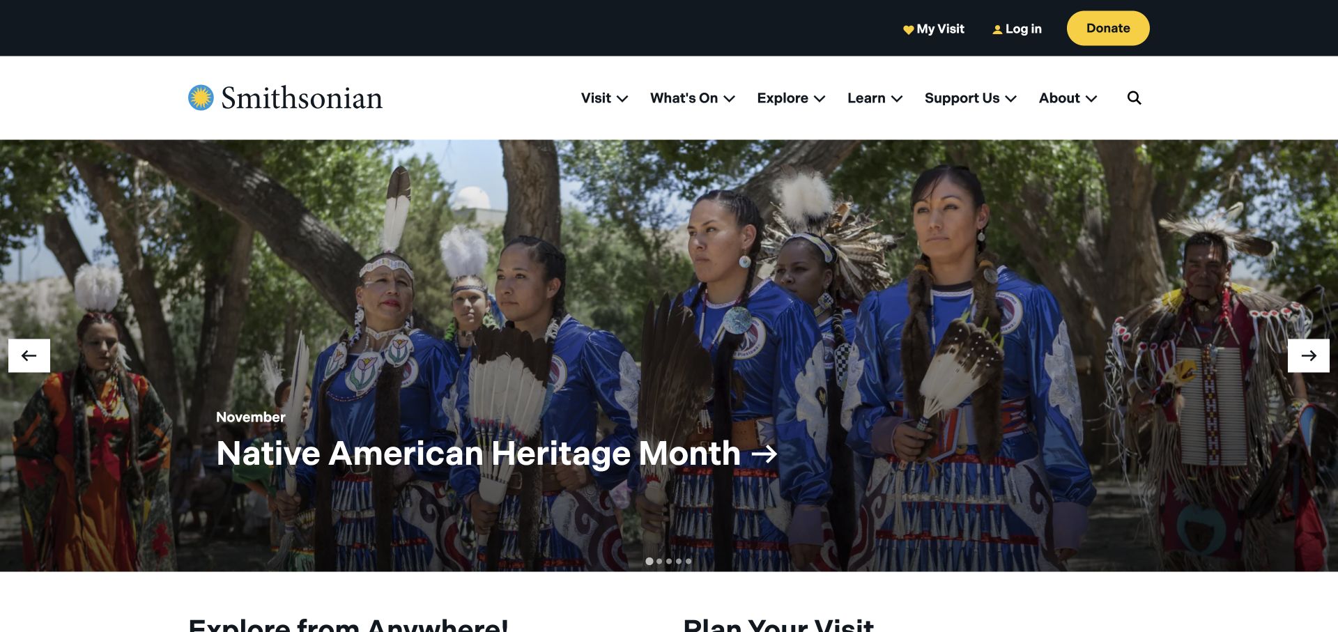
The Smithsonian homepage separates a dark utility strip from a white masthead containing its sun mark and serif identity. Below, a large seasonal cultural-story carousel carries a prominent white headline over photography. Side controls and slide navigation are visible, and a distinct visitor-information section begins beneath the campaign. The page therefore accommodates both changing editorial emphasis and a more durable planning route. Its public source references a named jQuery core asset; that observation does not prove the carousel’s implementation or reveal the museum network’s complete infrastructure.
What you can learn
A maintained legacy frontend should keep its stable visitor routes independent from rotating campaigns. Write requirements for slide selection, pause behavior, focus, and nonmoving content before changing a library or plugin. Test the same shell on pages without a campaign, rather than assuming a homepage enhancement defines the entire website.
Pros
Utility tasks are visibly separated from the main institutional identity.
The visitor section has its own place outside the changing story.
Cons & considerations
Photographic headlines need consistent contrast across every slide.
Multiple header layers can consume considerable space on a small screen.
Visible tech stack
Earlier / documented evidence
jQuery
Earlier cited evidence retained; no current scan result. References may be embedded or legacy—not a complete backend inventory.
Platform source: Public jQuery core asset. The named page exposes this jQuery asset. Library presence does not identify which controls use it, establish a complete stack, or endorse the observed version. Platform evidence is separate from the direct website screenshot and is not a complete current infrastructure audit.
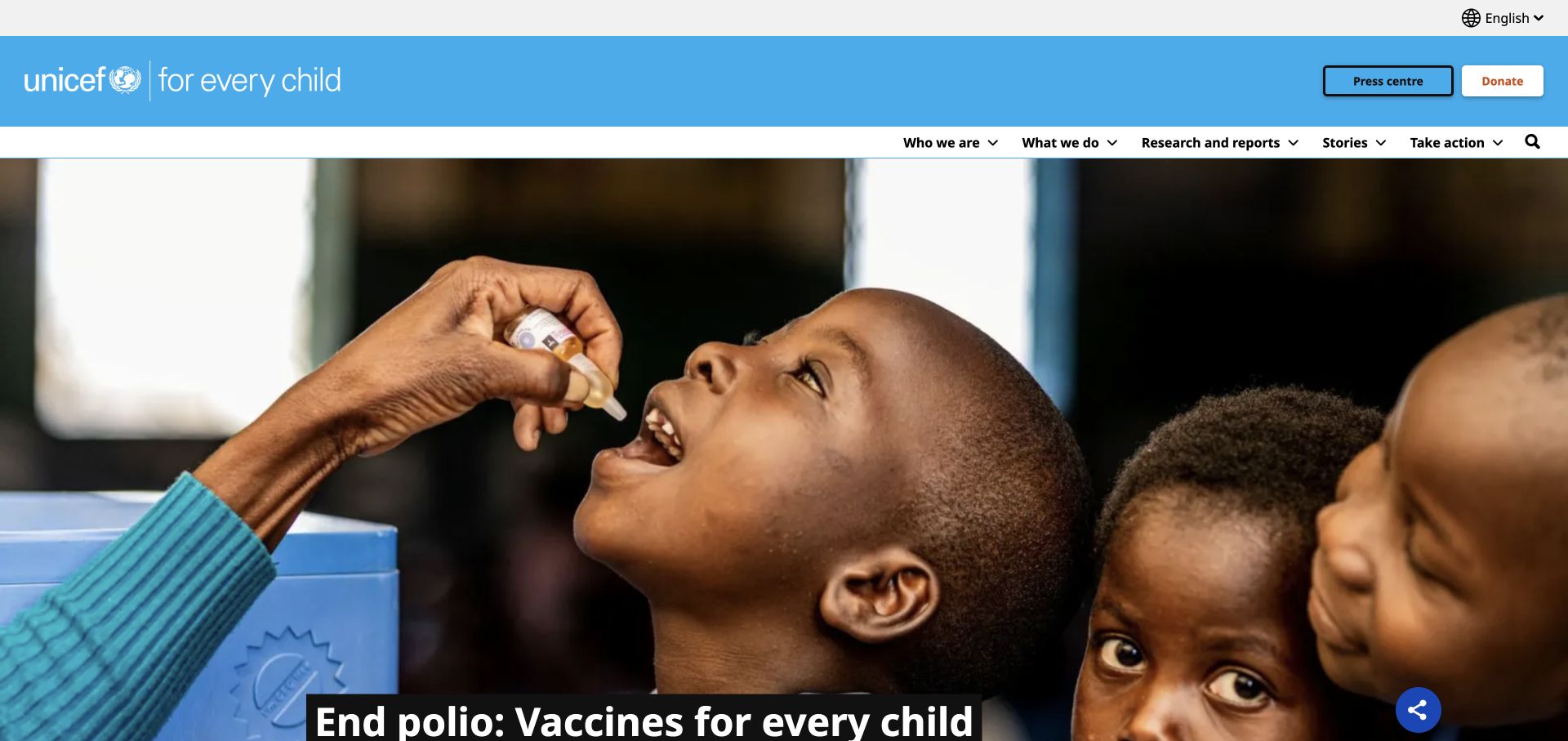
UNICEF’s homepage begins with a slim language strip, a large blue branded masthead, and a white navigation row. Press and donation routes receive distinct positions rather than being embedded in the campaign image. A broad health-related campaign photograph fills the main opening, with the headline carried by a dark panel near the lower edge. The visible hierarchy is useful even without attributing identities or outcomes to the people pictured. A named jQuery core asset appears in the public page; it is a dependency observation, not an audit of the organization’s systems.
What you can learn
For a multi-audience website, preserve language choice, principal sections, and donation destinations as ordinary navigable routes. If scripts enhance menus or campaigns, test their failure and keyboard behavior separately. Do not let a temporary campaign replace the durable information structure that returning visitors need.
Pros
The campaign headline has its own stable contrast surface.
Language, press, and donation tasks are not treated as interchangeable links.
Cons & considerations
The substantial header needs careful compression on narrow screens.
A large campaign image postpones more detailed program browsing.
PHPCMS dependency association; runtime not independently observed
Earlier cited evidence retained; no current scan result. References may be embedded or legacy—not a complete backend inventory.
Platform source: Public jQuery core asset. The named page exposes this jQuery asset. Library presence does not identify which controls use it, establish a complete stack, or endorse the observed version. Platform evidence is separate from the direct website screenshot and is not a complete current infrastructure audit.
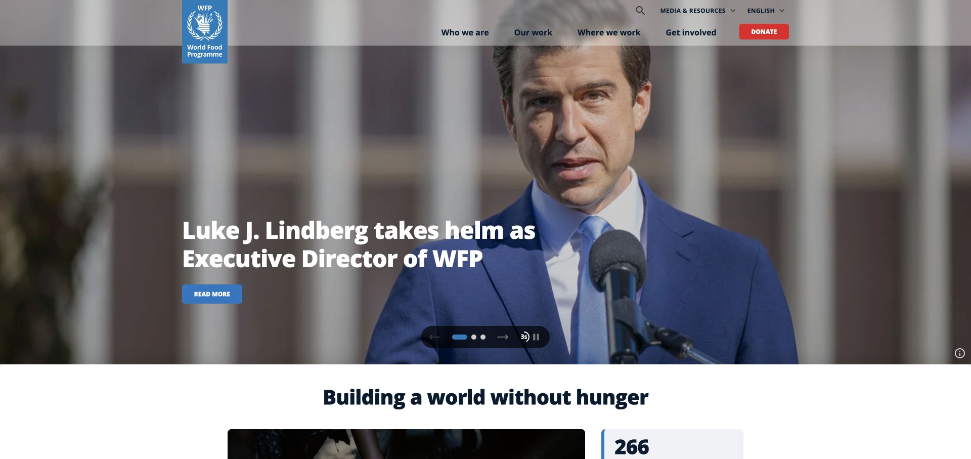
The World Food Programme uses a restrained header, a vertical blue identity, and a contrasting donation action above a large photographic story. White campaign copy sits over the image, with a reading action and visible carousel controls. Below, a white section introduces the organization’s broader purpose. The sequence distinguishes one current story from the continuing institutional explanation. A public jQuery core asset supports the library attribution on the selected homepage; it does not identify which visible controls use the library or establish anything about humanitarian operations.
What you can learn
A campaign-heavy site needs a clear boundary between changing media and dependable navigation. In a jQuery maintenance project, define the headline, link, pause, and focus behavior as testable requirements. Keep the wider mission and donation routes useful when a slide fails to load or a visitor prefers reduced motion.
Pros
The donation route is visually distinct from the editorial reading action.
The organization’s broader explanation has a separate section after the campaign.
Cons & considerations
White text over photography needs review for every campaign crop.
Carousel controls must remain understandable on touch and keyboard interfaces.
PHPCMS dependency association; runtime not independently observed
Public source checked November 3, 2026. References may be embedded or legacy—not a complete backend inventory.
Platform source: Public jQuery core asset. The named page exposes this jQuery asset. Library presence does not identify which controls use it, establish a complete stack, or endorse the observed version. Platform evidence is separate from the direct website screenshot and is not a complete current infrastructure audit.
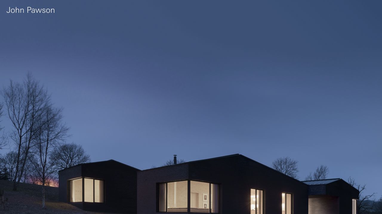
John Pawson’s opening removes most of the usual promotional furniture. A small identity and a nearly full-screen architectural photograph create the feeling of an opening plate in a monograph. The image, rather than a headline or service grid, carries the first impression. This makes the work unusually prominent but leaves little space for practical explanation. The preserved public source references a named jQuery asset and a history script; those are dependencies, not proof of the CMS or of the behavior behind every portfolio transition.
What you can learn
Borrow the clarity of a single visual priority, then specify the navigation underneath it. A minimal portfolio still needs discoverable project destinations, contact information, and usable history behavior. In a maintenance project, test direct project links and browser navigation instead of judging the interface only from its quiet opening.
Pros
The photography has an uninterrupted and consistent visual frame.
Very little decorative material competes with the work.
Cons & considerations
Practical information requires more deliberate discovery.
The approach depends on a strong and consistently edited image collection.
Visible tech stack
Referenced on the public page
jQuery
nginxReported response header
Public source checked November 3, 2026. References may be embedded or legacy—not a complete backend inventory.
Platform source: Preserved public jQuery asset observation. The named page exposes this jQuery asset. Library presence does not identify which controls use it, establish a complete stack, or endorse the observed version. Platform evidence is separate from the direct website screenshot and is not a complete current infrastructure audit.
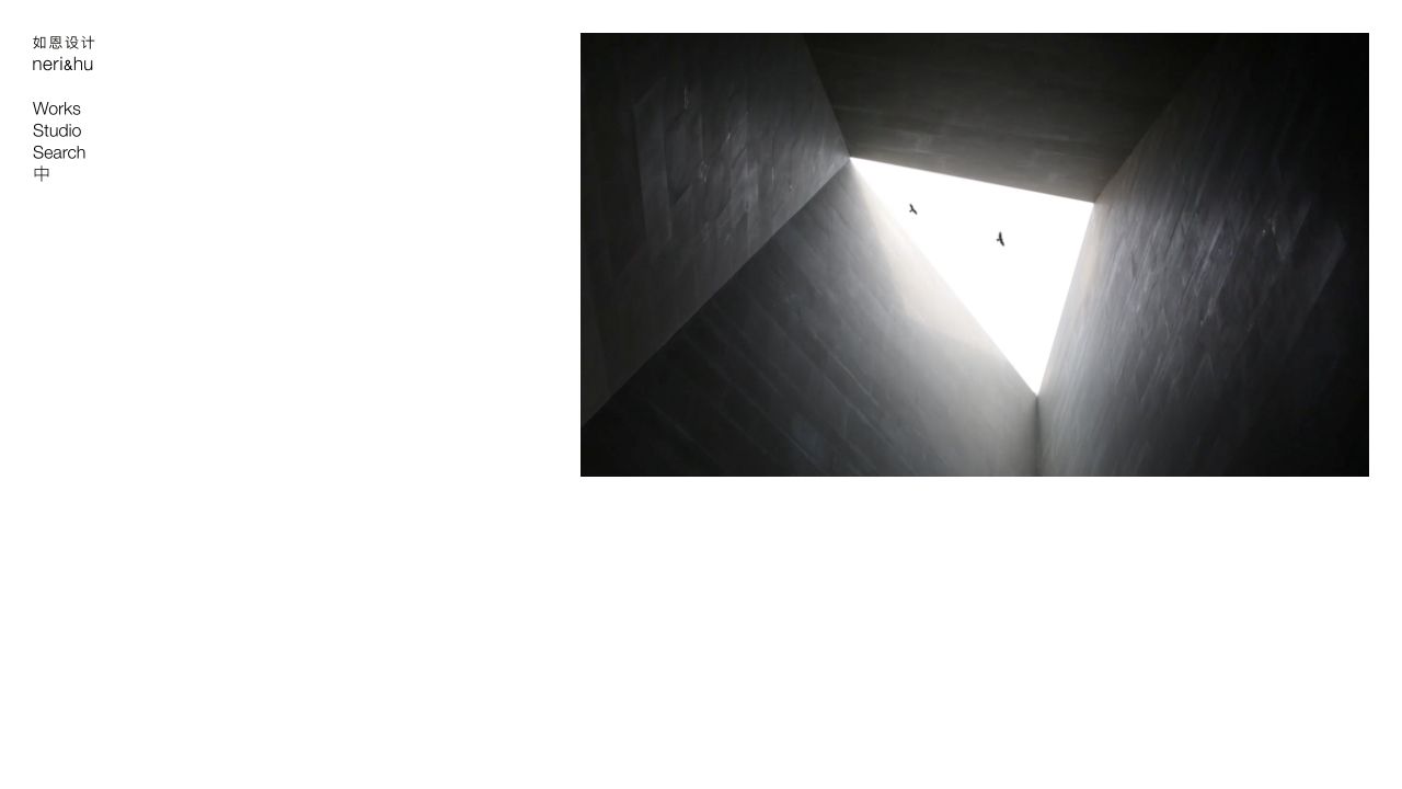
Neri&Hu places its bilingual identity and short left-hand navigation beside a large media area. The composition feels restrained even though the practice has a much deeper body of architecture, interior, and design work. Categories and alternative browsing modes can support that archive without forcing the homepage to list every project. A preserved named jQuery script supports the library observation. It does not show which archive controls use jQuery, and the additional public assets do not identify a complete content-management system.
What you can learn
For a legacy portfolio, treat category navigation, direct project links, and any index or map view as separate tasks with a shared content source. Maintain useful URLs and predictable back navigation. Add alternative views only when the size and diversity of the archive make them more helpful than a simple list.
Pros
The compact identity leaves the main media panel room to breathe.
A categorized archive can accommodate several design disciplines.
Cons & considerations
Multiple browsing modes introduce additional interaction states to maintain.
A small practice could inherit unnecessary complexity by copying the archive structure.
Visible tech stack
Referenced on the public page
jQuery
jQuery Migrate
Adobe Fonts
Earlier / documented evidence
Mapbox GL
Public source checked November 3, 2026. References may be embedded or legacy—not a complete backend inventory.
Platform source: Preserved public jQuery asset observation. The named page exposes this jQuery asset. Library presence does not identify which controls use it, establish a complete stack, or endorse the observed version. Platform evidence is separate from the direct website screenshot and is not a complete current infrastructure audit.
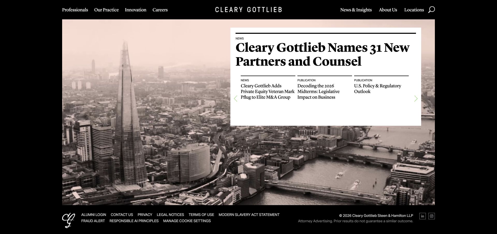
Cleary Gottlieb combines a black frame, desaturated city imagery, and white editorial panels rather than relying on a conventional full-screen slogan. News and publication areas are arranged with a front-page quality, using rules and typographic hierarchy to separate material. The visual system gives professional content a serious setting while keeping several routes visible. A named public jQuery library is recorded in the source evidence. The observation does not establish which search, navigation, or publication controls depend on it.
What you can learn
When updating a professional publishing site, identify the persistent shell and the varying editorial templates before changing scripts. Keep people, practices, news, and publication destinations available through normal links. Test a long title, a filtered list, and an empty result so the editorial frame remains useful outside the ideal homepage state.
Pros
Rules and contrast create structure without an excessive collection of card styles.
Several kinds of editorial material can coexist in one visual system.
Cons & considerations
Dense content needs careful spacing and order on smaller screens.
Subdued imagery may offer limited explanation to someone unfamiliar with the firm.
Visible tech stack
Referenced on the public page
jQuery
Public source checked November 3, 2026. References may be embedded or legacy—not a complete backend inventory.
Platform source: Preserved public jQuery asset observation. The named page exposes this jQuery asset. Library presence does not identify which controls use it, establish a complete stack, or endorse the observed version. Platform evidence is separate from the direct website screenshot and is not a complete current infrastructure audit.
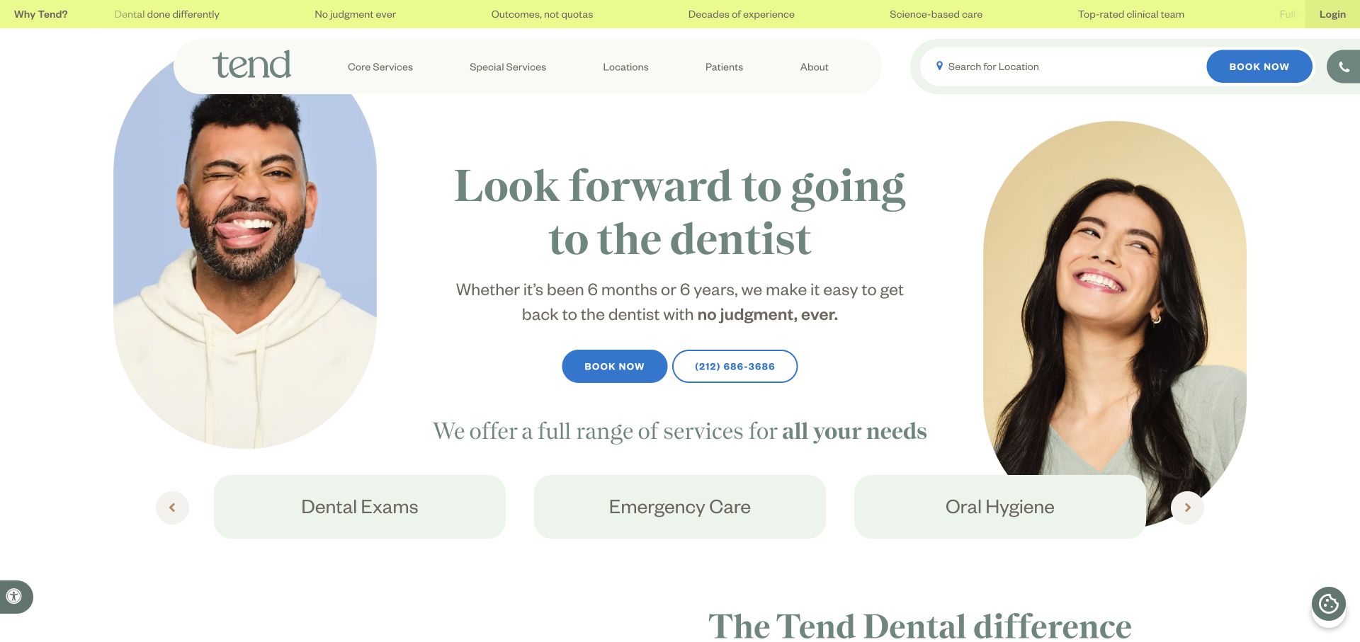
Tend Dental uses rounded portrait treatments, pale framing, and dark green serif typography to soften a service-led introduction. A location search and a contrasting blue booking action give visitors a practical route alongside the brand story. Service tiles begin below, creating a bridge from atmosphere to specific care categories. The page exposes a named jQuery asset through its delivery infrastructure. That establishes a visible dependency, not a claim about which booking or location controls use it, and not a statement about the people pictured.
What you can learn
For an existing service website, keep location selection, booking destinations, and explanatory content independent enough to test separately. A library upgrade should not silently change form focus, selection state, or third-party handoffs. Rehearse the journey for a visitor who knows their location and one who has not chosen it.
Pros
Location discovery and booking are visible before detailed service browsing.
The typography and rounded imagery create a consistent visual tone.
Cons & considerations
Portrait-heavy layouts need a sustainable image supply and suitable crops.
A connected booking journey can fail beyond the visible homepage.
Public source checked November 3, 2026. References may be embedded or legacy—not a complete backend inventory.
Platform source: Preserved public jQuery asset observation. The named page exposes this jQuery asset. Library presence does not identify which controls use it, establish a complete stack, or endorse the observed version. Platform evidence is separate from the direct website screenshot and is not a complete current infrastructure audit.
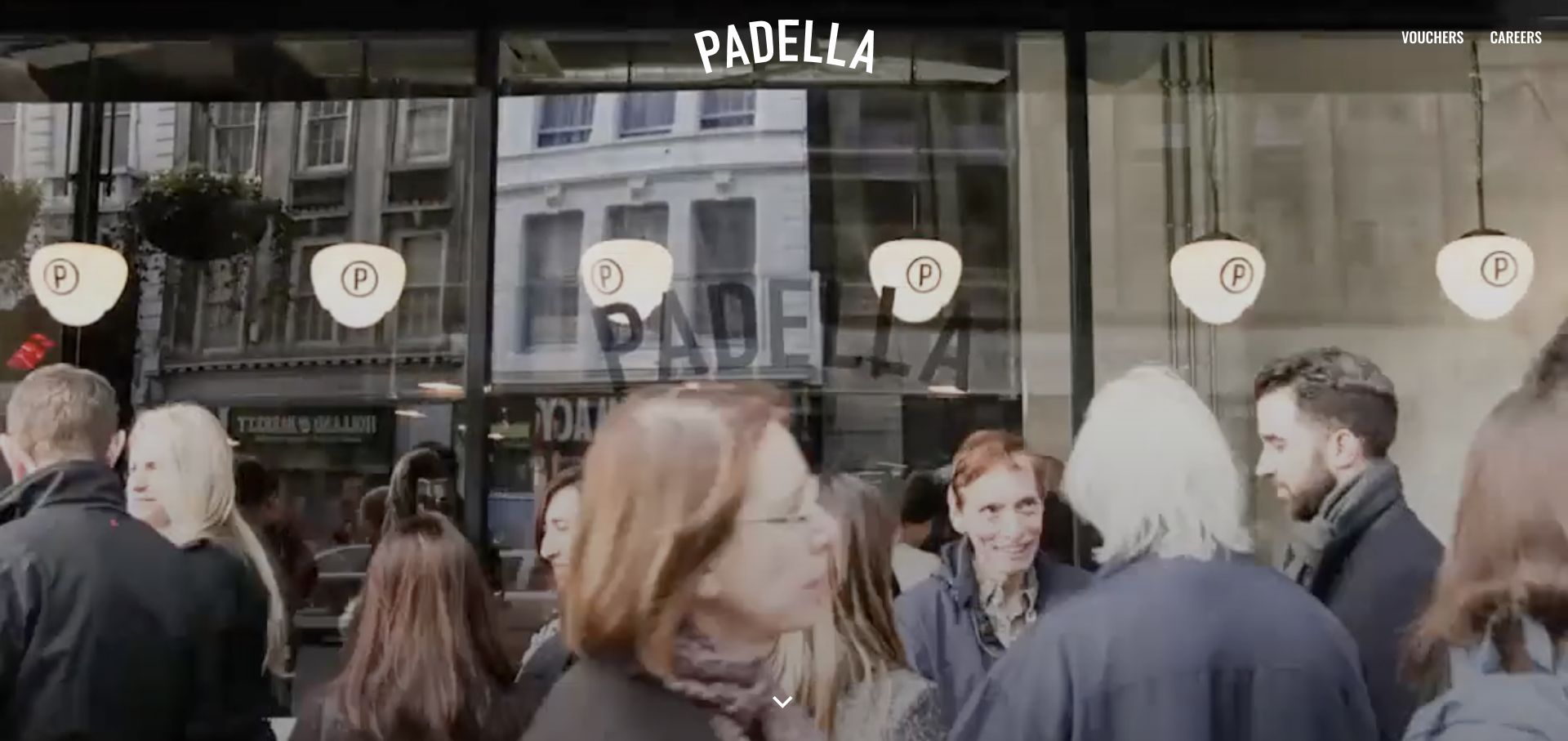
Padella’s homepage lets a street-window restaurant view carry most of the first screen. A white centered wordmark overlays the media, while smaller voucher and careers routes sit away from the main identity. Location information follows below rather than being expanded into a large introductory grid. The result is direct and atmospheric, with practical information distributed across the next part of the page. Public WordPress asset paths include a named jQuery core script. That does not prove the opening media or every navigation behavior is implemented with the library.
What you can learn
Preserve the restaurant’s practical routes while enhancing the atmosphere. Test how locations, menus, vouchers, and contact destinations are reached without waiting for media. For a jQuery-dependent site, a stable image fallback and ordinary links may matter more than reproducing the exact transition used in a reference.
Pros
The opening has a clear visual subject and restrained identity.
Smaller secondary routes do not become competing hero buttons.
Cons & considerations
Visitors with an immediate menu or address question must continue browsing.
Moving street imagery needs a useful nonmoving alternative.
Public source checked November 3, 2026. References may be embedded or legacy—not a complete backend inventory.
Platform source: Preserved public jQuery asset observation. The named page exposes this jQuery asset. Library presence does not identify which controls use it, establish a complete stack, or endorse the observed version. Platform evidence is separate from the direct website screenshot and is not a complete current infrastructure audit.
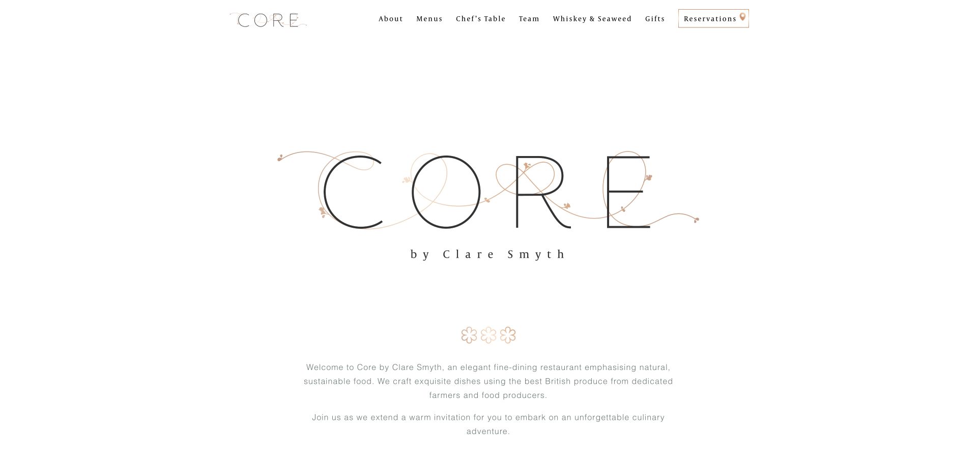
Core by Clare Smyth uses a broad white field, an elegant central wordmark, and restrained introductory copy. Compact navigation names and an outlined reservation control keep the interface deliberately light. The first impression depends more on typography and spacing than on a large collection of promotional cards. Public assets identify WordPress and Divi alongside a named jQuery core script, but this guide narrows its attribution to the observed library. Neither the reservation system nor the purpose of every script is established by that asset alone.
What you can learn
In a lightly styled hospitality interface, small interaction defects can become conspicuous. Test the reservation destination, menu opening, focus visibility, and text scaling before adding decorative effects. Keep custom handlers limited and document their dependencies so a theme or plugin update does not unexpectedly change the most important visitor task.
Pros
The reservation action is distinct without dominating the visual identity.
Generous white space gives fine typography a consistent setting.
Cons & considerations
Very delicate type and borders need contrast review at small sizes.
Sparse introductory content leaves practical dining details to deeper pages.
Public source checked November 3, 2026. References may be embedded or legacy—not a complete backend inventory.
Platform source: Preserved public jQuery asset observation. The named page exposes this jQuery asset. Library presence does not identify which controls use it, establish a complete stack, or endorse the observed version. Platform evidence is separate from the direct website screenshot and is not a complete current infrastructure audit.
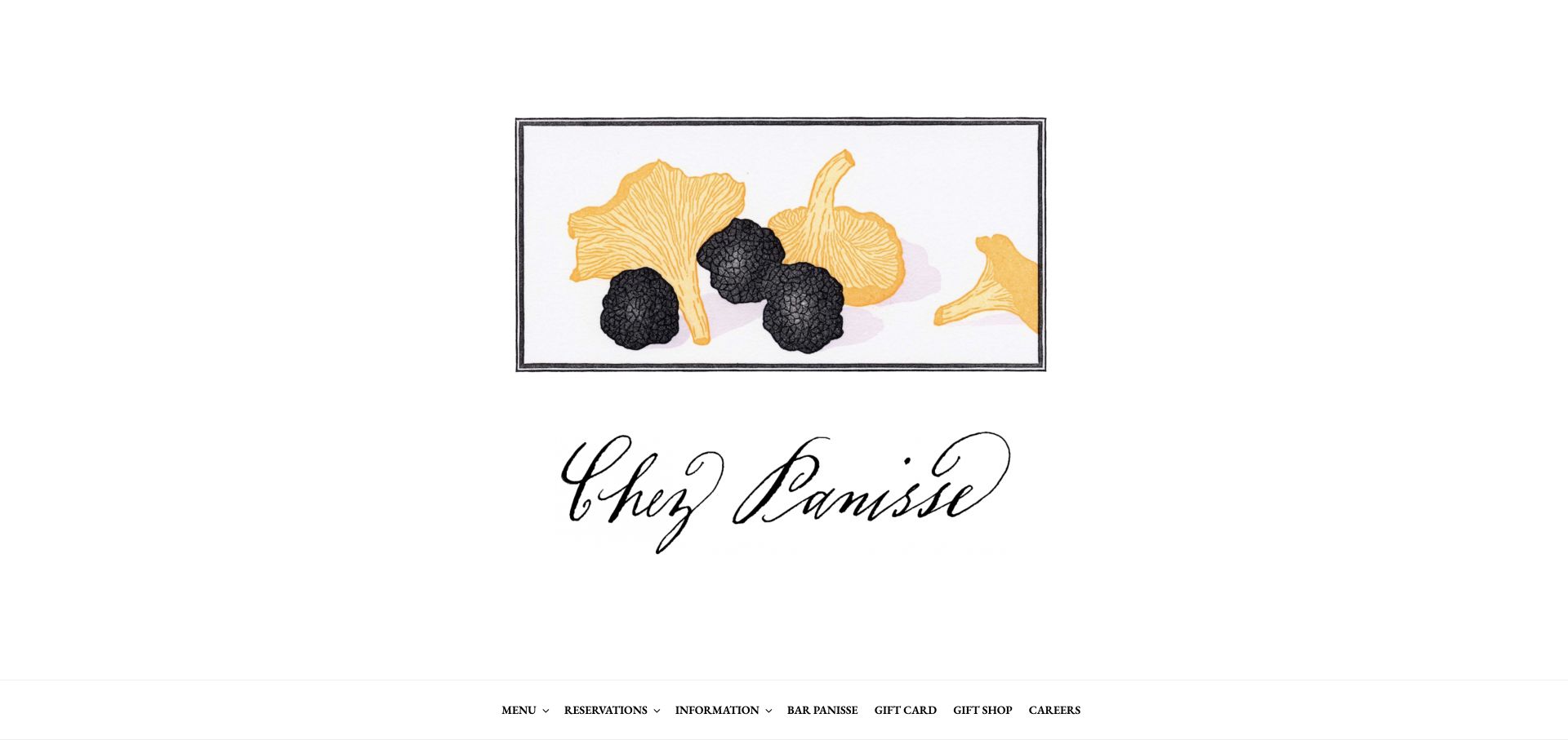
Chez Panisse frames its opening like an illustrated poster, combining ingredient artwork and a script-style identity on a white canvas. Practical navigation is organized below rather than being layered into the drawing. The distinction between restaurant and café gives the site a meaningful content division beyond the main artwork. Public source evidence includes a named jQuery core script, with other platform signals recorded separately in the shared catalog. The library’s presence does not establish which restaurant controls or commerce functions use it.
What you can learn
A distinctive illustrated opening can coexist with straightforward navigation. Preserve the separate dining routes, normal links, and clear page titles when improving an older frontend. If a plugin adds an interaction, test the same task with a keyboard and confirm the expected destination rather than treating the artwork as the whole experience.
Pros
The illustration creates identity without a generic hospitality photograph.
Restaurant and café information have a meaningful structural distinction.
Cons & considerations
The poster treatment offers limited immediate detail for a returning visitor.
Fine illustrative detail can become less informative at phone scale.
Public source checked November 3, 2026. References may be embedded or legacy—not a complete backend inventory.
Platform source: Preserved public jQuery asset observation. The named page exposes this jQuery asset. Library presence does not identify which controls use it, establish a complete stack, or endorse the observed version. Platform evidence is separate from the direct website screenshot and is not a complete current infrastructure audit.
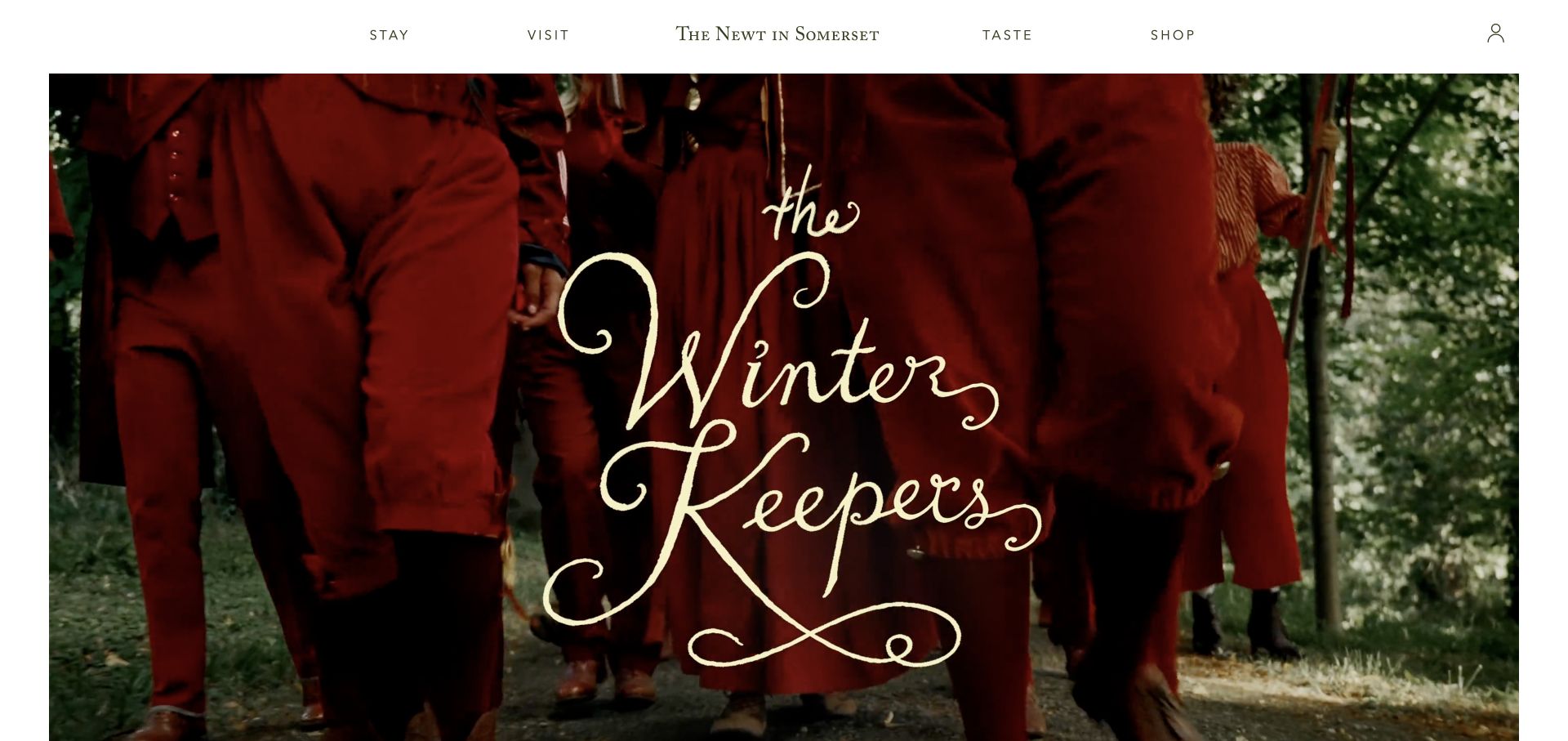
The Newt in Somerset uses a white header with a centered name and clear stay, visit, taste, and shop routes. Beneath it, an inset seasonal campaign brings saturated color and theatrical imagery into a restrained page frame. The header supplies a durable structure while the campaign changes the mood. The preserved source includes a named jQuery library. That supports the dependency observation only; it does not establish which navigation controls use it or identify the systems behind accommodation, tickets, and retail.
What you can learn
Treat each business journey as a separate destination with a common navigation shell. When changing a jQuery dependency, test the handoff to stay, visit, and shop experiences independently. Keep campaign media replaceable without altering essential header behavior, and avoid making a seasonal visual treatment the only explanation of the destination.
Pros
The main activity categories are concise and visibly separated.
An inset campaign frame keeps the site identity stable around changing imagery.
Cons & considerations
A broad estate offering requires clear distinctions after the first click.
Seasonal creative needs ongoing editorial work to remain relevant.
Public source checked November 3, 2026. References may be embedded or legacy—not a complete backend inventory.
Platform source: Preserved public jQuery asset observation. The named page exposes this jQuery asset. Library presence does not identify which controls use it, establish a complete stack, or endorse the observed version. Platform evidence is separate from the direct website screenshot and is not a complete current infrastructure audit.
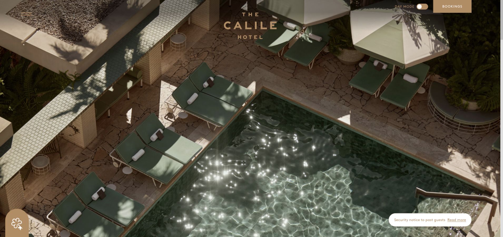
The Calile Hotel opens with an overhead pool composition: geometric edges, pale stone, and repeated lounge shapes create a strong visual pattern. The small central identity leaves the image dominant, while menu and booking routes occupy opposite corners. A mode control adds another visible interface element without becoming the main subject. The public page loads a named jQuery library alongside WordPress assets. Neither fact alone identifies which control uses the library, how availability is retrieved, or where the complete reservation system runs.
What you can learn
A minimal hotel opening still needs an explicit interaction contract. Test menu opening and closure, booking destination, focus return, and the behavior of any display-mode control. Keep the identity and practical routes legible across changing media and narrow crops rather than relying on one perfectly composed desktop photograph.
Pros
The image has an unusually coherent geometry and palette.
Menu and booking controls have distinct, stable positions.
Cons & considerations
Sparse copy gives first-time visitors little immediate location context.
Small controls over imagery need careful contrast and touch-target review.
Public source checked November 3, 2026. References may be embedded or legacy—not a complete backend inventory.
Platform source: Preserved public jQuery asset observation. The named page exposes this jQuery asset. Library presence does not identify which controls use it, establish a complete stack, or endorse the observed version. Platform evidence is separate from the direct website screenshot and is not a complete current infrastructure audit.
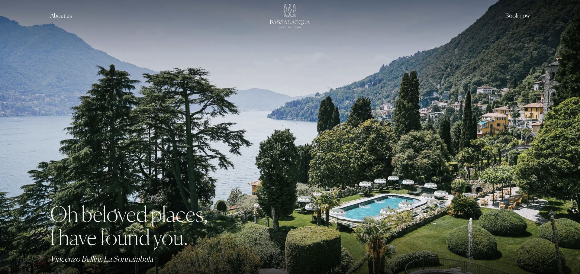
Passalacqua pairs a sweeping garden, pool, and lake view with a small centered crest and fine white typography. About and booking routes occupy the edges of the opening rather than competing with a large button group. A short literary line reinforces the atmospheric presentation. The imagery communicates setting more immediately than room information. A named jQuery asset appears in the preserved public evidence; the capture does not determine whether the image transition, navigation, or booking handoff uses that library.
What you can learn
If a hospitality site already depends on jQuery, define useful fallbacks around the visual opening before changing its effects. Booking must remain a real destination, and the menu needs predictable focus and closure behavior. Test the fine lettering against every supported image crop instead of assuming the reference composition is universally legible.
Pros
The landscape gives the introduction one coherent visual subject.
The crest and navigation remain restrained around the setting.
Cons & considerations
Fine white text depends on the image beneath it.
Room details and practical travel information are not immediate in the opening.
Visible tech stack
Earlier / documented evidence
jQuery
Earlier cited evidence retained; no current scan result. References may be embedded or legacy—not a complete backend inventory.
Platform source: Preserved public jQuery asset observation. The named page exposes this jQuery asset. Library presence does not identify which controls use it, establish a complete stack, or endorse the observed version. Platform evidence is separate from the direct website screenshot and is not a complete current infrastructure audit.
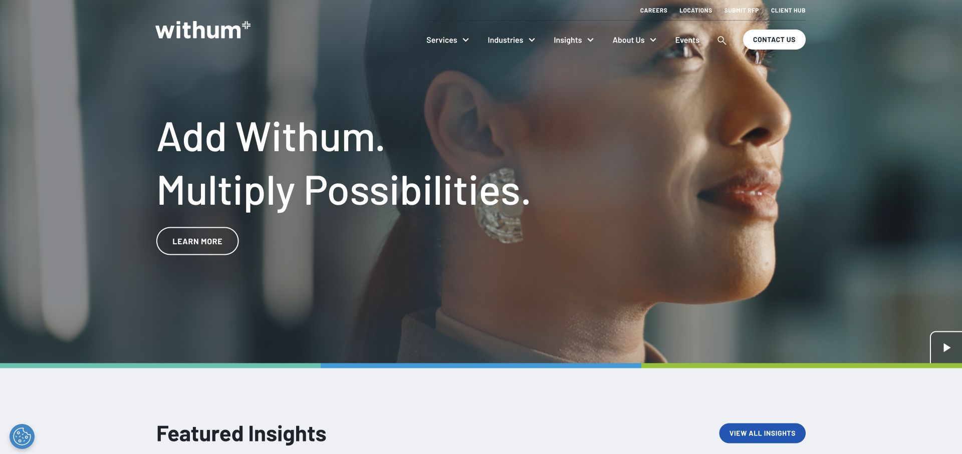
Withum places white campaign copy over a people-led film, using an outlined action rather than a large opaque card. Its header separates services, industries, and insights from client-oriented utilities such as access and payments. A visible pause control and a multicolor line give the opening additional structure. The public page includes a named jQuery core asset in its WordPress paths. That establishes a dependency on the selected page, not the implementation of its film controls, client tools, or request workflow.
What you can learn
For professional services, distinguish prospect browsing from existing-client tasks before enhancing the interface. A script change should be checked against both journeys. Keep the pause control understandable, preserve normal service links, and test a page without the campaign film so the navigation does not depend on its timing or dimensions.
Pros
Service exploration and client utilities have different places in the header.
The film includes a visible control rather than being entirely decorative motion.
Cons & considerations
White copy over changing footage needs ongoing contrast review.
A broad service taxonomy can become crowded when the desktop header compresses.
Public source checked November 3, 2026. References may be embedded or legacy—not a complete backend inventory.
Platform source: Preserved public jQuery asset observation. The named page exposes this jQuery asset. Library presence does not identify which controls use it, establish a complete stack, or endorse the observed version. Platform evidence is separate from the direct website screenshot and is not a complete current infrastructure audit.
Armanino uses a gold-toned resource campaign, large serif type, and a prominent checklist-style subject to introduce a specific piece of content. The header provides solutions, people, resources, and company routes, while utility destinations and search remain available above or beside them. The page also has competing interface elements such as chat. A public asset path names jQuery in a form-related directory. That is evidence of the library’s inclusion, not a conclusion about the complete CMS, form behavior, or every visible component.
What you can learn
An incremental frontend review should inventory competing controls before adding another widget. Give search, inquiry, client utilities, and chat clear priorities, then test their keyboard and narrow-screen behavior together. A named form-library dependency warrants regression tests for actual validation and submission states rather than an assumption that the form is complete.
Pros
The campaign promotes a concrete resource instead of only a broad brand claim.
Search and client-oriented utilities have visible destinations.
Cons & considerations
Light text over the gold treatment needs careful contrast review.
Chat and multiple utility controls can distract from the main resource.
Visible tech stack
Earlier / documented evidence
jQuery
Earlier cited evidence retained; no current scan result. References may be embedded or legacy—not a complete backend inventory.
Platform source: Preserved public jQuery asset observation. The named page exposes this jQuery asset. Library presence does not identify which controls use it, establish a complete stack, or endorse the observed version. Platform evidence is separate from the direct website screenshot and is not a complete current infrastructure audit.
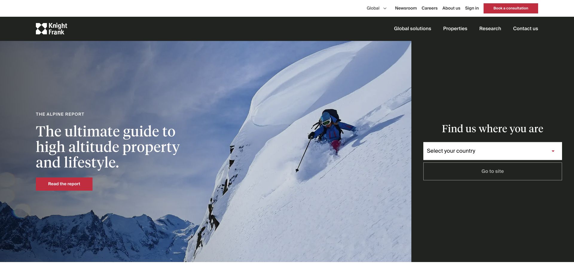
Knight Frank splits its opening between a large report-led image and a narrower dark geographic-choice area. A white masthead keeps solutions, property, research, and contact routes visible, with an additional utility layer above. The composition recognizes that a global visitor may first need the right market rather than a particular property listing. The preserved source names a jQuery asset in a forms-related path. Its presence does not identify the implementation of the country selector, property search, or every regional website.
What you can learn
Define geographic choice as a real navigation task, including the selected destination and how someone changes it. In a jQuery maintenance project, test dropdown focus, closure, empty options, and normal-link alternatives. Keep research browsing separate from market selection so one enhancement does not obscure the other.
Pros
The geographic task has a distinct visual area.
Research and service routes remain visible outside the campaign.
Cons & considerations
The split composition can leave the campaign and selector competing for attention.
Global and regional destinations need clear labels and return paths.
Public source checked November 3, 2026. References may be embedded or legacy—not a complete backend inventory.
Platform source: Preserved public jQuery asset observation. The named page exposes this jQuery asset. Library presence does not identify which controls use it, establish a complete stack, or endorse the observed version. Platform evidence is separate from the direct website screenshot and is not a complete current infrastructure audit.
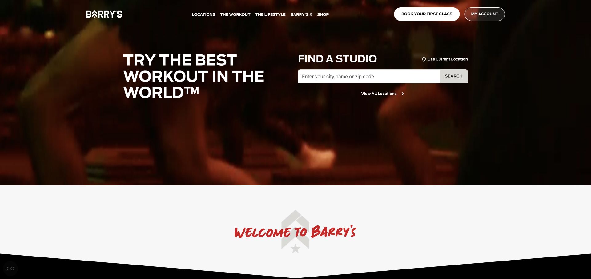
Barry’s combines dark workout imagery and a red brand accent with a large white studio-search surface. First-class and account routes are treated as different tasks, while a curved white transition separates the opening from subsequent content. The visual energy of the campaign is balanced by an immediate location question. Public source evidence records both Webflow delivery and a named jQuery library. This review attributes the library’s presence only; it does not establish which search controls use it or the platform behind bookings.
What you can learn
For a location-led service, make the studio choice understandable before adding visual effects. Test empty search results, keyboard selection, and the handoff to a specific location. If a builder or plugin manages the dependency, document that ownership before adding a second script or replacing the core library manually.
Pros
The white studio control has a clear contrast surface.
New-visitor and existing-account routes are visibly different.
Cons & considerations
Energetic moving media needs a calmer alternative.
The booking experience may continue into a separate system that needs its own testing.
Public source checked November 3, 2026. References may be embedded or legacy—not a complete backend inventory.
Platform source: Preserved public jQuery asset observation. The named page exposes this jQuery asset. Library presence does not identify which controls use it, establish a complete stack, or endorse the observed version. Platform evidence is separate from the direct website screenshot and is not a complete current infrastructure audit.
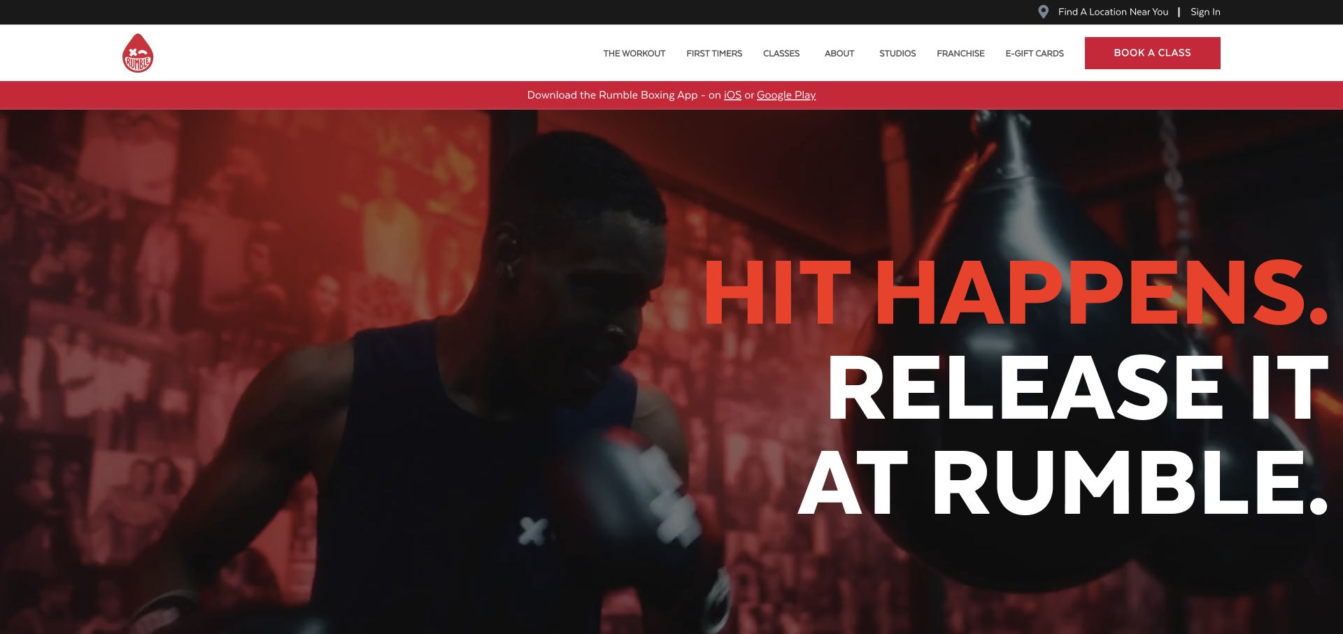
Rumble Boxing uses enormous red-and-white stacked type over workout footage, with a solid white navigation area and a contrasting class action. A dark utility row carries location and sign-in tasks, while an app promotion adds another red element to the opening. The result is deliberately forceful, but several visitor goals share a compact area. The public page exposes a named jQuery asset alongside HubSpot metadata. An observed older script is not a recommendation to use that version or evidence that it powers every visible control.
What you can learn
Treat this as a maintenance and interaction reference, not a dependency recipe. Inventory the builder-managed scripts and custom handlers, check current support guidance, and test location choice and class handoffs through their full states. Preserve an understandable static heading and pauseable media when the brand’s visual treatment relies heavily on movement.
Pros
The class action remains distinct from the large promotional headline.
Location and sign-in utilities are separated from the main content.
Cons & considerations
Very large type and multiple promotional layers can crowd smaller screens.
Older dependencies require an explicit compatibility and maintenance review.
Public source checked November 3, 2026. References may be embedded or legacy—not a complete backend inventory.
Platform source: Preserved public jQuery asset observation. The named page exposes this jQuery asset. Library presence does not identify which controls use it, establish a complete stack, or endorse the observed version. Platform evidence is separate from the direct website screenshot and is not a complete current infrastructure audit.
Improve, upgrade, or replace an existing dependency
Enhance a stable existing site incrementally
A small, well-understood improvement can be appropriate when the current site and plugins are maintainable. Keep the change bounded, document the selectors and events it relies on, and test it across the real page templates.
Plan an upgrade around the actual dependency graph
Check current support guidance, plugin compatibility, and custom code before changing a core asset. Use a test environment and a rollback plan. Old script versions visible in these captures are observations, not endorsements.
Native browser capabilities or a broader frontend rebuild may remove a dependency, but a rewrite also carries cost and regression risk. Specify what will be removed, what takes over, and which journeys must remain unchanged.
From references to requirements
Plan a safe interaction and dependency review
Map the controls and their owners
List menus, dialogs, forms, media controls, filters, and any third-party widgets. Identify which code owns each behavior before attaching another listener to the same element. Avoid two systems competing to update the same interface state.
Choose representative pages for regression testing
Include a homepage, long content page, listing, detail page, form, and a narrow-screen menu. Test repeated use and navigation back to a page, not only a fresh load. Record the expected focus and URL behavior.
Make the maintenance decision explicit
Decide whether the project is a short-term repair, a supported upgrade, or a broader rebuild. Name the owner of CMS updates and plugin changes so a future release does not silently undo the work.
A useful handover demonstration
Ask the actual team to carry out its routine job: publish a realistic update, correct a mistake, preview a narrow screen, and identify who owns an integration failure. For a library or frontend framework, also ask who maintains the content source and deployment. A polished screenshot does not answer those operational questions.
Beyond the screenshot
A jQuery-dependent website maintenance checklist
Inventory core, plugins, custom handlers, and duplicate library loads.
Review the current support policy rather than copying an example version.
Test staged upgrades and compatibility warnings in development.
Exercise keyboard focus, closure, and repeated interaction states.
Check forms, validation errors, and asynchronous failures.
Verify that meaningful content and destinations remain understandable.
Test every representative template after CMS or plugin updates.
Document removed code, remaining dependencies, ownership, and rollback.
Test with real content, a keyboard, a small screen, slow or failed requests, and the people who will maintain the system. These are planning checks, not an accessibility, security, performance, or search-ranking certification.
Sources & editorial method
How this jQuery collection was reviewed
The target evidence is a public jQuery script asset, including explicit core paths preserved in the source records. Its presence does not identify which controls execute jQuery, prove the library is needed, or establish that the version shown is supported.
Every image is an unmodified capture from the actual website, with its source and capture date. Some captures are reused from our shared catalog; their dates remain the original capture dates. None comes from a vendor gallery or a generated reconstruction. Moving imagery and live content can change.
Technology attribution uses public page assets or metadata, official platform documentation, or a cited first-party project case study. Documentary and framework-relationship evidence is identified where used; it is not a complete current backend inventory. A CMS image CDN alone does not establish a full CMS deployment. A library’s presence does not prove which individual controls use it, and a platform label does not establish AI authorship.
The composition notes, lessons, pros and tradeoffs are original editorial observations. We have not measured conversion, traffic, security, performance or accessibility conformance. Website owners retain their brands and imagery; these examples are not our client portfolio. Written, Edited and Curated are independent records, not dates advanced by a build. See our editorial standards or suggest a correction.
Questions worth asking
jQuery website development FAQs
Were these websites built entirely with jQuery?
That is not what the evidence says. jQuery is a library within a larger website. The collection establishes a public dependency, not a complete implementation inventory.
Should I use the script version visible in an example?
No. Treat it as a dated observation. Check current support and upgrade documentation, along with your actual plugin and CMS compatibility.
Is removing jQuery always the best redesign strategy?
No universal answer follows from its presence. Compare maintenance, dependency compatibility, regression risk, and the site’s actual requirements.
Does the carousel in a screenshot use jQuery?
Not necessarily. The review does not assign individual behaviors to the library without specific implementation evidence.