A theme park website has to sell the feeling of a day out and explain how that day will work. Keep operating dates, ticket scope, attraction suitability and arrival information easy to find beneath the seasonal campaign.
Visitors arrive with different intentions: checking whether the park is open, choosing a day ticket, comparing a pass, researching rides or arranging a hotel stay. Those tasks should remain recognizable when the homepage changes from a summer attraction launch to Halloween or Christmas. A strong campaign gives people a reason to visit; a stable planning structure helps them act on that interest.
These fourteen public websites show several ways to balance those demands, from cinematic resort gateways to direct booking panels and practical admission explanations. The reviews describe the pages observed and their design tradeoffs. They do not verify ride safety, accessibility suitability, ticket availability, promotional eligibility or booking completion. Offers and operating schedules in screenshots are historical observations, not current purchasing advice.
Before the examples
What makes good theme park website design in 2026?
Separate operating status from campaign dates
Show today’s status and a link to the full calendar even when the hero promotes a future event. State which park, water park or attraction each schedule covers. Give special events their own date range, entry arrangements and closure information, with an owner responsible for updating every affected page.
Explain what each ticket includes
Distinguish day admission, annual passes, separately ticketed events and hotel packages before asking for dates. Explain parking, reservation requirements, age categories and major exclusions beside the relevant option. A promotional headline should lead to an understandable product comparison rather than forcing visitors to infer the scope from a price.
Make suitability information part of planning
Create structured attraction records for published height restrictions, ride characteristics, access arrangements and temporary closures. Use the park’s approved information and link to detailed guidance. Families should be able to plan around their needs without treating an evocative ride name or photograph as a substitute for practical information.
The collection · 14 examples
14 theme park websites worth studying
Compare where each site places its operating calendar, how it separates tickets from overnight packages, and whether a seasonal story leads to an understandable next action. Notice how media, overlays and persistent booking bars affect the available reading space.
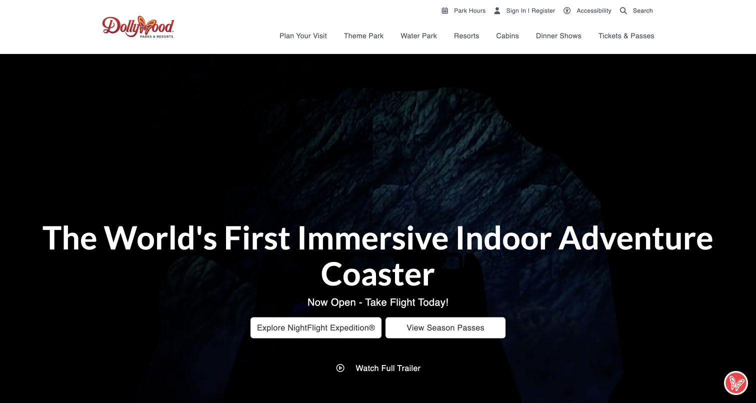
Dollywood gives a single new attraction almost the entire first screen, with a dark cinematic background and a large headline about the indoor adventure coaster. Two adjacent actions separate learning about NightFlight Expedition from viewing season passes. Above that campaign, a restrained white header keeps the larger resort understandable: theme park, water park, resorts, cabins and dinner shows remain distinct destinations. Park hours and accessibility are available in the utility row, so the immersive story does not entirely replace practical preparation.
What you can learn
Use a new attraction to create a strong opening story, then connect it to clearly different next steps. Keep the permanent park and accommodation categories outside the campaign artwork so returning guests can bypass the launch material.
Pros
The attraction and season-pass buttons express different visitor intentions without requiring a menu search.
Persistent resort categories accommodate guests planning more than a single park day.
Cons & considerations
A very tall moving hero postpones the rest of the resort choices below the opening view.
Several lodging and entertainment categories need clear detail pages to prevent overlap during trip planning.
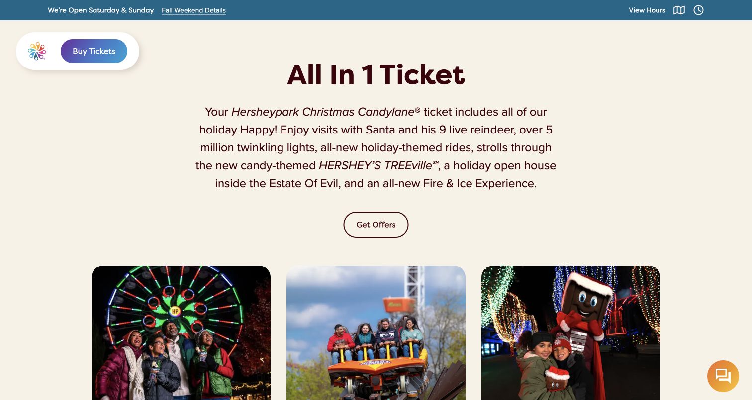
Hersheypark follows its seasonal introduction with an unusually direct All In 1 Ticket section. A centered paragraph explains the holiday experiences included, then rounded photographic cards move into family bundles, the core park and Christmas Candylane. The saved view captures this explanatory section rather than the large opening media area, which did not display reliably during this visit. A compact sticky logo and Buy Tickets control remain available while reading. The site makes the scope of admission part of the sales story instead of leaving every inclusion to checkout.
What you can learn
Before presenting a seasonal package, explain what ordinary admission already covers. Keep the explanation concise enough to scan and give separately priced experiences their own explicit treatment; a persuasive bundle still needs boundaries that visitors can understand.
Pros
The inclusion paragraph provides context for the promotional cards that follow it.
A compact purchase control stays available without repeating the entire desktop navigation.
Cons & considerations
The main media area was blank in this review session, making its fallback behavior a useful testing priority.
Long seasonal inclusion copy needs careful shortening and structure for readers on small screens.
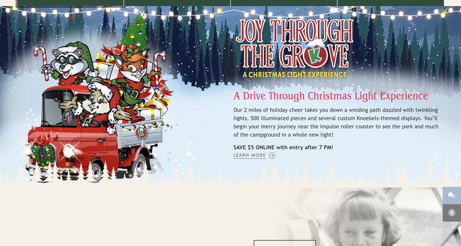
Knoebels places calendar, pricing, events and FAQs into four plainly named planning shortcuts. The pricing description immediately distinguishes pay-per-ride ticket books from unlimited rides, an important explanation for a park whose admission model differs from a conventional all-inclusive ticket. Farther down, the Joy Through the Grove section uses illustrated characters, winter scenery and a specific drive-through description to introduce a separate seasonal experience. The saved screenshot shows that section; the opening media and header area were not reliably rendered in this session.
What you can learn
Explain an unfamiliar admission model in the navigation context, before someone enters a purchase flow. Give a seasonal event its own description of how guests actually participate, especially when it is a drive-through experience rather than an ordinary park visit.
Pros
Pricing is described in everyday language directly beside other essential visit information.
The seasonal section states the physical format of the experience instead of relying only on festive artwork.
Cons & considerations
The opening blank area observed here makes a resilient media fallback especially important.
Campaign artwork contains substantial decorative text, so equivalent readable page text needs to remain available.
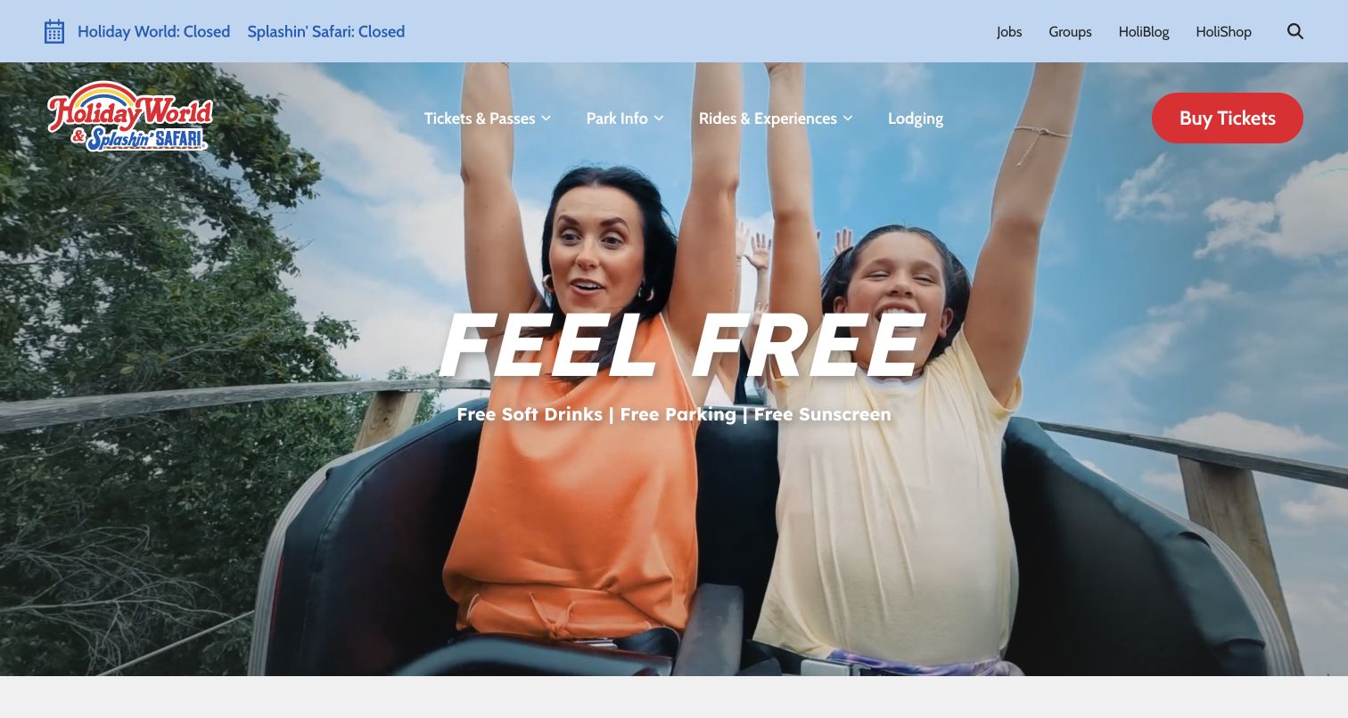
Holiday World combines energetic family ride footage with the short Feel Free headline. Immediately underneath, the page names free soft drinks, free parking and free sunscreen, turning the broad brand idea into concrete visit benefits. The pale blue utility bar reports the operating status of both Holiday World and Splashin’ Safari separately. The main navigation then divides tickets, park information, rides and experiences, and lodging, with a prominent red Buy Tickets button. This hierarchy makes the two-park identity visible without asking the hero to explain every attraction.
What you can learn
Connect an emotional promise to a short list of precise inclusions visitors can verify. When two facilities share a website, display each operating status independently and carry that distinction into schedules, tickets and closure notices.
Pros
The benefit line gives the large brand headline an immediate practical meaning.
Separate park statuses help visitors avoid assuming that the water park shares every operating day.
Cons & considerations
White hero text crosses changing footage, so contrast needs checking across the entire video.
The broad rides-and-experiences category needs useful subdivision for families comparing suitability and restrictions.
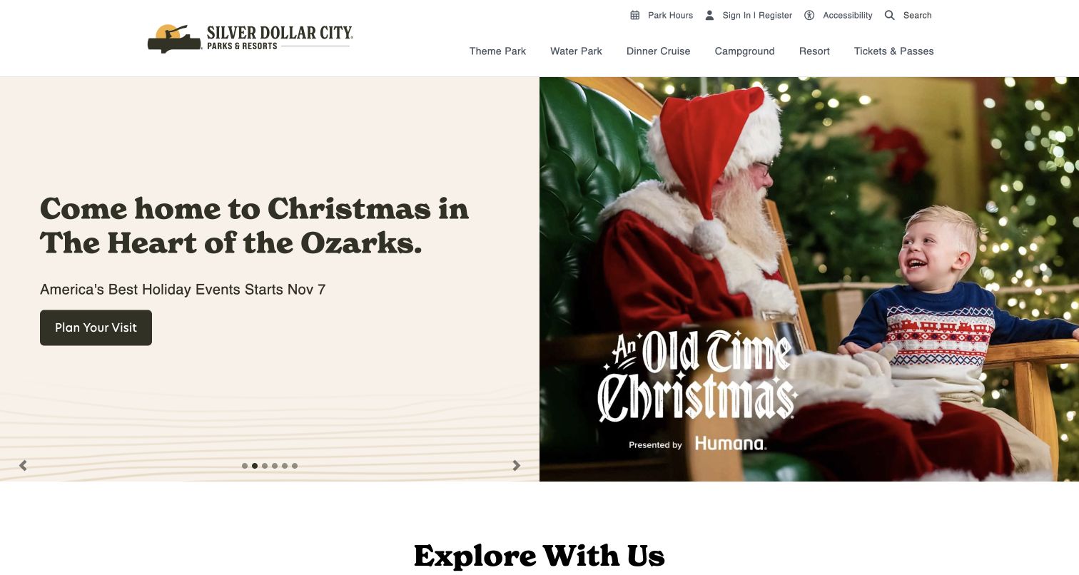
Silver Dollar City uses a warm split layout for its Christmas campaign: a cream text panel explains the season while a large photograph of Santa greeting a child supplies the emotional context. The campaign includes a start date and a Plan Your Visit button rather than treating the image as a complete explanation. A stable header separates the theme park, water park, dinner cruise, campground and resort. That combination allows one seasonal story to lead while acknowledging that the brand covers several different kinds of visit.
What you can learn
Build seasonal campaigns from separate text, dates, imagery and action fields so the artwork can change without obscuring the planning facts. For a multi-experience resort, retain recognizable product categories throughout the year, including during a highly specific holiday campaign.
Pros
The split hero gives the campaign copy a calm, predictable reading surface.
A stated season start and visit-planning action connect the festive image to a real next step.
Cons & considerations
A rotating hero can hide other campaigns unless its controls and timing are carefully considered.
Cruises, camping and park admission require distinct booking explanations despite sharing the same umbrella brand.
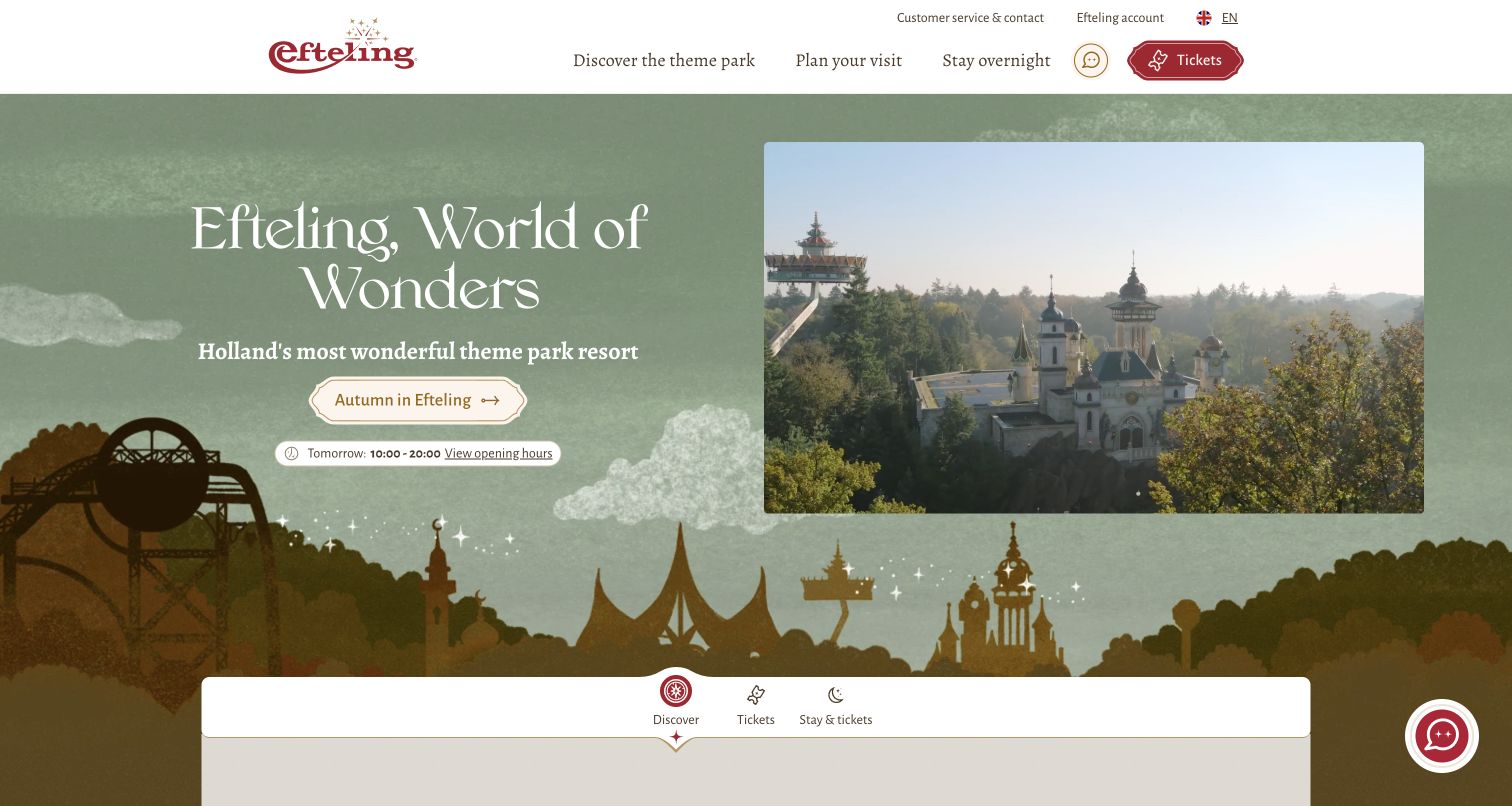
Efteling carries its fairytale character through an illustrated pale-green landscape, distinctive red branding and the World of Wonders headline. The opening area pairs that imaginative frame with a direct tomorrow-hours chip and an autumn exploration button. A substantial park image sits beside the text rather than covering every surface. Beneath it, the planning module separates discovery, tickets and a stay with tickets. The header similarly keeps discovering the park, planning a visit and staying overnight as different tasks, with language and support controls readily identifiable.
What you can learn
Let the visual identity establish the destination while practical controls answer the next question. Separate exploration from booking, and make the difference between a day ticket and an overnight package apparent before asking for dates or party details.
Pros
The illustrated environment feels connected to the park without making the text compete with busy photography.
Hours and booking choices appear early enough to serve visitors who already know the brand.
Cons & considerations
A tomorrow-hours cue does not replace a complete calendar for guests arranging a trip farther ahead.
Several parallel discovery and planning routes need consistent terminology to avoid sending visitors in circles.
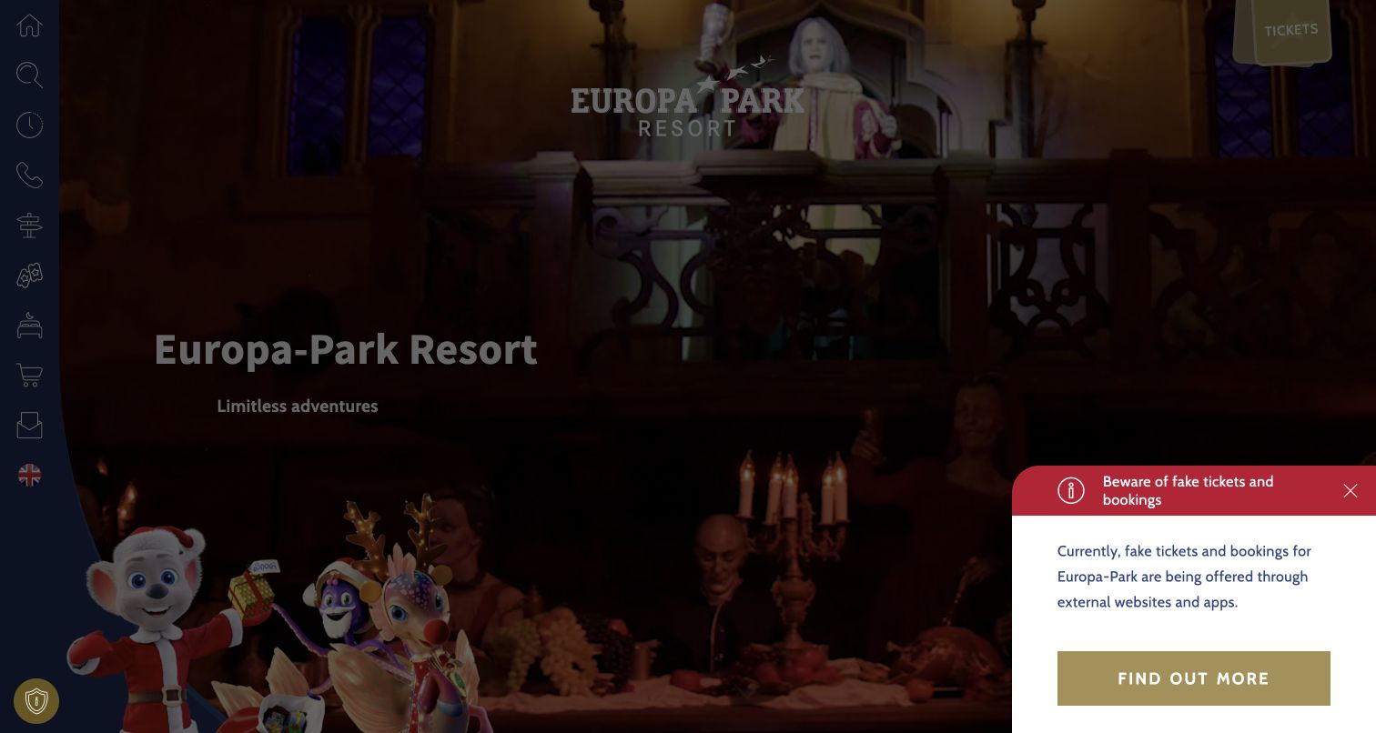
Europa-Park uses a full-screen video presentation to introduce the resort, with its logo above a short Limitless adventures message. Instead of a conventional horizontal menu, a narrow left rail holds controls for areas, search, hours, contact, arrival, tickets and accommodation. A separate ticket ribbon remains visible at the upper right. During this review a prominent warning about fake tickets and bookings also occupied the lower corner, appropriately interrupting the promotional atmosphere with practical purchasing guidance. The page presents a resort-level starting point rather than a single park itinerary.
What you can learn
A compact icon rail can preserve space for imagery, but every control still needs a clear label and a predictable expanded state. Treat urgent purchasing guidance as real content, and ensure it does not conceal essential navigation on smaller displays.
Pros
Hours, arrival and ticket controls remain grouped together despite the immersive presentation.
The fraud notice gives visitors a direct reason to verify the official booking route.
Cons & considerations
Icon-led navigation places more interpretation work on a first-time visitor than plainly visible text categories.
The advisory and cinematic background compete for space and require careful responsive layout checks.
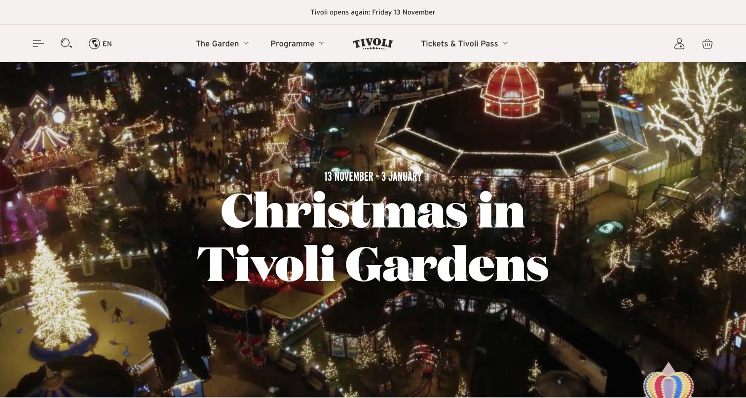
Tivoli places its next opening date in a slim strip above the main navigation, then lets a large nighttime photograph carry the Christmas campaign. The white serif title and visible date range sit over illuminated buildings and gardens. The cream navigation distinguishes the garden, programme and ticket or pass choices, while search, language and account controls remain separate. Below the campaign, the page introduces the Copenhagen destination and individual seasonal activities. The opening status and campaign period answer different questions and are both given visible space.
What you can learn
Publish operating status separately from campaign dates. A visitor should be able to tell whether the attraction is open today even when the homepage promotes a future season; the event story can then explain why to come back.
Pros
The reopening strip provides immediate operational context before the festive imagery.
The programme category acknowledges that many visitors arrive for a particular event rather than a generic park day.
Cons & considerations
Text over a detailed night scene needs contrast checks across responsive crops.
Seasonal dates and operating schedules must be updated together to avoid contradictory planning information.
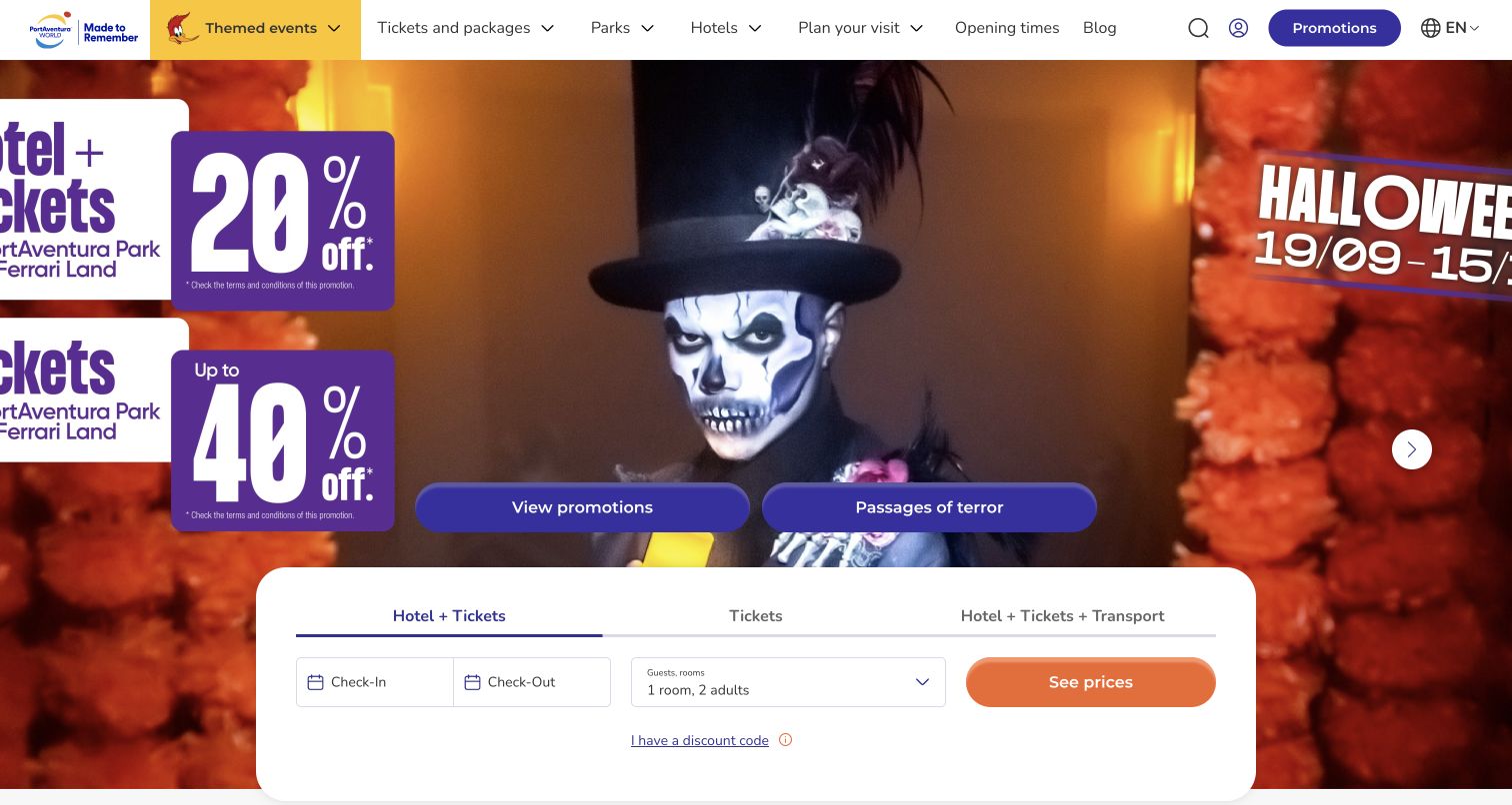
PortAventura World places a bright seasonal campaign above a large white booking module. The module explicitly divides Hotel + Tickets, Tickets, and Hotel + Tickets + Transport, so package scope is chosen before the date and party fields. Purple actions and orange price-search controls create a recognizable commercial hierarchy, while opening times and planning links remain in the header. The captured campaign uses substantial promotional text inside its artwork; at this desktop crop some edge content extends beyond the visible image area. This is a useful example of complex product selection attached to high-energy advertising.
What you can learn
Ask visitors to choose the type of trip before collecting fields that only some packages require. Keep the essential offer, dates and conditions in live text outside campaign artwork so responsive cropping cannot remove information needed to interpret a promotion.
Pros
Separate booking tabs make the included transport distinction visible at the start.
The white form panel gives date and guest controls a stable surface against busy seasonal imagery.
Cons & considerations
Promotional text embedded in the hero artwork is vulnerable to cropping at different screen shapes.
Multiple discounts and package options can overwhelm visitors unless conditions are explained near the relevant selection.
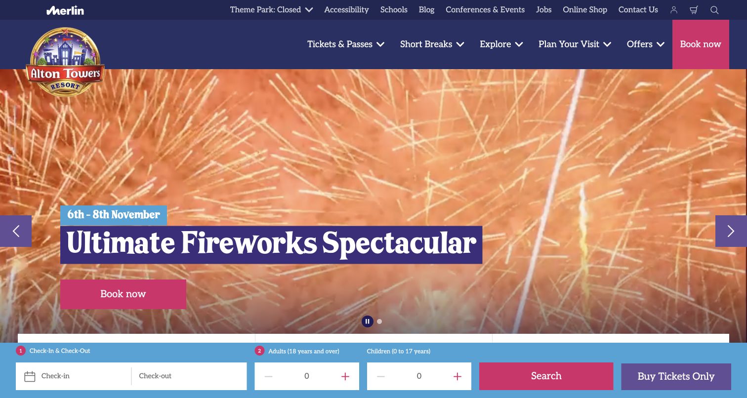
Alton Towers leads with its Ultimate Fireworks Spectacular campaign, placing a short date range in a bright pill and the main event title on a contrasting purple panel. A magenta Book Now button sits inside the hero. The utility area reports that the theme park is closed at the time of review, while the bottom booking strip offers check-in, check-out and party fields alongside a tickets-only alternative. The design therefore serves both an event-motivated visitor and a guest considering a longer stay, though those intentions share a crowded first screen.
What you can learn
Give an event a specific date and dedicated action, then keep the overnight option distinct from admission alone. A persistent planner should help an interested visitor continue without implying that every event requires a hotel booking.
Pros
The date pill makes the campaign timing easy to identify separately from the decorative title.
A visible tickets-only alternative prevents the hotel form from becoming the sole apparent next step.
Cons & considerations
The sticky planner takes space from the campaign and needs testing on short and narrow viewports.
Current closure status and a future event promotion require careful wording so visitors understand both correctly.
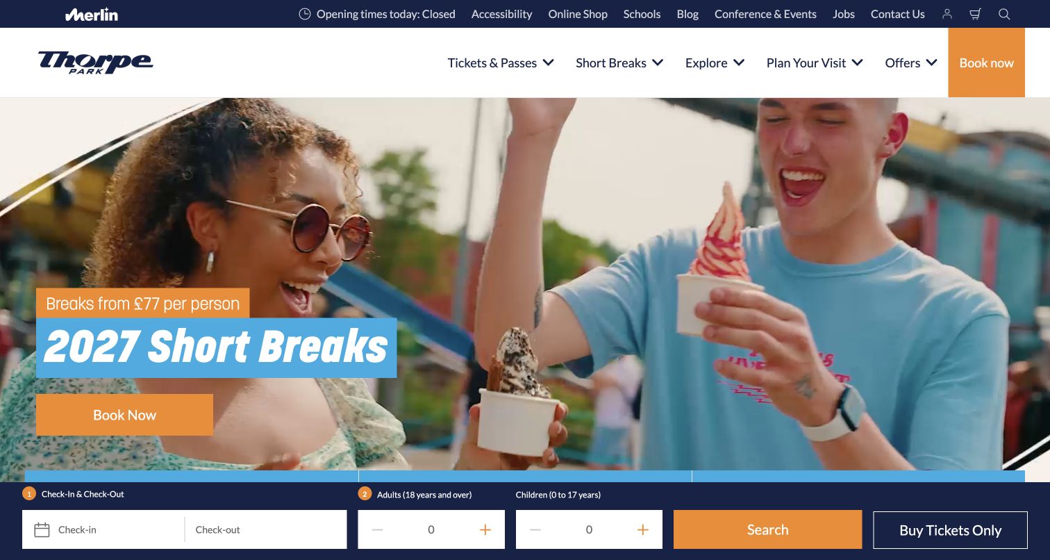
Thorpe Park uses a friendly photograph of visitors enjoying ice cream to introduce its short-break offer. The large cyan text panel, starting-price treatment and orange booking action sit beneath a restrained white navigation bar. The utility row reports the park’s current operating status, and a persistent booking strip supplies hotel dates and party controls with a Buy Tickets Only option. Below the opening campaign, the site returns to the distinct choices of short breaks, day tickets and annual passes. The page sells a broader trip while retaining several admission intentions.
What you can learn
When promoting accommodation, keep an equally understandable route for visitors who only need park entry. Make any starting-price qualification and package inclusions available before the date search, and retain an ordinary ticket comparison below the campaign.
Pros
The tickets-only route acknowledges the visitor who does not need an overnight stay.
Day tickets and annual passes remain recognizable choices beyond the short-break hero.
Cons & considerations
A hotel-first opening can make a simple day visit feel secondary unless the alternative remains prominent.
Starting-price messaging needs nearby eligibility and inclusion details to support meaningful comparison.
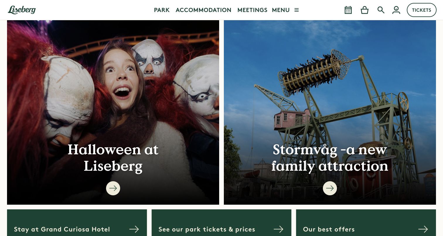
Liseberg divides the main visual area into two large adjacent image tiles: one introduces Halloween, while the other presents the Stormvåg family ride. Serif titles and circular arrow controls give each tile a similar visual weight. The cream-and-green header separates the park, accommodation and meetings, with calendar, account and ticket utilities nearby. Three green shortcuts beneath the images lead toward the hotel, park ticket prices and offers. This structure lets a current seasonal campaign and a new attraction coexist without asking visitors to wait for a carousel to rotate.
What you can learn
Use a small number of equal-weight tiles when two stories genuinely deserve the opening screen. Follow them with practical shortcuts that remain useful after the campaigns expire, and test that each image crop still explains its subject on a phone.
Pros
Both featured stories are visible at once, making comparison and discovery immediate.
The planning shortcuts translate the visual introduction into recognizable ticket and hotel tasks.
Cons & considerations
Equal emphasis can leave an uncertain visitor without a single obvious recommended next step.
A two-column composition needs deliberate stacking and image crops on narrow screens.
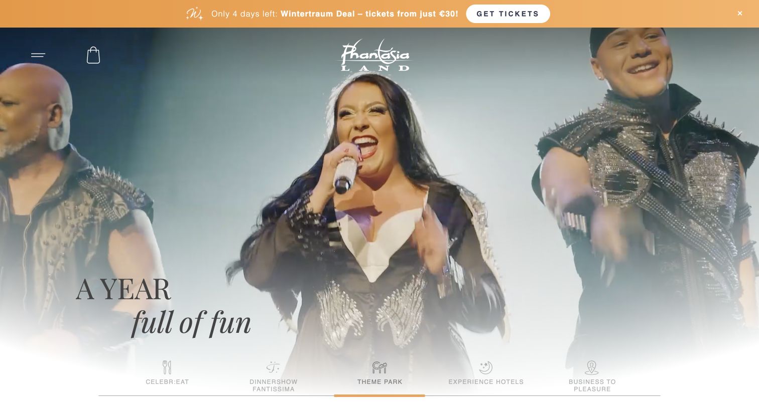
Phantasialand opens with cinematic footage, a centered gold logo and the restrained A year full of fun statement. A promotional strip sits above the imagery, while the main navigation is condensed into a menu control and shopping bag. Across the lower edge, named experience routes distinguish CELEBR:EAT, the Fantissima dinner show, the theme park, hotels and business events. The page gives the resort a theatrical atmosphere while making those divisions part of the presentation. It is most useful as an example of brand-level experience selection rather than immediate date-and-ticket comparison.
What you can learn
If a destination sells several experiences, let visitors identify their intended product before showing its booking controls. Preserve each product’s distinct name, but pair unfamiliar names with plain descriptions so visual sophistication does not become a navigation prerequisite.
Pros
The experience routes show that the destination offers more than conventional park admission.
A restrained overlay leaves the performance and attraction footage room to establish atmosphere.
Cons & considerations
Practical hours and day-ticket details are less prominent than the broad experience story.
Brand-specific experience names need explanatory labels for guests unfamiliar with the resort.
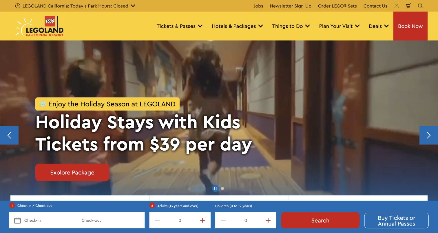
LEGOLAND California combines the familiar yellow-and-red brand language with a holiday family image and a clear package promotion. The header separates tickets and passes, hotels and packages, things to do, visit planning and deals. A blue booking strip remains at the bottom with hotel-date and party fields, while tickets and annual passes retain separate routes. Current park hours are also available in the utility area. The site speaks to a family arranging several parts of a trip, with branded imagery supplying recognition and explicit categories doing the organizational work.
What you can learn
Design the family visit around linked but distinct decisions: admission, accommodation, dates and party composition. A campaign can connect them, but package inclusions and installment terms should remain readable beside the offer rather than becoming assumptions carried into checkout.
Pros
Separate ticket, hotel and planning categories mirror the main decisions in a family trip.
The recognizable brand palette makes purchase controls easy to distinguish from the campaign photograph.
Cons & considerations
Promotional takeovers can interrupt the planning flow before the visitor understands the available products.
The persistent hotel form needs careful treatment on small screens and for visitors purchasing admission alone.
Map day visitors, passholders and overnight guests
List the questions each audience needs answered before purchase and on the day of arrival. Keep the common tasks near the top, then provide focused paths for hotel bookings, pass reservations, school groups and special events. Avoid requiring every visitor to begin with an accommodation search.
Create a reliable operational content model
Manage park schedules, event dates, attraction notices and ticket rules as explicit fields. Record the source and approval owner for each. Preview upcoming campaign changes alongside the current calendar so a seasonal launch cannot accidentally hide a closure or retain an expired offer.
Design package choices before booking controls
Specify exactly which products combine admission, hotels, meals or transport. Show inclusions, exclusions and the conditions that affect the displayed price. Keep an admission-only alternative visible when a homepage emphasizes stays, and verify that the selected product remains clear as visitors move into an external booking service.
Test the visit with realistic scenarios
Review the site as a parent checking ride suitability, a passholder checking a reservation rule and a first-time visitor arriving by public transport. Test narrow screens, keyboard navigation, reduced-motion preferences and a failed video load. Use published test data and stop before any real booking or payment is submitted.
The editing job behind the design
Choose systems that keep operational information consistent
Select a content system around the people maintaining schedules, attraction records, campaigns and access information. Reusable fields and clear publishing responsibilities matter more than copying a platform name from another park. A public stack observation can identify a visible library or delivery service without proving the internal ticketing, inventory or operations architecture.
Treat ticket and hotel providers as part of the visitor journey. Confirm date selection, product names, currency, error messages and return links across the handoff. Plan resilient static alternatives for promotional video and interactive calendars, and keep critical arrival or closure information usable when optional scripts do not load.
Our WordPress website examples offer a separate look at publishing approaches. A visible platform label is evidence for that named page, not a guarantee that the same system will suit your requirements.
Before the public launch
Theme park website planning checklist
Show the current operating status and a complete dated calendar.
Name the facility covered by every schedule and closure notice.
Separate admission, passes, special events and overnight packages.
Explain ticket inclusions and meaningful exclusions before checkout.
Keep published ride restrictions and access information easy to locate.
Provide arrival, parking and public transport guidance with clear maps.
Give seasonal campaigns visible dates and an accountable content owner.
Retain readable text and imagery when promotional video is unavailable.
Check keyboard access, focus states and motion controls in real page flows.
Test booking handoffs without creating real reservations or submitting payment.
These checks are a project checklist, not a performance, legal, security, or accessibility certification. Test real journeys with the people responsible for the website before making claims about the result.
Sources & editorial method
How this collection was selected and reviewed
Each example was reviewed on its public website and captured directly in a browser. Reviews compare visible hierarchy, planning information and navigation; they do not measure sales performance or certify accessibility. The Hersheypark and Knoebels captures show useful content sections below opening media that did not render reliably during this session. Screenshot dates and source URLs are preserved with each example. Public technology observations should be read within the scope of the recorded source and audit attempt.
Each example links to its actual source page. Screenshots are direct browser captures with their own capture dates; moving imagery, announcements and live designs can change. The notes describe observable design choices and conditional tradeoffs, not measured traffic, conversion results, service quality, or accessibility conformance.
Technology labels use public page metadata, asset evidence, or explicitly cited platform documentation. Platform documentation is not a complete current deployment audit. A component reference may be legacy or unused; it is not a complete backend inventory. Unknown stacks are omitted. These sites are editorial examples, not our client portfolio.
Written, Edited and Curated are separate editorial records, not timestamps advanced by a rebuild. Website designs and imagery belong to their owners. See our editorial standards or suggest a correction.
Questions worth asking
Theme Park website design questions
What belongs at the top of a theme park homepage?
Provide a clear destination identity, a current reason to visit and direct access to hours, tickets and visit planning. A large campaign image can lead visually, but it should not make a visitor guess whether the park is open or whether the offer is for admission, a special event or a hotel stay.
Should a park lead with a booking form?
A booking form works best when visitors already understand the product they are selecting. If the park sells admission, passes and accommodation, first distinguish those choices. Keep a straightforward day-ticket route visible when the main form is designed for hotel dates and party details.
How should seasonal events fit into the main site?
Give each event clear dates, inclusions, participation details and any separate-ticket requirements. Connect it to the operating calendar and relevant attraction notices. Retain the permanent planning navigation so visitors researching an ordinary park day can still find the information they need.
Can video carry the entire opening experience?
Video can communicate motion and atmosphere, but essential text, controls and dates should work independently. Provide a useful still-image fallback and usable pause controls. Review the page when the video fails or optional media scripts are unavailable, since a blank opening area can push useful content far down the page.
How should a park present accessibility information?
Link clearly to the park’s approved access guidance and explain the scope of the information. Organize published attraction requirements, facilities and support contacts so visitors can prepare questions before arrival. A visual review or limited automated test does not establish that a website or attraction meets every visitor’s needs.
Start with the decisions visitors must make before arriving, then give the park’s atmosphere room to shine around them. A distinctive campaign is most useful when hours, admission scope, suitability and travel logistics remain clear.