Best Comic Book Store Websites of 2026 (28 Real-World Examples)
28 real comic book store websites, reviewed for catalog discovery, local visiting information, subscriptions and the personality of independent bookselling.
Help a new reader find a starting point while giving returning collectors precise routes to the books and services they already know.
A comic book store website serves several different visits. Someone may need this week’s releases, a particular back issue, a graphic novel for a child or the address of a shop they have never entered. The strongest designs acknowledge those differences without turning the homepage into an exhaustive inventory.
These 28 examples range from collector catalogs to small art-comics specialists and community shops. Study how each business organizes formats, recommendations, subscriptions and physical visits. The useful pattern is the relationship between a particular shop’s identity and the customer’s next practical decision.
Before the examples
What makes good comic book store website design in 2026?
Give readers more than one starting point
Combine precise search with understandable shelves for formats, audiences and recommendations. A new reader may not know a publisher or issue number, while a collector may need an exact edition.
Make availability and timing explicit
Distinguish current stock, preorders, recent releases and sold-out items. Dates and edition labels should support comparison without requiring customers to infer availability from a promotional banner.
Connect the catalog to the local shop
Keep hours, address, events and subscription guidance easy to find. Use real photographs and specific programs to explain the business rather than relying only on familiar comic artwork.
The collection · 28 examples
28 comic book store websites worth studying
Each review identifies a useful design pattern and the tradeoffs visible in the actual source page. The order begins with an explicitly researched editorial selection; the remaining examples offer different approaches rather than a measured service ranking.
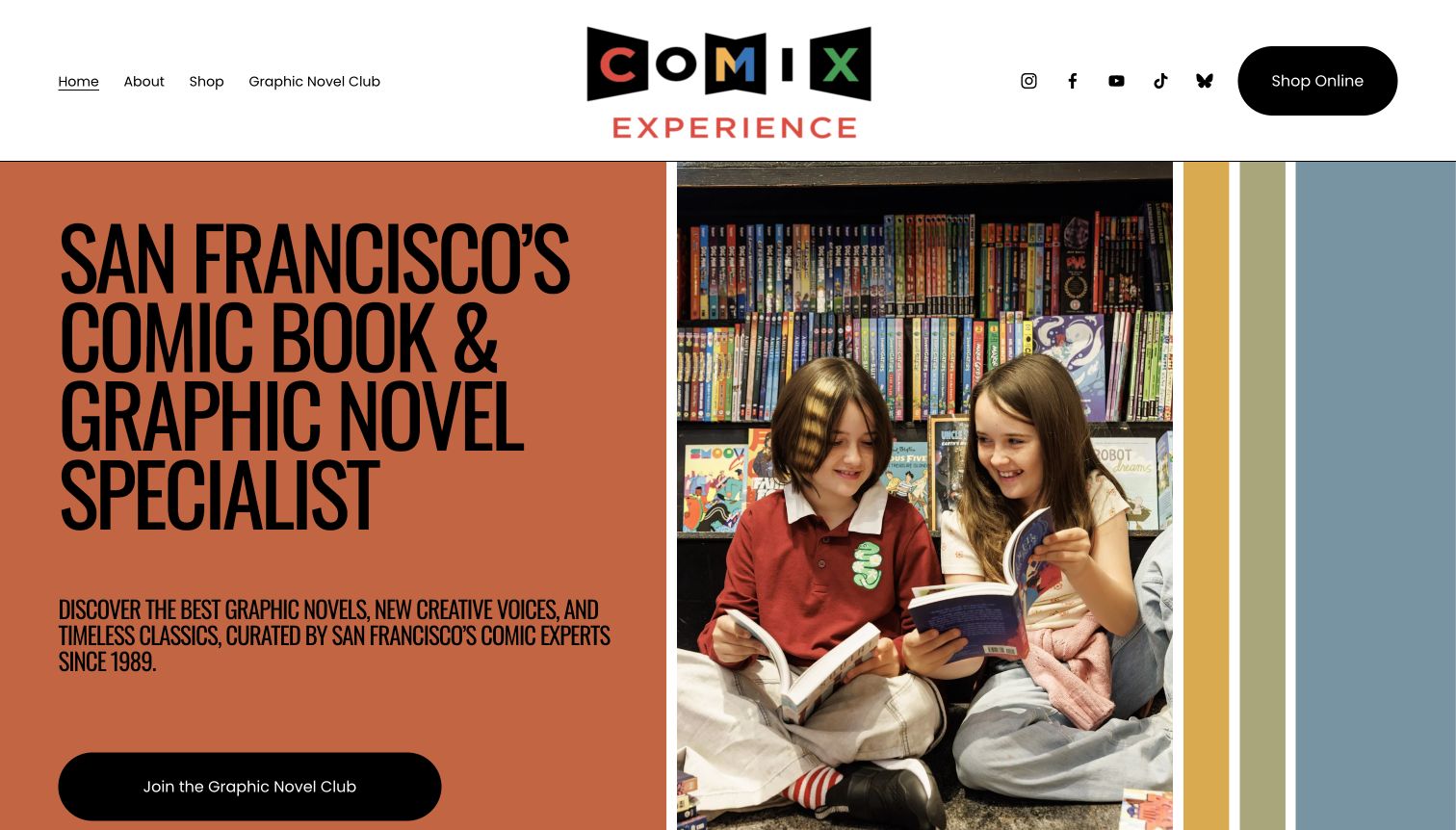
Comix Experience combines an oversized orange headline with a real photograph of young readers inside the shop. Its short navigation separates shopping from the Graphic Novel Club, while the page introduces recommendations, creator conversations and the San Francisco location. The result feels like an invitation into a reading community rather than a warehouse of issue numbers. The About page reinforces that identity with storefront photographs and an archive of original event artwork. This is our editorial selection for the way the design connects people, books and a distinctive local business.
What you can learn
Show what makes a specialist shop useful to a reader who does not already know what to buy. Real photographs, editorial programs and a clear shop route can work together. Keep membership benefits and ordinary shopping separate enough that a newcomer understands both.
Pros
The opening photograph and plain description make the shop approachable without relying on collector terminology.
Club, shopping and location information give the editorial personality practical destinations.
Cons & considerations
The oversized opening pushes the address and visiting details beyond the first screen.
Some program descriptions need closer alignment with their headings to distinguish the club from the magazine.
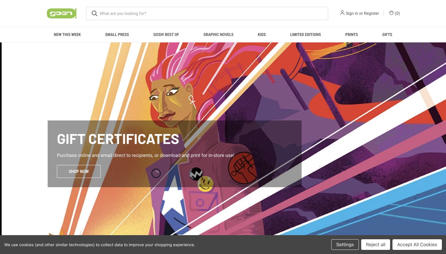
Gosh! uses a broad white header and a bright green identity around its illustrated opening. The navigation makes Small Press, Kids and the shop’s own recommendations as visible as new releases. Signed editions, bookplates and prints extend that bookseller-led approach below the hero. This is useful for visitors who browse by interest or audience rather than a particular superhero. The page still offers search and conventional shopping routes, so the editorial structure does not replace the practical catalog. It demonstrates how specialist recommendations can become part of the main navigation.
What you can learn
Translate the expertise of a physical shop into recognizable shelves online. Give children’s books, independent work and staff selections explicit destinations. Pair those routes with search for returning customers who already know a title, and distinguish preorders clearly from books ready to buy.
Pros
Audience and editorial categories broaden discovery beyond familiar publishers and franchises.
Signed and special editions have a visible place within the overall store structure.
Cons & considerations
The large illustration delays the first substantial product selection below the opening.
A cookie notice remains visible along the bottom of the captured view and competes with page content.
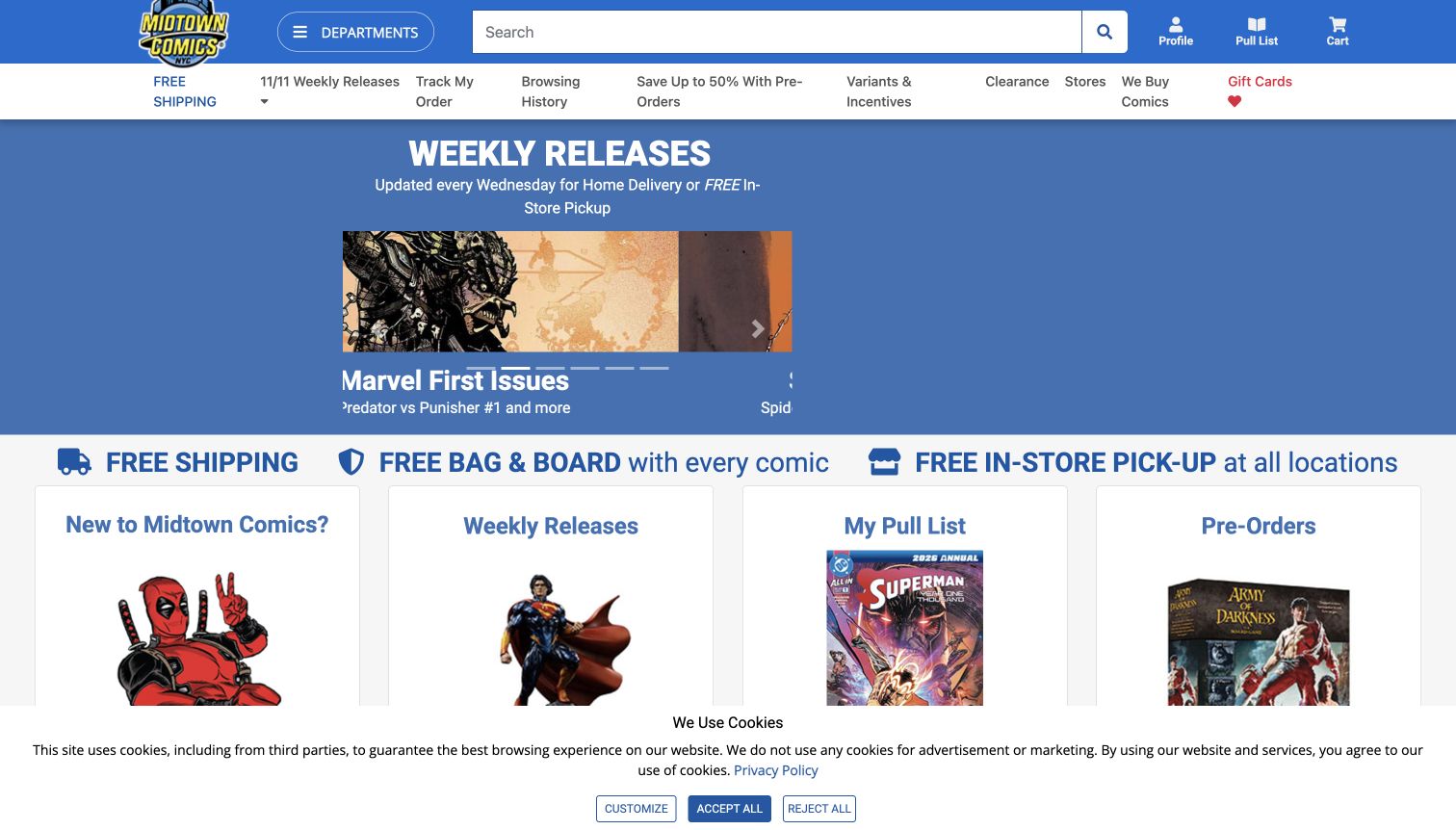
Midtown Comics makes the weekly release cycle the organizing idea of its homepage. The dated hero sits below a dense blue header that includes search, departments and collector services. Pull lists, preorders and wish lists receive their own visual routes further down. The design recognizes that a returning customer may want a particular week’s books rather than a general brand introduction. Service icons also explain conveniences such as pickup and protective supplies. It is a useful study in combining a large catalog with the recurring habits of comic readers.
What you can learn
Design around the frequency with which customers return. A clear release date, stable new-arrivals destination and explained subscription route can reduce repeated searching. Keep the weekly merchandising distinct from account controls so someone browsing for the first time can still understand the offer.
Pros
The dated release promotion gives regular visitors a concrete reason to return.
Collector services are named explicitly instead of being hidden inside a broad help menu.
Cons & considerations
Numerous header links compete for attention before the visitor reaches actual books.
The captured carousel frame and bottom cookie notice show how moving promotions can complicate a quick scan.
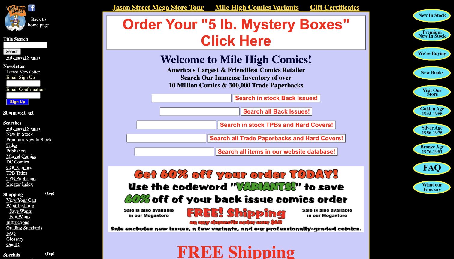
Mile High Comics presents several different search fields within a compact, three-column layout. Labels distinguish in-stock back issues, broader back-issue searches and collected editions. Surrounding links organize browsing by publishers, creators and collecting eras, with grading terminology and help also available. This is a very different approach from a photographic shop introduction: it assumes the visitor has a detailed collecting task. The design offers a useful lesson in exposing catalog scope, even though the dense typography and competing search boxes demand careful reading from anyone unfamiliar with the system.
What you can learn
For a complex inventory, explain what each search includes before asking for a query. Consider combining closely related searches behind a clearly labeled filter. Specialist terminology can remain available, but definitions and a simple starting route should help new collectors enter the same catalog.
Pros
Search labels distinguish inventory scopes rather than presenting one unexplained field.
Collector reference links sit near the catalog tools that make those terms relevant.
Cons & considerations
Several search boxes require visitors to decide which database they need before beginning.
Dense sidebars and promotional colors make the central reading order difficult to establish.
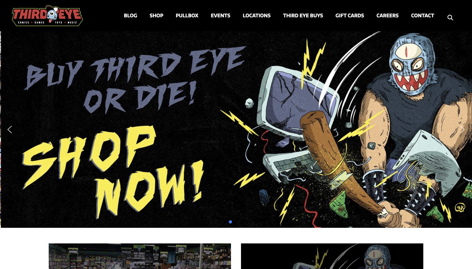
Third Eye Comics uses a black header, a strong red identity and comic-style artwork to introduce the business. Store locations and online shopping are separate destinations, while the broader navigation includes events, news and a pull-box service. Dated weekly posts give returning readers a changing editorial layer beyond the opening promotion. The site is useful as a brand front door: it can explain the business and direct people to a physical shop or a separate commerce destination. That split requires clear labels because the customer’s next task changes considerably between those routes.
What you can learn
Separate shopping, visiting and keeping up with releases when they lead to different systems. Give each route an ordinary label and preserve the brand across the transition. Date recurring editorial posts so a visitor can distinguish the latest release information from an archive.
Pros
Store and online-shop routes acknowledge two distinct customer intentions immediately.
Weekly content provides a reason to revisit beyond a static promotional hero.
Cons & considerations
The oversized opening artwork delays the more useful dated release information.
Several specialist destinations share equal weight in the header, increasing the first decision’s complexity.
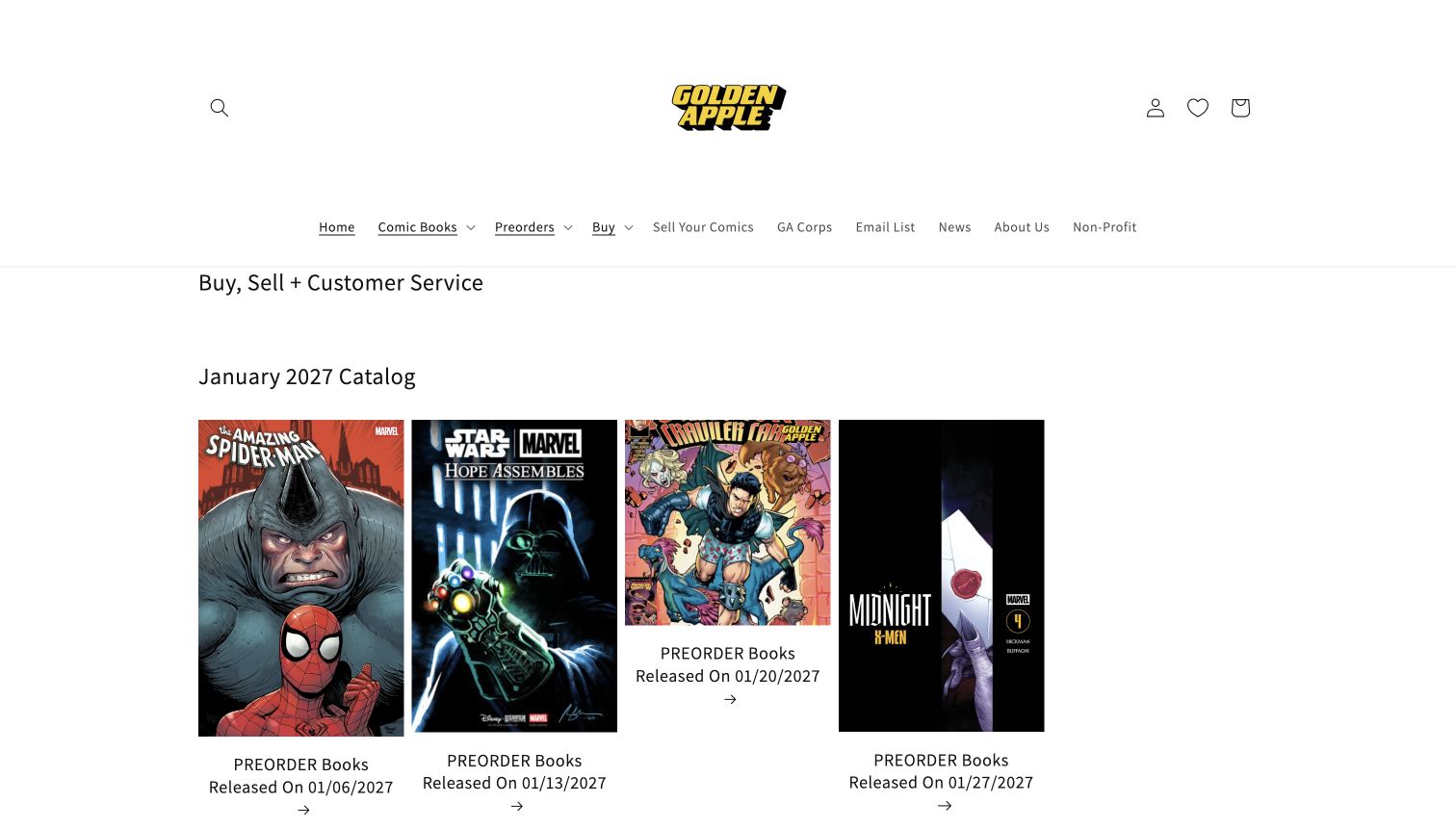
Golden Apple places dated preorder groups near the start of its catalog presentation. Separate release cards make the future calendar visible, while the header includes current comics, preorders and collection-selling information. The white background and generous spacing give cover artwork room to stand out. This approach suits readers who regularly reserve forthcoming issues, but it also makes chronology an important part of the interface. Someone looking for a book available today must understand the difference between the future catalog and the current new-release section further down the page.
What you can learn
Use dates as navigation when availability changes over time. Label preorder shelves consistently and give current stock an equally obvious route. A clear calendar structure is more helpful than relying on cover art or promotional language to explain when an item will actually become available.
Pros
Dated groups make the advance-order cycle visible at collection level.
The restrained background lets cover artwork remain the primary product signal.
Cons & considerations
Substantial header whitespace postpones the first practical shopping choices.
Future releases lead the page, so visitors seeking current stock need additional orientation.
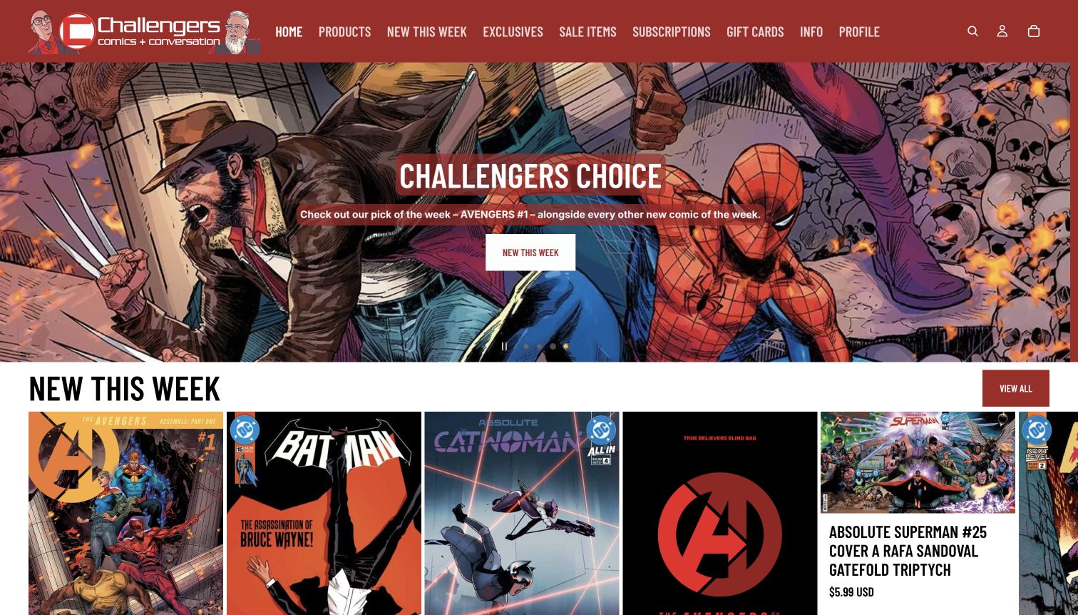
Challengers combines a vivid red header with an illustrated identity and a prominently featured recommendation. Weekly covers appear beneath that opening, while subscriptions, exclusives and sale items have clear navigation labels. The page also promotes creator appearances and signed books, connecting the online catalog with activity at the Chicago shop. Its language and graphics have a recognizable personality rather than the neutrality of a general retailer. The useful design idea is the connection between a shop’s point of view and specific books or events that a visitor can investigate.
What you can learn
Make recommendations feel authored by the shop, then provide a direct route to the recommended work. Place creator events alongside relevant books without confusing event attendance with product availability. Keep enough plain language around an expressive identity to welcome readers outside the regular customer community.
Pros
A featured recommendation gives the homepage an editorial point of view.
Signings and signed editions connect the website with the physical shop’s activity.
Cons & considerations
A rotating promotion can conceal other important offers until the visitor interacts.
Insider humor and specialist labels may require more explanation for a first-time comic buyer.
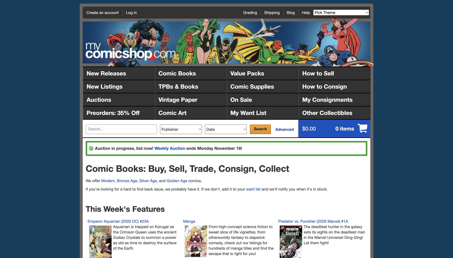
MyComicShop puts a compact search area above a substantial grid of catalog and service links. Publisher and date fields sit close to the main query, while advanced search remains available for more precise requests. Separate routes distinguish new releases, back issues, collected editions, auctions and selling or consignment. The structure is designed for visitors who know the type of transaction they want to complete. Short feature descriptions below provide another way into the stock. Its strength is explicit choice; its challenge is the amount of terminology presented before a newcomer has found a starting point.
What you can learn
Keep advanced catalog controls close to search, but explain which filters are optional. Separate buying from selling and consignment because those journeys require different information. A broad store can retain specialist depth while offering a simpler first route for someone buying a single book.
Pros
Publisher and date controls support precise discovery within a large catalog.
Selling and consignment have distinct labels rather than sharing one ambiguous contact route.
Cons & considerations
The dense navigation introduces many specialist choices at once.
An initial consent overlay obscured the source page until optional cookies were declined before the accepted capture.
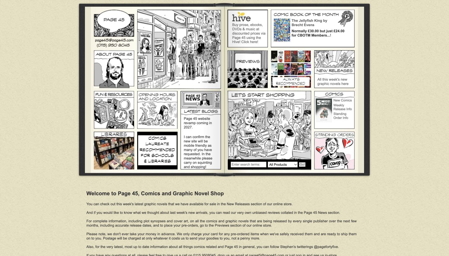
Page 45 turns its main navigation into an illustrated open book. Links for new releases, previews, recommendations and visiting information sit within that distinctive drawing. Below it, a text-led homepage offers substantial bookseller guidance and lists of forthcoming work. The result communicates a clear love of comics and a particular editorial voice. It also illustrates the limits of a highly illustrative navigation system: small labels need careful reading, and the site itself acknowledges a future redesign. The useful reference is its curatorial organization, not an assumption that every visual detail should be copied.
What you can learn
Preserve the character of a specialist business while making its recommendations easy to scan. Use illustrations to support clear links rather than making them the only navigational explanation. Long bookseller commentary works best beside concise collection labels, dates and a straightforward search option.
Pros
Recommendations and previews receive prominent editorial destinations rather than being buried in a blog.
The illustrated book motif creates an identity closely connected to the merchandise.
Cons & considerations
Small labels inside a dense illustration make the first navigation scan demanding.
Long lists of text links require more orientation than a concise set of visible book cards.
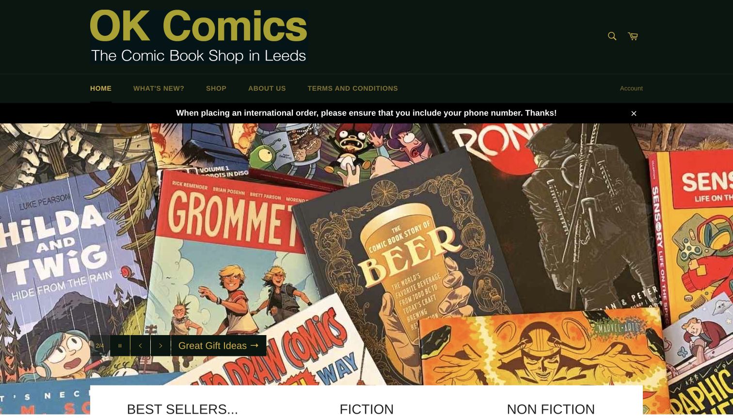
OK Comics uses a dark green and black header with a large mustard-colored identity. A short navigation leads to new books, shopping and information about the Leeds shop. The body organizes discovery through fiction, nonfiction, selected authors and local creators, with signed editions also visible. Product cards explicitly distinguish sold-out items. This makes the shop’s editorial taste more apparent than a catalog organized only around publishers. The large opening collage supplies atmosphere, while the categorized shelves provide the more practical reading paths once the visitor begins exploring.
What you can learn
Offer several meaningful ways into a graphic-novel catalog: subject, creator, audience and local interest. Make availability legible on collection cards. An independent shop’s expertise becomes useful online when recommendations are connected to named shelves that a visitor can understand without knowing comic-industry terminology.
Pros
Fiction, nonfiction and creator groupings support browsing beyond a single genre.
Visible sold-out states set expectations before a product page is opened.
Cons & considerations
The large collage delays the more useful curated product groups.
A prominent international-order notice competes with information for visitors planning a local shop visit.
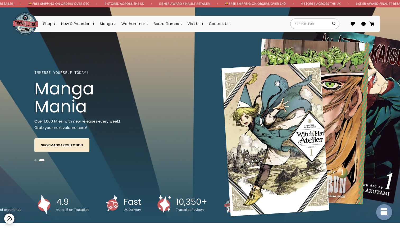
Travelling Man uses warm colors and large illustrated promotions to connect manga, comics and tabletop interests. The header gives manga, preorders and visiting information their own labels, while the page also promotes its physical locations and dated events. This helps a broad hobby retailer avoid presenting every visitor with the same undifferentiated catalog. The captured manga promotion uses actual covers as the central visual material. The site is a useful reference for balancing several interests, although layered promotional and privacy interfaces initially interrupted the page before the unobstructed source capture was made.
What you can learn
Give major audiences a clear route into a broad hobby catalog. Use recognizable product imagery and distinguish online categories from store locations. Keep optional signup prompts from blocking the first explanation of the business, especially when another privacy interface is already asking for attention.
Pros
Manga and preorder destinations are explicit within the main navigation.
Store locations remain available alongside the product-led shopping structure.
Cons & considerations
The first observation showed overlapping privacy and newsletter prompts that needed dismissal.
Promotional strips and social-proof elements add competition around the already colorful retail content.
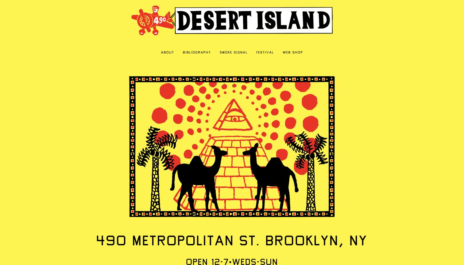
Desert Island uses a bright yellow background, hand-drawn lettering and a striking central illustration. The page quickly states its Brooklyn address and opening schedule, then offers a small set of routes for its shop, publications and related activity. The visual character is closely aligned with the independent comics and printed art it presents. Unlike a dense collector catalog, this homepage works as a concise introduction to a particular cultural space. Its practical information prevents the artwork from becoming a purely decorative splash page, even though product discovery requires another step.
What you can learn
Let a specialist’s visual culture shape the website while keeping address, hours and shop access unmistakable. A compact introduction can be effective when the business has a narrow identity. Make external destinations clear so visitors know whether they are entering the catalog, a publication archive or an event resource.
Pros
The illustrated identity immediately distinguishes the shop from generic retail templates.
Address and hours appear directly within the main introduction.
Cons & considerations
The opening provides little product-level detail for someone looking for a specific book.
Some related destinations leave the main site, which can interrupt an otherwise simple browsing journey.
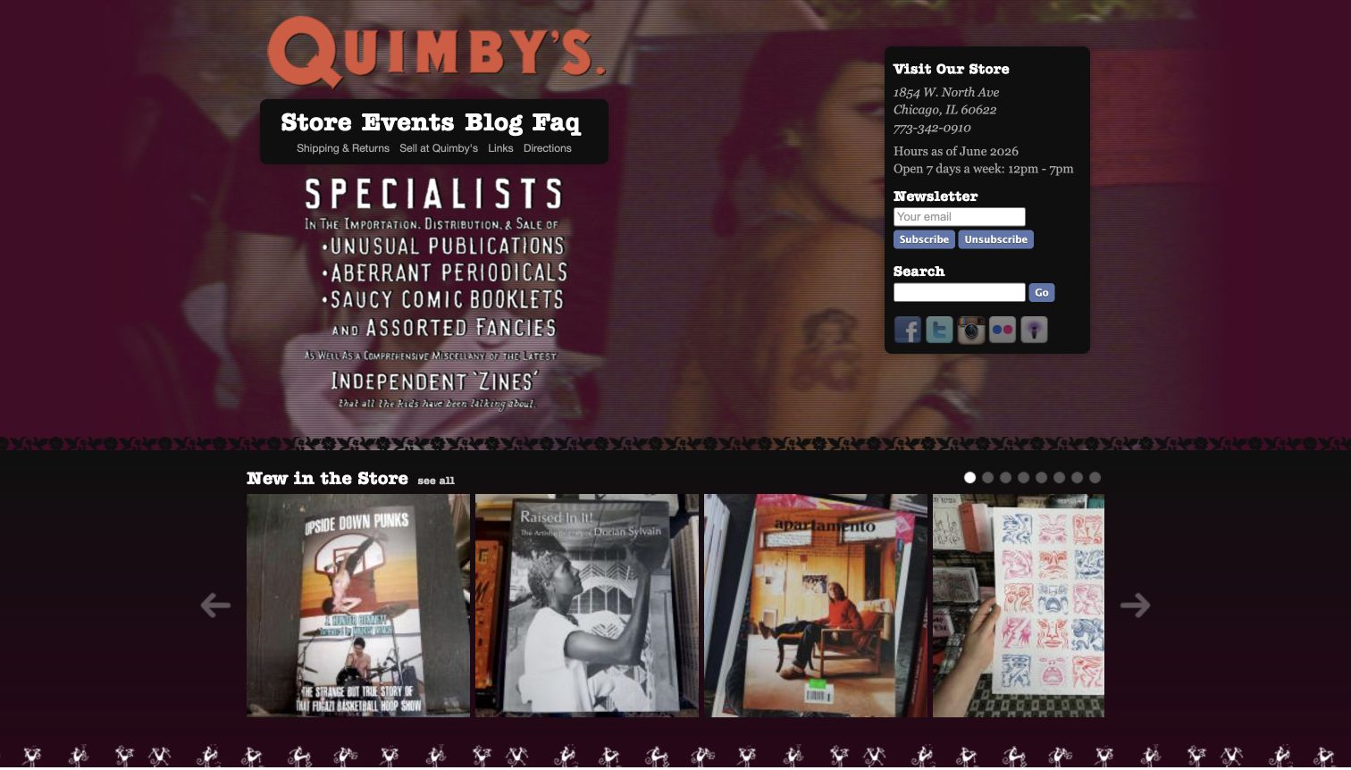
Quimby’s sets its large orange wordmark against a textured dark background. A compact navigation separates the store, events, blog and practical help, while a boxed sidebar gives the Chicago address and an explicitly dated hours notice. The opening describes the shop’s specialist publishing interests before a row of newly stocked books and zines. This creates a strong sense of character without hiding the physical destination. The page is useful for studying how an unconventional editorial identity can remain practical, although the dark palette and several small sidebar controls demand careful visual hierarchy.
What you can learn
Use a shop’s particular language and imagery to establish its niche, then place visiting information in a stable, easy-to-find block. Separate selling or consignment guidance from customer shopping. Make the first product group explain the range through titles and covers rather than relying on the brand statement alone.
Pros
The address and dated hours notice make the physical shop tangible immediately.
Store, events and publishing-related routes reflect the business’s actual range of activities.
Cons & considerations
Small newsletter and search controls compete within a compact dark sidebar.
The textured background can make fine lettering harder to scan than the larger orange identity.
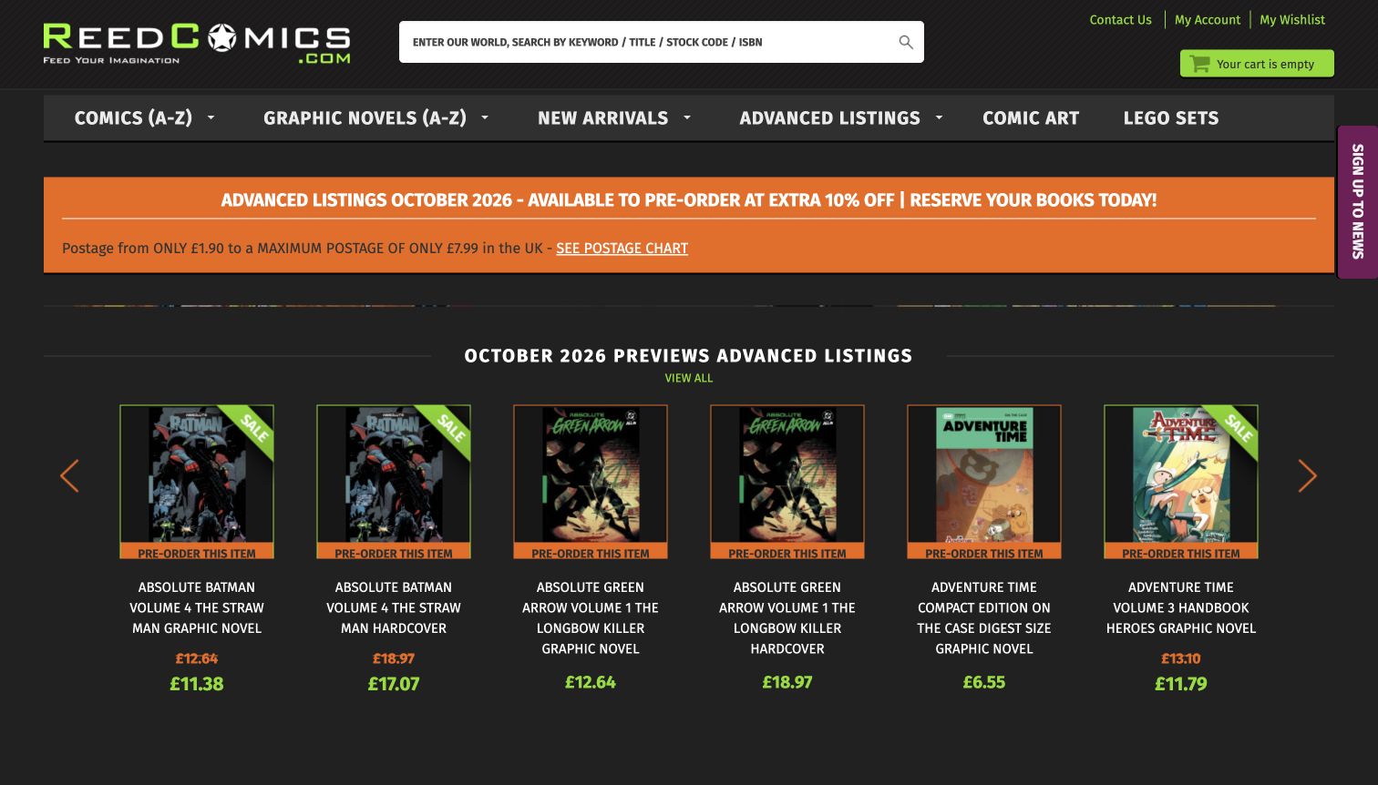
Reed Comics puts a wide search field beside its logo, explicitly inviting titles, stock codes and ISBNs. The navigation separates comics, graphic novels, new arrivals and advance listings. Below, product cards identify formats and show preorder status clearly, with an immediately visible route to postage information. This is a practical catalog-focused design for customers comparing editions rather than planning a store visit. The dark background gives covers strong contrast, while the repeated promotional colors and long uppercase product names create a more demanding scanning task across a large row of items.
What you can learn
Tell customers which identifiers your search understands and expose availability before checkout. Keep shipping information near the catalog introduction. When editions have long names, establish a consistent hierarchy for title, format, variant and status so the details remain usable rather than becoming an undifferentiated block.
Pros
Search explicitly supports ISBN and stock-code queries as well as ordinary titles.
Preorder labels and postage information clarify important buying conditions early.
Cons & considerations
Long uppercase product names can be difficult to compare across a crowded row.
Several bright sale and preorder treatments compete with the cover artwork for attention.
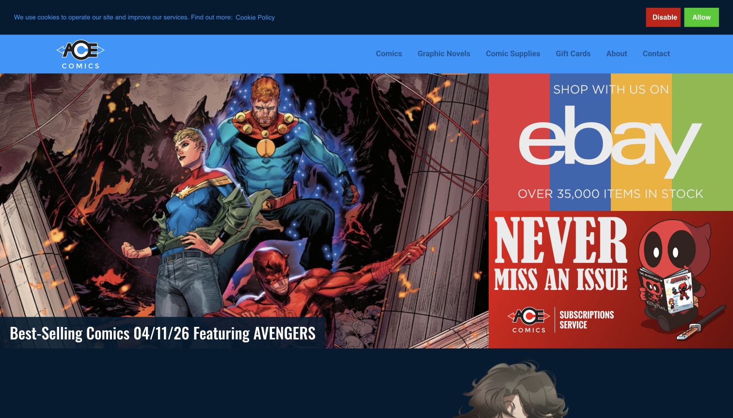
ACE Comics combines a dated best-selling-comics feature with prominent routes to its stock and subscription services. The navigation labels in-stock marketplace shopping separately from preorders and subscription tools, which is valuable when a business uses more than one commerce destination. Below the illustrated opening, new comic covers and a chronological update stream keep the editorial material connected to real releases. The homepage functions as a guide to those channels rather than pretending every action happens within the same catalog. Its success depends on maintaining clear destination labels and current dates.
What you can learn
When stock, subscriptions and special orders use different systems, explain the distinction before sending visitors away. Connect editorial release coverage to the appropriate route. Keep recurring posts consistently dated so older recommendations remain useful without being mistaken for the current week’s inventory.
Pros
Shopping links identify marketplace stock and subscription destinations distinctly.
Dated release posts make the shop’s editorial cadence visible.
Cons & considerations
The large promotional artwork dominates the opening before individual products appear.
A cookie banner occupies the top edge of the captured page, adding another layer above navigation.
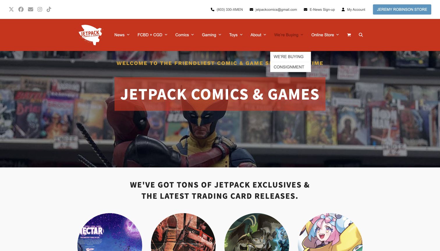
Jetpack Comics & Games uses a strong red header and a photographic introduction to its Rochester shop. Navigation distinguishes comics, gaming, news and the online store, while large category images lead toward exclusives and trading-card releases. Dated offers and creator signings give the body a changing local layer. The page shows how a store with several overlapping communities can make each activity visible. Its informal tone is memorable, but the practical address and hours arrive later, and an initial signup overlay interrupted the introduction before the accepted capture was made.
What you can learn
Give the major communities a recognizable entry point, then tie promotions to clear dates and destinations. A local shop should still provide an uncomplicated visit route beside its online catalog. Keep optional subscriptions from becoming the first barrier between a newcomer and the store’s basic explanation.
Pros
Comics, gaming and online shopping have distinct navigation labels.
Dated offers and signings connect the site to activity at the local business.
Cons & considerations
The initial newsletter prompt covered the main introduction until it was dismissed.
The crowded header and large hero delay address and opening-hour information.
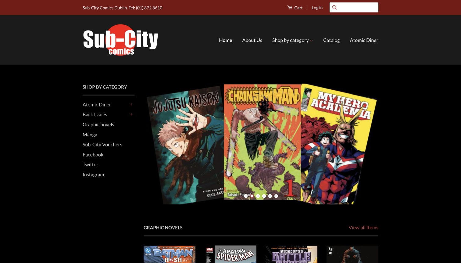
Sub-City Comics places a visible category list beside its large cover-art carousel. Back issues, graphic novels and manga remain easy to locate, while Atomic Diner receives a named route in both the main navigation and the category area. The dark background helps the colorful books stand out, and a phone number in the upper strip anchors the store to Dublin. Below the hero, a straightforward row of graphic novels includes titles and prices. The design is a useful example of keeping catalog orientation stable while promotional artwork changes beside it.
What you can learn
Use a persistent set of broad categories to make a small catalog understandable. Give a distinctive publishing specialty its own route, but explain the label for unfamiliar readers. Keep product information readable against the chosen background and make the local contact route as clear as the shopping controls.
Pros
The sidebar exposes the main comic formats without requiring a menu interaction.
The store’s local publishing interest has an identifiable place in the navigation.
Cons & considerations
Home, catalog and category links overlap, creating several similar ways into shopping.
The large carousel occupies most of the opening before actual product details appear.
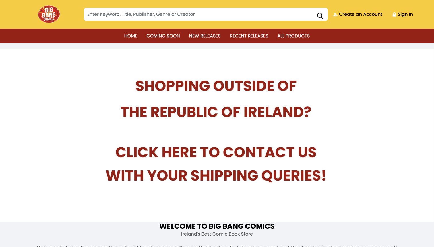
Big Bang Comics uses a broad search field above navigation organized around coming, new and recent releases. That chronological structure gives regular readers a clear way to choose the relevant part of the catalog. A substantial homepage notice explains that international shoppers should contact the store about shipping, followed by a welcome and detailed category list. The page makes the practical limits of its online ordering visible, but the notice occupies most of the first screen. It is a useful example of clear service boundaries that could be presented more compactly alongside actual merchandise.
What you can learn
Separate future, current and recent releases when those distinctions matter to the buyer. Explain shipping restrictions before an order begins, while keeping the notice proportionate to the task. Search labels can help visitors understand that creator, genre and publisher are valid starting points alongside a title.
Pros
Chronological release categories support the recurring habits of comic buyers.
The search prompt names several useful discovery fields beyond a simple product title.
Cons & considerations
The oversized international-shipping notice dominates the opening before books appear.
A long category list introduces substantial detail without an obvious short path for new readers.
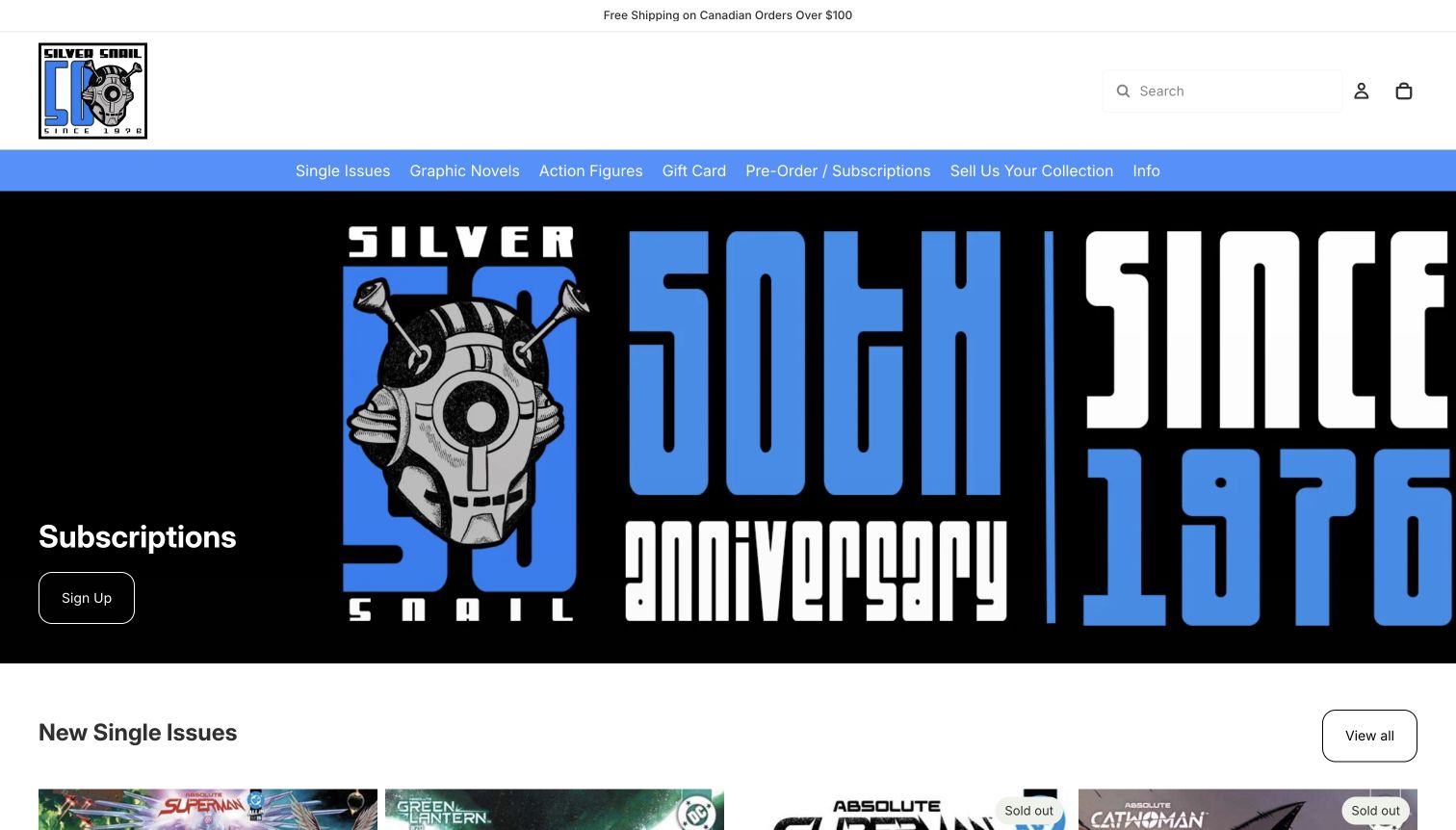
Silver Snail pairs a restrained white header with a blue navigation band and a large anniversary graphic. The primary links distinguish single issues, graphic novels and subscriptions, while selling a collection has a separate destination. Below, new-issue cards display detailed cover variants and sold-out states rather than presenting every book as interchangeable stock. This is useful for repeat buyers who care about an exact edition. The visual identity is memorable, but the oversized brand promotion means the practical inventory information begins near the lower edge of the captured opening.
What you can learn
Preserve issue and variant details where they affect the customer’s choice, and show availability at collection level. Separate subscriptions from one-off purchasing. A strong brand graphic can set the tone, but it should leave enough space for the release information that gives returning customers a reason to visit.
Pros
Single issues, collected editions and subscriptions are clearly separated in navigation.
Sold-out labels appear alongside the specific issue variants they describe.
Cons & considerations
The large anniversary image delays the new-product grid.
Long variant names can make adjacent cards difficult to compare without a stronger typographic hierarchy.
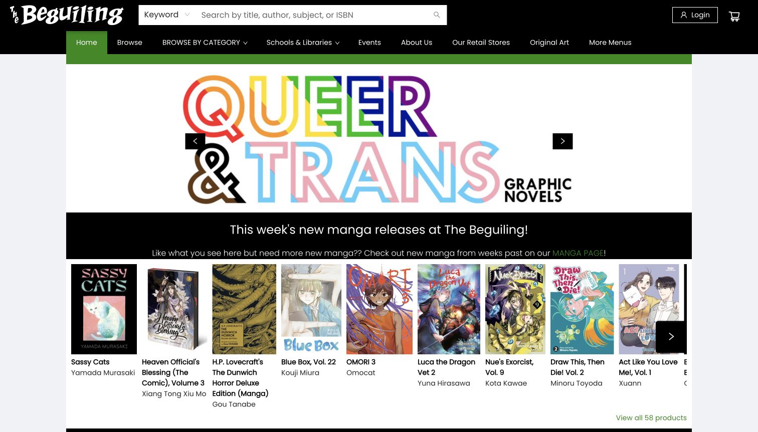
The Beguiling places a broad title, author and ISBN search above a navigation that includes schools, libraries and original art. Its homepage then organizes books into editorial shelves, including new manga and Canadian cartooning selections. Short explanations tell readers why a collection exists, while cover rows provide direct access to the actual titles. This combines conventional bookstore discovery with a recognizable comics specialty. The design is especially useful for showing that a shop can serve readers and institutional buyers within one coherent site, without making every visitor begin in the same product category.
What you can learn
Introduce a curated shelf with a short explanation, then let the books do the visual work. Give institutional customers an explicit route when their needs differ from ordinary retail. Keep long title and creator details aligned consistently so a wide cover row remains readable rather than becoming a wall of text.
Pros
Editorial introductions add context to the product shelves.
Schools and libraries receive a dedicated navigation route beside ordinary browsing.
Cons & considerations
Wide horizontal shelves can hide part of the selection beyond the visible row.
Long titles and creator names create uneven text blocks beneath the covers.
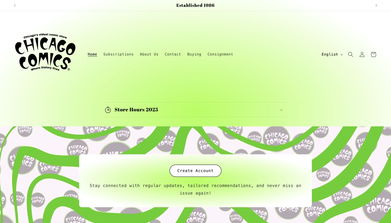
Chicago Comics uses a vivid green gradient and a large illustrated logo to establish a distinctive personality. Its compact navigation focuses on subscriptions, information about the shop, buying and consignment. An address appears in the announcement area, while the body emphasizes account creation and the shop’s independent-comics identity. This is more of a service and community front door than a conventional product-led catalog. It demonstrates the value of reflecting how a physical shop actually works, but also the need to help an unfamiliar visitor understand the offering before asking them to register.
What you can learn
Match the website to the store’s real services while keeping the first visit understandable without an account. Explain subscriptions and consignment in separate destinations. Put ordinary hours and address information in a stable place, and keep any date labels current enough that readers can trust the information’s relevance.
Pros
Subscriptions, buying and consignment are represented as distinct customer tasks.
The illustrated identity and vivid color create a memorable local-shop presence.
Cons & considerations
Account creation receives more emphasis than an immediately browseable selection of books.
The visible hours heading still references 2025 during the November 2026 observation.
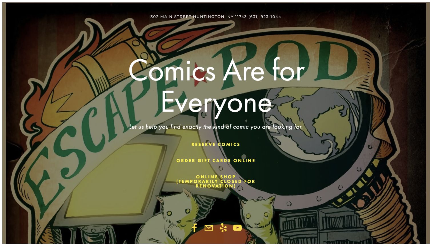
Escape Pod Comics places a short invitation over an illustrated background, with its address and phone number at the top. Three central links distinguish comic reservations, gift cards and the online shop. The latter is explicitly labeled temporarily closed for renovation in the observed page, an important qualification rather than a hidden surprise. The visual result is compact and strongly branded. It works as a basic gateway to the store’s available services, although it offers little product discovery or detailed visiting information within the landing page itself.
What you can learn
A small site can be useful when it prioritizes the few tasks customers actually need. Label unavailable services directly and keep contact details easy to find. Support an expressive background with readable text, and make sure essential information does not depend on following an external reservation or social link.
Pros
Address, phone and three main service routes are visible together.
The online-shop renovation notice sets a clear expectation before a visitor follows the link.
Cons & considerations
There is no browseable book selection in the captured landing page.
Opening hours and fuller store information are absent from the concise first view.
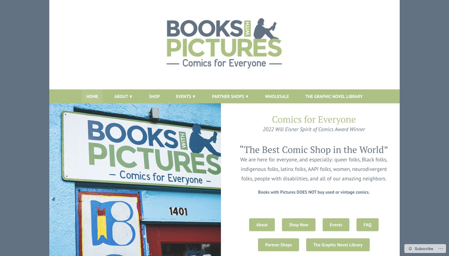
Books with Pictures combines a large wordmark with a photograph of its Portland storefront. Beside the photograph, a direct welcome describes the community the shop aims to serve. A compact group of buttons leads to shopping, events, frequently asked questions and related projects. The page also plainly states that it does not buy used or vintage comics, a useful operational boundary. This approach makes values and practical information part of the same introduction. The strongest lesson is that a welcoming message becomes more useful when visitors can immediately find the relevant service or explanation.
What you can learn
Explain the shop’s purpose in concrete language and connect it to ordinary customer tasks. State important service limitations before visitors make an unnecessary trip. Keep community projects identifiable, with shopping and visiting information available independently of social feeds or membership in another online platform.
Pros
The welcome and real storefront photograph make the local business understandable.
The explicit used-comics policy answers a common question before contact is needed.
Cons & considerations
A very large header postpones the useful introductory buttons.
A substantial social feed lower on the page makes some current activity dependent on third-party content.
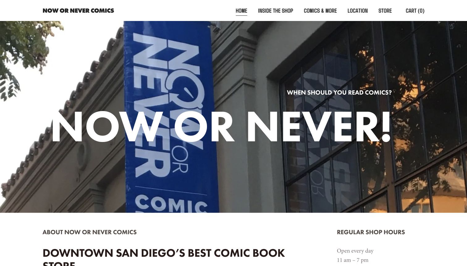
Now or Never Comics uses its own storefront as the main image, with an oversized phrase that plays on the shop’s name. A short navigation separates the interior gallery, comic information, location and store. Immediately below the hero, the homepage places its introduction beside regular hours, then supplies the San Diego address and a directions route. This is a clear visit-led structure. It gives a newcomer an impression of the real place before asking them to browse products, although the first screen devotes considerably more space to atmosphere than to individual books.
What you can learn
Show the actual storefront when finding and recognizing the shop is a central task. Pair the image with stable hours and directions rather than leaving those details to a footer. Use separate destinations for product browsing and a visual tour so visitors can choose the depth they need.
Pros
Real exterior photography helps connect the website to the physical destination.
Hours and location information follow the opening in a clear two-part structure.
Cons & considerations
The oversized slogan and image delay product-level discovery.
The homepage relies on broad descriptive claims where a small set of specific recommendations could provide more useful evidence.
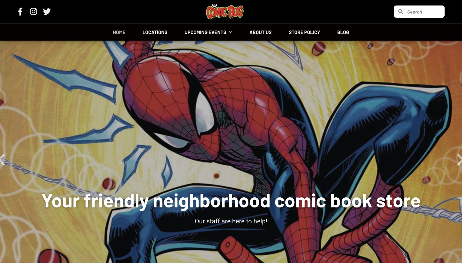
The Comic Bug uses a dark header and large comic artwork to introduce its neighborhood-store identity. Locations, events and store policies receive straightforward navigation labels, while the body separates a past-events area from links to the latest social updates. This is useful for a business whose value extends beyond a product catalog into gatherings and local participation. The captured opening strongly communicates the subject matter, but the image and slogan provide less practical guidance than the navigation. The older event archive also illustrates why dates and clear past-event labels matter on a community-focused site.
What you can learn
Make events and visiting information easy to find without relying entirely on social media. Keep historical activity visibly separate from upcoming dates. A dramatic illustration can establish the theme, but customers still need stable routes to locations, policies and a current schedule before planning a visit.
Pros
Locations and store policies are clearly named in the main navigation.
Past events have an explicit label instead of being presented as current announcements.
Cons & considerations
The large hero delays the practical location and event information.
The site directs visitors to a social platform for the latest updates, creating an additional dependency.
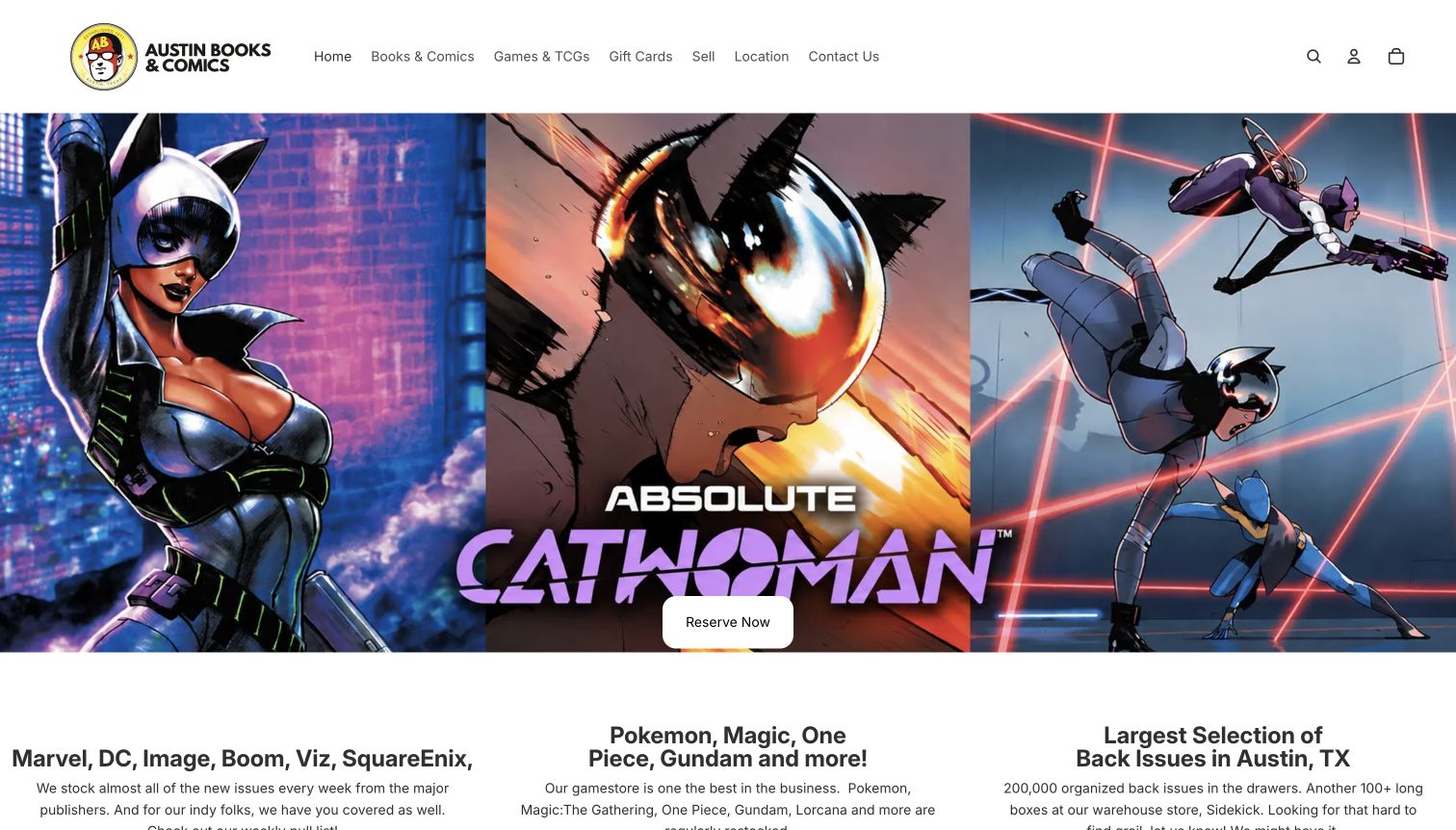
Austin Books & Comics opens with a large comic-art promotion and a single reservation button. The concise header separates books and comics from games, while location and contact information have their own routes. Below the opening, three text groups describe new comics, trading-card games and back issues. This gives a newcomer a useful outline of the store’s range without requiring them to explore a complete catalog first. The design’s clearest idea is the separation of stock types and customer intentions, although the first screen relies heavily on one promotional image.
What you can learn
Explain the major kinds of stock in a short overview before presenting a large catalog. Give regular-release reservations a specific route and keep local visit information accessible. Avoid making broad inventory or quality claims carry the entire explanation when examples and clearly labeled categories would be more concrete.
Pros
The navigation separates comics, games and practical visiting information.
A simple reservation call to action supports customers following regular releases.
Cons & considerations
The large promotional image dominates the opening before the store’s broader range is explained.
The brief stock descriptions would benefit from direct links to representative selections.
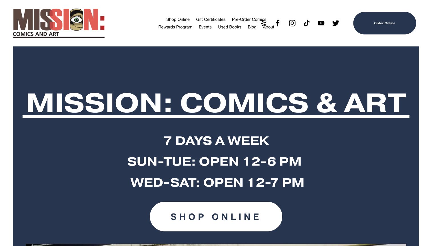
Mission: Comics & Art places its weekly opening schedule directly inside a large blue introduction. The shop name and online-shopping button surround that practical information, while the header offers preorders, used books and other services. Further down, the page supplies its San Francisco address, contact details and a map. This is a strikingly direct response to a common local-shop question: whether a visitor can come today. The design prioritizes usefulness over a cover-art promotion, although the large type and crowded header leave less room for editorial book discovery in the opening.
What you can learn
Make the most common local task explicit when it matters more than a promotional hero. Keep hours consistent across the homepage and footer, and distinguish online orders from a physical visit. Support a clear operational introduction with selected books or recommendations for visitors who are still deciding what interests them.
Pros
The weekly schedule is visible without opening a separate location page.
Address, phone and map information provide a concrete continuation of the visit-planning task.
Cons & considerations
Large operational typography leaves little room for books in the first screen.
Many service and social links compete within the compact header.
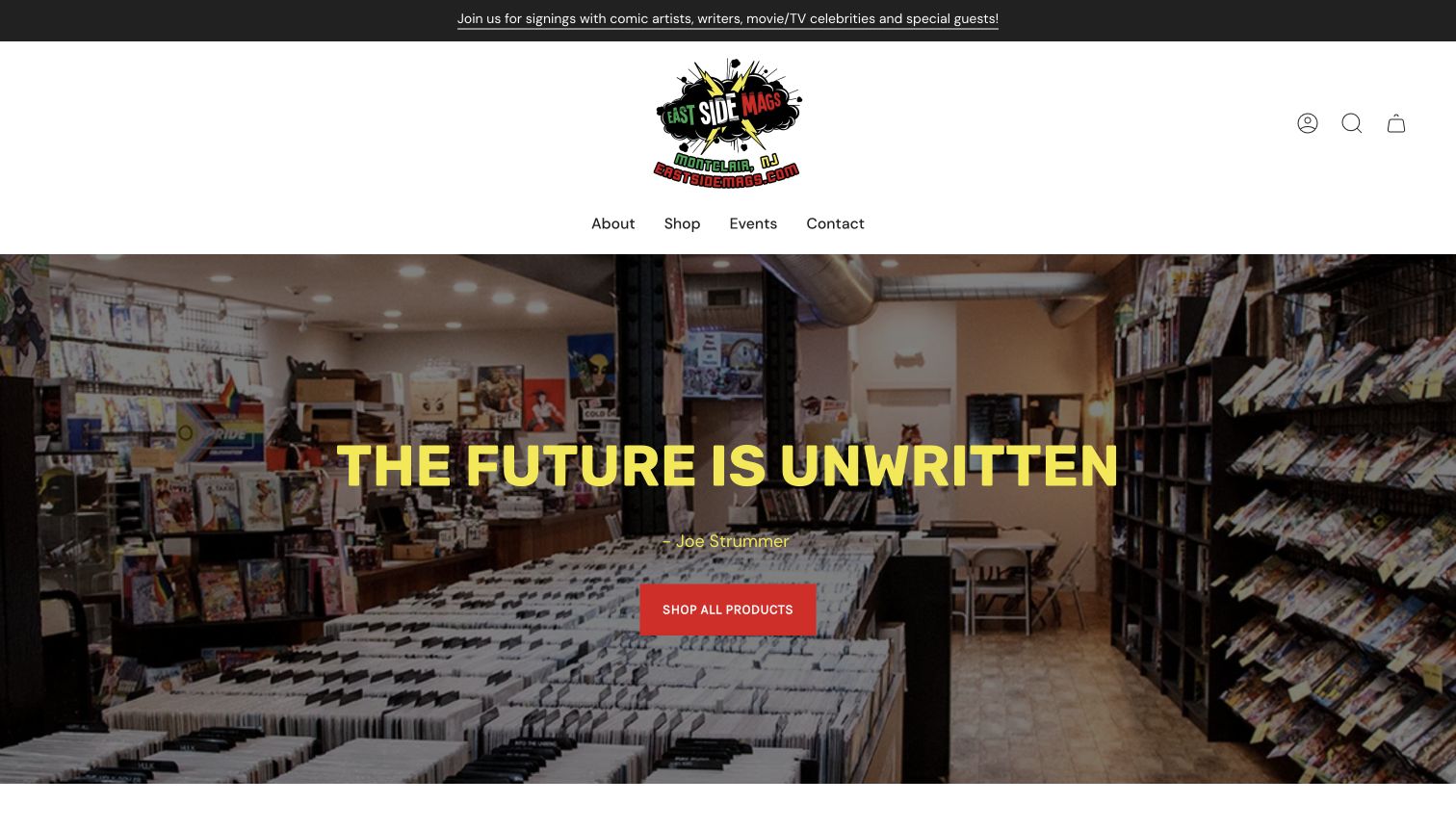
East Side Mags uses a photograph of its comic bins and shelves behind a short brand statement. A simple navigation leads to shopping, events and contact information, while the body combines products with dated signings, music and classes. A separate pull-list explanation speaks directly to repeat comic buyers. This shows how a local shop can present several forms of participation without making them indistinguishable. The actual interior grounds the identity in a real place, although the large header and inspirational quote take precedence over practical visiting information in the first view.
What you can learn
Connect the shop’s community activity to specific dates, formats and destinations. Give regular comic buyers a clear explanation of the pull-list service, while keeping classes and events separately labeled. Use real interior photographs to establish atmosphere, then place hours and location close enough to support an actual visit.
Pros
Dated event cards describe different activities rather than relying on a generic community claim.
The pull-list explanation recognizes the needs of returning comic customers.
Cons & considerations
The large logo area and hero delay practical location information.
Recently past events sit near future dates, so the schedule needs clear ongoing maintenance.
Kegan is a freelance web designer and developer with 15+ years of experience helping businesses turn complicated website requirements into clear, maintainable digital experiences. He works directly with clients from planning and design through development, launch, and ongoing support.
For comic book store website design, his development approach focuses on comic book store websites that connect reader recommendations, subscriptions and events with clear shopping and visiting information. The scope can be a targeted improvement or a complete custom build, with responsive layouts, thoughtful content structure, and integrations chosen around the people using and maintaining the site.
Show 3 other comic book store website designersHide other comic book store website designers
Plan a comic book store website around real reader tasks
Separate discovery from precise collecting
Begin with the different ways customers describe the book they want. An experienced collector may search a title, issue number, cover artist or ISBN. A parent may only know a child’s age and interests. Someone browsing graphic novels may prefer nonfiction, memoir or a trusted staff recommendation. These are different entry points into the same stock, so the navigation should not assume that every visitor understands publisher categories or collecting terminology.
Build a short hierarchy of formats and audiences, then add specialist filters where they are useful. Separate single issues from collected editions and explain unfamiliar abbreviations. Put title and creator details in a predictable order on product cards. If several cover variants are listed, identify the difference in text as well as the image. Preserve a clear distinction between an item’s availability and a shop’s general ability to order it.
Before choosing a visual style, outline a few representative journeys: finding the next issue of a series, choosing a first graphic novel and locating a specific older edition. Check where each journey needs a search field, a recommendation or an explanation. Use that map to decide which links belong in the main navigation and which are better placed inside a relevant category.
Explain subscriptions, release dates and service boundaries
Comic retail often involves decisions made before a book arrives. A pull list, preorder, reservation and ordinary in-stock purchase may follow different rules. Describe those differences before directing customers into an account system or external service. Explain how they choose books, how changes are handled and where they can find the shop’s current policies. Avoid making a promise about a future release date that the business cannot control.
Use consistent labels for upcoming, current and recent releases. A dated weekly page can be useful, but older pages need a clear place in an archive. Show preorder and sold-out states near the title rather than relying on the customer to discover them late in the journey. If an online shop is temporarily unavailable, say so on the link that leads to it. A truthful status notice is more helpful than an apparently working shopping button.
Write down the service boundaries that most often generate questions. These may include whether the shop buys collections, accepts consignments, ships internationally or offers local pickup. Give each policy an identifiable destination, and link it from the relevant product or service area. Keep these explanations concise enough to read while browsing, with the complete conditions available before any commitment.
Make the physical community visible and maintainable
A comic shop can be a place for recommendations, creator appearances, classes and regular gatherings as well as retail. Use real photographs of the storefront, shelves and people to explain that setting. A visitor should be able to recognize the entrance and understand the atmosphere without relying on a generic superhero illustration. Pair those images with a stable address, opening schedule and a straightforward contact route.
Give events structured information: date, time, location, format and any reservation requirement. Separate past appearances from upcoming events, and avoid leaving an expired promotion at the top of the homepage. Social posts can supplement the website, but the essential schedule should remain understandable without signing into another platform. When a shop has multiple locations, state which branch hosts each activity instead of making visitors infer it from the brand name.
Choose an editorial routine that the team can realistically sustain. A small set of current staff picks may be more useful than a large abandoned blog. Assign responsibility for hours, release pages, event archives and service notices. Keep community messaging connected to actual programs and clear navigation. The goal is a website that feels like the shop while still helping a stranger plan a visit or discover a book.
The editing job behind the design
Choose technology that supports the catalog and the shop
Start with the operational model: live stock, subscriptions, preorders, event information and local pickup may need different systems. Confirm how information stays consistent between them before selecting a visual theme. An attractive homepage cannot resolve contradictory availability or an unexplained transition to a separate ordering service.
The example stacks reflect bounded public-source observations, not complete inventories of a store’s backend. A visible library, delivery service or hosted resource does not establish the entire commerce system. Where a scan was blocked or partial, retain that limit rather than treating missing evidence as proof that a technology is absent.
Keep product images efficient, typography readable and essential visiting information available as ordinary page content. Test catalog search and account-dependent workflows separately using authorized test data; this editorial review did not place orders, submit forms or create customer accounts.
Our WordPress website examples offer a separate look at publishing approaches. A visible platform label is evidence for that named page, not a guarantee that the same system will suit your requirements.
Before the public launch
Comic book store website checklist
Give exact-title search a clear label and useful optional filters.
Separate single issues, collected editions, manga and relevant audience groups.
Identify cover variants, formats and edition differences in text.
Distinguish in-stock, preorder and sold-out states on collection cards.
Label weekly release dates and move older lists into an understandable archive.
Explain pull lists and subscriptions before the account or registration step.
Publish a consistent address and current opening schedule.
Use real storefront and interior photographs with descriptive alternatives.
Give events dates, locations and clear attendance requirements.
Separate collection buying and consignment from ordinary retail shopping.
Explain external shopping destinations and important shipping boundaries.
Keep optional signup prompts from obscuring the first useful page content.
These checks are a project checklist, not a performance, legal, security, or accessibility certification. Test real journeys with the people responsible for the website before making claims about the result.
Sources & editorial method
How this collection was selected and reviewed
The saved random target for this collection is 28, drawn before research. Each example is a distinct public comic-store property reviewed directly on November 10, 2026, with an actual browser capture, original commentary and a bounded broad public technology-audit attempt. Captures retain their source URL, observation date, real dimensions and attribution. Comix Experience is an explicit comparative website-design selection based on its reader-focused introduction, original shop imagery and connected editorial programs; it is not a service-quality endorsement or a vote result. Access-limited scans retain their limitations. No purchases, forms, subscriptions, votes or account actions were performed.
Each example links to its actual source page. Screenshots are direct browser captures with their own capture dates; moving imagery, announcements and live designs can change. The notes describe observable design choices and conditional tradeoffs, not measured traffic, conversion results, service quality, or accessibility conformance.
Technology labels use public page metadata, asset evidence, or explicitly cited platform documentation. Platform documentation is not a complete current deployment audit. A component reference may be legacy or unused; it is not a complete backend inventory. Unknown stacks are omitted. These sites are editorial examples, not our client portfolio.
Written, Edited and Curated are separate editorial records, not timestamps advanced by a rebuild. Website designs and imagery belong to their owners. See our editorial standards or suggest a correction.
Questions worth asking
Comic Book Store website design questions
What should a comic book store homepage prioritize?
Make the shop’s main offer understandable, then provide clear routes for browsing, searching, subscriptions and visiting. The balance depends on whether the business primarily serves online collectors, local readers or both. Address and hours should remain easy to find even on a large catalog.
How should a shop organize a large comic catalog?
Combine precise search with a short hierarchy of formats, audiences and editorial shelves. Use consistent title, issue, creator and variant labels. Avoid requiring a newcomer to understand specialist abbreviations before they can find a suitable book.
Should preorders and available books share one list?
They can appear together when their status is unmistakable, but separate current and upcoming routes often make comparison easier. Place release dates and preorder labels near the relevant item, and make the store’s ordering conditions accessible before a commitment.
Does every comic shop need a complete online checkout?
No. A focused local site can support visits, reservations and inquiries without presenting a full catalog. It should clearly explain which services are available and where an external ordering tool begins. An unavailable shop should be labeled honestly.
Why are some technology stacks incomplete?
Public evidence does not expose every system behind a website. This collection records a bounded source-audit attempt for every example, while access restrictions, partial asset checks and unavailable responses remain explicit limitations. Missing evidence is not a claim that a technology is absent.
Borrow the structure that matches your shop’s real work. Clear categories, honest availability and practical local information make a distinctive visual identity useful to both new readers and regular collectors.