Best Aerospace Websites of 2026 (12 Real-World Examples)
Aerospace websites that turn ambitious engineering into understandable products, missions and next steps.
A dramatic launch film may win attention, but a useful aerospace website also explains what is being built, who it serves and which claims describe present capability rather than future plans.
Aerospace websites often address several audiences at once: engineers, payload customers, investors, applicants, public agencies and people who are simply interested in space or aviation. These visitors do not need the same depth or sequence of information. The most useful examples establish the specific capability early, then offer clear paths into vehicles, applications, missions, technical context and company information.
This collection includes specialist space businesses, broader launch-and-component suppliers and aviation companies. It is an editorial study of public website design, not a technical audit of aircraft, launch reliability, safety, certification or commercial performance. Program schedules and company claims can change. The reviews distinguish information design from verification of the underlying engineering.
Before the examples
What makes good aerospace website design in 2026?
Name the actual capability early
Say whether the company builds launch vehicles, operates spacecraft, makes propulsion systems or develops flight automation. A short concrete explanation gives a dramatic image meaning before a visitor needs to learn product names.
Separate products, applications and audiences
Use a stable product hierarchy and make audience-specific routes explicit. A biopharma researcher, satellite operator and job applicant should not need to interpret the same long corporate narrative to find an appropriate destination.
Qualify the numbers and the program status
Explain which configuration, orbit or operating assumptions a performance figure describes. Distinguish a development goal, a planned mission and an operating service. Keep dates and availability states maintained.
Let evidence support the visual ambition
Connect imagery with actual vehicle information, engineering updates, mission records and relevant documentation. A cinematic homepage should remain intelligible when animation or optional media is unavailable.
The collection · 12 examples
12 aerospace websites worth studying
All 12 examples meet the saved original target. AstroForge is the explicit Editors Choice for introducing an unfamiliar commercial activity plainly and connecting it to mission and payload information. This recognizes website communication, not the quality or feasibility of its engineering or business claims.
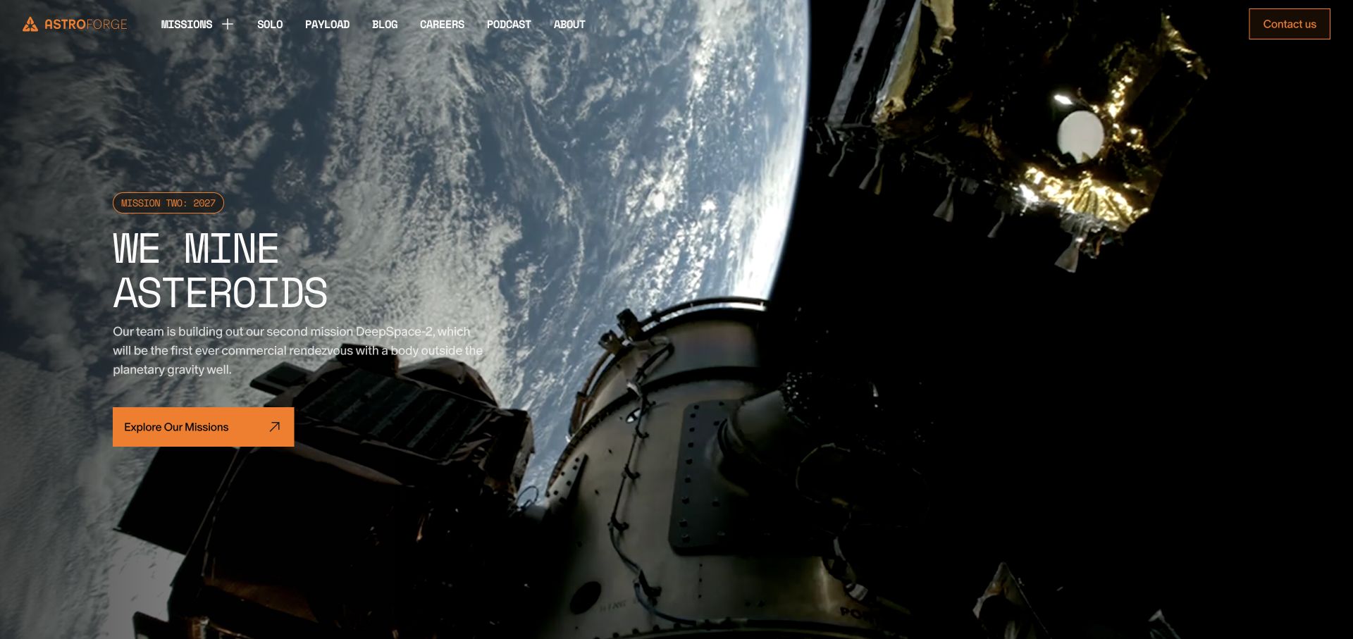
AstroForge makes an unusually complex business legible with a blunt asteroid-mining headline. The orange mission action is easy to distinguish from the cinematic spacecraft background, and the navigation separates missions, payloads, company information and careers. Below the introduction, a terrestrial-versus-asteroid comparison provides an explanatory bridge rather than asking visitors to understand the economics immediately.
What you can learn
Explain the specific activity before presenting the long-term vision. Pair ambitious imagery with a plain description and a route into the underlying mission information.
Pros
The introductory proposition names the actual activity rather than relying on a generic future-of-space slogan.
Mission and payload routes give technically interested visitors more specific destinations.
Cons & considerations
Large moving backgrounds need a useful reduced-motion and low-bandwidth alternative.
The economics comparison contains company claims that should remain attributed, not treated as independently verified forecasts.
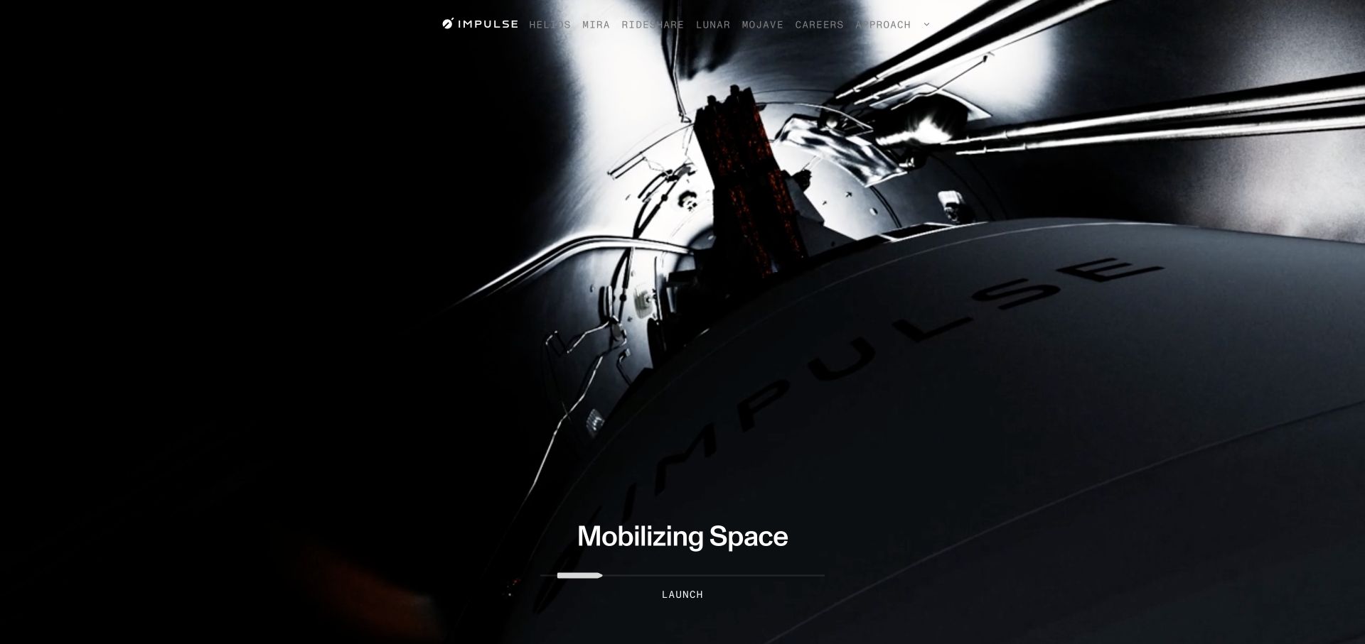
Impulse Space begins with a close-up spacecraft scene and a compact mobility proposition. The page then distinguishes Helios, Mira and Rideshare before showing missions in a table with dates, vehicles, destination orbits and availability. This is a useful shift from an atmospheric introduction to the concrete information a prospective payload customer might need.
What you can learn
Give each product a distinct job, then connect the product family to a maintained schedule. An understandable table can carry more decision value than another promotional panel.
Pros
Named vehicle roles make the portfolio easier to compare than a list of unexplained product names.
Mission rows bring timing, orbit and inquiry states into one consistent structure.
Cons & considerations
The initial cinematic sequence delays the more practical comparison information.
A mission schedule needs careful maintenance so booked, planned and operating states remain distinct.
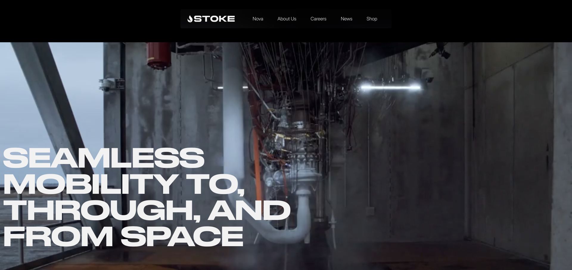
Stoke uses oversized type over real engineering footage to establish its space-transportation proposition. The homepage’s reusability section breaks the system into stage engines, a heat shield and an upper stage, while customer navigation distinguishes civil, defense and commercial audiences. The result combines a bold first impression with a route toward understanding how the company describes its approach.
What you can learn
Turn a broad engineering promise into named components that can be explored separately. Keep audience routes alongside the product story so different buyers can find relevant context.
Pros
Component headings give an abstract reusability argument a more concrete information structure.
Customer categories acknowledge that the same hardware can serve different procurement contexts.
Cons & considerations
Very large hero lettering leaves limited room for supporting explanation in the first viewport.
Accordion-led technical content should retain meaningful labels and remain usable without animation.
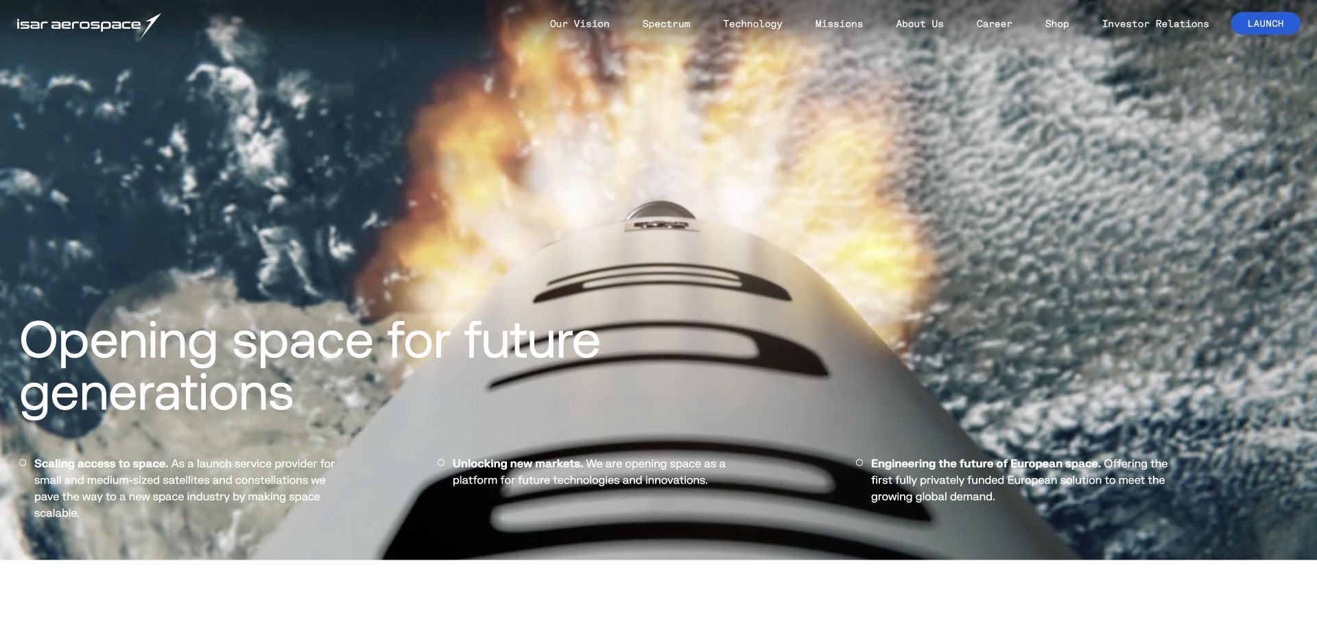
Isar Aerospace connects its broad access-to-space statement to Spectrum and three named booking configurations. Dedicated, Lead and Rideshare are accompanied by short explanations of control over timing and destination. Technology, mission and newsroom routes support deeper reading without requiring every visitor to follow the entire corporate narrative.
What you can learn
Translate internal product terminology into customer choices. State what changes between configurations before asking a buyer to investigate availability or start a conversation.
Pros
The three launch configurations explain practical differences rather than merely supplying branded names.
Visible technology and mission destinations support both commercial and engineering research.
Cons & considerations
Hero copy sits over a detailed moving image and needs contrast protection throughout the footage.
A broad corporate homepage can still require additional product-level specification and qualification detail.
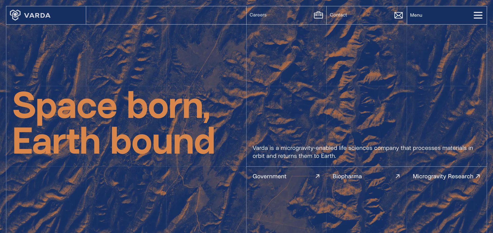
Varda’s blue-and-orange homepage pairs a short orbital-materials explanation with Government, Biopharma and Microgravity Research links. A visible grid carries the navigation and hero into one coherent visual system. The page gives each application a dedicated route before moving into platform, mission and career information, reducing the amount of specialist context demanded at the entrance.
What you can learn
When a platform serves unrelated audiences, explain the shared capability once and offer clearly named application routes. The audience labels should describe real tasks, not internal departments.
Pros
The three application links are immediately adjacent to the explanation of what the company does.
A consistent grid gives the distinctive color treatment an underlying information structure.
Cons & considerations
The image-and-grid background adds visual detail behind small navigation text.
Government and biopharma audiences will still need appropriately scoped evidence and technical documentation deeper in the site.
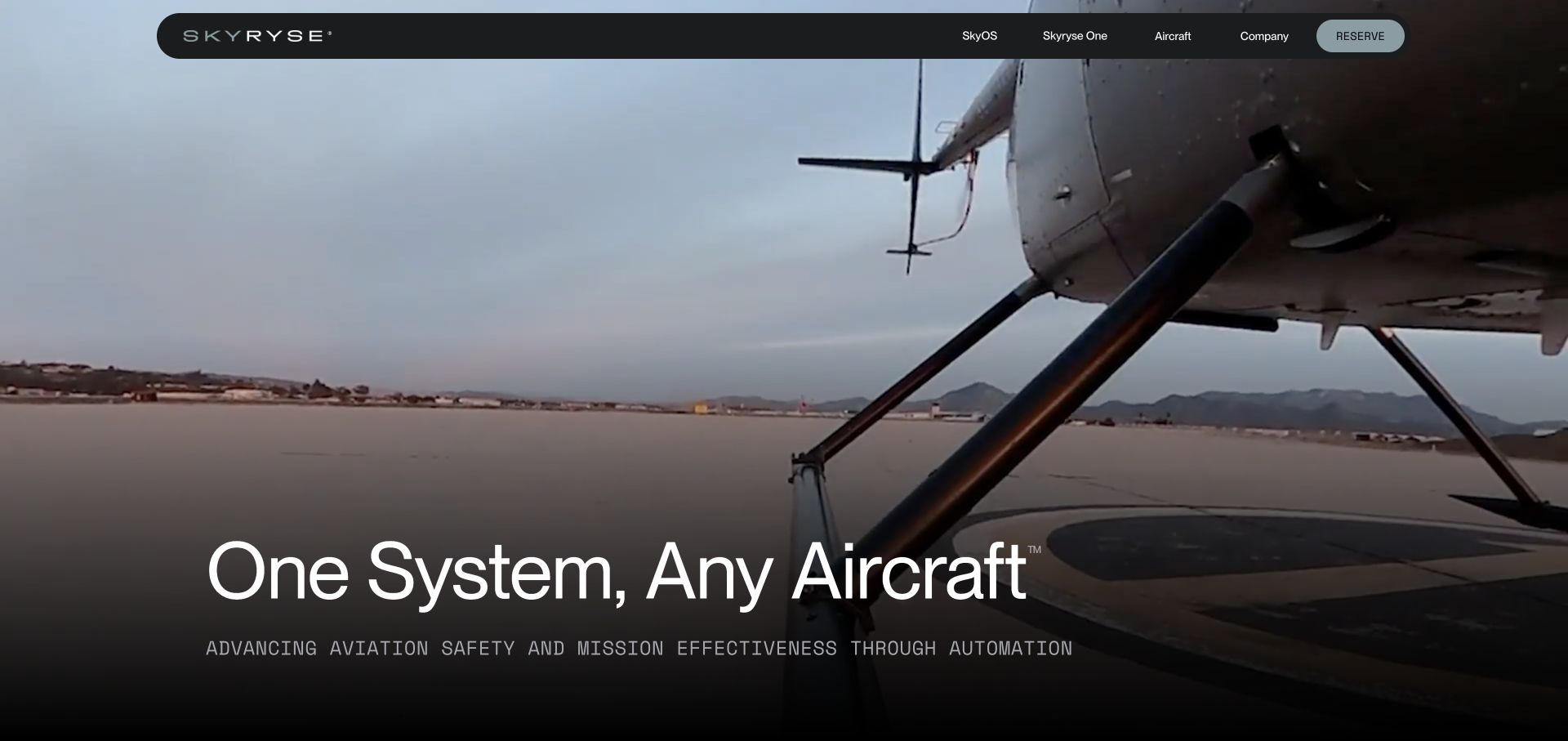
Skyryse introduces flight automation with a helicopter scene, a short universal-system headline and an explicit safety-and-mission explanation. The homepage distinguishes SkyOS from Skyryse One, then lists capabilities and fleet applications. Product navigation and the reserve action remain separate, helping a visitor understand whether they are researching software, an aircraft or a commercial next step.
What you can learn
Introduce an advanced system through its intended role, then show the relationship between the platform and the finished product. Keep capability descriptions separate from purchase or reservation actions.
Pros
Platform and aircraft names have distinct navigation destinations.
Capability headings turn the automation message into more specific topics for investigation.
Cons & considerations
Safety claims need supporting evidence and appropriate qualification rather than relying on visual polish.
A reserve action may be premature for visitors who first need certification, compatibility or operating information.
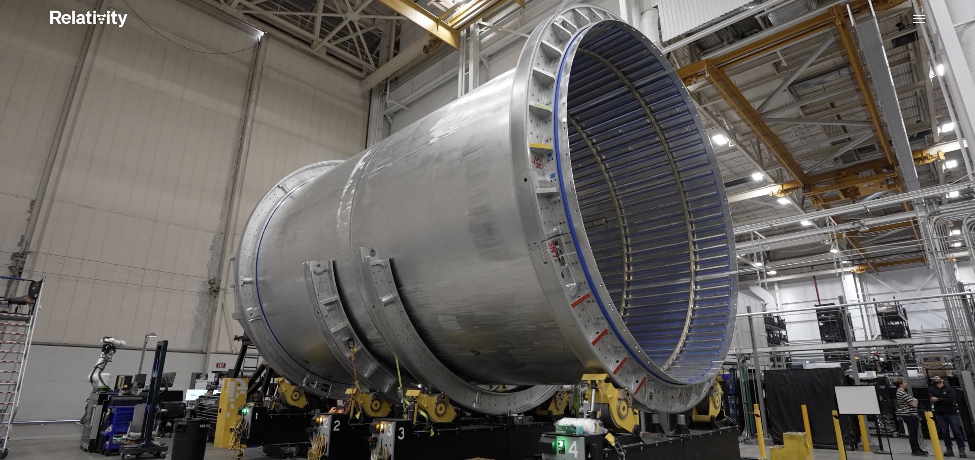
Relativity lets large-scale manufacturing footage establish the physical character of the business before presenting Terran R. Performance figures are labeled by destination orbit and landing configuration, avoiding a single unqualified payload number. Additional routes cover engineering, production, leadership and research initiatives, giving the wider organization a place without merging every subject into the vehicle introduction.
What you can learn
Use real production imagery to make engineering scale tangible, then qualify performance figures by their operating assumptions. A number is more useful when readers can tell which configuration it describes.
Pros
Orbit and recovery labels give the displayed performance figures necessary context.
The homepage distinguishes the launch vehicle from the broader research and company story.
Cons & considerations
A full-screen opening film can obscure the proposition until the visitor continues scrolling.
A growing portfolio makes a clear distinction between current products, development work and long-term vision important.
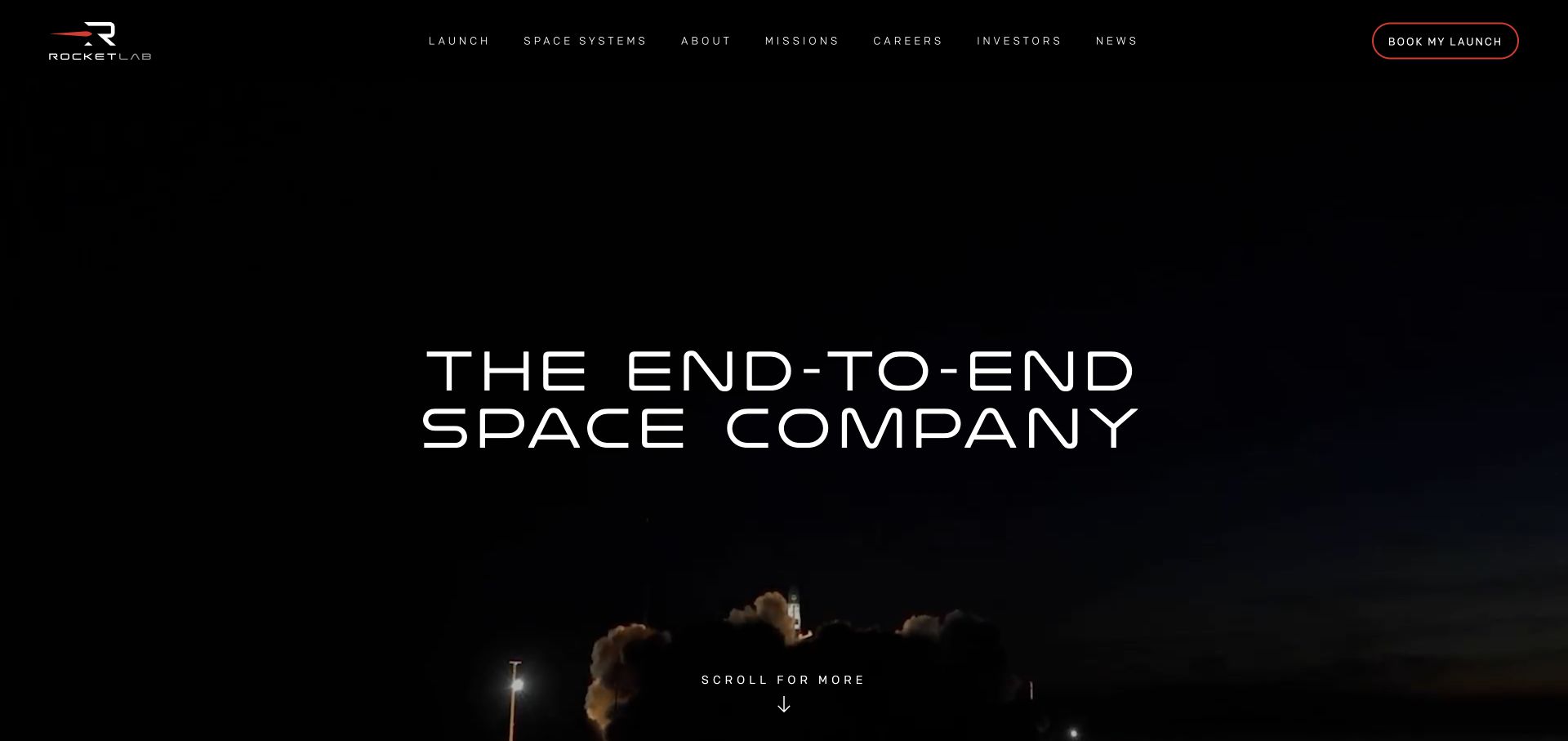
Rocket Lab’s homepage moves from an end-to-end space proposition into a sequence of named capability areas. Small launch, suborbital testing, medium launch, spacecraft, solar, software and satellite components each receive their own introduction and onward link. The persistent launch-booking action is visible without preventing visitors from exploring the much broader supplier catalog.
What you can learn
A broad engineering portfolio needs stable categories that reflect what a customer is trying to source. Give each category a concise role and an obvious next page instead of expanding everything in one section.
Pros
Product categories make the breadth of the company easier to scan.
Satellite-component links expose specific destinations rather than only a generic contact action.
Cons & considerations
The long homepage asks readers to scroll through categories that may not match their task.
Prominent performance and deployment statistics need dates, definitions and continued maintenance.
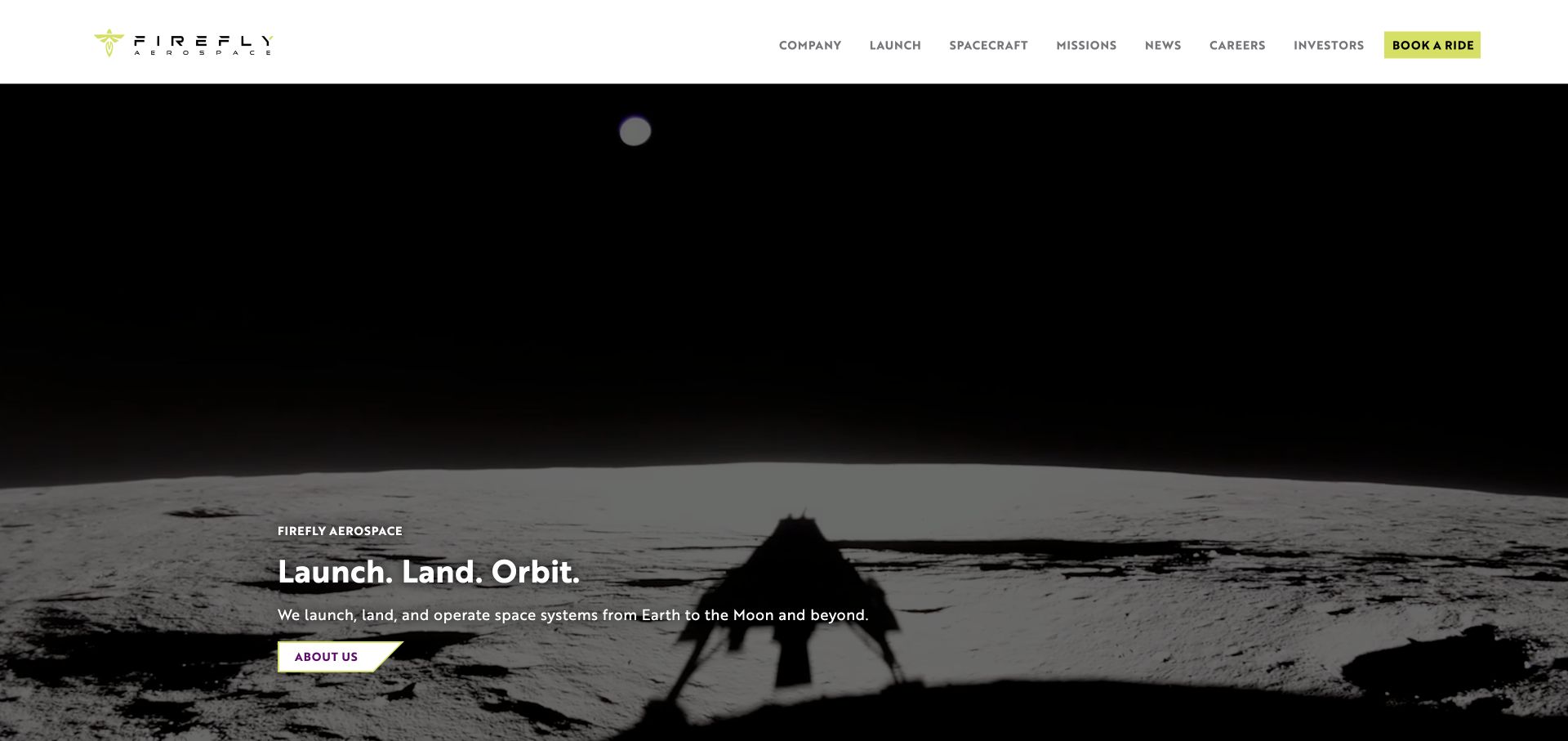
Firefly’s homepage links its launch, land and orbit message to actual vehicle and spacecraft sections. The white navigation contrasts with the large lunar and launch imagery, and a bright booking action remains easy to find. Mission updates and product introductions provide useful follow-through after the concise opening statement, rather than leaving the service range entirely inside a menu.
What you can learn
A short brand proposition works best when each part maps to a real service destination. Repeat that structure in the navigation and body so the memorable phrase also becomes a useful organizing device.
Pros
The opening proposition is short enough to understand before reading technical detail.
Launch, spacecraft and missions provide distinct navigation paths.
Cons & considerations
Autoplay media should not be the only way to understand an offering.
Product and mission claims need clear current-versus-planned status as programs develop.
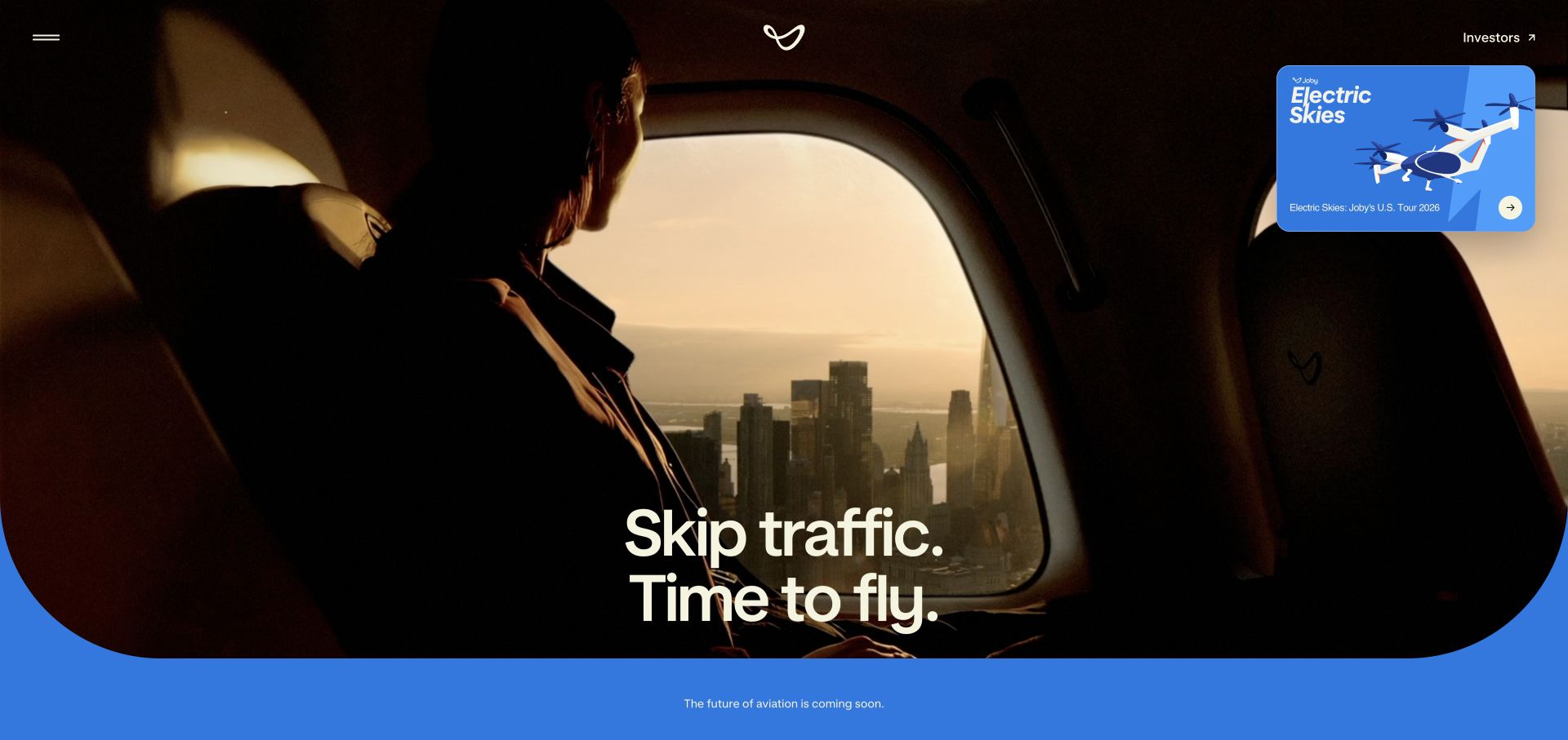
Joby starts with the passenger’s problem rather than aircraft engineering terminology. A rounded aerial-media frame, blue background and commute-focused headline establish a consumer travel identity. Experience, technology and company routes then let readers choose how much detail they need, while coming-soon wording distinguishes the proposed service from an ordinary immediately bookable transport website.
What you can learn
Match the entrance language to the intended user. Consumer-facing aviation can explain the journey first while keeping technology, availability and operating limitations easy to investigate.
Pros
The passenger perspective makes the intended benefit understandable without aviation knowledge.
Coming-soon labels help separate the product vision from current booking availability.
Cons & considerations
A simplified commute message still needs realistic route, timing and availability information before purchase.
Large looping media needs accessible controls and a meaningful static fallback.
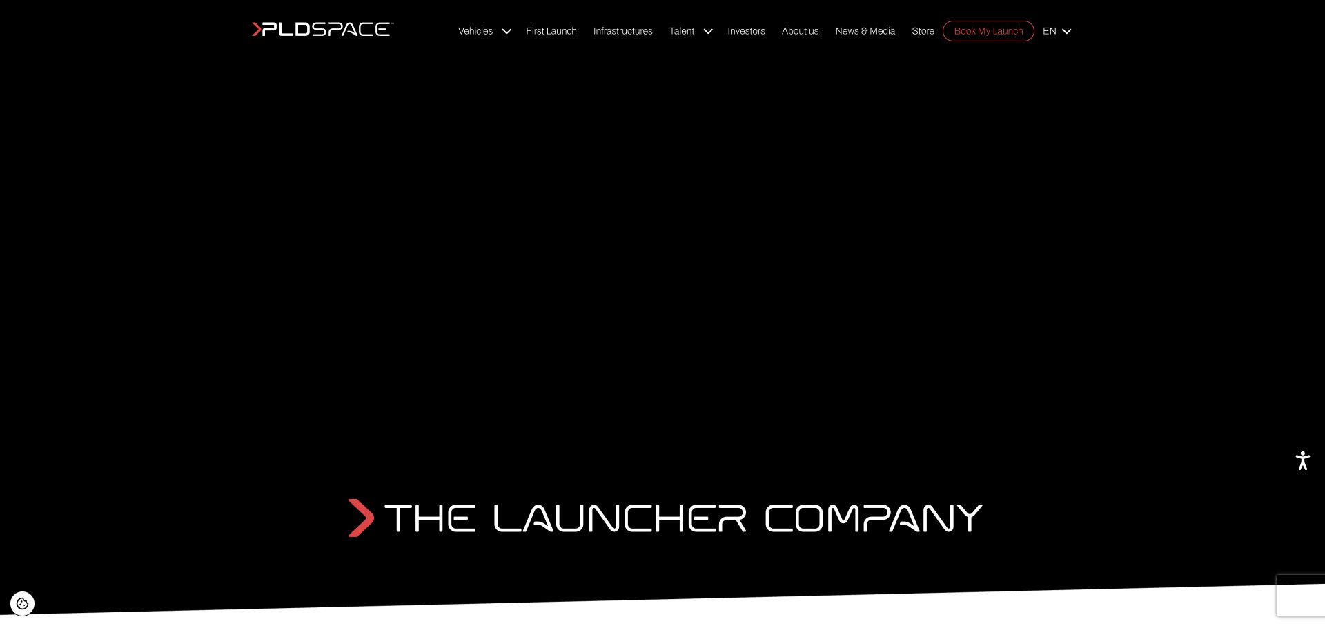
PLD Space groups its MIURA vehicles in a broad product navigation and pairs the launcher proposition with dated progress material. The English homepage links to vehicle introductions, infrastructure, careers, investment information and launch inquiries. Monthly engineering updates make the development story more specific than a general innovation claim, while the product family gives that news a stable context.
What you can learn
Connect development news to a persistent product architecture. Date meaningful program updates and distinguish operational availability from a future vehicle roadmap.
Pros
A visible vehicle family gives technical news an understandable product context.
Dated engineering updates provide a more concrete research path than an undifferentiated news feed.
Cons & considerations
The extensive navigation can be demanding for readers unfamiliar with the vehicle names.
The necessary-cookie view may show a much simpler hero, so the core proposition must work without background media.
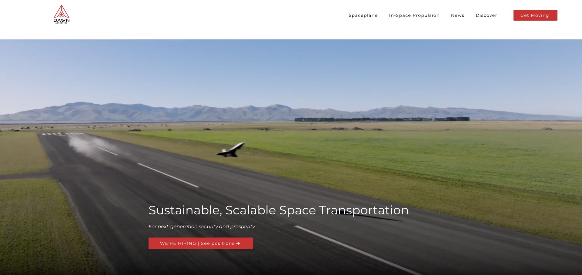
Dawn Aerospace gives its spaceplane and propulsion businesses separate navigation and homepage sections. A real runway scene establishes the aircraft side of the story, followed by a plain mission description and product-specific lists. The site then explains in-space propulsion as a different capability rather than asking visitors to infer how all of the hardware belongs together.
What you can learn
Keep different engineering products distinct while explaining the larger system they support. Product-specific use cases and requirements are more useful than repeating the same corporate mission above every item.
Pros
Spaceplane and propulsion routes are visible in the primary navigation.
Specific payload, orbit and turnaround information gives interested visitors a starting point for further questions.
Cons & considerations
A hiring action dominates the opening viewport even for prospective customers.
Performance and future-service statements require supporting context and must remain separate from independently verified operating results.
Kegan is a freelance web designer and developer with 15+ years of experience helping businesses turn complicated website requirements into clear, maintainable digital experiences. He works directly with clients from planning and design through development, launch, and ongoing support.
For aerospace website design, his development approach focuses on vehicle and mission information, dated milestones, technical material with qualified claims, and distinct customer, supplier, investor and careers routes. The scope can be a targeted improvement or a complete custom build, with responsive layouts, thoughtful content structure, and integrations chosen around the people using and maintaining the site.
Show 3 other aerospace website designersHide other aerospace website designers
Plan an aerospace website around the reader’s next technical or commercial question
Explain the category before the product nomenclature
Begin with the minimum explanation a qualified but unfamiliar reader needs. AstroForge states the activity directly; Varda describes processing materials in orbit and returning them to Earth. Both choices give the surrounding imagery a purpose. A new visitor should not have to understand every vehicle name, mission acronym or internal division before establishing whether the company is relevant.
Write product summaries around the job of each system. Impulse distinguishes the roles of Helios, Mira and Rideshare, while Dawn separates a spaceplane from in-space propulsion. Keep the category description stable even when a product name or development milestone changes. Navigation can then use the official names without leaving readers entirely dependent on prior knowledge.
Do not simplify by removing important boundaries. A product in development is not the same as an immediately available service. A website can explain an intended capability clearly while linking to current program status, qualifications and relevant constraints. Good introductory copy reduces confusion; it does not replace technical due diligence.
Give the audience a useful route into a broad engineering story
List the main reader tasks before deciding the homepage order. A payload operator may need an orbit and availability discussion, while a prospective employee may want to understand the work and the team. Varda exposes application routes early; Stoke distinguishes civil, defense and commercial customer contexts. These labels should lead to meaningful content, not duplicate pages with a different heading.
A broad supplier such as Rocket Lab needs a product taxonomy that can handle launch, spacecraft, components and software. Give each category a short explanation and a specific onward destination. Keep deeply technical material available without forcing general readers through the entire specification set. Avoid a single contact form as the only route through a complex portfolio.
Consumer-facing aviation has a different entrance problem. Joby leads with the commute and passenger experience rather than a parts catalog. That approach can be appropriate, provided the journey eventually exposes realistic availability and operating information. Choose the language for the audience in front of the page, rather than copying the tone of an unrelated aerospace brand.
Make performance and progress claims legible and maintainable
A numerical specification needs its relevant assumptions. Relativity labels payload figures by orbit and landing configuration, which is more informative than a single large capacity number. Decide which fields belong to each vehicle and keep the same definitions across the homepage, product page and downloadable material. Treat a change in configuration as a content-model issue, not only a copy edit.
Mission information benefits from consistent states and dates. Impulse places mission, vehicle, orbit and availability in a table; PLD connects a vehicle family to dated engineering updates. A current mission table needs an assigned owner and a review process. Preserve meaningful historical records, but do not leave an old booking action looking like a current offer.
Attribute commercial forecasts, safety language and operational claims appropriately. Website Unpacked’s design review does not establish certification, flight reliability, scientific results or market size. On the actual company site, connect important assertions to suitable public documentation where possible and make it clear when a figure is a target or company estimate.
Use motion to show the work without making it a barrier
The reviewed sites use launch footage, manufacturing scenes, aircraft and spacecraft imagery to communicate physical scale. Relativity’s production imagery and Dawn’s runway scene are useful because the subject is concrete. Decide what the media explains before giving it most of the first viewport. A beautiful but generic film can delay comprehension instead of supporting it.
Plan an intelligible static and reduced-motion experience. Necessary-cookie views may not load optional background media, and not every reader has a fast connection or wants animation. Keep the proposition, navigation and next step available as text. Protect contrast as the underlying footage changes and avoid conveying important program status only through video.
Treat media, news and mission updates as maintained content. Give files appropriate alternatives and captions where relevant, remove obsolete calls to action, and review links after a company or domain change. The website should help a reader move from interest to an informed question without pretending that the website itself proves the engineering.
The editing job behind the design
Choose tools for durable product and mission information
Model vehicles, configurations, missions, applications and program updates as maintained records rather than unrelated homepage blocks. Reuse verified fields consistently across navigation, tables, product pages and downloads.
Plan media delivery, accessible fallbacks and consent behavior together. Optional video should not remove the basic proposition when it is declined. Keep commercial inquiries separate from careers and investor requests.
Visible technology stacks reflect bounded public-source observations, not a complete backend inventory. A supporting library or delivery service does not establish a company’s flight software, internal engineering systems or safety practices.
Our WordPress website examples offer a separate look at publishing approaches. A visible platform label is evidence for that named page, not a guarantee that the same system will suit your requirements.
Before the public launch
Aerospace website planning checklist
State the specific activity before introducing internal product names.
Give each vehicle or system a concise role and a dedicated destination.
Separate customer applications from careers and investor information.
Label development goals, planned missions and available services distinctly.
Qualify performance figures by configuration and relevant assumptions.
Maintain mission dates, destinations and availability states.
Connect engineering news to the product it concerns.
Provide meaningful text when optional video or animation is unavailable.
Check contrast over every background-media state.
Keep inquiry routes appropriate to the reader’s actual task.
Attribute estimates and claims rather than presenting them as independently verified.
Assign owners to time-sensitive specifications and program content.
These checks are a project checklist, not a performance, legal, security, or accessibility certification. Test real journeys with the people responsible for the website before making claims about the result.
Sources & editorial method
How this collection was selected and reviewed
The original 12-example random target was saved before research. Each included public homepage was directly reviewed and captured in an ordinary browser. Optional cookies were declined or necessary-only preferences saved where controls were offered; obstructed first captures are retained privately and excluded in favor of the clean originals. PLD Space is represented by its English homepage. AstroForge was selected explicitly for a clear category explanation and mission navigation, not service quality, engineering feasibility or commercial outcomes. Capture timestamps remain independent of editorial dates. Each accepted source received a bounded broad public stack-audit attempt; it cannot reveal every internal system.
Each example links to its actual source page. Screenshots are direct browser captures with their own capture dates; moving imagery, announcements and live designs can change. The notes describe observable design choices and conditional tradeoffs, not measured traffic, conversion results, service quality, or accessibility conformance.
Technology labels use public page metadata, asset evidence, or explicitly cited platform documentation. Platform documentation is not a complete current deployment audit. A component reference may be legacy or unused; it is not a complete backend inventory. Unknown stacks are omitted. These sites are editorial examples, not our client portfolio.
Written, Edited and Curated are separate editorial records, not timestamps advanced by a rebuild. Website designs and imagery belong to their owners. See our editorial standards or suggest a correction.
Questions worth asking
Aerospace website design questions
What should an aerospace homepage explain first?
Explain the specific capability and intended audience in plain language. Product names and dramatic imagery work better once visitors understand whether the company offers launch, spacecraft, components, aviation systems or another service.
Should a launch company put specifications on its homepage?
Selected specifications can be useful when their configuration and assumptions are clear. Link to a maintained product record for the fuller context rather than displaying one unqualified number as if it describes every mission.
How should an aerospace website show a product still in development?
Distinguish targets, planned milestones, completed demonstrations and operating availability. Date meaningful updates and keep the commercial next step consistent with the actual status.
Does a polished website demonstrate aircraft or launch safety?
No. This collection reviews website communication and design. It does not verify certification, operational safety, engineering reliability or the accuracy of commercial forecasts.
Why is AstroForge the Editors Choice?
The reviewed homepage gives an unfamiliar asteroid-mining business a concrete introductory explanation and clear routes into missions and payloads. The selection concerns public website communication only.
Start with a plain explanation of the capability, give each audience a useful path and maintain the facts behind the visual story. Ambitious aerospace design works best when the next technical or commercial question is easier to ask.