Best Intercom Websites of 2026 (20 Real-World Examples)
Twenty verified public help centers showing how collection design, role choices and support context change the customer experience.
Intercom can power a public help center without powering the company’s marketing site or product. These examples study the exact support properties where the help-center application or an explicit platform disclosure was directly verified.
The collection starts with five deliberately selected recognizable category brands: Claude, Doodle, Ahrefs, Kit and Synthesia. Each has an official public support property with direct Intercom help-center evidence. The remaining examples broaden the patterns across education, creator payments, childcare, video production, email infrastructure and image editing. Brand prominence here is an explicit editorial judgment, not a fabricated traffic or market-share ranking.
Study the choice architecture rather than merely the familiar search-and-cards silhouette. A migration path, a participant route, an account-control shortcut or a precise developer destination can matter more than a large visual customization. We distinguish Intercom help-center rendering from a Messenger installation or Fin usage elsewhere, and we excluded older associations when the current public page no longer supported them.
Before the examples
What makes good Intercom website development in 2026?
Verify the help-center implementation, not the logo
Claude, Kit and the other asset-verified examples load the Intercom-hosted help-center application and its helpCenterIdentifier/locale rendering routes. Buy Me a Coffee, Playground and Intercom’s own help property visibly disclose the platform in the footer. These signals concern the named public portal. They do not prove which system serves the company’s main website, application or all support channels.
Doodle distinguishes participation from organizing, Teachable separates students from school operators, and Playground names families, teachers and administrators. Kit gives migration its own entry point. These are useful boundaries because responsibilities and prerequisites differ. A collection taxonomy should explain those distinctions, not simply mirror the internal department that last edited an article.
Support the state after the main button is pressed
HeyGen promotes pending and rejected-output guidance, Restream separates preflight and post-broadcast assets, and Photoroom treats image quality as an independent topic. A creation workflow includes blocked states, output requirements and administration, not only feature instructions. The visible patterns suggest content priorities; they do not establish resolution rates, automation quality or response speed.
Each example below is the named public help property shown in its direct browser capture. The first five have explicit sourced opening rationales; the rest emphasize different content and navigation decisions rather than pretending that a shared template makes every support journey the same.
We start with five recognizable brands or organizations: Claude Help Center, Doodle Help Center, Ahrefs Help Center, Kit Help Center, Synthesia Knowledge Base. Each attribution applies to the named website property, not every product or website belonging to its organization. This is a curated reading sequence, not a measured ranking.
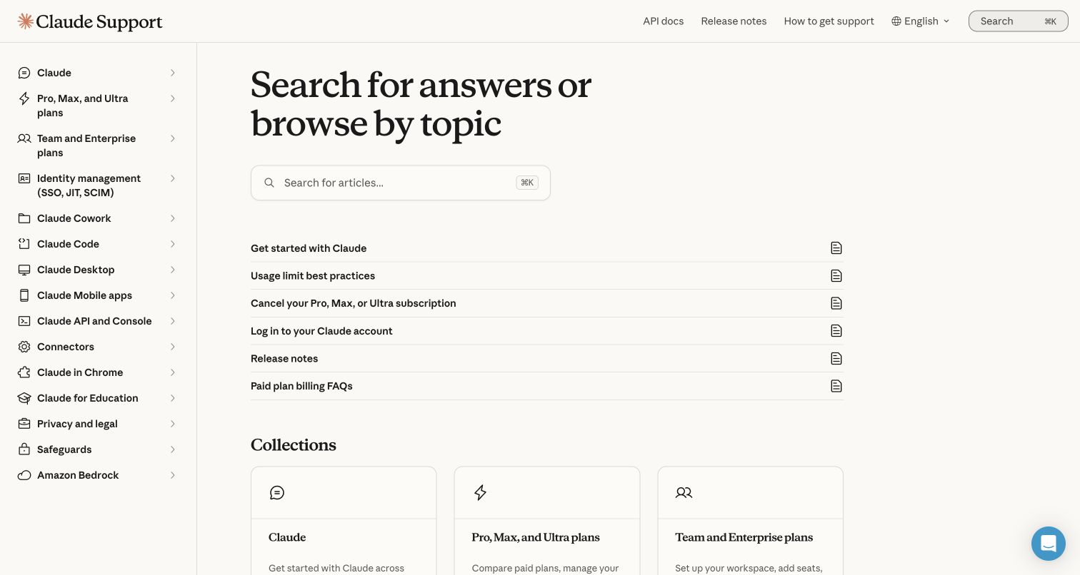
Claude’s help home keeps a detailed product and plan sidebar beside a compact group of frequently needed articles. The main panel promotes getting started, usage limits, cancellation, login, release notes and billing before the full collection grid. The sidebar distinguishes desktop, mobile, code, API, identity management, connectors and privacy. The practical lesson is the coexistence of stable product scope and direct links to sensitive account questions; visitors need not enter a plan comparison journey merely to find cancellation guidance.
What you can learn
Keep the most consequential operational questions close to the search field and maintain product context throughout browsing. Distinguish end-user instructions from enterprise identity administration so similar account terms do not lead different audiences into the same answer.
Pros
Cancellation, login and usage guidance are named directly in the short featured list above the collection directory.
The persistent sidebar keeps individual product surfaces and enterprise identity management visibly distinct.
Cons & considerations
If more product surfaces accumulate, the sidebar will need grouping to avoid becoming a long inventory.
If a visitor does not know their plan or product context, overlapping labels may still require explanatory cross-links.
Platform source: WordPress.org Showcase. Direct browser DOM inspection of this public help center found the Intercom-hosted help-center application scripts on static.intercomassets.com, including pages/_app-e4032437aaa5ec7a.js and the helpCenterIdentifier/locale rendering route. This is help-center application evidence, not a Messenger widget alone, and does not imply the company’s main product or marketing site uses Intercom. Platform evidence is separate from the direct website screenshot and is not a complete current infrastructure audit.
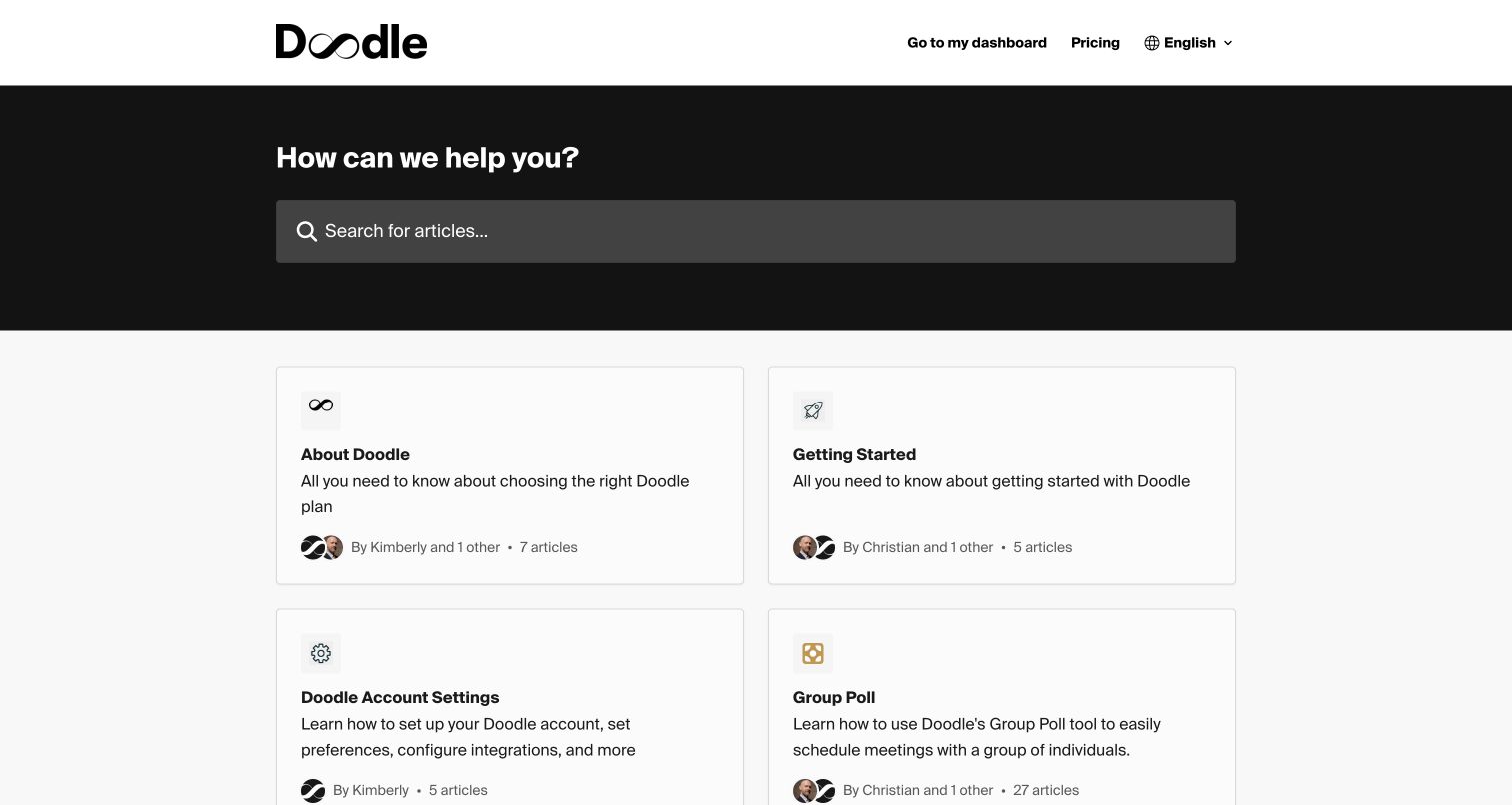
Doodle’s help center uses a black search hero above a two-column collection grid. The directory distinguishes Group Poll, Sign-up Sheet, Booking Page and one-to-one scheduling, with short explanations of each tool. It also separates participation from account settings, billing, integrations and team administration. Contact support is a visible fallback after the collections. The useful distinction is between running the scheduling process and responding to it: a participant should not have to read subscription administration instructions to understand an invitation.
What you can learn
Map support to both sides of an interaction when not everyone using the product has an account. Describe neighboring scheduling tools through their jobs, and keep participation, organizer setup and team administration as separate entry points.
Pros
Participation receives its own collection rather than being folded into product setup or account management.
Descriptions clarify differences between group polls, booking pages and one-to-one scheduling before users navigate.
Cons & considerations
If readers need a specific error resolved, a long equal-weight grid may be slower to scan than promoted fixes.
If a product name is unfamiliar, its card description must remain complete and readable on narrow screens.
Platform source: WordPress.org Showcase. Direct browser DOM inspection of this public help center found the Intercom-hosted help-center application scripts on static.intercomassets.com, including pages/_app-e4032437aaa5ec7a.js and the helpCenterIdentifier/locale rendering route. This is help-center application evidence, not a Messenger widget alone, and does not imply the company’s main product or marketing site uses Intercom. Platform evidence is separate from the direct website screenshot and is not a complete current infrastructure audit.
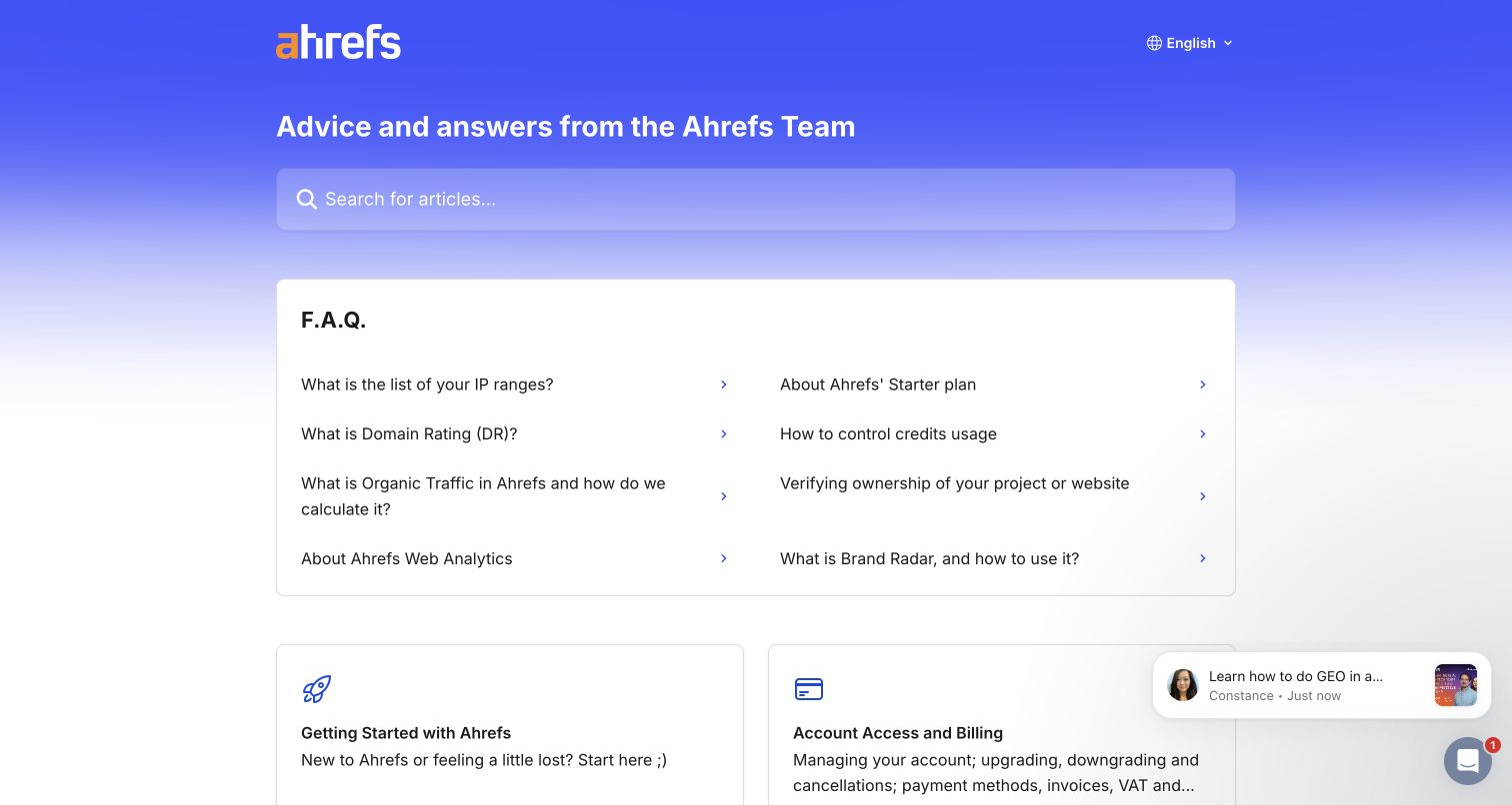
Ahrefs places an unusually practical FAQ block immediately below search. It links to IP ranges, credit usage, ownership verification and definitions of Domain Rating and organic traffic before presenting the broader tool directory. Collections then follow recognizable product areas such as Site Explorer, Keywords Explorer, Rank Tracker and Site Audit. Account access and billing remain separate from those analytical tools, while the footer points to academy and blog resources. This help center treats understanding a metric and controlling consumption as legitimate support tasks, not merely secondary educational content.
What you can learn
Promote definitions when a number can be misinterpreted without context, and separate usage controls from analytical technique. A help home can teach the meaning of an output as well as the steps needed to produce it.
Pros
Metric definitions, credit controls and verification questions appear as direct links ahead of the product directory.
Collections preserve the names of individual tools while account and billing guidance has a clear independent destination.
Cons & considerations
If new tools keep being appended, the large collection list will need editorial prioritization rather than equal emphasis.
If promotional chat notifications appear, they can compete with a visitor’s immediate documentation task.
Visible tech stack
Earlier / documented evidence
Intercom
Platform source: WordPress.org Showcase. Direct browser DOM inspection of this public help center found the Intercom-hosted help-center application scripts on static.intercomassets.com, including pages/_app-e4032437aaa5ec7a.js and the helpCenterIdentifier/locale rendering route. This is help-center application evidence, not a Messenger widget alone, and does not imply the company’s main product or marketing site uses Intercom. Platform evidence is separate from the direct website screenshot and is not a complete current infrastructure audit.
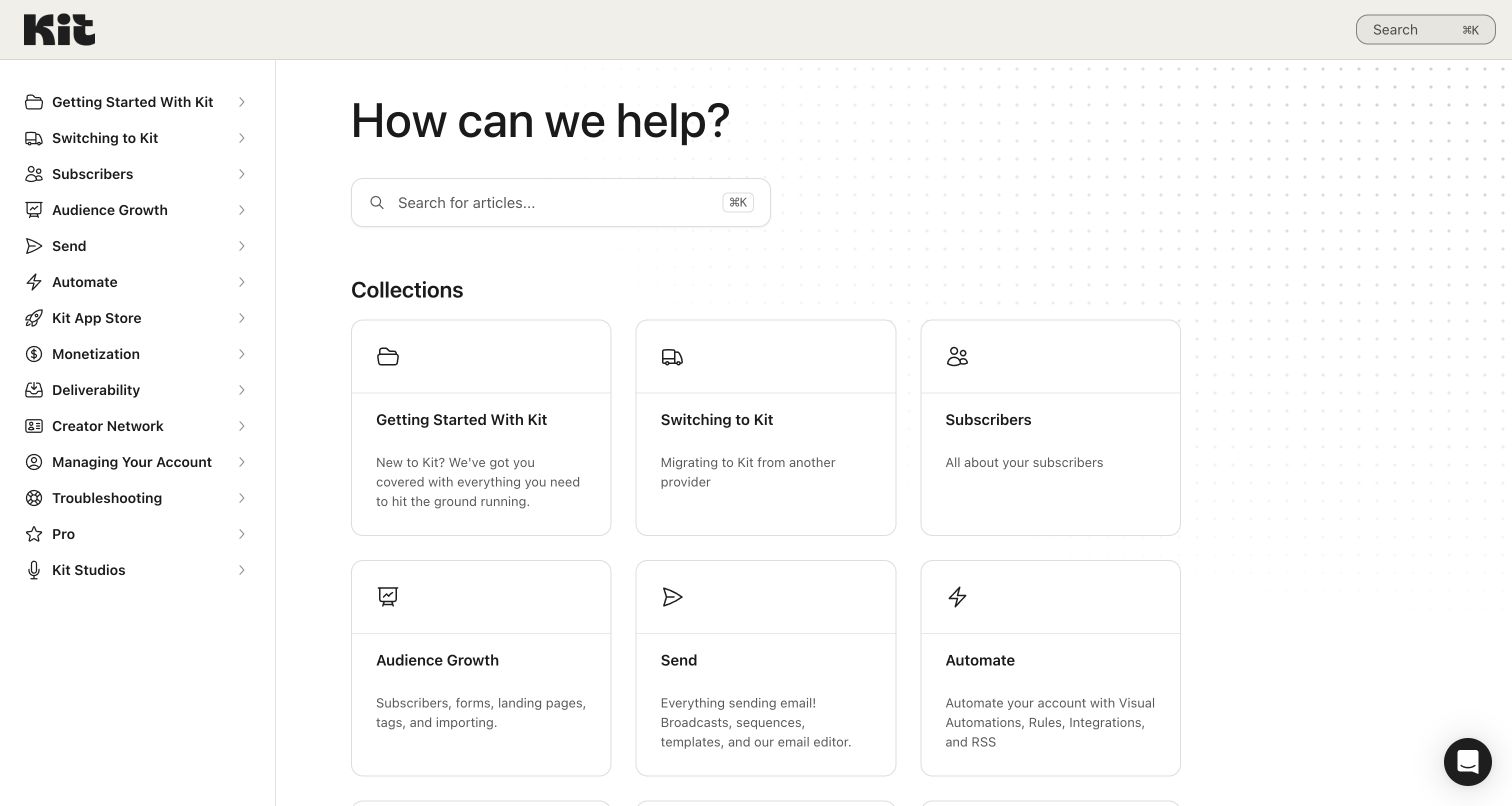
Kit’s help center uses a persistent sidebar and a three-column collection layout, with very little introductory marketing. Getting started and switching providers appear as separate early choices. The remaining taxonomy distinguishes subscribers, audience growth, sending, automation, monetization, deliverability and troubleshooting. Card descriptions explain practical boundaries: sending covers broadcasts and sequences, while automation covers workflows, rules and integrations. A separate migration route is particularly useful because a new customer bringing an existing list has different risks and prerequisites from someone starting from nothing.
What you can learn
Treat migration as its own operational journey rather than a subsection of beginner setup. Separate message creation, automation and deliverability, and explain where a task belongs when similar product concepts share terminology across the interface.
Pros
Switching providers is visible beside first-time setup instead of hidden deep within a general introduction.
Deliverability has a dedicated collection, distinct from ordinary sending and growth instructions.
Cons & considerations
If a visitor is unsure whether subscribers and audience growth overlap, the category descriptions must resolve that boundary.
If support contact is important for migration blockers, a directory-only first screen may need a clearer assistance route.
Platform source: WordPress.org Showcase. Direct browser DOM inspection of this public help center found the Intercom-hosted help-center application scripts on static.intercomassets.com, including pages/_app-e4032437aaa5ec7a.js and the helpCenterIdentifier/locale rendering route. This is help-center application evidence, not a Messenger widget alone, and does not imply the company’s main product or marketing site uses Intercom. Platform evidence is separate from the direct website screenshot and is not a complete current infrastructure audit.
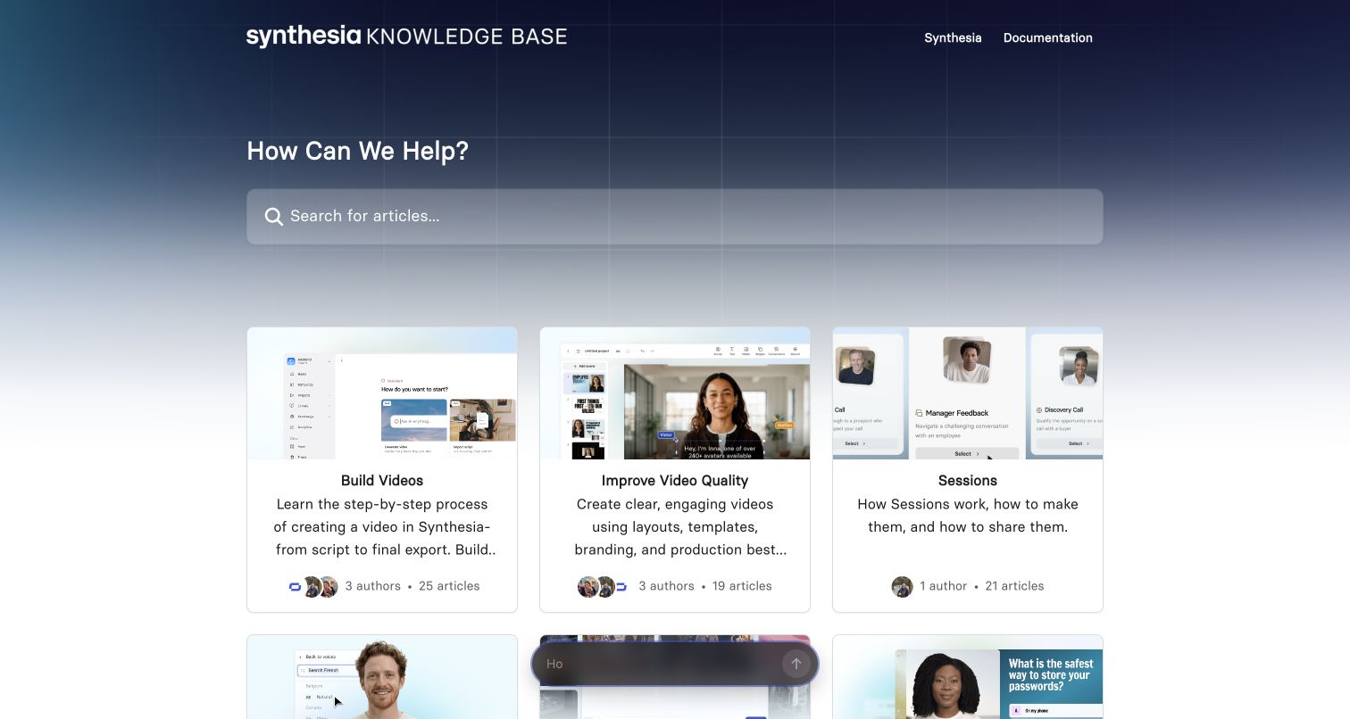
Synthesia’s knowledge base uses screenshots in collection cards rather than generic decorative icons. The early choices cover building videos, improving quality and Sessions; later groups address avatars, voice, AI, interactivity, publishing and localization. Workspace management, billing and trust and safety remain separate operational subjects. The taxonomy largely follows the production lifecycle, so visitors can identify the stage where they are stuck without knowing every feature name. The card imagery supplies product context, but the detailed descriptions carry the navigation meaning.
What you can learn
Organize a creation tool’s support around the lifecycle of the work, not only the names of editing controls. Keep account administration and responsible-use guidance distinct from creative technique, and do not let illustrative screenshots replace concise task descriptions.
Pros
Production-stage categories connect creation, quality improvement, publication and localization in a recognizable workflow.
Trust and safety is a named collection alongside billing and workspace operations rather than only a legal footer.
Cons & considerations
If collection screenshots age after an interface change, they may mislead despite remaining visually attractive.
If descriptions truncate on smaller cards, the distinction between adjacent production stages can become less clear.
Platform source: WordPress.org Showcase. Direct browser DOM inspection of this public help center found the Intercom-hosted help-center application scripts on static.intercomassets.com, including pages/_app-e4032437aaa5ec7a.js and the helpCenterIdentifier/locale rendering route. This is help-center application evidence, not a Messenger widget alone, and does not imply the company’s main product or marketing site uses Intercom. Platform evidence is separate from the direct website screenshot and is not a complete current infrastructure audit.
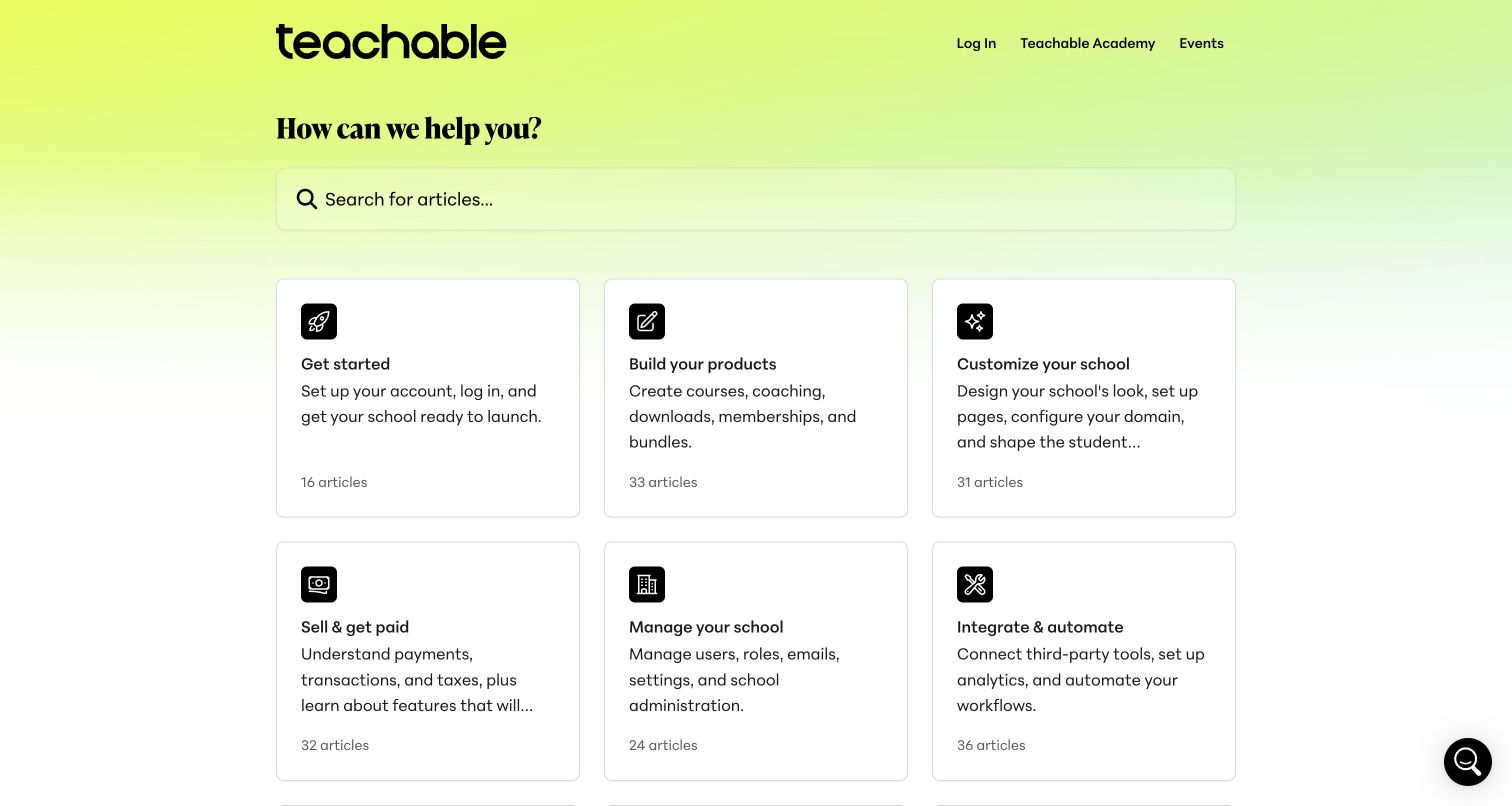
Teachable’s help home translates its product into a sequence of operational collections: get started, build products, customize the school, sell and get paid, manage the school, then integrate and automate. Student Guides receives its own route, separate from the creator’s administration tasks. Policies and trust and a help/contact collection round out the directory. This is a useful pattern for an ecosystem where the person reading the instructions may either run the business or have purchased access to one course.
What you can learn
Separate purchaser support from owner administration before presenting detailed instructions. Follow the business setup sequence where it helps, but retain an independent contact and troubleshooting route for existing users who are not starting a new school.
Pros
Student guidance is explicitly separated from building, selling and managing the creator’s school.
The collection labels describe concrete business stages instead of relying entirely on internal product menu names.
Cons & considerations
If a student overlooks their dedicated route, the owner-heavy first rows may initially appear irrelevant.
If article counts dominate card space, clearer descriptions may provide more navigational value than catalog size.
Visible tech stack
Earlier / documented evidence
Intercom
Platform source: WordPress.org Showcase. Direct browser DOM inspection of this public help center found the Intercom-hosted help-center application scripts on static.intercomassets.com, including pages/_app-e4032437aaa5ec7a.js and the helpCenterIdentifier/locale rendering route. This is help-center application evidence, not a Messenger widget alone, and does not imply the company’s main product or marketing site uses Intercom. Platform evidence is separate from the direct website screenshot and is not a complete current infrastructure audit.
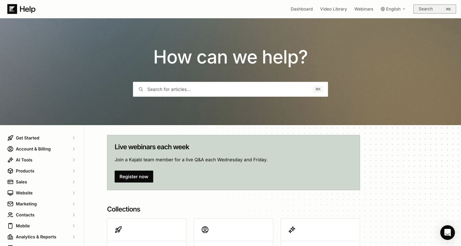
Kajabi combines a search hero with a persistent sidebar for account and billing, products, sales, websites, marketing, contacts, analytics and integrations. The main panel starts with a live webinar invitation before presenting collection cards with fuller explanations. Customer Guides has its own category for people using sites powered by Kajabi, distinct from the platform operator’s own business tasks. The page demonstrates how a large help catalog can mirror the business functions a creator manages while offering a human-led learning route alongside self-service material.
What you can learn
Use persistent function-based navigation when a platform combines several business tools, and explain which audience each guide serves. Place scheduled learning opportunities where they are discoverable without making a webinar signup the prerequisite for finding an operational answer.
Pros
Customer Guides distinguishes the platform’s customers from the end customers of sites built with it.
Collection descriptions explain the scope of sales, marketing and integrations rather than leaving only short labels.
Cons & considerations
If the webinar promotion is not relevant to the visitor’s issue, it delays the first collection row.
If functions overlap, website, product and marketing instructions need deliberate cross-links and clear ownership.
Platform source: WordPress.org Showcase. Direct browser DOM inspection of this public help center found the Intercom-hosted help-center application scripts on static.intercomassets.com, including pages/_app-e4032437aaa5ec7a.js and the helpCenterIdentifier/locale rendering route. This is help-center application evidence, not a Messenger widget alone, and does not imply the company’s main product or marketing site uses Intercom. Platform evidence is separate from the direct website screenshot and is not a complete current infrastructure audit.
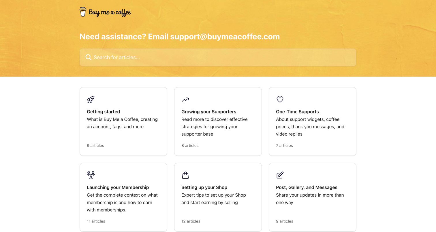
Buy Me a Coffee’s yellow help header does something unusually direct: it names the support email address above the search input. The collection grid separates starting out, growing supporters, one-time support, memberships, shops, posting and getting paid. Supporters and members also have their own collection, while account/content moderation and security are not hidden inside general growth advice. The pattern is useful for a smaller support operation that wants a clear public fallback without forcing every visitor through a messenger interaction first.
What you can learn
Publish a straightforward contact option when that matches the actual support process, and distinguish the person receiving funds from the person contributing them. Keep payout approval and security guidance visible as operational subjects, separate from monetization tutorials.
Pros
The support email is visible in the hero and repeated as a named footer destination.
Payout moderation, account security and supporter questions are separate collections rather than a single miscellaneous bucket.
Cons & considerations
If support depends on account context, a public email link still needs guidance about what information is safe to include.
If the collection directory expands, growth and monetization topics should not bury urgent payout or access problems.
Platform source: WordPress.org Showcase. The exact official public help-center page visibly discloses “We run on Intercom” in a footer link to intercom.com/intercom-link. This identifies the help-center property, not the company’s entire website or authenticated product. Platform evidence is separate from the direct website screenshot and is not a complete current infrastructure audit.
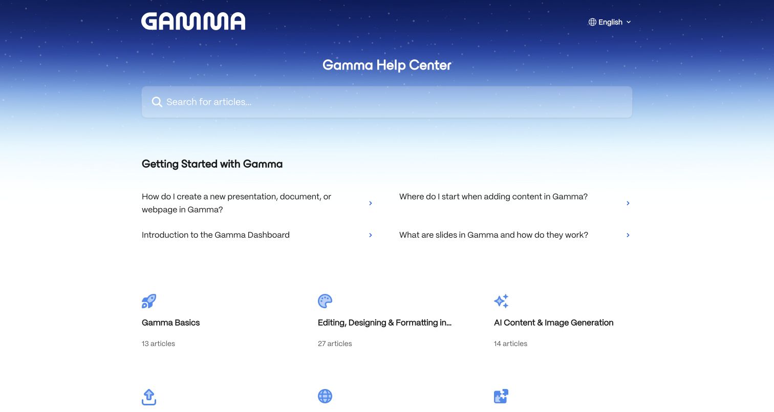
Gamma’s help center places a short getting-started article group between its blue star-pattern search hero and the category grid. The questions cover creating a presentation, document or webpage, adding content, navigating the dashboard and understanding slides. The directory below separates editing, AI generation, sharing, websites, imports, workspace settings, billing, privacy and troubleshooting. This makes the first screen about the product’s basic working model rather than a promotional feature catalog.
What you can learn
If your product changes a familiar mental model, explain its fundamentals before asking users to browse feature names. Pair a small set of introductory questions with stable operational categories, and keep billing and privacy independent from the creative curriculum.
Pros
The featured questions explain how the editor works before visitors must choose a feature-specific collection.
Website publishing, imports and sharing are distinct categories rather than being treated as interchangeable export tasks.
Cons & considerations
If users already know the basics, the introductory article block adds space before deeper troubleshooting topics.
If long category titles truncate, the lightweight grid needs enough room to preserve their meaning.
Visible tech stack
Earlier / documented evidence
Intercom
Platform source: WordPress.org Showcase. Direct browser DOM inspection of this public help center found the Intercom-hosted help-center application scripts on static.intercomassets.com, including pages/_app-e4032437aaa5ec7a.js and the helpCenterIdentifier/locale rendering route. This is help-center application evidence, not a Messenger widget alone, and does not imply the company’s main product or marketing site uses Intercom. Platform evidence is separate from the direct website screenshot and is not a complete current infrastructure audit.
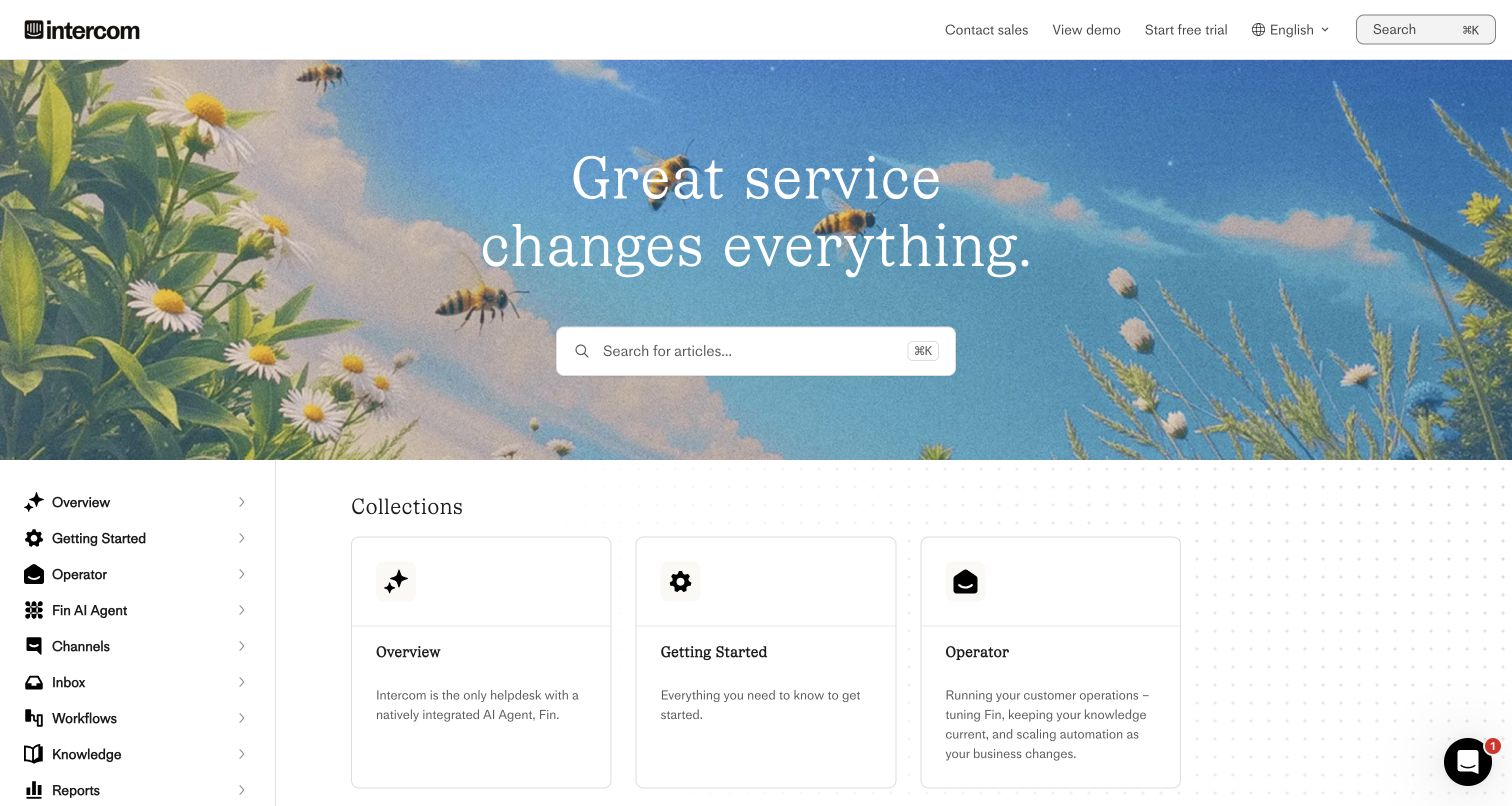
Intercom’s own help center combines a photographic meadow hero with a persistent product-function sidebar. Collections distinguish the inbox, channels, workflows, knowledge, reports, contacts, workforce management, integrations and mobile SDKs. Fin AI Agent is a named area within that larger structure rather than a synonym for every support capability. The footer explicitly states that the property runs on Intercom and links to developers, academy and community resources. The header also includes sales, demo and trial destinations, which makes this an example of a help property serving both evaluating and existing customers.
What you can learn
Separate the AI-agent subject from the rest of the support operating system. Maintain clear destinations for administrators, implementers and frontline operators, and distinguish learning resources from sales actions so existing customers can stay focused on their task.
Pros
Fin, knowledge, inbox and workflow subjects are separately labeled rather than collapsed into one general AI category.
Developer, academy and community resources remain distinct destinations in the help ecosystem.
Cons & considerations
If visitors are solving an urgent issue, the expansive photographic hero delays the operational collections.
If promotional event blocks remain after their date, they need review to avoid weakening the help center’s freshness.
Platform source: WordPress.org Showcase. The exact official public help-center page visibly discloses “We run on Intercom” in a footer link to intercom.com/intercom-link. This identifies the help-center property, not the company’s entire website or authenticated product. Platform evidence is separate from the direct website screenshot and is not a complete current infrastructure audit.
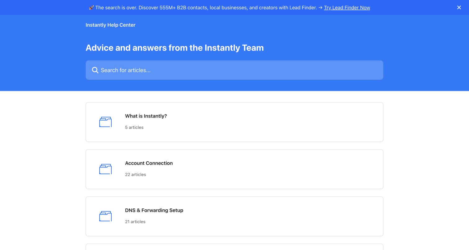
Instantly’s help home uses a blue search header and a single-column collection list. Account connection and DNS/forwarding setup appear before campaigns, followed by analytics, inbox, CRM, integrations, deliverability and settings. Troubleshooting and privacy have separate destinations. Compared with denser three-column layouts, the broad horizontal cards give each category a clear target but expose fewer topics in the initial viewport. The stronger editorial decision is placing technical prerequisites near the beginning rather than assuming a customer can launch successfully from the campaign screen alone.
What you can learn
Surface infrastructure prerequisites before the workflow that depends on them. For a product connected to external email systems, account connection, domain configuration and delivery diagnostics need clear separate routes rather than becoming scattered footnotes in campaign tutorials.
Pros
Account connection and DNS setup are early named collections, acknowledging external dependencies before campaign creation.
Deliverability, troubleshooting and privacy each have an explicit route alongside the commercial product features.
Cons & considerations
If the catalog grows, a single-column card list may require substantial scrolling to reach later support topics.
If a promotional strip is unrelated to the current problem, it competes with the help page’s practical purpose.
Visible tech stack
Earlier / documented evidence
Intercom
Platform source: WordPress.org Showcase. Direct browser DOM inspection of this public help center found the Intercom-hosted help-center application scripts on static.intercomassets.com, including pages/_app-e4032437aaa5ec7a.js and the helpCenterIdentifier/locale rendering route. This is help-center application evidence, not a Messenger widget alone, and does not imply the company’s main product or marketing site uses Intercom. Platform evidence is separate from the direct website screenshot and is not a complete current infrastructure audit.
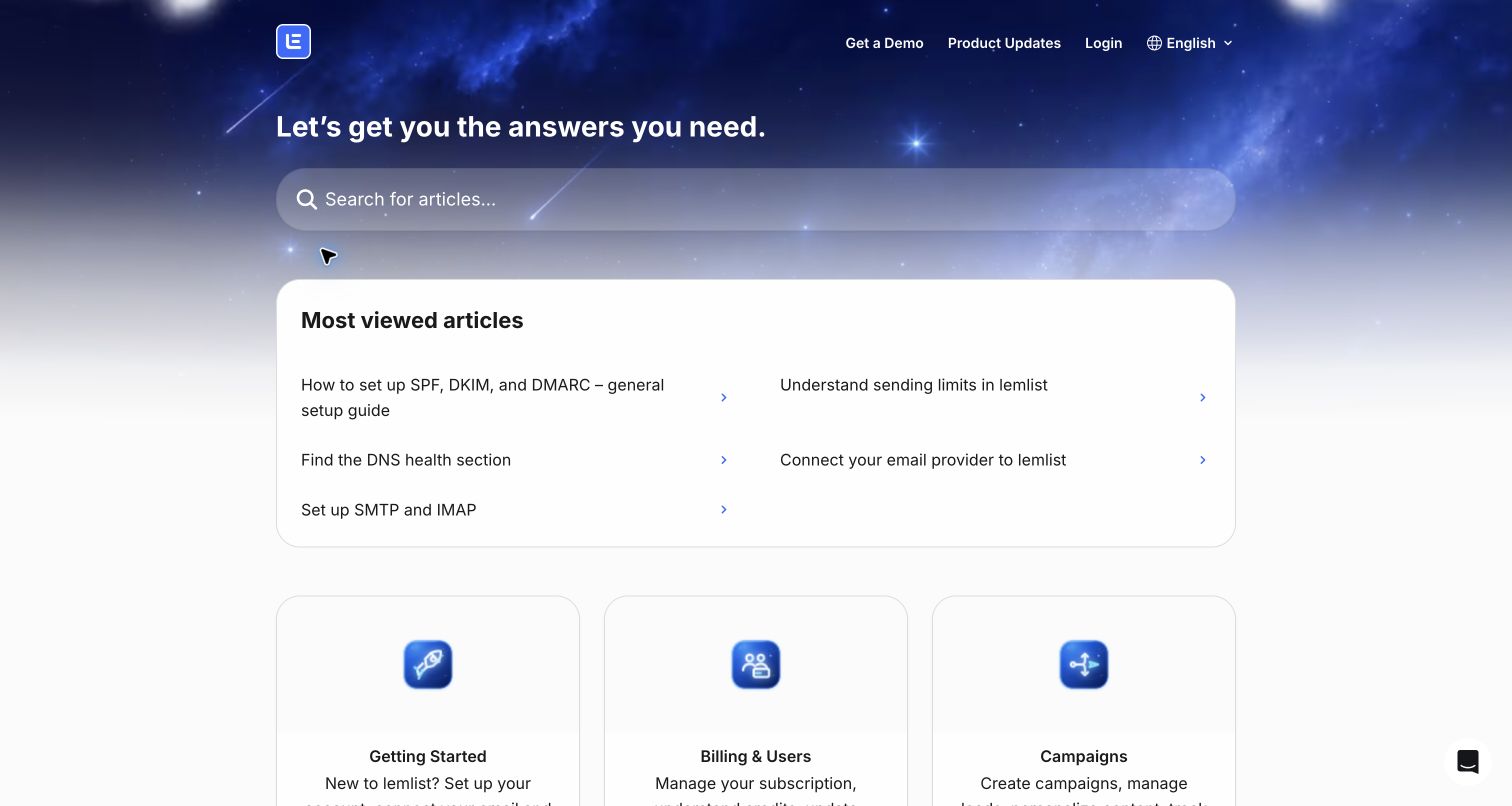
lemlist’s starry search hero leads into a most-viewed block focused on technical setup: SPF, DKIM, DMARC, sending limits, DNS health, provider connection and SMTP/IMAP. Below that, the catalog separates campaigns, personalization, leads, LinkedIn, calling, integrations, billing and troubleshooting. Adjacent products such as scheduling and email warm-up receive distinct collections, and beta features are clearly labeled as limited and subject to change. The home page therefore recognizes that failures in external configuration can block the core workflow.
What you can learn
Promote common prerequisites in the vocabulary customers encounter outside your application. Explain experimental availability explicitly and separate channel-specific questions, so a general campaign guide does not become the misleading answer to every technical or account issue.
Pros
The first article group gives direct access to domain authentication and connection issues without a category guess.
Beta-feature descriptions qualify availability and changing behavior rather than presenting experiments as universally stable capabilities.
Cons & considerations
If technical acronyms are unfamiliar, the linked guides need clear explanations rather than assuming an administrator audience.
If the growing suite shares similar feature names, collection boundaries will require regular editorial review.
Platform source: WordPress.org Showcase. Direct browser DOM inspection of this public help center found the Intercom-hosted help-center application scripts on static.intercomassets.com, including pages/_app-e4032437aaa5ec7a.js and the helpCenterIdentifier/locale rendering route. This is help-center application evidence, not a Messenger widget alone, and does not imply the company’s main product or marketing site uses Intercom. Platform evidence is separate from the direct website screenshot and is not a complete current infrastructure audit.
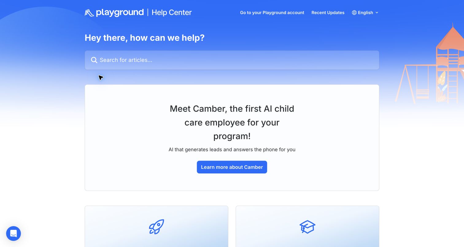
Playground’s public help center uses four audience collections: single-site administrators, teachers, families and multi-site administrators. Each description names the relevant dashboard or app, helping distinguish a parent’s task from an operator’s responsibilities. In the captured view, a large announcement for the company’s AI childcare offering sits between search and those role choices. That placement is the main design tradeoff: the role model is strong and appropriately specific, but a substantial product promotion delays the first practical help decision for visitors who already know their role.
What you can learn
Use role-based support when permissions and responsibilities genuinely differ, and explain the corresponding app or dashboard. Keep announcements proportional to the support task; families and teachers should not have to interpret an administrator-oriented product promotion to reach their instructions.
Pros
Families, teachers and administrators receive explicit separate routes with descriptions tied to their actual app context.
Single-location and multi-site administration are distinguished instead of assuming all operators have the same responsibilities.
Cons & considerations
If visitors need immediate guidance, the large AI product announcement pushes role selection below the initial screen.
If a person occupies multiple roles, cross-links must clarify which app and permissions each instruction requires.
Platform source: WordPress.org Showcase. The exact official public help-center page visibly discloses “We run on Intercom” in a footer link to intercom.com/intercom-link. This identifies the help-center property, not the company’s entire website or authenticated product. Platform evidence is separate from the direct website screenshot and is not a complete current infrastructure audit.
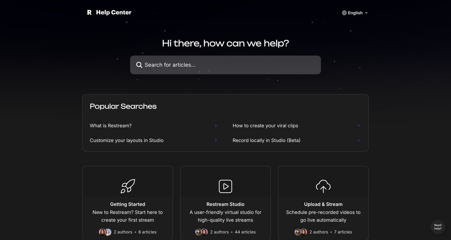
Restream’s dark help center pairs a search field with a short popular-article block, then presents collections for studio production, prerecorded streaming, encoders, platforms, guests, events and recordings. A distinct Before You Go Live collection introduces preparation as its own support task, while Solve a Problem gives troubleshooting a plain-language label. The structure is useful because a live event has stages and deadlines: connecting an encoder, inviting a guest and finding a recording are not interchangeable feature questions even if they all relate to the same broadcast.
What you can learn
Organize time-sensitive support around the production lifecycle and make preflight checks easy to find. Separate preparation, live operation and post-event assets, and use an obvious troubleshooting label for visitors who cannot yet identify the failing component.
Pros
Before You Go Live provides a named preparation route instead of scattering checks throughout unrelated feature guides.
Encoder, guest, platform and recording topics reflect different operational stages and external dependencies.
Cons & considerations
If a live issue is urgent, the large card catalog still requires clear search results and escalation beyond attractive navigation.
If dark-theme contrast is weak, subtle category borders and link colors may become harder to perceive.
Platform source: WordPress.org Showcase. Direct browser DOM inspection of this public help center found the Intercom-hosted help-center application scripts on static.intercomassets.com, including pages/_app-e4032437aaa5ec7a.js and the helpCenterIdentifier/locale rendering route. This is help-center application evidence, not a Messenger widget alone, and does not imply the company’s main product or marketing site uses Intercom. Platform evidence is separate from the direct website screenshot and is not a complete current infrastructure audit.
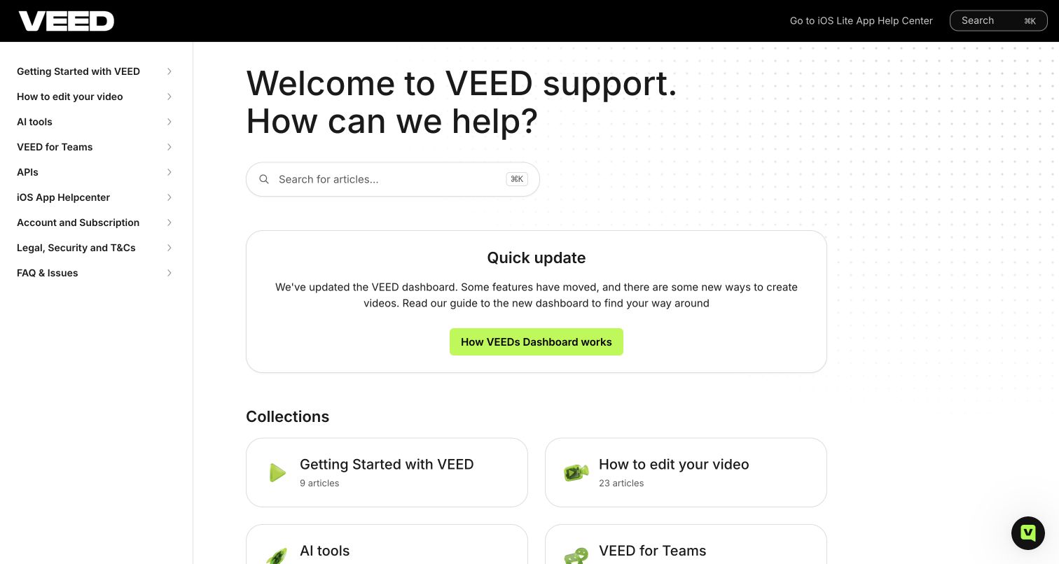
VEED’s help home uses a persistent sidebar, compact collection cards and a clear update notice explaining that dashboard features have moved. The notice links directly to the new dashboard guide rather than merely announcing a redesign. The taxonomy separates editing, AI tools, teams, APIs, iOS, subscriptions, legal/security and troubleshooting; the header also points to the iOS Lite help center. A lower support note distinguishes AI-first chat from further assistance and describes availability. The key pattern is helping existing customers relocate known actions while preserving stable subject navigation.
What you can learn
When an interface changes, publish a task-oriented relocation guide in the help center and keep it maintained. Distinguish web, API and mobile instructions, and explain assistance channels without treating a stated response expectation as a measured service guarantee.
Pros
The dashboard notice acknowledges moved features and provides a specific orientation guide for returning users.
Web editing, teams, APIs and mobile help are explicitly separated in persistent navigation.
Cons & considerations
If the redesign notice remains indefinitely, it may consume valuable space after the transition is no longer current.
If several mobile products exist, iOS and iOS Lite routes need precise labels to avoid misdirected instructions.
Platform source: WordPress.org Showcase. Direct browser DOM inspection of this public help center found the Intercom-hosted help-center application scripts on static.intercomassets.com, including pages/_app-e4032437aaa5ec7a.js and the helpCenterIdentifier/locale rendering route. This is help-center application evidence, not a Messenger widget alone, and does not imply the company’s main product or marketing site uses Intercom. Platform evidence is separate from the direct website screenshot and is not a complete current infrastructure audit.
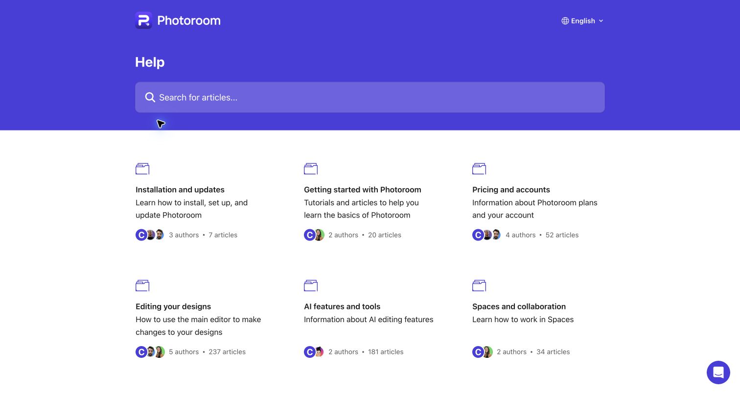
Photoroom’s purple help header leads into a compact three-column directory. Installation, introductory guidance and pricing appear first, followed by editing, AI tools, collaboration, batch work, Shopify publishing and image quality. Copyright responsibilities and API guidance have their own collections. The interesting choice is treating image quality and resolution as an independent topic rather than assuming every problem belongs to an editing tool. For commerce users, an apparently successful edit can still fail the practical requirement of a sharp, usable product image.
What you can learn
Separate output requirements from editing actions when customers care about the finished asset’s usability. Keep batch operations and destination-specific publishing distinct, and provide clear rights and account-management routes alongside creative tutorials rather than letting feature growth consume the entire directory.
Pros
Image quality, batch production and Shopify publishing are distinct topics that reflect different production requirements.
Copyright responsibilities and cancellation have visible public routes rather than being omitted from the creative support experience.
Cons & considerations
If collection sizes grow substantially, broad editing and AI categories will need stronger internal hierarchy.
If cancellation is a common need, placing its shortcut after the full directory may make it less immediately discoverable.
Platform source: WordPress.org Showcase. Direct browser DOM inspection of this public help center found the Intercom-hosted help-center application scripts on static.intercomassets.com, including pages/_app-e4032437aaa5ec7a.js and the helpCenterIdentifier/locale rendering route. This is help-center application evidence, not a Messenger widget alone, and does not imply the company’s main product or marketing site uses Intercom. Platform evidence is separate from the direct website screenshot and is not a complete current infrastructure audit.
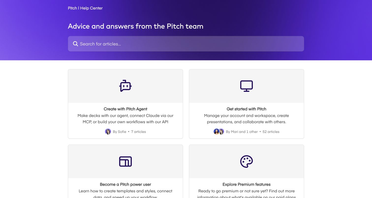
Pitch’s help center presents a purple search hero above a deliberately small collection grid. An agent/API/MCP collection sits beside the introductory path, followed by power-user guidance, premium features, troubleshooting, billing and contact. The card descriptions distinguish managing a workspace and collaborating from advanced templates, styles and data workflows. This is a useful contrast to help homes that expose every feature as its own top-level category: a few learning stages can be enough when their boundaries are understandable.
What you can learn
Use learning-stage collections when they simplify a modest catalog, but retain independent problem, billing and contact paths. Give new automation workflows a precise description so experienced users can recognize them without making every beginner navigate technical integration terminology.
Pros
Beginner and power-user collections describe different learning goals rather than presenting one undifferentiated tutorial list.
Troubleshooting, billing and contact remain explicit collections outside the product-learning progression.
Cons & considerations
If the catalog expands, large stage-based collections may become too broad without internal topic structure.
If agent and integration terminology is unfamiliar, its first-row prominence may need balancing against basic presentation tasks.
Platform source: WordPress.org Showcase. Direct browser DOM inspection of this public help center found the Intercom-hosted help-center application scripts on static.intercomassets.com, including pages/_app-e4032437aaa5ec7a.js and the helpCenterIdentifier/locale rendering route. This is help-center application evidence, not a Messenger widget alone, and does not imply the company’s main product or marketing site uses Intercom. Platform evidence is separate from the direct website screenshot and is not a complete current infrastructure audit.
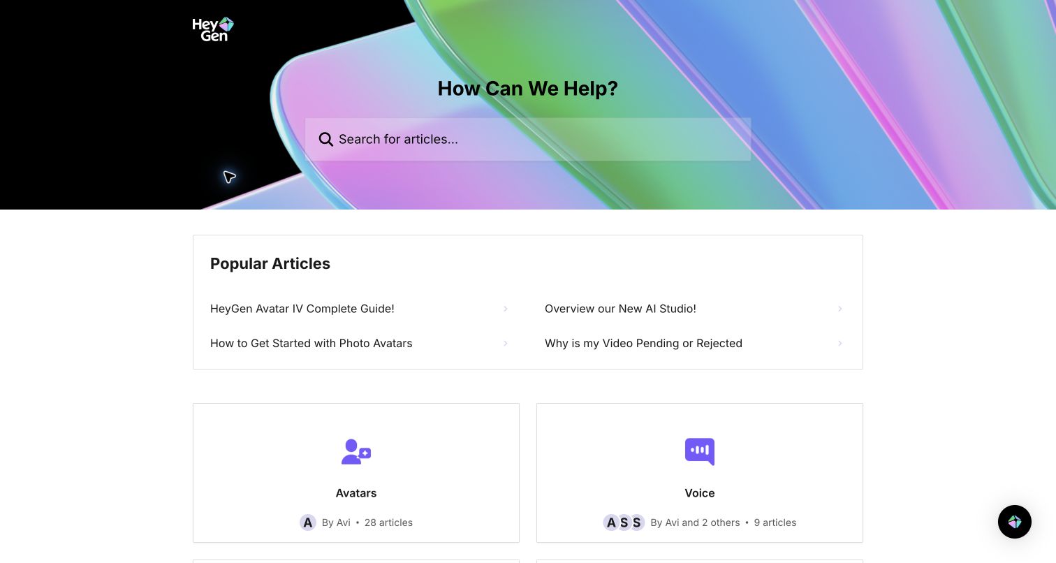
HeyGen’s iridescent search banner sits above a four-link popular-article group. Three links introduce avatar and studio workflows, while another addresses pending or rejected videos. The category grid then separates avatars, voice, translation, video, account/billing, apps and general product information. The inclusion of an unfinished-output question is important: an AI creation workflow does not end when a user presses generate, and support must explain what happens when an asset cannot be delivered as expected. The page offers both feature learning and a route into that operational uncertainty.
What you can learn
Pair creation tutorials with guidance for blocked, pending or rejected outputs. Keep voice, avatar, translation and account questions distinct, and explain moderation-related states carefully rather than treating every failure as an ordinary editor bug or a reason to retry blindly.
Pros
Pending or rejected video guidance is promoted beside new creative workflows instead of hidden in a generic FAQ.
Voice, avatars and translation receive separate collections, reflecting materially different creation inputs and questions.
Cons & considerations
If popular guides reference changing model versions, their titles and screenshots need active maintenance.
If article-count cards provide little descriptive text, newcomers may need search to understand where adjacent video topics belong.
Visible tech stack
Earlier / documented evidence
Intercom
Platform source: WordPress.org Showcase. Direct browser DOM inspection of this public help center found the Intercom-hosted help-center application scripts on static.intercomassets.com, including pages/_app-e4032437aaa5ec7a.js and the helpCenterIdentifier/locale rendering route. This is help-center application evidence, not a Messenger widget alone, and does not imply the company’s main product or marketing site uses Intercom. Platform evidence is separate from the direct website screenshot and is not a complete current infrastructure audit.
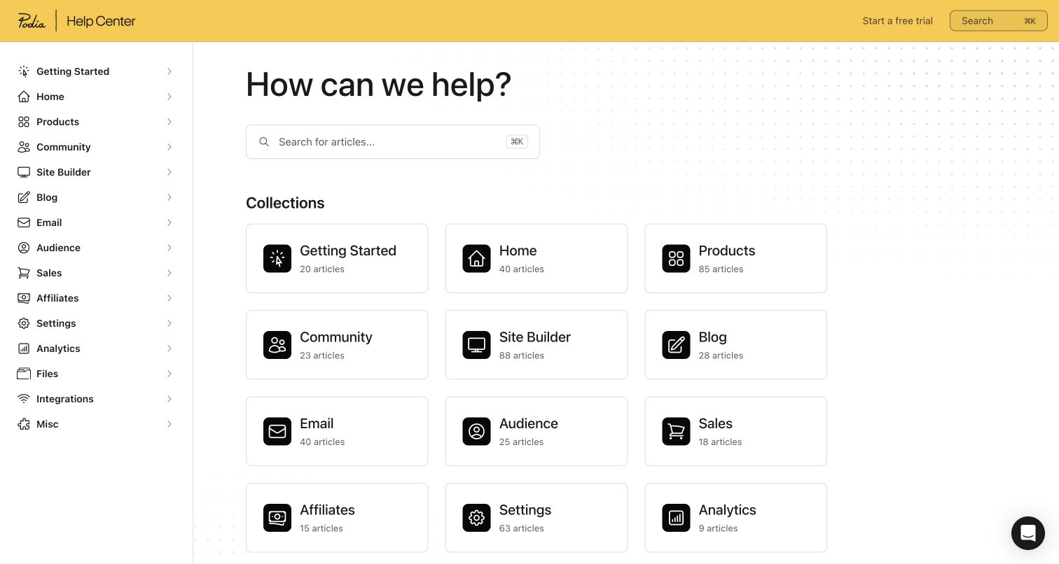
Podia’s help home mirrors a broad application workspace through a persistent sidebar and compact collection cards. Products, community, site building, blogging, email, audience, sales, affiliates, settings, analytics, files and integrations are visible alongside getting started. The main screen has little introductory material beyond search, which makes many destinations available quickly. The tradeoff is that several labels assume the visitor understands the application’s structure: Home, Products and Misc are less self-explanatory than a full question or a described task.
What you can learn
Mirror the application only where its labels are already meaningful to users. Add descriptions or promoted task questions where broad nouns are ambiguous, and prevent miscellaneous collections from becoming an unmaintained destination for every article without a clear owner.
Pros
The compact layout exposes many business-function destinations without a large marketing hero or launch promotion.
Persistent navigation preserves orientation while users move between the platform’s site, product, email and sales subjects.
Cons & considerations
If users are new to the application, labels such as Home and Misc may not explain which answers they contain.
If contact or troubleshooting is a frequent need, a function-only first screen may require an additional direct fallback.
Platform source: WordPress.org Showcase. Direct browser DOM inspection of this public help center found the Intercom-hosted help-center application scripts on static.intercomassets.com, including pages/_app-e4032437aaa5ec7a.js and the helpCenterIdentifier/locale rendering route. This is help-center application evidence, not a Messenger widget alone, and does not imply the company’s main product or marketing site uses Intercom. Platform evidence is separate from the direct website screenshot and is not a complete current infrastructure audit.
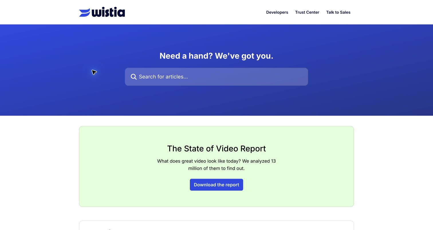
Wistia’s help center combines a blue search hero with a top-article list covering embeds, media management, account settings, channels and webinars. Collections then distinguish analytics, hosting, sharing, customization, uploads, production, podcasts, integrations and development. Developers and the trust center have direct header links. A large report promotion sits before the practical article list in the captured view, making the editorial balance visible: the brand’s wider educational content is present, but it occupies space that an existing customer may want for a specific operational task.
What you can learn
Keep developer reference and trust material discoverable without mixing them into everyday media-management instructions. Group operational help by production stage and delivery method, and judge promotional education blocks against the urgency of the support questions they push downward.
Pros
Developer and trust destinations are available directly in the header, not only after the help directory.
Embedding, uploading, analytics and webinar hosting have distinct support collections rather than a generic video category.
Cons & considerations
If visitors need immediate embed troubleshooting, the prominent report campaign delays access to the article links.
If new product capabilities keep accumulating, the media lifecycle taxonomy will need review to preserve understandable boundaries.
Platform source: WordPress.org Showcase. Direct browser DOM inspection of this public help center found the Intercom-hosted help-center application scripts on static.intercomassets.com, including pages/_app-e4032437aaa5ec7a.js and the helpCenterIdentifier/locale rendering route. This is help-center application evidence, not a Messenger widget alone, and does not imply the company’s main product or marketing site uses Intercom. Platform evidence is separate from the direct website screenshot and is not a complete current infrastructure audit.
Kegan has 15+ years of experience working with small businesses, Fortune 500 companies, and everything in between. No development job is too big or too small: he brings the same hands-on attention to a focused improvement, a complete website, or a custom application.
For Intercom projects, he can help with website integrations, form and campaign connections, analytics implementation, testing, and clear ownership after launch. He works directly with clients on scope, design, implementation, testing, and handover, with an emphasis on clear communication and a system that remains practical to maintain after launch.
Show 3 other Intercom developersHide other Intercom developers
Choose between a collection directory and a documentation workspace
A compact collection directory
Doodle, Pitch and Buy Me a Coffee use a familiar search-and-collections entrance. This can work well when descriptions make adjacent subjects distinct and the catalog remains manageable. Decide whether author names and article counts actually help users choose. A smaller collection with precise scope can be more useful than a larger one that becomes a catch-all.
Persistent navigation for a broad product
Claude, Kit, VEED and Podia keep navigation visible beside the main content. This preserves product context across a larger catalog, but can also reproduce ambiguous application labels. Plan grouping, explanatory descriptions and cross-links before adding every new feature to the top level. Confirm the actual implementation on small screens and with keyboard navigation.
Curated tasks before the full directory
Ahrefs promotes metric definitions and usage controls; Gamma explains the editing model; lemlist surfaces external configuration prerequisites. A small curated group can bridge the gap between a user’s question and the product’s vocabulary. Select it from real support needs, keep it current and do not let launch announcements consume the same space without review.
From references to requirements
Build the operating model behind the help center
Define audience, product and lifecycle context
Map who asks each question, what access they have and where they are in the workflow. Distinguish an account owner from a student, family member, participant or administrator. Identify whether instructions change by device, plan or product. Write collection descriptions around those differences and give cross-cutting subjects such as privacy, billing and troubleshooting clear owners.
Connect articles, automation and further assistance honestly
A useful public article does not automatically imply a particular messenger, AI or human-support entitlement. Define where account-specific questions move, what context can be collected safely and which channels are actually available. Label those routes before users choose them. Test the handoff without publishing unsupported response-time or automation-success claims, and keep sensitive operations inside the appropriate authenticated workflow.
Plan maintenance around product change
Assign maintainers for migration guides, model-version tutorials, interface relocation notices and platform integrations. Create a retirement process for old promotions and beta instructions. Test representative questions from search through the article and fallback route, including zero-result and wrong-product cases. Evaluate factual accuracy, task completion and support outcomes separately from the visual quality of the home page.
A useful handover demonstration
Ask the actual team to carry out its routine job: publish a realistic update, correct a mistake, preview a narrow screen, and identify who owns an integration failure. For a library or frontend framework, also ask who maintains the content source and deployment. A polished screenshot does not answer those operational questions.
Beyond the screenshot
Intercom help-center planning checklist
Record the exact public help URL and dated help-center platform evidence.
Do not equate Fin adoption or a Messenger widget with Intercom-hosted help content.
Define the roles, products and lifecycle stages that change the instructions.
Give collections concise descriptions and avoid unexplained miscellaneous categories.
Promote real prerequisite, account-control and blocked-output questions near search.
Label human, AI, community and documentation routes according to their actual scope.
Assign owners to release notices, beta guidance and integration instructions.
Test search, navigation, small screens and escalation journeys on the working help center.
Test with real content, a keyboard, a small screen, slow or failed requests, and the people who will maintain the system. These are planning checks, not an accessibility, security, performance, or search-ranking certification.
Sources & editorial method
How this Intercom collection was reviewed
All 20 named public properties were read and captured directly in a desktop browser on 6 November 2026 UTC. Platform evidence is a loaded Intercom help-center rendering application or the page’s explicit platform footer, not a customer-logo list, Messenger alone or a Fin customer story. Current pages that had moved to other systems, exposed security warnings or lacked adequate evidence were excluded. No support messages, request forms, account changes, purchases or logins were performed. Reviews assess visible structure and editorial tradeoffs, not measured support performance, accessibility conformance or search accuracy.
Every image is an unmodified capture from the actual website, with its source and capture date. Some captures are reused from our shared catalog; their dates remain the original capture dates. None comes from a vendor gallery or a generated reconstruction. Moving imagery and live content can change.
Technology attribution uses public page assets or metadata, official platform documentation, or a cited first-party project case study. Documentary and framework-relationship evidence is identified where used; it is not a complete current backend inventory. A CMS image CDN alone does not establish a full CMS deployment. A library’s presence does not prove which individual controls use it, and a platform label does not establish AI authorship.
The composition notes, lessons, pros and tradeoffs are original editorial observations. We have not measured conversion, traffic, security, performance or accessibility conformance. Website owners retain their brands and imagery; these examples are not our client portfolio. Written, Edited and Curated are independent records, not dates advanced by a build. See our editorial standards or suggest a correction.
Questions worth asking
Intercom website development FAQs
Does an Intercom customer story prove a website is an Intercom help center?
No. A company may use Fin or Messenger while publishing help content on a different system. This collection requires evidence tied to the named public help property: the actual help-center application or an explicit platform disclosure. Company-wide customer logos and historic associations are not enough.
Why are some familiar former Intercom help centers absent?
Public support systems change. During this review, the current OpenAI home did not expose the required direct Intercom application signal, Perplexity used a different documentation frontend and Coda redirected to Superhuman’s Zendesk help property. We excluded those candidates rather than presenting an older association as current evidence.
Should we use the same sidebar or card layout as these sites?
Choose the structure that matches your audience’s decisions. A small catalog can work as a clear collection grid; a broad suite may benefit from persistent context. Neither is automatically better. Check category boundaries, descriptions, search and the next assistance route with representative questions before judging the design by appearance.
Can screenshots show whether AI support or search works well?
No. They show the visible interface and editorial choices at a particular moment. Answer quality, escalation accuracy, privacy behavior, response speed and operational results need separate testing and authorized service data. The reviews intentionally avoid attributing those outcomes to the platform or design.
Begin with the question, the person asking it and the next honest route to an answer. Then borrow the collection, sidebar or curated-task pattern that makes that specific journey clearer—and verify the implementation with your own support content.