Best Leather Goods Brand Websites of 2026 (29 Real-World Examples)
Leather-goods websites that make bags, wallets and accessories distinctive while explaining materials, dimensions, use and care.
A persuasive leather-goods website gives customers a sense of the object and enough practical detail to understand whether it fits their daily life.
Leather goods are highly tactile products sold through an untouchable medium. Photography can suggest surface, shape and character, but a customer still needs to understand dimensions, interior organization, carrying options and the material used in the selected variant. A restrained luxury presentation works best when it does not make those ordinary questions difficult to answer.
The examples include specialist makers and broader accessories houses with leather-goods ranges. They are website design references, not independent assessments of leather grades, durability, labor conditions or environmental performance. Study how the sites connect an object’s identity with product information and an appropriate buying or service route. A compelling workshop story should remain distinct from verified evidence about every item in the catalog.
Before the examples
What makes good leather goods brand website design in 2026?
Show the object in use
Combine clear product views with useful scale and interior context. A bag’s silhouette is only one part of the decision. Show how it is carried and what its compartments are intended to accommodate without turning a styled photograph into an unqualified capacity promise.
Keep material and variant information specific
Attach the relevant material, finish, color and care information to the selected product. Do not assume that every item in a brand’s range uses the same leather or that a broader brand story accurately describes every component.
Make craft stories concrete
Explain the actual people, processes or design decisions behind a product where evidence and permissions support the account. Avoid using a workshop image as silent proof of in-house production or turning a descriptive material term into an unsupported quality ranking.
Treat care and service as part of ownership
Give customers a dependable route to care guidance, repairs or other support the business actually provides. Keep the conditions visible and distinguish advice for different finishes or constructions. Do not imply a universal service promise through a vague lifetime badge.
The collection · 29 examples
29 leather goods brand websites worth studying
Compare specialist workshops, functional carry brands and luxury accessories houses. Look for useful ways to show proportions, organize product families and connect a purchase with long-term care information.
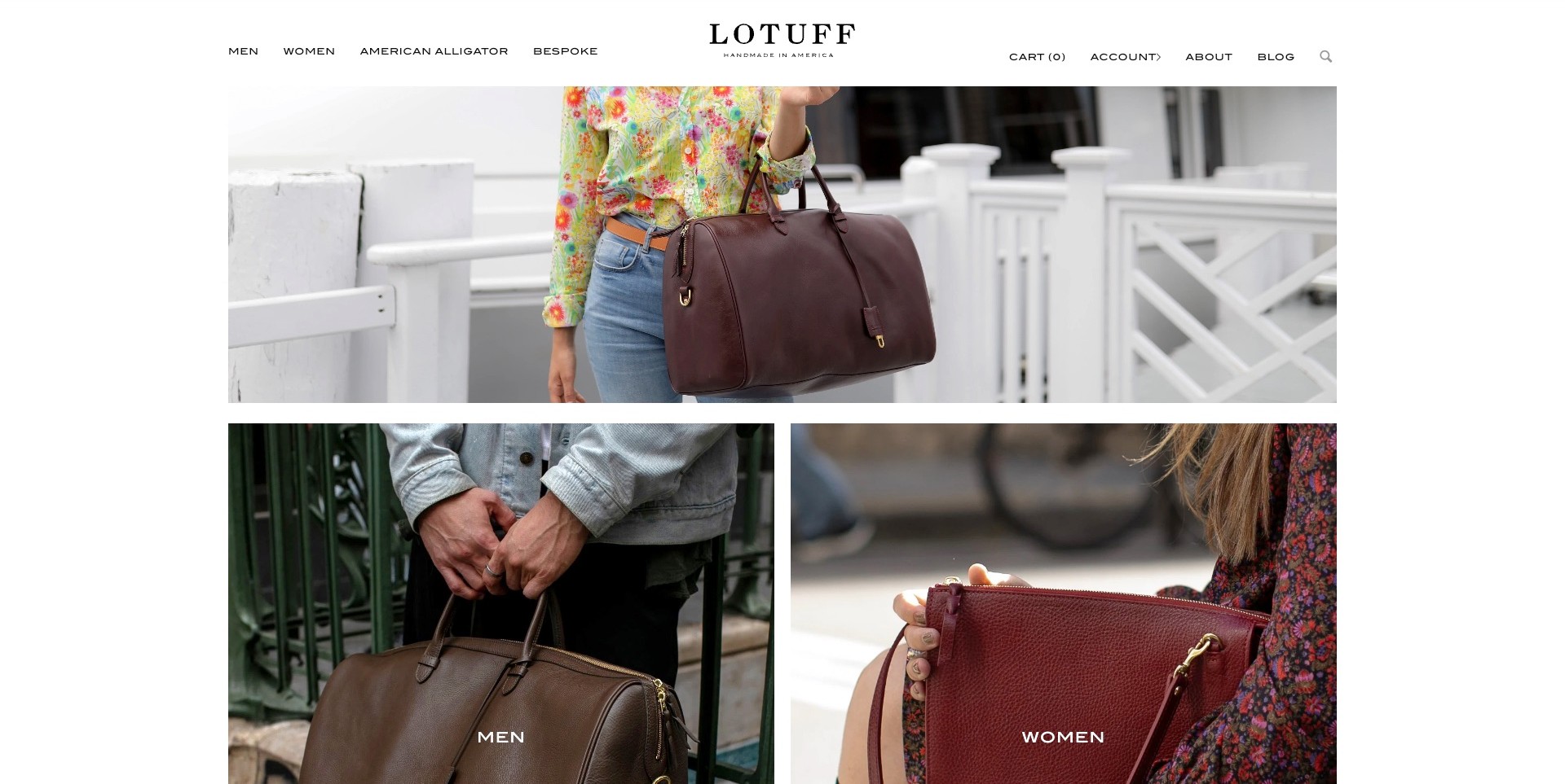
Lotuff Leather opens with a wide photograph of a person carrying a dark handled bag, followed immediately by two smaller image tiles labeled for men and women. White margins and a restrained centered wordmark keep attention on the bags rather than a stack of promotional messages. The header separates ordinary shopping from bespoke work, brand information and the blog. The photographs show how the products sit beside a body, but the homepage does not establish exact dimensions, leather grade or construction quality independently. Its strongest contribution is a direct and recognizable introduction to a specialist assortment.
What you can learn
Use the opening photographs to communicate the product’s form and approximate carrying scale, then make the next browsing choice explicit. Pair lifestyle imagery with neutral product views, measurements and material descriptions on the destination. A focused assortment does not need a long manifesto before visitors can start investigating it.
Pros
The immediate image grid provides clear shopping routes without covering the products.
Wide white margins give the leather colors and bag silhouettes room to register.
Cons & considerations
Gender-led categories benefit from product-type routes for task-focused shoppers.
On-person photography still needs precise dimensions and capacity information before purchase.
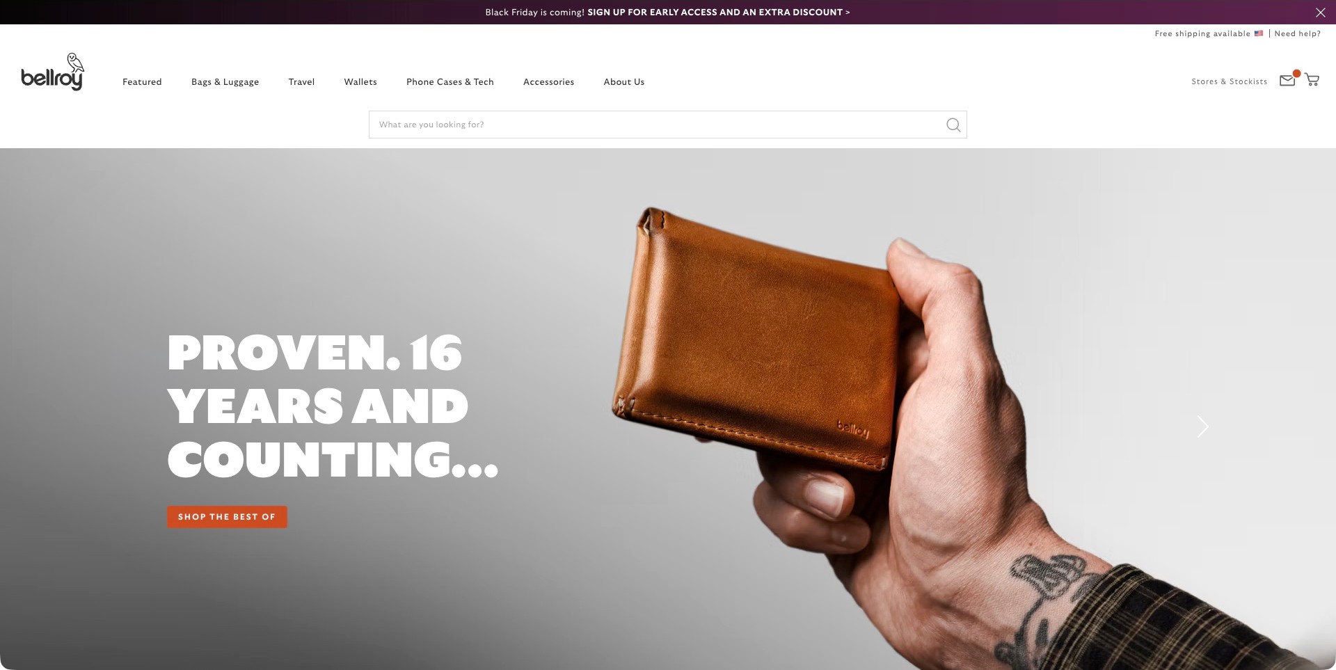
Bellroy’s captured homepage pairs a close photograph of a brown wallet held in a hand with a large anniversary-style message and one orange shopping action. The hand makes the object’s everyday scale more legible than an isolated texture image would. Above it, a prominent search field sits below plain categories for bags, travel, wallets, technology accessories and other goods. The actual page identifies a leather range, but the broad catalog is not assumed to use leather throughout. The headline’s longevity language is brand messaging, not an independently verified durability test.
What you can learn
Lead with one recognizable object when the catalog covers several carry tasks. Keep material information specific to individual products, and let customers navigate by what they need to carry rather than by campaign language alone. A visible search field can complement the large image for visitors who already know the item they want.
Pros
The held wallet gives the hero an immediate product and scale reference.
Plain product categories support several shopping intentions beyond the featured accessory.
Cons & considerations
Promotional strips and a large search header consume substantial vertical space.
An anniversary message needs separate evidence before it becomes a product-lifespan claim.
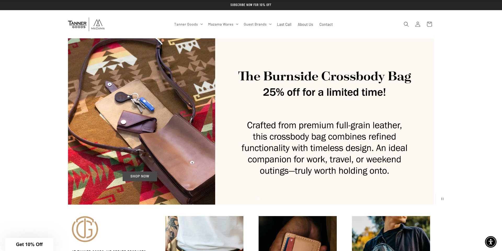
Tanner Goods shows its Burnside crossbody bag on a patterned textile beside keys and small accessories. A pale adjoining panel names the bag, identifies a promotion and describes the intended use. The shopping action sits over the product photograph, while the navigation distinguishes Tanner Goods from other brands and collections. Below, the next product imagery begins without another full-screen introduction. This particular page explicitly describes a leather bag, but the material grade and promotional claims remain the seller’s statements rather than an independent quality assessment.
What you can learn
Give a featured bag a name, an intelligible use case and a clear route to the exact product. Use the destination to explain dimensions, strap adjustment, closure and material care. When a store carries additional brands, keep the featured maker identifiable so shoppers understand whose product and policies they are reviewing.
Pros
The separate pale panel keeps explanatory copy away from the patterned background.
Nearby everyday objects give a useful visual reference for the bag’s intended role.
Cons & considerations
A button over detailed photography needs strong contrast at every screen size.
Large promotional copy should not displace exact specifications and offer conditions.
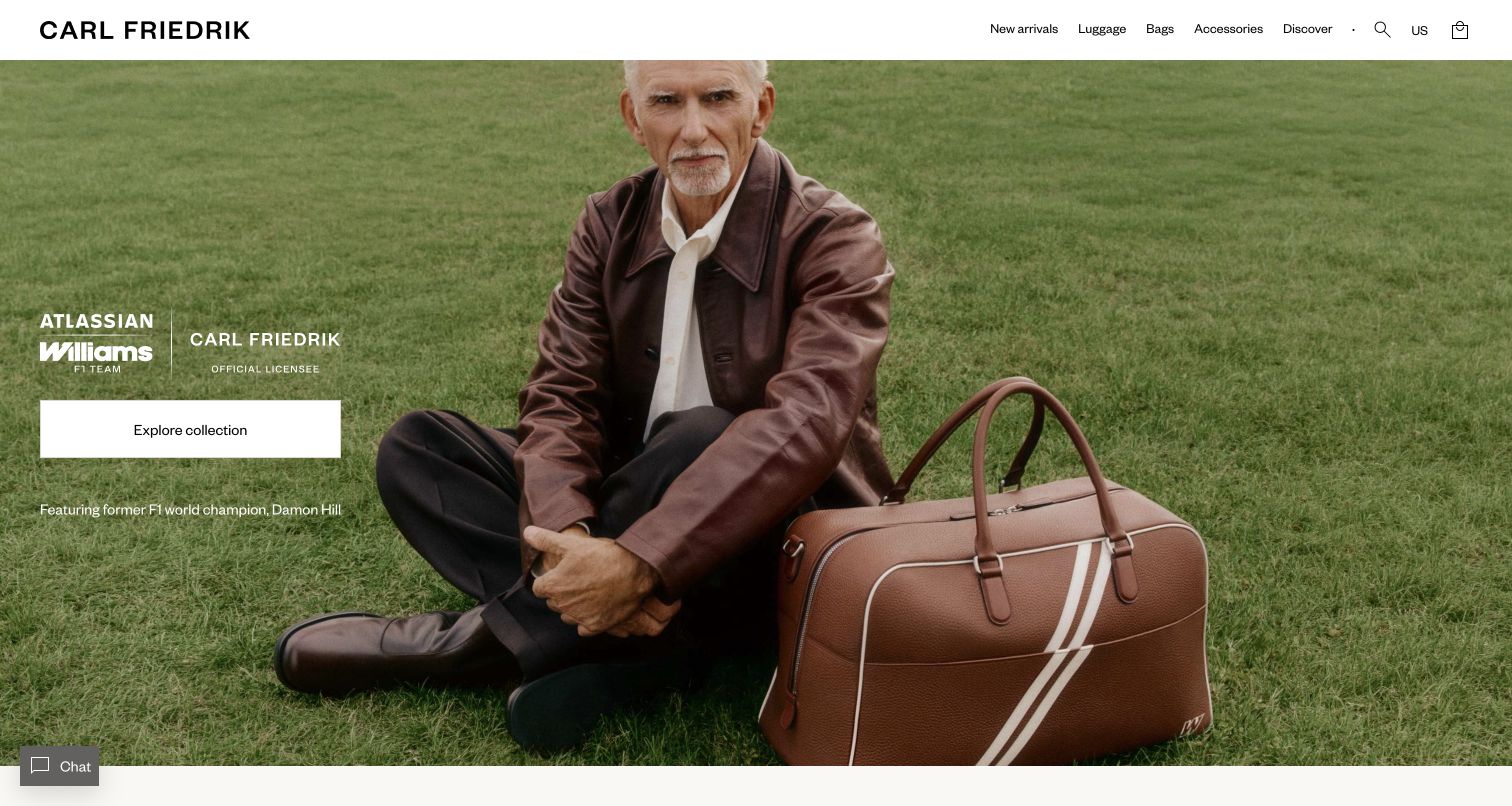
Carl Friedrik’s retained opening places a leather travel bag prominently beside a seated model on grass. The setting supplies scale and carrying context, while the product’s contrasting trim remains visible. A white header separates the wordmark and product categories from the full-width photograph. Collaboration lettering, a short identification line and a broad white collection button occupy the left side. The composition makes the campaign legible without relying on many simultaneous calls to action or hiding the ordinary bags and accessories routes.
What you can learn
Let an on-person image establish proportion and character, then connect it to a clearly named collection. Keep dimensions, material details and interior views in the product journey, because a persuasive campaign photograph cannot answer those practical questions by itself.
Pros
The bag is large enough to read while its relationship to a person supplies scale.
The white collection button stands apart from both the green setting and the collaboration text.
Cons & considerations
If a collaboration contains several products, the destination needs clear model and variant distinctions.
If customers are comparing carrying capacity, additional dimensions and interior imagery remain necessary.
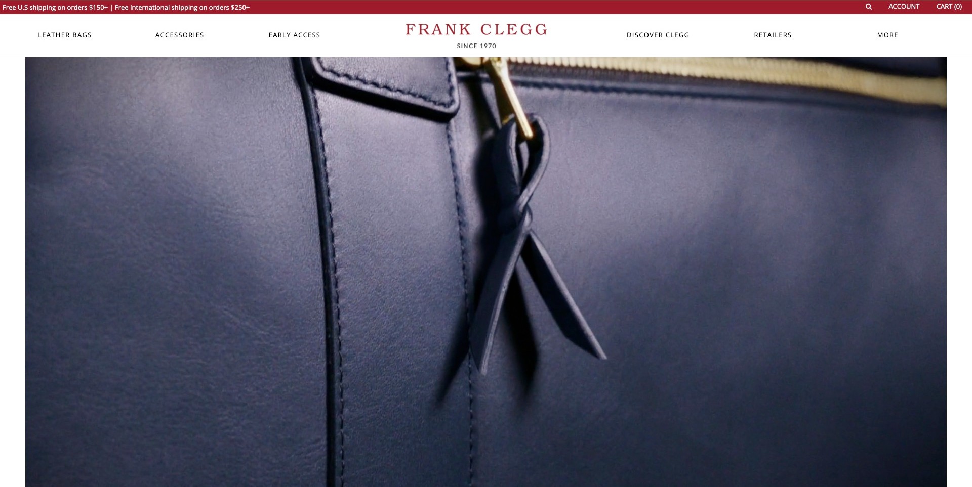
Frank Clegg’s accepted homepage frame is a close view of a blue bag’s seam, strap and hardware, not a complete bag or a workshop scene. The photograph occupies most of the viewport beneath a white header with a red wordmark. Leather Bags and Accessories are plainly named, with separate brand-discovery and retailer routes. This narrow visual focus makes surface and construction details noticeable, but it cannot establish manufacturing methods, leather quality or overall capacity. The site’s own leather-goods descriptions provide the category fit; the frame itself is an atmospheric detail study.
What you can learn
Let close imagery introduce a material, then give shoppers complete product views and practical details without requiring them to interpret the film. Keep a plain bag-category route available above the campaign. Measurements, openings, interiors and care information answer different questions from a beautiful seam photograph and deserve their own space.
Pros
Restrained white-and-red navigation stays separate from the large detail image.
Explicit Leather Bags labeling supplies context for the tightly cropped subject.
Cons & considerations
A macro view delays understanding of the complete silhouette and carrying scale.
Moving detail footage needs accessible alternatives and reliable routes to full product information.
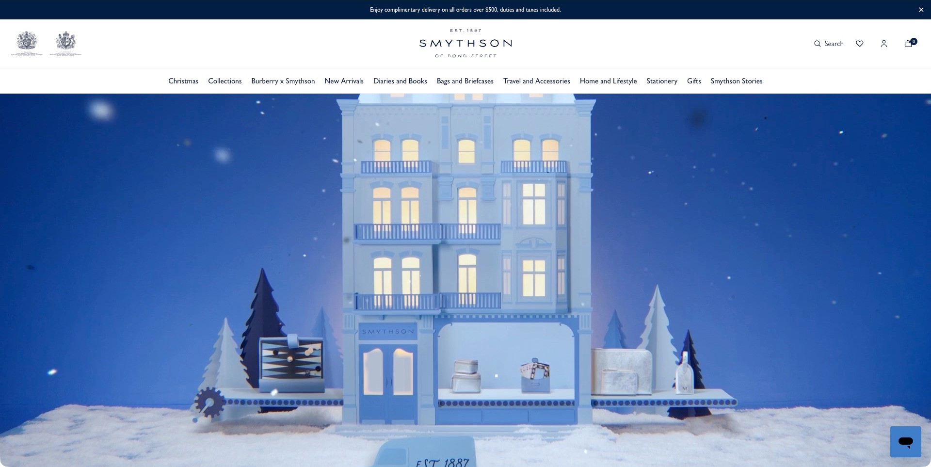
Smythson’s captured US homepage uses a blue miniature storefront in a snowy scene, with small product-like objects arranged around the windows. The winter film provides atmosphere rather than a close view of a specific bag. A broad white header names diaries, bags and briefcases, travel accessories, stationery and gifts, while search and account controls remain distinct. The official page separately identifies its own leather accessories, establishing the collection fit without assuming that every object in the wider catalog is leather. The miniature scene communicates a seasonal world, not measurable craftsmanship or product performance.
What you can learn
Keep imaginative brand imagery anchored by understandable product categories. A shopper seeking a diary, luggage tag or briefcase should not need to decode the campaign before finding the right range. Provide material, size and personalization information at product level rather than asking the miniature presentation to carry those practical details.
Pros
A consistent blue campaign gives several gifting categories a recognizable shared identity.
Specific category labels remain available above the immersive seasonal scene.
Cons & considerations
A tall atmospheric opening postpones close product inspection.
A wide navigation needs a well-organized smaller-screen alternative as categories expand.
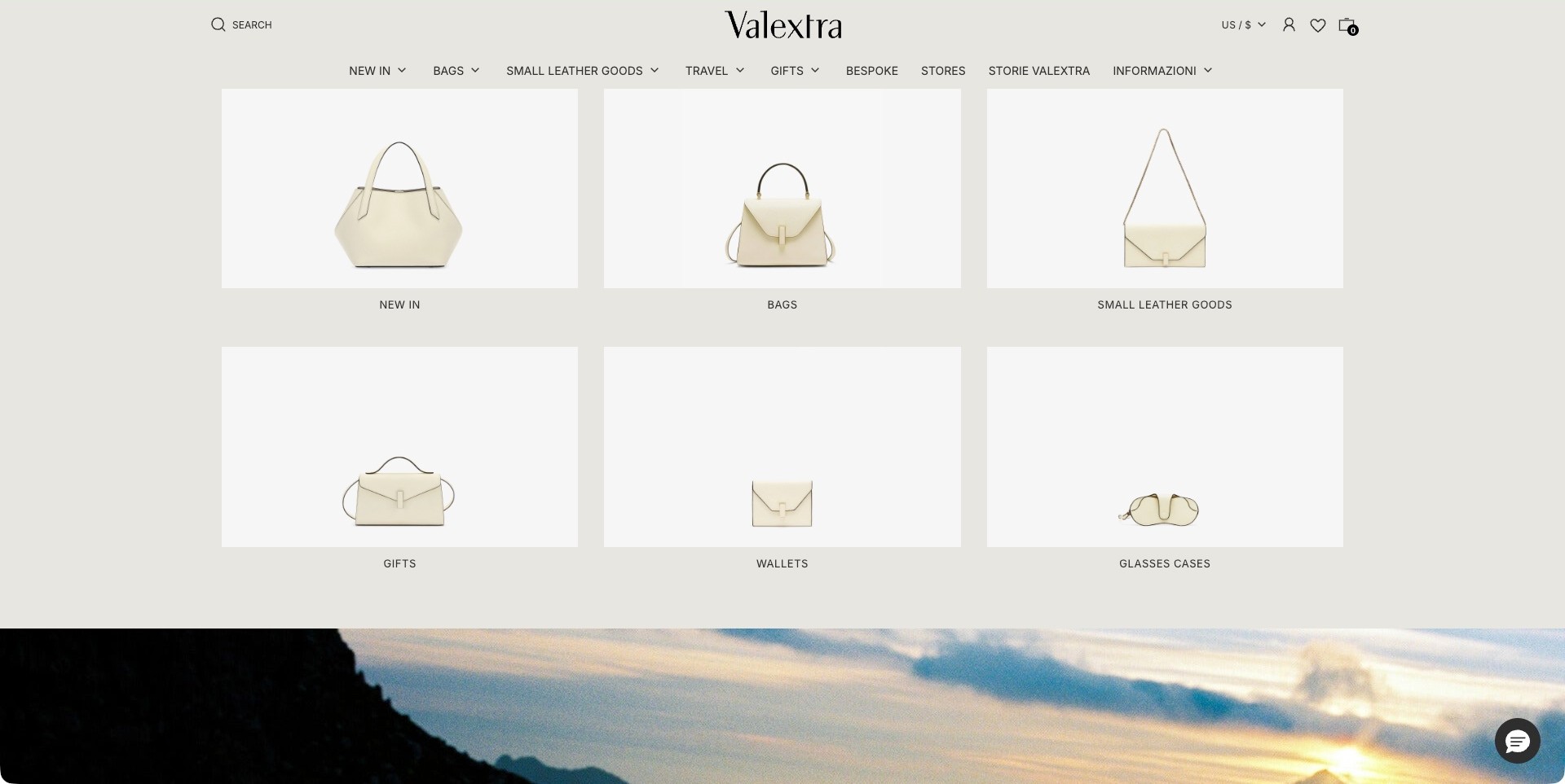
The accepted Valextra image is an ordinarily scrolled homepage section, not its opening film. Six evenly spaced tiles show pale bags and small accessories against near-white backgrounds, labeled for new arrivals, bags, small leather goods, gifts, wallets and glasses cases. A soft neutral page background and persistent header make the collection feel organized rather than promotional. Repeated color and framing emphasize differences in silhouette and carrying format. The official page identifies its own leather goods, but these small images do not establish each item’s material specification, internal capacity or construction quality.
What you can learn
Normalize product-image scale and background when the immediate task is choosing a category. Keep labels literal and make each tile’s destination understandable. Follow the overview with measurements, closure details and material descriptions, because visual consistency is useful for orientation but cannot replace meaningful product comparisons.
Pros
Consistent tile framing makes the category choices easy to scan together.
Plain labels distinguish small accessories from larger bag browsing routes.
Cons & considerations
Similar pale products need adequate edge contrast and informative alternatives.
Category tiles alone cannot explain capacity, material variation or how an item is carried.
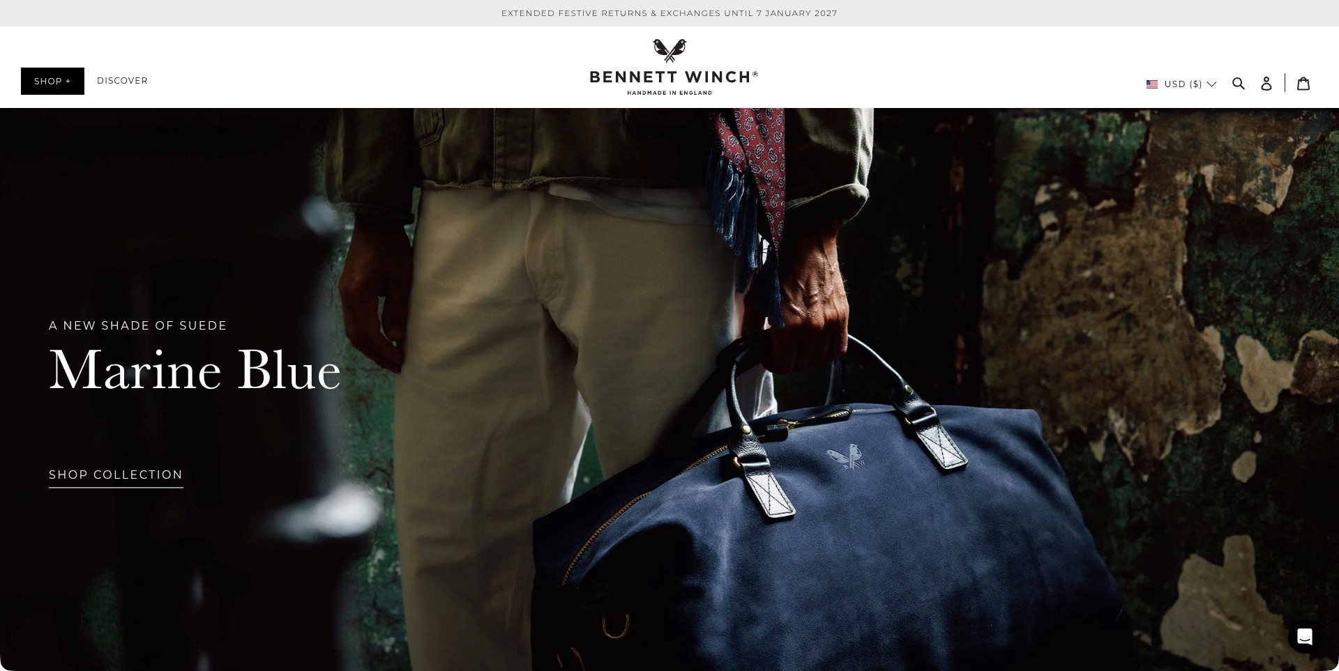
Bennett Winch’s homepage shows a person holding a large blue handled bag beside a weathered wall. A dark area on the left gives the collection’s color name and shopping link a readable setting. The white header limits its main choices to shopping and discovery, with separate currency, search and account controls. The campaign explicitly describes suede, while other visible page entries identify leather weekenders and watch rolls. This establishes a genuine leather-goods assortment without assuming every product uses the same material or treating the site’s manufacturing language as independently verified.
What you can learn
Name the feature that differentiates a collection, such as material or color, rather than relying on mood alone. Show the object beside a person to suggest scale, then provide exact dimensions, weight and carrying options on its product page. Keep the broader assortment distinguishable when multiple materials share one brand.
Pros
The on-person photograph makes the featured bag’s overall carrying form recognizable.
A quiet text area keeps the collection name separate from detailed photography.
Cons & considerations
A very broad Shop label can require another step for a specific product type.
A dramatic image still needs practical size and material-care information elsewhere.
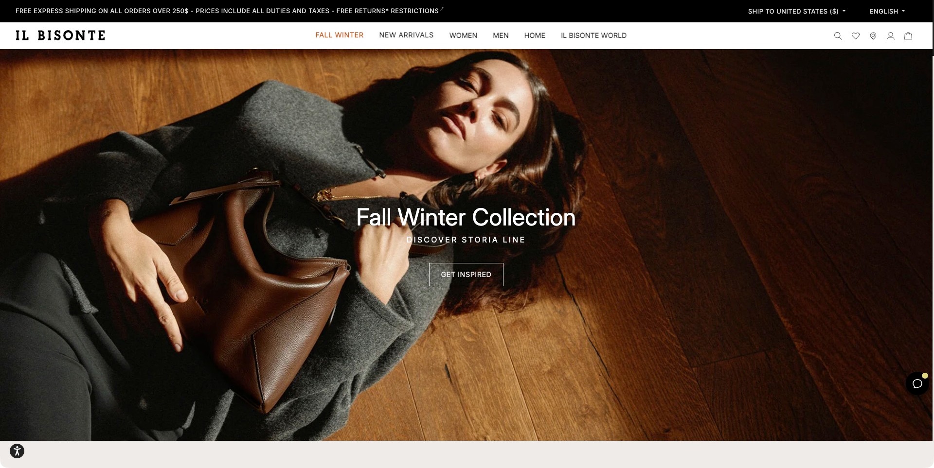
Il Bisonte’s captured US page pairs a reclining portrait with a large brown bag against warm wood flooring. Centered white type identifies the seasonal collection and a named line, followed by an outlined inspiration action. The white header retains arrivals, women, men and brand-world routes. The bag remains a recognizable part of the scene rather than a tiny accessory in an unrelated fashion image. The official leather-goods context establishes the category fit, but the photograph does not independently verify leather characteristics, handwork, durability or the capacity of this particular design.
What you can learn
Give a collection story a product that visitors can identify and investigate. Keep the campaign name connected to an explicit destination, and supplement editorial portraits with front, back, interior and on-person product views. Practical details should not depend on interpreting a pose or the proportions of a photograph.
Pros
Warm flooring and the brown bag create a coherent visual setting.
The campaign names a specific line instead of using an unexplained seasonal slogan.
Cons & considerations
White overlaid type needs contrast checks as responsive crops shift.
Inspiration-led action wording should lead to a clearly explained collection and product choices.
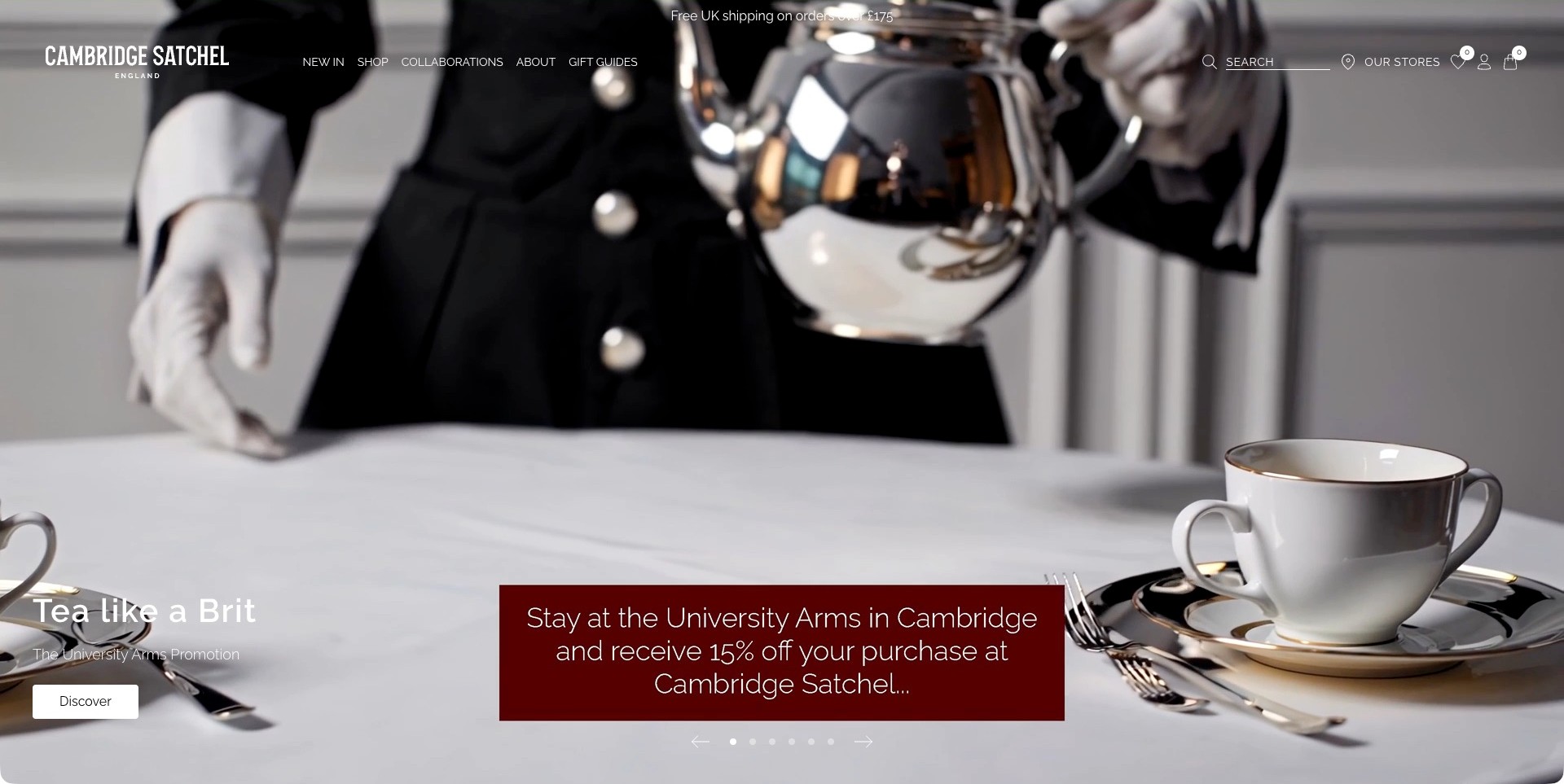
Cambridge Satchel’s accepted UK homepage frame shows tea being poured into a cup, introducing a hotel collaboration rather than a bag. A lower-left title and discovery button sit beside an integrated burgundy campaign explanation. The transparent header preserves Shop, Collaborations, About and Gift Guides, with search and store-finding controls. The page separately identifies the brand’s own leather satchels and handbags; the tea scene is not evidence of a pictured leather product. The interesting design issue is how a local partnership joins the brand narrative while customers still need ordinary product access.
What you can learn
State clearly when a campaign concerns a partnership rather than the main product range. Keep shopping and product context reachable without requiring visitors to watch the whole story. Tie any associated offer to legible conditions on its destination, and use separate product photography to answer material, size and carrying questions.
Pros
The campaign distinguishes its hotel collaboration from the normal shopping route.
A specific place-based story offers an alternative to generic luxury imagery.
Cons & considerations
A non-product lead can delay understanding for first-time bag shoppers.
Transparent white navigation needs reliable contrast over every film frame.
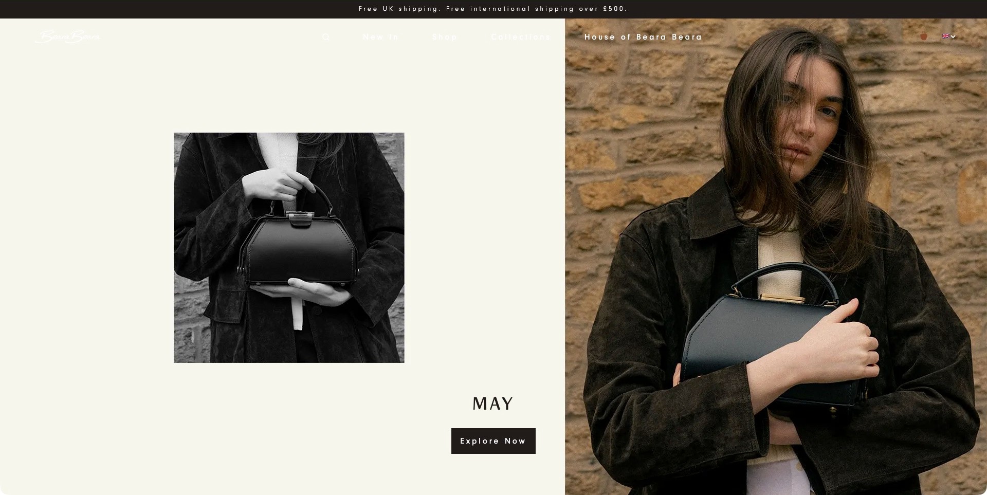
Beara Beara’s homepage pairs a smaller monochrome photograph of a structured handbag with a larger color portrait of the same style held against a coat. A pale panel supplies the model name and a dark exploration button. The composition gives the bag a clear silhouette in one image and a carrying reference in the other, with generous space around both. The official page identifies its own leather handbags, backpacks and satchels, rather than acting only as a multi-brand retailer. Neither the photographs nor the brand’s craft descriptions independently establish material grade or workmanship quality.
What you can learn
Use complementary views when each answers a different question: outline and closure in one, approximate scale and styling in another. Keep the product name and destination near those images. Provide dimensions, strap options and interior views beyond the editorial opening so the shopper can evaluate more than appearance.
Pros
The paired images make the bag recognizable without a dense product specification overlay.
A contained dark button gives the named model a distinct next step.
Cons & considerations
Pale header text over the light panel needs stronger contrast.
On-person styling still needs precise sizing and material-care details on the product page.
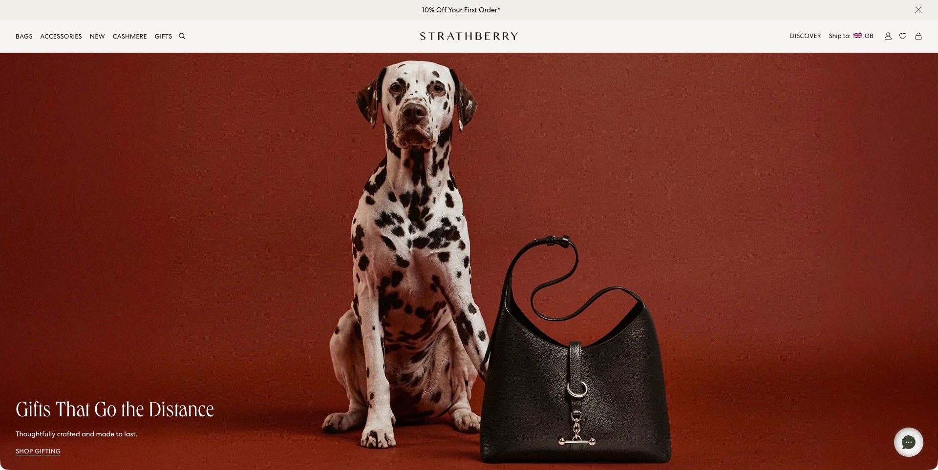
Strathberry’s captured UK homepage places a Dalmatian beside a black shoulder bag against an uninterrupted rust-colored background. The photograph leaves the bag’s outline, strap and metal detail clearly visible. A short gifting message and understated shopping link occupy the lower left, while the white header separates Bags, Accessories, Cashmere and Gifts. The dog adds personality without becoming the only subject. The page’s own leather-product descriptions establish the relevant assortment; neither the setting nor the campaign’s longevity language independently verifies material quality or how long a bag will last.
What you can learn
Introduce an unusual visual element only when the product remains easy to recognize. Keep the campaign destination and ordinary categories available, and explain material, size and care at product level. A memorable photograph can create interest without being asked to prove durability or suitability for a particular shopper.
Pros
The limited background palette makes the black bag and its hardware easy to distinguish.
Plain categories allow visitors to bypass the gifting campaign.
Cons & considerations
A broad gifting link needs helpful product organization after the click.
An atmospheric still life cannot replace interior views and precise carrying dimensions.
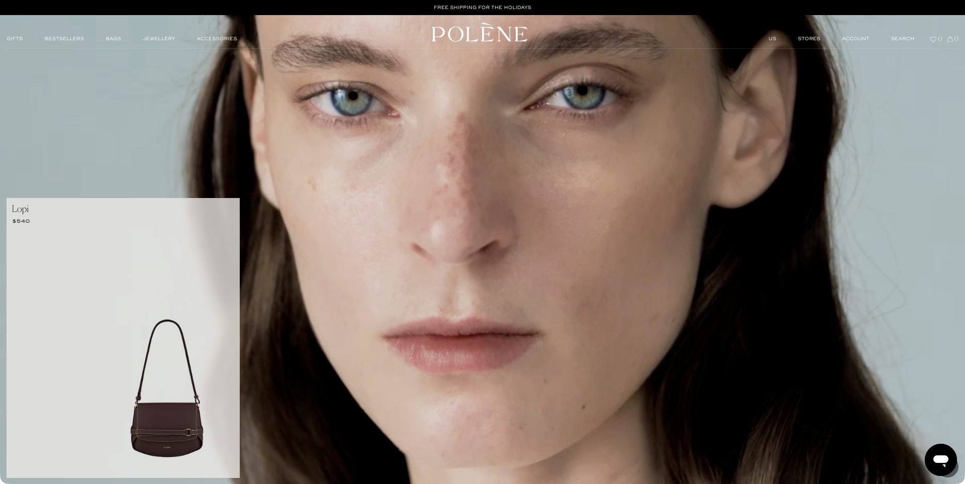
Polène’s accepted homepage frame is a close portrait, with a separate pale card showing the Lopi bag and its displayed price at the lower left. The bag is not being carried in this exact film moment. A transparent white header names Bags, Jewellery and Accessories around the large wordmark, while the product card maintains a consistent shopping subject alongside the changing imagery. The official leather-goods positioning establishes the brand’s fit, but the portrait does not independently explain material, capacity or construction. The useful pattern is the distinction between atmosphere and a stable product reference.
What you can learn
If a campaign film changes subject, keep an identifiable product destination available outside its individual frames. Give the card a clear name and next step, then provide complete still images, dimensions and material information beyond it. Do not expect a portrait to explain the object that a shopper is considering.
Pros
The separate bag card supplies concrete context during a non-product film frame.
Product categories remain named rather than being replaced by campaign language.
Cons & considerations
White navigation over a pale portrait needs stronger contrast checks.
A small product card still requires full-size views and specifications on its destination.
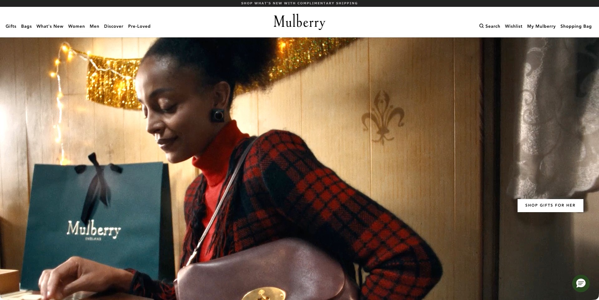
Mulberry’s US homepage shows a person wearing a brown shoulder bag in a warm interior with festive lights and a branded shopping bag. A small white gifting action sits at the right rather than covering the central portrait. The solid white header names Bags, new arrivals, women, men, discovery and pre-loved browsing. This gives the campaign several practical alternatives without a long introductory paragraph. The scene communicates a gifting context and recognizable bag form, but it does not independently establish materials for every pictured item, product capacity or the condition and policies of the separate pre-loved range.
What you can learn
Let seasonal imagery suggest an occasion while ordinary product and resale routes remain distinct. Link the gifting action to a clearly organized selection rather than making visitors reconstruct the campaign. Detailed product descriptions and condition information should answer material and practical questions that the festive photograph cannot.
Pros
A solid navigation band stays legible above the warm campaign image.
The separate pre-loved route acknowledges a different browsing task without dominating the hero.
Cons & considerations
The portrait-led crop needs complementary full product and interior views.
A broad gifting route benefits from clear price, recipient and product-type filters.
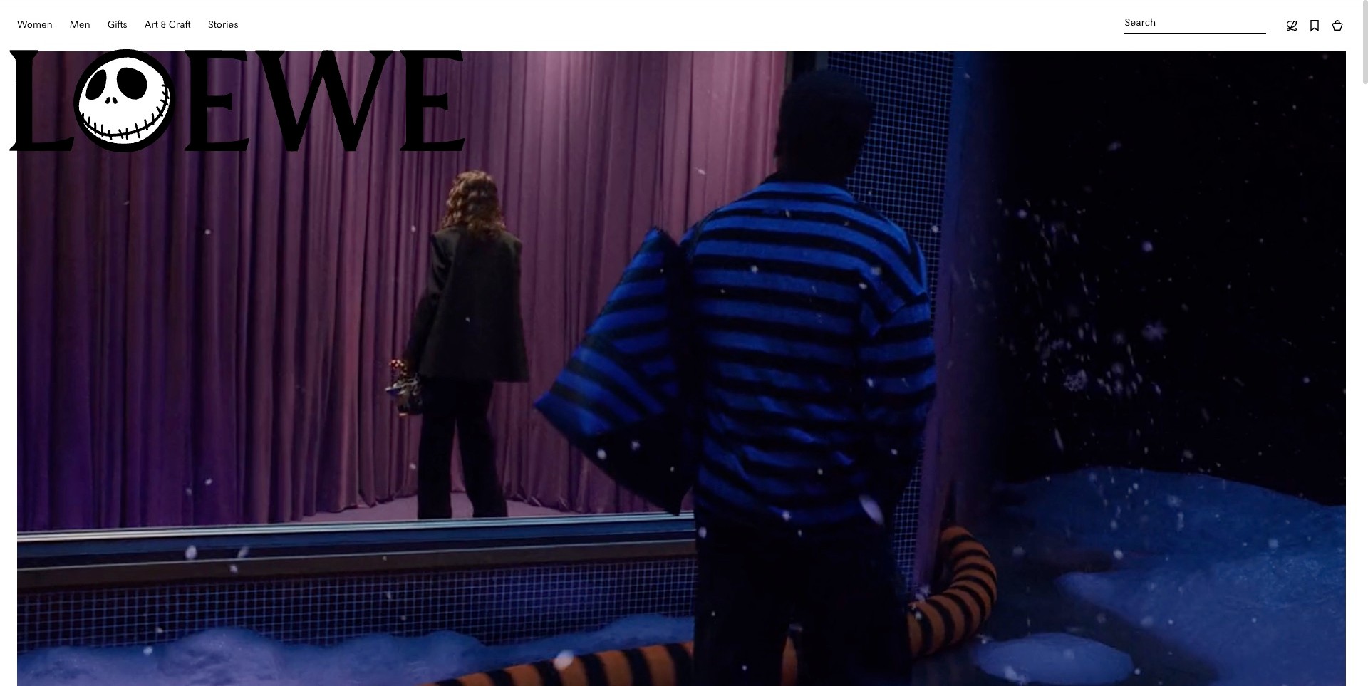
Loewe’s captured US homepage frame is a theatrical winter scene: a blue-striped figure faces a reflective area beside purple curtains, beneath an oversized adapted wordmark. It is not a close bag photograph or a normal product listing. The solid white utility header retains women, men, gifts, art and stories, with a separate search field. Elsewhere on the actual page, named leather-wallet and small-leather-goods entries establish the relevant assortment. This example is useful for studying an immersive collaboration, not for inferring that every visible prop is a saleable product or that the film proves material quality.
What you can learn
Give an expressive collaboration dependable exits into ordinary shopping and useful product information. A distinctive character treatment can establish a campaign identity, but shoppers still need to know which products belong to it. Separate narrative assets from item specifications, material descriptions and availability on the destination pages.
Pros
The plain white header preserves recognizable navigation around a visually complex film.
The oversized campaign identity creates an immediately distinct visual world.
Cons & considerations
A character-led frame postpones direct inspection of the leather-goods range.
Large branding and moving imagery need responsive checks so practical controls remain easy to find.
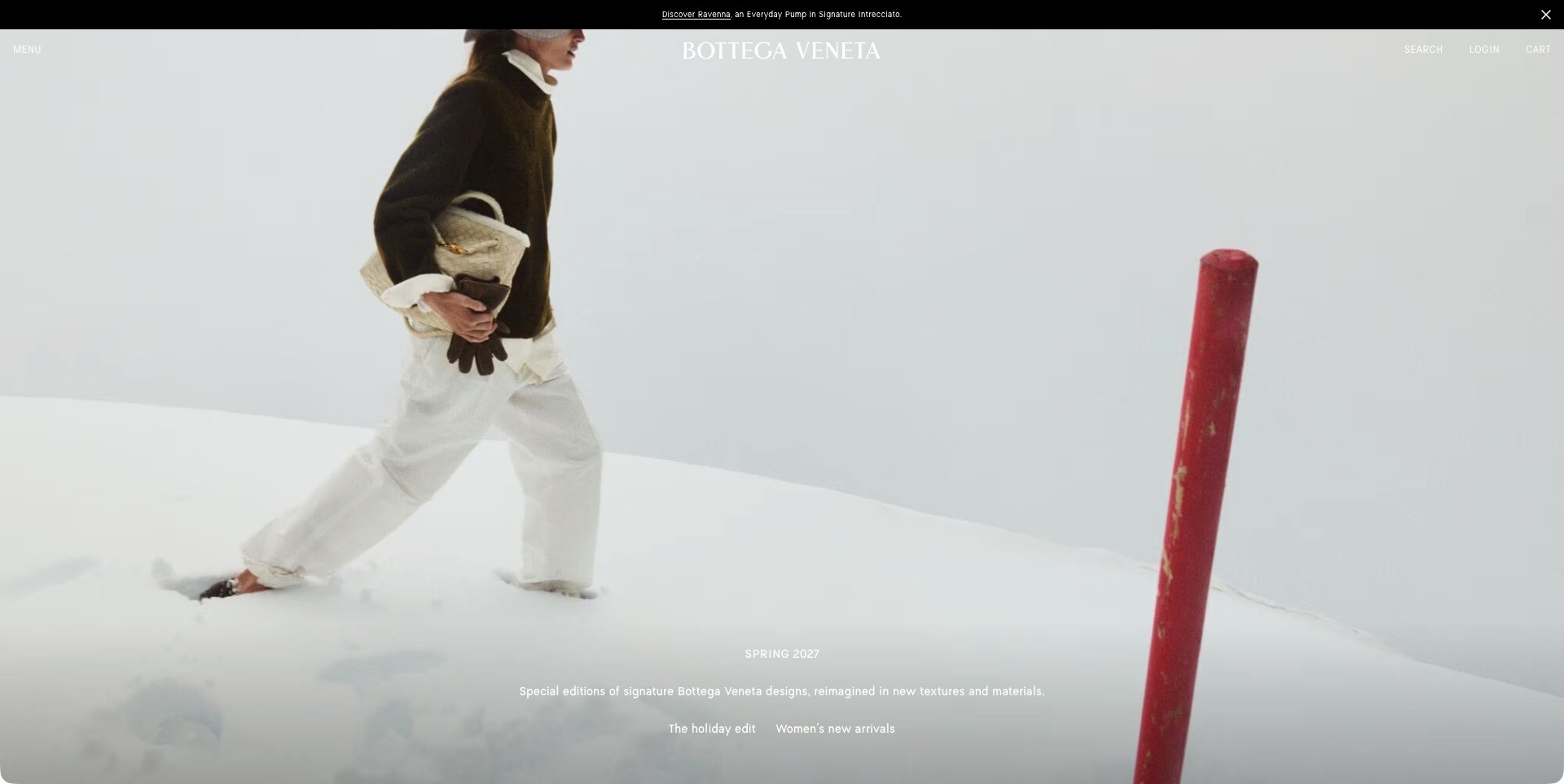
Bottega Veneta’s accepted US frame shows a person walking through a snowy scene carrying a pale textured bag, with a red post at the right. Small seasonal copy and two collection destinations sit near the bottom, while the upper interface is reduced to a menu, wordmark, search, login and cart. The brand’s own page separately names leather detailing and products, establishing the leather-goods context without assuming every fabric or accessory in the scene is leather. This is a mood-led collection introduction, not a detailed product comparison or an independently verified material demonstration.
What you can learn
When the interface is deliberately minimal, make the menu and campaign destinations predictable and easy to use. Provide clear bag categories, complete product views and material information after entry. Atmosphere can introduce a collection, but important shopping tasks should not depend on waiting for a particular moving frame.
Pros
Few visible controls allow the seasonal photograph to remain the main visual subject.
Separate collection destinations offer more than one route beyond the film.
Cons & considerations
White labels over a snowy scene need substantial contrast attention.
A hidden category menu adds a step for visitors seeking a specific bag or accessory.
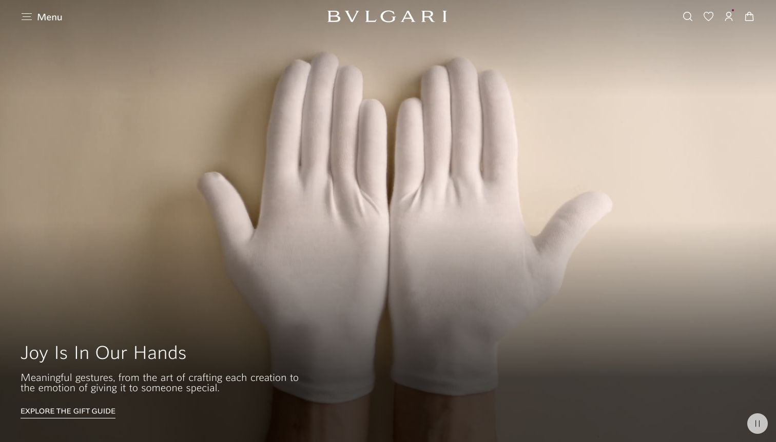
Bvlgari’s retained homepage makes its shared brand identity more prominent than any one product category. White-gloved hands fill a warm beige scene; the wordmark, small utility icons and concise gift-guide action sit around it without a product grid. The current official bags-and-accessories collection explicitly identifies calf leather bags and wallets, but none of those material details is shown in this opening. The useful reference is the restraint of the brand gateway and the need for a separate, more informative leather-goods destination.
What you can learn
A broad campaign can introduce the occasion for buying a bag or wallet, but it should not substitute for material and construction information. Plan category and product pages that clearly explain dimensions, interiors and the specific material used in each item rather than extending a luxury mood into unsupported claims.
Pros
The limited palette gives the identity and gift-guide action a coherent visual hierarchy.
Compact commerce controls leave the campaign image uncluttered.
Cons & considerations
If visitors need immediate bag comparison, this opening provides no capacity or material detail.
If a gift guide spans many categories, leather goods need an understandable route within it.
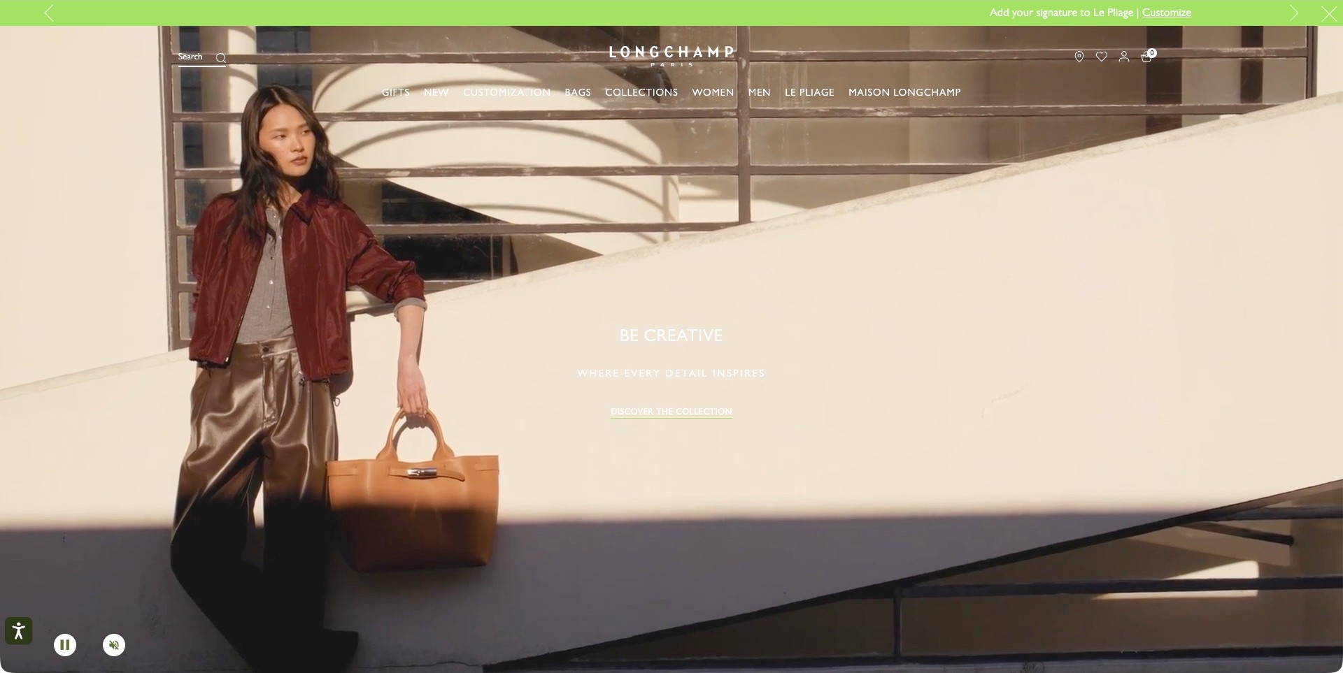
Longchamp’s captured US homepage shows a person holding a tan handled bag against sunlit architectural lines. The large pale wall leaves space for a short collection introduction, while the bag remains a recognizable part of the composition. A transparent header names Bags, Collections, women, men and the brand’s signature range. Small playback controls are visible at the lower left. The official page separately includes small leather goods, establishing a relevant own-brand assortment without implying that all Longchamp products share one material. The photograph suggests carrying scale, not exact measurements or independently tested material performance.
What you can learn
Choose campaign settings that help the product silhouette register instead of competing with it. Preserve a plain category route and make the collection action understandable. Supplement a beautifully lit carrying scene with neutral product photographs, dimensions, closure details and material descriptions so visitors can move from interest to practical evaluation.
Pros
Architectural negative space gives the campaign a clear composition around the bag.
Visible playback controls acknowledge that the large visual is moving content.
Cons & considerations
White navigation and captions over pale walls need stronger contrast.
A lifestyle view still needs close product and interior information beyond the film.
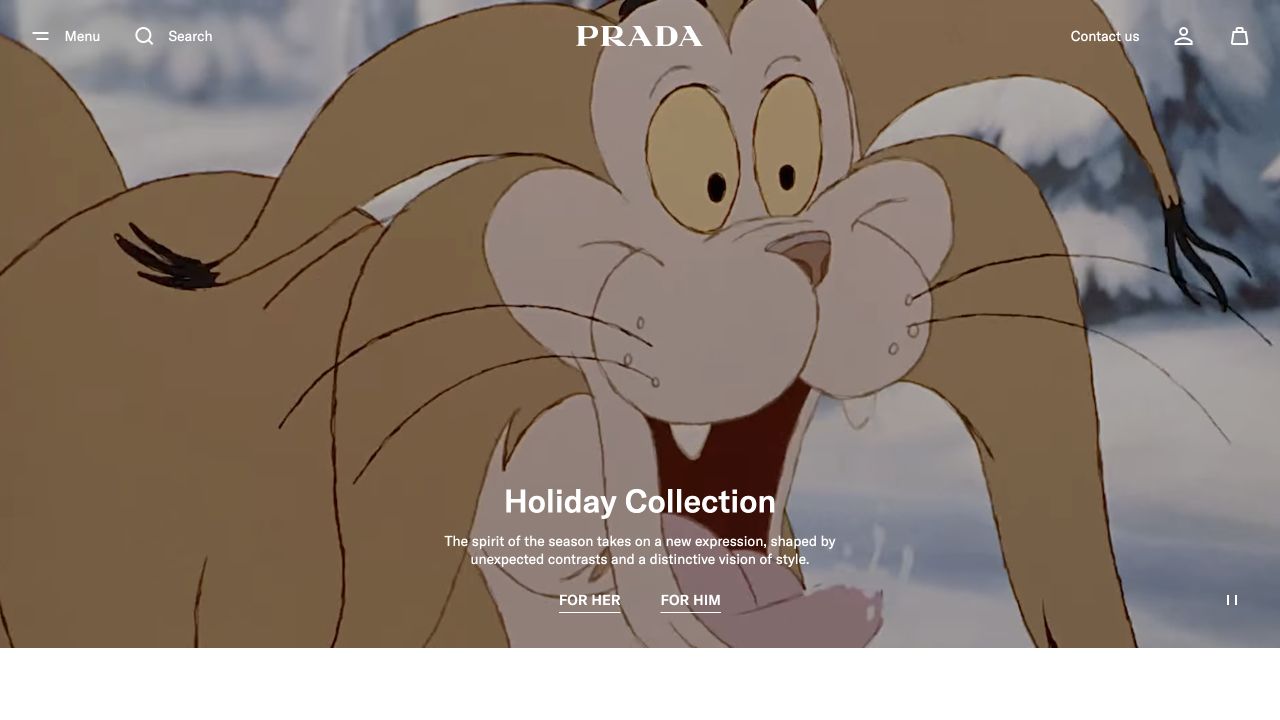
Prada’s retained opening uses an animated-style rabbit illustration rather than a bag photograph. A white wordmark and compact menu, search and service controls sit above the scene. The lower portion contains a complete Holiday Collection heading, a short introductory sentence and separate For Her and For Him links. A pause control is visible near the edge. The current official women’s bag collection explicitly lists leather materials and named bags, but the screenshot itself is an umbrella fashion campaign rather than evidence about any product’s construction.
What you can learn
An unusual creative treatment can make a leather brand recognizable without putting every product on the homepage. Keep the next navigation step clear, then use the actual collection and product journey to answer practical questions about material, dimensions, straps and carrying use.
Pros
The illustrated treatment creates a distinct identity without crowding the scene with product tiles.
Two clearly separated collection links establish the next browsing choice.
Cons & considerations
If bag shoppers arrive with a specific model in mind, the generic campaign adds another step.
If animation carries the identity, the static and reduced-motion versions still need a coherent opening.
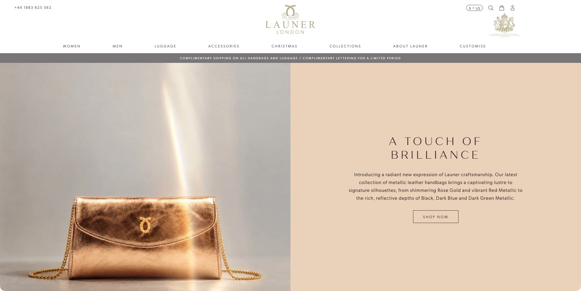
Launer London’s homepage divides the campaign between a metallic shoulder bag on the left and a pale peach text panel on the right. A beam of light emphasizes the reflective finish, while the panel introduces the collection and supplies a small outlined shopping button. The generous white header separates women, men, luggage, accessories and customization. The page explicitly describes metallic leather handbags, which establishes the own-brand leather-goods fit. Its craft and heritage language remains the brand’s presentation rather than independent verification of manufacturing quality, historical claims or long-term surface wear.
What you can learn
Use a separate information panel when the product photograph has strong highlights or reflections. Explain the new finish plainly and connect it to a specific collection. Product pages should show the finish under useful viewing conditions, alongside dimensions, closure information and care guidance rather than relying on dramatic lighting alone.
Pros
The peach text area keeps the collection introduction away from reflective photography.
Specific product categories and customization remain visible in the main navigation.
Cons & considerations
Small, widely spaced labels need readability checks on compact screens.
A reflective hero needs neutral close views to clarify color and surface variation.
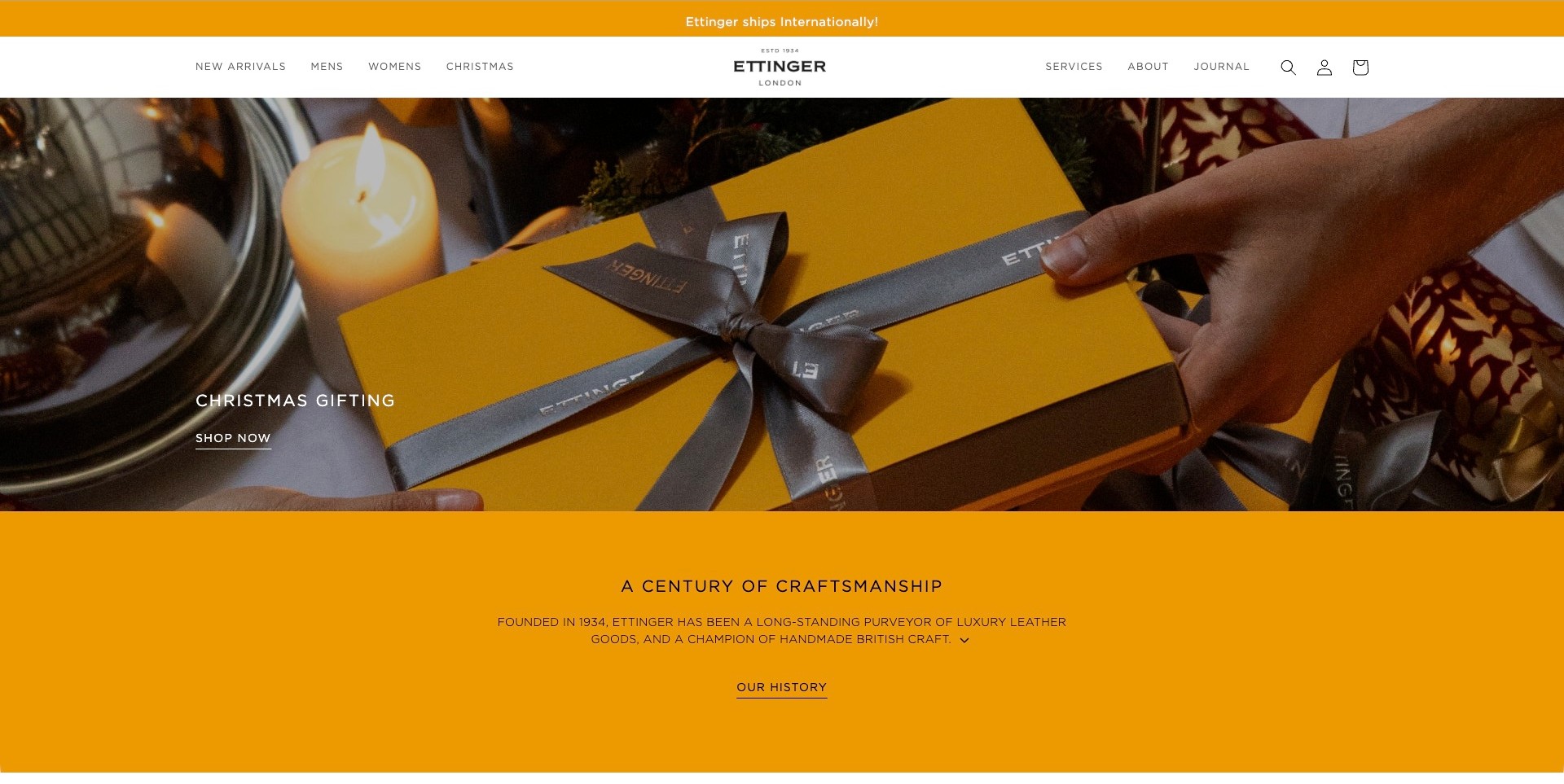
Ettinger’s current official homepage shows a bright yellow presentation box tied with a dark branded ribbon, held over a festive table setting. A simple gifting label and shopping link occupy the left. Below the photograph, a yellow section introduces the company’s leather-goods history and offers a separate reading route. The white header distinguishes arrivals, shopping groups, services and the journal. This connects packaging, seasonal merchandising and brand background without claiming that a closed box shows the item inside. The historical and craft descriptions are the seller’s statements, not independently verified product-quality evidence.
What you can learn
Let recognizable packaging support a gifting message, but make the contents and available product choices clear after the click. Keep company history optional rather than placing it between every shopper and the catalog. Explain materials, dimensions, personalization and delivery conditions at the level where someone chooses an actual accessory.
Pros
The repeated yellow creates a coherent transition from campaign image to brand information.
Shopping and historical reading are separate, clearly signposted routes.
Cons & considerations
A closed gift box postpones inspection of the actual leather product.
Heritage messaging needs specific product evidence rather than standing in for material details.
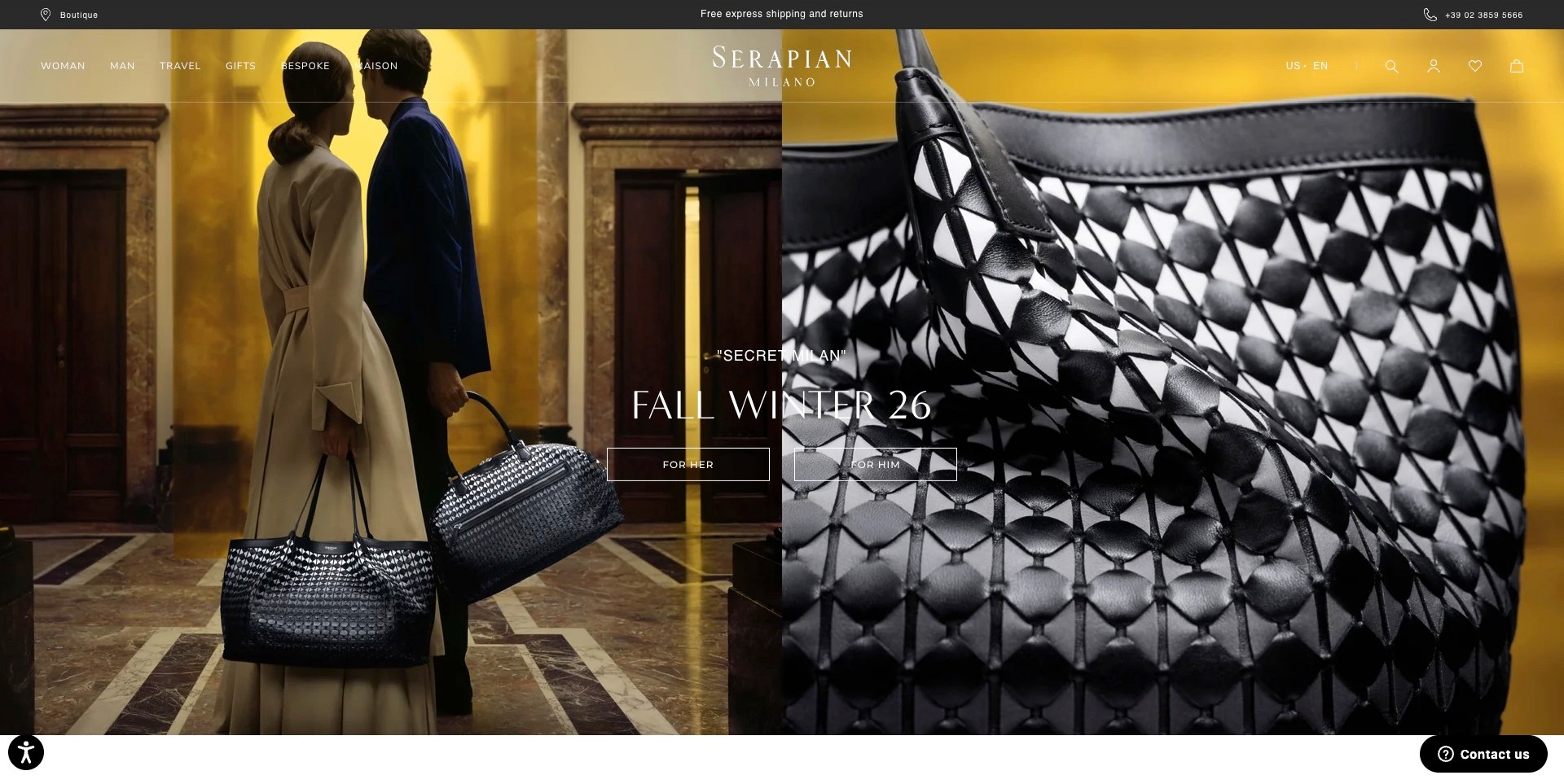
Serapian’s captured homepage pairs two people carrying patterned bags in a warm interior with a much larger close view of the black-and-white bag surface. Centered seasonal copy bridges the halves and offers two shopping destinations. The transparent header keeps travel, gifts, bespoke work and brand information distinct. The actual page identifies its own leather products, including named bag and briefcase entries. The dual view helps connect the overall object with its visible pattern, but the photograph alone does not establish the weaving method, leather grade or independent workmanship quality.
What you can learn
Use paired images to connect a distinctive detail with the complete product and approximate carrying scale. Identify the relevant collection and provide detailed material descriptions outside the campaign. Shoppers should be able to inspect closures, interiors and dimensions without interpreting a decorative surface as evidence of every construction claim.
Pros
The close detail makes the signature-looking pattern easier to recognize at a glance.
The on-person half preserves context for the size and form of the bags.
Cons & considerations
Centered white labels cross busy imagery and need responsive contrast checks.
Audience-based actions benefit from additional product-type navigation for task-focused visitors.
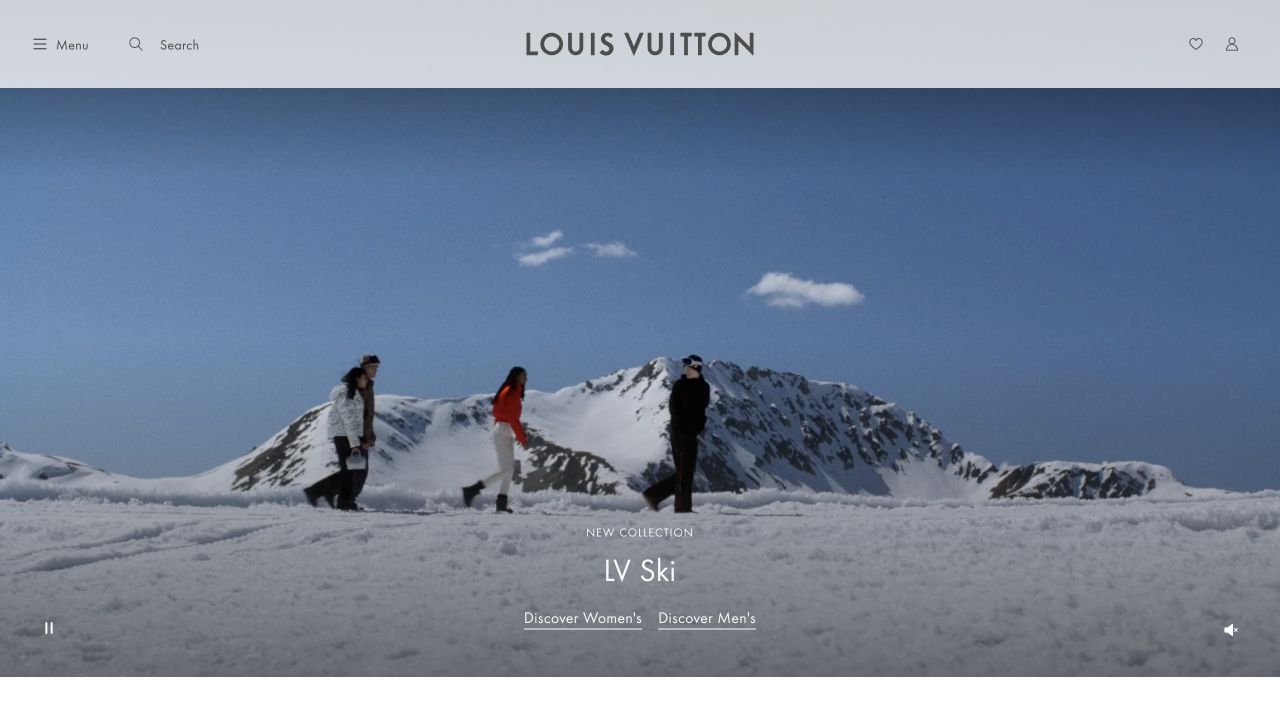
Louis Vuitton’s retained international homepage places a pale header above an alpine scene with three models. The centered wordmark is balanced by menu and search controls on one side and account-related icons on the other. An LV Ski collection label and two links sit over the lower image, with playback controls at the corners. The current official collection separately confirms wallets and small leather goods. This captured campaign provides lifestyle context, not a close-up of leather texture or proof that every item is leather.
What you can learn
Let lifestyle photography suggest the world around a product, but keep the practical collection route compact and readable. Once customers enter the leather-goods range, distinguish leather from canvas and other materials explicitly instead of relying on the umbrella brand or campaign to explain those differences.
Pros
The restrained header leaves substantial space for the campaign’s setting and scale.
Separate collection links provide a clear choice without adding a large promotional panel.
Cons & considerations
If the buying decision depends on interior capacity, the campaign needs complementary product detail views.
If collection names describe a lifestyle rather than a product type, clear category navigation becomes more important.
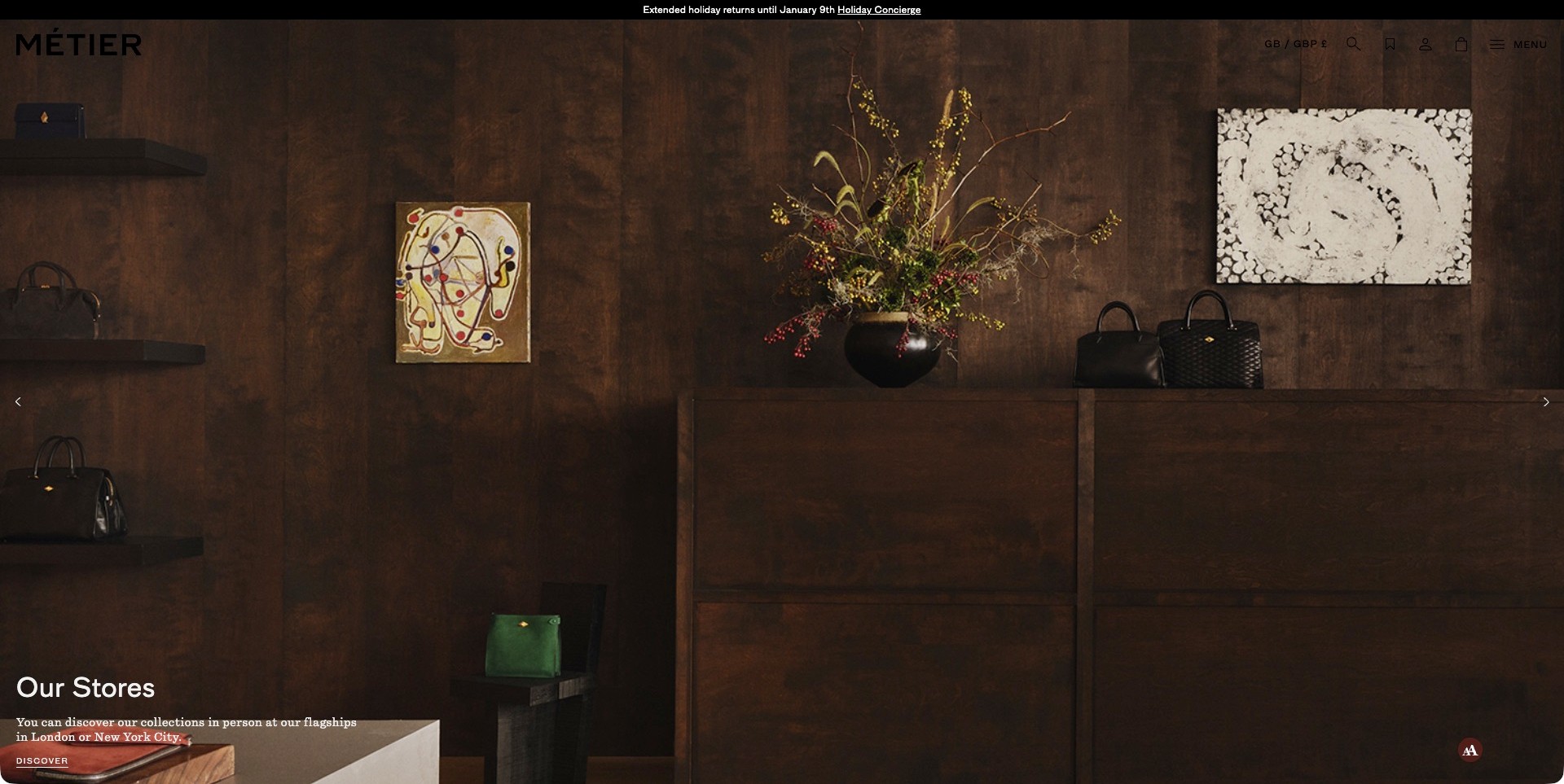
Métier’s accepted homepage frame shows a wood-paneled store interior with bags displayed among artwork and a floral arrangement. A short store-focused introduction and discovery link sit at the lower left. The upper interface is deliberately compact, with location, search, saved items, account and a menu. This is the actual store slide, not a different portrait or product campaign. The official page identifies its own leather bags and accessories, but the interior photograph does not establish store stock, opening hours, service quality or the material of every displayed object.
What you can learn
Make a physical-store story a clear, optional destination rather than an unexplained atmospheric image. Link it to accurate location, access and visit information, while preserving an online product route for people who cannot attend. Keep precise product materials and dimensions separate from the interior styling and brand environment.
Pros
The bags remain visible within a distinctive retail setting rather than disappearing into scenery.
A specific store-discovery action explains the role of the interior photograph.
Cons & considerations
Dark header controls over a dark photograph need better contrast.
A store-led introduction adds a step for visitors seeking a particular product online.
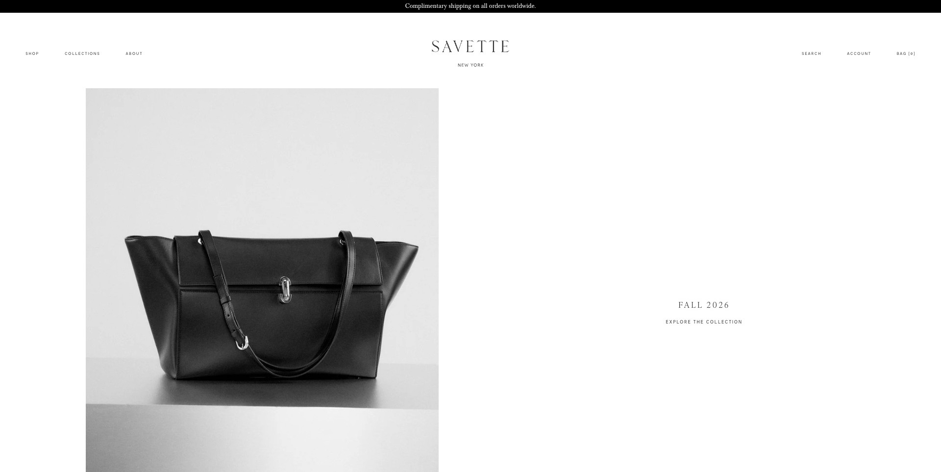
Savette’s captured homepage places a black shoulder bag in a neutral photograph on the left, balanced by a small seasonal collection label and exploration link on the right. A white header reduces navigation to shopping, collections and brand information. The object’s handles, folded outline and central hardware are recognizable because no promotional copy covers them. The official brand’s leather-goods assortment provides the context, but the photograph itself does not independently establish material specification, manufacturing quality or interior capacity. This is an exercise in visual focus rather than information density.
What you can learn
Give an important product enough space to be understood before adding more campaign elements. Keep the next destination explicit, then provide measurements, material descriptions, interior views and carrying photographs beyond the opening. A minimal layout works when useful details remain easy to reach, not when they are omitted from the whole shopping journey.
Pros
The isolated product image makes the bag’s overall form immediately legible.
A small set of top-level choices avoids competing campaigns around the object.
Cons & considerations
Tiny navigation labels need adequate sizing and spacing on smaller screens.
A quiet collection link still needs a clear, informative product destination.
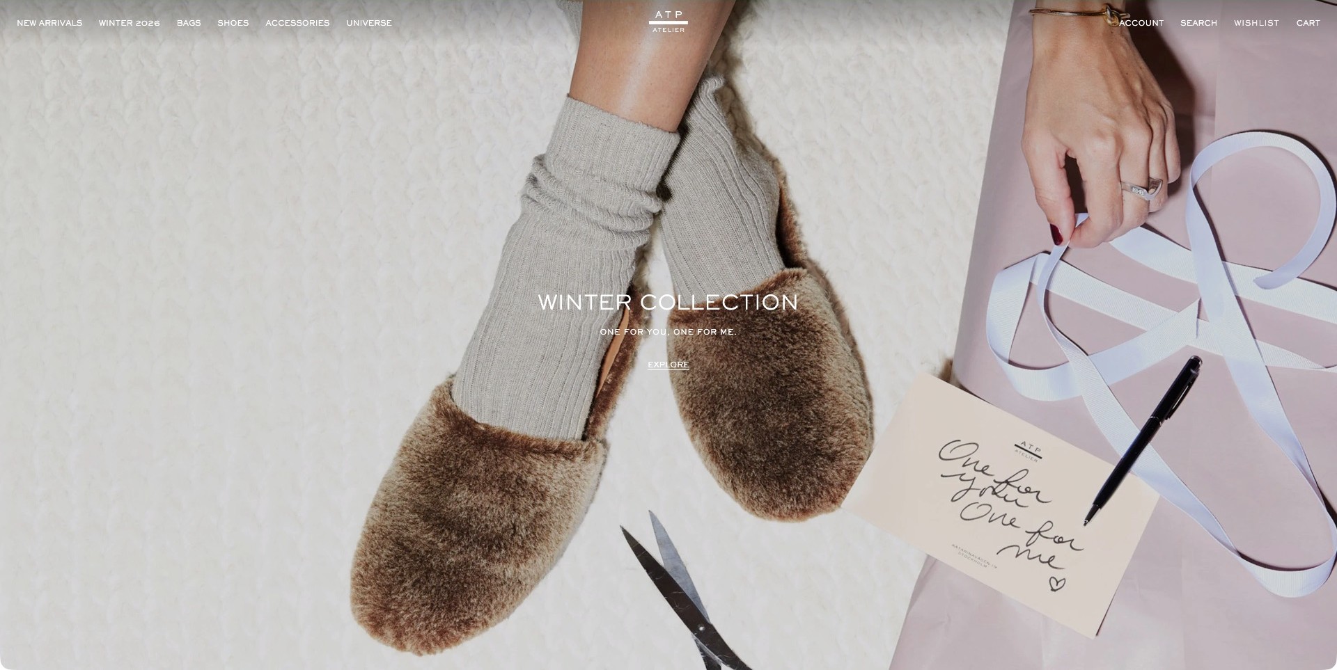
ATP Atelier’s accepted US homepage frame shows a pair of textured slippers beside ribbon, scissors and a handwritten gift card. Centered white text introduces the winter collection, with a short exploration link beneath it. The upper navigation plainly separates Bags, Shoes and Accessories rather than pretending this is a bag-led image. The actual page names its own leather pouches and handbags, establishing a genuine leather-goods assortment alongside footwear. The slippers’ appearance does not independently prove their material, and the gift scene does not explain the capacity or construction of the bags elsewhere in the catalog.
What you can learn
Keep cross-category seasonal storytelling connected to literal shopping routes. A customer seeking a handbag should be able to bypass a footwear campaign without guessing where to go. Explain materials at product level, and make the collection destination show what is actually included rather than relying on the gifting photograph alone.
Pros
Explicit bag and shoe labels keep the mixed assortment understandable.
A single seasonal action avoids multiple competing offers within the scene.
Cons & considerations
White text over pale textures needs stronger responsive contrast.
A footwear-led introduction delays direct inspection for visitors seeking leather bags.
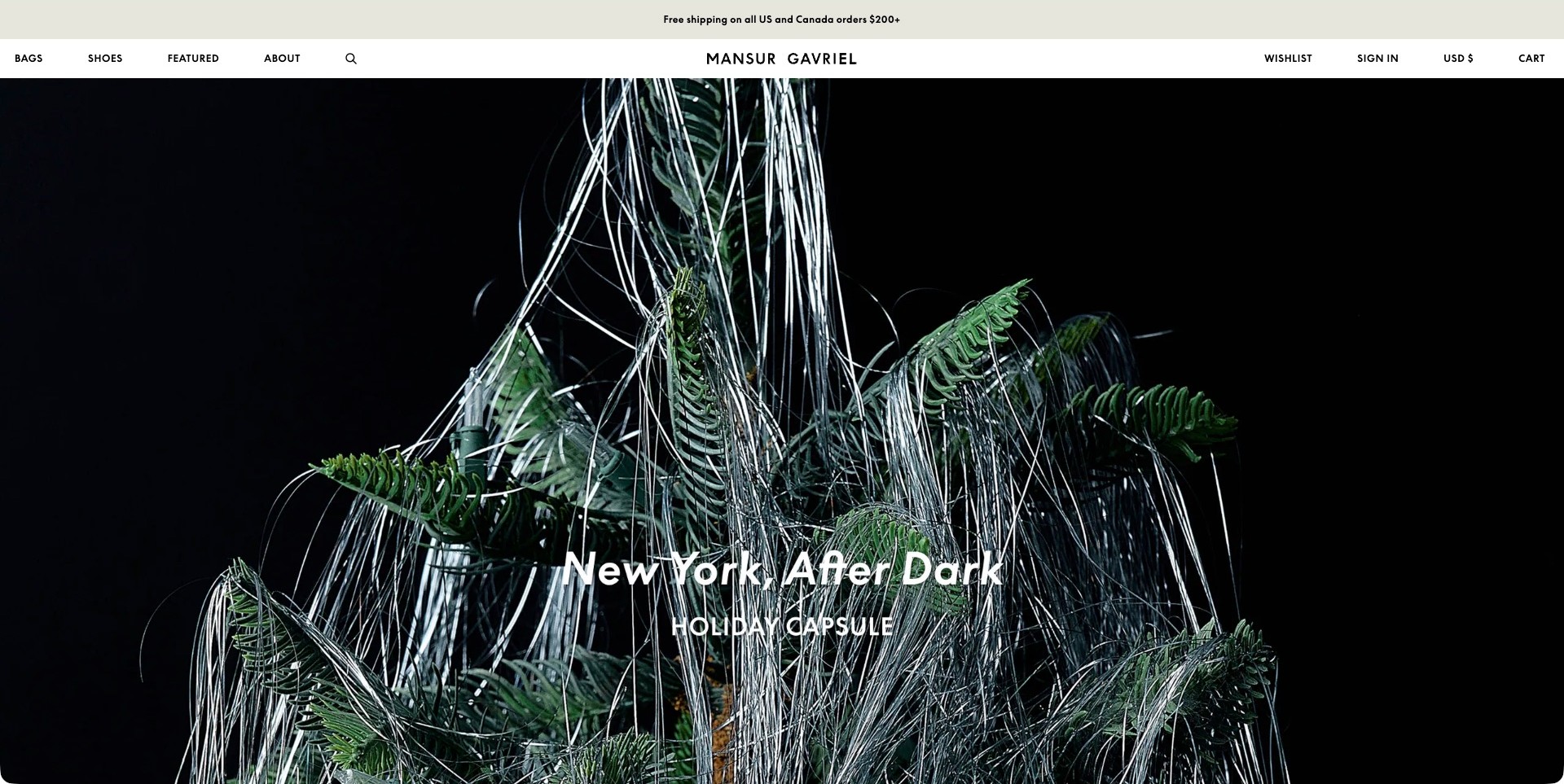
Mansur Gavriel’s homepage frame shows a dark evergreen arrangement draped with silver strands, accompanied by a short holiday-capsule title. No bag is visible in this campaign moment. A compact white header supplies Bags, Shoes, Featured and About alongside search and account controls. The brand’s own product and material pages establish the leather-goods fit separately from the seasonal scenery. This example is useful for studying contrast and atmosphere, but it should not be read as a product demonstration or evidence that an accessory’s materials, capacity or construction can be evaluated from the hero.
What you can learn
If the lead campaign deliberately omits the product, keep ordinary product routes unmistakable and provide a clear path into the featured collection. Follow the atmosphere with recognizable items and practical descriptions quickly. Visitors who already know which kind of bag they need should not have to wait for a film or interpret festive props.
Pros
The solid white header gives the atmospheric dark image a stable shopping frame.
Few top-level choices keep the first view visually focused.
Cons & considerations
A non-product scene delays understanding of the specific seasonal assortment.
A brief campaign title needs a clearly discoverable route to actual items.
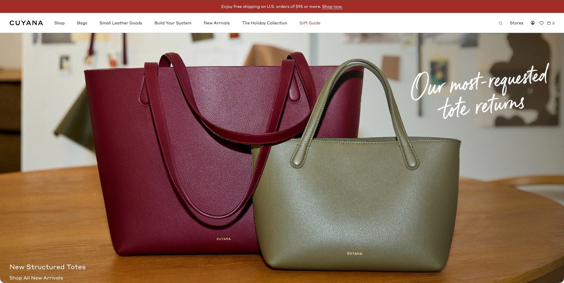
Cuyana’s captured homepage puts two structured totes on a wooden surface, with a larger burgundy bag behind a smaller green one. The close view makes handles, overall shape and surface texture recognizable, while a short handwritten-style message announces the return of the tote. A lower-left product introduction links toward new arrivals. The solid white header plainly distinguishes Bags, Small Leather Goods and a system-building route. The page provides explicit own-leather context elsewhere, but the hero’s relative sizes and textured surfaces do not replace dimensions, material descriptions or independent quality evidence.
What you can learn
Let a returning product’s recognizable shape lead the announcement, then give shoppers an unambiguous route to its variants. Explain actual dimensions, intended contents and accessory compatibility at product level. When two objects share a scene, avoid expecting perspective alone to tell customers which size or color they are selecting.
Pros
Large unobstructed product views make the tote silhouette easy to identify.
Plain bag and small-accessory categories remain available above the campaign.
Cons & considerations
Two differently positioned bags still need precise size comparisons.
A new-arrivals destination should keep the featured tote easy to identify after the click.
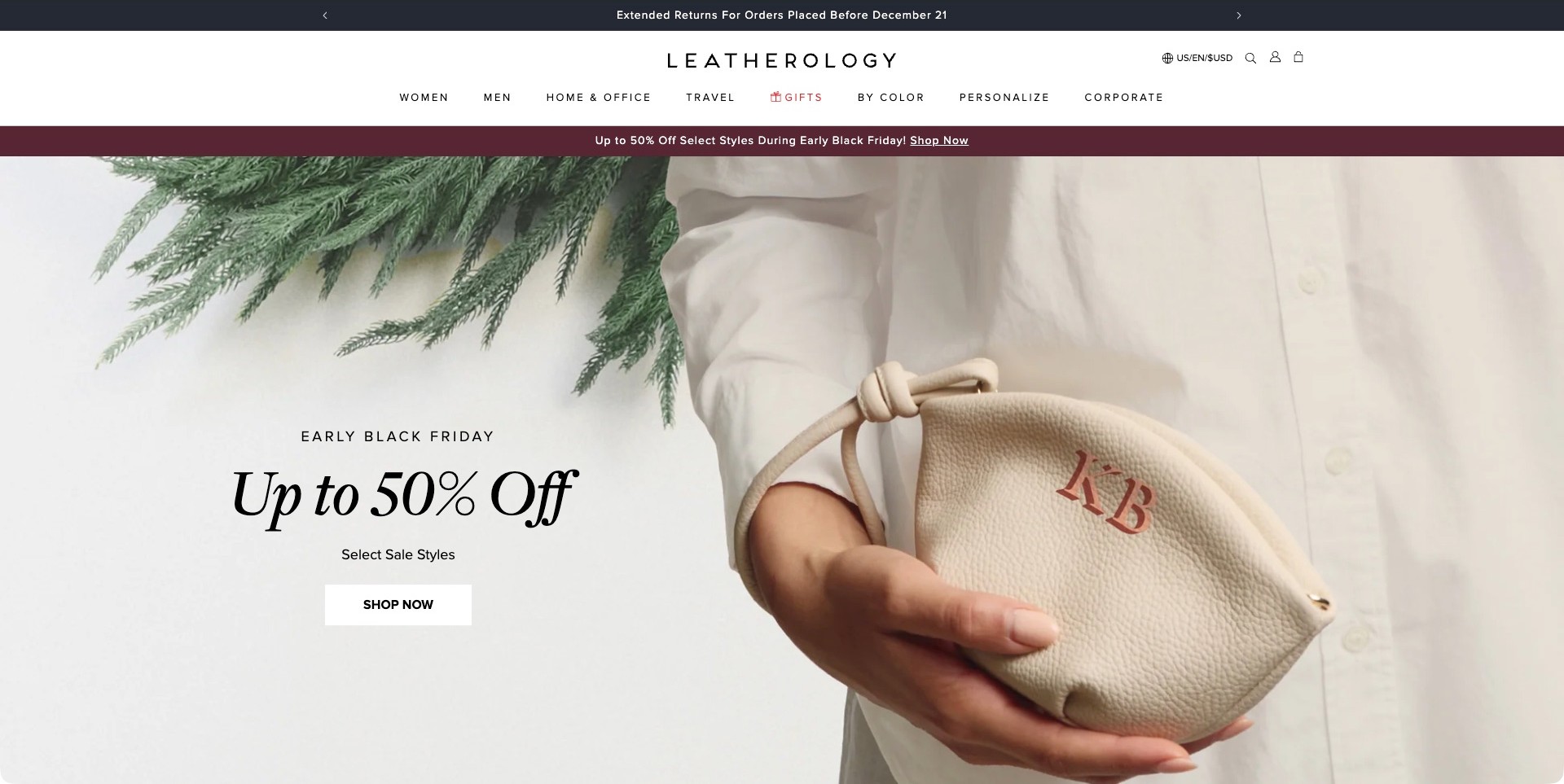
Leatherology’s captured homepage pairs a cream handbag marked with two large initials with a separate offer message on the left. Hands holding the bag give it a clear physical context, while the pale background keeps the dark text and white shopping button distinct. The solid header names travel, home and office, gifts, color browsing and personalization. The official page identifies its own leather wallets, bags and other accessories, establishing the category fit. The pictured initials demonstrate a presentation option, not a test of the personalization workflow, available lettering choices or delivery timing.
What you can learn
Show a concrete personalization example, then explain its choices and limits where shoppers configure the product. Keep promotion eligibility separate from customization requirements so visitors do not assume every pictured variation receives the same offer. Provide complete product dimensions, material information and preview guidance before someone commits to a personalized order.
Pros
A recognizable monogram makes personalization visible without a long explanatory paragraph.
Plain category and task labels support several accessory-shopping intentions.
Cons & considerations
Large offer messaging needs accessible eligibility and conditions on the destination.
A finished monogram photo cannot replace clear customization options and order-review information.
Kegan is a freelance web designer and developer with 15+ years of experience helping businesses turn complicated website requirements into clear, maintainable digital experiences. He works directly with clients from planning and design through development, launch, and ongoing support.
For leather goods brand website design, his development approach focuses on clear bag and accessory collections, useful dimensions and material information, considered product imagery, personalization and care boundaries, and dependable delivery and shopping routes. The scope can be a targeted improvement or a complete custom build, with responsive layouts, thoughtful content structure, and integrations chosen around the people using and maintaining the site.
Show 3 other leather goods brand website designersHide other leather goods brand website designers
Plan a leather-goods website around the object, its use and its ownership
Organize products by the decisions customers make
Map the range before borrowing another brand’s storefront structure. A maker focused on briefcases and small accessories needs different navigation from a house with handbags, luggage and seasonal collections. Use understandable product categories alongside any named collection system. A returning customer who knows a model should be able to find it directly, while a new visitor should have a practical route from their intended use.
Define the relationship between a model and its variants. Color, material, size and hardware may change together, so the product record must explain what is actually selected. Keep consistent names and identifiers across product cards, detail pages and the basket. Do not let a campaign page preserve an old description while the underlying product has moved to a different construction or finish.
Lotuff separates several bag and accessory categories in its public navigation, while Tanner Goods distinguishes its own product range from other brands and product lines. These are useful reminders to make the scope of the catalog explicit. If a storefront sells guest brands as well as its own designs, identify the maker rather than implying that every product has the same origin or production story.
Plan photography around proportion, access and carrying
Create an image checklist for each product type. A front and rear view establish the shape; an interior view explains access and organization; a carried photograph adds context for scale. Close-ups can show the surface and hardware without replacing the overall view. Keep the selected color consistent, and label a detail image when it shows another variant for explanatory purposes.
Give dimensions a readable structure and use consistent units. For bags, explain which measurements describe the exterior and identify relevant carrying or strap information. A laptop, notebook or other prop can help illustrate use, but a styled image should not become a guarantee that every device in a broad size category will fit. Where compatibility matters, publish approved dimensions and a clear support route.
Do not let dramatic cropping hide the product’s defining features. A close-up of a handle may be beautiful but insufficient for someone comparing two silhouettes. Pair atmosphere with information. Carl Friedrik’s retained campaign image, for example, places a leather travel bag in a recognizable carrying context; a complete product journey still needs the dimensions and details that cannot be read from that campaign alone.
Describe materials without relying on vague quality language
Decide which material fields the business can maintain accurately. They may include the relevant leather description, lining, hardware, finish and approved care information. Keep the description attached to the selected item and variant rather than assuming a single company-level paragraph covers everything. If a range includes other materials, make those differences visible instead of treating the entire catalog as interchangeable leather goods.
Explain unfamiliar terms where they matter to a purchase. Avoid presenting a simple hierarchy that implies one descriptive label guarantees all aspects of quality. Construction, finish, intended use and the business’s actual specifications still matter. Do not infer a tannery, origin, certification or environmental outcome from appearance or a familiar marketing term. Claims should use approved wording with the appropriate scope and supporting records.
A craft narrative can explain why a design choice exists. Keep the account specific about what is made, assembled or finished and by whom where the brand can document it. A photograph of tools or a workshop does not independently establish that every component was produced there. If a process varies across products, the content model should allow those differences rather than forcing one appealing story onto the whole range.
Make customization and gifting understandable before checkout
Separate a standard product variant from a made-to-order or personalized service. Explain which choices are available and how the customer confirms them. A monogram preview can be useful when its limits are clear, but it should not imply an exact physical result beyond what the business can support. Keep placement, character limits and relevant product restrictions near the decision.
Describe what happens after a custom request. An enquiry, design approval and completed order are different stages. Do not make a contact form confirmation look like acceptance of a bespoke commission or a guaranteed production slot. If an estimate or consultation is needed, label that route honestly. Collect only the information necessary to begin the conversation and protect any uploaded reference material appropriately.
For gifts, show what is included and which additions cost extra. Packaging, a message and personalization can have different conditions, especially for returns or changes. Those conditions should come from the business’s approved policies, not from generic storefront copy. Test the basket carefully so the selected product and custom instructions remain readable and customers can correct an error before completing the order.
Keep care, repair and service close to the relevant product
Build care content around the actual materials and finishes in the range. Guidance for one surface may not be appropriate for another. Give the business a clear approval and review process, and connect the relevant record to the product. Avoid publishing broad home-treatment advice merely to create search content; the brand should decide what guidance it can responsibly support.
If repairs, refurbishment or replacement parts are offered, explain the route and its conditions. Distinguish a general enquiry from a confirmed service booking, and avoid suggesting that every item or type of damage is covered. A useful page can identify what information helps the team assess a request without requiring a customer to disclose unnecessary personal details or send the physical product before receiving instructions.
Preserve practical information for earlier models when customers still need it. A seasonal product may leave the main collection, but its care or service record can remain useful. Keep links from order communications and product archives dependable. Give support staff a way to identify the model and material involved so they do not have to interpret a vague product nickname copied from an old campaign.
Build a restrained visual system that remains usable
A leather-goods site can feel distinctive through photography, spacing, typography and a consistent point of view without hiding navigation. Keep model names, prices and actions readable. A pale minimal interface should still provide adequate contrast and a visible focus state. A product card that reveals its name only on hover creates unnecessary friction on touchscreens and for keyboard users.
Plan seasonal changes as content updates within a stable system. Keep the product catalog, material records, stories and service pages connected so a new campaign does not require a complete rebuild. Record photographer, model and collaborator permissions. Reuse product facts from the maintained record rather than copying them into many promotional blocks that will gradually drift apart.
Test the real tasks: compare two bag sizes, inspect an interior, identify the selected finish, understand a custom option and reach care guidance. Review slow image loading, unavailable variants and regional storefront changes as well as the ideal desktop presentation. The result should help someone understand the object they are considering, not simply admire an editorial image and then leave with their practical questions unanswered.
The editing job behind the design
Choose tools for precise product records and durable ownership information
Model products, variants, materials, care records and service routes as connected content. Keep dimensions and material descriptions in one approved source rather than independently rewriting them in every collection story. Choose a system the team can maintain after launch.
Treat bespoke enquiries, personalization, ordinary purchases and repair requests as distinct workflows. Keep their confirmations accurate and define what information each needs. A generic form should not imply order acceptance or a service guarantee.
Prioritize responsive product photography, labelled variant controls, readable specifications and dependable support links. Public technology references do not establish a brand’s private production systems, sourcing records or material quality. Describe only the observed public scope.
Our WordPress website examples offer a separate look at publishing approaches. A visible platform label is evidence for that named page, not a guarantee that the same system will suit your requirements.
Before the public launch
Leather-goods website planning checklist
Map product categories and meaningful model families.
Distinguish own designs from guest-brand products.
Give variants stable material, color and size records.
Show front, rear, interior and carrying context where useful.
Publish clear dimensions with consistent units.
Avoid unqualified device-fit promises from styled images.
Keep material and origin claims specific and approved.
Explain the scope of workshop and craft stories.
Separate standard variants from bespoke services.
Keep personalization conditions visible before checkout.
Connect products to appropriate care guidance.
Explain actual repair and refurbishment routes.
Preserve useful ownership information for previous models.
Test product comparison and support tasks on mobile.
These checks are a project checklist, not a performance, legal, security, or accessibility certification. Test real journeys with the people responsible for the website before making claims about the result.
Sources & editorial method
How this collection was selected and reviewed
This collection contains exactly 29 distinct public leather-goods brand website examples, matching the original target saved before research. Each accepted image was independently inspected at full resolution. The 4 retained original direct captures keep their genuine earlier dates and bytes; 25 new browser captures retain actual UTC timestamps and remove only the observed native browser toolbar. Dated current first-party observations establish relevant own-brand product fit without turning older screenshots into fresh captures. Lotuff Leather is the explicit researched Editors Choice for the stated website-design reasons, not a measured or vote-derived ranking. Reviews evaluate visible communication and presentation only. Ingredients, efficacy, safety, materials, environmental descriptions, heritage, availability and commercial outcomes remain unverified unless separately established; no product-quality or service endorsement is implied. Unknown technologies remain unlisted pending scoped public evidence. External designs, images and trademarks belong to their respective owners.
Each example links to its actual source page. Screenshots are direct browser captures with their own capture dates; moving imagery, announcements and live designs can change. The notes describe observable design choices and conditional tradeoffs, not measured traffic, conversion results, service quality, or accessibility conformance.
Technology labels use public page metadata, asset evidence, or explicitly cited platform documentation. Platform documentation is not a complete current deployment audit. A component reference may be legacy or unused; it is not a complete backend inventory. Unknown stacks are omitted. These sites are editorial examples, not our client portfolio.
Written, Edited and Curated are separate editorial records, not timestamps advanced by a rebuild. Website designs and imagery belong to their owners. See our editorial standards or suggest a correction.
Questions worth asking
Leather Goods Brand website design questions
What product photographs are most useful for bags?
Show the overall shape, relevant sides, interior organization and carrying context. Add close-ups where they explain a material or feature. Pair those views with clear dimensions rather than relying on a model photograph to communicate every aspect of scale.
Should a small maker use luxury-style minimal navigation?
Only if visitors can still find the range, identify a product and reach useful information. Restraint can work well for a focused catalog, but hidden names, unreadable controls or missing dimensions do not make the experience more premium.
How should customization be presented?
Identify the available choices, relevant conditions and what the next action means. Keep an enquiry distinct from an accepted order. A preview should have an appropriate explanation of its limits, and the final selection should remain readable before checkout.
Can a craft story establish the quality of every item?
No. It can explain documented people, processes and decisions, but should not imply more than the evidence supports. Keep product-specific materials and construction information separate from a broader brand narrative.
Why keep care content for discontinued models?
Existing owners may still need accurate guidance or a service route after a product leaves the main catalog. Preserve useful records with clear model and material context instead of removing every support link when a campaign ends.
Borrow the clear product views, precise material records and durable care journeys. Help customers understand the object and its use while keeping attractive storytelling separate from claims the website cannot independently prove.