Best Laundry Service Websites of 2026 (14 Real-World Examples)
Laundry service websites that make pickup, pricing, and turnaround clear
These 14 examples compare local service coverage, wash-and-fold pricing, dry-cleaning distinctions, recurring plans, and collection scheduling.
The core decision is practical: can the service collect here, what will it handle, how is the charge calculated, and when will it return? A strong site answers those questions before requiring an account.
HappyNest is the editorial choice. Published prices and coverage remain qualified by location and service conditions; a headline bag price is not assumed to apply to every customer.
Before the examples
What makes good laundry service website design in 2026?
Define the charging unit
Explain per-pound, per-bag, per-item, or minimum-order pricing. State relevant bag dimensions, exclusions, or fees so the visitor can interpret the advertised amount.
Separate service types
Wash and fold, dry cleaning, ironing, and specialty care may have different handling and turnaround. Do not let one fast-delivery promise appear to cover every item.
Make coverage the first filter
Offer a clear area or postal-code route and explain collection windows. State when an advertised same-day or next-day service depends on location, cutoffs, or availability.
The collection · 14 examples
14 laundry service websites worth studying
Compare the examples by the visitor decisions they support. Each review identifies a specific pattern, practical lesson, strengths, and limitations in the directly inspected page.
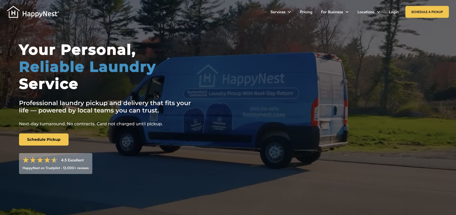
HappyNest pairs a branded delivery-van photograph with a direct pickup action and three useful assurances about timing, contracts, and when payment is taken. Its most valuable section defines the actual product: a bag with stated dimensions, an approximate two-load capacity, and a displayed price qualified by location. Pickup instructions explain labeling, detergent preferences, and driver notifications. This is our editorial choice because it turns an unfamiliar service into a concrete, understandable order. The long series of lifestyle testimonials repeats similar benefits, and the blue emphasis within the headline has weaker contrast against the darkened photograph than the surrounding white text.
What you can learn
Define the unit customers buy before asking them to create an account. Pair bag dimensions and realistic capacity with the price, local variations, collection window, and payment timing so the visitor can judge whether the service fits their household.
Pros
Bag dimensions and approximate capacity make pricing understandable.
Pickup preparation and payment timing are explained.
Cons & considerations
Repeated lifestyle testimonials lengthen the page.
Blue headline text has weaker contrast over the photograph.
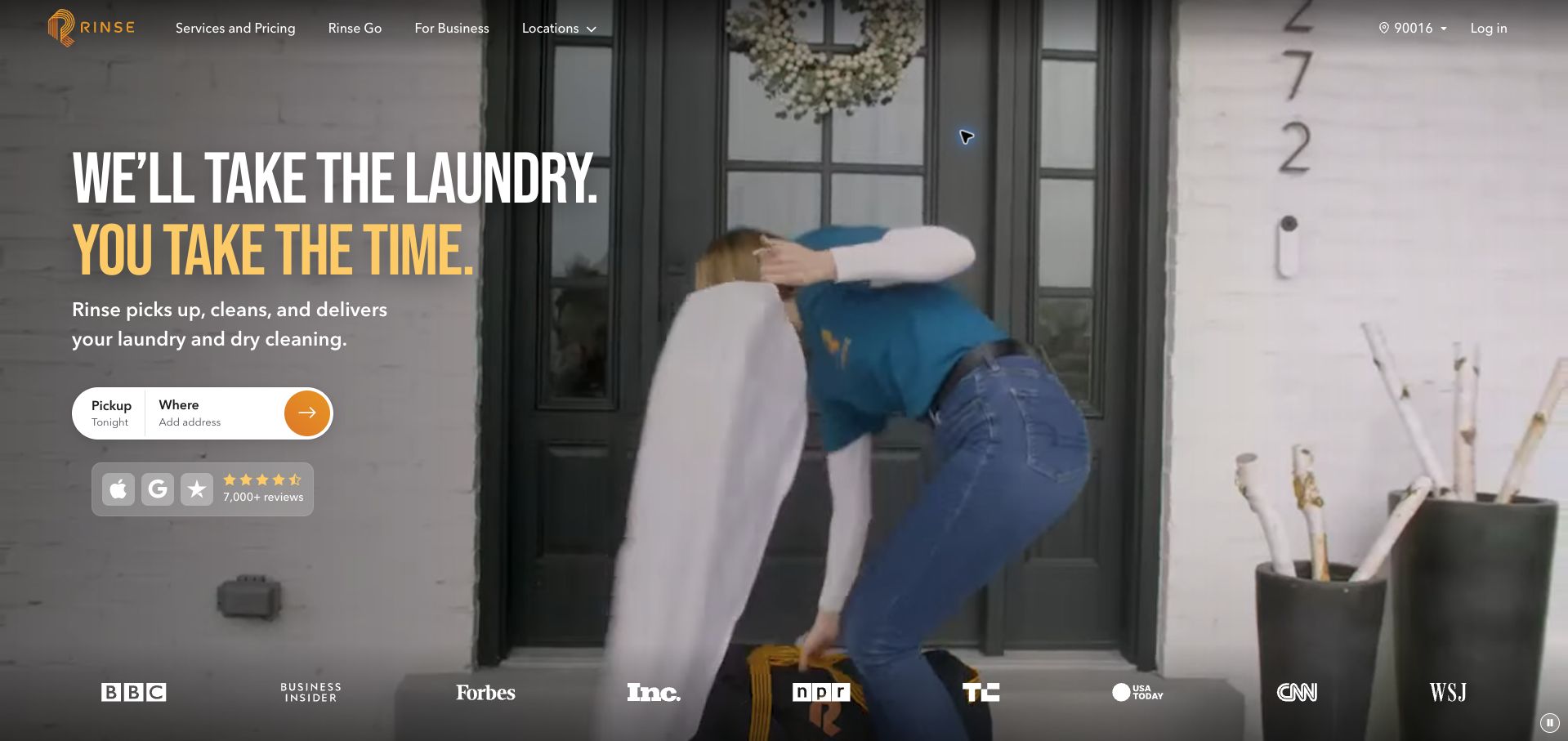
Rinse uses oversized typography and footage of collection and delivery to make the service feel tangible. A compact booking bar pairs a pickup date with an address request, while the body separates wash-and-fold bags from dry-cleaned garments. The latter receives an itemized price sample and its own turnaround information. First-pickup instructions explain the evening window, advance notification, and bags supplied by the driver. Those details answer more useful questions than a generic convenience claim. The opening Tonight label still appears before an address has established eligibility, and an introductory email-discount popup interrupted the first visit before it was closed for the retained capture.
What you can learn
Explain collection, cleaning, and return separately for each service type. Show what the driver supplies and what the customer prepares, and make fast availability claims visibly conditional on an eligible address and an actual open slot.
Pros
Wash-and-fold and dry-cleaning expectations are separated.
First-pickup instructions explain bags and arrival notifications.
Cons & considerations
Tonight appears before address eligibility is established.
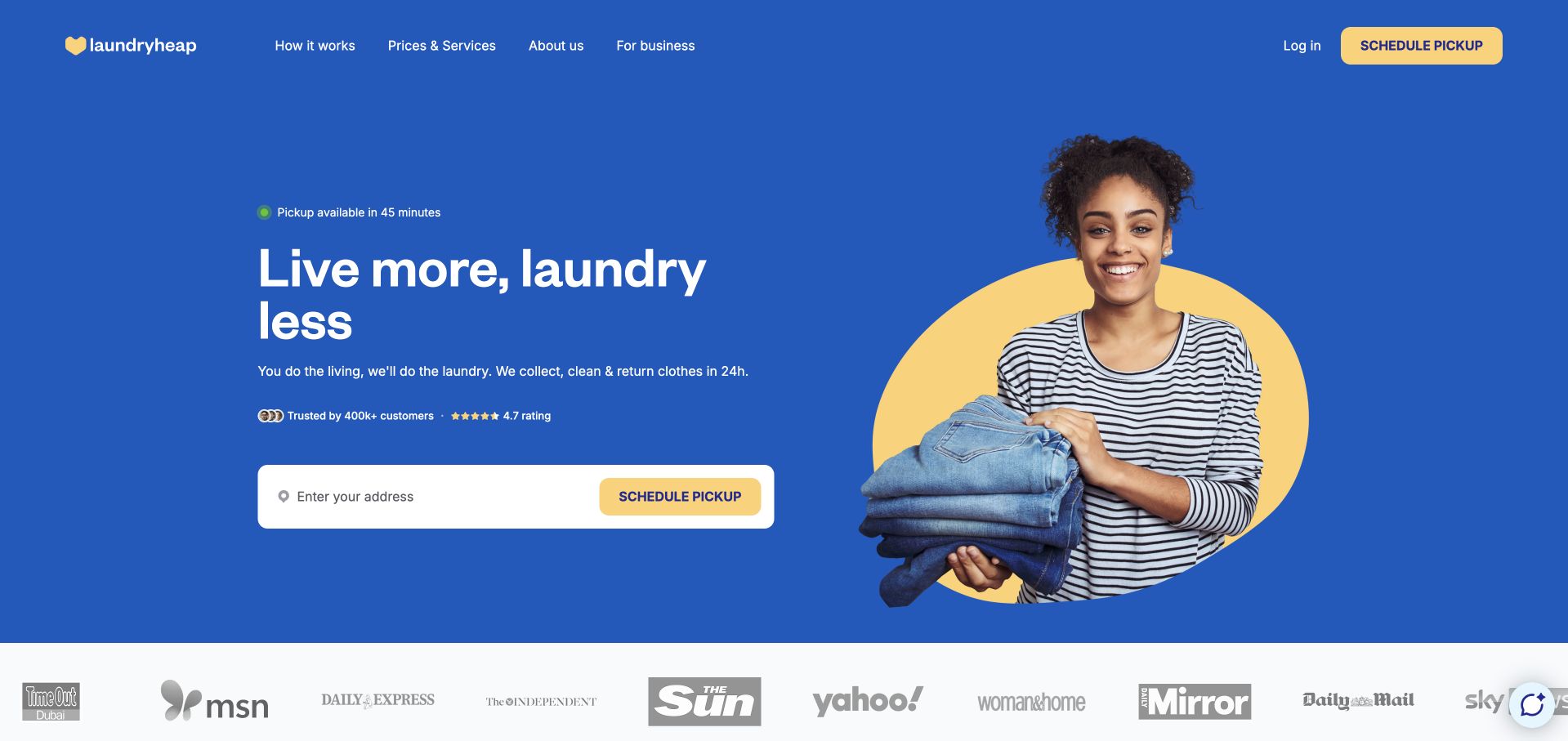
Laundryheap’s US page combines a short delivery promise with a prominent pickup action, then follows with three straightforward process steps. The price section gives different units for wash-and-fold, dry cleaning, and bulky items, which helps avoid treating all garments as one product. Its FAQ acknowledges that availability and prices depend on the city, and business laundry has a separate route. The country gateway makes the visitor choose a market before reaching this localized page. A 45-minute pickup message appears before an address check, however, and the firm 24-hour headline is softened to often within 24 hours in the FAQ. Neither promise was tested by placing an order.
What you can learn
Localize prices and units before presenting a booking form. Keep the qualification on collection and return times beside the headline promise, so a visitor does not have to reconcile stronger advertising language with a more conditional FAQ.
Pros
Service cards use distinct pricing units.
Commercial work and market-specific information have clear routes.
Cons & considerations
Immediate pickup availability appears before an address check.
Turnaround wording differs between the headline and FAQ.
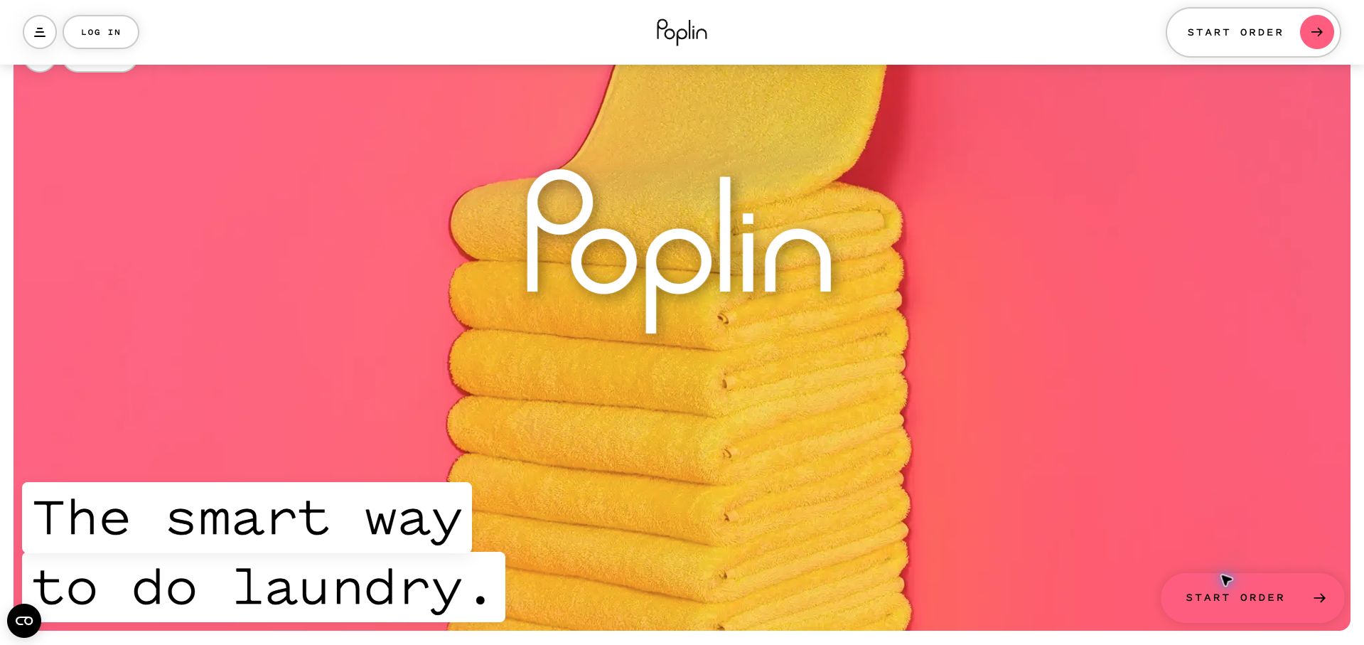
Poplin opens with a striking yellow towel against pink and an enormous wordmark, using a compact header for ordering and login. Farther down, a per-pound starting price, laundry-professional profiles, and an area checker explain the marketplace model. The detailed FAQ is particularly useful: it distinguishes standard and express service, minimum charges, oversized items, detergent choices, and services that are not provided. The visual opening is much stronger than its practical introduction, because almost the entire first screen is devoted to the brand image. The attractive per-pound figure also precedes the minimum-order charges by a substantial distance, making small-order economics harder to judge quickly.
What you can learn
Use a distinctive visual identity, then place the pricing floor beside the unit price. A marketplace should explain who handles the work, what preferences are supported, and which requests fall outside the service before customers begin an order.
Pros
The FAQ explains service limits and different delivery speeds.
Laundry-professional profiles clarify the marketplace model.
Cons & considerations
The oversized hero delays practical information.
Minimum charges are far from the headline unit price.
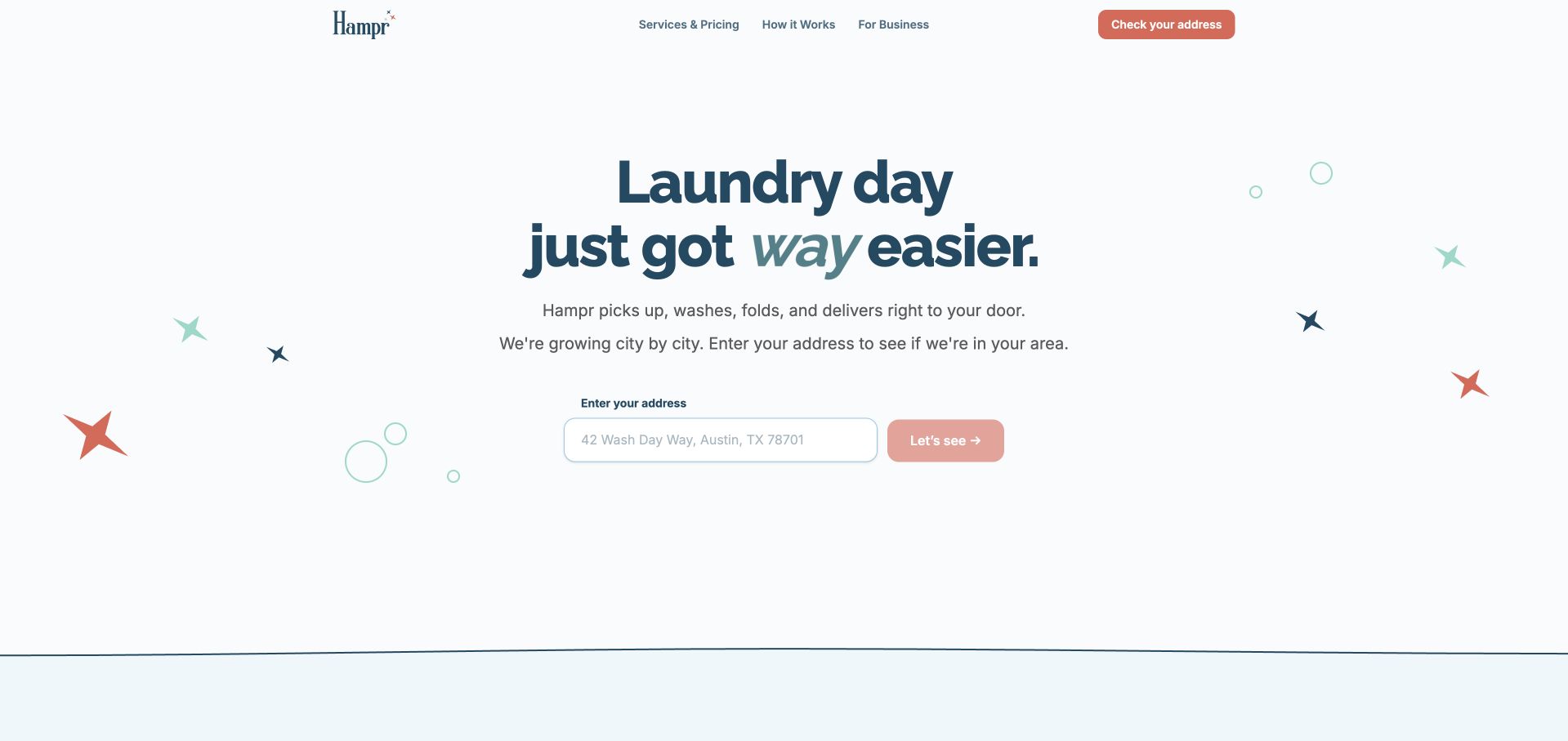
Hampr gives the address checker almost the whole opening screen, with a short explanation that coverage is growing city by city. This is a useful, honest prerequisite to ordering. The restrained navigation separates pricing, process, and business service, while the next section tells customers which bag to use and where to leave it. Soft colors and small illustrations keep the page approachable without obscuring the primary control. The action label Let’s see is friendly but less precise than Check availability. Pricing remains behind a separate link, and two similar newsletter blocks take up space that could explain minimum orders or collection windows. Optional cookies were rejected before the retained capture.
What you can learn
Establish service-area eligibility early and explain why an address is needed. Follow the checker with bag requirements, collection timing, and a concise price example, keeping newsletter invitations secondary to the practical decision the visitor is making.
Pros
The opening clearly qualifies service coverage.
Bag preparation is explained in a short sequence.
Cons & considerations
The availability button uses a vague label.
Repeated signup blocks compete with practical service detail.
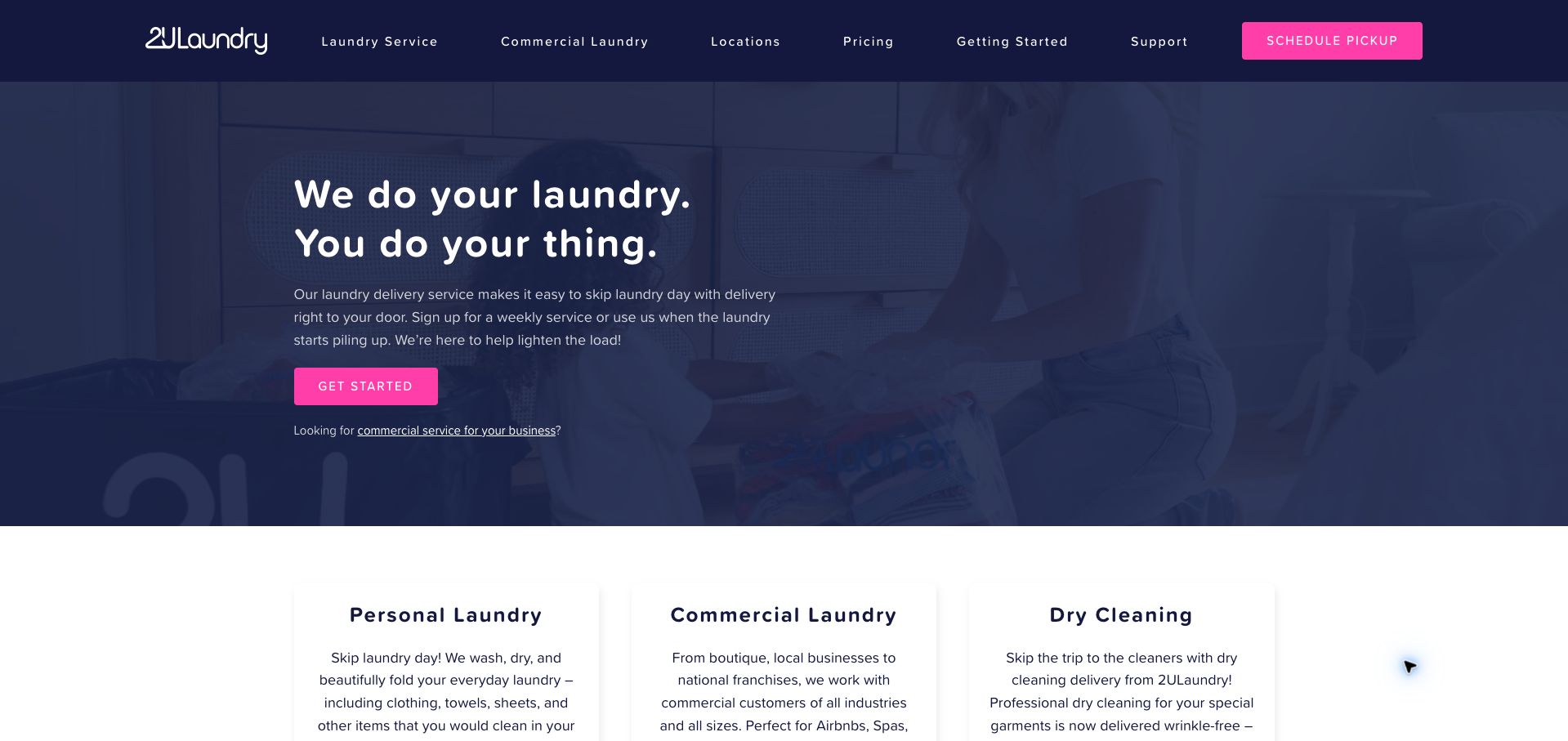
2ULaundry introduces weekly and occasional service in a navy-and-pink layout, then immediately separates personal laundry, commercial work, and dry cleaning. Its strongest teaching device is the bag system: the body explains how different bags identify everyday clothing, linens, dry cleaning, and delicate items. It also describes pickup reminders and leaving instructions when the customer is away. These details make the service easier to picture. The same section acknowledges that bag options vary by market, so the homepage cannot provide a complete local comparison. Repeated Get started and Learn more labels also make several different destinations sound interchangeable, despite the useful distinctions in the surrounding copy.
What you can learn
Use physical service containers as a clear information system when they determine treatment and price. Explain each bag’s purpose, then connect it to local availability and a descriptive action that names the next decision instead of repeating generic link labels.
Pros
The bag system explains different treatment categories.
Pickup reminders and unattended collection receive practical guidance.
Cons & considerations
Bag availability varies by market and needs another lookup.
Several different destinations share generic action labels.
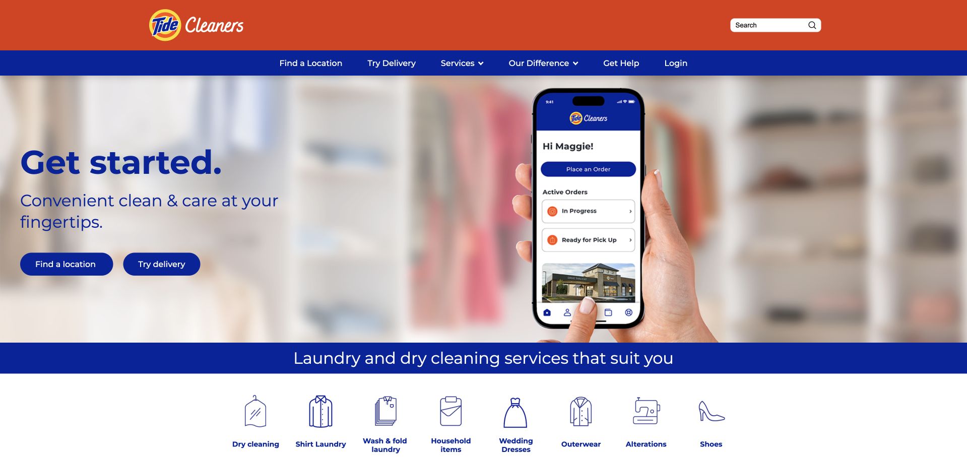
Tide Cleaners uses familiar orange and blue branding to frame two clear opening choices: find a location or try delivery. A row of labeled icons then distinguishes dry cleaning, shirts, wash-and-fold, household items, wedding dresses, alterations, and other services. Farther down, stores, lockers, campus service, and business access receive their own routes. This is effective navigation for a service with several ways to hand over garments. The hero headline itself says little about the offer, and an immediate discount modal asks for an address and email before the visitor has explored it. That modal was closed for the retained screenshot. Prices and turnaround estimates are absent from the homepage introduction.
What you can learn
When a service has several collection channels, separate the channel decision from the garment category. Let visitors identify a suitable location or delivery option before presenting signup promotions, and include enough timing and price context to make those routes meaningful.
Pros
Store and delivery actions are distinct.
Labeled service icons make a broad inventory scannable.
Cons & considerations
A discount modal interrupts initial exploration.
The introduction omits prices and turnaround estimates.
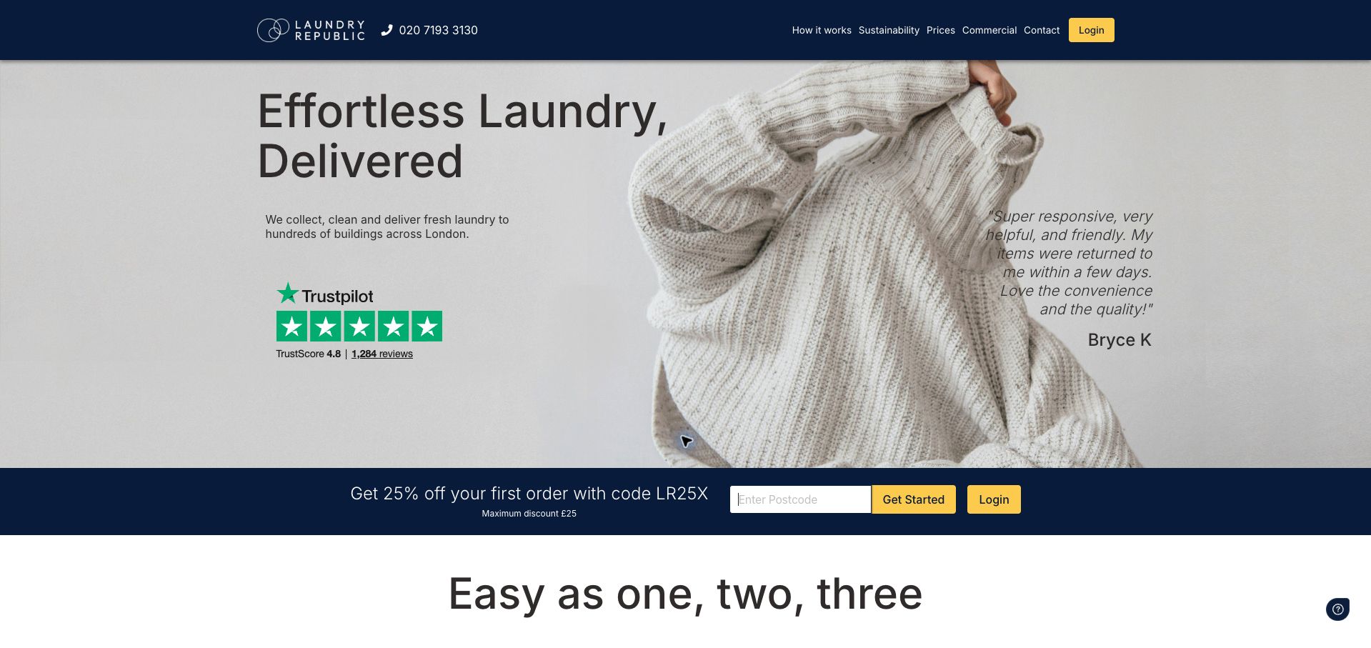
LaundryRepublic makes its London building model explicit: customers leave a bag with their concierge or in lockers, place an order, and receive notice when the cleaned items return. The homepage reinforces that process with a postcode checker and a clearly capped first-order promotion. This differs usefully from services that require someone to meet a driver. The page also says the final price is emailed after collection, an important purchasing condition that deserves stronger prominence beside the first action. Rotating claims about ratings and sustainability compete with the practical introduction. The retained capture follows turning off optional analytics and advertising cookies in the site’s consent dialog.
What you can learn
Explain the physical handoff that makes a building-based service work, including eligibility and return notification. If the final charge is determined after collection, disclose that next to the order action and provide an accessible price guide before the customer commits.
Pros
The concierge and locker workflow is easy to understand.
The first-order promotion states a maximum discount.
Cons & considerations
Final pricing is confirmed after collection rather than at the opening action.
Rotating marketing claims compete with the service explanation.
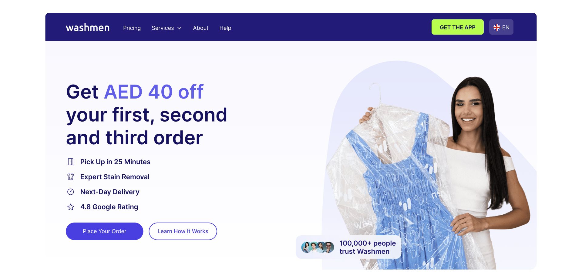
Washmen pairs a garment photograph with a large introductory offer and separate actions to order or learn the process. Its service section is more informative than the promotion: clean-and-press items have individual prices, wash-and-fold uses a weight allowance, and bed-and-bath service uses an item allowance. Shoe and bag care are identified as separate specialist categories. The app handoff is explained through direct store links and a QR-code sequence. Fast pickup claims dominate the opening, although the body describes a chosen two-hour window and arrival in as little as 25 minutes. The Dubai, Abu Dhabi, and Sharjah coverage context appears much later, leaving the opening promise insufficiently localized.
What you can learn
Keep each service’s price unit visible and explain what belongs in that category. Pair rapid-pickup advertising with its actual scheduling window and covered cities, then offer a clear desktop-to-phone handoff for customers who choose the app.
Pros
Service categories use explicit item, weight, or allowance pricing.
The desktop page explains the app handoff.
Cons & considerations
The fastest pickup claim needs its scheduling qualification nearby.
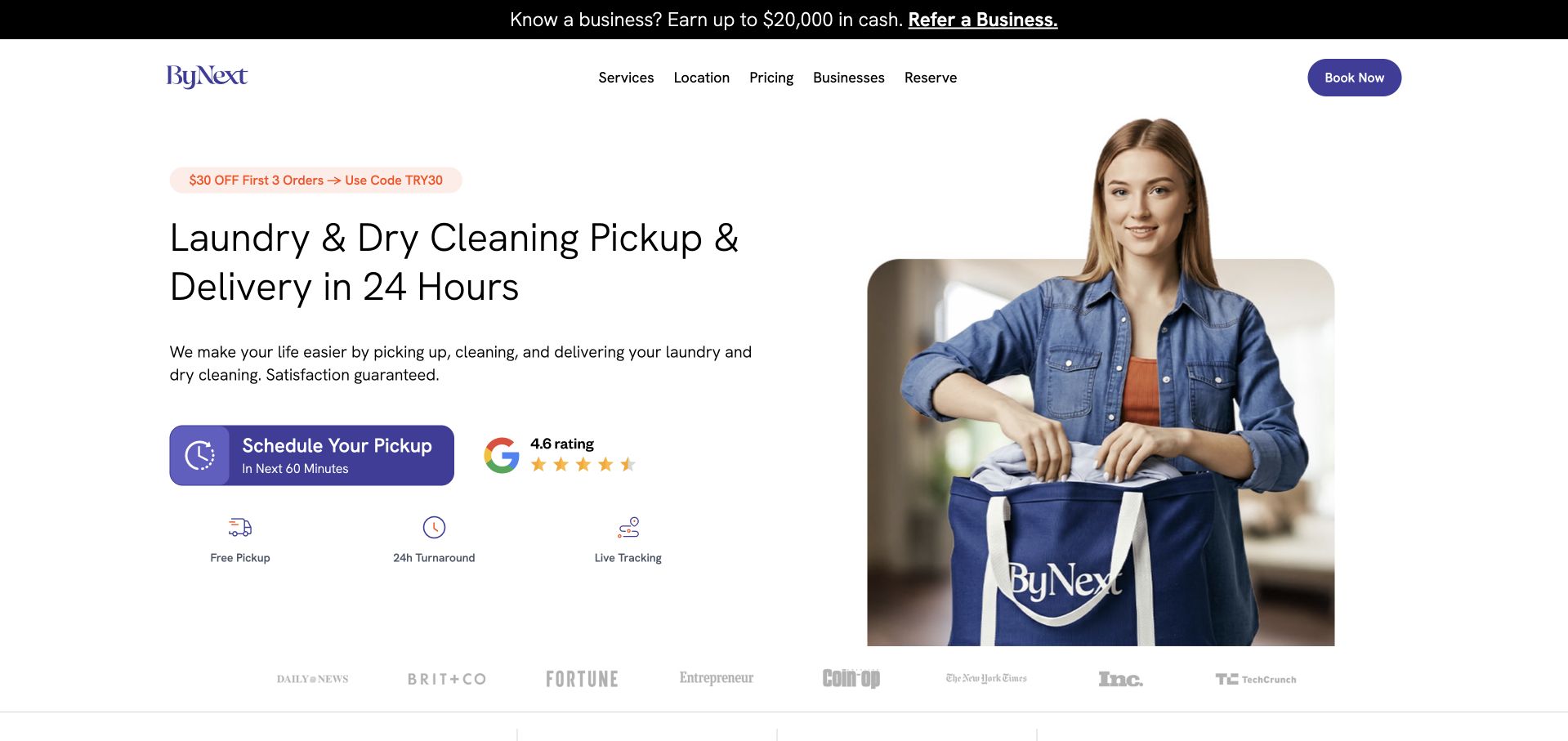
ByNext presents a clear laundry-and-dry-cleaning proposition, a large pickup button, and compact icons for collection, tracking, and return. Price cards below distinguish a per-pound laundry rate from an item-based dry-cleaning starting price. The FAQ supplies useful handoff options for customers who are away and names supported regions. The main weakness is inconsistency: the opening and price cards suggest a 24-hour return across the offer, while the FAQ says dry cleaning and laundered shirts require at least 48 hours. A prominent business-referral cash promotion also precedes the residential service introduction. These are observable content problems rather than evidence about the actual quality of cleaning or fulfillment.
What you can learn
Maintain turnaround times in one consistent source and display the correct estimate for each service. Keep business-referral promotions away from the first residential decision, and make price cards repeat the same operational conditions as the FAQ and booking flow.
Pros
Price cards distinguish laundry and dry-cleaning units.
The FAQ explains unattended pickup and supported areas.
Cons & considerations
Dry-cleaning turnaround claims conflict within the page.
A business-referral promotion distracts from the residential introduction.
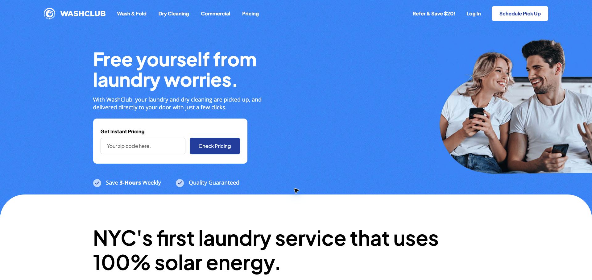
WashClub gives its bright blue homepage a useful first task: enter a ZIP code to check pricing. The control is isolated in a white panel, while navigation separates wash-and-fold, dry cleaning, and commercial work. The body explains detergent preferences, bag preparation, tracking, and pickup windows, including a Manhattan exception to the advertised 60-minute window. This specificity is more valuable than the broad convenience claims. The page spends considerable space on environmental positioning before the process explanation, and later timing copy repeats the short-window promise without always carrying the same geographic qualification. No ZIP code or personal information was submitted during this review.
What you can learn
Let visitors check local pricing before account creation and keep regional service exceptions attached to every repeated promise. Explain bag preparation and delivery notifications in the same sequence as ordering, so operational details remain easier to find than broad brand claims.
Pros
The price checker is prominent and clearly labeled.
Pickup instructions describe bags, preferences, and tracking.
Cons & considerations
Environmental messaging delays the process explanation.
Repeated pickup-window claims need consistent regional qualifications.
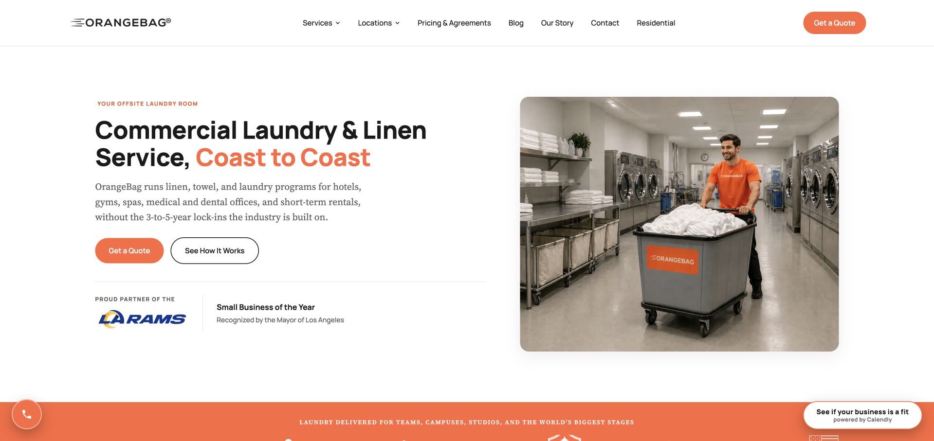
OrangeBag clearly addresses businesses in its opening, naming the industries it serves and pairing a quote action with an explanation of the process. The page describes scheduled routes, dedicated loads, written pricing, and a trial period, then develops separate routes for hotels, gyms, spas, rentals, and other buyers. This gives procurement visitors more useful context than household laundry imagery would. The stated agreement terms are under three years, which is a specific distinction rather than a claim of no commitment. Coast-to-coast wording is broader than the five service regions later listed, and the long industry inventory makes the page dense. A persistent scheduling prompt also competes with the main quote action.
What you can learn
Explain commercial laundry through routes, load handling, agreement length, and pricing documentation. Keep the service-area summary precise, then use industry pages for specialized requirements instead of asking every business buyer to scan the entire program inventory.
Pros
Operational details make the commercial offer concrete.
Industry-specific routes support different business requirements.
Cons & considerations
Broad geographic wording needs the regional qualification earlier.
The long inventory and persistent scheduling prompt add competition.
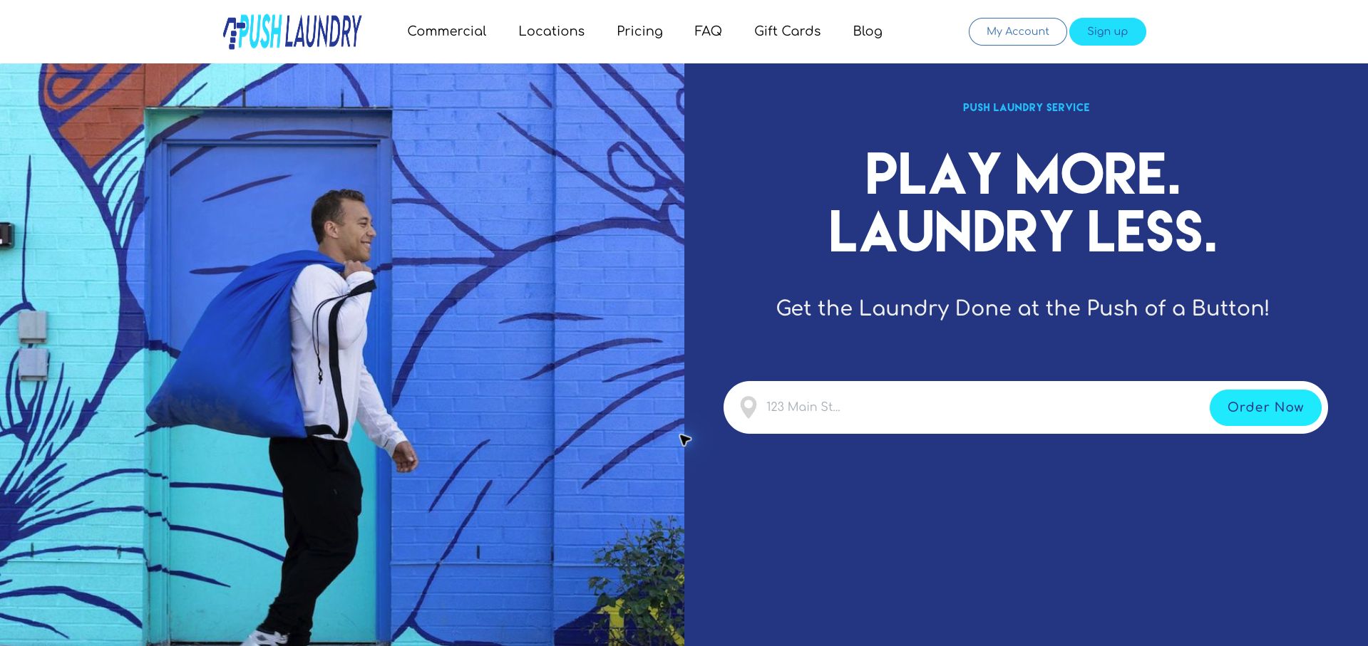
Push Laundry uses an energetic split-screen composition, pairing a person carrying a large bag with a dark blue ordering panel. The address field makes collection the central task, and the body later compares two-day and next-day service with separate per-pound starting prices. That simple speed-versus-price comparison is useful for a chore customers may schedule regularly. A full-pricing link offers a route to more detail, while commercial categories have their own section. The opening is dominated by a lifestyle slogan rather than the actual service conditions. Its address field also relies on faint placeholder text, and minimum-order context is not part of the prominent price comparison.
What you can learn
Make the cost of faster delivery easy to compare, using the same unit and clearly stated starting-price qualifications. Place minimum charges and address-field labels beside that comparison so visitors can assess the order before entering a scheduling journey.
Pros
Two delivery speeds have separate per-pound starting prices.
The opening gives the collection action a strong visual focus.
Cons & considerations
The hero delays practical price and timing information.
Faint field guidance and missing nearby minimums weaken clarity.
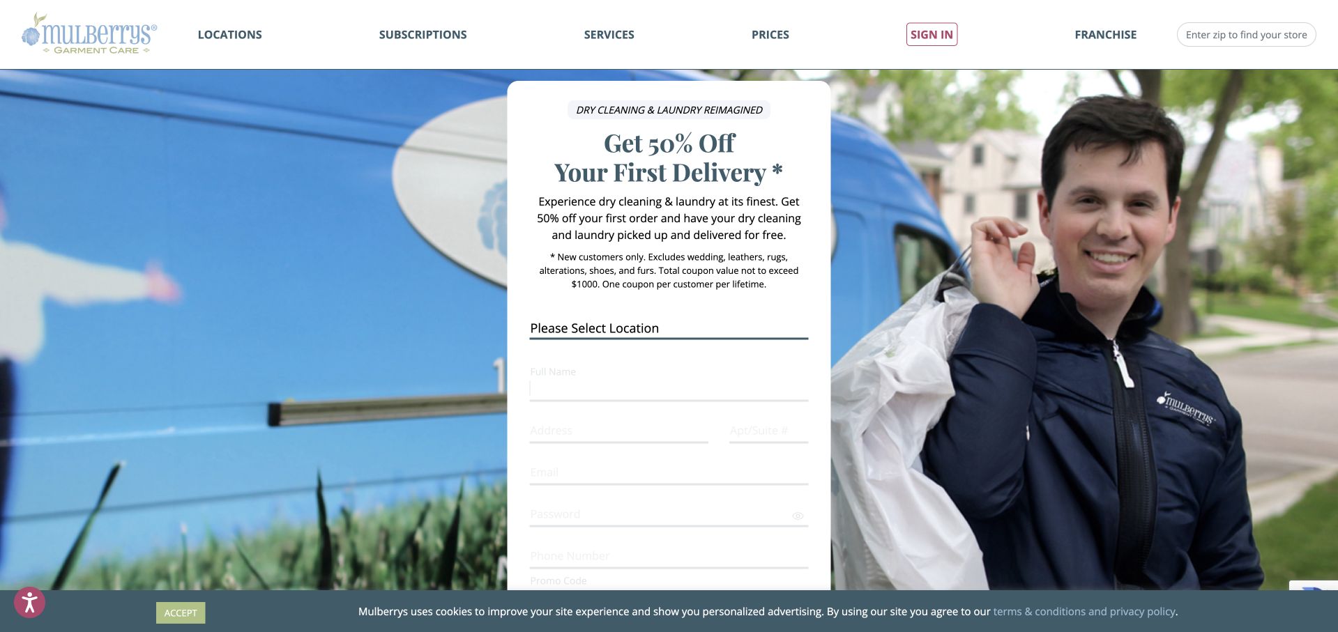
Mulberrys places a first-delivery discount over a photograph of its branded van and driver. The offer includes concrete exclusions, a maximum coupon value, and a new-customer restriction, which is more transparent than an unexplained percentage alone. The same panel immediately introduces location selection and a long account form containing contact details and a password field. A ZIP-based store finder remains available in the header, and process instructions sit below the hero. The form’s pale labels are difficult to distinguish against white, while its length pushes the final action below the initial viewport. The retained cookie strip further reduces that space. No form fields were completed during the review.
What you can learn
Keep promotional restrictions readable and close to the offer, then ask for information in a sequence proportional to the visitor’s readiness. Establish the local service and likely cost before a full account form, and give persistent field labels adequate contrast.
Pros
The promotion includes exclusions and a maximum value.
A separate store finder provides a local discovery route.
Cons & considerations
The long account form asks for substantial commitment immediately.
Low-contrast fields and the cookie strip reduce usable space.
Kegan is a freelance web designer and developer with 15+ years of experience helping businesses turn complicated website requirements into clear, maintainable digital experiences. He works directly with clients from planning and design through development, launch, and ongoing support.
For laundry service website design, his development approach focuses on service-area checks, pickup and delivery explanations, price conditions, care information, and order-system connections. The scope can be a targeted improvement or a complete custom build, with responsive layouts, thoughtful content structure, and integrations chosen around the people using and maintaining the site.
Show 3 other laundry service website designersHide other laundry service website designers
Record coverage, pickup windows, turnaround, price units, and exclusions together. Assign an owner to reconcile differences between hero claims, FAQs, and booking screens.
Explain the collection routine
Describe bags, labeling, contactless arrangements, and return delivery using the operator’s process. Keep these instructions available after the initial promotional offer.
Test exceptions and changes
Plan for unsupported areas, missed pickups, minimum charges, recurring-plan changes, and delayed returns. Give customers an understandable support route without making them re-enter the entire order.
The editing job behind the design
Choose systems the team can keep accurate
Connect service-area and pricing data to the booking system so marketing copy does not drift from operational availability. Retain a readable explanation outside the account flow.
Use the website to clarify the process; let the operational platform own orders, addresses, and delivery updates. Keep personal delivery details out of analytics payloads.
Our WordPress website examples offer a separate look at publishing approaches. A visible platform label is evidence for that named page, not a guarantee that the same system will suit your requirements.
Before the public launch
Website planning checklist
Explain the price unit.
State minimum charges.
Qualify promotional prices.
Separate dry cleaning from laundry.
Define turnaround by service.
Show coverage checks.
Explain pickup windows.
Describe bag preparation.
State recurring-plan terms.
Provide a missed-pickup route.
These checks are a project checklist, not a performance, legal, security, or accessibility certification. Test real journeys with the people responsible for the website before making claims about the result.
Sources & editorial method
How this collection was selected and reviewed
These 14 examples match the collection target saved before research. Public pages were directly opened and visually inspected; the pictured source and capture date identify the reviewed state. Reused captures retain their earlier dates. Each source also has a bounded public stack-audit attempt, with inaccessible and unknown results kept explicit. Editors Choice recognizes website design and information, not service quality or promised outcomes. No purchases, bookings, applications, or private forms were submitted. Images and trademarks belong to their owners.
Each example links to its actual source page. Screenshots are direct browser captures with their own capture dates; moving imagery, announcements and live designs can change. The notes describe observable design choices and conditional tradeoffs, not measured traffic, conversion results, service quality, or accessibility conformance.
Technology labels use public page metadata, asset evidence, or explicitly cited platform documentation. Platform documentation is not a complete current deployment audit. A component reference may be legacy or unused; it is not a complete backend inventory. Unknown stacks are omitted. These sites are editorial examples, not our client portfolio.
Written, Edited and Curated are separate editorial records, not timestamps advanced by a rebuild. Website designs and imagery belong to their owners. See our editorial standards or suggest a correction.
Questions worth asking
Laundry Service website design questions
Is a bag price enough?
Only when customers can understand the bag size, included service, minimums, and relevant conditions.
Where should coverage checking appear?
Before a strong scheduling commitment. Visitors should not create an account simply to learn that their address is unsupported.
Can one turnaround claim cover everything?
Only if it accurately applies. Otherwise distinguish wash-and-fold, dry cleaning, and specialty items beside the promise.
How should recurring service be explained?
State the frequency, charging basis, and how customers pause, skip, or cancel according to the actual plan terms.