Best Independent Cinema Websites of 2026 (14 Real-World Examples)
Independent cinema websites that make the program, the place and the next screening easier to explore.
Explore 14 real independent cinema websites, from neighborhood repertory theaters to cultural venues with festivals, education and dining. Compare how they turn film imagery into a useful path through dates, titles and visit information.
A cinema website has two different jobs at once. It needs to communicate why a film or program is worth exploring, and it needs to answer a practical question: what can I see, where and when? Strong examples let those jobs support each other. The film still creates interest; the schedule and visit details make that interest actionable.
This collection examines distinct public cinema properties and their observed information design. Some emphasize repertory programming, others combine screenings with education, hospitality or broader cultural activity. Those differences are retained in the reviews. The selection concerns website communication, not film quality, venue operations or a guarantee about a particular visit.
Before the examples
What makes good independent cinema website design in 2026?
Keep the date attached to the decision
A film title alone does not identify a visit. Keep the date, time, venue and any relevant presentation label together. A homepage feature should lead clearly to film information or a specific screening, with labels that explain which step follows.
Explain the curatorial structure
Give seasons, retrospectives, festivals and recurring programs stable names and routes. Short labels can connect an individual film to its wider context without asking every visitor to read a long institutional introduction before reaching the schedule.
Treat arrival information as part of the program
Keep location, transport, ticket policies and access information easy to find. Distinguish the venue’s published facilities from the particular screening’s stated format, and direct visitors to the current source for details that can change.
The collection · 14 examples
14 independent cinema websites worth studying
Compare 14 distinct cinema properties through their schedules, film imagery and visit information. The captures show homepages except Film Forum, whose Now Playing listing is identified. Brattle is the Editors Choice for its day-first schedule and concise program context; the selection concerns website design.
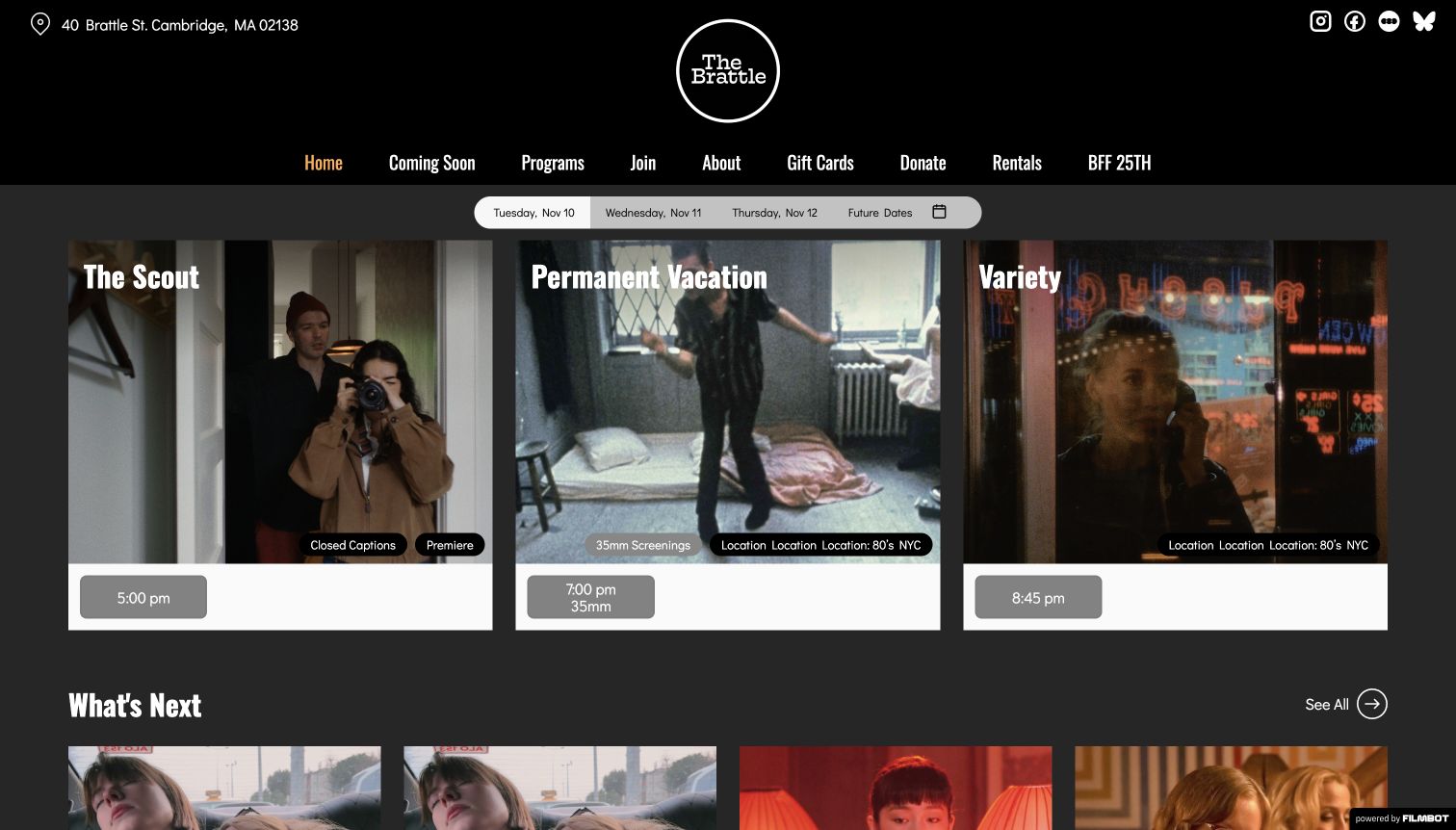
Brattle puts the practical cinema decision ahead of a large promotional slideshow. Rounded date tabs lead into three equal film cards, so a visitor can compare today's program without waiting for a slide to rotate. Each card combines a film still, a clear title and showtime controls; smaller program and format labels give the selection an editorial context. The black masthead and centered circular mark supply a strong identity without taking over the schedule. An address remains visible in the header, while the navigation separates programs, membership and practical institutional information. The following What's Next section continues the same discovery pattern rather than introducing an unrelated campaign layout.
What you can learn
Borrow the separation between the date, the film and the program it belongs to. A cinema can express a distinctive curatorial voice through small, consistent labels while leaving the immediate screening decision easy to find.
Pros
Date tabs and equal cards support direct comparison.
Program labels explain why films belong together.
Cons & considerations
Several short badges can crowd a busy film card.
Past showtime states need a clearly understandable explanation.
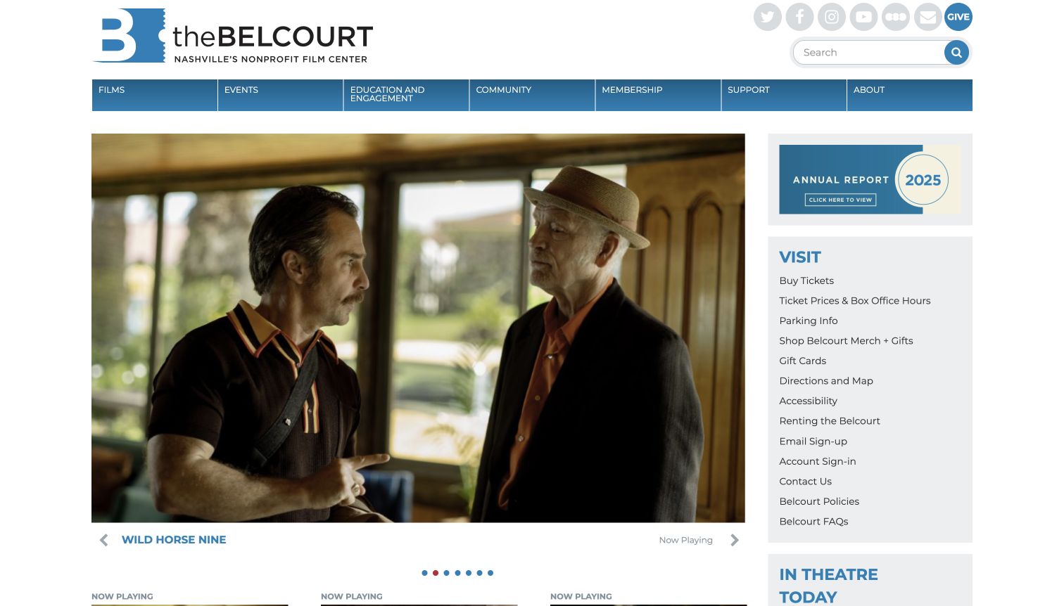
Belcourt pairs a wide film-image carousel with a remarkably practical right-hand column. The large feature gives a current film room to establish its mood, while the adjacent Visit list offers tickets, prices, parking, directions, accessibility and policies in one compact place. A blue navigation bar groups films, education, community, membership and support beneath the theatre's wordmark. The captured page also gives an annual-report tile its own space, making the nonprofit institution visible alongside its current program. This combination is useful because a returning filmgoer and a first-time visitor do not have to begin with the same question. The Now Playing heading below the feature promises a more systematic view of the schedule.
What you can learn
Give practical arrival information a dependable home beside promotional content. Keep that utility area stable as film campaigns change, and let the schedule remain a distinct route rather than burying it inside an institutional introduction.
Pros
Visit links cover several concrete planning questions.
Blue navigation provides a consistent visual organizer.
Cons & considerations
The utility list becomes dense at small text sizes.
Carousel controls are quieter than the dominant film image.
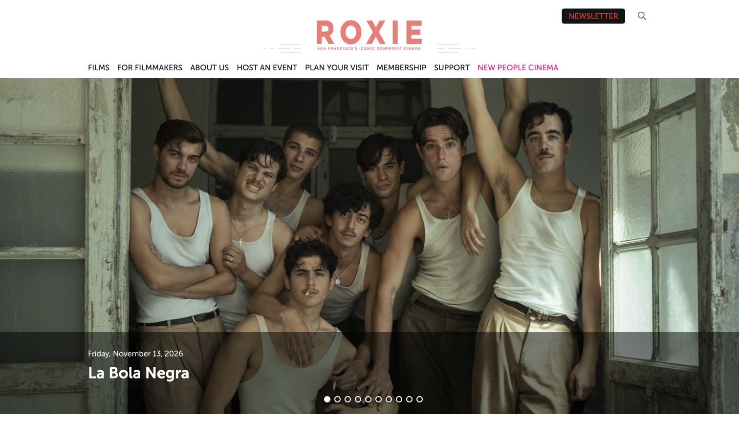
The coral Roxie wordmark and plain white header establish a friendly, recognizable identity before a large film still takes over the opening view. A translucent caption area attaches the current film title and timing to its image, avoiding a separate block of disconnected promotional text. The navigation makes room for filmmakers, event hire, visits, membership and support, showing that the cinema serves more than a single ticket-buying journey. Below the feature, Now Playing and weekly screening routes offer a more direct way into the program. The visible link to New People Cinema introduces another location-related choice, so location naming matters as much as visual consistency. The result feels like a working cultural venue rather than a generic film catalog.
What you can learn
Keep the cinema's local identity in the header, then use film artwork to carry the changing campaign. When more than one venue appears, repeat the relevant venue name at the point where a visitor chooses a screening.
Pros
A distinctive wordmark survives changing film artwork.
Navigation recognizes visitors, members and filmmakers.
Cons & considerations
A long row of carousel indicators adds visual clutter.
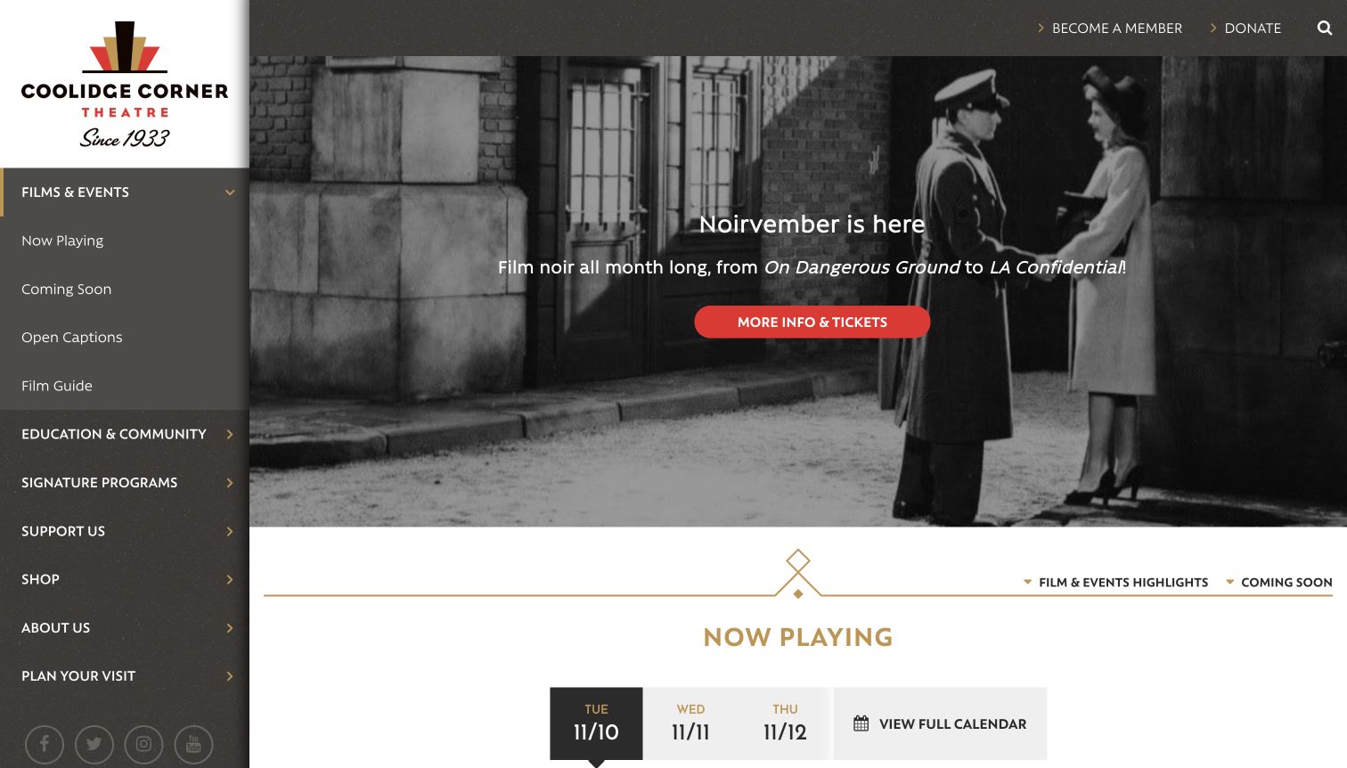
Coolidge uses a substantial left-hand navigation column, keeping the theatre's art-deco identity and program structure visible beside the main content. Films and Events expands into useful choices such as Now Playing, Coming Soon and Open Captions. The captured feature promotes Noirvember with a dark film image, gold framing and a red ticket action. That seasonal treatment gives the program an authored visual character without replacing the persistent routes to everyday tasks. Education, signature programs, support and planning a visit remain grouped in the sidebar. Immediately below the campaign, a Now Playing section introduces dated choices and a full calendar. The layout therefore distinguishes a highlighted season from the broader schedule instead of asking one hero banner to do both jobs.
What you can learn
Use a stable navigation system to support a strong seasonal feature. Give recurring program types their own durable routes, and always keep an obvious path back to all films when a visitor is interested in something outside the campaign.
Pros
The sidebar exposes meaningful program categories.
Seasonal art direction creates a clear editorial focus.
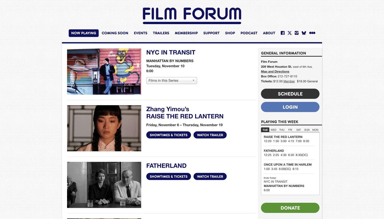
Film Forum's Now Playing page is a useful alternative to a promotional homepage. Horizontal rows pair film imagery with titles, dates and actions, making the list predictable from one entry to the next. The dark blue wordmark and restrained paper-like background preserve the institution's identity without overwhelming the program. A narrow side rail gathers general information, ticket details, schedule access and the day's screening times. This means visitors can explore a film editorially while retaining a compact view of practical timing. The familiar navigation also keeps Coming Soon, Events, Trailers, Membership and Support accessible. The reviewed capture is this listing page specifically; the collection does not treat the different homepage carousel as the same design surface.
What you can learn
Separate the browsable film catalog from the compressed daily timetable, but keep them close enough to compare. Stable rows are especially helpful when visitors want to scan several titles without waiting for a promotional rotation.
Pros
Repeated rows make film entries easy to compare.
A daily rail preserves quick access to times.
Cons & considerations
Small sidebar text creates a dense secondary reading area.
Several action types need consistently distinct labels.
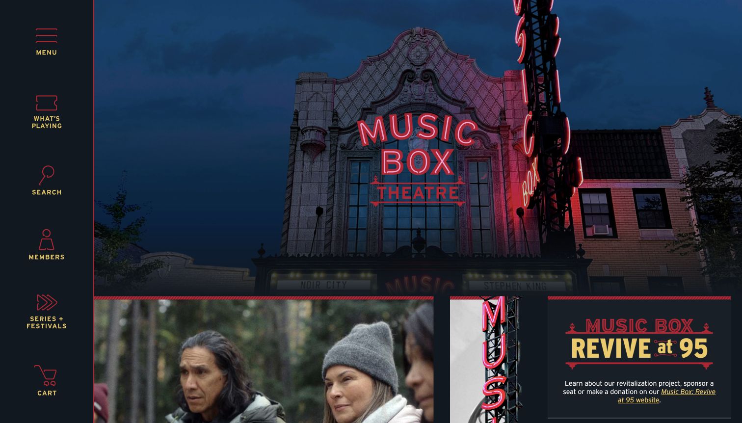
Music Box opens with a photograph of its building and illuminated sign, making the venue itself part of the browsing experience. A vertical navigation rail uses yellow labels and simple icons for the menu, current films, search, membership and programs. Film imagery and a theatre fundraising tile appear below the architectural introduction, so the institution and its screenings share the same visual world. The page's program structure includes a date selector and a full-calendar route, while venue information supplies further context beyond the opening photograph. The opening gives the cinema a sense of place before individual titles take over. It also means that the largest first-screen element is an atmosphere-setting image rather than a direct comparison of today's available films.
What you can learn
Use a genuine venue photograph when the building is part of the cinema's identity, but connect it quickly to the schedule. Keep icon labels visible so the visual character does not make routine navigation depend on interpretation.
Pros
The building photograph establishes a memorable local identity.
Labeled navigation icons provide several direct entry points.
Cons & considerations
The large venue image delays detailed screening information.
Fundraising and film promotion need a clear relative hierarchy.
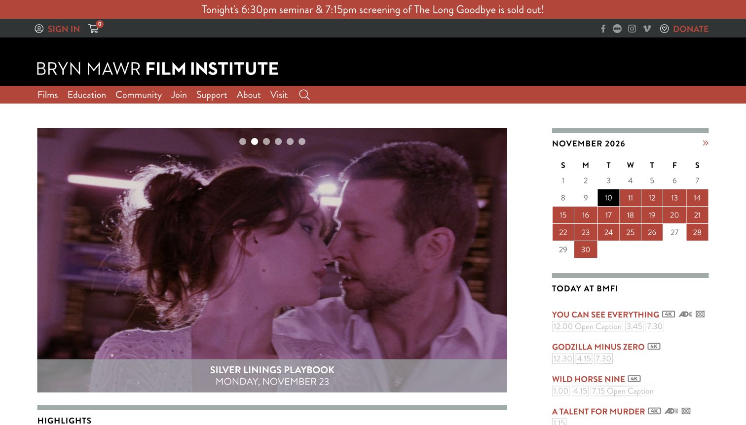
Bryn Mawr Film Institute gives a large current-film feature a practical companion: a calendar and a compact Today at BMFI list. Visitors can take in the cinematic image while checking a specific day without leaving the opening layout. The dark masthead, terracotta navigation and red announcement strip create distinct layers for institutional identity, ordinary browsing and urgent updates. In the captured page, the announcement reports a sold-out event rather than using vague promotional language. Screening entries include format and access-related markers, while the main navigation separates films, education, community, membership and visits. The arrangement is busy, but the information has recognizable jobs. A visitor interested in a seminar and one seeking a film tonight receive different routes within the same page.
What you can learn
Pair the editorial feature with a concise calendar, and reserve announcement styling for information that changes a visitor's decision. Explain screening markers near the schedule rather than assuming that every visitor already knows the abbreviations.
Pros
The calendar sits beside the main film feature.
A specific announcement communicates a real program change.
Cons & considerations
Several header bands compete for the first screen.
Compact format symbols depend on an easy-to-find key.
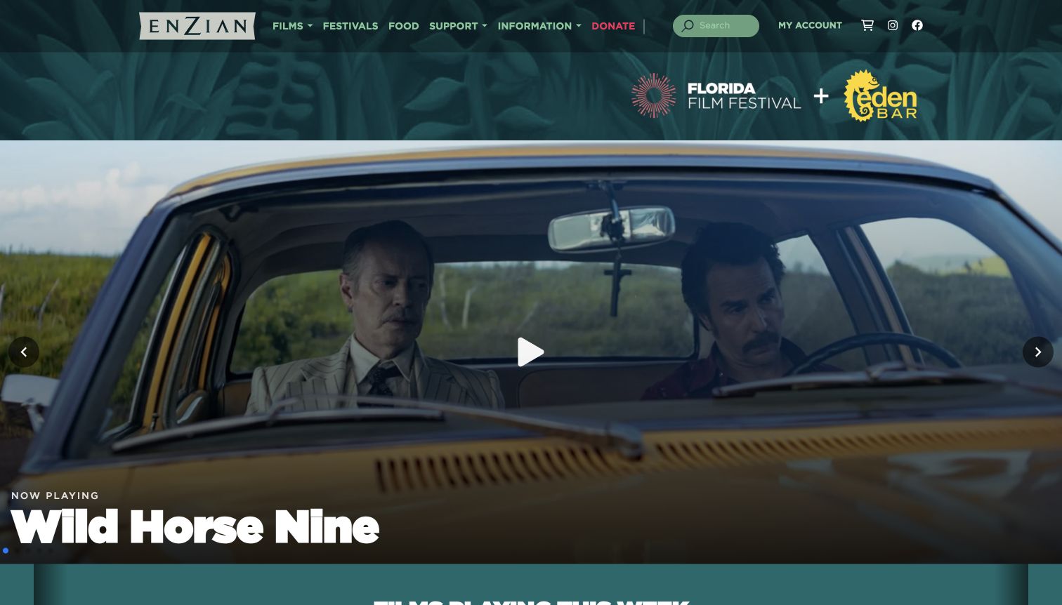
Enzian's green header and botanical texture create a distinctive setting before the film imagery begins. Films, festivals, food, support and information are separate navigation choices, while the Florida Film Festival and Eden Bar identities appear together in a secondary brand band. The opening film still carries a strong white title and a Now Playing label, giving a current screening the greatest visual weight. A following strip introduces the weekly program with dates and ticket links. This is a useful reference for a cinema whose public offer includes dining and festival activity: those parts of the visit are visible without forcing a visitor to interpret them from a photograph. The featured film still has a larger footprint than screening comparison.
What you can learn
Name the different parts of the venue experience explicitly. A cinema, bar and festival can share an identity while retaining distinct navigation and current information, avoiding an ambiguous single button that tries to represent every kind of visit.
Pros
Food and festival routes are clearly named.
The green identity gives film imagery a consistent frame.
Cons & considerations
Several associated brands make the header visually dense.
A dominant hero requires scrolling for broader schedule comparison.
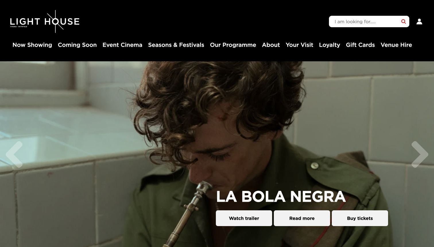
Light House uses a black header and angular white wordmark to frame a large, immersive film still. The captured feature gives its title generous scale and places Watch Trailer, Read More and Buy Tickets together as three explicitly different actions. That distinction matters: visitors can explore the film without confusing an informational step with a purchase route. The broad navigation exposes current and upcoming films, event cinema, seasons, the programme, visits, loyalty and venue hire. Further program labels distinguish audiences and screening formats, including accessible screenings. The cinematic hero and long navigation row create a substantial introduction before visitors reach other titles. Its strongest reusable pattern is the clarity of those three immediate choices.
What you can learn
Separate previewing, reading and booking instead of sending every visitor through the same generic call to action. Keep the film title associated with all three, and provide a simple all-films route for people who are not interested in the highlighted release.
Pros
Trailer, information and ticket actions have distinct labels.
Program categories accommodate different audience needs.
Cons & considerations
The wide navigation asks visitors to scan many choices.
An oversized feature limits first-screen title comparison.
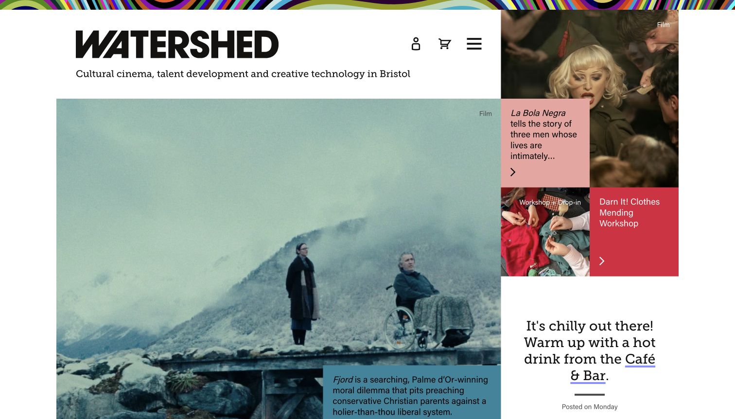
Watershed states its cultural-cinema, talent-development and creative-technology identity directly under its wordmark. The opening grid then gives that breadth a concrete form: a large film image sits beside smaller, colored editorial cards, including a workshop. Labels and short descriptions distinguish the kinds of activity instead of presenting every card as an interchangeable event. The white space and assertive typography feel more like an edited cultural publication than a conventional ticket catalog. A cafe message and link add another practical part of the venue experience. The reviewed view follows the ordinary Deny analytics cookies choice, with the earlier consent state retained privately. The layout suits a mixed cultural program, although screening times are secondary in the first screen.
What you can learn
When cinema is one part of a wider program, label the content type before asking visitors to interpret the image. Keep an equally clear route to the film schedule so editorial breadth does not slow down a straightforward screening search.
Pros
Content labels distinguish films from other activities.
The grid combines strong imagery with short editorial context.
Cons & considerations
Immediate showtime comparison is secondary to discovery.
A compact menu hides some routes until it is opened.
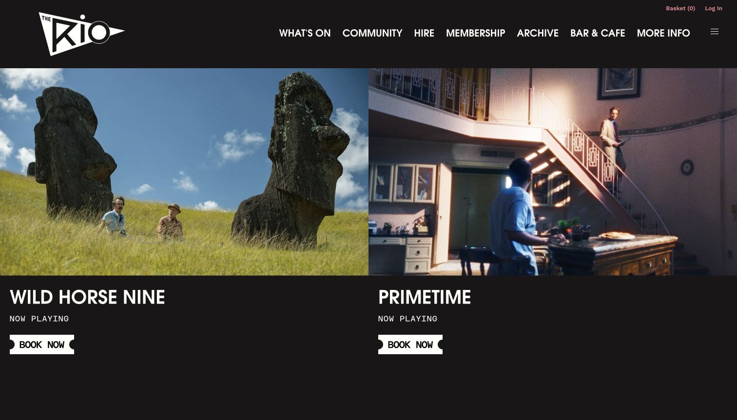
Rio presents two large film features side by side rather than giving the entire opening view to a single rotating image. Each has a prominent title, a Now Playing label and a white Book Now control shaped like a ticket. The black masthead and art-deco wordmark make those repeated controls feel like part of the cinema's identity. Navigation includes community activity, venue hire, membership, the archive and bar or cafe information alongside What's On. Below the features, Upcoming Shows introduces program and calendar views with a screening key. The page therefore supports both a quick response to a highlighted film and a more deliberate search through the schedule. The playful ticket motif stays attached to an explicit action label.
What you can learn
A distinctive button shape can reinforce the venue's character when the words still explain the action. Use the same screening labels and date structure in the feature and the full schedule, especially when special presentation types affect the visit.
Pros
Two opening features offer immediate film comparison.
Ticket-shaped controls have clear action text.
Cons & considerations
Large paired imagery still pushes the full program downward.
Special screening abbreviations need their nearby explanation.
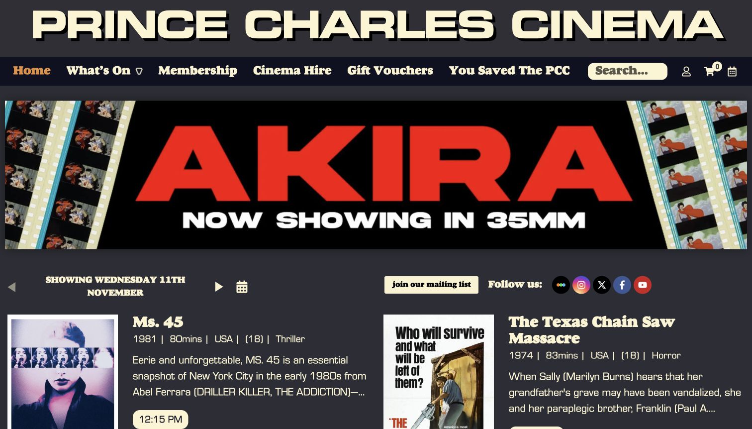
Prince Charles gives its name exceptional scale in a cream-on-charcoal masthead, followed by compact navigation and a wide program banner. The captured banner promotes an AKIRA 35mm presentation, making the screening format part of the attraction. Below it, a dated heading and calendar lead into film entries with posters, titles, year, runtime, country, rating, genre and rounded showtime controls. That context suits a repertory audience comparing works and presentations rather than selecting a new release. The design has a recognizable voice, yet the listing remains structured enough to repeat. Its tension is one of proportion: the large identity and banner occupy substantial space before the detailed daily program begins, and the film rows carry a considerable amount of text.
What you can learn
Expose the details that matter to the cinema's actual audience, such as presentation format and runtime, in a consistent order. Keep promotional identity strong without letting it separate the selected date from the film and showtime information.
Pros
Format and film metadata support informed comparison.
The distinctive masthead gives the program a memorable voice.
Cons & considerations
The large logo consumes significant opening space.
Detailed film rows can become dense on narrow screens.
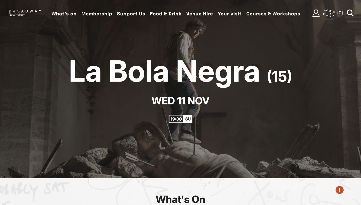
Broadway overlays its opening film still with a title, classification, date and a specific screening-time control. This makes the hero a route to an actual scheduled event rather than a poster with an uncertain next step. White navigation sits over the dark imagery and groups What's On, membership, support, food, venue hire, visits and courses. Below the feature, the What's On area offers Today, Next 7 Days, a calendar and event-type choices. A screening key explains special presentation labels. The design connects an image directly to a time, while the following controls widen the selection. Because the opening text sits directly on photography, future campaign images need the same care with contrast and readable placement as the captured example.
What you can learn
Connect featured artwork to a real date and screening action, then offer broader schedule controls immediately afterward. Keep abbreviated presentation labels explained where visitors choose a time, rather than making them search a separate policy page.
Pros
The feature includes a concrete date and time.
Nearby filters expand into the wider program.
Cons & considerations
Overlay text depends on suitable image contrast.
Compact screening abbreviations can be unclear without the key.
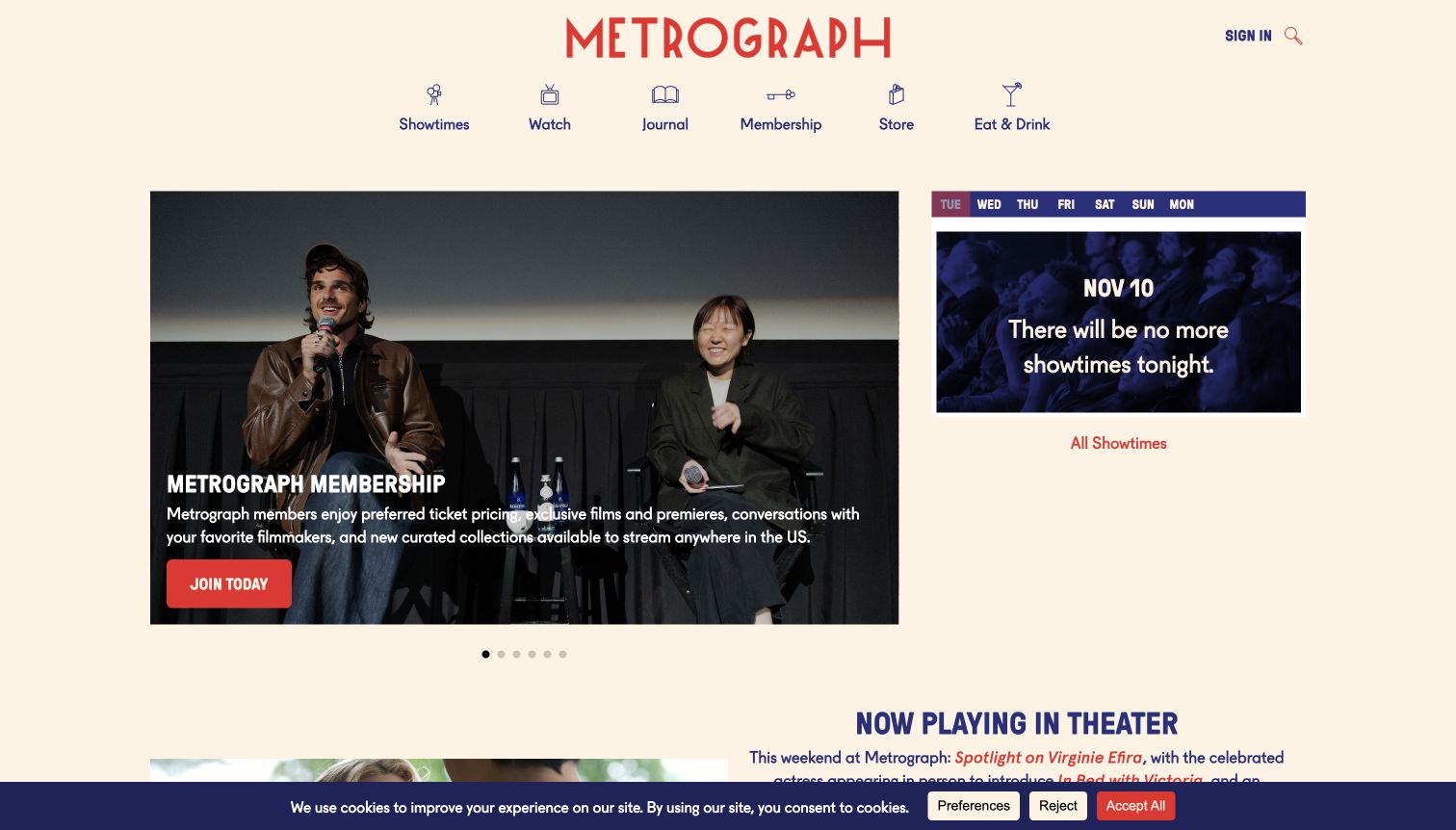
Metrograph's cream background, red wordmark and navy icon labels create a restrained frame for several different parts of its business. Showtimes, Watch, Journal, Membership, Store and Eat and Drink are separate, plainly named destinations. In the reviewed view, a large membership feature sits beside a weekday timetable card, which honestly states that there are no more screenings that night and offers All Showtimes. This is an effective empty state: the program area remains useful even when the selected day has finished. A Now Playing in Theater section follows below, distinguishing physical screenings from the wider media offer. The capture retains a cookie notice along the bottom; no consent choice or membership transaction was needed to inspect the page.
What you can learn
Keep the daily schedule useful when there is nothing left to book. An explicit end-of-day message and a route to future screenings are more informative than an empty panel, especially when the homepage also promotes memberships and related editorial products.
Pros
Named sections distinguish theater, viewing and editorial activity.
The timetable explains its end-of-day empty state.
Cons & considerations
Several business lines compete for homepage emphasis.
A persistent cookie notice occupies part of the lower view.
Kegan is a freelance web designer and developer with 15+ years of experience helping businesses turn complicated website requirements into clear, maintainable digital experiences. He works directly with clients from planning and design through development, launch, and ongoing support.
For independent cinema website design, his development approach focuses on independent cinema websites that connect film programmes, screening dates and accessible visitor information with clear ticket-booking handoffs. The scope can be a targeted improvement or a complete custom build, with responsive layouts, thoughtful content structure, and integrations chosen around the people using and maintaining the site.
Show 3 other independent cinema website designersHide other independent cinema website designers
Plan the film, screening and venue information together
Model films and screenings as different records
A film can have a synopsis, artwork, credits and a trailer that remain useful across several dates. A screening has a particular time, location, presentation and availability. Begin the content plan by separating those records. Reusing a film description should not accidentally duplicate an obsolete screening date, and changing one time should not require editing several independent promotional blocks.
Decide which system owns current availability. The public website may introduce a program while another approved service handles ticketing. Keep the film title, selected date and venue recognizable across that transition. A Read More action, trailer control and ticket link should look related but say what they actually do. Do not call an inquiry or general schedule page a confirmed booking.
Plan the states that occur outside a full schedule. A day with no remaining screenings can offer future dates instead of an unexplained blank space. A sold-out event can retain its useful program information while accurately describing the next available action. Make those messages part of the content model rather than improvised text added to a banner.
Give the program a voice without obscuring the timetable
Independent cinemas often distinguish themselves through selection and context. A retrospective, filmmaker conversation or unusual presentation deserves room for original editorial explanation. Decide how that context appears at each level: a short label on the film card, a concise program introduction and a deeper page for the full season. The same program name should connect those surfaces.
Choose imagery for the job it performs. A large still can establish the tone of a featured film, while a grid can make several titles comparable. A photograph of the building can establish the venue’s identity. None of these automatically replaces a readable date and time. If text overlays an image, select and position each campaign image with the text area in mind.
Keep the ordinary schedule route stable as campaigns change. Visitors who already know what they want should not need to explore a rotating feature before finding it. Review the number of promotions, membership messages and fundraising requests sharing the first screen. Each may be legitimate, but a clear hierarchy makes their different purposes easier to understand.
Publish the details that make a visit understandable
Collect approved information about the venue before writing the visit section. Address, arrival directions, ticket collection, admission policies and the relevant contact route should have a dependable home. If several screens or venues are involved, identify the correct location alongside the screening. Do not infer facilities or visitor suitability from photographs.
Use the cinema’s own verified screening descriptions for captions, subtitling, relaxed presentations or other particular arrangements. Explain abbreviations close to the schedule. A general venue-information page and a screening-specific label answer different questions; neither should silently stand in for the other. Provide a clear route to confirm current details where appropriate.
Assign an owner to dated information. Film seasons, opening hours, announcements and ticket-policy links can become stale at different speeds. Establish who reviews each and what happens after an event ends. Preserve useful program archives while keeping them visibly distinct from current screenings, and avoid sending visitors into an expired campaign with an active-looking booking label.
The editing job behind the design
Choose publishing tools around a reliable cinema schedule
Use structured film, program and screening records where the same facts appear in several places. Keep the approved ticketing system as the source of changing availability and define how public schedule information is refreshed.
Choose a publishing interface that lets the team update dates, images and concise program explanations without rebuilding the entire page. Keep a readable route to the schedule when optional video, embedded media or analytics consent is unavailable.
The displayed stacks are based on bounded public-page evidence. A ticket link or a media asset does not establish the cinema’s complete software setup, and an unavailable audit does not justify guessing a CMS or a hidden booking platform.
Our WordPress website examples offer a separate look at publishing approaches. A visible platform label is evidence for that named page, not a guarantee that the same system will suit your requirements.
Before the public launch
Independent cinema website brief checklist
Distinguish film information from individual screening records.
Keep dates, times and venue names together.
Explain presentation abbreviations next to the relevant schedule.
Make film details, trailers and ticket actions visibly different.
Provide a stable route to all current films.
Give seasons and retrospectives consistent names.
Separate current screenings from program archives.
Design useful sold-out and end-of-day states.
Keep address, arrival and ticket-policy information easy to find.
Use approved venue and screening access descriptions.
Review text contrast for every feature image.
Label multiple venue destinations clearly.
Assign an owner to announcements and expired promotions.
Keep essential program information available without optional media.
These checks are a project checklist, not a performance, legal, security, or accessibility certification. Test real journeys with the people responsible for the website before making claims about the result.
Sources & editorial method
How this collection was selected and reviewed
We reviewed these 14 public cinema properties directly on November 11, 2026. Film Forum is represented by its Now Playing listing; the other screenshots show homepage views. We also checked Brattle’s own About page for its repertory programming and nonprofit context before making the editorial selection. Each source page received a bounded public technology check, and unavailable findings remain unconfirmed. The reviews focus on observable design and information structure.
Each example links to its actual source page. Screenshots are direct browser captures with their own capture dates; moving imagery, announcements and live designs can change. The notes describe observable design choices and conditional tradeoffs, not measured traffic, conversion results, service quality, or accessibility conformance.
Technology labels use public page metadata, asset evidence, or explicitly cited platform documentation. Platform documentation is not a complete current deployment audit. A component reference may be legacy or unused; it is not a complete backend inventory. Unknown stacks are omitted. These sites are editorial examples, not our client portfolio.
Written, Edited and Curated are separate editorial records, not timestamps advanced by a rebuild. Website designs and imagery belong to their owners. See our editorial standards or suggest a correction.
Questions worth asking
Independent Cinema website design questions
What should an independent cinema homepage show first?
Give visitors a clear route to current screenings and enough film or program context to understand the offer. A large feature can work, but the selected date, venue and next action should remain easy to identify.
Should every film have a separate page?
A film page is useful when there is substantive information to share, such as a synopsis, program context and several screening dates. Keep individual screening details connected to that record instead of repeating them manually across unrelated pages.
How should a cinema handle a day with no remaining screenings?
Say so plainly and provide a route to upcoming dates. A useful empty state is more informative than a blank timetable and prevents an old time from looking like a current booking opportunity.
How much program information belongs on a film card?
Use the small amount that helps someone understand the selection: title, relevant date or time, venue when needed and a concise program or format label. Put longer editorial explanation on the related film or season page.
Can a cinema combine food, education and screenings on one site?
Yes, if each activity has a clearly named route and accurate details. Explain whether an event is a screening, workshop or another type of visit, and keep the film timetable easy to reach from the wider program.
Does Editors Choice endorse a cinema or its films?
No. It is an editorial selection about the reviewed website’s design and communication. It does not verify service quality, current availability, venue suitability or accessibility conformance.
Let the program supply the personality and the schedule supply the clarity. A useful cinema website helps someone discover a film, understand the screening and plan the visit without losing the character of the place.