Best Historical Society Websites of 2026 (16 Real-World Examples)
Historical-society websites that connect collections, local stories, research services and public participation.
Explore 16 real historical-society websites, including local organisations, statewide institutions and societies using a current museum or history-centre name. Compare their approaches to archives, exhibitions, events and community involvement.
A historical society serves people who arrive with very different questions. Someone researching a family name needs a route into collections, a teacher needs usable learning material, and a local resident may simply want to attend a talk or visit a historic building. The website has to make these activities discoverable without assuming that every visitor already understands the organisation or its holdings.
These examples include small local organisations and larger statewide societies. Several use a public museum or history-centre identity; their historical-society connection is supported by the cited institutional sources. Reviews focus on public website presentation, navigation and communication. They do not certify the completeness of an archive, the accuracy of every interpretation, preservation standards or research-service outcomes.
Before the examples
What makes good historical society website design in 2026?
Offer more than one way into the collection
Give experienced researchers a direct search or catalogue route while introducing broader subjects to newcomers. Explain what each resource contains, whether records are digitised and what someone can do when an item is not available online. A catalogue link is more helpful when its scope is clear.
Separate visiting, research and participation
Make the main visitor tasks recognisable. Museum admission, reading-room appointments, events, membership and donations are different journeys. Give each one appropriate instructions and avoid letting a single promotional message conceal the organisation’s other public services.
Show where information comes from
Use clear credits, dates, collection references and contextual descriptions where they belong. Distinguish a historical source from present-day interpretation, and explain reuse or access conditions without implying that every image is freely reusable. Give readers a route for corrections or further research.
The collection · 16 examples
16 historical society websites worth studying
Study the relationship between public programmes, collection discovery and research guidance across these 16 distinct organisations. The Editors Choice recognises an explicitly reviewed website approach, not archival accreditation, historical authority or a ranking of services.
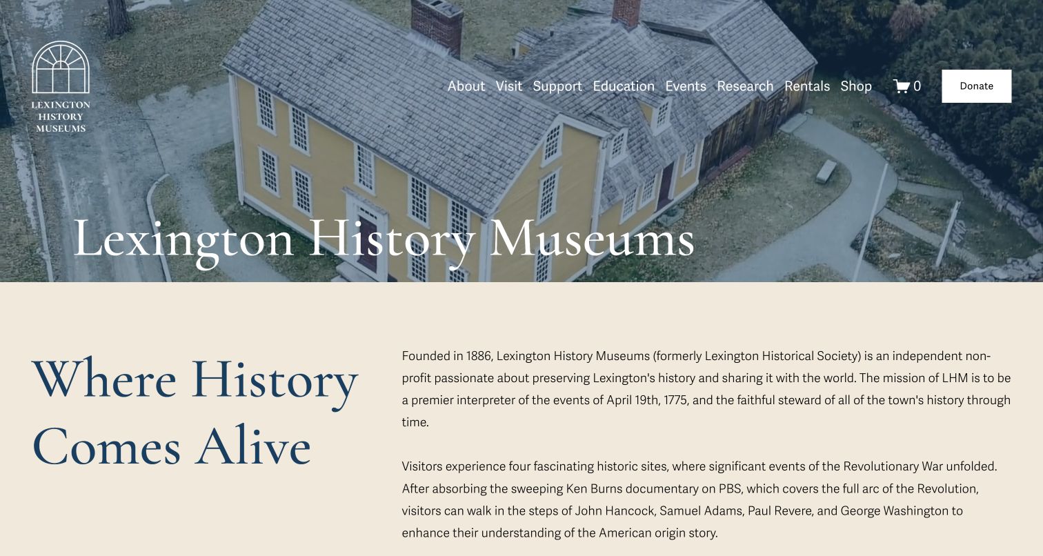
Lexington History Museums places an aerial view of a historic building behind its current name, then moves quickly into a cream-coloured introduction. A large blue heading sits beside a plain explanation of the organisation, including its earlier identity as Lexington Historical Society. That makes the change of name understandable without asking visitors to find a separate corporate-history page. The site also names visit, education, events and research routes in the opening navigation. The local image, generous typography and concise context provide a clear introduction. It is less immediately task-focused than a page opening with hours or tickets, and the long navigation shares space with a prominent donation action.
What you can learn
When a historical society changes its public name, explain continuity early. Pair the new identity with a real place and a short account of the organisation’s purpose, while retaining familiar routes into research and public programmes.
Pros
The previous historical-society identity is explained near the top.
The historic-building image gives the organisation a specific local setting.
Cons & considerations
Practical visit details are not visible in the opening capture.
Several navigation and support choices compete in the header.
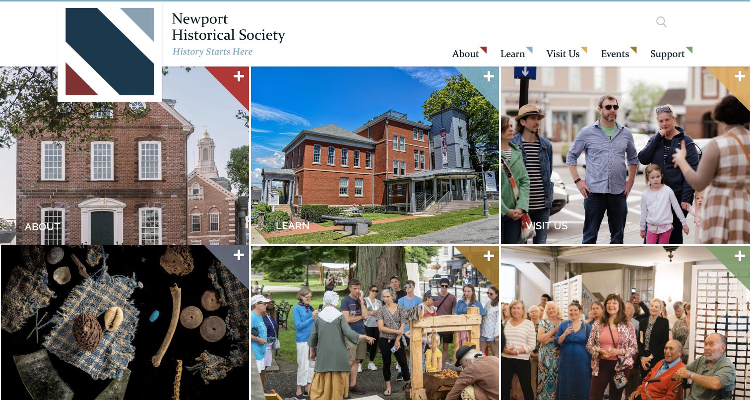
Newport Historical Society uses a grid of large photographs as its homepage introduction. Buildings, objects, tours and groups of visitors make the organisation’s activities visible at once. Labels such as About, Learn and Visit Us sit directly on the tiles, while coloured corner details connect the grid to the main navigation above. Official source navigation also exposes collections, property research, appointments and image-use information, giving the public-facing design a practical research foundation. Its limitations are the broad tile labels and small plus symbols, which require visitors to explore before understanding the precise destination. There is also little explanatory text in the opening screen for someone unfamiliar with the society.
What you can learn
Use a small set of photographic entry points to show the range of a local institution. Pair those broad invitations with clearly named research and access pages so the visual overview leads to useful detail.
Pros
The grid shows people, collections and historic places together.
Repeated colours connect the tiles with the main navigation.
Cons & considerations
Broad labels provide limited detail about each destination.
The first view offers little plain-language institutional explanation.
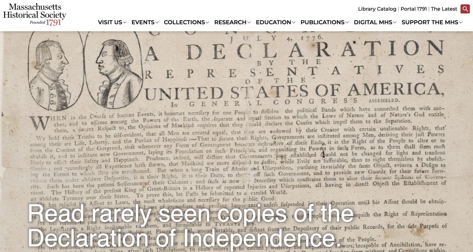
The Massachusetts Historical Society opens with a close view of a historical document rather than a generic heritage photograph. Its serif identity and restrained red accents make the organisation recognisable, while the white header keeps collections, research, education and publications available above the image. A separate utility row names the library catalogue and researcher portal. This is useful for an institution serving both curious visitors and people arriving with a specific research task. The source material gives the page a clear subject, but its detailed lettering competes with the large promotional text placed over it. The dense navigation also assumes that visitors can distinguish collections, research and digital resources. Those distinctions need explanatory landing pages, not just more menu labels.
What you can learn
Let authentic collection material introduce the institution, while preserving direct routes for experienced researchers. Keep promotional text legible against detailed documents and explain the scope of different research systems before sending newcomers into them.
Pros
The catalogue is directly available from the header.
The document-led opening makes the collection itself visible.
Cons & considerations
Text overlays compete with the detailed historical document.
Several related research labels require visitors to understand their differences.
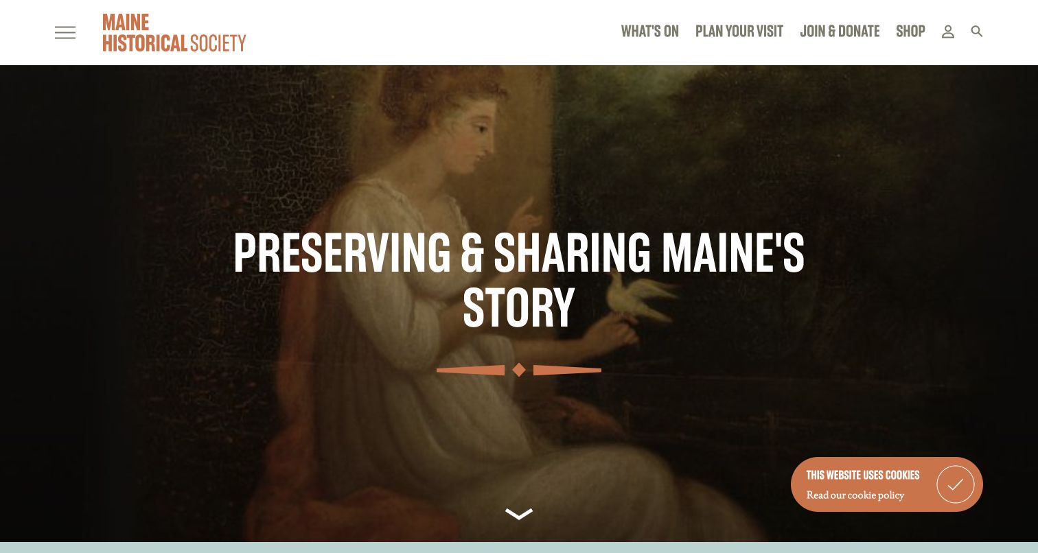
Maine Historical Society uses a portrait as the backdrop for a brief statement about preserving and sharing the state’s story. The darkened image supports bold white lettering, while a burnt-orange wordmark gives the otherwise restrained header a recognisable accent. Prominent links focus on current activity, visit planning and support; a separate menu icon holds the broader organisation. The result feels like a public invitation rather than a catalogue interface. It introduces the society to visitors deciding between a visit, programme or collection enquiry. The trade-off is that research resources are less apparent in the opening navigation. A small cookie notice also remains visible in the captured source, adding another element above the otherwise quiet image.
What you can learn
Use a concise institutional purpose to orient first-time visitors, but retain a clear route for people with a specific research task. A simplified public-facing header should not make the collections seem secondary or absent.
Pros
The short mission is easy to identify in the opening view.
Visit and current-programme routes are prominent.
Cons & considerations
Research is not named among the most prominent header links.
The image-led opening provides little detail about available resources.
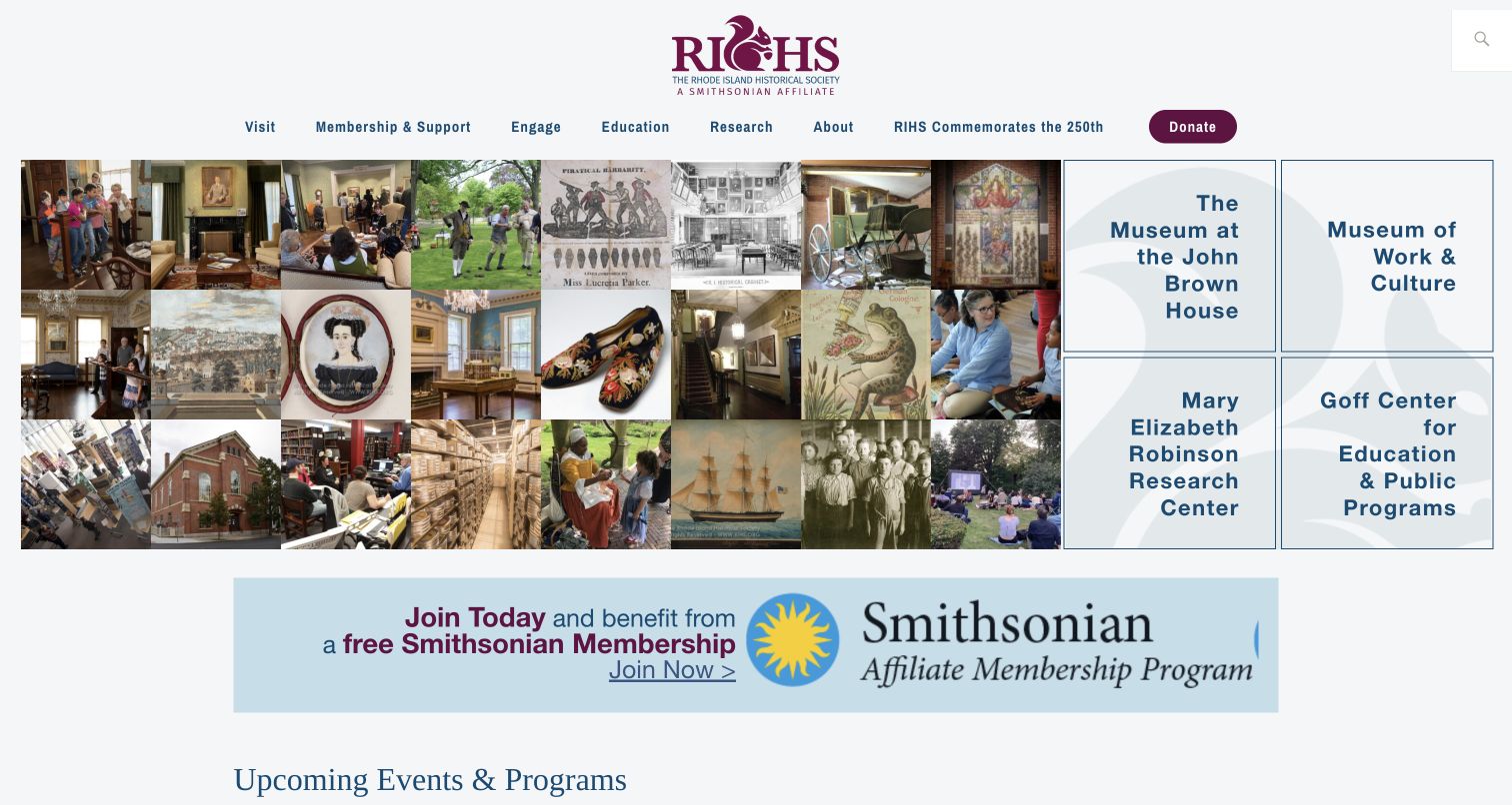
Rhode Island Historical Society pairs a dense mosaic of objects, buildings and public activity with four clearly labelled destination panels. The panels distinguish its house museum, work-and-culture museum, research centre and education programmes. This makes a multi-site organisation understandable without requiring every visitor to begin with an institutional overview. The mosaic conveys breadth, while the text panels provide practical orientation. Research and education also appear in the main navigation, giving those audiences more than one way to begin. The composition is information-rich, though the individual images are small and not self-explanatory in the opening view. A broad membership promotion follows immediately, competing with the upcoming-event section below. The useful lesson is the relationship between visual range and explicit names.
What you can learn
When an organisation operates several distinct public destinations, identify them plainly beside the introductory imagery. Give each route enough context that visitors can choose a museum, research service or programme without guessing from a photograph.
Pros
Four named destinations clarify the society’s public structure.
The imagery includes both collections and people participating.
Cons & considerations
Small mosaic images offer limited individual context.
The membership banner competes with programme discovery below.
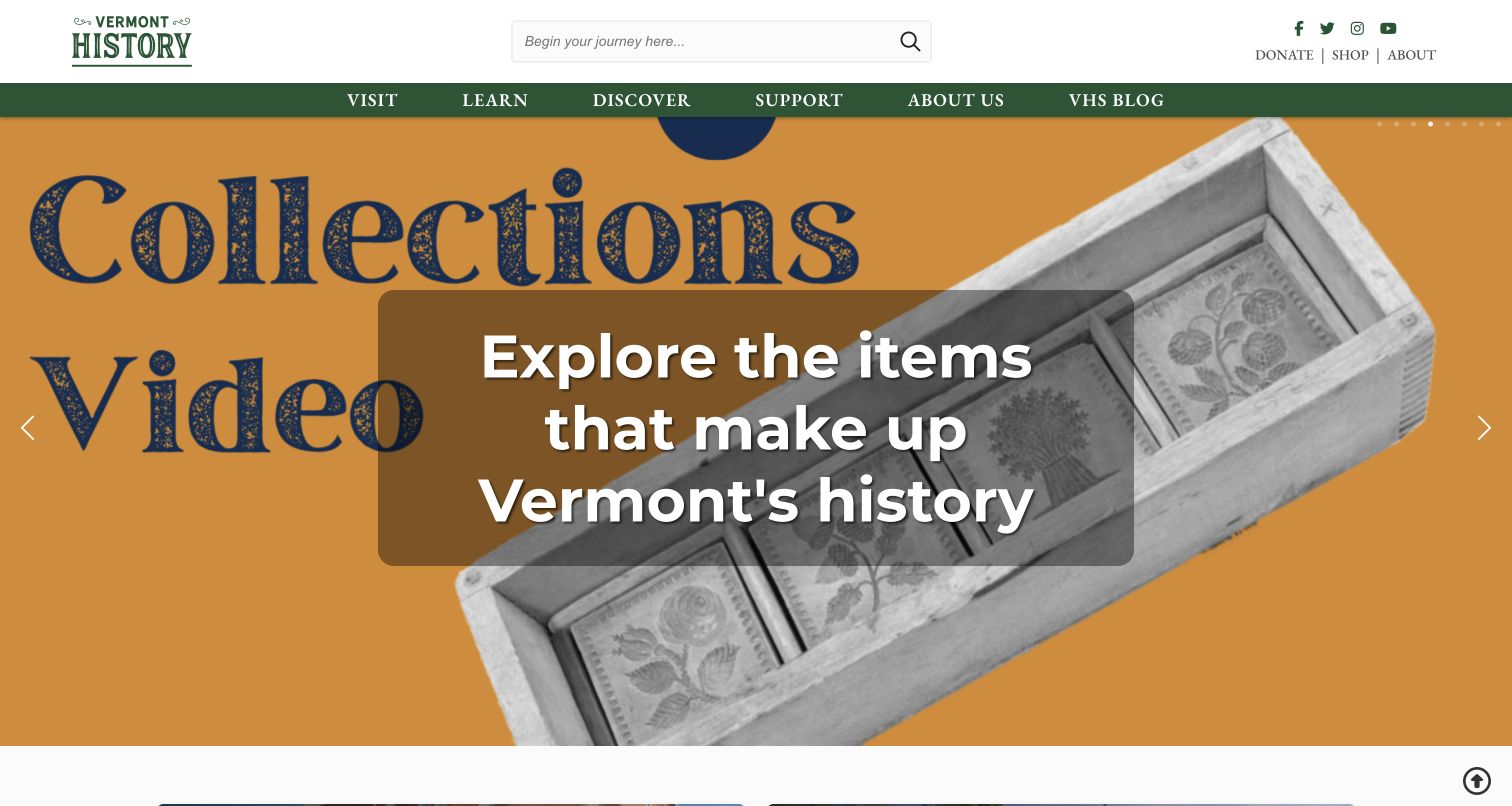
Vermont Historical Society combines a compact green identity with direct visit, learn and discover navigation. The captured hero promotes a collection-video feature, using an object image and a large invitation to explore the state’s material history. A translucent panel separates the white headline from the orange graphic behind it. The prominent search field provides another entry point for visitors who already know what they want. The official digital-resources page explains that different online resources expose different parts of the holdings, which gives substance to the discovery emphasis. The first-view carousel still creates a trade-off: its current promotion occupies most of the screen, while museum and library logistics remain elsewhere. Text embedded in the background graphic also competes with the overlaid headline.
What you can learn
Introduce collection discovery through an approachable example, then explain the scope of the resource it leads to. Keep search available for specific questions and avoid stacking competing text treatments inside a single promotional image.
Pros
Search is visible before the main promotional content.
Visit, learn and discover offer distinct starting tasks.
Cons & considerations
The hero leaves practical location details outside the first view.
Background graphic text competes with the headline overlay.
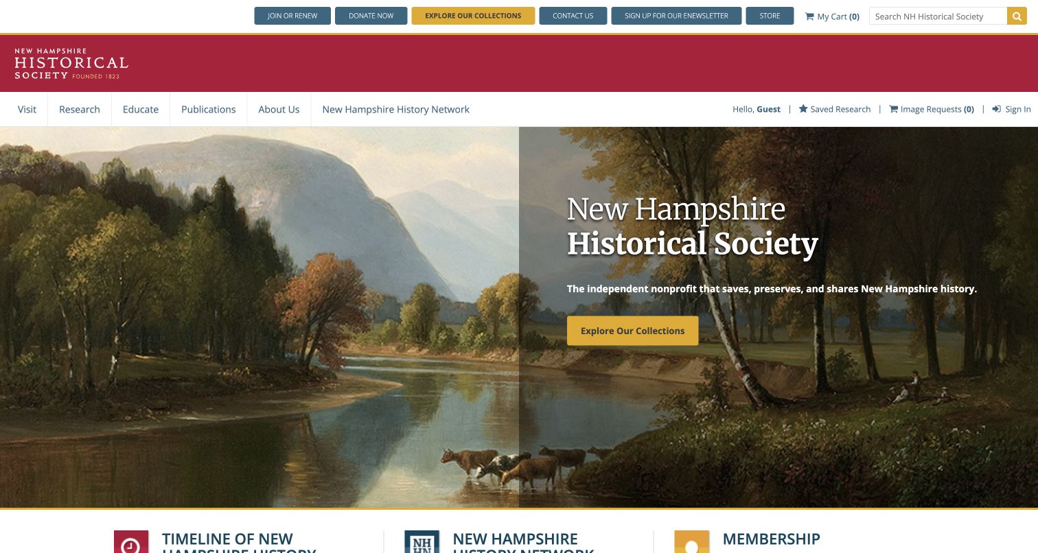
New Hampshire Historical Society gives a landscape painting most of its opening screen, with the organisation’s name and a short purpose statement over a darker panel. A yellow collection button provides an obvious next step. The same collection destination is highlighted in the utility bar, reinforcing research as a central activity rather than a hidden specialist service. Visit, research, education and publications occupy the main navigation, while saved-research and image-request controls sit separately. The page therefore supports both a public introduction and an ongoing researcher workflow. Its limitation is the density of the surrounding controls: membership, donation, newsletters, shop, account tools and search all appear before the main content. The hierarchy helps, but newcomers still encounter many different actions at once.
What you can learn
Make the main collection route easy to identify, especially when researcher tools coexist with public programmes. Separate account-related controls from introductory navigation so that the first visit does not feel like entering an unfamiliar administrative system.
Pros
A specific collection action anchors the hero.
The mission explains the organisation’s public purpose.
Cons & considerations
Many utility actions compete above the main content.
The landscape introduction does not itself explain collection scope.
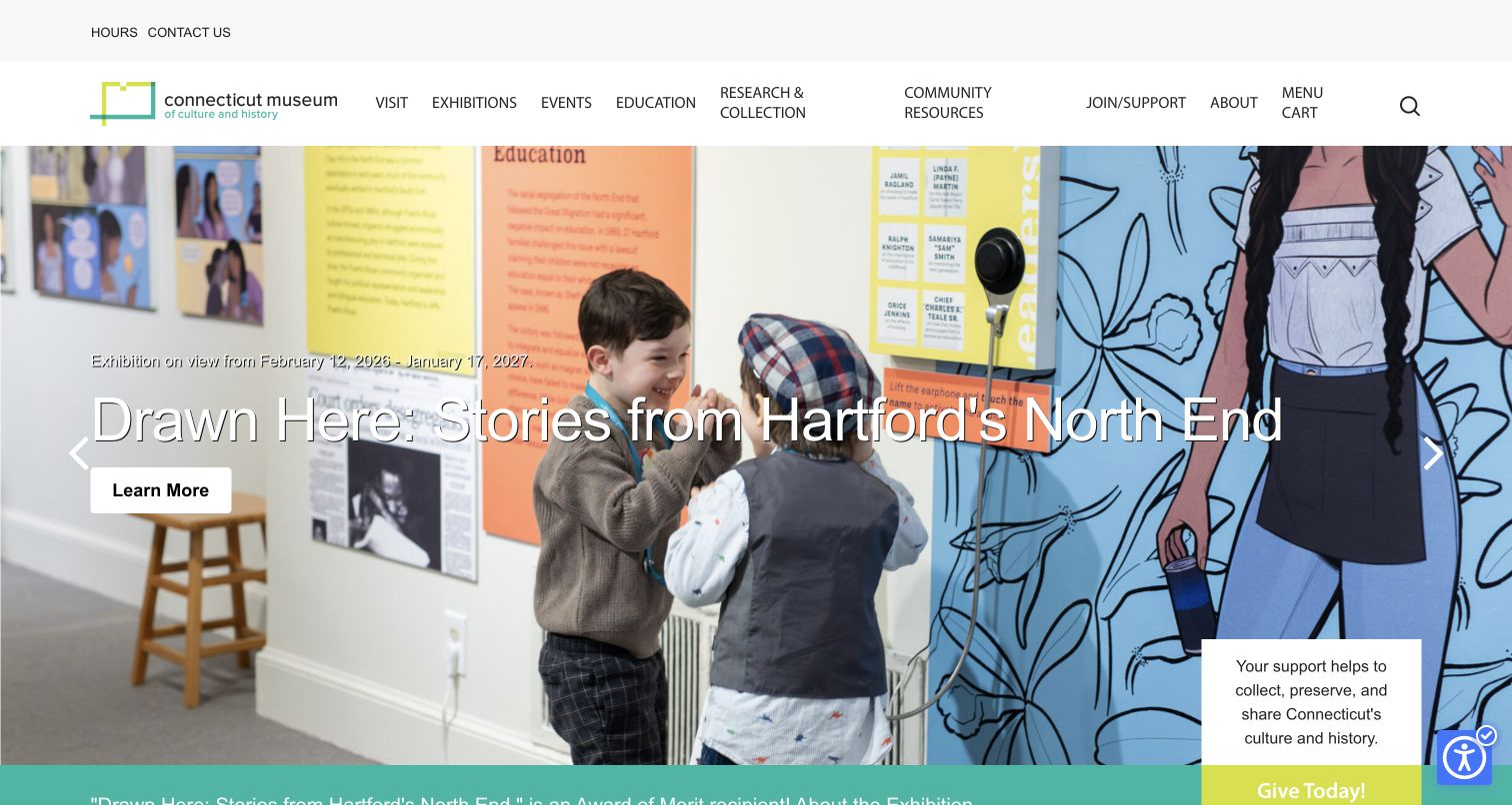
Connecticut Museum of Culture and History uses a photograph of children engaging with an exhibition to introduce its current programme. The image makes participation visible, while the exhibition title and dates explain what the promotion concerns. The current museum identity belongs to the former Connecticut Historical Society, a change documented in its own announcement. Broad navigation still gives research, collections, education and community resources a place alongside visiting and events. A refreshed public name need not erase archival activity. The opening is visually busy, however: a long white title crosses a varied photograph, carousel arrows sit at the sides, and a donation card occupies the lower corner. Those competing elements can make a simple exhibition introduction harder to scan.
What you can learn
A contemporary visual identity can broaden the invitation while retaining clear research and collection routes. Keep the institution’s earlier identity documented, and give long exhibition titles a predictable reading surface rather than relying on every background image.
Pros
The photograph shows people using the exhibition.
Research and collection remain explicit navigation categories.
Cons & considerations
The long title crosses a detailed, changing image.
The donation card adds another competing action in the opening view.
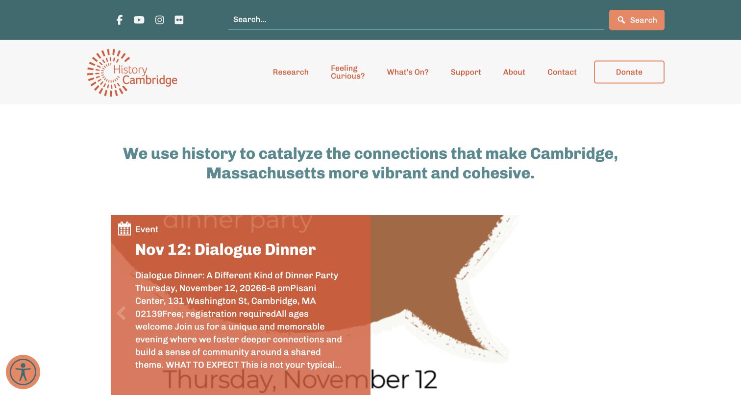
History Cambridge uses teal and orange to frame a community-centred introduction rather than opening with a monument or historic building. Its main navigation names research, curiosity, current activity and support, while a wide search field sits in the utility area. The captured page places a dated community-event card beneath the mission statement, making present-day participation part of the historical organisation’s identity. Its official about page documents the transition from Cambridge Historical Society to the current name. This documents the institutional connection. The event card is also a useful caution: its excerpt contains tightly joined pieces of date and location information, making it denser than the surrounding layout. A friendly visual system still needs careful content formatting to keep practical details easy to scan.
What you can learn
Show how local history connects with current community activity, but give event excerpts a structured format. Keep date, location and registration information distinct rather than allowing them to run together inside a promotional card.
Pros
Search and research are easy to locate.
The opening makes current community participation visible.
Cons & considerations
The event excerpt combines several practical details densely.
The mission statement is broad before specific research resources appear.
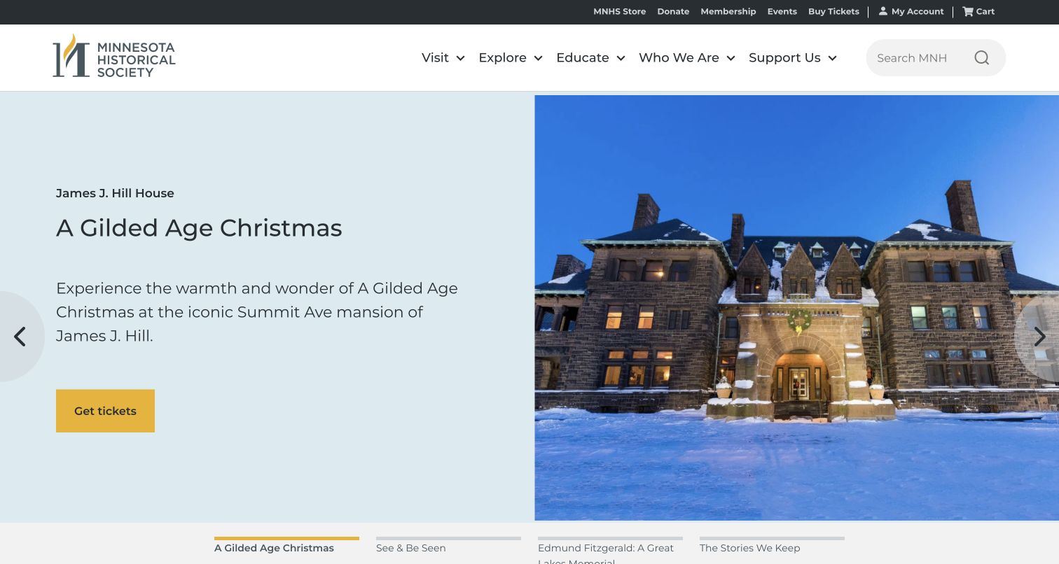
Minnesota Historical Society uses a split hero to introduce a programme at one of its historic properties. The text panel names the location, explains the seasonal experience and provides a ticket action; the photograph remains unobstructed beside it. Labels beneath the hero identify other featured stories, giving the carousel more context than dots alone. The main navigation preserves visit, exploration and education routes, while account and transaction links occupy a smaller dark strip. This is a useful structure for a statewide organisation with many destinations. The featured programme is clearly a particular property’s offer rather than the society’s entire purpose. The trade-off is that a first-time researcher still needs to move beyond the seasonal promotion, and the large image-and-text feature dominates the initial screen.
What you can learn
For a multi-site society, name the featured location before describing its event. Use a stable organisation-wide navigation above changing promotions, and give carousel choices meaningful labels so visitors can understand the available subjects.
Pros
The split layout keeps text separate from the photograph.
The featured property and ticket action are named clearly.
Cons & considerations
Seasonal promotion dominates the first view.
Collection research requires moving beyond the featured visit experience.
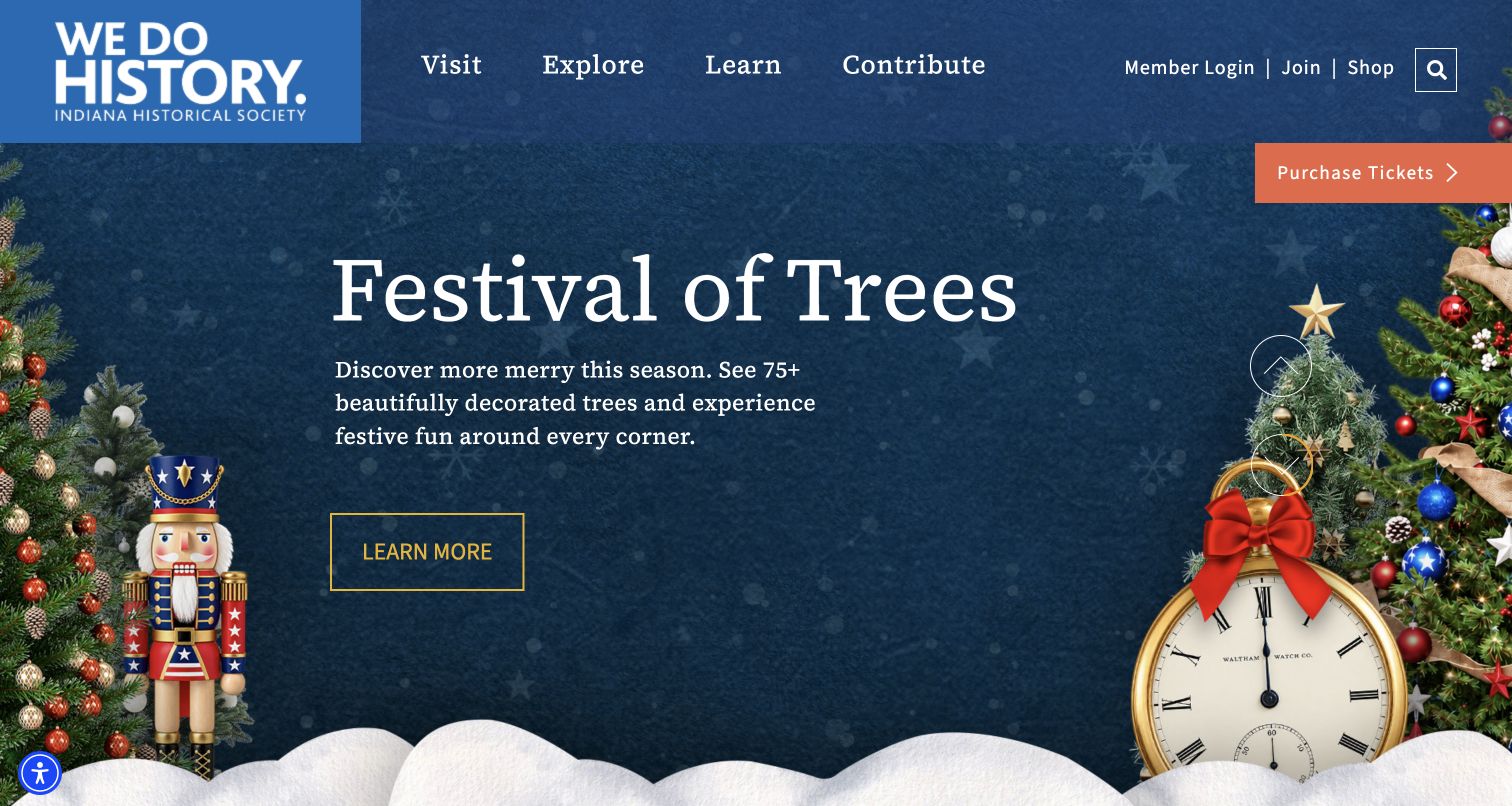
Indiana Historical Society gives its seasonal programme an expansive opening treatment, with a dark-blue background, decorative trees and a clear event title. The society’s compact identity remains visible at the top, while four broad navigation labels organise visiting, exploration, learning and contribution. An orange ticket action is separated from the main promotional explanation, giving returning visitors a direct route without requiring them to read the whole feature. The official site also provides research, collection and statewide service information beneath that public-facing structure. Its trade-off is that the seasonal promotion dominates the institution’s first impression, and the broad Explore label requires another step before a researcher can identify a specific resource.
What you can learn
Use a changing programme feature within a stable navigation system. Keep transactions easy to locate, but make sure the underlying collection and research services remain discoverable when a seasonal attraction becomes the homepage’s strongest message.
Pros
Four broad navigation groups keep the header manageable.
The ticket action is distinct from the promotional detail link.
Cons & considerations
Seasonal imagery dominates the initial institutional introduction.
Research resources require interpretation of broader navigation labels.
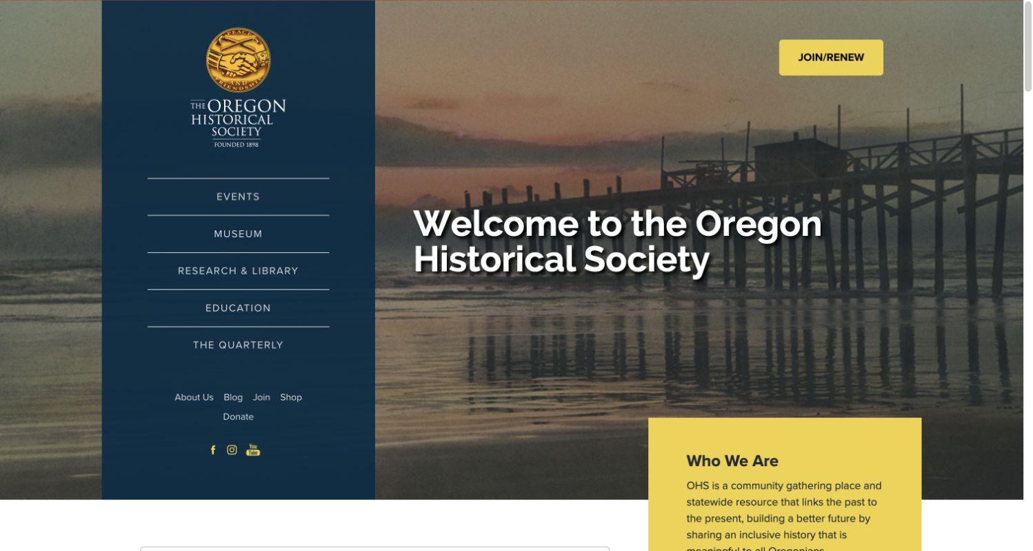
Oregon Historical Society places a tall dark-blue navigation panel over a waterfront image, giving the page an unusual and memorable structure. The society’s seal and name lead into separate links for events, museum visits, research and library services, education and its quarterly publication. A yellow membership action and a matching introductory card create clear accents against the subdued photograph. The layout gives research and publishing the same navigational standing as public visits, which suits an organisation with several kinds of audience. The welcome message is straightforward rather than tied to one temporary exhibition. Its trade-off is the amount of horizontal space devoted to the institutional panel, leaving less room for introductory content.
What you can learn
Give distinct public services explicit names and a consistent place in the navigation. An unusual layout can establish identity, provided the institution’s purpose and the next useful action remain easy to find beyond the opening image.
Pros
Research and library services have a clearly named route.
The restrained colour system makes support actions recognisable.
Cons & considerations
The large sidebar reduces space for the main introduction.
The mission explanation extends beyond the initial viewport.
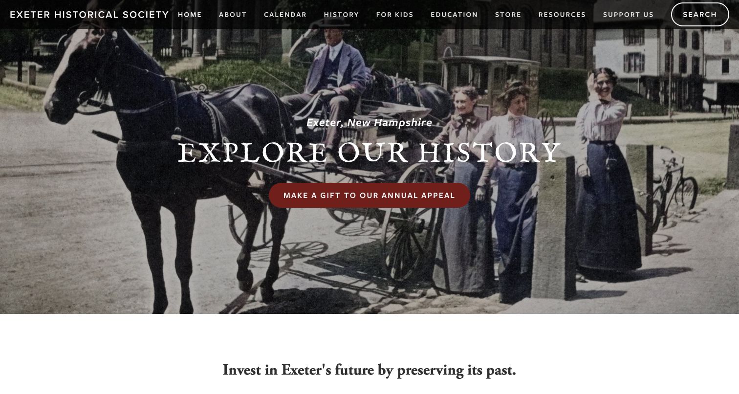
Exeter Historical Society uses a historic street scene to establish its local focus, with the town and state named above the introductory heading. The photograph includes people, transport and buildings, giving the history a human setting. A narrow black navigation band keeps the society’s name visible alongside history, education, children’s material and resources. The public source includes research and genealogy guidance, programme recordings and several local-history topics. This gives the broad opening invitation useful depth beyond a single museum visit. The annual-appeal button is the strongest action inside the hero, however, so someone responding to the invitation to explore history must choose another route. The long line of uppercase navigation also has little spare space between the organisation’s identity and the search control.
What you can learn
Choose an image that communicates the society’s actual place and people. Align the most prominent action with the surrounding message, while keeping research and educational material available through labels that newcomers can understand.
Pros
The location is named clearly in the opening view.
Children’s content and education receive visible navigation routes.
Cons & considerations
The hero’s main action is fundraising rather than exploration.
The compact uppercase header contains many adjacent choices.
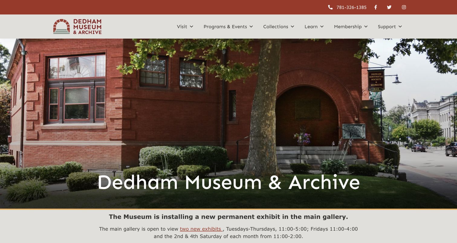
Dedham Museum and Archive introduces itself with a photograph of its brick building and a plain venue title. The red identity colour echoes the architecture, while the light navigation bar keeps visiting, programmes, collections and learning distinct. Immediately beneath the image, a notice explains the ongoing exhibition installation and current access arrangements. That is a useful example of giving operational context a visible place rather than preserving a purely promotional opening. The official visit page documents the organisation’s earlier historical-society name, and the collection navigation distinguishes museum holdings, archives and the database. The first view remains building-led, so the range of objects and research resources requires further exploration. Its practical notices also create an ongoing editorial responsibility: detailed access information must stay current to remain useful.
What you can learn
Use a recognisable building to orient visitors, then make temporary operating conditions easy to find. Keep collection and archive routes distinct, and explain institutional name changes where they help researchers recognise continuity.
Pros
The building photograph provides concrete arrival context.
An operational notice appears directly below the introduction.
Cons & considerations
The opening shows little of the collection itself.
Detailed access notices need regular review as conditions change.
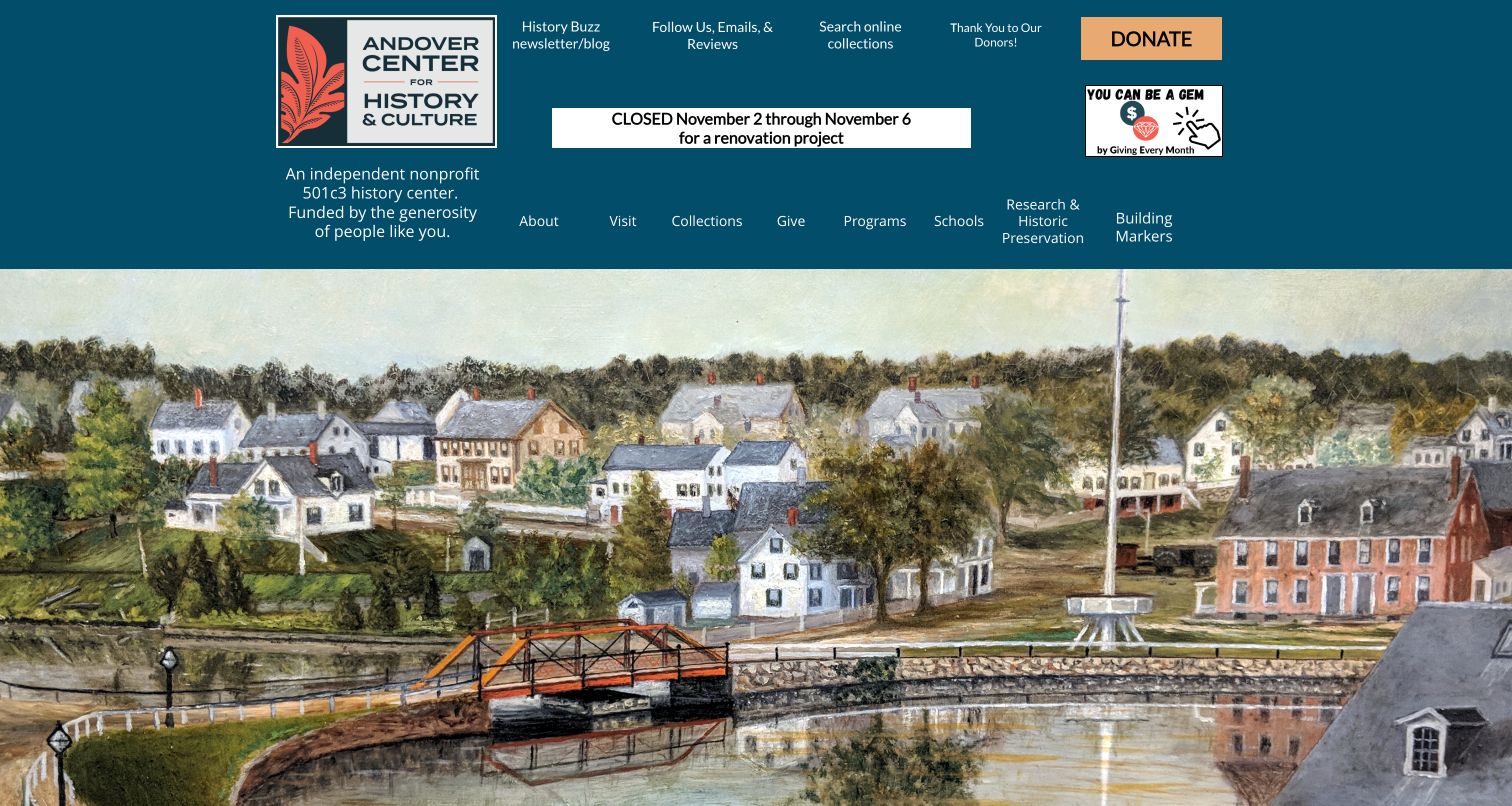
Andover Center for History and Culture places a town illustration beneath a substantial teal header. Its framed identity and short nonprofit explanation establish the organisation, while the navigation names collections, schools, research and historic preservation. An online-collection link appears separately among the utility items, making a useful resource visible before the main image. The captured page also shows why dated notices need ownership: a renovation-closure message for earlier November dates remains prominently displayed on the research date. It should not be read as confirmation of current opening arrangements. The header’s several rows create another trade-off, with support messages, updates and navigation competing for attention before the visitor reaches the historical illustration.
What you can learn
Make collection access and specialist local services visible, then maintain temporary notices as carefully as the permanent pages. An expired announcement can create uncertainty even when the rest of the website explains the organisation well.
Pros
Online collection access is available in the opening header.
Schools and historic-preservation research have explicit routes.
Cons & considerations
The captured renovation notice refers to dates already past.
Several header rows compete with the institutional introduction.
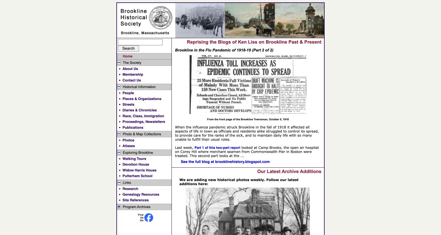
Brookline Historical Society uses a compact, fixed-width layout with a persistent left-hand navigation tree. Categories include people, places, streets, diaries, photographs and atlases, providing unusually specific entry points for local research. The main column opens with a historical feature and a credited newspaper image, followed by recent archive additions. This prioritises material and explanation over promotional imagery. The structure can be useful to someone browsing a particular subject because the taxonomy stays visible beside the story. Its trade-off is visual density: small text, closely packed links and narrow columns leave little breathing room on the captured desktop view. The design also gives the lead article more prominence than visit planning or a concise institutional introduction.
What you can learn
Build navigation around the subjects researchers actually seek, but give that taxonomy adequate space and readable hierarchy. Preserve the useful specificity of people, places and source types without crowding every link into a small panel.
Pros
Specific research categories remain visible beside the content.
The feature includes source-image context rather than imagery alone.
Cons & considerations
Small text and close spacing make the page visually dense.
Practical visit information is less prominent than the lead story.
Kegan is a freelance web designer and developer with 15+ years of experience helping businesses turn complicated website requirements into clear, maintainable digital experiences. He works directly with clients from planning and design through development, launch, and ongoing support.
For historical society website design, his development approach focuses on collection discovery, research services, visitor planning and clearly organized local-history publishing. The scope can be a targeted improvement or a complete custom build, with responsive layouts, thoughtful content structure, and integrations chosen around the people using and maintaining the site.
Show 3 other historical society website designersHide other historical society website designers
Plan a historical-society website around discovery and access
Create clear entry points for different kinds of curiosity
Begin with the questions people bring to the society rather than the names of internal departments. A resident researching a house, a student investigating a local event and a family planning a museum visit need different starting points. List these tasks and decide which can be answered directly, which need a catalogue and which require staff assistance. Keep the most common routes visible in ordinary language.
Explain each research resource before sending someone into it. A photograph database, archival finding aid, library catalogue and digitised newspaper collection are not interchangeable. Tell visitors what they can expect to find, what dates or places are covered and whether the material can be viewed online. When a system contains descriptions rather than digital copies, say so. A short introduction prevents an empty search result from being mistaken for proof that the society holds nothing relevant.
Provide browseable stories or themes alongside search. Selected objects, neighbourhood histories and clearly credited images can help people discover questions they did not know to ask. Connect these introductions back to appropriate records or research guidance, and preserve stable links as the collection grows. Assign someone to maintain labels and cross-references when resources move. The objective is not to expose every internal catalogue structure on the homepage, but to help visitors understand where to begin and what the next step involves.
Treat access and rights information as useful content
A collection page should help people understand both the material and the conditions for using it. Record a useful title, date or date range, creator when known, collection reference and an appropriate descriptive explanation. Identify uncertainty rather than silently presenting an estimated date or attribution as settled fact. Historical descriptions may need context, and editorial interpretation should be distinguishable from the original source.
Give researchers practical access instructions. Explain whether material is digitised, available by appointment, held off site or subject to restrictions that staff must assess. Make the process for requesting assistance clear without promising that an enquiry guarantees access to a particular item. Reading-room procedures, reproduction services and visit arrangements should each have an owner who can keep the information current.
Describe image and document reuse accurately. Possession of an object does not automatically establish permission to reproduce every associated work. Provide the society’s actual credit guidance and an appropriate contact route for unresolved questions rather than using a sweeping permission statement. Keep private donor information, restricted records and researcher correspondence outside public assets. Test content with realistic examples, including an item with an unknown creator, a collection without digital images and a record whose description has been updated. These cases reveal whether the design supports careful historical work instead of merely displaying attractive thumbnails.
Keep the public programme and organisation visibly current
A historical society’s subject may be the past, but its website needs to make present-day activity unmistakable. Maintain a clear calendar, current visit information and a short explanation of what the organisation does now. Give events their own dates, locations, registration requirements and cancellation status. Separate a past event record from an upcoming invitation, especially when archived pages remain useful for recordings or related research.
Connect membership, donations and volunteering to concrete ways of participating. Explain the actual benefits or responsibilities without suggesting that every supporter receives the same research service or access privilege. Keep registration and payment journeys distinct from general enquiries, and avoid asking for personal information that is unnecessary for the task. If another provider handles tickets or donations, identify that transition and retain accessible organisational contact details.
Plan for maintenance by a realistic team. Use reusable event and collection templates, a manageable set of navigation labels and clear ownership for announcements. Make it possible to update opening arrangements without editing several disconnected pages. When the organisation changes its public name, preserve its history and redirect established links so researchers can still recognise the institution. Review the site periodically for outdated promotions, confusing catalogue destinations and missing image credits. Reliable routine information can do more for trust than a large redesign that becomes difficult to maintain.
The editing job behind the design
Choose publishing tools that respect collections and staff capacity
Use structured content for events, exhibits, stories and access guidance. Keep the public website’s editorial pages distinct from collection-management records while providing clear links between them.
Choose search and catalogue integration around the actual material and audience. A public reference to a catalogue service does not establish that it manages every collection or that all holdings are available online.
Protect donor, membership, enquiry and restricted archival records. The technology notes reflect bounded public-source observations only; they do not reveal internal collections systems, security controls or a complete organisational stack.
Our WordPress website examples offer a separate look at publishing approaches. A visible platform label is evidence for that named page, not a guarantee that the same system will suit your requirements.
Before the public launch
Historical-society website brief checklist
Explain the organisation’s geographic focus and current public identity.
Give visitors clear routes for research, visits, events and participation.
Describe the scope of every linked catalogue or digital collection.
Distinguish catalogue descriptions from digitised source material.
Provide browseable stories or themes alongside direct search.
Include appropriate dates, credits, collection references and context.
Mark uncertain attributions or dates honestly.
Keep research appointments and museum admission requirements distinct.
Explain image reuse and reproduction procedures accurately.
Protect restricted material, donor information and private enquiries.
Make event dates, locations and registration requirements explicit.
Assign owners for opening information, external links and seasonal updates.
Preserve established URLs and organisational history through a rename.
These checks are a project checklist, not a performance, legal, security, or accessibility certification. Test real journeys with the people responsible for the website before making claims about the result.
Sources & editorial method
How this collection was selected and reviewed
This collection follows the original saved random target of 16 distinct historical-society properties. Institutions with a current museum or history-centre name are included only with a documented historical-society relationship. Direct source screenshots retain their own capture provenance and dates. Reviews assess public design and communication, not the completeness of collections, historical accuracy of every item or service quality. Every source has a bounded broad technology-audit attempt; blocked or robots-excluded results remain explicitly limited rather than being filled with inferred stacks. No membership, donation, research request, account action or real form submission was made.
Each example links to its actual source page. Screenshots are direct browser captures with their own capture dates; moving imagery, announcements and live designs can change. The notes describe observable design choices and conditional tradeoffs, not measured traffic, conversion results, service quality, or accessibility conformance.
Technology labels use public page metadata, asset evidence, or explicitly cited platform documentation. Platform documentation is not a complete current deployment audit. A component reference may be legacy or unused; it is not a complete backend inventory. Unknown stacks are omitted. These sites are editorial examples, not our client portfolio.
Written, Edited and Curated are separate editorial records, not timestamps advanced by a rebuild. Website designs and imagery belong to their owners. See our editorial standards or suggest a correction.
Questions worth asking
Historical Society website design questions
What should a historical-society homepage prioritise?
Make the organisation’s focus clear, then provide recognisable routes for visiting, research, public events and participation. The balance depends on the actual services offered. A small local archive does not need to imitate the breadth of a statewide institution.
Should the website include the complete collection catalogue?
It should provide an appropriate route to the available catalogue and explain its scope. Some holdings may not be digitised or publicly accessible. Distinguish online images from descriptive records, and tell researchers how to ask about material that is not represented.
How should a society present an old name after rebranding?
Use the current public name while explaining the institution’s earlier identity where it helps visitors and researchers. Preserve useful links and search terms, redirect changed pages and avoid making the old and new names appear to be separate organisations.
What belongs on an event page?
Include a clear title, date, location, description and any registration or admission requirements. Label cancellations and past events accurately. If an archived event includes a recording or research resource, keep that purpose clear after the original date passes.
Can visitors reuse every collection image shown online?
Do not assume that online access grants reproduction permission. Publish the organisation’s actual rights and credit guidance, identify relevant restrictions and provide a contact route when the status is unresolved. Different items can have different conditions.
Are these societies ranked by historical authority?
No. The examples and Editors Choice examine public website design and communication. Screenshots and website reviews do not certify archival standards, the accuracy of every interpretation or the quality of research services.