Best Climbing Gym Websites of 2026 (17 Real-World Examples)
Climbing gym websites that prepare a first visit
These 17 climbing-gym examples examine bouldering and roped-climbing distinctions, first-visit guidance, passes, courses, and multi-location navigation.
A new visitor may not know which activities need an introduction, a partner, equipment hire, or a separate booking. The public site should explain the gym’s actual process and keep staff assessment requirements clear.
Base5 is the editorial choice for its visitor-oriented presentation. The collection reviews website information, not facility safety or a visitor’s readiness to participate.
Before the examples
What makes good climbing gym website design in 2026?
Explain the climbing format
Distinguish bouldering, top-rope, lead climbing, and introductory activities where offered. Use plain descriptions and link the gym’s actual participation requirements.
Compare visits and memberships
Show the pass duration, hire inclusions, and important eligibility conditions. Separate casual entry from instruction or a membership commitment.
Keep location changes visible
Opening hours, temporary closures, and activity differences belong to the specific gym. Avoid a shared announcement that appears to apply to every branch when it does not.
The collection · 17 examples
17 climbing gym websites worth studying
Compare the examples by the visitor decisions they support. Each review identifies a specific pattern, practical lesson, strengths, and limitations in the directly inspected page.
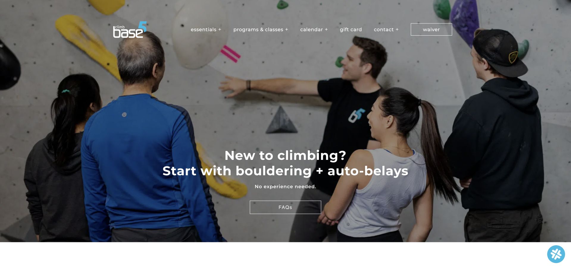
Climb Base5 makes its first-time page useful before visitors reach a membership pitch. The opening names bouldering and auto-belays, then a five-step sequence covers the waiver, check-in, equipment, orientation, and climbing. This is our editorial choice because it turns an unfamiliar activity into an understandable visit. Later sections distinguish the two climbing formats and provide branch addresses and hours. The large photographic opening could bring that sequence higher, and the page does not present an equally clear first-visit price. Its descriptions of equipment and safety are the gym's guidance; this review assesses the information structure rather than verifying those procedures.
What you can learn
Explain the sequence a newcomer will actually follow, including preparation and orientation. Pair each climbing format with its requirements, and place the total introductory cost near the same explanation so reassurance leads to an informed decision.
Pros
Five named steps make arrival and preparation predictable.
Climbing formats and branch details receive separate explanations.
Cons & considerations
The opening image delays the practical sequence.
A first-visit price is not part of the main explanation.
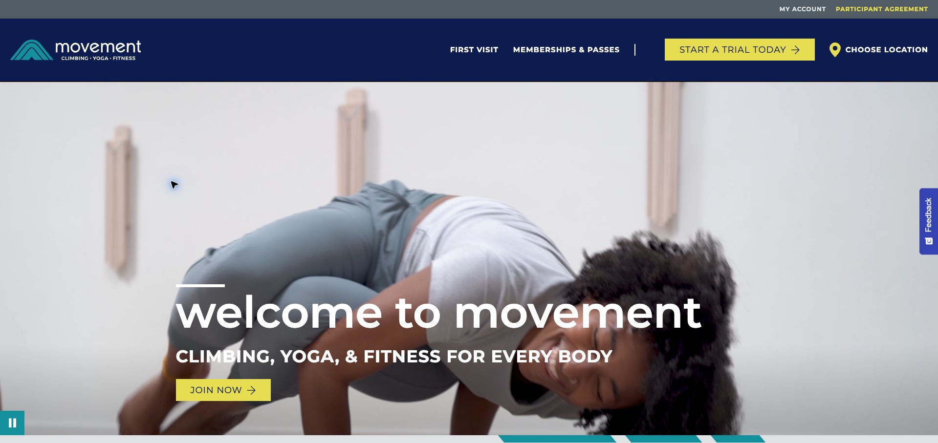
Movement uses a navy-and-yellow header over expansive climbing footage, with first visits, memberships, trials, and location selection clearly named above the hero. The geographic menu groups branches by state, helping visitors distinguish similarly named areas within a large network. Its short introduction also identifies climbing, yoga, and fitness as the combined offer. The main hero action asks visitors to join before a location or pass has been selected, however, and the introductory body supplies little comparison detail. A newsletter popup interrupted the initial visit and was dismissed for the retained capture. The persistent feedback tab adds another competing interface element near the edge.
What you can learn
For a large gym network, establish the visitor's branch and experience level before emphasizing membership. Keep useful first-visit and trial routes in the main header, and avoid interrupting that initial choice with newsletter acquisition.
Pros
First-visit guidance has a prominent header route.
The branch menu groups locations geographically.
Cons & considerations
The hero asks for membership before resolving local context.
A newsletter overlay interrupted the initial decision path.
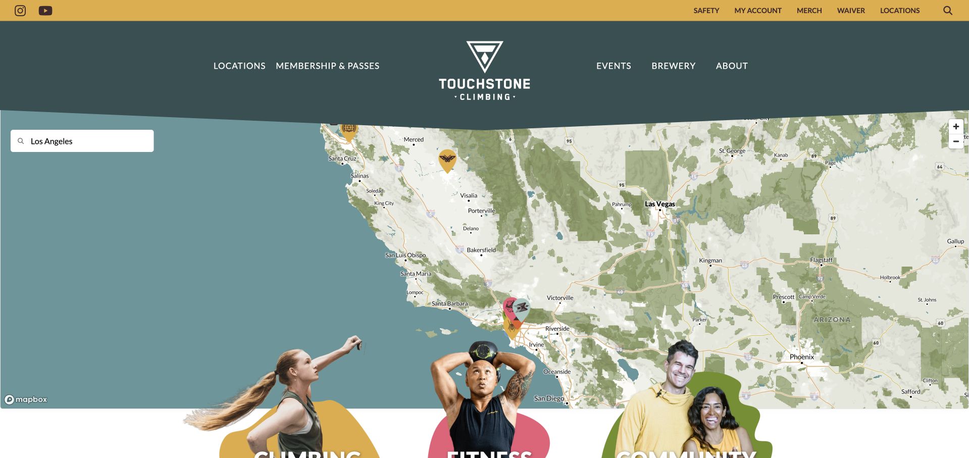
Touchstone opens with a large interactive California map beneath a dark green and gold header. This gives geography priority over a generic climbing promise, while membership, events, and account functions remain available above it. Cutout imagery and short climbing, fitness, and community headings continue the visual identity below. The map occupies almost the entire opening screen, so visitors need a dependable textual route as well as map interaction. Further down, the page repeats gym-finding actions frequently and includes large community statistics that require ongoing maintenance. With optional cookies declined, an embedded video becomes a consent notice, making the surrounding written introduction especially important.
What you can learn
A map can make a regional network understandable quickly, but it should be paired with an obvious text-based location route. Keep essential first-visit information readable when optional media is unavailable, and maintain any prominent network statistics.
Pros
Geography receives immediate prominence.
Location, membership, and account tasks have distinct navigation.
Cons & considerations
The large map leaves little opening room for first-visit guidance.
Repeated finder prompts and statistics lengthen the introduction.
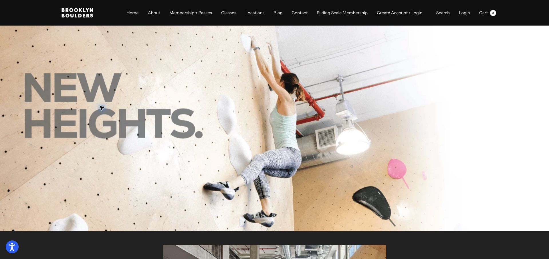
Brooklyn Boulders uses a dark, tightly packed header above a dramatic climber photograph. The body expands the offer beyond climbing to fitness, yoga, art, and coworking, then describes member classes and guest-pass benefits. A sliding-scale membership route is unusually visible in the main navigation, making an affordability option easier to discover. The opening interface nevertheless tries to expose too many destinations at once: account creation and login appear alongside another login link, a cart, and several general content sections. Large photographic and promotional sections do not immediately help a newcomer choose a local visit. Exact pass prices require further navigation.
What you can learn
Translate a broad community promise into specific benefits, but keep the first decision simple. Give newcomers a clear local visit route and consolidate duplicate account controls so membership alternatives do not disappear inside a crowded header.
Pros
Sliding-scale membership is visible in the main navigation.
The body names class and guest-pass benefits.
Cons & considerations
Duplicate login routes make the header unnecessarily busy.
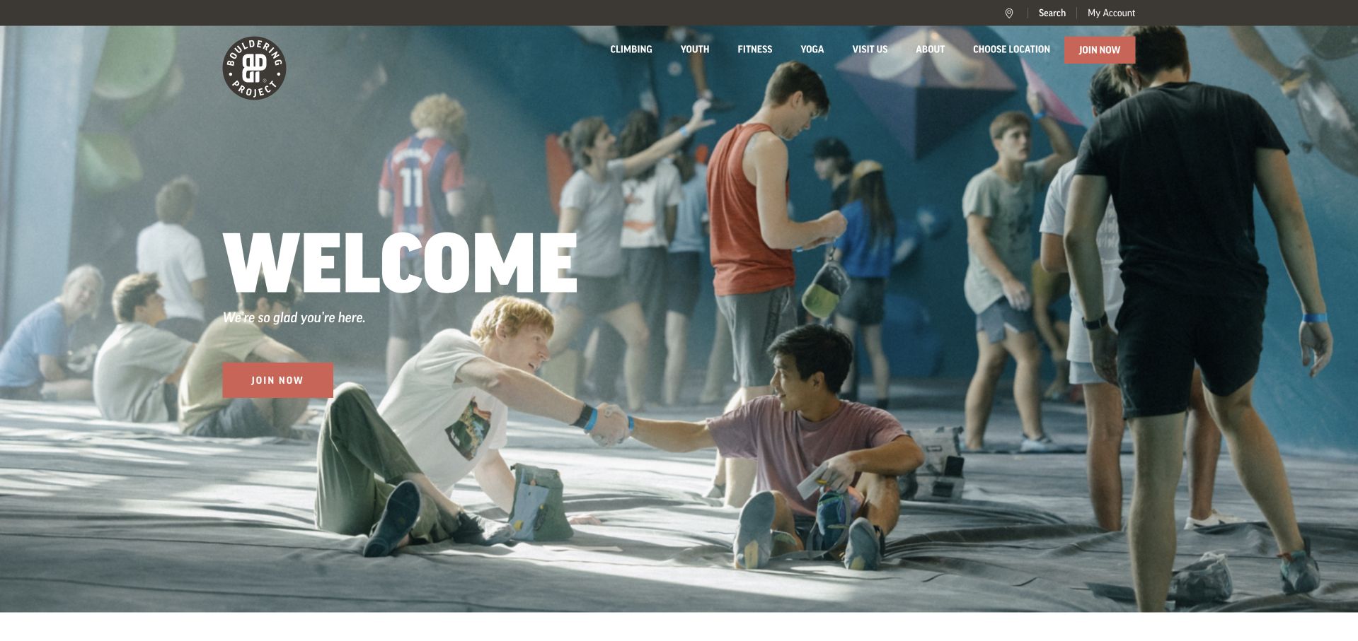
Bouldering Project opens with a full-width photograph of climbers greeting one another and a large welcome message. The coral action and clean white typography give the page a friendly, contemporary feel. Below the image, first visits and classes have their own cards, followed by monthly, annual, day-pass, and punch-pass options. Those four formats create a useful comparison framework without assuming every visitor wants a subscription. Prices are absent from that overview, though, and the location area reported that no branch had been found during the visit. The hero still asks visitors to join before that missing context is resolved.
What you can learn
Compare access formats using the same fields: price, visit allowance, included classes, and commitment. When location is unknown, make branch selection the next action so a welcoming introduction leads to an offer the visitor can actually evaluate.
Pros
Four access formats are presented as distinct options.
First visits and classes have separate introductory cards.
Cons & considerations
The access overview omits prices.
The membership action precedes a resolved branch selection.
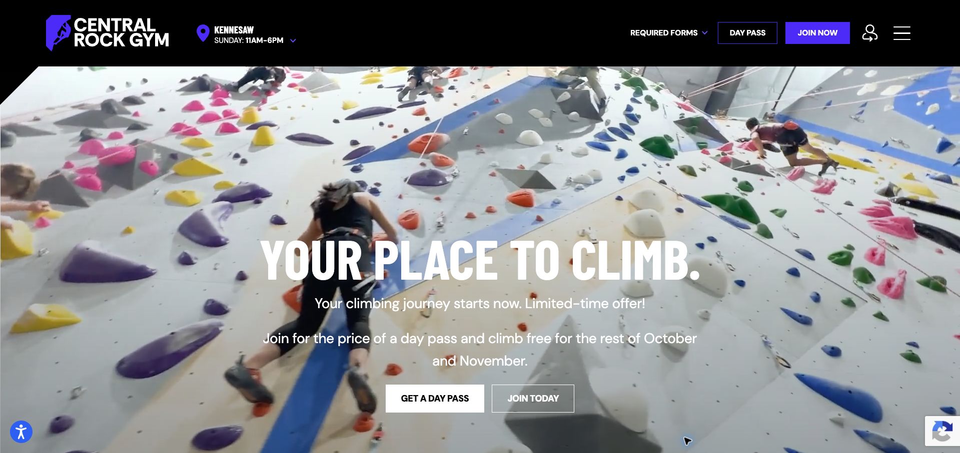
Central Rock Gym combines a black-and-purple identity with climbing footage and two prominent actions for day passes and membership. A selected branch and its daily hours appear in the header; Kennesaw was shown during this visit. The most helpful section follows the hero, organizing first climbs, learning, youth, and community into numbered routes. That provides a clearer decision structure than the later repeated program cards. Promotional maintenance is uneven: the membership offer mentions October and November, while youth copy still urges visitors to book nearly sold-out summer camps. Local selection also needs to remain explicit so automatically shown hours are not mistaken for the visitor's chosen gym.
What you can learn
Use experience and purpose to organize gym entry points, then connect each to the selected branch. Treat seasonal copy as operational content with an expiry date, particularly when urgency appears beside programs that run at different times of year.
Pros
Numbered routes distinguish several visitor intentions.
The header exposes a branch and its daily hours.
Cons & considerations
Summer-camp urgency remains in the November page.
Repeated program cards weaken the otherwise clear structure.
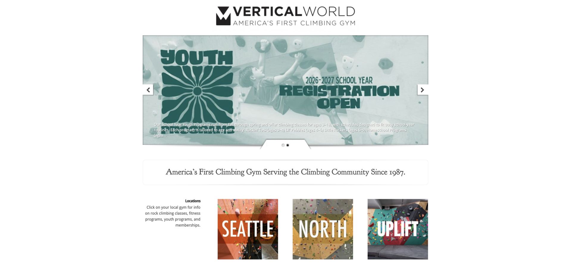
Vertical World presents a narrow, centered page with a youth-program carousel followed by three large location links. The restrained structure makes its main purpose understandable: choose a gym before looking at classes, fitness, or membership. A company-history section then explains how the network developed and names the current communities it serves. The opening relies on branded location labels such as North and Uplift, which are less immediately geographic than city names. Small carousel text and extensive white space also make the initial program message feel less polished than the location tiles. The footer's old copyright year adds to that impression without proving the operational information is outdated.
What you can learn
A parent-brand gateway can stay brief if every branch link combines its brand name with a city or neighborhood. Keep carousel messages readable and provide essential local context before asking visitors to enter a separate gym site.
Pros
Large location links support the page’s routing purpose.
The body names the communities served by the network.
Cons & considerations
Some prominent branch labels need clearer geographic context.
Small carousel text is harder to scan than the location choices.
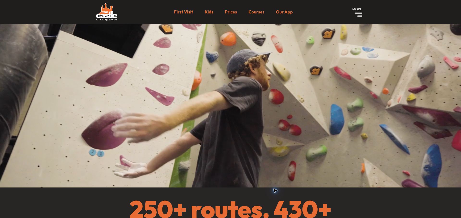
The Castle pairs a black-and-orange header with an expansive interior video, letting the building establish its identity. First-visit, children, prices, and courses are plainly named in navigation. Below the opening, separate routes for new and returning climbers lead into a venue map, hours, facility details, and learning options. The page also states that inexperienced families need bookings, attaching an operational qualification to the relevant audience. The video itself occupies most of the first screen without conveying those essentials. Numerous route and boulder counts appear later, creating a maintenance burden and requiring clear definitions so different totals can be understood rather than compared as equivalent figures.
What you can learn
Use a distinctive building to establish atmosphere, then quickly separate new and returning visits. Keep booking requirements attached to the affected audience, and present facility counts with consistent definitions and a clear reason for including them.
Pros
First-time and returning visitors receive distinct routes.
Family booking requirements are stated beside the relevant section.
Cons & considerations
The video postpones the practical venue overview.
Several facility totals require careful definition and maintenance.
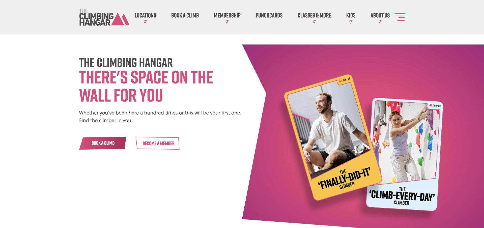
The Climbing Hangar uses angular pink-and-white graphics and a short inclusive headline to frame two obvious actions: book a climb or become a member. This is a practical opening because occasional visitors do not need to interpret a membership pitch before finding their route. The header also separates locations, classes, children, and punch cards. A competition campaign below the hero includes actual dates and participating-site context, while the membership section describes cancellation and joining terms as part of the offer. The homepage does not show a direct price comparison between those formats. First-timer guidance also sits inside the expanded navigation rather than alongside the two central actions.
What you can learn
Give occasional and recurring visitors equally understandable entry points. Support the membership promise with visible terms and a comparable price, while keeping first-visit requirements close enough that beginners can judge the booking action confidently.
Pros
Booking a visit and joining are equally legible in the hero.
Membership copy includes practical commitment terms.
Cons & considerations
The main offer lacks a direct pass-price comparison.
First-timer guidance is less visible than the purchase actions.
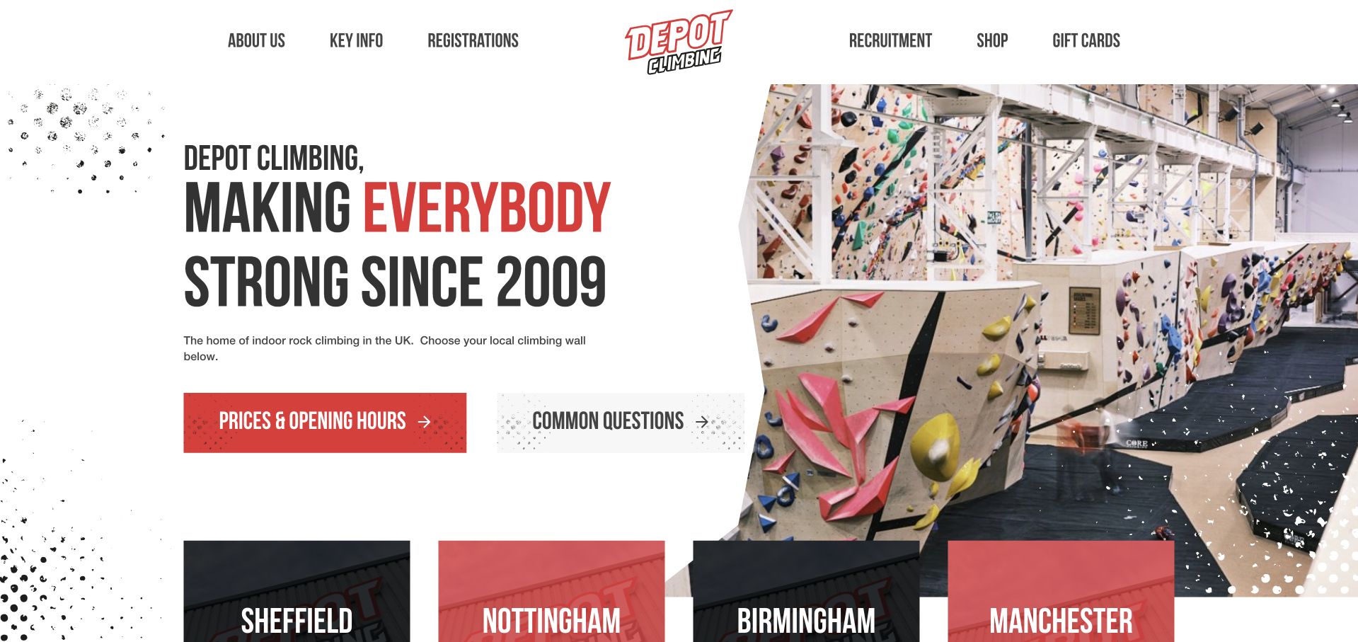
Depot places two unusually useful actions in its opening: prices and opening hours, and common questions. A climbing-wall photograph sits beside the bold introduction, with a grid of named locations immediately below. This makes the homepage effective as a gateway rather than requiring visitors to absorb a long brand story first. Further down, learning, youth sessions, competitions, equipment, and community content broaden the offer. The page needs tighter date maintenance: a November 7 competition still promotes tickets after the event date, and a student offer mentions shoe hire through October 31. These details undermine an otherwise practical information hierarchy and show why campaign content needs retirement rules.
What you can learn
Prioritize the questions visitors must answer before travelling, then show branch choices. Give every dated promotion an owner and expiry behavior so old ticket and discount language does not remain inside a useful evergreen homepage.
Pros
Prices, hours, and common questions are immediate actions.
Named branch tiles appear directly after the introduction.
Cons & considerations
Expired promotional language remains in the body.
The long mix of shopping, events, and stories dilutes the visit path.
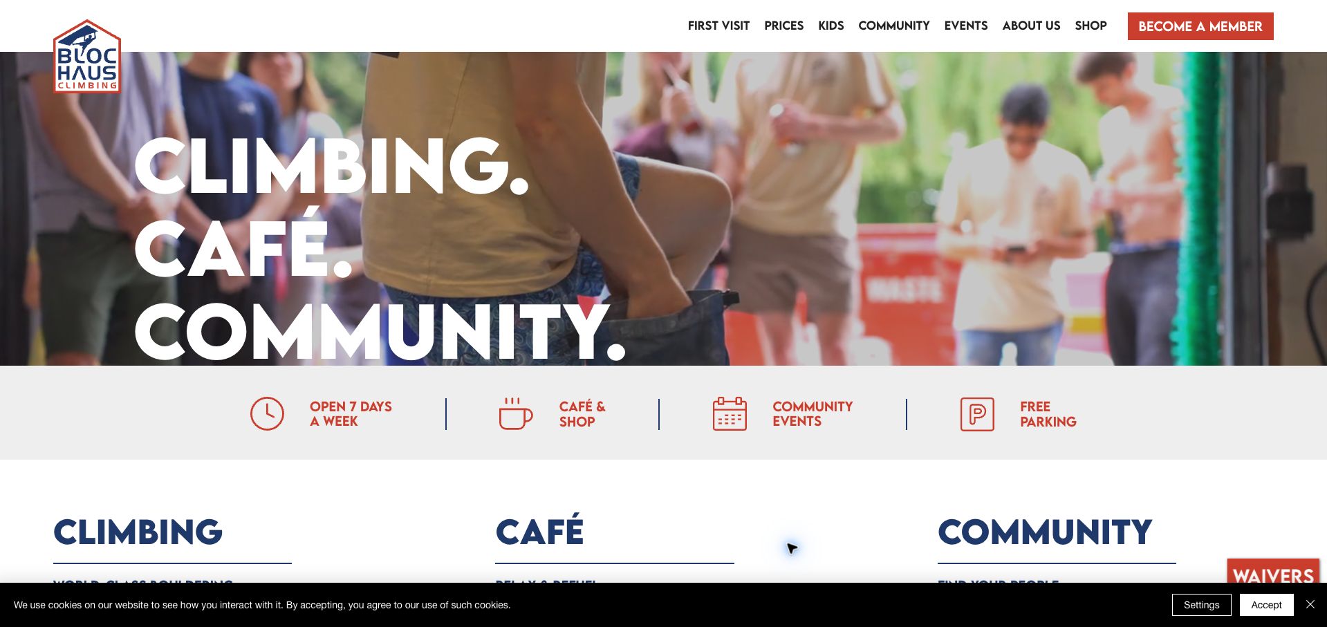
BlocHaus Manchester combines an oversized red headline with a navy-and-white layout and a compact row of practical benefits: opening days, café, events, and parking. First visits and prices are visible in the header, while the body gives climbing, café, and community their own routes. A dated upcoming-events list is particularly useful because it turns the broad community claim into specific social and youth sessions. The page then devotes considerable room to reviews and blog content, extending the path to practical information. A cookie strip and floating waiver control also compete at the viewport edges. The captured November event dates were upcoming, but that usefulness depends on continued calendar maintenance.
What you can learn
Support a community message with named, dated activities that visitors can actually investigate. Keep location and entry information near the same section, and prevent review feeds or floating controls from overwhelming the primary first-visit route.
Pros
Upcoming activities include dates and times.
First-visit and price routes are visible in the header.
Cons & considerations
Extended review content makes the page lengthy.
Cookie and waiver controls add competing edge elements.
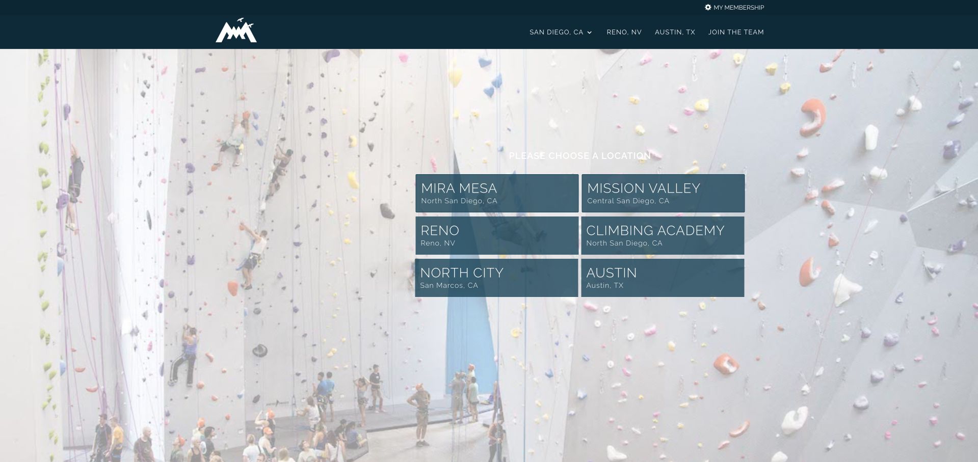
Mesa Rim reduces its homepage to a large climbing-wall photograph and six prominent location choices. Blue cards pair venue names with regional descriptions, distinguishing north and central San Diego as well as Reno, San Marcos, and Austin. Membership and broad regional navigation remain in the header. This is a focused approach for a network whose detailed offers belong on branch pages: there is little promotional material between arrival and choosing a gym. The minimalism also removes useful orientation. A newcomer receives no explanation of climbing formats, first-visit requirements, or the difference between the Climbing Academy and the regular gym locations, even though those choices share the same visual treatment.
What you can learn
A location gateway should be concise, but every destination still needs enough context to support the choice. Label specialist training facilities differently from general-access gyms and include a short first-visit route for people unfamiliar with the network.
Pros
Each main destination includes geographic context.
The page keeps branch selection visually dominant.
Cons & considerations
The academy appears equivalent to general gym locations.
Newcomers receive almost no introductory guidance.
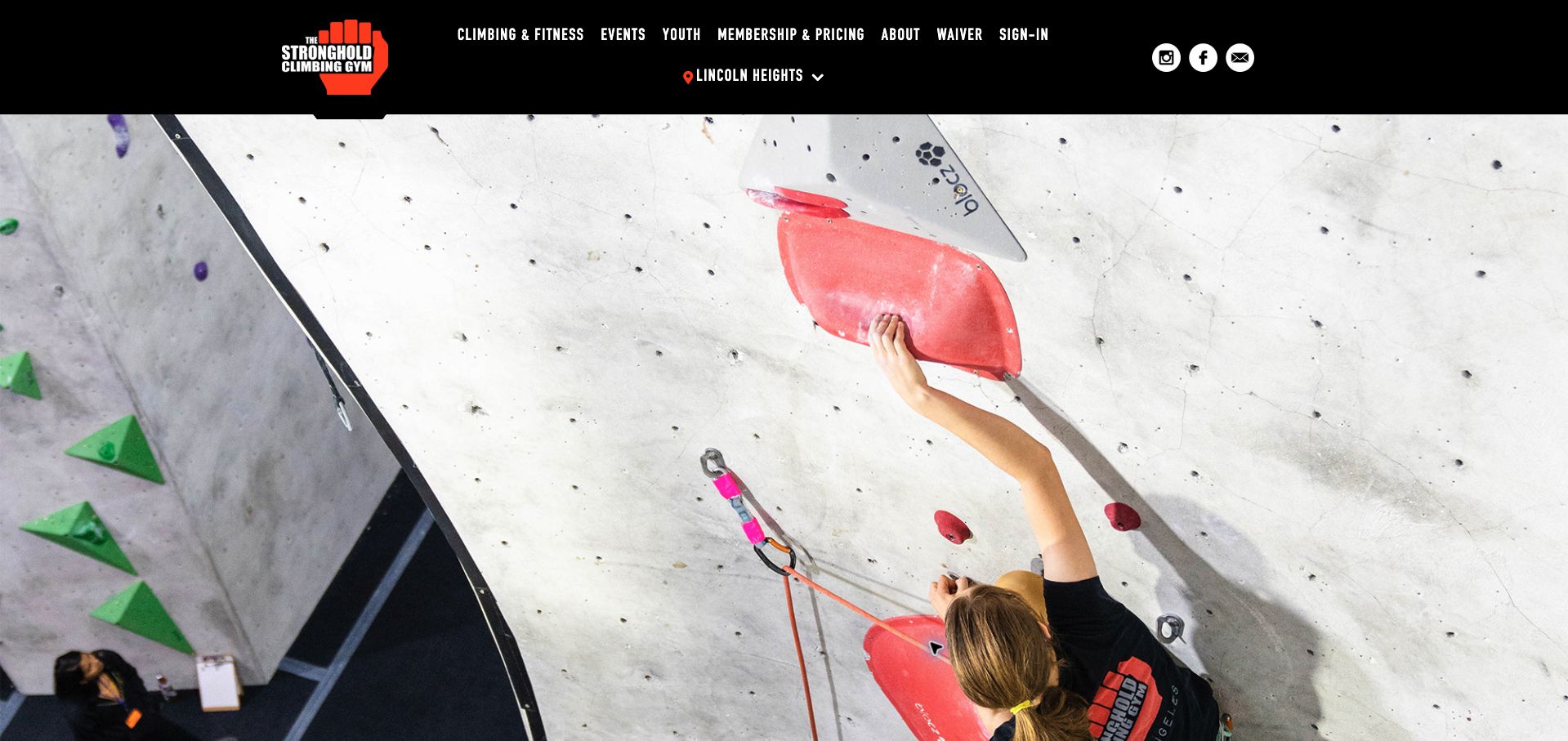
The Stronghold's Lincoln Heights page uses a bold black, white, and red identity above a large climbing photograph. Beneath that visual opening, the address, directions, phone number, and weekday or weekend hours are grouped together. A concise inventory then distinguishes roped climbing, auto-belays, bouldering, fitness space, and amenities. This makes the branch page more useful than a general brand introduction for someone deciding whether to visit. The photograph consumes most of the opening viewport, delaying those concrete details. A history section and social feed follow, but there is less immediate guidance about which activity a first-time visitor should choose or what the complete introductory visit costs.
What you can learn
Group address, hours, access, and facility types on a branch page, then connect them to a recommended first visit. Keep architectural history and social updates secondary to the information needed to choose an appropriate session.
Pros
Address, directions, phone, and hours are grouped together.
Facility types are listed in specific terms.
Cons & considerations
The large opening photograph delays visit logistics.
The branch overview lacks a clear introductory cost and sequence.
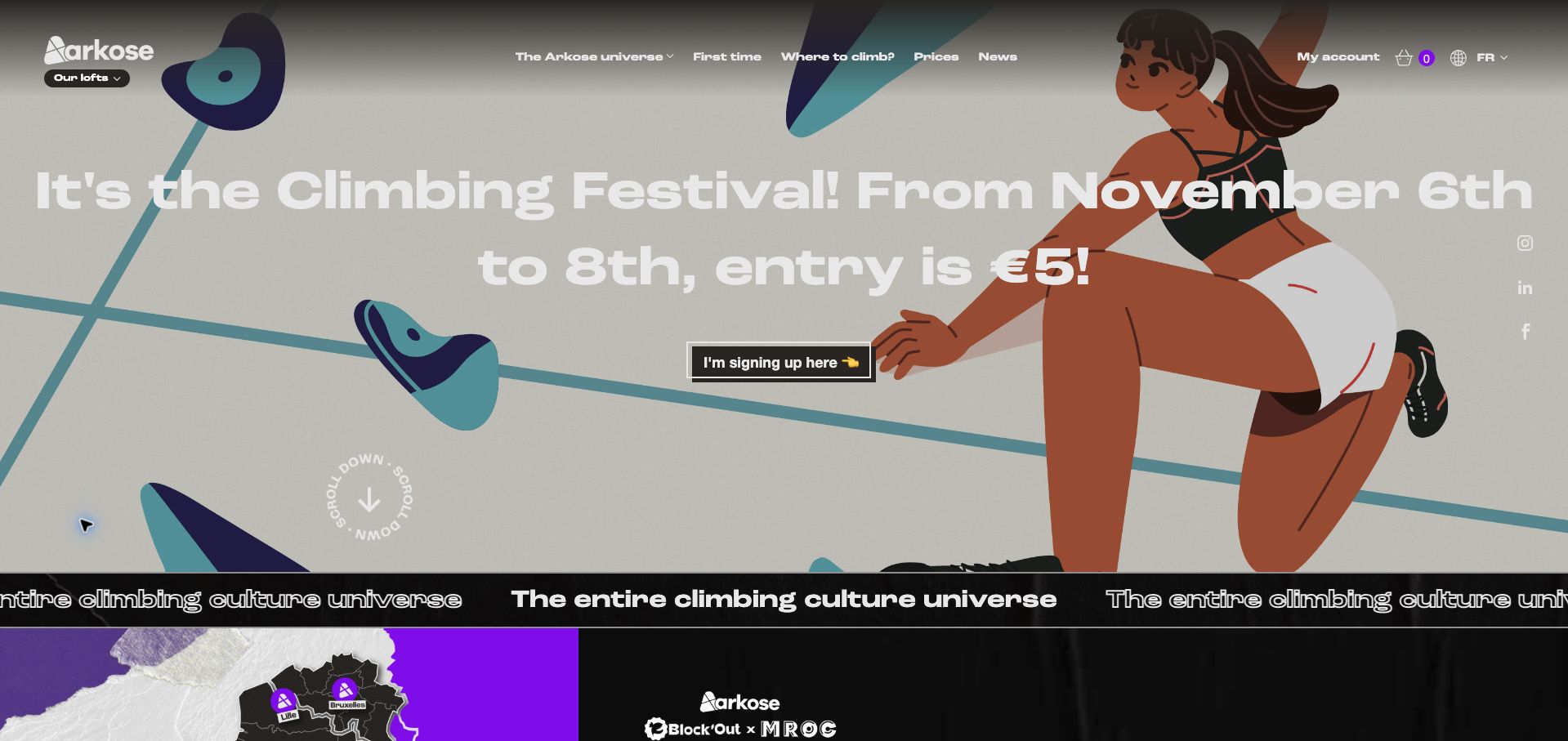
Arkose gives a climbing-festival campaign most of its opening screen, using illustrated climbers, an oversized white headline, and a dark registration action. Navigation still exposes first visits, locations, and prices, which helps preserve practical routes beneath the campaign. The body expands into the gym network, restaurants, and outdoor activities, and explains the combined Arkose, Block’Out, and MROC network. The reviewed browser displayed an English translation of the French page, so translated wording is not an assessment of the original copy. The pale illustration weakens contrast behind portions of the white headline, and the festival's short date window makes prompt campaign replacement especially important.
What you can learn
Keep permanent visit tasks visible during a temporary campaign. Test headline contrast against the actual illustration, and make the scope of a combined network clear before sending visitors into location, restaurant, or activity choices.
Pros
First visits, locations, and prices remain in the main header.
The network expansion is explicitly explained.
Cons & considerations
White campaign type loses contrast over pale artwork.
The time-limited hero needs prompt editorial replacement.
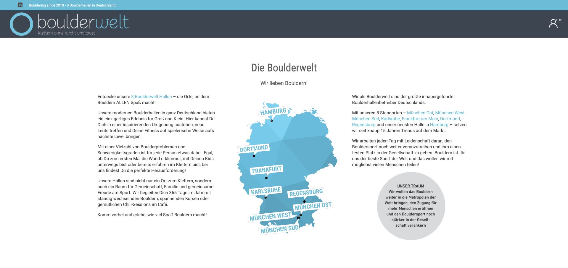
Boulderwelt uses a calm turquoise-and-gray identity and a three-column introduction with a Germany map, explanatory text, and a large brand statement. The German-language page then becomes a useful directory: each gym receives a description, street address, hours, and a destination link. That repeated structure helps visitors compare branches without opening every site. The opening itself is much denser than the directory, with several location names embedded in prose and little immediate first-visit or pricing guidance. Large promotional claims about the network also receive space before the practical entries. The strongest idea here is the consistent local information, rather than the length of the introduction.
What you can learn
Turn a multi-location homepage into a structured directory with the same facts for every branch. Move geographic choices above extended brand prose, and provide a newcomer route for visitors who need to understand the activity before selecting a venue.
Pros
Branch entries repeat addresses and opening hours.
A map establishes the network’s geographic scope.
Cons & considerations
Location choices initially sit inside dense introductory prose.
First-visit and pricing guidance lack opening prominence.
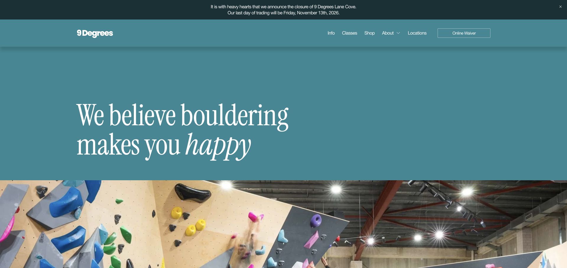
9 Degrees opens with a large pale-teal statement about enjoying bouldering, followed by a photograph and three audience groups. New climbers, regular visitors, and highly committed climbers each receive a different access format, with example prices and relevant facility details. This is a useful progression from motivation to practical commitment. A prominent notice also clearly identifies the forthcoming closure of the Lane Cove branch and its date, rather than implying the entire business is closing. The oversized introductory statement delays the offer comparison, however. Prices such as weekly membership starting rates also need branch-specific conditions kept close to the relevant next step so the overview does not imply uniform availability.
What you can learn
Match access formats to recognizable visitor habits and show indicative costs in the comparison. Give operational notices precise geographic scope and dates, then connect each offer to the branch details and conditions required to act on it.
Pros
Three audience groups have distinct formats and example prices.
The closure notice names the affected branch and date.
Cons & considerations
The large introductory statement delays the useful comparison.
Starting prices require clearer adjacent local conditions.
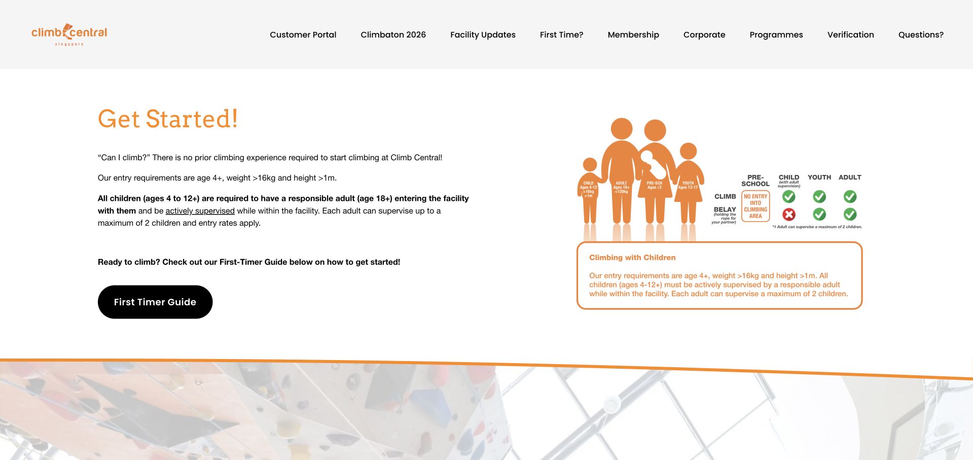
Climb Central puts practical eligibility information directly into the opening, pairing text with an orange family diagram. Age, height, and weight requirements appear before the first-timer guide, and adult supervision is explained alongside them. This is unusually direct for a climbing homepage and helps visitors decide whether the activity fits their group. The body then introduces climbing formats and lists branch addresses, phone numbers, and opening hours. The header is crowded with portal, event, verification, and program links, while the opening age phrasing includes an awkward plus sign that deserves clearer editing. The diagram also repeats substantial text instead of simplifying the decision. These are presentation observations, not an independent safety assessment.
What you can learn
Place eligibility and supervision requirements before booking, using precise age ranges and plain language. Let diagrams clarify the relationship between children and supervising adults, while a simple first-visit action leads into branch-specific prices and preparation.
Pros
Entry and supervision requirements appear before the main action.
Branch listings include addresses, hours, and phone numbers.
Cons & considerations
The header contains many competing destinations.
Age phrasing and duplicated diagram text need editorial simplification.
Kegan is a freelance web designer and developer with 15+ years of experience helping businesses turn complicated website requirements into clear, maintainable digital experiences. He works directly with clients from planning and design through development, launch, and ongoing support.
For climbing gym website design, his development approach focuses on first-visit guidance, climbing-format explanations, membership comparisons, class calendars, and booking handoffs. The scope can be a targeted improvement or a complete custom build, with responsive layouts, thoughtful content structure, and integrations chosen around the people using and maintaining the site.
Show 3 other climbing gym website designersHide other climbing gym website designers
Explain arrival, staff introductions, equipment, and booking according to the gym’s current policy. Do not turn a website checklist into a substitute for required instruction.
Structure programs separately
Give youth groups, coached sessions, social events, and casual climbing distinct records. Include age guidance, schedule, cost, and the correct venue.
Rehearse a phone-based visit plan
Check that someone can find today’s hours, understand the entry price, identify equipment needs, and explain what happens next without completing a waiver or purchase.
The editing job behind the design
Choose systems the team can keep accurate
Maintain location and pricing records in one place, then connect bookings and memberships to the appropriate service. Keep the public first-visit explanation accessible without an account.
Use real facility photographs with descriptive captions. Test navigation and timetable readability before adding complex route imagery or moving promotional banners.
Our WordPress website examples offer a separate look at publishing approaches. A visible platform label is evidence for that named page, not a guarantee that the same system will suit your requirements.
Before the public launch
Website planning checklist
Distinguish climbing formats.
Explain first-visit requirements.
Identify equipment hire.
State pass duration.
Qualify membership terms.
Maintain branch hours.
Scope closure notices.
Separate instruction from entry.
Show youth eligibility.
Test the booking destination.
These checks are a project checklist, not a performance, legal, security, or accessibility certification. Test real journeys with the people responsible for the website before making claims about the result.
Sources & editorial method
How this collection was selected and reviewed
These 17 examples match the collection target saved before research. Public pages were directly opened and visually inspected; the pictured source and capture date identify the reviewed state. Reused captures retain their earlier dates. Each source also has a bounded public stack-audit attempt, with inaccessible and unknown results kept explicit. Editors Choice recognizes website design and information, not service quality or promised outcomes. No purchases, bookings, applications, or private forms were submitted. Images and trademarks belong to their owners.
Each example links to its actual source page. Screenshots are direct browser captures with their own capture dates; moving imagery, announcements and live designs can change. The notes describe observable design choices and conditional tradeoffs, not measured traffic, conversion results, service quality, or accessibility conformance.
Technology labels use public page metadata, asset evidence, or explicitly cited platform documentation. Platform documentation is not a complete current deployment audit. A component reference may be legacy or unused; it is not a complete backend inventory. Unknown stacks are omitted. These sites are editorial examples, not our client portfolio.
Written, Edited and Curated are separate editorial records, not timestamps advanced by a rebuild. Website designs and imagery belong to their owners. See our editorial standards or suggest a correction.
Questions worth asking
Climbing Gym website design questions
What matters most to a first-time visitor?
The available activity, participation process, price basis, equipment arrangements, and correct location.
Should the waiver be the first action?
Visitors should first understand what they are choosing. Link required operational steps in the sequence the gym actually uses.
How should multiple gyms be organized?
Give each its own activity, hours, prices, and access information when these differ. Shared branding should not hide practical differences.
Do facility photos establish safety?
No. They illustrate the space. Website design reviews do not replace the gym’s instruction, supervision, or operational requirements.