Best Bicycle Shop Websites of 2026 (25 Real-World Examples)
Bicycle shop websites that connect products, workshop services, and local riding
These 25 examples examine bike discovery, repair menus, fitting and appointment routes, local store details, and cycling-community content.
A bicycle shop may sell online, repair existing bikes, organize rides, and provide specialist advice. Those tasks should remain distinct even when they share a strong local identity.
Angry Catfish is the editorial choice. Its design review considers how the shop’s character supports useful discovery, without claiming that the website establishes mechanical quality or bike suitability.
Before the examples
What makes good bicycle shop website design in 2026?
Separate shopping from service
Give repairs, fittings, rentals, and products clear labels. A workshop customer should not need to browse a retail catalog to learn how to bring in a bike.
Explain compatibility and availability
Use product specifications and fit guidance accurately. Distinguish online stock from local availability, and provide a staff-contact route when a component or bike needs individual advice.
Make the physical shop useful online
Publish current addresses, hours, workshop intake arrangements, and temporary-location notices. Community rides should include dates, meeting points, and relevant participation details.
The collection · 25 examples
25 bicycle shop websites worth studying
Compare the examples by the visitor decisions they support. Each review identifies a specific pattern, practical lesson, strengths, and limitations in the directly inspected page.
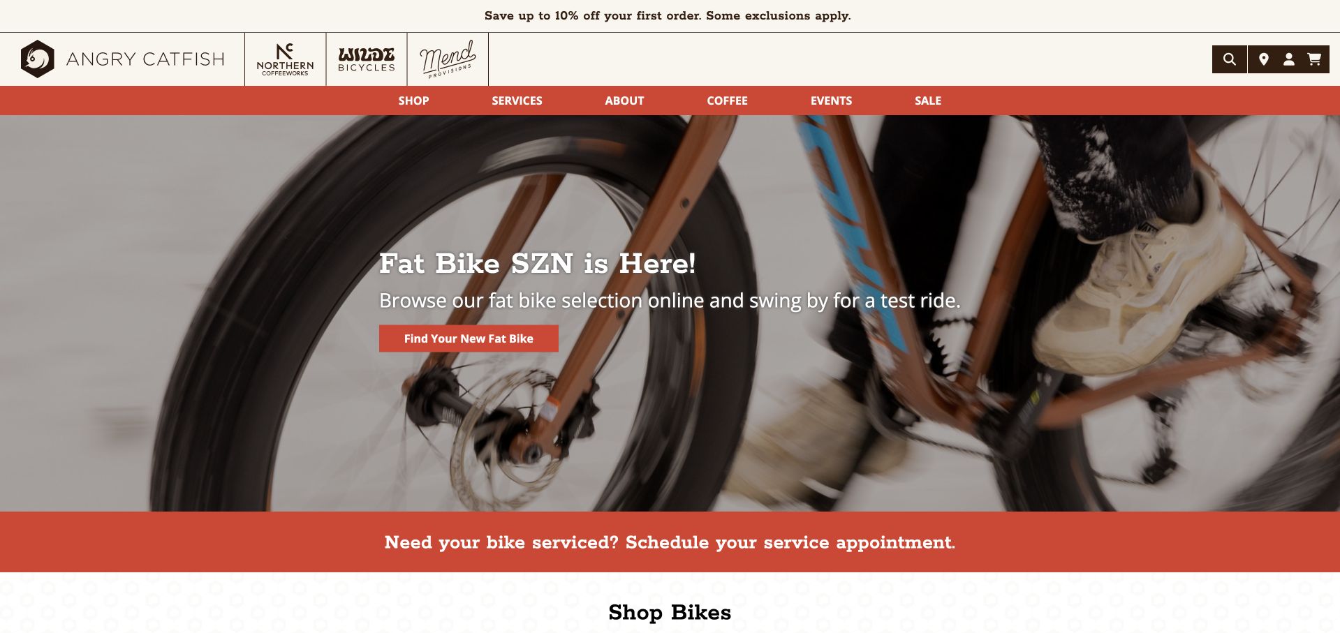
Angry Catfish gives a seasonal bike category one clear hero action and explicitly invites visitors to try the bikes in person. Directly beneath it, a contrasting strip points existing owners toward a service appointment. The body continues with familiar riding categories and separate routes for demos, repairs, fitting, and handbuilt wheels. This is our editorial choice because it treats buying and maintaining a bicycle as related customer journeys. Coffee and associated brands add character, although their prominent logos make the header busier. A later Gazelle promotion still says Spring Sale in the November capture, showing that strong service navigation needs equally careful campaign maintenance.
What you can learn
Place a workshop route beside the main shopping journey, and explain how customers can try a bike before buying. Preserve the shop’s personality through photography and local activities while giving dated promotions a clear review and removal schedule.
Pros
A service-appointment strip sits immediately below the hero.
Demos, fitting, repairs, and custom wheels have distinct routes.
Cons & considerations
Several associated brand logos complicate the header.
A spring promotion remains visible in the November capture.
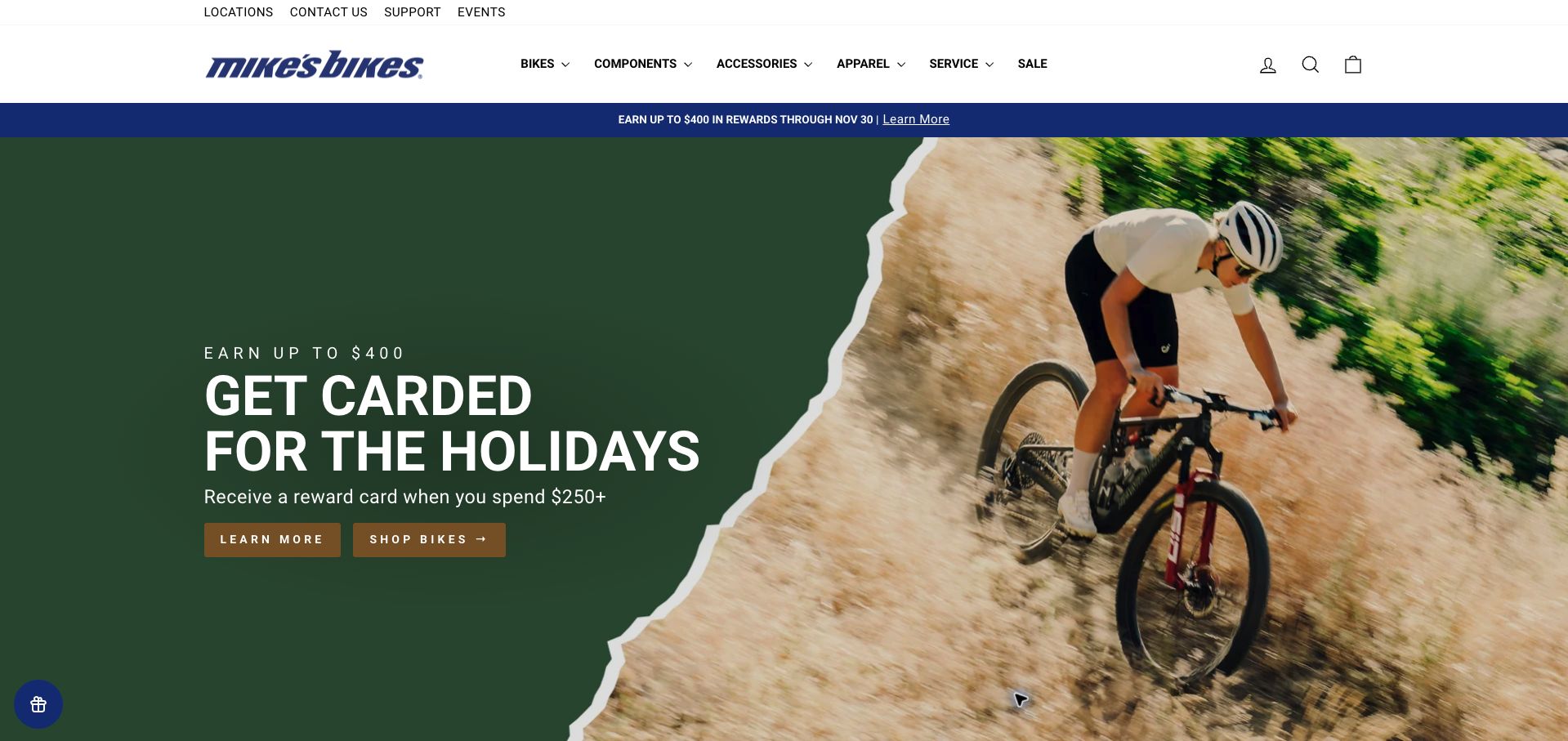
Mike’s Bikes uses a large seasonal rewards campaign to lead into its catalog, with a compact upper navigation for locations, support, and events. A three-part assurance row explains price matching, returns, and assembly, addressing concerns that matter when a complete bike arrives by delivery. Later sections connect trade-ins and brand collections to the same store. Service and fitting are available, but the homepage gives much more space to promotions and product brands than to those local capabilities. The rewards headline also requires another page to understand the spending tiers beyond its initial threshold. Optional cookies were declined before the retained screenshot.
What you can learn
Support a complete-bike sale with assembly, returns, and service information close to the catalog entry point. Keep seasonal reward terms understandable at a glance, and give local repair and fitting customers a route that does not depend on scanning product campaigns.
Pros
Purchase assurances address assembly and returns.
Locations, events, and support are available above the main catalog.
Cons & considerations
Promotions outweigh the local service offering.
Reward tiers require another page to understand fully.
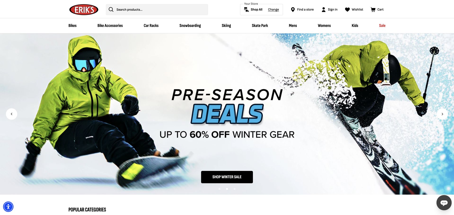
ERIK’S gives product search and store selection prominent positions in the header. The selected context initially says Shop All, which is a useful indication that the catalog is not yet narrowed to one branch. Popular bicycle categories and product cards with prices and comparison controls appear below a rotating promotional hero. The same navigation also includes skiing, snowboarding, and skate products, so the business’s broader offer is visible. That breadth creates a tradeoff: the retained slide promotes winter equipment rather than bikes, and repeated Shop now labels do little to distinguish campaigns. Comparison controls are visible, but this review did not test a comparison or verify branch stock.
What you can learn
Make the distinction between all-store inventory and a chosen branch explicit. In a multi-sport store, offer persistent category shortcuts and descriptive campaign actions so seasonal slides do not determine whether a bicycle customer can find the right starting point.
Pros
Search and store context are prominent.
Product cards show prices and comparison controls.
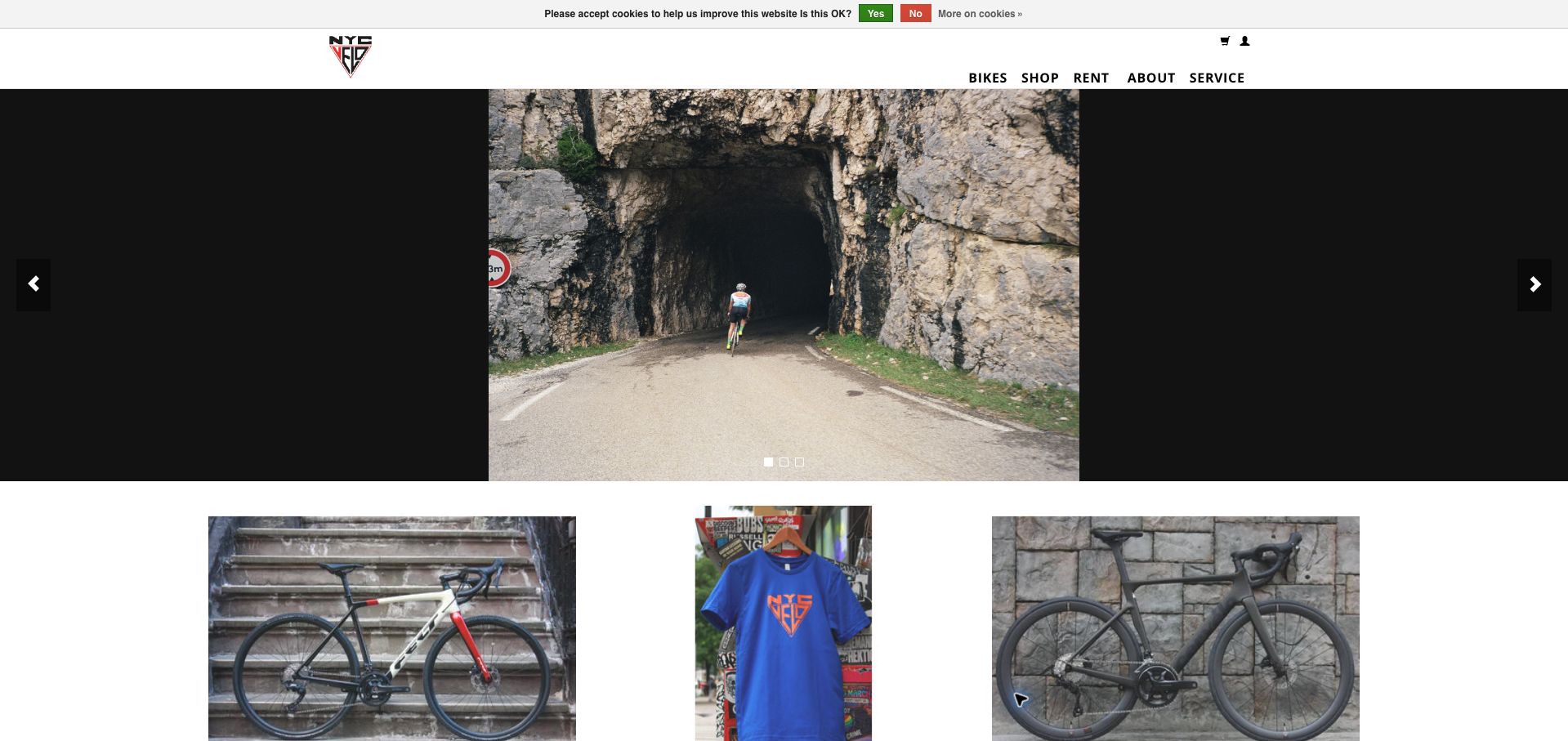
NYC Velo uses a restrained header with separate routes for bikes, general shopping, rentals, and service. A photograph-led opening is followed by a small set of featured products rather than a sprawling catalog. The most useful information is the pair of store listings: each gives an address, telephone number, day-specific hours, and a directions link, making a visit straightforward to plan. The opening photograph has no explanatory headline or clear next action, and its narrow image leaves broad black margins on desktop. A small cookie strip remains in the capture. The modest content length is appealing, but the homepage could explain the shop’s particular expertise before asking visitors to explore.
What you can learn
A neighborhood shop can keep its homepage short while still making each location independently useful. Pair the store details with a concise explanation of the shop’s specialty and a clear shopping or service action, rather than relying on an uncaptioned cycling photograph.
Pros
Both branches include hours, addresses, and directions.
Rental and service routes are separate from shopping.
Cons & considerations
The image-led opening lacks an explanatory action.
Large black margins make the desktop hero feel underused.
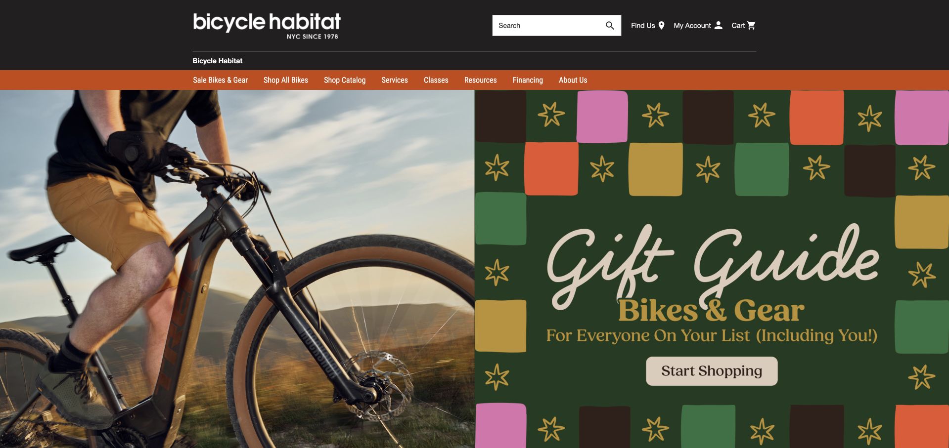
Bicycle Habitat combines a seasonal gift campaign with a detailed sale catalog and a cold-weather cycling guide. That guide names its New York neighborhoods and connects layering advice to relevant clothing, giving the retail content a practical local reason to exist. Services, classes, and resources are also visible in the main navigation, broadening the site beyond transactions. The opening gift artwork occupies almost the whole first screen, while actual bike selection and support arrive farther down. Product cards show price ranges with very small differences that are difficult to interpret without opening the item. A clearer explanation of variant pricing would make those catalog comparisons more useful.
What you can learn
Connect local riding conditions to advice and relevant products, then keep service and education visible beside shopping. Explain why a product has a price range, especially when the values differ only slightly, so customers can compare meaningful options rather than unexplained numbers.
Pros
Seasonal advice is tied to named local shops.
Classes and services have visible navigation routes.
Cons & considerations
The large campaign artwork delays product and service detail.
Small unexplained price ranges complicate comparisons.
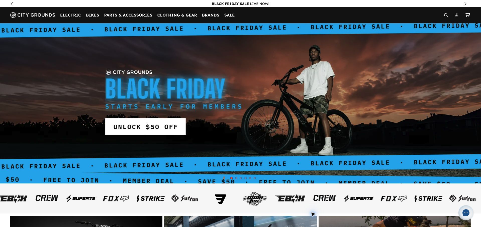
City Grounds expresses a clear visual identity through dark navigation, bright blue sale bands, and dramatic riding photography. Its catalog distinguishes electric models, big-wheel BMX, children’s bikes, and commuter options, which helps communicate the specialist range. Brand names and category tiles supply several ways into that range. The opening is nevertheless dominated by repeated sale messaging and a member-discount invitation. Several quite different products share Shop now actions, and the compact promotional descriptions emphasize power or speed more than intended use. For a mixed electric catalog, that leaves important product distinctions to later pages. The review concerns the visible shopping presentation, not the suitability or permitted use of any model.
What you can learn
Use energetic branding to support a clear product taxonomy. Give different electric and pedal-bike categories plain-language use descriptions and distinct actions, so customers can understand the range before encountering repeated discounts or headline performance specifications.
Pros
The catalog exposes several specific riding categories.
Brand and category routes support different browsing styles.
Cons & considerations
Repeated sale bands overwhelm the opening.
Short promotional descriptions give little intended-use context.
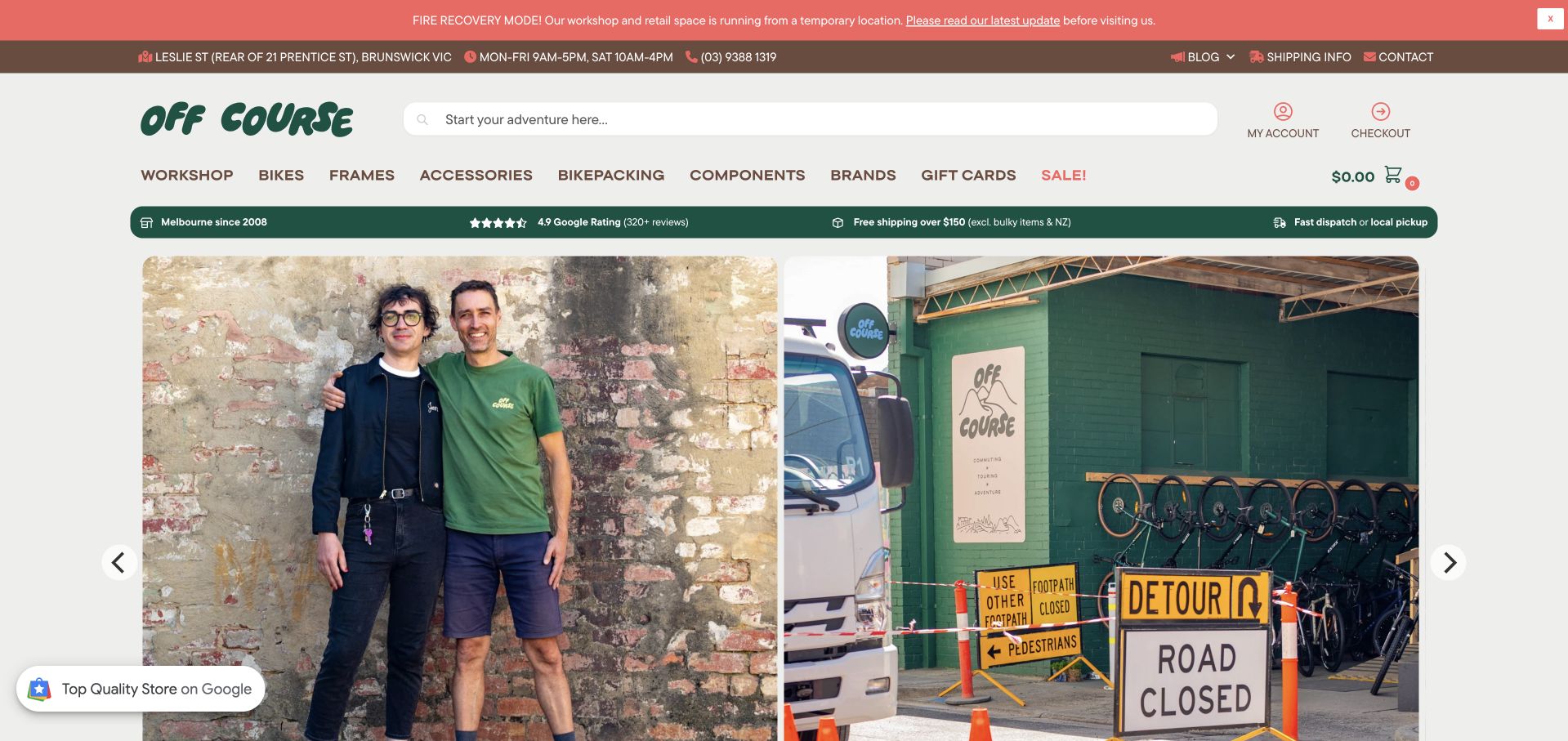
The former Commuter Cycles address redirects to Off Course, whose homepage puts a fire-recovery notice above the catalog. It identifies a temporary location and links to an update before visitors travel, while the header supplies hours and a phone number. Staff news and roadwork access information receive large image tiles, and the catalog uses explicit stock labels on featured products. This is a strong example of prioritizing a real operational condition over a routine sales campaign. The number of announcement, contact, navigation, and assurance rows makes the header tall. Important updates are also spread between the banner, image tiles, and dated blog entries, requiring readers to assemble the full visiting picture.
What you can learn
Put temporary-location and access changes before merchandising, with a single maintained visit summary. Link supporting updates from that summary while keeping stock information and workshop booking easy to reach beneath the operational notice.
Pros
Temporary location and access changes are prioritized.
Product cards display explicit stock labels.
Cons & considerations
Several stacked header rows delay the main content.
Visiting updates are distributed across multiple sections.
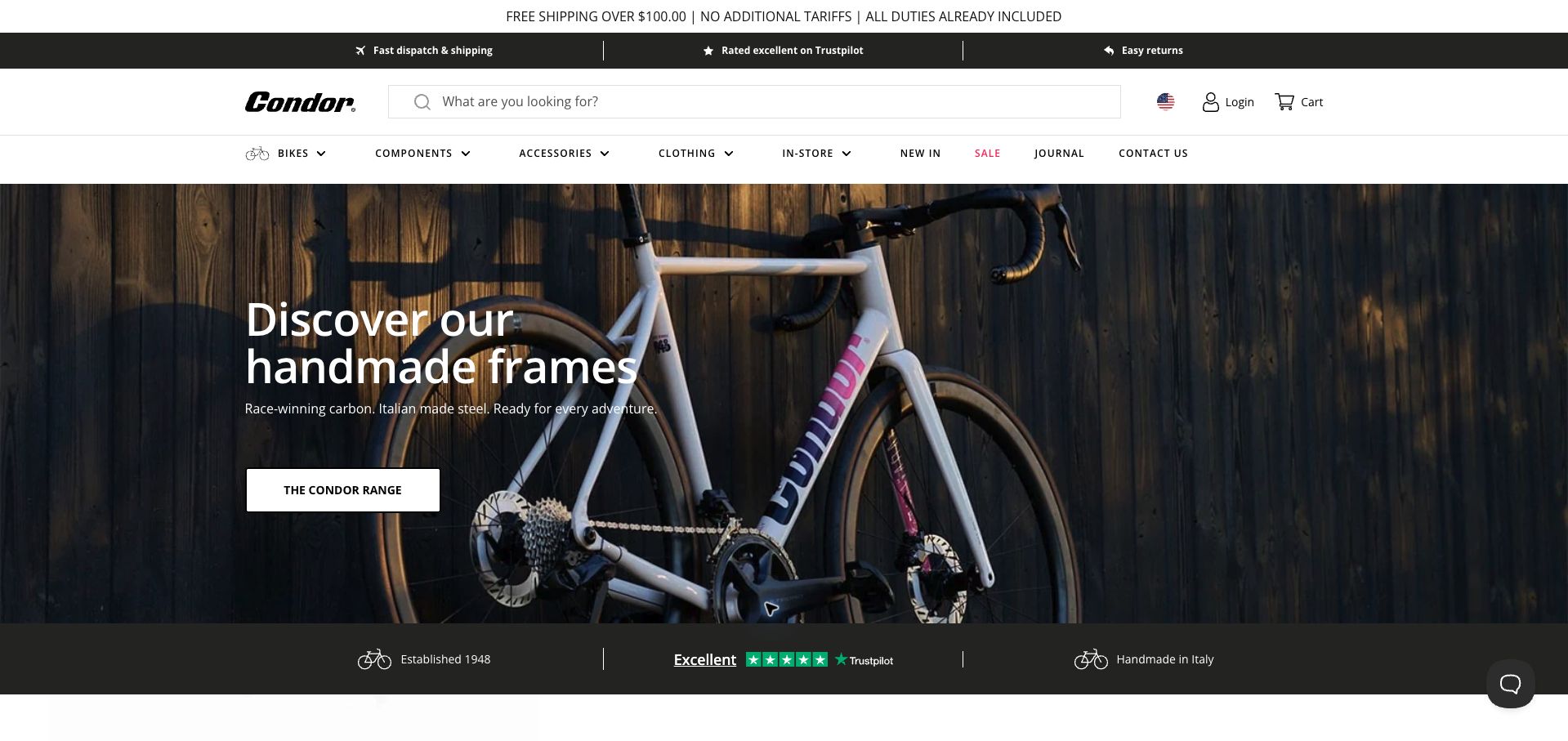
Condor leads with a close photograph of a complete bike and a direct route to its handmade frame range. The page then separates Condor and Brompton collections, followed by seasonal accessories and editorial stories. Its US-localized view shows dollars and a shipping-and-duties statement, while the London shop remains identifiable in the contact information. This combination gives the store a stronger point of view than a generic brand grid. Frameset starting prices appear prominently, however, and a novice could benefit from a clearer explanation that these are not necessarily complete-bike prices. The many assurance strips and navigation rows also consume substantial space before the main photograph.
What you can learn
Let a shop’s own products define its identity, but explain whether the displayed price buys a frameset or a complete build. Keep international pricing context clear while preserving a direct route to local fitting, workshop, and store information.
Pros
The proprietary frame range has a clear introduction.
Currency and shipping context are visible in the localized view.
Cons & considerations
Frameset pricing needs more context for newcomers.
Stacked assurance and navigation rows make the header tall.
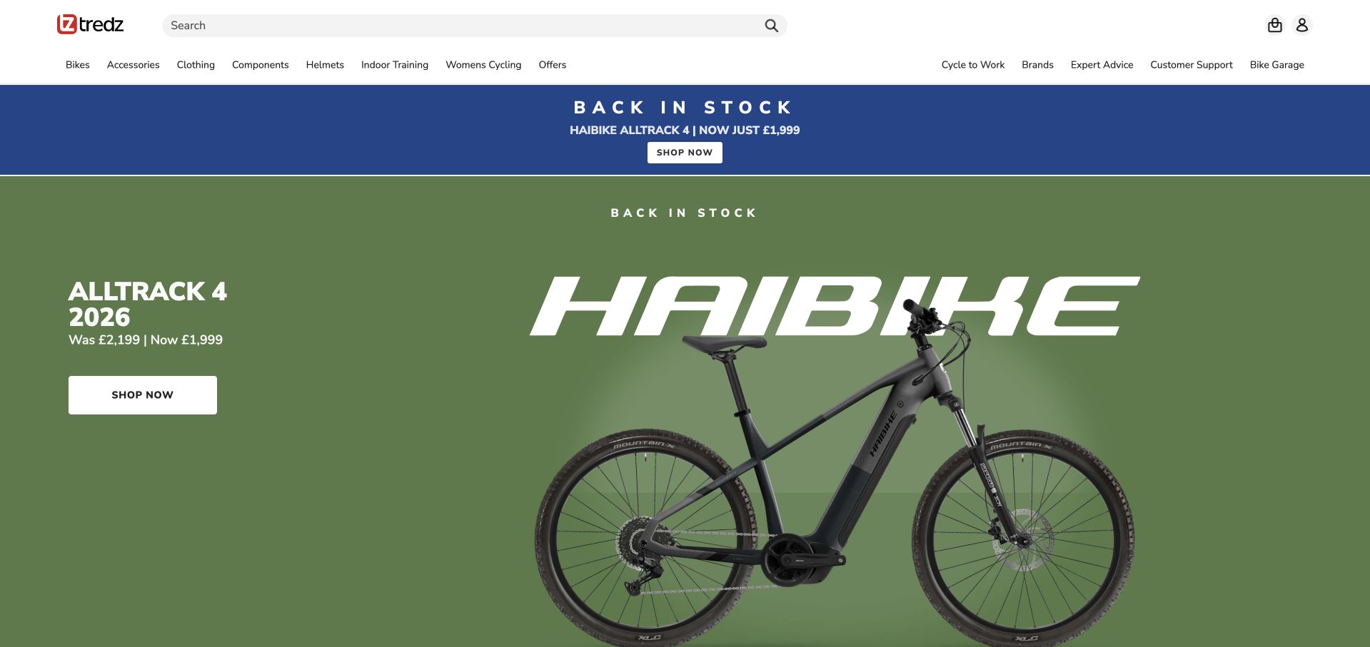
Tredz opens with a named Haibike model, its model year, and a before-and-after price, giving visitors a concrete product to evaluate. Search is large, and the navigation separates product categories from advice, support, and the bike-garage area. The body continues with electronics and other product cards that show prices and review counts. The specificity is useful, although the same stock announcement appears both in a blue strip and in the large hero. The first product rows also focus heavily on one electronics brand rather than helping an undecided rider choose a bicycle type. No stock or price was verified beyond what the public page displayed.
What you can learn
A named model and visible price can make a promotion useful without an elaborate campaign. Avoid repeating the same announcement in adjacent sections, and follow it with guidance by riding need so visitors without a specific product in mind have an equally clear route.
Pros
The opening identifies the model, year, and advertised price.
Advice and support are separated from product categories.
Cons & considerations
Adjacent sections repeat the same stock announcement.
Brand-heavy product rows offer limited help to undecided bike buyers.
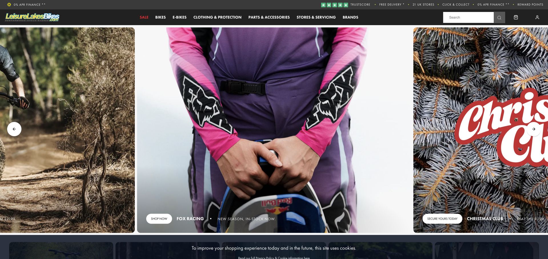
Leisure Lakes Bikes places Stores & Servicing in the main navigation and repeats practical buying options such as collection and delivery in its assurance strip. The body distinguishes electric bikes from conventional categories and promotes both current stock and preorders, making availability language part of the sales presentation. Its large horizontal campaign panels provide strong product photography, but partial panels at either edge leave some text and actions cropped in the desktop capture. The dense top strip, extensive navigation, and bottom cookie notice further compress the view. Workshop access is easy to identify, yet it must compete with several simultaneous seasonal and product promotions.
What you can learn
Keep store servicing visible within an online catalog and distinguish preorder items from stock available now. Design campaign panels to remain understandable when partially visible, with their essential label and action inside the safe area rather than clipped at a carousel edge.
Pros
Store servicing has a primary navigation position.
Promotions distinguish preorder and in-stock language.
Cons & considerations
Partial carousel panels crop useful text.
Dense assurance and consent strips compete with the main content.
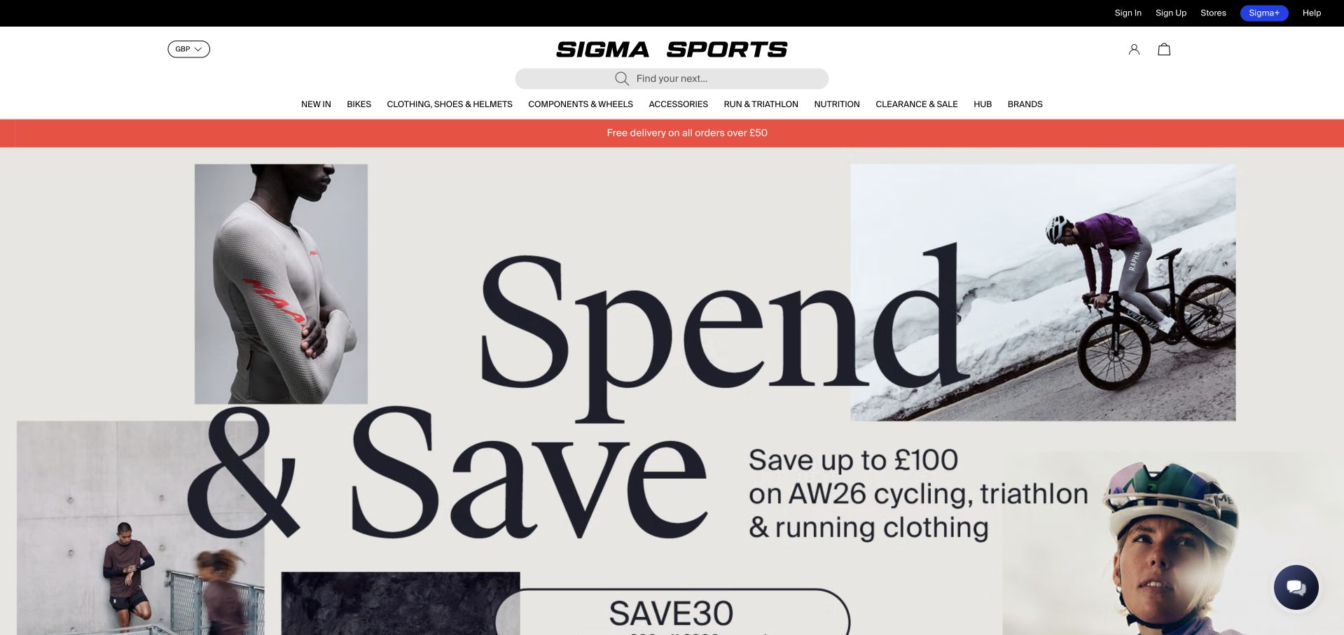
Sigma Sports gives its seasonal campaign an editorial look, using large type and a collage of riders and clothing. Below it, winter layers are organized by function: jackets, tights, jerseys, shorts, and base layers each receive a short explanation. That is more helpful than presenting unfamiliar product names alone. Product cards then include ratings, color choices, and purchasing actions, while store access remains in the upper utility navigation. The oversized campaign pushes its lower terms beyond the initial viewport, and the catalog spans running and triathlon as well as cycling. A bike-shop visitor therefore encounters a substantial amount of apparel and electronics before local service information.
What you can learn
Explain what a product category does before presenting its individual items. Keep campaign terms within a readable composition and provide a persistent local-service route, especially when a performance retailer also carries products for several neighboring sports.
Pros
Seasonal categories explain the role of each layer.
Product cards show ratings and variant choices.
Cons & considerations
The oversized campaign extends beyond the first viewport.
Local bike services receive less emphasis than apparel and electronics.
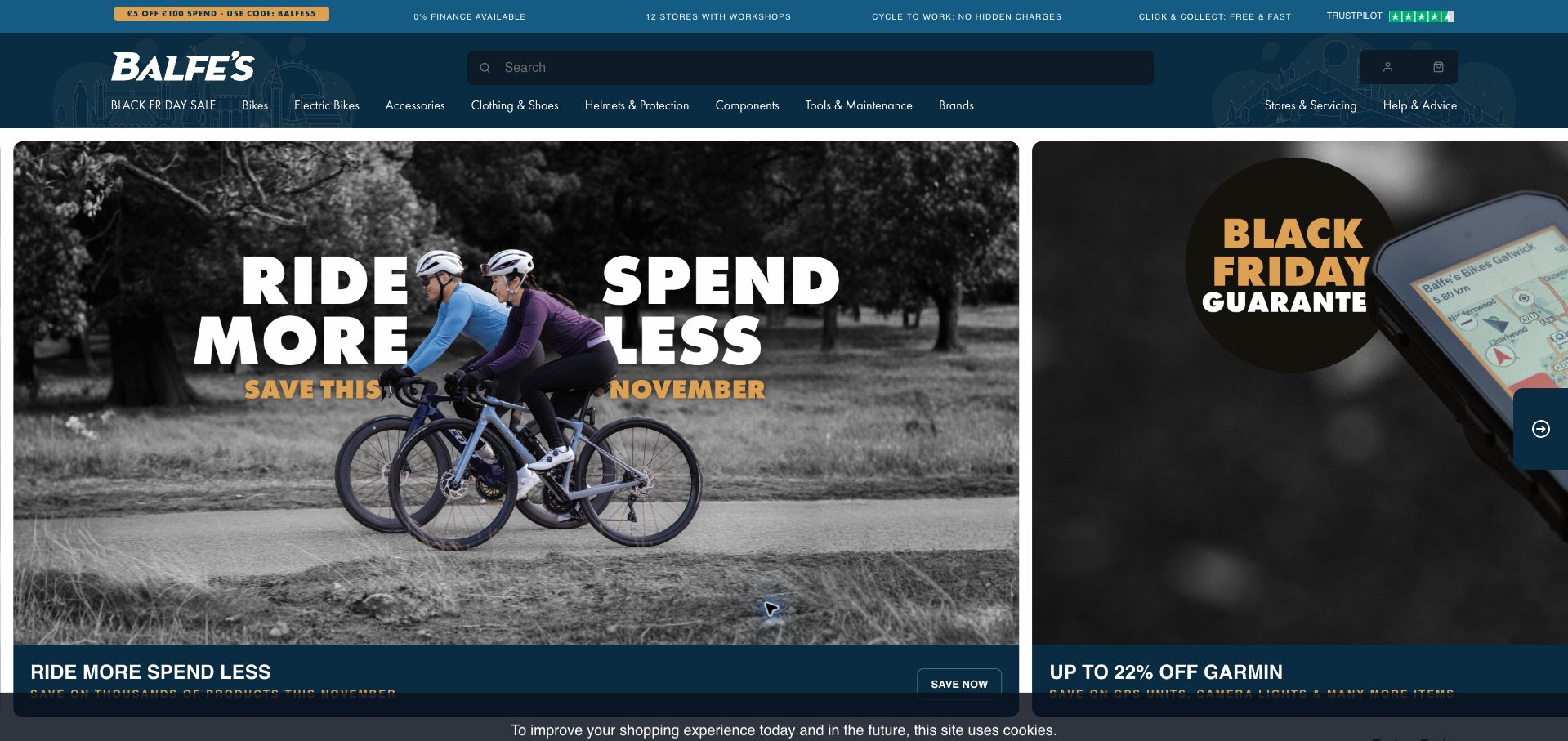
Balfe’s uses a wide seasonal campaign carousel beneath a header that explicitly mentions stores with workshops. Service booking and the nearest-store finder also appear as direct body links, giving existing owners a reason to use the site. Staff picks show sale prices, original prices, and model years, while a later introduction explains the London and South East network. The page is highly promotional, however, with many repeated savings actions and several adjacent discount categories. In the retained desktop view, the next carousel panel is cropped and a cookie strip overlays the bottom. Practical workshop information is available but visually quieter than the sale artwork.
What you can learn
Make workshop access a persistent part of the retail experience and connect regional claims to actual store pages. Reduce repeated savings panels so service booking, model-year distinctions, and collection options can share the visual priority of promotional pricing.
Pros
Service booking and a store finder are directly available.
Staff picks include model years and price comparisons.
Cons & considerations
Many repeated discount actions dilute the hierarchy.
Carousel cropping and the cookie strip obscure lower content.
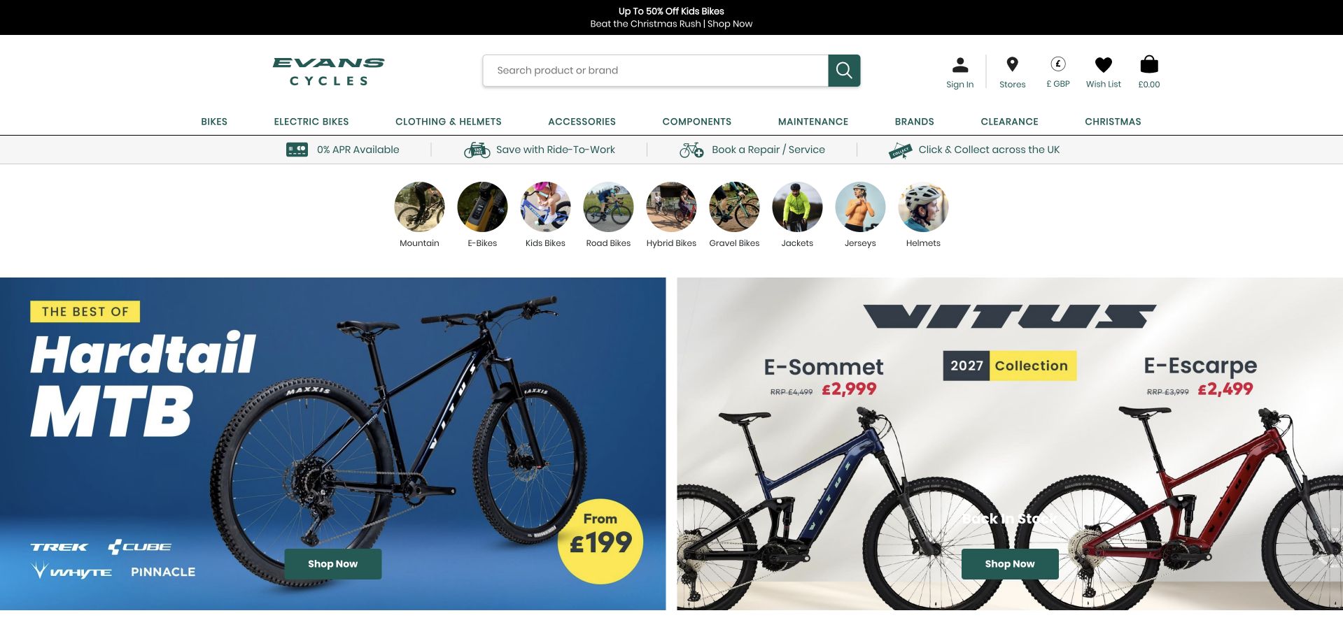
Evans Cycles places a practical strip for repairs, collection, and other buying options above its promotional tiles. A row of labeled circular images then offers familiar bike and clothing categories, allowing visitors to bypass the campaign if they already know their need. Large search and store controls reinforce that task-based approach. The page still accumulates several layers of navigation and promotions before the main content. One pale product campaign uses white overlay text that is difficult to distinguish against its image, and repeated Shop now labels make the lower tiles less informative when scanned quickly. Optional cookies were rejected for the retained capture.
What you can learn
Put recurring tasks such as repairs, collection, and category browsing ahead of seasonal artwork. Check text contrast on every campaign image and label actions by their destination, so the useful navigation remains understandable without relying on the surrounding photograph.
Pros
Repairs and collection are visible before the main campaigns.
Labeled category images provide quick catalog entry points.
Cons & considerations
Several navigation and promotion layers make the opening busy.
Some campaign text has weak contrast against the image.
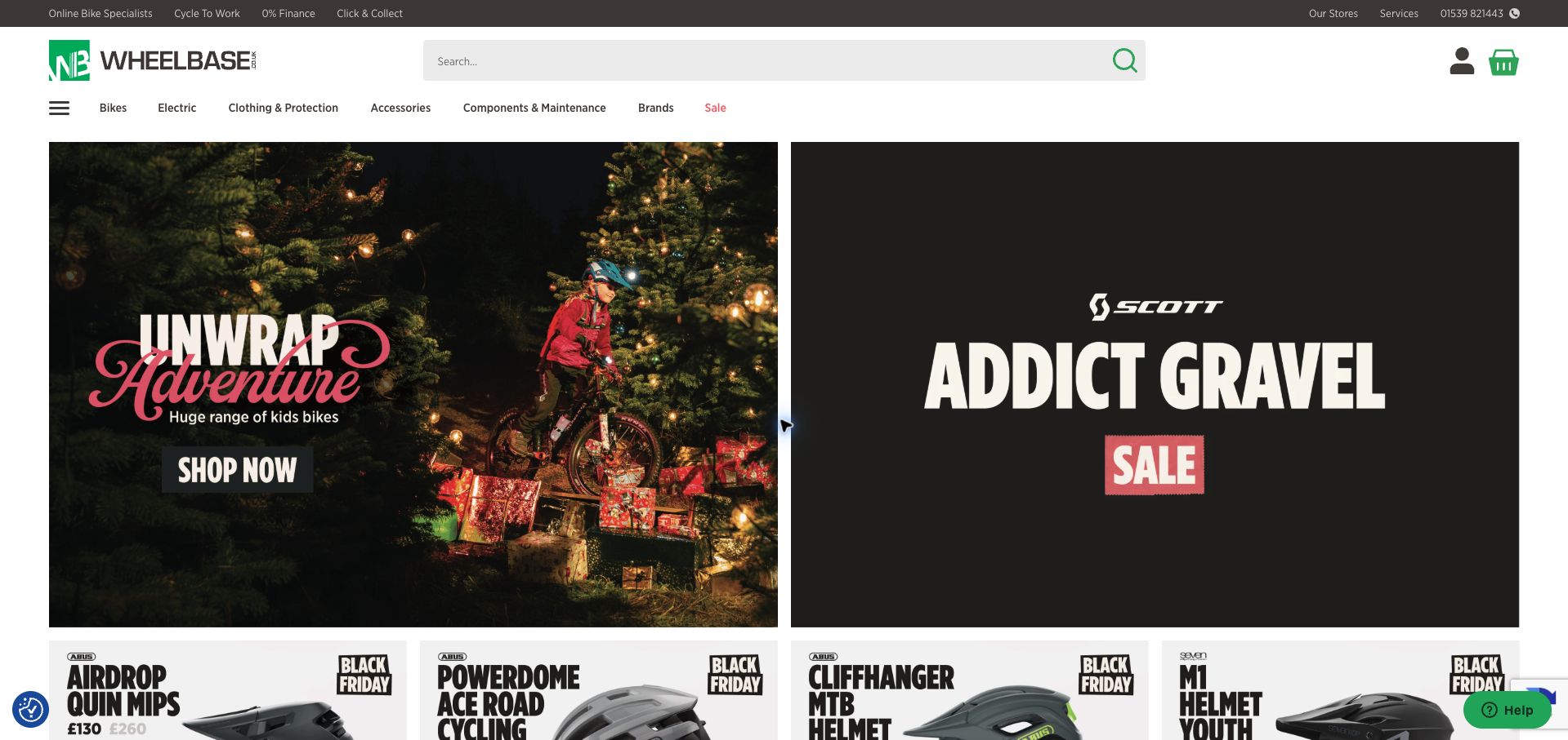
Wheelbase’s catalog breaks major categories into useful subtypes, including endurance and race road bikes, adventure and race gravel bikes, and several electric-bike uses. Those distinctions can guide a shopper more effectively than brands alone. The header also keeps store, service, phone, and collection routes available, while paired campaign panels introduce seasonal children’s bikes and a gravel sale. Smaller promotional tiles below show individual products and prices. The first screen gives much more space to campaign artwork than to the useful category distinctions. Some category labels also repeat electric options across several groups, which can make the taxonomy feel less predictable to a newcomer.
What you can learn
Organize bikes around the ride a customer wants to take, then explain where electric assistance fits across those groups. Surface that useful taxonomy before a long wall of campaigns, and keep local service and collection routes accessible throughout the catalog.
Pros
Subcategories distinguish riding intentions within each discipline.
Store, service, phone, and collection routes remain available.
Cons & considerations
Campaign artwork dominates the initial screen.
Repeated electric subcategories can make the structure harder to predict.
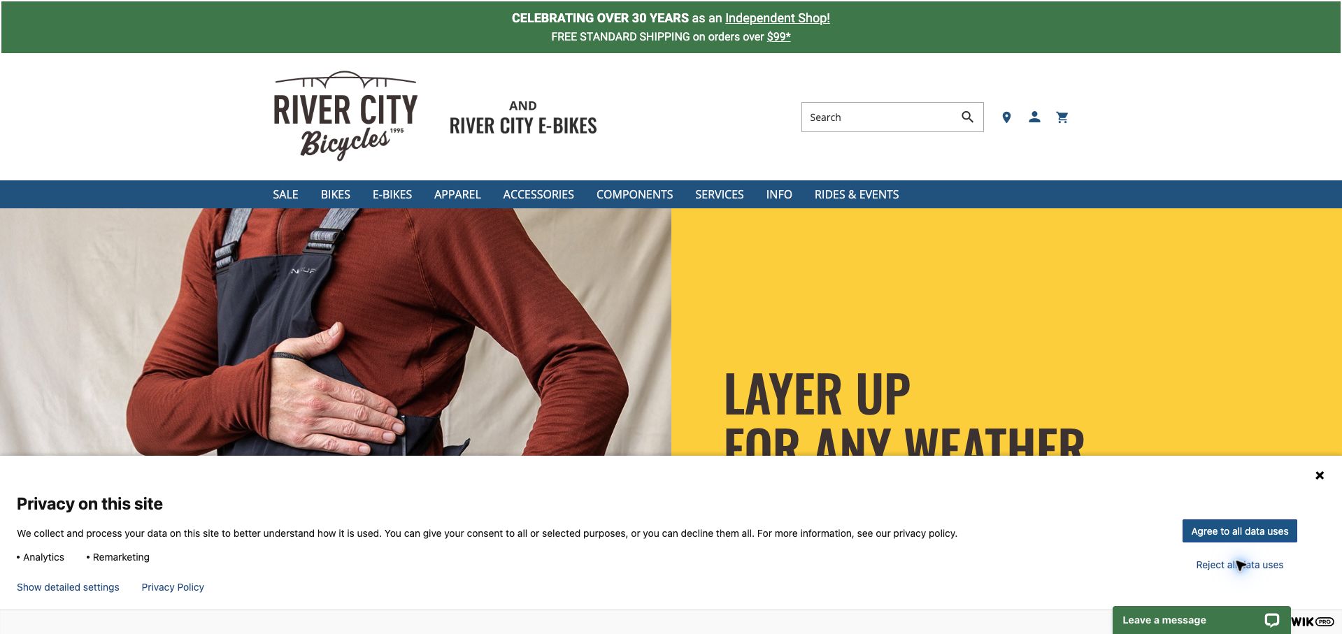
River City Bicycles combines seasonal clothing and lighting promotions with demo information and community news. The page gives different bike types a straightforward browsing row and identifies its main shop and electric-bike location separately in the footer. It even notes parking for pickups and drop-offs, a practical detail for service customers. The retained view has a very tall logo area and a large privacy panel that continues to cover the lower portion of the hero after the decline action. Much of the first screen therefore communicates branding and consent rather than a shopping or workshop decision. Generic Learn more actions also undersell the distinction between demos and community updates.
What you can learn
Pair seasonal riding advice with clearly named demos and workshop services, and make each physical location independently useful. Keep branding compact enough that essential actions remain visible even when a privacy panel or support control occupies part of the viewport.
Pros
Demo and community content broaden the retail offer.
Location details include practical pickup and parking information.
Cons & considerations
The tall header and retained privacy panel consume much of the view.
Generic links obscure the purpose of different features.
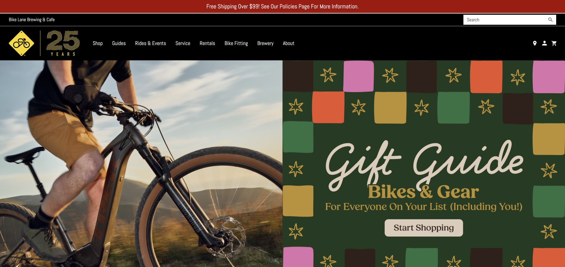
The Bike Lane makes service, rentals, fitting, and rides visible alongside its shop navigation. Its body introduces a women’s riding community, a demo guide, and separate coffee, bicycle, and brewery sections, explaining why someone might visit without making an immediate purchase. Benefits such as adjustments and rewards link to further details, and an in-stock product section supports ordinary shopping. The large holiday hero is visually very similar to campaign artwork used by other bicycle retailers in this collection, weakening the shop’s distinctive introduction. The later page also asks visitors to move among quite different activities, so clearer grouping would help someone focused only on a repair or rental.
What you can learn
Give a community-oriented shop room to express its rides and social spaces, but group those alongside clearly bounded retail and service journeys. Use original local imagery in the opening so the distinctive reasons to visit are apparent before generic seasonal merchandising.
Pros
Service, rentals, fitting, and rides have direct navigation.
The page explains social activities and ongoing customer benefits.
Cons & considerations
Generic holiday artwork weakens the distinctive introduction.
Many different activities make the lower page harder to scan.
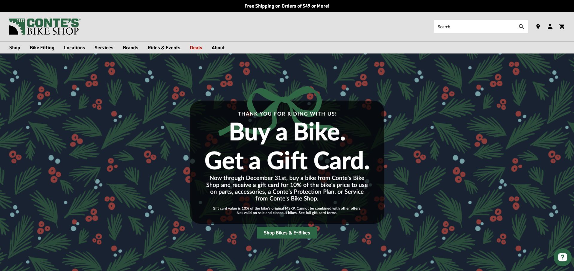
Conte’s builds its seasonal homepage around a bike-purchase reward and gift collections divided by price band. That budget structure is useful for someone buying for a cyclist without knowing a particular component or brand. The navigation gives fitting, locations, services, and rides distinct positions, preserving access to the shop’s expertise. The hero states the promotion’s end date and exclusions, although the smaller conditions are dense over decorative artwork. Its description alternates between a percentage of the bike’s price and the original suggested retail price, a distinction that should be more carefully aligned. Below the hero, extensive apparel and accessory sections prolong the seasonal emphasis.
What you can learn
Offer budget-based paths for gift buyers who lack specialist product knowledge. Keep promotional calculations consistent in the headline and conditions, and give fitting and service routes enough visual presence that a seasonal homepage still works for existing customers.
Pros
Gift categories are organized by useful price bands.
Fitting, services, and locations have clear navigation.
Cons & considerations
Dense promotional conditions are difficult to scan over artwork.
The reward calculation uses inconsistent price terminology.
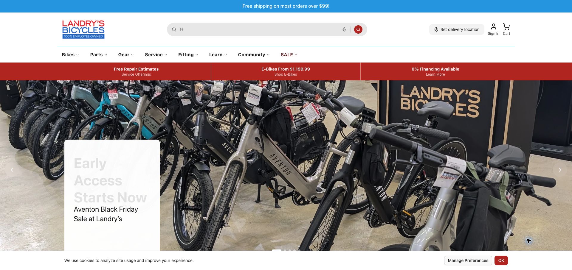
Landry’s gives free repair estimates a prominent place in the strip above its main campaign. Service, fitting, learning, and community each have a clear navigation label, and the body brings together repair clinics, rides, store hours, and a dated winter service offer. A used-bike route adds another practical option beyond buying new. These elements present a shop that supports ownership over time. In the retained capture, the main promotional heading is extremely pale against its white text panel, reducing readability. Several different offers also share the opening area, while store-specific details still require a location choice despite a general hours block appearing on the homepage.
What you can learn
Give repair estimates, clinics, and used-bike options visible positions beside new products. State whether displayed hours apply across the network or to one branch, and check promotional text contrast so the ongoing-service message is as readable as the sales pitch.
Pros
Repair estimates and educational events are prominent.
A used-bike route supports alternatives to buying new.
Cons & considerations
The hero heading has weak contrast in the retained view.
General hours need clearer connection to individual locations.
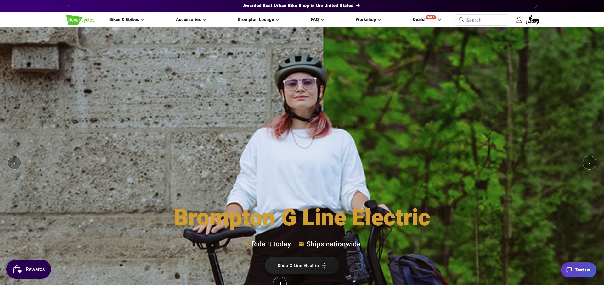
Clever Cycles leads with a folding electric-bike campaign and keeps a dedicated Brompton area, FAQ, and workshop in the main navigation. Below it, product cards identify cargo and folding models, while a buying guide promises to explain Brompton variations. This gives the catalog a clear urban-transport focus rather than presenting every cycling discipline equally. Price and availability badges are visible, and local rebate labels appear on selected products. The homepage nevertheless spends substantial space on rewards, financing, and decorative brand descriptions. Its gold headline also crosses a detailed photograph, producing uneven contrast. Buyers would benefit from earlier guidance about capacity, storage, and the differences among specialist models.
What you can learn
For folding and cargo bikes, pair the catalog with plain comparisons of storage, carrying needs, and model variations. Keep eligibility labels tied to their conditions, and let buying guidance take precedence over loyalty promotions when the product decision is complex.
Pros
The navigation includes specialist guidance and workshop access.
Product cards identify distinctive models and relevant availability labels.
Cons & considerations
Rewards and promotional sections delay practical comparisons.
Headline contrast varies across the hero photograph.
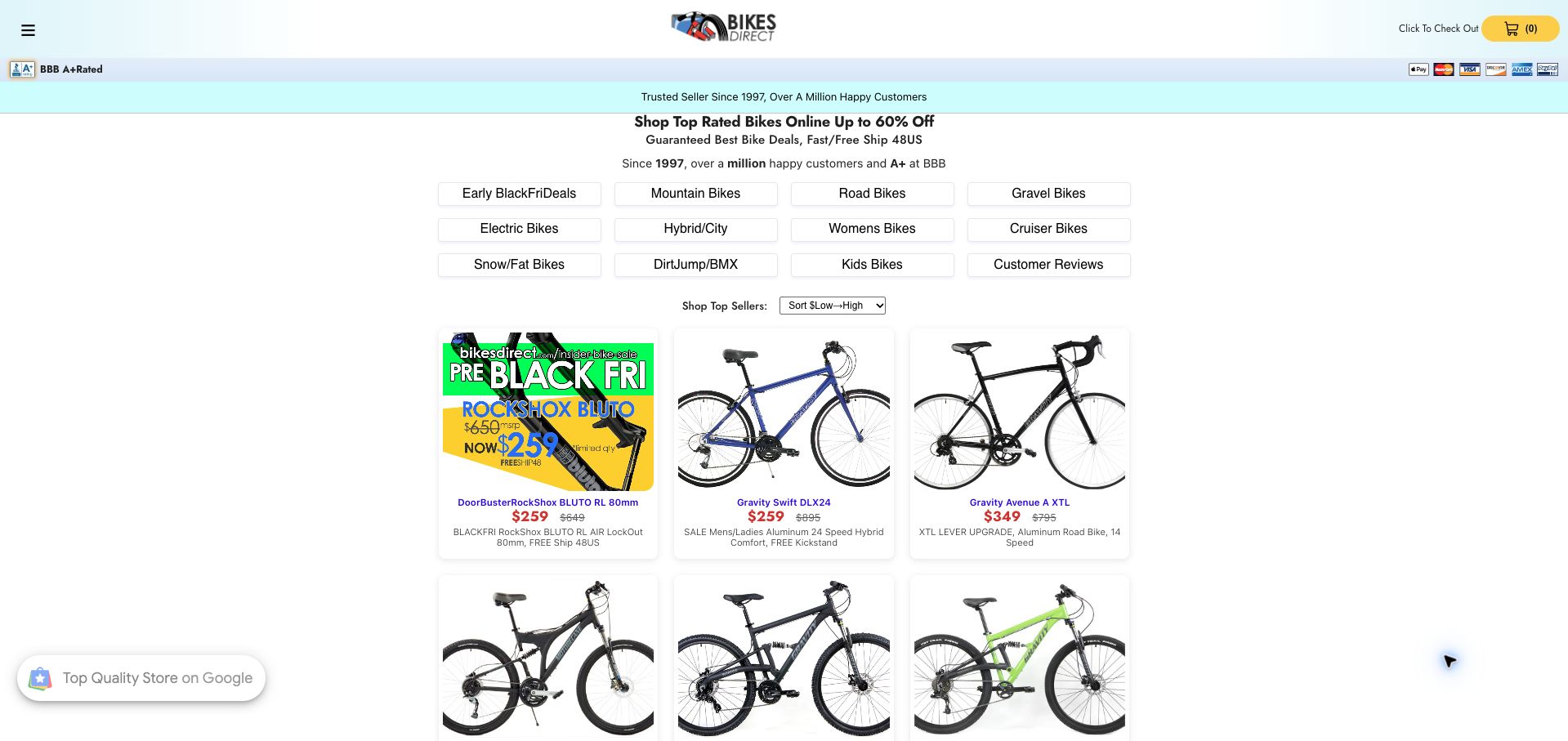
BikesDirect places a grid of bicycle categories and a price-sorting control directly above its top sellers. Product cards show a bike photograph, a sale price, a comparison figure, and a short specification summary, allowing budget-focused visitors to reach concrete options quickly. The page avoids a giant lifestyle hero and states its geographic shipping scope near the top. The tradeoff is density: abbreviations, mixed capitalization, and compressed model descriptions ask the reader to decode specialist information. The first featured item is a suspension fork among complete bikes, which makes the collection less predictable. Sizing, assembly, and support context are not part of this initial comparison surface.
What you can learn
A direct catalog can work well for price-led shopping when product types and specifications are consistent. Separate components from complete bikes, expand unfamiliar abbreviations, and place sizing and assembly guidance beside the comparison rather than leaving those decisions for later.
Pros
Category and price controls appear before the product grid.
Prices and concise specifications support quick browsing.
Cons & considerations
Dense abbreviations make product summaries difficult to read.
A component appears among complete-bike top sellers.
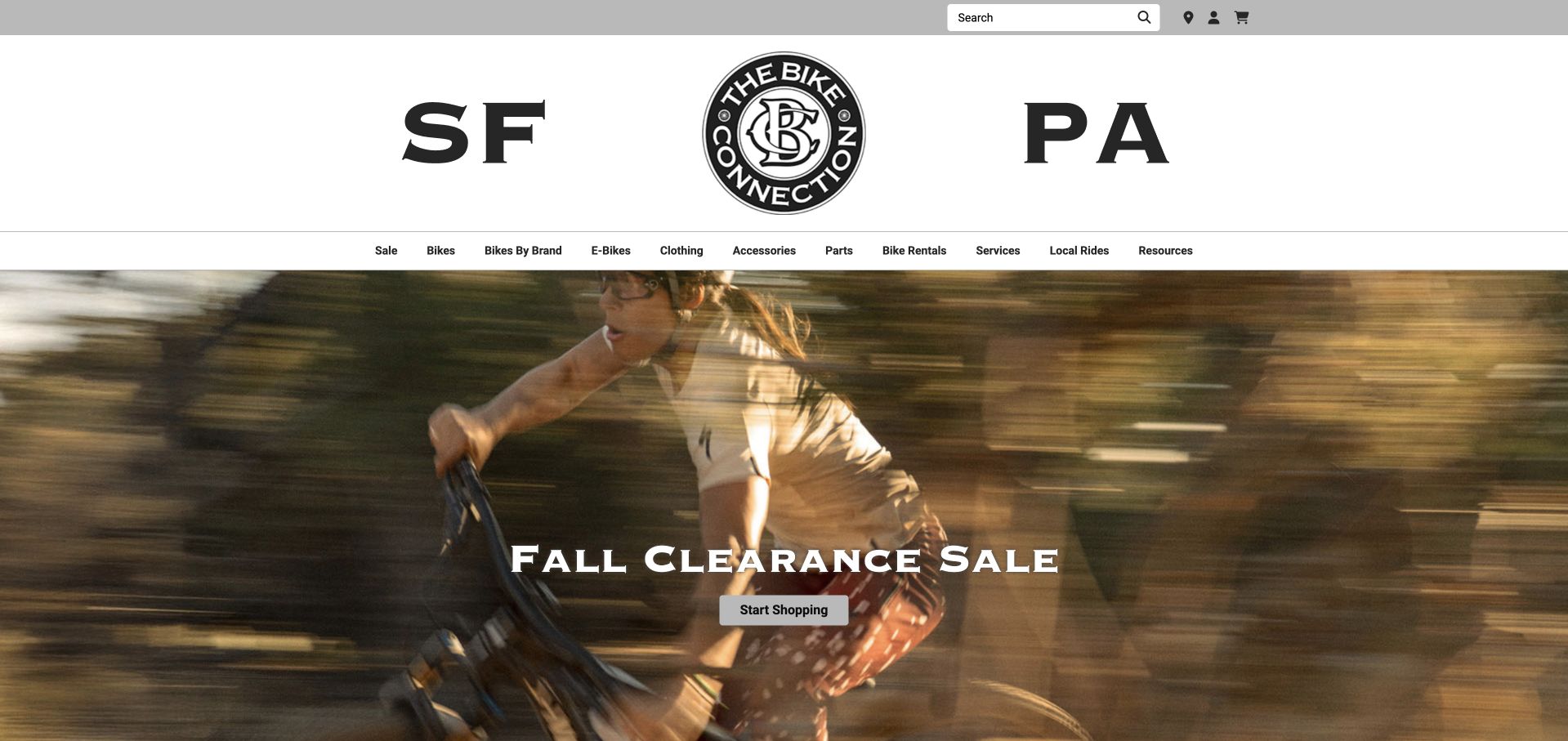
The Bike Connection gives San Francisco and Palo Alto prominent positions around its logo, with branch addresses, phone numbers, and directions available in the page structure. The catalog introduces selected bikes as ready to test ride, and rentals, services, and local rides have dedicated navigation routes. That connects the online store to real uses of a neighborhood shop. The huge initials and logo consume a substantial part of the opening, however, and the sale hero adds another tall layer before products appear. Product price ranges are visible without an immediate explanation of the variant or branch differences. The review did not independently confirm stock or arrange a test ride.
What you can learn
Make branch information and test-ride availability easy to connect, ideally on the same product journey. Keep the identity area compact and explain variant-dependent price ranges so customers can understand which bike, size, and location a displayed offer actually refers to.
Pros
Both branch identities are prominent.
Rentals, services, and local rides are separate from the catalog.
Cons & considerations
The oversized identity area delays useful content.
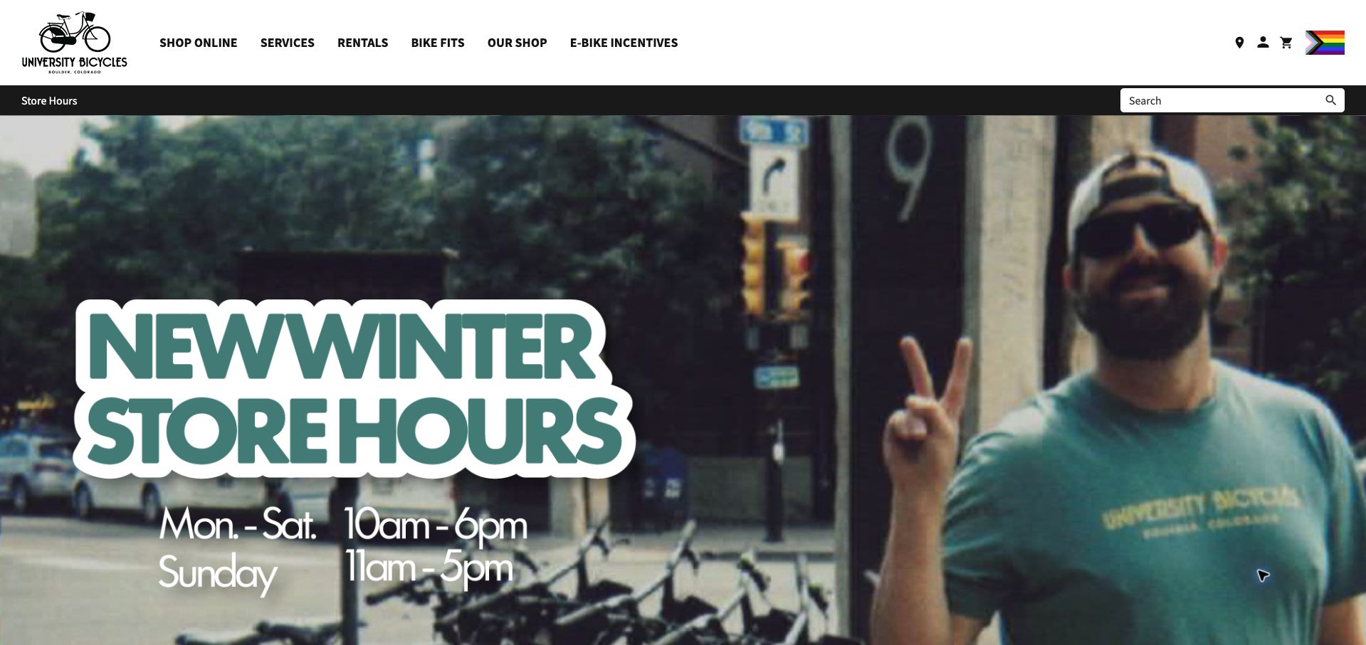
University Bicycles uses its opening image to announce winter hours, a practical seasonal update for a Boulder shop. The main navigation separately names service, rentals, fitting, and electric-bike incentives, while three body features highlight suspension work, fitting, and demos before the new-arrival catalog. A detailed weekly hours table and address later reinforce the visiting information. The site therefore gives local support a meaningful role beside product sales. Its opening hours announcement is embedded in a large image, though, and the main content starts with a separate heritage statement rather than repeating that information as ordinary text. Several service cards also share the generic Learn more label.
What you can learn
Use seasonal announcements for information customers need before visiting, and repeat essential details as readable page text. Pair distinct service names with descriptive actions so fitting, suspension work, and rentals remain clear even when someone is scanning quickly or using assistive navigation.
Pros
Service, rentals, and fitting have prominent separate routes.
The page includes a full weekly hours table and address.
Cons & considerations
The opening hours announcement relies heavily on image text.
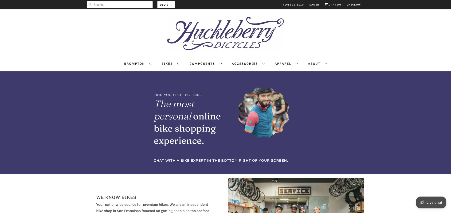
Huckleberry introduces its store through personal advice rather than a discount, pairing a staff photograph with an invitation to chat with a bike expert. The body explains its San Francisco base and nationwide shipping, then develops a strong Brompton specialty alongside other premium brands. A featured product includes size and color controls, and visiting hours appear with the street address. The opening still depends on a separate corner chat widget rather than a clear button within the introduction. Its unusually large wordmark and spacious header also push the shopping content down. Specialist expertise is evident in the copy, but a concise choice of advice, shopping, or service would make the first decision easier.
What you can learn
If personal advice is a shop’s main differentiator, give it an explicit action in the content rather than pointing vaguely to a widget. Keep local service, nationwide shopping, and specialist product guidance distinct so each audience can choose the right next step.
Pros
The opening explains the availability of human shopping advice.
Local visiting details coexist with a nationwide shipping proposition.
Cons & considerations
The advice invitation depends on a separate corner widget.
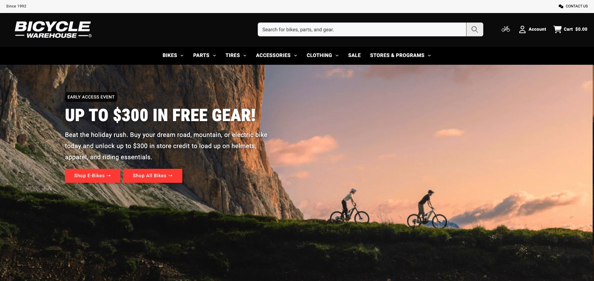
Bicycle Warehouse opens with a store-credit promotion for helmets, apparel, and other riding essentials, giving the incentive a practical relationship to buying a bike. Its header provides a large search field and separates tires from other parts, while the body introduces seasonal lighting and several riding categories. That structure offers both product-specific and broader browsing routes. The sale messaging becomes repetitive in a long animated strip, and the opening emphasizes the maximum credit without showing the full spending tiers beside it. Financing and other payment promotions add further competing messages before the catalog. The strongest information is the connection between a new bike and the accessories required for regular use.
What you can learn
Connect promotions to useful riding equipment, then state the qualifying purchase tiers close to the headline amount. Keep search and category routes stable, and limit repeated animated offers so customers can compare bicycles without competing financial and loyalty messages.
Pros
The incentive is tied to recognizable riding essentials.
Search and category routes support different shopping needs.
Cons & considerations
Repeated animated promotion text adds distraction.
The maximum credit appears before its full qualification tiers.
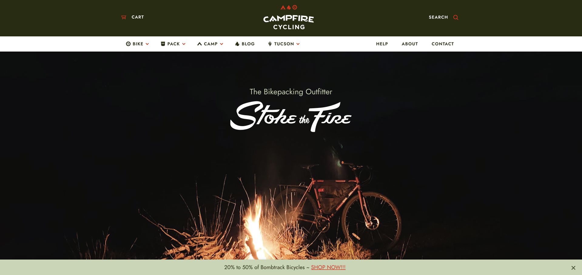
The former BikeShopHub address redirects to Campfire Cycling, whose homepage defines a narrow specialty immediately: bikepacking. Bike, pack, and camp navigation mirrors the components of a trip, while a Tucson route and visible address preserve the local-shop connection. Adventure articles and seasonal news support the retail proposition with relevant editorial content. A dark campfire photograph establishes a memorable mood, but the first screen offers no comparably prominent route into a starter setup or shopping category. The newsletter invitation arrives early, and sale messaging appears in a persistent bottom strip. The specialization is clear; the next practical step for a newcomer is less so.
What you can learn
Organize a specialist retailer around the customer’s complete activity, then provide a clear starting route for people assembling their first setup. Let trip stories support that decision while keeping newsletter signup and persistent sale messages secondary to shopping guidance.
Pros
Bike, pack, and camp categories express the specialty clearly.
Local Tucson information sits alongside relevant adventure content.
Cons & considerations
The atmospheric hero lacks a strong practical starting action.
Early signup and persistent sale messaging compete for attention.
Kegan is a freelance web designer and developer with 15+ years of experience helping businesses turn complicated website requirements into clear, maintainable digital experiences. He works directly with clients from planning and design through development, launch, and ongoing support.
For bicycle shop website design, his development approach focuses on bike and equipment discovery, stock explanations, workshop services, fitting information, and local pickup journeys. The scope can be a targeted improvement or a complete custom build, with responsive layouts, thoughtful content structure, and integrations chosen around the people using and maintaining the site.
Show 3 other bicycle shop website designersHide other bicycle shop website designers
Describe the work included in each service level, the price basis, and how staff approve additional repairs. Explain whether a booking reserves labor time or only an assessment.
Connect catalog and local inventory
Identify which system owns stock, variants, pricing, and fulfillment. Test products with several sizes and a special-order item before choosing the browsing interface.
Maintain community and change notices
Assign ride calendars, seasonal hours, and temporary closures to a responsible editor. Keep exceptional operating arrangements prominent until normal service resumes.
The editing job behind the design
Choose systems the team can keep accurate
A commerce system can own product and inventory facts while a structured service section explains workshop intake. Avoid forcing both journeys through the same generic checkout button.
Use real shop and riding imagery, but preserve readable specifications, service conditions, and contact details at narrow widths.
Our WordPress website examples offer a separate look at publishing approaches. A visible platform label is evidence for that named page, not a guarantee that the same system will suit your requirements.
Before the public launch
Website planning checklist
Expose the workshop route.
Define service inclusions.
Qualify labor prices.
Explain assessment versus repair.
Show size and variant information.
Label stock accurately.
Maintain store hours.
Publish current ride details.
Highlight temporary locations.
Test pickup and shipping labels.
These checks are a project checklist, not a performance, legal, security, or accessibility certification. Test real journeys with the people responsible for the website before making claims about the result.
Sources & editorial method
How this collection was selected and reviewed
These 25 examples match the collection target saved before research. Public pages were directly opened and visually inspected; the pictured source and capture date identify the reviewed state. Reused captures retain their earlier dates. Each source also has a bounded public stack-audit attempt, with inaccessible and unknown results kept explicit. Editors Choice recognizes website design and information, not service quality or promised outcomes. No purchases, bookings, applications, or private forms were submitted. Images and trademarks belong to their owners.
Each example links to its actual source page. Screenshots are direct browser captures with their own capture dates; moving imagery, announcements and live designs can change. The notes describe observable design choices and conditional tradeoffs, not measured traffic, conversion results, service quality, or accessibility conformance.
Technology labels use public page metadata, asset evidence, or explicitly cited platform documentation. Platform documentation is not a complete current deployment audit. A component reference may be legacy or unused; it is not a complete backend inventory. Unknown stacks are omitted. These sites are editorial examples, not our client portfolio.
Written, Edited and Curated are separate editorial records, not timestamps advanced by a rebuild. Website designs and imagery belong to their owners. See our editorial standards or suggest a correction.
Questions worth asking
Bicycle Shop website design questions
What should a repair menu explain?
The included work, price basis, assessment process, and how additional work is approved. Avoid implying that one package covers every bike condition.
Should products and services share navigation?
They can share a site, but should have distinct labels and next steps because the customer decisions differ.
How should special orders be labeled?
Explain that availability or timing needs confirmation rather than presenting a catalog listing as local shelf stock.
Do community rides belong on the homepage?
They can express the shop’s identity when dates and practical details are maintained and do not obscure shopping or workshop tasks.