Best Sports Equipment Manufacturer Websites of 2026 (15 Real-World Examples)
Sports equipment website examples that help people choose the right gear
Sports equipment websites need to connect an inspiring product story with practical choices about fit, size, use and support. These examples show how manufacturers combine sport categories, customization, fitting guidance and direct shopping without losing the details that matter to the buyer.
A sports equipment catalog serves people with very different levels of knowledge. A regular player may know the exact model, thickness or replacement component they need. A parent or gift buyer may only know the sport. A club or facility may need ordering information, space requirements and continuing support. The website should give each of these visitors a useful starting point without assuming that athlete imagery or technical terminology answers their first question.
This collection reviews public equipment-brand websites and regional brand properties across racquet sports, ball sports, golf and training equipment. It examines visible hierarchy, navigation, product framing and buying guidance. It does not test sporting performance, validate athlete claims, confirm current competition eligibility or stock, or certify accessibility. Promotional terms and product ranges can change; screenshots retain their actual observation dates.
Before the examples
What makes good sports equipment manufacturer website design in 2026?
Start with the sport and the use
Provide clear sport categories, then narrow by equipment type and intended use. Where experience level matters, explain the relevant product differences rather than assigning a vague beginner or professional label. Keep direct model search available for repeat buyers.
Make fit and specification differences readable
Show the dimensions, size, handedness, weight, material or other attributes that distinguish nearby products. Use consistent units and labels. Link specialist terms to concise explanations so customers can understand a comparison without leaving the catalog.
Keep guidance separate from promotion
Athlete stories, limited editions and seasonal campaigns can create interest, but selection tools need clear assumptions and useful results. Give visitors a direct route to product information and a human fitting or support option where an individual assessment matters.
Explain the whole purchase
Identify included items, optional components, customization timing and any assembly or installation requirements. Make regional availability and unavailable variants clear before checkout. Preserve support, care and replacement-part routes for the period after purchase.
The fifteen examples below compare multi-sport catalogs, racquet specialists, golf fitting journeys, table-tennis component systems and training-equipment communities. Each review highlights a visible design choice and the tradeoff to consider before applying it to another brand.
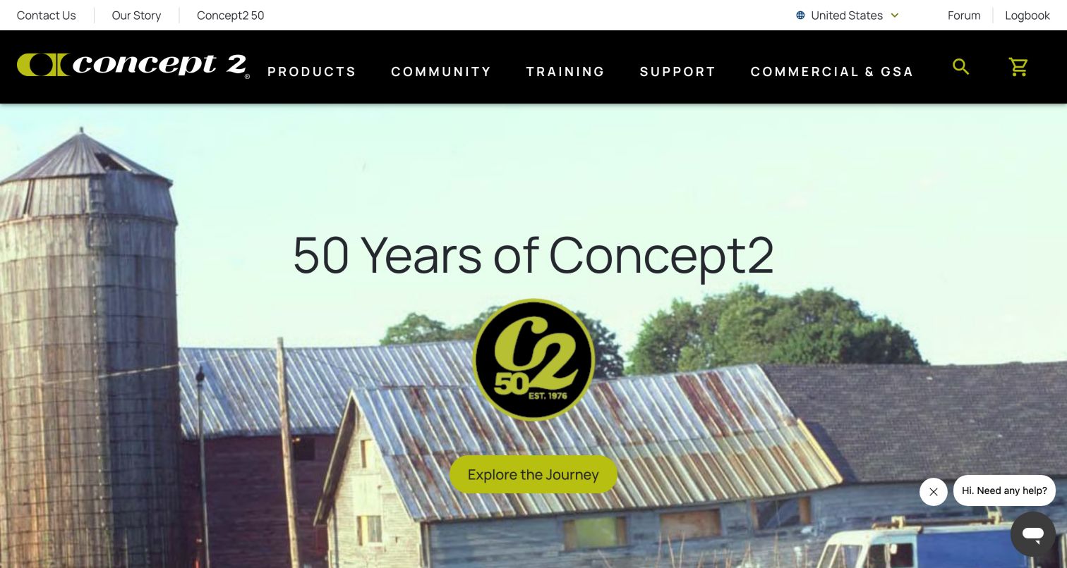
Concept2 gives Products, Community, Training and Support equal prominence in a black navigation bar, with Forum and Logbook visible in the upper utility row. The captured anniversary campaign uses a historical building photograph, a large commemorative mark and a single exploration action. The observed page also links getting-started instructions, software and apps, individual machines and community events. This is a strong example of a manufacturer treating the website as a resource after delivery. A customer can return to record activity or find support without interpreting a sales-only menu. The anniversary opening, however, emphasizes history rather than the equipment itself, and a small help prompt occupies the lower-right edge of the image.
What you can learn
Design the public site for the full ownership cycle, including setup, training and support. Keep community tools recognizable and separate from the store, while linking equipment pages to the instructions and software resources an owner will need next.
Pros
Training and support are primary navigation choices.
Forum and logbook shortcuts serve returning users.
Cons & considerations
The anniversary hero does not immediately show the product range.
Campaign and community modules can lengthen the route to an individual machine.
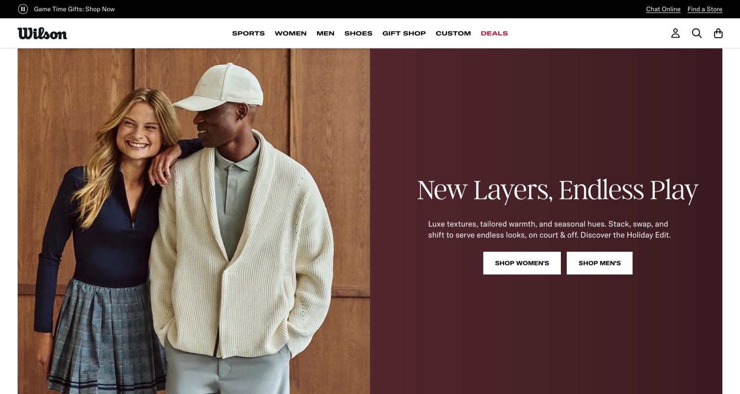
Wilson's captured homepage leads with a fashion-oriented holiday campaign: a photograph on the left, burgundy editorial panel on the right and separate shopping buttons for women and men. The white header keeps Sports and Custom visible beside apparel and gifting categories. Below the opening, sport-specific gift links include tennis, baseball, football, fastpitch, basketball and golf, while another section promotes custom gloves. The page demonstrates how a long-established equipment brand can use a retail lifestyle treatment without removing its sports taxonomy. For someone arriving to compare a racquet or ball, however, the opening asks for an additional navigation step before the technical equipment range becomes visible.
What you can learn
A seasonal campaign can change the homepage's emphasis, but stable sport and customization routes should remain conspicuous. Keep technical product guidance easy to reach for shoppers whose task is equipment selection rather than gifting or apparel discovery.
Pros
Sports and Custom remain explicit header choices.
The split composition keeps campaign copy separate from photography.
Cons & considerations
The opening gives apparel more attention than sporting equipment.
Gift categories overlap with ordinary sport navigation and need consistent naming.
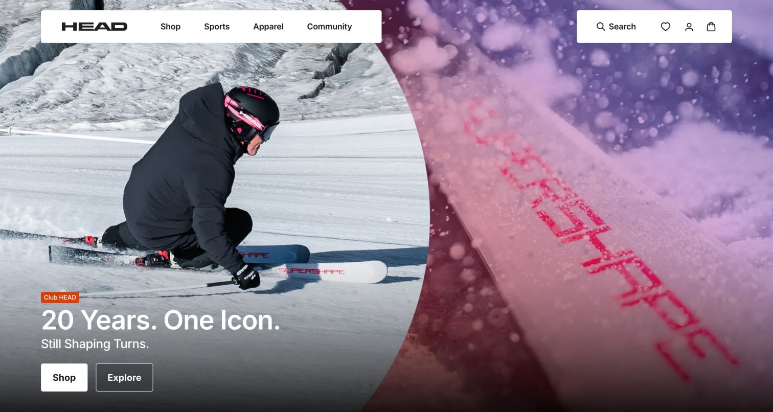
HEAD uses floating white navigation blocks above an expansive ski photograph, pairing an athlete in motion with a close view of the equipment. The campaign offers two distinct actions, Shop and Explore, which separate a purchase-oriented visitor from someone seeking the product story. Shop, Sports, Apparel and Community are the main header categories; the observed content later divides winter sports from racquet sports. Product highlights also pair shopping and exploration links for several ranges. This is a useful pattern when the same launch must serve enthusiasts and ready buyers. The immersion has a cost: the homepage can feel strongly seasonal even though the manufacturer serves several sports throughout the year.
What you can learn
Give technical launches a direct product route and a separate explanation route, with clear labels for both. Preserve sport-level navigation so a seasonal campaign does not make the rest of the assortment difficult to locate.
Pros
Shop and Explore express different levels of buying intent.
Winter and racquet sports receive distinct category groupings.
Cons & considerations
The first screen is dominated by one seasonal sport.
Text over action photography needs contrast checks across crops and viewports.
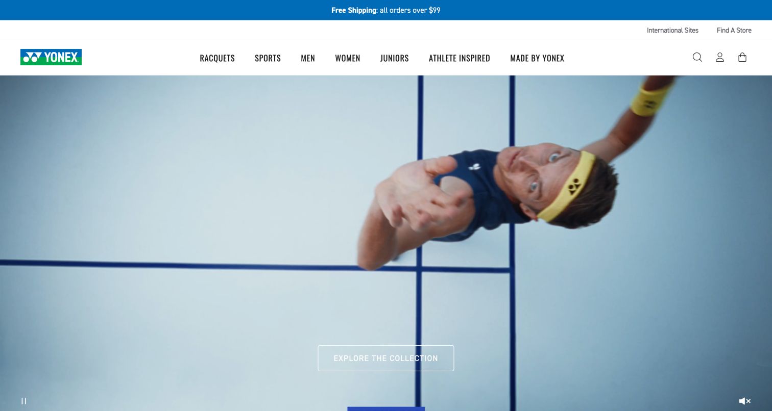
Yonex's US site places an athlete-led video beneath a white header and blue announcement strip. Racquets and Sports appear before demographic and athlete-inspired collections, keeping an equipment route visible even while the opening promotes a broader collection. The observed page continues with separate tennis racquets, strings, badminton and shuttlecock categories, then a Shop by Sport section and product cards with color choices. That component-level organization matters because a racquet player's purchase can involve replacement strings and accessories as often as a new frame. The video gives the brand energy, but the understated outlined action and lack of a substantial static explanation make the opening more atmospheric than diagnostic.
What you can learn
Treat consumable components and accessories as important browsing tasks alongside headline equipment. Let athlete campaigns lead to products, while preserving practical sport and component categories for visitors who know the replacement item they need.
Pros
Racquets receive a dedicated top-level route.
The page distinguishes strings and shuttlecocks from complete equipment.
Cons & considerations
The video-led opening provides limited comparison information.
A light outlined action can lose contrast over changing frames.
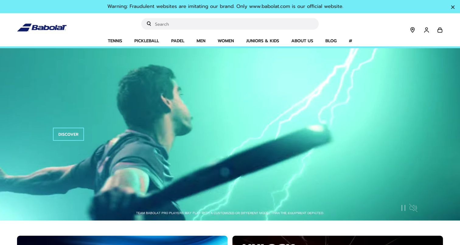
Babolat combines a broad central search field with direct Tennis, Pickleball and Padel navigation. Men, Women and Juniors & Kids provide another way into the assortment. The captured turquoise video campaign shows a player and racquet with a restrained Discover action; small on-screen text distinguishes professional player equipment from the depicted retail product. Lower sections introduce named collections and then return to the three sport categories. A conspicuous notice at the top identifies the official website amid a warning about imitations. The result supports brand storytelling and product discovery together, though the moving hero requires a visitor to infer the campaign subject before following its generic action.
What you can learn
Keep sports and player groups available as complementary browsing paths. Where professional athletes appear, explain the relationship between their equipment and retail models, and use specific destination labels when a campaign's visual story is not self-explanatory.
Pros
Search remains prominent across the header.
Sport categories are named directly instead of hidden behind a generic shop label.
Cons & considerations
The generic Discover label gives little destination detail.
The announcement and layered header consume substantial vertical space.
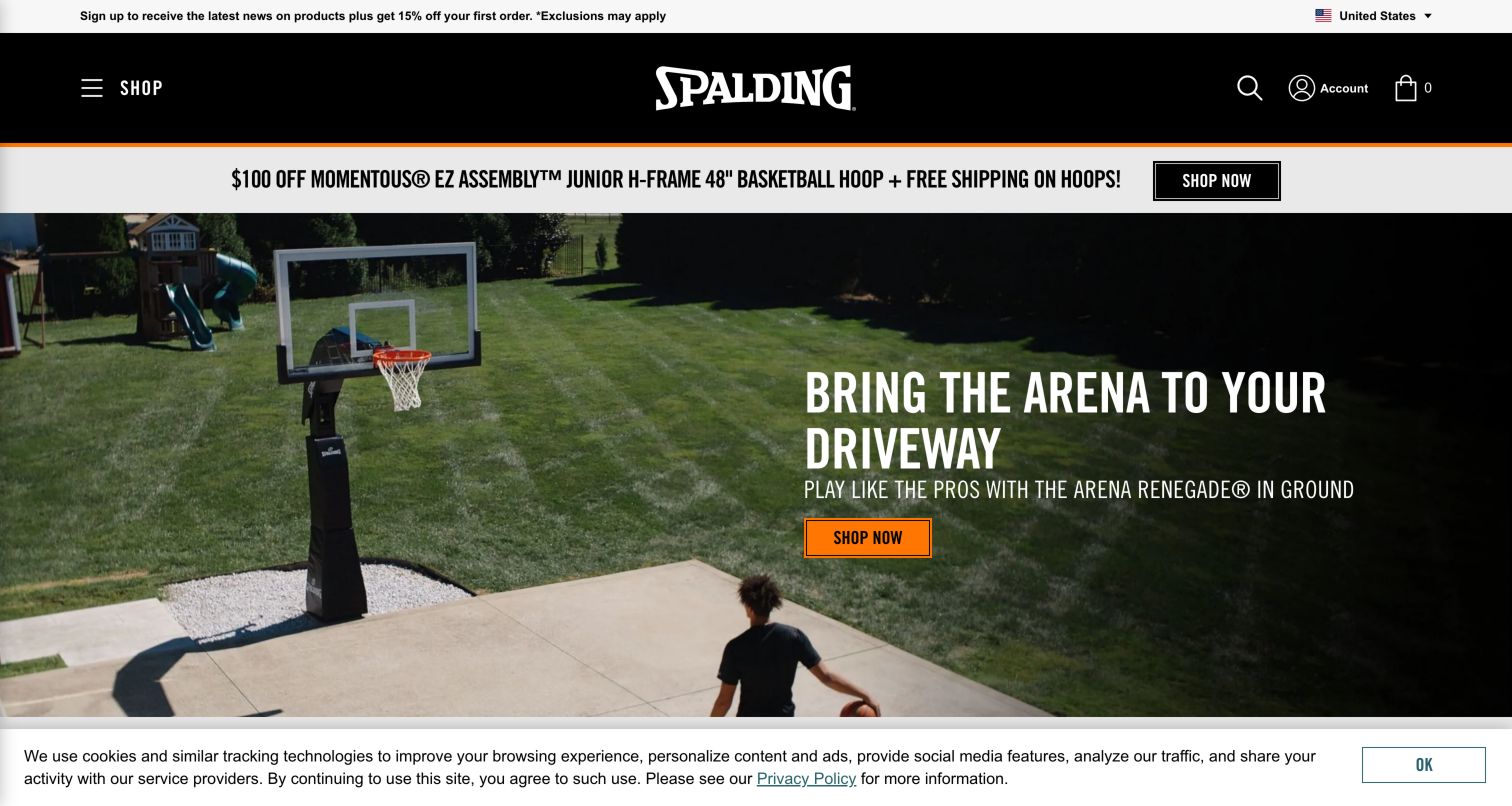
Spalding's opening shows a basketball system in a residential driveway, making the scale and intended setting visible before a shopper reaches specifications. A black header centers the wordmark, with Shop at the left and search, account and cart at the right. The orange action and thin orange divider connect the campaign to the brand palette. Below the hero, the observed content distinguishes portable systems from in-ground equipment and describes their different use contexts. This is valuable for a product that involves space and installation choices, rather than merely color or size. The captured cookie notice remains at the bottom, and the compact Shop menu conceals much of the wider product taxonomy.
What you can learn
For large sports equipment, show the product in a realistic space and explain installation categories before emphasizing promotions. Product pages should carry the dimensions, assembly requirements and support information needed to evaluate whether that setting matches the buyer's own.
Pros
The driveway photograph communicates scale and use context.
Portable and in-ground systems receive separate explanatory sections.
Cons & considerations
The broad assortment is hidden behind a compact Shop control.
The remaining privacy notice occupies part of the lower viewport.
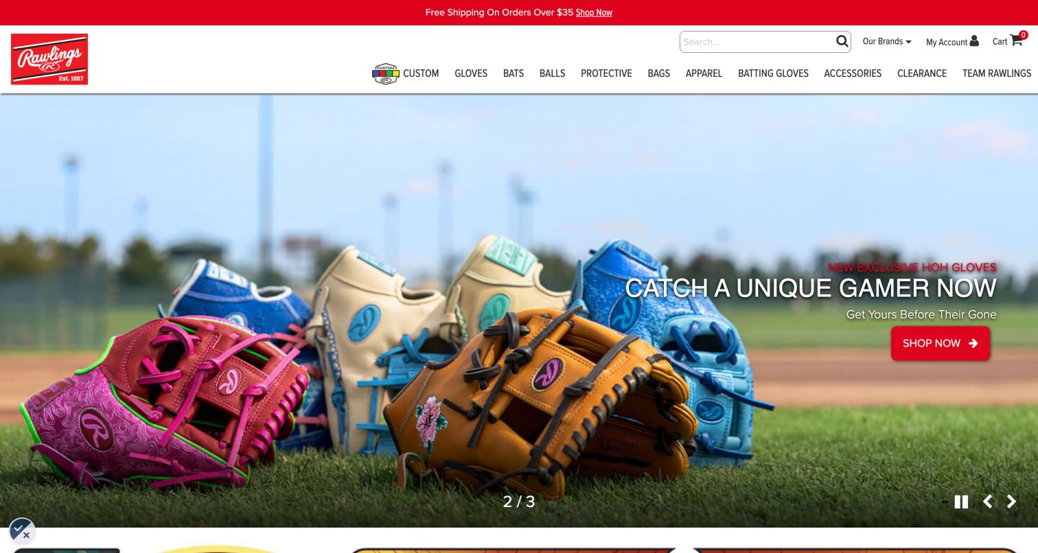
Rawlings gives Custom a prominent position before Gloves, Bats, Balls, Protective and other equipment categories. The captured hero displays several colorful gloves against a baseball field, with a direct shopping action and visible carousel controls. The observed custom-glove slide separately states a production lead time, which is especially useful when personalization changes delivery expectations. Product cards farther down include model names, sizes, prices and ratings. This combines the excitement of limited editions with a concrete equipment taxonomy. Its limitation is visual density: the navigation includes many adjacent categories, and the campaign relies on scarcity language rather than helping a visitor choose the right glove size or playing position.
What you can learn
Put customization beside standard product categories and disclose its timing before the design process begins. Preserve equipment fit, size and use criteria throughout limited-edition merchandising so a visually distinctive product can still be evaluated on its practical suitability.
Pros
Core equipment categories remain visible across the header.
Custom production timing appears within the observed campaign content.
Cons & considerations
The long main menu needs careful adaptation to smaller screens.
Limited-edition urgency provides less selection help than fit or position guidance.
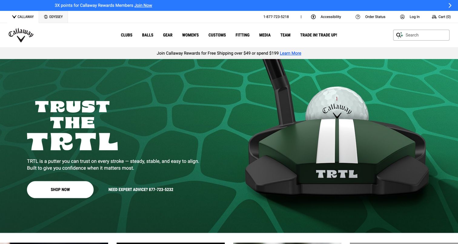
Callaway's captured launch gives the putter a large, clear product image on a green patterned background. The left panel combines a short alignment-focused description with a white Shop Now button and a visible expert-advice phone route. Clubs, Balls, Gear, Customs and Fitting remain available in the main navigation, while related brand and order utilities occupy a separate row. Below the opening, the observed page groups product families and displays featured items. The useful pattern is the proximity of buying and human guidance: a visitor can begin shopping without losing the option to seek help. Several promotional and utility strips above the hero, however, make the total header comparatively tall.
What you can learn
Place assisted selection close to the product action when specifications and fit materially affect the decision. Keep expert contact, fitting and ordinary shopping clearly differentiated, and explain the scope of product claims on the destination pages.
Pros
Expert advice is visible beside the main product action.
Fitting has an explicit top-level navigation route.
Cons & considerations
Several utility and promotional rows compete above the product.
The short launch description cannot establish the right fit for an individual golfer.
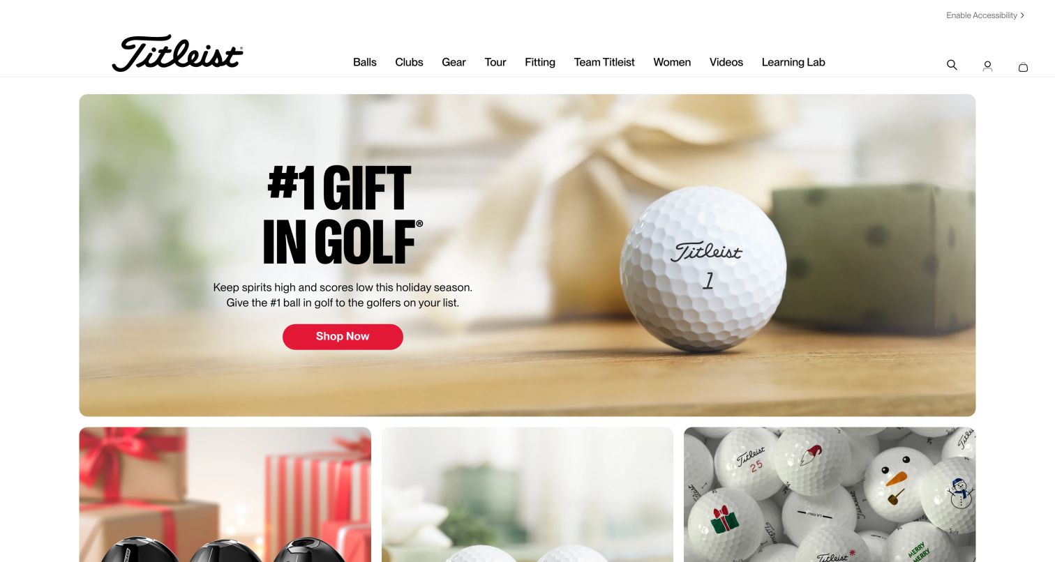
Titleist uses a spacious white header and an inset, rounded campaign image rather than a full-bleed retail banner. The captured holiday opening emphasizes a golf ball with one red shopping button, followed by three visual gift categories. The observed page then offers distinct selectors for balls, drivers, irons, wedges and bags, each presented as a named task. Fitting and the Learning Lab also remain in the main navigation. This makes the site useful as a model for combining promotional retail content with selection education. The homepage is long, and the selection tools sit below several campaign modules, so visitors who need technical guidance may benefit from taking the direct navigation route.
What you can learn
Create separate selection journeys for product types whose decision criteria differ. Name the tool by the item it helps choose, explain its limitations and keep professional fitting information available alongside any automated recommendation.
Pros
The main navigation includes fitting and educational content.
Product selectors identify the equipment category they address.
Cons & considerations
Seasonal modules precede the more technical selection tools.
A long sequence of campaigns can make the overall page difficult to scan.
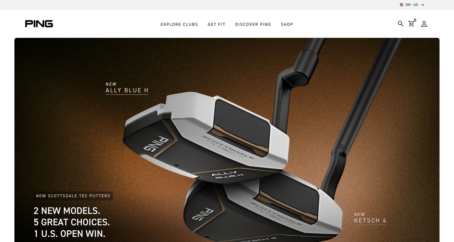
PING reduces its primary navigation to Explore Clubs, Get Fit, Discover PING and Shop. The captured putter campaign uses large product photographs against a warm dark background, with the surrounding white header giving the equipment room to stand out. Search, cart and account remain compact utility controls at the right. Farther down, featured products and a family-level section present named clubs with brief explanations, while engineering and fitting imagery support the brand story. The main strength is the distinction between researching equipment and purchasing it. That distinction needs consistent execution across destinations, because a visitor should not have to guess which section contains specifications, availability or a route to fitting.
What you can learn
Separate exploration, fit and purchase when they represent different customer tasks, then cross-link them at the product level. Maintain a clear path from a photographed model to its specifications and fitting options without requiring a return to the homepage.
Pros
The four primary labels are concise and task-oriented.
Large product photography makes the featured equipment easy to identify.
Cons & considerations
Explore Clubs and Shop need clear boundaries to avoid duplication.
The large rotating campaign delays side-by-side product comparison.
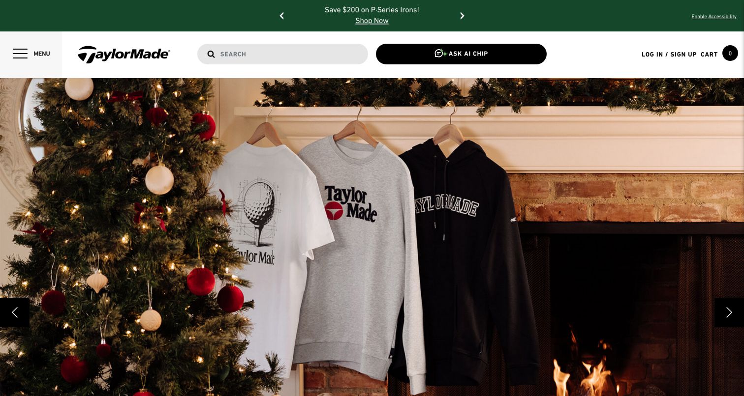
TaylorMade's captured header gives substantial width to ordinary product search and an Ask AI Chip control, while the catalog is consolidated behind a labeled Menu button. The holiday campaign below shows apparel in a domestic seasonal setting, illustrating how the same equipment brand can prioritize gifting at a particular moment. The observed menu still separates Clubs, Balls and Gear, with additional Design Your Own and Custom Clubs sections, followed by in-person and online fitting routes. The visible assistance control is an interface observation, not evidence of any particular underlying AI platform. The design provides several ways to seek guidance, but the equipment taxonomy is less immediately visible than on sites with a full desktop category bar.
What you can learn
Keep ordinary search and product browsing usable alongside conversational assistance. Make customization and fitting routes explicit, and explain what each guidance channel can resolve before a visitor shares information or expects a final recommendation.
Pros
Search is large and easy to find.
The observed menu distinguishes in-person and online fitting.
Cons & considerations
Core equipment categories require opening the menu.
The seasonal apparel hero gives little immediate help with club selection.
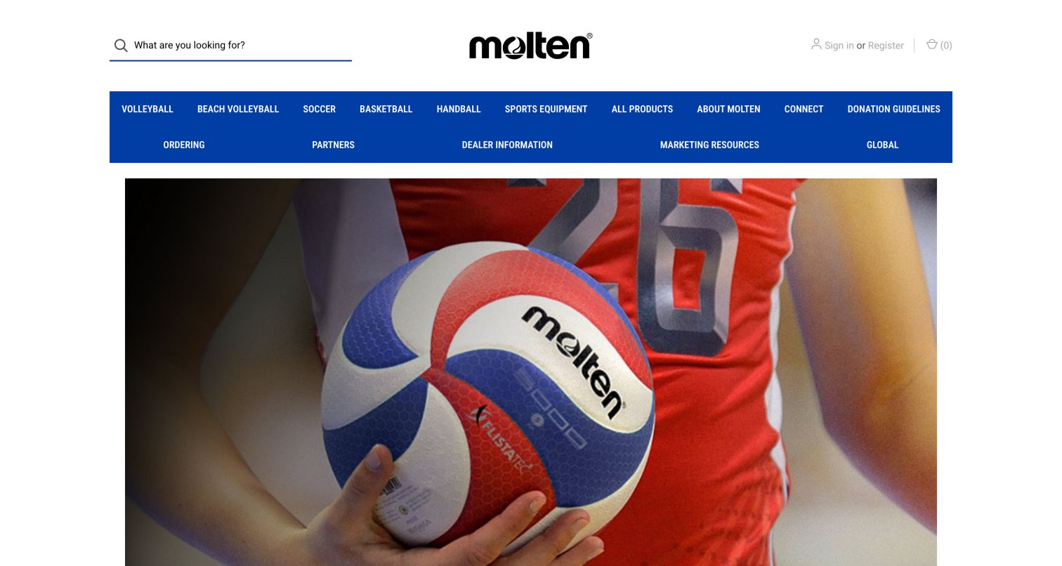
Molten USA uses a centered black wordmark above a broad blue navigation block. Volleyball, Beach Volleyball, Soccer, Basketball and Handball are visible as separate categories, while a second row exposes ordering, partners, dealer information and marketing resources. The captured campaign shows a branded volleyball in an athlete's hands, placing the physical product ahead of decorative graphics. The observed page continues with featured products that show prices and availability states. This is a useful example for a manufacturer whose audiences include individual players and organizations purchasing equipment. Its practical breadth makes the header dense, and the large rotating image pushes product distinctions and purchase details below the first screen.
What you can learn
Separate sport categories when the equipment requirements differ, and give organizational buyers a clearly named ordering or dealer route. Use product cards to communicate relevant variants and availability without making partnership imagery substitute for specification information.
Pros
Sport names are directly visible in the navigation.
Dealer and ordering resources have explicit labels.
Cons & considerations
Two wide navigation rows create a heavy header.
Partnership-led campaigns need supporting detail about the exact product shown.
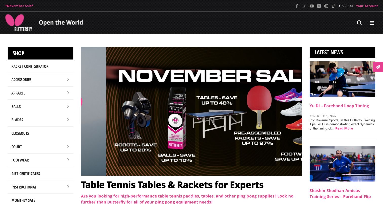
Butterfly's North American site uses a three-column desktop layout: a detailed shop list on the left, a promotional equipment panel in the center and current training news on the right. The pink identity accents connect the wordmark, article links and sale messaging. Racket Configurator appears near the top of the shop list, followed by component and equipment categories such as blades, rubber, balls, robots and tables. This structure reflects a specialist audience that may assemble a racket from separate parts and return for coaching content. It also creates a busy opening, where sale artwork, category links and articles all seek attention at once. The linked shop operates on a related subdomain, so the transition deserves clear continuity.
What you can learn
For component-based sports equipment, make configuration and individual parts equally discoverable. Connect educational content to relevant categories, while preserving a clear boundary between the regional brand resource and the shopping destination.
Pros
Specialist components are listed in plain view.
Training articles provide a reason to return after purchase.
Cons & considerations
The three-column layout is visually crowded.
Movement between the content site and shop needs consistent navigation and context.
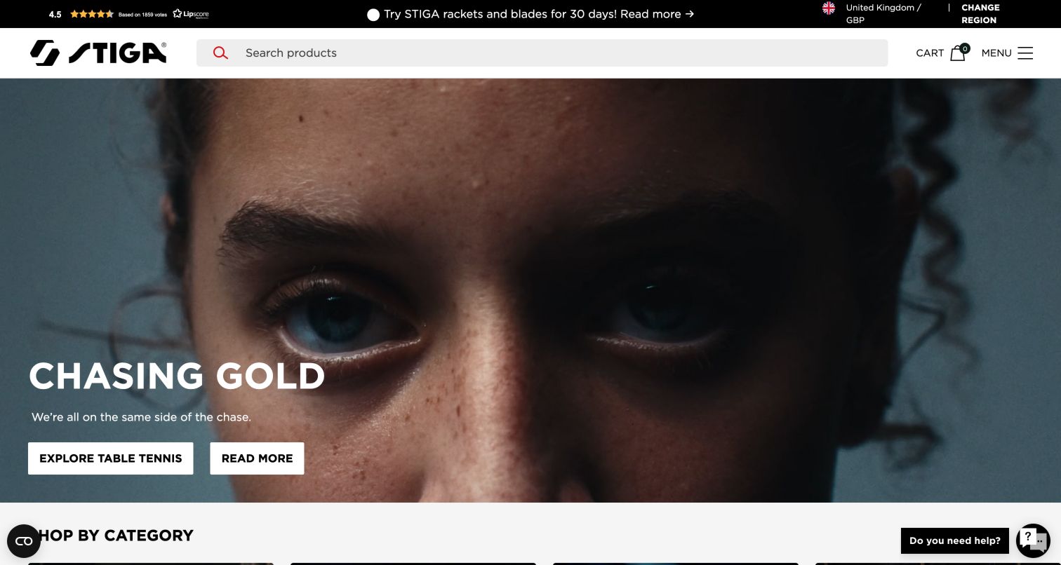
STIGA Sports places an unusually wide product search in a compact white header, with cart and menu controls at the right. The captured English regional edition uses a video-led campaign and two actions: Explore Table Tennis and Read More. The page then presents sport categories and a set of guides covering racket selection, table size and blade choices. This gives a broad recreational and competitive assortment an educational layer without requiring visitors to know every technical term. The region and currency remain visible above the search field. A signup promotion appeared during review and was dismissed; its timing illustrates how an otherwise direct path can be interrupted before a shopper has reached a product category.
What you can learn
Use buying guides to explain the variables behind a sports equipment choice, then link them to the relevant catalog. Keep region and currency explicit and delay promotional interruptions until visitors have had a chance to orient themselves.
Pros
Product search receives strong visual prominence.
Selection guides address equipment and space-related questions.
Cons & considerations
The initial video communicates mood more than product differences.
An early signup overlay interrupts the first browsing steps.
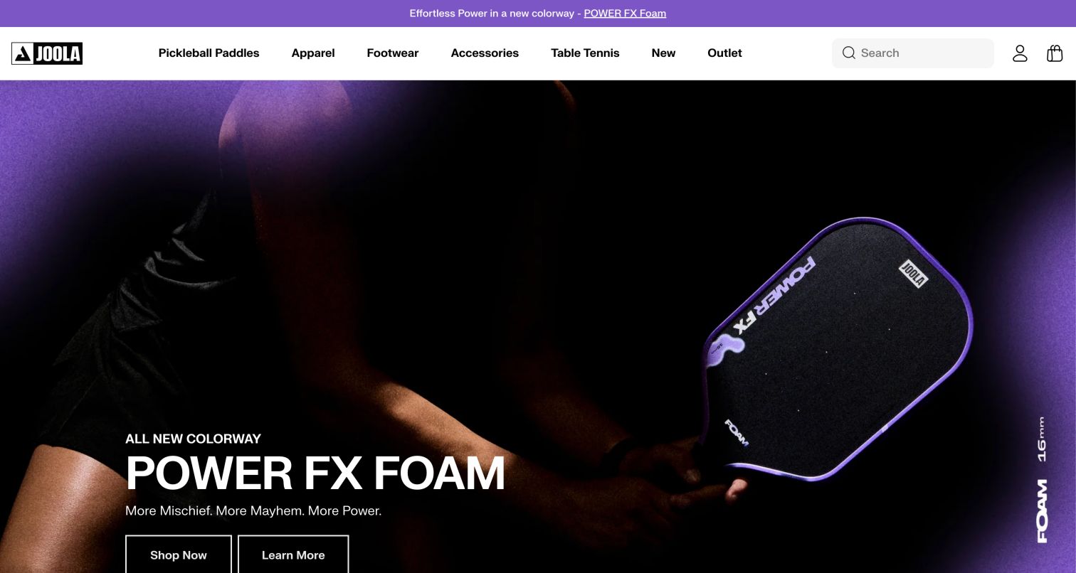
JOOLA's captured launch uses a dark purple product photograph, a large model-family headline and separate Shop Now and Learn More actions. The white header keeps Pickleball Paddles and Table Tennis visible alongside apparel and accessories. Directly below, the observed Pro Paddle Series section uses tabs for generations and product cards that include thickness in the model name. Sale and out-of-stock states are explicitly displayed, with unavailable purchase controls disabled. Those details are useful when products look similar but differ in variant and generation. The hero's dramatic language still needs a more measured technical explanation on the product page, and series tabs should not obscure how neighboring models compare.
What you can learn
Put meaningful variant identifiers into product names and comparison fields, and make unavailable states explicit. Separate the launch story from technical explanation while giving both a clear route from the campaign, especially when multiple generations remain on sale.
Pros
Series navigation separates product generations.
Thickness and availability appear in the observed product cards.
Cons & considerations
The campaign's performance language needs supporting specifications and conditions.
Tabbed series can hide alternatives unless their selected state is obvious.
Kegan is a freelance web designer and developer with 15+ years of experience helping businesses turn complicated website requirements into clear, maintainable digital experiences. He works directly with clients from planning and design through development, launch, and ongoing support.
For sports equipment manufacturer website design, his development approach focuses on product discovery, equipment specifications, buyer resources, and ecommerce. The scope can be a targeted improvement or a complete custom build, with responsive layouts, thoughtful content structure, and integrations chosen around the people using and maintaining the site.
Show 3 other sports equipment manufacturer website designersHide other sports equipment manufacturer website designers
Plan around the decisions that change an equipment choice
Map the audience beyond the athlete
Document the needs of experienced players, new participants, parents, gift buyers and organizational purchasers. Give each a route that matches what they know. A gift guide can support uncertain buyers, while exact model search and replacement categories serve people returning for a known item.
Define comparison fields by equipment type
A golf club, racket, ball and installed hoop need different comparison criteria. Build structured records for the attributes that materially change the choice, then reuse them in cards, filters and product pages. Keep marketing descriptions separate from measured specifications.
Design useful selection guidance
State what a selector or fitting tool can do before asking questions. Show why a result fits the supplied criteria and let visitors compare alternatives. Provide a route to qualified assistance when the decision depends on observation, testing or information the website cannot establish.
Make configuration constraints visible
Customization may affect lead time, available combinations and return conditions. Explain those implications early and summarize the final selection in readable language. Distinguish cosmetic personalization from technical fit and avoid hiding incompatibilities until the last step.
Connect education to ownership
Link buying guides to relevant products and product pages to setup, care, replacement components and support. Keep instructions tied to the correct model or generation. Community stories and training resources should have clear roles alongside the store rather than compete with essential service tasks.
Test realistic browsing states
Review empty searches, unavailable variants, regional changes, long product names and comparisons on small screens. Check keyboard focus, carousel controls, readable contrast and motion preferences. Validate the ordinary catalog path as carefully as any chat or guided-assistance interface, using test data without placing real orders.
The editing job behind the design
Choose tools that keep product variants and guidance consistent
The commerce and publishing system should maintain sport categories, product families, generations and meaningful variants as structured information. Evaluate how editors update technical attributes, regional assortments, care instructions and campaign pages without copying the same facts into several disconnected places. Product search and filters should draw from the same records used by comparisons and detail pages.
Fitting tools, customization, community accounts and support systems may be separate services. Define their responsibilities and the information passed between them. A visible widget or public website reference does not reveal the manufacturer's entire private architecture, and the presence of an AI-labeled control does not establish which underlying model or platform it uses. Choose integrations based on the actual catalog and customer tasks.
Our WordPress website examples offer a separate look at publishing approaches. A visible platform label is evidence for that named page, not a guarantee that the same system will suit your requirements.
Before the public launch
Sports equipment website planning checklist
Provide clear sport and equipment-type categories.
Support exact model and component searches.
Explain technical terms near filters and comparisons.
Use consistent units, sizes and variant names.
Separate product generations when their specifications differ.
Make unavailable options and regional limits explicit.
Distinguish athlete imagery from verified retail-product details.
Explain selector assumptions and offer fitting or support alternatives.
State customization timing and configuration constraints early.
Describe included items, assembly and space requirements where relevant.
Keep care, instructions and replacement resources tied to the correct model.
Check keyboard use, focus, contrast, motion and mobile comparison layouts.
These checks are a project checklist, not a performance, legal, security, or accessibility certification. Test real journeys with the people responsible for the website before making claims about the result.
Sources & editorial method
How this collection was selected and reviewed
We reviewed official public sports equipment brand pages and regional brand properties, with direct browser screenshots captured on November 5, 2026. The fifteen distinct properties match the saved random collection target. Each record preserves its source URL, actual capture date, dimensions and attribution. Reviews describe the observed design and public content; web technology claims require separate scoped evidence. No product performance testing, real purchases, account creation or customer inquiries were performed.
Each example links to its actual source page. Screenshots are direct browser captures with their own capture dates; moving imagery, announcements and live designs can change. The notes describe observable design choices and conditional tradeoffs, not measured traffic, conversion results, service quality, or accessibility conformance.
Technology labels use public page metadata, asset evidence, or explicitly cited platform documentation. Platform documentation is not a complete current deployment audit. A component reference may be legacy or unused; it is not a complete backend inventory. Unknown stacks are omitted. These sites are editorial examples, not our client portfolio.
Written, Edited and Curated are separate editorial records, not timestamps advanced by a rebuild. Website designs and imagery belong to their owners. See our editorial standards or suggest a correction.
What should a sports equipment homepage show first?
Make the relevant sports, equipment categories and search easy to find. A campaign can introduce a product or athlete story, but visitors should still be able to reach specifications, fit guidance and support through stable navigation. The right emphasis depends on whether the brand serves one specialist sport or a broad assortment.
How can product pages help inexperienced buyers?
Explain the attributes that change the choice in plain language and show the intended use. Use consistent comparison fields, meaningful size guidance and links to selection resources. Avoid treating a professional athlete endorsement as evidence that the same equipment suits every customer.
Should a brand offer a product selector?
A selector helps when the questions map to maintained product information and the result explains its reasoning. It should not conceal direct browsing or imply that limited answers replace a fitting assessment. Start with dependable specifications and comparisons before adding a more elaborate guided interface.
How should custom equipment be presented?
Show which choices affect appearance and which affect technical characteristics. Explain constraints, lead times and relevant purchase conditions before the customer invests time in a design. Provide a readable configuration summary and a route to correct mistakes before ordering.
What should remain available after purchase?
Provide model-specific setup, care, replacement-component and support information. For equipment used over several years, retain resources for earlier generations and clearly identify applicability. Training and community content can add value when it complements these practical ownership tasks.
A useful sports equipment website turns interest into an informed choice. Give the product story room to inspire, while keeping sport categories, meaningful specifications, fit guidance and ownership support clear enough to use without specialist knowledge.