Best Art Consultant Websites of 2026 (15 Real-World Examples)
Art consultancy websites that turn curatorial taste into a clear, credible service offer.
Study 15 real art advisory and consultancy websites, with direct screenshots, practical design observations and honest tradeoffs. The most useful ideas explain the work as clearly as they present it.
An art consultancy website has two jobs that can pull in different directions. It needs to show a sensitive visual point of view, but it also needs to explain a professional engagement. A private collector, a hotel project manager and a cultural institution may all want different kinds of help. Installation imagery can open the conversation; service categories, named people, process and practical contact information make it usable.
This collection includes independent art advisors, collection specialists and consultancies working in commercial or public spaces. The reviews assess the public website, not the quality of advice, authenticity of artworks, investment returns or fulfilment of a project. Company-published figures, testimonials and credentials are not independently certified by inclusion. Use the examples to compare communication patterns rather than treating their order as a measured business ranking.
Before the examples
What makes good art consultant website design in 2026?
Describe the engagement, not just the aesthetic
Make acquisition advice, collection management, commissioning, valuation, installation and finance distinguishable where they are genuinely offered. A general art-consultancy label does not explain which responsibilities the practice accepts.
Give each audience a useful route
Private collectors, designers, developers and institutions may use different language for a similar need. Offer audience paths only when they lead to relevant detail, not duplicate landing pages with the same generic text.
Identify people and contextualise the work
Name the advisors and explain their roles. Caption projects and artworks where permitted, separating a consultancy’s involvement from authorship, ownership or endorsement.
Make the next conversation clear
Tell visitors what information is useful for an initial enquiry and where the action leads. Retain a straightforward contact alternative when the main route uses a calendar, messaging service or external form.
The collection · 15 examples
15 art consultant websites worth studying
The original random target was 15. These 15 distinct public websites have direct, accepted browser captures and original reviews. Art Acumen is the explicit Editors Choice for combining expressive design with a concrete service and project structure.
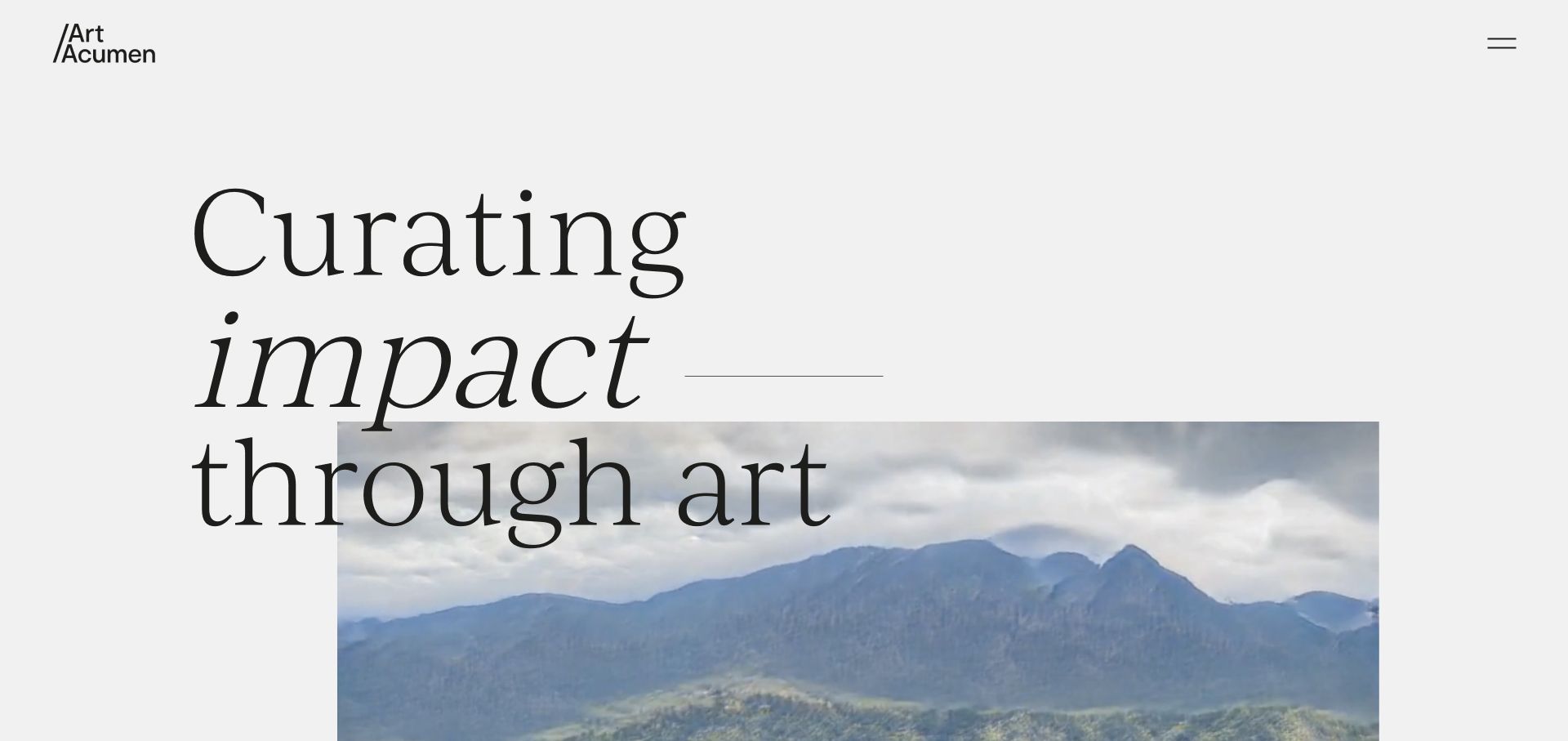
Art Acumen gives a large serif statement room to overlap a photograph of art in an interior. The introduction then becomes much more specific: strategy, commissioning, changeover exhibitions, public programming and collection stewardship each have a named route. Recent projects connect those categories to actual organisations and spaces. This combination makes the ambitious visual language easier to understand as a professional service rather than an unexplained portfolio.
What you can learn
Use an expressive opening to establish a point of view, then let distinct service names and identified projects explain what the consultancy actually delivers.
Pros
The service categories describe different stages and kinds of engagement.
Named recent projects provide a concrete bridge from positioning to work.
Cons & considerations
Oversized overlapping type needs careful small-screen and contrast testing.
A hidden menu makes persistent access to services more important lower down.
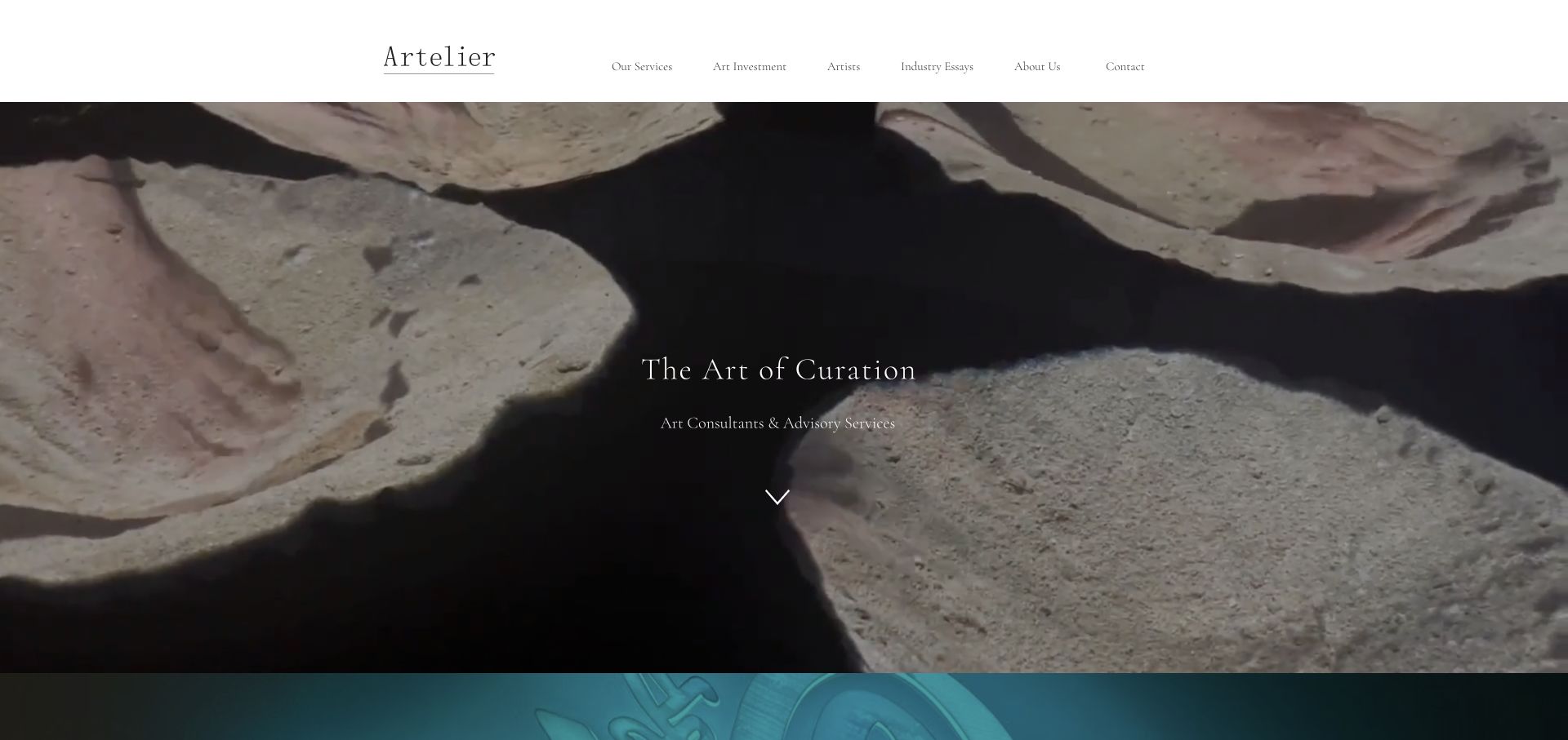
Artelier pairs a quiet serif navigation with an immersive art-led opening, then organises the long homepage around cultural, commercial and private projects. Hotels, corporate spaces, yachts, residences and aircraft receive more precise labels inside those groups. Artist information and industry essays sit alongside the service paths, giving visitors different ways to understand the practice. The tradeoff is substantial page length and repeated slideshow controls.
What you can learn
Divide a broad consultancy by the context in which clients commission work. Let each audience reach a specific brief rather than relying on a general services paragraph.
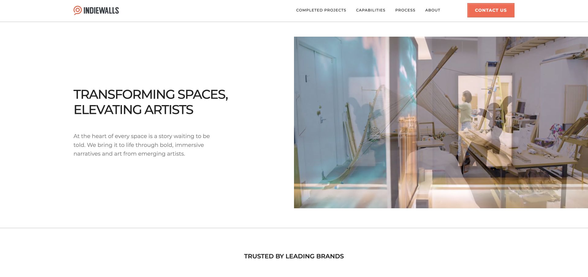
Indiewalls opens with a split composition: a concise statement and explanation on one side, a large installation image on the other. The navigation explicitly separates completed projects, capabilities and process. Below, industry tabs distinguish workplace, hospitality, multifamily, healthcare and cruise contexts. A consultation invitation states that project scope, services and fees can be discussed, which is more informative than a generic contact prompt.
What you can learn
Show the installed outcome while making the delivery process equally easy to find. Visitors commissioning a programme need to understand both the artwork and the engagement.
Pros
Completed work, process and capabilities have separate navigation destinations.
Industry tabs translate a broad offer into useful client contexts.
Cons & considerations
Important sector content inside tabs needs a robust keyboard and mobile implementation.
Brand logos and company-published impact figures should not replace project-specific evidence.
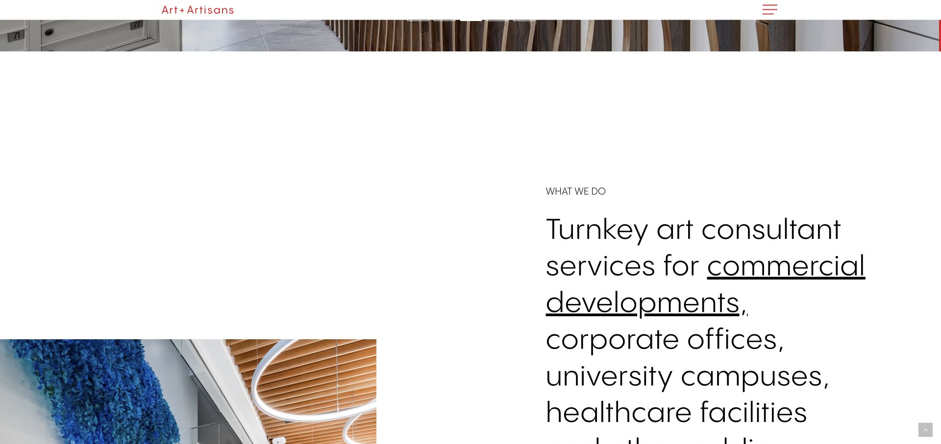
Art + Artisans follows its animated opening with a direct explanation of the commercial spaces it serves. The reviewed scrolled view gives the service statement a large typographic treatment beside installation photography. A numbered process then names discovery, selection, production and installation, followed by a featured mural and project links. This creates a practical narrative, although animation, a newsletter interruption and some inconsistent link destinations deserve attention.
What you can learn
Use an explicit sequence to explain an unfamiliar service, then connect that sequence to a named project. Keep ordinary navigation and enquiries available without watching an animation.
Pros
The four process stages make the broad consultancy offer easier to picture.
Featured work is linked rather than left as anonymous background imagery.
Cons & considerations
The opening animation delays the plain-language service introduction.
Several links still expose a staging-style hostname and merit a destination audit.
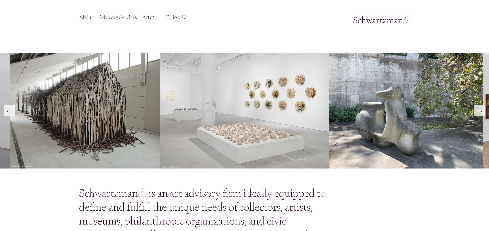
Schwartzman& gives installation photography a wide horizontal stage beneath a sparse serif navigation. The supporting statement explicitly names collectors, artists, museums, philanthropic organisations and civic initiatives. Advisory services are a direct top-level destination, while the footer keeps the physical address and contact details compact. The composition feels close to an exhibition viewing experience, but long text lines and small image credits can make detailed reading less comfortable.
What you can learn
Let a carefully edited image sequence establish curatorial breadth, but retain a clear service destination and readable explanation for visitors who are not already familiar with the firm.
Pros
The audience statement explains that the practice serves more than private collectors.
A short navigation keeps advisory services prominent.
Cons & considerations
Very wide paragraph measures can be tiring on large screens.
Small credits within the image presentation may be difficult to read.
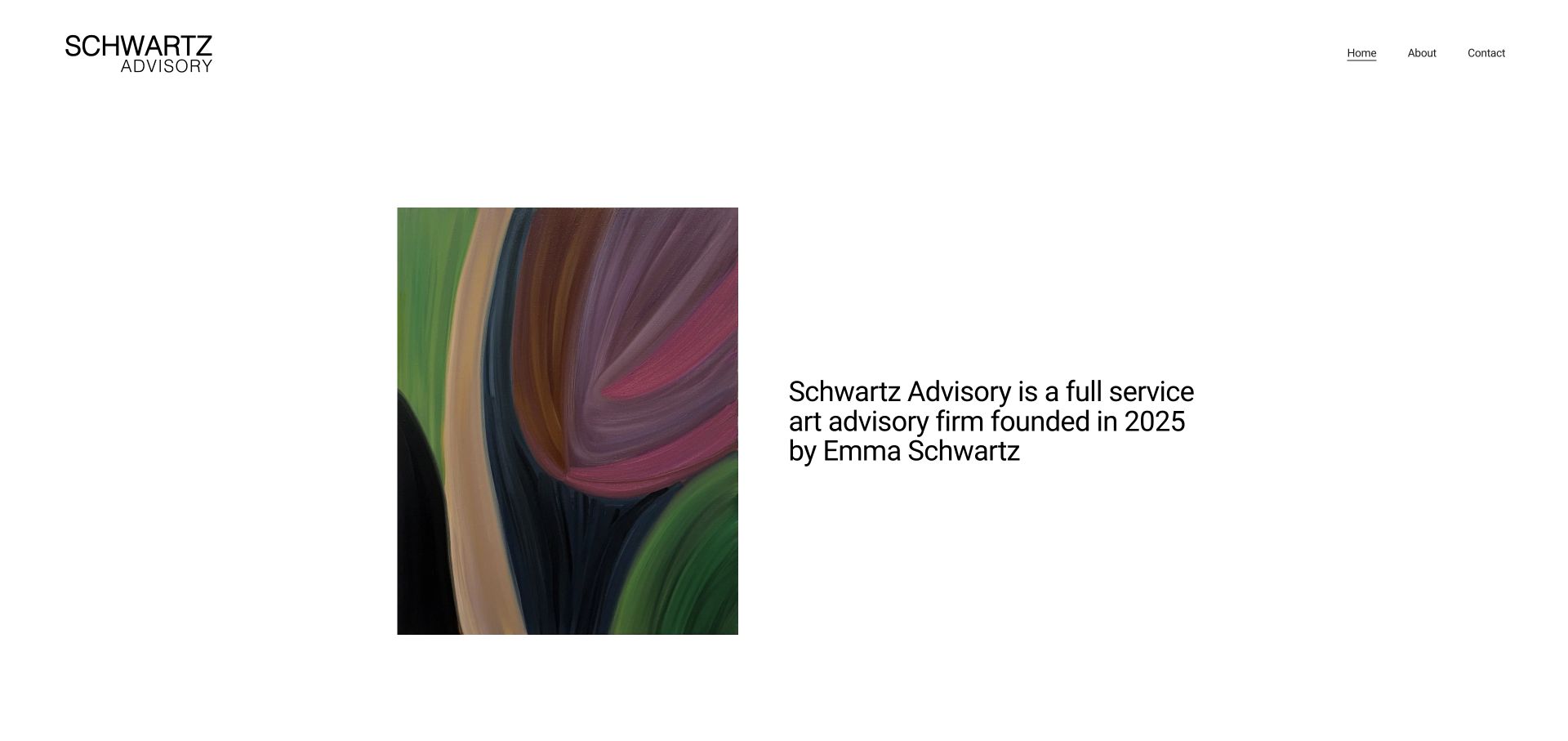
Schwartz Advisory places a single colourful artwork opposite a plain statement naming the practice and its founder. The white background and three-link navigation keep the first impression uncomplicated. Lower on the page, acquisitions, market insight, sourcing, valuations, collection management and logistics are explained separately. The site demonstrates that an independent practice can communicate a substantial offer without a sprawling navigation, although its founding-date statement should not displace the client’s immediate need.
What you can learn
For a small advisory, a named person, a focused image and concrete service descriptions can provide a stronger introduction than elaborate motion or generic luxury language.
Pros
The founder is identified immediately rather than hidden behind an abstract company identity.
Separate service explanations clarify the scope of a full-service offer.
Cons & considerations
The opening prioritises company background over the visitor’s particular problem.
Service detail could benefit from quicker in-page navigation on a longer visit.
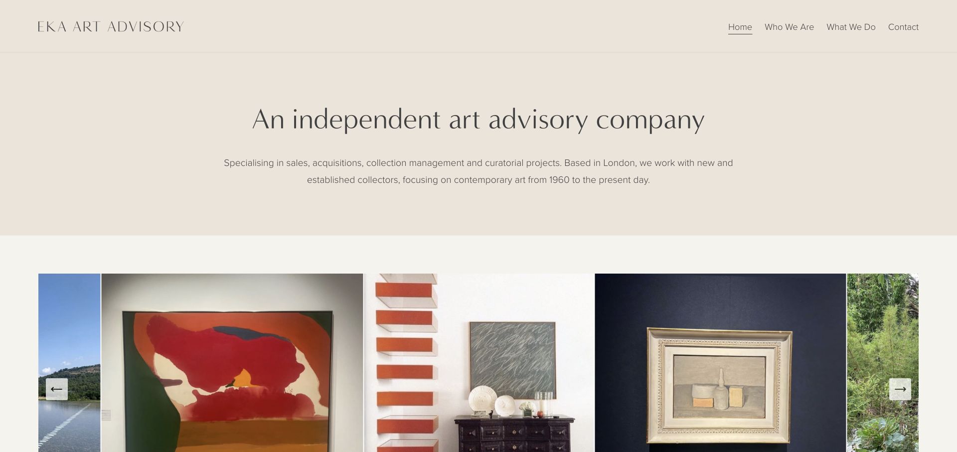
EKA Art Advisory begins with a concise independent-advisory statement, followed by location, service types and a clear contemporary-art timeframe. Warm neutral colours and an installation carousel support that explanation without overwhelming it. The homepage continues with the founder’s background and separates collection building from collection management and curating spaces. This is useful qualification for a prospective client, while more descriptive image captions would make the visual examples easier to interpret.
What you can learn
State the collecting focus, location and type of support before asking visitors to interpret a portfolio. Keep biography and services distinct so each answers a different question.
Pros
The introduction defines a specific art focus rather than claiming every specialism.
Service sections distinguish acquisition advice from care and spatial presentation.
Cons & considerations
Filename-like image alternatives provide little context for nonvisual browsing.
The gallery would be stronger with clear project or artwork captions where permissions allow.
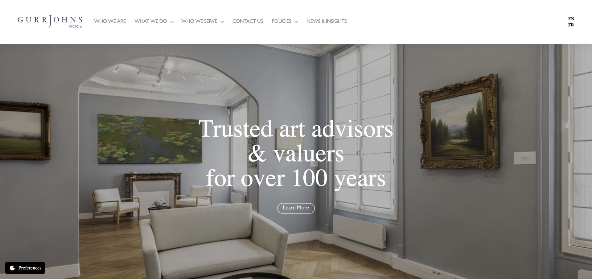
Gurr Johns overlays a concise experience-led statement on an art-filled interior, with a light navigation above it. The body gives appraisals, art advisory and art finance their own explanatory sections and destinations. A multilingual control and a detailed office footer support a geographically broad audience. The useful lesson is the separation of related but different services; company assertions about independence or experience remain statements to evaluate rather than facts established by the design.
What you can learn
Give adjacent services distinct names and pages, particularly when they involve different processes or risks. Keep location and language choices available without burying them inside a general contact form.
Pros
Advisory, valuation and finance are not collapsed into one vague service category.
Office details make the geographical offer more concrete.
Cons & considerations
Repeated Learn More text benefits from stronger contextual link names.
A photographic hero needs consistent contrast as images or crops change.
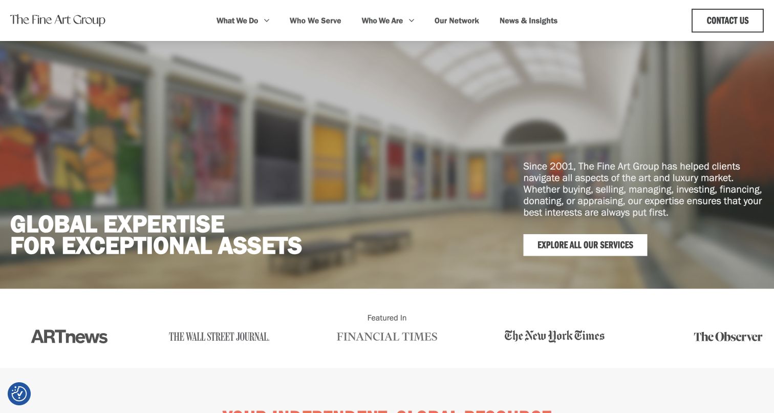
The Fine Art Group uses a broad photographic opening with its statement on the left and an explanatory paragraph and services action on the right. The navigation separates what the group does from whom it serves. Below, named service cards, team profiles and a network section break a wide offer into smaller choices. Figures are accompanied by a stated reporting date, a useful reminder that business metrics need context and maintenance.
What you can learn
When a consultancy serves several audiences, provide both a service-based route and an audience-based route. Date published business figures and keep them separate from independently assessed outcomes.
Pros
The What We Do and Who We Serve routes support different visitor vocabularies.
Team profiles link to named people rather than leaving expertise entirely abstract.
Cons & considerations
A large number of sections can compete with a single next step.
Dated homepage statistics and old news require deliberate editorial ownership.
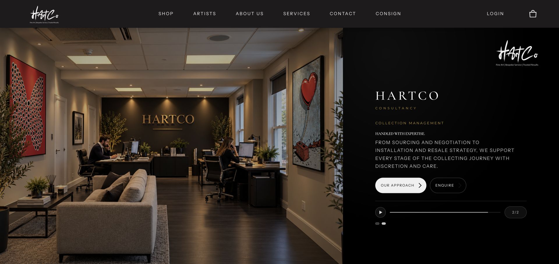
HartCo combines a dark, image-led introduction with immediate routes to services and artists. The homepage explicitly distinguishes its advisory model from a conventional gallery, while curated collections and available works provide a browsable product layer. Acquisitions, management and sales are described as an ongoing relationship rather than a single purchase. That mix is informative, although repeated brand treatments, slideshows and a mailing-list prompt create a busier path than the simple positioning initially suggests.
What you can learn
If available artworks and advisory services share a site, explain the difference between browsing stock and commissioning advice. Preserve a clear route for each intention.
Pros
Services and artist browsing are available as distinct initial actions.
Available works give the abstract advisory offer a tangible browsing route.
Cons & considerations
The loading screen and newsletter dialog add friction before exploration.
Several carousels and repeated wordmarks can compete with service clarity.
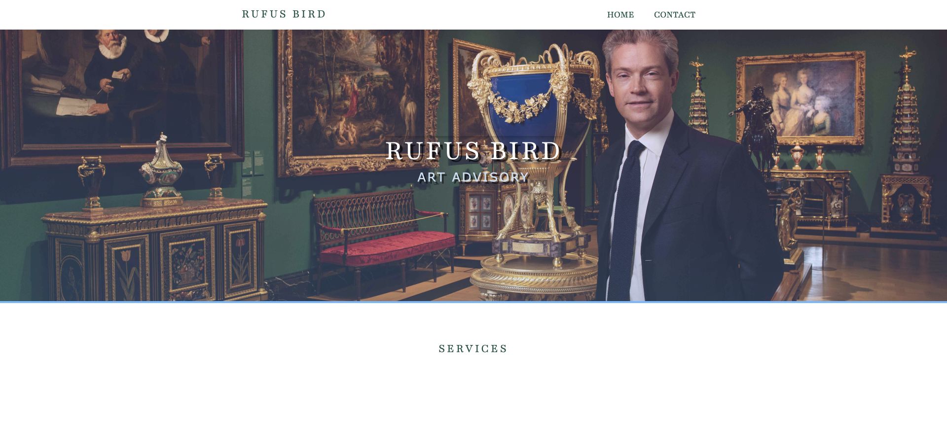
Rufus Bird Art Advisory places the named advisor within an art-filled setting and uses a very short navigation. Its service section is organised by buyers, sellers and curatorial work, with substantial explanation of what each engagement can involve. The biography supplies a detailed professional narrative, while direct contact details and policy links remain visible near the end. The approach is personal and legible, though the long biography and broad curatorial list would benefit from more scanning support.
What you can learn
Use familiar client tasks to introduce specialist services. A named advisor and a clear contact route can support confidence without turning the homepage into an indiscriminate credentials list.
Pros
Buyer, seller and curatorial headings map to concrete visitor intentions.
The named person, direct contact details and policy routes are easy to identify.
Cons & considerations
The substantial biography needs subheadings or selective emphasis for scanning.
A contact action in the hero would shorten the route for ready visitors.
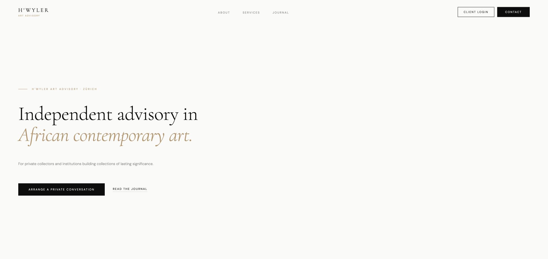
H’Wyler uses a generous, mostly typographic introduction to identify its focus on African contemporary art and its Zurich base. A single dark conversation button stands apart from a secondary journal link. Founder information, languages and three service categories follow in a one-page structure. This makes the specialist offer unusually easy to understand, but some utility links in the reviewed navigation use placeholder destinations and should not be treated as functioning client services.
What you can learn
A tightly defined specialism can carry the opening without a large image. Pair it with genuine service explanations and ensure every utility action actually resolves before launch.
Pros
The art focus and intended private/institutional audiences are explicit.
The contact section identifies a person, location and working languages.
Cons & considerations
Client Login, Impressum and Privacy links use placeholder anchors in the reviewed page.
Subtle small labels need adequate contrast and scale on smaller screens.
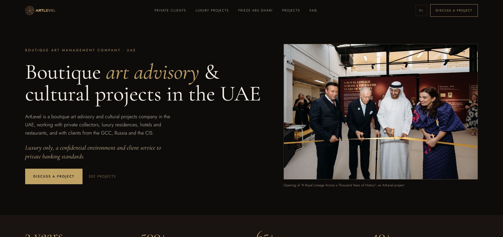
ArtLevel introduces a UAE-based advisory with a dark and gold palette, an explanatory paragraph and a captioned event photograph. Private clients and luxury projects are separate navigation routes, and the body breaks those audiences into specific services. Project summaries, programme details and FAQs provide further context. The clear segmentation is worth studying, while partnership, client and asset-related claims remain company-published assertions rather than outcomes verified in this review.
What you can learn
Use audience-specific sections to explain what a mixed advisory and cultural-project practice actually does. Caption documentary imagery and make any external messaging handoff clear.
Pros
Private clients and commercial project audiences have distinct paths.
The event photograph is accompanied by useful context rather than left anonymous.
Cons & considerations
The main enquiry action hands visitors to WhatsApp rather than an on-site alternative.
Time-sensitive programme dates and numerical claims require regular review.
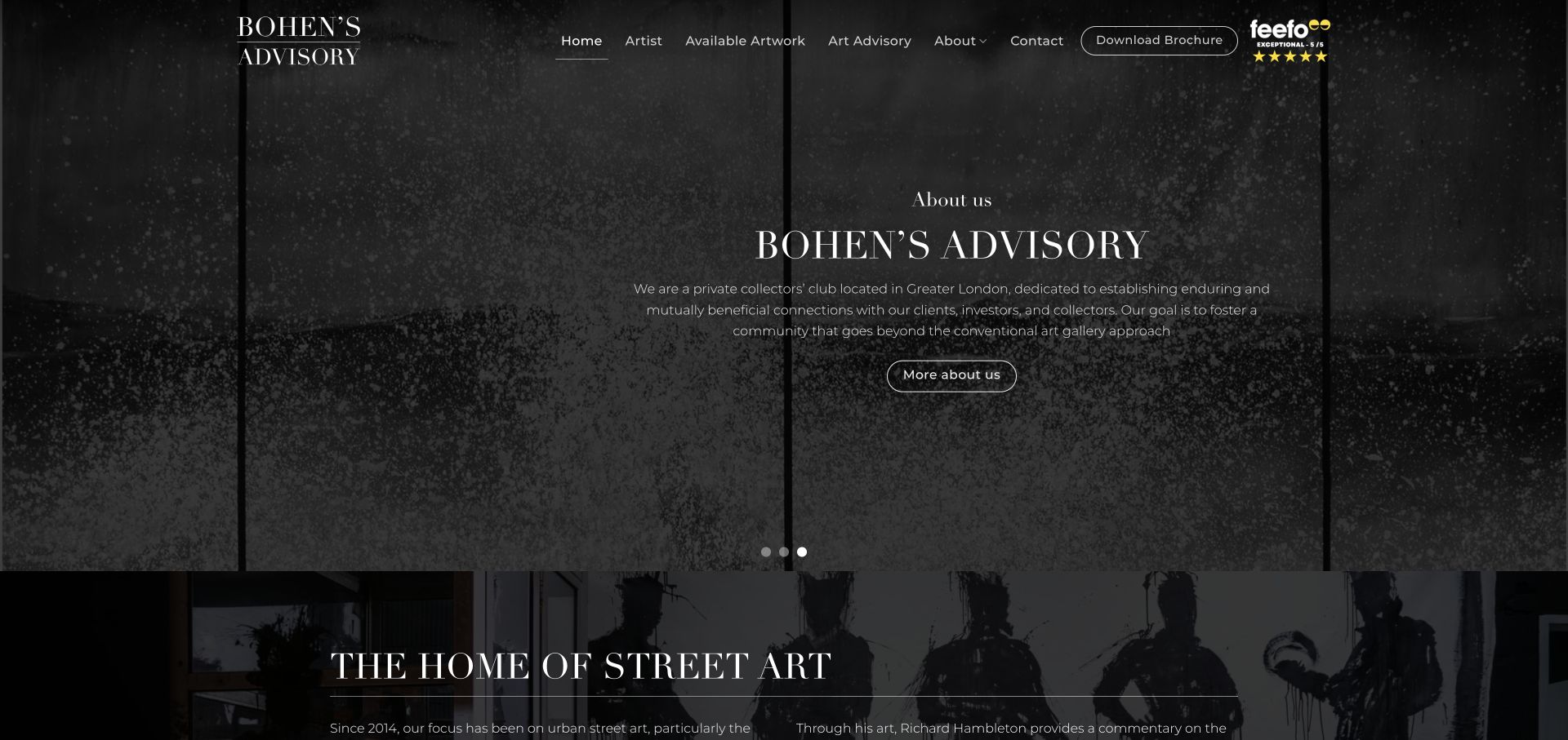
Bohen’s Advisory builds its homepage around a specific street-art focus, with a rotating introduction, available-artwork navigation and an artist destination. A brochure and office information provide additional ways to investigate the business. The narrow visual subject makes the site memorable, but its promotional investment language should not be borrowed uncritically: website design is not evidence of an artwork’s future value or of the suitability of a financial decision.
What you can learn
A narrow collecting focus can make an artwork catalog easier to understand. Keep commercial, historical and investment claims properly qualified rather than letting a polished presentation imply guarantees.
Pros
The artist and available-artwork routes make the specialism recognisable.
Contact information and a brochure offer different levels of further investigation.
Cons & considerations
Assured investment language needs careful qualification and should not imply guaranteed value.
Rotating hero messages can conceal context and contain small text over photography.
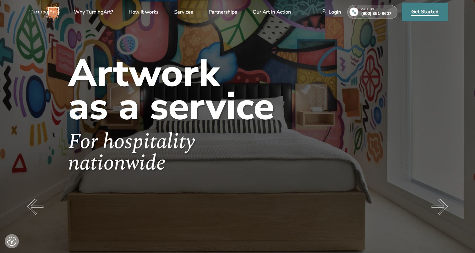
TurningArt frames its offer as an ongoing art service rather than merely a source of objects. Audience-specific hero messages lead into a five-phase explanation covering consultation, proposal, programme design, selection and installation. Separate routes for businesses, healthcare, hospitality, institutions, designers and real estate extend the same structure. The practical process is useful, while the long homepage and numerous company-published figures call for careful editing and clear attribution.
What you can learn
Explain the sequence and ongoing responsibilities of a service before showing all of its variations. Clarify whether a programme involves purchase, rental, rotation or commissioning.
Pros
The phase-based explanation makes the engagement more concrete.
Audience routes let visitors reach a relevant context without decoding internal terminology.
Cons & considerations
Several long sections and carousels make the page demanding to scan.
Company statistics and testimonials need sourcing and should not stand in for terms or scope.
Kegan is a freelance web designer and developer with 15+ years of experience helping businesses turn complicated website requirements into clear, maintainable digital experiences. He works directly with clients from planning and design through development, launch, and ongoing support.
For art consultant website design, his development approach focuses on project credits and client contexts, collection and commissioning services, clear process boundaries, and well-routed professional enquiries. The scope can be a targeted improvement or a complete custom build, with responsive layouts, thoughtful content structure, and integrations chosen around the people using and maintaining the site.
Show 3 other art consultant website designersHide other art consultant website designers
Plan an art consultancy website around the client’s brief
Begin with a service map that reflects real responsibilities
List the work the practice actually undertakes before designing the homepage. Acquiring a work, assessing an existing collection, commissioning an installation and arranging ongoing care involve different questions. A visitor should be able to tell whether a service covers advice, procurement, project management, logistics or some combination. Do not use a broad heading to imply responsibilities that belong to a separate supplier.
Art Acumen makes several forms of engagement explicit, from strategy to collection stewardship. Rufus Bird uses a simpler buyer, seller and curatorial structure. The useful distinction is not the number of categories; it is whether the labels help a visitor locate their own situation. Test the navigation with the language clients use in enquiries rather than relying only on the practice’s internal terminology.
Where commercial terms require a private conversation, explain the process without inventing a public price. State what the initial discussion covers and whether a visitor is requesting information or commissioning paid work. Keep finance and investment-related services appropriately qualified. A design review cannot validate a financial proposition, and an attractive interface must not make uncertain returns appear guaranteed.
Use artwork and project photography with enough context
A beautiful installation photograph can show scale, atmosphere and a relationship to architecture. It cannot, by itself, identify who selected, commissioned, made or installed the work. Add clear project context where permissions allow. Separate the artist credit, project location and consultancy role rather than letting visitors infer that every artwork shown was created or owned by the consultancy.
Indiewalls places a large installation image beside a direct explanation, while Artelier groups imagery around private, commercial and cultural projects. Schwartzman& gives a horizontal image sequence more of an exhibition character. Each approach establishes a different tone. Choose the format that helps the intended audience understand relevant work, and retain readable text for visitors who cannot use or do not want to wait for motion.
Confirm image rights, attribution and appropriate confidentiality before publication. Avoid presenting sensitive private collections or identifying a client without permission. Plan alternative text around the information an image communicates, not its filename. Captions and transcripts should remain separate from promotional claims. Preserve useful project records when a homepage campaign changes rather than making the portfolio depend entirely on a rotating banner.
Make expertise understandable without overwhelming the visitor
A named advisor helps a prospective client understand who they might work with. Explain the person’s role, specialism and relevant experience accurately, with supporting links when available. Distinguish a past employer, a current partnership and an independent credential. Do not imply that an institutional logo endorses the practice simply because someone previously worked there.
EKA states a contemporary-art focus and location before presenting background information. H’Wyler leads with a defined specialism, then supplies founder and language information. Schwartz Advisory uses a compact named-founder introduction and six service descriptions. These are useful examples of narrowing the offer. A smaller practice need not imitate the scale or vocabulary of an international group to be credible.
Keep long biographies scannable and connect them to the work being discussed. Team pages, process information and selected project records answer different questions, so they should not be substitutes for one another. If a website publishes numerical claims, client lists or awards, retain the basis and date of each claim. A visitor should not have to guess whether a figure describes current activity, historical totals or an estimate.
Design a proportionate enquiry and maintenance process
Make the initial contact action specific enough to set expectations without demanding confidential collection details. A short description of the project type, location, stage and desired support may be enough to begin. Avoid requesting valuations, ownership documents or private inventories through an ordinary marketing form when a more suitable secure process is needed later.
ArtLevel’s main action moves to WhatsApp; TurningArt offers a staged service explanation; Gurr Johns supplies several offices and language choices. These patterns serve different operating models. Tell the visitor when an action leaves the website, keep contact details accurate and provide alternatives appropriate to the practice. Verify utility links rather than launching a client-login or policy label that points nowhere.
Assign ownership for project records, team details, programme dates, office information and service descriptions. A polished homepage can become misleading when its event offer has ended or its partnership has changed. Remove expired invitations, preserve useful archives and date material claims meaningfully. Maintain accessible navigation, motion controls and readable typography as part of ordinary content work, not only during a redesign.
The editing job behind the design
Choose a stack that supports project records and careful enquiries
Prioritise maintainable project, artist, service and advisor records before choosing animation or gallery features. An editor should be able to update a caption or role without rebuilding a complex page.
Image handling needs appropriate sizing, useful alternatives and permission-aware publication. An enquiry system should collect only what is needed for the first conversation and keep private collection information out of public pages and analytics.
Visible technology items come from bounded public-source evidence and audit attempts, not a complete view of a consultancy’s internal systems. An unavailable audit remains unavailable. A public asset or supporting library does not establish the quality of the design or the security of a private client portal.
Our WordPress website examples offer a separate look at publishing approaches. A visible platform label is evidence for that named page, not a guarantee that the same system will suit your requirements.
Before the public launch
Art consultancy website planning checklist
Identify the actual audiences and the services each can commission.
Separate advice, acquisition, commissioning, management and installation responsibilities.
Keep a named advisor or team route easy to find.
Describe specialisms and experience accurately without implied endorsements.
Caption project images with permitted role and artwork context.
Confirm image rights and confidentiality before publishing.
Make galleries usable without waiting for autoplay.
Keep alternative text meaningful rather than filename-based.
Qualify investment and value-related language carefully.
Explain the purpose of an initial enquiry and any external handoff.
Verify contact details, policy pages and client-login destinations.
Assign owners for dated figures, events, team details and project archives.
These checks are a project checklist, not a performance, legal, security, or accessibility certification. Test real journeys with the people responsible for the website before making claims about the result.
Sources & editorial method
How this collection was selected and reviewed
The saved random target of 15 predates research. Fifteen distinct public source pages were directly reviewed in Chrome on November 13, 2026. Each accepted image is an original browser JPEG with its actual decoded dimensions recorded, not a vendor thumbnail or generated mockup. Cookie or newsletter overlays were dismissed using the website’s ordinary controls; optional cookies were rejected where an explicit choice was available. Art + Artisans is shown at a scrolled service-introduction section. NINE dot ARTS was excluded after an access-verification page, without bypass. Art Acumen was explicitly selected for website communication, not the quality of its art advice or commercial performance. Broad technology audits are handled by the shared publication workflow; no unknown platform is guessed from appearance.
Each example links to its actual source page. Screenshots are direct browser captures with their own capture dates; moving imagery, announcements and live designs can change. The notes describe observable design choices and conditional tradeoffs, not measured traffic, conversion results, service quality, or accessibility conformance.
Technology labels use public page metadata, asset evidence, or explicitly cited platform documentation. Platform documentation is not a complete current deployment audit. A component reference may be legacy or unused; it is not a complete backend inventory. Unknown stacks are omitted. These sites are editorial examples, not our client portfolio.
Written, Edited and Curated are separate editorial records, not timestamps advanced by a rebuild. Website designs and imagery belong to their owners. See our editorial standards or suggest a correction.
Questions worth asking
Art Consultant website design questions
What should an art consultancy homepage explain?
Identify the audiences, art focus and kinds of service offered. Make named advisors, relevant work, the engagement process and contact information easy to find. Photographs should support that explanation rather than replace it.
Should a consultancy separate private and commercial clients?
Separate them when the work, decision process or information differs. Useful audience routes lead to specific detail; duplicate pages with interchangeable language add little.
Can a project photograph imply that the consultancy created the artwork?
It should not. Where permissions allow, identify the artist, project and consultancy role clearly. Ownership, authorship, selection, commissioning and installation are different relationships.
Why is Art Acumen the Editors Choice?
Its reviewed homepage balances a distinctive typographic introduction with precise service routes and named recent projects. The selection concerns website design and communication, not independently tested advisory quality or outcomes.
Does inclusion validate an art investment offer?
No. These are website-design observations, not financial advice or verification of artwork authenticity, business claims, suitability or future value.
Start with a clear account of the service and the people behind it. Let artwork and installation imagery make that account more tangible, then maintain the practical information that helps a visitor begin an informed conversation.