Definitive guide · ExpressionEngine website development
Best ExpressionEngine Websites of 2026 (20 Real-World Examples)
Twenty public website examples with genuine screenshots, original design reviews and carefully scoped ExpressionEngine credits or documented project associations.
The strongest ExpressionEngine websites give complex information a clear public shape. A museum, utility, specialist publisher and product catalog may need very different interfaces, but each benefits from useful navigation, consistent content and an obvious next step.
Start with what visitors need to understand and what editors must keep accurate. Some of these websites organize exhibitions and educational resources; others explain services, products or research. Their visual styles differ, yet the recurring questions are practical: can a visitor recognize the organization, find a relevant section and understand what to do next? Study those decisions before borrowing an animation, card treatment or opening photograph.
This collection begins with the National Constitution Center, Wolters Kluwer’s FocusOn Oncology public property, Philadelphia Gas Works, Eastern State and the Alzheimer’s Drug Discovery Foundation. Each example identifies a specific public website. An organization’s own technology credit and an implementation agency’s project account are documentary evidence with different scopes. Neither automatically identifies a current software version, every related website or a private account system.
Before the examples
What makes good ExpressionEngine website development in 2026?
Model information before choosing a page layout
ExpressionEngine stores content in channels, whose fields can describe the information a particular project needs. That separation is useful when the same material appears in several contexts. A program might need a title, audience, date and short description whether it appears in a listing or on its own detail page. Define those facts first, then design the views that help people use them. A consistent card cannot compensate for missing dates or unclear titles.
ExpressionEngine’s template layouts provide a shared wrapper for individual templates. Use that idea to give visitors a stable header, navigation and reading structure while allowing different content types to have appropriate layouts. An exhibition page may need a large image; a utility notice may need concise instructions. Both should make their location and next action understandable. Reuse should improve recognition without forcing every topic into an identical composition.
The ExpressionEngine File Manager supports image adjustments and file information, including where a file is used. Give editors a clear purpose for each image and a consistent place to record its description and rights. A catalog photograph needs useful product detail; an institutional image may need context about the people or place shown. Decide those requirements before filling a grid. Cropping should preserve the subject that the nearby text discusses.
These reviews examine visible design choices across museums, public information services, associations, specialist businesses and editorial properties. Each is tied to its actual captured page and evidence record. The collection includes earlier documented implementations where a current website has changed platforms.
We start with five recognizable brands or organizations: National Constitution Center, Wolters Kluwer — FocusOn Oncology, Philadelphia Gas Works, Eastern State, Alzheimer’s Drug Discovery Foundation. Each attribution applies to the named website property, not every product or website belonging to its organization. This is a curated reading sequence, not a measured ranking.
The National Constitution Center gives its featured announcement a large photographic stage while keeping the enduring information architecture in a separate white header. The Constitution, Declaration, education and museum sections remain visible above the dark blue feature. Red actions distinguish a next step without turning every navigation item into a button. The page then moves into programs, teaching resources and practical visiting information. Its own website-information page explicitly credits ExpressionEngine for this public property; that credit does not describe every separately linked donation or event service.
What you can learn
Keep a changing announcement within a stable editorial frame. A returning visitor should still recognize the main learning and visiting routes even when the featured story, image and primary action change. Separate topical promotion from the institution’s long-lived resource categories.
Pros
The header gives major educational and museum tasks clear, consistently named destinations.
A strong image and contrasting text panel make the current announcement easy to scan.
Cons & considerations
A large promotional feature postpones practical visiting details until farther down the page.
Several navigation layers need careful spacing so their relative importance remains clear.
Platform source: Own-site public developer credit. The public museum and constitutional-education website, whose own website-information page explicitly identifies ExpressionEngine. The property’s own public website credit identifies ExpressionEngine development, read November 10, 2026. A public credit is documentary evidence, not an inspection of server internals. Platform evidence is separate from the direct website screenshot and is not a complete current infrastructure audit.
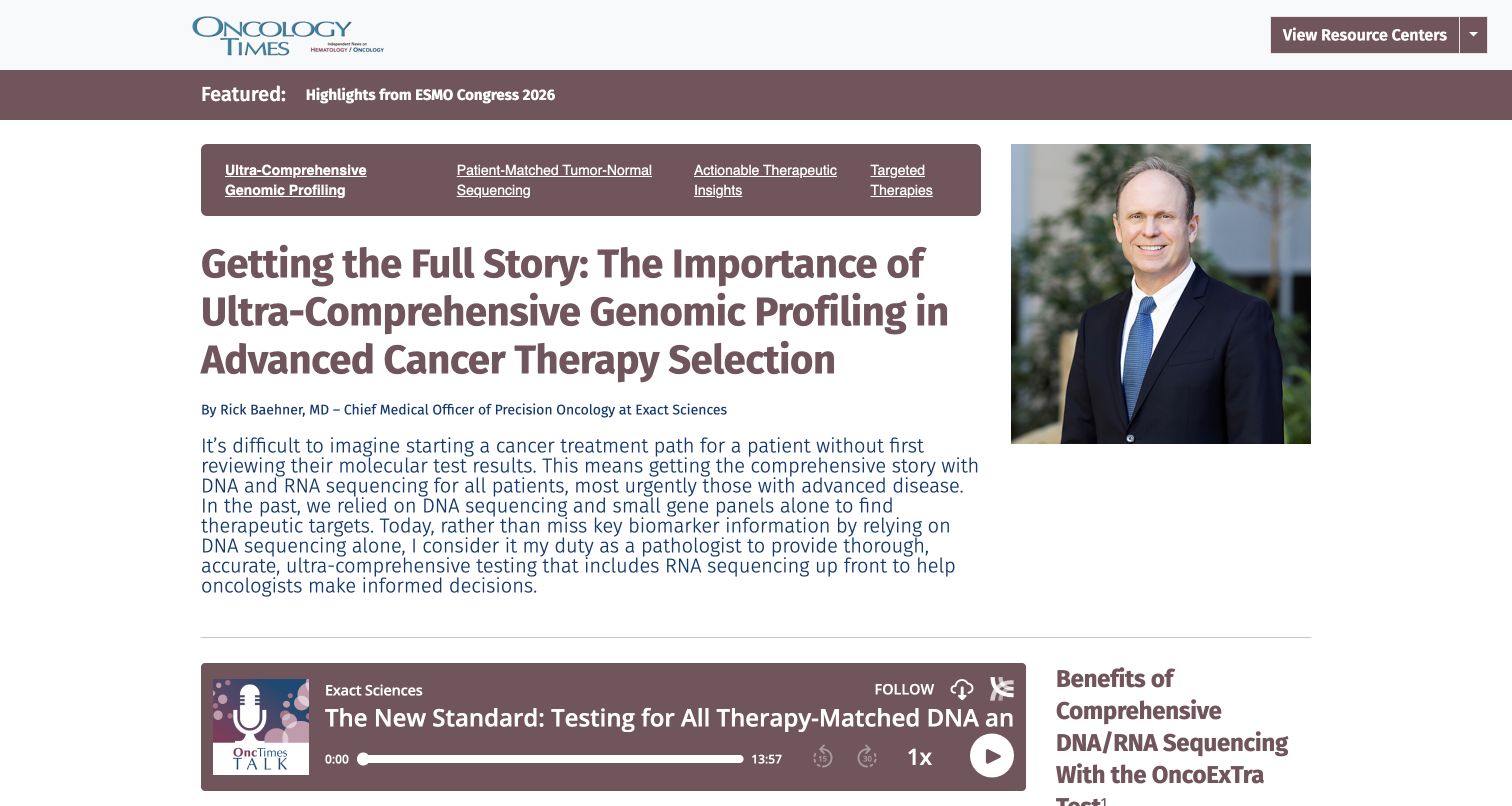
FocusOn Oncology currently sends its homepage visitor to a long editorial article, captured at that exact final URL. The Oncology Times identity, a resource-center control and a featured-coverage strip provide context above the article. A portrait sits beside the headline and author attribution, while topic links organize related material. The own-site About page identifies Wolters Kluwer and credits ExpressionEngine developers. This is evidence for the named public publishing property, not the publisher’s entire technology estate or any clinical system. The review assesses presentation without validating the medical claims.
What you can learn
For specialist publishing, make the author, article purpose and surrounding collection visible before asking readers to navigate a long text. Give media its own place in the reading sequence and keep the source references accessible without confusing promotional information with independent editorial judgment.
Pros
The portrait and author line connect the contribution with an identifiable expert.
Topic navigation and a featured strip place one article within a broader resource collection.
Cons & considerations
A lengthy headline and introduction push supporting media below the opening view.
The initial privacy dialog interrupts reading until the visitor makes a preference choice.
Platform source: Own-site public developer credit. The FocusOn Oncology public property created by Wolters Kluwer and credited to ExpressionEngine developers; not the publisher’s whole web estate or clinical systems. The property’s own public website credit identifies ExpressionEngine development, read November 10, 2026. A public credit is documentary evidence, not an inspection of server internals. The captured page is the public article reached by the homepage redirect; the About-page credit concerns this same FocusOn Oncology publishing property. Platform evidence is separate from the direct website screenshot and is not a complete current infrastructure audit.
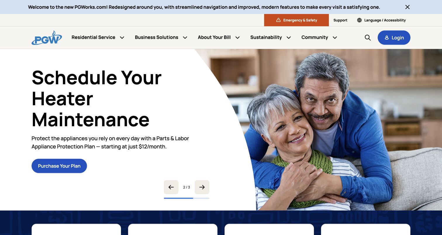
Philadelphia Gas Works places an emergency route, language assistance and support above its main navigation. A large rotating campaign occupies the central feature, but the page also exposes account, payment, emergency and service-change shortcuts. The captured slide pairs household photography with an oversized heater-maintenance message and one blue action. PGW’s own launch announcement identifies this public website, and Pedrera documents its ExpressionEngine work. The agency case is undated and does not establish the current CMS version. Separate customer accounts and billing systems are outside this review.
What you can learn
A utility website needs a task hierarchy that survives changing campaigns. Keep urgent help distinct from marketing, label account destinations clearly and provide direct public explanations before visitors enter a separate service portal. Seasonal promotions should complement those practical routes.
Pros
The orange emergency control is visually distinct from the blue account and campaign actions.
Plain-language service categories organize information around recognizable customer needs.
Cons & considerations
An announcement strip and several navigation layers consume considerable opening-screen space.
Rotating promotions require clear controls so visitors can pause their attention on a useful message.
Platform source: Implementation agency’s exact-property case. The public utility information website identified by PGW’s own October 26, 2026 launch announcement. Pedrera documents its ExpressionEngine website work; private billing and account systems are excluded, and the undated case does not identify a current version. The implementation agency documents this exact public website as an ExpressionEngine project. The case was read November 10, 2026; its undated account does not establish a current CMS version or complete present backend. Platform evidence is separate from the direct website screenshot and is not a complete current infrastructure audit.
Eastern State’s homepage places its large identity beside practical visitor links, ticket access and a donation route. The main navigation divides the organization into historic-site, justice-education and workforce-development areas. A blue campaign feature combines architectural texture, a large emblem and a short support message. Below it, the page explains the mission and gives each program a more specific entry point. The site’s own credits explicitly identify ExpressionEngine for this public website. Ticket purchases, donations and private systems were not tested or assigned the same implementation.
What you can learn
When an institution has several related missions, name those branches clearly before presenting individual campaigns. Keep practical visiting tasks near the top, then use the body to explain how the branches connect so the website feels like one organization rather than unrelated microsites.
Pros
The main navigation distinguishes program areas with direct, descriptive labels.
The repeated emblem and blue imagery connect the campaign feature with the broader identity.
Cons & considerations
The tall header and large campaign feature delay detailed program descriptions.
Multiple support and visitor actions need clear hierarchy when the layout becomes narrower.
Platform source: Own-site public developer credit. The historic site’s public visitor and educational website, explicitly credited to ExpressionEngine. Ticket purchase and private systems were not tested. The property’s own public website credit identifies ExpressionEngine development, read November 10, 2026. A public credit is documentary evidence, not an inspection of server internals. Platform evidence is separate from the direct website screenshot and is not a complete current infrastructure audit.
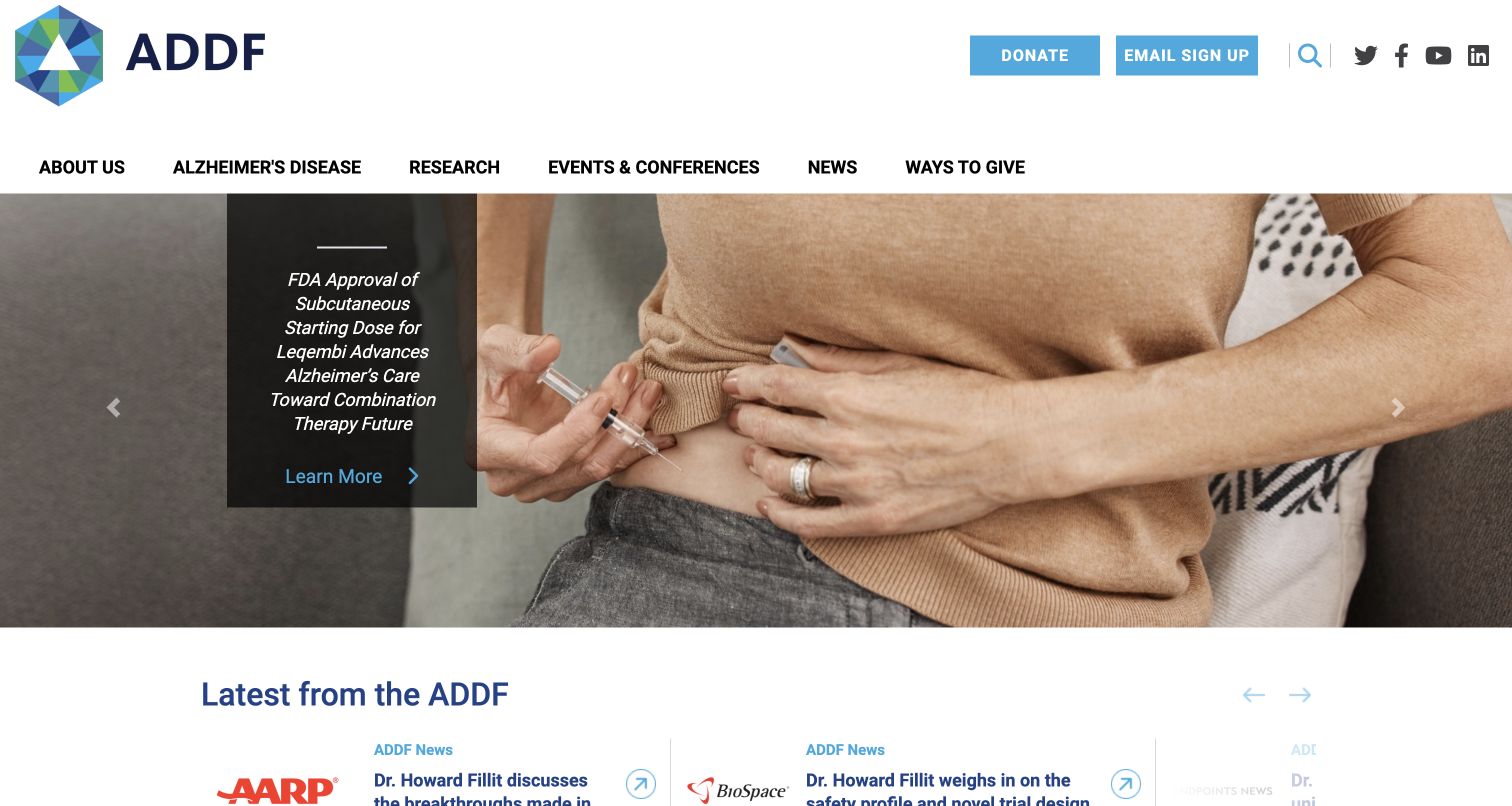
The Alzheimer’s Drug Discovery Foundation uses a large ADDF mark and a broad white navigation area to establish its identity. Donate and email-signup routes occupy a utility layer, while research, disease information, events and news have separate menu destinations. A photographic rotating feature leads into a labeled news collection. Pedrera’s implementation case explicitly names alzdiscovery.org and describes its ExpressionEngine rebuild; the undated account is not proof of a current software version. This review concerns the public presentation, without validating treatment statements or inspecting grant-management systems.
What you can learn
Separate donor participation from the routes used by readers seeking information. Clearly labeled research, news and organizational sections let a foundation address several audiences while keeping claims, sources and support requests in their appropriate contexts. The homepage should introduce those paths without requiring a donation decision.
Pros
Utility actions remain distinct from the primary informational navigation.
Labeled news cards help distinguish the continuing publication stream from the main campaign.
Cons & considerations
A large rotating feature gives relatively little space to supporting explanation in the opening view.
Clinical headlines require accessible context and source material beyond a short promotional summary.
Platform source: Implementation agency’s exact-property case. The agency case explicitly names alzdiscovery.org and describes its ExpressionEngine rebuild. No current version, treatment claim or separate grant-management system is inferred. The implementation agency documents this exact public website as an ExpressionEngine project. The case was read November 10, 2026; its undated account does not establish a current CMS version or complete present backend. Platform evidence is separate from the direct website screenshot and is not a complete current infrastructure audit.
FMI opens with a darkened industry scene and a compact declaration of its built-environment focus. The white header organizes consulting, investment banking, training and insights as distinct routes, while smaller office and contact links occupy a quieter utility strip. Below the feature, the page explains its two principal service divisions and publishes related analysis. Pedrera documents this matching public FMI website as an ExpressionEngine project. That undated agency account concerns the corporate publishing property, not private client systems, business outcomes or a verified current software version.
What you can learn
A broad consultancy can become easier to understand when its opening statement names the specific market it serves. Use the next layer to distinguish service divisions and expertise, then give articles a supporting role rather than asking them to explain the entire offer.
Pros
The concise positioning statement establishes a clear audience and sector focus.
Service divisions and editorial insights have separate, predictable navigation destinations.
Cons & considerations
The visible cookie panel occupies a substantial part of the opening composition.
An extensive nested menu needs strong grouping to avoid overwhelming visitors with internal terminology.
Visible tech stack
Earlier / documented evidence
ExpressionEngine
Platform source: Implementation agency’s exact-property case. The public corporate/consulting/investment-banking website; the agency case and official site identify the same FMI divisions and built-environment focus. Private client services and business outcomes are excluded. The implementation agency documents this exact public website as an ExpressionEngine project. The case was read November 10, 2026; its undated account does not establish a current CMS version or complete present backend. Platform evidence is separate from the direct website screenshot and is not a complete current infrastructure audit.
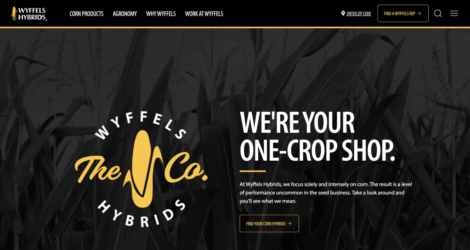
Wyffels Hybrids uses black, yellow and corn imagery to reinforce its single-crop identity. The opening feature pairs a large brand treatment with a direct introductory statement and a product-discovery action. The top navigation distinguishes products, agronomy, company information and careers, while a representative-finder route remains prominent. Farther down, resources connect the brand story with practical material for growers. The site’s developer credit and Pedrera’s implementation case support the ExpressionEngine association for this public website. Neither source establishes the technology of private systems or validates agricultural performance claims.
What you can learn
A specialized business can turn a narrow focus into a useful organizing principle. Repeat a small set of visual cues, but give product information, practical resources and human assistance their own clear routes so the brand message does not have to carry every task.
Pros
A restrained black-and-yellow palette connects navigation, identity and primary action.
The representative route gives visitors an obvious path toward relevant human assistance.
Cons & considerations
Large branding leaves detailed product comparisons to subsequent sections.
Image-rich expanded navigation needs concise labels and reliable keyboard behavior to remain manageable.
Platform source: Own-site public developer credit. The public corn-seed company website, supported by its own developer credit and the explicit agency implementation case. No account services, forecasts or agronomic claims are validated. The property’s own public website credit identifies ExpressionEngine development, read November 10, 2026. A public credit is documentary evidence, not an inspection of server internals. Platform evidence is separate from the direct website screenshot and is not a complete current infrastructure audit.
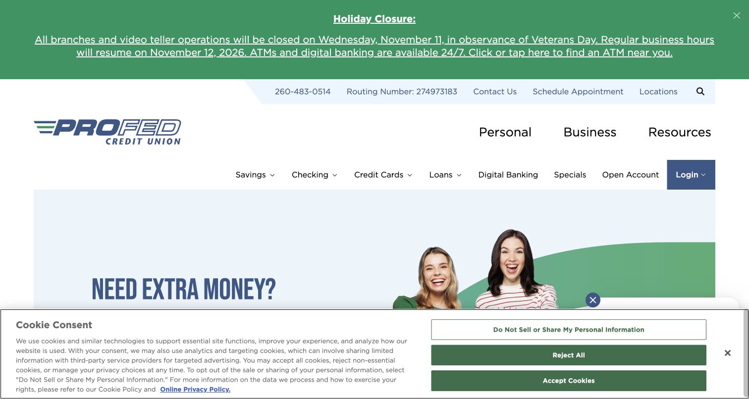
ProFed places a clearly dated holiday notice above its main navigation, making operational information visible before promotional content. Personal, business and resources form one navigation level, with product categories and a separate login control underneath. The opening campaign uses a light background, people photography and strong blue lettering. Pedrera’s case describes an ExpressionEngine public-website relaunch in 2024, and ProFed’s own location information confirms the matching organization. The review covers this marketing and information site, not online banking, financial transactions or the merits of any advertised product.
What you can learn
Service availability and audience selection should be easy to understand before visitors encounter a financial promotion. Preserve a clear boundary between public product explanations and account access, then use notices sparingly so urgent information remains recognizable when it matters.
Pros
The holiday notice communicates a specific operational change in a separate visual band.
Personal and business routes provide an understandable first division of the information architecture.
Cons & considerations
Several header layers and the cookie panel reduce the visible campaign area.
A long rotating promotion sequence can make it harder to return to a particular offer.
Platform source: Implementation agency’s exact-property case. The public credit-union marketing website described in the agency’s 2024 relaunch account; the bank’s own branch page confirms the matching Fort Wayne identity. Separate online banking and financial transactions are excluded. The implementation agency documents this exact public website as an ExpressionEngine project. The case was read November 10, 2026; its undated account does not establish a current CMS version or complete present backend. Platform evidence is separate from the direct website screenshot and is not a complete current infrastructure audit.
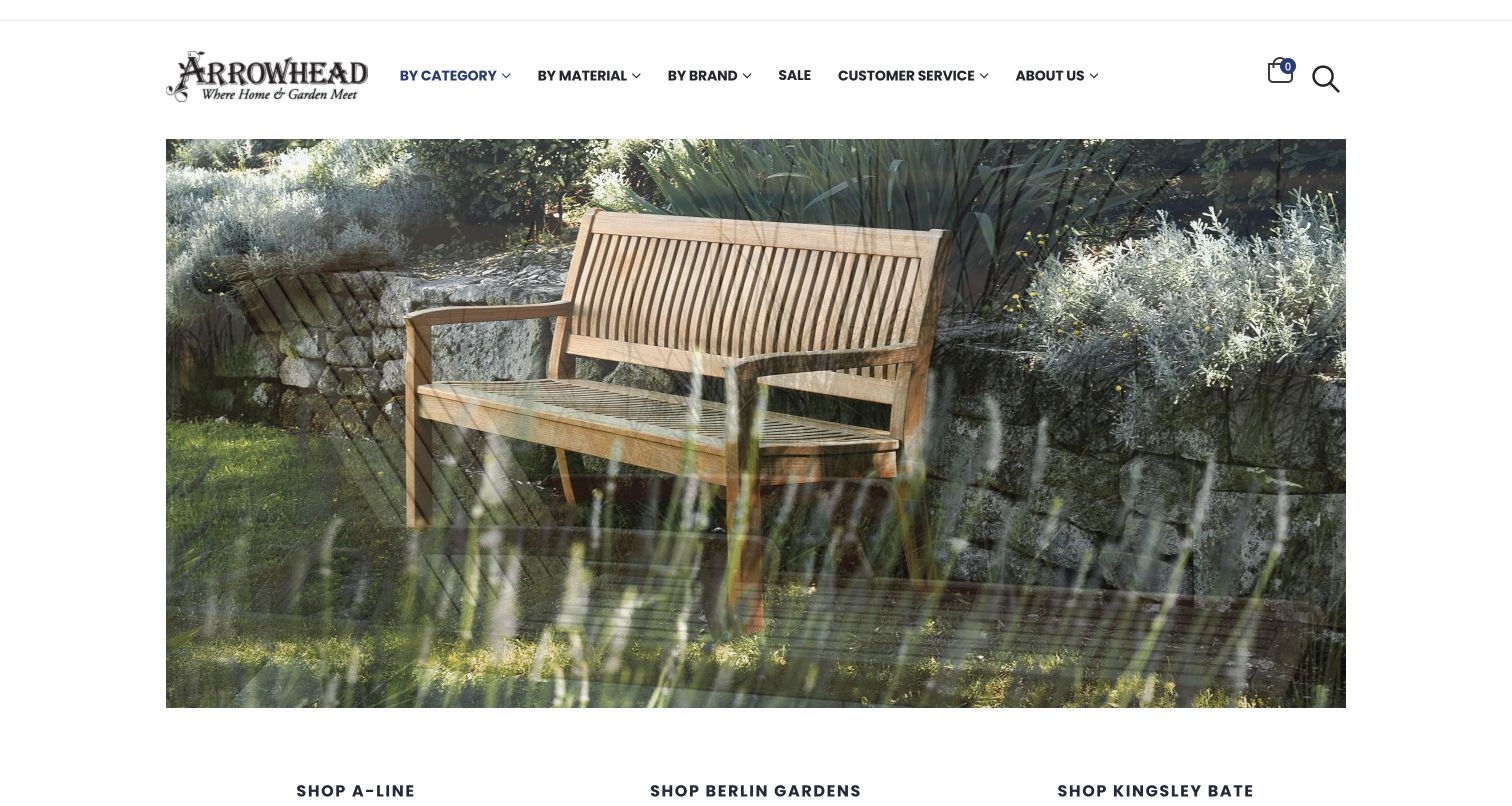
Arrowhead Furniture frames a large outdoor-furniture image with a restrained white header and dark text. Category, material and brand each offer a different route into the catalog, while sale and customer-service information remain separate. The next section introduces individual manufacturers before the page explains its Nantucket showroom and local service. The public developer credit and the specific agency case support the ExpressionEngine association, including the documented catalog project. This observation does not test checkout, inventory accuracy or fulfillment, and does not establish a current CMS version.
What you can learn
A furniture catalog benefits from more than one browsing model because customers may begin with a room need, a material preference or a familiar manufacturer. Make those entry points explicit, then connect the digital catalog with practical showroom and service information.
Pros
Category, material and brand navigation acknowledge different approaches to finding a product.
Large product photography gives the catalog a tangible setting before detailed browsing.
Cons & considerations
The rotating opening imagery can temporarily show overlapping frames during transitions.
Broad promotional links and starting prices need accurate destination pages to provide useful buying context.
Platform source: Own-site public developer credit. The public Nantucket furniture catalog, supported by its own developer credit and explicit agency case; no checkout operation was tested. The property’s own public website credit identifies ExpressionEngine development, read November 10, 2026. A public credit is documentary evidence, not an inspection of server internals. Platform evidence is separate from the direct website screenshot and is not a complete current infrastructure audit.
Pacer Financial presents a compact, conventional corporate layout with a blue identity block, a pale header and audience-specific navigation. The central feature addresses financial advisors, while the following columns introduce distribution partners, a separately linked ETF business and a leadership letter. A welcome section explains the company’s intermediary role. Pedrera’s case explicitly describes the public Pacer Financial website as an ExpressionEngine project. The association does not extend automatically to ETF, advisor or investor portals, and the review makes no judgment about products, performance or suitability.
What you can learn
For an intermediary business, make the audiences visible in the navigation and explain the relationship between them in ordinary language. Keep affiliated destinations clearly identified so visitors understand when they are leaving the corporate information site for another product or service.
Pros
The audience labels provide a straightforward choice before detailed exploration.
The introductory text explains the business relationship that the main feature only summarizes.
Cons & considerations
The dense opening layout gives several secondary stories similar visual weight.
A broad hero statement needs clear supporting detail on the destination page to become actionable.
Platform source: Implementation agency’s exact-property case. The public Pacer Financial corporate website explicitly described by the agency, with matching wholesaling-company identity on the current homepage. Separate ETF, advisor and gated investor properties are not additional examples or inferred implementations. The implementation agency documents this exact public website as an ExpressionEngine project. The case was read November 10, 2026; its undated account does not establish a current CMS version or complete present backend. Platform evidence is separate from the direct website screenshot and is not a complete current infrastructure audit.
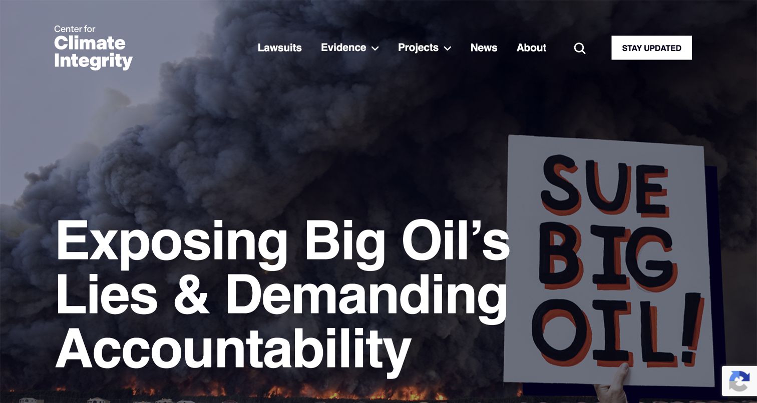
The Center for Climate Integrity uses a large white statement over a dark photographic background to introduce its advocacy purpose. The compact header separates lawsuits, evidence, projects, news and organizational information, with a contrasting stay-updated action at the edge. Subsequent sections explain the organization and direct readers toward news and document collections. Its own website credit and Pedrera’s exact-domain case support the ExpressionEngine association. The review assesses this public presentation and information architecture without independently validating legal allegations, advocacy positions or outcomes described by the site.
What you can learn
A strong mission statement should lead into a clear structure for examining its supporting material. Give evidence, projects and updates distinct destinations so readers can move from the broad premise to the documents and explanations relevant to their questions.
Pros
The evidence and project labels offer routes beyond the opening campaign message.
Large typography remains visually separate from the main navigation and update action.
Cons & considerations
The oversized opening statement delays specific documentary material until further exploration.
Text over photography needs stable contrast across different crops and changing background content.
Platform source: Own-site public developer credit. The organization’s public informational website; its credit is corroborated by the agency’s explicit ExpressionEngine project listing. Advocacy assertions are not independently validated. The property’s own public website credit identifies ExpressionEngine development, read November 10, 2026. A public credit is documentary evidence, not an inspection of server internals. Platform evidence is separate from the direct website screenshot and is not a complete current infrastructure audit.
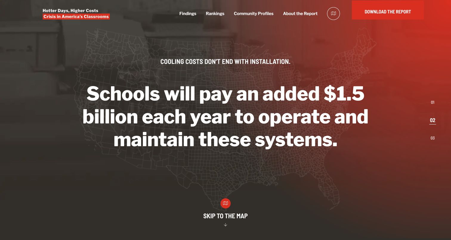
Cooling Crisis gives a single report its own visual identity, using a dark-to-red background, large statements and a map outline. The header keeps findings, rankings, community profiles and the report explanation visible, with a separate download action. A skip-to-map route connects the introductory narrative with the geographic presentation below. The site’s own developer credit explicitly names ExpressionEngine. This is a distinct public report property of the Center for Climate Integrity, not a separate organization; its estimates and historical projections were not independently validated during the design review.
What you can learn
A report microsite can offer both a narrative introduction and a direct route into the evidence. Keep the methodology and downloadable publication close to the interactive presentation so readers can understand the basis, date and limits of what the graphics summarize.
Pros
The map shortcut gives returning or task-focused readers a clear way past the introduction.
Findings, rankings and community profiles distinguish different levels of exploration.
Cons & considerations
Large headline figures need nearby dates and methodological context to avoid appearing timeless.
Animated opening panels can postpone the actual data controls for first-time visitors.
Platform source: Own-site public developer credit. The distinct public school-climate-cost report property, whose own credit explicitly identifies ExpressionEngine; not a separate organization and no modeled cost figures are validated. The property’s own public website credit identifies ExpressionEngine development, read November 10, 2026. A public credit is documentary evidence, not an inspection of server internals. Platform evidence is separate from the direct website screenshot and is not a complete current infrastructure audit.
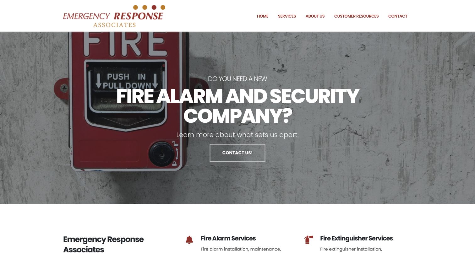
Emergency Response Associates places a simple white header above a large fire-alarm photograph and a direct service question. A single contact route accompanies the feature, while the next row separates alarms, extinguishers, emergency lighting and security services with small icons and short descriptions. The company’s public developer page explicitly identifies ExpressionEngine and Bootstrap. That credit concerns this informational website; separately linked customer systems, remote-support tools and monitoring services were not opened or assigned the same technology. The review does not evaluate the quality or safety of the company’s work.
What you can learn
A service homepage can be concise when it names the problem, shows a relevant object and immediately breaks the offer into recognizable categories. Keep supporting resources distinct from the main contact path so existing customers can find help without navigating a sales sequence.
Pros
The photograph provides concrete context for the service described by the headline.
Short category summaries make the range of services easy to scan.
Cons & considerations
Text over the large photograph needs consistent contrast in every responsive crop.
A broad contact action should lead to clear routing information for different service needs.
Platform source: Own-site public developer credit. The public fire-service company website, whose own credit expressly names ExpressionEngine and Bootstrap. No service, quote or safety-system operation was tested. The property’s own public website credit identifies ExpressionEngine development, read November 10, 2026. A public credit is documentary evidence, not an inspection of server internals. Platform evidence is separate from the direct website screenshot and is not a complete current infrastructure audit.
The Neuro-Optometric Rehabilitation Association places its full name and purpose beside a recognizable logo, with membership and provider-finder routes above the main content. Patients and caregivers have a distinct navigation path from healthcare professionals. The opening layout combines a rotating feature with adjacent educational video context, then introduces audience-specific resource lists. Its own developer-credit page expressly names ExpressionEngine for the public website. Separate membership and provider systems are excluded from that claim, and this review evaluates navigation and presentation rather than clinical effectiveness or treatment advice.
What you can learn
An association serving professionals and the public should name those audiences early and keep their resources distinguishable. Use a shared introduction to explain the organization, then offer specific routes that do not assume every visitor has the same vocabulary or purpose.
Pros
Audience-specific navigation helps readers choose an appropriate information path.
Resource lists connect broad introductory material with more focused topics.
Cons & considerations
The opening combines several substantial elements that compete for attention.
Medical information needs clear authorship, dates and context beyond a short promotional feature.
Platform source: Own-site public developer credit. The public association website, expressly credited to ExpressionEngine. Its separate member portal and provider systems are excluded; no clinical effectiveness claims are validated. The property’s own public website credit identifies ExpressionEngine development, read November 10, 2026. A public credit is documentary evidence, not an inspection of server internals. Platform evidence is separate from the direct website screenshot and is not a complete current infrastructure audit.
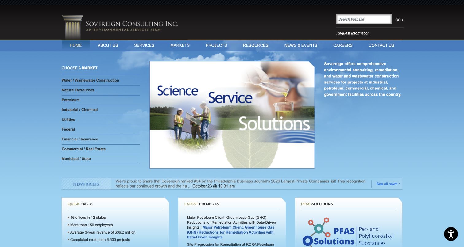
Sovereign Consulting uses a compact blue-and-black layout with a left-hand market list, a central image and an adjacent service description. The top navigation provides conventional routes to services, markets, projects and resources, while a news strip and project links appear directly below the feature. The result emphasizes reference and retrieval over a long brand narrative. Its own website-information page explicitly credits ExpressionEngine and Bootstrap for this public property. This is not evidence about internal project systems, and the design review does not validate the company’s reported project counts or environmental results.
What you can learn
A professional-services site can help visitors quickly by presenting sectors and project evidence near the opening explanation. Use clear labels and a predictable grid, then let detailed case pages carry the information that cannot fit into a compact homepage.
Pros
The visible market list offers a direct route to relevant sector material.
Project links and news appear close to the main service explanation.
Cons & considerations
Small text and many adjacent information blocks create a dense opening composition.
The gradient and decorative image treatment can compete with the clarity of the service description.
Platform source: Own-site public developer credit. The public environmental-consulting website, whose own website-information page expressly identifies ExpressionEngine. No internal project system is inferred. The property’s own public website credit identifies ExpressionEngine development, read November 10, 2026. A public credit is documentary evidence, not an inspection of server internals. Platform evidence is separate from the direct website screenshot and is not a complete current infrastructure audit.
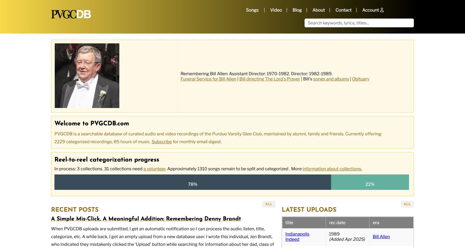
PVGCDB presents a searchable music archive with straightforward navigation, a prominent search field and clearly bordered information blocks. The opening includes a memorial notice, a collection introduction and a progress display for categorization work. Recent posts and uploads then provide evidence of continuing activity. Its public footer credits ExpressionEngine, and the archive’s own disclaimer states that it is independent of Purdue University and Purdue Musical Organizations. The example is this volunteer-maintained public archive, not the university’s website or private systems. No accounts, uploads or comments were submitted.
What you can learn
A specialist archive becomes easier to understand when it explains both what is available and how the collection is maintained. Give search a prominent place, make contribution needs explicit and distinguish editorial updates from the underlying catalog so returning visitors can find either.
Pros
The search field and content-type links make the archive’s purpose immediately practical.
The progress display explains unfinished cataloging work instead of hiding it.
Cons & considerations
Several text-heavy information blocks compete for attention near the top.
Archive quantities and progress indicators need clear maintenance dates as the collection changes.
Platform source: Own-site public developer credit. The independent music-history archive whose footer credits ExpressionEngine; its own disclaimer excludes affiliation with Purdue University or Purdue Musical Organizations. The property’s own public website credit identifies ExpressionEngine development, read November 10, 2026. A public credit is documentary evidence, not an inspection of server internals. Platform evidence is separate from the direct website screenshot and is not a complete current infrastructure audit.
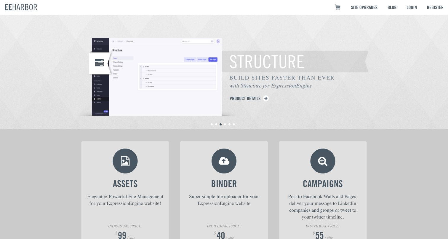
EEHarbor opens with a product feature above a dense catalog of ExpressionEngine add-ons. The header keeps upgrades, the blog and account routes compact, while repeated cards expose a product name, short purpose, price and version. This consistent structure makes very different utilities comparable without requiring a different layout for each one. The homepage footer explicitly says it is powered by ExpressionEngine, providing website-specific evidence beyond simply selling compatible products. The review covers the public catalog; it does not test licenses, purchases, account access or the advertised behavior of individual add-ons.
What you can learn
For an ecosystem catalog, standardize the information that visitors need to compare items. A short purpose statement and clearly separated commercial and compatibility details can do more work than a different visual treatment for every product. Keep incomplete listings visibly distinct.
Pros
Repeated product cards provide a stable structure for scanning a large catalog.
Purpose, pricing and version information appear together rather than in unrelated sections.
Cons & considerations
A long unfiltered catalog can make discovery harder when visitors need one specific capability.
Coming-soon products need clear labeling so they are not mistaken for immediately available tools.
Platform source: Own-site public developer credit. The public add-on catalog with an ExpressionEngine-powered footer credit; add-on marketing alone is not treated as implementation proof. No license purchase or login was attempted. The property’s own public website credit identifies ExpressionEngine development, read November 10, 2026. A public credit is documentary evidence, not an inspection of server internals. Platform evidence is separate from the direct website screenshot and is not a complete current infrastructure audit.
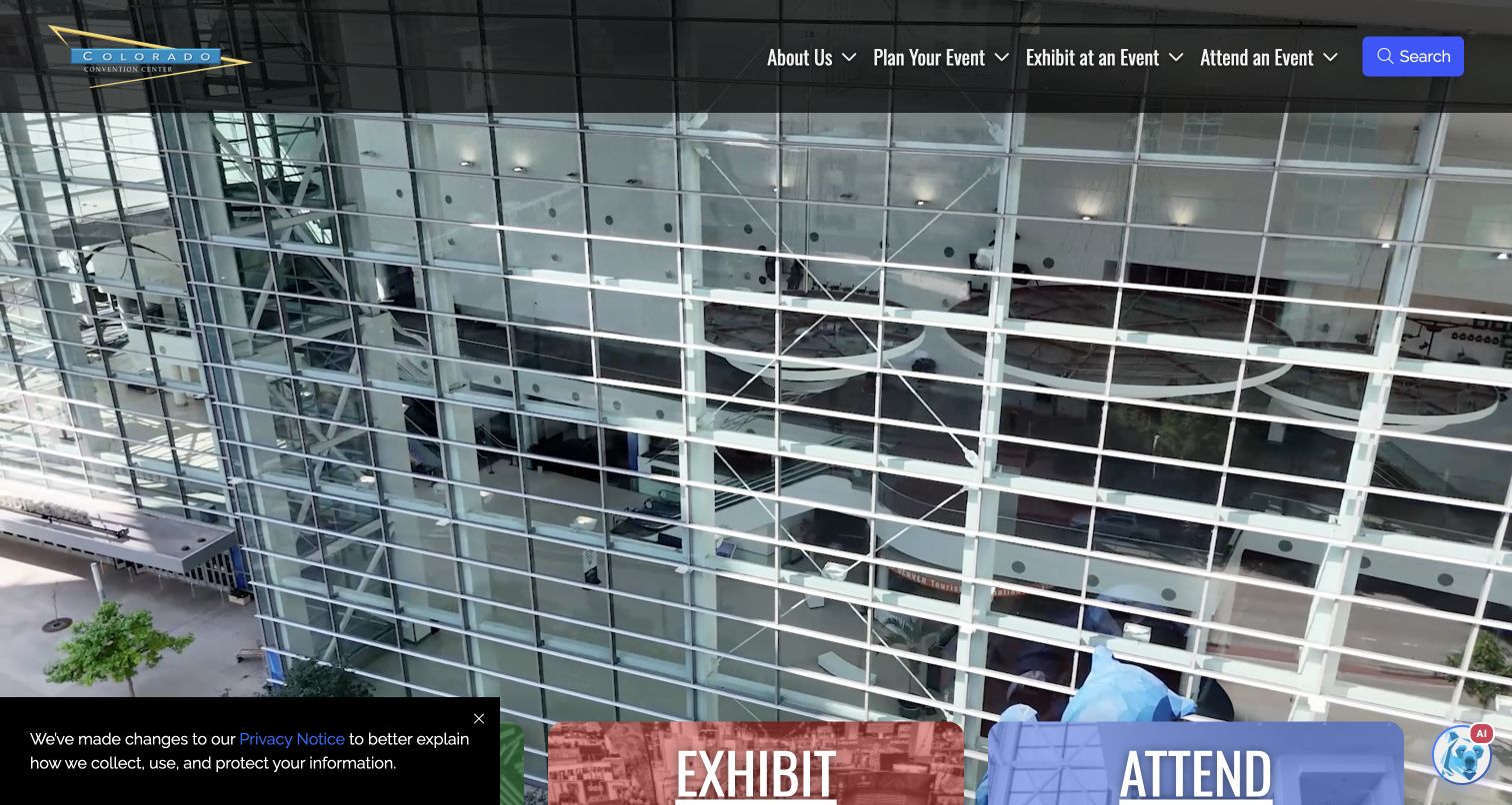
The Colorado Convention Center uses a full-width venue scene behind a compact navigation header. Three large colored routes introduce planning, exhibiting and attending, turning different visitor roles into the first meaningful choice. Below, maps, parking information, event listings and venue images provide practical follow-through. Unleaded’s project page explicitly links denverconvention.com and labels the website an ExpressionEngine implementation. That undated documentary association does not establish a current CMS version, booking platform or the technology of separately linked maps and event services. No requests or bookings were submitted.
What you can learn
A venue serves people with very different tasks, so organize the opening around those roles before listing every facility. Give each role a clear destination and keep practical logistics easy to find, while using the venue imagery to provide orientation rather than replace information.
Pros
The three audience routes make the main information architecture immediately understandable.
Maps, parking and upcoming events connect the visual introduction with practical visitor needs.
Cons & considerations
A large moving background needs a useful static presentation and dependable text contrast.
The visible privacy notice and chatbot compete with lower-screen entry points.
Platform source: Implementation agency’s exact-property case. The public convention-center website expressly linked and labeled ExpressionEngine in the agency case. An undated project does not establish a current CMS version or venue booking system. The implementation agency documents this exact public website as an ExpressionEngine project. The case was read November 10, 2026; its undated account does not establish a current CMS version or complete present backend. Platform evidence is separate from the direct website screenshot and is not a complete current infrastructure audit.
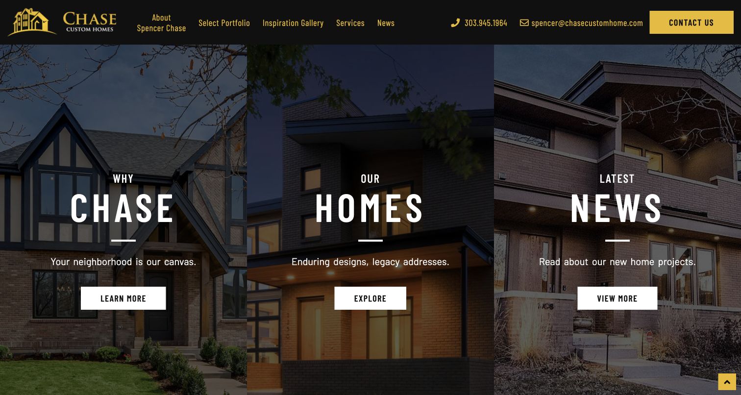
Chase Custom Homes divides its opening into three tall photographic panels for the business story, its homes and its news. Black-and-gold branding connects the header with large condensed labels, while each panel offers a simple next step. The page then introduces individual properties and room-focused imagery. Unleaded’s ExpressionEngine capability page links this project, and the project detail identifies the exact public domain. This is an undated implementation association, not a current runtime inventory or an assessment of construction quality. Contact forms and property inquiries were not submitted.
What you can learn
A portfolio business can give visitors several useful starting points without using a single rotating hero. Keep the parallel choices visually consistent but label their purposes distinctly, then provide deeper project information that explains what the photographs alone cannot show.
Pros
The three-panel opening gives business context, portfolio and updates equal clarity.
A limited color palette connects navigation, contact information and panel headings.
Cons & considerations
Dark overlays reduce the architectural detail visible in the opening photographs.
Several similarly styled actions need specific destination labels to avoid becoming interchangeable.
Platform source: Implementation agency’s exact-property case. The agency’s Built with ExpressionEngine section links this project, whose detail page names the exact public domain. This is an undated documentary association, not a current runtime inventory. The implementation agency documents this exact public website as an ExpressionEngine project. The case was read November 10, 2026; its undated account does not establish a current CMS version or complete present backend. Platform evidence is separate from the direct website screenshot and is not a complete current infrastructure audit.
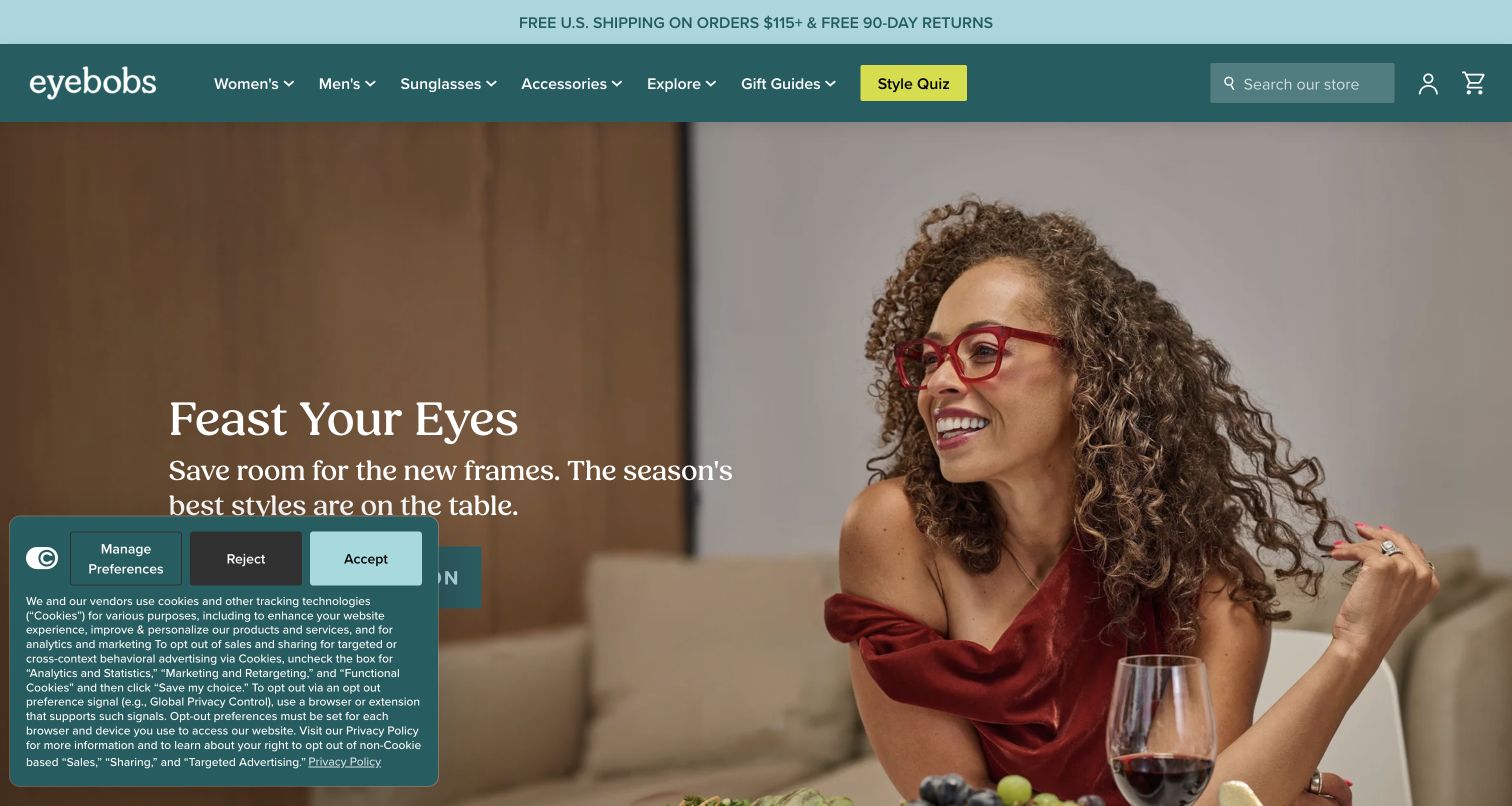
eyebobs pairs a teal navigation bar with a large lifestyle image, a serif campaign heading and one collection action. The page continues with product groups, audience routes, colors and frame shapes, giving shoppers several ways to enter the same catalog. Its earlier ExpressionEngine association is documented by Unleaded’s capability and project pages, which link this exact property. That historical association must remain separate from the current public storefront evidence and does not establish that today’s shop still runs ExpressionEngine. The review did not test checkout, prescriptions, rewards or product claims.
What you can learn
A distinctive retail identity works best when it is supported by practical browsing choices. Let the campaign establish tone, then offer clear paths based on the attributes shoppers recognize, such as shape or color, without making a quiz the only route to discovery.
Pros
The strong teal identity creates continuity between the header and the seasonal feature.
Color and shape routes complement broader audience and collection navigation.
Cons & considerations
The visible privacy panel covers part of the opening call to action.
Numerous catalog entry points need consistent naming to prevent overlap and confusion.
Platform source: Implementation agency’s exact-property case. The agency’s Built with ExpressionEngine section links this project, whose detail page names the exact public eyewear-shop domain. Treat as an earlier undated association and retain any different current observed CMS independently. The implementation agency documents this exact public website as an ExpressionEngine project. The case was read November 10, 2026; its undated account does not establish a current CMS version or complete present backend. The current bounded homepage audit identifies Shopify. ExpressionEngine is retained only as an earlier documented association, never as the current storefront platform. Platform evidence is separate from the direct website screenshot and is not a complete current infrastructure audit.
Kegan has 15+ years of experience working with small businesses, Fortune 500 companies, and everything in between. No development job is too big or too small: he brings the same hands-on attention to a focused improvement, a complete website, or a custom application.
For ExpressionEngine projects, he can help with responsive interfaces, reusable components, custom functionality, API connections, and performance-minded implementation. He works directly with clients on scope, design, implementation, testing, and handover, with an emphasis on clear communication and a system that remains practical to maintain after launch.
Show 3 other ExpressionEngine developersHide other ExpressionEngine developers
Choose an ExpressionEngine approach around the publishing job
A structured public information website
For recurring news, resources, programs or locations, define a small set of records with predictable information. ExpressionEngine channels can use assigned fields, field groups and categories. The project still needs clear labels and a useful distinction between content types. Separate a time-sensitive announcement from permanent practical information, and make the relationship visible to visitors. A public utility or association should not make someone search a news archive to discover an essential service route.
Some stories need a sequence of text, images, quotations and other material. ExpressionEngine’s Fluid field lets editors repeat and arrange assigned fields within an entry, while templates control their presentation. Keep the available choices purposeful. Explain when a quotation deserves its own treatment and when an image needs a caption. More flexibility is helpful when editors can still maintain a sensible heading order and an understandable reading sequence.
A company can use one system for public information while separate applications handle accounts, transactions or specialist operations. Make those transitions clear in navigation and explain where visitors are going. ExpressionEngine templates can present complete pages or reusable page portions, but the public presentation does not reveal every connected service. Document the responsibility for each destination, especially where its branding resembles the main site and could otherwise hide a change of context.
Three priorities for an ExpressionEngine website project
Define content types and a workable review process
Begin with an inventory of the material people need to publish. Group records by their meaning rather than their visual position on a page: programs, resources, locations, products or news. For each group, list the essential facts, the optional details and the person responsible for accuracy. A visitor should not have to infer an event date from a poster image or discover eligibility only after following a registration link. Give those details a predictable place. ExpressionEngine’s channel settings provide fields, categories and statuses; status access can be associated with member roles. Translate those capabilities into a simple editorial routine with clear responsibility for preparing, checking and publishing material. Do not create extra approval stages without a practical reason. Try the proposed form with a normal record, a long title and an entry that lacks an optional image. Ask an editor to explain the labels without developer assistance. Identify which details should be reused and which need context on each page. Finally, decide how expired material is handled. Some content should remain available as an archive, while outdated practical instructions need an obvious replacement. Record those rules so ordinary editing supports both an accurate current website and a useful historical record.
Plan routes and navigation around real visitor questions
Map the most important journeys before drawing the main menu. A museum visitor may need opening times, an educator may need a resource, and a supporter may want to understand the organization’s work. Those tasks can share a website without sharing the same starting point. Write destination labels that distinguish their purposes and check that each important page can be reached through a sensible route. ExpressionEngine template routes allow a project to define URL patterns beyond the default template-group structure. Use that flexibility to create an understandable address plan, then document it before migration or expansion. Preserve established destinations where possible and map deliberate changes to appropriate redirects. Consider what happens when a visitor arrives from an old link, search result or bookmarked resource rather than the homepage. The page needs enough context to stand on its own. Plan headings, related links and practical actions around that arrival. Check long labels, short descriptions and empty listings in the proposed structure. Keep account, payment and external booking destinations clearly identified so visitors can recognize a change of service. A polished opening screen is only one part of the experience; the surrounding navigation should make the rest of the material equally approachable.
Document the parts of the website that need attention after launch. Include the installed platform, add-ons, custom templates, hosting responsibilities and any external services that receive visitors or submitted information. Assign a responsible person for each area and provide a clear route for reporting broken content or an unexpected result. A public website and a private application may have different maintainers even when their branding is similar. ExpressionEngine’s backup guidance covers both site files and the database. Confirm what the chosen backup arrangement contains, how often it runs and how a restoration would be checked. Keep enough history to recover an earlier useful state, and make sure the recovery procedure does not depend on the same system remaining available. Treat editorial evidence as part of the handover too. Save image rights, source links and the dates on which important claims were checked. A newly published layout does not make an old case study a current technology observation. Agree on a routine for reviewing time-sensitive information, expired campaigns and changed destinations. When updates are released, verify the actual public result and follow up on errors. Ongoing care should be a named responsibility with an understandable process, not an assumption left behind with the finished design.
Ask the actual team to carry out its routine job: publish a realistic update, correct a mistake, preview a narrow screen, and identify who owns an integration failure. For a library or frontend framework, also ask who maintains the content source and deployment. A polished screenshot does not answer those operational questions.
Beyond the screenshot
ExpressionEngine website planning checklist
Identify the exact public property behind each technology claim.
Keep current observations separate from earlier documented implementations.
Define content types around information visitors need to understand.
Give important dates, locations and practical details dedicated fields.
Use editor-facing labels that match the organization’s vocabulary.
Assign a clear owner for preparing, checking and maintaining content.
Keep recurring navigation and page structure recognizable.
Give each flexible story component a clear editorial purpose.
Document image descriptions, rights and suitable crops.
Preserve useful URLs and map deliberate destination changes.
Identify transitions to external accounts, bookings and transactions.
Include both files and database content in the recovery plan.
Verify the published pages, links and content after each release.
Test with real content, a keyboard, a small screen, slow or failed requests, and the people who will maintain the system. These are planning checks, not an accessibility, security, performance, or search-ranking certification.
Sources & editorial method
How this ExpressionEngine collection was reviewed
This collection contains twenty distinct public website properties, direct browser captures made on November 10, 2026 and original design reviews. Each example records its actual capture destination, date, dimensions and attribution. ExpressionEngine associations come from explicit credits on the reviewed organizations’ websites or identified implementation-agency cases. Own-site credits are documentary evidence, and undated agency cases do not establish a current software version or current backend. The current eyebobs audit identifies Shopify; its ExpressionEngine link is preserved as an earlier documented association. FocusOn Oncology is reviewed at the exact public article destination reached by its homepage redirect, with property-level developer credits qualified accordingly. Broad public technology-audit attempts are recorded separately: partial, unavailable or access-limited observations are retained without fabricated additions. Private clinical, financial, member, billing and transaction systems were not tested. The reviews discuss visible design decisions and tradeoffs, not service quality, investment or treatment outcomes, measured conversion results, or accessibility certification.
Every image is an unmodified capture from the actual website, with its source and capture date. Some captures are reused from our shared catalog; their dates remain the original capture dates. None comes from a vendor gallery or a generated reconstruction. Moving imagery and live content can change.
Technology attribution uses public page assets or metadata, official platform documentation, or a cited first-party project case study. Documentary and framework-relationship evidence is identified where used; it is not a complete current backend inventory. A CMS image CDN alone does not establish a full CMS deployment. A library’s presence does not prove which individual controls use it, and a platform label does not establish AI authorship.
The composition notes, lessons, pros and tradeoffs are original editorial observations. We have not measured conversion, traffic, security, performance or accessibility conformance. Website owners retain their brands and imagery; these examples are not our client portfolio. Written, Edited and Curated are independent records, not dates advanced by a build. See our editorial standards or suggest a correction.
Questions worth asking
ExpressionEngine website development FAQs
How were these websites associated with ExpressionEngine?
Each example has an explicit public website credit or an implementation-agency source identifying the named project. Those documentary records are qualified individually. Separate broad public-source audits retain their own results and dates; an agency case without a date is not presented as a current backend inspection.
Why include a website whose current platform has changed?
A documented earlier implementation can still provide a useful project reference when its limits are clear. For eyebobs, the agency’s ExpressionEngine association is historical, while the current public audit identifies Shopify. The present screenshot is reviewed as a design example without relabeling the current store as an observed ExpressionEngine installation.
Does an organization’s public website reveal its private systems?
No. Evidence for a public marketing, museum, utility or editorial page does not establish how private applications work. The FocusOn Oncology article, for example, is a public publishing property; its developer credit says nothing about clinical systems. Banking, billing, member accounts and other separate services remain outside this collection’s claims.
Can ExpressionEngine support structured content and varied layouts?
ExpressionEngine channels organize content, while templates determine how it is presented. Fluid fields can provide an ordered selection of repeatable fields within an entry. Those capabilities support different editorial needs, but a useful result still depends on clear content types, sensible field labels and well-designed templates.
What should be planned before a redesign or migration?
Inventory the existing content and destinations, identify the people who maintain them, and define how new records will be prepared and checked. Preserve useful links or map deliberate changes, document external services, and establish a recoverable backup of both files and database content. Check the actual published result after release.
Borrow the decisions that make information easier to use: clear audience routes, useful content fields, readable page structure and well-explained next steps. Adapt them to the material your own team can maintain, and keep technology claims tied to the exact evidence behind them.