Best Eyewear Brand Websites of 2026 (13 Real-World Examples)
Eyewear brand websites that connect a distinctive visual identity with useful frame, fit, lens and store information.
A compelling eyewear website helps someone imagine wearing a frame without losing the practical details that determine whether it belongs on their shortlist.
Eyewear occupies an unusual place between personal style, a physical product and, for prescription purchases, a professional service. A striking campaign can introduce the collection, but a visitor also needs to understand frame dimensions, available colors, lens options and the route to help. Treating all of those needs as a conventional fashion grid leaves important questions unanswered.
This collection looks at the communication and shopping patterns of eyewear brands, from specialist frame makers to larger international names. It is not an optical examination, a recommendation about a particular prescription or an independent assessment of frame quality. Study how each website balances discovery and decision support, then adapt the useful ideas to the products, services and regions your own business genuinely supports.
Before the examples
What makes good eyewear brand website design in 2026?
Make fit information understandable
Give dimensions, size options and a useful explanation of how to compare them. A model photograph can suggest character and proportion, but it cannot establish a precise fit for every face. Keep the path to human assistance visible rather than relying on a style quiz to answer every question.
Separate frame choice from lens choice
Help visitors understand which decisions concern the frame and which concern the available lens service. Explain what an advertised starting price includes before a customer reaches checkout. Avoid a product card that looks complete while hiding essential configuration steps.
Let brand character coexist with shopping clarity
Use campaign photography, collection stories and distinctive type to establish a point of view. Keep names, color labels, navigation and actions readable over those images. A visitor should not need to understand a campaign concept before finding the optical or sunglasses collection.
Connect online browsing with real service routes
Where the brand has stores, appointments, stockists or remote support, explain the differences. Do not imply that every retailer provides every service. A good store page gives the relevant address, hours and contact route, not merely a decorative pin on a map.
The collection · 13 examples
13 eyewear brand websites worth studying
Compare expressive campaign-led storefronts with specialist makers that emphasize materials, sizing and service. Look for the moment each site turns visual interest into a useful next decision.
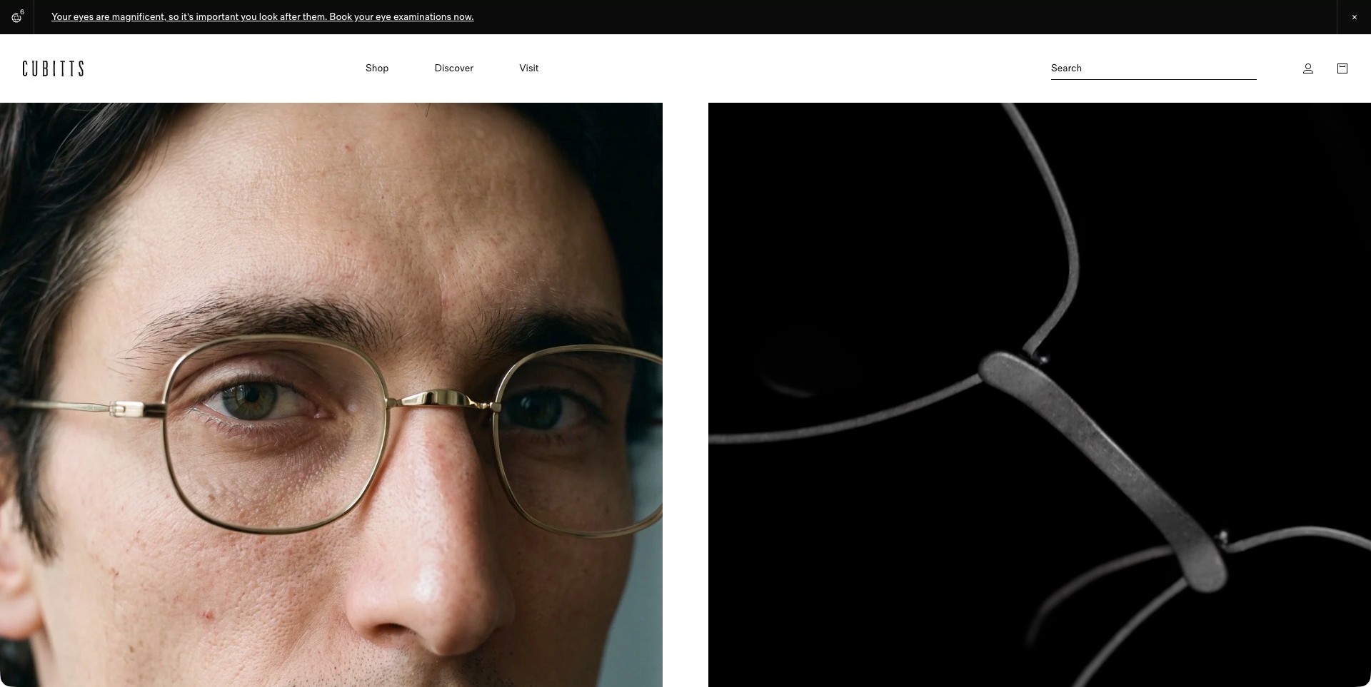
Cubitts divides its opening image between a close portrait wearing fine metal spectacles and a dark macro view of the frame construction. The pairing connects an object to its appearance on a face without surrounding it with promotional copy. Above, a white header separates Shop, Discover and Visit, with search. A black announcement strip directs visitors toward eye examinations. The actual page also names its own spectacle collections. This is a study of product presentation and navigation, not an independent assessment of optical care or frame quality.
What you can learn
Show both the worn scale and the physical detail of an eyewear design, then give shopping, brand discovery and store visits separate routes. Close photography can communicate a particular point of view, but product pages still need precise dimensions, lens information and straightforward fit guidance.
Pros
The paired views make the frame and its relationship to a face immediately visible.
Separate shopping and visiting routes acknowledge different reasons for arriving.
Cons & considerations
If imagery occupies the first screen, a concise collection introduction may need to appear promptly below.
A very spacious header needs careful responsive treatment to keep search and navigation practical.
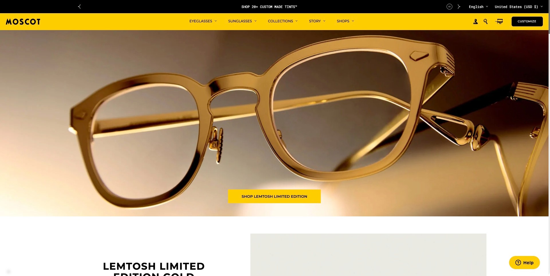
MOSCOT combines a bright yellow navigation band with an expansive photograph of a gold-colored spectacle frame. The product fills the campaign, exposing the bridge, hinge and temple rather than hiding the glasses in a distant lifestyle scene. A matching yellow button names the LEMTOSH limited-edition collection. Eyeglasses, Sunglasses, Collections, Story and Shops remain separate navigation choices above it, while a black utility strip handles locale and a tint promotion. The next white section begins with the named product family. The photographed finish is a design observation, not verification of the advertised material.
What you can learn
Use a campaign to make a particular frame memorable, but keep ordinary category and store routes outside that promotion. Naming the collection on its button helps establish the destination. Follow the large image with specifications and fit information so close photography does not become a substitute for product clarity.
Pros
Consistent yellow accents connect the brand header and campaign action.
Close product photography makes several construction details easy to notice.
Cons & considerations
If a limited edition leads the page, availability and applicable variants need clear destination information.
Multiple promotional and navigation rows can take substantial space on shorter screens.
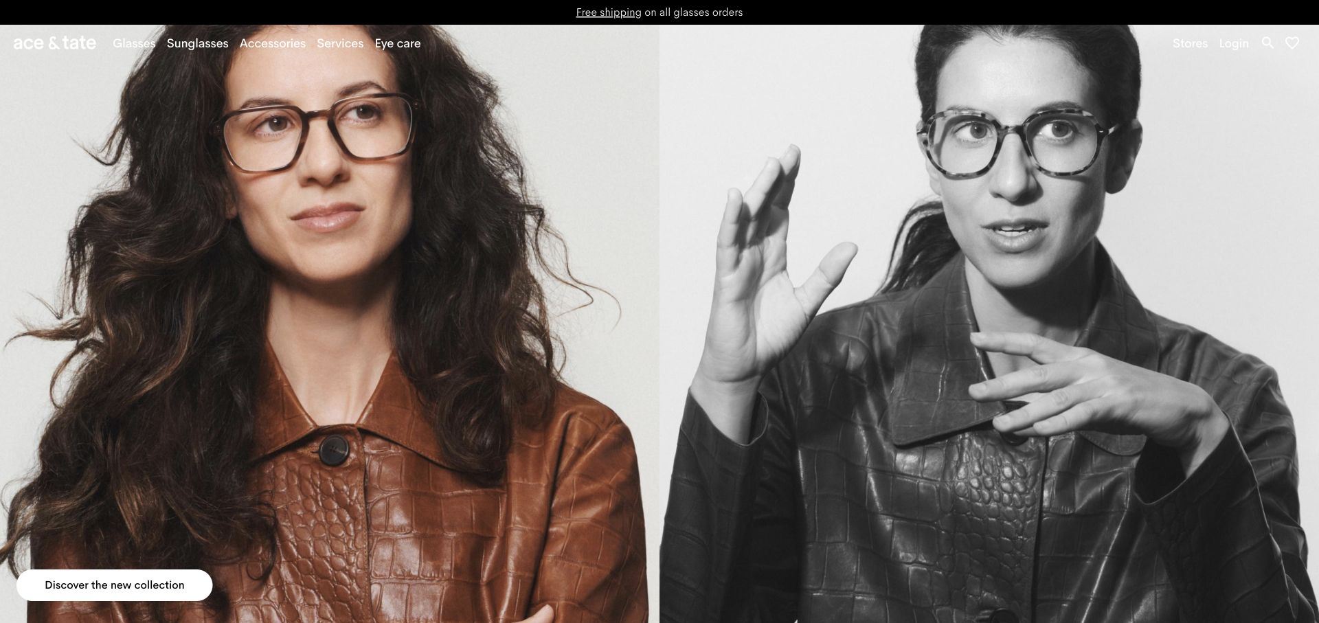
Ace & Tate’s retained US opening pairs a color portrait with a black-and-white portrait across the width of the screen. Both subjects wear clearly visible frames, making the glasses part of the identity rather than a small accessory hidden in a lifestyle scene. A restrained white navigation row names Glasses, Sunglasses, Accessories, Services and Eye care over the photograph. The lower-left collection button supplies a clear next step, while a separate black service strip occupies the top. The current exact US site confirms the brand’s own named frames and optical collections.
What you can learn
Let portrait photography establish the relationship between a frame and a face, then keep ordinary product and service routes close at hand. A collection campaign can introduce character, but the subsequent product journey still needs sizes, fit information and a clear distinction between frame and lens choices.
Pros
The large portraits make the visible frame proportions easy to notice.
Plain category labels provide routes beyond the featured collection.
Cons & considerations
If white navigation overlays a pale photograph, contrast needs checking across responsive crops.
If shoppers are comparing precise fit, portrait imagery needs complementary dimensions and consistent product views.
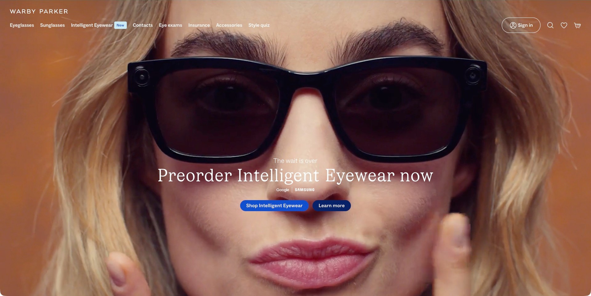
Warby Parker places a close portrait wearing black camera-equipped frames behind a centered Intelligent Eyewear preorder message. Two blue actions distinguish shopping from learning more, while small Google and Samsung marks provide campaign context without explaining the complete product relationship. The white navigation still includes Eyeglasses, Sunglasses, Contacts, Eye exams, Insurance and Accessories, alongside the new category. The captured copy explicitly says preorder; no purchase, delivery availability or feature performance was tested. The useful design contrast is between a high-impact launch campaign and the familiar browsing routes retained around it.
What you can learn
A new eyewear category needs both an explanatory route and a commercial next step. Keep existing product and service labels recognizable so a launch does not disorient other shoppers. Explain preorder conditions, capabilities and limitations in destination content rather than expecting a portrait or partner logo to answer every question.
Pros
The two actions distinguish product exploration from the shopping journey.
Existing optical categories remain visible around the launch message.
Cons & considerations
White navigation over changing photography requires contrast checks for every responsive crop.
A preorder campaign needs carefully maintained expectations about timing and product availability.
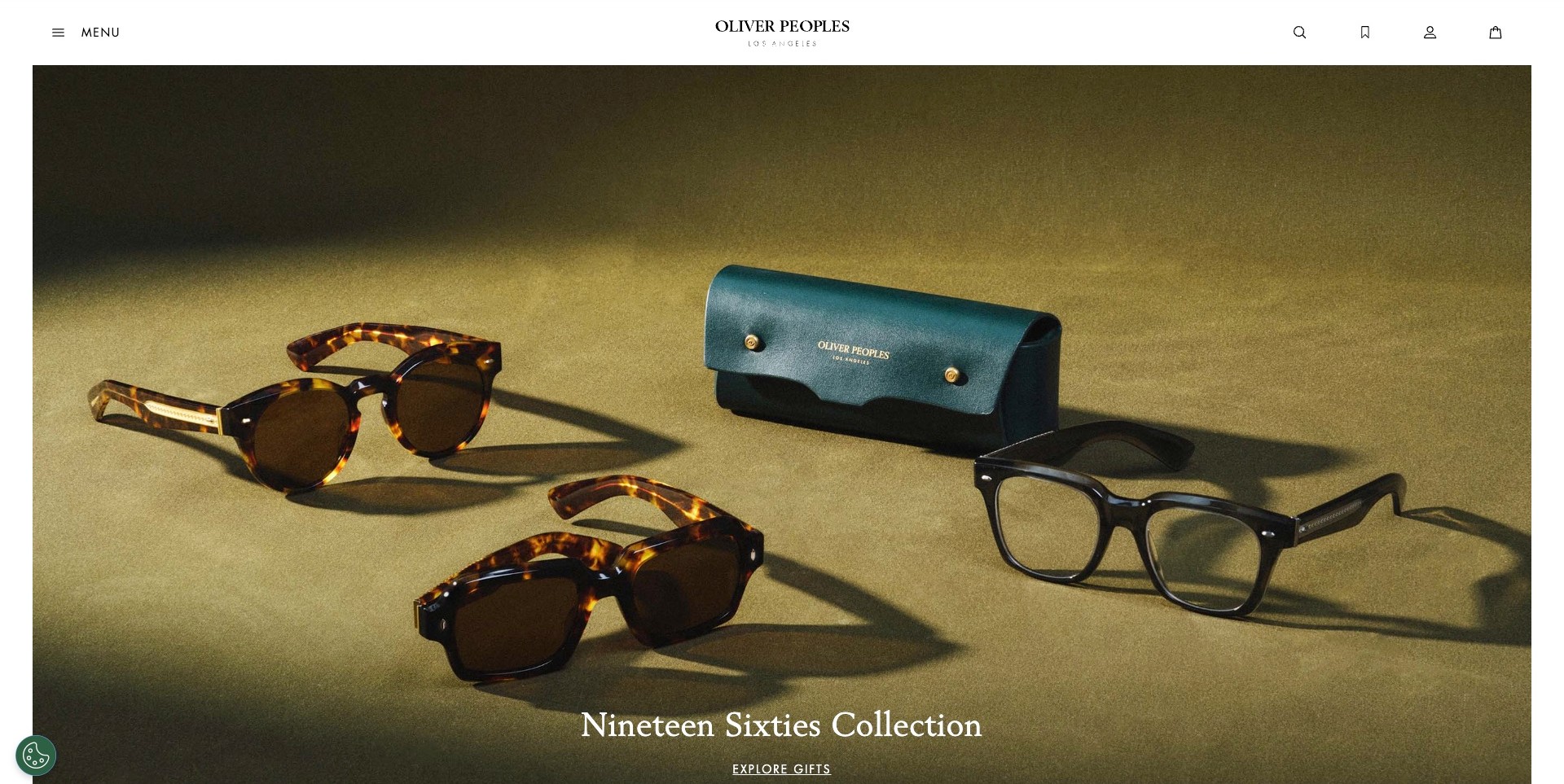
Oliver Peoples presents several tortoiseshell and black frames beside a dark green branded case on an olive background. Directional shadows distinguish silhouettes and folded temples. The photograph sits within narrow white margins under a centered wordmark, a Menu label and utility icons. At its lower edge, the Nineteen Sixties Collection heading and Explore Gifts link identify the campaign without covering the products. The exact US page also provides separate sunglasses, eyeglasses and boutique routes. This is visual merchandising analysis; the still does not establish the pictured frames’ materials or current availability.
What you can learn
Group related frames so shoppers can notice differences in shape and finish before they open a category. Keep campaign naming in real text, then connect the image to clearly labeled product and store destinations. A compelling still life still needs complementary worn views and practical sizing information.
Pros
Directional lighting distinguishes the frames without decorative interface elements.
The white header gives the collection image a quiet, recognizable brand frame.
Cons & considerations
If the collection introduction sits low in a large image, shorter screens may delay its context.
Icon-heavy utilities need clear accessible labels rather than depending on recognition alone.
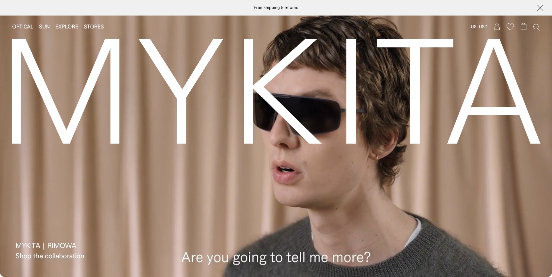
MYKITA stretches its white wordmark across a portrait-film frame showing a person wearing dark sunglasses. The MYKITA and RIMOWA collaboration label and an underlined shopping link sit at the lower left, separate from the film subtitle. Optical, Sun, Explore and Stores remain readable along the top, with a white shipping strip above. The actual capture is one complete film frame, not evidence of every animation or a product demonstration. Its most distinctive choice is to make brand recognition almost as prominent as the glasses while retaining ordinary category navigation.
What you can learn
A collaboration campaign should identify both its subject and a practical next step without replacing the rest of the catalog. Give product categories stable positions around expressive imagery. If film establishes the mood, supporting stills and product pages must supply details that a moving portrait cannot reliably communicate.
Pros
The collaboration label and shopping link give the film a clear commercial context.
Simple category names remain accessible around an unusually large identity treatment.
Cons & considerations
An oversized wordmark can compete with the frame details visitors want to inspect.
If video carries the introduction, reduced-motion behavior and alternative content need deliberate testing.
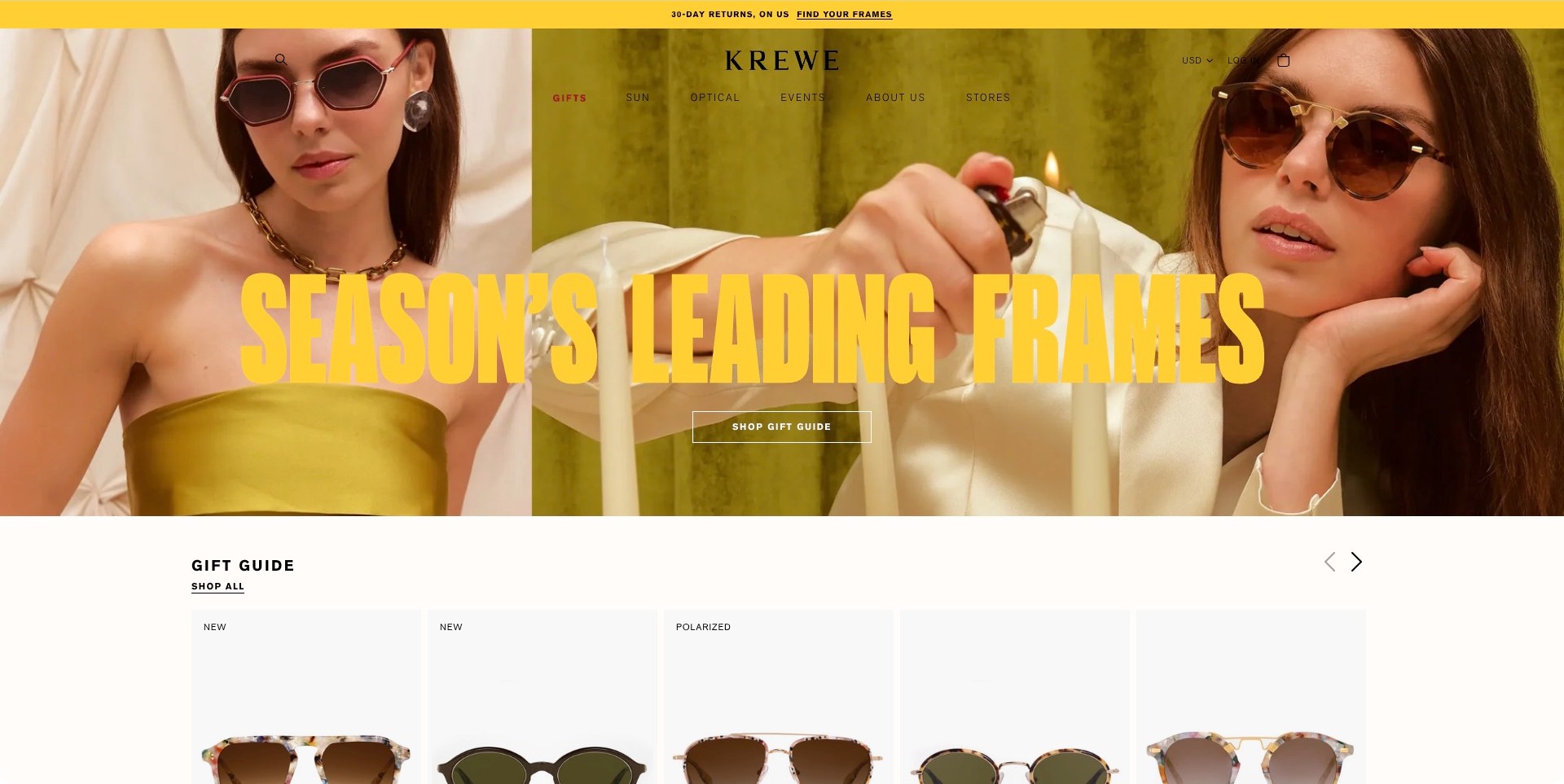
KREWE puts two sunglass portraits beside a candle-lit still-life panel, carrying a strong yellow accent through the announcement strip and oversized seasonal headline. A bordered Shop Gift Guide button gives that campaign a destination. Below, a white Gift Guide section begins a row of product cards, letting visitors move from the styled photographs toward individual frames. Sun, Optical, Events and Stores remain in the header instead of disappearing behind a single launch button. The image shows current campaign presentation, not verification of return terms, polarization or other product-label claims.
What you can learn
Connect an expressive campaign to actual products quickly, using a consistent visual accent rather than unrelated promotional blocks. Keep optical, sun and location routes easy to distinguish. A gift guide should help customers compare options and understand practical restrictions, not simply repeat the same campaign image on another page.
Pros
The first product row gives the lifestyle introduction a concrete browsing continuation.
Repeated yellow accents create a coherent campaign without recoloring every product card.
Cons & considerations
Large overlaid lettering can compete with the frame details in campaign photography.
If promotional terms lead the page, their full conditions need a clearly maintained destination.
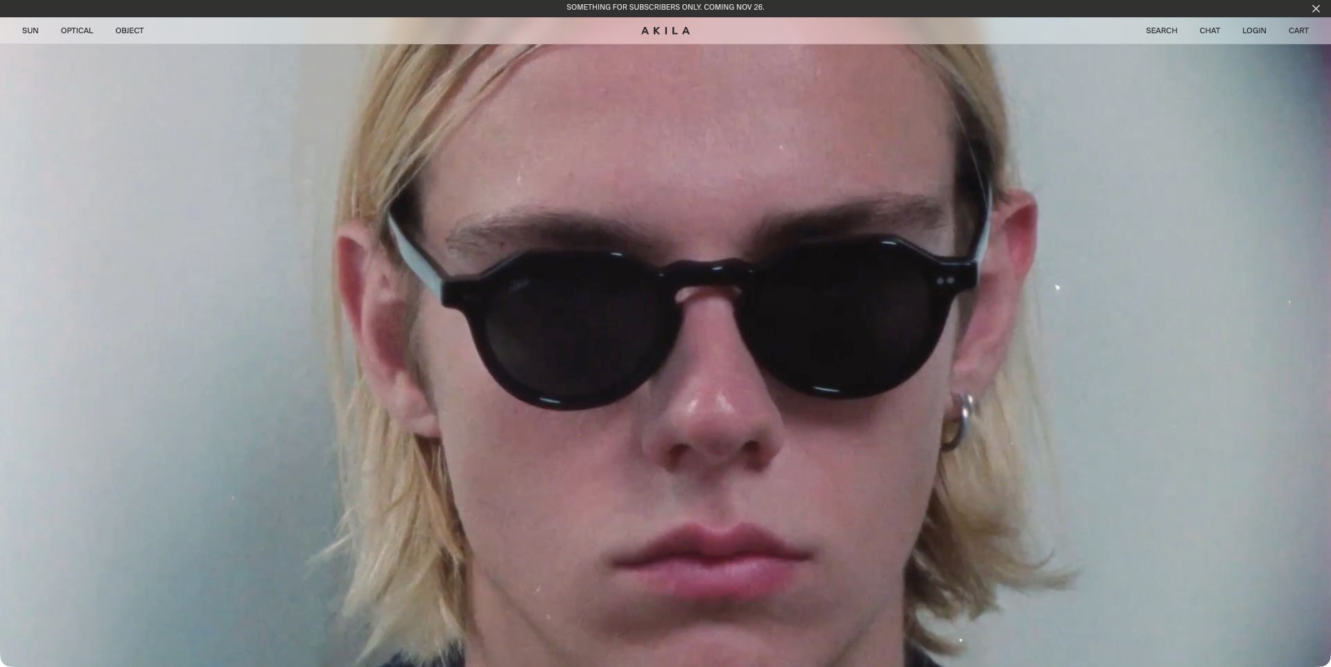
AKILA’s captured Fall 2026 film frame is dominated by a close portrait wearing black sunglasses. A thin translucent header keeps Sun, Optical and Object on the left, the spaced wordmark in the center, and labeled Search, Chat, Login and Cart controls on the right. The dark announcement strip above is a separate subscriber promotion, not an open signup form. There is no large campaign headline or shopping button visible in this particular frame. Current exact-page content identifies AKILA’s own named frame models and separate optical and sunglasses collections.
What you can learn
When a portrait supplies most of the introduction, let the navigation do practical work with plain category and utility labels. Follow the image with product names, comparison views and fit information. A recognizable silhouette can create interest without proving comfort, construction quality or the suitability of a frame for an individual.
Pros
The close portrait makes the main frame outline easy to notice.
Text labels distinguish shopping utilities rather than relying entirely on unfamiliar icons.
Cons & considerations
Without a visible campaign action, the first screen depends heavily on header navigation.
Tiny navigation and promotional text require responsive sizing and contrast checks over the film.
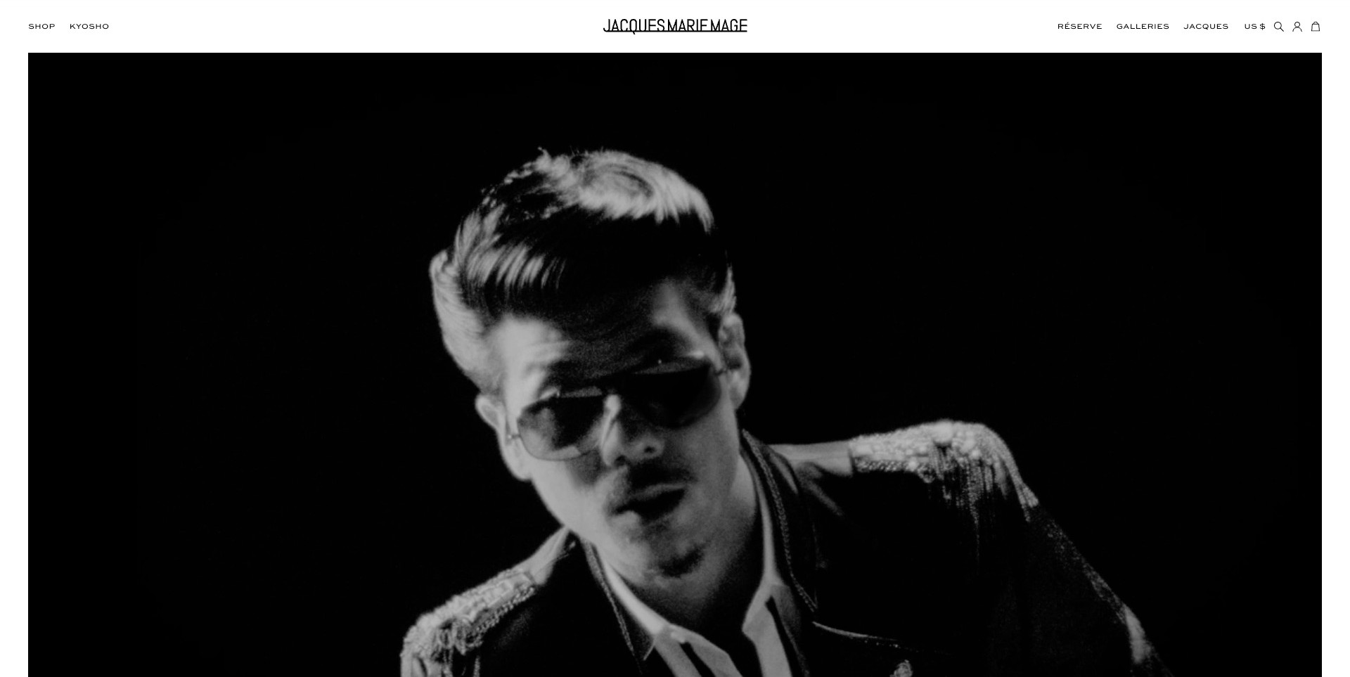
Jacques Marie Mage opens with a large black-and-white portrait of a person wearing dark glasses, bordered by white space and a narrow, centered wordmark header. Shop and Kyosho sit on the left, while Réserve, Galleries and Jacques provide separate destinations on the right beside utility icons. The captured film frame contains no prominent explanatory sales paragraph or visible campaign button. Lower page content separately identifies Sunglasses and Optical collections. The useful observation is the contrast between expressive portraiture and restrained storefront controls, without independently verifying product specifications.
What you can learn
Editorial photography can establish an eyewear brand’s tone before a customer chooses a model. Preserve an obvious shopping entry and explain unfamiliar navigation labels where they lead. Support a cinematic introduction with stable collection pages, product views and fit details that do not depend on watching the whole film.
Pros
White margins and a restrained header give the monochrome image a clear visual boundary.
Shopping and gallery destinations remain separate rather than collapsing every task into one action.
Cons & considerations
A mood-led first screen can delay practical product context for unfamiliar visitors.
Specialist collection labels need clear destination explanations rather than assumed prior knowledge.
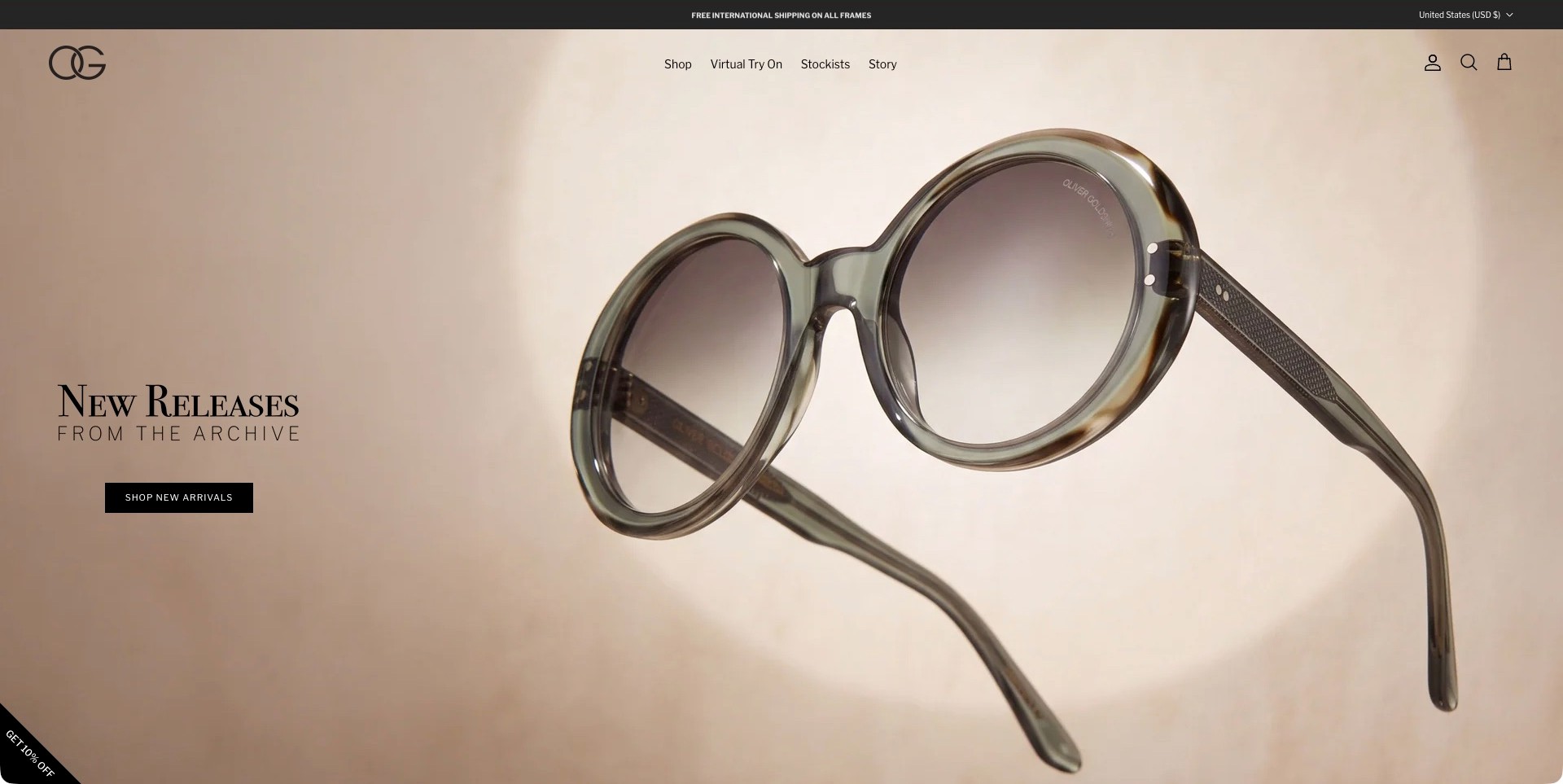
Oliver Goldsmith’s US storefront places one oversized round frame against a soft beige background, with its open temples showing the object from more than a straight-on angle. New Releases from the Archive appears to the left above a black shopping button. The OG mark anchors a sparse header containing Shop, Virtual Try On, Stockists and Story, while the utility strip explicitly shows United States and USD. The actual page lists its own named frames below. This regional capture illustrates product presentation, not a tested fitting tool, shipping promise or manufacturing claim.
What you can learn
Give an archive-led release a plain shopping route and show enough of the object to establish its silhouette. Keep storytelling, stockists and fitting assistance distinct. Product detail pages should explain dimensions and variants rather than expecting a heritage reference or attractive hero image to answer practical questions.
Pros
The isolated frame is easy to distinguish from the subdued background.
The US currency context is stated without an obstructing region-selection modal.
Cons & considerations
A close object view still needs worn images to communicate scale on a face.
If a fitting tool is promoted, its limitations should be clear before visitors rely on it.
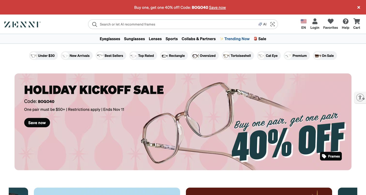
Zenni’s retained storefront gives a long search field substantial space beside the wordmark. Below, a product-family row separates eyeglasses, sunglasses and lenses, followed by compact shortcuts such as price, shape and material-related labels. The rounded pink campaign then displays oversized transparent frames and a prominent sale message. A black action button supplies the next step without hiding those more practical browsing routes. The image contains historical seasonal terms; the current official site independently confirms Zenni’s own frame collections and product references.
What you can learn
Build eyewear navigation around the language customers actually use: frame shape, budget, intended use and lens questions are not interchangeable. A campaign can sit below that system, giving returning shoppers a direct route instead of requiring everyone to start with the promotion.
Pros
The visible frame shortcuts acknowledge several different ways to narrow a large catalog.
Large product photography makes the featured frame shape legible within the campaign.
Cons & considerations
If several navigation rows compete, their combined height can delay access to the products.
If a discount is emphasized, eligibility and expiry need clear, consistently maintained destination content.
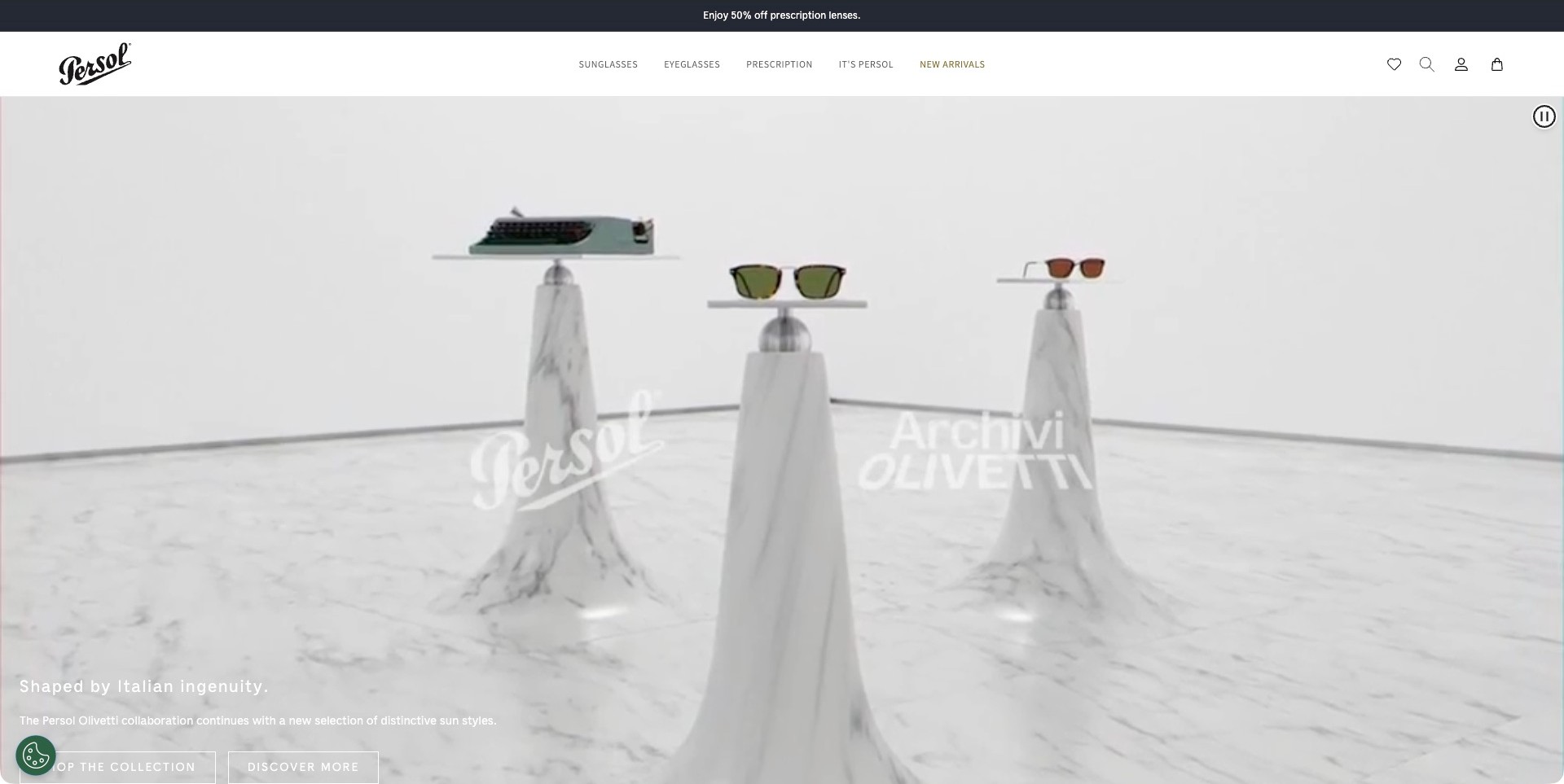
Persol’s US homepage shows sunglasses and a typewriter arranged on marble-like display plinths in a pale campaign film frame. Persol and Olivetti marks identify the collaboration, while a short lower-left explanation introduces the sun styles. Two outline actions sit along the lower viewport edge. Above, a restrained white header separates Sunglasses, Eyeglasses, Prescription, the brand story and New Arrivals. The captured page also names specific Persol and Olivetti frame models. The scene supplies editorial context, not independent evidence about the collaboration’s production process, lens promotion or product performance.
What you can learn
Use collaboration imagery to make the relationship understandable, then preserve familiar product labels for visitors who simply want glasses. Separate collection shopping from further explanation. A campaign film can introduce a design reference, but individual product pages still need consistent photography, dimensions and a clear account of available options.
Pros
The campaign presents both eyewear and its collaboration reference in one scene.
Ordinary optical categories remain visible above the editorial treatment.
Cons & considerations
Actions near the bottom of a tall film need careful treatment on shorter screens.
Pale lettering over pale imagery requires contrast testing across changing film frames.
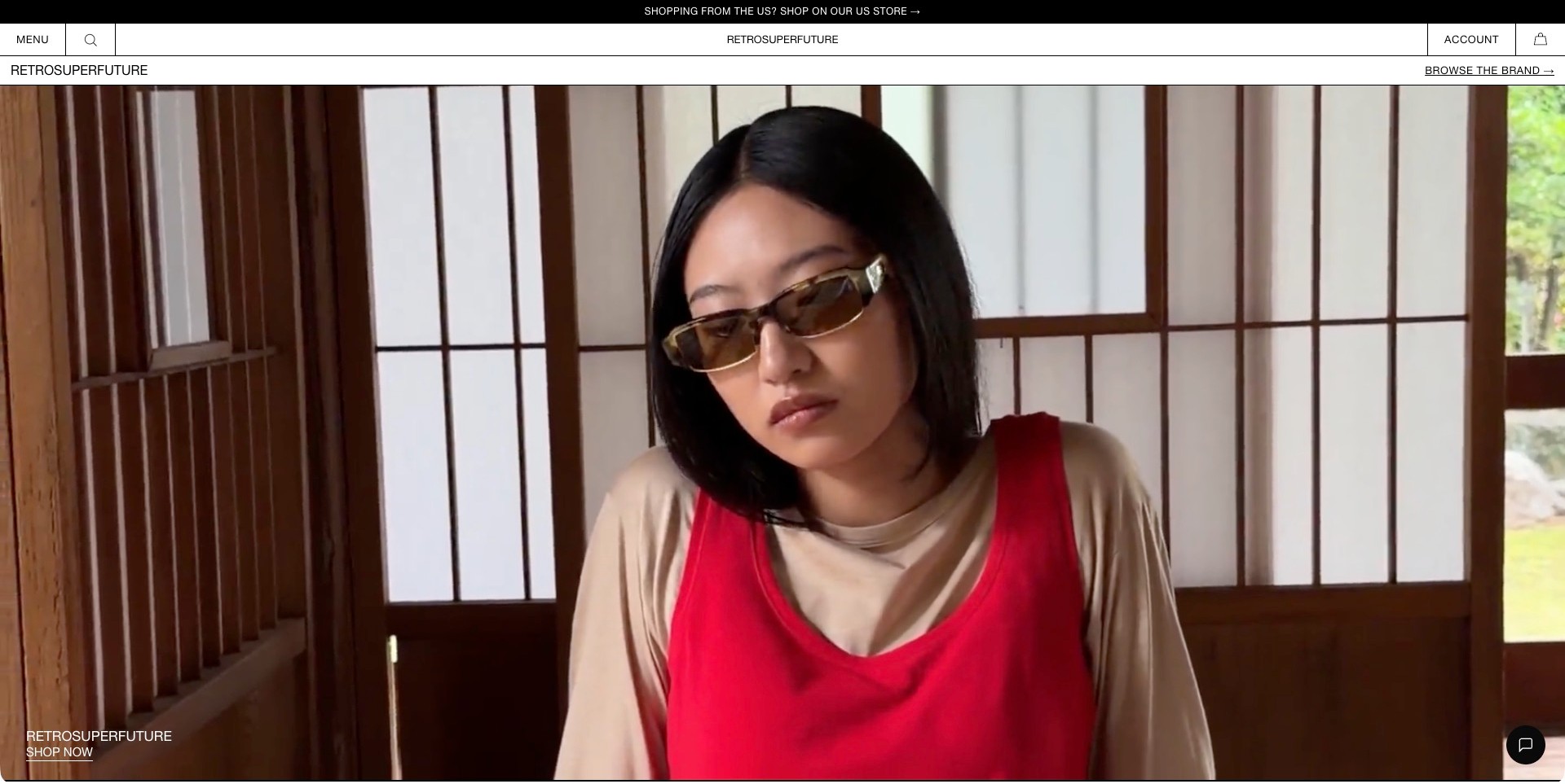
RETROSUPERFUTURE surrounds a large portrait-film frame with thin black rules and compact white navigation bars. The person’s sunglasses remain visible against a warm interior, while a small brand label and Shop Now link sit at the lower left instead of a large promotional headline. Menu, search, account and bag occupy distinct header cells. A black utility strip directs US shoppers toward a separate US store; this capture remains the global property rather than silently substituting the regional site. The page identifies its own sunglasses and optical eyewear collections below.
What you can learn
A restrained interface can let a campaign establish character while keeping shopping controls recognizable. Make regional-store differences explicit and preserve the correct currency, availability and service information at the destination. Editorial film should lead toward stable collection pages rather than become the only way to understand the products.
Pros
Ruled header divisions give the minimal shopping controls clear positions.
The regional-store notice states a practical distinction without an open location overlay.
Cons & considerations
A small corner action can be missed when portrait imagery dominates the screen.
If a film carries the opening, alternative still content and reduced-motion behavior need testing.
Kegan is a freelance web designer and developer with 15+ years of experience helping businesses turn complicated website requirements into clear, maintainable digital experiences. He works directly with clients from planning and design through development, launch, and ongoing support.
For eyewear brand website design, his development approach focuses on clear frame and lens distinctions, useful fit and sizing information, honest product imagery, store and appointment discovery, and dependable shopping journeys without medical-outcome claims. The scope can be a targeted improvement or a complete custom build, with responsive layouts, thoughtful content structure, and integrations chosen around the people using and maintaining the site.
Show 3 other eyewear brand website designersHide other eyewear brand website designers
Plan an eyewear website around discovery, fit and a confident next step
Define what customers can actually do on the site
Start with the operating model rather than the homepage layout. Can someone buy complete prescription glasses online, order a frame without lenses, browse a collection before visiting a stockist, or book an appointment? Those are different journeys. List the supported countries, product types and services, then make the differences visible before a visitor invests time in configuration. A beautiful product page is frustrating when its purchase route disappears only after a customer selects their region.
Create a short task map for first-time and returning visitors. A first-time buyer may compare shapes and sizes; a returning customer may already know the model and need a new color or service information. Search, collection filters and recognizable model names serve the second group without weakening the brand experience for the first. Keep promotional collection names connected to plain categories such as optical frames, sunglasses and accessories.
Review the overlap between commerce and professional services carefully. The website can explain how an appointment is booked and what information the business requests, but should not turn a styling recommendation into medical advice. If prescription details are collected, define the intended process, permitted access and support route. The homepage does not need to expose sensitive information to demonstrate that the brand offers a complete service.
Build product records that survive beyond a campaign
Treat the model as structured content, not a photograph with a price attached. Record the product name, color name, material description, available sizes, dimensions and supported purchase options in maintainable fields. Use stable identifiers behind the scenes so a product can move between a seasonal campaign and an evergreen collection without acquiring conflicting descriptions. Mark unavailable variants honestly, especially when images show a color that cannot currently be ordered.
Plan a consistent image set. Front, side and angled views answer different questions, while a person wearing the frame adds useful scale and styling context. Keep photographic lighting reasonably consistent across colors so a customer can compare them. Do not present a screen rendering as a perfect guarantee of color, and avoid cropping the frame out of the very image intended to explain its proportions. Decorative campaign imagery can sit alongside these practical views rather than replace them.
Write measurement guidance for someone who has not bought glasses online before. Explain how the displayed dimensions relate to the frame and where to find comparable markings on an existing pair, when appropriate to the brand’s process. Do not promise that a simple numeric match guarantees comfort. Link support and store options from the same area so the customer can ask a useful question without starting their visit again.
Design collection navigation for real comparison
Choose filters that correspond to meaningful differences in the catalog. Shape, size, color, material and product type can help, but only when values are applied consistently. A filter called medium becomes less useful if its meaning changes between collections. Let customers clear a filter easily, retain an understandable result count and recover from an empty selection. On a phone, the filter interface should not hide the results or trap the visitor in a full-screen panel.
Show enough information on the product card to support scanning. A clear model name and visible variation options can be more useful than several promotional badges. Distinguish a model from its individual color variants so the grid does not appear to contain many unrelated products that are actually one frame. Where a collection has only a few models, a thoughtful editorial sequence may be simpler than a large filtering system.
MOSCOT’s public navigation demonstrates several distinct discovery routes, including shape, color and size. Cubitts combines collection stories with an explicit range of frame sizes. Those are useful planning references, not proof that every buyer should receive the same menu. Test the language against the questions your customers ask. A specialist collector may search by model name, while a new buyer may need a plain-language starting point.
Explain lenses, pricing and support before the final step
Map the order configuration as a sequence of understandable decisions. Keep the selected frame visible while explaining available lens services, relevant requirements and how the price changes. Avoid preselecting a paid option in a way that obscures the comparison. If a stated price is for a frame alone, make that clear where the price first appears, not only in a final basket summary.
Give support information a useful local context. Delivery destinations, collection options, adjustments, returns and repairs may differ by product or region. Connect the appropriate policy to the product journey without burying it in a long footer. Do not copy another eyewear company’s service promises or imply that a policy covers an order when exclusions apply. The business should own and maintain the published wording.
Where virtual try-on or a style quiz is available, explain its purpose and limitations in ordinary language. It can help a person explore appearance but should not be presented as a substitute for every fit, prescription or professional assessment. Offer a route that works without granting camera access. Test keyboard use, permission refusal and slow connections so a useful optional feature does not become an unnecessary barrier to shopping.
Make stores and stockists part of the customer journey
Give each owned store an individual page with current practical information. Include its location, opening hours, contact details, available services and a clear appointment route where one exists. Distinguish an owned store from an independent stockist; their inventory and services may differ. A visitor should not interpret a map marker as a promise that a specific frame or appointment is available at that location.
Connect the store route to the product context. Someone comparing frames may want to see where a model can be viewed, while someone looking for an adjustment may need a different contact. Explain what can be confirmed online and what requires contacting the location. A straightforward stockist list can work well when it is accurate; a complex live inventory widget is not useful if the underlying data cannot be maintained.
MYKITA’s public site separates its own stores from selected retailers, and Garrett Leight exposes stores and virtual appointment destinations in its navigation. Use those distinctions as prompts for your own service model. Keep addresses and hours editable without a code change, provide a non-map alternative, and review links after a relocation or service change. Operational accuracy matters more than an elaborate locator animation.
Keep the editorial identity accessible and maintainable
Create a campaign system with deliberate guardrails. Decide where art direction can vary and where product information, navigation and important controls remain consistent. Large video, unusually thin typography and low-contrast labels can look distinctive in a presentation but become difficult on a phone outdoors. Provide readable text and meaningful actions even when a video is paused, unavailable or reduced by the visitor’s preferences.
Give the team reusable content types for collections, products, stories, people and locations. This makes it easier to connect a craft story with the relevant frames without manually rebuilding every page. Record image credits and permissions, including model and photographer requirements. A brand’s claim about a patented process, specialist material or manufacturing origin should come from an approved source; visual polish does not independently verify it.
Test a few complete journeys before launch: find a named frame, compare sizes, understand the purchase options, identify a store and reach support. Include keyboard navigation and realistic mobile conditions. Review empty searches, unavailable variants and region changes as carefully as the ideal campaign path. Keep a maintenance owner for product information and store content so the website remains useful after the seasonal imagery has changed.
The editing job behind the design
Choose tools for a precise catalog and connected customer service
Choose a commerce and content setup that can model frame variants, product dimensions, regional availability and collection stories without duplicating essential information. A more expensive framework does not compensate for inconsistent product records. Decide which team owns each field and how updates reach every relevant page.
Keep appointment booking, stockist information and optional try-on tools connected through understandable journeys. Separate those services from sensitive prescription information where the operating process requires it. Do not infer an example’s private order, inventory or optical systems from the technology visible in its homepage.
Prioritize responsive images, accessible controls, dependable search and a clear fallback for optional media. Public stack notes describe only observed references or explicitly qualified associations. They do not establish that a particular software choice caused the site’s design, service quality or commercial results.
Our WordPress website examples offer a separate look at publishing approaches. A visible platform label is evidence for that named page, not a guarantee that the same system will suit your requirements.
Before the public launch
Eyewear brand website planning checklist
Define online purchase, appointment and stockist journeys separately.
Identify supported regions and product-specific availability.
Give frames stable names and structured variant records.
Show front, side, angled and on-person views where useful.
Explain dimensions without promising a universal fit.
Use consistent shape, size, color and material filters.
Clarify what a starting price includes.
Keep frame and lens decisions understandable.
Offer assistance without requiring camera access.
Distinguish owned stores from independent stockists.
Keep service policies attached to their actual scope.
Protect any sensitive information collected during service journeys.
Test unavailable variants, empty searches and region changes.
Assign an owner to store hours and product updates.
These checks are a project checklist, not a performance, legal, security, or accessibility certification. Test real journeys with the people responsible for the website before making claims about the result.
Sources & editorial method
How this collection was selected and reviewed
This collection contains exactly 13 distinct public eyewear-brand website examples, matching the original random target saved before research. Every accepted image was independently inspected at full resolution. Two retained original direct captures keep their genuine older dates and bytes; eleven new browser captures keep actual UTC timestamps and remove only the observed native browser toolbar. Current dated first-party observations establish own-brand eyewear fit without turning an old image into a fresh capture. Cubitts is the explicit researched Editors Choice for the stated website-design reasons, not a vote-derived or measured ranking. Reviews evaluate visible communication, navigation and presentation; no optical examination, product performance, frame materials, medical suitability, stock availability or service-quality guarantee is implied. Public technology labels require scoped evidence, and unknown components remain unlisted. External designs, photographs and trademarks belong to their respective owners.
Each example links to its actual source page. Screenshots are direct browser captures with their own capture dates; moving imagery, announcements and live designs can change. The notes describe observable design choices and conditional tradeoffs, not measured traffic, conversion results, service quality, or accessibility conformance.
Technology labels use public page metadata, asset evidence, or explicitly cited platform documentation. Platform documentation is not a complete current deployment audit. A component reference may be legacy or unused; it is not a complete backend inventory. Unknown stacks are omitted. These sites are editorial examples, not our client portfolio.
Written, Edited and Curated are separate editorial records, not timestamps advanced by a rebuild. Website designs and imagery belong to their owners. See our editorial standards or suggest a correction.
Questions worth asking
Eyewear Brand website design questions
Should an eyewear homepage lead with a product grid or a campaign?
Either can work when it matches the audience and catalog. A campaign can establish a distinctive point of view, while a grid helps direct comparison. Keep plain product categories and a route to named models visible so visitors do not have to understand the campaign before they can browse.
Can virtual try-on replace fit information?
No. Treat it as an optional way to explore appearance, with appropriate limitations. Keep measurements, product views and a route to assistance available. A customer should still be able to browse and make progress when they decline camera access or the feature does not load.
Should prescription services be part of every eyewear storefront?
Only when the business actually supports them. A frame-only brand, a prescription retailer and a manufacturer selling through stockists need different journeys. Explain the supported process clearly and avoid collecting sensitive information without a defined purpose and handling process.
How much craftsmanship information belongs on product pages?
Enough to explain relevant materials and design decisions in a useful context. Connect longer stories to products rather than forcing every customer through them. Keep technical or origin claims approved and specific; a polished presentation is not independent proof of manufacturing quality.
What should a stockist page tell visitors?
It should identify the location and explain what can be confirmed there. Distinguish independent retailers from owned stores, keep contact information current and avoid implying that every location carries every frame or offers the same services.
Borrow the clear frame records, distinctive art direction and useful service connections. Build a website that helps someone choose their next step, not one that leaves practical questions outside the picture.