Best Cosmetic Brand Websites of 2026 (27 Real-World Examples)
Makeup and skincare cosmetics websites with distinctive campaigns, readable product choices and useful routes beyond the seasonal promotion.
A beauty storefront should make color, texture and creativity inviting while helping customers understand the product, format, shade or routine they are choosing.
Cosmetics websites need to support two different kinds of attention. Someone may arrive inspired by a finished look, while another visitor already knows the product and wants to compare shades or replace a favorite. The strongest experiences connect those journeys. They give art direction room to express the brand without letting campaign imagery overwhelm the practical work of selection.
These examples focus on website design, product presentation and shopping communication. They are not product tests or recommendations about skin suitability, ingredient safety or performance. A compelling shade finder or an impressive before-and-after image does not independently establish an outcome for every customer. Borrow the useful design patterns while keeping product claims and limitations grounded in the brand’s approved information.
This collection covers both makeup and consumer skincare cosmetics, with makeup-led brands forming the majority. The skincare examples are product businesses, not medical clinics, treatment providers or device directories. Compare how a color-focused catalog explains shades and looks with how a skincare range explains formats, product categories and optional routine discovery. The shared design challenge is helping someone understand what they are buying without treating a polished presentation as individualized advice.
Before the examples
What makes good cosmetic brand website design in 2026?
Make the selected shade unmistakable
Keep the shade name, swatch, product imagery and purchase state synchronized. A customer should not have to infer which color is selected from a tiny circle alone. Provide text labels and a visible selected state that does not depend only on color.
Connect looks with the products that create them
Editorial photography can introduce a finish or style, but the customer needs a practical route to the actual items and variants. Identify what is included in a set and what is merely shown alongside it. Avoid making a tutorial function as a hidden shopping puzzle.
Give product information a dependable structure
Organize size, finish, application guidance, ingredients and relevant conditions consistently. Keep the factual record distinct from seasonal campaign language. A customer comparing two products should not have to decode a different page structure for each one.
Keep discovery tools optional and honest
Shade matching and virtual try-on can support exploration, but should not be presented as a universal guarantee. Offer a useful path without camera access or a completed quiz. Explain the role of human support where the brand provides it.
The collection · 27 examples
27 cosmetic brand websites worth studying
Compare artist-led makeup brands, expressive color collections and consumer skincare storefronts. Makeup leads this selection, while skincare introduces useful contrasts in routine discovery, packaging and information density. Look for the link between campaign identity, product clarity and the small decisions that help someone build a realistic shortlist.
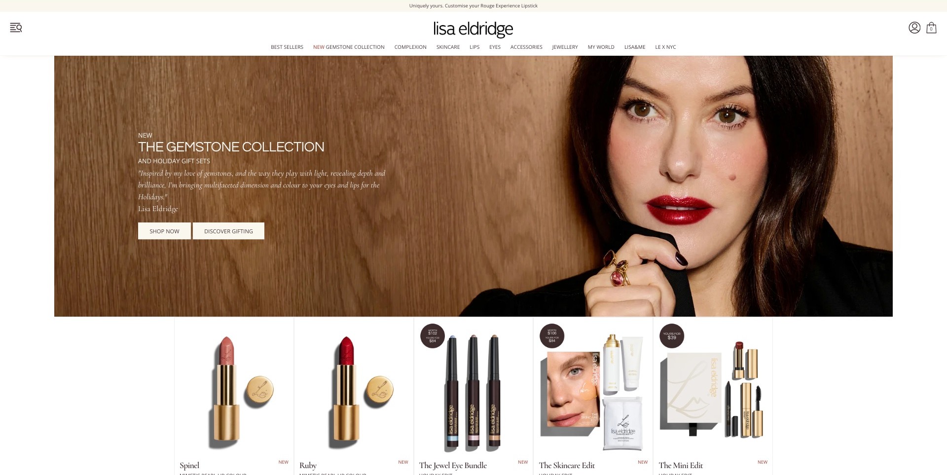
Lisa Eldridge’s US storefront pairs a close portrait with glossy red lips and defined eye makeup against a warm wood background. The Gemstone Collection introduction sits to the left with separate shopping and gifting actions. Directly below, a consistent product row shows individual lipsticks, eye pencils and sets rather than another unrelated campaign. The white header keeps Complexion, Skincare, Lips and Eyes distinct. This establishes a useful connection between an overall look and named products, without proving which items created every detail of the pictured makeup or how they perform.
What you can learn
Show an inspiring finished look, then give shoppers a clear route to the relevant collection and recognizable product formats. Keep shade names, close product views and practical comparisons available beyond the portrait. A strong editorial image should invite investigation rather than substitute for color and application information.
Pros
The immediate product row connects the campaign to concrete browsing choices.
Separate color-cosmetics categories remain visible around the seasonal introduction.
Cons & considerations
Small category labels need sufficient size and spacing on narrower screens.
A finished-look portrait needs complementary swatches and product details for meaningful shade comparison.
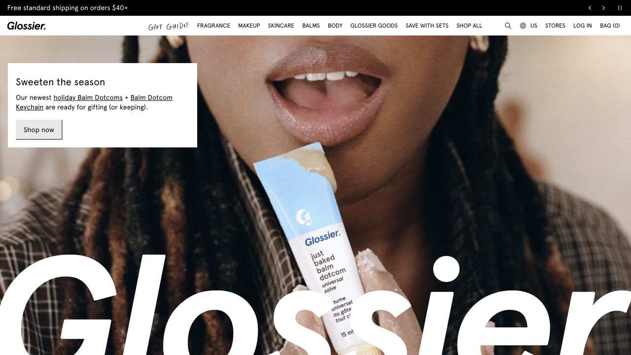
Glossier’s retained opening pairs an unusually close model photograph with the balm itself, so the product is visible in a recognizable application context rather than isolated against an abstract background. A small white panel names the seasonal feature and supplies a straightforward shopping action. Above it, the navigation keeps makeup, skincare, fragrance and other categories available. The enormous white wordmark crossing the lower image adds graphic character, while the ordinary product categories provide a practical counterweight to the campaign.
What you can learn
Let campaign photography establish the mood, then give the customer a compact, readable explanation of the actual product. Keep a direct category route for visitors who are replacing a known item rather than responding to the seasonal feature.
Pros
The product appears beside its application context, connecting packaging with the campaign’s subject.
The white caption panel separates the buying prompt from a visually detailed photograph.
Cons & considerations
If a collection needs precise shade comparison, this campaign view still needs complementary product imagery.
If oversized branding crosses important content, image crops need careful checks at other viewport sizes.
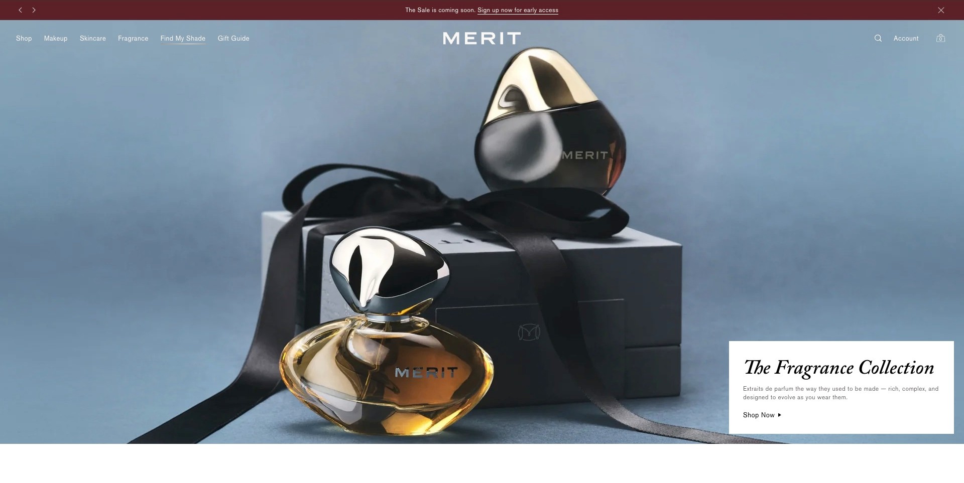
MERIT’s captured homepage leads with two sculptural fragrance bottles and a ribboned box against pale blue, not a makeup application image. A separate white panel names the Fragrance Collection and supplies a shopping action. The centered wordmark and simple header preserve Makeup, Skincare, Fragrance, Find My Shade and Gift Guide routes. The actual page separately presents its own makeup range, which establishes the cosmetics fit. The useful design question is how a brand adds a category while keeping established customers oriented, not whether the photograph demonstrates cosmetic results.
What you can learn
Let a category launch have its own visual identity without replacing plain product navigation. A makeup customer may still need shade assistance while another visitor explores fragrance. Keep those tasks separate, and make the campaign’s destination explicit so the lead image does not redefine the whole catalog accidentally.
Pros
A contained text panel keeps the fragrance action readable over the still life.
Makeup and shade-finding routes remain easy to distinguish from the launch category.
Cons & considerations
A non-makeup hero can delay context for first-time shoppers expecting color cosmetics.
White overlaid navigation needs contrast checks as imagery and responsive crops change.
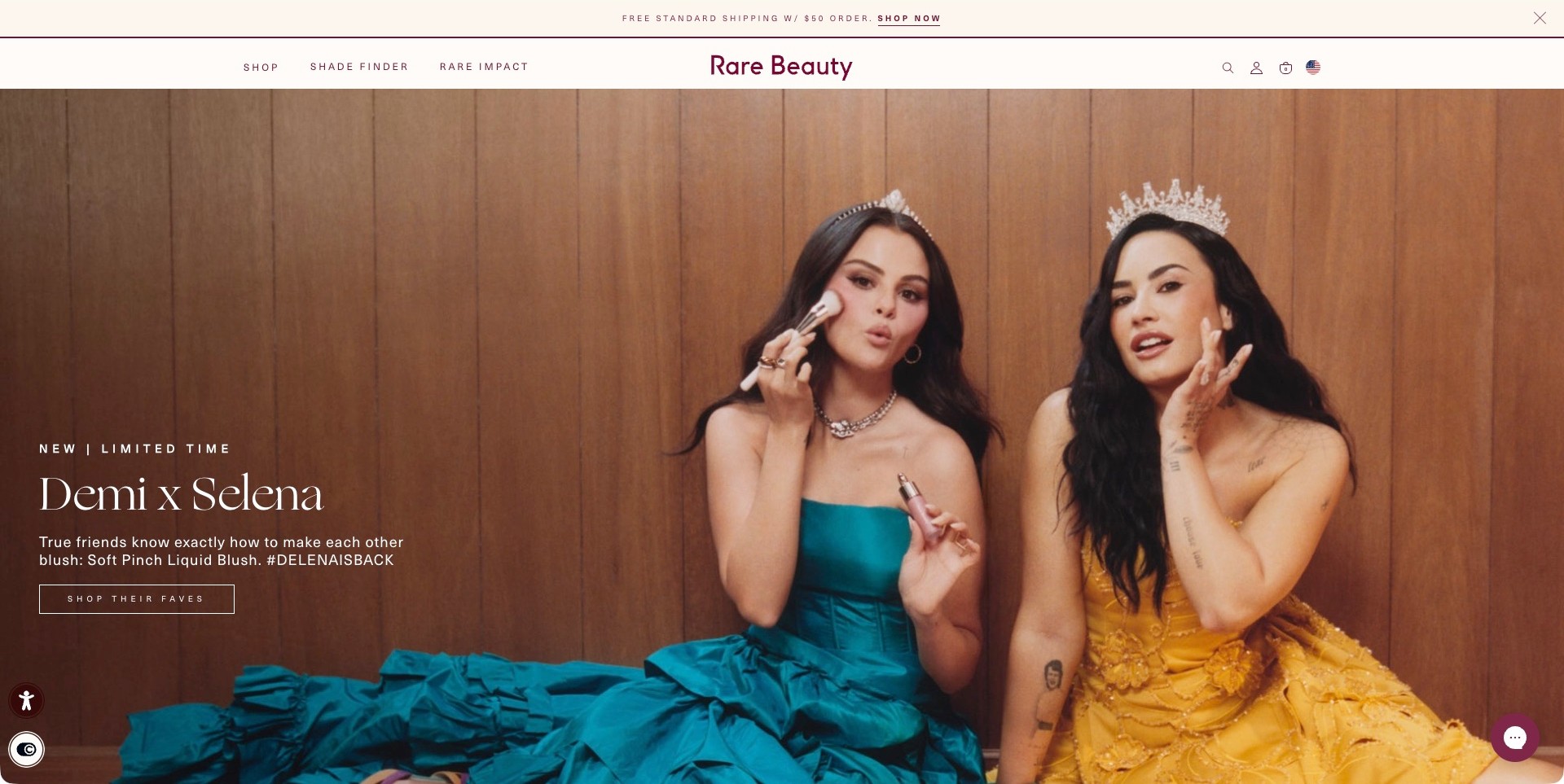
Rare Beauty’s paused Demi x Selena campaign shows two people with visible makeup products and a brush against a warm paneled wall. The lower-left copy identifies Soft Pinch Liquid Blush and offers a specific campaign-shopping action. A restrained cream header separates Shop, Shade Finder and Rare Impact around the burgundy wordmark. The actual page also identifies its own blush and other makeup products. This is the complete accepted two-person campaign frame, not a different gift-box slide, and it does not establish independently measured application results or product suitability.
What you can learn
Pair personality-led imagery with an explicit product name and a practical next step. Keep shade assistance available for visitors who need comparison rather than campaign storytelling. Destination pages should explain colors, formats and application information without treating a photographed look as a guarantee of the same result for everyone.
Pros
The campaign identifies the product type instead of relying on the personalities alone.
A persistent Shade Finder route addresses a practical makeup-shopping task.
Cons & considerations
A large portrait scene still needs accessible product and shade information elsewhere.
A campaign-shopping label should lead to a clearly explained selection rather than an ambiguous full catalog.
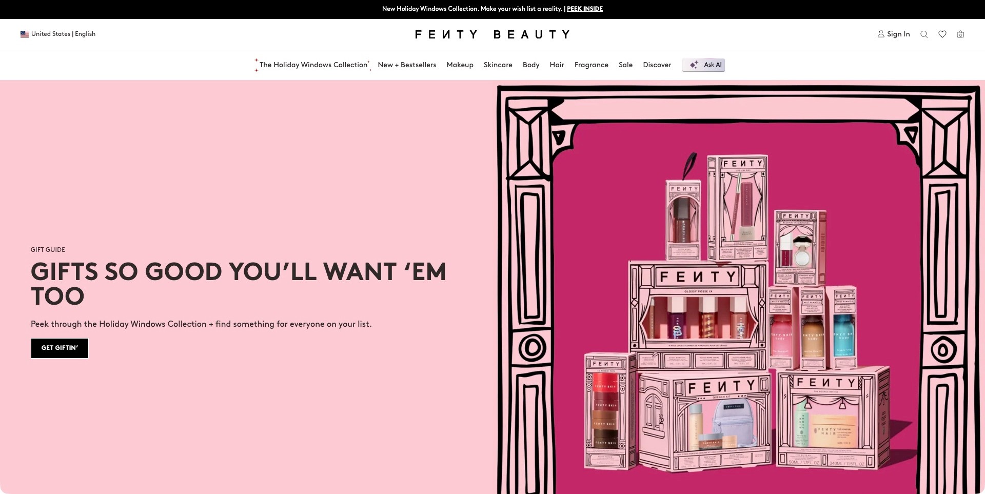
Fenty Beauty turns the captured homepage into a pink shop window. Illustrated black framing surrounds a stack of boxed cosmetics, while the left side holds a large gift-guide headline, a short explanation and one dark shopping button. The packaging makes several product formats visible without requiring separate campaign tiles. Above it, a white navigation band distinguishes Makeup, Skincare, Body, Hair and Fragrance. The design brings a wide beauty catalog into one seasonal story, but the photographed gifts and category labels do not establish ingredient suitability or the performance of the individual formulas.
What you can learn
Give a cross-category promotion a consistent visual wrapper while preserving ordinary product routes. Let shoppers enter through a gifting idea or a specific beauty category rather than forcing everyone through the campaign. Follow the illustrated presentation with clear contents, sizes and shade information on the linked product pages.
Pros
The dark action button stays identifiable within an expansive pink composition.
Plain category names keep the broad catalog understandable around the campaign.
Cons & considerations
A large gift arrangement needs closer product views when labels become too small.
Several promotional navigation entries can compete with routine replenishment tasks.
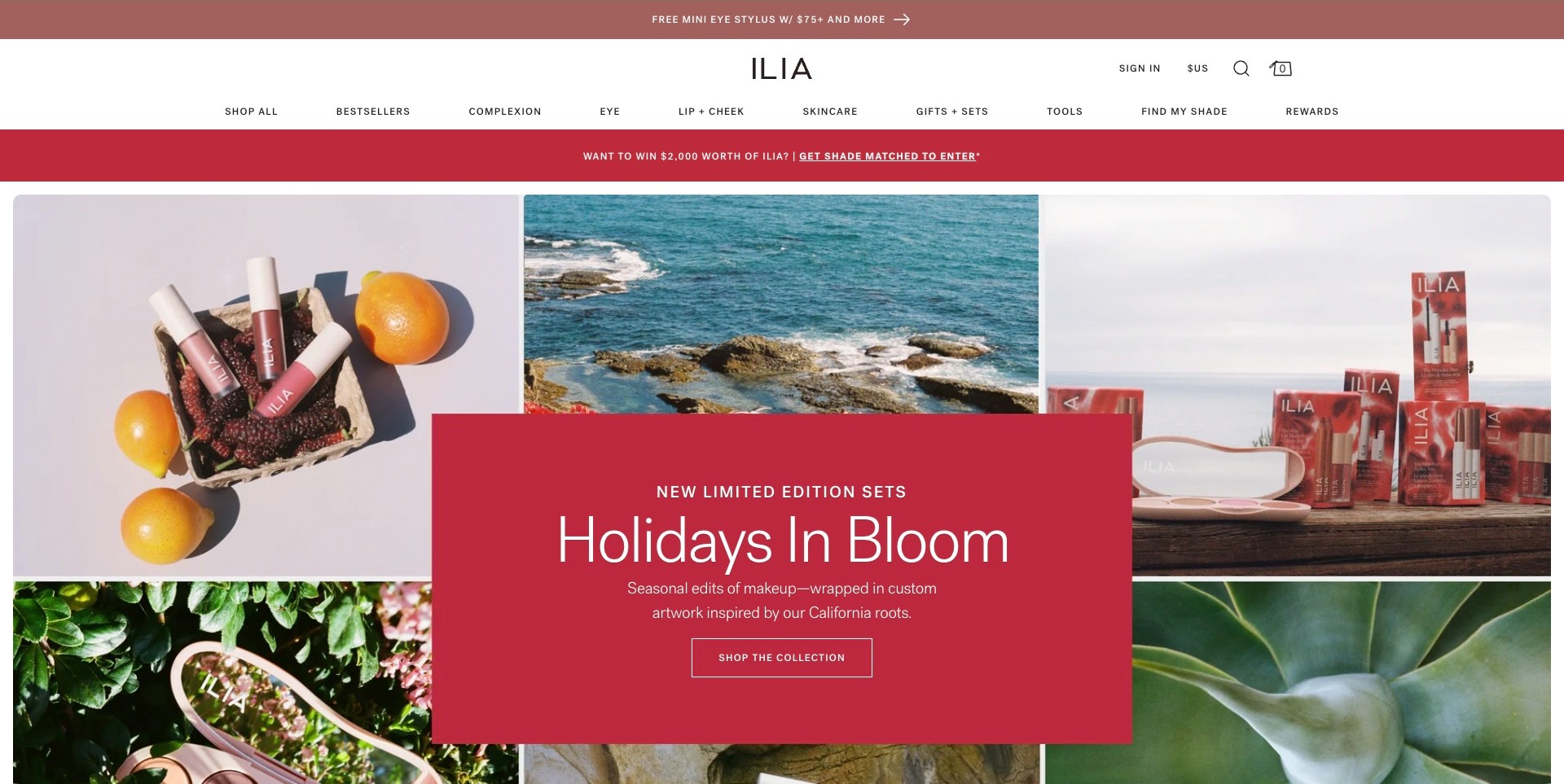
ILIA’s homepage places a red collection panel over a grid of photographs: lip products beside fruit, a coastal scene, illustrated gift packaging and foliage. The central text introduces seasonal makeup sets and links to their collection. This creates a distinct campaign without replacing the white header, where Complexion, Eye, Lip + Cheek, Skincare and Find My Shade remain explicit. The visible composition connects packaging and atmosphere, rather than showing an application tutorial. Its references to natural surroundings are a creative direction, not independent evidence about ingredients, environmental impact or cosmetic results.
What you can learn
Use a collage when several images genuinely contribute different information: product format, packaging and visual context. Anchor it with a single readable explanation and destination. Keep shade support and product categories outside the art direction so a returning customer can bypass seasonal storytelling and find a familiar item.
Pros
A solid central panel separates the collection message from varied photographic backgrounds.
Specific makeup categories and shade assistance remain available in the main header.
Cons & considerations
Multiple announcement bands can push useful collection information farther down smaller screens.
Decorative scenery needs product-level details to support an informed purchase.
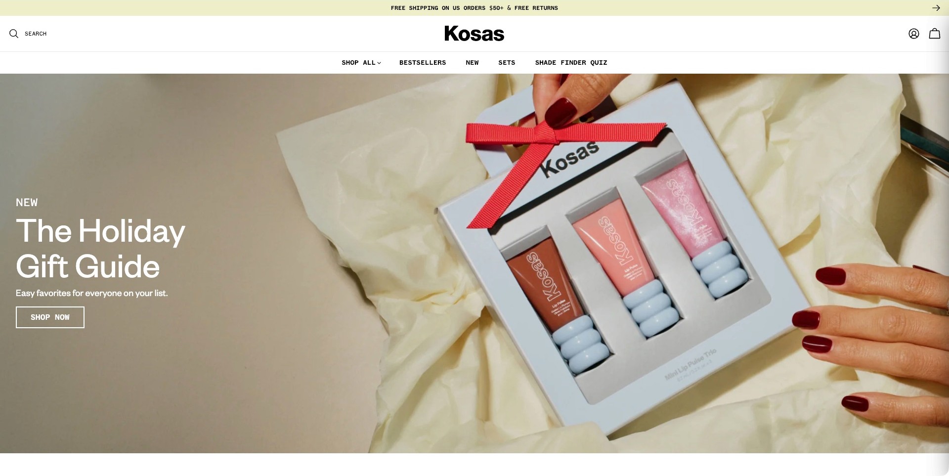
Kosas leads with a close photograph of three mini lip-product tubes inside an open, ribboned presentation box. Hands and pale fabric give the set a physical context while the left side supplies a short seasonal headline and a single outlined shopping action. A simple white header places search, shopping categories and the shade-finder quiz above the photograph. The image communicates a packaged product format more directly than an abstract festive background would. It does not, however, show how each color appears on different lips or establish the formula’s skincare claims.
What you can learn
Make a gift-set hero answer the immediate question of what someone receives. Use the following product page to identify individual contents, sizes, shades and packaging inclusions. Keep shade guidance easy to reach for customers buying for themselves as well as those choosing a gift for somebody else.
Pros
The open box gives the campaign a specific and recognizable product subject.
A short header preserves search and shade assistance without crowding the hero.
Cons & considerations
White headline text needs contrast checks across every responsive crop.
A single package photograph needs swatches and size details beyond the landing view.
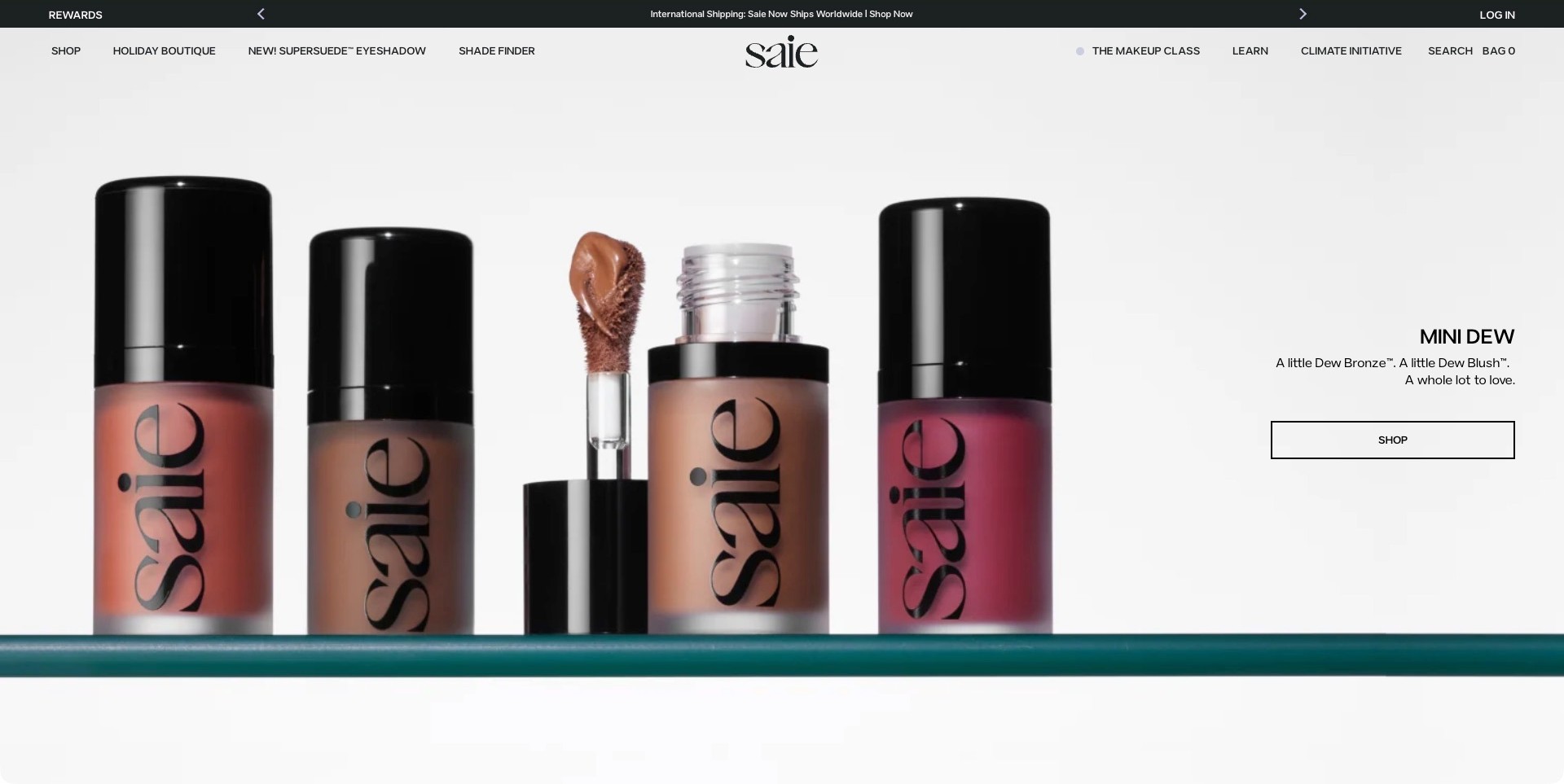
Saie’s captured homepage fills the left side with a lineup of tinted bottles, including an open container and visible applicator. The right side names the miniature collection, gives a short description and offers one wide outlined shopping button. A largely monochrome background and restrained typography let the packaging and colors carry the image. The header keeps a shade finder, shopping and makeup-learning routes separate. This is a product-format introduction rather than an application demonstration: the bottles show approximate visual differences, but the photograph cannot establish how the shades behave on different skin tones.
What you can learn
When introducing a size variation, show the recognizable package and explain the change in plain language. Keep exact volumes, shade names and available combinations on the destination page. A large product image works best when it is paired with practical information rather than expected to answer every comparison question.
Pros
The open applicator helps communicate the physical product format.
A spacious text area gives the collection a clear shopping destination.
Cons & considerations
Large product photography needs useful alternatives and details on smaller screens.
A miniature label still needs exact sizes and shade comparisons before purchase.
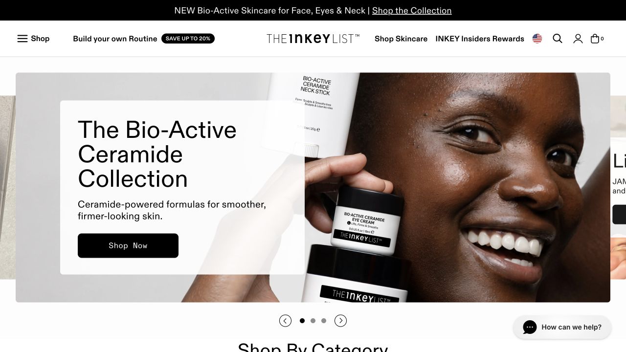
INKEY’s retained opening puts a large white caption panel over a photograph of a model holding branded cream containers. The collection name is prominent, a short description follows, and a broad black shopping button anchors the panel. Above it, the wordmark sits between product and routine-related navigation, while carousel controls appear below the main image. The photograph shows packaging and a person together, but the product description remains separated from that detailed background. This is a retail communication reference, not independent confirmation of the collection’s performance claims.
What you can learn
Give skincare campaigns the same product clarity that a makeup release needs. Name the featured range, show recognizable packaging and retain ordinary category browsing so customers do not have to complete a routine builder before finding a familiar product.
Pros
The opaque caption area gives the collection name and shopping action a dependable background.
Visible packaging connects the campaign photograph to identifiable products.
Cons & considerations
If a collection contains several formulas, the destination must explain their different roles and sizes.
If carousel slides change automatically, the controls and reduced-motion behavior need deliberate testing.
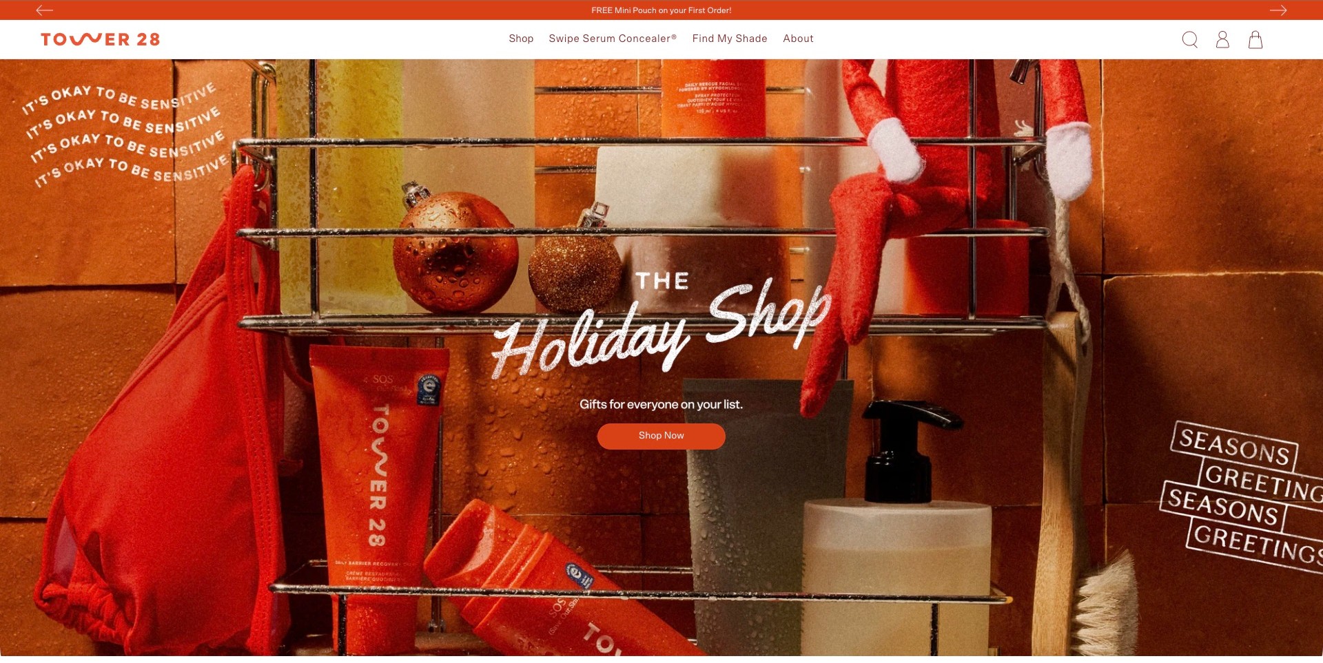
Tower 28 places its holiday campaign in an orange-tiled bathroom scene with a shower rack, product tubes, bottles, ornaments and a small red holiday figure. The centered handwritten-style title and orange action sit over this detailed setting. Above it, a compact white header preserves Shop, a named concealer route and Find My Shade. The brand’s own makeup range establishes its cosmetics fit even though this particular campaign frame prominently features skincare products. The bathroom styling and visible product labels explain a setting and assortment, not independently verified sensitive-skin suitability or medical benefit.
What you can learn
Build seasonal imagery from a setting customers recognize instead of adding unrelated festive decoration. Keep a short, clear path into the promoted assortment, and retain product-category or shade routes for people with a specific task. Product suitability and usage information should remain factual and easy to locate beyond the campaign.
Pros
The consistent orange palette connects the header with the campaign environment.
A compact menu keeps shade assistance visible above the busy photograph.
Cons & considerations
White script over a detailed scene requires careful responsive contrast testing.
A skincare-led seasonal image needs clear makeup navigation for color-product shoppers.
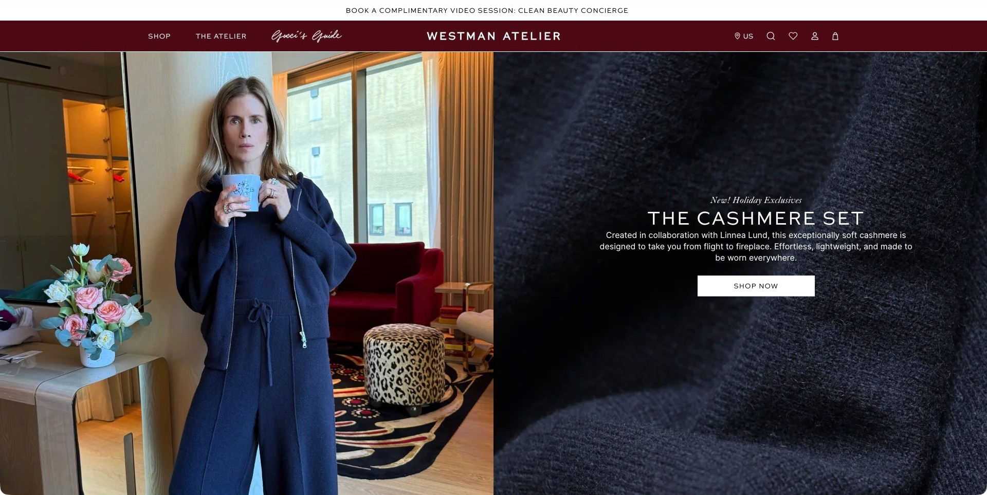
Westman Atelier’s homepage introduces a cashmere collaboration, not makeup. A person holding a mug occupies the left half, while a close textile texture supports the collection name, explanatory copy and a white shopping button on the right. The dark burgundy header separates shopping from editorial destinations, and an upper strip offers a beauty-concierge video session. The actual page also identifies the brand’s own makeup products, establishing the cosmetics context. The useful design lesson is category expansion: the pictured clothing does not demonstrate makeup application, formula performance or material quality independently.
What you can learn
Name an adjacent-category collaboration plainly so a visitor knows what the campaign sells. Keep the core beauty assortment and advice routes easy to find outside it. A lifestyle image can broaden the brand story, but it should not force customers to decode whether they are browsing cosmetics, clothing or editorial content.
Pros
Separate image and text halves keep the collaboration explanation readable.
The campaign explicitly identifies its cashmere subject rather than implying a makeup launch.
Cons & considerations
A broad Shop label may require another step to reach a particular cosmetics category.
Lifestyle imagery can delay product context for first-time makeup shoppers.
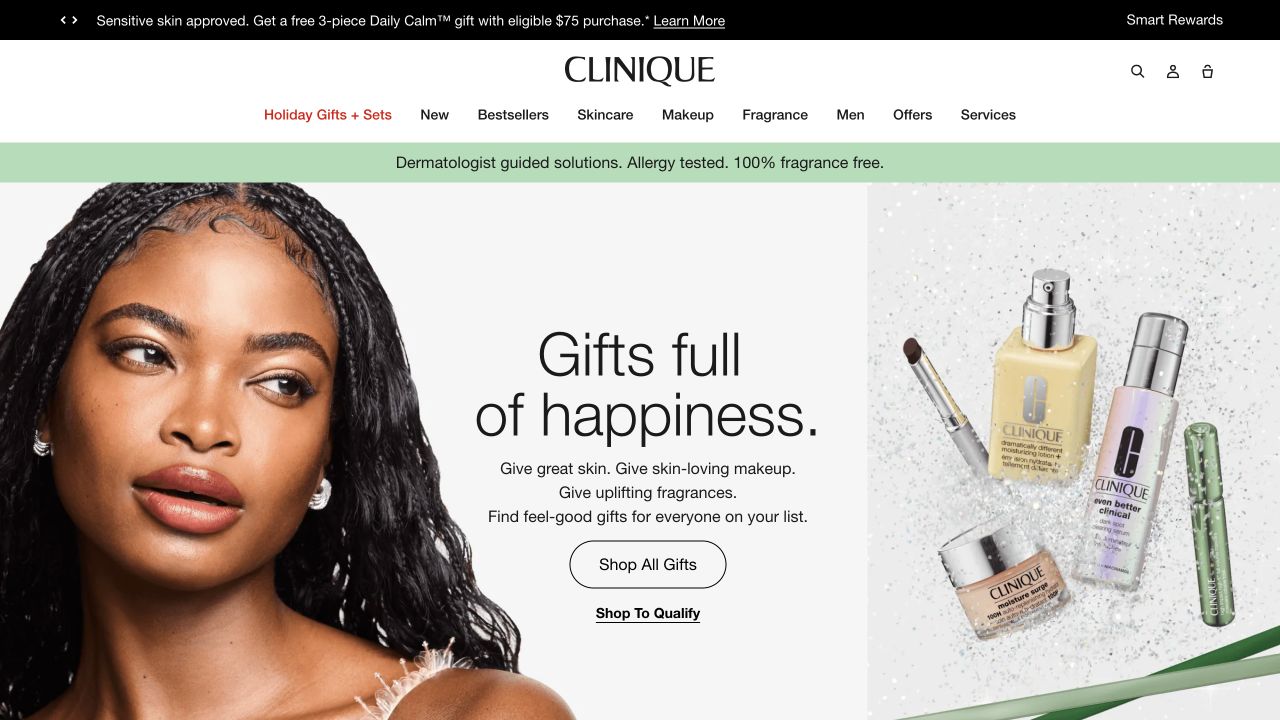
Clinique’s retained campaign uses a three-part layout rather than placing all text directly over a model. A close portrait fills the left side, a central white column holds the gift message and outlined shopping button, and a product cluster occupies the right. Makeup sits alongside other beauty categories, which the white navigation separates with ordinary labels. The black offer bar and green brand statement supply additional layers above the campaign. The layout makes the seasonal message readable while still showing both the person and the objects being sold.
What you can learn
Separate the campaign’s emotional and practical jobs. A model can establish the visual world, product photography can identify the range, and a dedicated caption area can explain the next step without forcing detailed purchasing information onto a busy photograph.
Pros
The white central column gives the gift message and button an uncluttered background.
Distinct category labels make makeup identifiable within a wider beauty catalog.
Cons & considerations
If shoppers are choosing a shade, this broad campaign needs supporting product and swatch views.
If offer and claim bars accumulate, they can compete with the actual product-selection content.
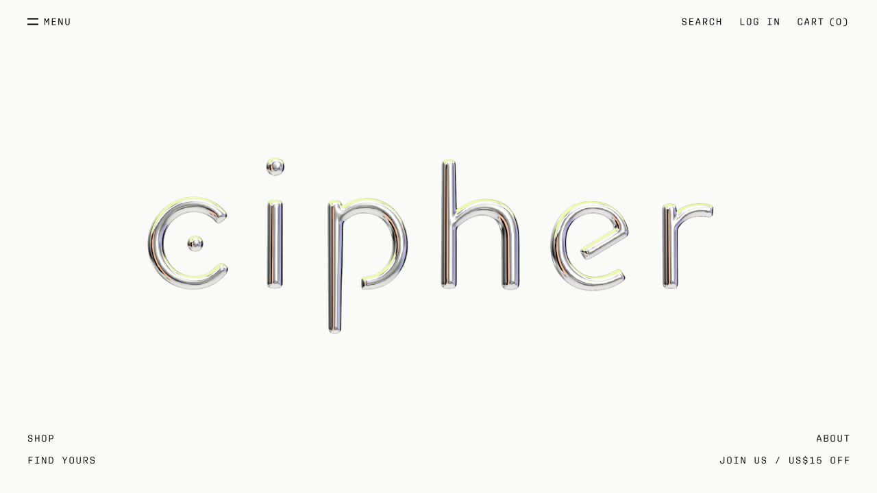
Cipher’s retained opening is unusually sparse. A large chrome-effect wordmark occupies the center of a white field, while Menu, Search, Log In and Cart sit around the upper edge. Shop and Find Yours appear at the lower left; About and a newsletter-related invitation sit at the lower right. There is no product photograph or benefit-led hero paragraph in this frame. Current first-party content identifies an independent skincare lab and its own cosmetic products, so the reference concerns how a specialist brand uses restraint before visitors enter its catalog and learning content.
What you can learn
A minimal brand gateway can work as an introduction when its next actions are explicit. Give product discovery and brand information distinct routes, then make the catalog informative enough to compensate for what the opening intentionally leaves unsaid. Do not mistake an uncluttered screen for a complete buying journey.
Pros
The unusual wordmark has generous space without competing campaign banners.
The separated corner links distinguish shopping, assistance and brand information.
Cons & considerations
If visitors are unfamiliar with the brand, the opening gives little immediate product context.
If important links sit near the edges, keyboard order and mobile placement need deliberate planning.
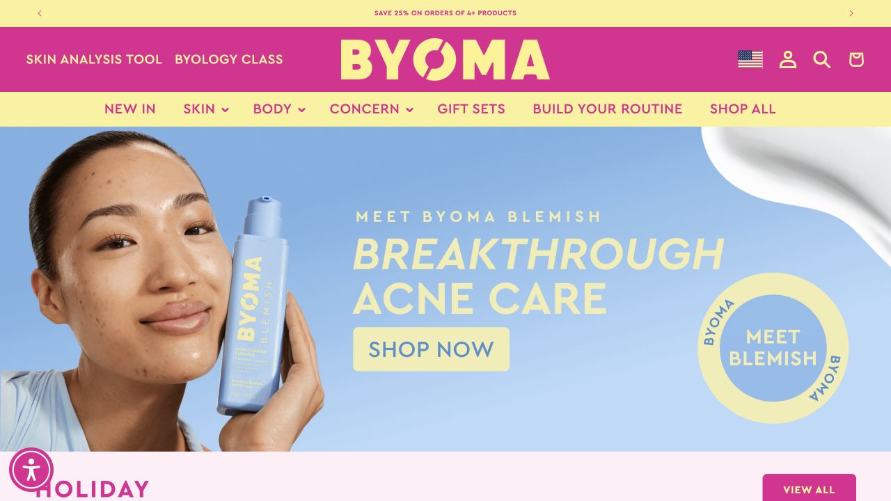
BYOMA’s retained homepage uses vivid pink and yellow across the wordmark, utility area and category navigation, then changes to a pale blue campaign background. A model holds a tall branded bottle at the left, while a large headline, yellow shopping button and circular collection label occupy the right. Skin, Body, Concern and routine-related routes remain visible in the header. The colors connect the interface with the packaging rather than leaving the product isolated inside a neutral template. The campaign’s skincare claims are the brand’s wording, not conclusions established by this design review.
What you can learn
Build a recognizable color system that supports both product identity and navigation. Keep readable category names alongside expressive campaign lettering, and make product facts accessible separately so an energetic visual treatment does not have to carry all the explanatory work.
Pros
The header and campaign share a distinctive palette that makes the storefront recognizable.
The bottle and model appear together at a useful visual scale.
Cons & considerations
If pale text is placed on pastel colors, contrast needs checking in actual interface states.
If concern-based navigation is offered, it should not imply an individualized diagnosis or guaranteed result.
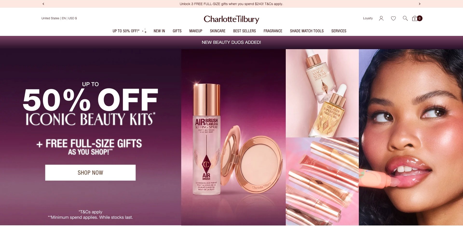
Charlotte Tilbury’s captured US homepage gives the promotional offer the largest type, using a burgundy-to-pink background beside product photographs and a close makeup portrait. A white shopping button sits below the main message, with qualification text at the bottom of the campaign. The header separately names Makeup, Skincare, Fragrance and Shade Match Tools. This is a deliberately retail-led introduction rather than a quiet brand manifesto. Its effectiveness depends on explaining the actual offer after the click; neither the large discount figure nor a photographed makeup look establishes universal savings, product results or individual suitability.
What you can learn
If an offer leads the page, make its scope and conditions available as clearly as the headline. Preserve direct category and shade routes for visitors who are not shopping the promotion. Pair campaign art with legible terms, eligible products and ordinary prices rather than relying on urgency alone.
Pros
A high-contrast shopping button gives the busy campaign one clear action.
Specific categories and shade tools remain identifiable above the promotional imagery.
Cons & considerations
Several offer messages can compete for attention across the header and hero.
Small qualification text needs readable sizing and an accessible route to full terms.
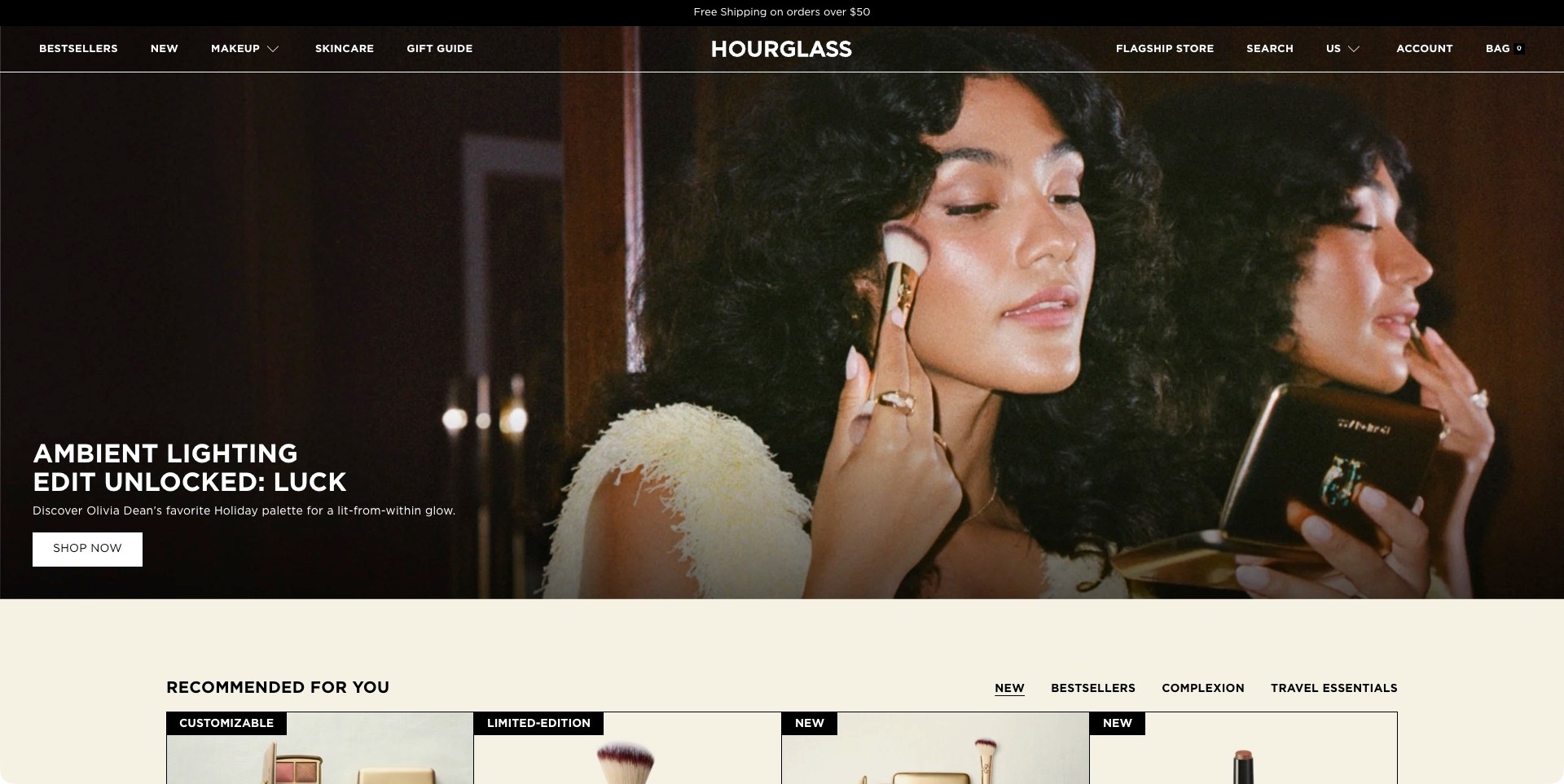
Hourglass introduces an Ambient Lighting palette through a large portrait of Olivia Dean applying makeup beside a mirror. The compact and brush are visible, while a dark area at the left supports the collection headline, explanatory line and white shopping action. A transparent dark header retains Makeup, Skincare and Gift Guide routes. Below the hero, a pale recommendation area begins with separate merchandising tabs. The page gives the application scene a named product context, but the photographed lighting and finish are not independent measurements of how the palette will appear on every person.
What you can learn
Connect an editorial face with a specific product name and destination, then offer practical comparison beyond the campaign. Palette contents, shade descriptions and application guidance should be available without requiring visitors to recognize the person. Keep the first product section visually distinct from the immersive introduction.
Pros
Dark negative space keeps the campaign explanation readable beside the portrait.
The named palette provides a more specific entry point than a generic beauty slogan.
Cons & considerations
Transparent navigation needs contrast checks across changing campaign frames.
A single application scene needs complementary swatches and unambiguous palette contents.
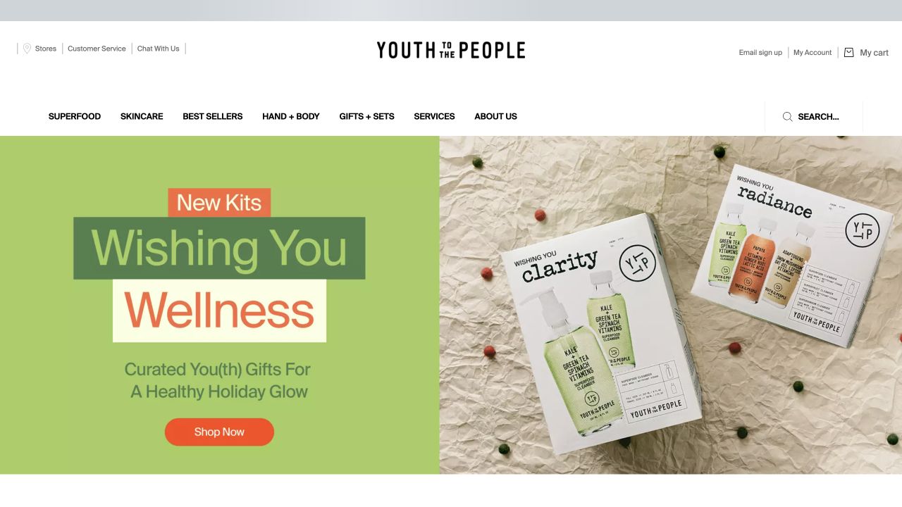
Youth To The People’s retained opening separates a lime-green text panel from a flat-lay photograph of boxed skincare kits. Stacked colored lettering gives the gift message a playful editorial rhythm, and an orange shopping button provides a clear action underneath. The packages on the right show the brand and several product formats at a readable scale. A generous white header keeps skincare, hand-and-body, gifts and other routes distinct. The scene communicates a seasonal collection through actual packaging rather than suggesting that an unlabelled lifestyle image explains the offer.
What you can learn
When promoting a skincare kit, let the packaging establish what kind of purchase is being discussed and reserve a separate area for the campaign message. The linked product record should then clarify exact contents and sizes rather than expecting customers to read everything from the photograph.
Pros
The split layout gives the message and product photography their own visual space.
Visible boxed sets help distinguish gifting from an individual-product campaign.
Cons & considerations
If a photograph includes several kits, the destination must identify what each purchase contains.
If bold color blocks become a recurring pattern, they still need consistent text contrast and hierarchy.
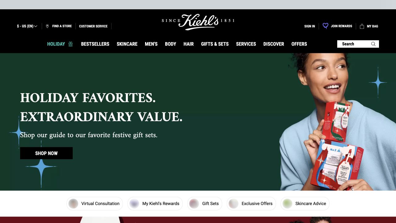
Kiehl’s retained homepage uses a black header with a centered script wordmark and a straightforward row of product and service categories. Beneath it, a dark green holiday scene places a model holding gift sets beside a large cream-colored message and a black shopping button. A separate white strip below offers pill-shaped routes for consultation, rewards, gift sets, offers and advice. Those shortcuts are visually distinct from the campaign itself. The opening supports several levels of intent without making the promotional photograph the only way into the brand’s consumer products.
What you can learn
Separate the seasonal story from the recurring jobs customers need to complete. Clear product categories and a small set of contextual shortcuts can help returning visitors, while assistance routes should explain their purpose without promising individualized medical advice or making ordinary shopping dependent on them.
Pros
The dark header and campaign create a coherent setting for the recognizable wordmark.
The shortcut strip distinguishes ongoing services and utilities from the seasonal promotion.
Cons & considerations
If too many shortcuts are added, they can compete with the main product categories.
If several gift sets are pictured, the destination must make contents and eligibility explicit.
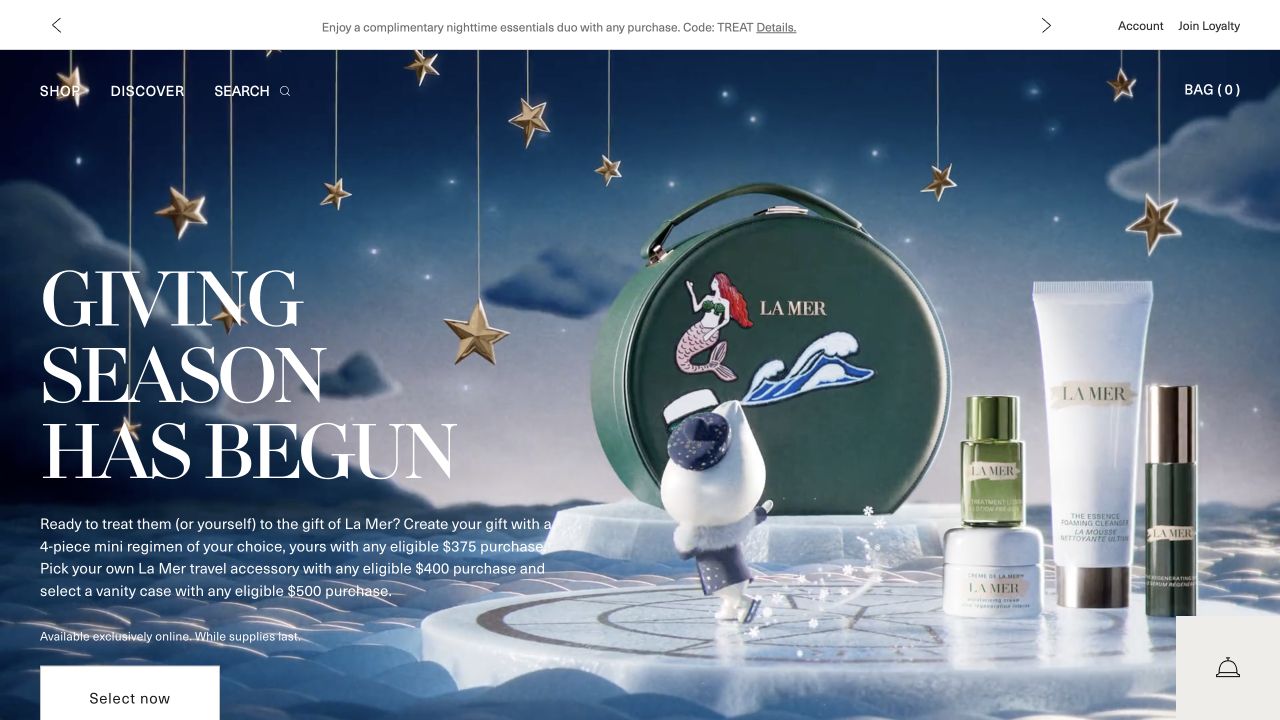
La Mer’s retained opening creates a dark blue gifting scene around skincare bottles, jars and a vanity case. White serif lettering fills the left side, followed by several lines explaining the promotion and a white selection action. Shop, Discover and Search remain compact at the top, with an account-related utility strip above. The picture gives the products a theatrical setting, but the dense caption shows the information burden created when one campaign combines several gift conditions. The retained offer is historical screenshot content, not a current purchasing recommendation.
What you can learn
Use a distinctive scene to establish the campaign, then simplify the actual choice customers must make. If gift eligibility depends on different thresholds, keep those rules consistent across the banner, selection journey and basket rather than letting decorative art direction obscure the conditions.
Pros
The blue setting and white typography create a strong, recognizable visual atmosphere.
Product and accessory imagery makes the campaign more concrete than an abstract seasonal slogan.
Cons & considerations
If several thresholds appear together, a compact comparison may be easier to understand than a paragraph.
If the action sits near the viewport edge, responsive layouts need to preserve its visibility.
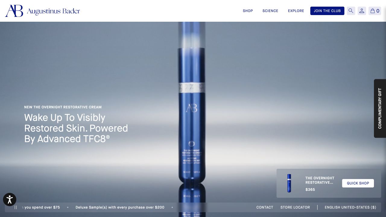
Augustinus Bader’s retained opening centers a tall blue bottle against a cool, softly blurred background. The white header uses navy branding and a small number of top-level routes. Lower-left copy names the featured cream and presents the brand’s benefit-led message, while a separate translucent card at the lower right repeats the product image, name and quick-shop action. Small service and location controls run along the bottom. The design gives one release a dominant place without requiring the campaign paragraph itself to function as the purchase interface.
What you can learn
Connect an expressive product hero to a clearly identified shopping record. Repeating the exact featured item in a compact action card can help orientation, provided the name, size, price and availability remain consistent with the destination and the card does not become a competing promotional overlay.
Pros
A single bottle gives the campaign a focused product identity.
The separate action card connects the image with a named item and next step.
Cons & considerations
If benefit claims dominate the copy, their qualifications need to remain available in the product journey.
If several floating controls accumulate, they can crowd the small-screen view.
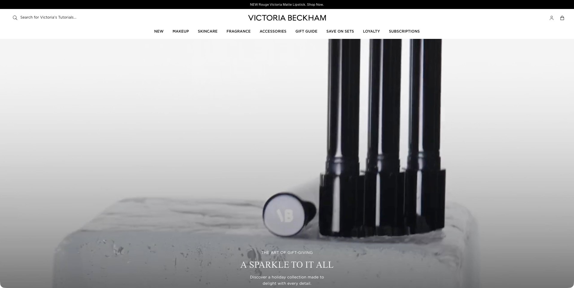
Victoria Beckham Beauty’s accepted film frame shows tall black lipstick barrels and a branded cap on a pale stone-like surface. The tops extend above this particular frame; it is not a complete view of every lipstick or shade. Small seasonal copy sits near the lower center, while the white header separates Makeup, Skincare, Fragrance, Accessories and gifting routes. A search prompt explicitly mentions tutorials. The restrained palette gives the packaging prominence, but this captured moment is better understood as atmosphere and form than as a product comparison or an application demonstration.
What you can learn
Use detail footage to establish a product’s visual identity, then provide complete still views, color information and accessible text outside the film. Keep ordinary categories and educational search available for visitors who want an answer rather than a moving campaign. Important actions should remain reachable regardless of the current frame.
Pros
The pale background and dark packaging create a distinct visual contrast.
Separate makeup, skincare and fragrance routes keep the wider assortment understandable.
Cons & considerations
A close film crop cannot replace full product and shade photographs.
Campaign text near the bottom needs responsive checks so the next step stays easy to reach.
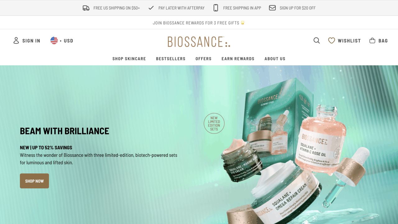
Biossance’s retained homepage puts a turquoise gift-set box and a cluster of skincare containers against a matching textured background. The left side supplies a short black headline, an explanatory line and a bronze shopping button. Above, several white utility rows separate shipping, rewards, the wordmark and product navigation. The packaging is large enough to identify formats and labels without a model in the scene. The result is a product-led campaign with strong color continuity, although the surrounding utility messages occupy a substantial part of the opening.
What you can learn
Let a clear package composition carry the identity of a set, then use a concise caption to explain the shopping task. Keep promotion, membership and delivery information organized around that task instead of adding a new banner for every team’s current message.
Pros
The coordinated turquoise palette connects the box, containers and background.
Product formats remain visible rather than being reduced to decorative background props.
Cons & considerations
If several utility bars are retained, their cumulative height needs checking on phones.
If savings or set contents change, campaign copy and product records must be updated together.
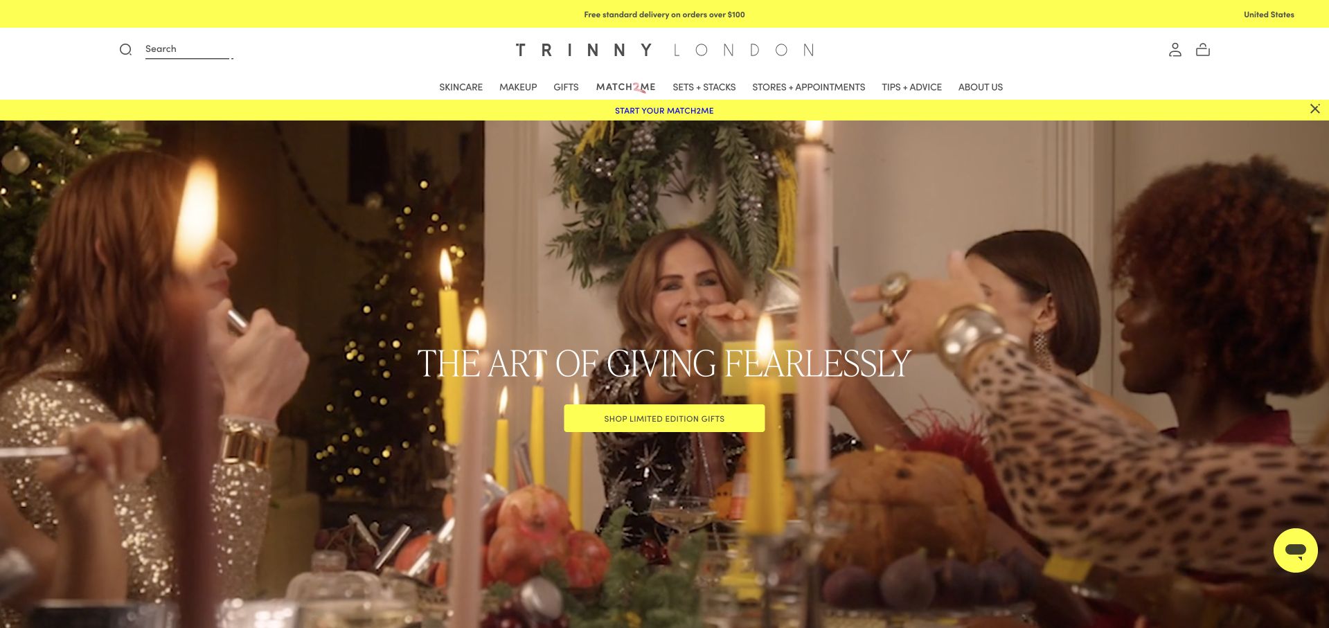
Trinny London’s retained campaign uses a warm dinner scene rather than a tightly cropped product portrait. A restrained white header holds the spaced wordmark and familiar shopping categories, while vivid yellow bars highlight practical and discovery-related routes. The central gifting message and yellow button remain readable over the darker middle of the photograph. Search, account and basket controls stay recognizable. The frame places gifting within a broader cosmetics storefront instead of making the seasonal promotion the only way to explore the brand.
What you can learn
Reserve a distinctive accent color for a few important actions and utility areas, then let the photography carry the atmosphere. Keep product categories available so a gift-led campaign does not interrupt visitors who already know what they need.
Pros
The yellow action creates a clear visual destination within a busy lifestyle photograph.
The header separates shopping categories from the optional matching-related route.
Cons & considerations
If several promotional bars are added, their combined height can crowd the product content.
If the campaign suggests a complete look, linked pages must clarify the actual products and quantities included.
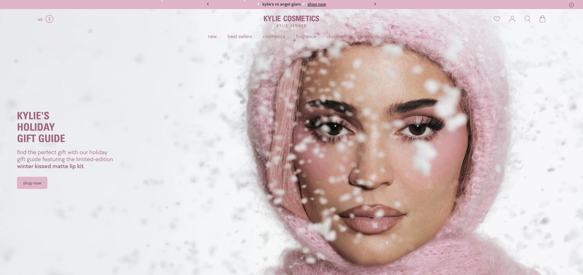
Kylie Cosmetics’ retained opening places a close-up model portrait on a soft pink winter-themed background. The left-side heading names the holiday gift guide, and the short paragraph identifies the featured lip-kit release rather than stopping at a generic seasonal slogan. A pink shopping button follows directly below. The wordmark and product-family navigation remain centered above, with familiar account and bag controls at the right. The composition connects a face-led campaign to a particular product story while leaving other categories accessible through the header.
What you can learn
Pair expressive campaign imagery with enough product language to explain what is actually being featured. Customers should be able to distinguish a lip kit, a complete look and a broader gift collection before they choose a destination, especially when several product families share one brand.
Pros
The caption identifies a specific lip-product feature within the larger holiday campaign.
A consistent pink accent ties the primary action to the campaign’s visual identity.
Cons & considerations
If shade accuracy is important, the stylized campaign needs neutral product and swatch photography elsewhere.
If decorative seasonal effects move across content, readable text and reduced-motion behavior need checking.
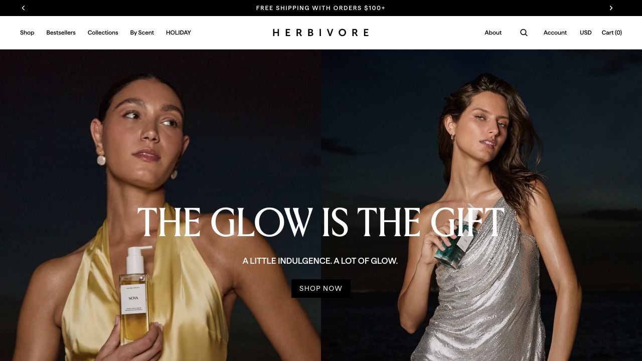
Herbivore’s retained opening places two models against a dark background, each holding a clearly visible product. A large white gift-focused heading stretches across the center, with a short supporting line and black shopping action below. The white header is comparatively spare: a widely spaced wordmark sits between ordinary shopping labels and compact utility controls. The campaign introduces the products through people and styling rather than a technical formula diagram. Current first-party categories confirm that the brand sells its own skincare and body-care range; the image is not evidence of personal suitability or product efficacy.
What you can learn
Use lifestyle photography to suggest the context around a cosmetic product, while keeping the package visible and the buying route understandable. For body care, explain the actual format, amount and contents on the destination page rather than assuming that a persuasive model image answers those questions.
Pros
Visible products keep the lifestyle scene connected to the catalog.
The simple white header provides a calm contrast to the darker campaign.
Cons & considerations
If large lettering crosses detailed imagery, responsive crops need careful contrast checks.
If a gift campaign includes several formats, customers need clear item and size distinctions afterward.
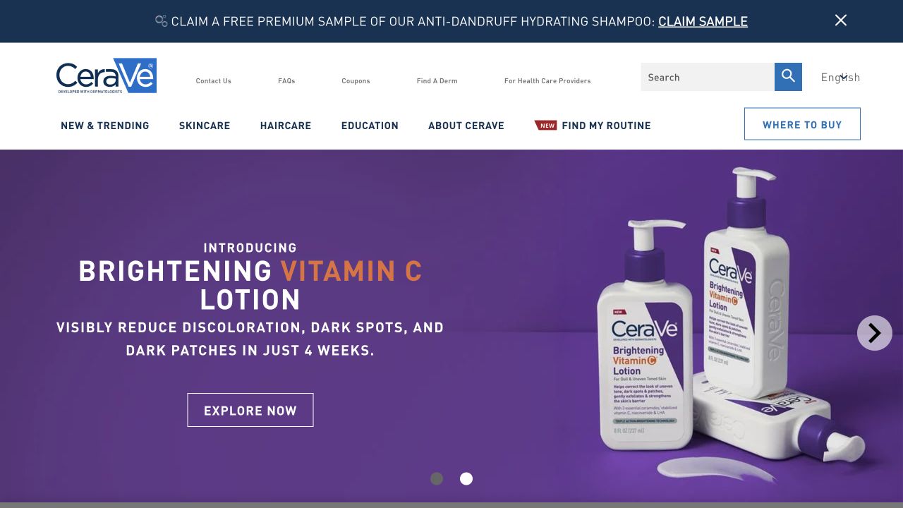
CeraVe’s retained opening uses a blue-and-white header with separate product, education and brand routes, plus a prominent Where to Buy action. A purple campaign beneath it names a lotion and shows two large pump bottles, with an outlined exploration button at the left. The product title and package imagery make the subject explicit before any deeper explanation. The header also contains professional and dermatologist-related links, but this example is the consumer product-brand website, not a clinic review. The campaign’s stated benefits remain the brand’s assertions rather than independently verified outcomes.
What you can learn
Match the main action to the business model. A brand that directs visitors to retailers needs a clear relationship between product education and seller discovery, while still identifying the exact product so customers can recognize it when they leave the brand’s own website.
Pros
The product name and large bottle images make the featured format easy to identify.
Where to Buy is distinguished from general educational navigation.
Cons & considerations
If regional sellers carry different products, the handoff must preserve the customer’s product context.
If benefit language is prominent, qualifications should remain readable without turning claims into blanket guarantees.
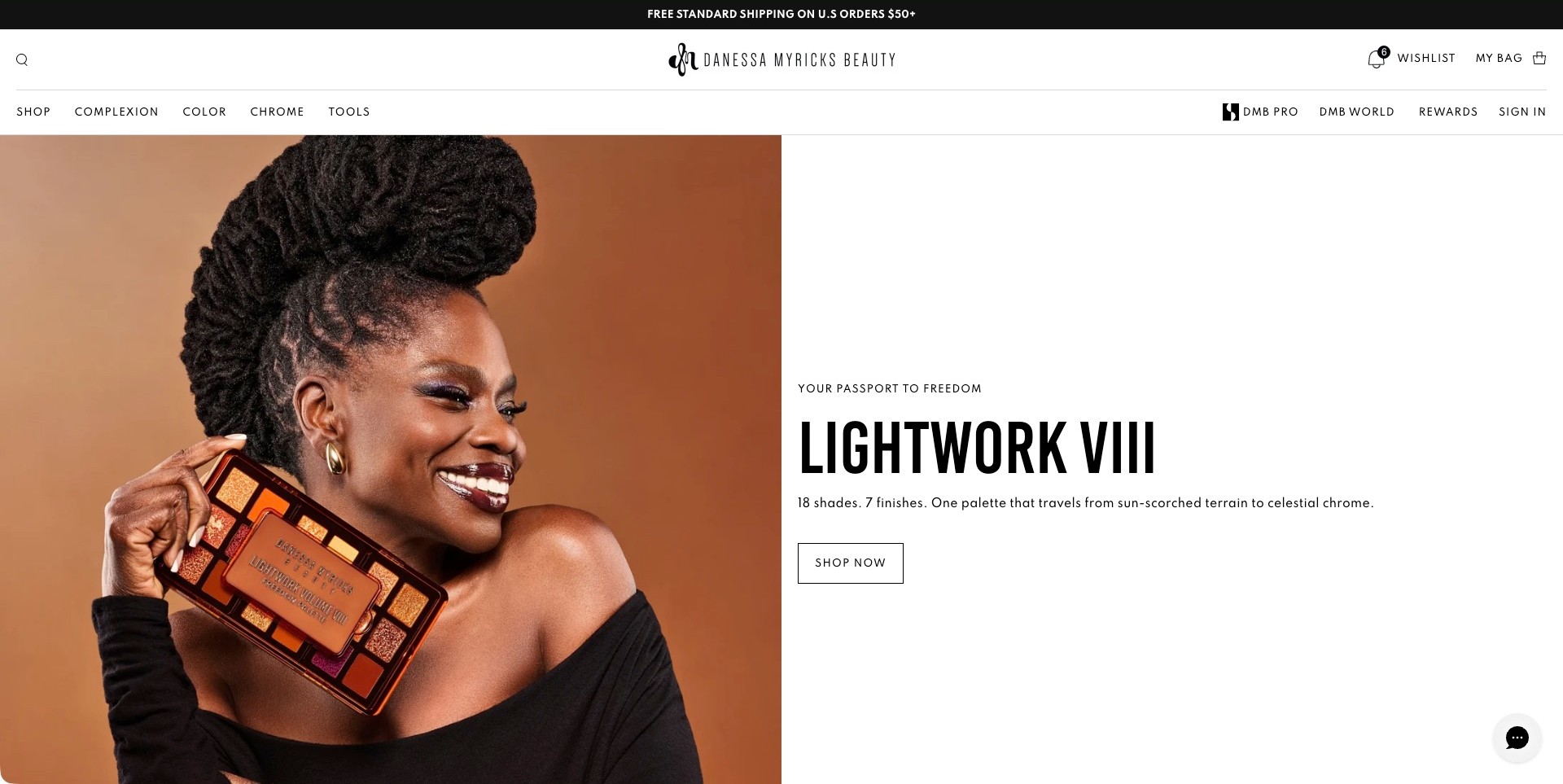
Danessa Myricks Beauty divides its captured homepage evenly between a warm portrait holding an open palette and a white information panel. The large Lightwork VIII name is followed by a concise shade-and-finish description and a small outlined shopping action. A spacious header separates Complexion, Color, Chrome and Tools, with a distinct professional destination. The actual palette is visible alongside the finished look, giving the headline a concrete subject. This does not prove that every photographed effect uses the displayed products or that a screen reproduces the colors accurately.
What you can learn
Place an expressive image next to plain product information rather than making the photograph carry the whole explanation. State what the product is, then let the destination explain individual shades, finishes and application options. Keep professional resources distinguishable without making ordinary shoppers decode industry terminology before browsing.
Pros
A solid white panel makes the palette name and action easy to locate.
The open palette links the portrait to a recognizable physical product.
Cons & considerations
Specialist finish terminology needs accessible explanations on the linked product page.
A finished look still needs separate swatches and close views for meaningful color comparison.
Kegan is a freelance web designer and developer with 15+ years of experience helping businesses turn complicated website requirements into clear, maintainable digital experiences. He works directly with clients from planning and design through development, launch, and ongoing support.
For cosmetic brand website design, his development approach focuses on clear makeup and skincare categories, useful shade and product information, carefully qualified claims, readable ingredients and use guidance, and dependable shopping and support journeys. The scope can be a targeted improvement or a complete custom build, with responsive layouts, thoughtful content structure, and integrations chosen around the people using and maintaining the site.
Show 3 other cosmetic brand website designersHide other cosmetic brand website designers
Plan a cosmetics website around understandable products, shades and routines
Organize the range around customer tasks
List the main entry points before designing the navigation. A visitor might browse complexion, lips or eyes; compare cleansers and moisturizers; search for a named product; shop a finished look; or choose a gift. Decide which routes deserve top-level space and which can sit inside collections. Keep plain product categories visible alongside creative collection names so a new visitor does not need to know the brand’s vocabulary before browsing.
Model products, shades, sizes, sets and editorial looks as connected records. A product can appear in several collections without acquiring different ingredient descriptions or availability states. A look can connect to the relevant products and selected variants. Keep a deliberate distinction between a bundle sold as one item and a group of separately purchased recommendations.
MERIT’s public navigation separates makeup categories, sets, looks and shade discovery. Lisa Eldridge exposes product families and artist-related destinations. These are useful references for serving different levels of intent, not a requirement to build the largest possible menu. A focused range can use a simpler structure if customers can still find a specific item and understand the alternatives.
Design shade selection as a readable interface
Treat a shade as a meaningful product variant with a stable name and properly connected imagery. Show the selected label next to the swatch and update price or availability when it genuinely differs. Keep keyboard focus and the selected state visible. Color alone should not communicate whether an option is selected, unavailable or part of another product family.
Plan imagery that supports comparison rather than relying on a single stylized swatch. Product texture, application context and consistent photography can help, provided they are labelled accurately. Avoid implying that lighting, a screen or an optional camera tool can reproduce every aspect of the physical result. Record when an image shows several products or an application technique that is relevant to the finished look.
Keep the number of choices manageable on a phone. A long row of almost identical circles can be difficult to scan and operate. Group shades or provide useful filters only when the grouping is applied consistently. Preserve the selected option when someone reads application guidance or returns from a shade-help page. Test out-of-stock choices without silently switching the customer to another color.
Make product pages answer practical questions
Create a consistent product-information framework. The exact fields depend on the range, but customers may need the amount, intended finish, application guidance, available shades and approved ingredient information. Use readable headings and clear labels rather than hiding every detail behind unexplained icons. Give the team a way to maintain these records without editing each campaign page separately.
Keep promotional claims distinct from observable interface information. Terms about wear, coverage, skin benefits or environmental attributes should use approved wording and retain their relevant qualifications. A design review can describe how a claim is presented, but does not independently verify it. Do not assume that a familiar marketing label means the same thing across several brands or products.
Make set contents explicit. List the products, sizes and shades included, especially when the photography also contains props or accessories. If customers can build a bundle, show the current selection and any requirements before the final basket. Avoid a low starting price that looks like the complete look when the featured result requires several separately purchased items.
Connect inspiration with a usable learning journey
Build tutorials around an identifiable task, look or technique. Give the reader a short explanation, the relevant products and a way to revisit the steps. A video can demonstrate application, but important product names and instructions should not exist only in the soundtrack. Provide appropriate text support and make the page useful when the video cannot play.
Treat artist content as a genuine editorial resource rather than a large collection of indistinguishable product promotions. Label who is speaking and which products are used, and record permission for imagery and participant contributions. If a look uses a particular shade combination, connect that context to the products rather than linking every item to its default variant.
Saie’s public site includes a makeup-class destination alongside its product categories, while Lisa Eldridge gives artist-oriented content a recognizable place in the broader brand. The useful lesson is a clear relationship between learning and shopping. Do not require every customer to watch a lesson before they can buy, and do not treat an optional tutorial as individualized professional advice.
Offer assistance without making it a data-collection gate
Decide which questions a shade finder, quiz or consultation can realistically help answer. Explain what inputs are needed and let customers decline optional camera access. A recommendation should be framed as assistance, not as proof of a guaranteed match. Keep ordinary product browsing available without signing up for marketing emails or completing a questionnaire.
Give support a useful context. A customer may need help choosing between two formulas, understanding a set or locating an order. Route those tasks clearly rather than presenting one generic chat prompt on every screen. Do not request sensitive personal information simply because a form allows it. Keep the purpose and handling process appropriate to the service the business actually provides.
Test the unsuccessful paths. What happens when a quiz has no suitable result, a recommended shade is unavailable or a consultation link does not load? Offer a clear recovery route without silently changing the recommendation. If a tool depends on a third-party service, plan a fallback that still lets customers reach the catalog and the brand’s approved product information.
Support skincare browsing without turning the store into a diagnosis
For skincare cosmetics, begin with ordinary product categories such as cleanser, moisturizer, face oil and body care. Customers who know what they need should be able to reach that category without completing an assessment. A concern-based route can sit alongside it, but the interface must make clear that it is organizing products rather than diagnosing a condition or promising a personal outcome. Do not copy unsupported medical claims into filter labels or generated summaries.
Use a consistent record for product format, amount, ingredient information and the brand’s approved directions. A routine or set should identify each included item and its size. If the brand describes an application order, keep that information connected to the actual products and preserve its qualifications; do not let a generic recommendation engine invent combinations or frequency instructions. A design guide can recommend a readable information structure without recommending a formula to the reader.
INKEY’s public site separates product types, ingredients and concern-related routes, while BYOMA distinguishes skin, body and routine browsing. Biossance exposes product categories and sets, and Cipher gives ingredient-oriented learning a recognizable place beside its catalog. Study those different entry points rather than importing one universal routine template. In a mixed makeup-and-skincare brand, keep shade selection where it belongs and do not require a skincare product to inherit irrelevant color fields.
Keep campaigns, promotions and accessibility maintainable
Design a reusable campaign system rather than a homepage that needs to be rebuilt for every launch. Set guardrails for type size, contrast, text placement and image cropping. Keep the product and action legible when the creative assets change. A strong campaign can be expressive without placing essential text inside an image that becomes unreadable on a small screen.
Make promotional conditions understandable near the relevant action. Gift thresholds, eligible products, regional limits and time windows should come from maintained business rules, not text copied independently into several banners. When an offer ends, update the campaign and its linked pages together. Do not let an old landing page suggest that a discontinued gift or price remains available.
Review the full experience with keyboard navigation, reduced motion and realistic mobile use. Check swatches, product galleries, drawers, optional media and basket confirmations. Keep popup frequency proportionate so visitors can actually inspect a product before being asked to subscribe. Assign ongoing responsibility for product facts, stock messaging, promotion terms and editorial credits; a beautiful launch is only the beginning of a useful storefront.
The editing job behind the design
Choose tools for accurate variants and connected beauty content
Use structured records for products, shades where relevant, sizes, formats, sets and looks or routines. Keep the selected variant consistent across imagery, cart actions and any external discovery tool. A clear product model is more valuable than a sophisticated interface built on conflicting information.
Keep optional shade tools, consultations and learning content distinct from checkout. Connect them through useful links and honest confirmations. Do not infer a brand’s formulation, testing or private customer systems from the technologies visible on its public website.
Prioritize responsive images, labelled swatches, accessible controls and dependable product information before adding extra visual effects. Public stack notes identify observed references or explicitly qualified associations; they do not independently establish product performance or a reason for the business’s results.
Our WordPress website examples offer a separate look at publishing approaches. A visible platform label is evidence for that named page, not a guarantee that the same system will suit your requirements.
Before the public launch
Cosmetics website planning checklist
Map category, named-product, look and gift-shopping journeys.
Give products and variants stable structured records.
Keep shade names and selected imagery synchronized.
Use labelled swatches with keyboard-visible states.
Show consistent comparison imagery where appropriate.
Keep ingredients and approved claims maintainable.
Explain exact set contents, sizes and included shades.
Connect tutorials to the actual products used.
Provide text support for video-based learning.
Keep quizzes and camera access optional.
Plan recovery for unavailable recommendations.
Make promotion conditions visible and current.
Test product selection and basket actions on mobile.
Record permissions and ownership for editorial assets.
Keep skincare categories usable without a diagnostic quiz.
Identify routine or set contents without inventing application instructions.
These checks are a project checklist, not a performance, legal, security, or accessibility certification. Test real journeys with the people responsible for the website before making claims about the result.
Sources & editorial method
How this collection was selected and reviewed
This collection contains exactly 27 distinct public cosmetics brand website examples, matching the original target saved before research. Each accepted image was independently inspected at full resolution. The 14 retained original direct captures keep their genuine earlier dates and bytes; 13 new browser captures retain actual UTC timestamps and remove only the observed native browser toolbar. Dated current first-party observations establish relevant own-brand product fit without turning older screenshots into fresh captures. Lisa Eldridge is the explicit researched Editors Choice for the stated website-design reasons, not a measured or vote-derived ranking. Reviews evaluate visible communication and presentation only. Ingredients, efficacy, safety, materials, environmental descriptions, heritage, availability and commercial outcomes remain unverified unless separately established; no product-quality or service endorsement is implied. Unknown technologies remain unlisted pending scoped public evidence. External designs, images and trademarks belong to their respective owners.
Each example links to its actual source page. Screenshots are direct browser captures with their own capture dates; moving imagery, announcements and live designs can change. The notes describe observable design choices and conditional tradeoffs, not measured traffic, conversion results, service quality, or accessibility conformance.
Technology labels use public page metadata, asset evidence, or explicitly cited platform documentation. Platform documentation is not a complete current deployment audit. A component reference may be legacy or unused; it is not a complete backend inventory. Unknown stacks are omitted. These sites are editorial examples, not our client portfolio.
Written, Edited and Curated are separate editorial records, not timestamps advanced by a rebuild. Website designs and imagery belong to their owners. See our editorial standards or suggest a correction.
Questions worth asking
Cosmetic Brand website design questions
What makes a shade selector useful?
It should identify the selected shade with text as well as color, update the connected imagery and availability correctly, and work with keyboard and mobile controls. A clear selection state matters more than decorative swatch effects.
Does every cosmetics brand need virtual try-on?
No. Consistent product photography, clear shade descriptions and a useful support route may be sufficient. If try-on is offered, keep it optional and explain its role without guaranteeing a perfect physical match.
How should a brand connect tutorials with shopping?
Identify the task or look, name the relevant products and provide links to the actual items and variants used. Keep important information available outside the video and allow customers to shop without completing a lesson.
Can editorial design verify clean-beauty or performance claims?
No. A review can describe how information is organized, but product claims need their own appropriate evidence and approved wording. Do not turn a marketing term or a polished presentation into a universal safety or suitability promise.
What should be prioritized for a smaller product range?
Start with accurate product records, readable imagery, clear variants and a dependable buying route. Add filters, quizzes or complex campaign systems only when the range and customer tasks justify them.
Does this collection include skincare as well as makeup?
Yes. Makeup-led brands form the majority, with consumer skincare product brands included to compare useful catalog, gifting and routine-discovery patterns. These are website references, not medical recommendations, treatment reviews or a list of clinics.
Borrow the expressive campaigns, readable shade systems and useful learning journeys. Make the next product decision easier without confusing a persuasive presentation with a promise about personal results.