Best Chakra UI Websites of 2026 (20 Real-World Examples)
Twenty distinct public properties with documented Chakra UI associations, genuine captures and original reviews of their design choices.
A shared component system can support very different experiences: a data explorer, an editorial publication, a developer tool or an expressive consumer brand. These examples show how hierarchy, navigation and useful interaction patterns matter more than a recognizable library aesthetic.
Chakra UI is a React component system with tools for styling and building a shared design language. Its official documentation covers layout, typography, controls, overlays and feedback components. Those building blocks do not decide the content or the visitor's task. The choices that make a website understandable still include what it says first, how it groups information and what a person can reasonably do next.
The collection opens with Udacity, Gamma, the World Economic Forum, Lattice and Plotly. Each is a distinct public property named by Chakra's maintainer showcase. That is qualified documentary evidence, not a claim that a present-day screenshot reveals the complete stack. Some public source audits show other frameworks or delivery services, and some remain unavailable. We retain those distinctions rather than turning an older association into a fresh runtime certification.
Before the examples
What makes good Chakra UI website development in 2026?
Begin with the visitor's task
An interface becomes coherent when its main action follows from the visitor's purpose. Blockscout foregrounds a search field for identifiers; The Infatuation exposes location and editorial discovery; MockRocket distinguishes watching an example from opening a tool. Before choosing a component, name the task it needs to support and the information a person requires to complete it.
Create a small, explicit visual vocabulary
Chakra's styling system uses style props and reusable text, layer and animation compositions. Use those mechanisms to make repeated choices deliberate: text hierarchy, spacing, emphasis and control states. A marketing hero may have a distinct art direction, but routine actions should not change meaning or appearance on every page.
A real product has loading, empty, disabled, successful and failed states. Decide what each communicates and what the visitor can do next. Prepin's task suggestions, Codiga's product tabs and Blockscout's dense data presentation are useful prompts for this discussion, but their presence is not proof that every underlying interaction has been tested.
Treat accessibility as implementation work
The library provides components intended to support accessible interfaces, but the finished experience also depends on labels, semantics, contrast, content, focus management and behavior. Review the actual flows with representative input and assistive technology. A component choice or polished reference screenshot is not a certification of the complete website.
Look for the connection between each public page's primary task and its supporting structure. The examples are separate website properties, not a count inflated with several pages from one service. Their evidence describes documented associations and bounded observations, with original capture dates retained.
We start with five recognizable brands or organizations: Udacity, Gamma, World Economic Forum, Lattice, Plotly. Each attribution applies to the named website property, not every product or website belonging to its organization. This is a curated reading sequence, not a measured ranking.
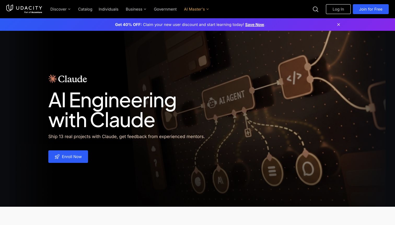
Udacity makes its current learning offer the visual center of a broad education platform. The retained capture pairs a direct AI engineering course headline with a dark code-oriented illustration, while the navigation provides routes into a larger course catalog. Its announcement strip adds a promotional message without covering the page. For a Chakra UI project, the useful reference is the relationship between a distinctive campaign panel and repeatable navigation, action and content components. The maintainer showcase documents the website association; the screenshot does not establish which current elements use that library.
What you can learn
Build a course landing system around a clear learning outcome, an identifiable next action and a reusable supporting-content pattern. Let campaign artwork change within that system, while preserving familiar catalog navigation and enough context to compare the featured course with alternatives.
Pros
The course-specific hero gives a broad education platform an immediate, concrete point of entry.
Contrasting artwork and a restrained action area keep the offer visually distinct from navigation.
Cons & considerations
Promotional messaging competes with the course proposition before visitors see curriculum detail.
The retained screenshot illustrates that observed campaign, rather than every current course or authenticated learning screen.
Platform source: Maintainer-documented Chakra UI website association. Chakra UI’s maintainer showcase explicitly links this public website under its websites-built-with-Chakra heading. This undated documentary association does not establish current runtime use, an exclusive stack, or implementation across other pages, private products or native applications. Platform evidence is separate from the direct website screenshot and is not a complete current infrastructure audit.
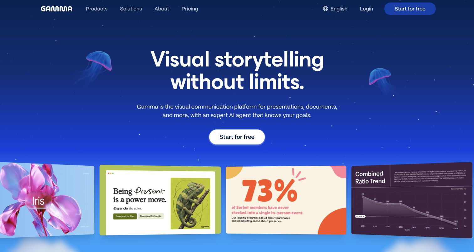
Gamma uses a deep blue visual field and a large presentation preview to sell the output of its tool before explaining the interface. The retained homepage capture places a short visual-storytelling promise above the primary start action, with colorful example material introducing what a user could make. Compact navigation leaves most of the opening screen to the product narrative. This is useful for studying how a component-based marketing site can feel expressive without turning every element into a competing card. Chakra's showcase supplies a documented website association, not proof of the private editor's complete implementation.
What you can learn
Show a recognizable result beside the action that begins producing it. Keep the opening language broad enough to communicate the benefit, then use examples and subsequent sections to clarify formats, constraints and the work required from the user.
Pros
The strong background and large example previews create a cohesive first impression.
A simple primary action keeps the entry path visible amid the visual material.
Cons & considerations
The broad storytelling promise needs supporting detail before a visitor can assess specific workflows.
The marketing capture cannot establish the editor's accessibility, export quality or account experience.
Platform source: Maintainer-documented Chakra UI website association. Chakra UI’s maintainer showcase explicitly links this public website under its websites-built-with-Chakra heading. This undated documentary association does not establish current runtime use, an exclusive stack, or implementation across other pages, private products or native applications. Platform evidence is separate from the direct website screenshot and is not a complete current infrastructure audit.
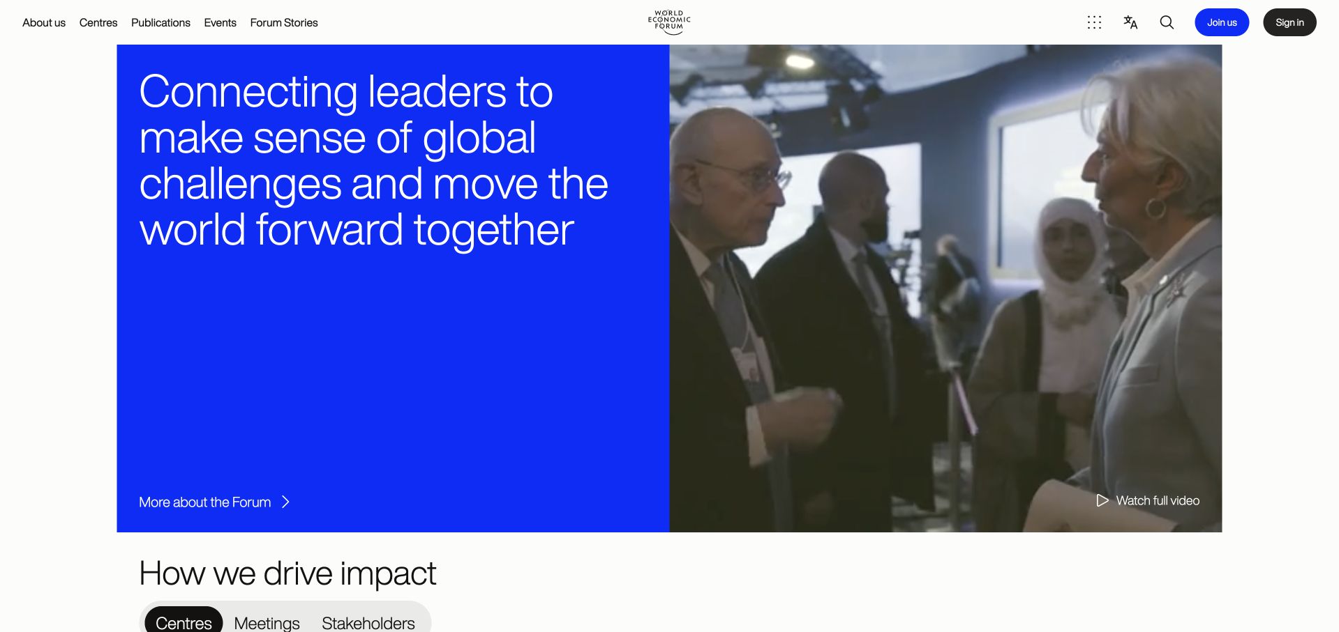
The World Economic Forum homepage balances institutional identity with a clear explanation of purpose. In the retained capture, a white header holds the organization's mark above a split introduction: a deep blue mission panel on the left and event imagery on the right. Separate routes invite visitors to learn about the organization or watch the full video. The opening avoids presenting the entire publication archive at once, while the next section introduces impact-oriented navigation. Its Chakra association comes from the maintainer's public showcase and should remain distinct from older evidence about other Forum properties.
What you can learn
For a large institution, establish the organization and its purpose before expanding into topics, reports and events. A shared component system should give those destinations recognizable navigation and headings, while allowing editorial photography to carry the subject matter.
Pros
The split introduction gives institutional context and human activity separate, readable areas.
Distinct information and video actions make the available next steps understandable.
Cons & considerations
The broad mission requires deeper reading before a visitor reaches a specific program or report.
A homepage capture and showcase listing do not establish the technology used across every associated Forum service.
Platform source: Maintainer-documented Chakra UI website association. Chakra UI’s maintainer showcase explicitly links this public website under its websites-built-with-Chakra heading. This undated documentary association does not establish current runtime use, an exclusive stack, or implementation across other pages, private products or native applications. Platform evidence is separate from the direct website screenshot and is not a complete current infrastructure audit.
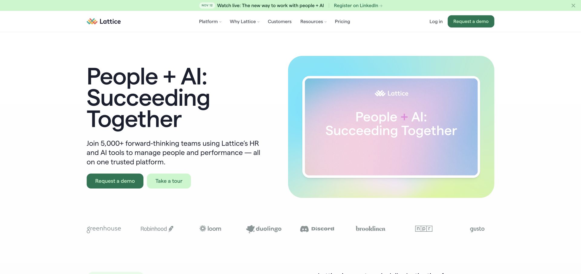
Lattice organizes its people-management proposition around a broad headline and an immediate view of the product. The retained capture uses a pale mint announcement strip, a spacious white introduction and a pastel interface composition to the right. Demo and product-tour actions offer different levels of commitment, while customer marks sit below the main pitch. For teams considering Chakra UI, the instructive pattern is the separation of narrative, product evidence and conversion controls. The maintainer's documented association is retained alongside older public Webflow observations, without claiming the present homepage exclusively runs on Chakra.
What you can learn
Give a business-software visitor more than one way to evaluate the product. Pair an assisted sales route with a lower-commitment explanation or tour, and make screenshots specific enough to communicate the kinds of tasks the software supports.
Pros
The two evaluation routes acknowledge different stages of buyer readiness.
The light palette and spacious composition keep product imagery from overwhelming the headline.
Cons & considerations
The wide people-and-AI proposition needs lower sections to explain particular workflows.
Customer logos alone do not demonstrate the outcomes, implementation scope or suitability of the product.
Platform source: Maintainer-documented Chakra UI website association. Chakra UI’s maintainer showcase explicitly links this public website under its websites-built-with-Chakra heading. This undated documentary association does not establish current runtime use, an exclusive stack, or implementation across other pages, private products or native applications. Platform evidence is separate from the direct website screenshot and is not a complete current infrastructure audit.
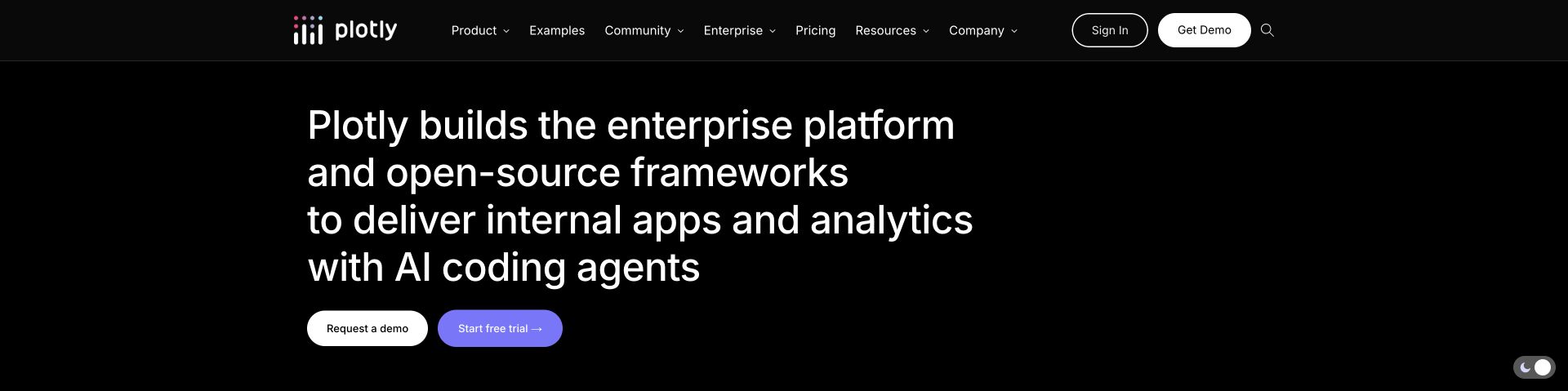
Plotly's public homepage presents a broad technical offering with unusually direct typography. A black background carries a large white statement about its enterprise platform and open-source frameworks, followed by separate demo and trial actions. The navigation divides product information, examples, community and enterprise content instead of collapsing them into a single developer menu. Further down, the page distinguishes Dash, graphing tools and newer product surfaces. The capture shows the introduction after a normal page scroll and cookie rejection. Its Chakra connection is documentary showcase evidence, not an assertion about every Plotly library or generated application.
What you can learn
When a company offers both open-source tools and commercial infrastructure, make those layers legible in the navigation and product sections. Shared buttons and headings should connect the experience while preserving distinct expectations for documentation, trials and sales conversations.
Pros
High-contrast text gives the technical proposition a strong reading hierarchy.
Separate example, community and enterprise paths support different visitor intentions.
Cons & considerations
The long opening sentence asks readers to absorb several product categories at once.
The marketing presentation cannot establish the performance or accessibility of applications created with its tools.
Platform source: Maintainer-documented Chakra UI website association. Chakra UI’s maintainer showcase explicitly links this public website under its websites-built-with-Chakra heading. This undated documentary association does not establish current runtime use, an exclusive stack, or implementation across other pages, private products or native applications. Platform evidence is separate from the direct website screenshot and is not a complete current infrastructure audit.
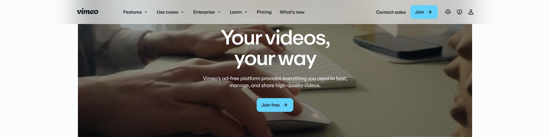
Vimeo puts moving imagery behind a concise explanation of its video platform, then uses a bright action to make the entry point easy to locate. The public homepage separates features, use cases and enterprise information in its header, while lower sections explain hosting, collaboration, embedding and monetization. A temporary promotional bar was dismissed through its normal close control before capture. The useful Chakra-related design reference is how a complex product family can share consistent navigation and actions while allowing media to dominate the narrative. The official showcase association remains qualified independently of current runtime detection.
What you can learn
Use video to demonstrate the medium, but accompany it with readable text and a direct next step. Organize the supporting architecture around visitor tasks and audiences so that an evocative opening does not become the only explanation of the service.
Pros
The cyan action stands out clearly against the darker hero imagery.
Feature and audience navigation provide complementary routes into a broad platform.
Cons & considerations
Moving imagery can compete with reading and needs appropriate playback and motion handling.
The homepage and retained unavailable audit do not prove every player, editor or account surface uses Chakra UI.
Platform source: Maintainer-documented Chakra UI website association. Chakra UI’s maintainer showcase explicitly links this public website under its websites-built-with-Chakra heading. This undated documentary association does not establish current runtime use, an exclusive stack, or implementation across other pages, private products or native applications. Platform evidence is separate from the direct website screenshot and is not a complete current infrastructure audit.
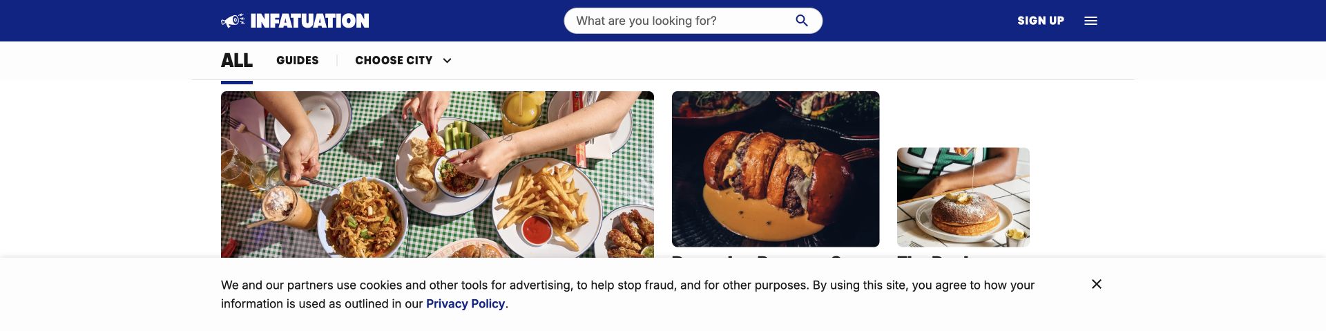
The Infatuation is an editorial food-discovery website, and its homepage behaves like one. A cobalt masthead puts search in a prominent position, with a city chooser directly beneath it. An asymmetrical grid gives a large feature photograph priority while smaller food stories remain easy to scan beside it. Bold titles and repeated city sections make the long page navigable without turning it into a restaurant booking interface. The captured public root redirected to its all-city landing page. Chakra's showcase provides a documented association with this publication property, not a claim about the restaurants it covers.
What you can learn
For a location-sensitive publication, make geography and search available before the reader enters a story. Reuse image and title components consistently, but vary editorial prominence so that a featured story can stand apart from routine recommendations without confusing the overall hierarchy.
Pros
The city selector makes the geographic scope of the publication readily discoverable.
Large food photographs and strong headline contrast support quick editorial scanning.
Cons & considerations
A long feed can require substantial scrolling before less prominent cities are reached.
Restaurant scores and recommendations are the publisher's content, not independent judgments validated by this design review.
Platform source: Maintainer-documented Chakra UI website association. Chakra UI’s maintainer showcase explicitly links this public website under its websites-built-with-Chakra heading. This undated documentary association does not establish current runtime use, an exclusive stack, or implementation across other pages, private products or native applications. Platform evidence is separate from the direct website screenshot and is not a complete current infrastructure audit.
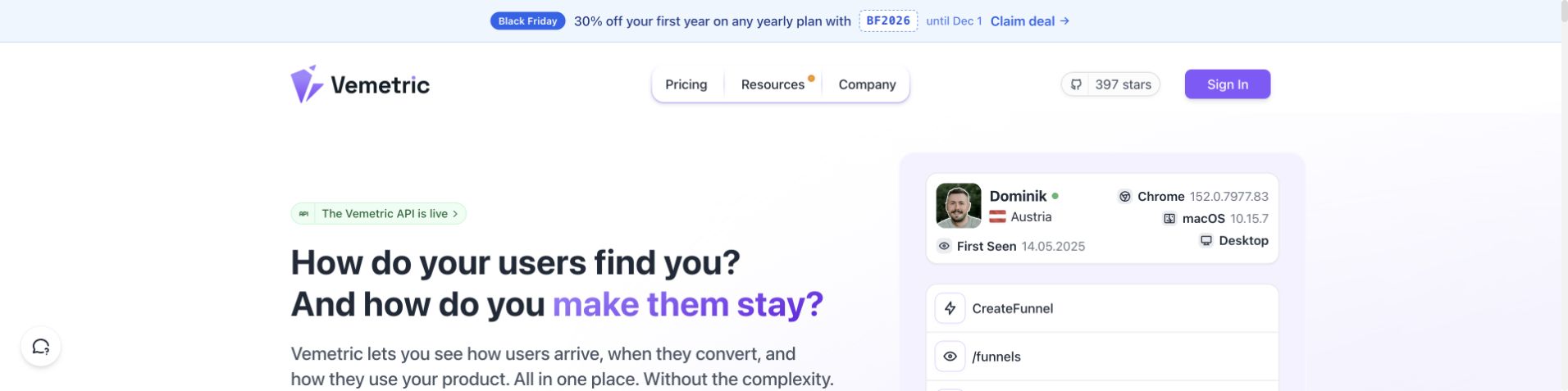
Vemetric frames analytics around two concrete questions: how people arrive and what makes them stay. The pale homepage combines that proposition with an example user timeline rather than relying only on abstract charts. Pricing, resources and company information occupy a compact navigation, while product sections introduce dashboards, users, funnels and events. A public demo link offers a further evaluation route. The captured page includes a static promotional strip as part of its header, with no modal obscuring the content. The Chakra showcase association is separate from any claim about the accuracy or privacy behavior of the analytics product.
What you can learn
Translate a technical feature set into the questions a buyer is trying to answer, then show an interface example that connects those questions to a task. Keep demo access and pricing findable, and explain measurement limits in product documentation rather than expecting visuals to prove them.
Pros
Question-led copy connects acquisition and retention to understandable visitor goals.
The example timeline makes the product's event-oriented interface tangible.
Cons & considerations
Dense example data can distract from the headline when several animated states compete.
Marketing interface examples do not establish actual reporting accuracy or regulatory compliance.
Platform source: Maintainer-documented Chakra UI website association. Chakra UI’s maintainer showcase explicitly links this public website under its websites-built-with-Chakra heading. This undated documentary association does not establish current runtime use, an exclusive stack, or implementation across other pages, private products or native applications. Platform evidence is separate from the direct website screenshot and is not a complete current infrastructure audit.
HelloBonnie introduces employee benefits through a recognizable object: a smartcard shown inside a large phone mockup. The off-white layout and orange accents give the proposition a restrained visual identity, while the navigation separates features, solutions and pricing. Lower sections explain designing, selecting and using benefits, then provide distinct routes for companies, employees and partners. A payroll calculator and accompanying legal notice add detail without making the opening screen carry every qualification. The review concerns this public presentation and its documented Chakra association; it does not independently validate tax savings or the card's operational coverage.
What you can learn
When several audiences share one service, start with the common mechanism and then separate their tasks. Pair financial illustrations with visible assumptions and qualifications, and use a consistent component vocabulary for the steps, audience cards and follow-up actions.
Pros
The card and wallet visual gives an otherwise abstract benefits service a concrete reference.
Three-step and audience sections create useful layers beneath the concise introduction.
Cons & considerations
Savings illustrations require careful reading of assumptions and local applicability.
The oversized phone image can delay practical detail on shorter viewports.
Platform source: Maintainer-documented Chakra UI website association. Chakra UI’s maintainer showcase explicitly links this public website under its websites-built-with-Chakra heading. This undated documentary association does not establish current runtime use, an exclusive stack, or implementation across other pages, private products or native applications. Platform evidence is separate from the direct website screenshot and is not a complete current infrastructure audit.
Solidity's homepage uses the visual language of programming without hiding its purpose. A geometric mark, a brace-and-underscore heading and faint keyword typography create an identity around the language itself. Documentation and repository links provide practical next steps, while release information, contribution guidance and a lower playground support more experienced readers. The restrained lavender palette is distinct from a generic dark developer landing page. This collection reviews the website named in Chakra's showcase; it does not imply that Solidity contracts, the compiler or every linked documentation property are implemented with the same interface library.
What you can learn
A developer homepage should explain the tool's role, offer a direct route to documentation and show signs of ongoing maintenance. Decorative code references can support the identity, but release notes and contribution pathways provide more useful orientation than a wall of technical slogans.
Pros
The visual identity relates closely to the language without obscuring navigation.
Documentation, repository and contribution routes serve different levels of developer involvement.
Cons & considerations
Specialist terminology can make the opening less accessible to first-time blockchain learners.
The public playground's presence is not evidence that every example or compiler path has been independently tested.
Platform source: Maintainer-documented Chakra UI website association. Chakra UI’s maintainer showcase explicitly links this public website under its websites-built-with-Chakra heading. This undated documentary association does not establish current runtime use, an exclusive stack, or implementation across other pages, private products or native applications. Platform evidence is separate from the direct website screenshot and is not a complete current infrastructure audit.
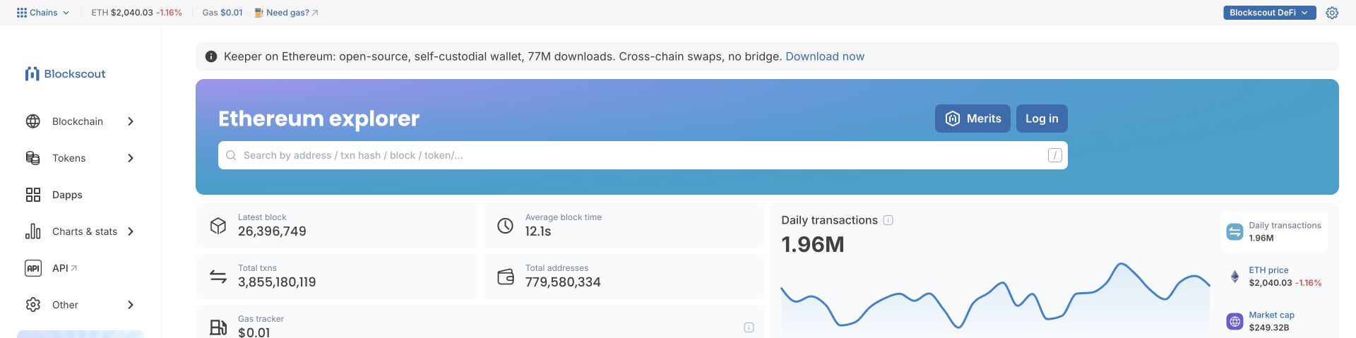
Blockscout's Ethereum explorer makes search the main task rather than an afterthought. A broad input accepts several kinds of blockchain identifiers, while a persistent left rail separates blockchain activity, tokens, applications and statistics. Compact metric cards establish the network context before the page reaches detailed block and transaction tables. The visual treatment is restrained enough that dense data remains the focus. Unlike most marketing pages in this collection, this is a directly viewable utility interface. Chakra's showcase names this exact explorer property; the review does not evaluate blockchain values, investment prospects or the safety of linked wallets.
What you can learn
For a data explorer, make the accepted search inputs explicit and keep navigation stable as information density increases. Summaries should help readers orient themselves, while detailed tables need clear identifiers, labels and routes to the underlying records rather than decorative dashboard filler.
Pros
A prominently labeled multi-type search supports a clear primary task.
Persistent navigation and compact metrics create a predictable information hierarchy.
Cons & considerations
Abbreviations and rapidly changing figures require background knowledge from new visitors.
Public interface inspection does not verify data freshness, financial accuracy or third-party wallet security.
Platform source: Maintainer-documented Chakra UI website association. Chakra UI’s maintainer showcase explicitly links this public website under its websites-built-with-Chakra heading. This undated documentary association does not establish current runtime use, an exclusive stack, or implementation across other pages, private products or native applications. Platform evidence is separate from the direct website screenshot and is not a complete current infrastructure audit.
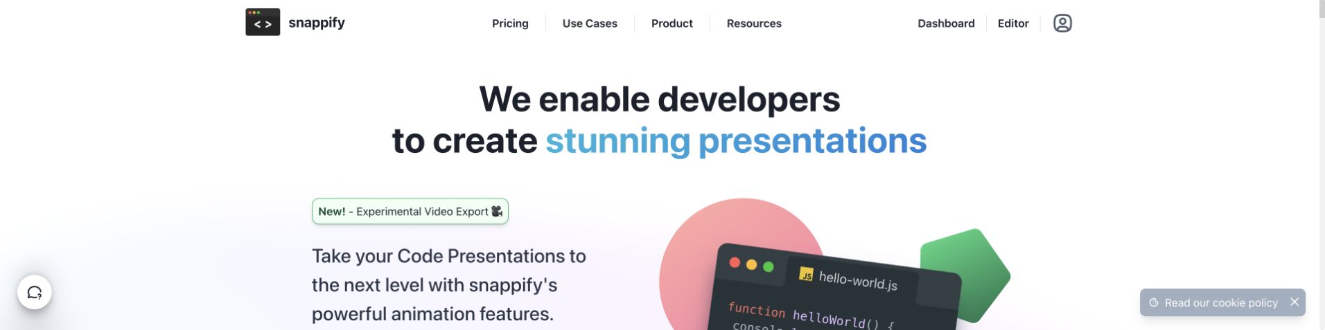
snappify addresses developers directly and demonstrates the visual material it helps them create. The homepage combines a blue-accented presentation headline with stylized code windows and simple geometric forms. Further sections explain annotations, multiple code panels, branding and interactive educational slides through concrete examples. Templates and the editor remain findable in the navigation, while user stories add context for different teaching and publishing workflows. The public page is a useful reference for making a specialist tool understandable through its own outputs. The Chakra association is documented by its maintainer showcase, not inferred from the appearance of the code examples.
What you can learn
A tool for technical creators should demonstrate a meaningful artifact before describing every control. Give visitors a way to inspect templates and documentation, then organize advanced capabilities around what they help explain rather than presenting an undifferentiated list of editor features.
Pros
Code-based visuals establish the intended audience without a lengthy explanation.
Examples connect annotation and presentation features to teaching and publishing tasks.
Cons & considerations
Animated illustrations may compete with the reading of technical examples.
The public presentation does not establish export fidelity, private project behavior or measured learning benefits.
Platform source: Maintainer-documented Chakra UI website association. Chakra UI’s maintainer showcase explicitly links this public website under its websites-built-with-Chakra heading. This undated documentary association does not establish current runtime use, an exclusive stack, or implementation across other pages, private products or native applications. Platform evidence is separate from the direct website screenshot and is not a complete current infrastructure audit.
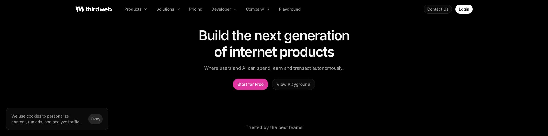
thirdweb's homepage uses a black background, a centered proposition and a bright pink start action to introduce a wide developer platform. A quieter playground action provides an alternative path for exploration. The navigation separates products, solutions and developer material, while lower cards break the offering into wallets, data access, tokens and other infrastructure. Customer stories and pricing appear as distinct stages of evaluation. For a Chakra UI project, the reference is the reuse of concise cards and consistent actions across a technical product family. The showcase association concerns this public website, not every customer application or blockchain integration.
What you can learn
When a platform covers many technical services, show the common purpose first and then divide the offering into independently understandable modules. Keep documentation and exploratory routes visible alongside account creation, and distinguish product claims from evidence of real implementation outcomes.
Pros
The restrained opening gives the primary and exploratory actions clear visual separation.
Product modules help visitors navigate a large infrastructure offering.
Cons & considerations
Broad internet-product language can leave first-time visitors unsure which service they need.
The review does not validate security, financial transactions, token value or the performance of linked applications.
Platform source: Maintainer-documented Chakra UI website association. Chakra UI’s maintainer showcase explicitly links this public website under its websites-built-with-Chakra heading. This undated documentary association does not establish current runtime use, an exclusive stack, or implementation across other pages, private products or native applications. Platform evidence is separate from the direct website screenshot and is not a complete current infrastructure audit.
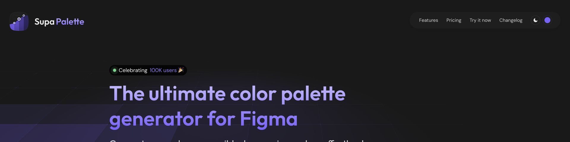
Supa Palette makes its category unmistakable: a color palette generator for Figma. Purple typography and a dark grid-like background echo the product's design-system focus, while the header keeps features, pricing, plugin access and release information close together. The page then moves through discovery, refinement and integration before explaining color systems, contrast tools and export formats. A discount overlay was closed and cookies rejected before capture. The association with Chakra comes from the official showcase, while the site's separate mention of Chakra export formats describes an output feature and is not used as implementation proof.
What you can learn
For a design utility, make the destination workflow explicit and separate trying the plugin from purchasing a license. Organize detailed capabilities around a small sequence of user tasks, then explain technical options and limitations where a designer can evaluate them in context.
Pros
The headline identifies both the product function and its intended host application.
A three-stage explanation connects palette exploration to practical integration.
Cons & considerations
Dense feature sections can overwhelm visitors who only need a simple palette workflow.
Contrast-tool marketing does not independently demonstrate the accessibility of a complete design or exported interface.
Platform source: Maintainer-documented Chakra UI website association. Chakra UI’s maintainer showcase explicitly links this public website under its websites-built-with-Chakra heading. This undated documentary association does not establish current runtime use, an exclusive stack, or implementation across other pages, private products or native applications. Platform evidence is separate from the direct website screenshot and is not a complete current infrastructure audit.
Codiga's homepage pairs a colorful code-quality identity with practical integration information. A plum background and animated clean-code headline establish the visual theme, while tabs divide static analysis, custom rules, security checks and related features. Lower sections map the product to stages from an IDE through code review and production. The page prominently states that Codiga has joined Datadog, which is important context when interpreting its older product presentation. Cookie preferences were saved with analytics unchecked before capture. Chakra's showcase documents the website association, without establishing current standalone product availability or the effectiveness of its analysis.
What you can learn
Technical product pages should connect features to the tools and stages where users work. When a service changes ownership or product direction, keep that transition visible and avoid letting a polished historical landing page imply that every advertised workflow is still offered unchanged.
Pros
Integration and lifecycle sections give the abstract code-quality promise concrete context.
The acquisition notice helps readers interpret the site's ongoing product positioning.
Cons & considerations
Animated wording can briefly produce incomplete phrases while the headline changes.
The homepage does not independently verify vulnerability coverage, fix quality or current service terms.
Platform source: Maintainer-documented Chakra UI website association. Chakra UI’s maintainer showcase explicitly links this public website under its websites-built-with-Chakra heading. This undated documentary association does not establish current runtime use, an exclusive stack, or implementation across other pages, private products or native applications. Platform evidence is separate from the direct website screenshot and is not a complete current infrastructure audit.
BrandBird introduces a screenshot editor with a dark dotted canvas and a headline that cycles through its intended audiences. The supporting copy names practical outputs such as social posts, landing pages and newsletters, while the header exposes templates, features, pricing and the studio. Below the introduction, a short upload, customize and export sequence leads into examples of gradients, tilt effects, annotations and device mockups. A small cookie notice was dismissed before capture. This review concerns the public product explanation and documented Chakra association; no private image was uploaded and no editing result was fabricated.
What you can learn
Explain an image tool through the transformation it performs and the situations where that result is useful. Templates can bridge the gap between inspiration and execution, but the primary flow should still communicate what the visitor supplies, changes and exports.
Pros
Specific publishing use cases make the editor's purpose understandable quickly.
The three-stage workflow and template gallery give visitors concrete ways to evaluate the tool.
Cons & considerations
Rotating audience labels add motion without necessarily adding new product information.
Customer engagement claims are testimonials, not measured outcomes established by this review.
Platform source: Maintainer-documented Chakra UI website association. Chakra UI’s maintainer showcase explicitly links this public website under its websites-built-with-Chakra heading. This undated documentary association does not establish current runtime use, an exclusive stack, or implementation across other pages, private products or native applications. Platform evidence is separate from the direct website screenshot and is not a complete current infrastructure audit.
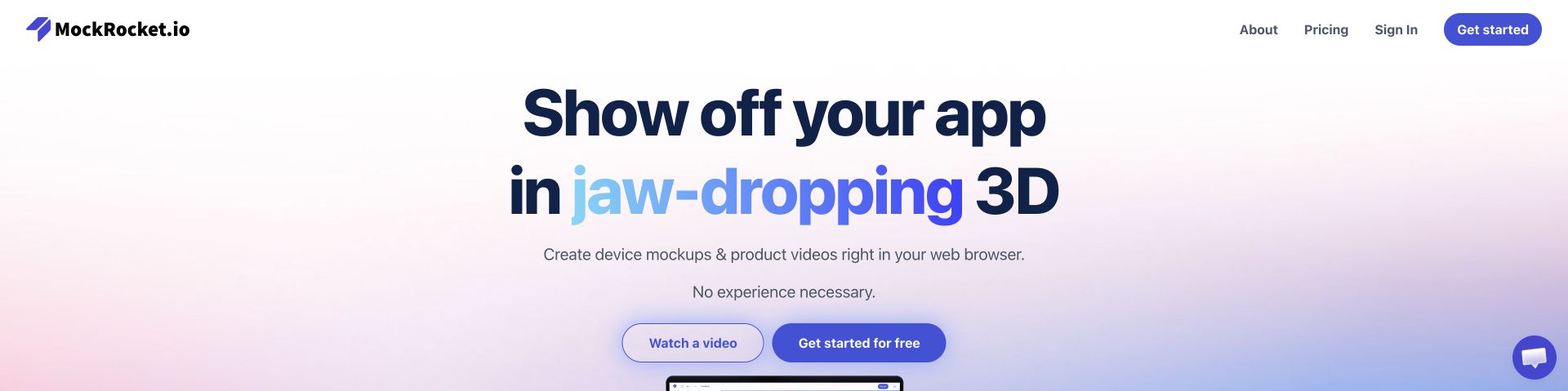
MockRocket describes its purpose in a large headline about showing an app in three dimensions, then pairs a video-preview button with a free-start action. The soft gradient background supports the proposition without competing with the text. Further sections distinguish product videos, presentations, portfolios and app-store previews, followed by template, control and export information. Sample artwork is explicitly attributed on the page, a useful detail for a visual-production service. The Chakra showcase supplies a documented association with the public website; it does not demonstrate the implementation of the separately linked editor or validate its rendering claims.
What you can learn
For a visual creation product, separate an explanation of the output from the action that opens the tool. Show examples with appropriate attribution, then reveal advanced controls in a structured sequence so that beginners and experienced users can assess different levels of capability.
Pros
The paired preview and start actions support evaluation before commitment.
Use-case and export sections connect the visual promise to practical deliverables.
Cons & considerations
Large headline styling leaves less room for a concrete example on a short viewport.
Public marketing cannot establish output quality, browser performance or the handling of uploaded designs.
Platform source: Maintainer-documented Chakra UI website association. Chakra UI’s maintainer showcase explicitly links this public website under its websites-built-with-Chakra heading. This undated documentary association does not establish current runtime use, an exclusive stack, or implementation across other pages, private products or native applications. Platform evidence is separate from the direct website screenshot and is not a complete current infrastructure audit.
Yubo's public website uses acid yellow, oversized black lettering and a collage of people to communicate a social product immediately. The hero emphasizes making friends, while a purple download action and platform icons point toward the native apps. Lower sections explain chat and community experiences, followed by blog material and extensive safety and privacy routes. The visual identity is much louder than the business-software examples in this collection, but the primary task remains straightforward. Chakra's showcase association applies to the public website; it is not evidence that the native applications or moderation systems use the same technology.
What you can learn
A consumer-app landing page can use expressive art direction while keeping its platform destination clear. Pair the emotional proposition with discoverable safety, privacy and support information, and avoid treating promotional imagery as evidence of the quality or safety of real interactions.
Pros
The yellow-and-black palette gives the public page a distinctive, coherent identity.
Platform links and the download action make the intended next step easy to understand.
Cons & considerations
Oversized type and collage imagery can dominate more practical product information.
Public safety content does not independently establish moderation effectiveness or the experience of individual members.
Visible tech stack
Earlier / documented evidence
Chakra UI
Platform source: Maintainer-documented Chakra UI website association. Chakra UI’s maintainer showcase explicitly links this public website under its websites-built-with-Chakra heading. This undated documentary association does not establish current runtime use, an exclusive stack, or implementation across other pages, private products or native applications. Platform evidence is separate from the direct website screenshot and is not a complete current infrastructure audit.
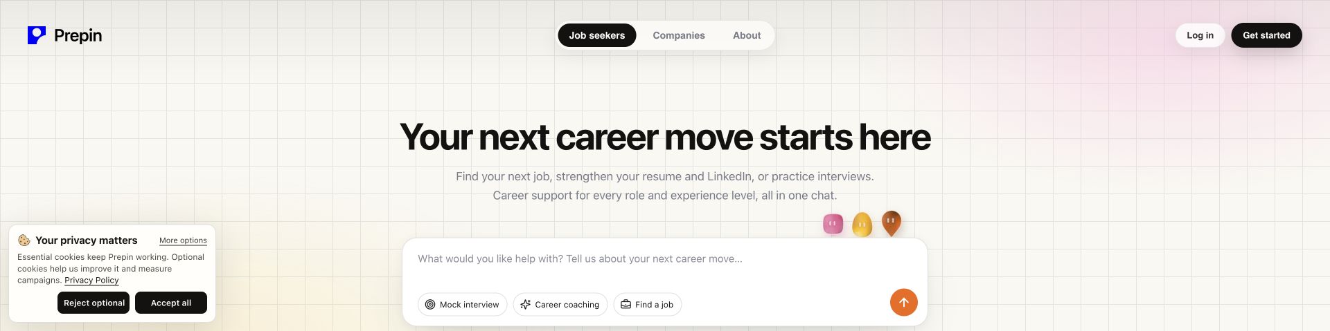
Prepin's homepage turns a broad career-support service into a visible starting task. A large prompt area sits below a concise headline, with suggested actions for mock interviews, coaching and finding work. Navigation separates job seekers from companies, and later sections introduce coach, matcher and interviewer roles. The page labels sample profiles and role matches as illustrative, which helps distinguish explanation from actual applicant outcomes. The review covers this public presentation and the exact website documented in Chakra's showcase. No résumé, employment history or other personal information was entered, and no application or recruiter contact was initiated.
What you can learn
When a service begins with a conversation, show users what kinds of help they can request before asking for personal context. Clearly label sample results, explain what requires signup and keep the user's review and approval responsibilities visible throughout the product narrative.
Pros
Task suggestions make the otherwise open-ended chat entry easier to understand.
Illustrative labels and role descriptions clarify the intended workflow.
Cons & considerations
A prompt-shaped opening can suggest immediate use even when continuing requires an account.
Marketing examples do not establish match quality, hiring outcomes or the treatment of sensitive applicant information.
Platform source: Maintainer-documented Chakra UI website association. Chakra UI’s maintainer showcase explicitly links this public website under its websites-built-with-Chakra heading. This undated documentary association does not establish current runtime use, an exclusive stack, or implementation across other pages, private products or native applications. Platform evidence is separate from the direct website screenshot and is not a complete current infrastructure audit.
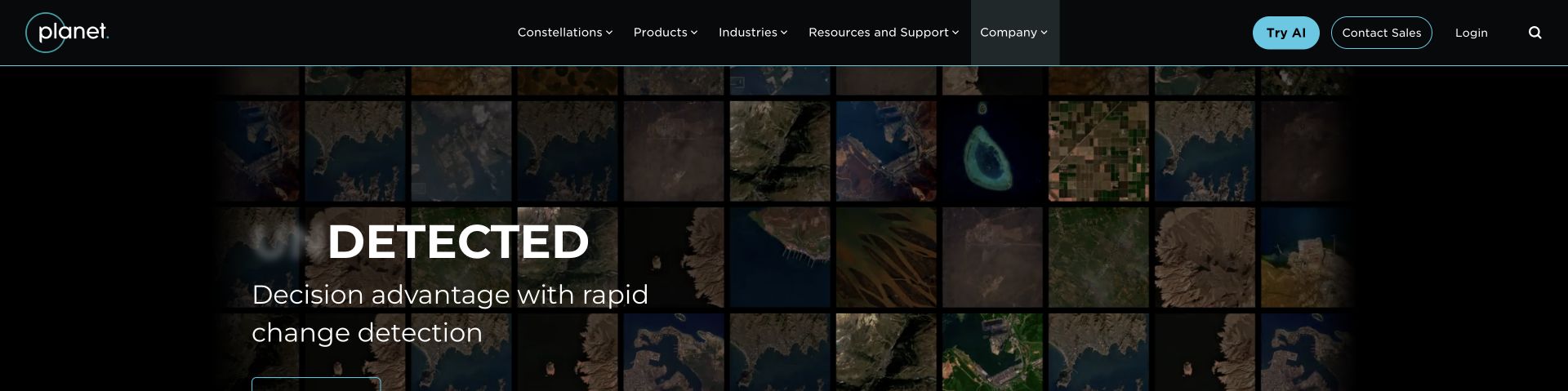
Planet's public homepage belongs to the Earth-observation company, despite an inaccurate travel descriptor in the Chakra showcase. Its dark header organizes constellations, products, industries and support above a satellite-imagery hero about detecting change. Lower sections distinguish broad monitoring, high-resolution views and derived data, then connect those capabilities to products and customer use cases. A cookie panel was closed normally before the unobstructed capture. The maintainer directly links this public domain as a Chakra website; that documentary association does not establish the stack of its separate account, AI or data-delivery services.
What you can learn
For a complex data product, use imagery to explain what the service observes, then organize capabilities around distinct analytical questions. Separate public product education from account and sales routes, and make illustrative material and technical limitations clear instead of allowing dramatic visuals to imply universal precision.
Pros
The imagery and change-detection message communicate the company's subject matter directly.
Products and industry navigation provide complementary routes through a specialized offering.
Cons & considerations
Large moving visuals may delay the appearance of useful information on initial load.
A marketing capture does not verify imagery accuracy, service coverage or the performance of downstream analysis.
Platform source: Maintainer-documented Chakra UI website association. Chakra UI’s maintainer showcase explicitly links this public website under its websites-built-with-Chakra heading. This undated documentary association does not establish current runtime use, an exclusive stack, or implementation across other pages, private products or native applications. The showcase category descriptor says travel; the directly reviewed website identifies Planet Labs and Earth-observation products, so that inaccurate category was not adopted. Platform evidence is separate from the direct website screenshot and is not a complete current infrastructure audit.
Kegan has 15+ years of experience working with small businesses, Fortune 500 companies, and everything in between. No development job is too big or too small: he brings the same hands-on attention to a focused improvement, a complete website, or a custom application.
For Chakra UI projects, he can help with responsive interfaces, reusable components, custom functionality, API connections, and performance-minded implementation. He works directly with clients on scope, design, implementation, testing, and handover, with an emphasis on clear communication and a system that remains practical to maintain after launch.
Show 3 other Chakra UI developersHide other Chakra UI developers
Gamma, Lattice and HelloBonnie show different ways to introduce a broad service without exposing every feature immediately. Pair a concise proposition with tangible product evidence, then offer evaluation routes for people with different levels of readiness. Keep trials, tours, information requests and purchases distinct rather than giving every action the same generic label.
Developer tools and data interfaces
Plotly, Solidity and Blockscout serve visitors who may arrive with a specific technical question. Make documentation, search, examples and source repositories easy to identify. A dense interface needs consistent labels and meaningful state feedback; a developer landing page needs enough context to explain where the tool fits without demanding that every visitor already knows its terminology.
Editorial and expressive public websites
The Infatuation relies on geography and story prominence; the Forum combines mission and institutional material; Yubo uses a much louder visual identity around an app-download task. Repeated components can support all three approaches. The goal is a dependable structure that leaves room for the subject matter, rather than a fixed arrangement of interchangeable cards.
From references to requirements
Plan the system before filling the screens
Map the public and private boundaries
List the pages and applications you are actually building. A public homepage may link to a separate editor, account, native app or payment service. Record which system owns each step so that navigation, support expectations and technology descriptions remain accurate. A company name is not enough to establish the implementation of every associated domain.
Use realistic content and viewport constraints
Test long headings, short screens, translated labels, dense tables and media that fails to load. Chakra documents responsive style props and a mobile-first breakpoint system, but your content determines where the layout becomes uncomfortable. Choose changes that preserve the task and reading order, rather than shrinking a desktop composition until it technically fits.
A button needs a clear purpose, a form needs helpful feedback and a data display needs an understandable empty state. Write those requirements alongside the component inventory. Identify who maintains changing offers, product names, release notes and policy information, so that a reusable design system does not distribute stale facts more efficiently.
Evaluate evidence separately from appearance
A good-looking interface cannot establish response time, business results, privacy behavior or security. Keep those questions in a separate evaluation plan with appropriate measurements and sources. Use this collection for design observations and documented implementation leads, then verify the requirements of your own project directly.
A useful handover demonstration
Ask the actual team to carry out its routine job: publish a realistic update, correct a mistake, preview a narrow screen, and identify who owns an integration failure. For a library or frontend framework, also ask who maintains the content source and deployment. A polished screenshot does not answer those operational questions.
Beyond the screenshot
A practical Chakra UI website checklist
Name the main visitor task for each public page.
Separate marketing, documentation, accounts and external services.
Define shared typography, spacing and action emphasis.
Give components clear labels and consistent meanings.
Plan loading, empty, disabled, error and success states.
Test long content, translations and short viewports.
Preserve useful keyboard navigation and visible focus.
Keep motion and media from obscuring essential information.
Label illustrative product data and sample results.
Make privacy, support and product limitations discoverable.
Assign ownership for changing content and release information.
Record exact technology evidence rather than inferring it from a visual style.
Test with real content, a keyboard, a small screen, slow or failed requests, and the people who will maintain the system. These are planning checks, not an accessibility, security, performance, or search-ranking certification.
Sources & editorial method
How this Chakra UI collection was reviewed
The twenty public properties are individually named in Chakra UI's undated maintainer showcase. Their association is documentary and limited to those properties; it does not establish the current implementation of every page, private application or native product. Sixteen fresh browser captures were made on November 12 UTC, corresponding to November 11 in America/Los_Angeles. Four clean captures of Udacity, Gamma, the World Economic Forum and Lattice were retained with their original dates and source records. Normal site controls dismissed obscuring notices; page content was not altered. Each selected source has a broad public-stack audit attempt. Fifteen new attempts produced fourteen checked records and one access-limited Yubo record; five earlier audit records remain unchanged, including unavailable Gamma, Forum and Vimeo observations. No access restriction was bypassed, no account was created and no private data, upload, form submission or transaction was used. The public Planet property was reviewed as Planet Labs' Earth-observation website; the showcase's inaccurate travel descriptor was not adopted.
Every image is an unmodified capture from the actual website, with its source and capture date. Some captures are reused from our shared catalog; their dates remain the original capture dates. None comes from a vendor gallery or a generated reconstruction. Moving imagery and live content can change.
Technology attribution uses public page assets or metadata, official platform documentation, or a cited first-party project case study. Documentary and framework-relationship evidence is identified where used; it is not a complete current backend inventory. A CMS image CDN alone does not establish a full CMS deployment. A library’s presence does not prove which individual controls use it, and a platform label does not establish AI authorship.
The composition notes, lessons, pros and tradeoffs are original editorial observations. We have not measured conversion, traffic, security, performance or accessibility conformance. Website owners retain their brands and imagery; these examples are not our client portfolio. Written, Edited and Curated are independent records, not dates advanced by a build. See our editorial standards or suggest a correction.
Questions worth asking
Chakra UI website development FAQs
Does inclusion prove that the website currently uses only Chakra UI?
No. The maintainer showcase documents a specific association. Public source observations may identify other frameworks, libraries or delivery services, and some source checks are unavailable. The collection keeps those qualifications and does not turn a showcase entry into proof of an exclusive or complete current stack.
Are the native apps and private products included in the technology claim?
No. The evidence is limited to the exact public website properties linked by the showcase. A public marketing page can lead to a separate application, account system or native app. Those destinations are not automatically included in the association.
What should I borrow from these examples?
Borrow an understandable hierarchy, a useful navigation pattern or a clear explanation of a task. Adapt it to your own content and audience. Copying a visual treatment does not establish that the same technology, interaction or business model is right for your project.
Does Chakra UI guarantee an accessible website?
No component library can guarantee the accessibility of a finished website. Content, labels, semantics, focus behavior, contrast and complete interaction flows still need evaluation. The examples are design observations, not accessibility certifications.
Why do some screenshots have older dates?
A genuine clean capture can remain useful when its original source and date are preserved. Four examples reuse verified captures rather than pretending they were newly taken. Their current collection review and documentary association are recorded separately from those capture dates.
How were inaccessible or redirected candidates handled?
Unavailable source audits retain their exact limitations and earlier evidence. Candidates whose redirected origins could not be reviewed within the authorized scope were excluded, with independently qualified public properties used instead. No denied access was retried through another route.
Start with the task, the content and the states a visitor will encounter. A shared component system is most useful when it makes those decisions consistent while leaving the website's subject and identity clear.