Best Balloon Artist Websites of 2026 (15 Real-World Examples)
Real balloon-artist websites showing how to present installations, explain live entertainment and turn an event idea into a useful inquiry.
A balloon artist’s website should show the work and explain what it takes to bring that work to an event.
A dramatic installation can make a strong opening image, but an organizer also needs to understand the service. Live twisting, custom décor, gift delivery and collection orders involve different timing, staffing and budgets. The most useful websites make those differences clear without losing the personality of the artist.
This collection includes regional performers, independent décor studios and balloon divisions within broader event businesses. Some examples lead with a finished environment; others explain the artist, the process or a focused service. Compare how each one moves from visual inspiration to practical information rather than treating a single style as the right solution for every business.
Before the examples
What makes good balloon artist website design in 2026?
Make the service and location unmistakable
Say whether you provide live entertainment, installed décor, deliveries or a combination. Identify the actual service area and distinguish collection from on-site work. A visitor should not need to infer the offer from a photograph or discover travel requirements only after submitting an inquiry.
Show representative work with useful context
Use real photographs that explain scale, setting and the finished result. For live twisting, show the interaction as well as individual creations. For installations, include enough of the venue to make proportions understandable. Label the type of project and avoid implying that every pictured setup is a standard package.
Explain the decisions that affect a quote
Event date, location, duration, guest count, installation access and the desired design can all change the scope. Explain the relevant requirements before asking for them. Use honest starting ranges or package details when available, and distinguish an inquiry from a confirmed booking.
The collection · 15 examples
15 balloon artist websites worth studying
Look for the connection between the photograph and the next practical step. The strongest examples make it easier to choose a service, understand its scope and send an informed inquiry.
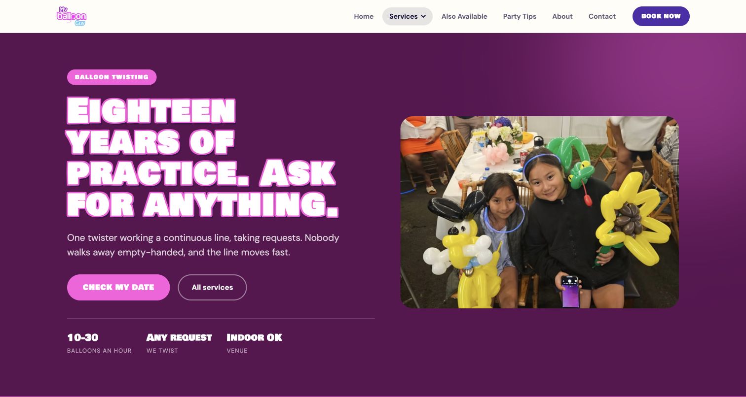
My Balloon Guy gives balloon twisting its own vivid purple page, with a large photograph of finished creations and a short explanation of the live service. The opening pairs a date inquiry with three compact facts about output, requests and indoor use. Farther down, a duration-based price list sits beside the included activities, while a gallery shows different shapes and scales. The useful detail is operational: the page explains that design complexity affects throughput, suggests a second twister for larger groups and discusses summer heat. That makes the offer easier to compare without presenting every booking as identical.
What you can learn
Build a service page around the questions that change a customer's decision. Show representative work, explain duration and capacity, qualify the estimate and place the inquiry beside that information. Keep the bright personality, but let practical detail carry the booking conversation.
Pros
The page connects pricing, inclusions and group-size guidance in one readable sequence.
A focused gallery demonstrates the actual range of balloon twisting.
Cons & considerations
The large opening headline postpones some of the practical detail.
The date inquiry moves to an external booking system.
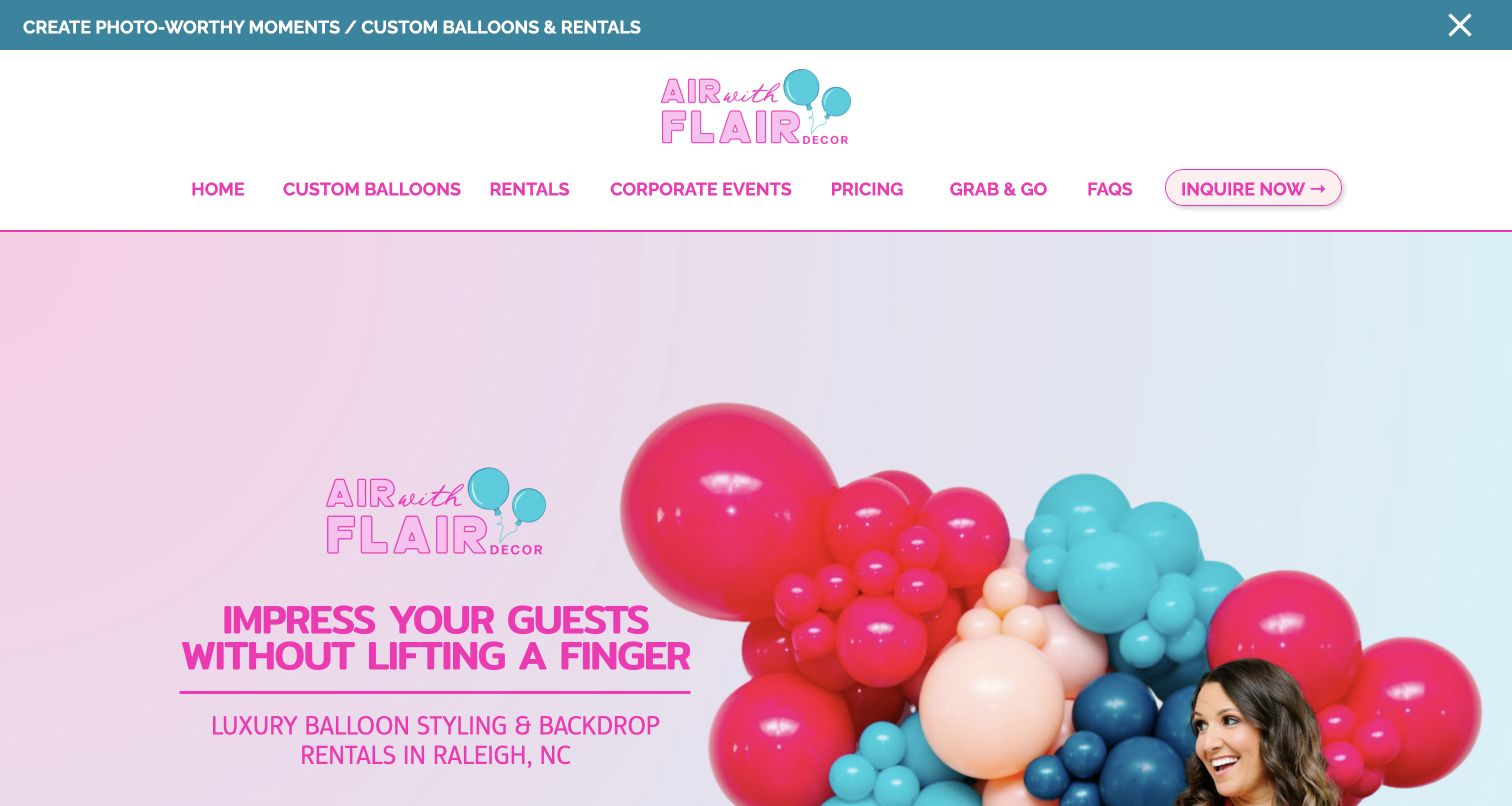
Air with Flair puts its Raleigh service area and balloon décor proposition into a cheerful pink-and-aqua introduction. A real installation and the artist's portrait share the hero, making the business feel personal while showing the type of work on offer. Navigation distinguishes custom balloons, rentals, corporate events and grab-and-go options rather than treating every visitor as a full-service installation client. The longer page supplies starting-price information, a process explanation and practical questions. There is plenty to explore, although the promotion strip, extensive navigation and multiple calls to action compete for attention before the visitor has chosen a route.
What you can learn
Organize the website around how people buy. Someone collecting a small garland needs different information from an event planner commissioning a venue installation. Give each route a clear name, relevant examples and a realistic explanation of what happens after an inquiry.
Pros
Local positioning and visible artist imagery make the offer easy to identify.
Distinct service routes help visitors choose an appropriate starting point.
Cons & considerations
Several promotional elements compete in the opening screen.
A long page needs careful link maintenance to keep every route useful.
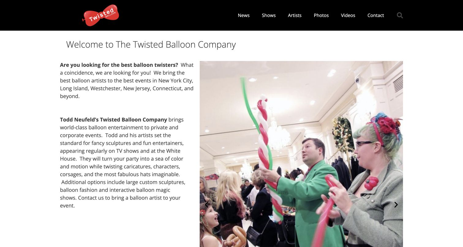
Twisted Balloon Company presents balloon art as live entertainment, with photographs of performers interacting with children beside a substantial introduction. The dark header and red balloon identity keep the navigation distinct from the busy event photography. Shows, artists, photos and videos each have a visible route, giving an organizer different ways to understand what an event might involve. The copy also distinguishes twisting from larger sculptures and fashion pieces. This breadth is useful, but the text-heavy opening asks visitors to read before they have a concise comparison of the available formats or a clear indication of the booking process.
What you can learn
Use photographs that show the interaction as well as the finished object. For live entertainment, the performer, audience and setting explain something a product photograph cannot. Then summarize the available formats so an organizer can move from inspiration to a suitable inquiry.
Pros
Event photography demonstrates the live nature of the service.
Separate artist and show sections support different planning questions.
Cons & considerations
The opening introduction is dense for a quick first visit.
Practical booking information could be surfaced earlier in the main flow.
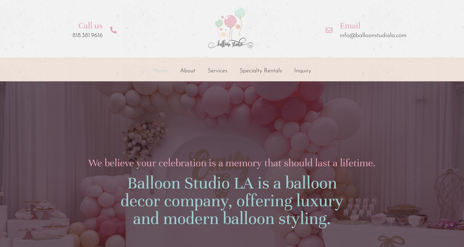
Balloon Studio LA uses pastel branding and a large event installation to establish its visual style immediately. The header keeps contact details visible and offers direct routes to services, specialty rentals and an inquiry. The reviewed page describes walls, arches, garlands, mosaics and bouquets, then asks for the details that can change a project: venue, date, timing, budget and whether the setting is indoors or outdoors. That specificity is useful for a custom service. The page also contains unfinished placeholder copy near the footer, which interrupts the otherwise professional presentation and shows why content maintenance matters as much as the opening photograph.
What you can learn
Make the inquiry reflect the real production decisions. Venue access, installation time and budget help define a useful response. Introduce those questions after showing relevant work, and review every supporting section before launch so unfinished material does not undermine the main offer.
Pros
Contact routes remain easy to find in the main navigation.
The inquiry structure reflects concrete event-planning requirements.
Cons & considerations
Placeholder footer text weakens the finished impression.
Large hero lettering competes with an already detailed background photograph.
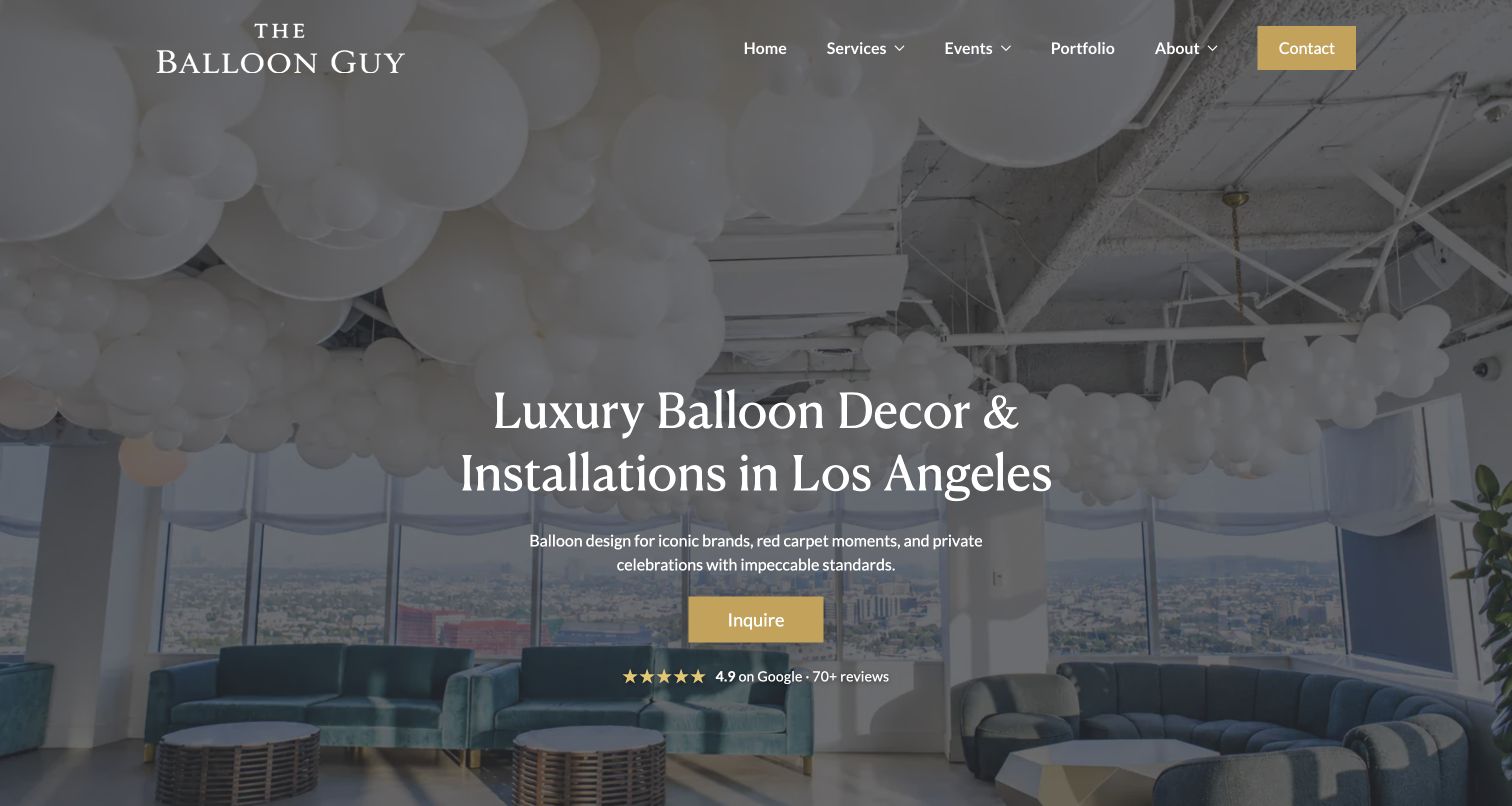
The Balloon Guy opens with an elegant room filled with ceiling balloons, using a restrained palette and large serif lettering to frame the work as part of an event environment. A contrasting inquiry button remains easy to recognize. Below that introduction, the site separates décor, twisting and related entertainment, while the portfolio and event routes provide further context. The effect is more polished and atmospheric than a catalog of individual balloon products. The tradeoff is that visitors looking for a quick price or a small installation must explore further before understanding which service path fits their budget and occasion.
What you can learn
Photograph the completed space when the value lies in transforming a venue. Let the opening communicate scale and mood, then follow it with plain service categories. A distinctive visual direction works best when the next step explains the scope rather than relying entirely on atmosphere.
Pros
The opening photograph shows balloons in a complete event setting.
A prominent inquiry button gives the editorial presentation a clear next step.
Cons & considerations
The broad service range requires additional navigation to compare.
Pricing expectations are not established in the opening view.
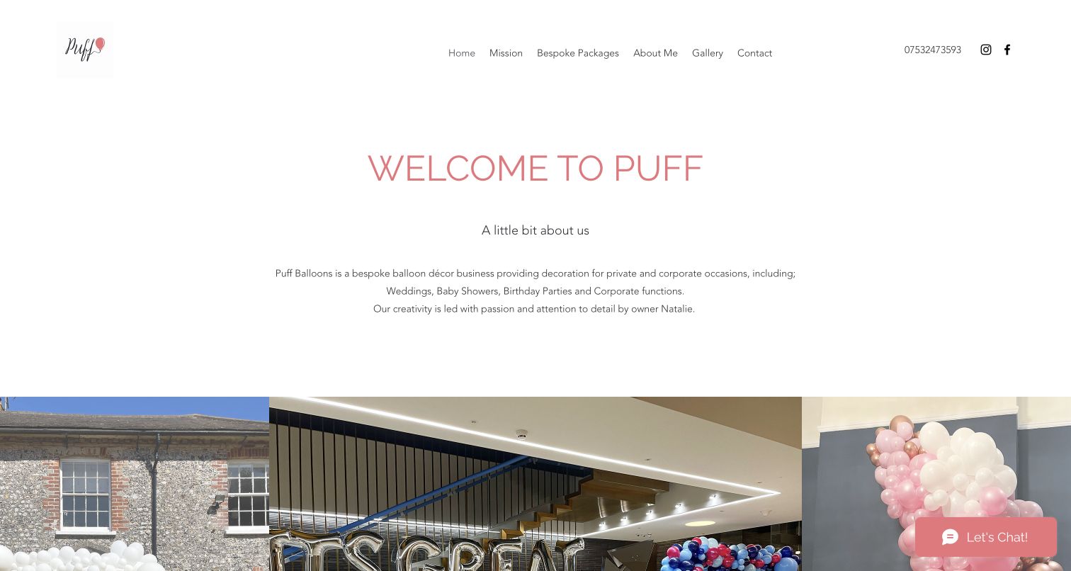
Puff Balloons begins with generous white space, a centered welcome and a concise introduction before the first row of event photographs. The navigation uses straightforward labels for bespoke work, packages, the artist and a gallery. The page identifies Natalie O’Brien and explains the kinds of celebrations the studio serves, making the business feel approachable without crowding the opening with every installation. A later inquiry groups requests by event type. The calm composition is a useful counterpoint to louder balloon websites, although the amount of empty space delays the visual evidence and makes the first screen less informative than it could be.
What you can learn
A personal studio does not need a complicated interface. Introduce the artist, show a small set of representative installations and connect them to understandable service options. Keep enough room for the work to breathe, but ensure the opening still answers what is offered and where to begin.
Pros
Plain navigation supports a simple first visit.
A named artist and event categories make the studio feel specific.
Cons & considerations
Large empty areas push substantial portfolio imagery lower down.
Package labels alone do not explain likely project cost or scope.
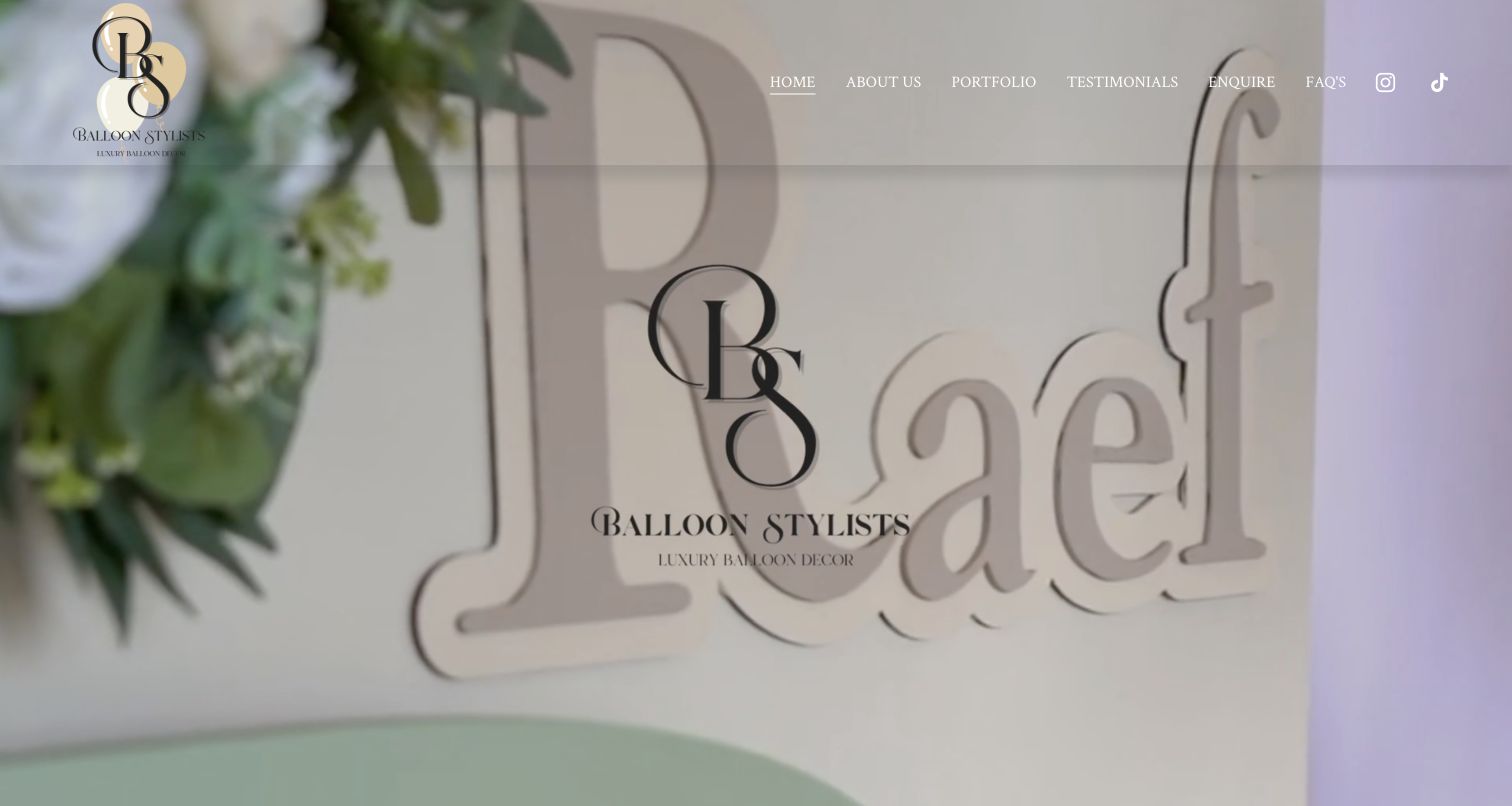
Balloon Stylists uses a muted installation image across the opening screen, with a transparent header and a compact set of navigation links. The first impression is deliberately atmospheric: the captured view emphasizes event styling and monogram detail rather than a large explanatory headline. Lower down, the page identifies its London balloon-and-floral work and separates balloon, floral and business categories. That structure gives visitors a useful way to narrow the portfolio. The opening itself asks more of a newcomer, who must continue down the page to confirm the service and location rather than seeing those facts alongside the image.
What you can learn
A quiet visual identity can help sophisticated event work stand out, but it still needs a clear introduction. Put the service and area near the strongest image, then use distinct portfolio categories to explain how the studio's work changes across private celebrations and business settings.
Pros
Muted styling lets the installation imagery define the mood.
Separate portfolio categories give different clients useful routes.
Cons & considerations
The first screen provides little explicit service context.
Practical information depends on continuing beyond the atmospheric opening.
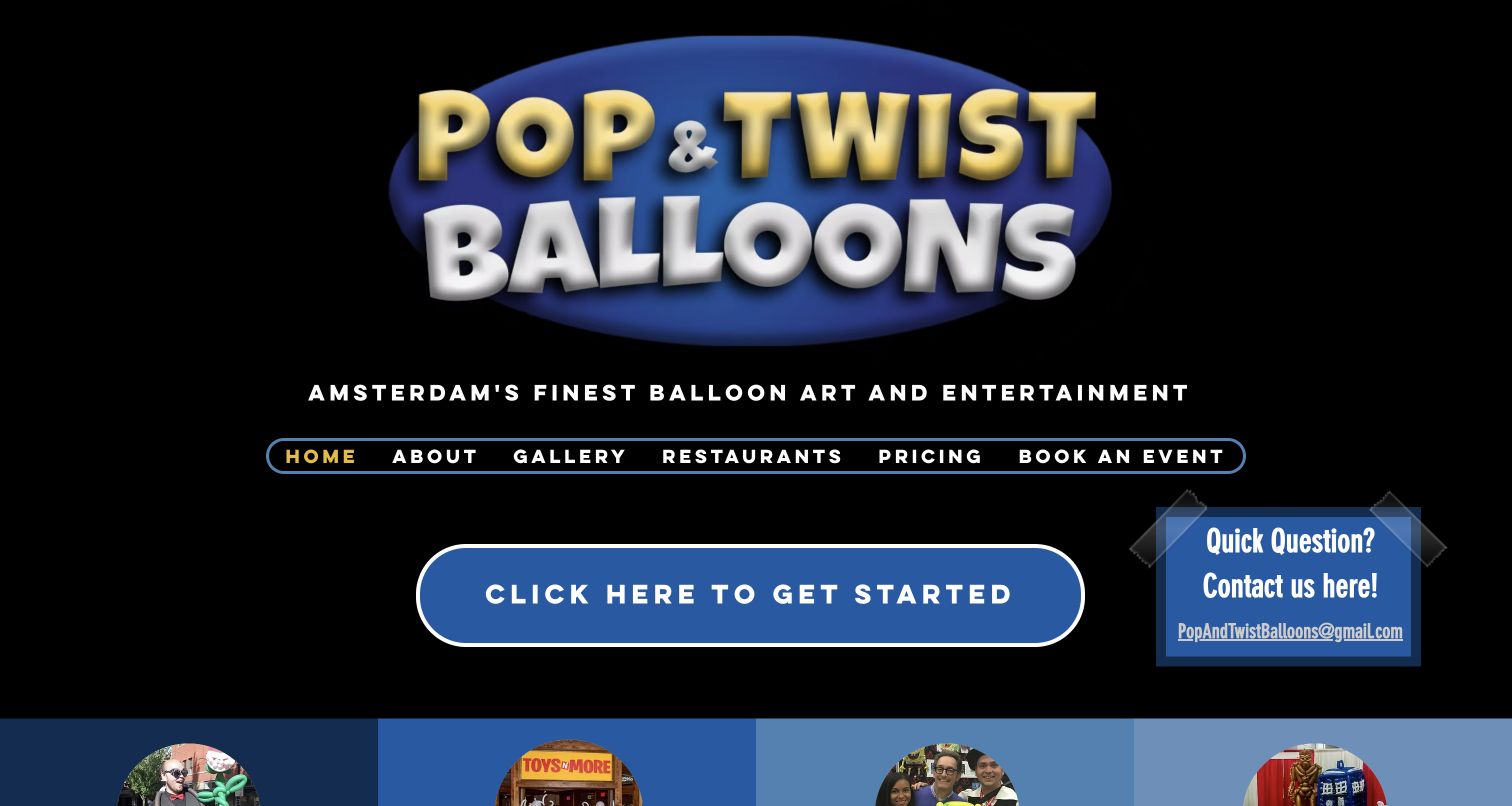
Pop and Twist gives its logo a dramatic amount of space against a dark background, using bright blue and yellow lettering to create an unmistakably playful introduction. Rounded navigation and a prominent getting-started button keep the page informal. The longer content separates twisting, décor, balloon telegrams and large sculptures, which helps explain that the business offers several different experiences. Named ownership and local context add specificity. The oversized identity is memorable, but it also pushes meaningful examples toward the bottom of the opening view, so someone arriving with a practical event question must move past a substantial branding moment first.
What you can learn
Let personality make the site recognizable, then translate that personality into clear choices. A playful studio can use bold typography and color while still explaining whether a visitor is booking a performer, ordering a gift or commissioning a large installation for a venue.
Pros
The distinctive identity is easy to recognize at a glance.
Separate service descriptions distinguish several kinds of balloon work.
Cons & considerations
The large logo delays the first substantial portfolio examples.
The opening could provide a more compact summary of booking requirements.
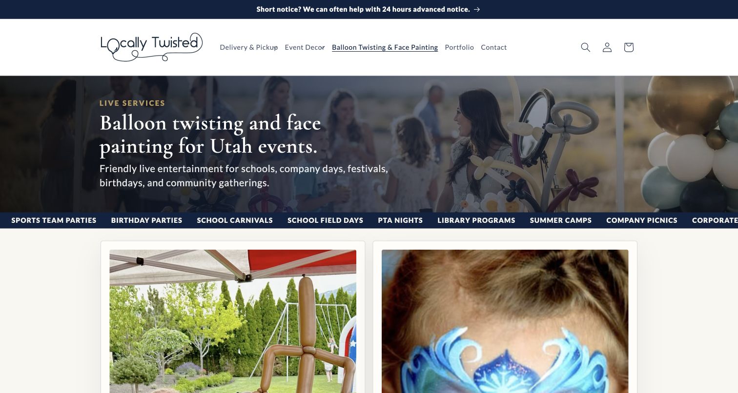
Locally Twisted's balloon-twisting and face-painting page names the service and Utah setting directly above two separate visual service panels. The photographed performers and finished work make the offer concrete, while a strip of event types shows the range of intended occasions. The useful content continues into capacity, staffing, pricing questions and booking details. It explains that balloon output depends on complexity and that different activities require appropriate staffing. This review concerns that specific service page rather than the site's retail homepage. The longer booking information is helpful, though it takes time to work through both activities and their associated questions.
What you can learn
Separate services that require different people or timing, even when customers often book them together. Give each one an example image and practical capacity guidance, then collect the event details needed to confirm staffing. A clear scope reduces the ambiguity of a generic entertainment inquiry.
Pros
The service and geographic area are explicit in the headline.
Staffing and capacity guidance supports realistic event planning.
Cons & considerations
Two substantial service explanations make the page fairly long.
Final availability and staffing still require an individual booking conversation.
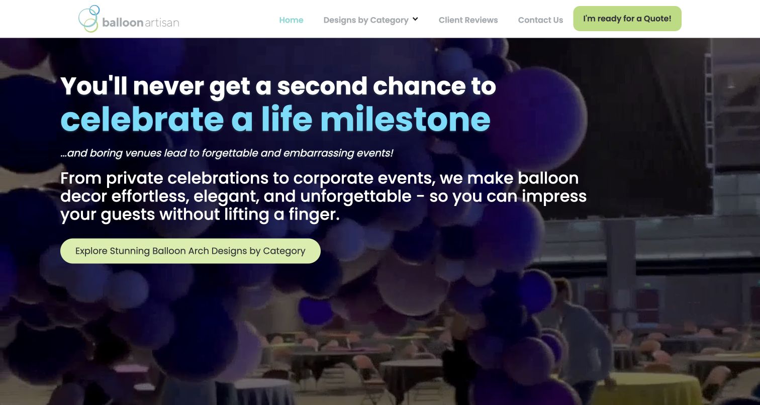
Balloon Artisan puts a large promise over footage of an installation, followed by a bright category button and a persistent quote route in the header. The page is built as a long persuasive sequence: installation photographs, client stories, ordering questions and repeated opportunities to request a quote. The category route is useful because it gives visitors somewhere concrete to go after the emotional opening. The extensive testimonials and emphatic language dominate much of the journey, however. A visitor comparing dimensions, delivery arrangements or likely cost may need to work through more promotional material than on a compact service page.
What you can learn
Give a persuasive page a practical structure underneath its message. Categories, representative installations and clear ordering questions help a visitor assess fit. Keep claims proportionate and distinguish the website's client stories from independently established outcomes; inspiration should lead toward useful project information, not replace it.
Pros
Contrasting buttons make the principal next steps easy to identify.
Installation categories and ordering questions support further investigation.
Cons & considerations
The lengthy persuasion sequence can slow a practical comparison.
Repeated urgent language may feel heavier than the event information requires.
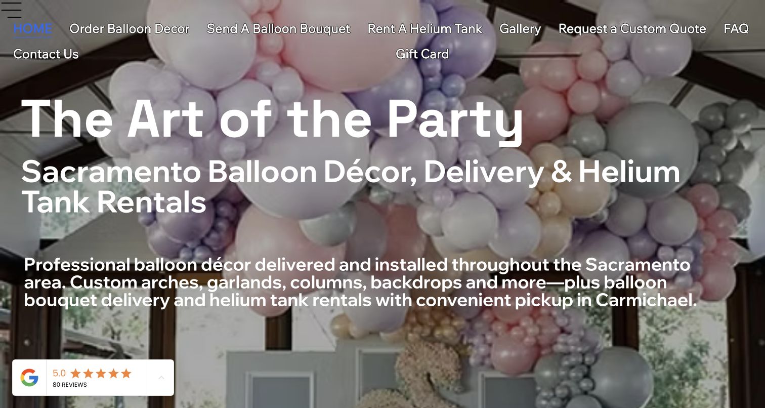
The Art of the Party places Sacramento, balloon décor, delivery and helium rentals directly into the opening message. A large installation photograph forms the background, while navigation and repeated buttons divide the offer into three practical routes. The page explains the Carmichael studio's appointment expectations, the local delivery area and the difference between custom installation work and a balloon bouquet. These details make the website useful beyond its imagery. The opening is visually crowded, with extensive text laid over a detailed photograph and a navigation row that wraps across the screen, reducing the calmness of the first impression.
What you can learn
Name the location and service model early, especially when collection, delivery and installation have different requirements. Give each one a dedicated destination and explain how visiting the studio works. Keep the opening concise enough that the useful local information remains easy to scan over the imagery.
Pros
The service area and main purchase routes are explicit.
Studio-visit guidance helps set practical expectations before contact.
Cons & considerations
Dense text competes with the hero photograph.
The extensive header navigation needs more breathing room at this width.
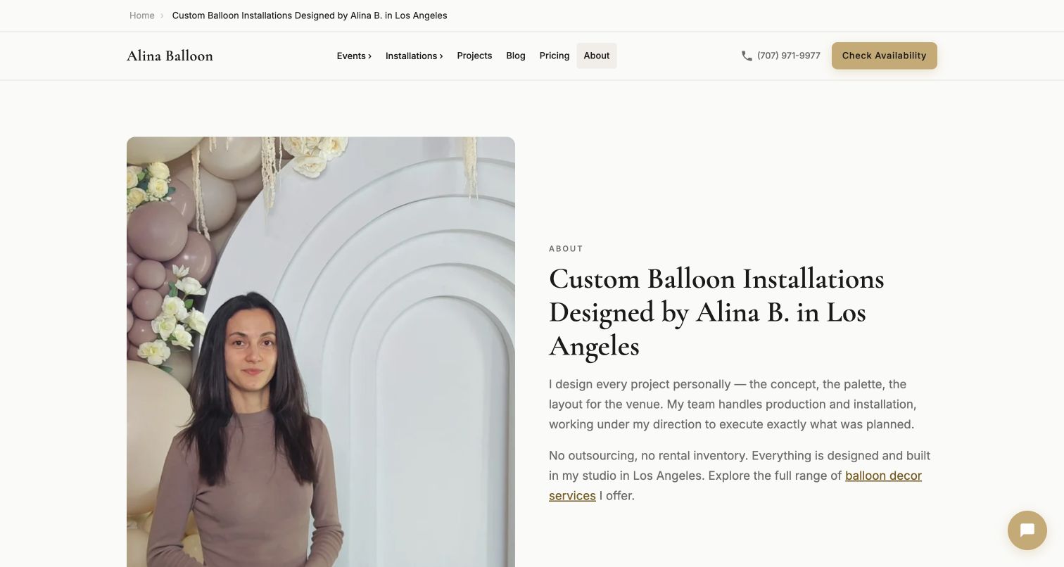
Alina Balloon's About page pairs a portrait within an installation with a clear Los Angeles headline and a first-person explanation of the design role. The restrained cream-and-gold styling keeps the text and portrait prominent. The page then breaks the project into four stages, from receiving event details to proposal, fabrication and installation. It also provides a starting-price signal and describes included delivery and breakdown. That sequence is useful for someone considering a bespoke installation. Some broader material and service claims require independent substantiation, so the strongest design lesson comes from the observable process structure rather than accepting every promotional statement.
What you can learn
Use an About page to explain the working relationship, not only the origin story. Show who develops the concept, which details the client supplies and how the project moves forward. Link to actual projects and pricing so a personal introduction supports a practical decision.
Pros
The portrait and named designer make responsibility clear.
A numbered process connects the initial brief to installation and breakdown.
Cons & considerations
The substantial text requires careful reading to compare the offer.
Broad promotional claims need evidence beyond an attractive presentation.
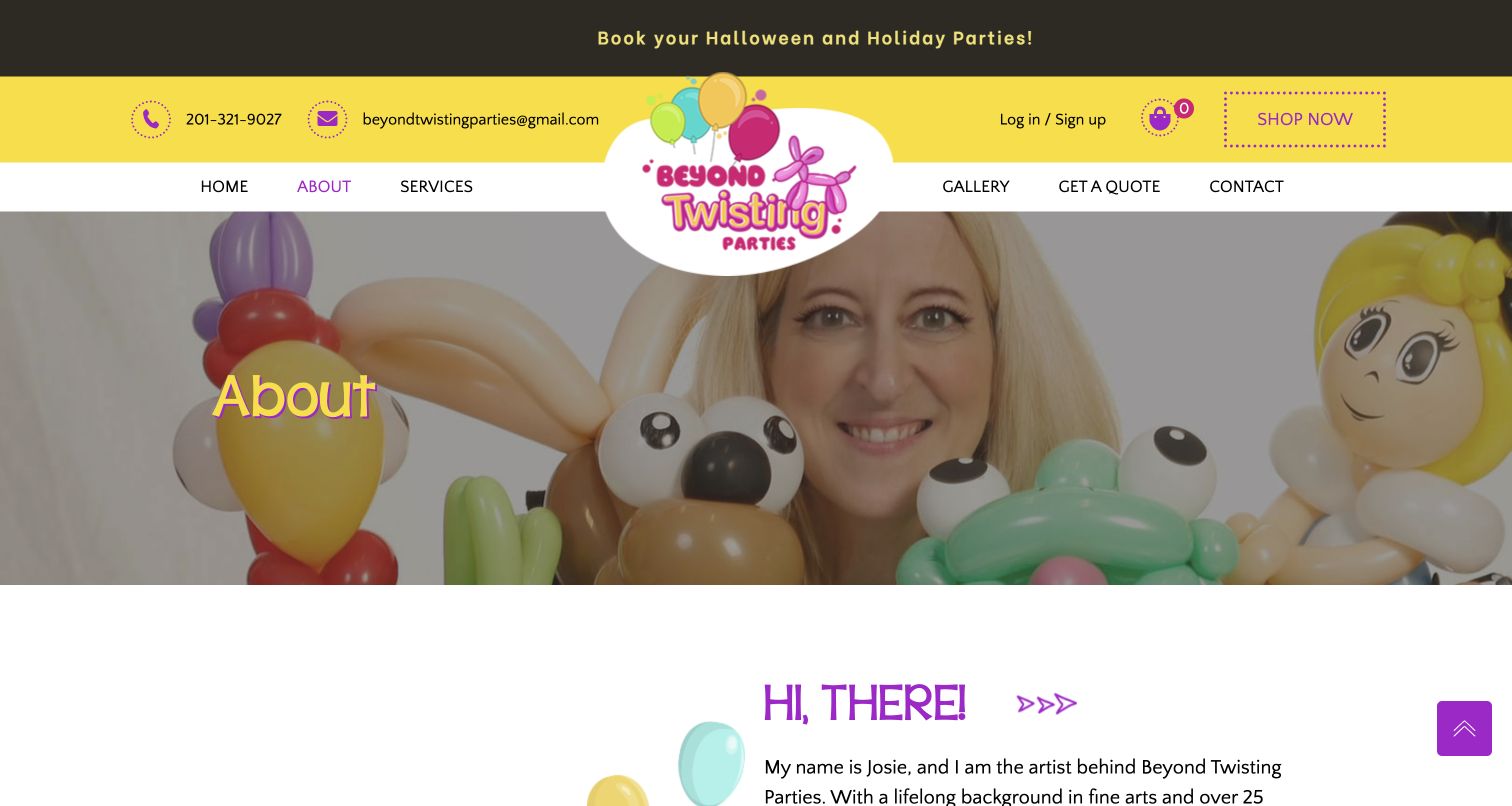
Beyond Twisting Parties uses bright yellow and purple branding around a portrait filled with balloon characters. The About page introduces Josie by name and describes the move from an arts background into balloon artistry and face painting. A straightforward navigation bar connects that story to services, a gallery and a quote route, while contact details remain visible above it. The result is personable and relevant to family-event work. Retail account controls, a shop link and a newsletter appear alongside the service navigation, however, creating several secondary tasks around what is otherwise a simple introduction to the artist.
What you can learn
Let an artist biography demonstrate the connection between the person and the work. A relevant portrait can do more than a decorative headshot, especially when the finished objects appear with the maker. Keep the route from biography to portfolio and inquiry direct, with retail tasks clearly separated.
Pros
The portrait shows the artist with recognizable examples of the work.
Services, gallery and quote links support the personal introduction.
Cons & considerations
Shop and account controls add competing tasks to a service page.
The biography gives limited practical detail about event packages or timing.
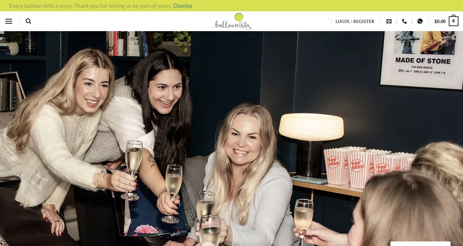
Balloonista's About page opens with a large team photograph before moving into its London studio positioning and a series of sections about projects, logistics and care. The page shows the people behind the work and describes the range from gift deliveries to installations in homes, hotels and business settings. Contact links recur through the story, making an inquiry possible without returning to the header. The account, basket and search controls retain a strong retail presence. Combined with the full-screen opening photograph, that means a visitor seeking a concise installation brief must continue farther down to find the relevant service explanation.
What you can learn
Behind-the-scenes photography can make a studio story more tangible, especially when custom work depends on coordination. Pair those images with specific explanations of project scope and a visible inquiry route. Keep retail navigation understandable without allowing it to obscure the distinction between a product order and a commissioned installation.
Pros
People-focused photography gives the studio a recognizable presence.
Repeated contact routes connect the longer story to an inquiry.
Cons & considerations
The opening photograph delays the main service explanation.
Retail controls and bespoke-service content create a mixed initial hierarchy.
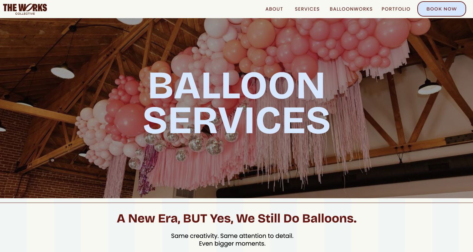
The Works Collective gives BalloonWorks a dedicated page, beginning with a large pink installation and a plain balloon-services title. A short introduction acknowledges that the studio's wider identity has evolved while the balloon work remains available. Three visual service blocks then distinguish custom installations, ceiling work and helium or party additions. Each leads toward pricing, followed by a portfolio route and an invitation from the founder. The page keeps the balloon service recognizable inside a broader experiential-design business. It offers less immediate guidance about budget, geography and project logistics, so the photographs provide more detail than the initial text.
What you can learn
When a studio expands, preserve a clear route for the service existing customers recognize. Use a dedicated page and concrete categories to explain what remains available. Let the broader brand support that offer, then add enough scope information that a visitor can judge whether an inquiry is appropriate.
Pros
A dedicated division page preserves a recognizable balloon-service destination.
Three image-led categories distinguish different installation formats.
Cons & considerations
Pricing links require an inquiry rather than offering an initial range.
Practical project requirements receive less space than the visual presentation.
Kegan is a freelance web designer and developer with 15+ years of experience helping businesses turn complicated website requirements into clear, maintainable digital experiences. He works directly with clients from planning and design through development, launch, and ongoing support.
For balloon artist website design, his development approach focuses on service portfolios, event requirements, geographic coverage and clear custom-project inquiries. The scope can be a targeted improvement or a complete custom build, with responsive layouts, thoughtful content structure, and integrations chosen around the people using and maintaining the site.
Show 3 other balloon artist website designersHide other balloon artist website designers
Plan a balloon-artist website around real event questions
Separate the services before designing the navigation
List the services you actually provide and how each one is delivered. A performer working a continuous line, a team installing a venue backdrop and a customer collecting a small garland need different information. Give those routes plain names before deciding how they should look.
Choose the main audience for each route. A parent planning a birthday may need duration and guest-capacity guidance, while an event producer needs venue access, installation windows and breakdown arrangements. Keep the questions specific to the service instead of giving everyone the same long page.
Define the service area and travel policy in language you can maintain. If distance, event size or timing changes eligibility, explain that clearly. Avoid promising availability through a button label when a person still needs to confirm the date and staffing.
Build a portfolio that explains what visitors are seeing
Select photographs that show different useful dimensions of the work: a completed room, an installation at human scale, a detail and a live interaction. Do not fill a gallery with near-identical close-ups that make size and context difficult to judge.
Add concise project labels where they help. A custom ceiling installation and a collection garland may share colors but involve very different production work. Explain the format without revealing private client details or suggesting a pictured bespoke project is a fixed-price product.
Prepare images for the actual layout and retain their important proportions. Provide useful descriptions and avoid embedding essential service information only inside a graphic. A visitor should still understand the offer when a photograph loads slowly or is not visible.
Design the inquiry around the next useful conversation
Ask for the details that genuinely help assess the project: date, venue or area, occasion, service, timing and an appropriate budget range. Explain why a requirement matters when it may be unfamiliar. Keep optional inspiration uploads separate from essential contact details.
State what happens after the inquiry. Explain whether the artist checks availability, prepares a proposal or requests more information, and distinguish that response from a reservation. Keep deposit and cancellation information accessible without turning the opening page into a contract.
Review the website whenever the service changes. Update prices, travel areas, lead times, staffing and portfolio labels while preserving accurate historical project dates. Check the inquiry destination and error handling without sending unnecessary test bookings to a live business.
The editing job behind the design
Choose a website setup the studio can keep accurate
A manageable content system with reusable service and project records is usually more valuable than a complex visual effect. Keep the artist able to replace photographs, correct prices and update availability guidance through an ordinary editing workflow.
Use commerce only for products or packages that can genuinely be ordered with a defined scope. Custom installations often need an inquiry first. If booking uses an external service, make that transition understandable and keep unnecessary personal information out of the initial request.
Public technology observations describe accessible evidence from the reviewed page and its supporting resources. They do not establish the artist’s private tools or complete architecture. Choose the implementation for image handling, content maintenance, accessibility and the actual booking process rather than copying another studio’s visible stack.
Our WordPress website examples offer a separate look at publishing approaches. A visible platform label is evidence for that named page, not a guarantee that the same system will suit your requirements.
Before the public launch
A balloon-artist website launch checklist
The opening clearly names the service and genuine geographic area.
Live entertainment, installations, deliveries and collection orders have distinct routes where relevant.
Representative photographs show real work at a useful scale.
Portfolio labels distinguish bespoke projects from standard packages.
Any prices or starting ranges explain important scope limits.
Capacity and duration guidance is qualified rather than presented as a universal guarantee.
Travel, setup, access and breakdown requirements are easy to find.
The inquiry asks only for information needed to assess the event.
Visitors can understand the difference between requesting a quote and confirming a booking.
Contact and external booking destinations work and are clearly identified.
Images, navigation and forms remain usable on narrow screens and with a keyboard.
The studio can maintain service details without leaving placeholder copy or stale promotions.
These checks are a project checklist, not a performance, legal, security, or accessibility certification. Test real journeys with the people responsible for the website before making claims about the result.
Sources & editorial method
How this collection was selected and reviewed
We reviewed these 15 public balloon-artist websites on November 11, 2026, using the actual homepage or explicitly labeled service or studio page. The collection compares portfolio presentation, service clarity and inquiry guidance. My Balloon Guy is the Editors Choice for its focused balloon-twisting page, which combines real examples with duration pricing, capacity qualifications and event conditions. This is an editorial website-design selection, not an endorsement of event performance, safety, availability or customer outcomes. Public technology observations remain limited to accessible source evidence; unknown details and promotional claims are not treated as independently verified facts.
Each example links to its actual source page. Screenshots are direct browser captures with their own capture dates; moving imagery, announcements and live designs can change. The notes describe observable design choices and conditional tradeoffs, not measured traffic, conversion results, service quality, or accessibility conformance.
Technology labels use public page metadata, asset evidence, or explicitly cited platform documentation. Platform documentation is not a complete current deployment audit. A component reference may be legacy or unused; it is not a complete backend inventory. Unknown stacks are omitted. These sites are editorial examples, not our client portfolio.
Written, Edited and Curated are separate editorial records, not timestamps advanced by a rebuild. Website designs and imagery belong to their owners. See our editorial standards or suggest a correction.
Questions worth asking
Balloon Artist website design questions
Should balloon twisting and balloon décor share a page?
They can share an introduction, but each needs clear service information. Twisting is usually a live activity with duration and staffing considerations. Installed décor has design, access, setup and breakdown requirements. Separate sections or pages help visitors understand those differences before making an inquiry.
Should a balloon artist publish prices?
Publish accurate package prices or starting ranges when the scope is sufficiently defined. Explain what can change the quote, such as scale, travel, access or staffing. A custom installation may need an individual proposal, but visitors still benefit from a realistic explanation of the pricing process.
What photographs belong in a balloon portfolio?
Use real examples that explain the work. Show a complete installation in its setting, selected details and useful scale references. For live entertainment, include appropriate photographs of the performer and activity where permission allows. Avoid relying entirely on close-ups that conceal the size or event context.
What should an event inquiry ask for?
Start with contact details, the event date, venue or area, requested service and relevant timing. Add guest count, budget direction or installation requirements when they affect the project. Explain the next step and do not imply the booking is confirmed simply because the form was submitted.
Does every balloon business need an online store?
No. A store makes sense for clearly defined products or collection packages with maintained availability and fulfillment arrangements. A bespoke installation or staffed event may be better served by a focused inquiry. Keep those paths separate so customers understand what they can buy immediately and what needs discussion.