Best Watch Brand Websites of 2026 (30 Real-World Examples)
Watch brand websites that balance distinctive photography, collection storytelling and the practical details behind a considered purchase.
A good watch website makes the design memorable, the specifications usable and the buying or enquiry route unmistakable.
A watch purchase can begin with a dial color, a familiar model name, an interest in a particular complication or a search for something that fits comfortably. The website needs to accommodate those entry points without turning every visitor into a specialist collector. Strong art direction creates interest; coherent model records and useful service information help someone decide what to do next.
These examples include smaller specialist makers and established international brands. They are selected for website design and communication, not ranked by watchmaking quality, resale value or investment potential. Study the relationship between imagery, product information, availability and service. A sophisticated-looking storefront does not independently establish a product’s performance or the accuracy of its promotional claims.
Before the examples
What makes good watch brand website design in 2026?
Keep model identity clear
Give collection names, individual references and variants a consistent structure. A visitor should be able to identify the pictured watch, find its specifications and return to it later without relying on a campaign headline or a photograph alone.
Show scale as well as surface detail
Macro photography can communicate dial texture and case finishing, while wrist images help explain proportion. Keep dimensions and material descriptions close to those images. Neither a dramatic close-up nor a stated diameter alone establishes how a watch will feel on every wearer.
Explain the actual availability model
Separate in-stock purchase, preorder, made-to-order production, waitlists and retailer enquiries. A notification signup is not a confirmed reservation. Give the next step a truthful label and maintain its supporting information when stock or production plans change.
Treat ownership support as part of the product
Make service, care, warranty and contact routes easy to find. Keep their conditions specific to the product and market. A heritage story can enrich the brand, but it should not replace the practical information a new or existing owner needs.
The collection · 30 examples
30 watch brand websites worth studying
Compare product-led boutiques, editorial craft stories and larger collection systems. Look for clear model hierarchy, readable specifications and a purchase route that matches the brand’s real operating model.
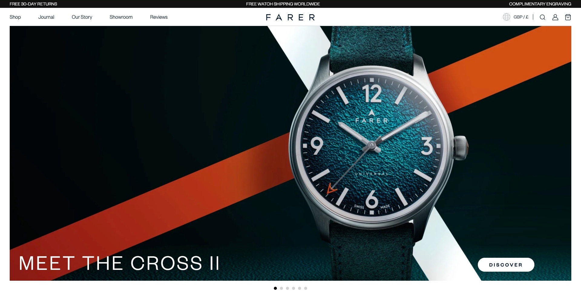
Farer’s opening places a teal textured watch against white and orange diagonal bands, with the Cross II name and a white discovery action along the lower edge. A restrained white header separates shopping from the journal, brand story, showroom and reviews. A thin service strip sits above it, while visible dots explain the rotating campaign area. The useful pattern is making a memorable product image identifiable rather than treating it as anonymous atmosphere. The strap, dial and case are visible presentation details, not independent material or performance findings. Shipping, return and engraving statements remain the brand’s published terms, not verified purchase commitments.
What you can learn
Give an image-led launch a stable model destination and retain a direct route into the wider range. Make showroom and ownership information available without forcing visitors through the campaign sequence. Product details should explain the actual reference rather than requiring customers to infer specifications from a dramatic close-up.
Pros
The campaign names the model beside its discovery action.
Range, editorial and showroom routes have distinct permanent labels.
Cons & considerations
If a tall hero leads, keep model details readily reachable.
If service claims occupy a utility strip, link their relevant conditions clearly.
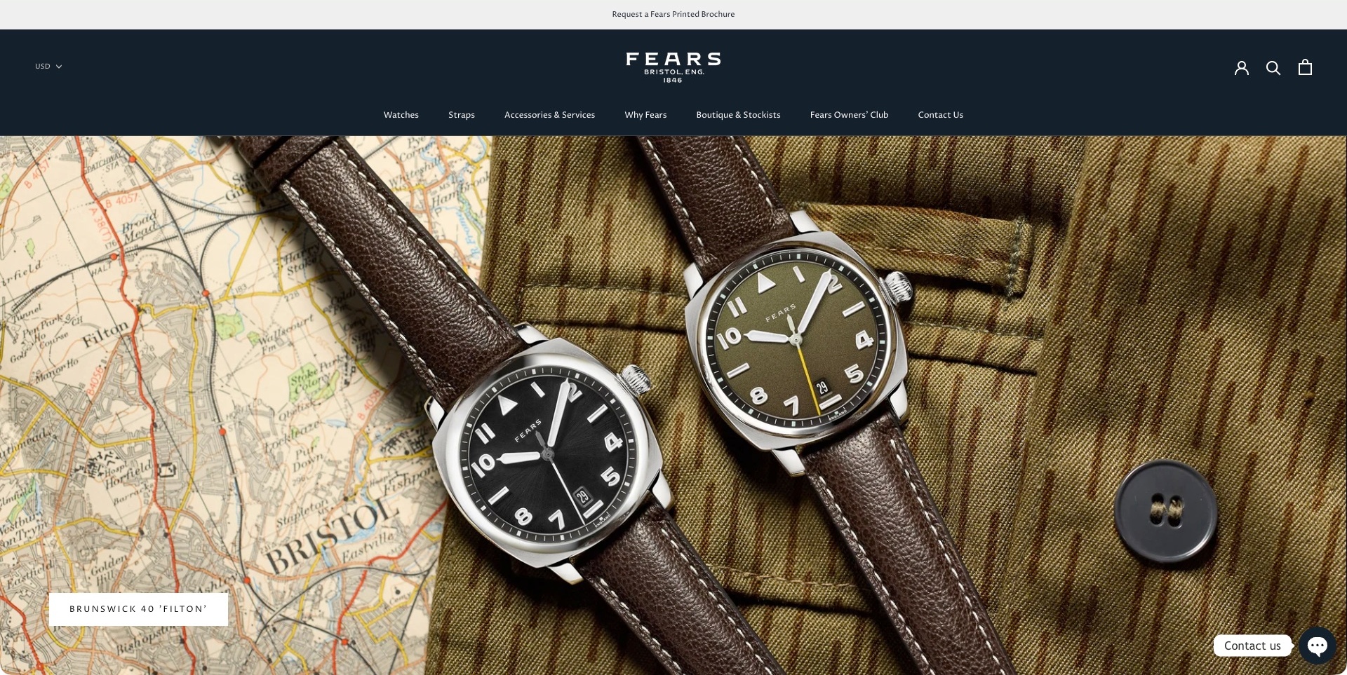
Fears’ accepted US-regional frame shows two rounded-square watches laid across a Bristol map and textured jacket. A compact Filton collection action sits at the lower left. Above, the navy header separates watches, straps, accessories and services, company context, stockists and an owners’ club. The currency state remains visible, and the small contact launcher is closed rather than an expanded message. The useful pattern is giving product character a substantial photograph while treating ownership and retail discovery as enduring navigation needs. The image does not independently establish movement quality, provenance or comparative performance; the historical brand identity remains supplier presentation.
What you can learn
Keep model-family browsing and owner support distinguishable even when they share one brand experience. Identify the actual regional store and its currency without implying that terms apply worldwide. A paired product image can introduce alternatives, but the destination should explain their precise references and differences.
Pros
Services and the owners’ club are explicit navigation routes.
The collection action identifies the pictured family.
Cons & considerations
If two watches share an image, clarify their references on the destination.
If the header is deep, protect product discovery on shorter mobile screens.
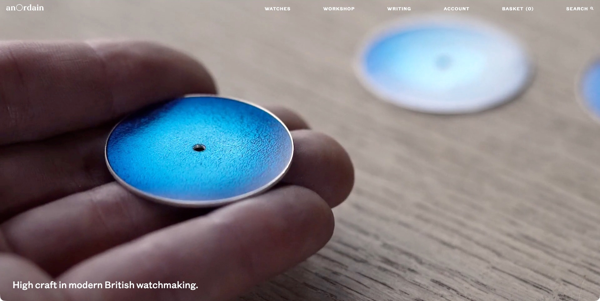
anOrdain’s accepted frame shows a hand holding a blue watch dial over a work surface. White navigation names watches, workshop and writing, with account, basket and search kept alongside them. A statement sits near the lower edge, leaving the process image to establish the initial character. This is one frame of the brand’s workshop film, not a photograph of a complete assembled watch or an independent manufacturing inspection. The current official page also explains a made-to-order waiting-list route. The useful pattern is separating the product, process story and longer editorial material while making the viewing context visually immediate.
What you can learn
Let process imagery explain a point of view, then give customers precise model and availability information on a stable destination. Keep a waiting-list request distinct from a confirmed build allocation or purchase. A film can enrich the introduction, but essential product and support information should remain useful without playback.
Pros
Product and workshop investigation have separate labels.
The restrained text gives the process image a clear focal role.
Cons & considerations
If white text overlays film, test contrast throughout its frames.
If the production process leads, explain which product and availability details remain to be established.
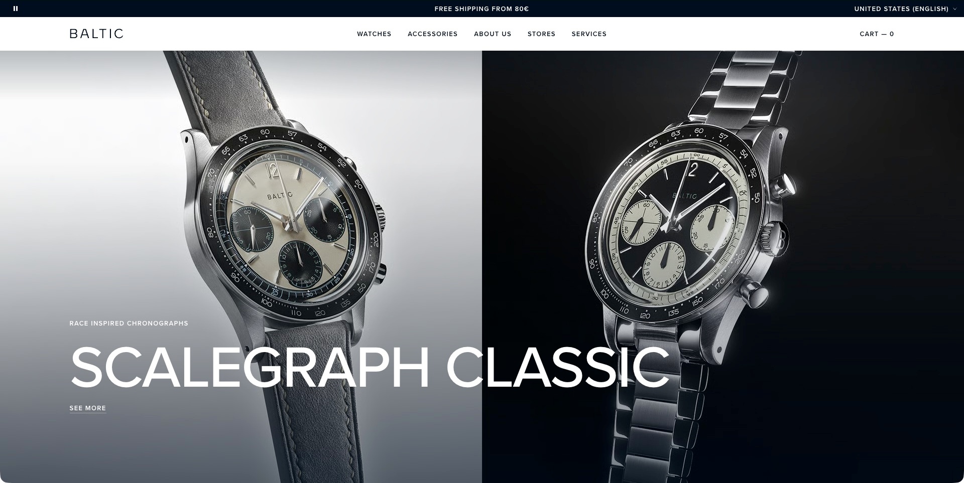
Baltic’s accepted English page shows two chronograph watches across a pale-and-dark split image. The oversized Scalegraph Classic name spans both sides, with a smaller discovery link beneath. Above, a white navigation bar separates watches, accessories, company information, stores and services; the market state sits in its own utility strip. The useful pattern is giving a collection a clear identity while letting photography communicate visible differences. This is a view of the public presentation, not an independent finding about movement quality, precision, origin or the materials shown. The source’s shipping statement remains a regional commercial term rather than a reviewed promise.
What you can learn
Use paired imagery to introduce alternatives, then provide precise reference and variant information on the destination. Keep service and store routes useful outside the campaign. The model family should remain identifiable even when the two photographs are stacked on a phone or the campaign changes.
Pros
One collection name gives the paired images a clear shared context.
Stores and services have distinct permanent routes.
Cons & considerations
If a headline spans images, test its reading order when the layout stacks.
If watches look closely related, explain their actual differences before purchase.
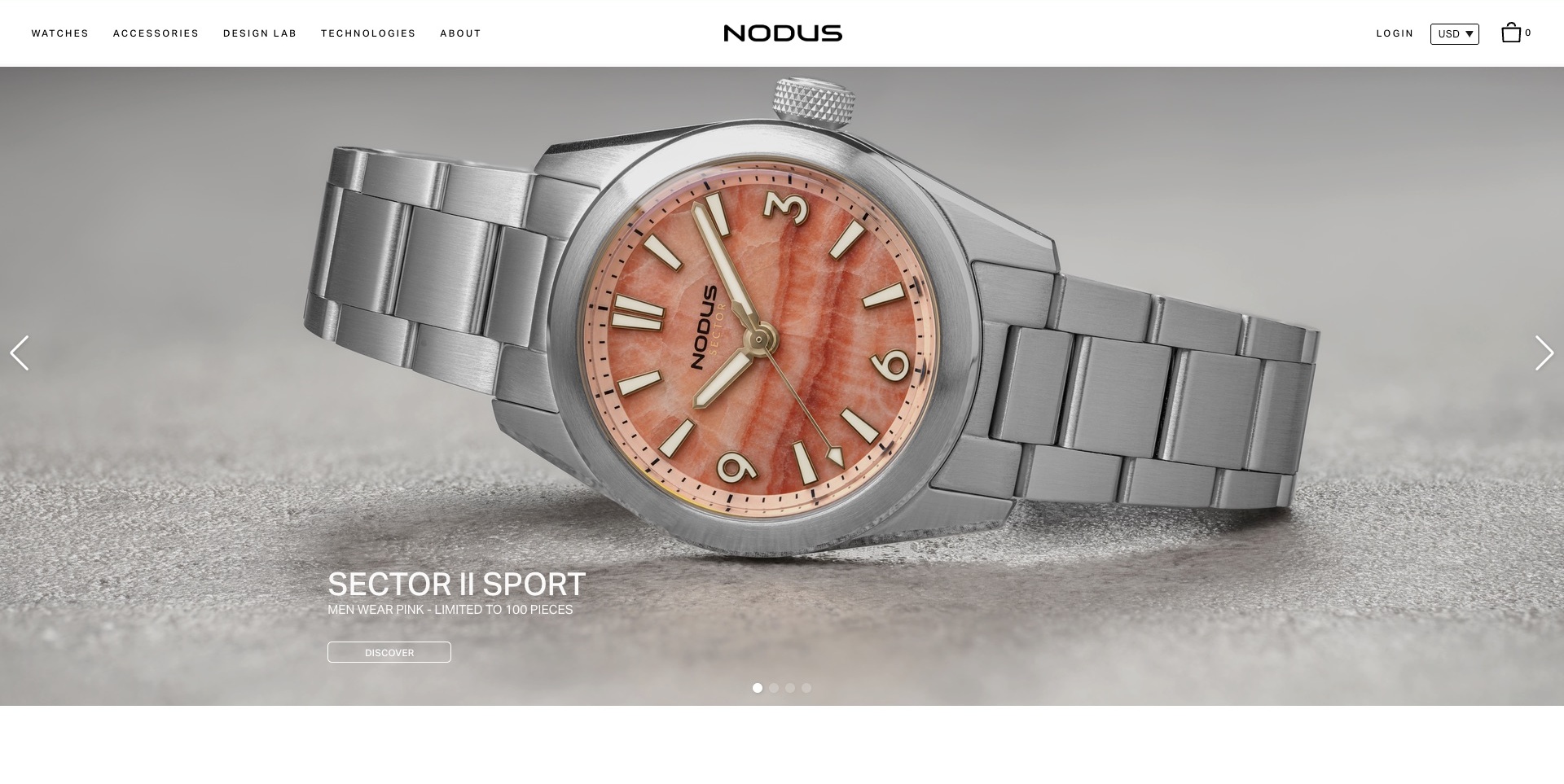
Nodus’ accepted frame places a pink-dial Sector II Sport watch across a neutral textured setting. The model name, short launch line and small discovery action sit beneath the case, with arrows and dots exposing the carousel structure. A white header separates watches and accessories from Design Lab, technologies and company context. The useful pattern is letting the product image lead while providing other routes for visitors who want to understand the design approach. The stated edition quantity and research language remain supplier information; neither the macro photograph nor this review independently verifies manufacturing quality, durability or stock availability.
What you can learn
Keep the exact family name attached to the image, then explain variants and specifications on a maintained product record. A technical or design story can enrich the range, but it should not replace ordinary purchase and support information. Make every campaign frame useful without waiting through the full sequence.
Pros
The model has a readable name and discovery action.
Design and technology investigation have separate permanent labels.
Cons & considerations
If an edition quantity is prominent, maintain its actual availability context.
If technical language supports the brand, distinguish explanation from independently tested results.
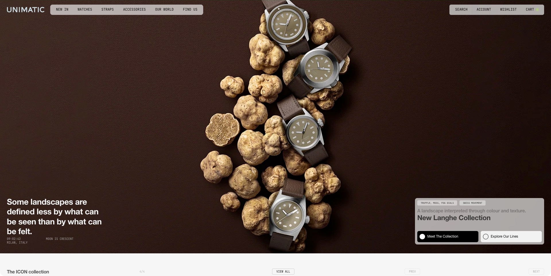
Unimatic’s accepted opening arranges several watches and truffles across a brown background. Floating grey navigation blocks frame the image, while a lower panel identifies the Langhe collection and separates meeting that collection from exploring the wider lines. A short editorial statement occupies the opposite corner. The useful pattern is translating the campaign’s texture-and-landscape theme into a named product destination instead of leaving the image unexplained. The watches and truffles form brand art direction, not independent evidence of materials, place of manufacture or physical quality. The small movement and dial labels remain supplier descriptions rather than verified specifications.
What you can learn
Give an expressive collection story a specific destination and an alternative route into the full range. Keep the model references and approved details understandable beyond the metaphor. Floating interface blocks need a deliberate reading order so atmosphere does not make product discovery harder on a small screen.
Pros
The collection and wider-range actions are separately labelled.
The named collection anchors the unusual visual story.
Cons & considerations
If several floating panels compete, prioritise their order on mobile.
If a material metaphor leads, make the actual product descriptions precise.
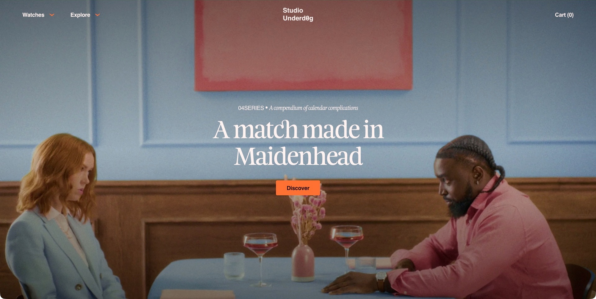
Studio Underd0g’s accepted frame shows a couple at a restaurant table in a coordinated blue-and-pink scene. A serif campaign line and orange discovery button sit centrally, with an 04SERIES label above. The minimal header keeps Watches and Explore on the left, the brand identity centred and the cart on the right. The scene is a brand narrative, not a separate restaurant example or a close-up that establishes watch specifications. The current official range identifies the brand’s own calendar and other watch families. The useful pattern is making the story distinctive while preserving a plainly named route directly into products.
What you can learn
Let the campaign reward curiosity, but do not require a visitor to understand its reference before finding a watch. Give the destination enough model and availability context to complete the story. The navigation should remain intelligible when the film is paused, unavailable or replaced by a different campaign.
Pros
Watches remains a direct category label beside the narrative.
The orange action has a clear visual priority.
Cons & considerations
If the campaign conceals the product, explain it promptly on the next step.
If white text overlays film, test contrast across its actual frames.
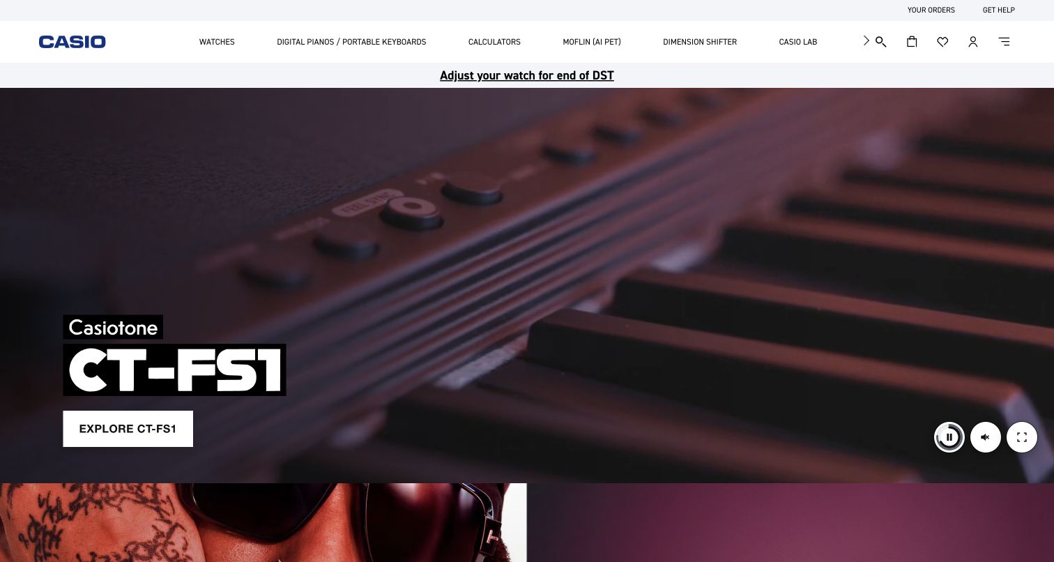
Casio’s retained US homepage is not a watch hero: the actual image shows a Casiotone keyboard campaign with a model name and an exploration action. Watches remains an explicit category in the white header, and a narrow utility strip links to a watch-adjustment notice. Playback controls are visible over the campaign. The current official range confirms the brand’s watch category; it does not turn the pictured keyboard into a timepiece example. The useful pattern is maintaining a direct route for a product audience even when the main promotion serves another category. The dated adjustment notice is historical source content, not current service guidance.
What you can learn
Give product families navigation independent of the campaign. A visitor who arrives for a watch should reach its range without waiting for a different slide. Keep practical ownership notices separate from product promotion and maintain their timing through an explicit editorial process.
Pros
Watches is a plainly labelled permanent category.
The ownership notice has a place distinct from the main product campaign.
Cons & considerations
If unrelated products lead, keep category entry easy to find on mobile.
If a time-sensitive notice remains published, assign someone to review its relevance.
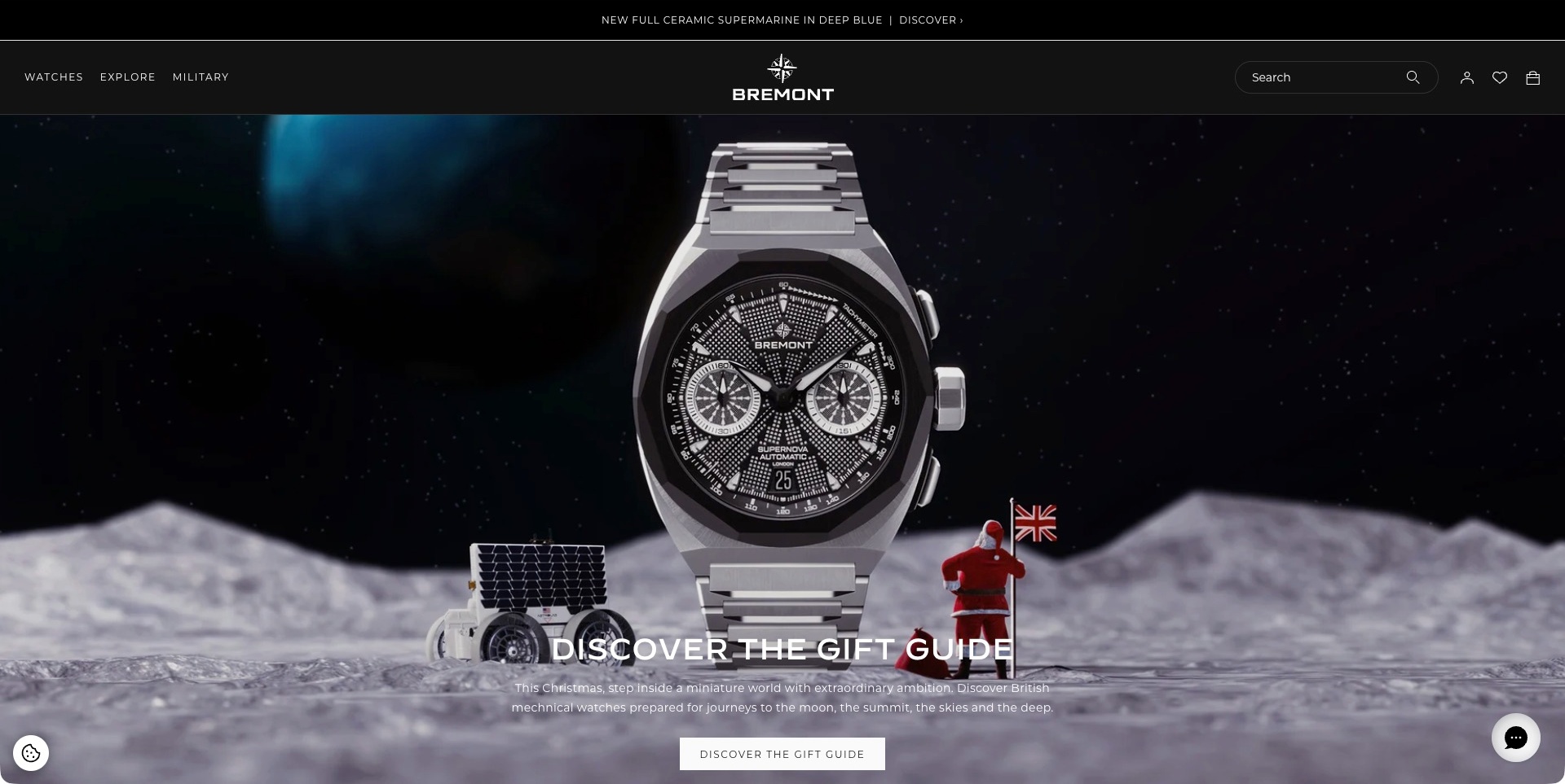
Bremont’s accepted opening uses a miniature lunar landscape, a large branded watch, a rover and a small Santa figure holding a flag. A gift-guide heading, short explanation and matching action sit over the scene. The dark header keeps watches, exploration and military-related material separate, with search and commerce utilities on the right. The useful pattern is giving seasonal art direction one identifiable editorial destination while retaining a direct range route. The scene is an imaginative marketing composition, not evidence that the pictured watch was used in space, meets a military standard or performs in the depicted environment.
What you can learn
Keep the gift story connected to the exact products and approved information behind it. A playful setting can express the brand without becoming a technical claim. Maintain the direct shopping and support paths after the season changes, and distinguish campaign imagery from documented product use or testing.
Pros
The gift-guide action repeats the campaign’s stated purpose.
A permanent watch route remains independent of the seasonal scene.
Cons & considerations
If a dramatic setting implies capability, qualify the actual product claims.
If the campaign is seasonal, review its destinations and availability afterwards.
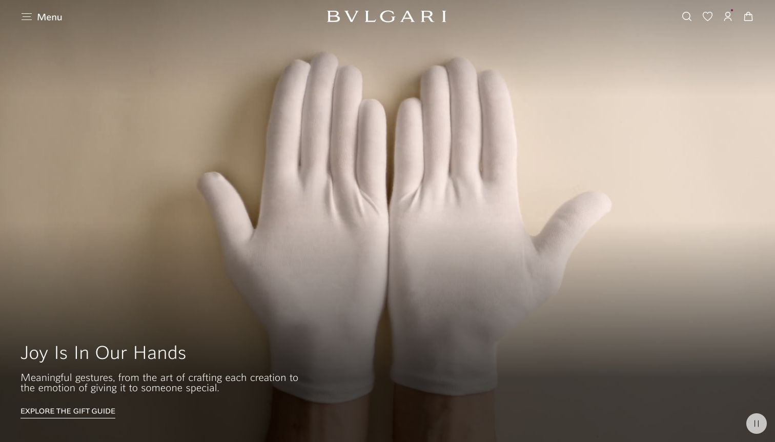
Bvlgari’s captured US campaign uses a neutral field, white-gloved hands and a large white wordmark to introduce a gift-guide story. A short paragraph and underlined guide link sit at the lower left, with a visible pause control at the opposite corner. The header keeps a menu and commerce utilities available without displaying every product. The current official site explicitly offers its own watch range, but the captured scene is a broader gifting presentation, not a watch close-up. The useful pattern is giving a seasonal story one coherent destination within a restrained brand frame. No product quality or craftsmanship claim is independently verified here.
What you can learn
Let a gift story introduce the brand without making it the only route into models. Make the watch category understandable and connect editorial selections to the exact products they show. Preserve useful product names, availability and ownership information beyond the changing seasonal campaign.
Pros
The guide has a single identifiable editorial action.
The pause control is visibly separated from shopping utilities.
Cons & considerations
If the catalogue is hidden in a compact menu, test watch-category discovery.
If a campaign is seasonal, keep its product links and availability accurate after the launch.
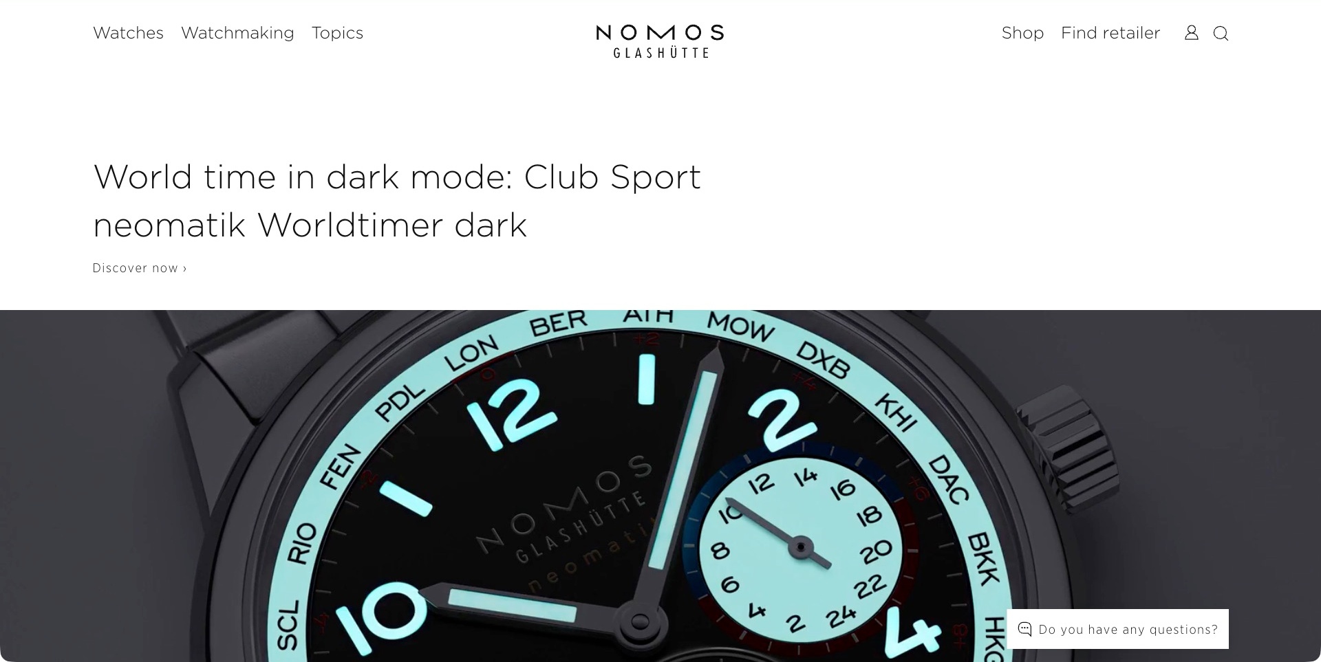
NOMOS’ accepted English page gives the Club Sport neomatik Worldtimer dark a broad white title area above a tightly framed luminous dial image. The discovery link remains with the heading rather than floating over the photograph. The restrained header distinguishes watches, watchmaking and topics from shopping and retailer discovery. The useful pattern is letting the model name establish context before a close-up shows the visual character. The image illustrates the brand’s presentation of a particular watch; it does not independently demonstrate luminosity duration, accuracy or movement quality. The small closed help teaser is ordinary site UI, not a completed service interaction.
What you can learn
Give long model names enough room to remain readable, then connect the image to a precise reference and approved details. Keep the technical story separate from store discovery so visitors can choose their next step. A close-up needs a useful continuation, including scale and complete-watch context.
Pros
The model heading has a stable area independent of the photograph.
Watchmaking and retailer routes serve different investigation needs.
Cons & considerations
If a detail image leads, provide overall scale and reference information next.
If the name is long, test its hierarchy and wrapping on phones.
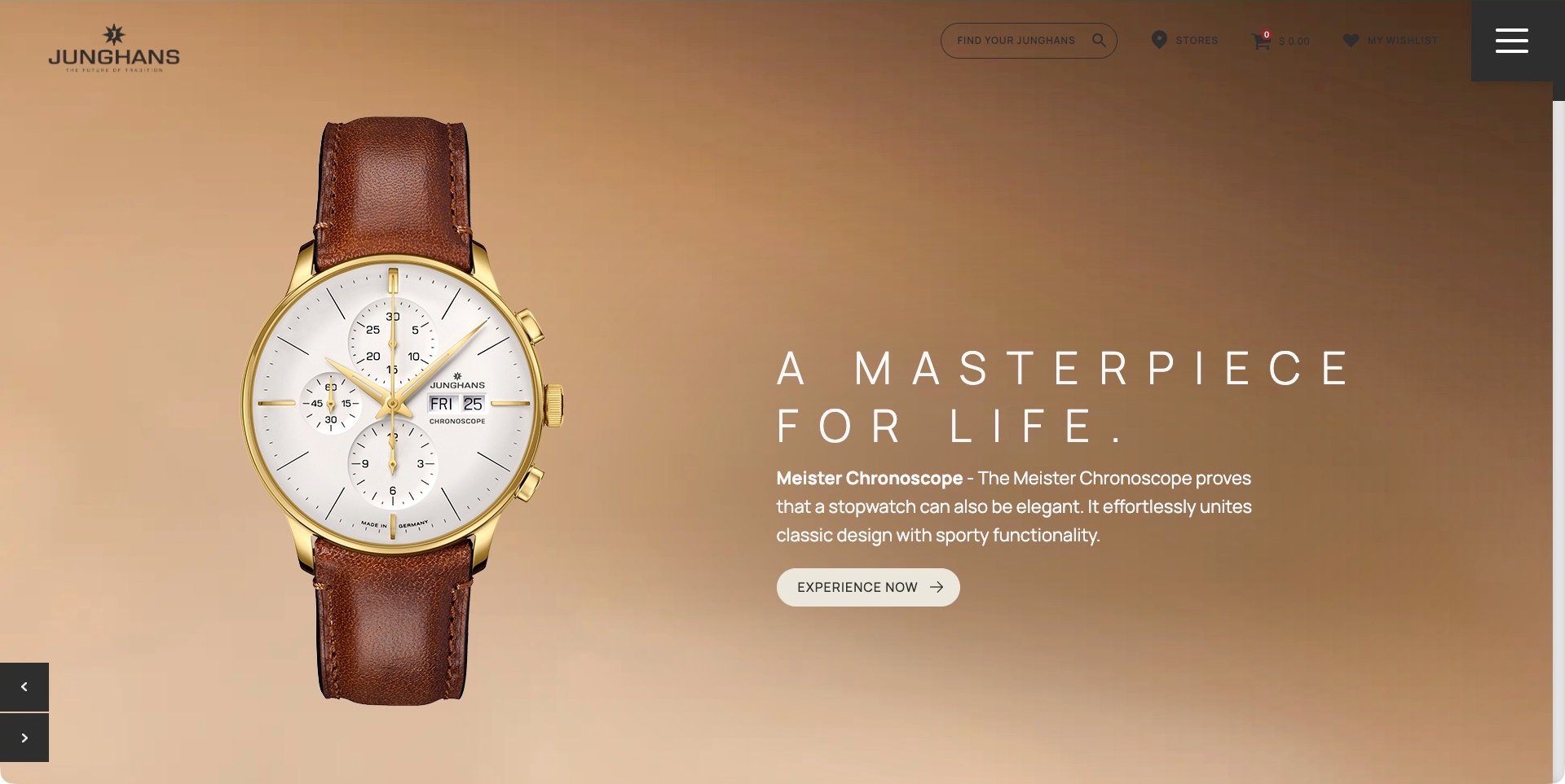
Junghans’ accepted USA storefront shows a large gold-coloured Meister Chronoscope watch against a warm tan background. A widely spaced statement, model name, explanatory paragraph and rounded action occupy the opposite side. Search, stores, wishlist and cart remain across the top, with a prominent menu control at the right. The useful pattern is pairing the pictured product with more explanation than a collection name alone. This is the exact regional junghans-shop.com source reached by the normal browser redirect, not the German brand page or a different national store. The promotional statement does not independently establish longevity, materials, accuracy or physical product quality.
What you can learn
Name the reference and explain the relevant function without making promotional language carry the entire description. Keep regional identity and store conditions clear. Product, history and store information can share a brand frame, but visitors should understand which destination supports the decision they are trying to make.
Pros
The model is accompanied by a written explanation and distinct action.
Search and store discovery remain visible outside the campaign.
Cons & considerations
If wide letterspacing supports the identity, check narrow-screen wrapping.
If a regional redirect occurs, make the resulting market context understandable.
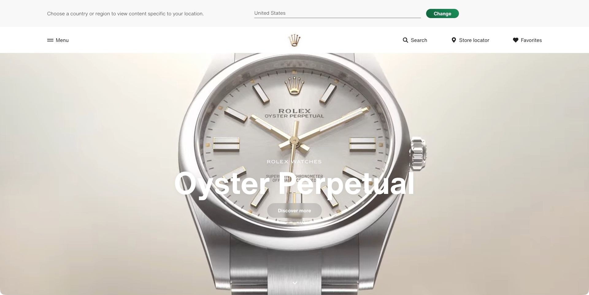
Rolex’s US page shows a pale Oyster Perpetual dial filling the campaign area beneath a white header. The family name and discovery action sit over the watch, while the centred crown identity is flanked by menu, search, store-locator and favourites routes. A country-selection strip remains inline above the header. The useful pattern is giving a recognisable model family a simple focal point while preserving a separate route to physical retail. This is the actual US-regional frame, not the different regional page returned by a separate web read. The macro image does not independently establish precious-metal content, accuracy or availability.
What you can learn
Keep the model family identifiable and give store discovery a stable place outside the campaign. Explain the relevant reference and local purchasing route on the next step rather than implying that a discovery action reserves a watch. Market context should be clear without becoming an obstacle to reading.
Pros
Store discovery is explicitly separate from the model campaign.
The family name and action share a clear focal area.
Cons & considerations
If white text overlays pale media, test contrast across actual frames.
If the market selector occupies space, preserve a useful introduction on shorter screens.
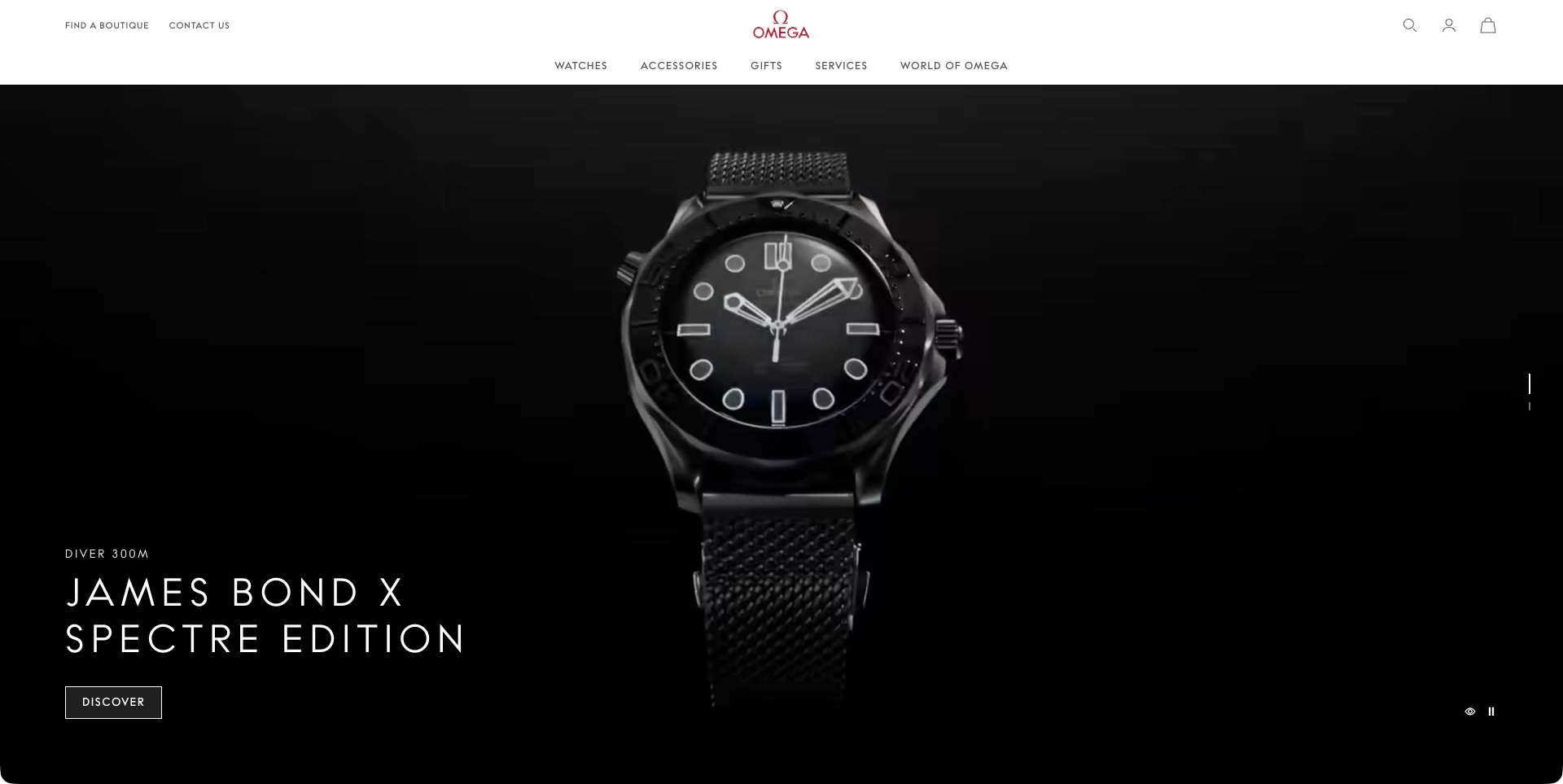
Omega’s US frame places a front-facing black watch against a nearly black background. The Diver 300M and James Bond x Spectre Edition labels sit with a small discovery action, while the white header separates watches, accessories, gifts, services and brand context. Boutique discovery and contact sit in a utility row. This is the complete front-facing campaign frame, not an earlier case-back detail from the same film. The useful pattern is keeping edition identity explicit while other purchase and ownership routes remain available. The named collaboration and diver label are source presentation, not independent verification of specifications, film use or suitability for an activity.
What you can learn
Give a special edition an identifiable model record and explain what distinguishes it from related references. Keep service and retail routes outside the launch film. A dramatic dark image can establish character, but readable approved details and actual availability still need their own maintained destinations.
Pros
The edition name remains visible beside its action.
Services and boutique discovery are permanent routes.
Cons & considerations
If the product is dark against dark media, retain useful detail images next.
If an activity label leads, preserve its approved conditions rather than implying universal use.
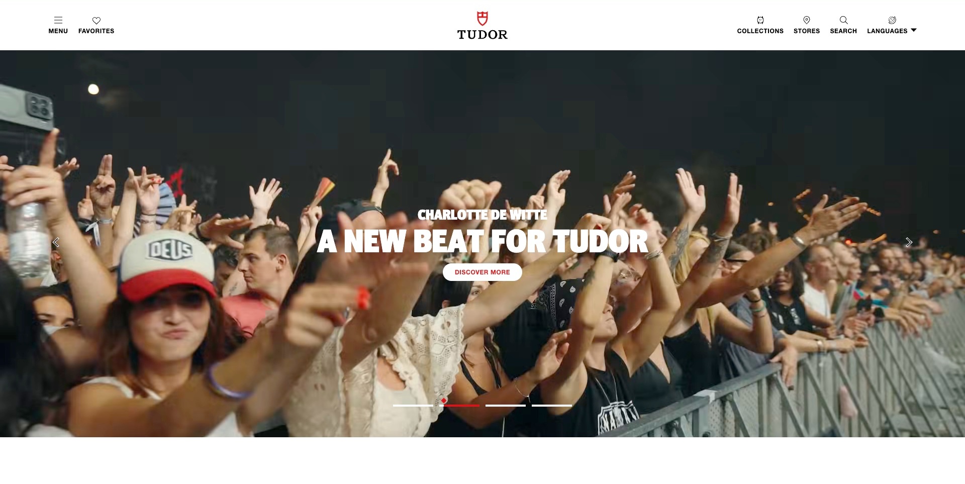
Tudor’s accepted frame shows a concert crowd beneath a Charlotte de Witte campaign title and a white discovery button. The white header keeps collections, stores, search and language controls around the centred red-and-black identity. Arrows and a small progress indicator expose the rotating presentation. This is a cultural brand campaign, not a watch close-up or evidence of an audience member’s product use. The current official source separately provides the brand’s own watch collections. The useful pattern is giving a wider story a clear destination while leaving the product and store routes available to visitors with more immediate shopping intentions.
What you can learn
Let an ambassador or cultural story add context without becoming a required step before finding a model. Make the campaign destination explain its actual relationship to the brand. Keep the range and store locator readable and useful regardless of which film frame is showing or whether playback is available.
Pros
Collections and stores have distinct permanent labels.
The campaign has visible navigation controls and an identifiable action.
Cons & considerations
If a non-product scene leads, preserve direct model discovery.
If text overlays moving crowds, test contrast and focus across the sequence.
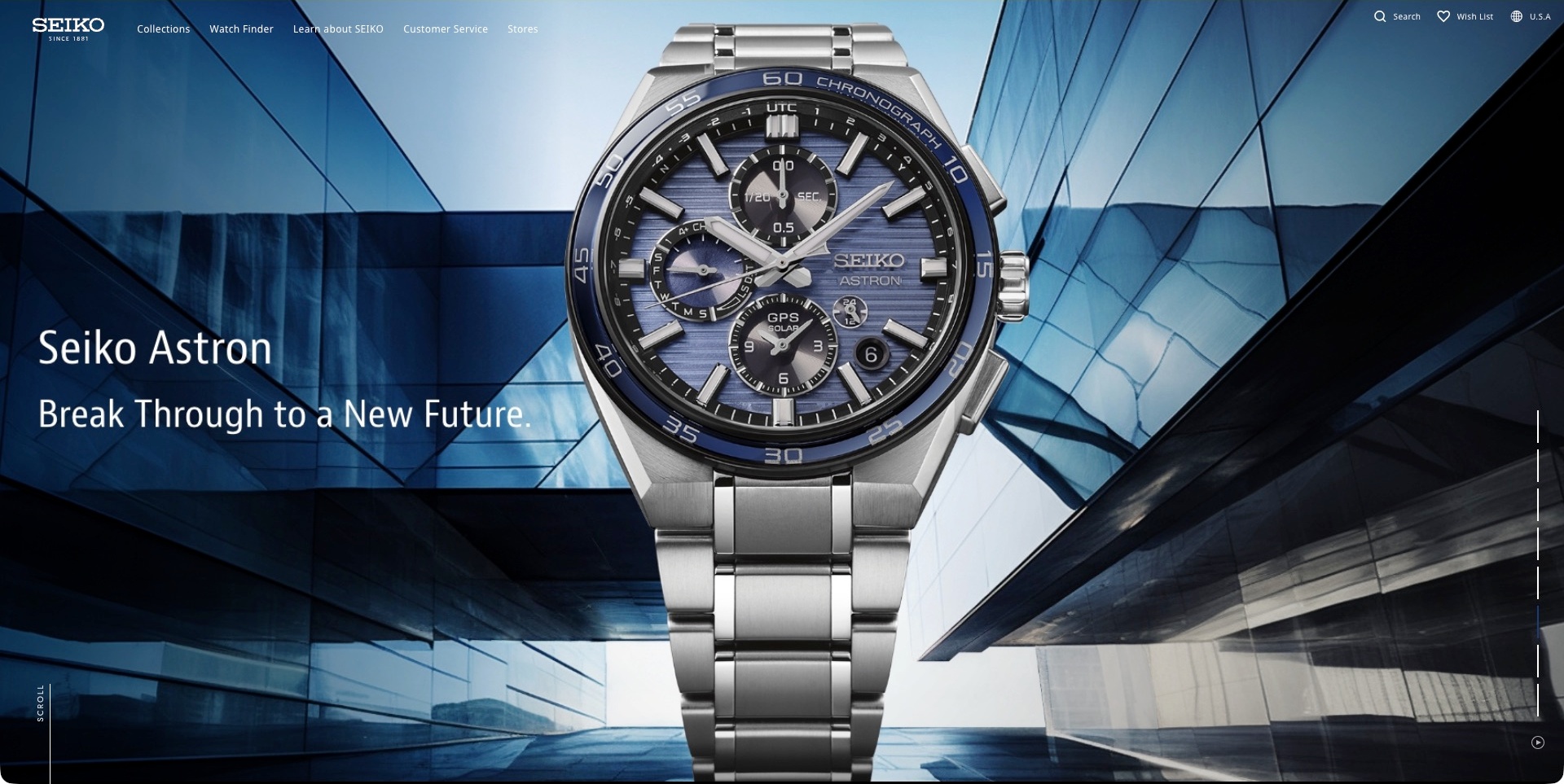
Seiko’s accepted US frame centres an Astron watch against blue glass architecture. The family name and short statement occupy the left, while collections, a watch finder, customer service and stores remain in the compact top navigation. A vertical indicator exposes the broader campaign sequence. The accepted frame is complete and paused through the normal control; it is not an anniversary or another collection image from the same area. The useful pattern is making an intricate product visually prominent without eliminating practical discovery and ownership routes. Dial markings and campaign language are manufacturer presentation, not independent verification of accuracy, solar charging or satellite functionality.
What you can learn
Pair the distinctive image with a stable model route and approved explanations of unfamiliar features. A finder can help visitors who do not arrive knowing the collection name, while support serves existing owners. Keep those tasks usable independently of the rotating campaign and its most elaborate imagery.
Pros
A watch finder offers an alternative to collection-name browsing.
Customer service and stores remain permanent navigation options.
Cons & considerations
If technical markings dominate the dial, explain their relevance clearly next.
If navigation overlays changing media, test its contrast across the sequence.
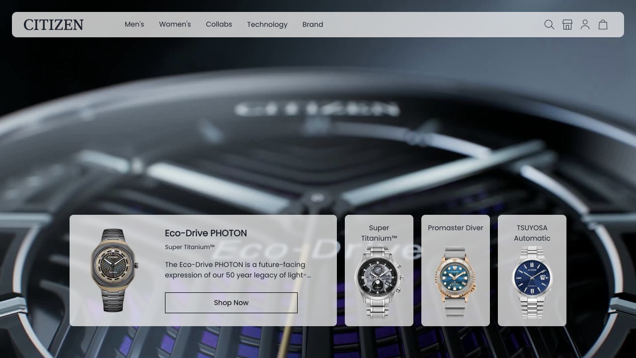
Citizen UK’s image places a translucent navigation bar over a dark watch macro. A row of pale cards introduces named ranges, with a larger Eco-Drive PHOTON card carrying a product image, description and shopping action. Smaller cards pair other collection names with recognisable watch faces. The useful pattern is letting the campaign establish material character while a parallel structure helps visitors identify alternatives. This is the captured UK storefront, not evidence about every regional Citizen property. The light-powered, material and heritage language remains the manufacturer’s presentation; the screenshot does not verify accuracy, construction or durability.
What you can learn
Keep each pictured watch connected to a stable family and product destination. Give visitors a way to distinguish alternatives without making them decode the background macro. A comparison can begin with photography and names, but dimensions, variants and approved technical details should remain easy to investigate next.
Pros
Distinct model cards make alternatives visible in the opening.
The main card combines an identifiable watch with a descriptive destination.
Cons & considerations
If translucent panels overlay changing media, test contrast across real frames.
If technical range labels are prominent, explain their practical meaning on the destination pages.
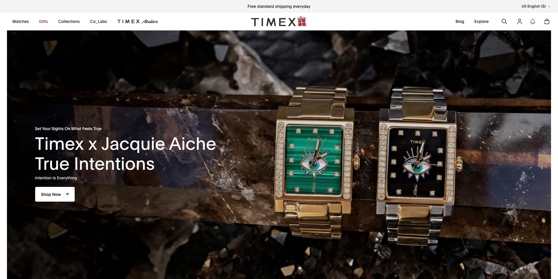
Timex’s accepted US opening shows two rectangular watches with contrasting green and black dials in a textured dark setting. The Jacquie Aiche collaboration name and a short campaign phrase sit above a white shopping action. A permanent header separates watches, gifts, collections and collaborations from editorial exploration, while a seasonal detail appears in the centred wordmark. The useful pattern is giving a special range a clear identity within a much wider catalogue. The photograph shows visual differences, not independently verified gemstones, plating or movement quality. The shipping line and campaign availability remain supplier information rather than reviewed purchase commitments.
What you can learn
Name the collaboration and connect it to precise product records so visitors can understand the choices beyond the campaign. Keep the main watch range available for those arriving with another model in mind. Seasonal styling should not make the catalogue, support or market context harder to recognise.
Pros
The collaboration is identified in a readable written heading.
The broader watch and collection routes remain visible.
Cons & considerations
If two variants share one image, explain their exact differences on the destination.
If seasonal branding is added, retain a consistent navigation hierarchy.
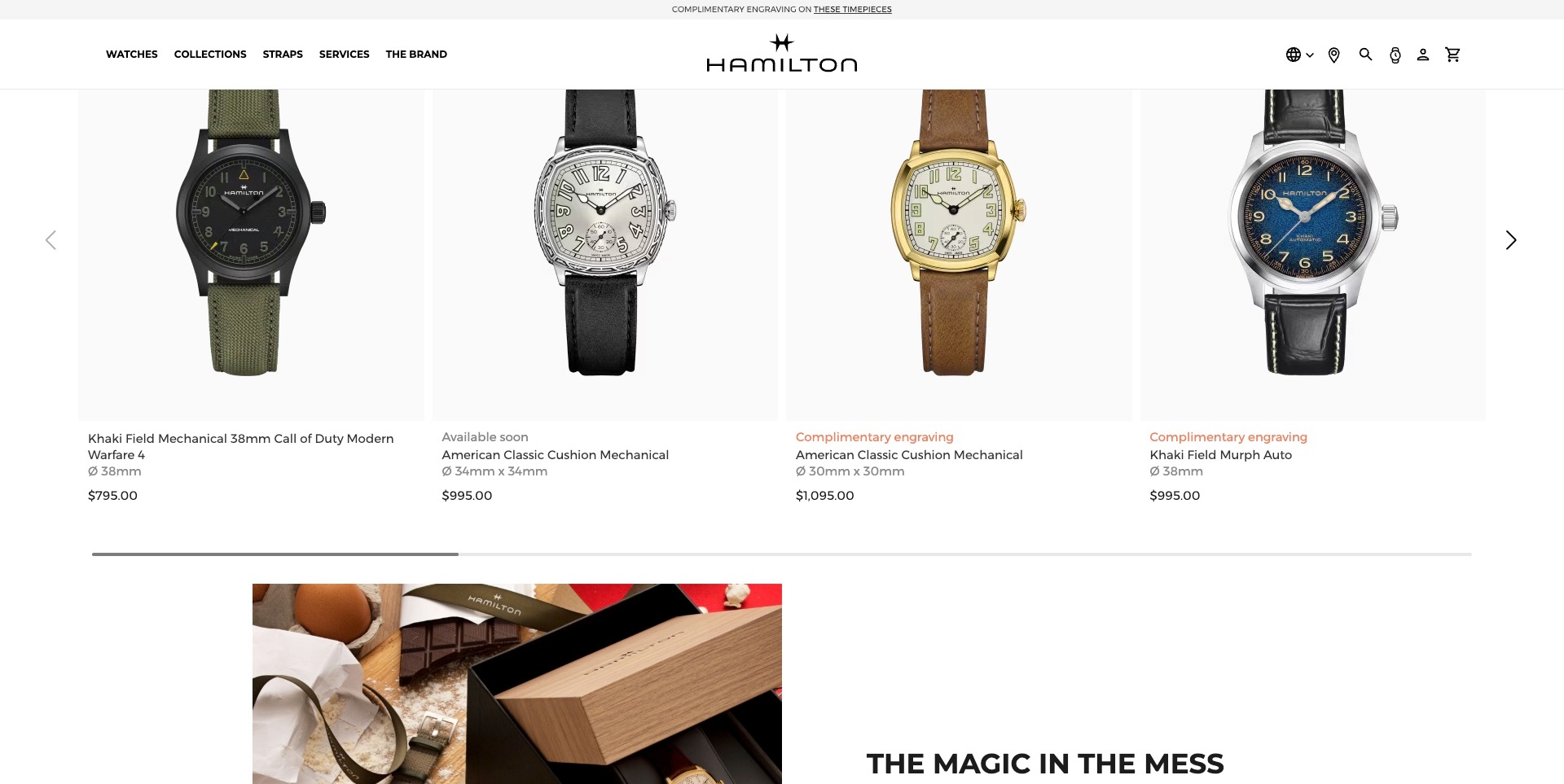
Hamilton’s accepted US capture is a scrolled homepage section, not its opening film. Four product cards show different watches on pale backgrounds beneath the sticky header. Names, dimensions and prices remain with the images; one card has an available-soon label, while others mention engraving. The next editorial image begins below. The useful pattern is giving visual comparison a consistent written structure: the visitor can distinguish a Khaki Field reference from the two American Classic Cushion variants without interpreting a campaign slogan. Prices, dimensions and product states are the source’s displayed information, not independently verified specifications or purchasing commitments.
What you can learn
Keep each model’s identity, size and availability close to its photograph, with a useful route into full details. Explain the difference between diameter and other case measurements when mixing shapes. Treat an available-soon label as a distinct state rather than letting every product imply immediate checkout.
Pros
Model names and dimensions use a consistent card structure.
Different product states are visible beside the relevant watch.
Cons & considerations
If a row scrolls horizontally, test discovery and keyboard operation.
If promotional engraving labels appear, explain their applicable conditions before purchase.
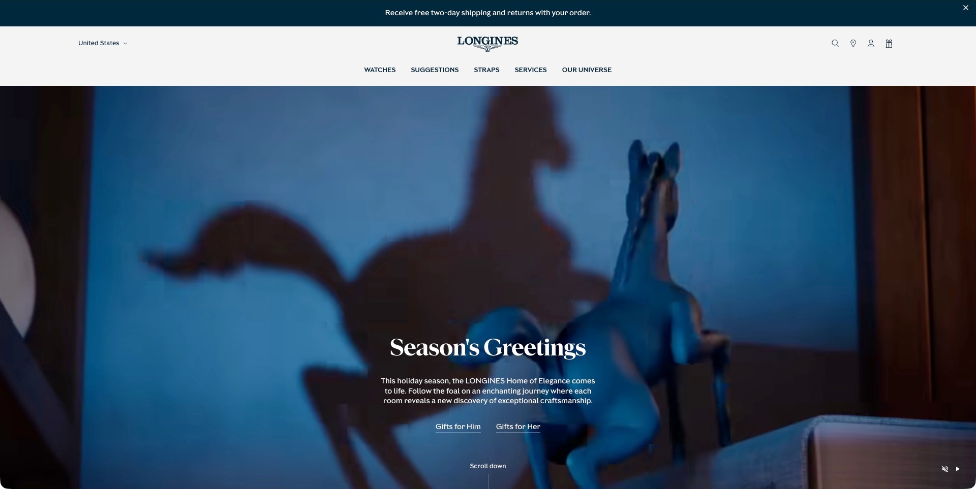
Longines’ accepted US frame shows a blue horse figurine and its shadow within a seasonal film. A short greeting, explanatory paragraph and two gift-discovery links sit over the image. The pale header preserves watches, suggestions, straps and services, with the market state visible above. This is a gifting-story frame, not a watch close-up or an independent demonstration of craftsmanship. The current official catalogue separately identifies the brand’s own watch ranges. The useful pattern is accommodating visitors who begin with a recipient in mind rather than an exact model name, while keeping ordinary product and ownership routes available.
What you can learn
Let gift browsing lead into precise products and approved availability information. Keep it an alternative to collection discovery, not a replacement for the catalogue. Maintain the seasonal story and its destinations after the campaign ends, and explain relevant market conditions without making an inline service message the whole purchasing policy.
Pros
The two gift routes provide identifiable entry points for unfamiliar shoppers.
Straps and services remain separate permanent navigation categories.
Cons & considerations
If the campaign is seasonal, review its product links and timing afterwards.
If a story scene leads, keep direct model discovery easy to reach.
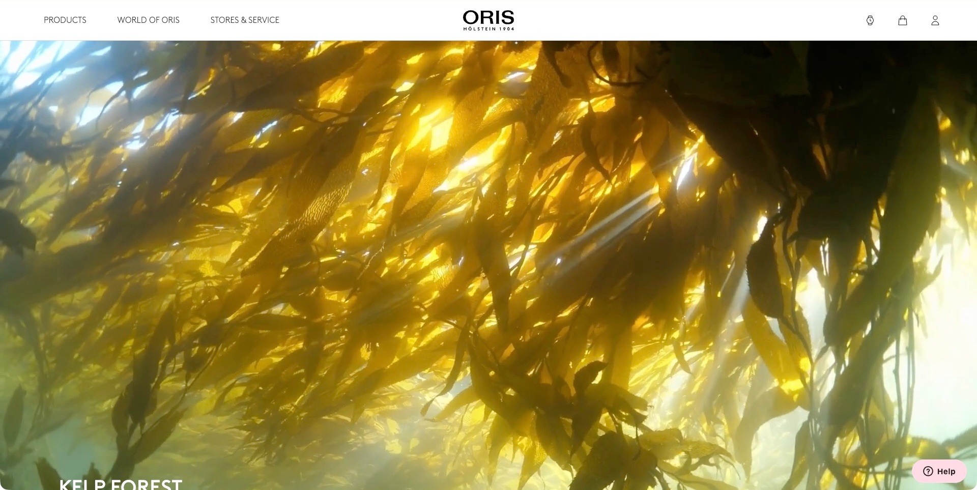
Oris’ accepted US page shows a sunlit kelp-forest film beneath a restrained white header. Products, the brand’s wider world and stores with service have distinct labels; the campaign heading begins naturally at the bottom of the viewport. The scene is fully loaded public media, not a blank placeholder or a watch-product photograph. The current official source separately identifies the brand’s own watch collections. The useful pattern is giving a wider editorial story a clear place while keeping product and ownership investigation available. The kelp imagery does not independently establish an environmental partnership, contribution, conservation outcome or physical product capability.
What you can learn
Connect a mission or landscape story to clear factual information about the actual relationship and relevant products. Keep the catalogue available for visitors who arrive ready to investigate a watch. A film can establish atmosphere, but the explanatory text should remain readable and useful without playback.
Pros
Products and stores with service have explicit permanent routes.
The restrained header gives the story a consistent frame.
Cons & considerations
If environmental imagery leads, document any actual contribution separately.
If film fills the first viewport, keep the explanation and next action easy to reach.
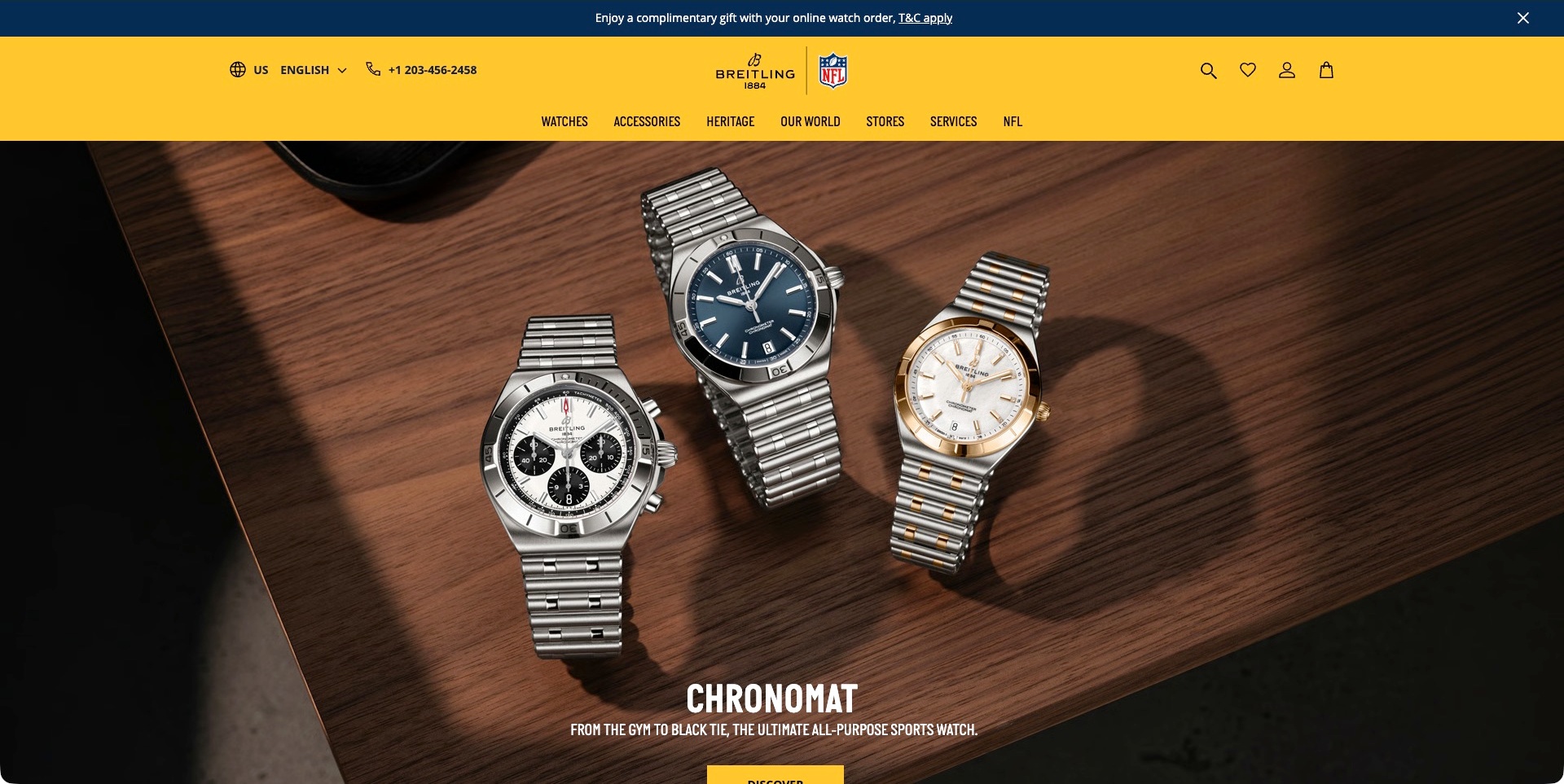
Breitling’s accepted US frame shows three Chronomat watches arranged on a wooden table beneath a strong yellow header. The collection title and short positioning line appear near the lower edge. Watches, accessories, heritage, stores and services remain separate permanent routes, with market and contact information above. This is the Chronomat frame, not an earlier Navitimer image from the same carousel. The useful pattern is showing visual variety while retaining one recognisable family name. The sports and all-purpose language is supplier positioning; the picture does not independently establish activity suitability, material content, certification or comparative performance.
What you can learn
Use a group image to introduce the range, then identify the actual references and meaningful differences on maintained product pages. Keep retail and ownership information independent of campaign rotation. A broad lifestyle statement should not replace the specific approved conditions behind a product’s intended use.
Pros
The collection name gives the three watches a shared context.
Stores and services remain explicit permanent routes.
Cons & considerations
If several references share a scene, make each one identifiable next.
If broad activity language leads, explain the actual product conditions without overstating them.
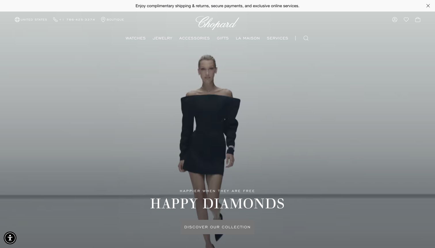
Chopard’s captured US view places a model on grey beneath a script wordmark. The Happy Diamonds campaign title and collection action sit near the bottom, while Watches has its own place in the horizontal product navigation. A service strip sits above the identity. This is a broader watch-and-jewellery brand scene, not a technical watch photograph or movement evidence. The current official range confirms watch collections and audience routes. The useful pattern is allowing campaign art direction to serve the shared brand while keeping watches visible. Shipping, service and product statements remain supplier-presented information.
What you can learn
Give the watch collection a stable label even when the main image promotes a wider brand story. Support a campaign with precise model records rather than expecting a visitor to infer product details from a model photograph. Keep service statements linked to their approved regional conditions and maintain the underlying destinations.
Pros
The watch category is visible without opening the main menu.
The campaign action and utility service strip occupy distinct levels.
Cons & considerations
If pale imagery sits behind white text, check contrast across the actual media.
If a shared campaign spans categories, make its product destinations explicit.
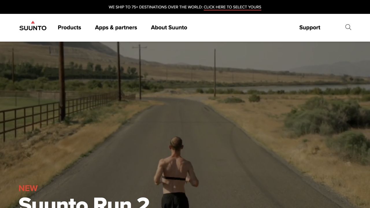
Suunto’s retained storefront uses a running image beneath a white header with products, apps, company information and support. The product introduction naturally continues below the viewport; it is not an overlay or reconstructed image. The current official site explicitly lists its own sports-watch models. The useful pattern is connecting a watch family to an activity context while keeping support and connected-product information accessible. The running scene is brand presentation, not evidence of tracking accuracy, battery endurance or suitability for every training condition. The original capture date and dimensions remain unchanged.
What you can learn
Use the activity image to establish context, then make the exact model, dimensions and approved capabilities easy to investigate. Keep apps and ownership support close enough to be discoverable without suggesting that a picture demonstrates device performance. Make the first product explanation understandable on a short mobile viewport as well as a large desktop.
Pros
Apps and support are separate permanent navigation routes.
The activity context gives the product introduction a recognisable setting.
Cons & considerations
If the image occupies most of the first screen, keep the model explanation reachable.
If performance-oriented imagery leads, support the actual claims with properly scoped product details.
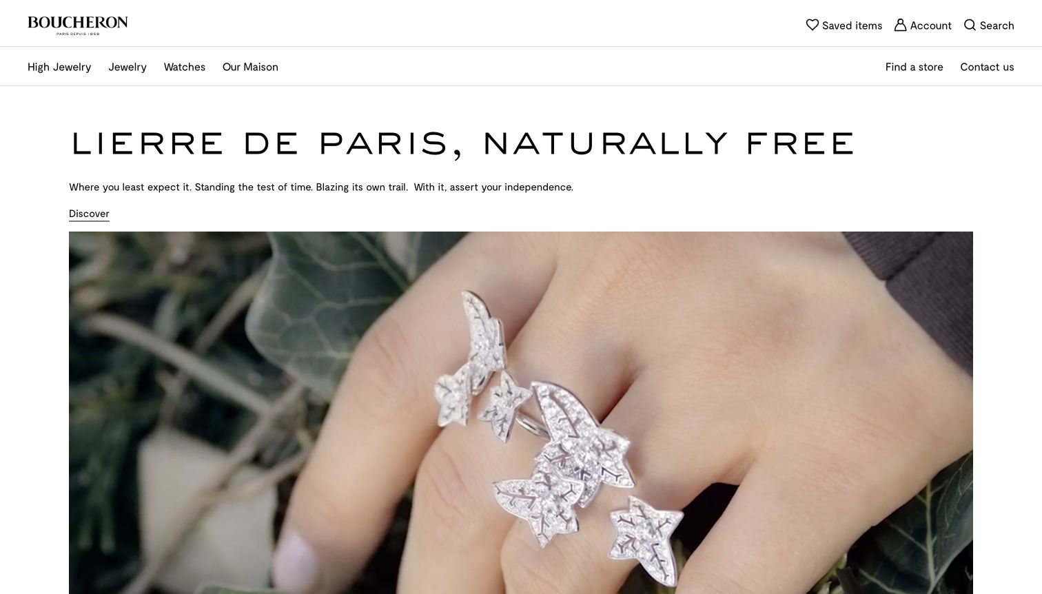
Boucheron’s worldwide capture uses a white background, wide-spaced heading and explanatory paragraph above a large jewellery photograph. The discovery link sits with the text rather than over the image. Watches is an explicit navigation category, and the current official watch catalogue identifies the brand’s own Reflet and Serpent Bohème references. The captured Lierre de Paris scene is jewellery-led; it does not show or verify those watches. The useful pattern is separating an editorial explanation from the image while keeping a specific product family accessible. Craft, independence and product-value implications are not independently evaluated.
What you can learn
Give the collection story a written place and a descriptive destination. A shared luxury identity can serve several categories, but watch visitors still need their own model records and ownership information. Keep the distinction between the pictured campaign and the actual watch range clear rather than implying that one image demonstrates both.
Pros
Text has a stable reading area separate from the photograph.
Watches remains explicitly available in the main category navigation.
Cons & considerations
If the headline is widely spaced, test its wrapping on narrow screens.
If a jewellery story leads, maintain direct access to the separate watch catalogue.
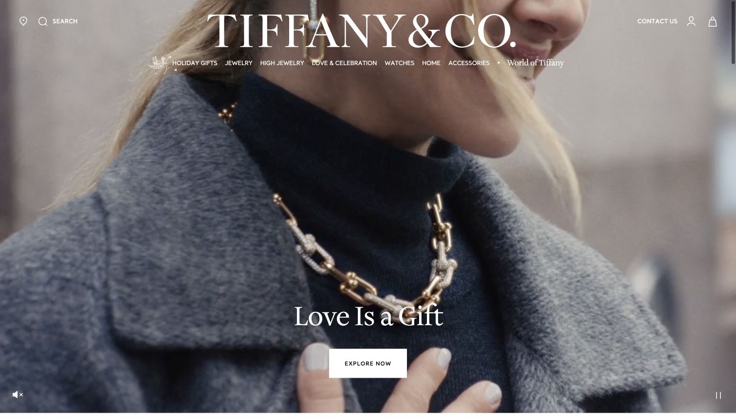
Tiffany’s retained homepage shows a close-up model wearing a necklace, with a white wordmark and a horizontal category line. Watches appears explicitly between other product families. A gifting headline and exploration button sit lower in the image, alongside ordinary media controls. The current official catalogue confirms a watch range, but the actual captured campaign remains jewellery-led. The useful pattern is using a strong shared identity without removing access to the watch collection. This is a review of the public navigation and presentation, not an assessment of the physical jewellery, watchmaking quality or a purchaser’s experience.
What you can learn
Keep the watch route persistent when other products dominate the brand campaign. Make the destination explain its own models and conditions rather than relying on familiarity with the parent name. Distinguish a gifting story from a product specification, and keep the shopping path useful when the background film is unavailable.
Pros
Watches is a readable named category in the main navigation.
The campaign provides a single clear exploration action.
Cons & considerations
If the identity is oversized, preserve category legibility on smaller screens.
If jewellery photography leads, ensure watch visitors can enter the right range directly.
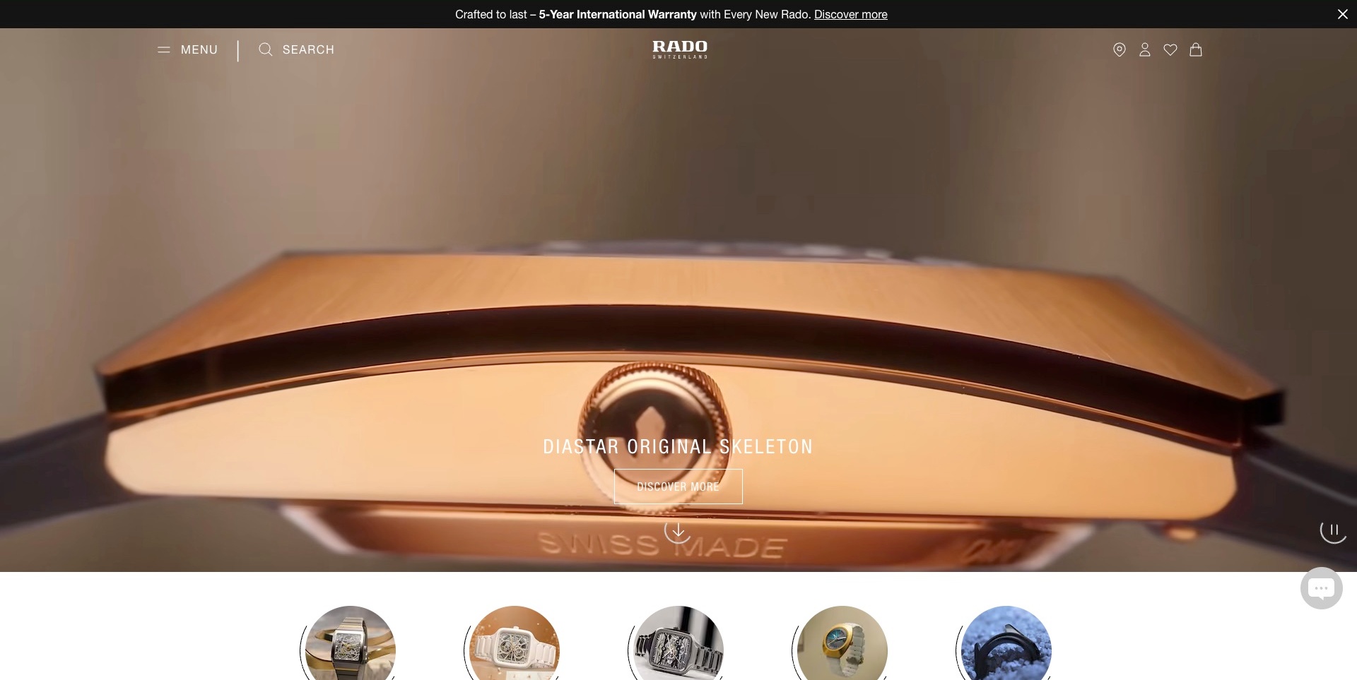
Rado’s US frame focuses on the side of a watch case and its crown. The DiaStar Original Skeleton name and outlined discovery action sit over the image, while a compact menu, search and commerce utilities frame the top. Small product thumbnails begin below the campaign, and a warranty message occupies a separate inline strip. The useful pattern is making an unusual detail image identifiable instead of leaving visitors to guess the collection. The close-up does not independently verify materials, resistance or the movement implied by the model name. The warranty wording remains the manufacturer’s terms, not a promise made by this review.
What you can learn
Give a detail-led introduction a clear model destination with full front, side and scale information. Keep the written reference useful when the film changes its framing. Link service and warranty language to relevant conditions rather than expecting a promotional strip to answer ownership questions on its own.
Pros
The model is named directly beside the discovery action.
The lower thumbnails begin to offer other product context.
Cons & considerations
If a side detail leads, provide complete-watch views promptly next.
If the main categories are hidden, test product discovery through the compact menu.
Mido’s US frame magnifies a blue textured dial, with a watch hand and large lettering. The collection name and discovery action sit at the lower left. Watches, straps, stores and customer service remain in the header, while an orange promotional strip carries the brand accent. The useful pattern is attaching a precise model-family name to an otherwise abstract texture-led image. This is a normally paused film frame, not an independent inspection or proof of a chronometer rating. Technical markings, origin language and the gift offer remain supplier statements rather than verified product or purchase findings.
What you can learn
Use the close-up to establish character, then supply complete-watch views, dimensions and approved technical explanations on the destination. Keep customer service and straps accessible to existing owners. A technical term can support model identity without becoming a substitute for the relevant evidence and conditions behind the specification.
Pros
The collection name keeps the magnified detail connected to a product family.
Customer service and straps remain explicit permanent routes.
Cons & considerations
If the image is highly magnified, provide scale and whole-product context next.
If a technical rating is prominent, explain its approved scope rather than relying on lettering alone.
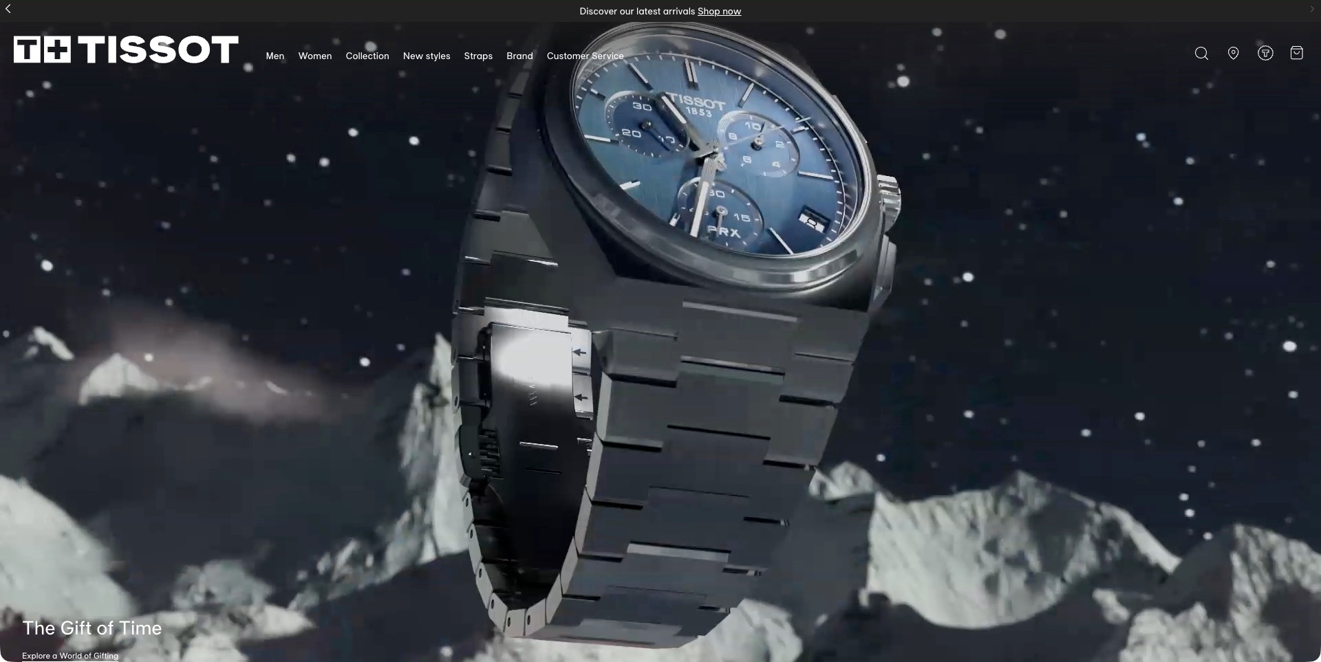
Tissot’s US frame shows an angled PRX watch in a dark scene with rock-like forms and particles. A gift-themed heading begins near the lower edge, while the large white identity and category navigation remain above. Collections, new styles, straps and customer service give the film a practical frame. The useful pattern is letting a seasonal story use a recognisable product rather than replacing the entire opening with an unrelated lifestyle scene. This is one actual campaign frame, not proof of environmental resistance, construction or the watch’s suitability for the imagined setting. Availability and purchasing terms require their own product information.
What you can learn
Connect the gift destination to exact references, variants and current availability. Keep the permanent catalogue and ownership routes useful after the seasonal campaign changes. A dramatic film should not require visitors to infer materials or technical capability from its setting, and essential text should remain understandable without playback.
Pros
The depicted product is recognisable within the seasonal story.
Straps and customer service remain separate permanent categories.
Cons & considerations
If film occupies the first viewport, keep its destination and explanation reachable.
If a scene implies harsh conditions, distinguish art direction from approved product claims.
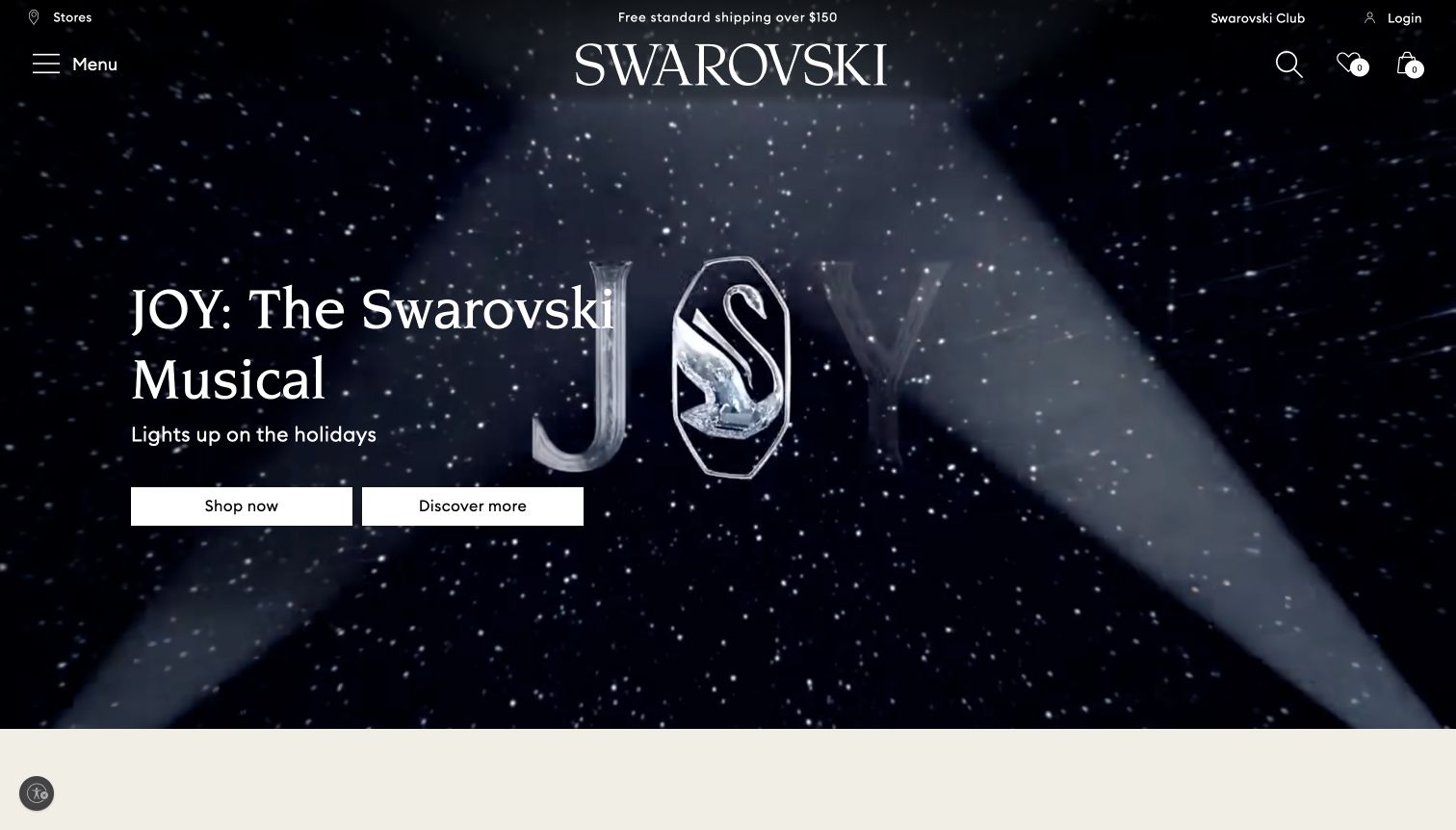
Swarovski’s US capture uses a star-filled image and white wordmark above two adjacent actions: shopping and discovering more. A compact menu, search and commerce utilities frame the presentation. The source’s current product navigation explicitly includes watches and related watch categories, but the captured musical campaign is not a timepiece product photograph. The useful pattern is allowing a visitor to choose between immediate range exploration and understanding the story first. The visible shipping strip and seasonal messaging belong to the historical captured page, not independently checked purchasing terms or evidence of watch quality.
What you can learn
Keep editorial discovery distinguishable from the route into actual products. In a broad catalogue, make the watch category easy to identify within the compact menu and connect its products to precise model information. Maintain seasonal destinations without implying that a campaign or shipping statement remains unchanged indefinitely.
Pros
The shopping and story actions have different labels.
Permanent search and commerce utilities remain visible beside the campaign.
Cons & considerations
If the product categories sit behind a menu, test direct watch discovery.
If two actions are equally prominent, ensure their destinations deliver genuinely different information.
Kegan is a freelance web designer and developer with 15+ years of experience helping businesses turn complicated website requirements into clear, maintainable digital experiences. He works directly with clients from planning and design through development, launch, and ongoing support.
For watch brand website design, his development approach focuses on clear watch collections and specifications, useful sizing and movement information, considered product imagery, transparent purchase and service conditions, and dependable retailer or shopping routes. The scope can be a targeted improvement or a complete custom build, with responsive layouts, thoughtful content structure, and integrations chosen around the people using and maintaining the site.
Show 3 other watch brand website designersHide other watch brand website designers
Plan a watch brand website around models, meaning and ownership
Start with the collection architecture, not the launch film
Inventory the range before deciding how the homepage should move. Record model families, individual references, case sizes, dial variants, straps and genuinely separate editions. Identify which distinctions matter to customers and which are internal stock identifiers. A customer who recognizes a collection name should reach its range directly, while someone browsing by size or function should have another understandable route.
Create a stable page for each meaningful product or reference, with a deliberate approach to variants. Do not scatter the same watch across several campaign pages with conflicting availability or specifications. A seasonal story can point into that durable record. When a discontinued model remains useful for ownership information, label it clearly rather than silently redirecting every old link to the latest launch.
NOMOS presents model families as explicit browsing destinations, while Farer gives several watch types and collections their own routes. Those patterns illustrate different ways to organize a range; they do not require every small maker to adopt a large mega menu. Match the structure to the actual number of products and the questions your audience brings. A compact catalog often benefits from fewer, clearer decisions.
Make product photography answer a sequence of questions
Plan the image set around what a remote buyer cannot inspect physically. A clear front view establishes the dial, an angled view explains case shape, and a wrist photograph adds context for scale. Detail images can show a texture or feature without pretending to be an independent inspection. Keep the selected color and strap identifiable across the sequence so the customer knows which variant is being shown.
Use atmospheric campaigns for character, but protect product legibility. Text over a moving background needs a reliable contrast treatment and a useful fallback when the video cannot play. Avoid making important specifications depend on hovering over a desktop-only animation. A person on a phone should be able to pause, inspect and move between images without losing their place or accidentally changing the selected product.
Give images useful descriptions and keep captions specific. A photograph may show one prototype, a previous edition or an optional strap; that context belongs near the image where it affects the buying decision. Do not imply that every photographed accessory is included. Record photography permissions and retain enough detail for the editorial team to update a campaign without accidentally changing the product’s factual record.
Translate specifications without flattening their meaning
Present the core facts in a consistent, readable format. Dimensions, case and crystal descriptions, movement information, power source, strap details and stated water resistance may be relevant, depending on the range. The brand’s technical team should approve the wording and its conditions. A convenient comparison table is useful only when the fields describe genuinely comparable information.
Offer a plain-language layer for unfamiliar terms, with more detailed references available when needed. Explain what a complication lets the wearer do rather than filling the page with unexplained abbreviations. Keep manufacturer-stated accuracy, durability or resistance claims tied to their approved scope. The website should not turn a rating into universal guidance for every activity or suggest that a marketing description replaces the product’s instructions.
Give collectors a reliable way to identify the exact reference, but do not make everyone decode it. The visual model name and the technical reference can coexist. Where several sizes or versions look similar, make the difference visible before the customer enters checkout. Test the page with someone unfamiliar with the range: can they explain which watch is selected, what distinguishes it and where to find the relevant details?
Design availability, preorders and waitlists as different journeys
Map the actual sales process for each product state. An in-stock item, a future release and a handmade-to-order watch should not share an ambiguous button. State what the customer is requesting and what happens after the action. If a deposit, order or account is required, explain the applicable terms through the approved purchasing process rather than improvising them in promotional copy.
Keep availability information close to the selection. A campaign may remain visible after an edition sells out, but the customer should not discover that only at the last step. Distinguish email notifications from an allocation or a guaranteed place in a production sequence. Do not use a countdown or a scarcity message unless the business can maintain the underlying information accurately.
anOrdain’s public site explicitly distinguishes watches available through a waiting-list process, while other brands expose a more conventional shopping route. Use that contrast to clarify your own operating model. A small maker can create a valuable enquiry-led experience without pretending to operate an always-available store. The quality of the explanation matters more than whether the button says buy, enquire or join a list.
Make ownership and service information durable
Plan for the visitor who already owns a watch. They may need care instructions, a service contact, strap information or help identifying an older reference. Give those tasks a stable support structure that does not disappear when the homepage changes. A clear product archive can be useful even when the business no longer offers the model for sale.
Keep warranty, servicing and delivery statements specific to the relevant market and product. Identify when a customer should contact the brand, an authorized retailer or another service route. Do not imply that an independent stockist provides every service available through a brand-owned location. The business should approve service promises and maintain the conditions that accompany them.
Fears makes servicing, heritage servicing and other ownership-related destinations explicit in its public navigation. That is a useful reminder that a watch website continues to serve people after purchase. Bring support links into product pages where they answer likely questions, rather than relying on a crowded footer alone. Test the contact route without sending real customer details during development.
Let heritage and craft stories earn their space
Use original stories to explain a real design decision, process or point of view. A workshop sequence can help visitors understand the people and steps behind a product, but it should identify what is actually being shown. Avoid treating an atmospheric factory image as proof that every component was manufactured in-house. Keep origin and craftsmanship claims precise and approved.
Connect editorial content to the relevant models without forcing it into every purchase path. A visitor who already knows the reference should not have to replay the entire brand history. A visitor discovering the brand may appreciate a longer account. Reusable story and collection records let the editorial team serve both audiences while keeping the commerce data consistent.
Choose a manageable publishing rhythm. A small, well-maintained archive is more credible than an abandoned journal filled for launch. Update links when a model changes status, identify historical products accurately and preserve useful instructions. Measure the experience through real tasks such as finding a model, comparing two sizes and reaching support, not only through how impressive the opening animation looks in a design review.
The editing job behind the design
Choose tools that preserve model accuracy and a usable buying journey
Model references, variants, specifications, availability and editorial stories as connected records. Keep factual product information in one maintained source rather than copying it into every campaign. Choose a commerce platform or content system that the team can update accurately when a launch changes.
Separate notifications, waitlists, preorders and completed purchases in both the interface and the operational process. A mailing-list tool does not create an allocation system by itself. Keep confirmations honest about what was received and avoid collecting more personal information than the specific task needs.
Prioritize responsive photography, accessible product controls and readable technical tables before adding complex motion. Public technology references do not reveal a brand’s private production, inventory or service systems, and they do not explain the quality or value of the physical watch.
Our WordPress website examples offer a separate look at publishing approaches. A visible platform label is evidence for that named page, not a guarantee that the same system will suit your requirements.
Before the public launch
Watch brand website planning checklist
Map collections, models, references and genuine variants.
Keep product records separate from short-lived campaigns.
Show dial, case and on-wrist context clearly.
Identify optional accessories in campaign photography.
Use a consistent specification structure.
Explain unfamiliar terms without inventing performance claims.
Keep manufacturer-stated ratings within approved conditions.
Separate stock purchase, preorder, enquiry and waitlist actions.
Make notification confirmations distinct from reservations.
Maintain useful information for previous models.
Connect products with care, warranty and service routes.
Distinguish owned boutiques from independent stockists.
Test comparison, availability and support tasks on mobile.
Assign an owner to product and service content.
These checks are a project checklist, not a performance, legal, security, or accessibility certification. Test real journeys with the people responsible for the website before making claims about the result.
Sources & editorial method
How this collection was selected and reviewed
This collection contains exactly 30 distinct public examples, matching the original random target saved before research. It includes specialist watch brands and explicitly identified broader brands with their own watch ranges. Captured keyboard, jewellery-led and seasonal scenes are described honestly rather than relabelled as watch-product photography. Eight retained original direct captures keep their actual bytes and date-only precision; 22 new native direct captures keep actual UTC timestamps and browser-toolbar-only crop proof. Current first-party brand and product material supports the stated category fit; failed or mismatched source attempts remain separate history. Every accepted image was independently reviewed, and every review is original watch-specific website analysis. Farer is the explicitly researched Editors Choice for its clear model identity, distinctive product presentation and separate range/story/showroom routes, not a measured ranking or product-quality endorsement. No watchmaking, investment, origin, physical-performance or service outcome is independently verified. Unknown technologies remain unlisted pending root’s scoped broad audit. External imagery, designs and marks belong to their respective owners.
Each example links to its actual source page. Screenshots are direct browser captures with their own capture dates; moving imagery, announcements and live designs can change. The notes describe observable design choices and conditional tradeoffs, not measured traffic, conversion results, service quality, or accessibility conformance.
Technology labels use public page metadata, asset evidence, or explicitly cited platform documentation. Platform documentation is not a complete current deployment audit. A component reference may be legacy or unused; it is not a complete backend inventory. Unknown stacks are omitted. These sites are editorial examples, not our client portfolio.
Written, Edited and Curated are separate editorial records, not timestamps advanced by a rebuild. Website designs and imagery belong to their owners. See our editorial standards or suggest a correction.
Questions worth asking
Watch Brand website design questions
Should a watch brand lead with specifications or a campaign?
Use the opening to establish the product and the brand’s point of view, then make the relevant specifications easy to reach. A collector and a first-time buyer may need different levels of detail. Neither group benefits when the model identity is hidden behind a campaign name.
Does every small watchmaker need online checkout?
No. An enquiry-led, appointment or made-to-order process can be appropriate when it matches the business. The important requirement is a clear explanation of availability and what the next action means. Do not disguise an email signup as a confirmed order or allocation.
How should sold-out watches be handled?
Keep useful model and ownership information where there is a reason to retain it, while clearly identifying the current availability. Offer a relevant next step without implying that another product is the same reference. Review old campaign links instead of redirecting everything indiscriminately.
Can a website’s design establish product quality?
No. Photography and clear information can help someone understand a watch, but website observations are not an independent inspection. Technical, origin and service claims need their own appropriate evidence and conditions.
What is most useful in a model comparison?
Compare fields that genuinely differ, such as dimensions, movement information and supported options. Use a consistent format, identify the exact references and link to the full approved details. Avoid presenting promotional adjectives as measurable comparison criteria.
Borrow the precise model organization, memorable product imagery and honest availability explanations. Make the website a dependable introduction to the watch and the ownership experience, not just a launch presentation.