Best Vintage Clothing Store Websites of 2026 (23 Real-World Examples)
Real vintage clothing websites showing how distinctive styling, useful garment details and clear stock status can work together.
A vintage clothing website should make a one-off garment easier to understand, compare and find again.
The appeal of vintage is often its difference: an unusual cut, a particular fabric, a period detail or a piece that does not exist in every size. The website needs to celebrate those differences while answering practical questions about measurements, wear, availability and how to buy or visit.
This collection includes neighborhood shops, larger vintage retailers, designer specialists and period-focused archives. Some sell mixed merchandise or keep reference pieces alongside available stock. Compare their photography, category structure and information hierarchy without treating presentation as proof of authenticity, garment age or service quality.
Before the examples
What makes good vintage clothing store website design in 2026?
Show the garment and explain its fit
Use photographs that reveal the whole silhouette, a useful detail and any material wear. Record actual measurements with units and explain how they were taken; an old size label is not a reliable substitute. Styled photographs help someone imagine an outfit, while clear item records help them decide whether the particular piece is suitable.
Separate available stock from archive and inspiration
A sold garment may still be interesting, but it should not look purchasable. Give available, reserved, sold, rental and reference items explicit states. Distinguish vintage clothing from reworked pieces, reproductions and newly made accessories so a mixed catalog remains understandable.
Make discovery work for different kinds of shopper
Some visitors browse for a mood; others need a jacket in a particular measurement range. Combine a manageable set of garment categories with accurate filters where the inventory supports them. Add designer, period or material routes when staff can maintain those fields consistently, rather than filling the navigation with thin or ambiguous collections.
The collection · 23 examples
23 vintage clothing store websites worth studying
Look at what each page chooses to show first: a shop interior, a styled campaign, a garment grid or visiting information. Then examine how quickly a visitor can reach the facts that the opening image cannot provide.
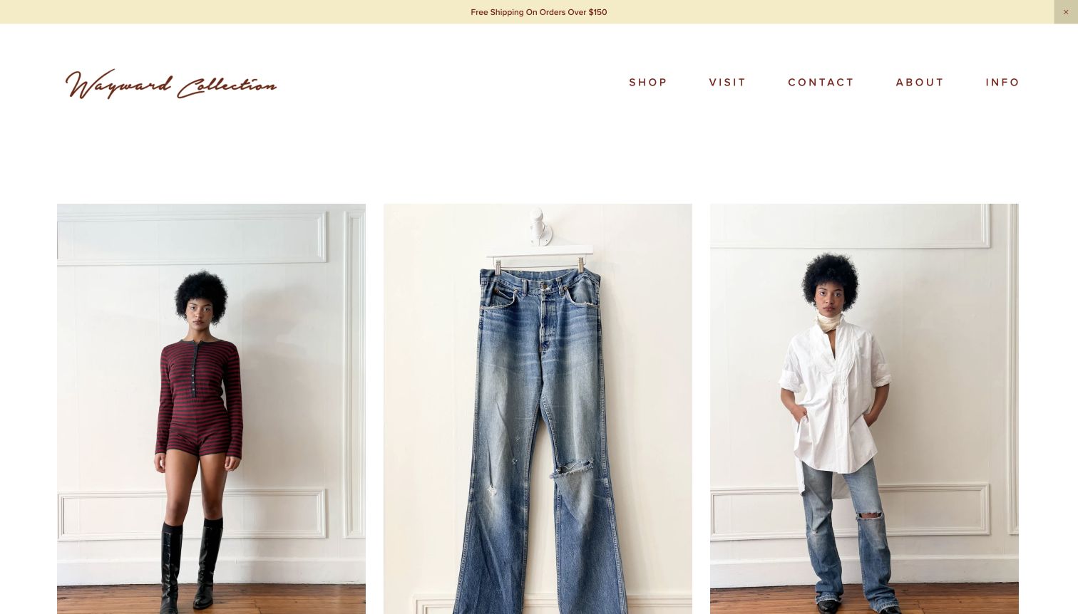
Wayward Collection makes the garments do the introductory work. Its new-arrivals page places a styled knit, hanging denim and an antique blouse in a generous three-column grid, using restrained backgrounds to connect very different pieces. The handwritten brown identity adds personality without competing with fabric or silhouette. Product names supply useful distinctions such as period, maker and material rather than relying on a vague vintage label. Shop, Visit, Contact, About and Info remain easy to find. This is a specialist retail presentation with a clear route from visual discovery to a particular item, rather than a decorative mood board detached from stock.
What you can learn
Borrow the consistent photographic treatment and specific naming system together. A vintage shop needs room for unusual pieces, but repeating the backdrop, card structure and information order makes those differences easier to compare. Keep measurements and condition one obvious step away.
Pros
Large garment photographs communicate shape and styling immediately.
Plain shop and visit routes balance online browsing with physical access.
Cons & considerations
Prices and complete titles fall below the initial image-heavy viewport.
A sparse catalog introduction leaves fit and condition guidance to deeper pages.
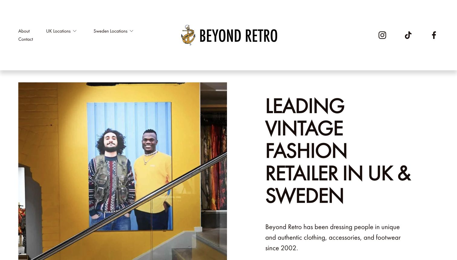
Beyond Retro opens with a photograph of a crowded, colorful shop beside a bold explanation of its vintage clothing offer. That pairing shows the kind of browsing experience a visitor can expect before asking them to choose a location. The navigation gives UK and Sweden stores separate, clearly named routes, with About and Contact alongside them. This homepage emphasizes the retail network rather than a grid of purchasable garments. Its oversized typography and unusually spacious header make the brand unmistakable, although they also delay the finer practical details of each destination. The design is most useful as an example of store discovery.
What you can learn
If the visit is the main conversion, show the real shop and place location choices near the opening message. Use dedicated store pages for opening times, access information and directions, rather than assuming an atmospheric photograph answers those practical questions.
Pros
Actual shop photography gives the stock and environment a tangible context.
Country-specific location links make the next decision understandable.
Cons & considerations
The large header uses space that could reveal individual store details sooner.
Shoppers expecting an immediate product catalog need a clearer explanation of the browsing model.
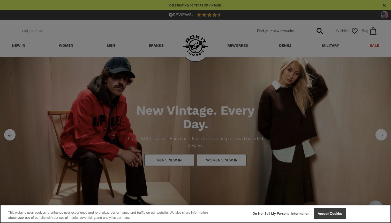
Rokit uses a split fashion photograph to frame two direct entry points: new arrivals for men and for women. Around that campaign image, the header offers more precise routes through brands, denim, military clothing and reworked pieces. Search, wishlist and bag controls stay separate from those editorial categories. The source also exposes descriptive product names including garment type, period and size, which helps move the experience beyond a generic secondhand feed. In the captured view, a cookie notice darkens most of the page, making the otherwise legible campaign less effective. The underlying hierarchy is clear, but the overlay is a real first-visit tradeoff.
What you can learn
Give a large catalog a small set of dependable starting points, then let shoppers narrow by brand or garment type. Treat consent interfaces as part of that design: they should remain readable without obscuring the product choices they temporarily accompany.
Pros
Two clear arrival buttons connect the opening image to shopping intent.
Specialist departments distinguish denim, military and reworked inventory.
Cons & considerations
The consent overlay dims the main photograph and promotional message.
Multiple promotional strips add visual weight before the first product row.
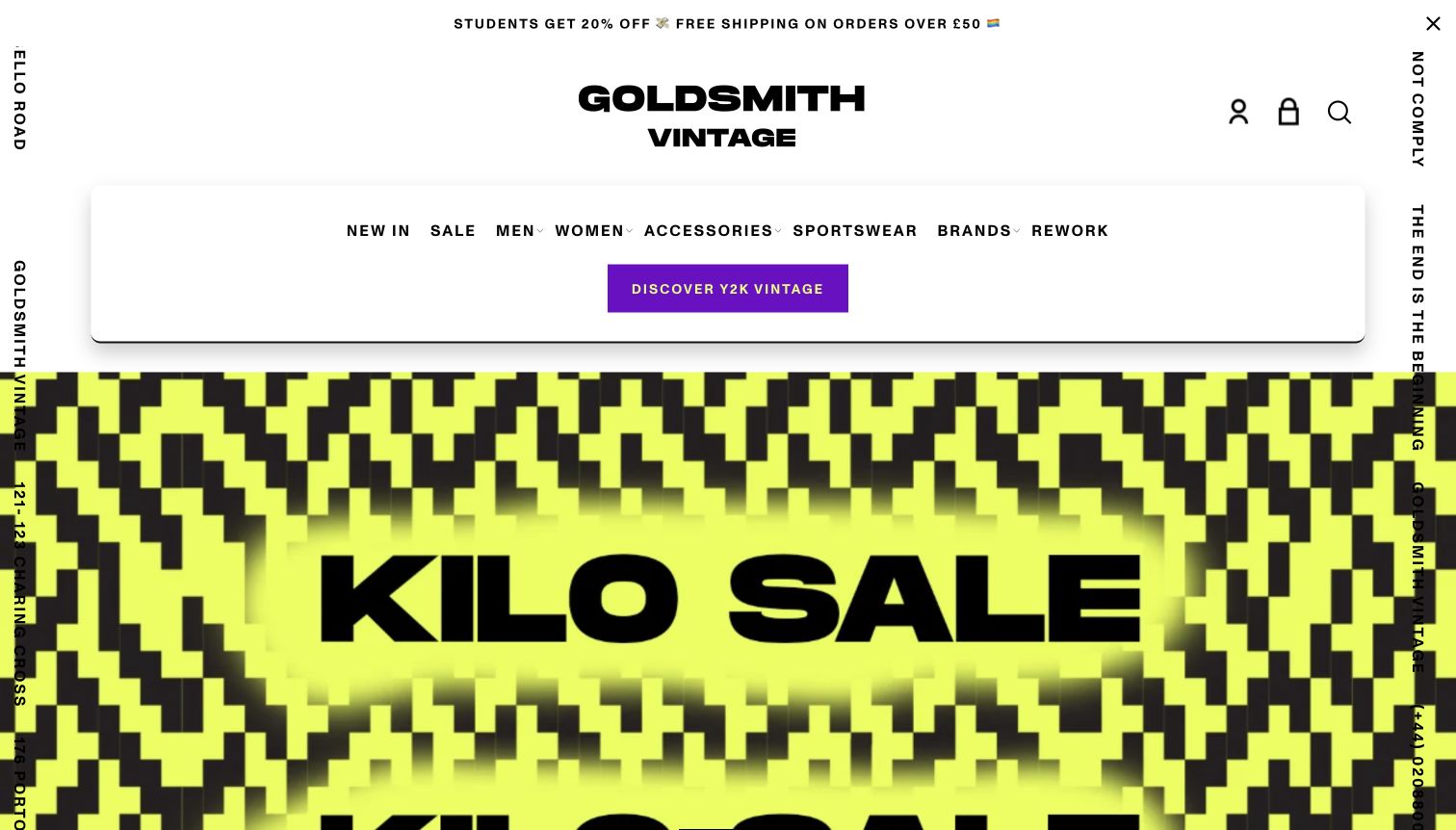
Goldsmith Vintage pairs a large black wordmark with a rounded navigation panel and an energetic kilo-sale campaign. Lime, black and purple graphics make the site feel closer to a street poster than a conventional neutral fashion shop. The menu still uses recognizable shopping labels, including men, women, accessories, sportswear, brands and rework. That practical structure prevents the expressive artwork from becoming the only way to understand the business. The opening view prioritizes an event and its visual personality, with actual garment selection deferred to the catalog. It is a useful reference for a shop whose campaigns and in-person activity are central to its appeal.
What you can learn
Let a campaign have a memorable visual language while keeping navigation predictable. Event graphics should lead to concrete information about where, when and what is available; everyday product browsing should remain accessible when the campaign is not relevant to a visitor.
Pros
A recognizable palette creates a strong retail identity across the opening screen.
Conventional category labels provide a stable counterweight to the expressive graphics.
Cons & considerations
The opening poster communicates atmosphere more quickly than individual stock.
Dense decorative elements can compete with small navigation text.
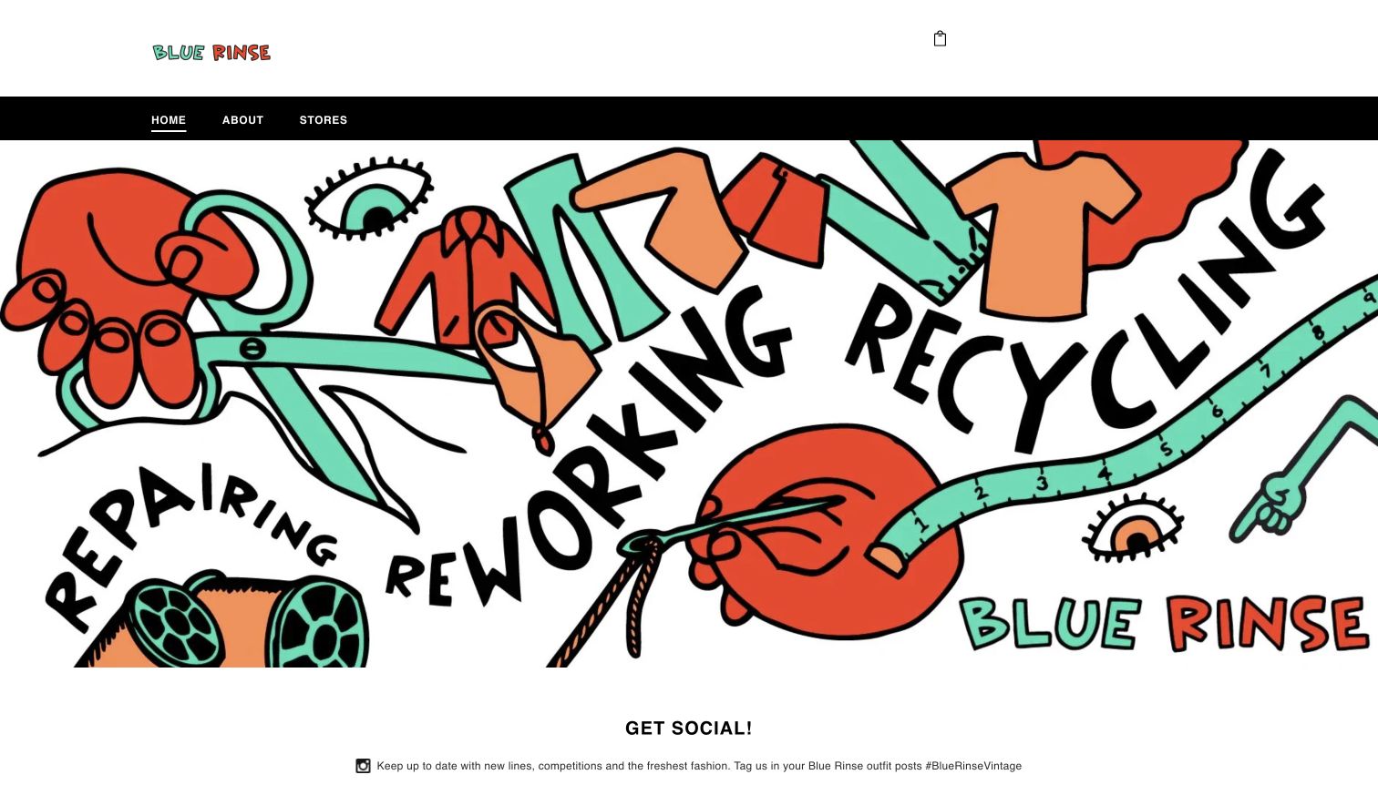
Blue Rinse Vintage makes its approach visible through a large illustration of garments, tools and sewing-related objects. The words repairing, reworking and recycling give that artwork a specific purpose rather than leaving it as decoration. A simple header offers Home, About and Stores, and the main graphic connects to the remade clothing proposition. The result is much closer to a brand introduction and store gateway than an online inventory screen. Its limited navigation makes the message easy to absorb, but also means a visitor cannot compare individual garments from the opening page. The observed design works best when the remaking story is the intended starting point.
What you can learn
Use illustrations to explain a real process, with clear words and a useful destination behind the image. If customers also buy online, make that route explicit rather than expecting them to infer it from a campaign or social link.
Pros
The illustrated tools and clothing explain the remaking theme quickly.
A short menu keeps the store and background information easy to identify.
Cons & considerations
Specific garments, prices and availability are absent from the opening view.
The prominent visual needs clear link labeling for visitors browsing without images.
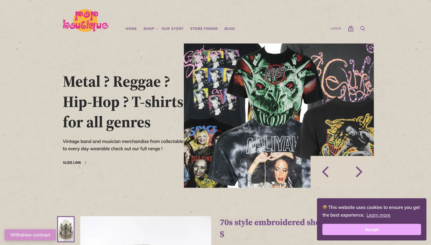
Pop Boutique uses a warm cream background, a colorful identity and a large T-shirt collage to introduce a music-themed collection. The metal, reggae and hip-hop headline makes the campaign understandable before a visitor explores the products. Shop, Our Story, Store Finder and Blog provide a compact set of routes around it. Further source content shows much more detailed item writing, including era, measurements and specific condition notes for a shearling jacket. That contrast is instructive: the campaign supplies the mood, while the item record supplies the buying information. The opening call to action, however, appears with the generic label “SLIDE LINK,” weakening that otherwise specific introduction.
What you can learn
Carry the precision of good product descriptions into campaign controls. A button should say which collection it opens, and detailed measurements or flaws should remain clearly attached to the individual garment rather than hidden in general store policies.
Pros
The music theme gives a mixed T-shirt assortment a coherent entry point.
Observed item copy distinguishes measurements and condition rather than concealing wear.
Cons & considerations
The generic campaign button label fails to describe its destination.
The cookie panel occupies part of an already busy opening composition.
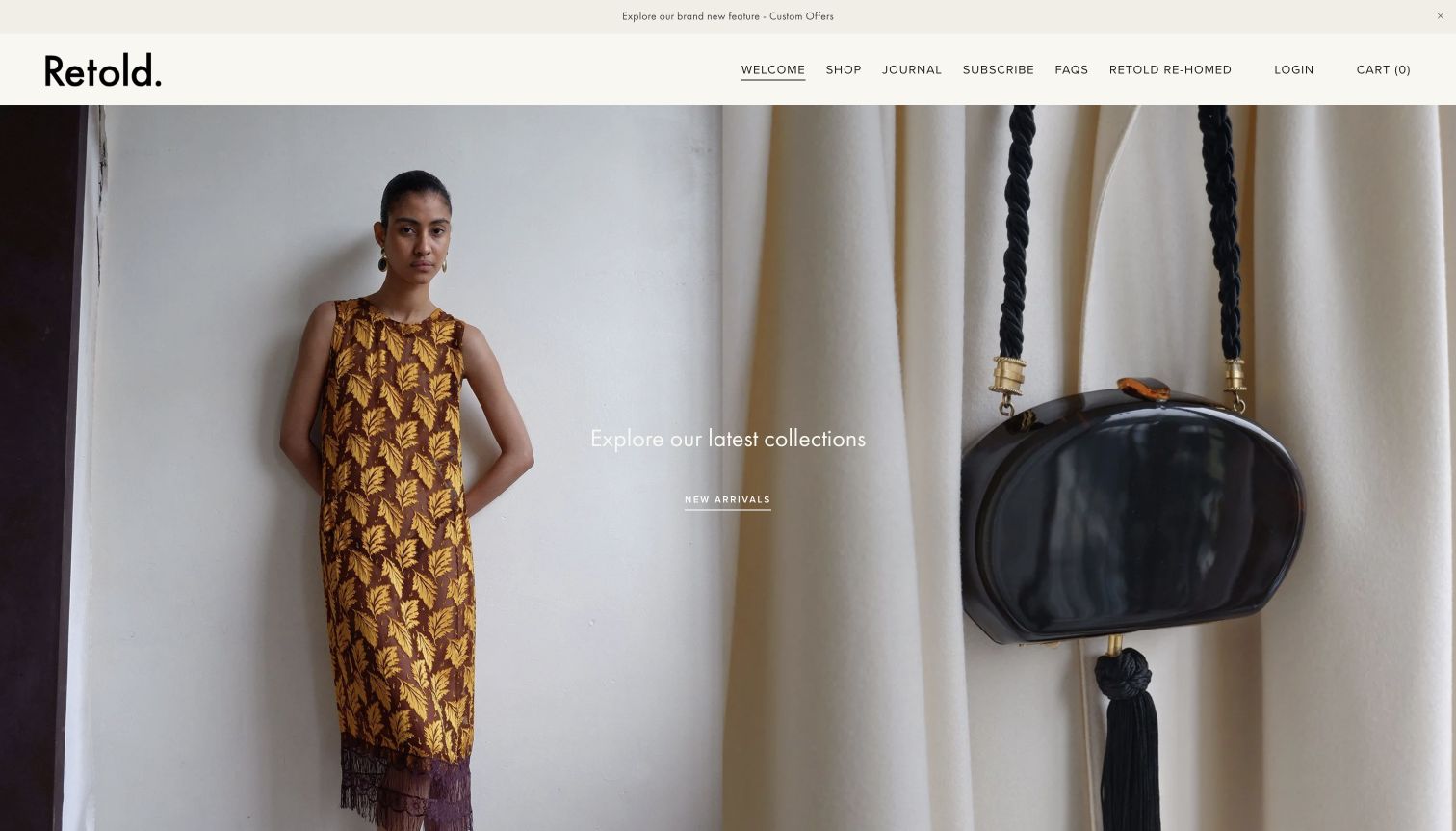
Retold Vintage presents its latest collection through two complementary photographs: a styled garment and a close detail of an accessory. A cream header, restrained wordmark and compact navigation keep the image treatment prominent. Shop and Journal sit beside FAQs and Retold Rehomed, separating browsing, editorial context and the resale proposition without a crowded mega menu. The observed product material includes designer or year references and clear sold states, useful details for stock that cannot simply be replenished. The homepage feels more like a small fashion editorial than a discount shop. Its subtle overlay text is attractive, though the shopping invitation is less forceful than the photography.
What you can learn
Pair an evocative styled photograph with a closer detail so visitors can appreciate both the outfit and the object. Preserve the quiet aesthetic through clear typography, but keep collection links visibly actionable against changing image backgrounds.
Pros
Complementary photographs communicate both styling and material character.
A concise menu keeps shopping, editorial content and FAQs distinct.
Cons & considerations
Small white calls to action depend on image contrast for visibility.
A first-visit newsletter prompt can interrupt the otherwise calm introduction.
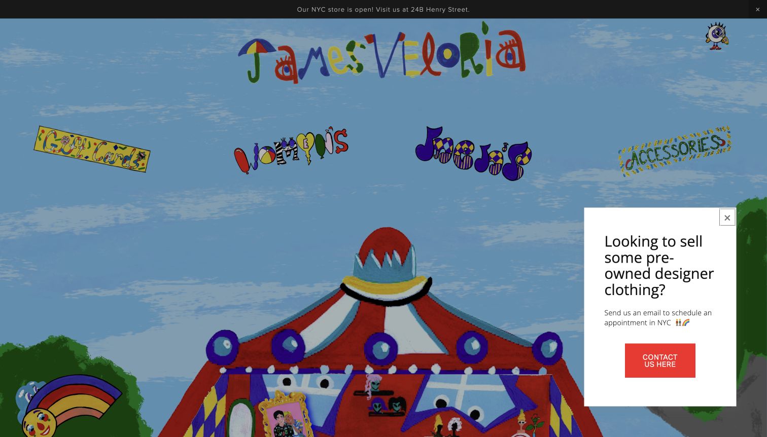
James Veloria introduces its shop through an illustrated scene rather than a conventional photograph of clothing. A pale blue sky, rainbow and hand-drawn lettering turn the opening page into a distinct visual world. Women, men, accessories and gift cards are embedded within that identity, while the New York store information appears in a contrasting dark strip. The result is memorable and strongly authored, but it asks visitors to recognize illustrated navigation instead of scanning a familiar product grid. A selling invitation also occupies part of the lower corner. This is an identity-led example whose usefulness lies in the relationship between artwork and navigation, not immediate garment comparison.
What you can learn
A distinctive illustration can function as a storefront when each route remains legible and descriptive. Keep an equally clear text-based shopping path available, and separate selling inquiries from the primary buying journey so the two tasks do not compete.
Pros
Original illustration gives the shop a readily identifiable visual personality.
The store address adds a concrete destination to an expressive introduction.
Cons & considerations
The initial screen offers little direct evidence of individual garments.
Illustrated labels and the selling prompt create competing entry points.
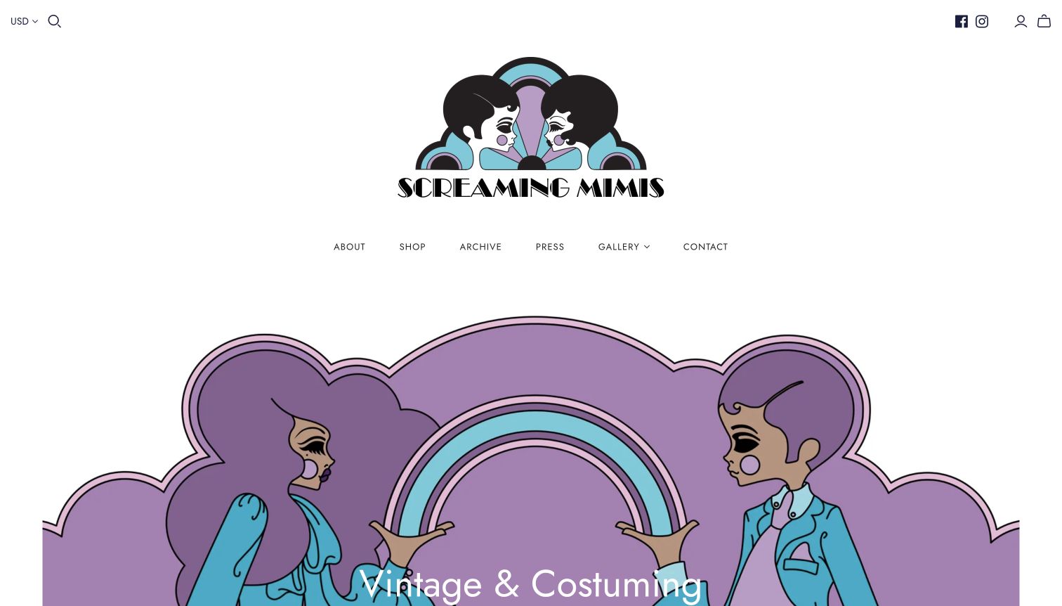
Screaming Mimis uses a purple illustrated figure and a generous white field to establish a theatrical personality. The prominent vintage-and-costuming message helps distinguish the shop from a general resale retailer. Its navigation separates Shop, Archive, Press, Gallery and Contact, which is particularly useful when visitors may be buying clothes, researching an aesthetic or sourcing for a production. The source describes film, television, theater and special-event uses, but the design review does not treat those descriptions as a service guarantee. In the first view, branding and illustration take priority over merchandise. That makes the specialty clear while leaving current stock for a subsequent browsing step.
What you can learn
When a shop serves both ordinary buyers and creative professionals, give those activities separate, named routes. An archive or gallery can communicate range, but should not be mistaken for the collection currently available to purchase.
Pros
The illustrated identity reinforces a clear vintage and costuming specialty.
Archive and shop links distinguish reference browsing from retail browsing.
Cons & considerations
A large branding area delays access to specific garments and prices.
The opening artwork needs supporting text for visitors unfamiliar with the shop.
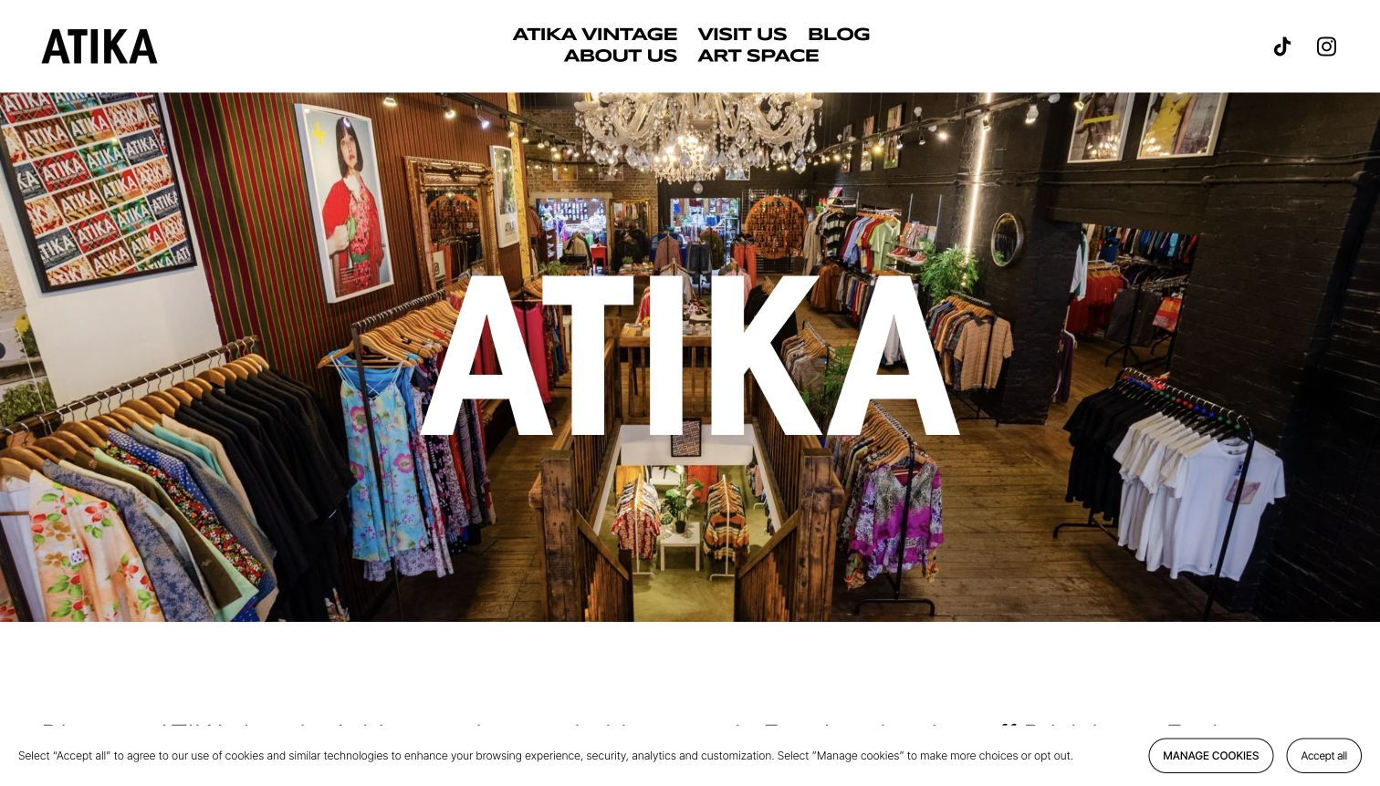
ATIKA London puts the interior of its shop behind a huge white wordmark, immediately making the physical environment the subject of the homepage. Clothing rails, shelves and architectural details convey a browsing destination more effectively than an abstract fashion image would. The header provides Visit Us, About Us, Blog and Art Space alongside the vintage identity, making clear that the business has more than an online catalog to discuss. The source describes categories such as denim, designer pieces and Y2K clothing, but those are not item-level stock promises. The opening screen is useful for understanding atmosphere; practical trip planning still requires the dedicated visit route.
What you can learn
For a destination store, show an honest interior and make the visit link unmistakable. Follow the image with current opening information, access details and an explanation of how the physical inventory relates to anything sold online.
Pros
A real interior photograph gives visitors a sense of the shopping environment.
The dedicated visit and art-space routes express the store’s broader uses.
Cons & considerations
The oversized wordmark covers some of the very interior being introduced.
A multi-line header and consent controls add density around the hero.
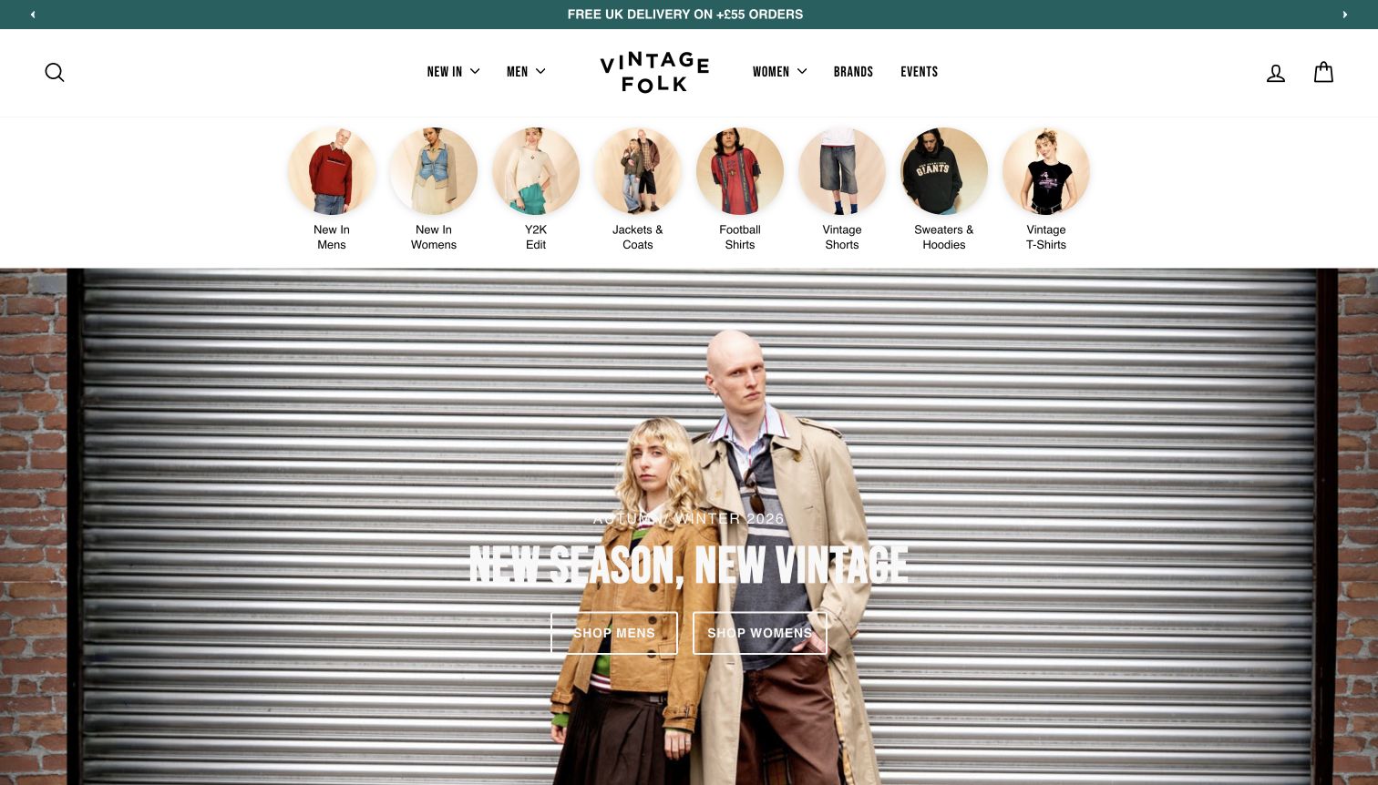
Vintage Folk places a strip of circular category photographs above its seasonal campaign. New arrivals, jackets, football clothing, shorts, sweaters and T-shirts become visually recognizable destinations before the visitor reaches the large model photograph. Men, Women, Brands and Events remain available in the main header, alongside search. This ordering is useful for a broad vintage assortment: shoppers can either choose a practical category immediately or browse through the seasonal styling message below. The observed autumn-winter campaign gives the site a current editorial frame without replacing those everyday routes. The many small shortcuts do compete for attention, but they are grounded in actual clothing categories rather than promotional slogans.
What you can learn
Place high-demand categories where returning shoppers can reach them without crossing a long campaign. Use small, consistent images to aid recognition, then keep the larger editorial area for people who want styling inspiration before choosing an item.
Pros
Photographic category shortcuts make common clothing types easy to recognize.
The seasonal image complements rather than displaces the main shopping routes.
Cons & considerations
Numerous circular links create a dense band on the opening screen.
Small category labels need enough space and contrast at narrower widths.
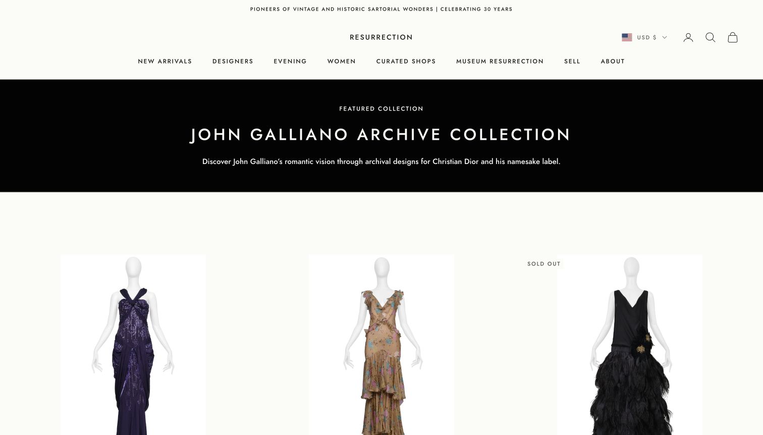
Resurrection Vintage introduces a John Galliano archive collection with a short contextual heading followed by large mannequin photographs. A restrained cream header and spacious layout let the garments’ cuts and surfaces dominate. The navigation separates designers, eveningwear, curated shops and Museum Resurrection, giving shoppers several ways to understand the assortment. Product titles in the source carry more specific designer and period information, while sold-out labels distinguish availability within the display. This is a strong example of bringing fashion-history context into a retail page without turning every card into a long essay. The initial newsletter dialog was intrusive, so the retained capture shows the collection after it was dismissed.
What you can learn
Use collection-level context to explain why garments belong together, then make each item’s status and identifying details easy to compare. Keep museum or reference material distinct from purchasable stock, especially when both use similar photography.
Pros
Large, consistent mannequin photographs emphasize silhouette and construction.
Designer, curated-shop and museum routes support different browsing intentions.
Cons & considerations
The opening signup dialog interrupts the first view of the collection.
Sparse introductory copy leaves authentication and condition details to item pages.
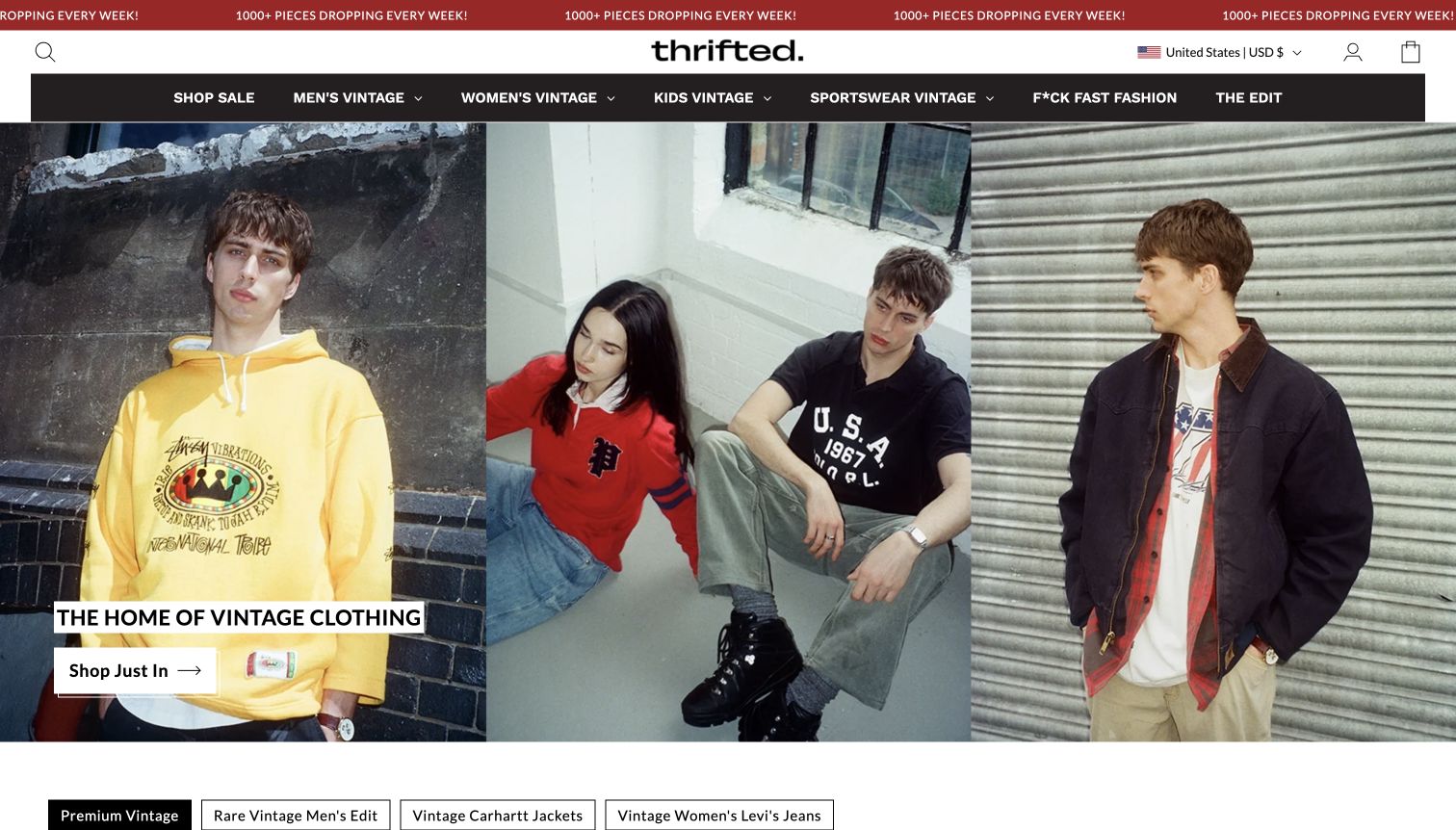
Thrifted opens with three adjacent street-style photographs and a clear shopping button, using the campaign to establish an accessible fashion tone. The navigation then broadens the offer into men, women, kids, sportswear, sale and editorial content. Product records exposed in the source include brand, garment description, size and price, which matter more to a purchase decision than the broad opening slogan. The design balances a large catalog with a single visible starting action. Its promotional ticker and strongly worded campaign links add energy, but also create extra reading before someone can assess a particular item. The review concerns that visible retail structure, not unverified environmental outcomes.
What you can learn
Give a large secondhand shop a clear first action, then preserve precise information on every product card. Campaign language can communicate attitude, but material, size, condition and availability need their own factual, easily scanned presentation.
Pros
The three-part photograph supplies varied styling within one coherent opening.
Specific category routes support shoppers with an existing garment in mind.
Cons & considerations
Promotional strips and editorial slogans compete with basic shopping information.
A campaign-first screen cannot show individual condition or fit by itself.
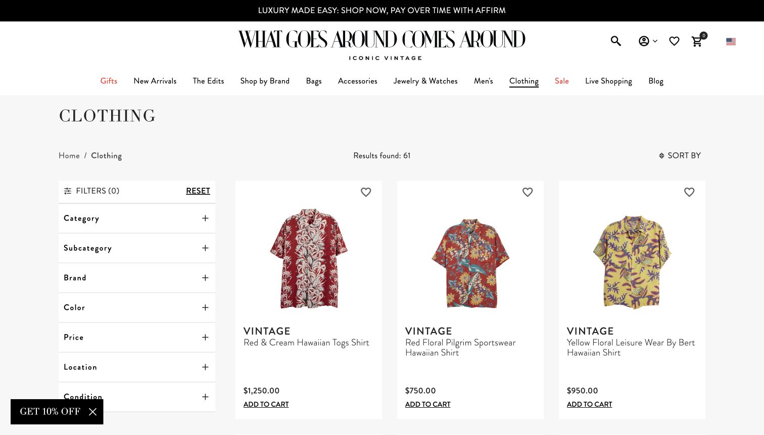
What Goes Around Comes Around provides a particularly practical reference on its clothing collection page. A persistent filter column sits beside a clean product grid, offering category, brand, color, price, location and condition choices. The visible result count and sorting control explain the scope of the current list. Individual cards name the item and show a price, while restrained white backgrounds keep the garments readable. This captured page is the clothing catalog, not the brand homepage, and its value is that more focused comparison interface. Some purchase controls appear directly on cards, but the review does not imply that checkout or availability was tested.
What you can learn
For a specialist assortment, expose the filters that answer actual buying questions rather than simply copying a generic fashion menu. Condition deserves the same visibility as price or brand, while item pages should still carry the full evidence and measurements.
Pros
The sidebar keeps practical narrowing options visible beside the results.
Clear names, prices and a result count make the catalog easy to scan.
Cons & considerations
A long filter column can require substantial vertical scanning.
Small floating promotions distract from the otherwise restrained comparison layout.
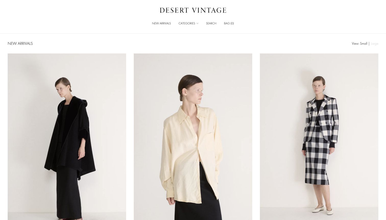
Desert Vintage’s new-arrivals catalog uses very large model photographs against a consistent pale backdrop. The first row presents distinctly different garments without surrounding them with badges, campaigns or dense descriptions. A centered wordmark and brief navigation keep attention on the clothing, while small and large view controls acknowledge different browsing preferences. Product names in the source identify designers or garment types and show prices and sold states. The retained capture is the new-arrivals page, which is more informative for this comparison than the initial homepage view. Its simplicity is compelling, although shoppers must look below the large images for essential textual details.
What you can learn
A consistent setting can make a varied vintage assortment feel coherent without making the clothes look identical. Pair that visual discipline with accessible titles, prices and availability close to each image, and offer a denser view for purposeful shoppers.
Pros
Repeated backdrops and generous photographs make silhouettes easy to study.
View-size controls support both leisurely discovery and faster scanning.
Cons & considerations
Large image cards push prices and titles beyond the first viewport.
Minimal navigation gives less immediate help to shoppers filtering by fit or era.
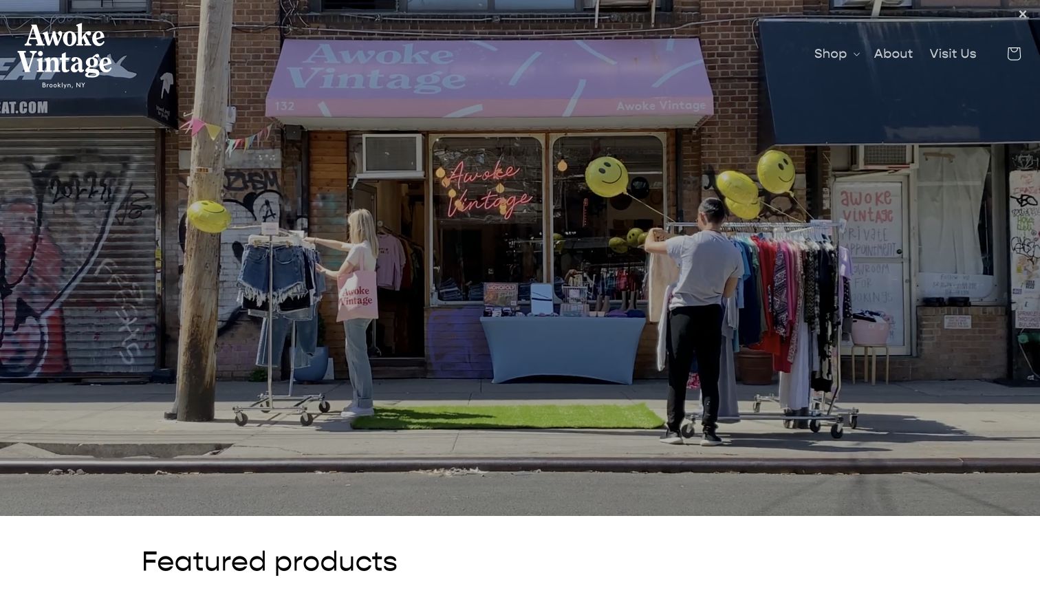
Awoke Vintage opens with a photograph of its pink-awning storefront and clothing racks on the sidewalk. The scene communicates a neighborhood shopping experience, while Shop, About and Visit Us keep the main choices uncomplicated. Featured products follow the opening image, providing a transition from atmosphere to individual items. The public source mixes vintage denim with other merchandise and smaller brands, so the site should not be read as a promise that every listed object is vintage. That distinction is useful for shops with a similarly mixed offer. The large exterior photograph gives the business a tangible identity, but leaves item-level details for the next section.
What you can learn
A real storefront can establish place more convincingly than a generic lifestyle image. Explain mixed inventory clearly, and make each product’s category explicit so customers can distinguish vintage garments, reprints and newly made accessories without guessing.
Pros
The shopfront photograph gives the brand a concrete neighborhood setting.
A simple visit route connects the imagery to practical store discovery.
Cons & considerations
The image-heavy opening postpones product names, sizes and prices.
Mixed stock requires clear labeling to avoid treating every item as vintage.
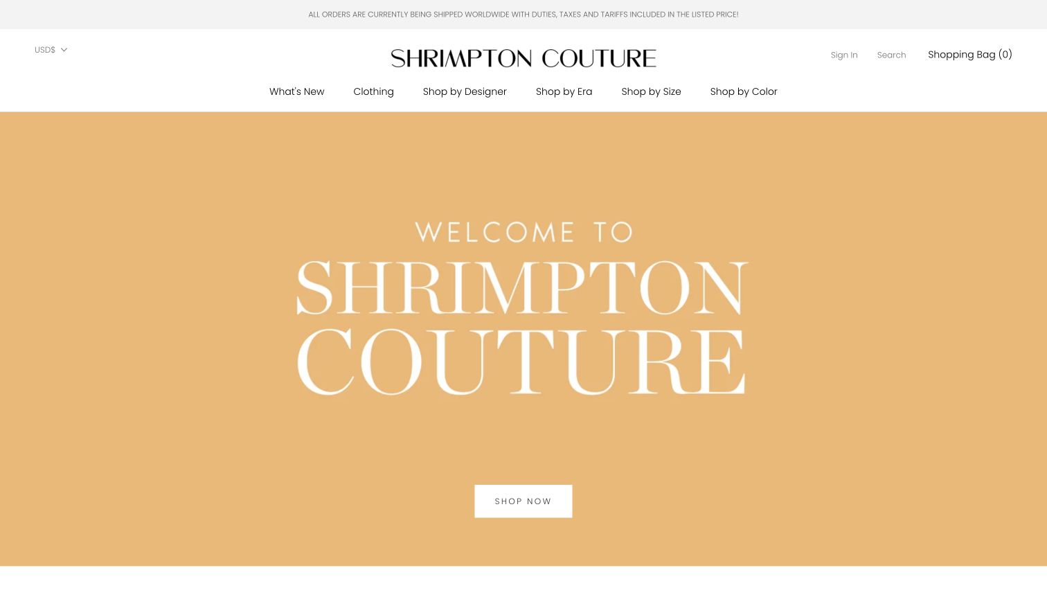
Shrimpton Couture combines a large gold-toned welcome panel with a much more specific shopping navigation. Visitors can choose clothing, designer, era, size or color rather than relying on a single stream of new arrivals. The source also exposes highly descriptive item titles with designer and collection context, which suits a catalog where superficially similar dresses may have very different histories. The opening panel itself is dominated by typography and a Shop Now button, so it says more about the store’s identity than any particular garment. The most transferable idea is the set of browsing dimensions in the header, not the amount of space devoted to the welcome message.
What you can learn
Organize specialist vintage around the questions customers already bring: designer, period, fit and color. Preserve precise item titles, but pair them with readable summaries so historical context does not overwhelm basic condition and measurement information.
Pros
Designer, era, size and color routes reflect meaningful vintage-shopping tasks.
Detailed item naming gives the catalog more context than a generic product feed.
Cons & considerations
The large welcome panel shows little actual inventory above the fold.
Long historical titles need careful formatting to remain easy to compare.
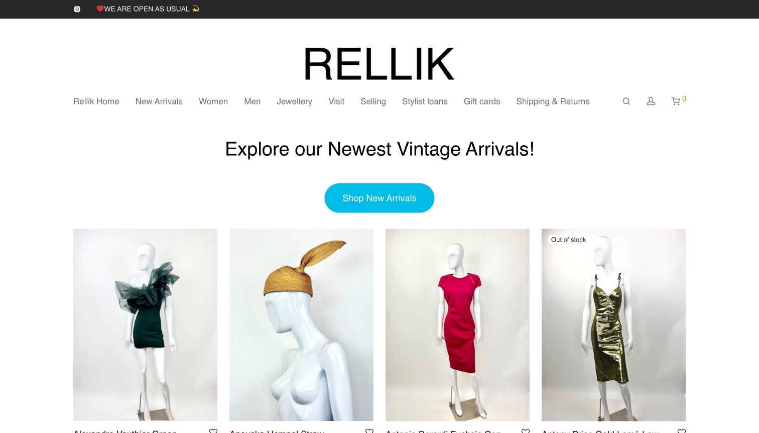
Rellik introduces its newest vintage arrivals with a plain heading, a bright cyan button and a four-column row of mannequin photographs. The images are large enough to distinguish a sculptural dress, a hat and contrasting eveningwear before opening individual records. Above them, navigation includes Visit, Selling, Stylist loans and Shipping & Returns as well as the ordinary shopping categories. That gives different audiences a direct route without making the homepage explain every service at length. An out-of-stock label is visible on one card, an important distinction for unique pieces. The very large wordmark and generous spacing make the opening calm, though they also consume substantial vertical room.
What you can learn
Show actual new stock early and name specialist tasks plainly. Selling to the shop, borrowing for styling and purchasing are different journeys; keeping their links distinct is clearer than placing every inquiry behind one generic contact button.
Pros
Large mannequin photographs make individual silhouettes immediately comparable.
Service-specific links support buyers, sellers and styling professionals separately.
Cons & considerations
The oversized identity and spacing delay the complete first product row.
Stock-status labels need to remain conspicuous against varied product photography.
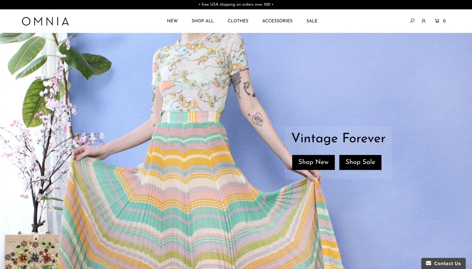
Omnia places a brightly patterned outfit against a pale lavender background, using the garment’s color and movement as the main visual attraction. A restrained wordmark and a short menu for New, Shop All, Clothes, Accessories and Sale keep the frame deliberately simple. Two dark buttons distinguish new stock from markdowns without a complicated promotional hierarchy. The footer exposes a fit guide, shipping and returns information and an archive, which are useful companions to one-off clothing. The retained image follows dismissal of a newsletter flyout; that interruption illustrates how easily a large signup panel can cover a carefully composed hero. The underlying page is otherwise direct and visually coherent.
What you can learn
Let the clothes supply the color and keep shopping controls visually stable. Make new arrivals and sale stock separate, while giving measurement guidance and return information permanent links that do not depend on a campaign or popup.
Pros
The styled image communicates a clear taste without an overloaded header.
New-stock and sale buttons give the opening view two understandable actions.
Cons & considerations
The initial newsletter flyout can obstruct the main shopping buttons.
Fit guidance is available, but not prominent within the first screen.
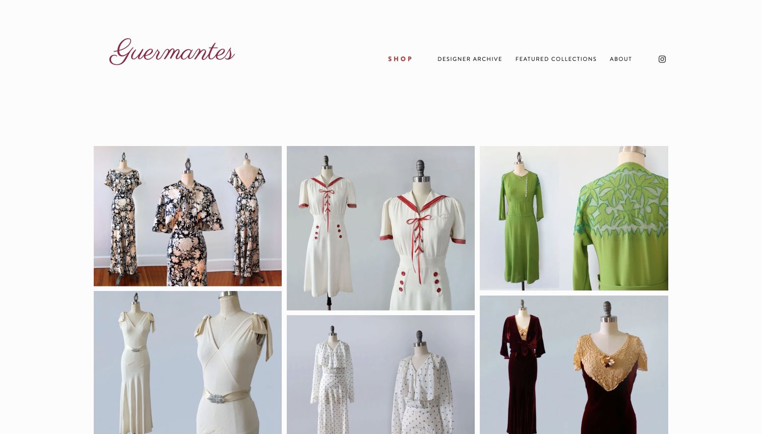
Guermantes Vintage’s 1930s–1940s dress page presents a masonry-like arrangement of garment photographs and detail views. The restrained script identity and white background leave room for differences in cut, fabric and decoration. Descriptive image labels identify periods and features such as appliqué, velvet, lace or capelet sets. Some entries link out to Etsy listings, so this page functions as an archive and discovery surface rather than a self-contained current-stock checkout. That distinction matters: an attractive historical collection should not be presented as a live availability promise. The page is most useful for studying how a narrowly defined specialty can be communicated through image grouping and carefully named categories.
What you can learn
Give specialist archives clear period labels and distinguish reference pieces from stock for sale. Detail images can explain construction or decoration, but visible captions and explicit destination labels help visitors understand what they are seeing and where a click leads.
Pros
Period-specific grouping gives the archive a focused curatorial purpose.
Multiple views reveal details that a single front-facing photograph would miss.
Cons & considerations
Availability and prices are not established by the gallery itself.
External marketplace links make the purchasing journey less continuous.
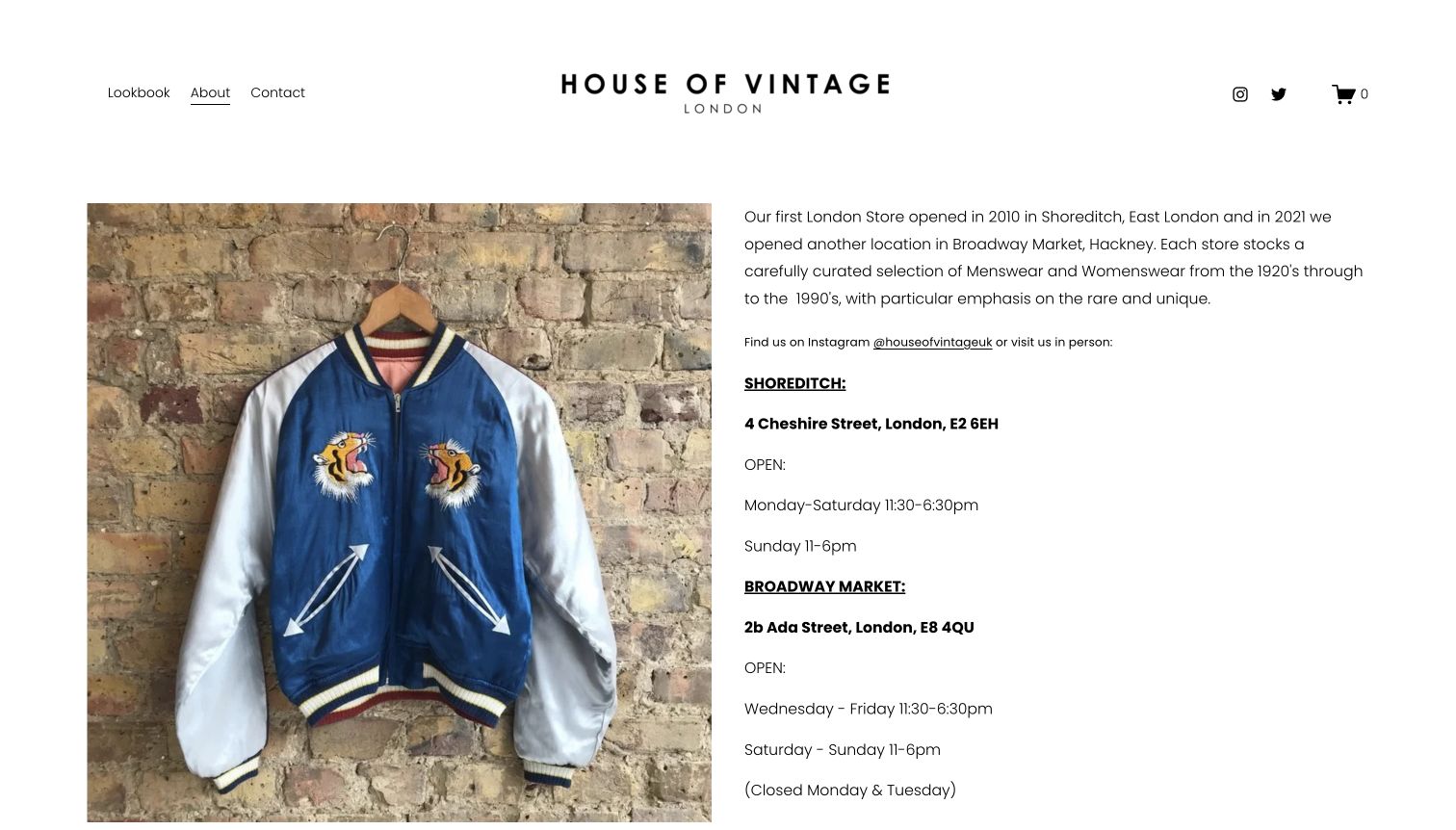
House of Vintage’s About page places a large embroidered jacket photograph next to a concise account of its London stores. The text identifies the clothing’s broad period range, then separates the Shoreditch and Broadway Market addresses and opening schedules under clear labels. A simple header keeps Lookbook, About and Contact visible. This is a useful store-information page rather than an online catalog: the garment supplies visual character while the adjacent copy answers practical visit questions. It avoids burying both locations in a generic footer. The long right-hand column does need scrolling, especially for the second store, and the page offers no immediate comparison of available stock.
What you can learn
Pair a representative item with factual location information when visits matter more than online checkout. Give every branch its own address and schedule, and make clear whether a lookbook shows current stock or simply illustrates the shop’s style.
Pros
The image and explanatory text work together without a large promotional detour.
Separate branch labels make addresses and opening schedules understandable.
Cons & considerations
The second location’s complete details extend below the initial viewport.
Visitors cannot determine individual item availability from this page alone.
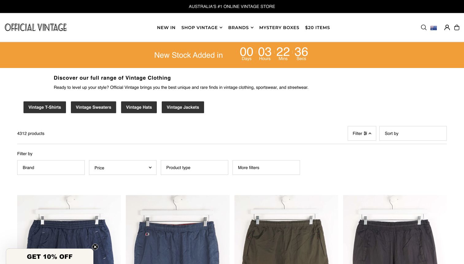
Official Vintage’s complete catalog opens with a short clothing introduction and shortcuts to T-shirts, sweaters, hats and jackets. Beneath it, the page exposes a result count, sorting control and a horizontal filter row for brand, price, product type and additional attributes. Product titles include garment names and sizes, and the currency is shown explicitly. The retained screenshot follows dismissal of a discount signup overlay, leaving the actual browsing interface visible. A bright countdown to new stock gives the page energy but also occupies valuable space before the first row of garments. This is a useful catalog-structure example, independent of the site’s own promotional ranking claims.
What you can learn
For a large one-off assortment, place useful filters near the results and include size in concise card titles. Keep stock-drop promotions secondary to the controls that help people find something wearable now, and label currency consistently.
Pros
Visible filters and category shortcuts make a broad assortment easier to narrow.
Product titles and currency labels provide useful purchase context.
Cons & considerations
The stock countdown consumes space before the first garment row.
A discount popup initially obscures the catalog and filtering controls.
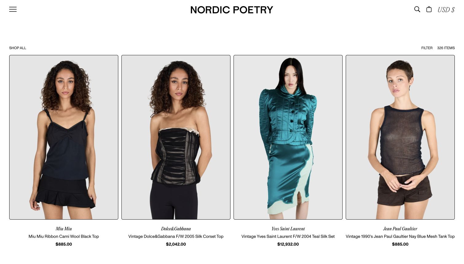
Nordic Poetry’s Shop All page uses four large, similarly framed model photographs across a clean white layout. Each card separates the designer name from the garment title and price, making it possible to compare pieces without opening every record. The sparse header includes search, bag and currency controls, while a compact filter control sits beside the result count. The source navigation also distinguishes the archive and rentals from purchasable clothing, which is important when a business uses fashion-history material alongside retail inventory. The captured catalog is more restrained than a campaign homepage: the garments carry the personality, and the repeated card structure provides the order.
What you can learn
Use a consistent image ratio and a stable information hierarchy for designer pieces. Separate designer, descriptive title, period and price rather than combining everything into one difficult-to-scan line, and label rental or archival material distinctly from sale stock.
Pros
Consistent model photography makes silhouette and styling easy to compare.
Designer names, item descriptions and prices have separate visual roles.
Cons & considerations
The compact filter entry offers little immediate explanation of available refinements.
Large photographs reduce the number of items visible in one screen.
Kegan is a freelance web designer and developer with 15+ years of experience helping businesses turn complicated website requirements into clear, maintainable digital experiences. He works directly with clients from planning and design through development, launch, and ongoing support.
For vintage clothing store website design, his development approach focuses on vintage clothing store websites that present one-off garments with useful sizing, condition details, availability and clear purchase or store-visit routes. The scope can be a targeted improvement or a complete custom build, with responsive layouts, thoughtful content structure, and integrations chosen around the people using and maintaining the site.
Show 3 other vintage clothing store website designersHide other vintage clothing store website designers
Plan a vintage clothing website around one-off inventory
Agree on the garment record before designing the storefront
Choose the fields that make an item usable online: stock reference, descriptive title, category, measurements, material, condition, current status and photographs. Add a designer or period attribution only when it is supported, and preserve uncertainty in the wording. A theme cannot compensate for incomplete or inconsistent item records.
Create a repeatable measurement method for the garments you actually sell. Show the relevant chest, waist, length or rise information, with a short explanation of the method and units. Separate the original label size from your measurements so shoppers can compare the piece with something they already own.
Decide how wear, repairs and alterations will be photographed and described. Detail images should make the text easier to assess rather than hide flaws behind styling. For specialist designer stock, keep provenance and authentication statements specific to the evidence available for that item.
Build two clear journeys: shopping online and visiting the store
For online browsing, start with categories that match customer language and the actual assortment. A small shop may need only new arrivals, clothing and accessories. A larger collection can support more detailed filters, but those filters should narrow the results meaningfully instead of creating dozens of near-empty pages.
For physical visits, make the current address, opening schedule and appointment requirements easy to find. Explain whether online and in-store stock are the same and whether a customer can arrange to see a particular garment. A shopfront photograph creates interest, but cannot answer these operational questions alone.
Keep buying, selling to the shop, styling loans and rentals separate where those services exist. Each route needs an accurate explanation of the next step. Avoid presenting an inquiry as a confirmed hold, or an archive photograph as an invitation to purchase the pictured piece.
Make stock changes a normal editing task
Assign responsibility for photographing new pieces, checking descriptions and updating availability. One-off stock can become misleading quickly when a sale in one channel is not reflected elsewhere. Establish the workflow before adding countdowns, scheduled drops or repeated promotional campaigns.
Preserve useful item URLs after a sale, with a clear sold state and a relevant route back to available clothing. If a piece moves into an archive, explain that change rather than silently leaving a purchase control in place. Do not let a sold-out collection dominate search results for current stock.
Review the first real inventory cycle with the people who use the editor. Check how long it takes to add measurements, replace a photograph and mark an item sold. Fix repetitive workarounds in the content structure instead of solving each new garment with a custom page.
The editing job behind the design
Choose tools that suit changing, single-piece stock
An online store needs inventory behavior that handles one-off items and any physical sales channel coherently. A store-led website may need only a manageable catalog, clear visit information and an inquiry route. Decide the operating model before choosing the most visually elaborate theme or adding optional integrations.
Ask how staff will publish multiple garment photographs, enter measurements, distinguish sold records and maintain filters. Useful features include structured fields, image resizing, descriptive alternative text and stable product URLs. Test these ordinary editing tasks with real pieces from the shop rather than an idealized demonstration catalog.
The technology evidence attached to these examples describes a bounded public-page sample. A visible script, font or delivery service does not establish every system behind the store, and an inaccessible response does not justify a guess. Choose a platform for the shop’s verified requirements and editing capacity, not because another retailer appears to use it.
Our WordPress website examples offer a separate look at publishing approaches. A visible platform label is evidence for that named page, not a guarantee that the same system will suit your requirements.
Before the public launch
A vintage clothing website launch checklist
Every listed garment has a stable stock reference and a descriptive title.
Measurements state their units and the method used, separately from the original label size.
Condition notes identify relevant wear, repairs or alterations clearly.
The photographs show the actual item, including useful detail and honest color where possible.
Vintage, reworked, reproduction and newly made merchandise are labeled distinctly.
Designer, period and material claims are supported or explicitly qualified.
Available, reserved, sold, rental and archive states cannot be confused.
Category and filter choices correspond to consistently maintained inventory fields.
Shipping, collection and return information is easy to find before a purchase decision.
Store addresses, opening times and appointment instructions agree wherever they appear.
Navigation, controls, image descriptions and contrast work for the actual implementation.
Staff can publish a garment and change its availability without an improvised workaround.
These checks are a project checklist, not a performance, legal, security, or accessibility certification. Test real journeys with the people responsible for the website before making claims about the result.
Sources & editorial method
How this collection was selected and reviewed
We reviewed these 23 public vintage clothing websites on November 11, 2026, using their actual homepage or the explicitly labeled catalog, archive or store-information page. The comparison focuses on garment photography, browsing structure, useful item context and practical shop information. Wayward Collection is the Editors Choice for its restrained garment presentation, specific item naming and clear shop and visit routes. This is an editorial website-design selection, not a verification of every garment, an authentication service or an endorsement of retail service quality. Public technology checks are limited to the sampled page and accessible supporting resources; unknown or blocked details remain unclaimed.
Each example links to its actual source page. Screenshots are direct browser captures with their own capture dates; moving imagery, announcements and live designs can change. The notes describe observable design choices and conditional tradeoffs, not measured traffic, conversion results, service quality, or accessibility conformance.
Technology labels use public page metadata, asset evidence, or explicitly cited platform documentation. Platform documentation is not a complete current deployment audit. A component reference may be legacy or unused; it is not a complete backend inventory. Unknown stacks are omitted. These sites are editorial examples, not our client portfolio.
Written, Edited and Curated are separate editorial records, not timestamps advanced by a rebuild. Website designs and imagery belong to their owners. See our editorial standards or suggest a correction.
Questions worth asking
Vintage Clothing Store website design questions
What information should a vintage clothing product page include?
Start with clear photographs, a descriptive title, current availability, measured dimensions and condition notes. Explain repairs or alterations and distinguish the original label size from the measurements. Add material, designer or period information only to the extent it can be supported, with shipping or collection details easy to reach.
Should sold vintage pieces stay on the website?
They can remain useful as a clearly labeled archive or styling reference. Remove purchase controls and keep sold pieces separate from available-stock results, or make the filter state unmistakable. Offer a relevant current category instead of implying the original one-off garment can be reordered.
Are styled model photographs better than hanger photographs?
They answer different questions. A styled view helps someone understand silhouette and how a piece might be worn. A clear front, back or detail view can show construction and condition more directly. Use a consistent presentation and retain measurements, since neither photograph establishes fit by itself.
Does a vintage shop need a full online checkout?
Not necessarily. A store-led business may prioritize current visiting information, an informative selection and a clear inquiry process. If customers can pay online, inventory, shipping, collection and return arrangements need to support that promise. State the actual buying process rather than borrowing purchase controls from a different business model.
How should a shop organize a varied vintage inventory?
Begin with garment types and new arrivals, then add accurately maintained filters such as measurements, designer or period when they improve real browsing. Avoid assigning every piece to broad trend labels that mean different things. Keep specialist archives and rentals distinct from ordinary sale stock.
Can reworked and newly made items appear in a vintage store?
A mixed assortment can be presented clearly when every item is labeled honestly. Explain whether a piece is original vintage, altered or reworked, a reproduction, or newly made. Do not let the store’s overall vintage branding stand in for an item-specific description.
Let the garments provide the character. Give each one the photographs, facts and clear status a visitor needs to understand it, then make the route to buying or visiting straightforward.