Best Sylius Websites of 2026 (20 Real-World Examples)
20 public commerce and service properties with documented Sylius associations, genuine screenshots and practical design lessons. Historical projects and backend roles remain explicitly qualified.
The most useful Sylius examples begin with a particular buying problem: choosing a compatible furniture front, finding a school publication, arranging transport or checking a delivery area. Study how each website explains that decision, then define the commerce rules needed to support your own customers.
This collection opens with REISS, HBX, Relais & Châteaux, Dr. Oetker’s Bakken.nl and Corolle. The evidence concerns specific public properties and documented project roles. HBX is the retail site, rather than Hypebeast’s editorial estate; the Relais & Châteaux association page does not establish the systems used by every member hotel.
Sylius is an open-source commerce framework built on Symfony, with a commercial Sylius Plus edition. The documented implementations vary. Office Partner’s case describes a commerce core with a separate frontend, while Bakken.nl’s case assigns Sylius Plus a loyalty and backend role alongside Contentful and Vue.js. Neither relationship means the pictured interface is a standard Sylius storefront or that Sylius is its content-management system.
REISS and E3 retain historical Sylius associations. The current REISS capture is the UK storefront, and the former E3 property now explains its transition into Petrol. Their present appearance does not confirm that the earlier platform remains in use. Throughout the collection, current visual observations and documentary implementation evidence answer different questions.
Before the examples
What makes good Sylius website development in 2026?
Make the customer’s real selection problem understandable
Use the questions that determine a suitable purchase to organize the interface. A compatible cabinet front, an educational title and a motorcycle transport route require different information. Clear category names, search labels and selection prompts should reflect those differences. A large campaign image works best when visitors can still identify the practical next step.
Model the operating context before multiplying storefronts
Sylius configuration distinguishes channels, locales, currencies, countries and zones. Establish which market, language, pricing context and delivery rules your actual business needs before translating those concepts into navigation. A second campaign is not necessarily a new storefront, and a language choice should not conceal a change in the customer’s commercial conditions.
Keep the visible experience and implementation claims precise
Record the exact property and the role described by its source. A separate frontend, loyalty system or historical project can be a valid association without proving a current storefront backend. Make those distinctions readable, and avoid extending one case to sibling brands, private accounts or every website belonging to the same organization.
The collection · 20 examples
20 Sylius website examples worth studying
Compare the visible decisions: department entrances, task-led search, compatibility guidance, regional context and service conditions. Each example’s source note describes the supported Sylius association. The sequence is an editorial reading order, not a performance ranking or an award for the technology.
We start with five recognizable brands or organizations: REISS, HBX, Relais & Châteaux, Dr. Oetker — Bakken.nl, Corolle. Each attribution applies to the named website property, not every product or website belonging to its organization. This is a curated reading sequence, not a measured ranking.
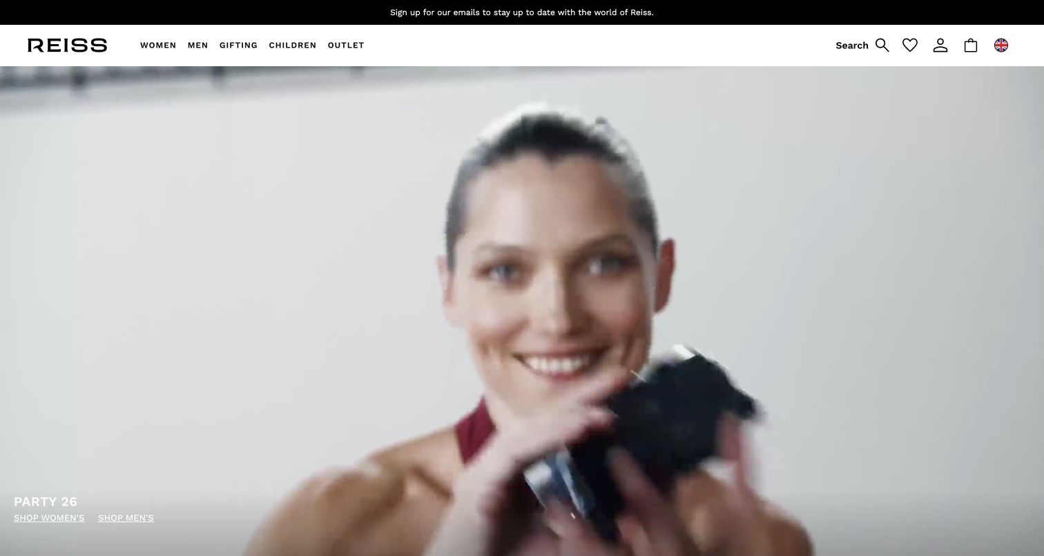
REISS gives its partywear campaign almost the entire opening screen. A monochrome film still sits beneath a compact white header, with small shopping links anchored at the lower left. Women, men, gifting, children and outlet remain legible across the top, while search and account tools occupy the opposite side. The result feels like a fashion editorial with shopping routes attached, rather than a grid of competing offers. New arrivals and more literal product categories appear further down the page. The official Sylius showcase and Inviqa reference document an earlier implementation; this current UK storefront capture does not establish that the same commerce platform remains in use.
What you can learn
Let a campaign own the imagery while permanent navigation does the practical work. Keep the action labels readable against every film frame, and provide a motion-independent route to the same products for visitors who prefer to browse directly.
Pros
The restrained header preserves recognizable category choices.
Search remains visible without competing with the campaign.
Cons & considerations
Small white hero links depend on image contrast.
Motion can distract from the limited explanatory copy.
Platform source: Official Sylius exact-property project case. The official Sylius showcase and Inviqa partner reference document an earlier REISS online-store implementation. The reviewed property is the current REISS UK storefront. Its current public audit observes ASP.NET/IIS and React references; continued use of Sylius is not independently confirmed. Platform evidence is separate from the direct website screenshot and is not a complete current infrastructure audit.
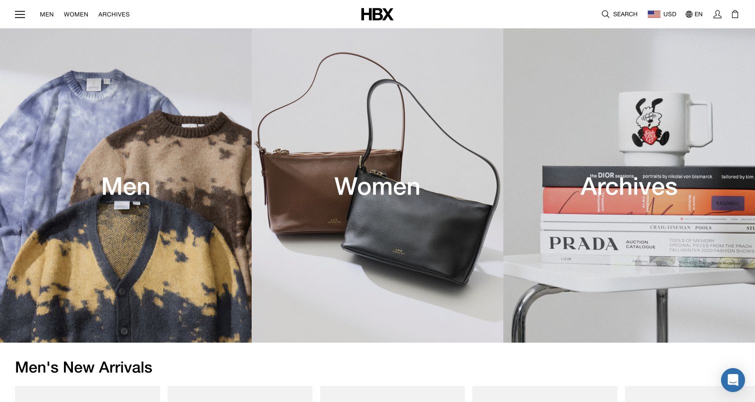
HBX opens with three equal photographic panels for men, women and archives. Each image makes its department tangible: folded clothing, leather bags and lifestyle objects establish different browsing moods without a paragraph of explanation. The centered wordmark and narrow utility bar leave most of the viewport to those choices. Below, new-arrival rails introduce recognizable product names, prices and stock-related labels. This is an effective bridge between editorial curation and an extensive retail catalog. The public property is HBX, the Hypebeast-associated store, and the Sylius evidence concerns that commerce operation. It does not establish the platform behind Hypebeast’s news and editorial websites.
What you can learn
When a catalog serves several shopping modes, begin with a few meaningful doors and follow them with literal products. Give each doorway a clear destination and avoid making shoppers understand the internal merchandising taxonomy before they can start.
Pros
Three balanced panels make the opening decision manageable.
New-arrival cards introduce prices and specific product names.
Cons & considerations
The large images postpone detailed product information.
Archives may need explanation for visitors unfamiliar with the store.
Platform source: Official Sylius exact-property project case. Official exact HBX retail-property showcase, not the Hypebeast media estate. Platform evidence is separate from the direct website screenshot and is not a complete current infrastructure audit.
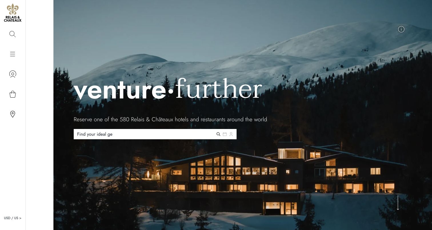
Relais & Châteaux places a snowy mountain property behind a broad invitation to explore. A slim vertical rail carries the identity and utility icons, leaving the landscape and central search field as the main composition. Further down, travel inspiration, gift boxes and regional destinations offer several ways to begin without already knowing a hotel name. The photography communicates atmosphere, while the supporting navigation exposes the breadth of the association. Some essential functions rely on icons rather than persistent text labels. Sylius’s earlier showcase links this exact public association property; that documentary relationship is not evidence that every independently operated member hotel or private reservation system uses the same platform.
What you can learn
Pair evocative destination imagery with a concrete discovery tool. Offer inspiration and geographic browsing for undecided travelers, but make the meaning of utility icons clear so the elegant frame does not make basic tasks harder to locate.
Pros
The search field has a prominent position within the hero.
Regional and thematic routes support different travel intentions.
Cons & considerations
Icon-only utilities require interpretation before use.
Large photography leaves limited opening space for practical conditions.
Platform source: Official Sylius exact-property project case. An earlier official Sylius showcase links the exact Relais & Châteaux association property. The current review is its US public entry, not independently operated member-hotel sites or private reservation systems. Current Sylius backend use is not independently confirmed. Platform evidence is separate from the direct website screenshot and is not a complete current infrastructure audit.
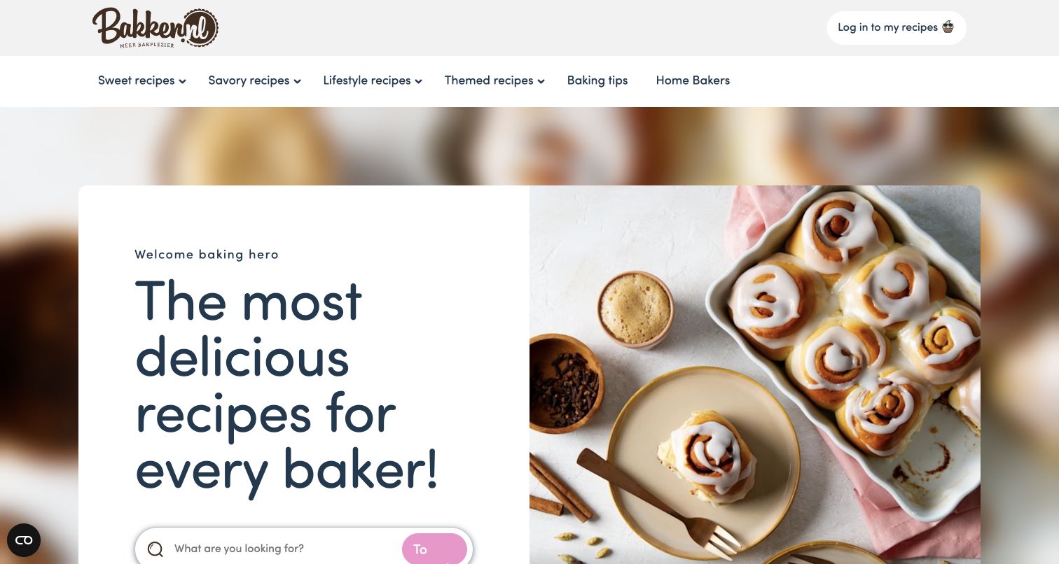
Bakken.nl introduces itself with a generous recipe photograph beside a welcoming headline and search field. The navigation distinguishes sweet, savory, lifestyle and themed recipes, then separates baking tips and the home-baker community. Seasonal rails add difficulty, preparation time and other small decision cues to their recipe cards. This makes the public site useful before someone logs in or joins a loyalty program. The footer identifies the initiative with Dr. Oetker and Koopmans. Sylius’s case describes a loyalty and backend role after the earlier shop changed direction, alongside Contentful and Vue.js; it does not mean the recipe presentation itself is a standard Sylius storefront.
What you can learn
Lead with a useful task that visitors can complete without becoming members. Make recipe categories and search understandable first, then connect optional account benefits to that experience without making participation a prerequisite for finding inspiration or learning a technique.
Pros
Distinct recipe groups support several kinds of baking intent.
Platform source: Official Sylius exact-property project case. The official Sylius case explicitly names Dr. Oetker-owned Bakken.nl and documents Sylius Plus in a loyalty/backend role alongside Contentful and Vue.js. The public recipe page is the reviewed property; this does not establish Sylius as its recipe CMS or as the platform for Dr. Oetker worldwide. Platform evidence is separate from the direct website screenshot and is not a complete current infrastructure audit.
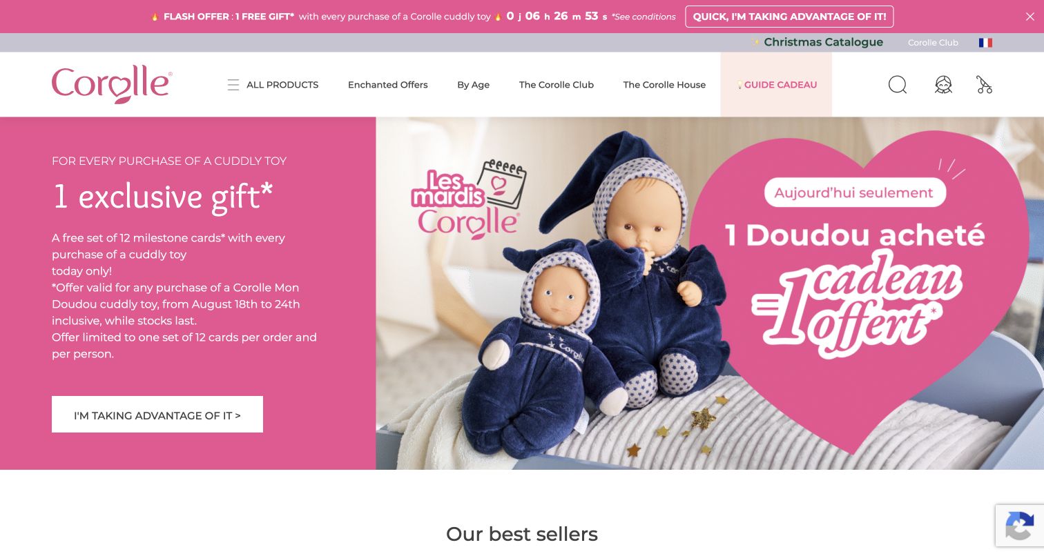
Corolle uses a soft pink palette, doll photography and a wide promotional panel to make its product world immediately recognizable. The header includes shopping by age, the brand club and a gift guide, acknowledging that an adult may arrive with a recipient in mind rather than a product name. Bestsellers below the campaign combine product photography, prices and review links. The opening also shows a maintenance concern: different parts of the promotion carry different date wording, so a visitor must inspect the conditions carefully. The official Sylius case identifies the French brand’s direct store and custom doll configuration work; no configurator, review submission or purchase was exercised here.
What you can learn
Organize gift discovery around the recipient as well as the catalog. Keep promotion dates synchronized across artwork, live copy and terms, and make product differences understandable before asking visitors to enter a more involved customization or checkout flow.
Pros
Shopping by age offers a practical gift-selection route.
The color and photography create a consistent product identity.
Cons & considerations
Promotional timing needs consistent wording across the page.
Several campaign bands compete with the main shopping navigation.
Platform source: Official Sylius exact-property project case. Official case identifies French toy brand D2C store and Sylius-based custom commerce/configurator. Platform evidence is separate from the direct website screenshot and is not a complete current infrastructure audit.
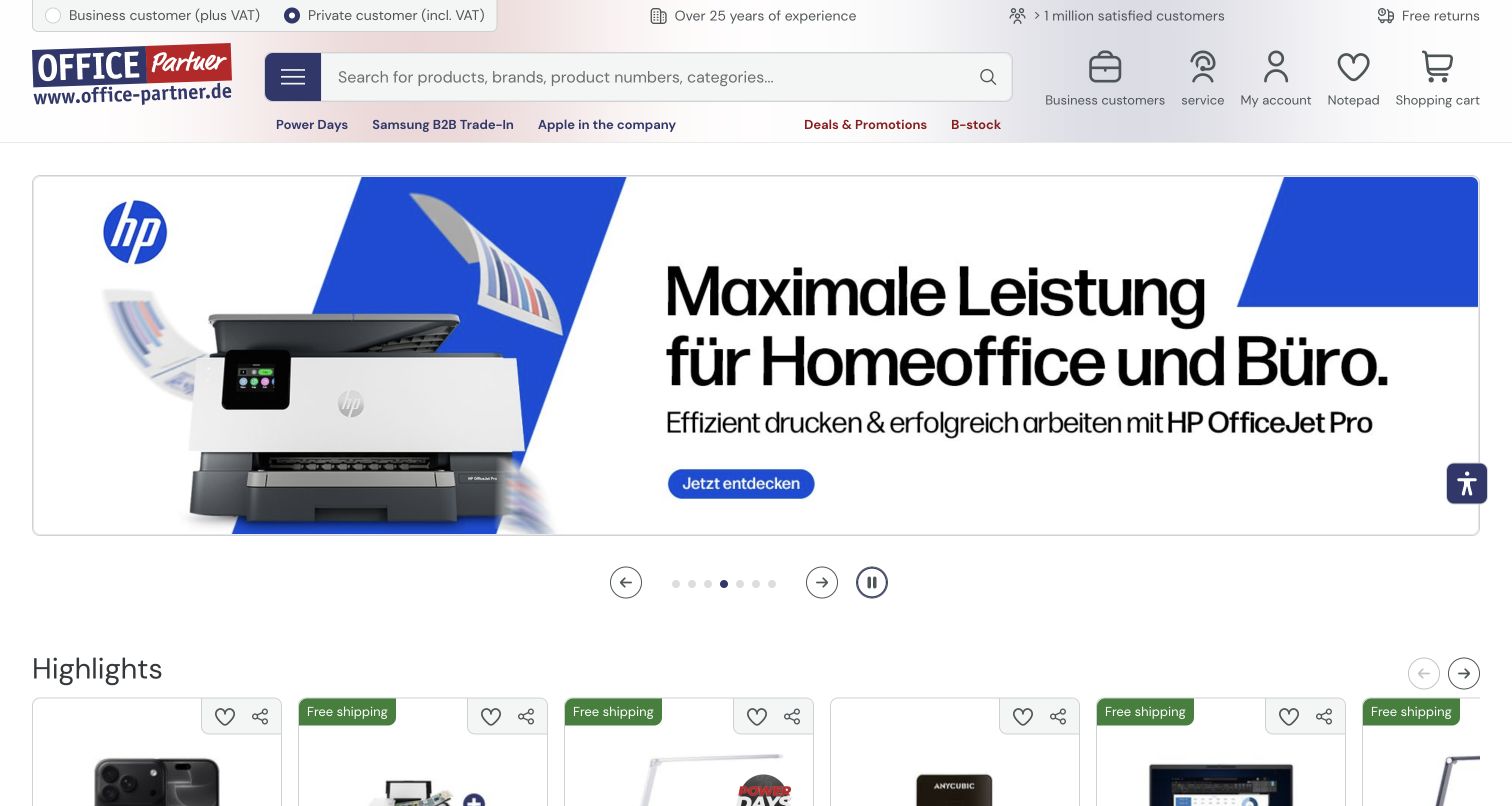
Office Partner makes a large product search field the center of its header. Above it, business and private customer options explain whether displayed pricing includes VAT. Below, campaign shortcuts sit beside service, account, wishlist and basket tools. The main carousel promotes specific equipment families, while a highlights row begins exposing individual products immediately afterward. This approach suits a catalog where visitors may already know a model or part number. The screen is useful but dense, with several layers of navigation and promotional text. The official Sylius case documents a commerce core behind a custom headless frontend, so the visible presentation is not treated as a default Sylius theme.
What you can learn
Clarify the customer and price context before shoppers compare products. Give exact search generous space, then use campaigns to support discovery without letting temporary promotions displace the stable categories and service information that repeat buyers rely on.
Pros
The header makes product and model search easy to find.
Business and consumer price contexts are explicitly distinguished.
Cons & considerations
Several horizontal header layers require considerable scanning.
Rotating campaigns can distract from a focused purchasing task.
Platform source: Official Sylius exact-property project case. Official completed Sylius core with custom headless frontend; one property, not additional Playox entry. Platform evidence is separate from the direct website screenshot and is not a complete current infrastructure audit.
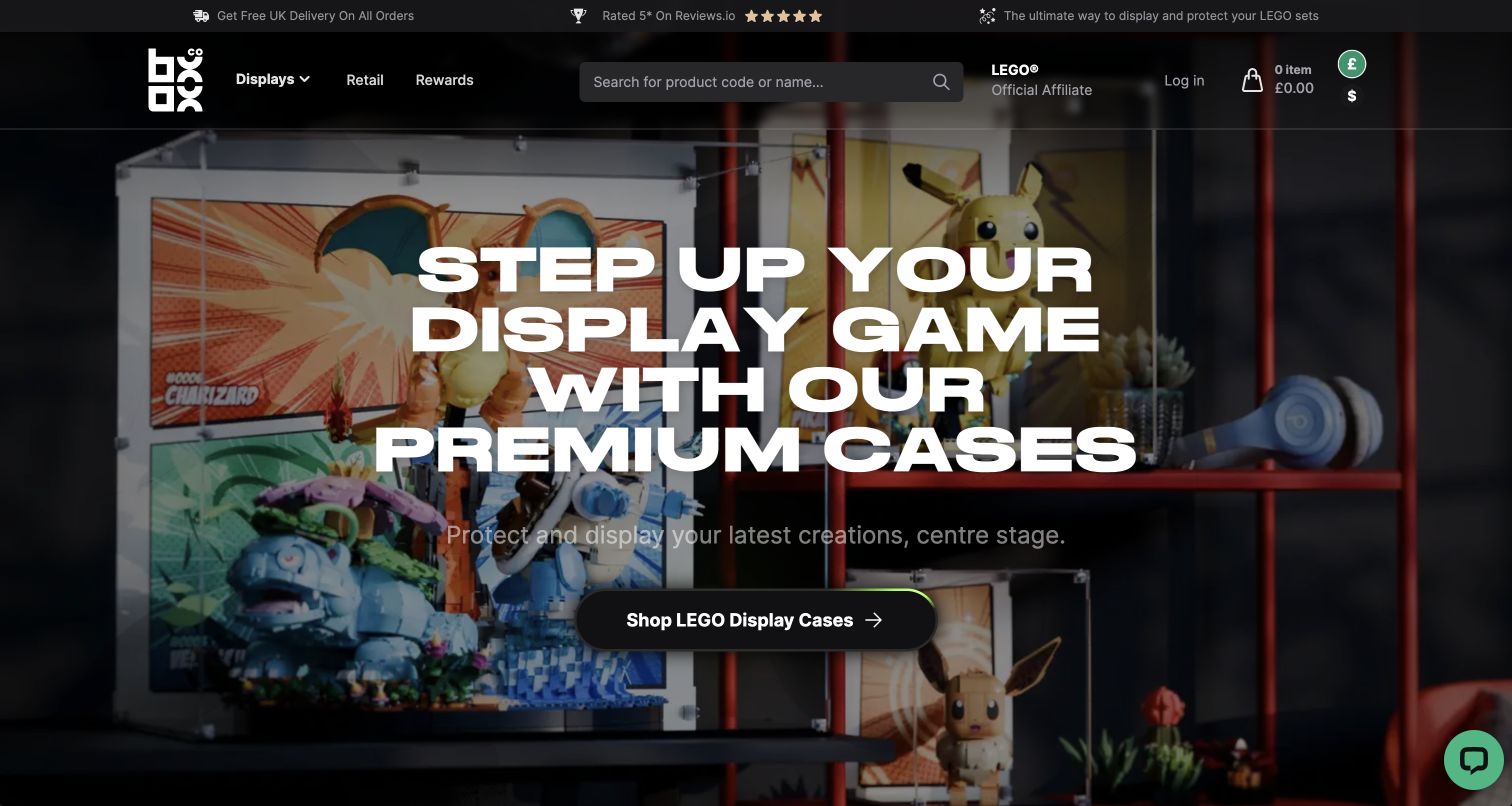
BOXXCO shows display cases in use rather than opening with isolated acrylic boxes. The hero places recognizable collectibles inside protective cases and overlays a direct statement about displaying and protecting a collection. A single prominent category action connects that scene to the catalog. Search, delivery messaging and account utilities remain in a dark header that matches the photography. Lower sections distinguish standard display cases from custom sizes and explain the material proposition. A first-visit currency suggestion was dismissed without changing currency. The Sylius case concerns BOXXCO’s own display-case commerce, not LEGO or the other licensed brands whose collectibles appear in its merchandising and product compatibility descriptions.
What you can learn
Demonstrate what a specialist accessory does before asking people to compare its dimensions. Follow the inspirational scene with precise compatibility, sizing and material information, and let visitors dismiss regional suggestions without interrupting the underlying browsing task.
Pros
The display scene explains product value quickly.
Standard and custom-size routes recognize different buying needs.
Cons & considerations
Large overlaid text obscures some of the showcased products.
Currency and promotional prompts can interrupt a first visit.
Platform source: Official Sylius exact-property project case. Official completed custom display-case public store; not LEGO brand infrastructure. Platform evidence is separate from the direct website screenshot and is not a complete current infrastructure audit.
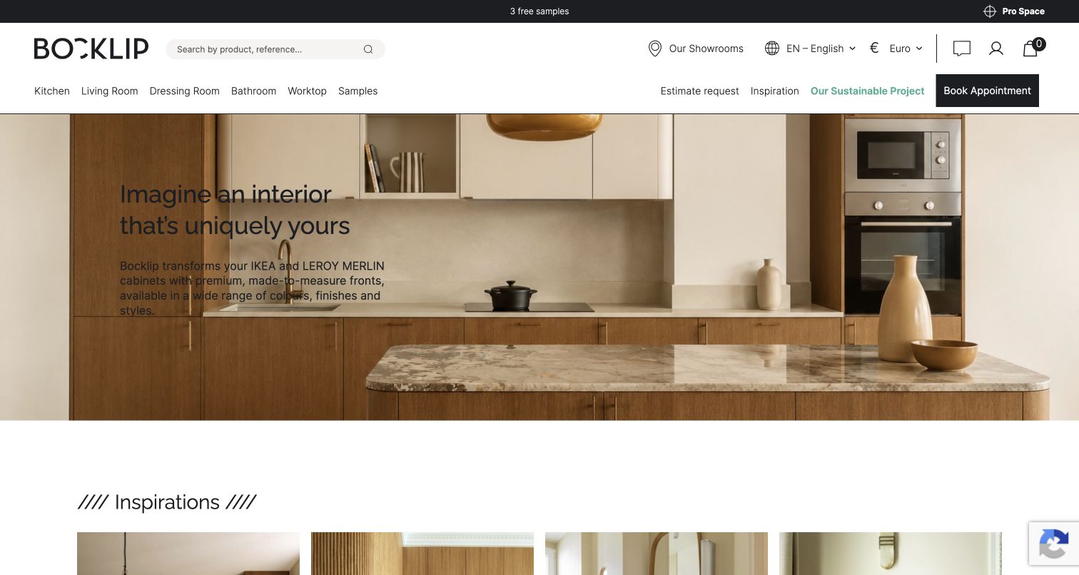
Bocklip’s opening image presents a finished kitchen, with a concise explanation of how its made-to-measure fronts adapt existing cabinet systems. The pale interior and restrained header create a calm setting for a product that could otherwise feel technical. Navigation groups rooms, worktops and samples, while showroom, quotation and appointment routes support more involved decisions. The next section explains a sequence from imagining an interior to buying compatible boxes and ordering fronts. The official Sylius case concerns this furniture-front business, not the IKEA or Leroy Merlin platforms mentioned for compatibility. A language prompt and optional-cookie notice appeared initially and were dismissed without submitting a project or selecting a new language.
What you can learn
Use a finished-room image to establish the desired outcome, then explain the buying sequence in ordinary language. Keep compatibility, samples and human help close to the inspirational content so customers can turn an attractive idea into an informed specification.
Platform source: Official Sylius exact-property project case. Official completed guided furniture-front store; not IKEA or Leroy Merlin platforms. Platform evidence is separate from the direct website screenshot and is not a complete current infrastructure audit.
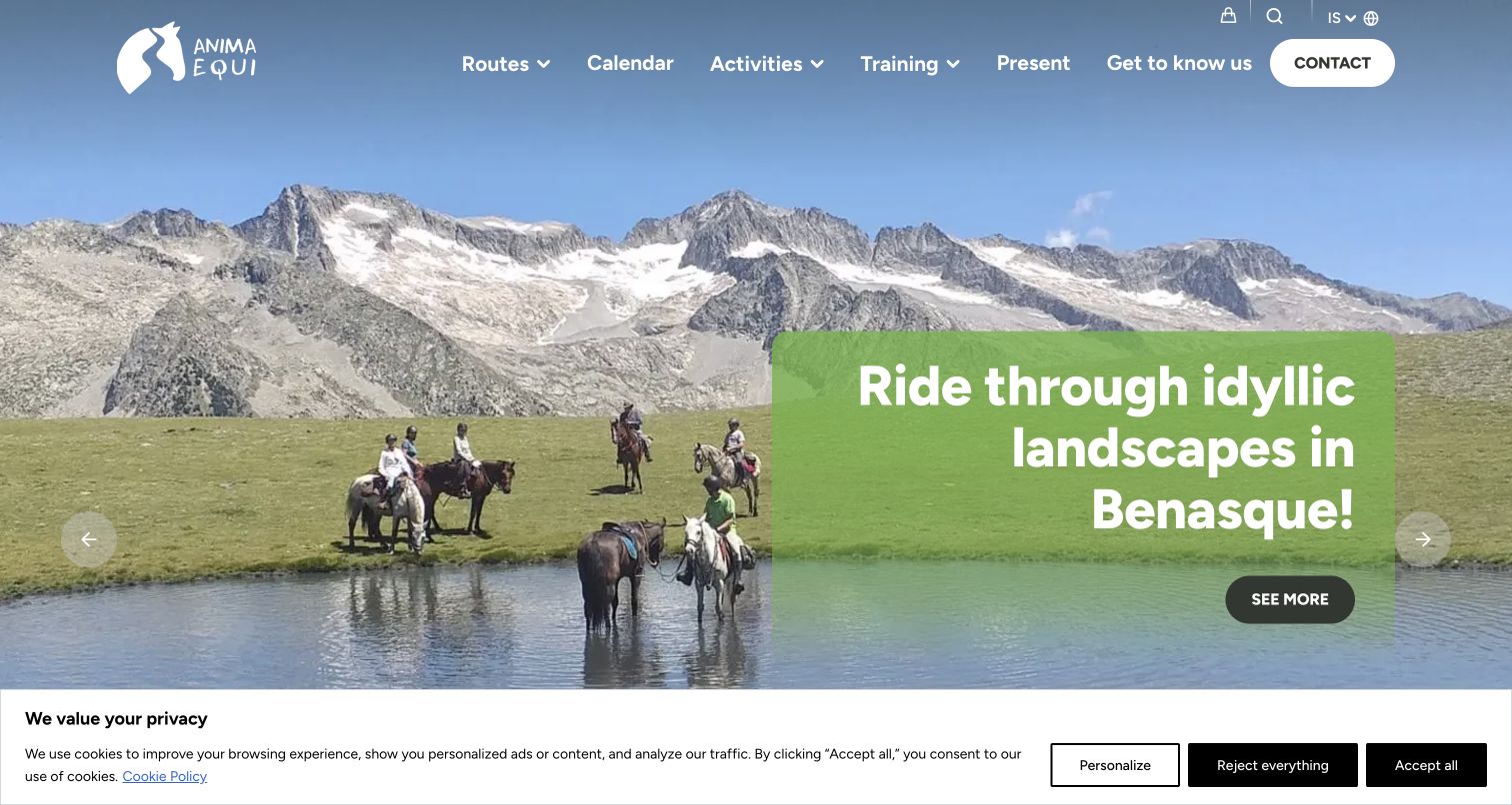
Anima Equi places riders and mountain scenery at the center of its opening carousel. A translucent green panel carries the invitation and next action, while the white navigation separates routes, calendar, activities and training. Below, individual itineraries introduce duration, group size, ability level and a starting price. Those details make the experience more concrete than the scenic hero alone. The page also explains the organization’s interest in horses and the Pyrenees, giving the catalog a personal context. The Sylius case documents its equestrian-tourism booking project; this review concerns the public discovery interface, with no availability request, participant details, reservation or payment entered.
What you can learn
Let the landscape create interest, but put suitability information on each route before the booking step. Duration, ability and group requirements should be as easy to compare as the photographs, especially when an appealing experience may not suit every visitor.
Pros
Route cards expose duration and experience-level differences.
Training and leisure activities have separate navigation routes.
Cons & considerations
Generic hero actions explain less than the itinerary cards.
The initial cookie strip covers the lower edge of the scene.
Platform source: Official Sylius exact-property project case. Official completed equestrian-tourism booking platform; public entry only, no booking submitted. Platform evidence is separate from the direct website screenshot and is not a complete current infrastructure audit.
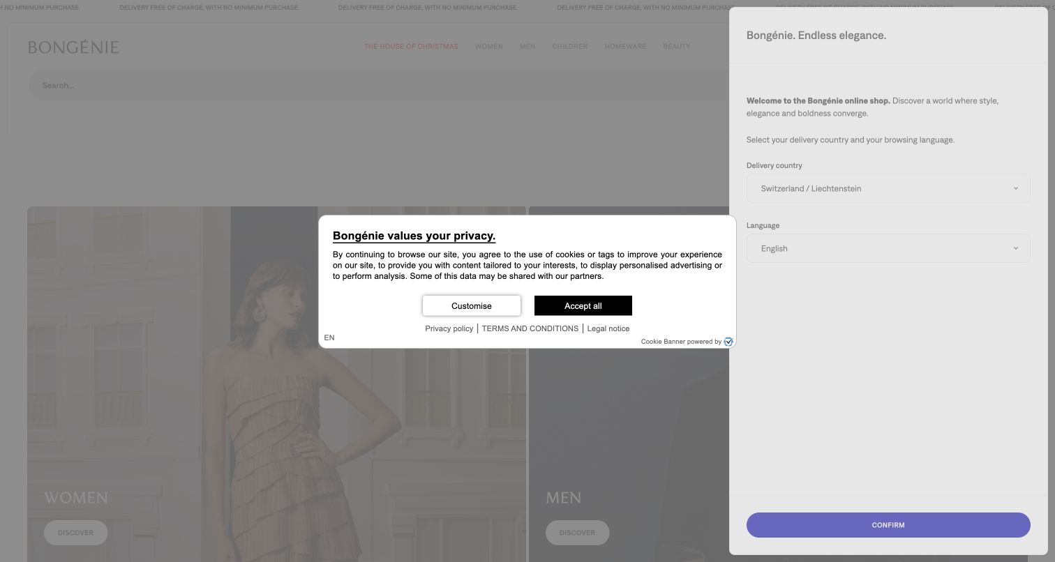
Bongénie uses generous department photography and understated typography to present women, men, children, homeware and beauty. The opening structure feels more like a department-store window than a promotion grid, with each image leading into a broad browsing area. Search and customer utilities sit above the pictures, and service promises appear further down. The captured first-visit state also exposes a significant interruption: a delivery-country and language panel overlaps the right side while a separate consent notice occupies the center. Those choices were left unchanged. The official Sylius case documents the Swiss main store’s replatforming; outlet, loyalty and other group properties are not counted as separate examples.
What you can learn
Regional setup should explain the service boundary while preserving the visitor’s sense of place. Combine related first-visit decisions where possible, and make clear whether a country selection changes delivery eligibility, language or the actual merchandise available to browse.
Pros
Department images offer clear broad shopping destinations.
Delivery and service information receive explicit supporting sections.
Cons & considerations
Two simultaneous overlays obstruct much of the initial page.
A mandatory regional choice can delay basic catalog exploration.
Platform source: Official Sylius exact-property project case. Official completed Swiss store; one main property, not outlet or loyalty duplicates. Platform evidence is separate from the direct website screenshot and is not a complete current infrastructure audit.
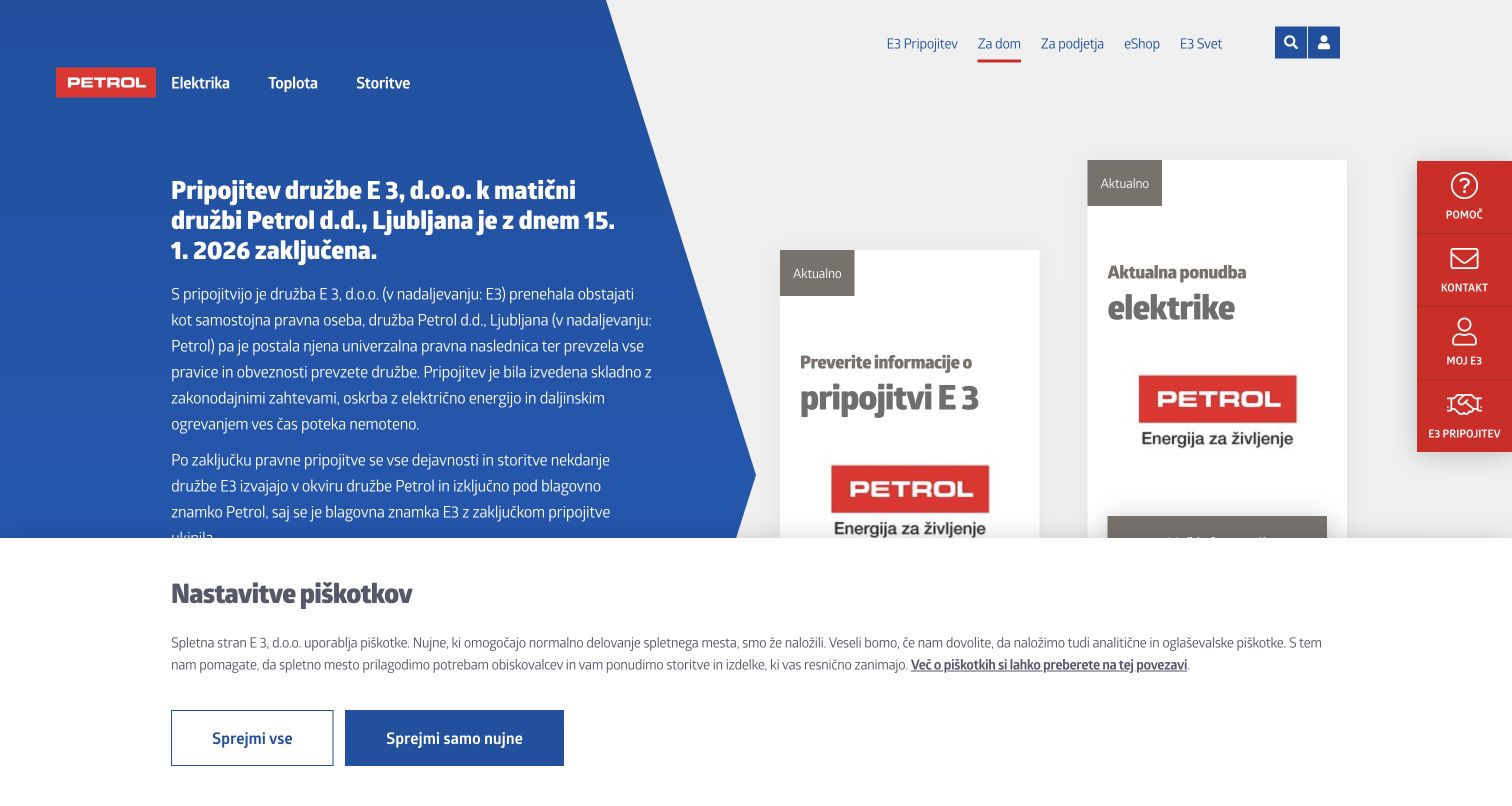
The former E3 homepage now leads with information about its January 2026 merger into Petrol. A large blue text area explains the change, while adjacent cards point toward merger details and current electricity information. Persistent help, contact and account links remain available at the right edge, which is valuable for existing customers arriving through an old bookmark. The page’s dense copy prioritizes continuity over a conventional sales campaign. An initial merger notice and cookie controls were observed rather than removed from the evidence. Sylius’s case describes the earlier public website and self-service project; that history does not establish the technology of Petrol’s broader estate or its current private customer applications.
What you can learn
When an organization changes, make the consequences for existing visitors explicit before promoting a new offer. Preserve recognizable help routes and explain which information remains on the old property, while pointing to authoritative current destinations without implying every system has migrated together.
Pros
The merger explanation addresses a likely returning-customer concern.
Help and contact routes remain visible beside the main content.
Cons & considerations
Long paragraphs make the opening comparatively demanding to scan.
The notice and cookie layer add competing informational surfaces.
Platform source: Official Sylius exact-property project case. The official case documents an earlier E3 public website and self-service project using Sylius. The current e3.si property announces its January 2026 transition into Petrol. Historical evidence does not confirm the current hidden backend or extend to other Petrol systems; only the public entry was reviewed. Platform evidence is separate from the direct website screenshot and is not a complete current infrastructure audit.
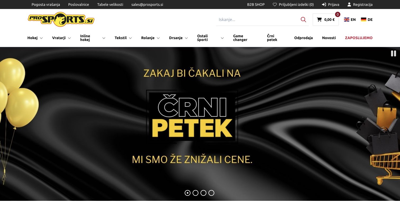
ProSports uses a practical header with a prominent search field, account tools and a clearly separate B2B shop link. Its main categories distinguish hockey, goalkeepers, inline hockey, textiles and other sports rather than relying on a single broad equipment menu. The captured Black Friday campaign sits beneath that stable structure, followed by product promotions with names and prices. Size guides and store locations are exposed in a slim utility row, supporting decisions that often need more than a photograph. The official Sylius project covers connected B2C and B2B commerce, but only the public Slovenian retail property was reviewed; the wholesale login and account functions were not opened.
What you can learn
Use the vocabulary of the sport to make a specialist catalog approachable. Keep size guidance and service locations available before checkout, and separate business purchasing from consumer discovery without forcing casual visitors to understand the company’s wholesale arrangements.
Pros
Equipment categories distinguish meaningful sporting roles and needs.
Size guides and physical-store information have visible entry points.
Cons & considerations
A large campaign pushes individual product choices below the fold.
Dense utility navigation can compete with the main categories.
Platform source: Official Sylius exact-property project case. Official Sylius B2C/B2B integration; public B2C storefront only. Platform evidence is separate from the direct website screenshot and is not a complete current infrastructure audit.
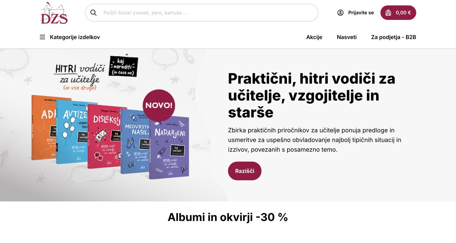
DZS combines an expansive search field with a short navigation row for product categories, promotions, advice and business purchasing. Its opening campaign introduces practical guidebooks for teachers, caregivers and parents, pairing book covers with an explanatory paragraph and one action. The next section moves directly into a product offer, demonstrating how editorial guidance and routine retail can coexist. Product cards elsewhere include quantity and basket controls, but none were used. The Sylius case documents the completed school-supplies commerce project. This review stays with the public store and does not extend the platform claim to private teacher tools, student records or the separately linked B2B operation.
What you can learn
Let useful educational context introduce the catalog without replacing literal search and product categories. Keep promotional guidance distinct from the mechanics of ordering, and make audience-specific resources understandable without requiring visitors to identify themselves or provide school information first.
Pros
The wide search field supports known-item shopping.
The campaign explains who the featured books are for.
Cons & considerations
Long campaign copy reduces space for immediately visible products.
Different audience needs share a relatively compact navigation row.
Platform source: Official Sylius exact-property project case. Official completed school-supplies public store; no teacher/student/private account actions. Platform evidence is separate from the direct website screenshot and is not a complete current infrastructure audit.
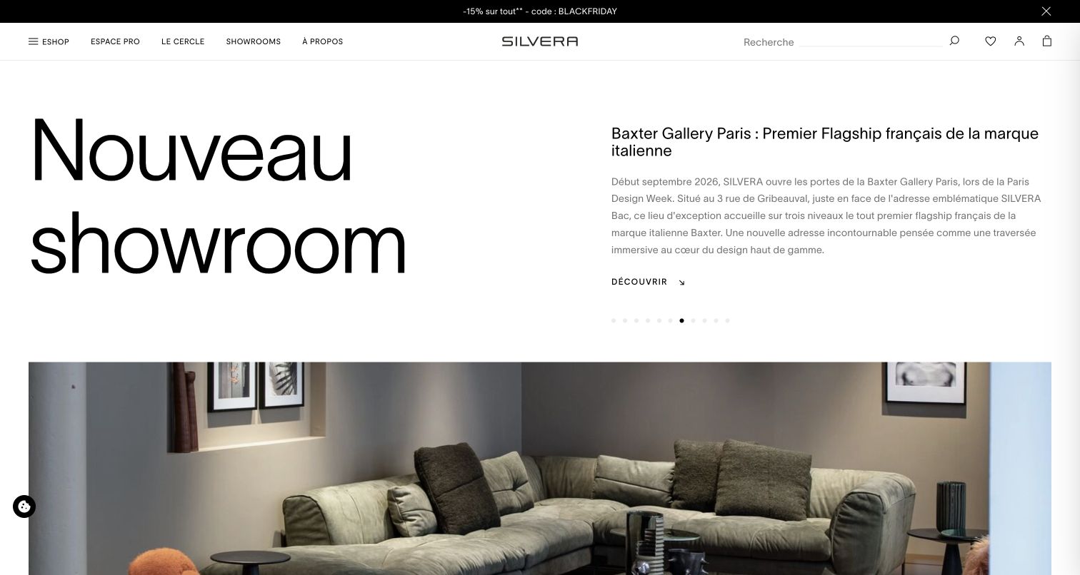
Silvera’s homepage uses oversized typography and broad whitespace to introduce design stories. In the captured carousel state, a new showroom headline sits beside explanatory copy, while furniture photography begins below. Other slides promote designers, products and services through the same editorial structure. The narrow header distinguishes the shop, professional space, circular-design initiative and showrooms, giving the business several clear entry points. This creates a strong magazine-like identity, although the long carousel asks visitors to wait or navigate for particular stories. The official Sylius Plus case documents the French retailer’s commerce transformation; no professional account, product order or newsletter subscription was created during the review.
What you can learn
A retailer can use editorial pacing when the stories help people understand products and services. Keep permanent shopping routes obvious, and ensure important announcements remain discoverable outside a rotating hero so typography and atmosphere do not become obstacles to finding specific items.
Pros
Large headlines establish a distinctive editorial hierarchy.
Shop and professional-service routes are visibly separated.
Cons & considerations
Numerous carousel slides can hide useful destinations.
The opening emphasizes a story before showing detailed merchandise.
Platform source: Official Sylius exact-property project case. Official completed Sylius Plus multi-store migration; exact French public property only. Platform evidence is separate from the direct website screenshot and is not a complete current infrastructure audit.
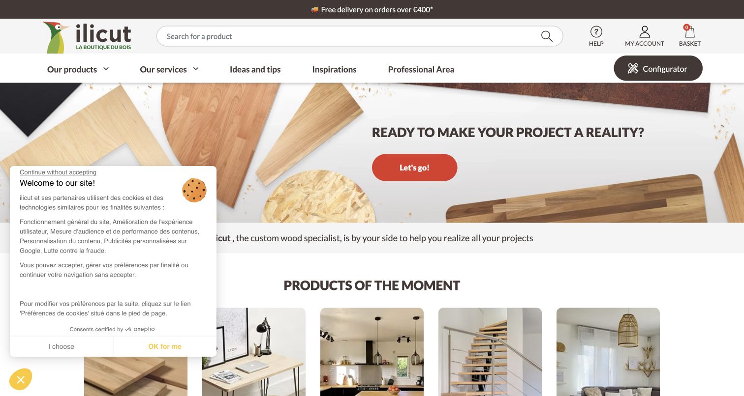
Ilicut turns its custom-cut wood proposition into a simple starting question: are you ready to realize your project? Wood samples and finished material surfaces surround the main action, while a permanent configurator button sits in the header. Immediately below, illustrated categories translate the materials into familiar uses such as desks, worktops, tables and stairs. Additional sections explain wood species, services and customer projects. This progression is useful for people who know their intended result but not the specification. The official Sylius case documents the custom-wood commerce and configuration project; this review did not enter dimensions, request a price or test an order.
What you can learn
Introduce customization through recognizable project types before exposing technical fields. Give visitors a route to materials guidance and examples, then make the configurator a clear next step with enough context to reduce avoidable mistakes in dimensions, finishes and installation expectations.
Pros
Project categories translate material choices into practical uses.
The configurator remains visible in the permanent header.
Cons & considerations
The first-visit cookie panel overlaps several product categories.
Custom pricing is not understandable from the opening screen alone.
Platform source: Official Sylius exact-property project case. Official completed custom wood commerce/configuration; review public interface without quote or ordering. Platform evidence is separate from the direct website screenshot and is not a complete current infrastructure audit.
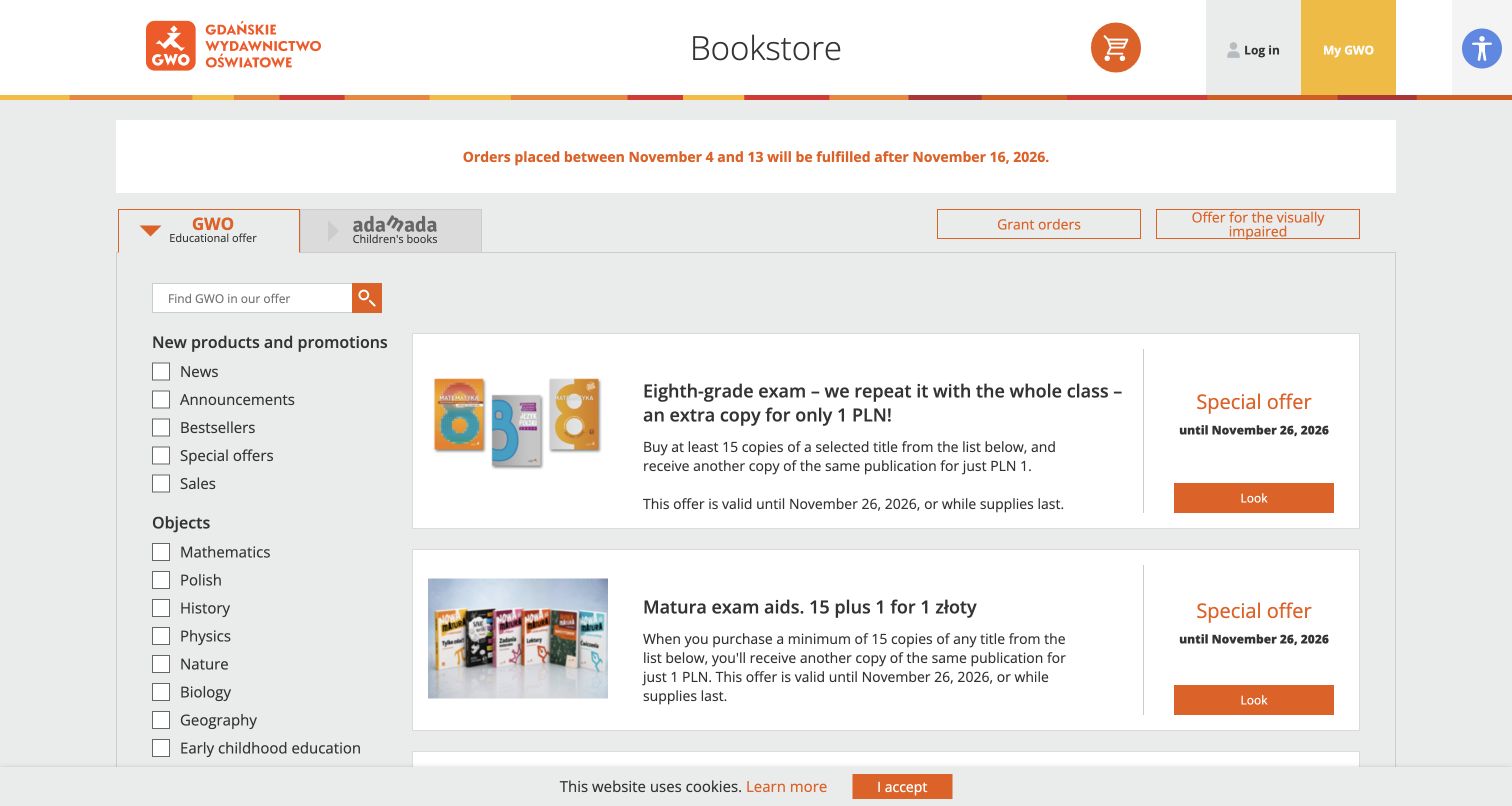
GWO’s public bookstore places a large filter column beside a sequence of educational offers. The filters distinguish subjects, school levels, publication types and digital formats, giving a purchaser several concrete ways to narrow the catalog. An orange service notice above the list explains a temporary order-fulfillment delay before visitors choose a product. The design is comparatively utilitarian: book thumbnails are small, while descriptions and offer conditions carry much of the information. The bookstore was reached through the publisher’s own navigation. Sylius’s case describes this completed retail bookstore and further migration work; the main publisher website, teaching applications and private accounts are not treated as the same implementation.
What you can learn
Make the catalog’s real decision dimensions visible instead of reducing every product to a generic category. Put temporary service limitations above the offers, and keep the path between subject, grade and format clear enough that a busy purchaser can verify the intended edition.
Pros
The filters expose useful educational and format distinctions.
The fulfillment notice appears before the product offers.
Cons & considerations
Dense offer descriptions create a demanding reading surface.
Small cover thumbnails make visual browsing less immediate.
Platform source: Official Sylius exact-property project case. The official case documents the completed GWO main retail bookstore and an ongoing wider channel migration. The exact public bookstore at ksiegarnia.gwo.pl was resolved through the publisher’s own navigation. This claim does not apply to the publisher homepage or its private educational applications. Platform evidence is separate from the direct website screenshot and is not a complete current infrastructure audit.
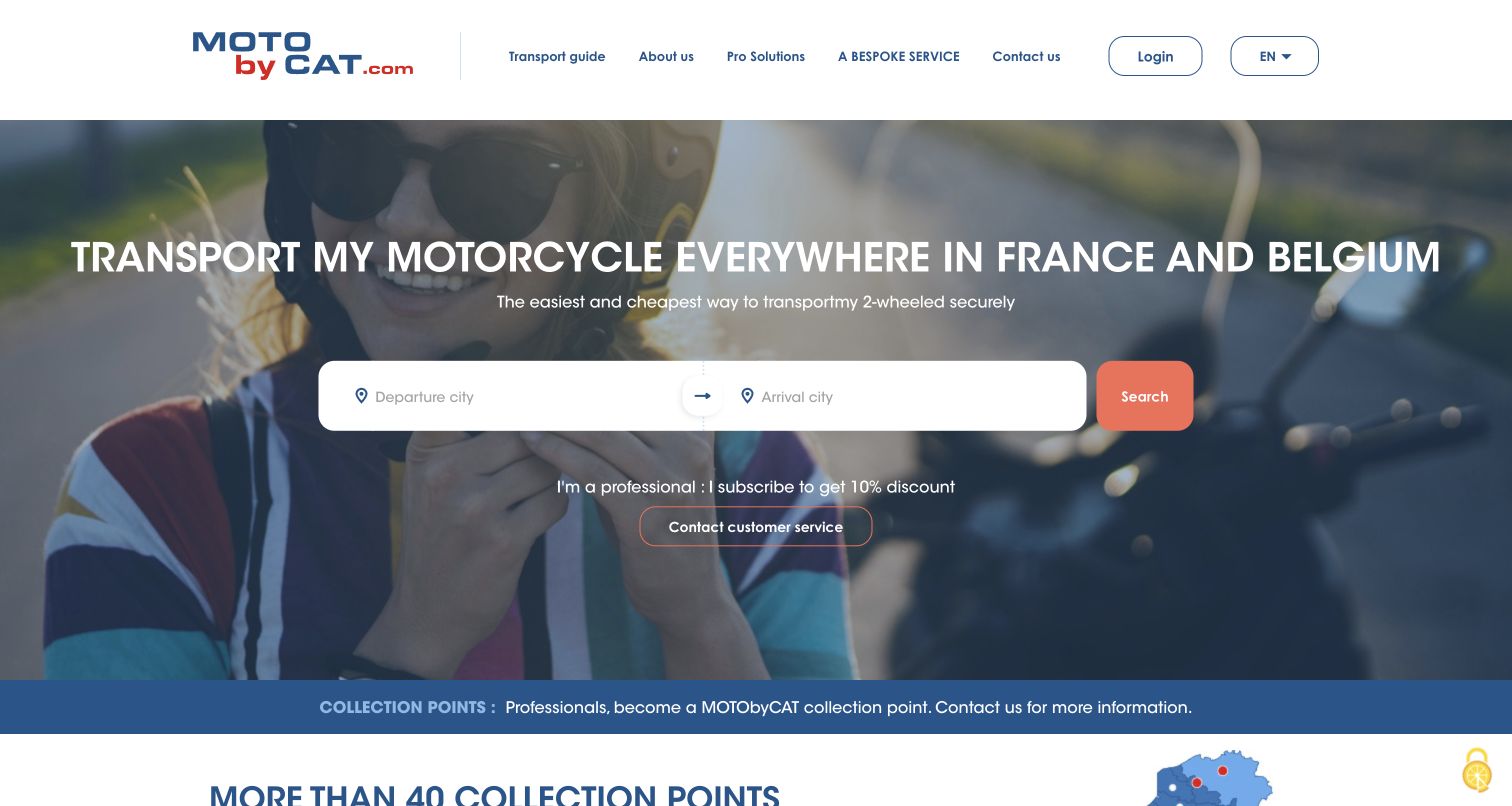
MotoByCAT’s homepage states its motorcycle-transport purpose and geographic scope before presenting a two-field route search. Departure and arrival sit inside one broad white panel, visually connecting the two pieces of information needed to begin. A supporting service link addresses professionals, while lower sections describe collection points, transport methods and exclusions. The site therefore combines a simple entry with more detailed operational reassurance. Its English text contains some awkward phrasing and crowded navigation, which slightly weakens the otherwise direct task structure. The official Sylius case concerns this transport website and commerce flow, not all CAT Group systems; the fields remained empty and no quotation or booking was requested.
What you can learn
A service can often be introduced through its essential inputs. Explain coverage before those inputs, then make exclusions and handoff arrangements easy to find so a simple opening does not create unrealistic expectations about every route, vehicle or delivery condition.
Pros
Departure and arrival form a clear paired task.
Coverage and collection information support the main proposition.
Cons & considerations
Some English wording needs editorial refinement.
Closely spaced navigation labels reduce the header’s clarity.
Platform source: Official Sylius exact-property project case. Official completed transport website/checkout; not all CAT Group infrastructure. Platform evidence is separate from the direct website screenshot and is not a complete current infrastructure audit.
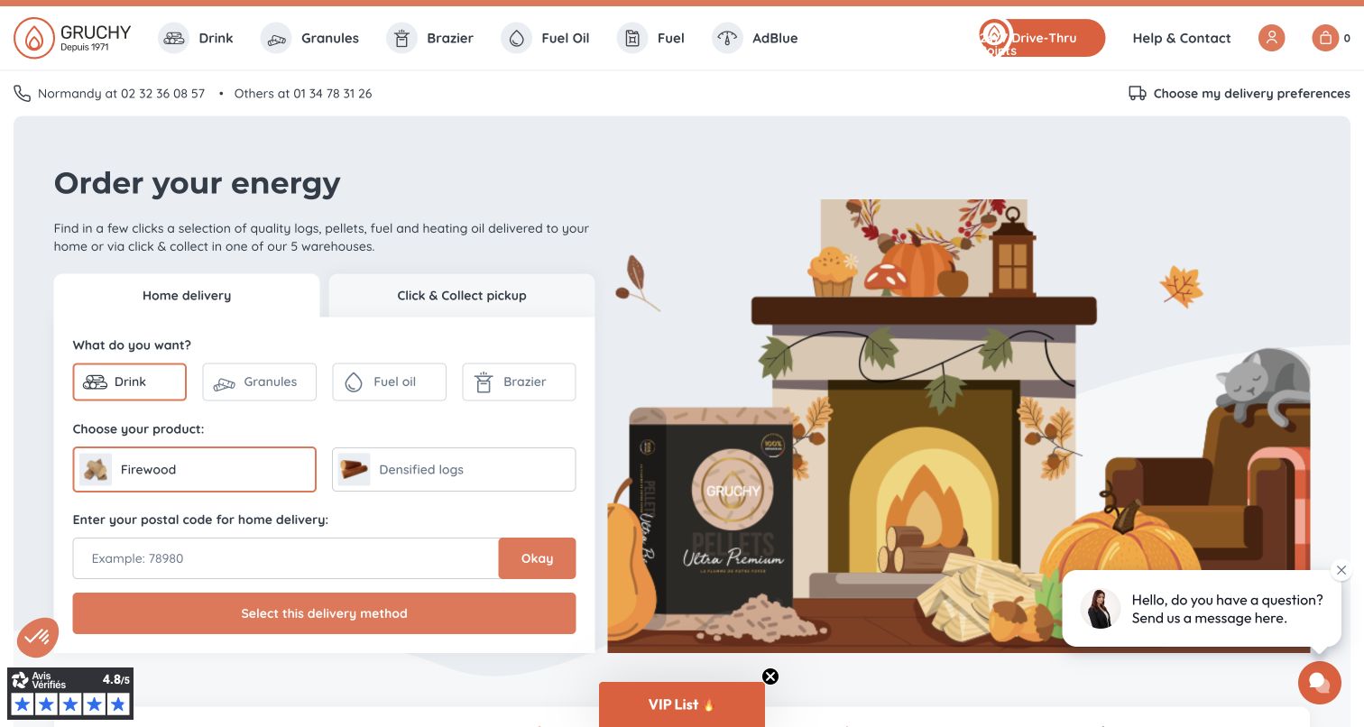
Gruchy makes delivery mode part of the opening shopping task. A pale panel asks visitors to distinguish home delivery from collection, choose a fuel category and enter a postal code before confirming the route. Seasonal fireplace artwork occupies the other half, balancing a practical form with a familiar use context. The header retains literal product categories and drive-through locations, while later sections explain the family business and supply range. The page also carries chat and promotional widgets that compete near the edges. The official Sylius case documents the conditional delivery catalog; no postal code, customer details, fuel order or delivery preference was submitted for this review.
What you can learn
If eligibility changes the available catalog, explain it at the moment shoppers begin. Keep fulfillment choices separate from an actual order, label each required input plainly, and avoid surrounding a consequential selection panel with so many optional prompts that its purpose becomes unclear.
Pros
Delivery and collection are distinguished before ordering.
Product choices are illustrated inside the initial selection panel.
Cons & considerations
Chat and promotional widgets compete with the main task.
The opening requires several decisions before showing specific prices.
Visible tech stack
Earlier / documented evidence
Sylius
Platform source: Official Sylius exact-property project case. Official completed conditional delivery catalog; no location or order entered. Platform evidence is separate from the direct website screenshot and is not a complete current infrastructure audit.
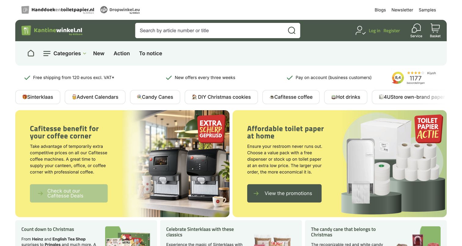
Kantinewinkel gives article-number and title search a prominent position inside its green header. Beneath it, service assurances and category shortcuts lead into broad campaigns for coffee supplies and paper products. The combination recognizes two shopping patterns: a repeat purchaser looking for a known item and someone replenishing an entire workplace category. Seasonal shortcuts add timely routes without removing the permanent catalog structure. Links to sibling shops appear separately at the top, making the portfolio visible but potentially distracting. The official Sylius case describes 4Ustore’s multi-entity commerce migration and directly links this property; those other stores are not counted as extra examples or assumed to share every implementation detail.
What you can learn
Design wholesale discovery around both repeat-item search and category replenishment. Put service conditions near the catalog, and distinguish sibling brands from the active store so visitors understand which basket, account and product range they are currently using.
Platform source: Official Sylius exact-property project case. Official 4Ustore migration case explicitly links this one public store; no eight-store duplicate count. Platform evidence is separate from the direct website screenshot and is not a complete current infrastructure audit.
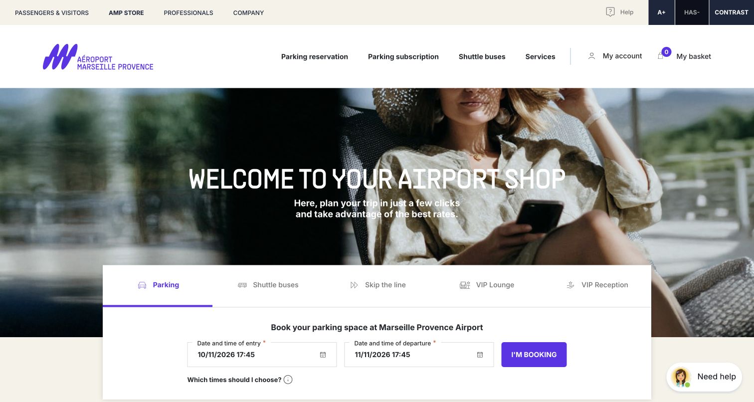
Marseille Provence Airport’s store separates parking, bus shuttles, fast-track access and lounge services within one booking area. A travel photograph establishes context, while a broad white panel gives the selected parking task its own date fields and action. The permanent navigation distinguishes this store from the passenger site and professional services, reducing confusion within a larger airport estate. Supporting sections explain parking benefits, ancillary services and common reservation questions. The default dates shown in the capture were generated by the site and were left untouched. The Sylius case concerns this airport-services commerce property, not flight operations or the corporate website; no availability check, reservation or payment was submitted.
What you can learn
Group related travel services in a shared store while giving each task a clearly labeled entry. Explain time assumptions and cancellation conditions close to booking decisions, and keep commercial reservations visibly separate from general passenger information or professional account systems.
Pros
Service tabs make the available booking paths explicit.
Helpful reservation questions follow the initial task area.
Cons & considerations
Default dates require careful confirmation before booking.
The broad hero delays some practical service details.
Platform source: Official Sylius exact-property project case. Official airport services store migration, parking/queue/lounge booking only, not airport corporate or flight systems. Platform evidence is separate from the direct website screenshot and is not a complete current infrastructure audit.
Kegan has 15+ years of experience working with small businesses, Fortune 500 companies, and everything in between. No development job is too big or too small: he brings the same hands-on attention to a focused improvement, a complete website, or a custom application.
For Sylius projects, he can help with responsive interfaces, reusable components, custom functionality, API connections, and performance-minded implementation. He works directly with clients on scope, design, implementation, testing, and handover, with an emphasis on clear communication and a system that remains practical to maintain after launch.
Show 3 other Sylius developersHide other Sylius developers
Choose the commerce experience around the customer’s task
Build a clear catalog for repeat and exploratory shopping
Office Partner, ProSports, DZS and Kantinewinkel show how prominent search can coexist with category and campaign routes. A returning purchaser may know an article number, while a new visitor needs the product hierarchy. Give both tasks dependable entry points, then keep account context and pricing explanations close enough to avoid ambiguity. Optional promotions should not obstruct those permanent tools.
Guide a configured purchase through understandable choices
Bocklip and Ilicut connect technical products to familiar projects, while BOXXCO shows the intended use of its display cases. Begin with the result the customer wants, then introduce compatibility, material and specification questions in a deliberate sequence. Explain which choices affect the offer and how mistakes can be corrected. Do not assume a visually simple configurator means the underlying pricing or fulfillment rules are simple.
Treat service booking as its own information problem
Anima Equi, MotoByCAT and the Marseille Provence Airport Store sell experiences or services with meaningful conditions. Define the location, route, timing, eligibility and exclusions relevant to each offer. Keep an initial inquiry distinct from a reservation or payment, and make default dates or selected options conspicuous. A service can use commerce infrastructure while needing a very different interface from a product grid.
Separate content, loyalty and transaction responsibilities
Bakken.nl is useful because its documented loyalty/backend role differs from the public recipe presentation. Use that distinction to ask who owns editorial content, participation rules, customer identity and any transaction. Choose system boundaries around a demonstrated requirement and an accountable maintenance team. The framework’s flexibility does not remove the need to explain what each layer does.
Plan the buying rules, content and maintenance together
Use difficult real examples to define the purchase model
Start with a small set of representative products or services rather than a perfect demonstration catalog. Include a product with several compatible options, an unavailable variant, an unusually long name and an offer whose eligibility depends on location. For a service, add a route or time choice that cannot be fulfilled and a request that needs staff clarification. Work through the information a customer needs at each decision. Identify which facts are descriptive, which alter the price and which determine whether the request can proceed. Give those facts consistent names and owners before designing filters or configuration controls. Decide where an unfamiliar term needs explanation and how a mistaken choice can be changed without restarting the entire task. Then compare the homepage promise with the detailed offer. A campaign should not suggest universal availability when the underlying service has limits. Use realistic content to evaluate the interface, including translations, units and meaningful empty states. Ask the staff who answer customer questions to review these scenarios, because they know which distinctions regularly cause confusion. Their feedback should shape the model and the wording, not become a late collection of exceptions hidden inside the checkout.
Map the boundaries between commerce and other systems
List the systems involved in product facts, editorial content, prices, stock, customer accounts, loyalty, payment and fulfillment. For each important field or event, identify the authoritative source and the team responsible for keeping it accurate. A separate frontend may display commerce information without owning it, while a loyalty service can support a content-led website without becoming its CMS. Draw those relationships before choosing integrations based on a case study’s appearance. Describe how information moves, how long updates may take and what the public interface should do when a dependency is unavailable. Include conflicting stock records, an expired offer and a location that no longer qualifies for delivery. Decide which conditions can be explained immediately and which require a conversation with staff. Keep private customer information and credentials out of browser code, public assets and diagnostic screenshots. Review the same scenarios across each intended market or customer context, including how language and currency choices are communicated. Finally, ask a maintainer to trace one ordinary change from its source to the public result. If ownership becomes unclear halfway through, resolve that responsibility before adding another layer or promising a seamless customer experience.
Make routine change and recovery part of the handover
Choose the routine jobs the operating team will perform after launch: changing a campaign, correcting a product detail, updating a service condition and handling an unavailable offer. Demonstrate those jobs with realistic content in an appropriate test environment, including the steps required to review and publish a correction. Record who owns custom code, integrations, hosting and the editorial interface. Sylius publishes a release and maintenance policy; use the official documentation when planning ongoing upkeep rather than treating a customer case as evidence of support for the current project. Keep an inventory of the application’s dependencies and customizations, with a responsible maintainer and a process for assessing changes. Define checks for the important shopping or inquiry paths and preserve the evidence linking a release to its source. Explain how the team would identify and recover from a faulty deployment, including any separate considerations for changed data. Recovery should be a rehearsed project procedure, not an undocumented command known by one developer. Finish with clear evidence locations, escalation contacts and a schedule for reviewing time-sensitive offers and operational notices. A successful handover lets someone other than the original builder make a controlled update and explain what is live afterward.
Ask the actual team to carry out its routine job: publish a realistic update, correct a mistake, preview a narrow screen, and identify who owns an integration failure. For a library or frontend framework, also ask who maintains the content source and deployment. A polished screenshot does not answer those operational questions.
Beyond the screenshot
A practical Sylius commerce planning checklist
Name the exact public property, market and customer context in scope.
List the decisions customers need to make before a purchase or inquiry.
Use realistic products and services to expose compatibility and eligibility rules.
Keep repeat-item search and exploratory browsing easy to distinguish.
Explain price basis, regional conditions and delivery limitations near the decision.
Distinguish an inquiry or availability check from an actual reservation.
Assign ownership for catalog, content, prices, stock and loyalty information.
Document the role of any separate frontend or content system.
Provide understandable unavailable, invalid and expired-offer states.
Check translations, units, default selections and changing campaign conditions.
Keep optional promotions from obscuring essential shopping tools.
Test keyboard access and readable labels with representative content.
Keep credentials and private customer records out of public assets and reports.
Plan maintenance responsibilities using the official project documentation.
Rehearse a controlled update and the project’s recovery procedure.
Preserve exact-property evidence and qualify historical implementation claims.
Test with real content, a keyboard, a small screen, slow or failed requests, and the people who will maintain the system. These are planning checks, not an accessibility, security, performance, or search-ranking certification.
Sources & editorial method
How this Sylius collection was reviewed
The collection contains 20 distinct public properties with direct browser captures made on November 10, 2026 UTC and official Sylius project evidence. Actual URLs, regional paths, capture timestamps, dimensions and attribution remain attached to the images. Some pages displayed automatic translations from the existing browser; the relevant capture labels disclose that state. Reviews describe the visible public interface without submitting purchases, quotes, bookings, account details or loyalty actions. Documentary associations are limited to the named project. REISS and E3 remain historical references, and the former E3 property’s current Petrol context does not establish a wider platform claim. Bakken.nl’s case documents a loyalty/backend role with Contentful and Vue.js, not a recipe-site CMS attribution. GWO is the exact public retail bookstore rather than all publisher applications; Marseille is the airport-services store rather than flight operations. Broad source-audit outcomes are recorded separately from case evidence, including any unavailable observations. These are design references, not service-quality endorsements, business-performance measurements or compliance certifications.
Every image is an unmodified capture from the actual website, with its source and capture date. Some captures are reused from our shared catalog; their dates remain the original capture dates. None comes from a vendor gallery or a generated reconstruction. Moving imagery and live content can change.
Technology attribution uses public page assets or metadata, official platform documentation, or a cited first-party project case study. Documentary and framework-relationship evidence is identified where used; it is not a complete current backend inventory. A CMS image CDN alone does not establish a full CMS deployment. A library’s presence does not prove which individual controls use it, and a platform label does not establish AI authorship.
The composition notes, lessons, pros and tradeoffs are original editorial observations. We have not measured conversion, traffic, security, performance or accessibility conformance. Website owners retain their brands and imagery; these examples are not our client portfolio. Written, Edited and Curated are independent records, not dates advanced by a build. See our editorial standards or suggest a correction.
Questions worth asking
Sylius website development FAQs
Is every pictured property a conventional Sylius storefront?
No. The documented projects include retail, configuration, service booking and loyalty work. Some use separate presentation layers. Read the exact role in each source note before interpreting the association; appearance alone does not establish the commerce architecture.
Why are REISS and E3 included as historical examples?
Official project evidence documents earlier Sylius relationships. The present REISS UK storefront and former E3 property provide current design observations, but do not confirm that the same platform remains in use. E3’s organizational transition also does not extend its old implementation claim to Petrol’s wider systems.
Does Bakken.nl use Sylius as its recipe CMS?
That is not what the cited case establishes. It describes Sylius Plus in a loyalty and backend role alongside Contentful and Vue.js. The public recipe interface and its underlying editorial responsibilities must remain distinct from the documented loyalty implementation.
What should be decided before configuring multiple markets?
Identify the actual storefronts, languages, currencies, customer contexts and delivery rules the business needs. Sylius documents channels and related configuration concepts, but the team must map them to its own operating model rather than copying another store’s regional selector.
Does the Relais & Châteaux example cover every member hotel?
No. The earlier official showcase links the public association property. It does not establish the platform used by independently operated hotel websites or their private reservation systems. The review stays with the named public entry.
How should a custom product configurator be planned?
Begin with the choices that affect compatibility, price and fulfillment. Explain them in the customer’s language, use realistic invalid and unavailable combinations, and make corrections possible. A simple-looking control can depend on complex business rules that need separate validation.
Can these reviews confirm checkout or private-account behavior?
No. The research observes public pages and documented implementation accounts. No purchase, reservation, quote, account or loyalty action was submitted. Those functions require authorized project-specific testing before operational claims can be made.
What does a restricted public technology audit establish?
It establishes the limit of the permitted observation, not the absence of technology. Retain the recorded outcome and earlier documentary scope. Do not bypass the restriction or promote an older project account into a claim about the current hidden backend.
Borrow a useful way to explain a choice, then test it against your catalog, service conditions and maintenance team. Precise operating rules and honest implementation evidence make a stronger brief than assuming a familiar brand’s website reveals the whole system.