Best Library Websites of 2026 (30 Real-World Examples)
Library websites that help people borrow, discover and visit
Explore 30 library website examples, with practical lessons for catalog search, branch information, digital resources and public programming.
A library homepage serves people with very different intentions. One visitor wants to renew a book, another needs a quiet room, and another is beginning a research project without knowing which collection to search. A successful design makes these routes understandable while showing the library's wider cultural and community role. The examples in this collection include city systems, state libraries and national research institutions, so their priorities differ in useful ways.
The strongest patterns are often operational: an explicit catalog-versus-website choice, a branch notice that explains the next step, an event card that includes its date and location, or a visible route to ask a librarian. Photography and editorial stories matter too, particularly when they help people recognize the library as a welcoming place. These reviews examine the public pages as observed and distinguish useful design choices from areas that deserve closer testing.
Before the examples
What makes good library website design in 2026?
Make search scope explicit
Catalogs, archival collections, events and website pages may live in separate discovery systems. Show the scope before a query is submitted and explain unfamiliar collection names. A single unlabeled magnifying glass rarely communicates these boundaries.
Support the next visit
Locations, hours, transport, parking and closure notices help people decide whether and how to visit. Give branch-specific information a stable home and write temporary notices with dates, affected services and useful alternatives.
Expose membership and help
Getting a card, signing in and asking a librarian are different needs. Keep each route recognizable. Place human assistance near difficult research tools instead of assuming everyone understands catalog terminology.
Give programs useful context
An event image should introduce the subject, while ordinary text supplies date, time, branch and audience information. Use editorial features to express the library's identity without displacing the tasks that bring repeat visitors back.
The collection · 30 examples
30 library websites worth studying
Compare how these libraries balance practical services with editorial discovery. Each example includes a real homepage capture and a specific lesson; the ordering is a collection of patterns, not a ranking of library quality.
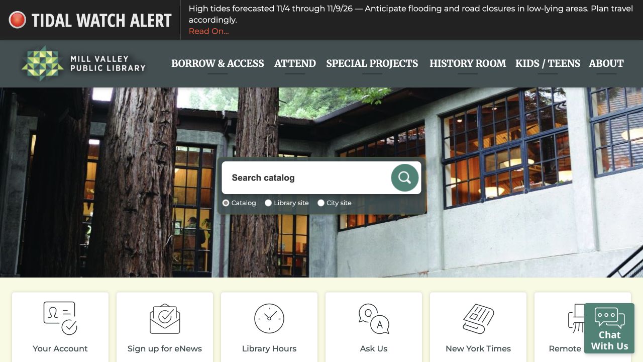
Mill Valley Public Library uses its building and trees as a visual introduction, with catalogue search and a row of practical service links close by. News and events then give the local branch a living schedule, making the website useful beyond an attractive photograph of a library.
What you can learn
Use a recognizable local place to introduce the service, then prioritize what visitors actually came to do. Search, account access, hours and events need clear labels and different destinations. A library landing page should serve frequent practical tasks alongside discovery; a strong event or reading recommendation should never hide catalog search or opening hours.
Pros
The building photograph makes the local institution specific.
Search and common service shortcuts support repeat visits.
Cons & considerations
Municipal notices and library news can compete for space in the opening.
An embedded catalogue or event system needs accessible fallbacks and clear destination labels.
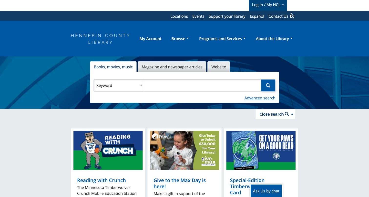
Hennepin County Library gives search a large dedicated region above its feature cards. The three tabs distinguish books, movies and music from magazine and newspaper articles and the general website. A keyword selector and advanced-search route add depth without crowding the main navigation. Beneath the search region, the captured page promoted a Timberwolves reading event, a fundraising campaign and a special-edition library card in a consistent three-column card format. The blue header keeps account access, browsing and service categories separate from these changing stories. This is a useful example of a practical discovery tool retaining first priority while local partnerships still give the homepage a recognizable community voice.
What you can learn
Separate different information sources with visible search tabs and keep advanced controls close to the query field. Use a consistent feature-card structure below the tool so campaigns can change without moving the primary discovery task.
Pros
Search tabs distinguish article databases from both the catalog and general website.
Community partnership features have readable titles and descriptions below their images.
Cons & considerations
The expanded search region occupies substantial height before the editorial cards.
Several account and utility layers require consistent labels to avoid redundant navigation.
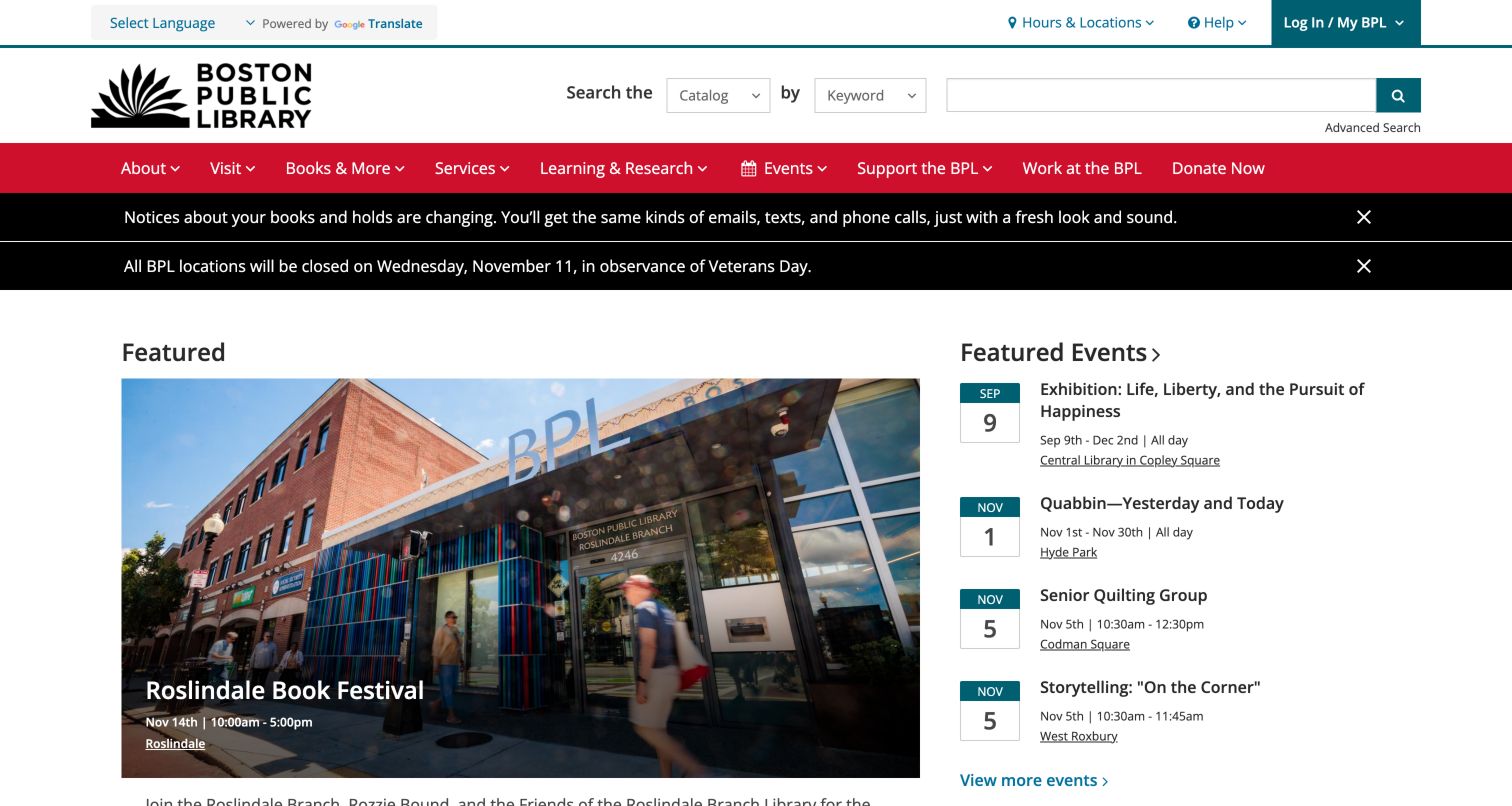
Boston Public Library puts catalog search into a recognizable utility header, then uses a red navigation band to separate service categories from current programming. In the captured page, a photograph promoting the Roslindale festival occupied the main feature while an adjacent list exposed upcoming events with dates and branch names. That pairing gives a neighborhood story visual weight without requiring every event to become a large campaign tile. Service notices were highly visible above the feature, including a closure message. The result resembles a useful community front desk: search and account tasks have their own place, and the editorial area can change with the calendar.
What you can learn
Combine one rich local story with a compact event list that carries date and location information. Give operational notices a distinct treatment so visitors can separate service interruptions from invitations to attend something.
Pros
Catalog scope and keyword controls are visible before the promotional content.
The event list supplies branch context without opening each listing.
Cons & considerations
Multiple notices consume substantial height before the main feature.
The mixed event and campaign formats need disciplined editing to remain balanced.
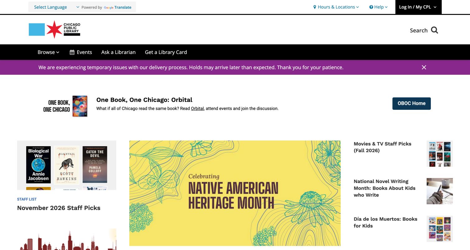
Chicago Public Library gives its One Book, One Chicago campaign a prominent horizontal feature, with the selected title and a direct route to learn more. Below it, the page changes scale into a grid of staff picks, Native American Heritage Month material and audience or media topics. The strong black navigation establishes an institutional frame while the editorial blocks introduce more color and variety. A separate purple service notice calls out holds delivery issues. This arrangement lets a major reading program act as the homepage story without forcing all the surrounding content into the same visual style. Catalog search is available through a compact header control rather than a large central form.
What you can learn
Use a citywide program to give the homepage a clear current focus, then provide smaller independent routes for people who came to borrow, browse or find resources for a particular audience.
Pros
The main campaign has a clear title and action rather than relying on photography alone.
Smaller editorial blocks accommodate books, films and age-specific discovery.
Cons & considerations
Compact search is less immediately dominant than on search-led library homepages.
Several visual treatments compete once the visitor reaches the editorial grid.
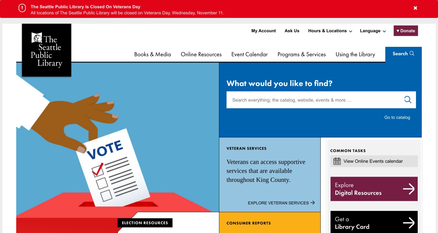
Seattle Public Library places a large search prompt inside a blue module beside its current feature rather than pushing search into a small corner of the header. The captured page paired that tool with election resources, Consumer Reports access and other service tiles. A Common Tasks area made practical destinations such as digital resources and getting a card explicit. The hanging black library mark and a restrained utility header provide a consistent frame around the colored modules. A red closure alert appeared above the navigation, making the distinction between an interruption and ordinary editorial content clear. This is a useful layout for visitors arriving with several very different intentions.
What you can learn
Reserve a stable, large module for search while allowing adjacent editorial modules to rotate. Name common tasks in direct language and keep them visually separate from topical reading or learning recommendations.
Pros
The search prompt is large enough to compete with the main promotional artwork.
Practical shortcuts coexist with timely civic resources in the first page sections.
Cons & considerations
The modular grid requires careful ordering when the available width narrows.
A visitor must distinguish the broad search tool from the separate catalog route.
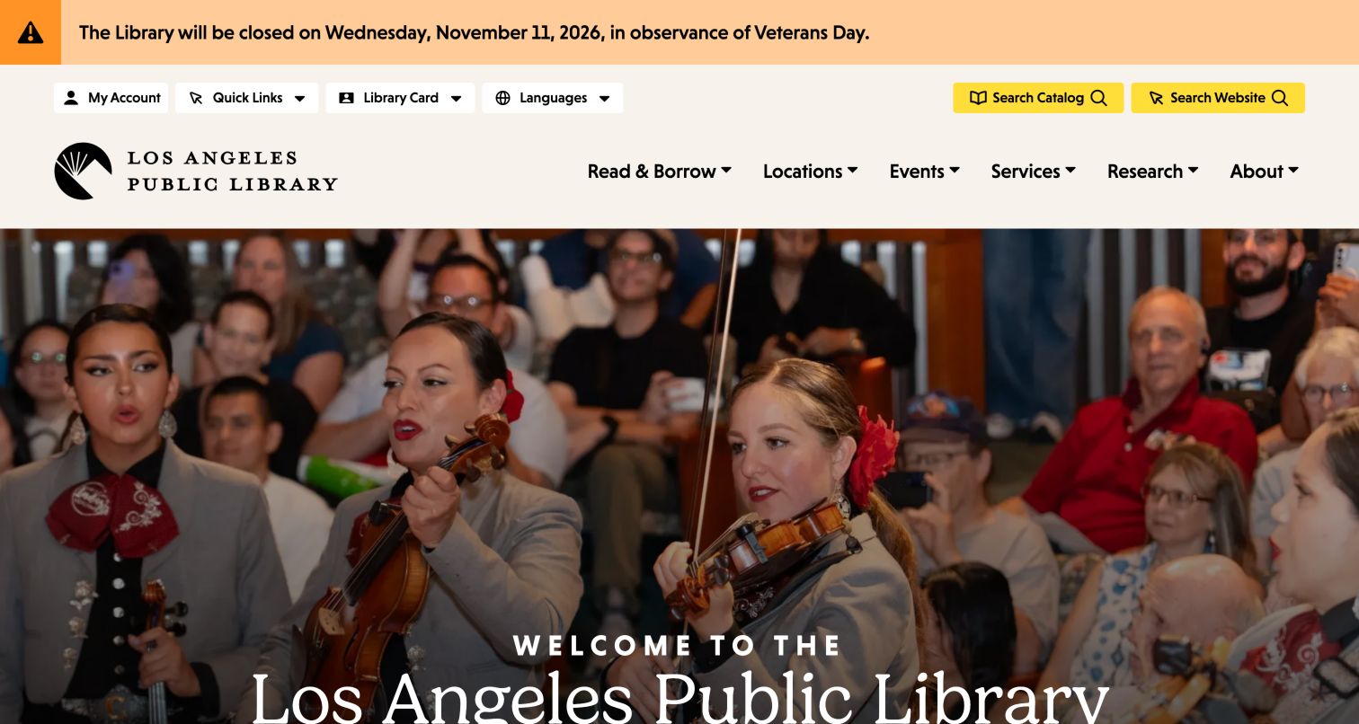
Los Angeles Public Library opens with a large photograph of musicians and community activity, accompanied by a serif welcome. The image makes the institution feel like a place where things happen, while yellow Catalog and Website controls keep the two search destinations explicit. The page repeats that distinction in its broader search area and then introduces task shortcuts for obtaining a card, printing, getting help and shopping. Read, Stream and Borrow group the collection offers in approachable verbs. A closure notice remains distinct at the top. The strongest idea is the separation of an emotional introduction from a clearly named set of service routes immediately around it.
What you can learn
A community photograph can establish belonging, but pair it with visible tools for visitors who already know their task. When catalog and website search are separate systems, label the destination before submission.
Pros
Catalog and website search are differentiated with written labels.
Community photography expands the idea of a library beyond shelves and books.
Cons & considerations
The large opening image pushes some practical shortcuts below the first viewport.
Repeating search choices in more than one area calls for consistent labels and behavior.
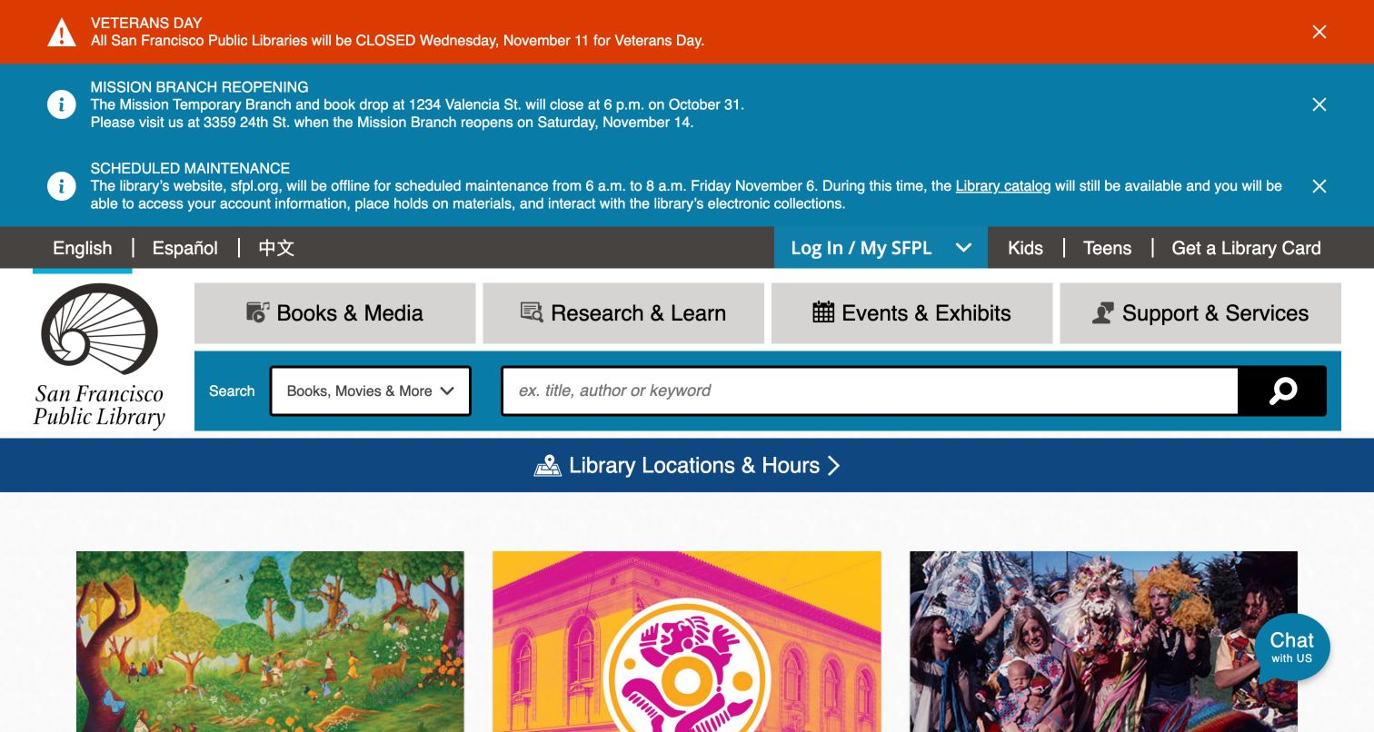
San Francisco Public Library makes operational information unusually prominent. The observed homepage showed a holiday closure, details of the Mission Branch move and a scheduled website maintenance notice that also explained continued catalog access. Below those notices, English, Spanish and Chinese routes sit alongside account and card links. Large gray navigation blocks lead into a teal search area with a selectable scope, and a full-width Locations and Hours bar gives branch information its own clear destination. This is an effective example of explicit service communication, though the accumulated alert stack occupies a substantial part of the first screen and delays the editorial content.
What you can learn
Write alerts with the affected service, dates and a useful alternative, especially when a catalog remains available during website maintenance. Establish an editorial limit for simultaneous notices so urgent information does not obscure routine tasks.
Pros
Maintenance messaging explains what patrons can still do through the catalog.
Language choices and location access are visible without opening a menu.
Cons & considerations
Three active notices dominate the initial page height.
The wide navigation and search controls create a dense desktop header.
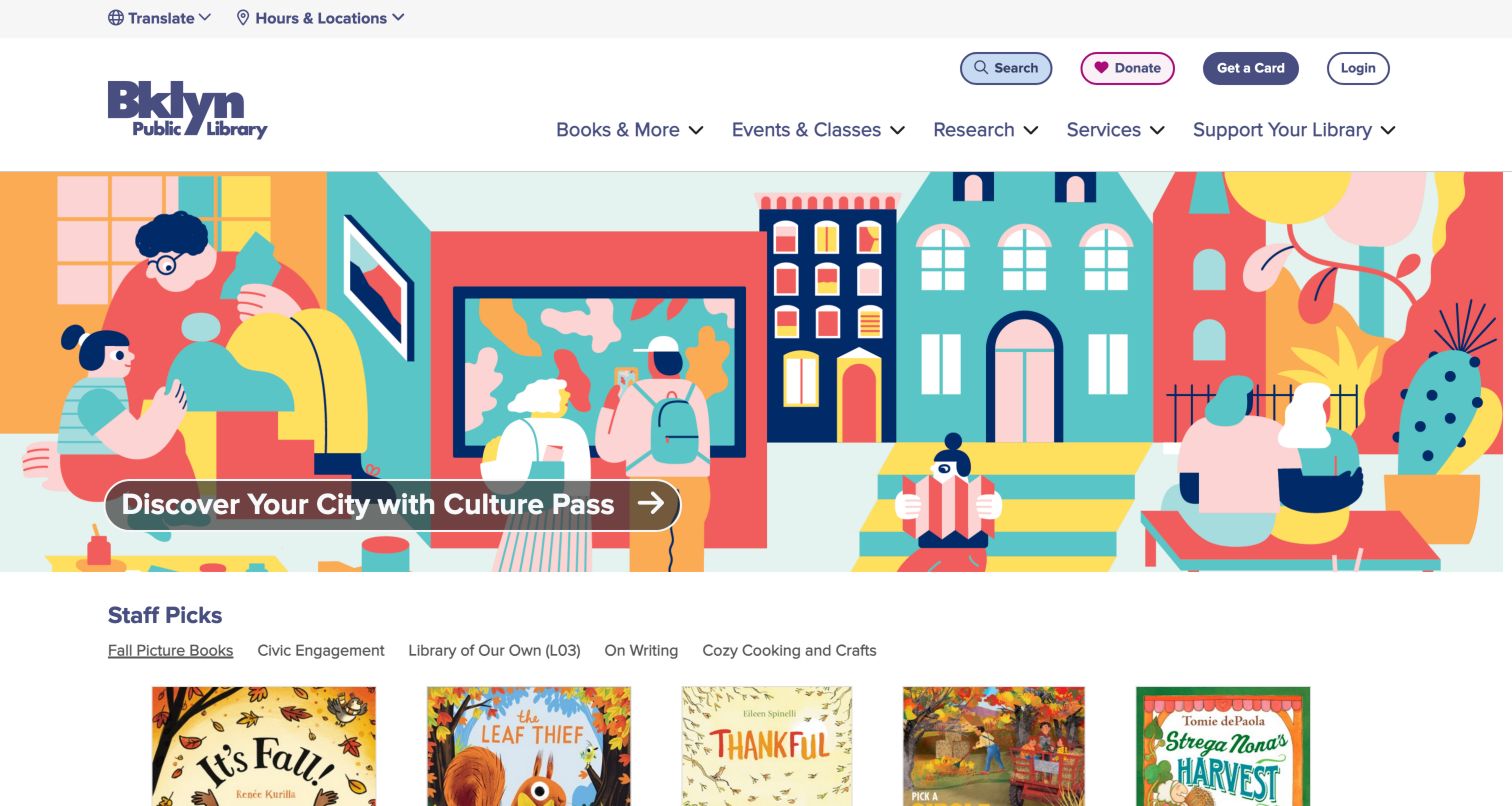
Brooklyn Public Library uses a colorful illustrated city scene to promote Culture Pass. The direct invitation to discover the city is legible over the artwork, while the header keeps Search, Donate, Get a Card and Login as separate pill-shaped controls. A slim utility row gives translation and hours their own place. Below the feature, Staff Picks changes the mode from a broad benefit to a browseable reading shelf, with topics such as fall picture books, civic engagement and cozy cooking. The page communicates that membership connects readers to cultural experiences as well as books. Its visual identity remains distinctive without requiring each utility action to adopt the illustration style.
What you can learn
Connect an expansive membership benefit to a concrete next action, then offer a smaller curated entry point below it. Keep utility controls in a stable zone so campaign artwork can change independently.
Pros
The Culture Pass benefit is explained through both a clear title and civic illustration.
Staff Picks topics make browsing feel more specific than a generic books carousel.
Cons & considerations
The large illustration occupies much of the first viewport.
Several compact header actions need adequate spacing when adapted to smaller screens.
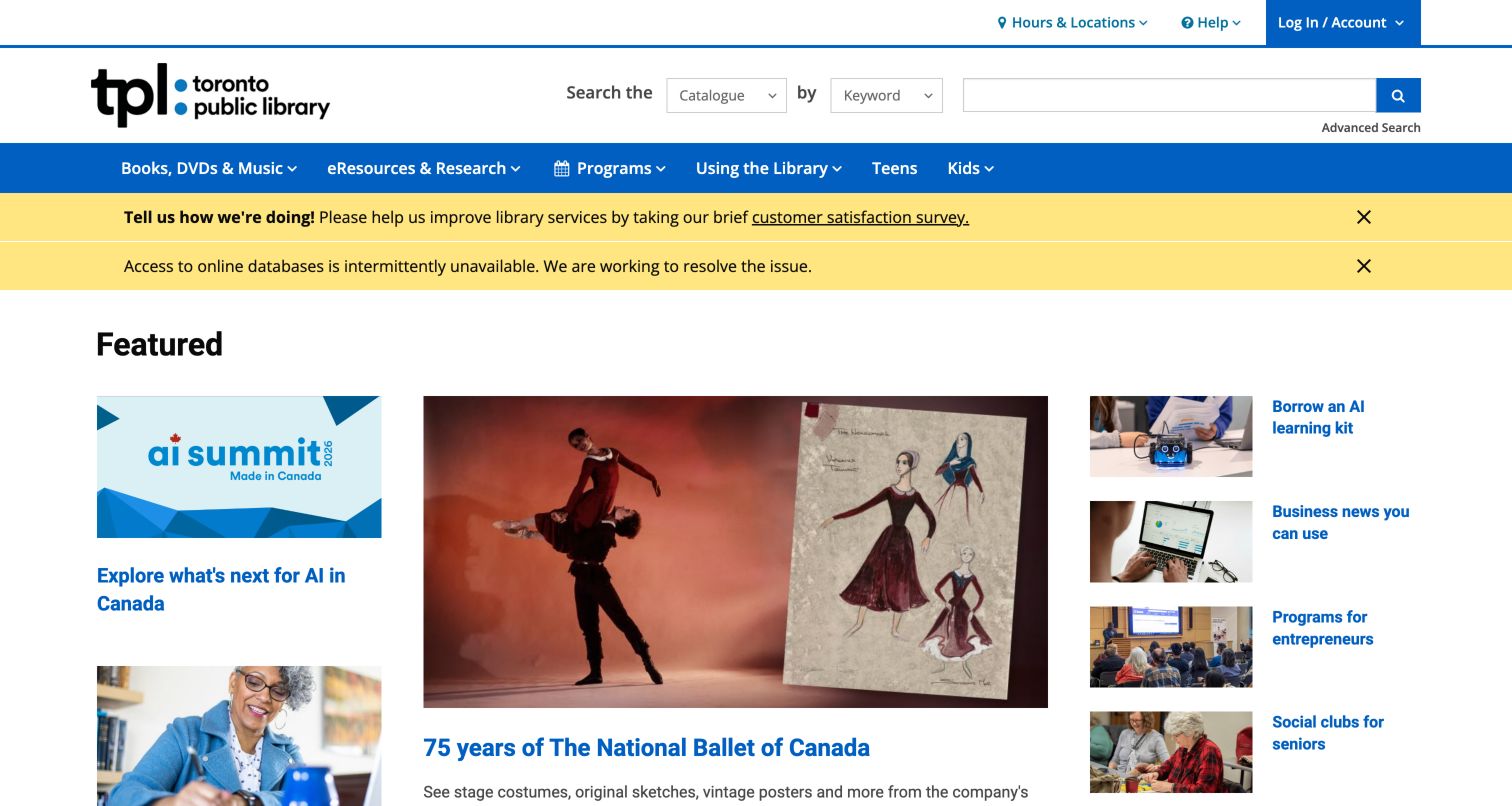
Toronto Public Library combines a conventional catalog and keyword search header with a more editorial grid below it. The captured page featured an AI summit, a ballet exhibition and smaller reading or learning stories, with separate routes for kids and teens. A satisfaction survey and a database interruption appeared as yellow notices before the features. The central exhibition image anchors the grid while the side columns allow text-led stories to receive attention without oversized photographs. This is a practical approach when a library has many programs to promote simultaneously. It also makes editing priority important: the first screen contains several different calls for the visitor's attention.
What you can learn
Build a recognizable search and service header, then use different editorial card sizes to signal priority. Treat survey requests and service outages differently so a voluntary invitation does not visually rival a disruption.
Pros
The catalog interface remains clearly identified above changing editorial content.
Different card sizes accommodate exhibitions, learning events and shorter resource stories.
Cons & considerations
Several announcements and campaigns compete within the same first screen.
Small text-led side stories may need stronger prioritization on narrow layouts.
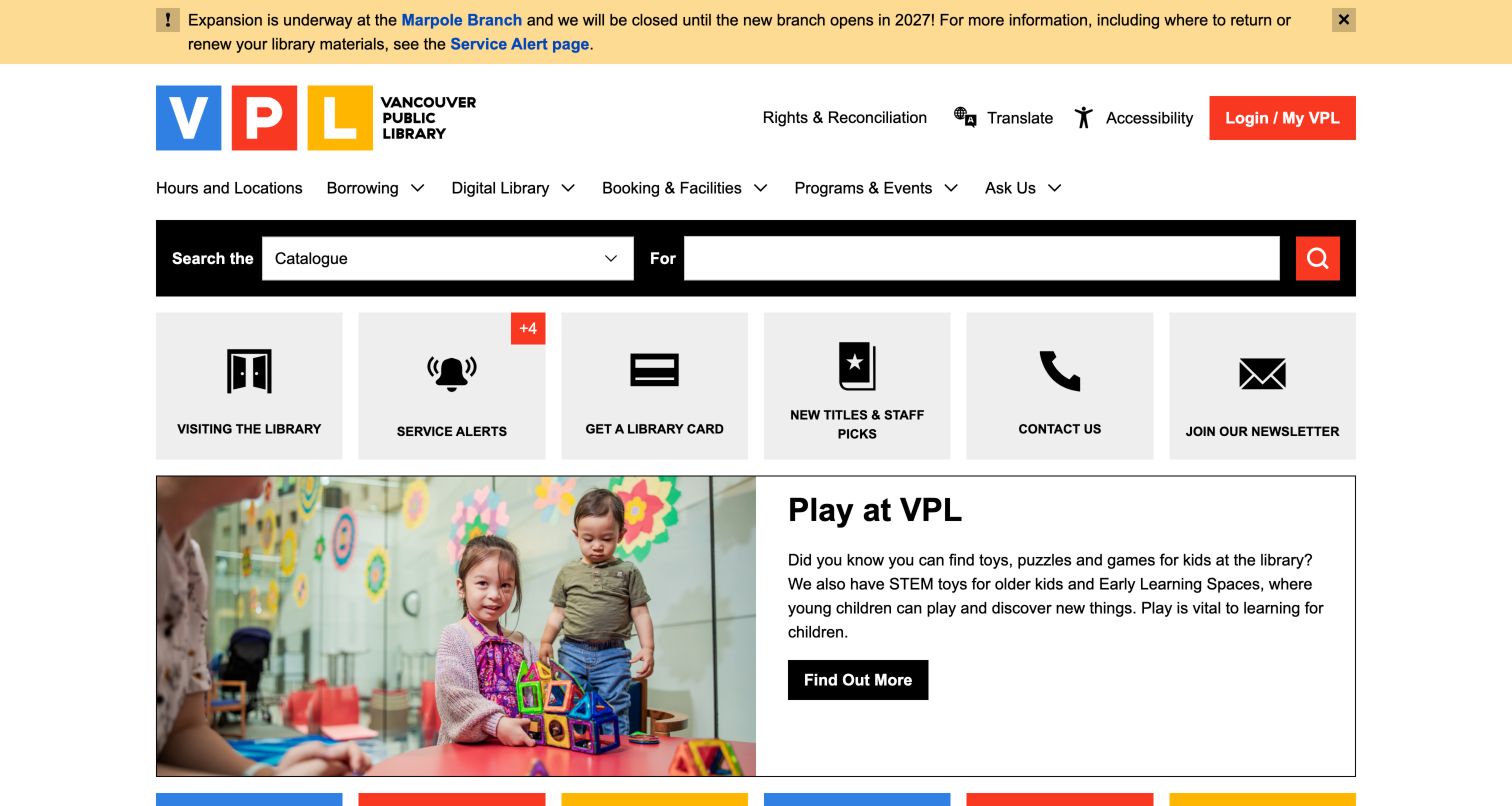
Vancouver Public Library uses a black search bar with a visible scope selector for catalog, website and events. Beneath it, a row of gray service tiles names Visiting, Service Alerts, Library Card, New Titles, Contact and Newsletter. Those controls create a dependable task layer before the larger family program photograph. A prominent Marpole closure notice included directions about returns and renewals, while utility links covered translation, accessibility and account access. The arrangement gives practical information equal status with the library's editorial voice. The blocky colored logo and restrained gray modules also keep the service layer recognizable even when the featured program changes.
What you can learn
Place high-frequency services in a reusable strip and let campaign content begin below it. A branch closure notice should help patrons choose their next step, not merely announce that a building is unavailable.
Pros
Search scope is explicit rather than implied by a generic magnifying-glass control.
The service tile row exposes card, contact and visiting tasks together.
Cons & considerations
A long row of equally weighted shortcuts can flatten priority between common and secondary tasks.
The alert and utility layers add considerable material before the featured program.
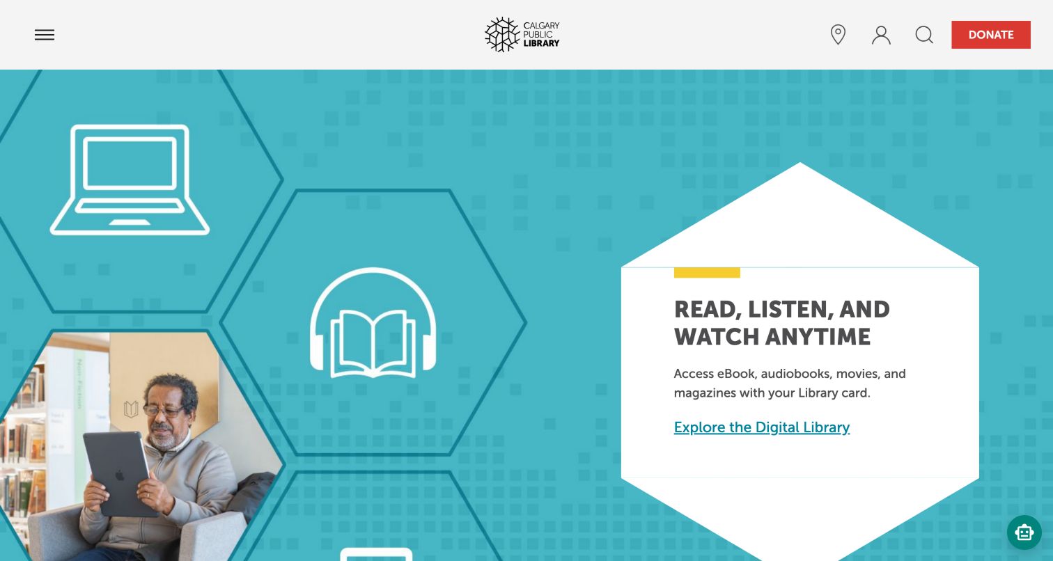
Calgary Public Library uses a restrained header with a centered logo and compact controls for locations, account access, search and donations. The captured hero makes the Digital Library its subject, combining a reader photograph, geometric shapes and a white text card on a teal field. Below it, concise shortcuts lead to membership, digital resources, the hotline, collections, printing and the store. A volunteer story introduces another type of participation farther down. The page is more campaign-led than a search dashboard, but the repeated practical shortcuts provide a bridge from the colorful introduction to specific services. The central brand position gives the campaign a clear institutional anchor.
What you can learn
Translate an abstract service such as a digital library into a human image and a brief explanation. Pair a compact navigation header with visible task labels below the hero so essential destinations do not depend entirely on icons.
Pros
The digital service receives a distinct visual explanation rather than only a menu link.
A short service row reconnects the campaign to routine patron needs.
Cons & considerations
Several primary header functions initially rely on compact icons.
The dominant feature makes immediate catalog searching less prominent than on utility-led sites.
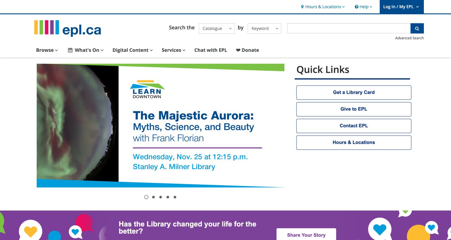
Edmonton Public Library places a lecture promotion in its main visual area while keeping a separate Quick Links panel for card applications, giving, contact and hours. The captured event creative included a title, date and venue, giving the image more practical value than a purely atmospheric banner. A purple invitation to share a library story appeared below the feature. The familiar catalog header establishes the borrowing context before the page shifts into programming. This composition is useful because the right-hand service panel can remain stable while the carousel changes, although the information embedded in event artwork still needs equivalent readable text and predictable access to other slides.
What you can learn
Give recurring services a fixed place beside rotating program promotions. Include event logistics in ordinary page content as well as artwork so the campaign remains understandable when an image is small or unavailable.
Pros
The Quick Links panel preserves direct access to hours and card information.
The featured lecture communicates concrete timing and venue information.
Cons & considerations
A carousel makes some promotions dependent on slide discovery.
Text within campaign artwork can become difficult to read when scaled down.
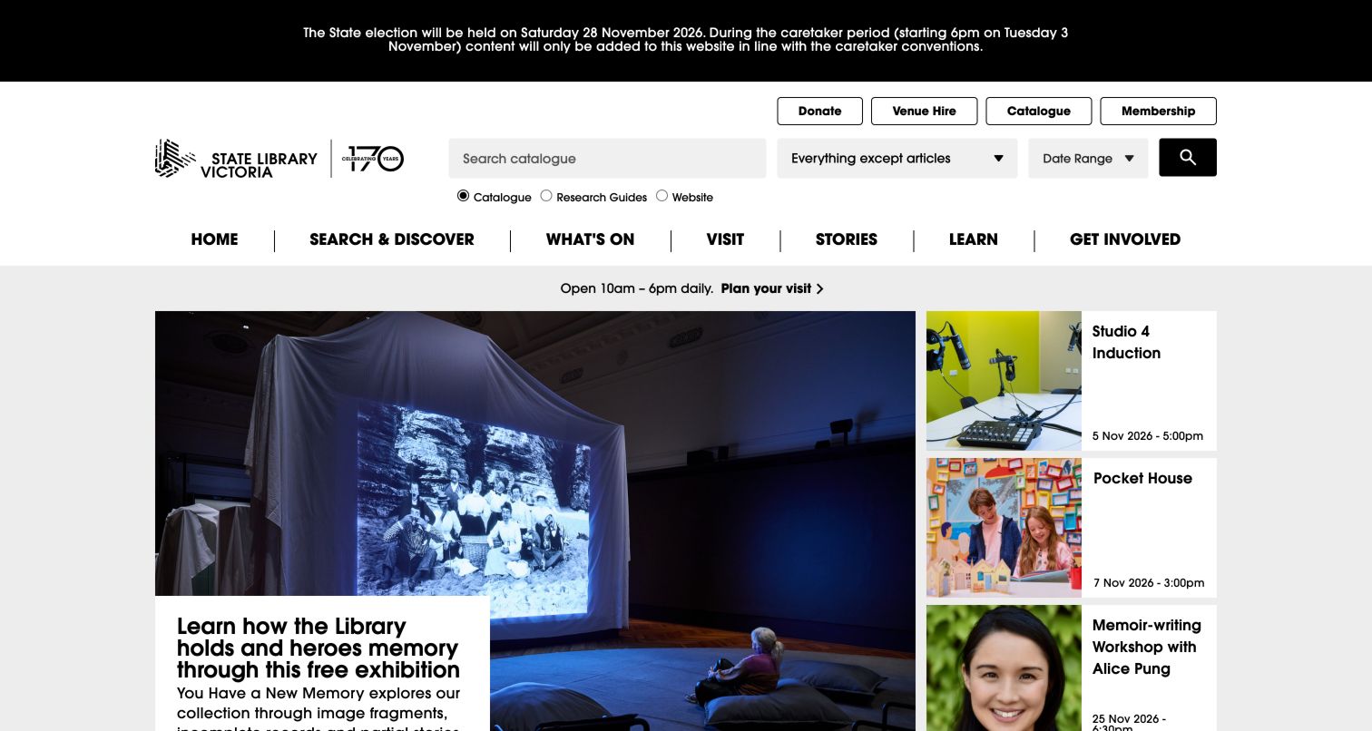
State Library Victoria places a detailed search interface near the top: visitors can choose Catalogue, Research Guides or Website, with additional material and date controls. A clear opening-hours line and Plan Your Visit link then introduce a large exhibition photograph alongside smaller event cards. Those event cards expose dates rather than treating every program as a generic image tile. The observed page also carried a caretaker-period notice and an introductory acknowledgment screen before the main content. The combination reflects a dual purpose: researchers need control over where they search, while visitors need to understand what is on and when the building is open.
What you can learn
Differentiate research scopes before a query is submitted, then keep visiting information separate from discovery tools. Pair a large exhibition feature with compact, dated events so cultural programming does not hide practical logistics.
Pros
Catalog, research-guide and website scopes are named directly.
Hours and event dates are visible close to the main cultural feature.
Cons & considerations
The detailed search controls make the header visually dense.
The introductory acknowledgment adds a step before the homepage becomes visible.
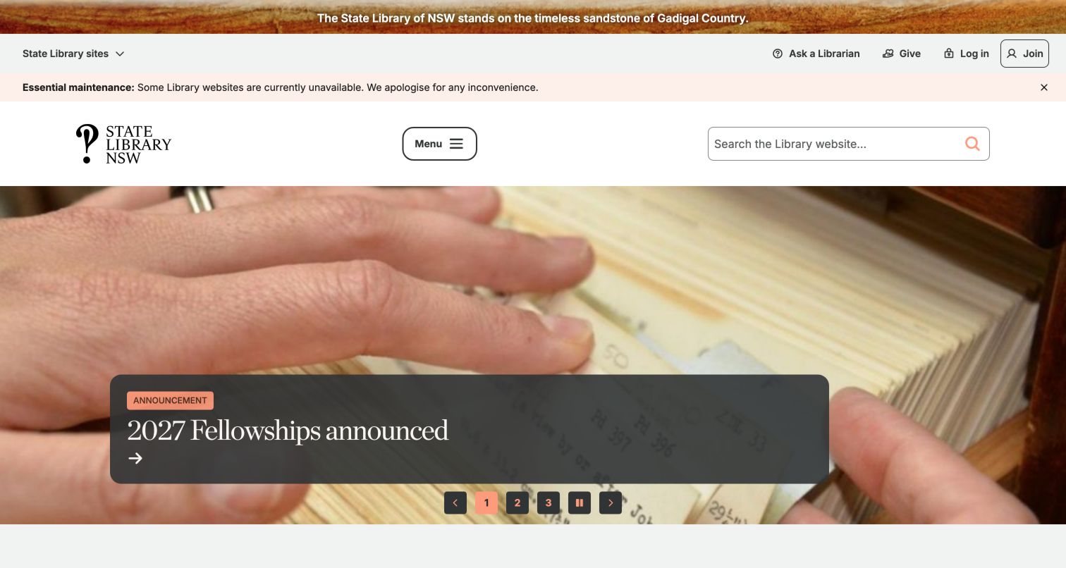
The State Library of New South Wales uses a large archival manuscript image to support a fellowship announcement. Its spacious white header separates the library identity, menu and website search from utility links such as Ask, Give, Login and Join. The hero includes visible playback and slide controls, while collection searching is introduced separately farther down the page. A maintenance notice and an acknowledgment were also present during the visit. This organization helps the library present its collections as material for active research and public stories, rather than as a static archive. The tradeoff is that visitors seeking an item in the catalog must distinguish collection search from the smaller website search.
What you can learn
Use collection imagery to explain current scholarship, but name each search destination clearly. Visible controls should accompany rotating features, and important announcements should also be reachable outside their current slide position.
Pros
A real archival image connects the fellowship story to the library's collections.
Utility actions for questions, membership and support are separated from the main feature.
Cons & considerations
Collection search sits below a large campaign area.
Multiple notices and introductory elements precede the central content.
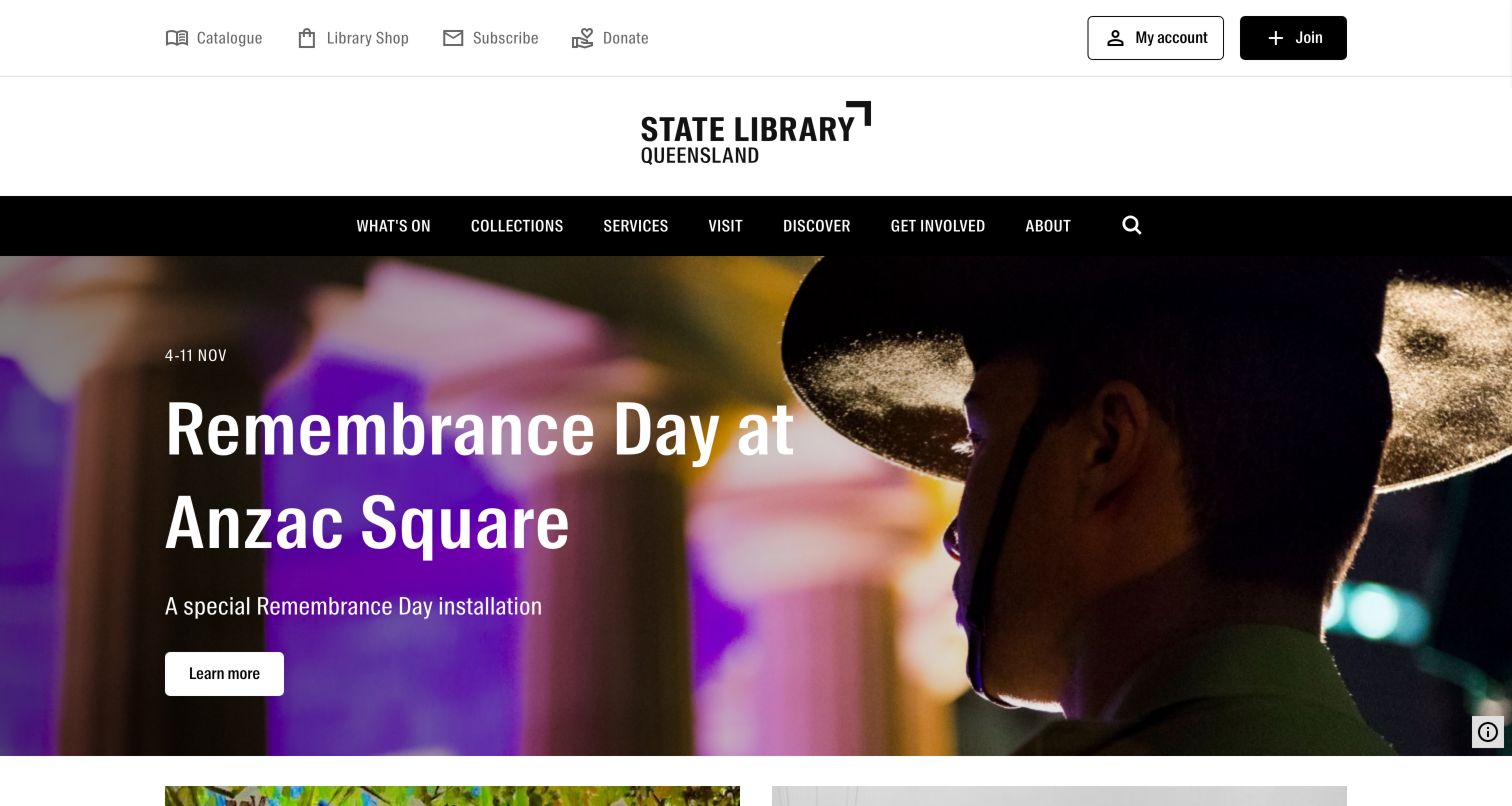
State Library of Queensland uses a centered wordmark and a restrained black navigation bar to frame a large commemorative story. In the observed page, a Remembrance Day photograph was paired with a short date range and a Learn More action. Utility links for the catalog, shop, subscription, donations, account access and joining occupied a separate upper row. The photograph carries the emotional tone while the short copy establishes the time-sensitive program. Exhibition and research routes continue beneath the hero. The layout shows how a library can give a current cultural story enough space to matter while still maintaining identifiable routes for patrons who arrived to use a collection or account.
What you can learn
Give a commemorative or exhibition feature one clear action and concrete dates. Keep durable research and membership routes outside the hero so they remain available after the topical campaign changes.
Pros
The feature includes a date range and a direct next step.
Catalog and account destinations remain visible in a separate utility layer.
Cons & considerations
The large image limits how much collection discovery appears in the initial viewport.
A long utility row requires careful prioritization when space is restricted.
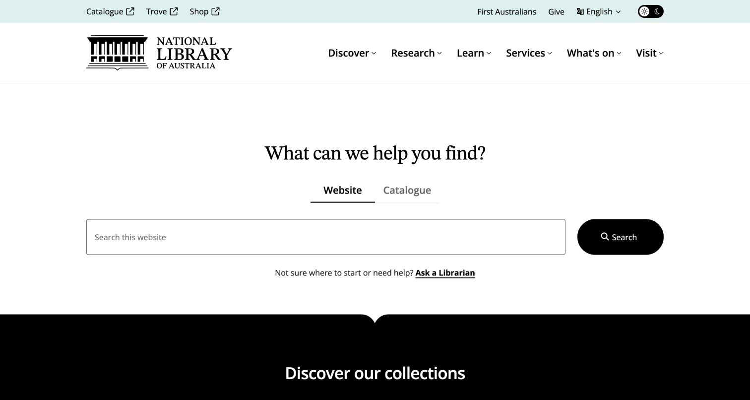
The National Library of Australia makes a simple question the center of its homepage: what can it help the visitor find? Website and Catalogue tabs sit above a broad search field and a high-contrast search control. Ask a Librarian appears nearby, giving people an alternative when they do not know how to formulate a query. A pale teal utility row distinguishes Catalogue, Trove and Shop as separate destinations, including external-link indicators. The page feels deliberately quieter than an exhibition-led library homepage. After a cultural-sensitivity introduction, the main screen gives the search task generous space and introduces collection discovery below it rather than making promotional content the first decision.
What you can learn
Start with the visitor's research intention and make the search scope visible. Put a human-help route beside the tool, especially when the collection spans unfamiliar terminology, formats or discovery systems.
Pros
Website and catalog searches are distinguished with explicit tabs.
Ask a Librarian is located near the main search rather than buried in a footer.
Cons & considerations
The introductory cultural notice creates an extra step before search.
Separate Catalogue and Trove destinations require clear explanations for unfamiliar visitors.
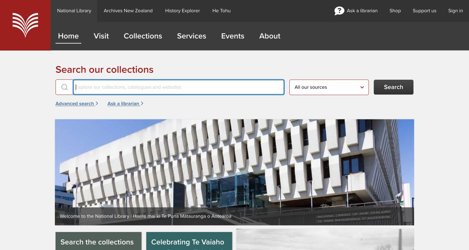
National Library of New Zealand puts Search Our Collections near the start of the page and allows the visitor to choose the source of a query. The observed options distinguished all sources, the Alexander Turnbull collection, the catalog and the website, with advanced search and help nearby. A building photograph and featured topics followed the tool rather than replacing it. Dark navigation bands and a red identity mark give the page a consistent institutional frame. The key design lesson is the visibility of the search boundary: visitors can see that different information systems exist before submitting a term, which is especially useful when a library combines published material with archival holdings.
What you can learn
Expose collection boundaries using understandable source labels and place search help next to the controls. Avoid assuming that every visitor knows which catalog holds an item or what an archival collection name means.
Pros
Source selection communicates the breadth of the discovery system.
Advanced search and help are adjacent to the main query interface.
Cons & considerations
Institution-specific source names may still need explanation for new researchers.
The layered dark navigation is visually dense before the first editorial feature.
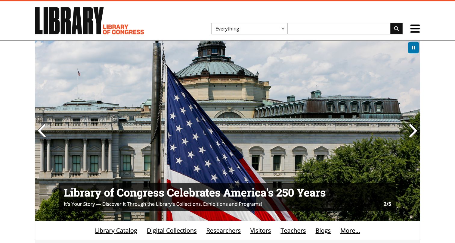
Library of Congress uses a bold stacked wordmark beside a search field with an Everything scope. The large opening feature promoted America 250 through a photograph of the building and flag, with visible slide and pause controls. Immediately below, the page named distinct routes for the catalog, digital collections, researchers, visitors, teachers and blogs. That combination recognizes that a national library is both a discovery system and a public cultural institution. The audience row is particularly useful because it lets visitors choose a mode of engagement without decoding an internal department structure. The expansive feature gives the institution presence but also takes space away from those practical routes.
What you can learn
Pair a broad institutional story with explicit audience and collection entry points. A teacher, researcher and tourist may all use the same homepage, but they should not have to begin with the same navigation assumption.
Pros
Audience routes distinguish research, teaching and visiting needs.
The hero exposes pause and slide controls rather than presenting invisible rotation.
Cons & considerations
The large campaign image places audience links lower on the screen.
An Everything search scope may need further guidance once users encounter mixed results.
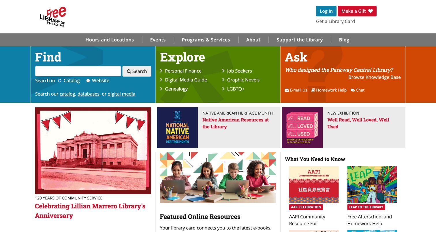
Free Library of Philadelphia builds its upper task area around three verbs: Find, Explore and Ask. Find includes a catalog-versus-website choice, Explore introduces subject destinations, and Ask offers a knowledge-base route alongside contact and help options. The three colors make the parallel paths easy to distinguish. Below them, a denser editorial area carries anniversary content, Indigenous resources, exhibitions, digital media and programs. The useful idea is that searching is only one way to begin. Someone who needs a recommendation or assistance can identify an appropriate path before confronting the many stories on the page. Utility links for account access, cards and giving remain separate above the task row.
What you can learn
Offer a search path, a browsing path and a help path at the same level. Use verbs that describe the visitor's behavior, then keep the supporting controls specific enough to show what each route will do.
Pros
The three starting modes accommodate different levels of research confidence.
Catalog and website scope are visible in the Find area.
Cons & considerations
The lower editorial columns introduce a high density of competing stories.
Three equally prominent modes need concise labels to avoid an overloaded header.
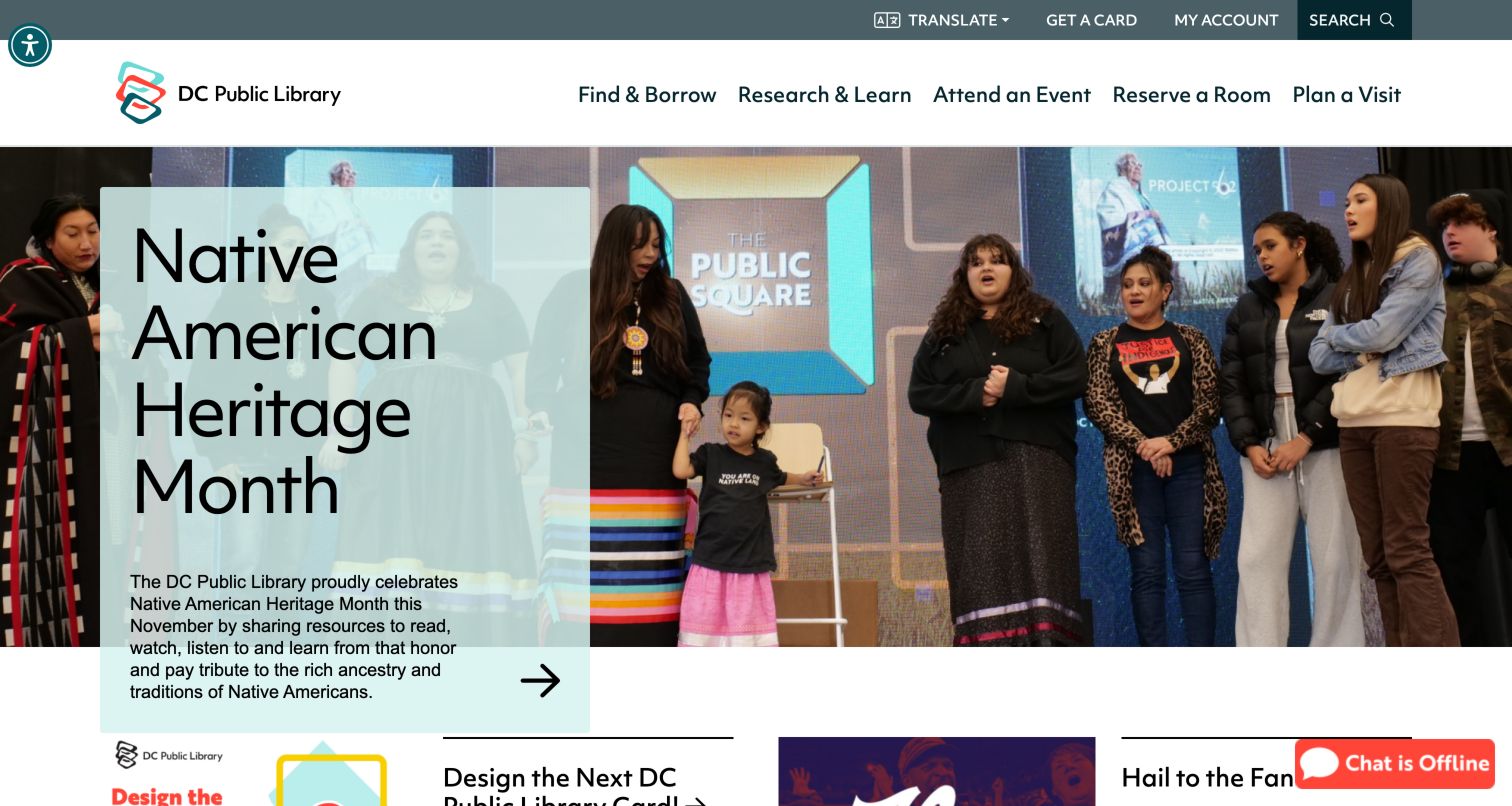
DC Public Library organizes its primary navigation around actions: Find and Borrow, Research and Learn, Attend an Event, Reserve a Room and Plan a Visit. In the captured page, a Native American Heritage Month photograph supported a translucent cyan story card, while translation, card and account routes remained in the utility area. The verbs make the institution's services easier to interpret than a set of department names would. The room-reservation route is especially visible alongside traditional borrowing tasks. A chat badge appeared at the lower edge with an offline state, showing the importance of communicating assistance availability rather than presenting chat as an always-live promise.
What you can learn
Name navigation around patron goals and give non-book services a legitimate place in the hierarchy. When offering live help, communicate its current availability and provide an alternative contact route when staff are offline.
Pros
Navigation labels explain what visitors can do in each section.
Room reservations are visible alongside borrowing and events.
Cons & considerations
Text over a large photograph requires careful contrast across different campaign images.
An offline chat badge needs a useful follow-up path to avoid becoming a dead end.
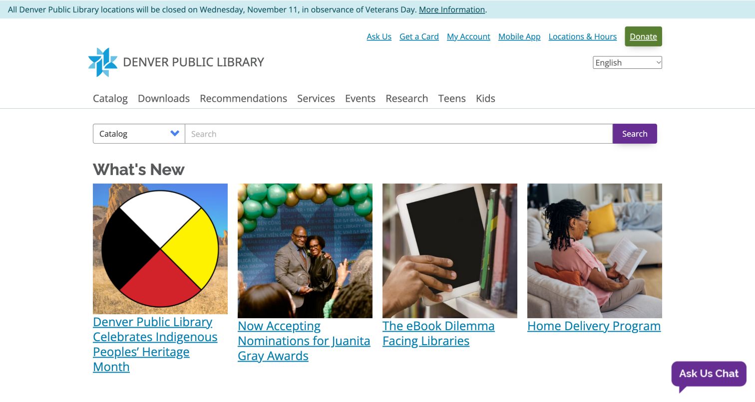
Denver Public Library puts a broad search interface above a four-card What's New grid. The scope choices explicitly include catalog, digital collections, events, history and the website, making the range of material visible before a query. In the captured page, the cards covered Indigenous heritage, awards, e-book issues and home delivery. Compact utility links offer card, account, app, location and donation routes, while a closure strip stays distinct at the top. The main content is relatively restrained: a small number of photographic cards gives each story room without a full-screen hero. A chat entry remains available near the bottom edge for visitors needing assistance.
What you can learn
Use search scope to reveal specialized resources such as local history, and limit the first editorial row to a few well-chosen stories. Clear utility links can carry repeat tasks without turning the page into a dashboard.
Pros
Search scopes include specialized collections rather than only catalog and website.
The four-card row gives news a predictable and readable structure.
Cons & considerations
Numerous utility links and category choices create a busy header.
Visitors unfamiliar with collection boundaries may need help selecting the right scope.
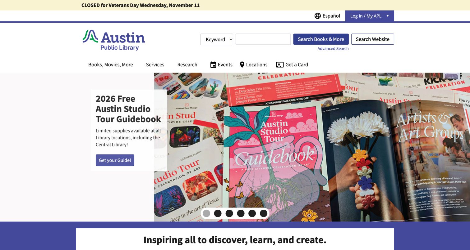
Austin Public Library explicitly separates Books and More from Website search with two labeled controls beside the same query area. The header also exposes Spanish-language access, account information and practical navigation for cards, events and locations. The captured hero promoted a studio-tour guidebook with a colorful collage and a direct Get Guide action. Below it, the page introduced the library mission and service shortcuts such as meeting rooms, cards and job help. This is a useful balance of local participation and familiar library tasks. The large carousel gives a topical city campaign prominence, but the search destination labels ensure that the promotional focus does not erase the distinction between collection and service information.
What you can learn
If one search field can send a query to different systems, write the destination on the action control. Use local campaigns to demonstrate relevance while keeping card, location and help tasks in a stable surrounding structure.
Pros
The two search actions state their destination in ordinary language.
The guidebook feature offers a specific next step rather than a vague promotional link.
Cons & considerations
The tall campaign image pushes some service shortcuts below the initial viewport.
Carousel dots alone give limited information about the subjects of other slides.
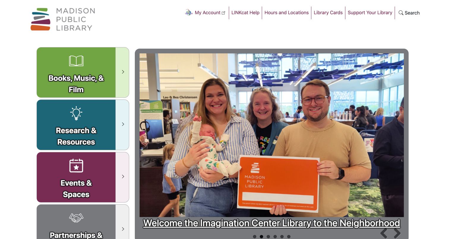
Madison Public Library places four colored category blocks in a vertical rail: Books, Music and Film; Research and Resources; Events and Spaces; and Partnerships and Initiatives. Beside them, the main photograph showed a family with a card connected to the new Imagination Center. The upper utility area keeps account access, LINKcat help, hours, cards and support separate from the narrative feature. The vertical rail gives the page a clear division between ongoing service families and a current story. It also makes partnerships visible as a first-class category rather than treating them as institutional background. The main campaign uses overlay text and carousel controls, which need consistent treatment as photographs change.
What you can learn
Group services into a small set of recognizable families and use a stable rail to distinguish them from rotating stories. Include community partnerships when they are a meaningful reason people use the library.
Pros
Four service families create an understandable alternative to a long horizontal menu.
The community photograph connects a new facility with the people it serves.
Cons & considerations
A vertical navigation rail needs a deliberate reordering on narrower screens.
Overlay text may compete with detailed photographs in future campaign slides.
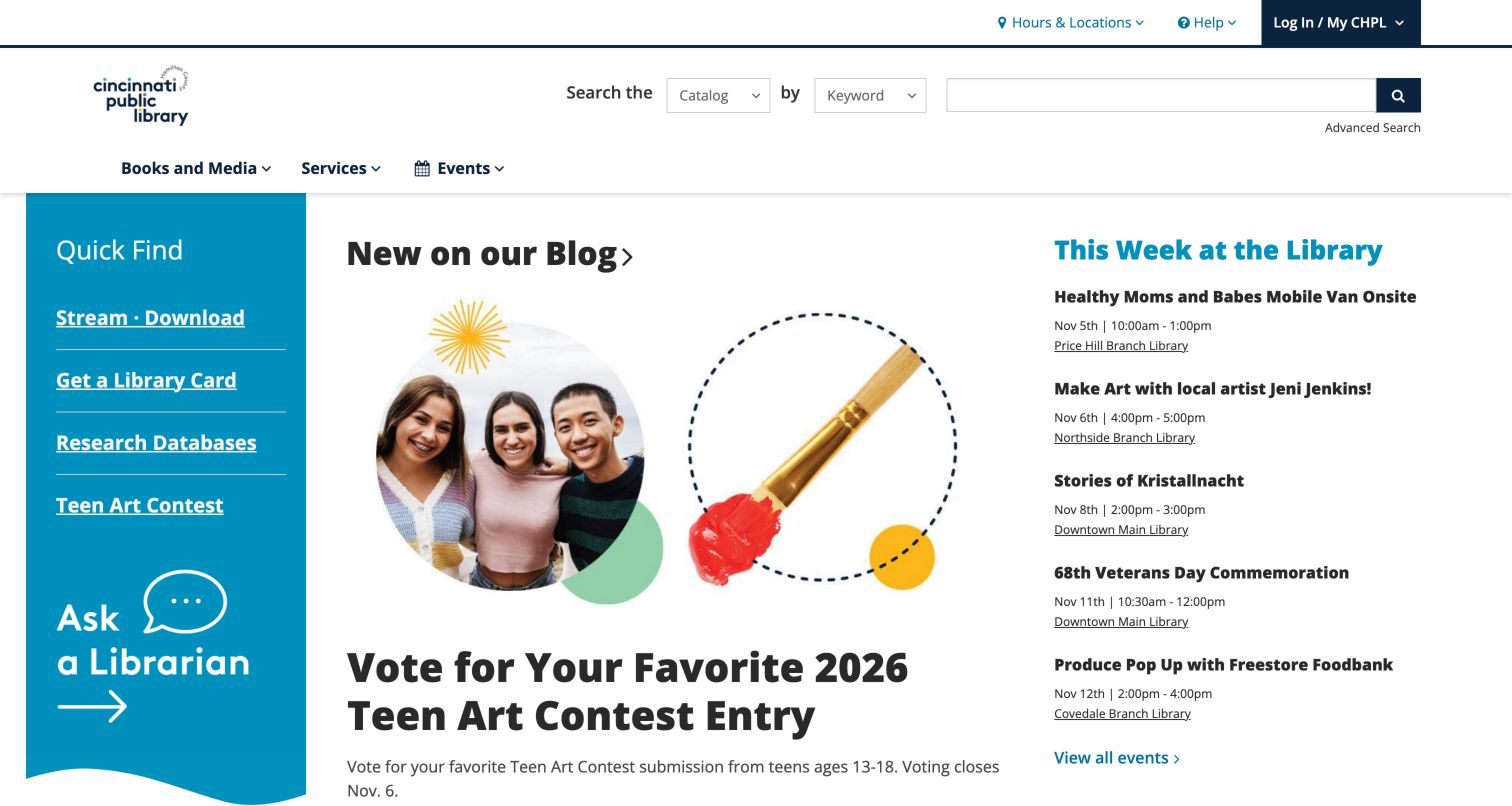
Cincinnati and Hamilton County Public Library uses a compact primary navigation for Books and Media, Services and Events, with catalog search in the header. Its main area divides into three useful roles: a teal Quick Find panel, a current blog feature and a This Week event list. The captured story promoted a teen art vote, while the event list carried dates and branch details. Quick Find included streaming, library cards, databases and an Ask a Librarian route. The composition gives the visitor several useful choices within one view without making every item a large graphic. Its effectiveness depends on the three columns keeping distinct jobs rather than becoming interchangeable promotional spaces.
What you can learn
Assign each homepage column a purpose: repeat tasks, one featured story and near-term events. Keep date and branch metadata in event summaries so visitors can judge relevance before opening a detail page.
Pros
The Quick Find panel exposes common services close to the page entrance.
Upcoming events retain practical time and location context.
Cons & considerations
Three columns can become text-heavy if editorial descriptions grow.
A central promotional story needs enough contrast to remain distinct from the adjacent lists.
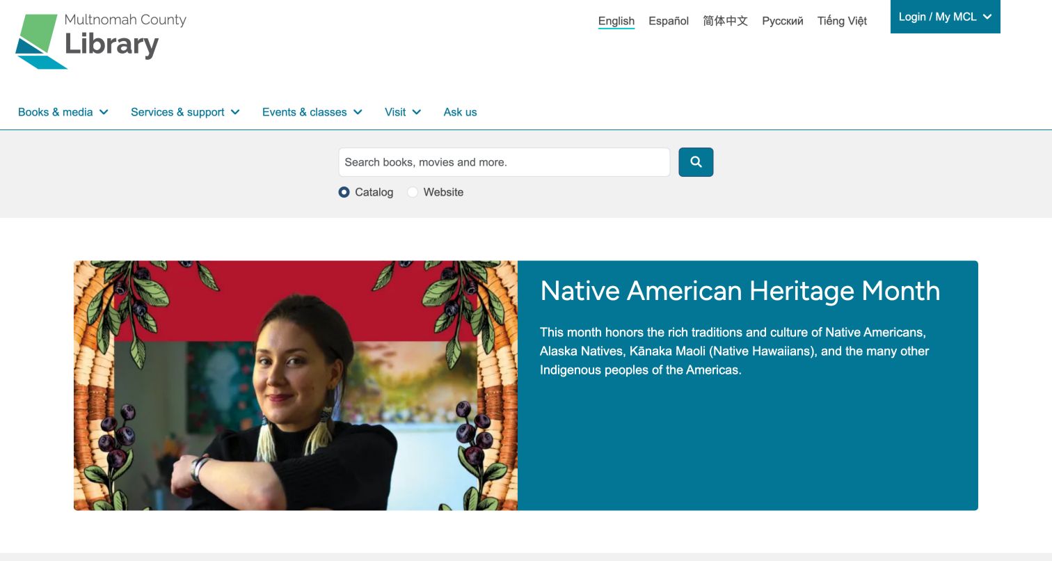
Multnomah County Library puts language routes in the upper utility area, including English, Spanish, Chinese, Russian and Vietnamese. A concise navigation row covers books, services, events, visits and questions, while catalog-versus-website radio controls make the search scope visible. The observed feature paired a Native American Heritage Month photograph with a teal text panel, keeping the headline outside the image. Community resource destinations continued below it, including culturally specific and multilingual material. The arrangement communicates language access as part of the normal site structure rather than an afterthought. It also leaves the hero adaptable: photography and explanatory text occupy separate areas with different responsibilities.
What you can learn
Place language choices where they remain visible across campaigns, and keep hero text separate from photographs when possible. Use clear search-scope controls to help multilingual visitors understand which information system they are entering.
Pros
Several language versions have explicit entry points in the utility header.
The split hero keeps its written message independent of image detail.
Cons & considerations
A compact row of language links can become crowded when labels are translated.
Visitors still need clear explanations of community-resource categories below the feature.
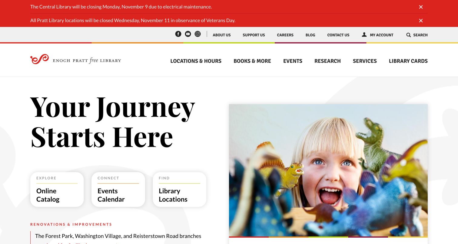
Enoch Pratt Free Library combines a large serif invitation, Your Journey Starts Here, with a photograph of a child using puppets. Three white cards for the Online Catalog, Events Calendar and Library Locations sit over the lower part of the hero, bringing practical choices into the visual introduction. Utility links and a restrained multicolor brand line give the page an institutional frame. Two red closure notices were active above the header, and renovation updates continued farther down. The design's strongest move is its three-route simplification: borrowing, attending and visiting are available without reading a long mission statement. The portrait gives those tasks a human context rather than presenting a purely administrative page.
What you can learn
Reduce the first practical decision to a few meaningful destinations and place them where the welcome image leads the eye. Make closure and renovation messages specific while limiting how much vertical space simultaneous notices occupy.
Pros
Catalog, calendar and locations form a concise task trio.
The child-focused photograph gives the library's services a tangible human context.
Cons & considerations
Multiple red notices substantially extend the header before the hero.
Overlapping service cards require careful spacing when images and layouts change.
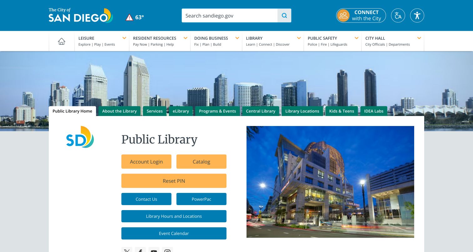
San Diego Public Library operates within the city's broader website frame. A cyan city header includes city search and translation, followed by city navigation and a skyline image. The library's own identity then appears in an inset department panel with prominent account, catalog and PIN-reset links, plus contact, PowerPac, hours and event controls. This layered structure makes the relationship to city government explicit, but it also creates two levels of navigation and searching. The library panel is therefore doing important orientation work: it tells the visitor that the current section is the library and supplies task-specific routes that would otherwise be lost among general municipal services.
What you can learn
When a library shares a municipal platform, give the department a strong local identity and its own clear task controls. Label citywide search separately from catalog access so visitors understand where their query will go.
Pros
Library account and catalog tasks receive prominent colored controls within the department panel.
The page preserves a visible connection to the city's broader service framework.
Cons & considerations
City and library navigation layers compete for the same first-screen space.
Multiple catalog-related labels may require explanation for unfamiliar patrons.
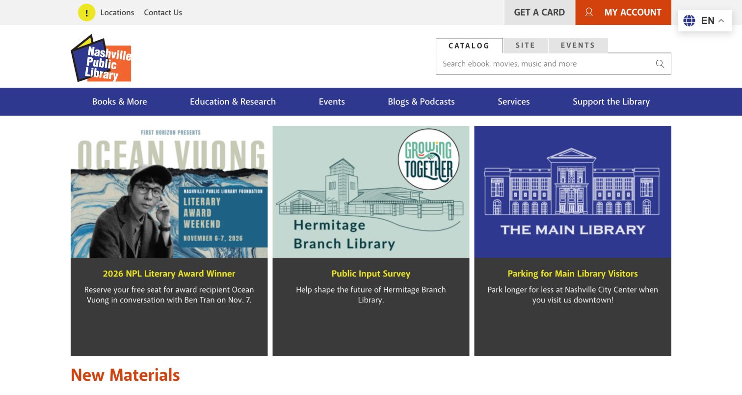
Nashville Public Library places Catalog, Site and Events tabs above its search area, making the three discovery destinations explicit. Get a Card, My Account, Locations and Contact remain in a separate utility row. After the branch alerts were collapsed using the page's own control, the captured homepage showed three promotional cards: an author award event, a public-input survey and downtown parking guidance. That mixture is instructive because a major cultural program receives space alongside ordinary access information. The blue navigation and restrained caption blocks keep the cards coherent despite their different subjects. Alert management is especially important here because several branch notices can otherwise precede the useful main content.
What you can learn
Include practical visiting information in the same editorial planning process as major events. Search tabs should communicate distinct destinations, and a long alert area should have a clear way to collapse it without hiding its presence.
Pros
Catalog, website and event search modes are visibly distinguished.
Parking guidance appears alongside cultural programming where visitors can encounter it.
Cons & considerations
Multiple branch alerts can dominate the opening view when expanded.
Three promotions of equal size may not communicate which action is most urgent.
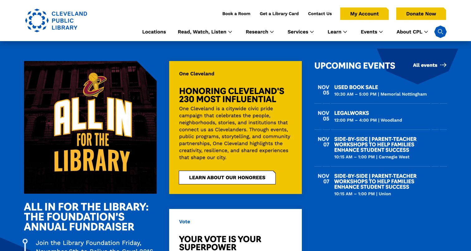
Cleveland Public Library uses a clear white header with room booking, card and contact routes, plus yellow account and donation controls. Below the navigation, the captured page combined a fundraising image, a bright One Cleveland civic story and a text-based upcoming-events list. Event entries included dates, times and branches, keeping the right-hand column useful for visitors making near-term plans. The civic story is more expressive than a standard book promotion and reinforces the library's public role. Search is comparatively compact in the header, so this example is strongest as a model for programming and participation rather than as a catalog-first homepage. The contrasting panels make the different content types recognizable.
What you can learn
Give civic programming a clear editorial voice while retaining dates, times and branch details in the event agenda. Keep frequent actions such as booking a room and obtaining a card independent of changing campaign content.
Pros
The event agenda exposes timing and branch information before a detail click.
Room booking and card access are visible in the upper utility area.
Cons & considerations
The compact search control has less visual prominence than the civic campaign.
Several strongly colored panels require careful editing to avoid competing focal points.
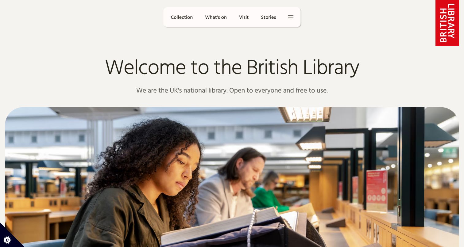
The British Library opens with a direct welcome and a statement that it is open to everyone and free to use. A large reading-room video fills much of the first screen, with a visible pause control. The pale header uses a rounded navigation group for Collection, What's On, Visit and Stories, while the tall red logo provides a distinctive anchor at the right. Below the video, a question about what the visitor wants to do introduces illustrated task routes. The composition makes the institution feel approachable before asking people to choose a service. Its generous visual space suits an invitation, though visitors arriving for a specific catalog task must move beyond the opening scene.
What you can learn
Use a plain-language welcome to reduce uncertainty about who a research library serves. Follow the atmosphere-setting image with concrete task choices, and provide visible motion controls when a moving hero occupies the main view.
Pros
The welcome explicitly addresses public access rather than assuming prior familiarity.
A pause control accompanies the large reading-room video.
Cons & considerations
The video occupies substantial space before practical task choices.
The compact navigation requires visitors to open broader categories for specific research actions.
Kegan is a freelance web designer and developer with 15+ years of experience helping businesses turn complicated website requirements into clear, maintainable digital experiences. He works directly with clients from planning and design through development, launch, and ongoing support.
For library website design, his development approach focuses on catalog connections, event information, branch details, and accessible community resources. The scope can be a targeted improvement or a complete custom build, with responsive layouts, thoughtful content structure, and integrations chosen around the people using and maintaining the site.
Show 3 other library website designersHide other library website designers
Plan a library website around real patron decisions
Map the separate discovery systems
List the catalog, digital collections, archives, events platform and general website. Decide which queries each one handles, how patrons recognize a change of system and where help is available. Preserve the search context when linking between them where the systems support it.
Define a small set of durable tasks
Use service data and staff knowledge to identify repeat needs such as account access, cards, hours, reservations and borrowing. Give these tasks stable labels and positions so a new campaign does not change the basic way the site works.
Create a branch information model
Store each branch's address, current hours, exceptions, contact details, facilities and accessibility information consistently. Distinguish a temporary closure from permanent location information, and assign responsibility for keeping dates current.
Set an alert hierarchy
Separate an urgent service interruption from a survey invitation or general announcement. Decide how many notices may appear at once, when they expire and whether visitors can collapse them. Every interruption should explain its practical effect.
Build an editorial calendar around services
Plan reading lists, exhibitions and community stories alongside card campaigns, digital-resource guidance and visiting advice. A large feature should have one clear action, while smaller dated lists can handle frequently changing events.
Test with different kinds of patrons
Review tasks with first-time visitors, experienced researchers, caregivers and people using different languages or assistive technology. Check search labels, keyboard paths, motion controls, text resizing and transitions to external systems. A visual review alone does not establish accessibility conformance.
The editing job behind the design
Choose systems that keep library information dependable
Treat the public website, integrated library system, discovery catalog and events tools as related services with distinct responsibilities. A polished homepage cannot compensate for unclear transitions between them. Confirm which system owns account information, catalog availability, branch hours and event registration before designing shared components or synchronization.
Public technology observations can show references to content, analytics, media or interface tools, but they do not establish the complete internal library stack. The evidence groups attached to individual examples should be read at their stated scope. Evaluate authoring roles, translation support, alert expiry, search integration and maintenance capacity directly when selecting a platform for your own library.
Our WordPress website examples offer a separate look at publishing approaches. A visible platform label is evidence for that named page, not a guarantee that the same system will suit your requirements.
Before the public launch
Library website review checklist
Can visitors distinguish catalog search from website and event search?
Are account access and card applications easy to identify?
Does every branch have current hours, an address and contact details?
Do closure notices name the affected service and dates?
Are alternatives explained when a service is interrupted?
Do event summaries include date, time, audience and location?
Can patrons find digital borrowing and research help?
Are language routes visible and consistently maintained?
Are room bookings and other non-book services discoverable?
Can rotating or moving features be paused?
Have keyboard navigation, text resizing and assistive-technology paths been tested?
Are transitions to external catalogs and registration tools clearly identified?
These checks are a project checklist, not a performance, legal, security, or accessibility certification. Test real journeys with the people responsible for the website before making claims about the result.
Sources & editorial method
How this collection was selected and reviewed
Original selection: This collection uses the saved target of 29 distinct library websites. Official public homepages were opened and reviewed on November 5, 2026, with direct browser screenshots retained alongside their source URLs, actual capture dates and dimensions. Reviews describe observed content organization and visual presentation; searches, account actions, reservations and other forms were not submitted. Temporary campaigns and notices reflect the observation date. Public stack findings are separately scoped evidence and do not establish internal systems, performance or accessibility certification. On November 5, 2026, Mill Valley Public Library was reviewed and added as Editors Choice in the first slot, bringing this collection to 30 examples. All earlier reviews and their original capture dates are retained. The badge is an editorial design selection, not a user-vote award or an endorsement of the organization’s services.
Each example links to its actual source page. Screenshots are direct browser captures with their own capture dates; moving imagery, announcements and live designs can change. The notes describe observable design choices and conditional tradeoffs, not measured traffic, conversion results, service quality, or accessibility conformance.
Technology labels use public page metadata, asset evidence, or explicitly cited platform documentation. Platform documentation is not a complete current deployment audit. A component reference may be legacy or unused; it is not a complete backend inventory. Unknown stacks are omitted. These sites are editorial examples, not our client portfolio.
Written, Edited and Curated are separate editorial records, not timestamps advanced by a rebuild. Website designs and imagery belong to their owners. See our editorial standards or suggest a correction.
Questions worth asking
Library website design questions
Should a library homepage lead with search or a campaign?
That depends on its audience and task mix. Research-focused libraries often benefit from prominent scoped search, while public systems may balance a feature with common tasks and events. In either case, repeat tasks need a stable route that does not disappear when the campaign changes.
Why separate catalog search from website search?
The two searches often cover different material and may run on different systems. A person seeking a book and a person seeking opening hours should understand the destination before submitting a query. Tabs, radio controls or clearly labeled action buttons can make the distinction explicit.
What belongs in a branch closure notice?
Name the branch or service, explain the relevant dates and state what patrons should do next. Depending on the interruption, useful details may include alternative locations, returns, renewals or continued online access. Remove or archive the notice once it no longer applies.
How much event information belongs on the homepage?
Include enough to judge relevance: the subject, date, time, location and intended audience where appropriate. Use detail pages for fuller descriptions and registration requirements. A compact dated list often handles multiple events more efficiently than a carousel of promotional artwork.
Do these examples prove a website is accessible?
No. The reviews identify visible design patterns and potential questions for further testing. Accessibility evaluation requires direct testing of interaction, structure, assistive-technology behavior and relevant content across the complete service, including any external catalog or registration tools.
Start with the patron's next decision: what to search, where to go, when to arrive or whom to ask. Then use the library's collections, people and programs to make those practical routes feel connected to a distinctive public institution.