Best Kirby Websites of 2026 (20 Real-World Examples)
Twenty public websites with direct screenshots, original design reviews and carefully scoped Kirby evidence from its official showcase and public sources.
A good Kirby website gives its content a useful structure and its editors a manageable way to maintain it. The finished interface can be quiet, expressive or dense with information. What matters is whether visitors can understand the organization, find the right material and move between pages without learning a new set of rules each time.
Start with the content that changes and the people responsible for changing it. A university department needs different records from a performer, a cultural festival or a software product. Identify those records before deciding how many layouts the site needs. Clear titles, useful relationships and consistent image information can support several visual treatments without making each page an independent design project.
This collection begins with ETH Zürich’s Chair of Being Alive, the German STIHL centenary microsite, Sea Shepherd France, Fisherman’s Friend Germany and the public OBS Project website. Those are the specific reviewed properties. A showcase listing does not establish the technology of every site owned by the same organization, the current Kirby version or a separate shop, ticketing service or native application. The reviews keep those boundaries explicit.
Before the examples
What makes good Kirby website development in 2026?
Design the editor’s form around the real content
Kirby blueprints configure the Panel interface for pages, files, users and the site. Treat that interface as part of the design work. An editor should recognize the fields and understand which information belongs together. For a project archive, distinguish a project title, description, date and image credits instead of relying on one large text box. Give recurring content a predictable structure, with labels that match the team’s language. A useful editing form makes later visual consistency easier to maintain.
Kirby templates combine HTML with PHP to present content, and pages with a similar structure can share a template. Use that flexibility to create a clear order for headings, descriptions, supporting details and next actions. A highly individual visual style still needs recognizable navigation and readable text. Consider a short entry, a long title and an incomplete image set while defining the layout. The template should remain useful across ordinary content variation rather than depending on one perfect demonstration page.
An image may document a work, explain a place, identify a person or set the tone of a story. Decide that purpose before choosing its crop and display size. Kirby’s thumbnail tools support resizing and cropping, including use of a saved focus point. Prepare image requirements that the team can follow: useful source dimensions, meaningful captions, appropriate alternatives and consistent credit information. Check whether a crop removes the detail the surrounding text discusses. A striking opening photograph should not make later content harder to find.
The examples cover institutional information, public campaigns, product websites, cultural programs and independent publishing. Each review refers to an exact public property and a real capture. Official showcase associations are documentary evidence; separately recorded public-source observations may add current signals at their own dates. Neither layer is a complete current backend inventory.
We start with five recognizable brands or organizations: ETH Zürich — Chair of Being Alive, 100 Years of STIHL, Sea Shepherd France, Fisherman’s Friend Germany, OBS Studio. Each attribution applies to the named website property, not every product or website belonging to its organization. This is a curated reading sequence, not a measured ranking.
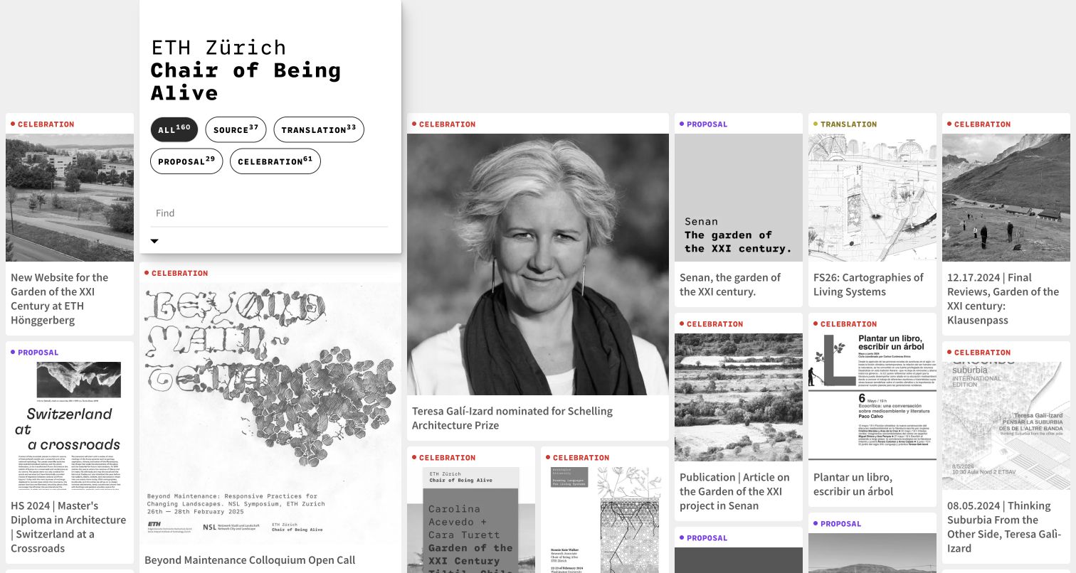
The Chair of Being Alive website at ETH Zürich presents research as a varied field of images, drawings and project cards. A compact floating introduction and search area remains distinct from the larger visual archive. Small colored markers and category counts introduce order without forcing every contribution into an identical thumbnail. The uneven rhythm suits a collection where individual projects have different visual material. Kirby’s official showcase links this chair website specifically; the association does not extend to ETH Zürich’s entire web estate.
What you can learn
For a research archive, separate the tools for finding material from the material itself. Give categories recognizable names and visible counts, then allow the images enough variation to communicate the character of each contribution before a visitor opens its detail page.
Pros
The floating text panel supplies context while leaving much of the archive immediately visible.
Mixed image proportions preserve the differences between photographs, drawings and other research artifacts.
Cons & considerations
A dense visual field can make reading order less obvious than a conventional list.
Small markers need supporting text so category meaning does not depend on color alone.
Platform source: Official Made with Kirby showcase (undated). The public Chair of Being Alive website, not ETH Zürich’s entire web estate. Documentary association from the official Made with Kirby showcase, reviewed November 10, 2026. The undated listing does not establish the implementation date, current CMS version or complete present backend. It applies only to the linked public property. Direct screenshot and bounded public-source audit evidence are recorded separately. Platform evidence is separate from the direct website screenshot and is not a complete current infrastructure audit.
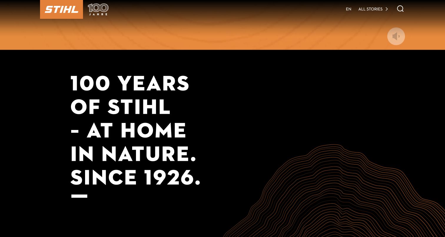
STIHL’s centenary microsite uses orange branding, oversized white typography and a dark editorial field to make its anniversary feel substantial. This capture deliberately shows the scrolled introduction beneath the opening motion sequence. Orange contour lines suggest growth and natural forms while the compact anniversary mark anchors the header. The composition is more like a campaign chapter than a product catalog. Kirby’s showcase identifies this specific centenary property, not the main STIHL store, regional dealer sites or every corporate publishing system.
What you can learn
A focused anniversary site can use a stronger narrative rhythm than the main corporate website. Keep the recognizable brand mark close to the reading path, then structure the story into clear sections so expressive typography and motion do not become the only means of understanding it.
Pros
The dark background and restrained orange accent create a clear, memorable hierarchy.
The introduction gives the anniversary an editorial premise rather than simply displaying a date.
Cons & considerations
Very large headings consume substantial space before detailed historical material becomes visible.
Motion-led openings need an equally useful static reading experience and an obvious route into the story.
Platform source: Official Made with Kirby showcase (undated). The German centenary editorial microsite, not the main STIHL shop or all corporate properties. Documentary association from the official Made with Kirby showcase, reviewed November 10, 2026. The undated listing does not establish the implementation date, current CMS version or complete present backend. It applies only to the linked public property. Direct screenshot and bounded public-source audit evidence are recorded separately. Platform evidence is separate from the direct website screenshot and is not a complete current infrastructure audit.
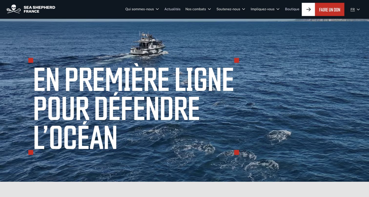
Sea Shepherd France places its marine-protection message over a blue ocean scene with a vessel visible in the frame. Large condensed white lettering and red corner marks turn the mission into the dominant visual element. A dark header preserves navigation, while a separate red donation action remains recognizable without requiring visitors to interpret the background image. The official Kirby listing concerns this French organization website. Its linked shop and donation services are separate properties and were not tested or assigned the same implementation.
What you can learn
Use a relevant scene to explain the setting of a mission, then give the actual purpose its own readable text layer. Keep organizational information and support actions clearly differentiated so visitors can learn before deciding whether to participate.
Pros
The ocean imagery makes the conservation context concrete without needing a long preliminary explanation.
Red accents distinguish the main support route from the broader informational navigation.
Cons & considerations
Text over changing imagery needs consistent contrast across every video frame and crop.
A forceful mission statement still needs accessible supporting pages explaining the organization’s work and evidence.
Platform source: Official Made with Kirby showcase (undated). The public French organization website, not separate donation or shop services. Documentary association from the official Made with Kirby showcase, reviewed November 10, 2026. The undated listing does not establish the implementation date, current CMS version or complete present backend. It applies only to the linked public property. Direct screenshot and bounded public-source audit evidence are recorded separately. Platform evidence is separate from the direct website screenshot and is not a complete current infrastructure audit.
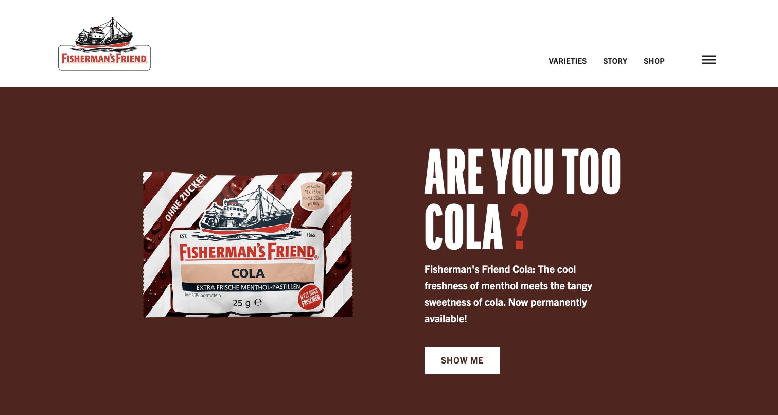
Fisherman’s Friend’s German website pairs a simple white header with a burgundy product campaign. The package occupies one side of the feature, while large condensed lettering and a short explanation occupy the other. That separation makes the product recognizable before the visitor needs to read much supporting copy. The captured browser displayed translated text while remaining on the German property. Kirby’s official showcase links this brand site; the documentary association does not establish the technology of separate loyalty services or every international property.
What you can learn
Give a product campaign two clear jobs: show the actual package and explain why this particular variant matters. Preserve a calm navigation layer above it so visitors who are not interested in the featured product can still understand the broader range.
Pros
The large package image connects the digital campaign with an item visitors may recognize elsewhere.
The white header creates useful separation from the strongly colored promotional area.
Cons & considerations
Large campaign lettering can push detailed product information below the opening view.
Translated text may change line lengths, so campaign layouts need room for different language treatments.
Platform source: Official Made with Kirby showcase (undated). The named German public brand website; separate loyalty services are excluded. Documentary association from the official Made with Kirby showcase, reviewed November 10, 2026. The undated listing does not establish the implementation date, current CMS version or complete present backend. It applies only to the linked public property. Direct screenshot and bounded public-source audit evidence are recorded separately. Platform evidence is separate from the direct website screenshot and is not a complete current infrastructure audit.
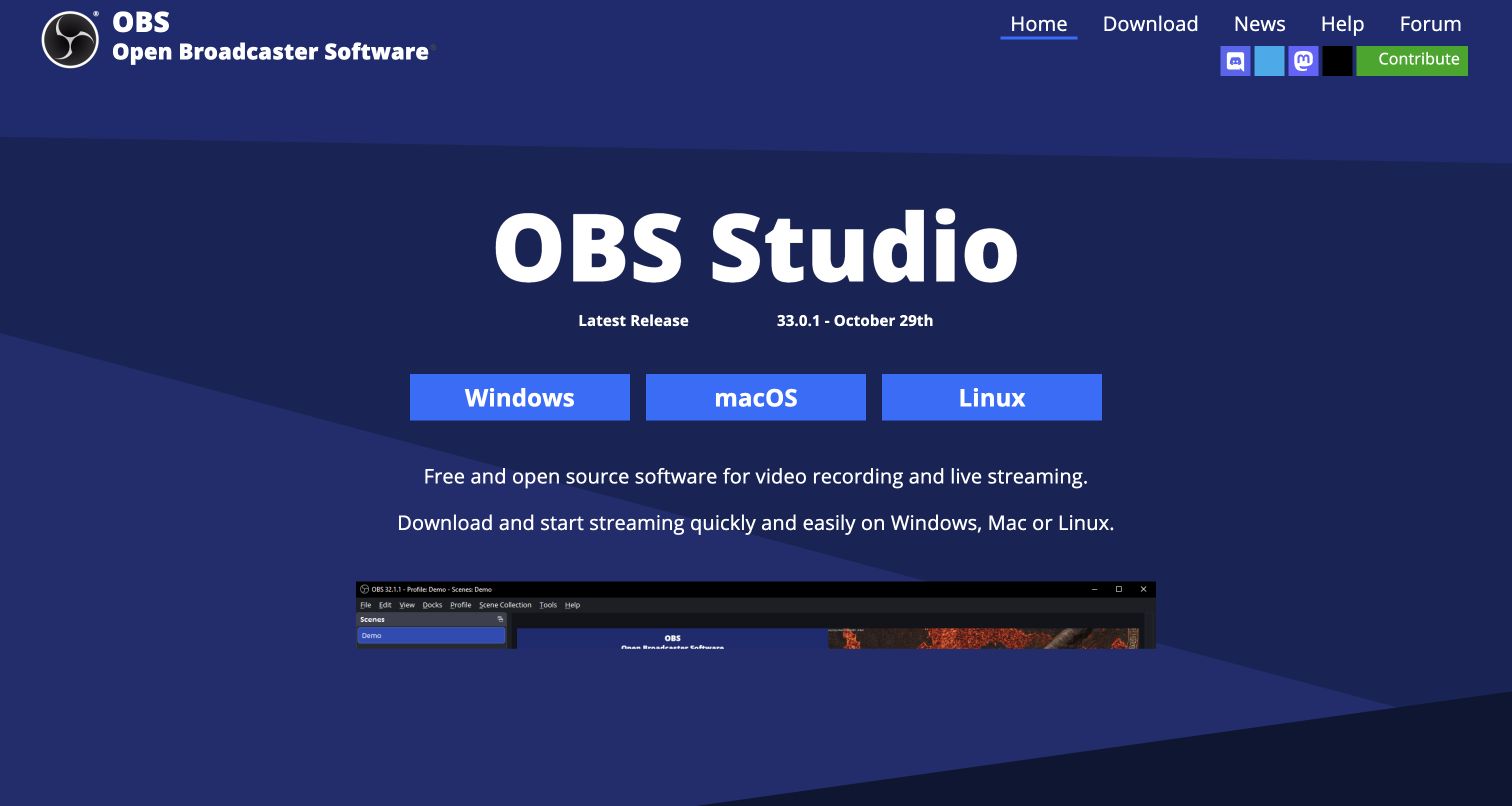
The OBS Studio website uses a dark blue background, a large product heading and three prominent operating-system buttons to establish a direct path into the software. A short explanation sits above a substantial application screenshot, connecting the download choices with the product’s purpose. The restrained composition leaves little ambiguity about the primary task. Alongside its official Kirby showcase listing, the public website footer credits Kirby CMS. This evidence concerns the website; it does not imply that the native broadcasting application itself is built with Kirby.
What you can learn
When a product has several platform editions, present those choices together and label them plainly. Add enough explanation and a genuine interface image to help a new visitor understand the product before choosing a download, while keeping support routes discoverable.
Pros
The operating-system choices have equal visual treatment and are easy to compare.
The application screenshot supplies concrete product context beneath the introductory message.
Cons & considerations
Download-first layouts should still give unfamiliar visitors a clear route to requirements and documentation.
A large interface image can become difficult to interpret without useful surrounding captions or feature explanations.
Platform source: OBS Project website footer credit. The public OBS Project website, whose footer also credits Kirby CMS; not the native broadcasting application. The public OBS website footer explicitly credits Kirby CMS, observed November 10, 2026. This is a website credit, not an inspection of server internals and not evidence about the native OBS application. Platform evidence is separate from the direct website screenshot and is not a complete current infrastructure audit.
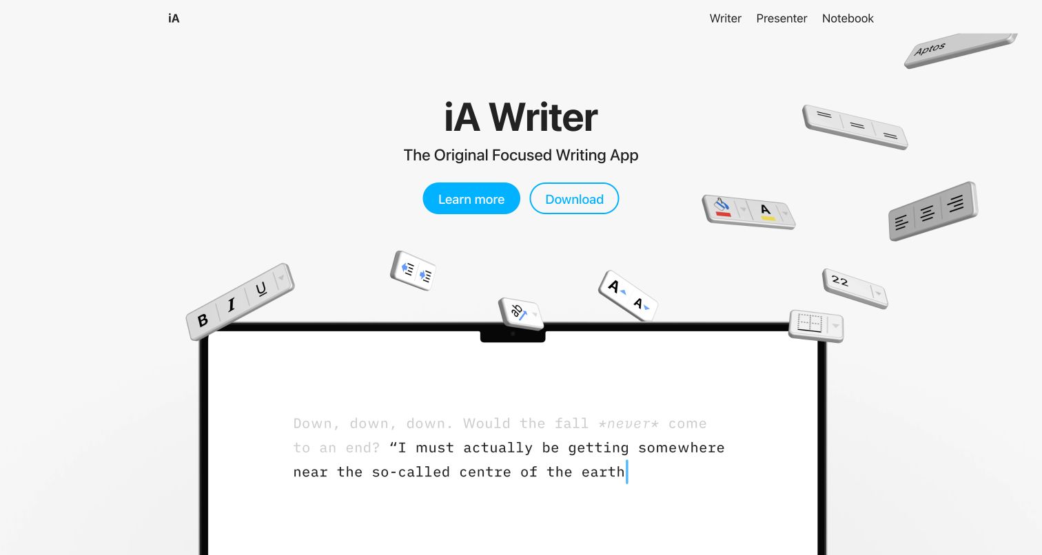
iA’s homepage places its writing product in a spacious, nearly white composition. A compact product navigation sits above a centered introduction, two blue actions and a large laptop image. Small interface elements around the device add detail without overwhelming the basic hierarchy. The page communicates a concentrated writing experience through its own visual restraint. Kirby’s official showcase associates the public iA website with the CMS; it is not evidence about the implementation of iA’s native writing or presentation applications.
What you can learn
Let the product interface carry specific information while the surrounding page establishes a clear reading pace. A small number of well-separated actions can be more useful than several competing feature claims, especially when visitors need to understand a focused tool rather than a broad software suite.
Pros
Generous space separates navigation, introductory text and the product demonstration.
The limited blue accent makes the next actions recognizable within an otherwise quiet composition.
Cons & considerations
A restrained opening can leave important platform and compatibility details outside the first view.
Decorative interface fragments should not be mistaken for interactive controls on the marketing page.
Platform source: Official Made with Kirby showcase (undated). The public iA product and company website, not its native writing or presentation applications. Documentary association from the official Made with Kirby showcase, reviewed November 10, 2026. The undated listing does not establish the implementation date, current CMS version or complete present backend. It applies only to the linked public property. Direct screenshot and bounded public-source audit evidence are recorded separately. Platform evidence is separate from the direct website screenshot and is not a complete current infrastructure audit.
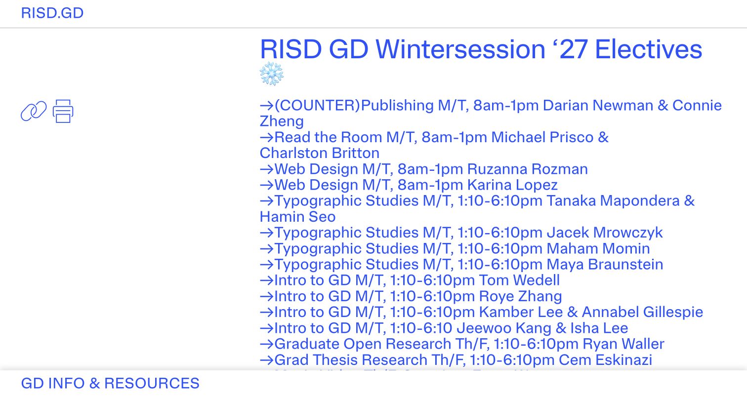
RISD Graphic Design’s public department site makes a large blue course listing the dominant content in the captured view. Small identity and utility labels sit near the edges, while generous empty areas keep the typography from becoming a conventional dense university portal. Graphic fragments add a studio-like character without replacing the course information. The Kirby showcase links risd.gd specifically. This is a department-level documentary association, not a claim about admissions, administration or every Rhode Island School of Design website.
What you can learn
A department site can develop its own editorial voice while keeping recurring information recognizable. Use a consistent type treatment and stable utility labels, then let course names, dates and projects supply the changing content instead of redesigning the interface for every announcement.
Pros
The strong blue type gives current academic information a distinctive visual hierarchy.
Small persistent identity labels keep the department recognizable without occupying a large header.
Cons & considerations
Experimental placement can make conventional navigation harder to locate for first-time visitors.
Oversized course text needs careful wrapping and meaningful document structure to remain useful on smaller screens.
Platform source: Official Made with Kirby showcase (undated). The public graphic-design department website, not every Rhode Island School of Design property. Documentary association from the official Made with Kirby showcase, reviewed November 10, 2026. The undated listing does not establish the implementation date, current CMS version or complete present backend. It applies only to the linked public property. Direct screenshot and bounded public-source audit evidence are recorded separately. Platform evidence is separate from the direct website screenshot and is not a complete current infrastructure audit.
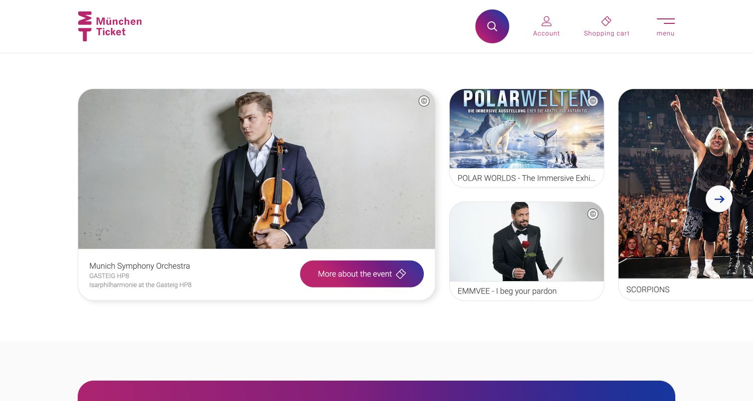
München Ticket combines a purple and magenta identity with a grid of event cards. One larger concert image sits beside smaller promotional panels, creating a readable hierarchy across several simultaneous choices. Search, account, basket and menu controls remain grouped in the header. The capture follows an optional-cookie refusal and shows the public discovery page rather than a purchase flow. Kirby’s official listing documents this website association, but does not establish how private accounts, ticket inventory or payment systems are implemented.
What you can learn
For an events catalog, let image size express editorial priority while preserving useful alternatives in the same view. Keep search and transaction-related controls separate from the featured content so visitors can browse freely or move toward a specific event when ready.
Pros
Different card sizes distinguish a lead event from supporting choices without hiding either.
The vivid header provides a consistent identity above varied event artwork.
Cons & considerations
Poster-based cards can contain small text that is difficult to read at reduced sizes.
Account and basket icons need clear accessible labels and should not replace useful public browsing routes.
Platform source: Official Made with Kirby showcase (undated). The public ticket-discovery website; no private account or transaction implementation is inferred. Documentary association from the official Made with Kirby showcase, reviewed November 10, 2026. The undated listing does not establish the implementation date, current CMS version or complete present backend. It applies only to the linked public property. Direct screenshot and bounded public-source audit evidence are recorded separately. Platform evidence is separate from the direct website screenshot and is not a complete current infrastructure audit.
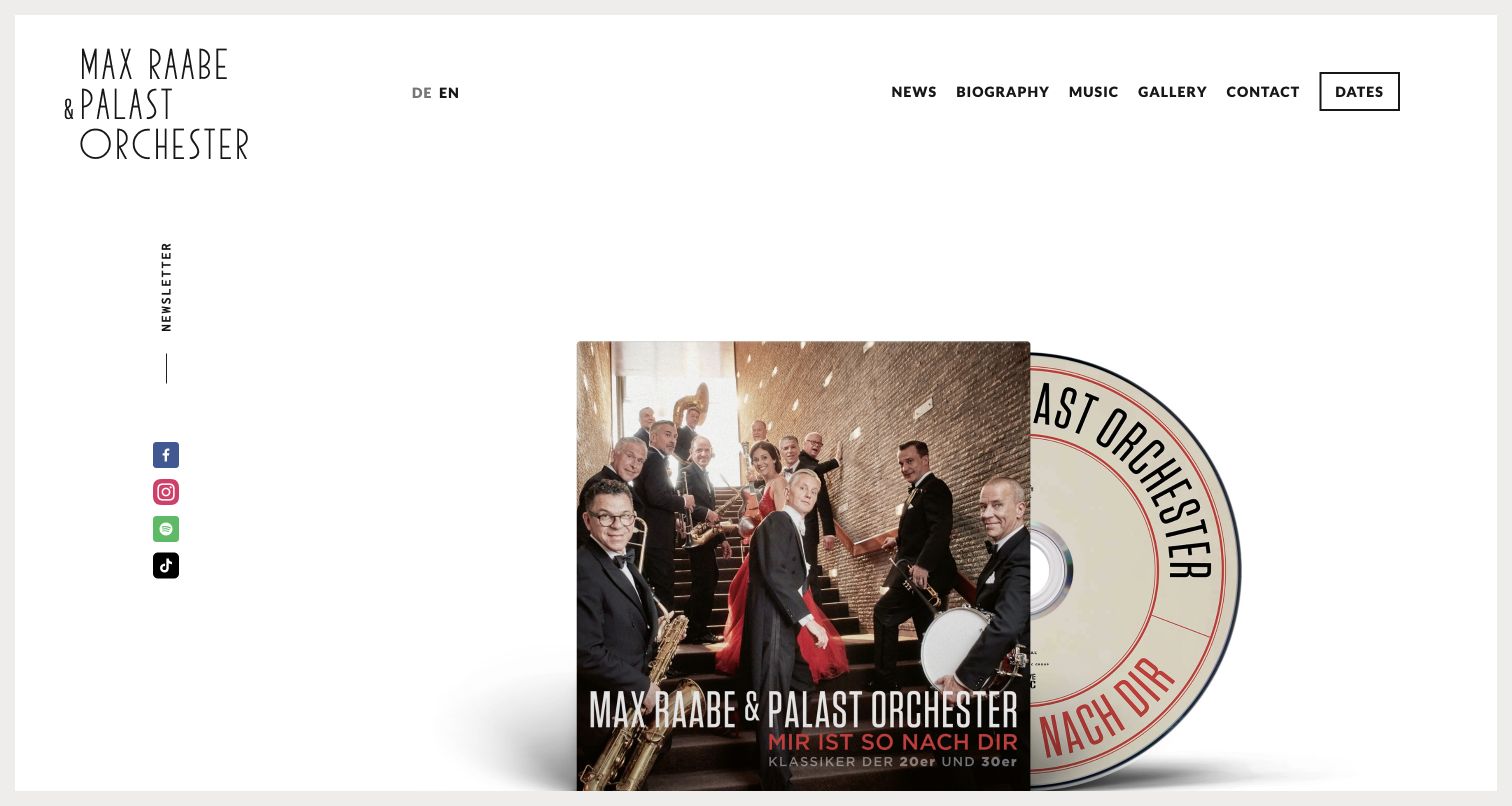
Max Raabe & Palast Orchester’s English website uses a spacious white frame, a distinctive hand-drawn wordmark and compact black navigation. The captured opening introduces an album through overlapping physical-media imagery rather than a dense list of announcements. Dates remain a distinct navigation choice, while social and newsletter references occupy a separate edge of the composition. The official Kirby showcase links this performer website. External ticketing and music-purchase destinations are outside the reviewed property and were not inspected as transactions.
What you can learn
A performer site should let a current release have visual character while keeping recurring tasks, especially concert dates, predictable. Use a stable navigation frame around changing artwork so fans returning for practical information do not have to decode a new campaign each time.
Pros
The generous white space gives the album artwork room without competing interface decoration.
A distinct dates route supports a frequent visitor task alongside promotional content.
Cons & considerations
Sparse openings can require additional scrolling before practical event details become visible.
Edge-positioned social or newsletter labels need sufficient size and contrast to remain easy to recognize.
Platform source: Official Made with Kirby showcase (undated). The public performer and concert-information website, not external ticketing services. Documentary association from the official Made with Kirby showcase, reviewed November 10, 2026. The undated listing does not establish the implementation date, current CMS version or complete present backend. It applies only to the linked public property. Direct screenshot and bounded public-source audit evidence are recorded separately. Platform evidence is separate from the direct website screenshot and is not a complete current infrastructure audit.
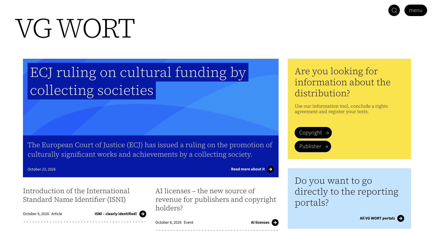
VG WORT’s homepage starts with a large black serif wordmark and divides the opening into strongly colored information areas. A blue lead story sits beside yellow audience routes, with another blue-toned portal panel below. This creates a distinction between reading current information and finding a practical organizational service. The capture follows an optional-cookie refusal. Kirby’s official showcase supports the public information website association only; private member, royalty and reporting systems are not part of this review or assigned the same technology.
What you can learn
For an organization with several audiences, separate editorial updates from service entry points before adding more navigation. Color can help visitors scan those different purposes, provided the labels themselves explain who each route serves and what a person can do there.
Pros
The large identity and clear blocks create a recognizable hierarchy despite several competing tasks.
Audience-oriented routes offer a practical alternative to reading the latest news first.
Cons & considerations
Strong colored panels need consistent text contrast and should not carry meaning without labels.
Institutional terminology may require short explanations for visitors unfamiliar with the organization’s processes.
Platform source: Official Made with Kirby showcase (undated). The public organization information website, not private royalty or member systems. Documentary association from the official Made with Kirby showcase, reviewed November 10, 2026. The undated listing does not establish the implementation date, current CMS version or complete present backend. It applies only to the linked public property. Direct screenshot and bounded public-source audit evidence are recorded separately. Platform evidence is separate from the direct website screenshot and is not a complete current infrastructure audit.
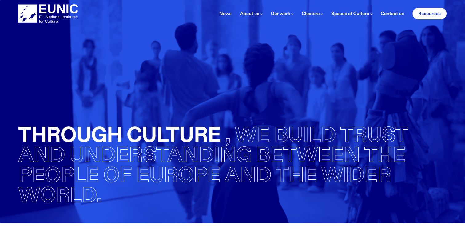
EUNIC’s public homepage covers its opening photograph with a vivid cobalt-blue treatment. Large white filled and outlined lettering places the network’s cultural mission over the scene, while compact navigation and a resources control sit above it. The shared color treatment makes a varied photographic subject feel like part of a consistent identity. Kirby’s official showcase links the EUNIC network website, not the websites or internal systems of every national cultural institute represented by the organization.
What you can learn
A network of institutions benefits from a strong common introduction before visitors move into individual activities. Use a consistent visual treatment to connect varied cultural material, and keep resources or project navigation easy to identify so the mission statement leads into usable information.
Pros
The single-color treatment creates continuity between photography, typography and navigation.
A distinct resources route gives practical visitors an alternative to following the introductory narrative.
Cons & considerations
Outlined display lettering may be harder to read over detailed or changing imagery.
An umbrella mission needs clear project-level evidence and destinations beyond the initial full-screen presentation.
Visible tech stack
Earlier / documented evidence
Kirby
Platform source: Official Made with Kirby showcase (undated). The public EU National Institutes for Culture network website, not every member institution. Documentary association from the official Made with Kirby showcase, reviewed November 10, 2026. The undated listing does not establish the implementation date, current CMS version or complete present backend. It applies only to the linked public property. Direct screenshot and bounded public-source audit evidence are recorded separately. Platform evidence is separate from the direct website screenshot and is not a complete current infrastructure audit.
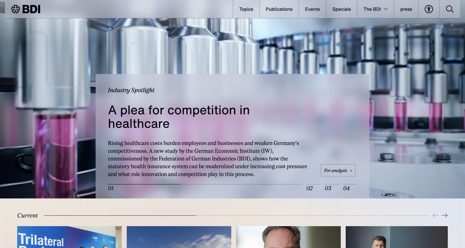
The Federation of German Industries’ German homepage places a factory scene behind a translucent feature panel containing a headline and short explanation. A restrained header and numbered story controls keep the composition closer to an editorial publication than a promotional landing page. Additional news begins beneath the main feature. The visible industrial setting gives the subject a concrete context, without independently validating any policy claim. Kirby’s official showcase association concerns this public association property, not the systems of its member companies.
What you can learn
Institutional commentary becomes easier to approach when its setting is visible and the lead story has a concise explanation. Keep the article hierarchy clear, and provide stable routes to other news so a prominent feature does not become the only useful entry point.
Pros
The text panel separates the headline from a detailed background photograph.
Numbered feature controls communicate that the lead area contains more than one story.
Cons & considerations
Translucent panels require careful contrast across different background images.
A rotating feature can hide other important updates unless supporting stories remain available in a visible list.
Platform source: Official Made with Kirby showcase (undated). The public association website, not its member companies’ systems. Documentary association from the official Made with Kirby showcase, reviewed November 10, 2026. The undated listing does not establish the implementation date, current CMS version or complete present backend. It applies only to the linked public property. Direct screenshot and bounded public-source audit evidence are recorded separately. Platform evidence is separate from the direct website screenshot and is not a complete current infrastructure audit.
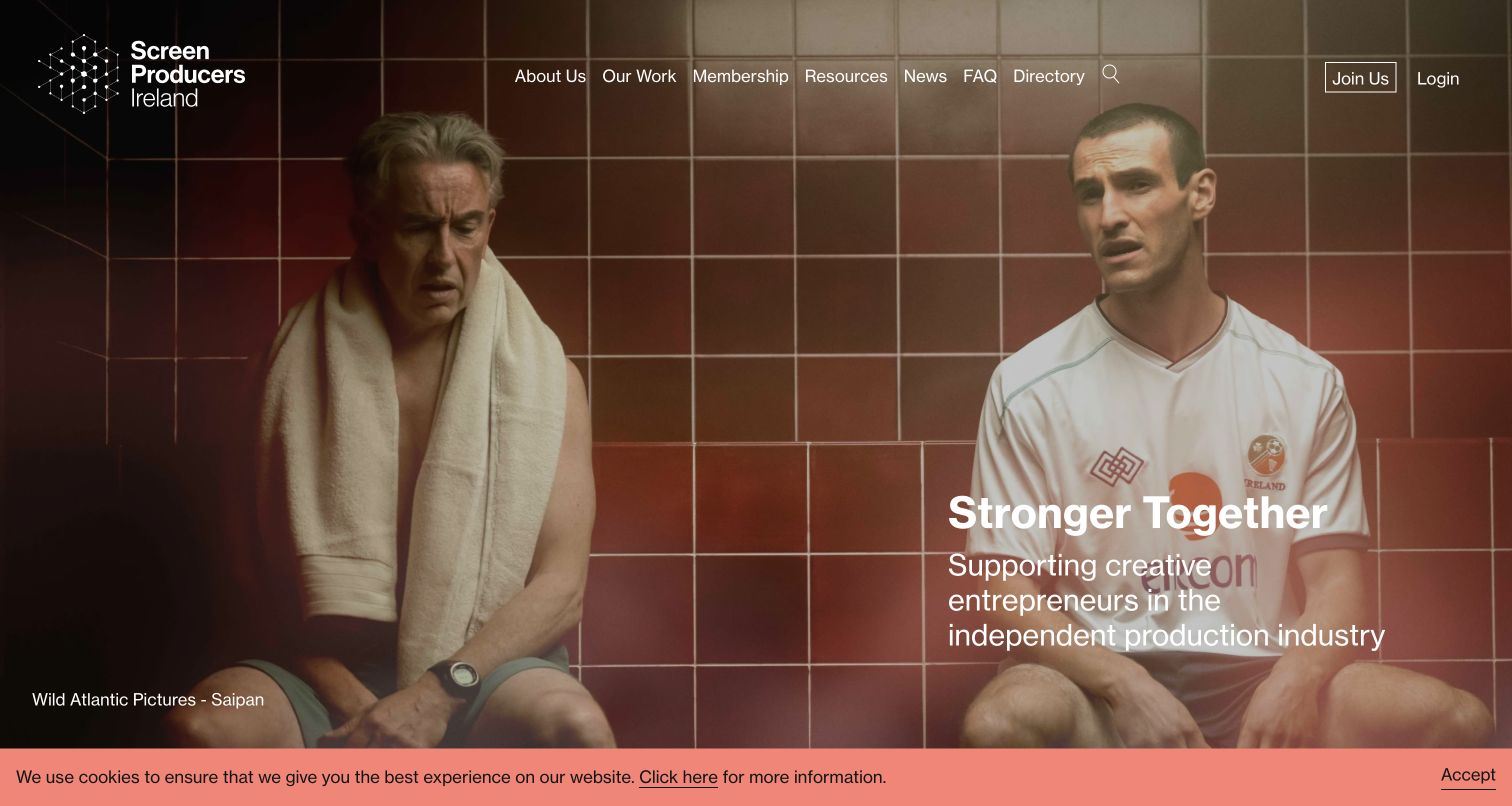
Screen Producers Ireland uses a full-width film still to introduce the public association site. A compact geometric identity and white navigation sit above a mission statement placed within the image. The visible production credit gives the photograph a clearer editorial context than an anonymous stock image would. A small privacy notice remains along the bottom of the direct capture. Kirby’s official showcase links this public website; the review does not enter member services or infer their private implementation.
What you can learn
An industry association can explain its field through the work it represents. Use credited imagery and a short mission statement together, then keep navigation legible enough that members, prospective members and public visitors can each find a relevant next destination.
Pros
The film still connects the organization with its creative field immediately.
The visible production credit acknowledges the source of the featured imagery within the composition.
Cons & considerations
White text and navigation need dependable contrast when the featured image changes.
A broad introductory statement should lead to clear explanations of membership, advocacy and public resources.
Platform source: Official Made with Kirby showcase (undated). The public association website, not private member services. Documentary association from the official Made with Kirby showcase, reviewed November 10, 2026. The undated listing does not establish the implementation date, current CMS version or complete present backend. It applies only to the linked public property. Direct screenshot and bounded public-source audit evidence are recorded separately. Platform evidence is separate from the direct website screenshot and is not a complete current infrastructure audit.
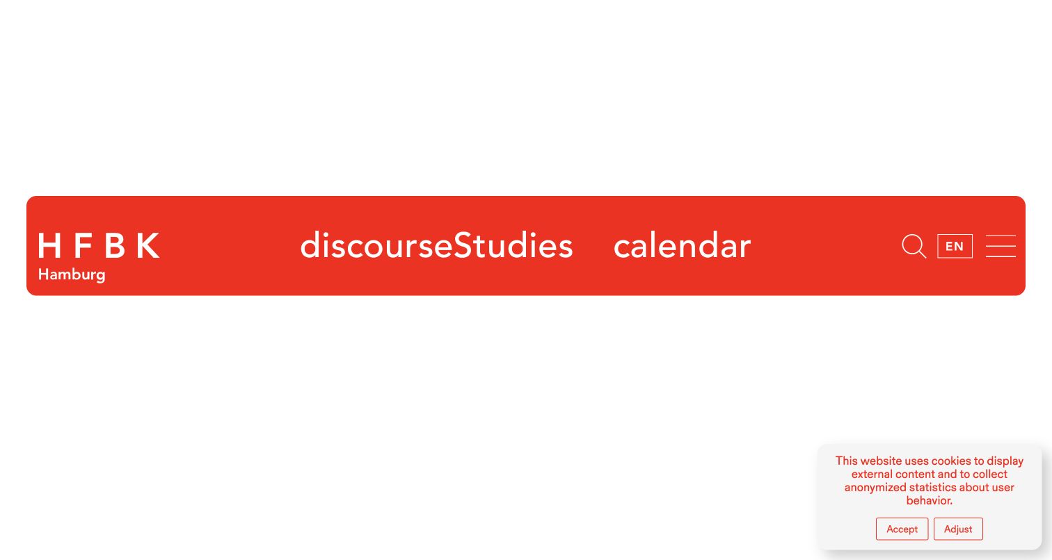
HFBK Hamburg’s captured public homepage is unusually sparse: a broad red navigation strip sits within a large white field. The university identity, three main subject routes, search, language choice and menu receive almost all of the visible emphasis. A small privacy panel remains in the lower corner. The frame is useful as a record of the actual opening state, including its limited explanatory content. Kirby’s official showcase associates this public art-university website with the CMS, not its student-administration systems.
What you can learn
Minimal navigation can make a small number of priorities unmistakable, but an institutional homepage still needs to orient newcomers. If the opening deliberately leaves substantial space, ensure the main routes use understandable labels and lead to substantive information without requiring familiarity with the institution.
Pros
The red strip makes the identity and main navigation immediately distinguishable from the surrounding page.
Search and language controls remain grouped with the primary routes rather than buried in a footer.
Cons & considerations
The sparse captured opening provides little immediate explanation of the university or current activity.
Translated navigation labels can run together when a tightly designed header leaves insufficient spacing.
Platform source: Official Made with Kirby showcase (undated). The public art university website, not student administration systems. Documentary association from the official Made with Kirby showcase, reviewed November 10, 2026. The undated listing does not establish the implementation date, current CMS version or complete present backend. It applies only to the linked public property. Direct screenshot and bounded public-source audit evidence are recorded separately. Platform evidence is separate from the direct website screenshot and is not a complete current infrastructure audit.
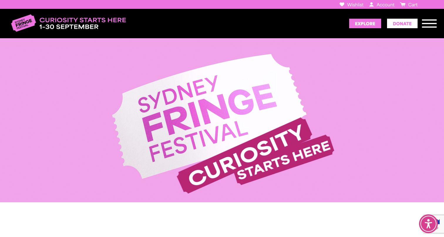
Sydney Fringe’s captured homepage uses pink, black and white to turn a ticket-shaped graphic into its central campaign image. A dark navigation band keeps exploration and donation actions separate from the animated feature, while account-related links sit in a thinner strip above. The final capture follows dismissal of an optional signup prompt; no account or ticket transaction was started. Kirby’s undated showcase listing supplies an earlier documentary association; the current bounded audit found WordPress references. This presentation and its separate ticketing service are not claimed to run on Kirby.
What you can learn
A recurring festival can build a memorable campaign around one simple visual motif. Keep the enduring discovery controls outside the animation so visitors can reach the program even when the seasonal identity, dates or featured artwork change.
Pros
The ticket motif connects the visual identity with the event experience in a direct, recognizable way.
The dark header separates practical exploration controls from the brightly colored campaign field.
Cons & considerations
An animated brand feature can postpone specific event information for visitors seeking a program immediately.
Signup prompts can interrupt discovery before visitors have understood what the festival offers.
Platform source: Official Made with Kirby showcase (undated). The public festival website, not separate booking or ticketing services. Documentary association from the official Made with Kirby showcase, reviewed November 10, 2026. The undated listing does not establish the implementation date, current CMS version or complete present backend. It applies only to the linked public property. Direct screenshot and bounded public-source audit evidence are recorded separately. The current bounded homepage audit identifies WordPress references, so the Kirby listing is retained only as an earlier documentary association. Platform evidence is separate from the direct website screenshot and is not a complete current infrastructure audit.
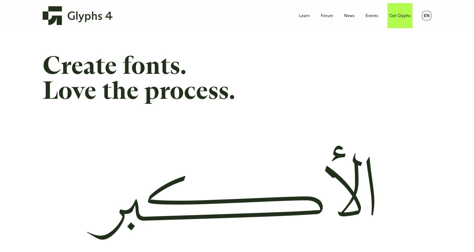
Glyphs’ public product website places a large serif introduction above expressive Arabic lettering on a mostly white background. A dark green identity and bright lime purchase route create a restrained contrast around the typography. The opening makes the product’s creative purpose visible through letterforms rather than a generic software illustration. Kirby’s official showcase associates this public website with the CMS. It does not describe the implementation of the native font editor, its file format or every separately linked community service.
What you can learn
For a creative tool, demonstrate the kind of work people can make while retaining clear routes to learning and product information. Give the example sufficient space and attribution, then let deeper pages explain the editing workflow and practical requirements that the visual introduction cannot communicate alone.
Pros
The typography serves as relevant product demonstration instead of unrelated decorative artwork.
The limited color palette makes the primary product action easy to distinguish.
Cons & considerations
Large display examples can delay information about compatibility, licensing and feature differences.
Animated specimens need controls and static alternatives that preserve the meaning of the demonstration.
Platform source: Official Made with Kirby showcase (undated). The public font-editor product website, not the desktop software itself. Documentary association from the official Made with Kirby showcase, reviewed November 10, 2026. The undated listing does not establish the implementation date, current CMS version or complete present backend. It applies only to the linked public property. Direct screenshot and bounded public-source audit evidence are recorded separately. Platform evidence is separate from the direct website screenshot and is not a complete current infrastructure audit.
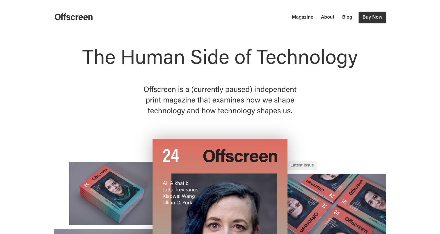
Offscreen’s homepage combines a simple wordmark and compact navigation with a large editorial heading and photographs of its printed magazine. Overlapping covers make the physical object tangible while the introductory paragraph explicitly states that publication is currently paused. That status is important context for interpreting the latest-issue label and purchase routes. Kirby’s official showcase documents the public publication website association; the current capture is a design observation rather than a claim that a new issue or publishing schedule has been announced.
What you can learn
An archive can remain useful without pretending to be newly active. State the current publishing status clearly, then give existing issues enough visual and editorial context for visitors to understand the collection and choose what to explore.
Pros
Photographs of the printed object connect the digital introduction with the publication’s physical character.
The visible pause notice sets expectations before visitors interpret the issue and purchase navigation.
Cons & considerations
A latest-issue label can seem current unless its date and publishing status are easy to find.
Large overlapping cover imagery leaves detailed issue contents to subsequent sections or dedicated pages.
Platform source: Official Made with Kirby showcase (undated). The public publication website and its documented showcase association. Documentary association from the official Made with Kirby showcase, reviewed November 10, 2026. The undated listing does not establish the implementation date, current CMS version or complete present backend. It applies only to the linked public property. Direct screenshot and bounded public-source audit evidence are recorded separately. Platform evidence is separate from the direct website screenshot and is not a complete current infrastructure audit.
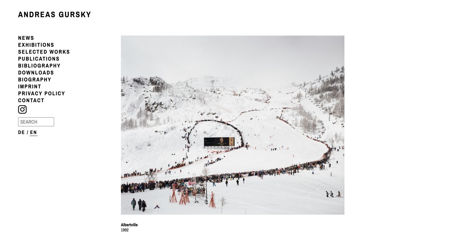
Andreas Gursky’s English website places a single large photograph beside a compact left navigation rail. Uppercase labels organize news, exhibitions, works, publications and biography, with search and language controls underneath. A small caption beneath the image identifies the work and its year, keeping descriptive information close without competing with the photograph. The official Kirby showcase links this artist website specifically; it does not establish the technology used by galleries, museums or other organizations displaying the artist’s work.
What you can learn
For an image-led archive, let the work occupy most of the page while keeping reference tasks in a predictable frame. Place the title and date close to the image, and use straightforward navigation labels so visitors can move between visual exploration and contextual research.
Pros
The large image area preserves the photograph’s visual detail and internal composition.
The stable navigation rail offers several clear research routes without overlaying the artwork.
Cons & considerations
A narrow text rail can become crowded as an archive gains more sections.
Small captions need adequate size and contrast because dates and titles are essential context, not incidental decoration.
Platform source: Official Made with Kirby showcase (undated). The public artist portfolio website, not a claim about represented galleries’ sites. Documentary association from the official Made with Kirby showcase, reviewed November 10, 2026. The undated listing does not establish the implementation date, current CMS version or complete present backend. It applies only to the linked public property. Direct screenshot and bounded public-source audit evidence are recorded separately. Platform evidence is separate from the direct website screenshot and is not a complete current infrastructure audit.
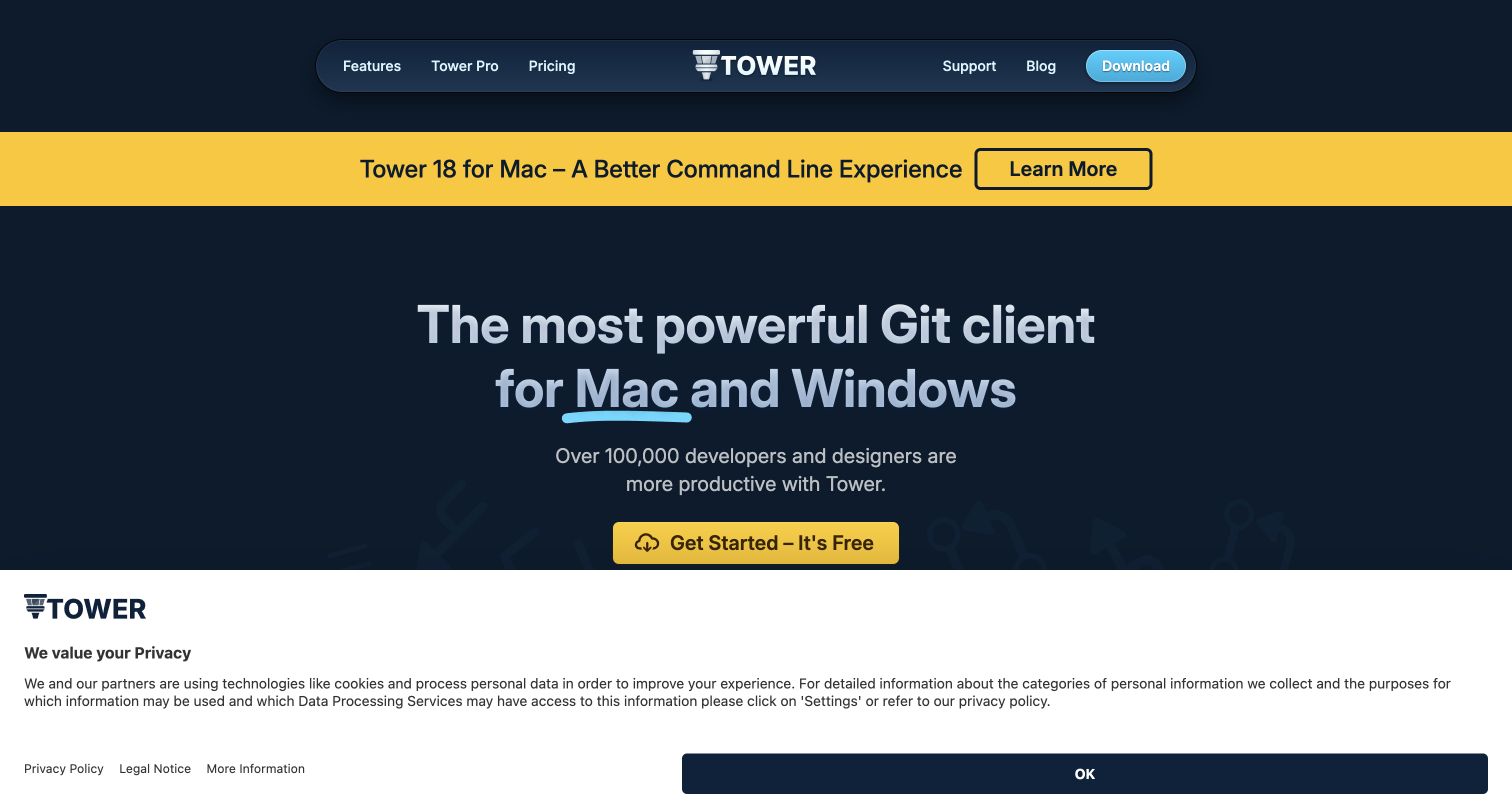
Tower’s public website uses a dark blue field, a rounded navigation bar and a bright yellow release strip above its central product introduction. The main headline explains the Git client’s supported desktop platforms, while a yellow download action forms the next obvious step. A substantial privacy panel occupies the lower part of the direct capture and limits how much of the product image is visible. Kirby’s official showcase concerns this marketing website, not the native Git client or any customer repository.
What you can learn
Keep release news and the enduring product explanation in separate layers. A returning user can follow the announcement while a first-time visitor still understands what the tool does and where to begin; neither path should depend on interacting with the other.
Pros
The release strip is distinct from both the navigation and the main product message.
The repeated yellow accent links announcement and action without adding several competing colors.
Cons & considerations
The opening privacy panel consumes significant vertical space before the product demonstration becomes visible.
Prominent download language should be accompanied by accessible pricing, requirements and licensing information.
Platform source: Official Made with Kirby showcase (undated). The public Git-client product website, not the native Git client or customers’ repositories. Documentary association from the official Made with Kirby showcase, reviewed November 10, 2026. The undated listing does not establish the implementation date, current CMS version or complete present backend. It applies only to the linked public property. Direct screenshot and bounded public-source audit evidence are recorded separately. Platform evidence is separate from the direct website screenshot and is not a complete current infrastructure audit.
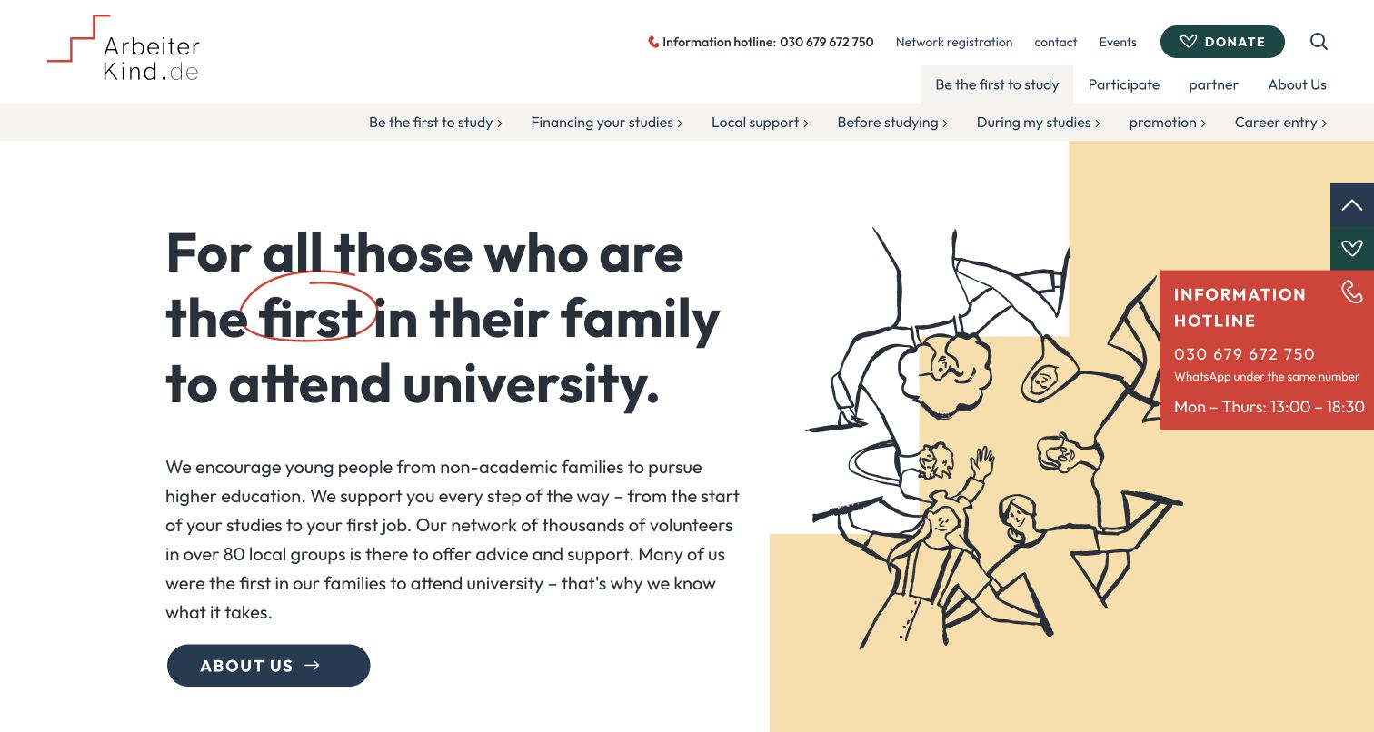
ArbeiterKind.de’s homepage introduces first-generation university study through a large plain-language heading, a warm illustration and a short explanation of the organization’s support. The primary navigation follows stages and practical concerns such as study financing, local help and entering a career. A red information panel makes human assistance visible beside the introductory content. The captured text reflects the browser’s existing translation state. Kirby’s official showcase identifies the public organization website, not its separate participant network or private support systems.
What you can learn
Start with the situation the audience recognizes, then organize help around the decisions that follow. A clear mission statement and practical life-stage navigation can work together, while a visible assistance route reassures visitors who do not know which section to choose.
Pros
The audience-specific heading makes the organization’s purpose understandable before detailed browsing.
Life-stage and financing routes connect the broad mission with concrete visitor needs.
Cons & considerations
Several navigation layers can take space away from the introductory content on smaller screens.
A floating assistance panel should remain readable without obscuring the main explanation or illustration.
Platform source: Official Made with Kirby showcase (undated). The public educational-support organization website, not its private participant systems. Documentary association from the official Made with Kirby showcase, reviewed November 10, 2026. The undated listing does not establish the implementation date, current CMS version or complete present backend. It applies only to the linked public property. Direct screenshot and bounded public-source audit evidence are recorded separately. Platform evidence is separate from the direct website screenshot and is not a complete current infrastructure audit.
Kegan has 15+ years of experience working with small businesses, Fortune 500 companies, and everything in between. No development job is too big or too small: he brings the same hands-on attention to a focused improvement, a complete website, or a custom application.
For Kirby projects, he can help with responsive interfaces, reusable components, custom functionality, API connections, and performance-minded implementation. He works directly with clients on scope, design, implementation, testing, and handover, with an emphasis on clear communication and a system that remains practical to maintain after launch.
Show 3 other Kirby developersHide other Kirby developers
Choose a Kirby approach that fits the publishing work
A focused portfolio or product website
A smaller site can benefit from a restrained set of page types. Define the information that every project, product or article needs, then give the most important material enough room to be understood. Kirby’s default content model uses files and folders, with each page organized around its content. Plan a structure that is understandable to both visitors and maintainers. Resist creating a new content type for every visual exception; first check whether the difference is genuinely useful to the reader.
A publication or campaign may need more freedom to combine text, quotations, images and other material. Kirby’s blocks field lets editors arrange and edit content blocks. Choose a set of components around recurring storytelling needs, and give each a clear purpose. Editors should know when to use a quotation, when a heading introduces a new section and when two images belong together. More choices are helpful only when the resulting pages remain understandable and the team can maintain them consistently.
Kirby can supply content to a separate frontend or another channel through approaches such as content representations, its REST API or custom routes. Consider that separation when the same structured material has several real uses. Document how previews, updates and unavailable content will behave in every output. A separate frontend introduces another part of the publishing process to maintain. Choose it for an identified requirement, with a clear owner for the integration and a dependable way to confirm that published changes have arrived.
Plan the content, languages and ongoing responsibilities
Map the publishing states before designing the workflow
Decide who can prepare material, who approves it and when it becomes public. Kirby documents draft, unlisted and listed page states, along with the editing workflow. Translate those concepts into instructions your team can use for its actual content. A campaign may need material prepared ahead of an announcement, while an archive may need stable links even after a page leaves the main navigation. Document those differences and check that ordinary editing does not unintentionally change a public destination.
Kirby supports multilingual websites, but the project still needs an editorial plan for every language. Identify which fields require translation, how language-specific URLs should be handled and who reviews a revised page. Consider what a visitor sees when an equivalent translation is missing. Navigation labels, image descriptions and practical details belong in the plan as well as the main text. Avoid building a language selector that promises more coverage than the team can sustain.
Record the installed Kirby version, custom templates, plugins, deployment process and backup responsibilities. The official security guide recommends keeping supported software updated, checking changes before applying them to production and having a backup available. Define who handles that work after launch and how a failed update is recovered. Editors should know where to report a broken page or an unexpected publishing result. A small, understandable implementation still needs an owner and a recovery plan.
Ask the actual team to carry out its routine job: publish a realistic update, correct a mistake, preview a narrow screen, and identify who owns an integration failure. For a library or frontend framework, also ask who maintains the content source and deployment. A polished screenshot does not answer those operational questions.
Beyond the screenshot
Kirby website planning checklist
Name the exact public property behind every example and technology claim.
Keep showcase associations separate from dated current-source observations.
List the page types and recurring information the editorial team must maintain.
Use Panel field names that match the team's actual publishing vocabulary.
Define useful titles, descriptions, image credits and alternative text.
Test templates with long headings, sparse entries and varied image proportions.
Give each reusable block a clear editorial purpose.
Map draft, unlisted and listed states to the team's approval process.
Plan translated content, URLs and missing-language behavior.
Document the reason for any separate frontend or external content source.
Preserve established URLs and verify redirects when reorganizing an archive.
Record plugins, update responsibilities, backups and recovery steps.
Check public navigation, keyboard use, responsive reading and content after release.
Test with real content, a keyboard, a small screen, slow or failed requests, and the people who will maintain the system. These are planning checks, not an accessibility, security, performance, or search-ranking certification.
Sources & editorial method
How this Kirby collection was reviewed
This collection reviews twenty distinct public websites with direct source captures made on November 10, 2026, original collection-specific analysis and individual capture provenance. The official Made with Kirby showcase supplies documentary associations for the named properties. Undated listings are not presented as fresh backend inspections or evidence of a particular Kirby version. The opening examples are limited to ETH Zürich’s Chair of Being Alive, STIHL’s German centenary microsite, Sea Shepherd France, Fisherman’s Friend Germany and the public OBS Project website. Separate shops, donation systems, ticketing services, accounts and native applications are outside those claims. Broad public-source audit attempts retain their own dates, supported findings and access limitations. The research did not submit forms, create accounts, make purchases, test private systems or measure conversion, security, performance or accessibility conformance. Official Kirby documentation informs the planning advice without assigning its current software version to the examples. The STIHL image shows the scrolled homepage introduction. Some text appears in the browser’s existing translated state; the recorded URLs preserve the actual language-specific properties. Visible privacy panels were retained where no optional-cookie refusal was selected. Sydney Fringe’s current public-source audit found WordPress references, so its undated Kirby listing is treated as an earlier association rather than current CMS confirmation.
Every image is an unmodified capture from the actual website, with its source and capture date. Some captures are reused from our shared catalog; their dates remain the original capture dates. None comes from a vendor gallery or a generated reconstruction. Moving imagery and live content can change.
Technology attribution uses public page assets or metadata, official platform documentation, or a cited first-party project case study. Documentary and framework-relationship evidence is identified where used; it is not a complete current backend inventory. A CMS image CDN alone does not establish a full CMS deployment. A library’s presence does not prove which individual controls use it, and a platform label does not establish AI authorship.
The composition notes, lessons, pros and tradeoffs are original editorial observations. We have not measured conversion, traffic, security, performance or accessibility conformance. Website owners retain their brands and imagery; these examples are not our client portfolio. Written, Edited and Curated are independent records, not dates advanced by a build. See our editorial standards or suggest a correction.
Questions worth asking
Kirby website development FAQs
Does the official showcase prove a website’s current Kirby version?
No. It supports the named website’s documented association with Kirby. An undated listing does not establish a current version, plugin inventory or backend configuration. Current public-source observations are recorded separately and only support the signals actually found.
What does a Kirby blueprint control?
A blueprint configures the Panel interface for a page, file, user or the site. It defines the editing arrangement rather than the entire public presentation. Plan it around the information editors need to maintain and use clear, familiar field labels.
Does Kirby require one fixed visual style?
No. Templates define the public HTML and use PHP to bring in content. That gives a project substantial presentation freedom. The useful constraint is the content and audience: a distinctive layout should still have readable text, understandable navigation and consistent behavior.
When should a project use content blocks?
Use blocks when editors need to combine recurring kinds of material into different stories or pages. Define a manageable set with clear purposes. If every page follows the same predictable structure, a focused editing form may be easier to maintain.
Does a Kirby website have to be headless?
No. Kirby can render pages through its own templates or provide content to other outputs. A separate frontend should address a real requirement, such as shared content across channels, and include a plan for previews, updates and integration maintenance.
Why are some examples limited to a department or microsite?
An organization can operate many websites with different platforms. Evidence for the Chair of Being Alive or STIHL’s centenary site applies to that property. It does not establish the technology of the entire university, corporate group or its separate services.
What should a Kirby handover include?
Provide the content model, editing instructions, language responsibilities, template and plugin inventory, deployment procedure and backup recovery plan. Identify who handles updates and who investigates a problem after a page is published.
Borrow the decisions that make a site understandable and maintainable. Give the content a clear structure, the public pages a useful reading order and the editorial team an interface it can use confidently as the website grows.