Best Board Game Store Websites of 2026 (22 Real-World Examples)
Board game store websites that connect game discovery, honest availability, local play and a clear way to buy.
A good board game store website helps people find the right game for their table and understand how to get it.
Some visitors arrive with an exact title and edition in mind. Others know only that they need a game for two people, a family gathering or a group willing to learn something complex. Useful board game retail websites support both kinds of shopping. Search and category navigation need to work alongside clear explanations of player count, play time, complexity and what is included in the box.
This collection covers specialist online retailers, physical game shops, mixed hobby stores and cafés with a documented retail offer. Their priorities differ: some promote new releases, some help visitors discover unfamiliar games, and others connect a play session to a later purchase. Study those choices without treating the examples as endorsements of prices, stock accuracy, fulfilment or customer service.
Before the examples
What makes good board game store website design in 2026?
Support exact-title search and open-ended discovery
A visitor who knows a title should be able to find its correct edition quickly. Someone choosing a gift needs different help: player count, typical duration, age guidance and the kind of experience a game offers. Keep these routes complementary. Clear filters and short explanations are more useful than expecting every customer to understand a specialist genre or publisher name.
Distinguish the different meanings of available
In stock, available for preorder, available by special order and available at a physical shop are different promises. State them consistently in product lists and detail pages. Explain how mixed orders, collection and release dates work. When online ordering is paused or dispatch is delayed, align the main action and service messages with that current limitation.
Connect the catalogue to the real shop experience
Events, advice, demonstrations and café play can help people choose a game, but they need clear relationships to the retail offer. Show actual locations and explain what a visit involves. Keep shopping, booking and event registration distinct so customers can follow their own task without confusion.
The collection · 22 examples
22 board game store websites worth studying
Compare how these stores organise broad catalogues, explain changing stock and connect online shopping with local game communities.
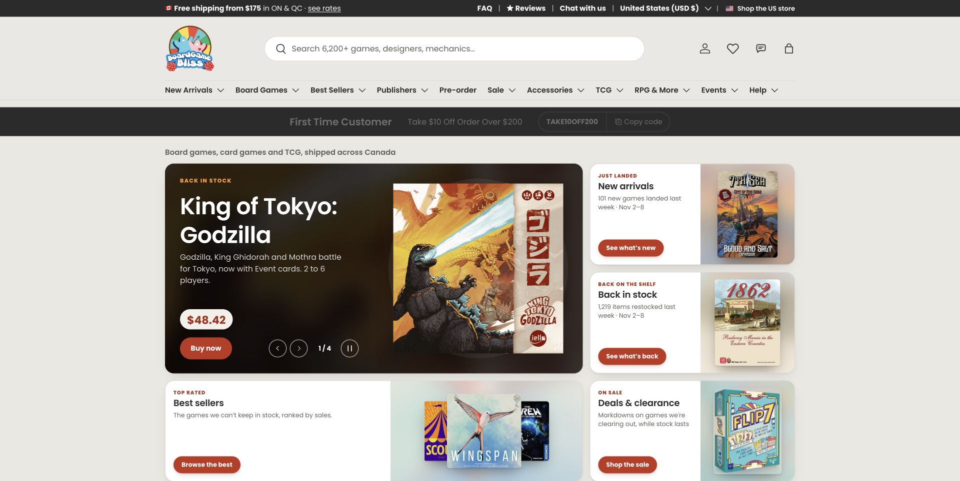
Board Game Bliss treats the featured game as something to understand, not just a box to buy. The observed homepage pairs product artwork with a short explanation, player information, price and a clear shopping action. Further down, discovery routes distinguish new stock, familiar favourites and different kinds of play. A prominent search field still serves visitors who already know a title. The cream background and restrained red controls keep a substantial catalogue approachable. It is a useful specialist-store example because the design connects merchandising to the questions people ask before choosing a game.
What you can learn
Give newcomers a way to describe their players, time and preferred complexity, while keeping exact-title search immediately available. Product recommendations become more useful when the reason for each suggestion is visible.
Pros
Featured games receive meaningful context alongside price and artwork.
Different discovery routes accommodate both experienced buyers and uncertain gift shoppers.
Cons & considerations
The many navigation groups still require careful prioritisation on smaller screens.
Campaigns and recommendation data need regular maintenance to stay aligned with stock.
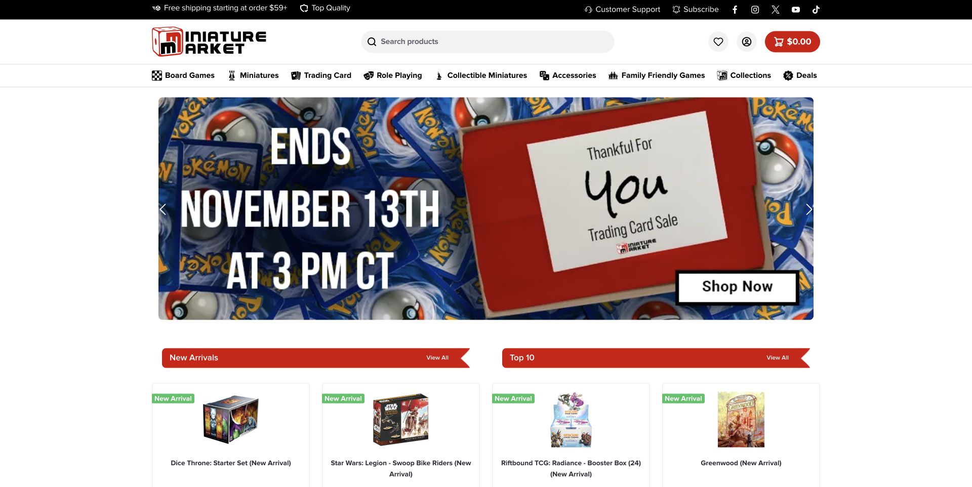
Miniature Market uses a red, black and white header to organise a wide hobby assortment. Board Games and Family Friendly Games have explicit navigation positions beside miniatures, trading cards and role-playing products. That permanent structure remains understandable even though the captured hero promotes a trading-card sale. New Arrivals and Top 10 rows then return visitors to named products and box artwork. The lesson is in the separation between an energetic temporary promotion and predictable catalogue routes. A board-game shopper does not have to decode the current campaign to find the relevant department.
What you can learn
Keep stable product departments outside the promotional carousel. When a store serves several hobbies, clearly labelled routes should carry the main navigation burden rather than the artwork selected for this week's offer.
Pros
Icon-supported category names make the range visible before scrolling.
Product rows provide a useful next step after the seasonal hero.
Cons & considerations
The dominant campaign may be unrelated to a visitor's immediate board-game interest.
Dense navigation and multiple product modules can compete for attention.
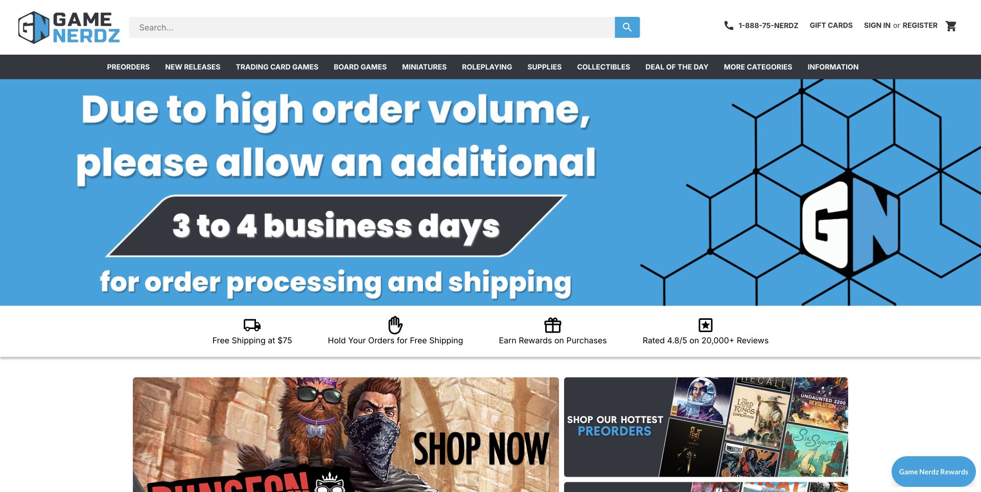
Game Nerdz makes a practical service constraint unusually prominent. In the reviewed page state, a large blue notice explains additional processing and shipping time before the visitor reaches promotional product tiles. Search and a dark navigation strip still provide direct access to Board Games, Preorders and New Releases. The benefit row beneath the notice introduces order holds and other purchasing information, though its claims remain the retailer's own. This is worth studying as an information-priority decision: a temporary limitation takes precedence over sales imagery, while permanent shopping routes remain available.
What you can learn
Give consequential fulfilment changes a visible home near the start of the shopping journey. Explain whether a delay affects processing, dispatch or delivery, and keep the rest of the catalogue usable beneath the notice.
Pros
The service notice is difficult to miss and describes the affected stage.
Search, board-game navigation and preorder routes remain easy to locate.
Cons & considerations
The large notice occupies most of the opening view.
Several benefit claims need detail pages to explain their conditions.
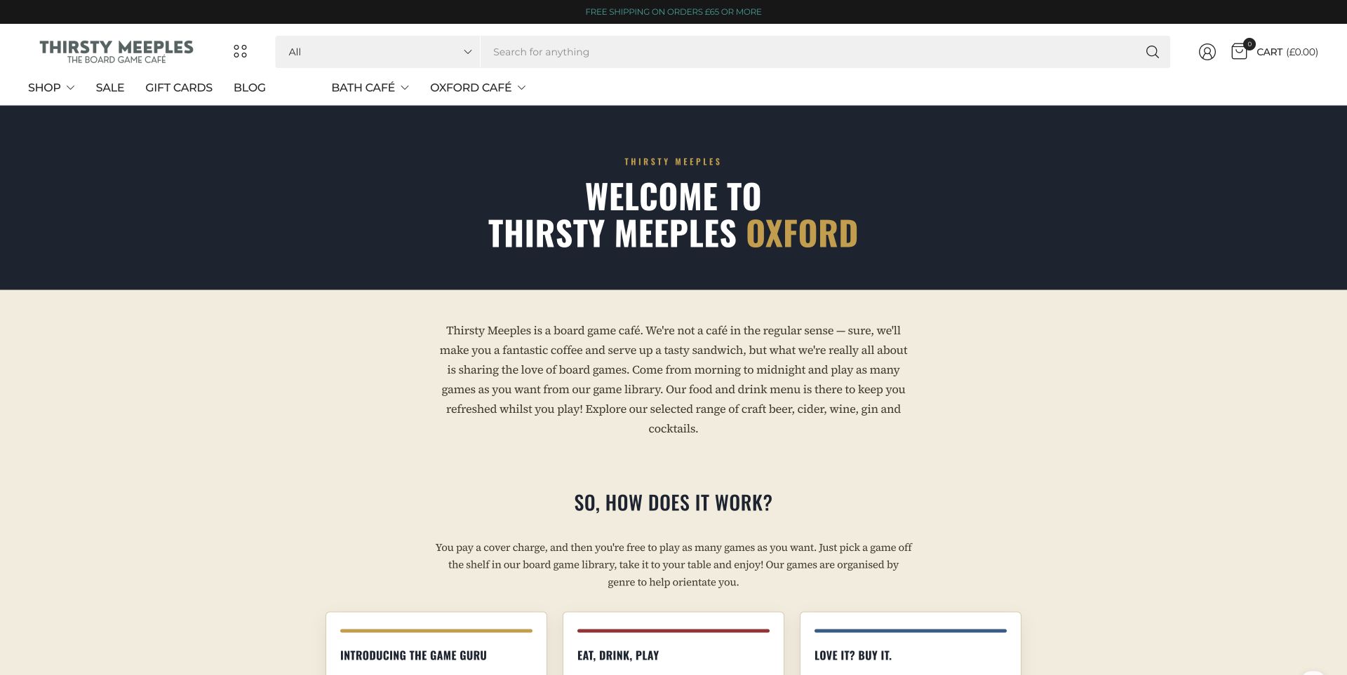
Thirsty Meeples' Oxford information page uses a dark heading band, warm background and readable explanatory sections to introduce the café. The store connection is explicit in the page's Love It? Buy It section: it describes games available through the café shop and collection of webstore orders. Search, Shop and cart controls remain in the shared header. This is a useful hybrid-retailer example because the retail journey grows out of trying games in person. The capture represents the Oxford information page rather than the shop homepage, so its strongest lesson is explanation and cross-navigation, not product-grid merchandising.
What you can learn
If customers can try games before buying, explain how the experience connects to the shop. Keep product browsing and collection information reachable from visit pages without making visitors infer the relationship between café and retail stock.
Pros
The exact page explains the connection between playing and buying.
Shared shop and search controls keep retail routes available.
Cons & considerations
The information-page format gives little room to compare individual products.
The visitor must distinguish café arrangements from online-store fulfilment details.
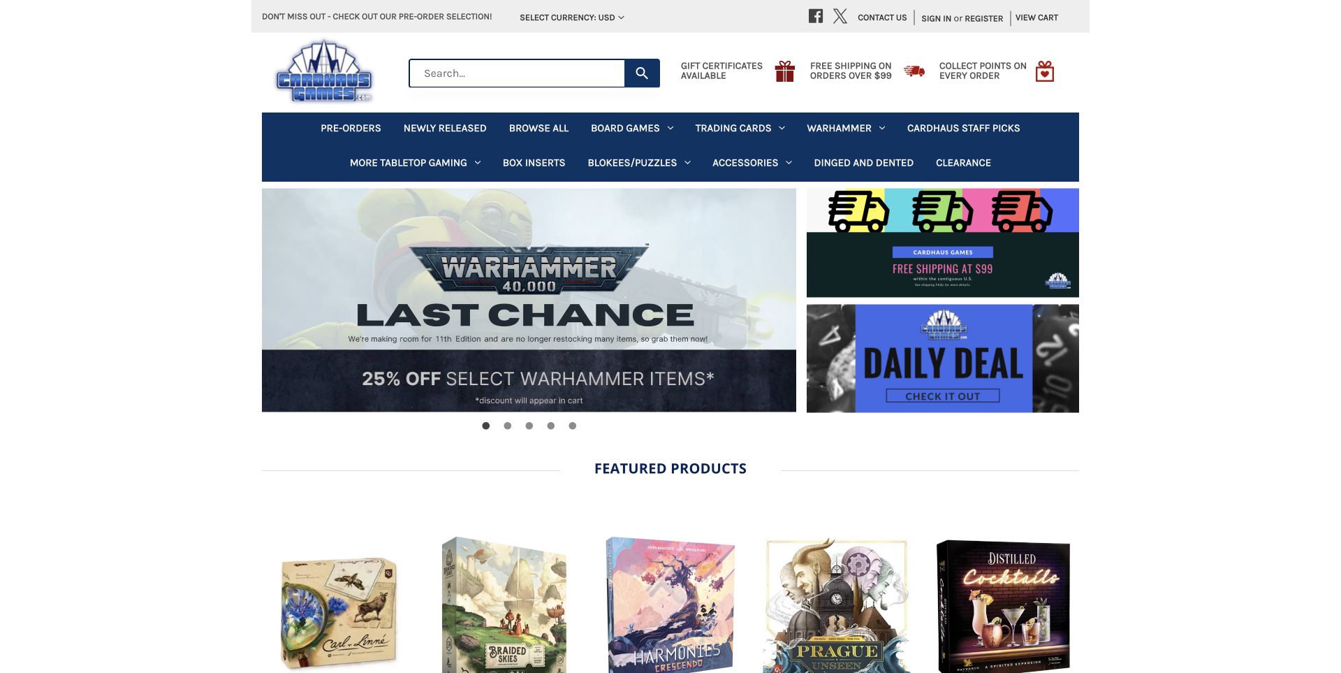
Cardhaus combines a navy navigation system with broad promotional artwork and more compact shopping modules. The observed page distinguishes board games from collectible cards and other hobby products, with search prominently available above the catalogue. Its featured products provide names, prices and status cues rather than relying entirely on promotional images. The screenshot shows a Warhammer offer, illustrating why a multi-category retailer needs navigation that survives changes in its headline campaign. For a board-game store, the useful pattern is the combination of a stable taxonomy, direct search and small repeated product records.
What you can learn
Design product cards and category routes as the permanent structure of the store. Let seasonal or supplier campaigns occupy a separate space so a change in promotion does not alter how repeat customers find games.
Pros
Persistent departments and search support specific shopping tasks.
Named product cards make the catalogue more concrete than a sequence of banners.
Cons & considerations
Several promotional areas compete with the main catalogue.
A hero from another hobby category can make the board-game offer less immediate.
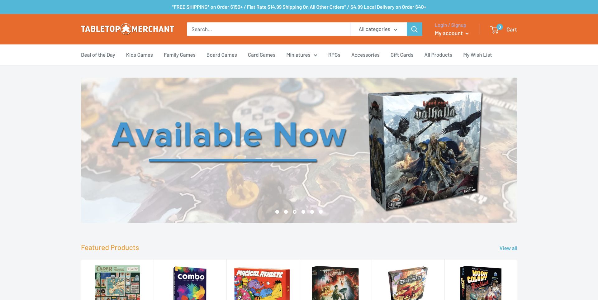
Tabletop Merchant's opening view gives a featured release room to stand out, with bold box artwork and a clear availability message. Orange and cyan accents connect that campaign to a search-led header and named departments including board games and family-oriented shopping. The page then moves into ordinary product cards, allowing visitors to continue beyond the highlighted release. The capture is useful for the balance between collector enthusiasm and straightforward commerce. Its shipping qualifications also show why a store's broad promotional promise needs more precise information nearby, especially when different regions have different arrangements.
What you can learn
Use a launch campaign to tell one clear story, then provide an obvious transition into the wider assortment. Keep eligibility, fulfilment and regional conditions close to the relevant shopping information rather than hidden inside the artwork.
Pros
The featured release has strong visual focus.
Named departments and search make the broader assortment accessible.
Cons & considerations
Large campaign artwork pushes ordinary product comparison lower down.
Availability and shipping statements can become stale without clear editorial ownership.
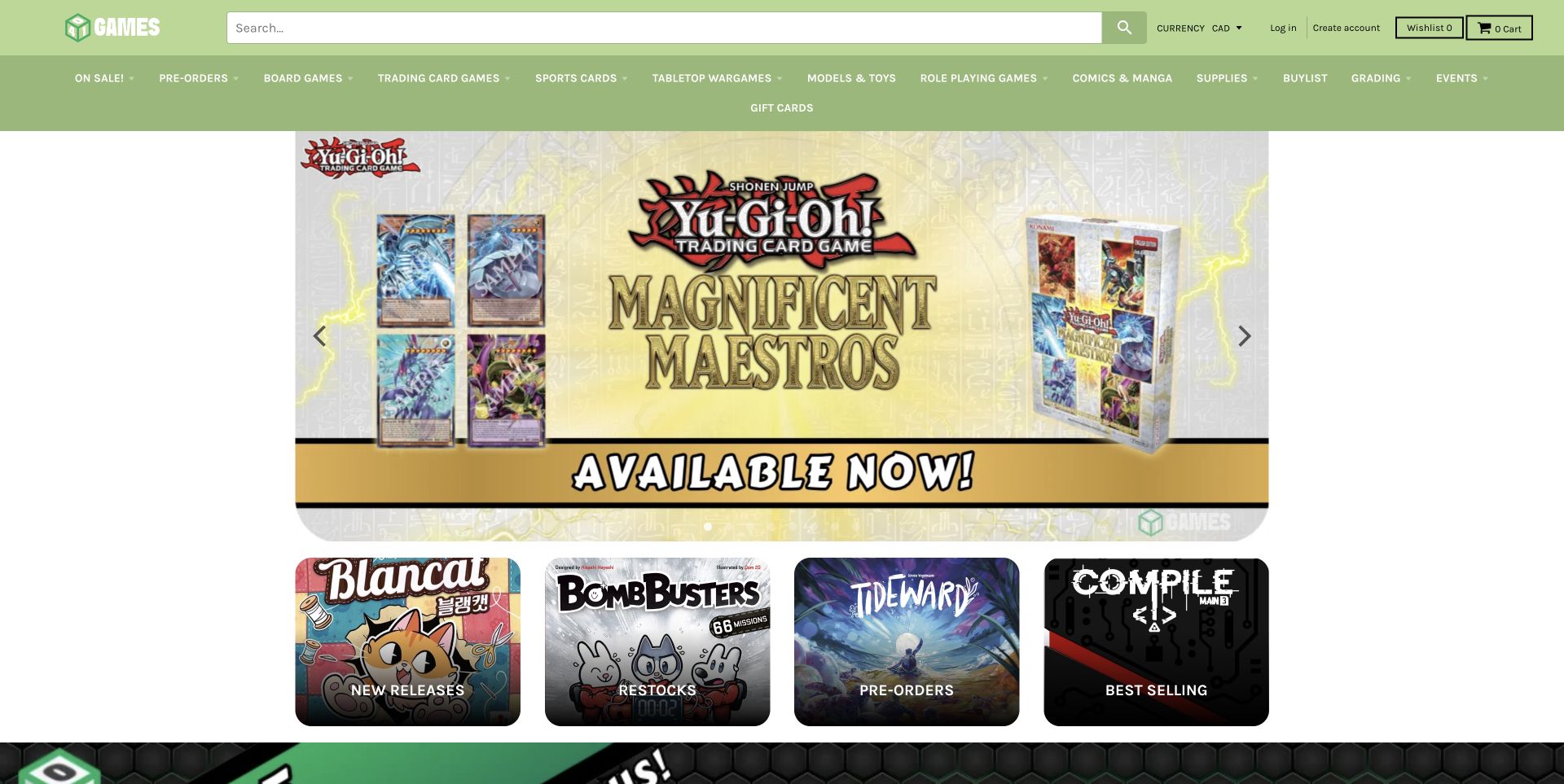
401 Games places a broad search field and compact navigation above its promotional hero. The captured campaign concerns trading cards, but four board-game shortcuts below it distinguish new arrivals, restocks, preorders and best sellers. Those routes reflect different repeat-shopping intentions more precisely than a single generic Shop button. The green header gives the busy page a consistent identity while numerous categories compete for space. For board-game retail design, the instructive element is this second layer of navigation: it lets a returning customer look for what has changed without browsing the whole catalogue again.
What you can learn
Separate new releases, returning stock and future availability when customers visit repeatedly for different reasons. Keep these labels literal, and make each destination's purchasing status clear at the product level.
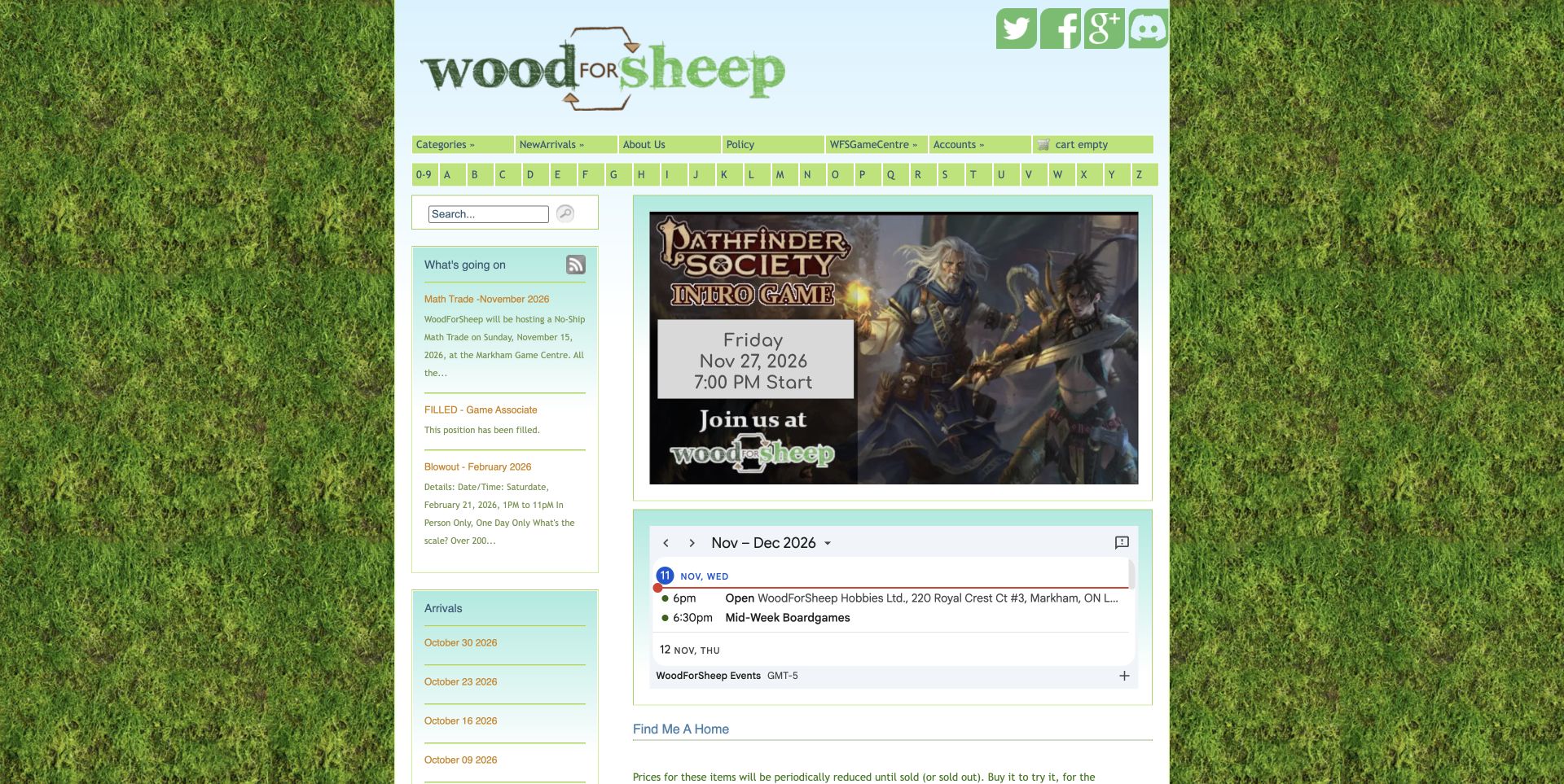
Wood for Sheep uses a narrow, traditional storefront layout with a green identity, product navigation and a visible A–Z browsing route. The opening content foregrounds a Pathfinder event and calendar information rather than a polished full-width sales campaign. Side columns carry store updates, while priced games appear further through the page. The result communicates an active local hobby community alongside the retail offer. Its density is also the main tradeoff: newcomers must distinguish events, news and shopping links in a relatively small space. This is a useful reference for stores whose community programme is genuinely part of their identity.
What you can learn
Give community activity a clear relationship to the shop without merging every update into one crowded column. Separate permanent catalogue routes from dated events and assign someone to keep each type of information current.
Pros
The calendar and event content make the store's play community tangible.
An alphabetical route supports visitors who already know what they want.
Cons & considerations
Small type and several columns make the page visually dense.
Community announcements can push product discovery below the opening view.
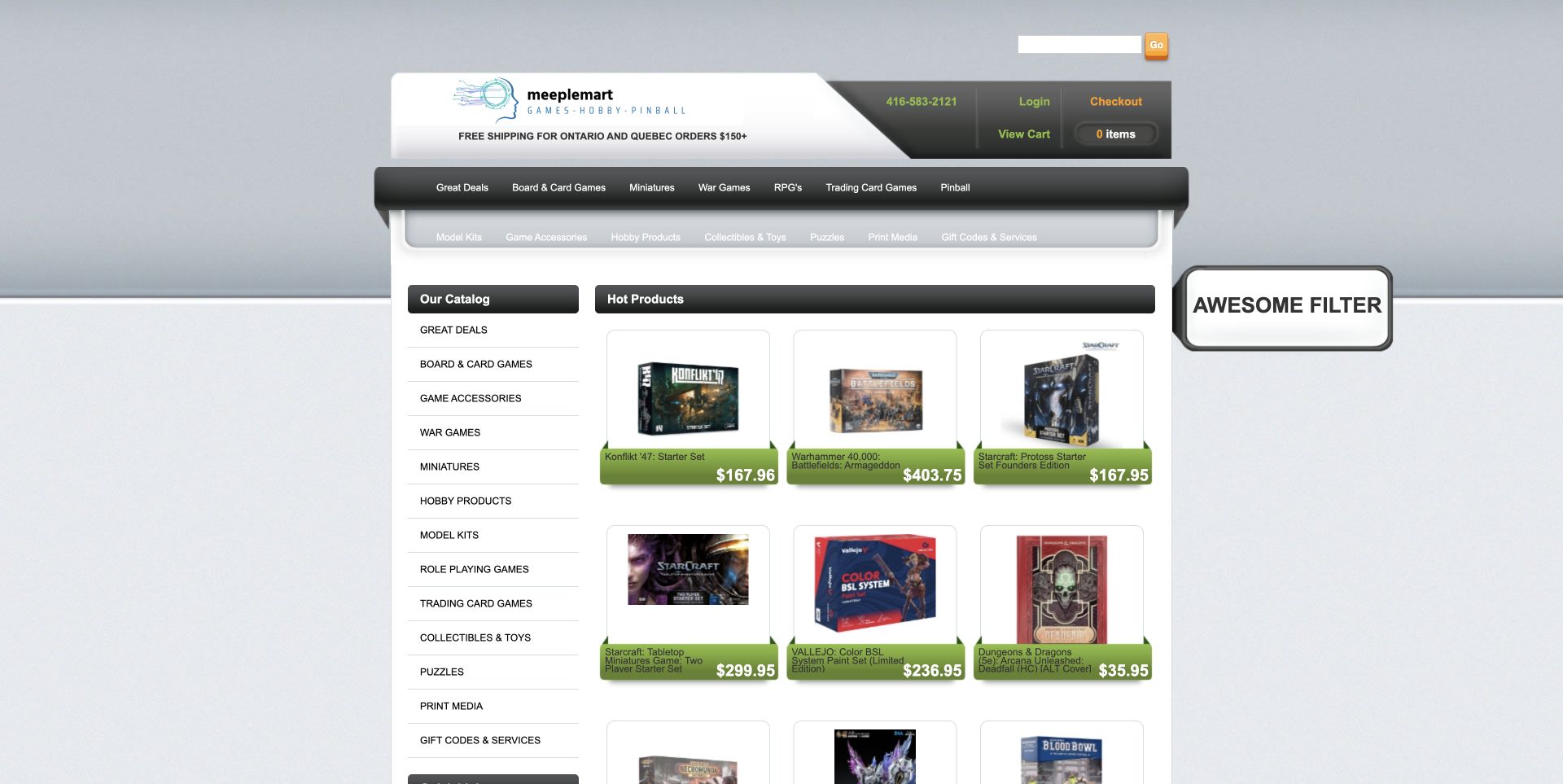
Meeplemart presents its assortment through a persistent left-hand catalogue and a compact grid of hot products. A grey and black visual system gives way to green price ribbons within the product cards, making the shopping information stand out against the restrained frame. The sidebar includes an explicit Board & Card Games route and a brand selector, useful for visitors navigating a large mixed hobby catalogue. This design prioritises access and quantity over atmosphere. It is worth studying for its directness, while recognising that small labels and many adjacent links can make the same layout less welcoming to a first-time game buyer.
What you can learn
A large catalogue can benefit from visible category and brand routes, but navigation density needs restraint. Preserve the useful structure while giving product titles, stock states and controls enough space to be read comfortably.
Pros
The sidebar keeps catalogue routes available beside products.
Prices and product images form a consistent comparison grid.
Cons & considerations
The interface's small text creates a demanding scan.
Category breadth does little by itself to guide an inexperienced board-game shopper.
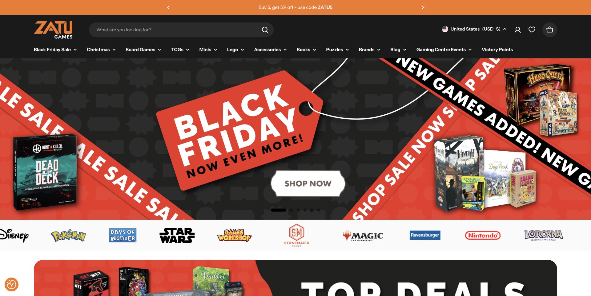
The reviewed Zatu destination is the site's US locale, reached from its former board-game.co.uk address. A black and orange header identifies Board Games alongside other hobby departments, while the opening view centres on a seasonal campaign and a row of familiar product-brand marks. This is a commerce-first presentation with a clear visual identity and extensive browsing choices. The locale matters: the screenshot documents that particular destination, not a promise about UK pricing or delivery. For other retailers, the useful lesson is to make regional context explicit while maintaining a consistent path into the assortment.
What you can learn
Treat country, currency and fulfilment context as part of the shopping interface. Keep core product navigation stable across regional destinations, and do not let a campaign imply conditions that only apply in another market.
Pros
The distinctive colour system holds a busy catalogue together.
Board-game navigation stays separate from the seasonal promotion.
Cons & considerations
The campaign occupies much of the first screen.
Regional redirects can surprise returning visitors unless the destination is clear.
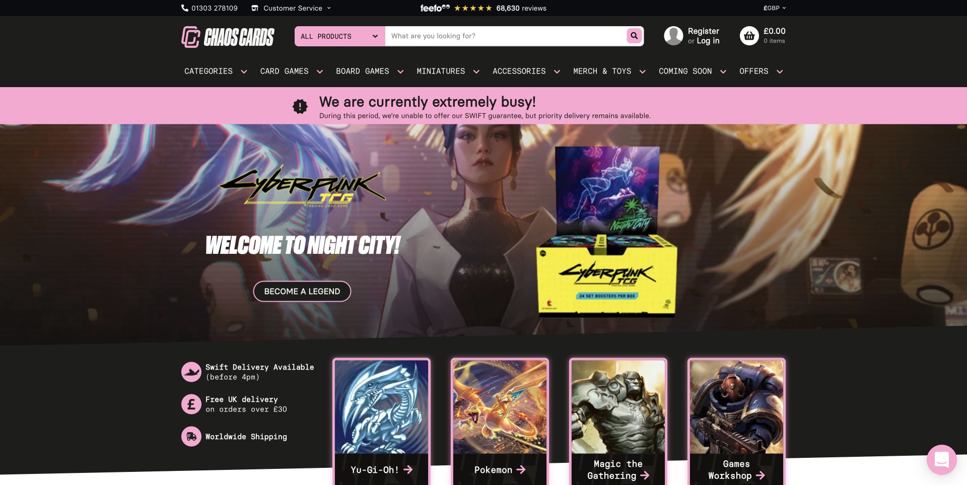
Chaos Cards combines a black and pink header, broad search and explicit board-game navigation with a large entertainment-led campaign. The reviewed page also carries a busy-period notice that qualifies dispatch expectations and the availability of its faster service. That specific message is more informative than a generic benefit icon alone. Below it, the promotional artwork and catalogue routes maintain the shop's energetic character. The design is useful to study as a case in keeping operational information visible, although the coexistence of temporary exceptions and permanent service claims requires careful wording so customers can tell which conditions apply now.
What you can learn
When an ordinary service promise changes, place the exception where it can be read before purchase. Check the surrounding benefit strips and campaign copy for consistency rather than adding a notice in isolation.
Pros
The service exception is visible near the main shopping navigation.
Search and named departments support direct access beyond the campaign.
Cons & considerations
Dense header information competes with a large hero.
Permanent benefit language needs checking whenever temporary exceptions are introduced.
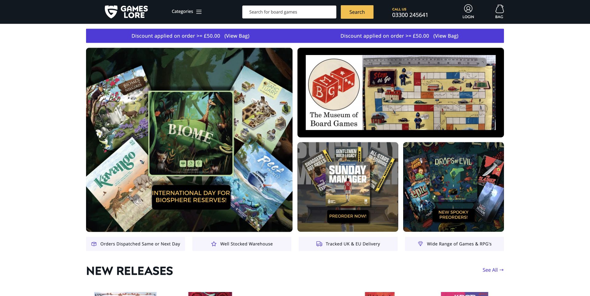
Games Lore uses a compact dark header with yellow search controls, followed by an asymmetric mosaic of game imagery and editorial destinations. The captured arrangement includes a thematic game selection, a board-game museum reference and distinct preorder promotions. New Releases then introduces ordinary product browsing below the artwork. The mosaic offers several starting points at once, which can be more inviting than asking every visitor to follow one campaign. The tradeoff is that meaning relies heavily on image text and multiple adjacent messages. Repeated discount wording adds further visual noise above an otherwise clear set of destinations.
What you can learn
Use a small number of clearly differentiated tiles when the store has several worthwhile stories. Give each one a specific purpose and readable label, and keep the transition from discovery content to priced products obvious.
Pros
Several distinct topics are visible without waiting for a carousel.
The compact header leaves substantial space for the store's editorial selection.
Cons & considerations
Promotional text embedded in artwork can be difficult to scan.
Repeated discount messaging competes with the more useful discovery tiles.
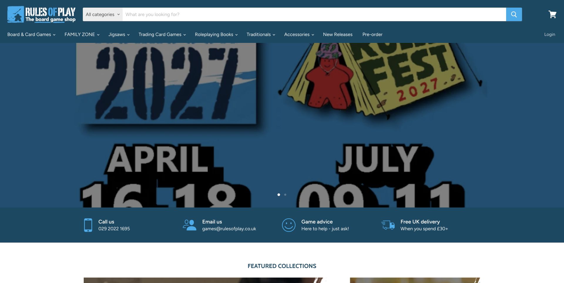
Rules of Play pairs a large search field and plainly named Board & Card Games navigation with an event-led hero. In the captured state, RulesFest artwork introduces future community activity, followed by a practical strip for telephone, email, game advice and delivery information. Featured collections and products continue below. This is a helpful model for a store that wants to be known for more than stock alone. The event gives the page personality, while the contact strip offers a route for uncertain customers. The oversized, tightly cropped artwork also shows the limitations of treating an event poster as a responsive homepage banner.
What you can learn
Connect events to the enduring retail journey with clear advice and catalogue routes. Build campaign artwork for its actual display area, so dates and calls to action remain readable rather than depending on a cropped poster.
Pros
Advice and contact options sit close to the opening campaign.
Product and family-game routes remain explicit in the main navigation.
Cons & considerations
The event artwork consumes much of the viewport and crops important details.
Future event content needs an expiry and replacement plan.
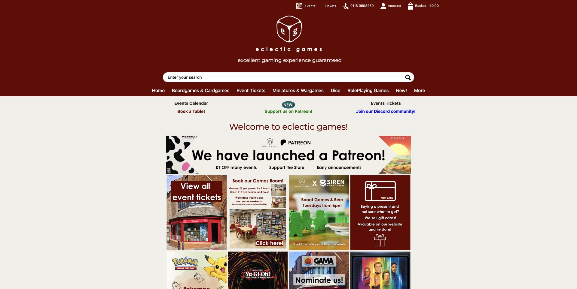
Eclectic Games leads with a burgundy identity, a prominent search field and literal navigation for board games, events and other tabletop interests. Below, a mosaic combines the storefront, gaming-room photography, event tickets and community offers. Those real place images help explain what exists beyond the online catalogue. Board-game products and stock information further down establish that this is also a retailer, rather than simply an events venue. The opening view is notably community-heavy, making it a useful reference for shops where visiting and playing are central to the customer relationship. The amount of promotional text is the main cost of that breadth.
What you can learn
Use photographs of the real shop and play space to explain the experience, then give visitors separate routes to buy games, attend an event or arrange a visit. Each journey needs its own clear next step.
Pros
Actual shop and room images make the local business concrete.
Events and catalogue categories are separately named in the navigation.
Cons & considerations
The large masthead pushes shopping content lower down.
Many small promotional panels ask visitors to read several competing messages.
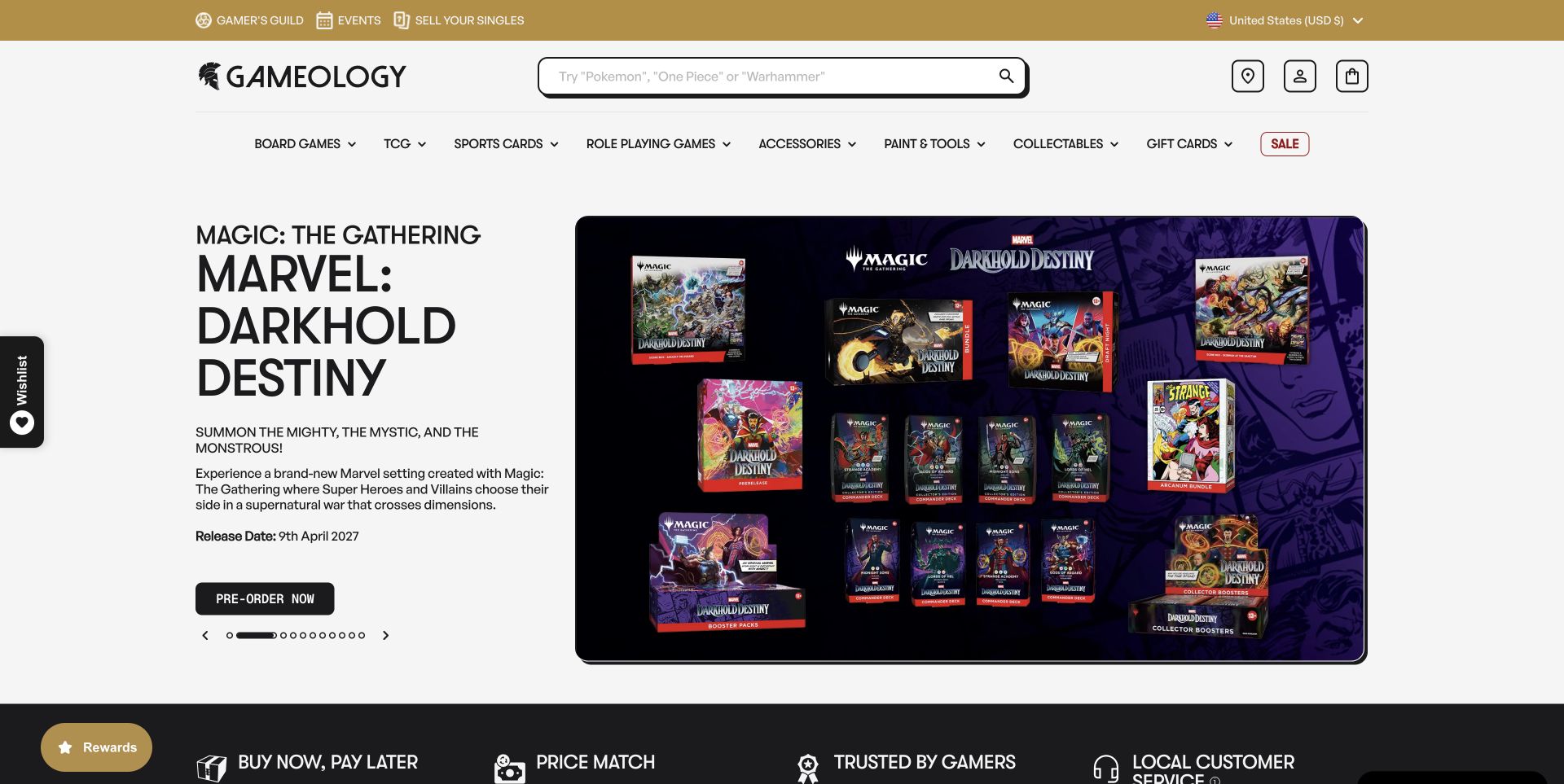
Gameology separates promotional text and an action from the corresponding product artwork. The captured campaign names a future release, gives its date and uses a preorder action rather than implying immediate availability. A generous search field and a stable department row, including Board Games, remain above the campaign. This division is useful because the information hierarchy does not depend entirely on a decorated image. The page also supports multiple hobbies and store events, creating a broad retail destination. Its numerous carousel positions and peripheral promotional controls add complexity, so the calm text-and-artwork composition benefits from disciplined limits elsewhere.
What you can learn
Keep important launch details as readable page content beside the artwork. Match the action to the actual purchasing state, and distinguish a future release from stock customers can expect to receive now.
Pros
Campaign copy, date and action are visually separate from product imagery.
The search field and department row preserve direct shopping routes.
Cons & considerations
Many carousel positions dilute the emphasis of an individual campaign.
Peripheral promotional controls can distract from the main shopping task.
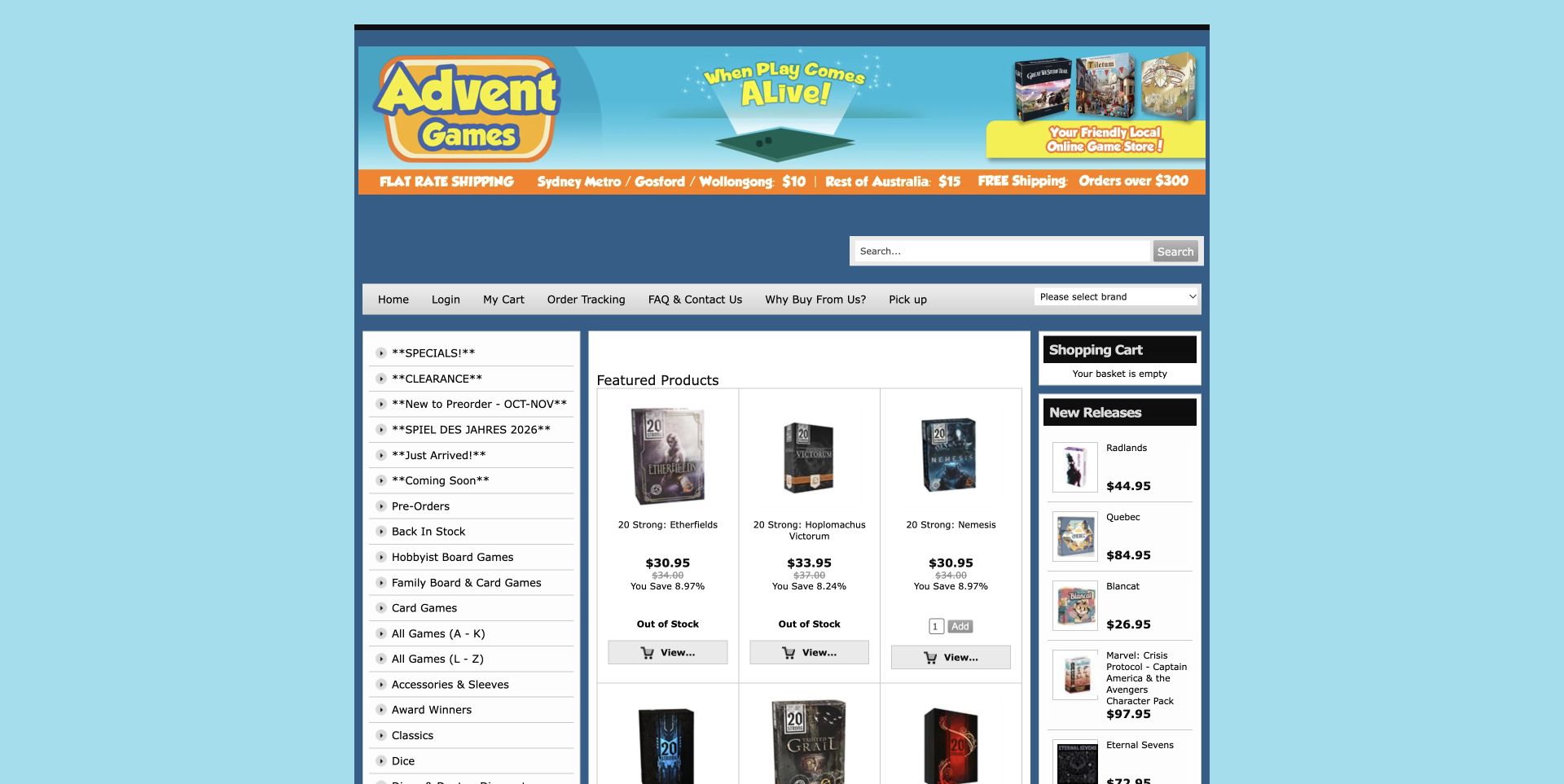
Advent Games uses a traditional three-column storefront with a blue frame, persistent category lists and a grid of featured products. Its opening view gives shipping context a prominent strip and distinguishes Hobbyist Board Games from Family Board & Card Games in the left navigation. Product cards visibly differentiate unavailable titles from those with a purchasing control. That operational clarity is more useful than the decorative header alone. The layout is dense and comparatively small, but it makes a good reference for stores serving repeat customers who value a quick stock check and direct access to known categories.
What you can learn
Keep availability states consistent and visible in product lists, not just on detail pages. Preserve the difference between a title being listed, available to order and ready to ship, while avoiding a crowded interface.
Pros
Stock labels provide concrete information before a product is opened.
Hobbyist and family categories offer distinct browsing routes.
Cons & considerations
The narrow layout and small labels constrain comfortable scanning.
Several side panels compete with the product grid for space.
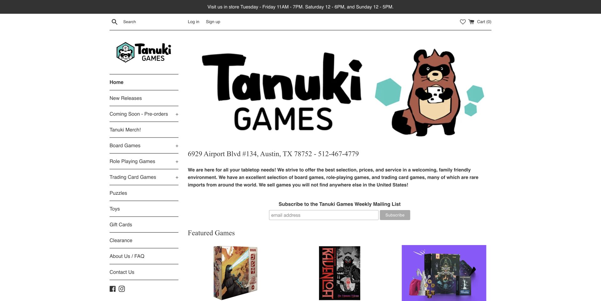
Tanuki Games uses a friendly mascot and an unusually straightforward sidebar to introduce its Austin store. Opening hours appear at the top, while the address and telephone number sit beside a short explanation of its tabletop assortment and interest in imported games. The catalogue remains explicit: Board Games, upcoming releases, role-playing products and other departments are named in the sidebar, with featured products below the introduction. The large identity graphic gives the shop personality, but it also delays product discovery. The useful design lesson is the connection between a recognisable local business and an accessible shopping structure.
What you can learn
State the shop's location and genuine specialism in plain language, then make the catalogue easy to reach. A distinctive mascot can establish character, but it should not take over the space needed for useful product information.
Pros
Location, hours and contact information are easy to find.
The persistent sidebar makes the retail assortment clear.
Cons & considerations
The oversized identity area pushes featured games down the page.
A general specialism statement needs supporting product detail rather than broad exclusivity claims.
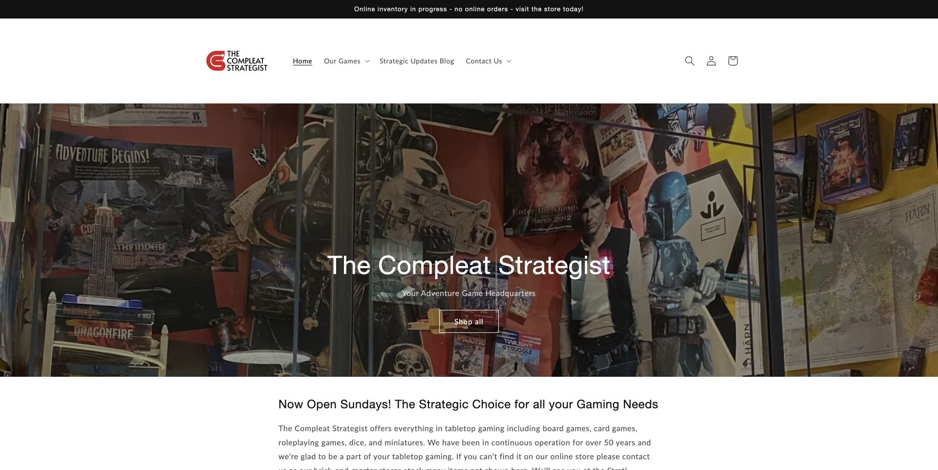
The Compleat Strategist opens with a photograph of its densely stocked shop, giving a tangible sense of the physical business. A prominent notice states that online inventory is in progress and online orders are not being accepted, directing people to visit the store. The page also explicitly describes board games among its tabletop range. This example is therefore a physical-retailer website in transition, not evidence of a working online checkout. The retained Shop all action creates some tension with the notice, making the page useful for studying how temporary operational states should influence every part of the interface.
What you can learn
When online ordering is unavailable, align the main action, catalogue labels and explanatory notice around the real way to buy. Keep useful product discovery, but do not imply that a conventional shopping button completes an available transaction.
Pros
Real shop photography communicates the breadth and character of the store.
The current online-order limitation is plainly disclosed at the top.
Cons & considerations
The Shop all action does not fully reflect the stated offline purchase route.
Online stock labels cannot be assumed to describe everything available in the physical store.
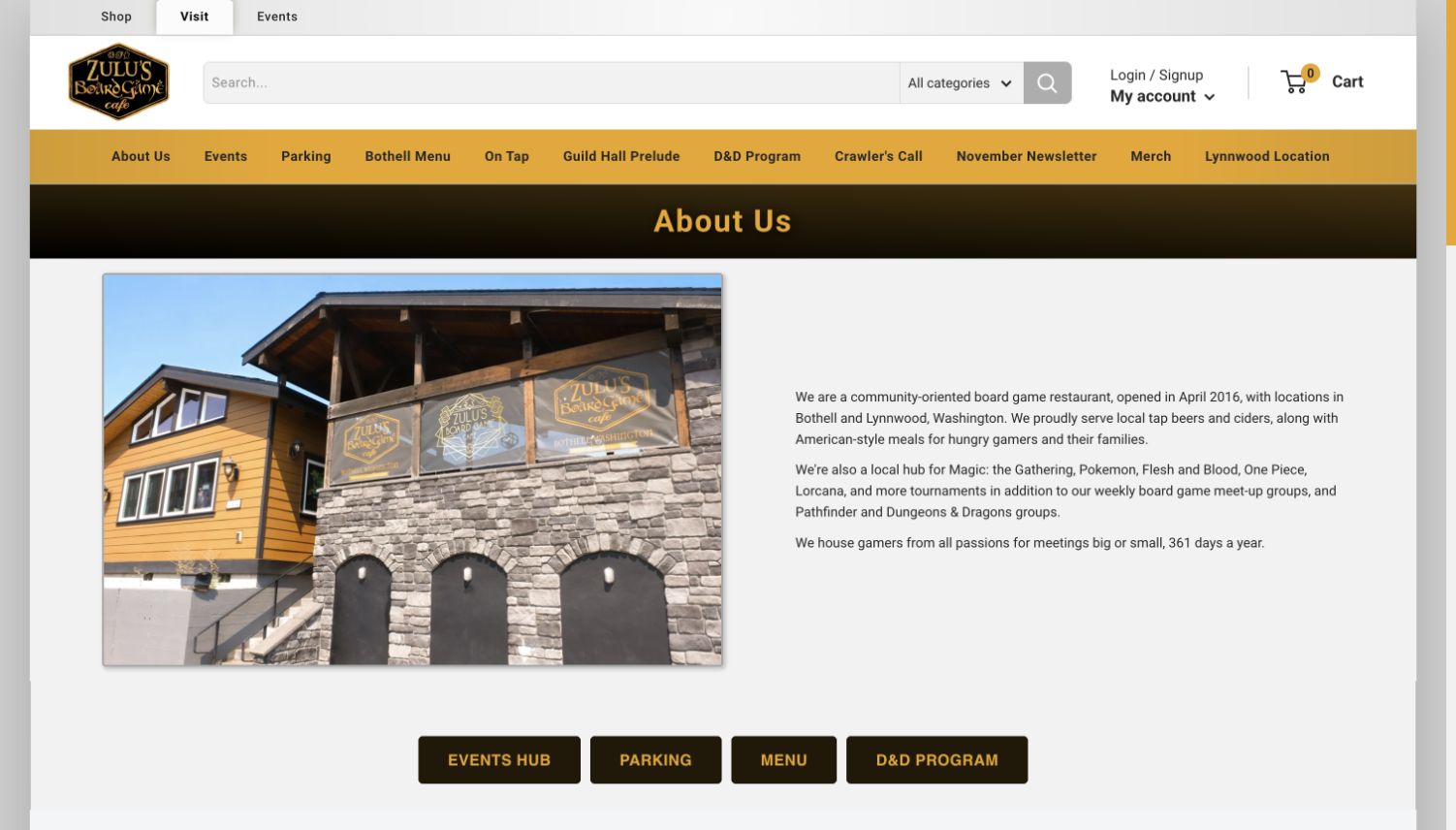
Zulu's About page provides a concrete introduction to a physical game-store and café business. The retained capture shows the building and a clear brand identity, while the surrounding navigation separates shopping, visiting and events. Board-game shopping is available within that wider structure. For a retail-design collection, the interesting choice is using a real place to support the catalogue rather than filling the page with generic hobby imagery. This is an About-page view captured on November 10, so it should be read as evidence of the store's presentation and navigation, not as a current stock or service-performance assessment.
What you can learn
Use an About page to answer practical questions about the business behind the catalogue. Real location imagery is most useful when it is connected to distinct shopping, visit and event routes rather than left as decoration.
Pros
The physical building makes the business's local presence tangible.
Shop, visit and event journeys have distinct navigation roles.
Cons & considerations
An About page does not substitute for product-level shopping information.
Retail and café content need clear boundaries so visitors know which details apply.
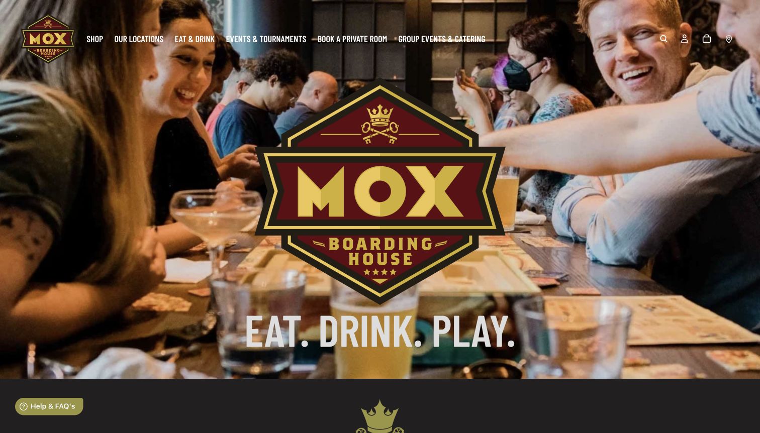
Mox Boarding House presents gaming as a social experience through people-focused photography and its Eat, Drink, Play identity. The retained homepage also provides explicit Shop navigation and a best-selling board-games section, establishing the retail offer alongside locations, events and private rooms. Its value for a game-store designer is in that connection: a visitor can understand why they might spend time at the venue and still find a route to purchase games. The large experiential opening is less useful for someone arriving with a specific product in mind, making the persistent shop route an important counterpart.
What you can learn
Show the real experience that makes a store distinctive, then preserve a direct shopping journey for visitors who do not need that introduction. Hospitality, events and game purchases should support each other without becoming one ambiguous action.
Pros
People and place give the storefront a recognisable social context.
Shop and board-game product content substantiate the retail offer.
Cons & considerations
Experience-led imagery delays product comparison.
Multiple location and hospitality journeys can compete with shopping priorities.
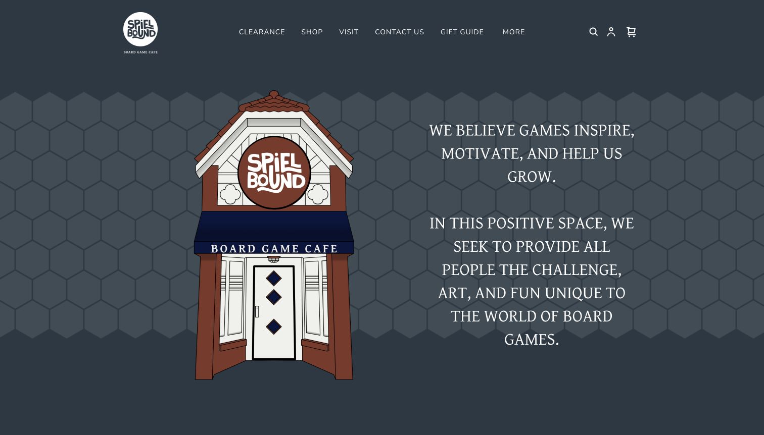
Spielbound's retained homepage pairs an illustrated storefront with mission-led copy, giving the business a warm and distinctive introduction. The navigation includes Shop and Clearance, and the recorded source content identifies special-order games as well as shipping and returns. Those details are what qualify the example as a retailer within its café context. The page does not need a conventional full-width product hero to communicate character, but shopping tasks must remain easy to find alongside the mission. This is a useful reference for a community-focused store that wants its website to explain both its purpose and its retail activity.
What you can learn
A strong mission can introduce the business, but it should be accompanied by specific purchase and fulfilment routes. Make special orders, ordinary stock and visit information distinct so a visitor can choose the right path.
Pros
The illustrated storefront creates a clear sense of identity.
Shop, clearance and special-order information provide concrete retail routes.
Cons & considerations
Mission content can overshadow immediate product discovery.
A hybrid café and shop requires careful separation of service and purchase information.
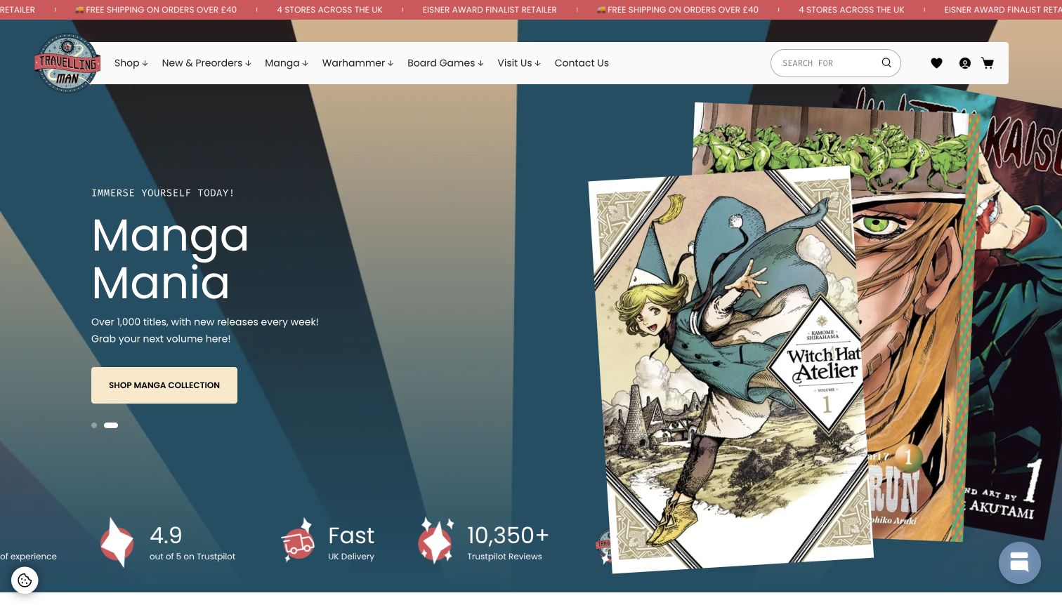
Travelling Man's retained homepage uses a warm blue and tan palette with a large manga campaign and recognisable product covers. Board Games remains an explicit route in the wider navigation alongside its other retail interests. That matters because the featured campaign alone would give a narrow impression of the assortment. For a board-game retailer that also sells comics, books or hobby products, this is a useful example of a shared brand system supporting several distinct shopping intentions. The screenshot records the observed manga-led campaign, not a board-game landing page, and the review focuses on that navigation relationship.
What you can learn
When a shop spans adjacent interests, keep each major department visible independently of the current campaign. The homepage can express a shared culture while allowing customers to reach the specific products they came to find.
Pros
A consistent palette and product-cover imagery give the store a coherent identity.
Explicit board-game navigation remains available beside other departments.
Cons & considerations
The featured campaign does not explain the board-game assortment.
Cross-category stores need additional discovery help beyond a single department label.
Kegan is a freelance web designer and developer with 15+ years of experience helping businesses turn complicated website requirements into clear, maintainable digital experiences. He works directly with clients from planning and design through development, launch, and ongoing support.
For board game store website design, his development approach focuses on board-game discovery, product comparisons, local pickup and delivery information, community events and clear specialist retail service details. The scope can be a targeted improvement or a complete custom build, with responsive layouts, thoughtful content structure, and integrations chosen around the people using and maintaining the site.
Show 3 other board game store website designersHide other board game store website designers
Plan for discovery, repeat purchases and local visits
Map the questions customers bring
List the common shopping intentions: finding a named game, replacing an expansion, choosing a gift, browsing recent releases and buying something played in store. Include the information needed to choose correctly, such as language, edition, base-game requirements and player count. Use those questions to shape navigation before deciding on a campaign layout.
Give game and stock information a consistent structure
Define reusable fields for editions, expansions, player counts, durations, language, availability and fulfilment. Decide how product lists show important differences without becoming crowded. Keep the source and update process for game details clear; an attractive product card cannot compensate for an ambiguous edition or misleading stock label.
Assign ownership of changing content
Preorders, release dates, restocks, events and shipping notices need maintenance. Identify who checks them, how old campaigns expire and what replaces them. Give the shop permanent discovery and contact routes so the website remains useful when a particular sale, tournament or launch is over.
The editing job behind the design
Choose tools around the catalogue and fulfilment model
Evaluate search, structured product fields, edition and expansion relationships, stock states, preorders and collection before choosing a commerce platform. Use representative awkward products in the assessment: a language variant, an expansion that needs a base game, a future release and an item available only in store. The system should explain those differences consistently to customers.
Keep event and advice publishing manageable alongside products. A small local shop and a broad online retailer may need very different operational tools. Public page observations reveal only some technology signals or documented associations; they do not establish the complete inventory, payment or customer-support system behind any example.
Our WordPress website examples offer a separate look at publishing approaches. A visible platform label is evidence for that named page, not a guarantee that the same system will suit your requirements.
Before the public launch
Board game store website launch checklist
Make exact titles, publishers and relevant edition identifiers searchable.
Provide useful discovery routes for player count, duration and level of complexity.
Explain language, edition and base-game requirements where they affect the purchase.
Distinguish in-stock, preorder, special-order and physical-store availability.
Keep product-list availability consistent with detail pages and purchasing actions.
State collection, mixed-order and shipping arrangements in plain language.
Make temporary ordering or dispatch limitations visible before purchase.
Separate shopping, café visits, events and private-booking journeys.
Give dated campaigns, release information and events a maintenance owner.
These checks are a project checklist, not a performance, legal, security, or accessibility certification. Test real journeys with the people responsible for the website before making claims about the result.
Sources & editorial method
How this collection was selected and reviewed
We reviewed official public store pages, source text and original screenshots for this collection. Eighteen images were captured on November 11, 2026; four inspected original images retain their November 10 capture dates. Some examples are About or café information pages with an explicit retail connection, and their reviews identify that scope. Board Game Bliss is the Editors Choice for connecting game explanation, product information and guided discovery in a specialist storefront. This is an editorial website-design selection, not a vote-based ranking or a service-quality endorsement. The Compleat Strategist is included as a physical retailer whose observed site explicitly pauses online orders. Bounded public technology audits retain prior observations and access limitations without inferring hidden systems.
Each example links to its actual source page. Screenshots are direct browser captures with their own capture dates; moving imagery, announcements and live designs can change. The notes describe observable design choices and conditional tradeoffs, not measured traffic, conversion results, service quality, or accessibility conformance.
Technology labels use public page metadata, asset evidence, or explicitly cited platform documentation. Platform documentation is not a complete current deployment audit. A component reference may be legacy or unused; it is not a complete backend inventory. Unknown stacks are omitted. These sites are editorial examples, not our client portfolio.
Written, Edited and Curated are separate editorial records, not timestamps advanced by a rebuild. Website designs and imagery belong to their owners. See our editorial standards or suggest a correction.
Questions worth asking
Board Game Store website design questions
What should a board game store homepage prioritise?
Give visitors clear search, useful departments and an immediate understanding of how they can buy. Combine direct access for customers who know a title with discovery help for people choosing by player count, time or experience. Keep permanent routes visible beside temporary promotions.
Which product details help people choose a game?
Useful details include player count, typical duration, language, edition, age guidance and a plain explanation of the experience. Expansions should state what base product they require. Keep information sourced and distinguish descriptive guidance from a promise that every group will enjoy the game.
How should a game store present preorders?
Use a clear preorder state and explain the expected release or fulfilment information without presenting it as guaranteed when it is uncertain. Explain payment and mixed-order arrangements on the appropriate policy pages. Keep preorder labels distinct from stock that can be dispatched now.
Can a board game café be included in a retail collection?
Yes, when the reviewed source explicitly documents a game shop or another genuine retail offer. The review should distinguish the café experience from buying games and identify whether the pictured page is a shop, homepage or visit-information page.
What should a physical game shop do when online ordering is unavailable?
State the limitation prominently and direct people to the actual purchase route, such as visiting or contacting the store. Align primary buttons and product labels with that message. A catalogue can still be useful, but it should not imply that an unavailable checkout will work.
Does a public technology audit reveal the complete store system?
No. It records bounded public page signals or documented associations. Inventory, payments, fulfilment and support may involve systems that are not visible. Use those observations as qualified context and choose tools around your own catalogue and operational requirements.
Borrow the useful discovery routes, clear stock language and concrete sense of place. Make the path from interest to an appropriate game as understandable as the campaign that attracts the first visit.