Best Board Game Cafe Websites of 2026 (15 Real-World Examples)
Study 15 real board game café websites, with direct screenshots and practical lessons in visit planning, game libraries, menus, reservations and group events.
A board game café website should make an unfamiliar kind of night out easy to understand and easy to plan.
A newcomer may not know whether to reserve, how the game fee works or whether someone can explain the rules. A regular may only need the menu, an event date or a table for a larger group. Useful café websites answer those different questions without assuming everyone already belongs to the hobby.
These 15 public website properties range from neighborhood cafés to regional hospitality groups. The reviews examine how each site presents its setting and practical information. They are observations about design and communication, not endorsements of food, service, safety or the availability of a particular game.
Before the examples
What makes good board game cafe website design in 2026?
Explain the visit before asking for a booking
State what the game fee includes, whether food purchases are separate, how long guests can stay and whether help is available. Put the booking expectation beside the reservation link instead of hiding it inside an external system.
Route locations and group sizes deliberately
Distinguish a casual table from a private gathering, and let guests choose a specific venue where the business has several locations. Menus, hours and reservation conditions should clearly belong to that branch.
Show the atmosphere without obscuring practical details
Use real spaces, people, food and games to explain the experience. Keep location, hours, accessibility information and menus easy to find even when the homepage uses a large photograph, animation or video.
The collection · 15 examples
15 board game cafe websites worth studying
These 15 distinct public properties were directly reviewed and captured. Bonus Round Game Cafe is the explicitly researched Editors Choice for its approachable explanation, visible group-size routes and clear visit charges. The selection recognizes website communication rather than the quality of the café service.
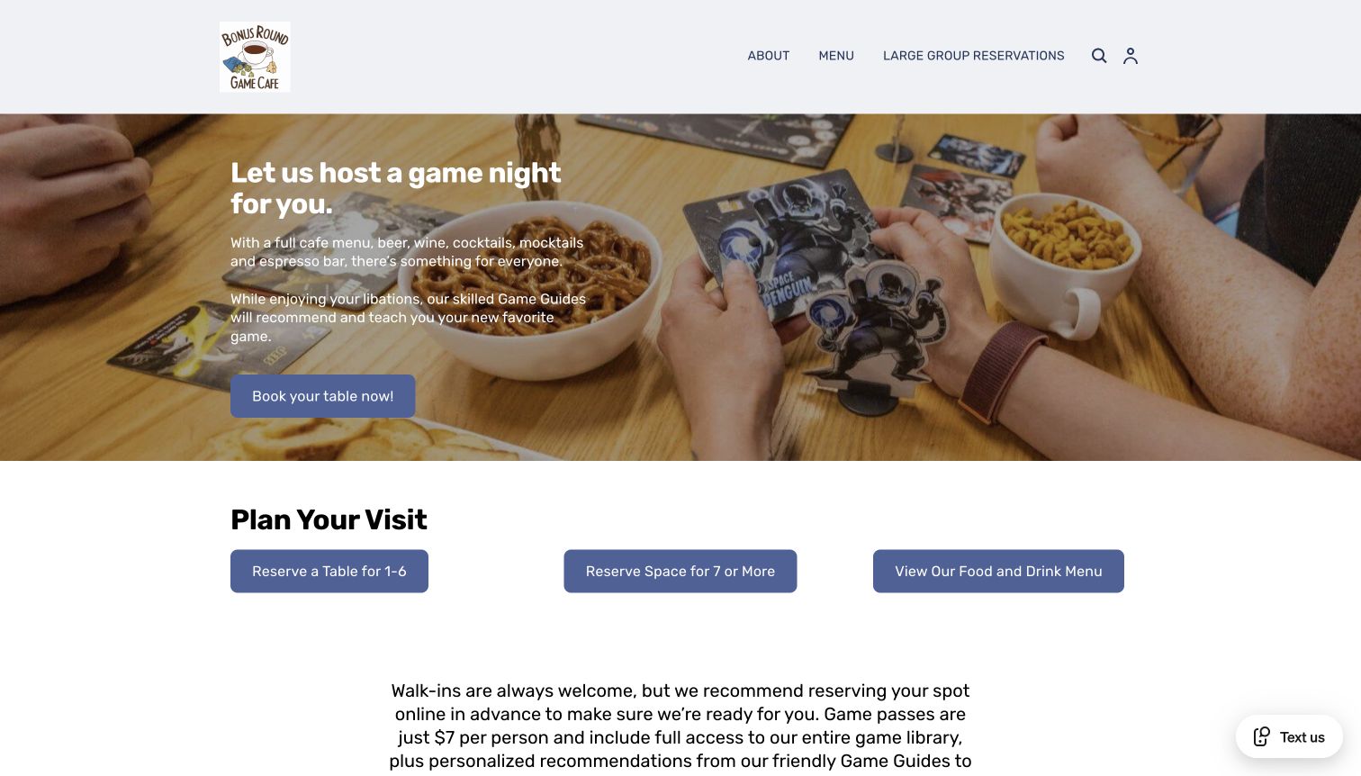
Bonus Round makes its offer understandable before asking visitors to reserve. A photograph of food and cards supports a short explanation of the café and its Game Guides. Immediately below, three large routes separate tables for one to six, larger groups and the menu. The following copy explains the game pass, food and drink minimum and staff recommendations. That sequence gives newcomers a practical picture of their evening.
What you can learn
Organize a café homepage around the decisions guests must make together. Explain what the visit includes, disclose separate charges and route large groups deliberately. A straightforward planning section can turn an appealing social photograph into an actionable invitation without requiring a visitor to understand gaming terminology.
Pros
Group-size choices are explicit, reducing ambiguity between a casual table and an organized gathering.
Food, games and help from staff appear together, making the experience approachable to less experienced players.
Cons & considerations
The events section still carries an October heading in the November observation, creating a maintenance question.
The opening image contains prominent copy, so its crop and contrast deserve care on narrow screens.
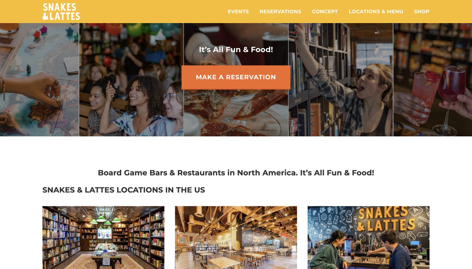
Snakes & Lattes opens with a bright yellow header and a collage of people, shelves, food and drinks. This quickly communicates that the business combines several parts of a social evening. A large reservation button gives the image a clear next step, while locations and menus have a stable place in the navigation. Lower on the page, separate location cards help visitors move from the shared brand to a particular venue.
What you can learn
Use a shared homepage to explain the experience, then direct people to the location that can actually host them. Keep venue selection close to reservations and menus. Avoid making customers infer which address, hours or food offering applies from a general brand photograph alone.
Pros
The image collage represents playing, eating and browsing games rather than relying on a single product shot.
Reservations and location choices are prominent enough to serve visitors with an immediate plan.
Cons & considerations
The colorful opening carries several competing images, which may distract from smaller navigation labels.
Session charges and location-specific conditions require further exploration beyond the first screen.
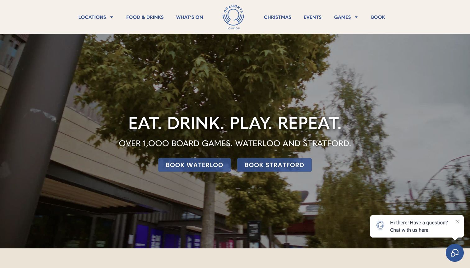
Draughts uses a restrained cream header, blue navigation and a full-width moving backdrop. The central message connects eating, drinking and playing, while two matching buttons identify Waterloo and Stratford. That is a useful early decision: the visitor can choose a venue before encountering its menu or booking details. The wider navigation also separates food, events and group occasions. At the captured moment the video shows an exterior scene, so the practical venue choices carry more explanatory weight than the imagery.
What you can learn
Give each important branch an equally legible entry point rather than hiding location selection inside a booking widget. Support the choice with recognizable place names and consistent page structure. Moving imagery should reinforce the offer, while headings and controls explain it even in an uninformative frame.
Pros
The paired location buttons make the first navigation decision unusually clear.
Menus, events and bookings have distinct labels that accommodate several reasons for visiting.
Cons & considerations
A video frame may show little actual gameplay, making the experience less obvious without reading the headline.
Fees and session conditions are not explained within the captured opening screen.
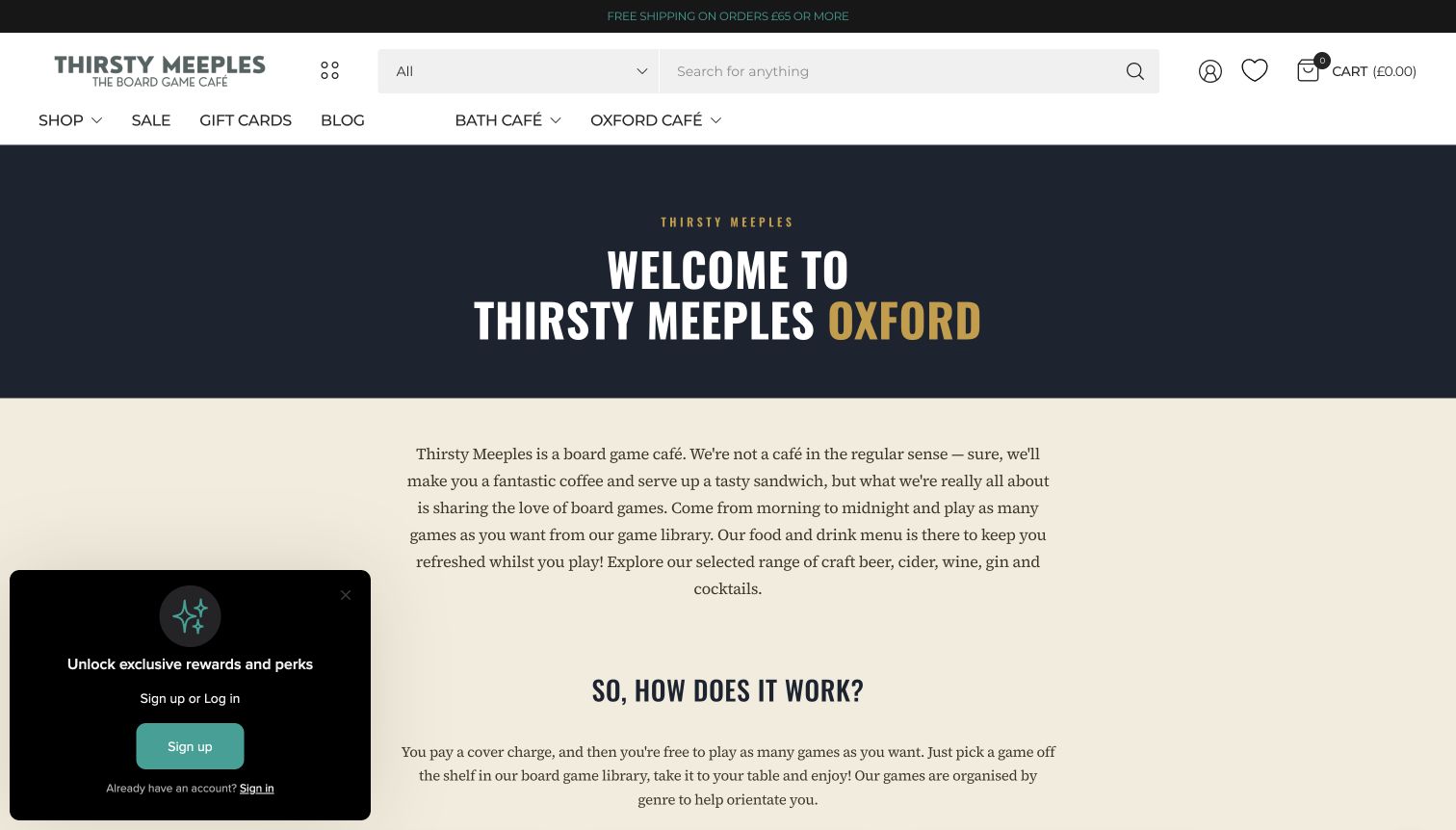
Thirsty Meeples gives its Oxford café a dedicated information page inside a broader retail website. A large welcome heading leads into a plain explanation of the café, followed by how the session works. The page distinguishes game-only visits from visits including food or drinks and explains the three-hour period. Staff assistance, table service, booking and the game library are presented as connected parts of the experience. This is particularly useful because the surrounding header also contains product search and shopping controls.
What you can learn
When one domain serves retail and hospitality, create a destination that explains the visit in its own terms. State session length and charging differences together, then connect the explanation to booking and the library. Keep the store catalog available without allowing its controls to substitute for café information.
Pros
The how-it-works section answers practical questions about time, charges and assistance.
Separate café and library links help visitors distinguish playing a game from purchasing it.
Cons & considerations
The large retail search and cart remain visually prominent on a page aimed at café guests.
A floating reward prompt competes with the lower-left reading area in the captured view.
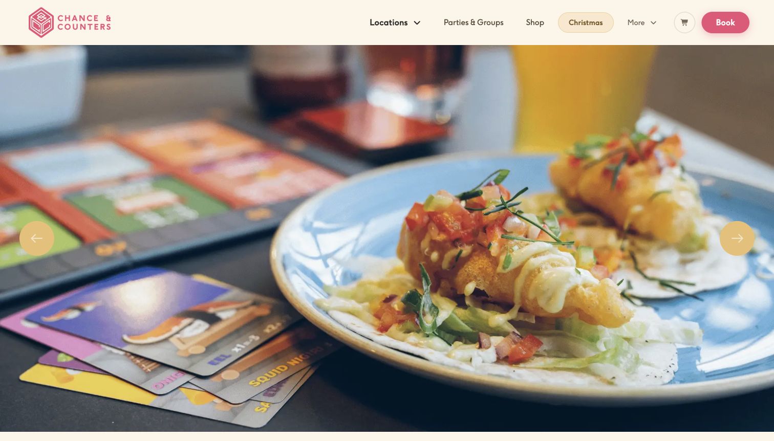
Chance & Counters combines a cream header, pink wordmark and a large photographic opening. The image emphasizes food and the table setting, positioning the visit as a social occasion rather than a specialist retail transaction. Locations, groups and booking remain available in the header, and the broader page introduces its café network and game-led hospitality. The contrast between playful colors and conventional navigation keeps the brand distinctive while preserving familiar routes.
What you can learn
Use visual personality to make the venue memorable, then keep the main visit tasks in plain language. A location selector, group route and booking button can share the same header without becoming a complete site map. Let detailed rules live in the relevant venue information.
Pros
The restrained navigation gives location and group planning a stable position above the imagery.
Color and food photography communicate a relaxed hospitality setting rather than a technical hobby catalog.
Cons & considerations
The opening photograph explains the food offer more clearly than the range of games available.
Visitors comparing session charges need to move beyond the broad brand introduction.
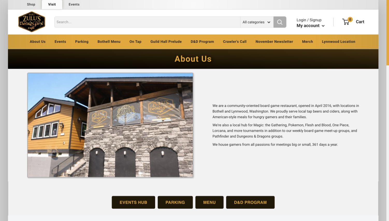
Zulu’s places Shop, Visit and Events in separate top-level tabs. Its About page then introduces the board game restaurant with a real building photograph and short community-focused text. Direct buttons lead to events, parking, the menu and its role-playing program. Further information distinguishes locations and even separates store, kitchen and card-counter hours. Those details matter when a single business supports shopping, eating and organized play at different times.
What you can learn
Treat visiting as a complete task when a retail business also runs a café. Show the building, distinguish each location and publish department-specific hours where they differ. Give parking and the food menu direct routes instead of assuming a product catalog can answer a guest’s planning questions.
Pros
Shop, Visit and Events establish different intentions before the visitor enters a dense retail menu.
Parking and menu shortcuts translate the local introduction into practical next steps.
Cons & considerations
The persistent search, account and cart controls still consume substantial space on the visiting page.
The secondary navigation includes many specialist programs, increasing the reading work for a first-time guest.
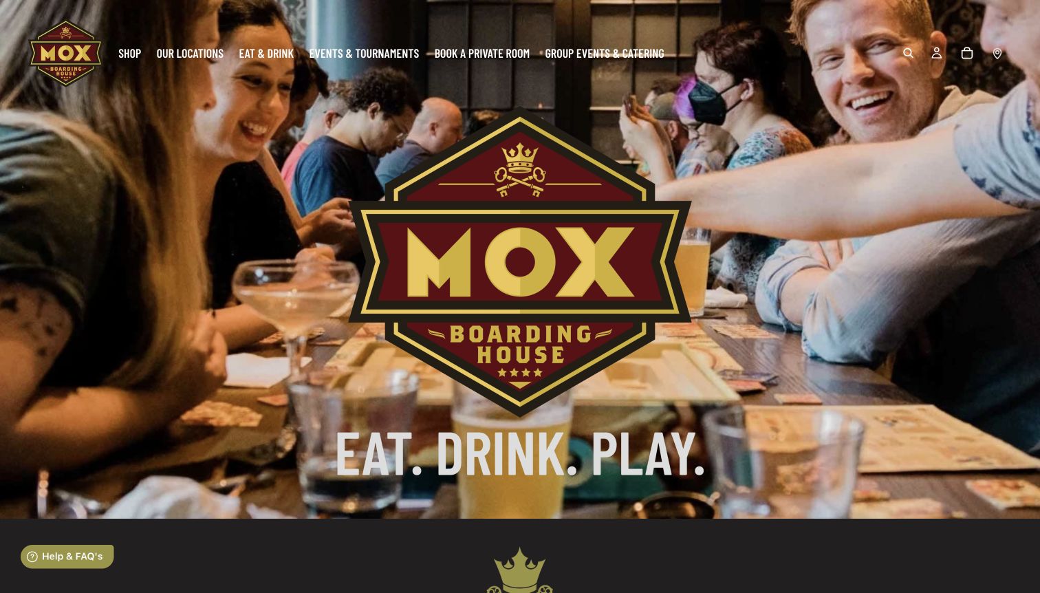
Mox Boarding House places a large central brand mark over a photograph of people sharing a table. The short headline ties food, drink and play together, while the header separates shopping, locations, dining, events and private spaces. Below the opening, the page explains its combined offer and provides location cards before presenting retail products. This sequence acknowledges that visitors may arrive for a meal, an organized event or a particular game.
What you can learn
Define the major purposes of a combined venue in the navigation, then show how they connect in the body. Real people and tables can communicate the social atmosphere, while location cards and service descriptions help the visitor choose an appropriate next step without conflating shopping with reservations.
Pros
Distinct dining, event and private-room routes prevent the retail catalog from becoming the only entry point.
Location cards provide a useful transition from the shared brand to a specific venue.
Cons & considerations
The oversized central logo occupies much of the opening image and delays more practical information.
The number of header destinations may need careful prioritization on smaller screens.
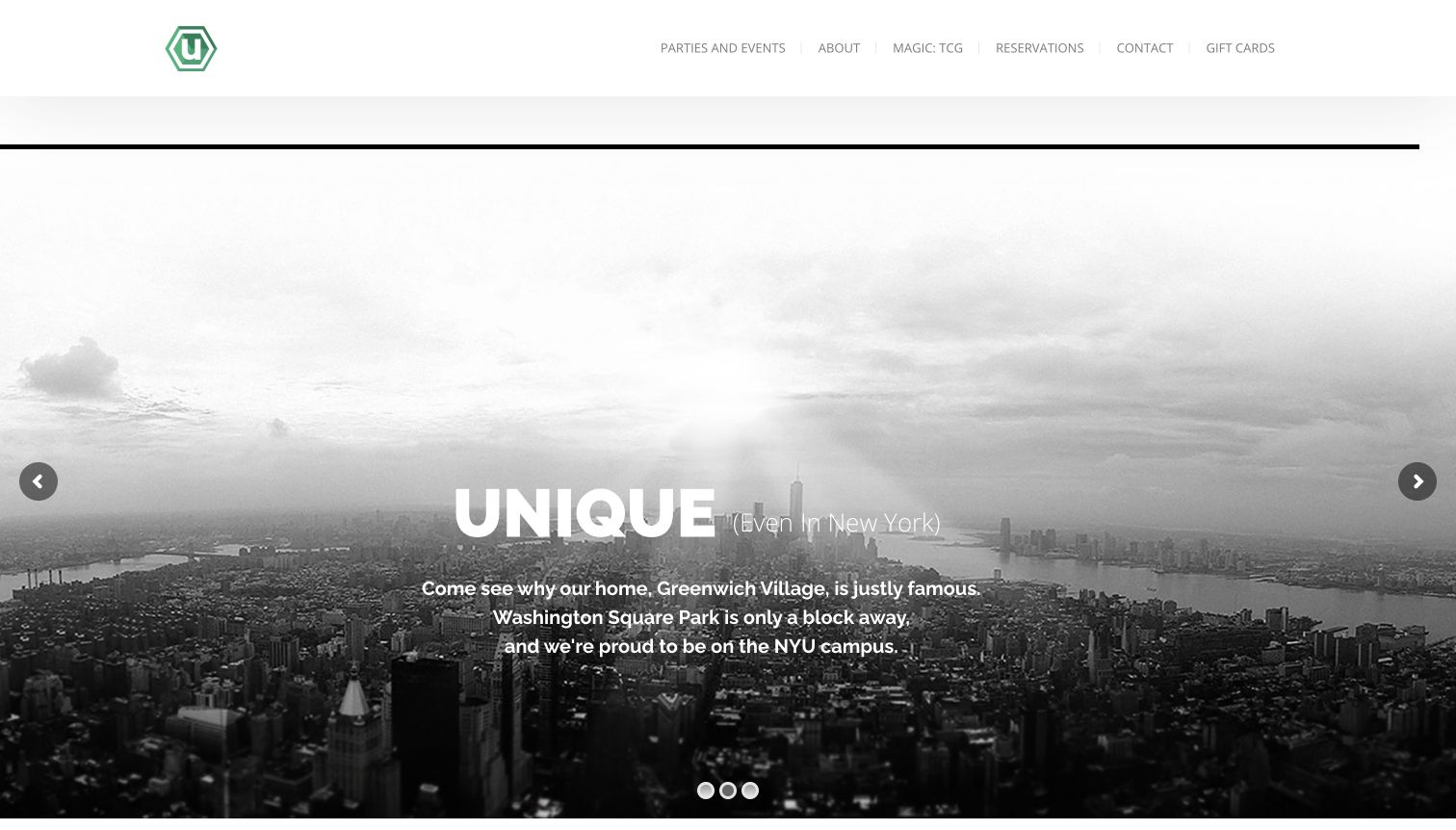
The Uncommons uses a spare white header, a small green symbol and a wide image carousel. The captured slide presents a monochrome New York view and neighborhood context rather than an overhead game photograph. Reservations, parties, contact information and the About page are easy to identify in the short navigation. Address and opening hours are also available in the page content. This creates a compact local identity, although the café experience needs more explanation than the city image supplies.
What you can learn
Keep a local café’s navigation focused on the tasks people actually bring: finding the venue, reserving a table and organizing a group. Use neighborhood imagery as context, then add clear information about the experience. A recognizable skyline should not carry the whole burden of explaining a specialist business.
Pros
The small number of navigation choices makes reservations and group events easy to locate.
The page publishes its street address and hours without requiring an account or inquiry.
Cons & considerations
The captured carousel frame communicates New York more strongly than board games or food.
Game fees and the mechanics of a visit are not evident in the opening presentation.
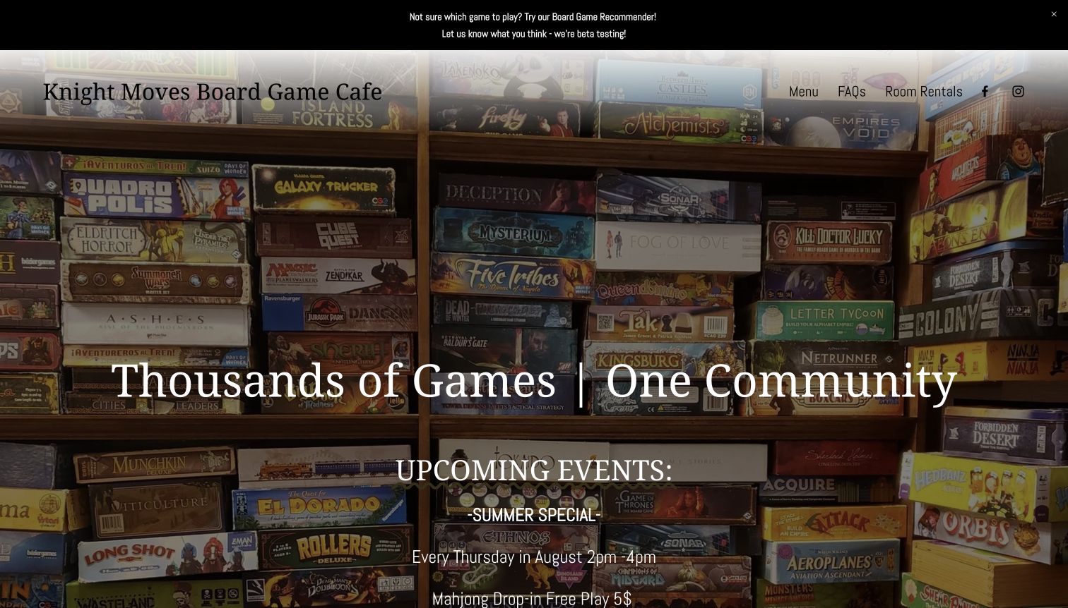
Knight Moves uses shelves of real game boxes as a full-width background, immediately establishing its subject. The main page then sets out the game fee, opening hours, kitchen closing times and rules for larger parties. It also distinguishes people playing games from those stopping for something from the menu. A recommender and a linked collection support visitors who want to explore before arriving. The practical depth is valuable, but the captured opening still advertises a summer event under an upcoming-events heading during the November observation.
What you can learn
Write visit rules alongside the welcoming message, especially where fees, group size or kitchen hours differ. Keep library discovery optional for newcomers. Give time-sensitive notices an owner and expiry date so an otherwise informative page does not appear neglected because of one old announcement.
Pros
Separate kitchen and venue hours address a common source of uncertainty when planning a late visit.
The fee explanation makes clear what a player receives and how larger groups should prepare.
Cons & considerations
The summer promotion remains prominently labeled as upcoming in the observed November page.
Text over a detailed shelf photograph requires strong contrast and disciplined spacing.
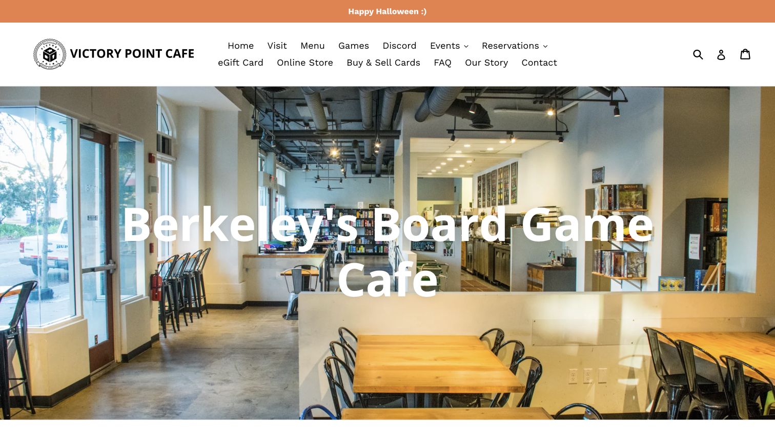
Victory Point Cafe opens with a bright photograph of its Berkeley interior and a direct description of the business. The main content explains how access to the collection works, how staff help with rules and what food is available. Separate sections introduce games, the community and the menu, followed by reservation guidance and hours. This progression is useful for a visitor who has never tried a board game café. The header is more crowded than the body, mixing visiting information with online shopping, gift cards and card trading.
What you can learn
Introduce the physical experience in ordinary language before presenting every specialist offer. Explain who helps, what guests can do and where food fits. Group secondary shopping routes so they remain available without competing equally with the information needed to plan a first visit.
Pros
The interior photograph makes the seating and game-focused setting tangible immediately.
The how-it-works section describes staff assistance instead of assuming visitors already know the format.
Cons & considerations
The multi-line header presents many similarly weighted destinations, which can slow the first decision.
A Halloween announcement remains at the top during the November observation and needs date-aware maintenance.
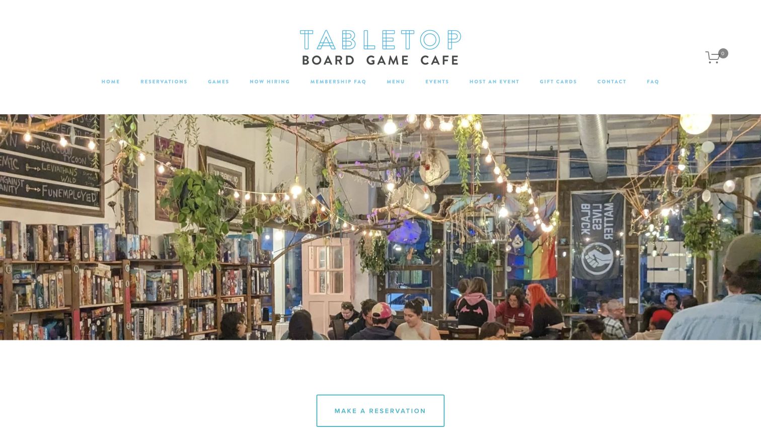
Tabletop Board Game Cafe uses a light header and a broad photograph of its Cleveland space. A reservation button appears directly below the image, followed by an explanation that booking is recommended rather than always required. The how-it-works section introduces the play pass and staff recommendations in approachable language. Event cards and menu links then extend the visit beyond ordinary table play. The page also explicitly says that events do not prevent normal café access, a useful reassurance for someone comparing dates.
What you can learn
Place the booking expectation beside the booking link, rather than making guests discover it after entering a reservation system. Explain whether scheduled events change ordinary access. A short operational sentence can answer a more important question than another decorative photograph or promotional headline.
Pros
The distinction between recommended reservations and ordinary access is stated clearly.
The play-pass explanation and staff recommendations give newcomers an understandable starting point.
Cons & considerations
The first visit triggered a large newsletter overlay that obscured the café presentation until a later unobscured view.
The pale navigation lettering is delicate against the white header and deserves contrast attention.
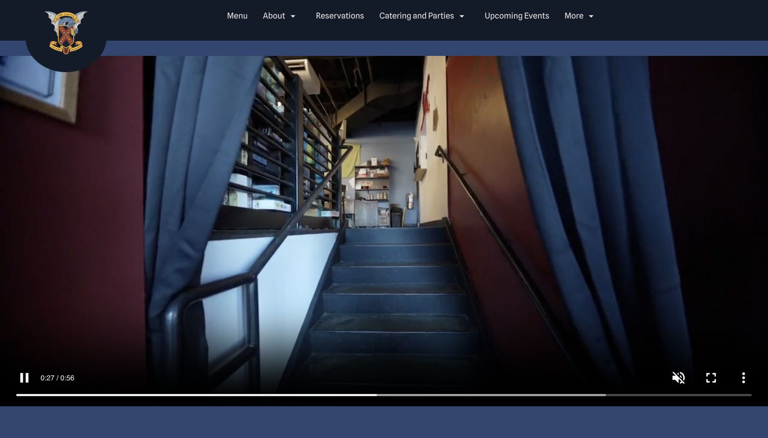
The Castle uses a dark header, a colorful crest and a large video tour to establish the venue. Its navigation separates the menu, reservations, group occasions and upcoming events. Further down, the page combines dining-room photography with simple routes for eating, catering and parties, followed by community information and location details. This is a restaurant-oriented approach to board game hospitality: guests can plan food and gatherings without first browsing a game catalog.
What you can learn
Organize a social venue around the occasions it hosts, with clear routes for a normal visit and a private event. Support moving tours with stable written information about the location and offer. Keep video controls visible and let practical content remain usable independently of the film.
Pros
Reservations, catering and parties are separate tasks instead of being folded into a generic contact link.
The page provides a direct location and hours area after its hospitality introduction.
Cons & considerations
The large video delays the explanatory content and can show frames with little board game context.
An ordering call to action may compete with the reservation journey for visitors primarily planning play.
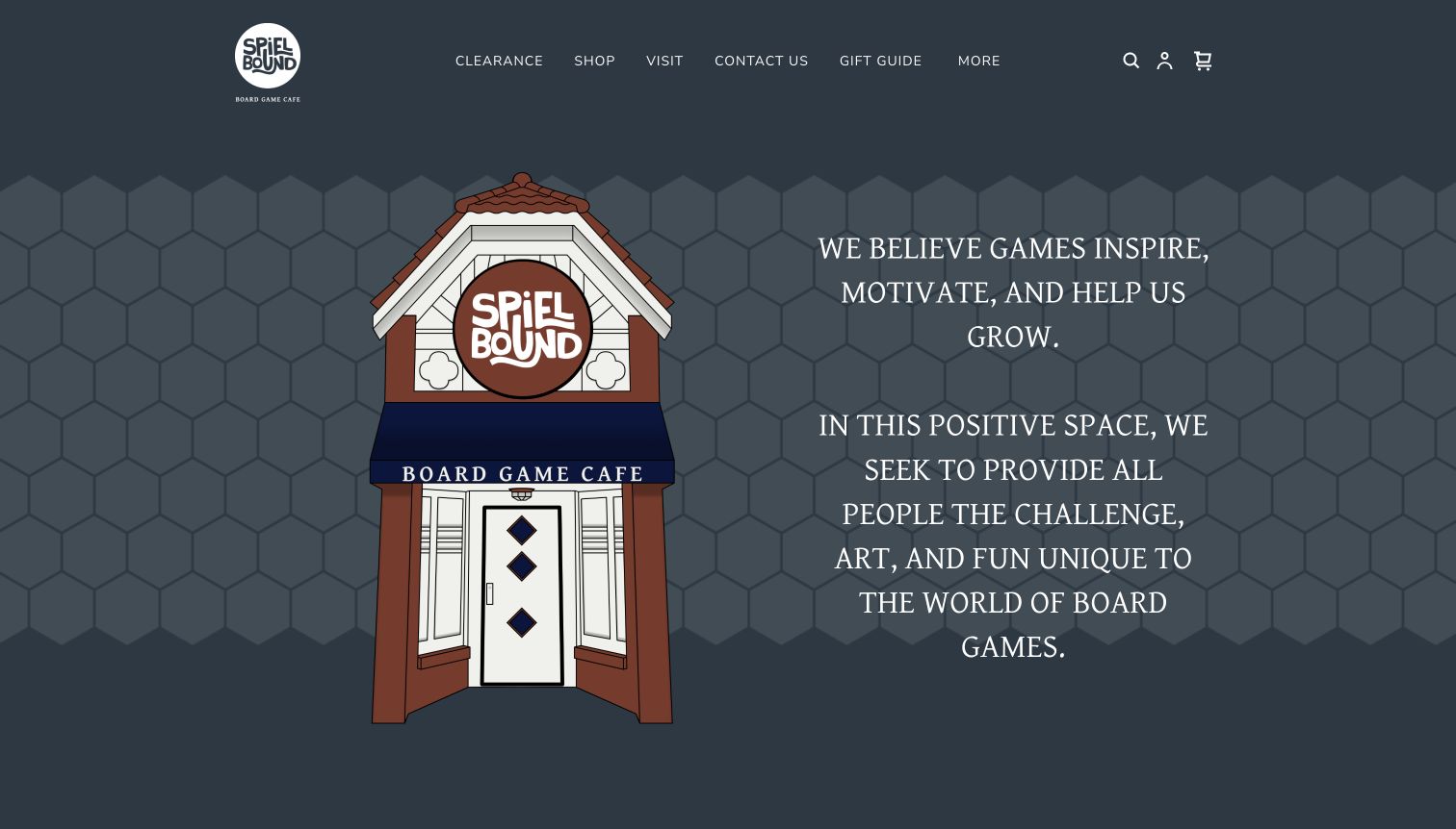
Spielbound opens with an illustrated building, a dark blue palette and a large statement about what games can offer. The navigation separates the store from visiting information, with routes for the menu, rooms, reservations, the library and a game guide. The page also distinguishes the café from its associated nonprofit destination. This gives the business a clear sense of purpose beyond a list of available products. However, the mission-led opening requires visitors to continue reading or use the menu for practical details.
What you can learn
Explain the purpose of a community venue without making guests search for the mechanics of visiting. Separate the café, shop and any associated organization clearly. A concise visit section should translate the broad mission into information about food, play access, reservations and the physical location.
Pros
Shop and Visit form useful top-level distinctions for different visitor intentions.
The separate nonprofit route reduces confusion between the café and its related organization.
Cons & considerations
The large mission statement occupies most of the opening screen before practical visit details appear.
An initial shipping promotion interrupted the café introduction and needed dismissal before the saved capture.
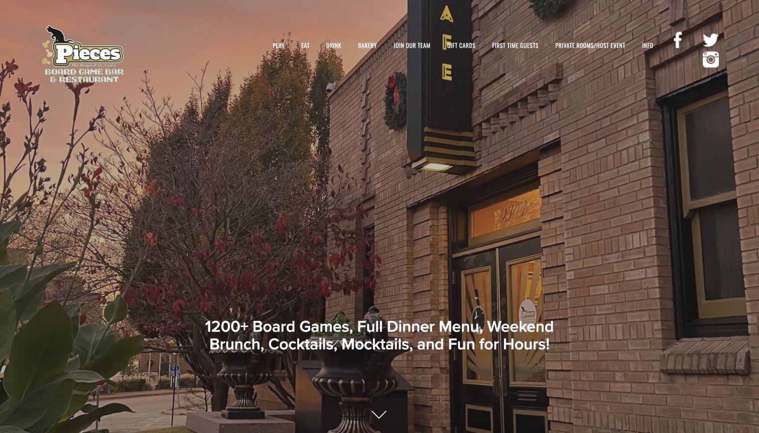
Pieces uses a large exterior photograph and a short overview of games, food and drinks. The first-time-guests route is prominent in its navigation alongside playing, eating and private rooms. Below the opening, a substantial relocation explanation addresses the new entrance, parking, private spaces and the gaming fee. This is valuable operational content for an established venue whose returning customers may remember an earlier address. The page also distinguishes casual walk-ins from private-room reservations.
What you can learn
Treat a move or major venue change as a customer-information project. Explain the entrance, parking and reservation implications in one stable place, then connect that information from the homepage. Keep the new address consistent throughout the site and avoid relying on social announcements alone.
Pros
A dedicated first-time route makes the unusual café format easier to investigate.
The relocation questions connect the physical venue change to parking and private-room planning.
Cons & considerations
The long relocation explanation creates a substantial reading task before some routine visit information.
Small white navigation labels sit over detailed photography and may be harder to scan in some crops.
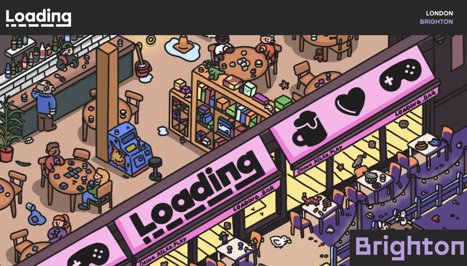
Loading Brighton opens with a distinctive illustrated scene and a clearly labeled location. The body lists board games separately from consoles and credit-operated arcade machines, then introduces dining areas and other parts of the venue. A booking section explains the session length and charging structure before the reservation area. Location details and opening hours complete the page. This is useful because the business spans several entertainment formats: the visitor needs to know that tabletop play is part of the offer without assuming every activity follows identical rules.
What you can learn
When a venue combines different activities, name them separately and state which conditions apply to each. Put booking duration and charges before the booking control. Use the individual location page for practical details rather than expecting a broad brand homepage to describe every branch accurately.
Pros
The activity list distinguishes board games, consoles and machines that use separate credits.
Booking terms, address and hours are assembled on the same location-specific page.
Cons & considerations
The opening illustration communicates personality but delays the real photographs and practical explanation.
The technical-sounding section label is playful, although a first-time visitor may prefer a plainer description of available activities.
Kegan is a freelance web designer and developer with 15+ years of experience helping businesses turn complicated website requirements into clear, maintainable digital experiences. He works directly with clients from planning and design through development, launch, and ongoing support.
For board game cafe website design, his development approach focuses on board game cafe websites that explain the visit, game-library access and table options, with clear menu information, group planning and reservation paths. The scope can be a targeted improvement or a complete custom build, with responsive layouts, thoughtful content structure, and integrations chosen around the people using and maintaining the site.
Show 3 other board game cafe website designersHide other board game cafe website designers
Plan a board game café website around the first visit
Write the visit rules as a customer journey
Start with the questions people ask before agreeing to a night out. Do they need to reserve? Is the charge per person, per hour or per session? Does a food purchase change that charge? Can someone explain a new game? Work through the real operating model with the café team and write the answers in ordinary language. A photograph of smiling players may establish atmosphere, but it cannot explain these conditions accurately.
Arrange the information in the order someone needs it. Introduce the café and its location, explain the basic visit, then offer the appropriate reservation route. Put exceptions beside the relevant statement rather than collecting them in an unrelated disclaimer. If large groups need a separate room or advance contact, show that route before the ordinary booking button creates the wrong expectation.
Include the distinction between venue hours and kitchen hours when they differ. Explain walk-ins without promising a table will be available. Keep a stable page for the full rules and link to it from short homepage summaries. Review those summaries whenever the operating model changes, so the friendly introduction and the detailed booking information continue to tell the same story to every visitor.
Build a useful connection between games, food and place
Plan the content around the experience the café actually provides. A view of the room helps a guest imagine the setting; photographs of tables, meals and games show how the activities fit together. Use captions when an image needs context and avoid treating one attractive photograph as proof of every menu item or space. The goal is a believable introduction, not a promise that every visit will look exactly like the hero image.
Decide how much library detail guests need before arrival. A searchable catalog may help experienced players, while newcomers may benefit more from a few understandable game categories and an explanation of staff recommendations. If the library is maintained in a separate system, label that destination and keep a route back to visiting information. Do not imply that a listed title is guaranteed to be free at the requested time.
Give the menu the same care as the game library. Make it readable without requiring a download when possible, distinguish food from drink choices and keep practical dietary information under the café team’s control. Connect all of this to the correct location. A multi-venue business should not ask visitors to infer which menu, opening time or photograph belongs to their chosen branch.
Keep events and recurring information maintainable
A café website often has several changing layers: weekly meetups, one-off tournaments, seasonal menus, holiday hours and private events. Give each type of information a clear owner and a realistic update process. An old summer promotion under an upcoming-events heading can undermine confidence in otherwise accurate hours. Prefer event records with dates and automatic archive behavior over permanent promotional text that nobody remembers to remove.
Explain how events affect ordinary visitors. If casual play continues during a scheduled activity, say so. If part of the venue is reserved or an event needs a separate ticket, make that distinction visible before someone plans a normal visit. Keep event registration, a table reservation and a private-room inquiry as separate actions when they involve different arrangements.
Check the website with realistic tasks rather than only reviewing its appearance. Find a menu, locate the current address, compare a weekday and weekend visit, and identify the route for a group. Confirm that external booking destinations are correctly labeled and that optional newsletter or chat prompts do not hide important information. Use read-only checks for public research; testing a website does not require making a real reservation, subscribing or contacting the business.
The editing job behind the design
Choose tools that keep café information accurate
A café may need a content editor, a booking service, an event calendar and a separate retail catalog. Define those jobs before choosing a platform. A simple site with well-maintained visit information can be more useful than a complicated set of widgets whose hours and fees disagree.
Each exact source page in this collection received a bounded broad public technology-audit attempt. The underlying records preserve the actual observation date, status and evidence scope. Public references may identify content tools, interface libraries, fonts, analytics or delivery services; they do not reveal a complete backend inventory.
Treat booking and retail integrations as distinct components when the evidence supports only those components. A media host does not establish the café’s publishing system, and an external reservation link does not prove how the main website is built. Retain unknowns rather than filling the visible stack with guesses.
Our WordPress website examples offer a separate look at publishing approaches. A visible platform label is evidence for that named page, not a guarantee that the same system will suit your requirements.
Before the public launch
A practical board game café website checklist
Name the café and its actual location near the beginning.
Explain the game fee and any separate food or drink minimum.
State session length and relevant extensions or limits accurately.
Distinguish recommended reservations from required reservations.
Provide a separate route for large groups or private rooms.
Keep opening hours and kitchen hours consistent and clearly labeled.
Make the current menu readable and easy to reach.
Explain staff help without assuming visitors already know the games.
Label external game-library and reservation destinations clearly.
Publish dated events and remove or archive expired promotions.
Explain parking, the entrance and relevant access details in stable content.
Check that optional overlays do not obscure essential visit information.
These checks are a project checklist, not a performance, legal, security, or accessibility certification. Test real journeys with the people responsible for the website before making claims about the result.
Sources & editorial method
How this collection was selected and reviewed
The saved pre-research draw for this guide was 15, and the collection contains exactly 15 distinct public website properties. Source pages were directly opened, reviewed and captured on November 10, 2026. The Oxford, Brighton and Zulu’s examples use explicitly identified café or visiting pages; other captures show the homepage. Reviews are original collection-specific observations. Bonus Round was selected explicitly after comparison for its clear first-visit explanation and local specialist context, with supporting company-page research. One candidate with unrelated live content was excluded, and an obscured capture was preserved privately before a single corrected capture. Public technology audits use bounded requests and respect access restrictions. No reservation, purchase, subscription, account or contact form was submitted.
Each example links to its actual source page. Screenshots are direct browser captures with their own capture dates; moving imagery, announcements and live designs can change. The notes describe observable design choices and conditional tradeoffs, not measured traffic, conversion results, service quality, or accessibility conformance.
Technology labels use public page metadata, asset evidence, or explicitly cited platform documentation. Platform documentation is not a complete current deployment audit. A component reference may be legacy or unused; it is not a complete backend inventory. Unknown stacks are omitted. These sites are editorial examples, not our client portfolio.
Written, Edited and Curated are separate editorial records, not timestamps advanced by a rebuild. Website designs and imagery belong to their owners. See our editorial standards or suggest a correction.
Questions worth asking
Board Game Cafe website design questions
What should a board game café homepage explain first?
Introduce the venue and location, then explain how a visit works: the play charge, food arrangements, session length, staff help and reservation expectations. A clear next step is more useful than assuming everyone understands the café format.
Should the complete game library be on the website?
It can be useful when the café can maintain it accurately. Offer understandable discovery routes for newcomers as well as search for experienced players. Make clear that a catalog entry is not a guarantee that the game will be available at a particular time.
How should multiple locations be organized?
Give each venue a stable page with its own address, hours, menu and booking conditions. Use the shared homepage to introduce the brand and choose a location, avoiding ambiguous information that appears to apply to every branch.
Should group events use the normal reservation form?
Only if that matches the café’s actual process. If larger groups require a private room, a different menu or advance arrangements, provide a separate clearly labeled route before visitors start an ordinary table booking.
Does the Editors Choice label certify the café’s service?
No. It identifies an explicit editorial selection for website design and communication. The reviews do not measure food quality, service outcomes, accessibility conformance or the availability of games and tables.
Borrow the clarity behind these examples: explain the visit, show the real setting and give each guest a sensible next step. Build the information around your café’s actual operating model, then keep it current.