Best Artist Residency Websites of 2026 (12 Real-World Examples)
Real artist residency websites that connect a sense of place with clear program, eligibility and application information.
An artist residency website has two jobs: make the experience imaginable and explain the commitment well enough for someone to decide whether to apply.
Applicants may be comparing disciplines, studio equipment, length of stay, funding, access and time away from other responsibilities. A beautiful landscape cannot answer those questions on its own. The strongest information patterns connect the atmosphere of a place with straightforward explanations of who the program supports, what it includes and how the application works.
These examples include regional arts organisations, interdisciplinary retreats, urban residency networks and craft schools with dedicated residency programs. Some captures show a residency detail page rather than a homepage; the source labels identify the actual view. The reviews concern website communication, not the quality of selection panels, funding or the experience of attending. Application cycles and arrangements can change.
Before the examples
What makes good artist residency website design in 2026?
Explain the kind of residency before the application
Describe the intended disciplines, duration, working arrangements and relevant stage of practice. Make the distinction between a residency, a taught workshop, a fellowship and a public visit clear enough for a new applicant to recognise.
Publish the practical commitment
Give costs, inclusions, studio access, accommodation arrangements and relevant access information their own maintained fields. Explain what remains unknown or must be discussed with staff rather than suggesting every program offers the same support.
Keep the application state honest
Distinguish open, closed and upcoming cycles. Publish the relevant period, required materials and a useful next step before asking for an account or personal information. A permanently prominent Apply link should lead to a clear status.
Show a real working community
Use credited photographs, named artist profiles and specific program activity to explain the setting. Do not confuse prominent alumni, attractive studios or a website award with evidence about an applicant’s likely experience.
The collection · 12 examples
12 artist residency websites worth studying
The original target of 12 was drawn and saved before research. All 12 examples have directly reviewed public pages and genuine source captures. Djerassi is the explicit Editors Choice for its place-specific identity, clear introductory explanation and separate applicant and supporter routes.
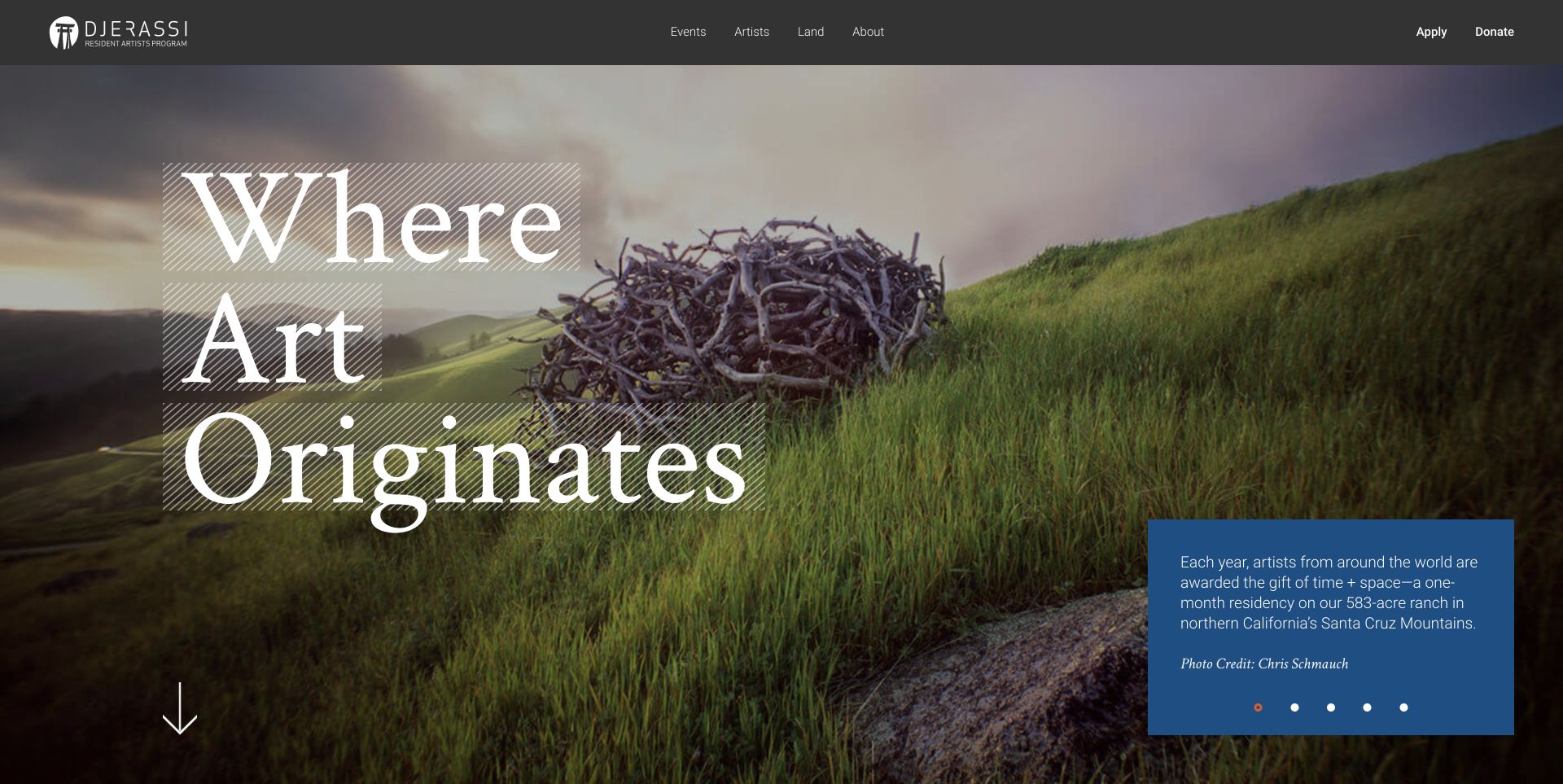
Djerassi places a large landscape photograph behind an unusually expressive serif headline. A separate blue panel explains the residency rather than leaving the image to communicate everything. Apply and Donate remain distinct in the dark header, while the page connects its land, artists and program through short chapters and credited photography.
What you can learn
Pair an evocative setting with a plain program explanation and an obvious applicant route. The photograph can establish character without becoming the only source of practical information. The separate blue explanation is the important bridge: it lets the landscape establish atmosphere while applicants and supporters continue toward different kinds of commitment.
Pros
Persistent Apply and Donate links separate two important audiences.
Visible photo credits recognise the people behind the program imagery.
Cons & considerations
Large opening typography postpones some practical details below the first screen.
A rotating introduction needs readable static content and usable controls.
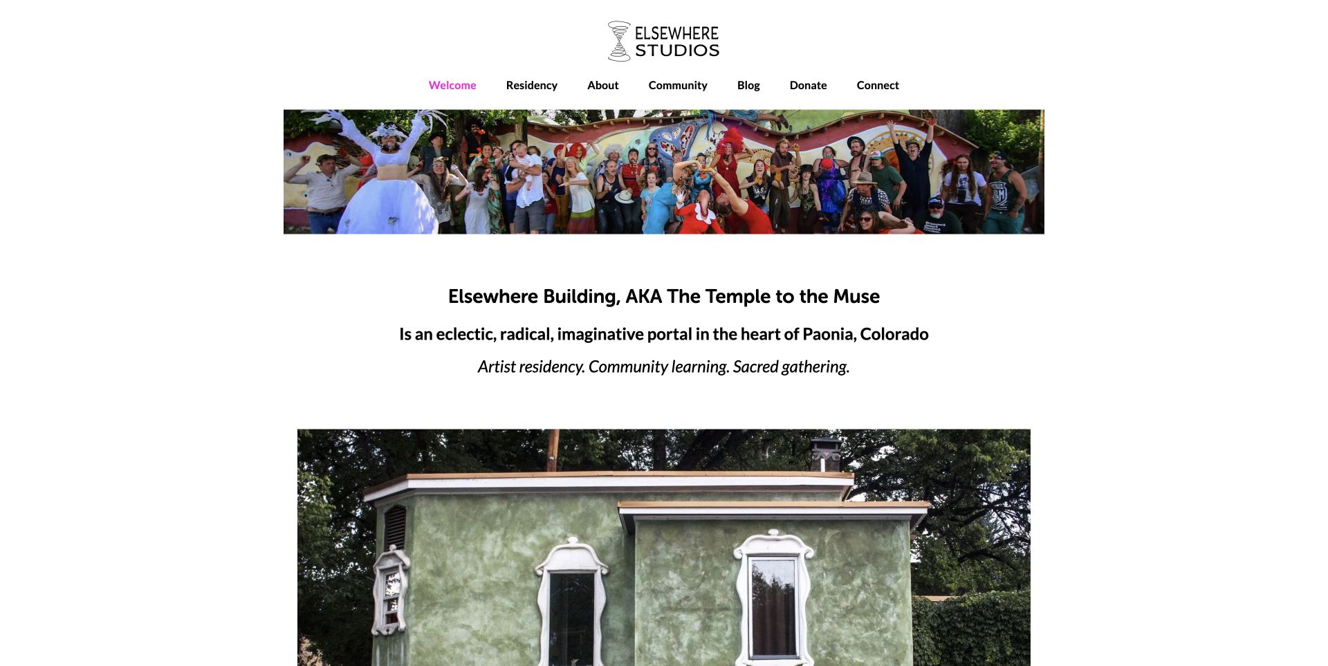
Elsewhere uses a group photograph, a compact hand-drawn identity and an informal introduction to present a specific place rather than a generic retreat. Its Residency menu names spaces, pricing, scholarships, parent residencies and FAQs separately. Community projects also appear on the homepage, making the relationship between visiting artists and the local organisation visible.
What you can learn
Turn the questions applicants actually ask into recognisable destinations. Separate practical residency information from the broader community calendar so both can remain useful. Keep pricing and scholarship information attached to the relevant residency arrangement, so a parent residency does not appear to share every condition of a standard stay.
Pros
Specific menu labels expose costs, spaces and different residency arrangements.
Real community imagery gives the organisation a recognisable local context.
Cons & considerations
Several long announcements make the homepage a substantial reading task.
Application periods and future programming require explicit content maintenance.
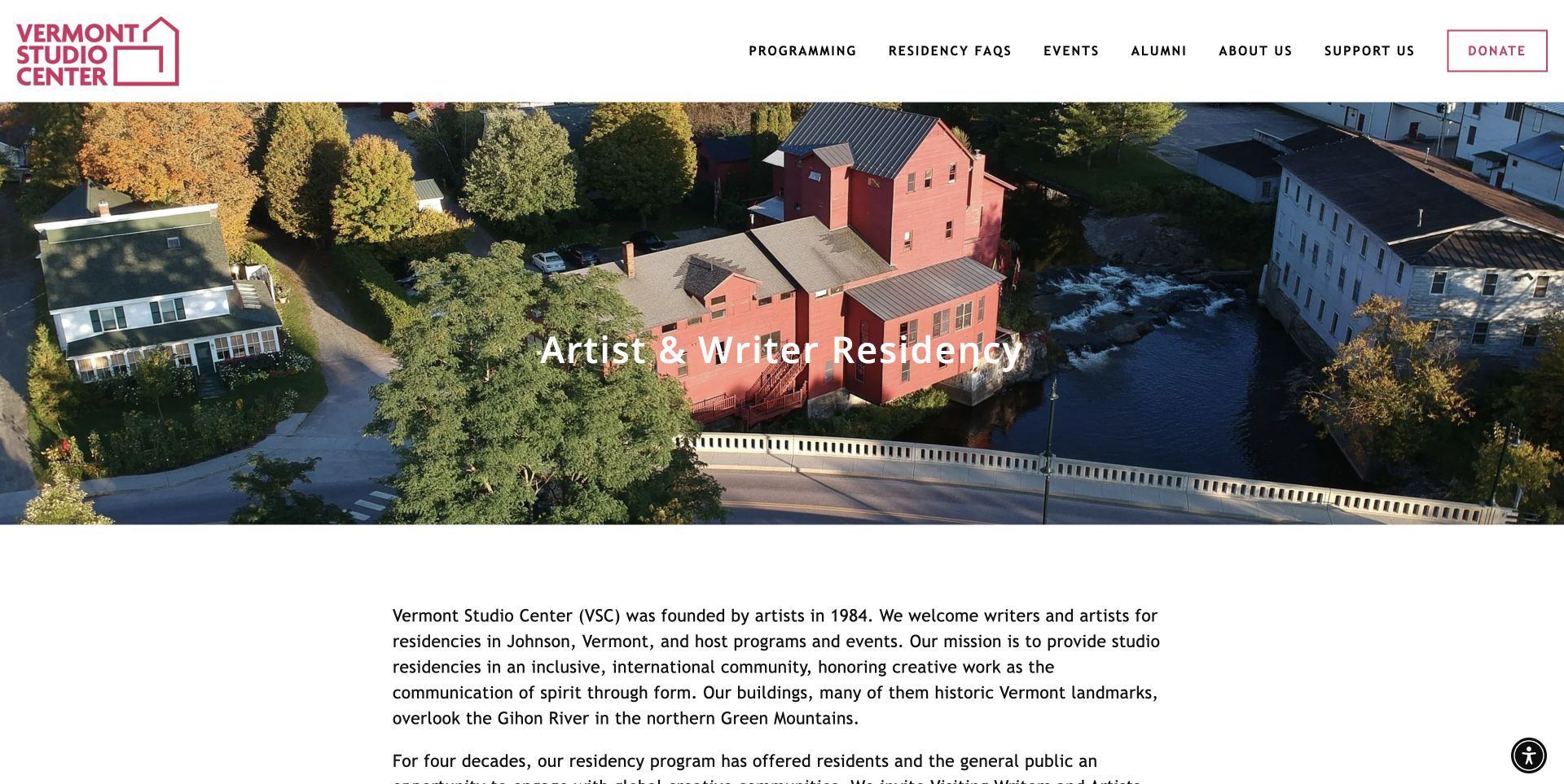
Vermont Studio Center opens with an aerial campus photograph and the straightforward label Artist & Writer Residency. The next section explains who the organisation welcomes and where the program takes place. Navigation distinguishes programming, residency FAQs, events and alumni, with practical destinations covering fees, lodging, studios and accessibility.
What you can learn
Use campus photography to orient visitors, then let labelled information answer the questions the image cannot. Treat arrival, costs and access as part of the applicant journey. Housing, fees and access should resolve into consistent details for the selected program, not remain isolated menu promises that applicants must reconcile after choosing a date.
Pros
The opening label immediately establishes the type of program.
The navigation gives housing, fees and accessibility their own destinations.
Cons & considerations
The broad menu contains many choices for a first-time visitor to process.
The large campus image pushes application status beyond the opening view.
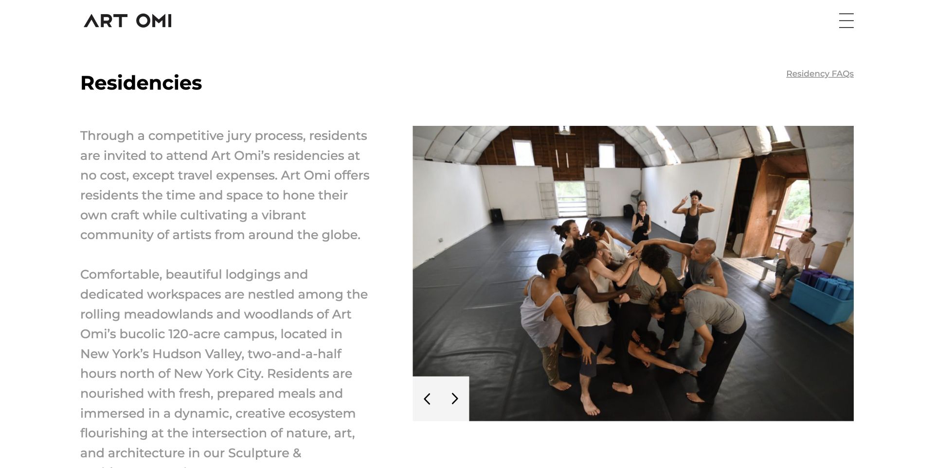
Art Omi pairs its residency introduction with a large photograph of artists working together. The overview then separates Architecture, Artists, Dance, Music and Writers into named programs rather than forcing them into one undifferentiated application. An FAQ route appears near the title, and the page identifies program staff with their responsibilities.
What you can learn
Give each discipline its own clear route while maintaining a useful shared overview. Make the differences visible before a visitor invests time preparing an application. Discipline pages should preserve shared terminology for duration, facilities and application status while leaving room for genuine differences; a common visual identity should not imply identical participation conditions.
Pros
Distinct discipline labels help applicants identify the relevant program.
Program staff and FAQ routes support questions beyond the introductory pitch.
Cons & considerations
The pale introductory text merits careful contrast checking.
Open-call messaging must be maintained when listed deadlines have passed.
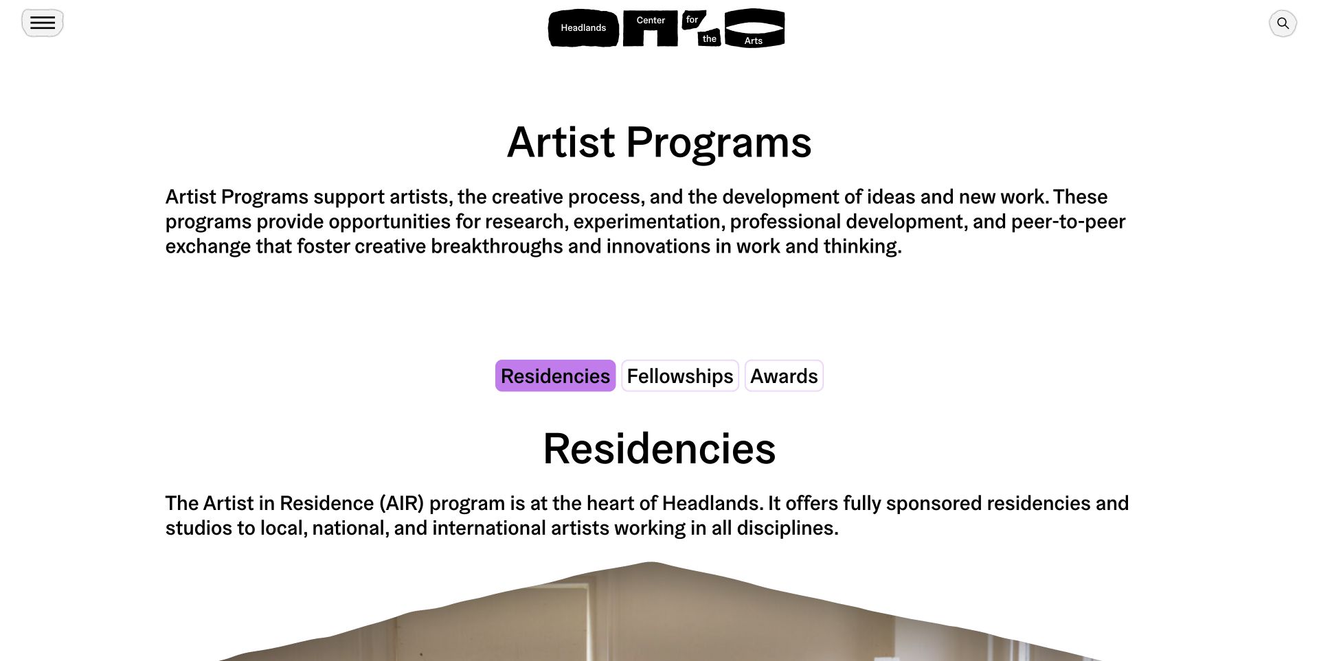
Headlands uses a typographic page rather than a full-screen landscape to introduce Artist Programs. Three prominent links divide Residencies, Fellowships and Awards. Individual program explanations include application status and practical inclusions, while the identity retains an intentionally handmade character in its black-and-white wordmark.
What you can learn
Group opportunities by the distinctions applicants need to understand, not merely by internal department names. Give each category a concise explanation and an honest current status. A short category comparison can connect those large links to practical differences in purpose and support. That would let unfamiliar artists choose where to read next without decoding the organisation’s opportunity names.
Pros
Large category links make the opportunity structure easy to scan.
Specific program descriptions explain what support includes.
Cons & considerations
The long page benefits from clear anchor and expanded-state behaviour.
An abstract identity should not replace a plain explanation for new visitors.
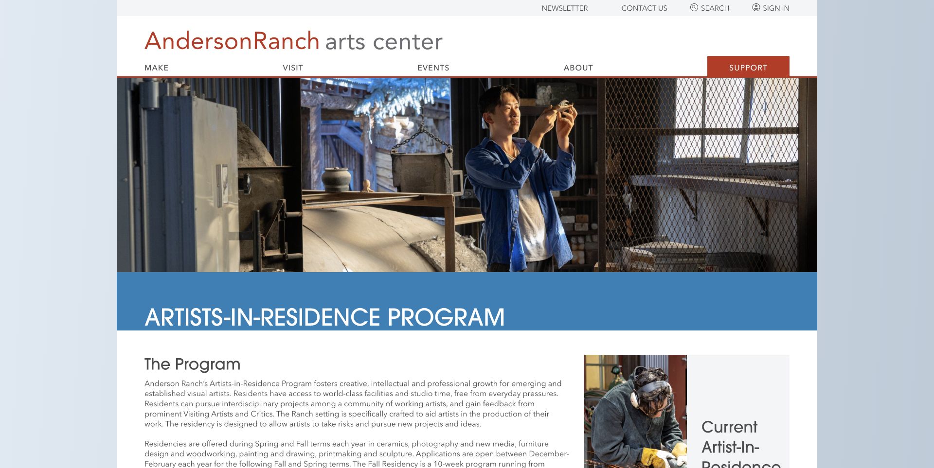
Anderson Ranch introduces its residency with a photograph of an artist working in a ceramics studio, then moves into a detailed program explanation. The page records sessions, application preparation, disciplines, studios and the resident community. Related links distinguish current and past residents, providing context beyond a single promotional statement.
What you can learn
Show the working environment, then publish the concrete requirements needed to evaluate it. A residency page should support preparation as well as inspiration. Connect the application checklist to the studio description, so someone can judge whether their proposed work fits the facilities before spending time assembling materials or interpreting session dates.
Pros
Actual studio imagery communicates the making context.
Application materials and studio information are recorded in one program page.
Cons & considerations
Dense text needs strong headings and comfortable reading measures.
Dates and fee statements need an owner when each application cycle changes.
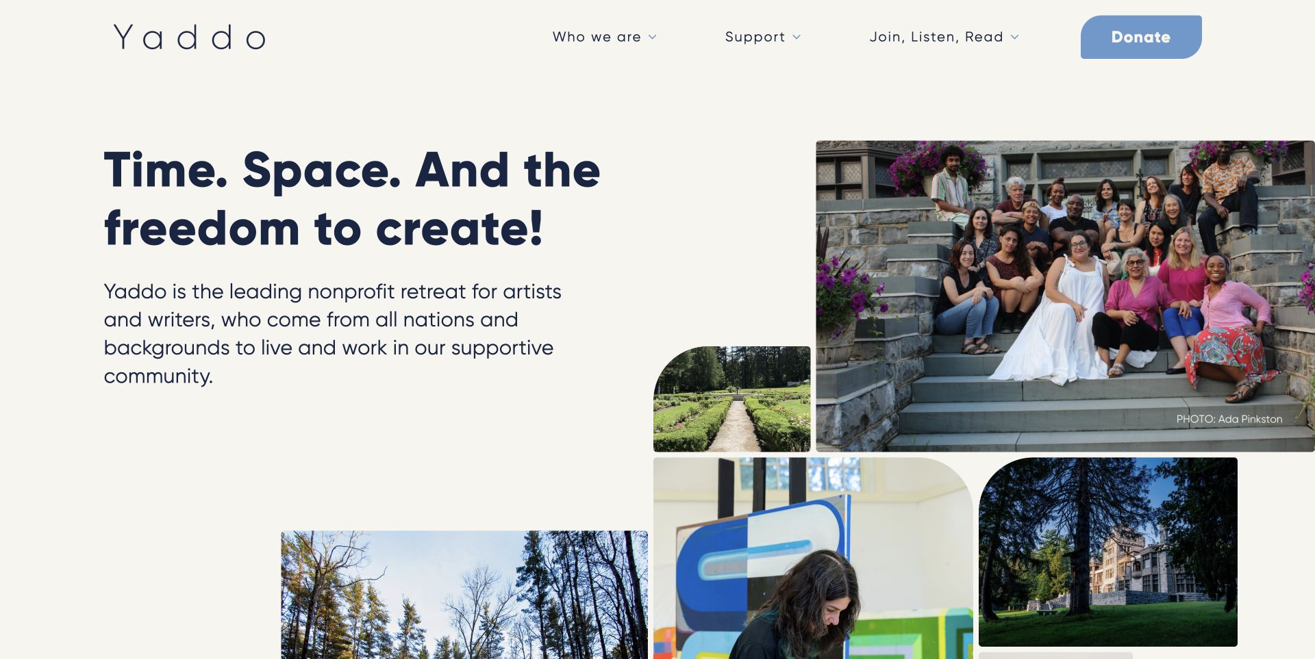
Yaddo combines a substantial introductory headline with a collage of artists, gardens and working spaces. Its homepage gives applications their own section instead of treating every visitor as a donor. Public programming carries dates, locations and past-event labels, while the main navigation keeps the organisation, support and editorial activity distinct.
What you can learn
Use images to show several dimensions of the experience without making them a substitute for task-specific sections. Applicants and supporters should be able to recognise their next step. The collage can communicate variety, but application requirements should remain ordinary readable content. Dated public events also need a different update process from the lasting residency explanation.
Pros
The image collage connects people, making and the physical setting.
Application and support sections serve different visitor intentions.
Cons & considerations
A very large first-screen composition delays the application section.
Event archives need clear past and current states to avoid confusion.
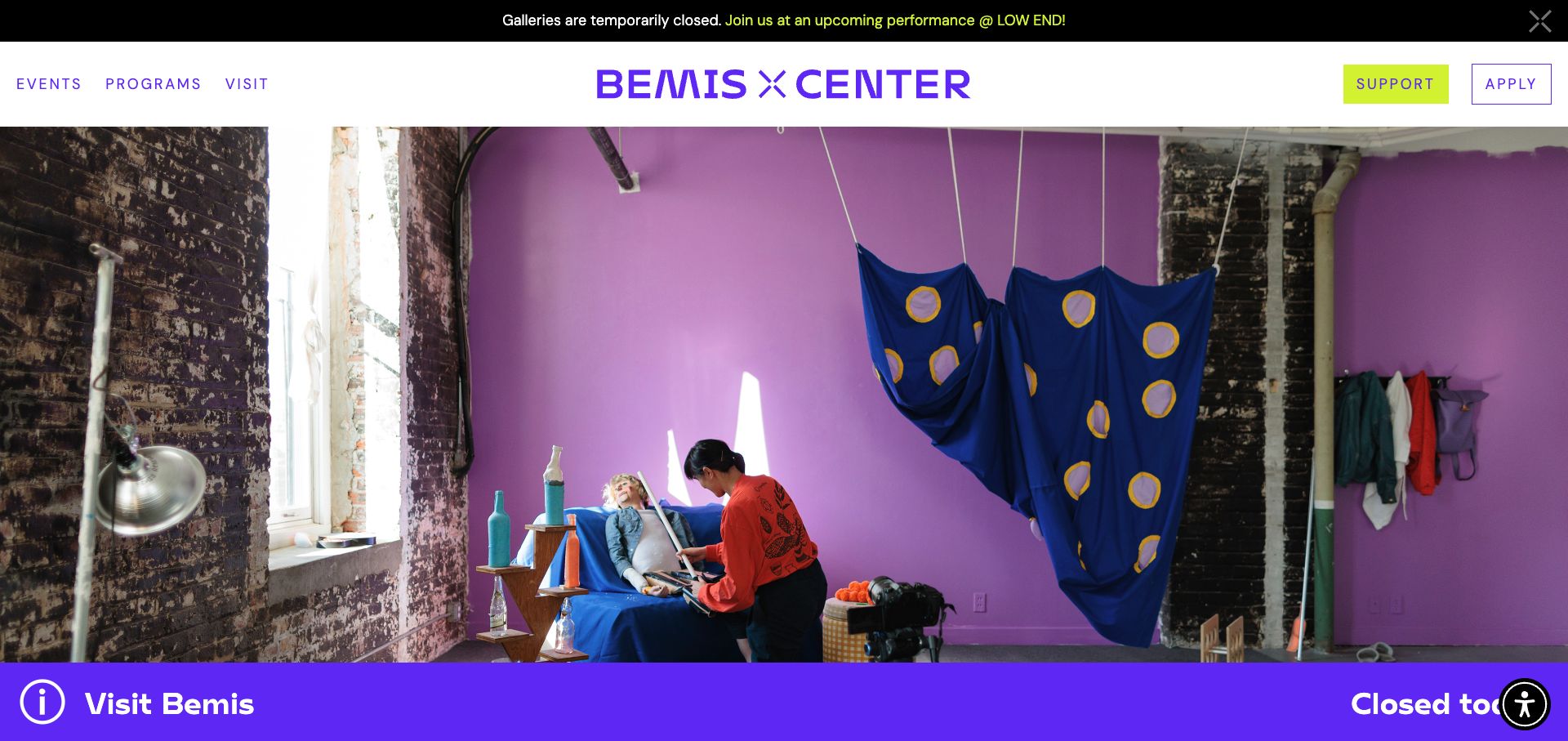
Bemis gives its residency hub a strong purple identity and an expansive studio image. The page then provides local navigation for current residents, programs, benefits, facilities and alumni. Resident cards identify both people and program types, while a prominent application message states that the current cycle is closed.
What you can learn
Combine a memorable visual identity with a practical residency index. When applications are closed, explain that state instead of leaving an apparently active call to action unresolved. Treat the closed cycle as a useful information state: retain benefits, facilities and resident context, while explaining where a future opportunity would be announced without implying an application is currently accepted.
Pros
The local navigation separates practical program questions.
Named residents make the program more tangible than an anonymous gallery.
Cons & considerations
The large opening image postpones the residency explanation.
Prominent Apply navigation should agree with the closed-cycle message.
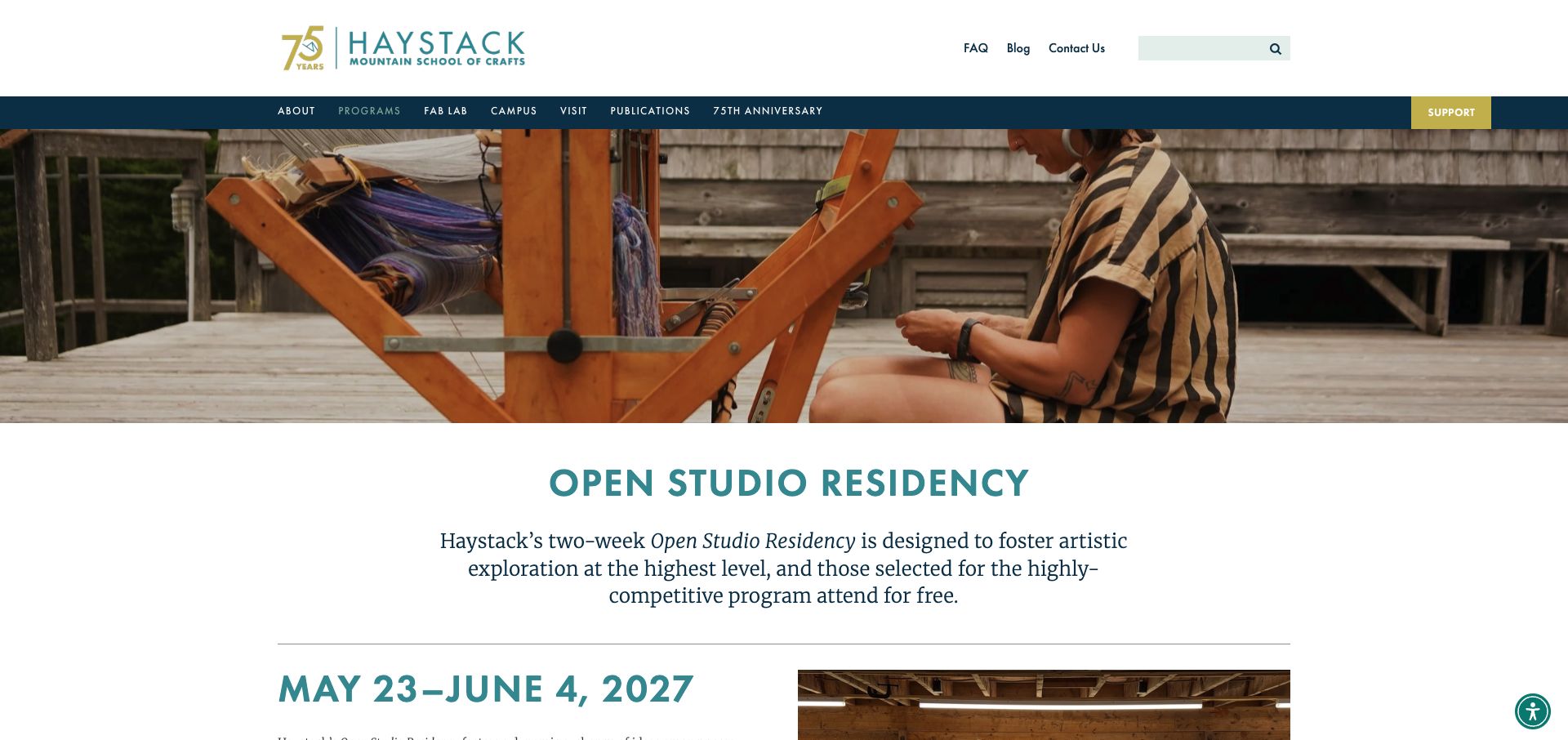
Haystack opens its Open Studio Residency page with a photograph of weaving in progress and a plain explanation of the opportunity. The program dates receive a large dedicated heading. Further sections distinguish application preparation, materials, fees and FAQs, including the difference between independent studio work and taught workshops.
What you can learn
Publish the period and the nature of participation before asking someone to apply. Explain whether facilities are available for independent work, instruction or both. The independent-working distinction should carry through the application and studio information. Someone comparing a taught workshop with this residency needs to understand the difference before interpreting similar photographs of tools and materials.
Pros
The program’s date range is a prominent content element.
Materials and independent-working expectations receive explicit explanations.
Cons & considerations
The extensive institution-wide navigation can distract from the program task.
Several practical sections need local navigation on a long page.
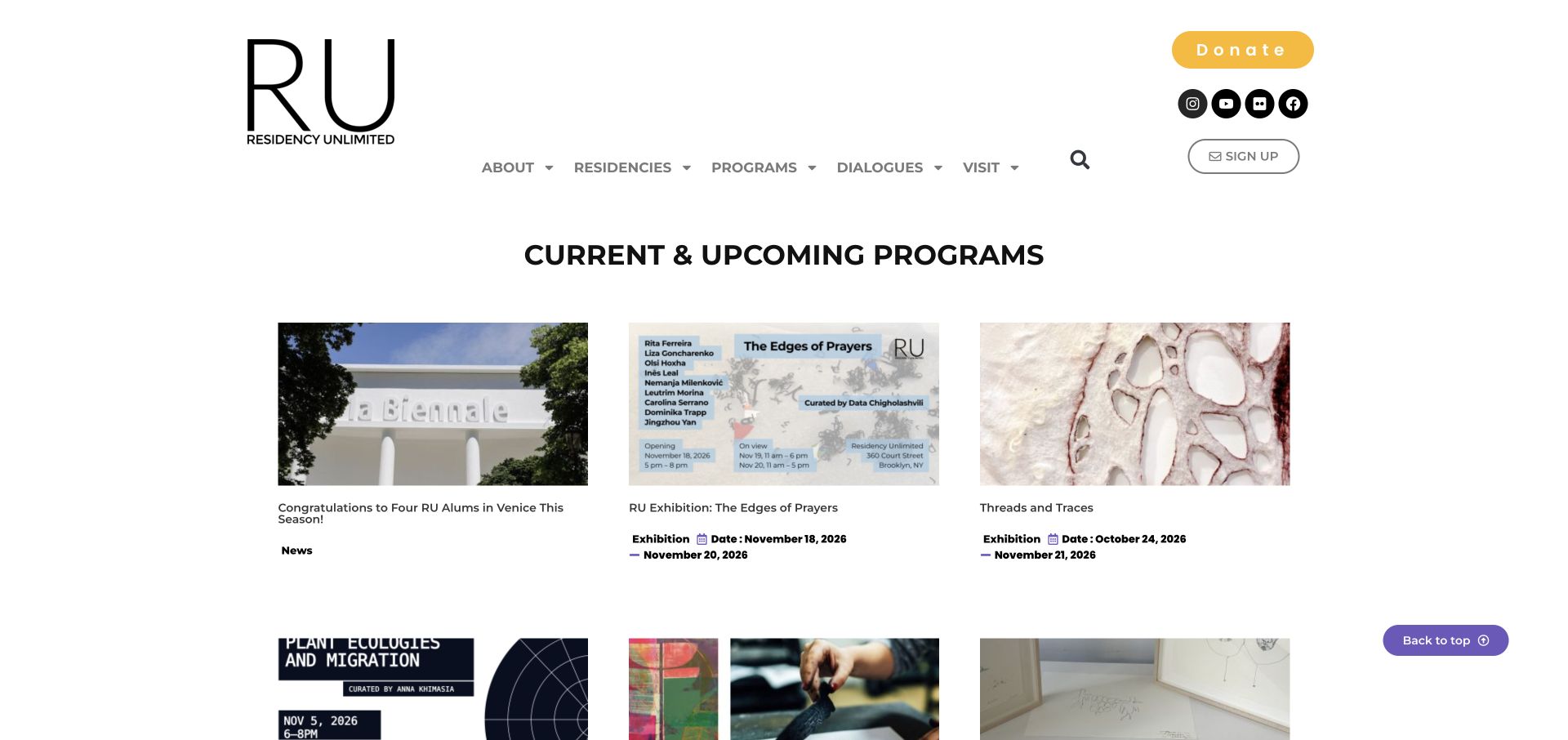
Residency Unlimited uses a consistent grid of upcoming programs, each with an image, content type and date information. Current residents receive a separate section, while the header distinguishes residencies, programs, dialogues and visiting. The result emphasises an active creative network rather than relying on a scenic retreat photograph.
What you can learn
Show how a residency participates in an ongoing community. Keep residency eligibility and application instructions clearly separate from public events and editorial activity. Give a dated dialogue or public program its own event record rather than allowing it to resemble an open residency call. Resident profiles can then connect the activity to identifiable participants.
Pros
Program categories and dates make the event grid useful to scan.
A separate resident section identifies the people behind the activity.
Cons & considerations
Application information is less immediate than the public program grid.
Repeated publication and event dates need labels that distinguish their meanings.
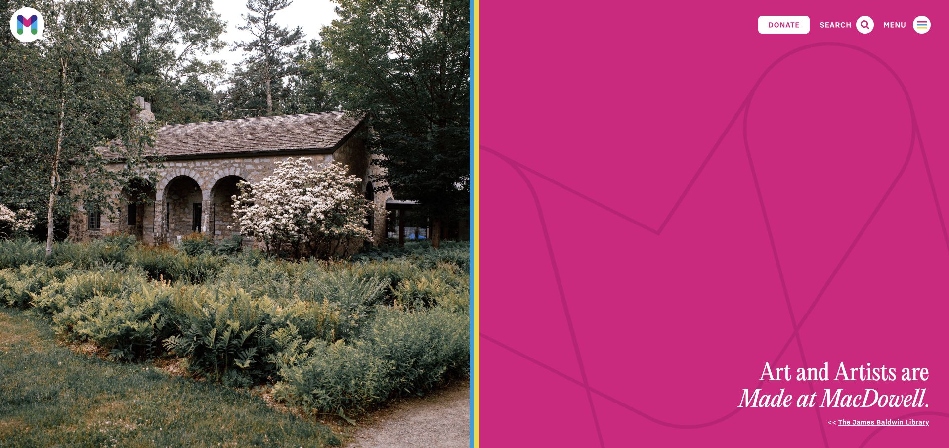
MacDowell divides its opening screen between a photograph of the James Baldwin Library and a vivid magenta identity panel. The broader page separates Apply and Donate, and the application section plainly explains that submissions are closed before naming the next opening period. Artist stories and organisational news extend the site beyond the current call.
What you can learn
A strong institutional identity can coexist with a direct operational message. Keep application status readable in normal content rather than requiring visitors to discover it inside a form.
Pros
A distinctive split-screen composition gives the organisation visual recognition.
The application section explains a closed state instead of hiding it.
Cons & considerations
The large first-screen treatment provides little practical application detail.
A menu-only route requires clear labelling and reliable keyboard behaviour.
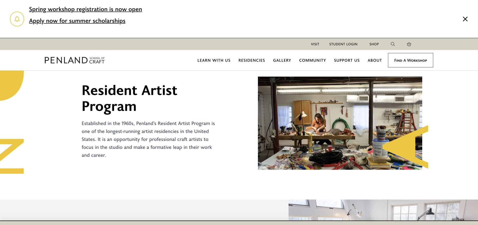
Penland introduces the Resident Artist Program with a clear title, a studio photograph and a short explanation of its purpose. The page then organises duration, intended participants, costs, benefits and application information as labelled overview fields. Detailed sections and FAQs distinguish studio life, housing, community and the application process.
What you can learn
Use a compact factual overview before the longer narrative. It helps applicants compare a substantial commitment without hunting through unrelated workshop or fundraising information. Keep the overview fields tied to the relevant application cycle, while longer housing and studio explanations remain separately maintainable. That reduces the risk of contradictory conditions across the same page.
Pros
Labelled overview fields expose the decisions applicants need to make.
A dedicated program page separates residencies from the larger workshop catalog.
Cons & considerations
Large workshop announcements compete with the residency introduction.
Application dates should show a clear closed state after their period ends.
Kegan is a freelance web designer and developer with 15+ years of experience helping businesses turn complicated website requirements into clear, maintainable digital experiences. He works directly with clients from planning and design through development, launch, and ongoing support.
For artist residency website design, his development approach focuses on program and application-cycle records, eligibility and practical commitments, studio and access information, artist profiles, and clear applicant and supporter journeys. The scope can be a targeted improvement or a complete custom build, with responsive layouts, thoughtful content structure, and integrations chosen around the people using and maintaining the site.
Show 3 other artist residency website designersHide other artist residency website designers
Plan an artist residency website around an informed application
Model the program and its current cycle separately
Begin with a maintained program record: its purpose, creative disciplines, duration, setting and type of support. Keep that record distinct from the current application cycle. Deadlines, dates, available sessions and required materials have a different lifecycle from the description of the studios or the organisation’s mission.
A closed application should still be informative. Explain whether another cycle is expected, where future information will appear and how someone can read the requirements without submitting anything. Do not turn a defunct form into the only record of eligibility. Preserve prior calls as labelled archives rather than making their dates look current after a rebuild.
If an organisation has several opportunities, compare them before sending visitors to different forms. A concise table or set of labelled records can explain the relevant disciplines, duration, studio arrangements and application route. Only publish distinctions staff can verify, and give unusual arrangements room for a fuller explanation.
Make the experience specific without overselling it
Show actual working spaces and the people or activity that define the program. A landscape can explain remoteness or a sense of place; a studio image can clarify the type of making environment. Add appropriate credits and descriptions so the photograph remains useful outside a purely visual first impression.
Avoid treating a room photograph as a universal promise. Accommodation, equipment access and the amount of shared or private space may vary. Explain those differences alongside the relevant program rather than relying on a single gallery. When access arrangements require a conversation, give people a clear way to ask without framing a general statement as a certification.
Artist profiles can show the range of a community while remaining factual. Identify the artist, discipline and relevant residency period, and link to the original work with permission. Keep awards and notable alumni separate from selection promises. The website should support an informed choice, not imply that visibility or admission outcomes are guaranteed.
Prepare the application before collecting it
Publish a checklist of materials and constraints in ordinary page content. Explain whether people need a portfolio, statement, references or a project proposal, and state any file or length requirements where they are verified. Visitors should be able to judge the work involved before creating an account.
Give applicants a stable program reference and a clear handoff when a third-party application platform is used. Explain which organisation receives the submission, where questions belong and what acknowledgement the applicant should expect. Keep the public page useful when the external platform is temporarily unavailable.
Do not test a live application with real personal information merely to inspect the design. Use an approved test environment or a read-only review of the public instructions. Store actual application materials privately, with appropriate staff access and retention practices. A public inspiration review does not establish the security of a program’s private admissions workflow.
Serve artists, supporters and visitors without merging their journeys
Residencies often share a website with exhibitions, public events, workshops, donations and an alumni archive. These audiences can benefit from one identity without sharing the same primary task. Use clear names and dedicated sections instead of asking everyone to begin with a general institutional message.
Keep dated public events distinct from residency application periods. A publication date is not the date an event occurs, and a residency year is not necessarily an open call. Label these fields consistently in cards, calendars and archives. Retain useful artist stories when the related event ends, but replace misleading booking or application actions.
Assign a content owner to each recurring record. Program managers should be able to correct dates and practical details without redesigning a page; communications staff can maintain credited imagery and editorial activity. Schedule a real review when a cycle closes or arrangements change rather than refreshing the visible review date automatically.
The editing job behind the design
Choose a system around program records, dates and accessible information
A maintainable content system should support residency programs, application cycles, people, facilities and public events as separate related records. Reuse the same verified date and status wherever the opportunity appears rather than copying a paragraph into several pages.
Keep the practical explanation available in normal accessible page content even if applications are handled elsewhere. Preserve headings, meaningful links, keyboard access, readable contrast and useful alternatives to motion or image-only information.
The visible technology stacks come from bounded public-source audit attempts. A public script, image host or delivery reference is not a complete backend inventory and does not establish the security of a private application system. Unavailable results remain unavailable rather than being filled with guesses.
Our WordPress website examples offer a separate look at publishing approaches. A visible platform label is evidence for that named page, not a guarantee that the same system will suit your requirements.
Before the public launch
Artist residency website planning checklist
Name the residency, intended disciplines and relevant participation criteria.
Explain duration and the expected working arrangement.
Separate the evergreen program from each application cycle.
State whether the current cycle is open, closed or upcoming.
Publish verified dates and material requirements before an account is needed.
Explain costs, support and exclusions without implying universal funding.
Describe studio, accommodation and access arrangements accurately.
Use real credited images of the actual program or setting.
Keep applicant, public visitor and donor routes distinct.
Label current and archived events and residency periods clearly.
Provide a practical route for questions and application-platform problems.
Assign staff responsibility for each cycle’s content review.
These checks are a project checklist, not a performance, legal, security, or accessibility certification. Test real journeys with the people responsible for the website before making claims about the result.
Sources & editorial method
How this collection was selected and reviewed
The saved random target was 12 before source research began. Each accepted source page was directly reviewed in the normal browser and captured on November 13, 2026 UTC. Captures show the views identified in their labels; several are dedicated program pages. Cookie notices were dismissed through normal offered controls; optional analytics and advertising choices were left off where available. One Skowhegan navigation timed out and did not reach the target; it was excluded without repeated attempts. The exact 12 accepted captures and their real timestamps are retained. Djerassi was explicitly selected for observed website information and visual design, not the quality of the residency, admissions decisions or funding. Each accepted source received a bounded broad public technology-audit attempt; unavailable results remain unavailable.
Each example links to its actual source page. Screenshots are direct browser captures with their own capture dates; moving imagery, announcements and live designs can change. The notes describe observable design choices and conditional tradeoffs, not measured traffic, conversion results, service quality, or accessibility conformance.
Technology labels use public page metadata, asset evidence, or explicitly cited platform documentation. Platform documentation is not a complete current deployment audit. A component reference may be legacy or unused; it is not a complete backend inventory. Unknown stacks are omitted. These sites are editorial examples, not our client portfolio.
Written, Edited and Curated are separate editorial records, not timestamps advanced by a rebuild. Website designs and imagery belong to their owners. See our editorial standards or suggest a correction.
Questions worth asking
Artist Residency website design questions
What should an artist residency website explain first?
State the type of program, who it is intended for, its duration and the relevant working arrangement. Pair the sense of place with practical routes to costs, facilities, eligibility and application status.
How should a closed residency application be presented?
Keep the program explanation and preparation requirements readable. State that the cycle is closed and give verified information about a future cycle when available. Do not leave an apparently open form as the only next step.
Should a residency website show costs?
Publish verified participation costs, available support and relevant exclusions in context. Distinguish support provided by the program from expenses the artist must cover, and explain where arrangements depend on the specific opportunity.
Can a residency use an external application platform?
Yes, but keep the program information on the public website and explain the handoff. Give applicants a stable source for requirements, a contact route and clear acknowledgement expectations.
Why is Djerassi the Editors Choice?
The reviewed homepage pairs a distinctive landscape identity and credited photography with a plain introductory explanation and separate persistent Apply and Donate links. This recognises website presentation, not program quality or admission outcomes.
Start with an accurate program record and an honest application state. Let the setting, artists and creative activity add character around those facts, then maintain the practical details that help someone decide whether the opportunity fits.