Best Wallpaper Store Websites of 2026 (14 Real-World Examples)
Wallpaper store websites that connect pattern inspiration with a confident product enquiry or order
A wallpaper website needs to make a design look desirable and explain what the customer is actually choosing: the material, scale, colourway, sample, roll or made-to-measure mural.
Wallpaper is difficult to judge from a flat image alone. A small repeat can feel very different across a wall, and a dramatic room photograph may tell a shopper little about the product format or colourway. A useful store connects those two views. It gives the pattern room to express its character while helping a visitor understand what can be sampled, ordered and supported by the retailer.
The examples in this collection are genuine public retail and specialist-brand websites offering wallpaper-related shopping routes. Some sell other interior products too, so the review distinguishes the pictured entrance from the wallpaper offer qualified on the official site. We compare presentation and information design, not product quality, installation suitability or sales performance. Original screenshots retain their actual dates, and visible technology findings are kept separate from assumptions about inventory, manufacture or fulfilment.
Before the examples
What makes good wallpaper store website design in 2026?
Show the pattern and the room together
Use clear product views alongside contextual room photography so a customer can distinguish motif, scale and overall effect. Label colourways and formats consistently. An atmospheric interior should not be the only source of product information, and a swatch should not be expected to explain the appearance across an entire wall.
Make sampling a deliberate shopping route
Where samples are available, explain the sample’s size, format and purpose in the retailer’s own current terms. Keep the sample choice connected to the correct product and colourway. Do not imply that an on-screen image or a sample settles every question about a particular wall, lighting condition or installation.
Explain the actual item being purchased
A roll, a panel set, a mural and a sample are different products. Put the relevant supplied dimensions, material and ordering information near the choice. Give customers a clear route for questions rather than hiding essential product distinctions in a distant policy page.
The collection · 14 examples
14 wallpaper store websites worth studying
Compare how each store moves from visual inspiration to a specific pattern, colourway or sample. Notice where the atmosphere helps the decision and where practical product information must take over.
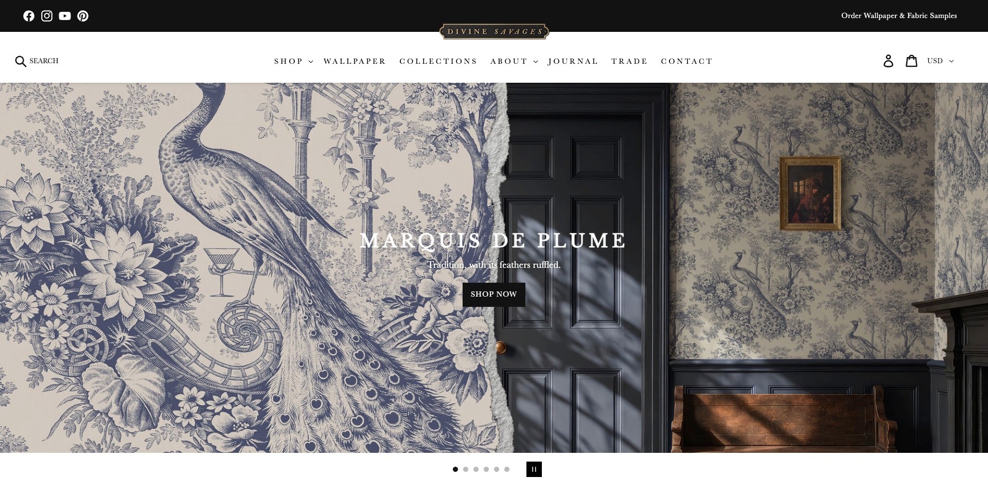
Divine Savages’ pictured Marquis de Plume campaign places a large pattern detail beside a room-scale installation. The bird and botanical imagery can be inspected closely on the left, while the doorway, furniture and wall on the right explain how the repeat sits within an interior. A concise collection name and Shop Now action occupy the middle. Above it, a separate sample-ordering link and straightforward Wallpaper, Collections, Trade and Contact navigation keep practical routes visible. The useful distinction is between appreciating the illustration and understanding its use at room scale. The screenshot cannot establish exact color, texture, repeat dimensions or suitability for a particular wall.
What you can learn
Show a wallpaper both close up and in a believable room context, then provide an obvious route to samples and product facts. A strong collection story should support the decision, not replace the information needed to specify the material correctly.
Pros
The paired views explain detail and interior scale together.
Sample ordering is visible outside the rotating campaign.
Cons & considerations
White text needs checking against every campaign image.
A styled room does not replace dimensions, material details or a physical sample.
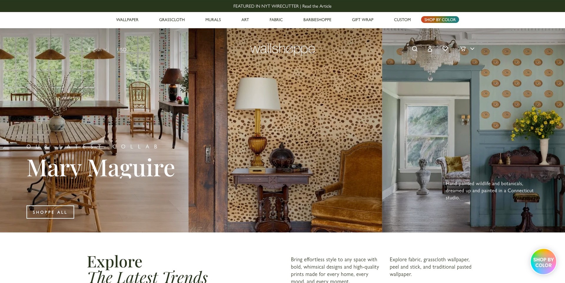
Wallshoppe’s saved homepage introduces the Mary Maguire collaboration with three adjacent interior photographs. Each room gives the pattern a different relationship to furniture, light and architectural detail. A large collection name and Shoppe All action sit over the left image, while a short description occupies the right. The header keeps Wallpaper, Grasscloth, Murals, Fabric and Custom separate, with a distinct Shop By Color route. This combination acknowledges two shopping modes: browsing a designer’s world and narrowing by a practical category. The photographs demonstrate the presentation, not precise color matching or the performance of a wallcovering after installation.
What you can learn
Use collection pages to tell a coherent design story, but retain alternative routes for shoppers who already know a material or color. Multiple room images can show range more effectively than making one heavily decorated scene carry every product message.
Pros
Three interiors communicate variation within the collaboration.
Material and color routes are visible alongside the campaign.
Cons & considerations
Small white supporting text can be difficult over detailed photography.
Several header layers use space before the product content begins.
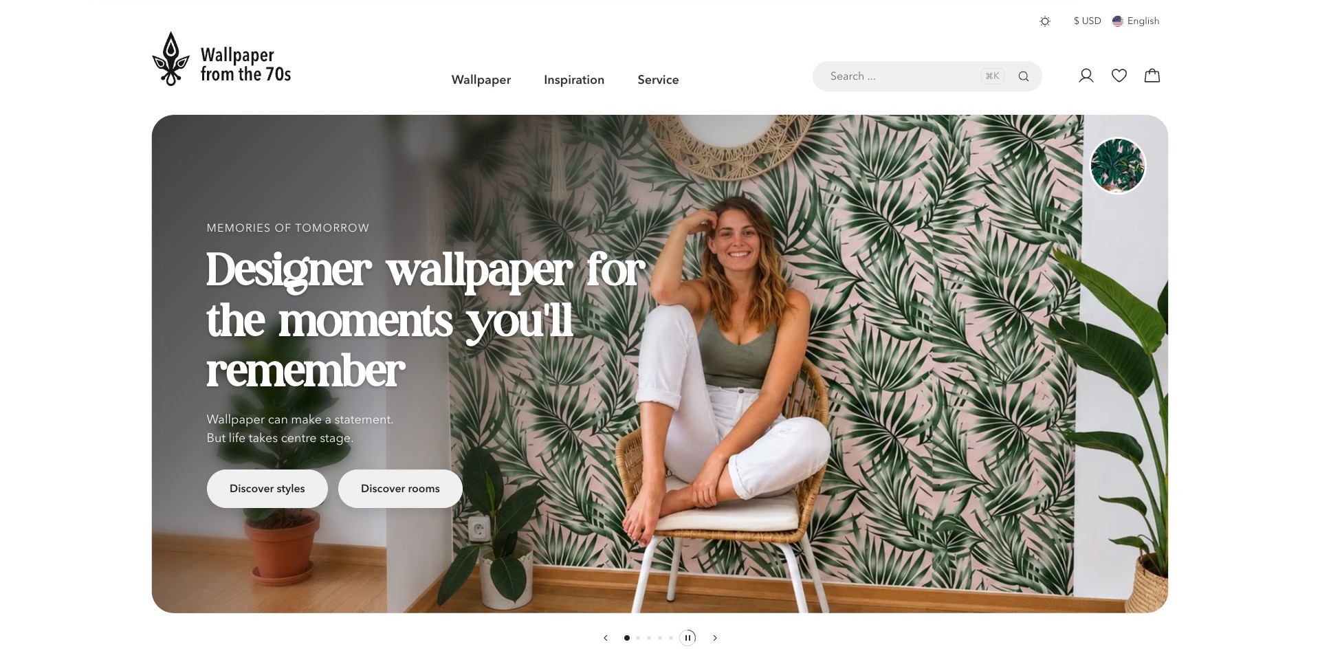
Wallpaper from the 70s places a botanical-wallpaper room inside a large rounded hero panel. The headline emphasizes memorable living spaces, while Discover Styles and Discover Rooms offer two distinct starting points. A woman seated in the room gives the image a human scale, and a small circular pattern detail provides a visual connection to the wall treatment. The surrounding white header includes search and a short Wallpaper, Inspiration and Service navigation. Rather than assuming visitors know a pattern’s name, the page supports browsing by the kind of environment they want to create. It does not demonstrate a completed selection or prove that a pictured color will match another room.
What you can learn
Offer discovery routes that reflect how customers think before they know your catalogue. Room and style labels can help an uncertain shopper begin, while search remains available for someone arriving with a specific product in mind.
Pros
The two discovery actions describe genuinely different browsing intentions.
Human and room context help communicate the pattern’s visual scale.
Cons & considerations
A broad lifestyle headline supplies little technical product information.
Carousel-led introductions need equivalent stable routes to the featured designs.
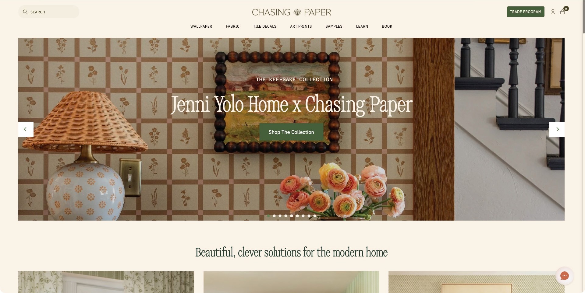
Chasing Paper’s captured homepage presents the Jenni Yolo Home collaboration over a checked floral wall, with a lamp, framed picture and flowers giving the pattern domestic context. Cream page framing and a green Shop The Collection button create a coordinated palette without removing contrast from the main action. Wallpaper, Fabric, Tile Decals, Art Prints and Samples are independently named in the header, alongside a Trade Program route. This is useful for shoppers who may enjoy the campaign but want to check the physical product before committing. The styled scene shows one design application; it does not verify installation difficulty, material behavior or the result in another home.
What you can learn
Keep the sample route visible while presenting a collection emotionally. Use styling to explain the product’s role in a room, then let customers leave the campaign for the practical information or sample they need next.
Pros
Samples have a clear top-level destination.
The main collection action is distinct from the detailed photograph.
Cons & considerations
Many carousel positions may make some collections difficult to rediscover.
Long collaboration titles require careful sizing on narrow screens.
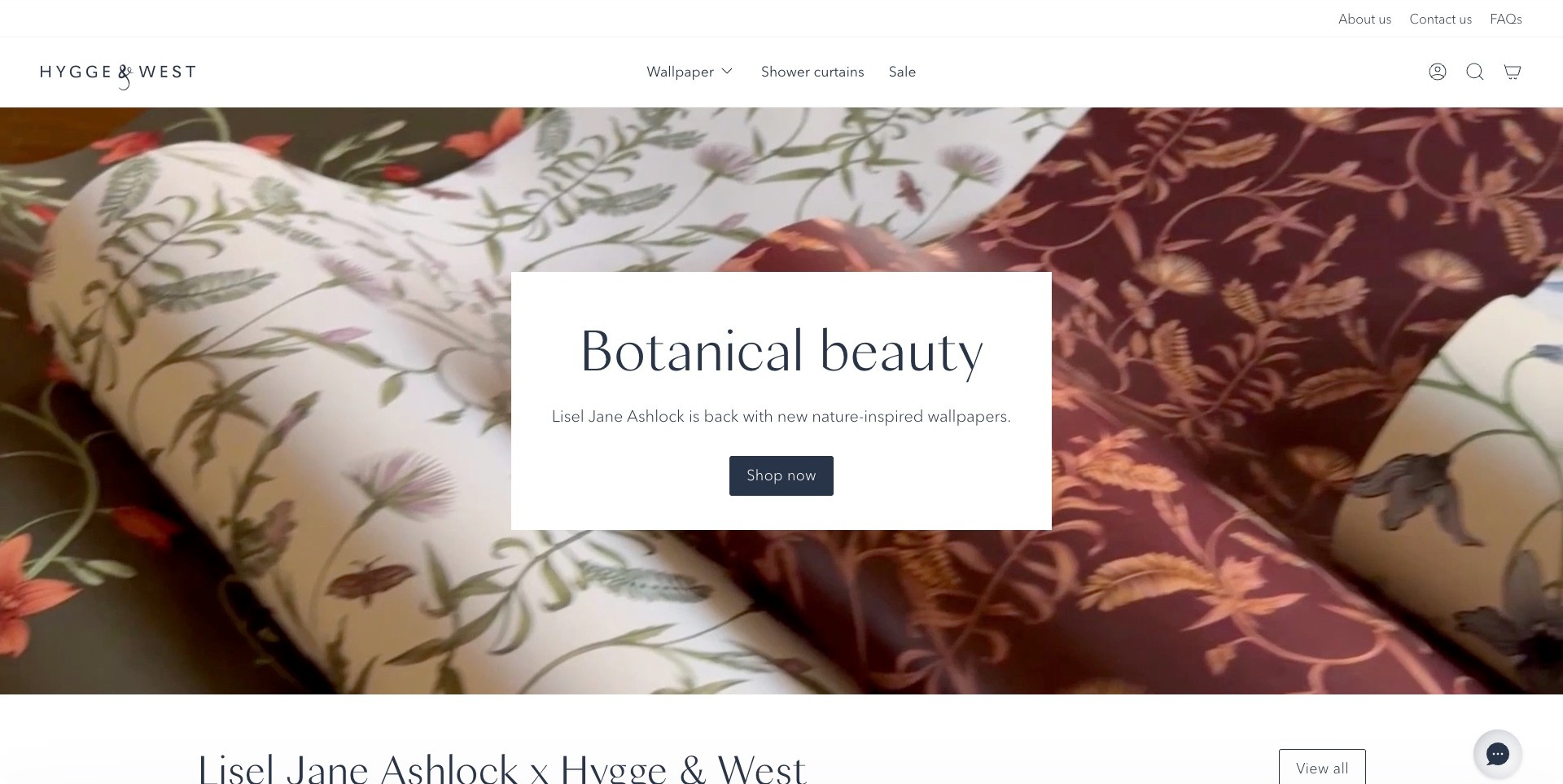
Hygge & West’s saved Botanical Beauty campaign shows overlapping rolls of illustrated wallpaper behind a white text panel. The panel names the collaboration and provides a single Shop Now action, while the header separates Wallpaper, Shower Curtains and Sale. About, Contact and FAQs sit in a smaller utility row. Showing rolls rather than only an installed room makes the product itself visible and gives the collection a tactile visual presence. The next section begins with the artist’s name, preserving the connection between campaign and catalogue. A photograph of rolled material cannot establish texture, color or the sample experience, and the page’s appearance is not evidence of a tested checkout.
What you can learn
A restrained text panel can protect readability over detailed patterns. Give a collaboration a clear next step, then connect it to the actual product range rather than making visitors interpret an image without knowing what they can explore.
Pros
The white panel keeps the campaign text readable.
Utility help routes remain separate from product categories.
Cons & considerations
A close-up alone does not explain the pattern’s scale across a whole room.
A broad Shop Now label may need more context when several campaigns are visible.
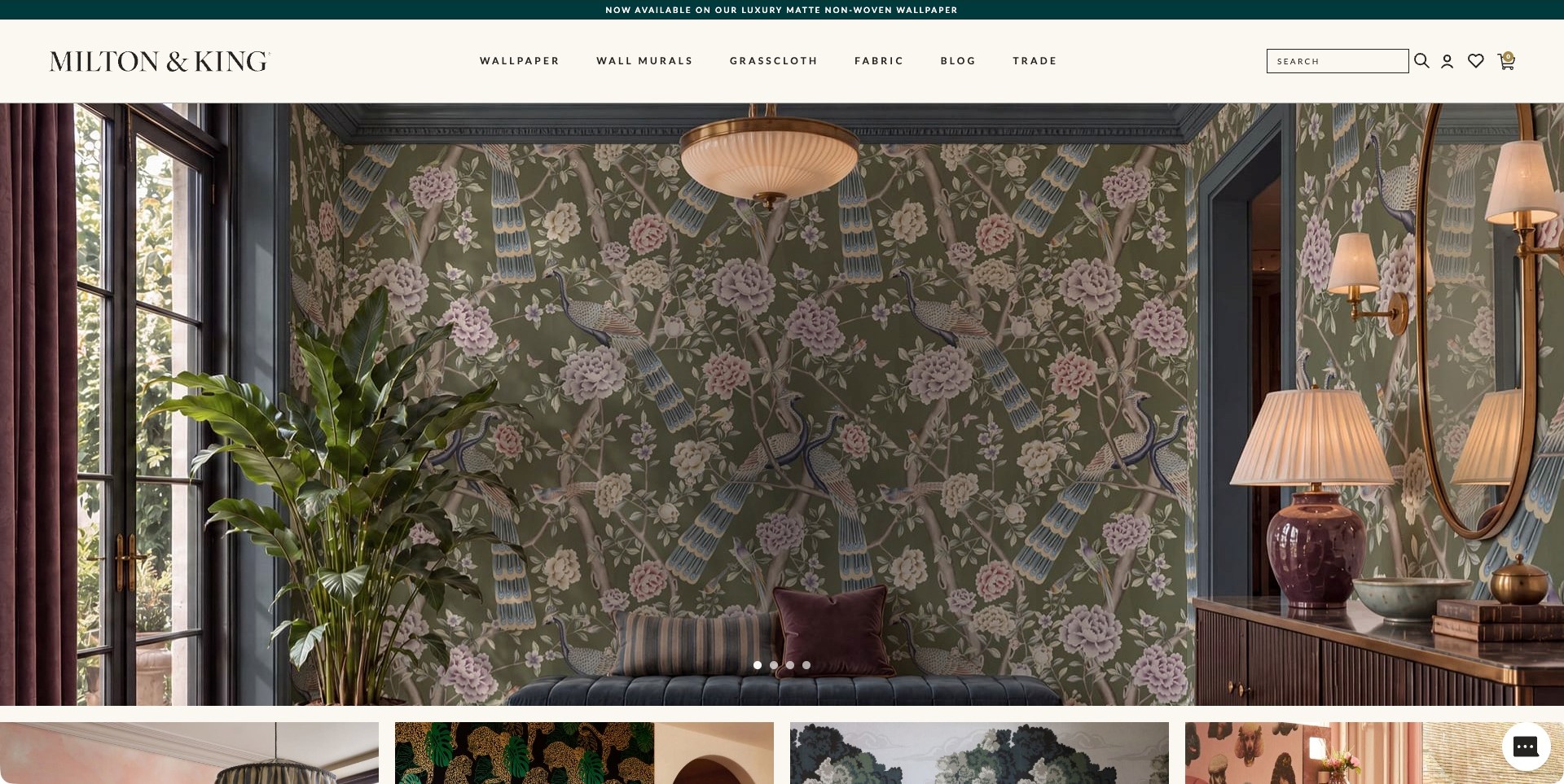
Milton & King’s saved homepage frame shows a peacock-and-floral wallpaper across a furnished room, with lighting, mirrors and a sofa giving the repeat clear architectural context. The image is largely unobstructed by campaign text in this particular carousel frame. A cream header lists Wallpaper, Wall Murals, Grasscloth, Fabric, Blog and Trade, with search and shopping utilities at the right. Smaller image tiles begin below the hero, suggesting further visual discovery without overwhelming the main view. The room photograph is especially useful for studying composition, but it cannot communicate exact roll measurements or replace product-specific specifications. This review describes the saved frame, not other automatically changing slides.
What you can learn
Leave enough of an installed-room photograph visible for customers to understand the repeat and its relationship to furniture. Keep product categories stable outside the carousel so an attractive image does not become the only way to find the relevant range.
Pros
The full-wall view makes the repeat visually understandable.
Wallpaper and mural categories are independently labelled.
Cons & considerations
An image-only carousel frame may need a clearer product destination.
Styled lighting can alter how a wallpaper color appears on screen.
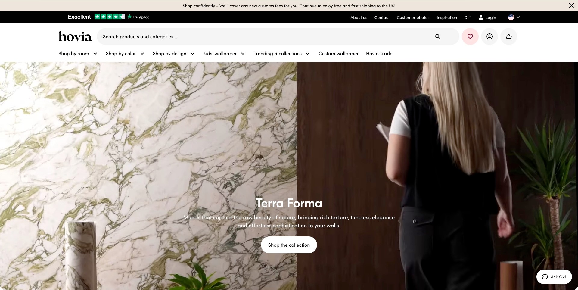
Hovia’s captured Terra Forma campaign combines a marble-like wall image with a person in a room-scale film. A brief description and Shop The Collection action sit low in the image. Above it, a large product-and-category search field is more prominent than a tiny utility icon, and the navigation offers shopping by room, color and design, plus custom wallpaper. That hierarchy supports both inspiration-led visitors and shoppers who already have a constraint in mind. The campaign suggests visual texture, but a screen image cannot establish the material’s physical surface or exact color. The compact Ask Ovi launcher is closed in the capture; no assistance conversation or recommendation was tested.
What you can learn
Make search and browse categories equally understandable when the range is large. A named collection can introduce a mood, while room, color and design routes help customers turn that mood into a manageable shortlist.
Pros
Search has substantial, clearly labelled space in the header.
Several browsing dimensions are visible without opening a general menu.
Cons & considerations
Multiple header rows reduce the initial space available for products.
Text over moving room imagery needs contrast checks across the whole film.
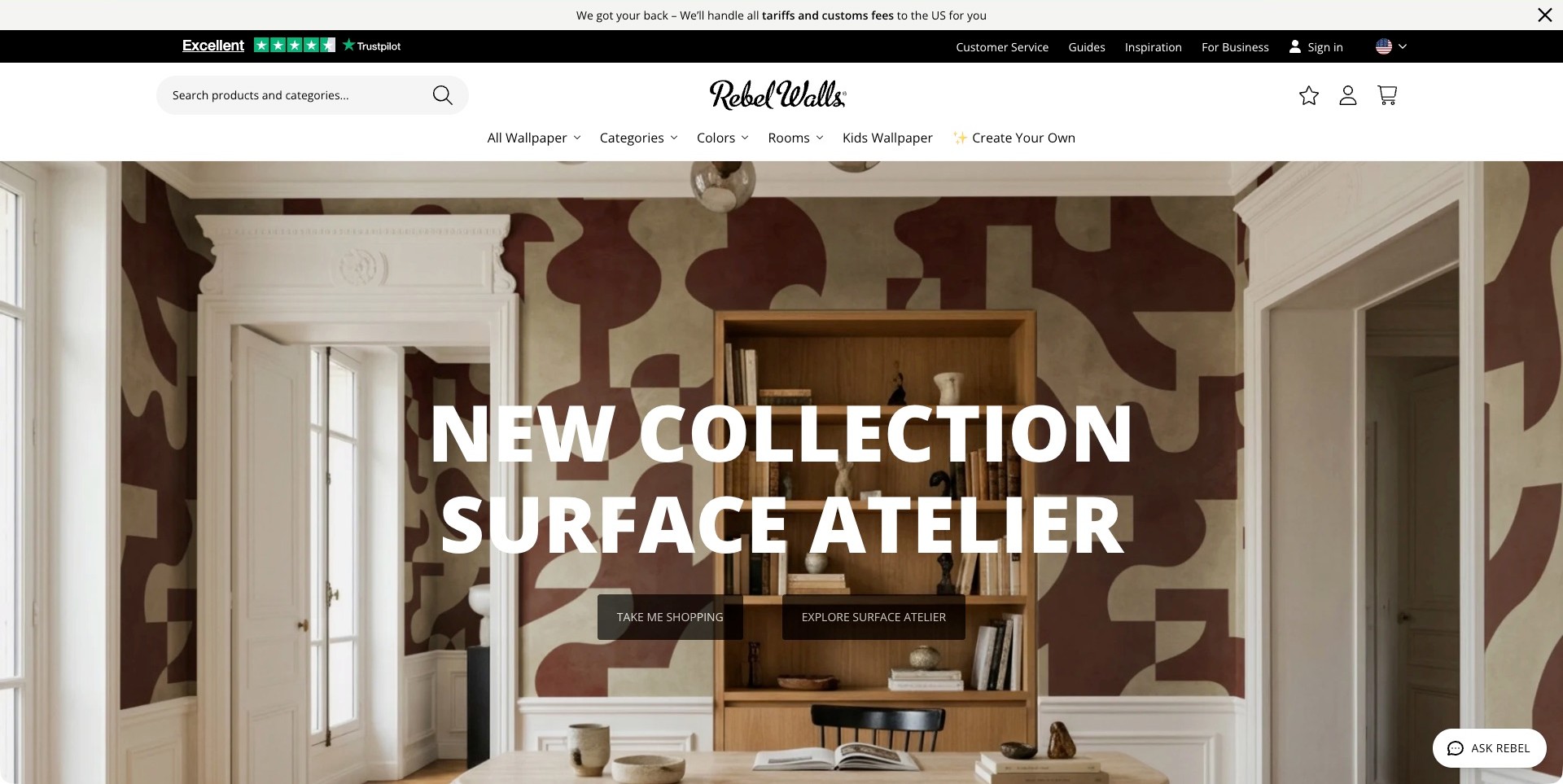
Rebel Walls’ saved Surface Atelier campaign shows large burgundy geometric forms across an interior wall. An oversized white title makes the collection unmistakable, while two actions distinguish general shopping from exploring the featured range. The header includes search, categories, colors, rooms, children’s wallpaper and a Create Your Own route. This is a useful balance between a strong campaign and a catalogue that can be approached in more than one way. The doorway and furniture supply room-scale context for the large forms. The image does not prove how a bespoke mural will be measured, produced or installed, and no configuration flow was completed as part of this review.
What you can learn
Make a campaign visually bold, but preserve ordinary category and search routes for shoppers whose needs do not match it. If customization is offered, distinguish it clearly from browsing finished designs rather than burying both paths under the same action.
Pros
The room context makes the large pattern scale visible.
Custom design and standard catalogue discovery have separate labels.
Cons & considerations
An oversized headline can cover a significant area of the pattern.
Dark translucent actions need consistent contrast against different room photographs.
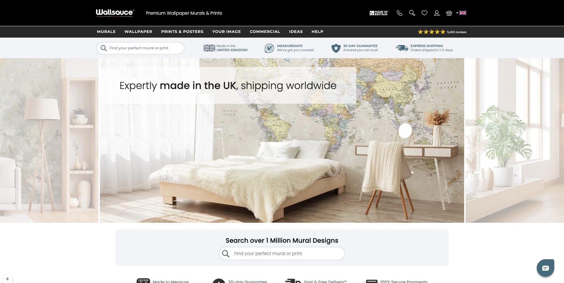
Wallsauce’s saved homepage slide shows a world-map mural behind a bed and desk. The central room is flanked by portions of other carousel images, making the range visibly broader than one design. A product search sits above the image, and a larger search area begins below it. Murals, Wallpaper, Your Image, Commercial, Ideas and Help are independently labelled in the dark header. Delivery and measuring-related messages appear close to the shopping context, although these are the retailer’s claims and were not transaction-tested. The room image makes the mural’s possible scale understandable, but it cannot establish the correct measurements, material choice or outcome for a different wall.
What you can learn
Place practical search and help routes close to inspirational room imagery. Customers considering a made-to-measure product need a route from a visual idea to precise product information, rather than a homepage that only cycles through attractive rooms.
Pros
Search is visible both before and immediately after the hero.
Commercial work and customer-supplied imagery have separate routes.
Cons & considerations
Repeated reassurance strips can make the header feel dense.
Carousel images need clear design destinations and should not substitute for measurement guidance.
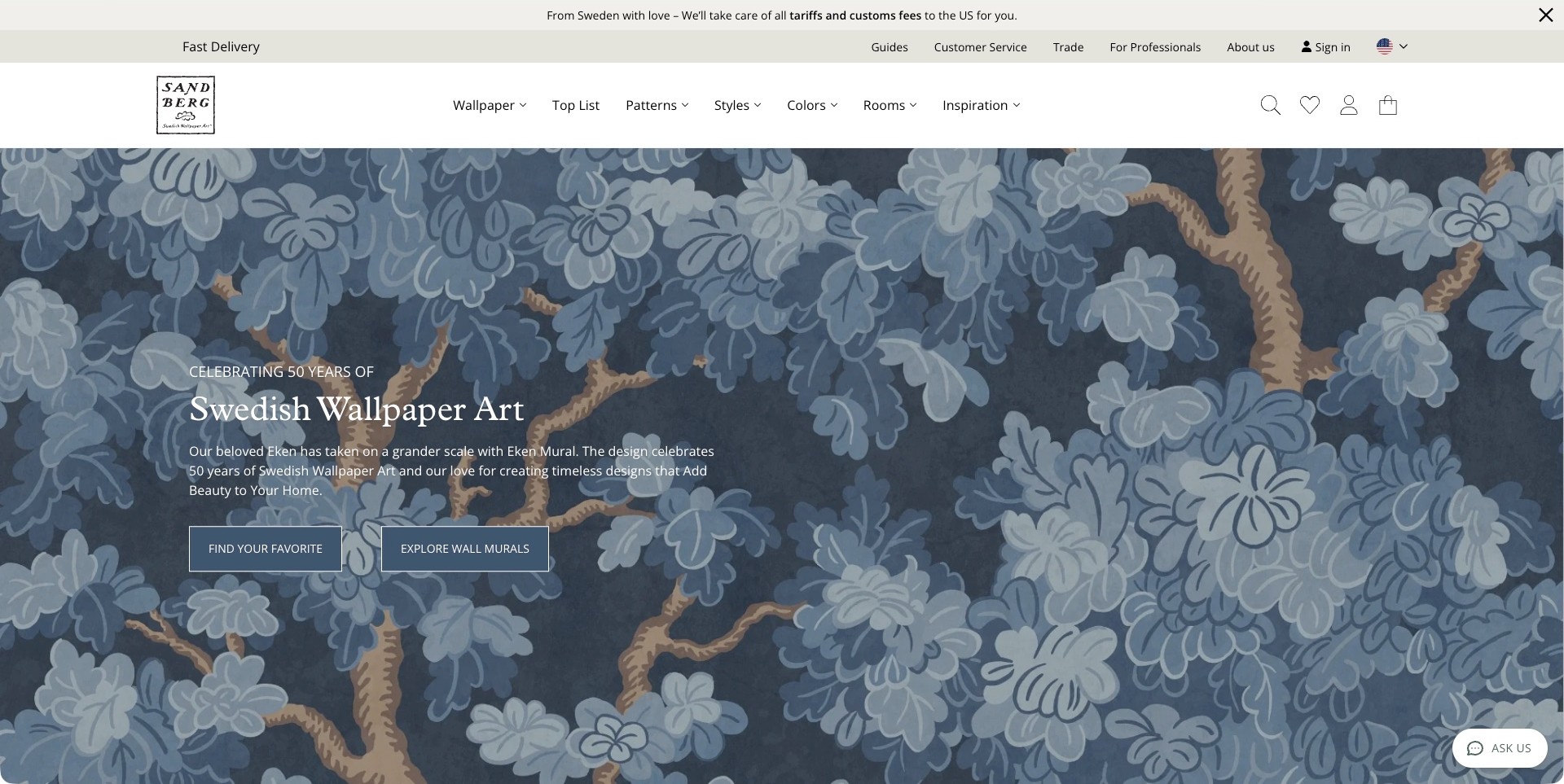
Sandberg’s captured homepage enlarges a blue botanical Eken pattern across the full hero. A short Swedish Wallpaper Art anniversary message explains the design’s move into mural scale, with separate Find Your Favorite and Explore Wall Murals actions. The white header provides Patterns, Styles, Colors, Rooms and Inspiration alongside the main Wallpaper route. This is useful information architecture for a shopper who recognizes an aesthetic but not a product name. The pattern-first view is visually calm and makes the illustration easy to study, but it gives fewer real-world scale cues than a furnished-room photograph. The anniversary language is the brand’s story, not an independent measure of product quality.
What you can learn
Explain a collection’s specific design idea in a few sentences, then provide browsing categories that help shoppers narrow the range. Pair enlarged pattern imagery with product dimensions or installed examples before expecting customers to understand its actual scale.
Pros
The enlarged illustration reveals the pattern clearly.
Room, color and style provide different discovery routes.
Cons & considerations
The hero alone does not show how large the repeat looks beside furniture.
A broad favorite-finding action may need more explanation on its destination page.
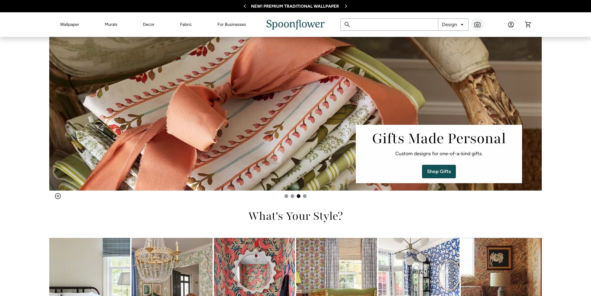
Spoonflower’s saved homepage promotes personalized gifts with a close-up of patterned fabric tied with ribbon. Wallpaper and Murals nevertheless remain clearly named in the main navigation, alongside Decor, Fabric and For Businesses. Below the campaign, a What’s Your Style section begins with room photographs showing varied wall treatments. The combination demonstrates a catalogue challenge rather than a wallpaper-only homepage: one seasonal message must coexist with several product categories. The search field is substantial, offering another route for visitors who arrive with a design in mind. The gift image should not be mistaken for a wallpaper material demonstration, and this review does not establish the quality of any creator’s design or fulfilment.
What you can learn
When the homepage serves several related product categories, keep the wallpaper entry point stable through changing promotions. Use the next content section to reconnect an unrelated seasonal campaign to the main ways customers explore the range.
Pros
Wallpaper and murals remain explicit top-level categories.
Room-based style thumbnails begin immediately below the campaign.
Cons & considerations
A fabric-gift hero may initially distract a wallpaper shopper.
A broad marketplace needs clear distinctions between design, material and finished-product options.
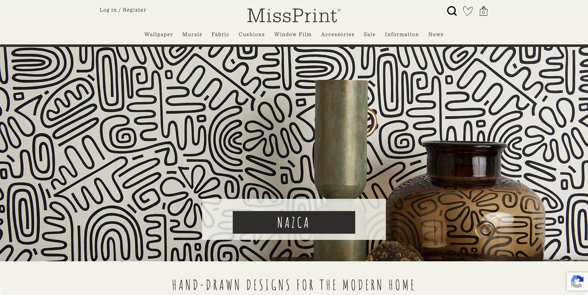
MissPrint’s saved Nazca campaign shows a bold black-and-white wall pattern behind a small arrangement of vessels. The pattern is the dominant visual element, while a dark collection label provides a concise next step. A cream header holds the large wordmark and separate Wallpaper, Murals, Fabric, Cushions, Window Film and Accessories routes. The hand-drawn-design positioning begins just below the image, making the relationship between the visual and the brand’s approach easy to recognize. The vases provide some scale context, although they do not communicate repeat measurements or room-wide composition. The capture shows the actual Nazca slide rather than the different To The Moon image seen during an earlier unsettled inspection.
What you can learn
Let a distinctive pattern supply the visual impact, then keep the collection name and product-category routes simple. Include installed views and dimensions elsewhere so an arresting close-up does not leave shoppers guessing how the design will behave across a wall.
Pros
The restrained label leaves much of the pattern visible.
Wallpaper and murals are separately identified.
Cons & considerations
A close-up arrangement offers limited whole-room scale information.
Many product categories may need clearer grouping on smaller screens.
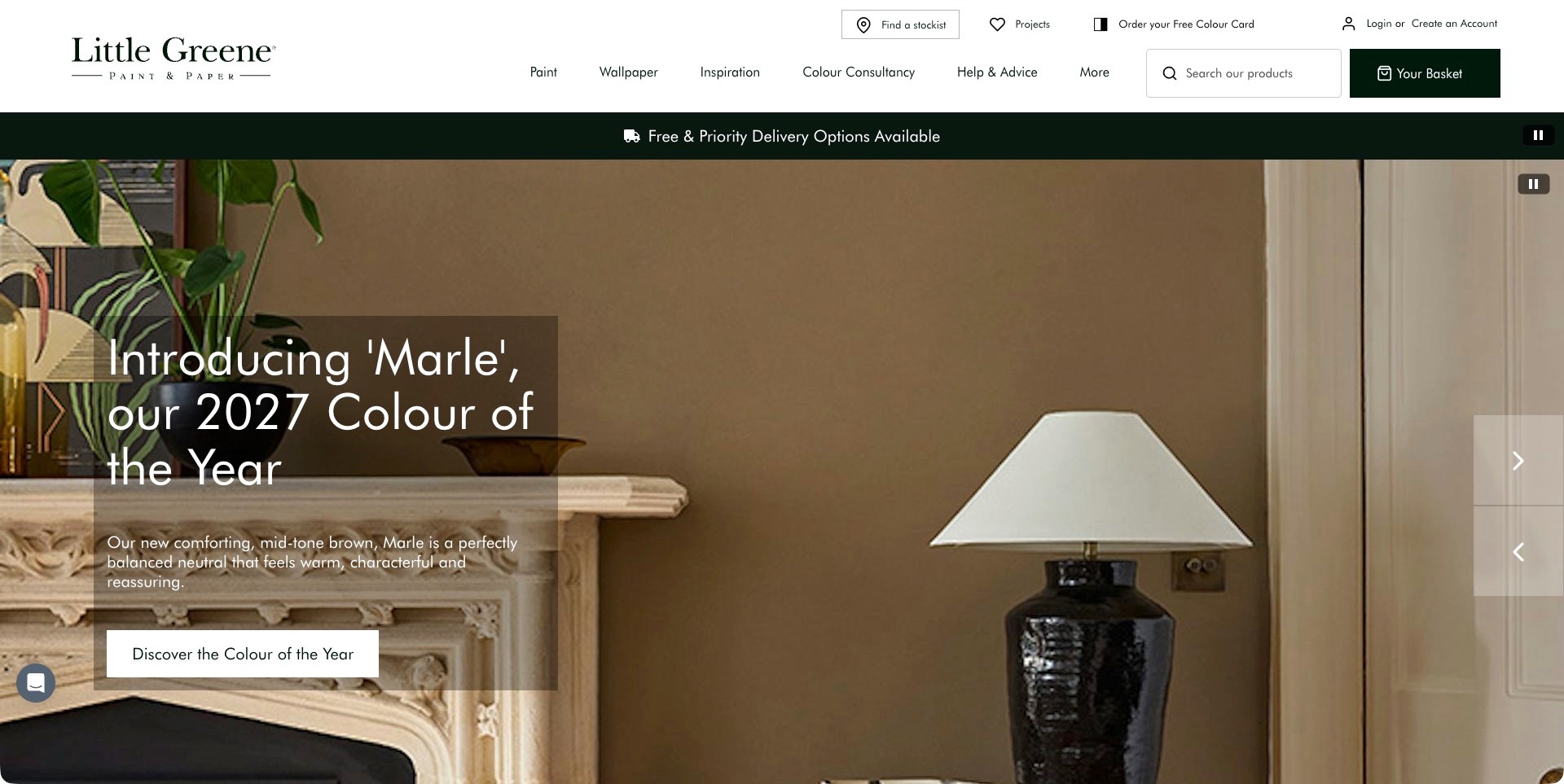
Little Greene’s fresh homepage capture promotes Marle, its 2027 color campaign, using a brown painted wall, mantel and lamp. This is a paint image, not a wallpaper installation. Its relevance to wallpaper retail lies in the surrounding structure: Wallpaper is a distinct main navigation route beside Paint, Inspiration, Colour Consultancy and Help & Advice. Search, stockist information and the basket are also visible. The page therefore supports a decorating journey across coordinated categories rather than treating wallpaper as an unrelated add-on. The campaign can supply mood and palette context, but neither the pictured wall nor the color description demonstrates the appearance or performance of a wallpaper product.
What you can learn
Keep wallpaper easy to find even when a paint campaign leads the homepage. Coordinate inspiration across categories, but distinguish the actual products and their specifications so customers do not confuse a styled room’s painted surface with a purchasable wallcovering.
Pros
Wallpaper has its own clear top-level route.
Help, consultancy and stockist information support different customer needs.
Cons & considerations
The leading paint campaign may not immediately answer a wallpaper shopper’s question.
Several utility controls compete for space above the main image.
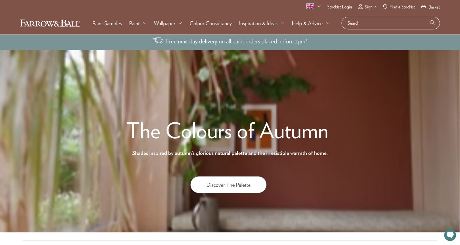
Farrow & Ball’s retained screenshot presents an autumn-color room campaign beneath a russet navigation band. Paint, Wallpaper, Colour Consultancy, Inspiration & Ideas and Help & Advice are independently labelled, with a large search field at the right. The central palette action belongs to the pictured seasonal paint story; it is not a wallpaper purchase demonstration. A current first-party source check separately confirms that wallpaper collections and wallpaper samples remain part of the store’s offer. Keeping these observations distinct is important: the original image retains its original capture date, while the new review considers how the navigation accommodates wallpaper within a wider decorating business.
What you can learn
A paint-and-paper brand can share inspiration across categories without hiding wallpaper behind a generic shop label. Keep product routes explicit and explain which surface a campaign actually shows, then connect customers to the relevant samples and specifications before they make a material decision.
Pros
Wallpaper is visible alongside paint in the main navigation.
Search and help routes are available above the room image.
Cons & considerations
A seasonal palette campaign may require wallpaper shoppers to change direction.
On-screen color and a retained photograph cannot establish a current product’s exact appearance.
Kegan is a freelance web designer and developer with 15+ years of experience helping businesses turn complicated website requirements into clear, maintainable digital experiences. He works directly with clients from planning and design through development, launch, and ongoing support.
For wallpaper store website design, his development approach focuses on pattern and colour discovery, useful repeat and roll information, sample ordering, considered room photography, and clear delivery and installation guidance. The scope can be a targeted improvement or a complete custom build, with responsive layouts, thoughtful content structure, and integrations chosen around the people using and maintaining the site.
Show 3 other wallpaper store website designersHide other wallpaper store website designers
Plan a wallpaper store around patterns, formats and real shopping questions
Define the catalogue before choosing the homepage imagery
Inventory the products the business actually sells and the distinctions customers need to make. Conventional rolls, peel-and-stick products, printed-to-order patterns, murals, borders and samples may require different product information. A retailer carrying several brands needs to preserve each supplier’s accurate specifications rather than applying one generic description to every item. Record what belongs to the store’s own offer and what is provided through another business. The content model should describe real shopping choices rather than only marketing collections.
Choose a manageable set of category entrances. Pattern, colour, room, style, designer and collection can all be useful, but they do different jobs. Use the routes supported by the catalogue and the team’s ability to maintain them. A small specialist store may communicate its perspective through a few well-edited collections instead of a large filter system. Make clear when a category is inspiration rather than a technical statement about suitability for a particular location.
Build dependable pattern and colourway records
Decide how a pattern relates to its available colourways, formats and samples. A shopper should be able to recognize when they are choosing a different colour rather than a different product specification. Keep the name, reference and relevant image set connected. If the retailer supplies dimensions, repeat information or material details, store them in consistent fields so the same fact is not manually rewritten across several pages. Use current information from the responsible supplier and give the team a place to correct it.
Keep descriptive writing separate from functional specifications. A product can have an evocative name and story while still explaining what arrives in the order. Do not let a striking collection title conceal whether the listing concerns a sample, a single roll or a panel set. Where a product is customized or made to order, explain the decision process in the store’s actual terms. Avoid inventing availability, delivery timing or cancellation conditions to make the page look complete.
Create a useful image sequence rather than one impressive hero
Plan images to answer different questions. A clear pattern view can show the motif; a detail can suggest texture; a room scene can communicate scale and atmosphere. Label rendered room imagery or other illustrative material accurately when the business uses it. Do not imply that every scene is a photographed installation or that a product will look identical in every home. Record permissions and the correct product association so visually similar colourways do not become mixed in the catalogue.
Review the actual crops used in category cards, product pages and smaller layouts. An oversized crop may make two patterns look alike, while a tiny repeat may disappear in a thumbnail. Preserve meaningful alternatives and readable product names. Give important images enough detail without making the first visit depend on very large downloads or autoplay. The aim is a coherent shopping explanation, not a gallery that asks customers to infer all practical details from a styled room.
Make samples easy to understand and maintain
If the store offers samples, define what the customer receives and how the sample relates to the product. Keep its format and any ordering conditions accurate. A sample route can be prominent without claiming that it guarantees a final visual match or replaces the relevant supplier and installer guidance. Make colourway selection explicit so the shopper does not accidentally order a sample of one option while reading another. Avoid a generic sample button that loses the product context.
Decide how samples appear in the basket, confirmation and staff workflow. They may be separate items with different fulfilment arrangements from rolls or murals. The site should describe those distinctions in current business terms rather than assuming a sample is a miniature version of every order condition. Test the authorized shopping flow on the store you control, including unavailable samples and corrections. Do not infer another retailer’s checkout behaviour or fulfilment success from its public sample entrance.
Present quantities and measurement help responsibly
Customers may need help understanding supplied dimensions, product formats and the information required for an order. Publish the supplier’s accurate values and define units clearly. If a calculator is appropriate, state what it estimates, the inputs it uses and the limits of the result. A generic area calculation should not pretend to account for every repeat, opening, installation method or site condition. Qualified product or installer advice remains separate from a convenient web estimate.
Keep the practical ordering route available when the customer is uncertain. A short question form or supported contact channel can help the retailer clarify a format or refer someone to the correct guidance. Do not turn a design-inspiration page into technical installation instructions that have not been reviewed by the responsible expert. A website can make product information intelligible without guaranteeing quantities or recommending a material for a wall it has not assessed.
Give browsing and search distinct useful roles
Think about the person who arrives with a reference name and the person who only knows the room mood they want. Search should help with the first task; collections and sensible categories can support the second. Use consistent product names and synonyms only where they genuinely clarify the catalogue. Avoid manufacturing many nearly identical category pages for every possible phrase. A smaller number of useful, maintained entrances is easier to understand than an extensive directory of thin listings.
Where filters are used, make their effects visible and reversible. Keep selected colour, format and other choices understandable on small screens, and preserve a useful empty state. A room label should not quietly function as a universal product-suitability claim. Explain whether a result is available to order, available as a sample or included for inspiration. The public interface needs to reflect the business’s current information rather than an assumed inventory system.
Connect retail and trade enquiries without confusing the offer
Some stores serve both individual shoppers and design professionals. Identify the actual differences in access, account requirements and support before adding a Trade route. A public catalogue can remain welcoming while a separate enquiry explains professional services. Do not invent a discount or trade entitlement merely because a competing store has one. The website should accurately describe the business relationship, including when a supplier or partner manages an enquiry rather than the retailer itself.
Keep the initial form proportionate. A customer may only need to ask about a pattern reference, sample or order format. A designer may need a broader conversation, but a general contact page should not demand confidential plans or unrestricted file uploads by default. Explain what the request does and does not confirm. An acknowledgement should not imply stock allocation, approved credit or a delivery commitment without the real operational process behind it.
Plan the content and fulfilment handover
Assign an owner to product specifications, imagery, samples, availability wording and policies. These may come from different people, but the public record must remain coherent. Define how the store learns that a pattern is retired, a colourway changes or a sample is temporarily unavailable. Keep historical inspiration pages connected to current information without making an old room photograph look like a live product listing. Use stable product links and redirects when the catalogue structure changes.
At handover, demonstrate a normal product update and a correction to a colourway or sample. Review the actual authorized basket and order notifications separately from the visual design. Document which systems own inventory, payment and fulfilment rather than assuming the content platform controls everything. Keep technical access and business accounts with the organization, and schedule practical checks of representative products and contact routes after significant changes. A polished launch should become a maintainable store, not a permanently frozen catalogue.
The editing job behind the design
Choose technology around the actual catalogue and ordering model
Decide whether the site is a full online store, a catalogue with sample ordering, an enquiry-led specialist shop or a mixture. Product variants, bespoke formats, samples and trade accounts need explicit requirements rather than a generic ecommerce label.
Keep content, stock information, payment and fulfilment ownership clear. A visible storefront component does not establish how a supplier produces wallpaper or how a warehouse processes an order.
Use public technology signals as scoped observations about the named pages, not proof that every product shares the same backend or that a platform guarantees reliable ordering.
Our WordPress website examples offer a separate look at publishing approaches. A visible platform label is evidence for that named page, not a guarantee that the same system will suit your requirements.
Before the public launch
A wallpaper store website checklist
Define which wallpaper formats and related products are actually sold.
Connect each pattern to the correct colourways and samples.
Separate descriptive stories from dependable product specifications.
Show both pattern detail and meaningful room context.
Label illustrative room imagery accurately when applicable.
Keep supplied dimensions and units consistent.
Explain what a sample order contains in current store terms.
State the limits of any quantity estimate.
Offer search for references and browsing for inspiration.
Keep filters understandable and reversible on small screens.
Distinguish trade enquiries from ordinary retail routes.
Explain the next step without inventing stock or delivery commitments.
Assign ownership for retired products and changed colourways.
Test the authorized basket, notification and correction workflow.
These checks are a project checklist, not a performance, legal, security, or accessibility certification. Test real journeys with the people responsible for the website before making claims about the result.
Sources & editorial method
How this collection was selected and reviewed
This collection reviews genuine public wallpaper retail and specialist-brand websites for their visible product presentation, category structure, inspiration and ordering context. Current official pages qualify the retail offer; original captures preserve their actual dates and pictured scope. We do not buy products, test installation, verify colour matching, calculate quantities for a real wall or measure sales. Editors Choice highlights a specific website design approach, not a ranking of wallpaper quality or suitability.
Each example links to its actual source page. Screenshots are direct browser captures with their own capture dates; moving imagery, announcements and live designs can change. The notes describe observable design choices and conditional tradeoffs, not measured traffic, conversion results, service quality, or accessibility conformance.
Technology labels use public page metadata, asset evidence, or explicitly cited platform documentation. Platform documentation is not a complete current deployment audit. A component reference may be legacy or unused; it is not a complete backend inventory. Unknown stacks are omitted. These sites are editorial examples, not our client portfolio.
Written, Edited and Curated are separate editorial records, not timestamps advanced by a rebuild. Website designs and imagery belong to their owners. See our editorial standards or suggest a correction.
Questions worth asking
Wallpaper Store website design questions
Should wallpaper stores lead with room photography or pattern swatches?
They answer different questions. A room image can communicate atmosphere and scale, while a clear pattern view helps identify the motif and colourway. A useful product sequence connects them and supplies readable facts rather than expecting one image to explain the whole product.
How prominent should sample ordering be?
Where samples are genuinely available, make the route easy to find and keep it connected to the correct product and colourway. Explain the sample’s format and current conditions. Do not imply that a screen image or a sample guarantees the final appearance in every room.
Does a wallpaper store need a roll calculator?
Only when its purpose and limits are understood. Use accurate supplier data, clear units and qualified review for the intended calculation. A simple web estimate should not pretend to account for every pattern, installation method or wall condition, and it should provide a sensible route for uncertainty.
Can a store sell paint and wallpaper on the same website?
Yes, when their product choices and practical information remain distinct. A shared interior-design identity can connect the categories without applying paint specifications, sample conditions or ordering assumptions to wallpaper. Clear category and product records matter more than forcing everything into one generic listing.
What matters most at handover?
The team should be able to update a product, correct a colourway, maintain samples and identify who owns stock, payment and fulfilment information. Demonstrate a real correction and an authorized test order route rather than handing over only a set of attractive empty templates.
Borrow how these stores connect a pattern’s personality with a specific product choice. Then build the sample, specification and support information your own business can keep dependable.