A useful Sitecore website turns a complex organization into understandable visitor tasks. Its content model, editorial responsibilities, and integrations matter as much as the opening image: people need to find a service, compare options, locate support, or understand the organization without learning its internal structure.
These examples span retail, manufacturing, healthcare, tourism, education, financial services, and public-interest organizations. Their shared challenge is coordination. Different teams maintain campaigns, products, locations, documents, audience journeys, and regional requirements. A coherent website gives those teams enough editorial control while preserving a dependable navigation system and authoritative records for important facts.
Sitecore is a product family with implementations described as XP, XM, XM Cloud, and the current SitecoreAI platform. This collection preserves the product names and scope in each source instead of treating them as interchangeable installed configurations. Every reference combines a named official case with an actual current public-page capture. Historical stories, recognizable brands, and visible resources establish only the stated association; they do not reveal every connected service or private backend.
Before the examples
What makes good Sitecore website development in 2026?
Start with content responsibility
Define which records represent services, products, locations, people, documents, and campaigns. Assign an owner to each fact and a clear relationship between records. Editors should be able to select approved content without creating uncontrolled copies. Sitecore’s current CMS offering includes visual editing and publishing workflows, but a successful project still needs an understandable model, usable component choices, and review responsibilities appropriate to the organization.
Make the public task survive organizational complexity
A visitor needs a recognizable route to care, a product, a destination, or a support service. Use the organization’s terminology only where the audience understands it. Separate institutional navigation, audience selection, and operational utilities deliberately. A large menu is not an information strategy: test whether a person can identify the right starting point and understand what the next page will do.
Define a complete publishing unit
A page may rely on shared content, images, translations, and related records. Decide which dependencies must be approved together, and verify the resulting public page after publication. Sitecore’s publishing documentation distinguishes a page, related items, subpages, and language versions. Use the documentation for the selected product and version, then rehearse the actual workflow with editors and reviewers.
Study the relationship between the campaign and the permanent task. The most useful detail may be a location selector, audience tab, service notice, product taxonomy, or clear handoff to support. Each example is one distinct public property with its own evidence scope and observed capture date.
We start with five recognizable brands or organizations: BHP, Pet Supplies Plus, VELUX, Tourism Ireland, FIS. Each attribution applies to the named website property, not every product or website belonging to its organization. This is a curated reading sequence, not a measured ranking.
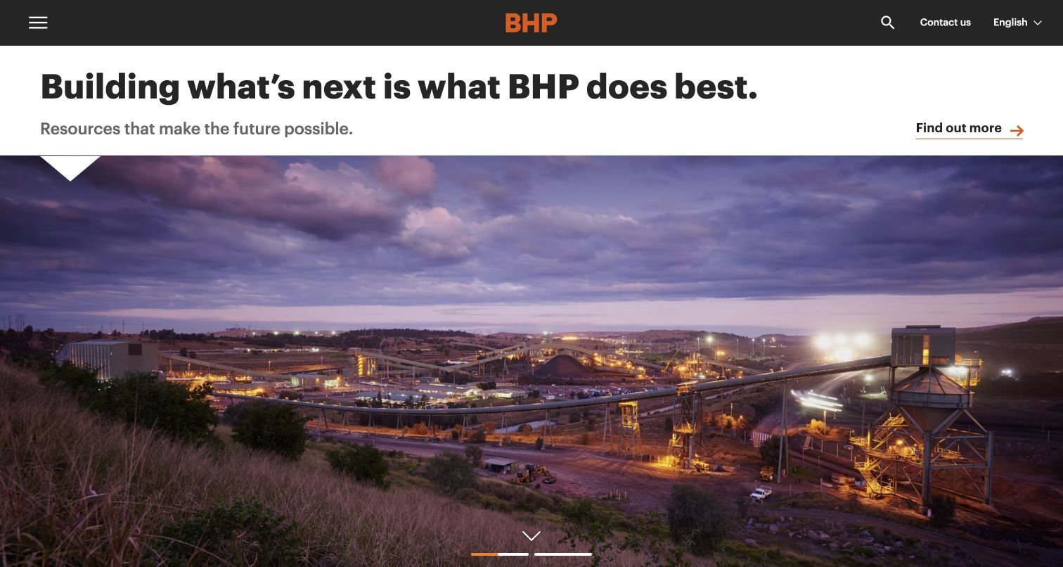
BHP separates a corporate statement from a photograph of an operating site at dusk. The dark header centers the orange identity, with menu, search, language, and contact controls at the edges. An orange arrow and underline identify the destination without adding a button over the photograph. Sitecore’s named case documents Experience Platform and SXA for this public property; the current capture is distinct from the historical implementation description.
What you can learn
Give a corporate campaign a bounded content model with a short proposition, supporting sentence, destination, and approved photograph. Preserve investor, career, and operational information beyond the campaign so the site serves practical visits as well as reputation building. Review the headline with different crops and translated text. A dramatic site photograph should have a useful description and documented rights, without becoming evidence for an unverified environmental claim.
Pros
The headline sits on a solid background instead of competing with detailed industrial imagery.
A restrained accent color connects the identity and the principal editorial action.
Cons & considerations
The collapsed menu adds a step before visitors can see the organization’s main information areas.
A large photographic opening delays practical corporate resources below the initial view.
Visible tech stack
Earlier / documented evidence
Sitecore
Earlier cited evidence retained; no current scan result. References may be embedded or legacy—not a complete backend inventory.
Platform source: Sitecore’s named customer case study. Sitecore’s named BHP case explicitly links bhp.com and describes Experience Platform and SXA for its public corporate website. Current public HTML retains a Sitecore context reference. The case documents a particular implementation; no installed version or current personalization behavior is asserted. Platform evidence is separate from the direct website screenshot and is not a complete current infrastructure audit.
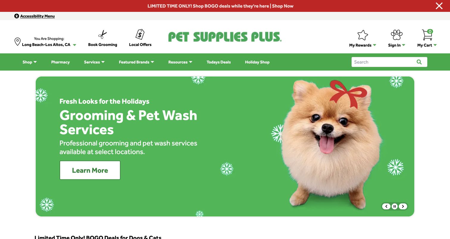
Pet Supplies Plus places the selected store, grooming, local offers, rewards, account, and cart above a green product-navigation bar. A large seasonal campaign pairs a dog photograph with a direct service message and a white action. The carousel controls remain visible at its lower corner. The named Sitecore case describes XM Cloud, content operations, and commerce capabilities; this screenshot documents the public storefront rather than testing stock, bookings, or checkout.
What you can learn
Separate the store record from seasonal creative so location, hours, and service availability remain authoritative when campaigns change. Give each hero a destination, publication window, alternate text, and a static fallback. A location notice should be dismissible without obscuring navigation indefinitely. Preview the experience for visitors without a selected store and for a store that does not offer the advertised service. Do not infer operational eligibility from the campaign artwork.
Pros
Store and service utilities remain available above changing promotional content.
Clear carousel controls accompany the large seasonal image and readable action.
Cons & considerations
Two navigation rows and an announcement consume substantial space before the campaign.
Local service claims require store-specific rules and careful campaign expiry handling.
Visible tech stack
Earlier / documented evidence
Sitecore
Earlier cited evidence retained; no current scan result. References may be embedded or legacy—not a complete backend inventory.
Platform source: Sitecore’s named customer case study. Sitecore’s named Pet Supplies Plus case links this public storefront and describes XM Cloud content management alongside content operations, DAM, and OrderCloud. Expected benefits in the case are not presented as measured outcomes. The browser displayed the live public storefront; an anonymous source fetch returned HTTP 403, so independent markup corroboration was unavailable. Platform evidence is separate from the direct website screenshot and is not a complete current infrastructure audit.
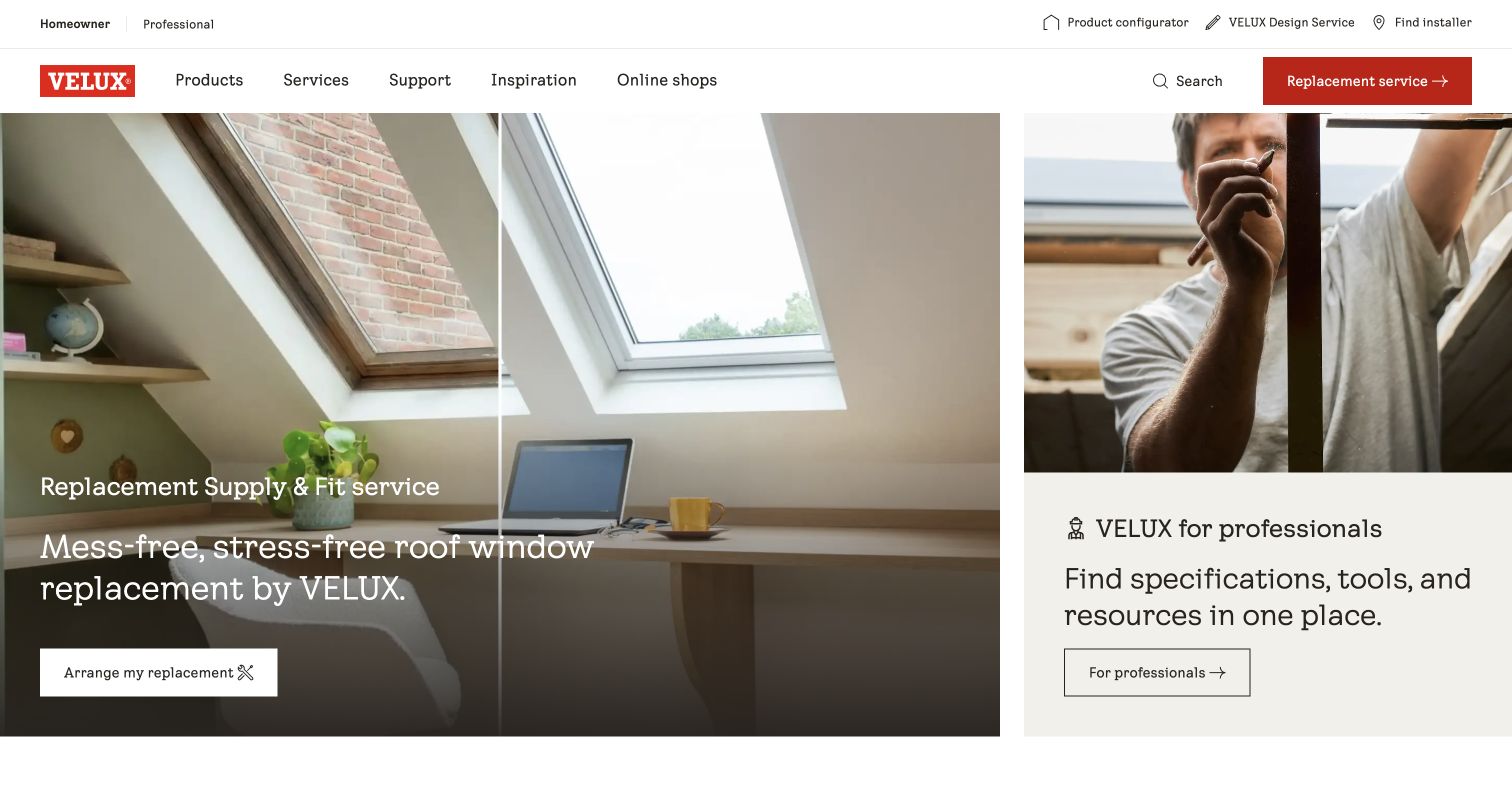
VELUX UK divides its opening between a large roof-window replacement scene and a smaller professional-services panel. Both use plain actions, while a narrow audience selector and practical project tools sit above the main navigation. The red brand and replacement button provide the strongest accents against the pale interior photography. Sitecore’s case names the UK property within its wider content program; current public markup also exposes Sitecore content context for this exact website.
What you can learn
Make the audience split explicit in the content model, with distinct destinations and editorial owners for homeowner guidance and professional specifications. Product facts should come from governed records instead of being copied into each hero. Preview imagery with long service titles and confirm that a crop still explains the window or installation. Keep replacement, installer discovery, support, and product warnings accessible when the featured campaign changes.
Pros
The two panels communicate different audience needs without requiring a preliminary landing screen.
Practical tools are visible in the upper utility row alongside the main product navigation.
Cons & considerations
Several header layers need careful prioritization on narrow screens.
Image-backed text requires contrast checks across every approved crop and campaign photograph.
Vue.jsAssociated with Nuxt; not independently observed
Public source checked November 3, 2026. References may be embedded or legacy—not a complete backend inventory.
Platform source: Sitecore’s named customer case study. Sitecore’s VELUX case explicitly links the UK website and documents XM and Content Hub in a wider multi-property program. The current UK public markup exposes Sitecore content context. The association applies to this property and does not identify every market, shop, configurator, or account service. Platform evidence is separate from the direct website screenshot and is not a complete current infrastructure audit.
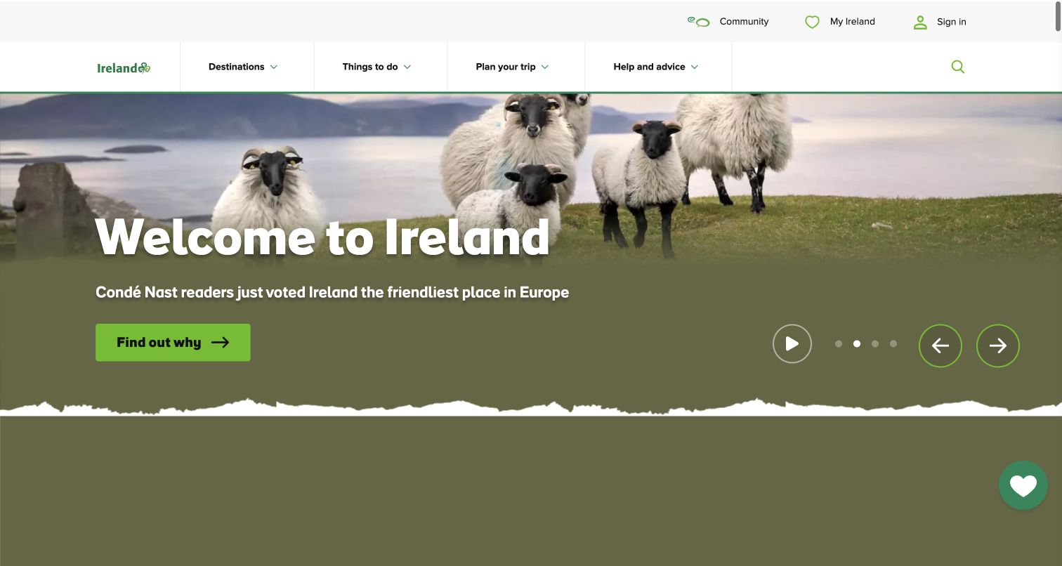
Tourism Ireland’s US English property uses a wide landscape image, a large destination headline, and a bright green action. A torn-paper edge softens the transition into the next section. Above it, destinations, activities, planning, and advice use familiar travel vocabulary; community and saved inspiration sit in a separate utility row. The Sitecore source is a historical 2021 implementation case, while the current screenshot and public Sitecore-related markup were reviewed separately.
What you can learn
Keep destination records, seasonal campaigns, and trip ideas distinct so a homepage selection does not become the only source of practical information. Give each carousel panel a complete message and a clear destination. The visible pause control is valuable, but teams should still verify keyboard access, motion preferences, and the first slide. Place image credits, local conditions, and editorial review dates in the publishing process rather than embedding them into artwork.
Pros
Planning categories remain clear while the seasonal campaign supplies emotional context.
Visible playback and slide controls make the moving opening more understandable.
Cons & considerations
A large carousel can delay practical destination information for visitors with a specific task.
Saved-board and community features introduce separate journeys that require clear account expectations.
Visible tech stack
Referenced on the public page
CookieYes
Earlier / documented evidence
Sitecore
Public source checked November 3, 2026. References may be embedded or legacy—not a complete backend inventory.
Platform source: Sitecore’s named customer case study. Sitecore’s historical 2021 Tourism Ireland case explicitly links ireland.com and describes Experience Platform. Current public markup includes Sitecore-related conventions, and the public US English opening was separately captured in November 2026. The historical implementation details and reported results are not assumed unchanged. Platform evidence is separate from the direct website screenshot and is not a complete current infrastructure audit.
FIS places a large brand statement over an aerial city scene, with bright green actions and a narrow navigation bar. Products, insights, developers and the client portal are separate destinations. Below the opening, the page organizes its portfolio around different stages of the money lifecycle, connecting each theme to products and related reading. Sitecore’s case study documents an XP, SXA and headless-services marketing implementation and links this public property; it does not establish the technology running FIS financial products.
What you can learn
Follow a broad institutional message with a concrete product taxonomy. Make the marketing-to-client-portal boundary explicit, and preserve the main proposition when video is paused or unavailable. A reusable campaign structure should allow imagery to change without making navigation or the first useful action difficult to locate.
Pros
The green action is visually distinct from the surrounding photographic field.
Product, editorial and existing-client routes have separate labels in the header.
Cons & considerations
Small navigation text overlays a detailed scene and needs careful contrast review.
The abstract opening takes time to reach the specific product explanations below.
Public source checked November 3, 2026. References may be embedded or legacy—not a complete backend inventory.
Platform source: Official Sitecore customer case study. Sitecore’s official FIS case links fisglobal.com and documents a marketing-platform upgrade using Experience Platform, Experience Accelerator and Headless Services. The association concerns FIS’s public marketing websites; it does not establish the software running financial products, a current installed version, or every linked service. Platform evidence is separate from the direct website screenshot and is not a complete current infrastructure audit.
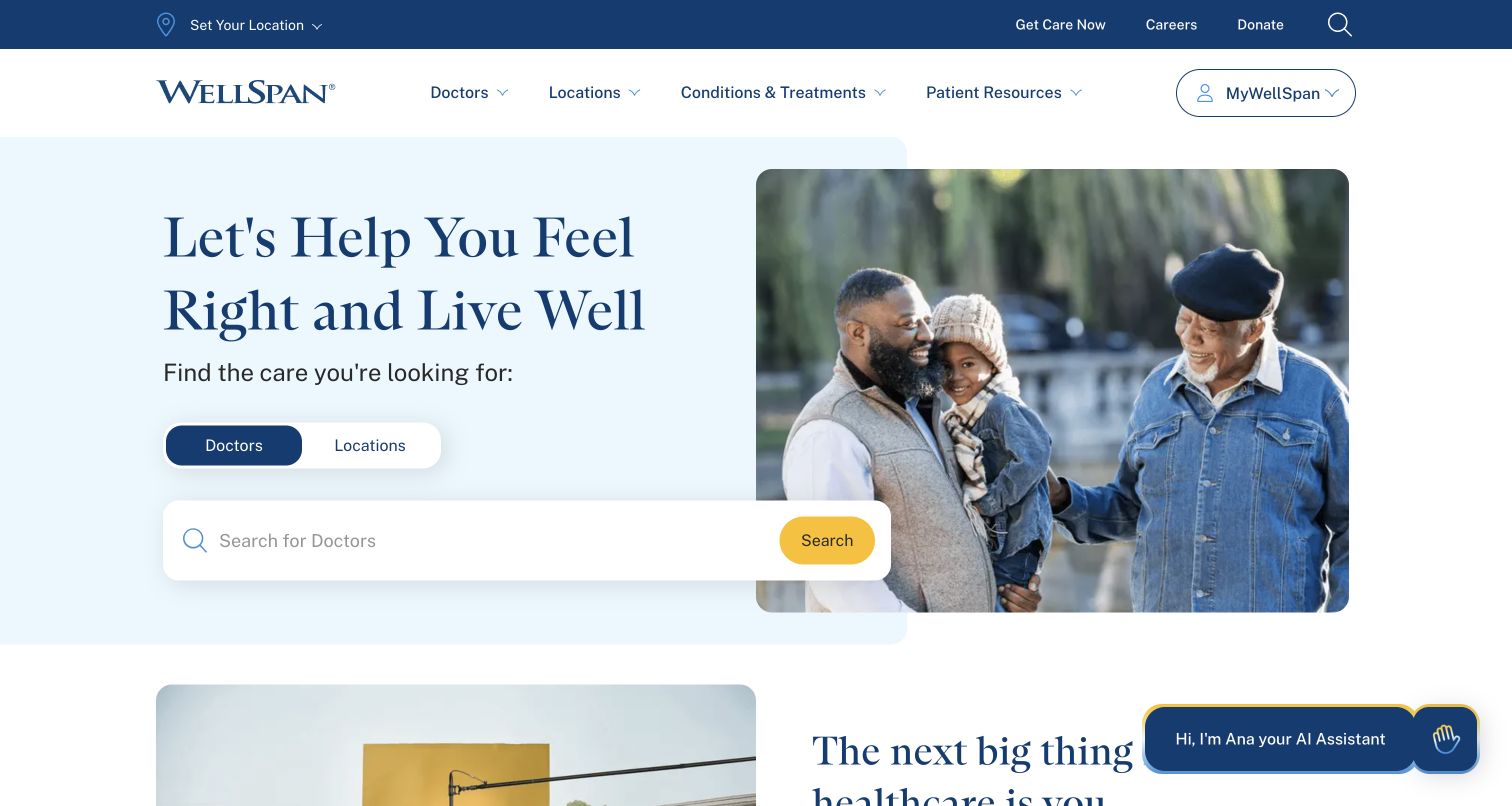
WellSpan places a doctor-or-location selector and a search field beneath its opening statement. The search panel overlaps a family photograph and pale blue text area, bringing the task ahead of the supporting campaign below. Doctors, locations, treatments, and patient resources remain visible in the header, with the patient portal visually separate. Sitecore’s case documents a headless website implementation; current public markup also includes Sitecore page context for this property.
What you can learn
Model location and clinician information as maintained records with accountable owners. The CMS should present appropriate explanations and routes while operational systems control availability and patient workflows. Preview empty and unsuccessful searches, long clinician names, and missing photographs. Keep urgent-care guidance and the portal distinct from general editorial content. A public screenshot can demonstrate navigation and hierarchy, but it cannot establish clinical quality, accessibility compliance, or the behavior of private patient services.
Pros
The search task appears early and uses two understandable categories.
A separate portal control helps distinguish returning patients from public information seekers.
Cons & considerations
The overlapping search panel needs deliberate stacking and focus order on mobile.
The visible assistant prompt competes with content and needs careful scope and fallback design.
ReactAssociated with Next.js; not independently observed
Public source checked November 3, 2026. References may be embedded or legacy—not a complete backend inventory.
Platform source: Sitecore’s named customer case study. Sitecore’s named WellSpan case links wellspan.org and describes a headless website using XM and related capabilities. Current public HTML includes Sitecore page layout context. This association covers the public website, not private patient records, clinical systems, or portal transactions. Platform evidence is separate from the direct website screenshot and is not a complete current infrastructure audit.
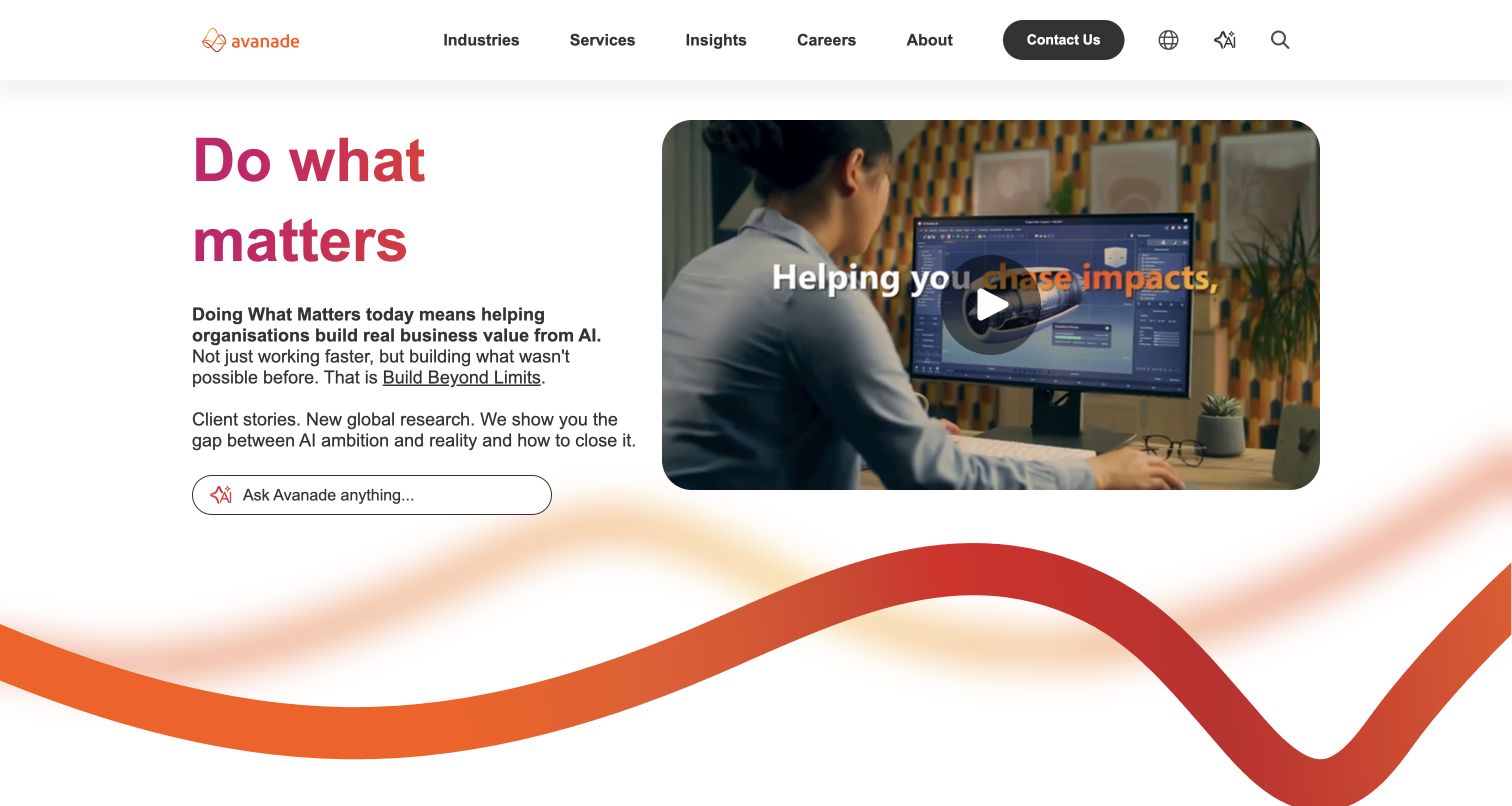
Avanade’s UK homepage places a pink headline and explanation beside a rounded video poster. A question field offers an alternative route beneath the copy, while industries, services, insights, careers, and company information remain in the header. An orange ribbon carries the visual identity into the lower page. The Sitecore case documents its content platform, and current HTML includes Sitecore layout data; separate media references do not identify a competing page CMS.
What you can learn
Treat the proposition, supporting evidence, video, and conversational entry as distinct editorial components with clear ownership. Keep a conventional navigation route for visitors who do not want to use an assistant. Provide captions and a useful poster for the video, and maintain the associated destination when messaging changes. A question field also needs an understandable purpose and response limits; no messages were submitted during this public design review.
Pros
The two-column layout makes the relationship between proposition and explanatory media easy to scan.
Established navigation remains available alongside the optional conversational entry.
Cons & considerations
The large decorative ribbon occupies space that could otherwise introduce supporting evidence.
Broad outcome language needs concrete case studies and qualifications deeper in the journey.
ReactAssociated with Next.js; not independently observed
Public source checked November 3, 2026. References may be embedded or legacy—not a complete backend inventory.
Platform source: Sitecore’s named customer case study. Sitecore’s named Avanade case explicitly links its UK English property and documents the content platform. Current public HTML contains Sitecore layout data and page-context styles alongside a Next.js frontend. Other vendor media URLs are asset references, not proof of a competing page CMS. No complete current configuration or commercial outcome is independently audited. Platform evidence is separate from the direct website screenshot and is not a complete current infrastructure audit.
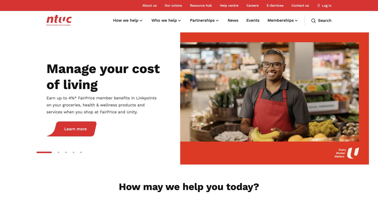
NTUC’s public portal pairs a cost-of-living message with a shopkeeper photograph inside a red frame. The main navigation asks how and whom the organization helps, followed by partnerships, news, events, and memberships. Institutional details and login occupy a thinner utility band. Sitecore’s case describes Experience Platform and Content Hub across the organization’s websites. This reference is limited to the publicly accessible uportal, without entering member accounts or service applications.
What you can learn
Build audience and need records that connect a visitor’s situation to relevant programs, eligibility information, and next steps. Keep time-sensitive benefit amounts and conditions in controlled fields instead of relying on campaign images. The paired navigation concepts should have clear landing pages so visitors can browse by situation or audience without guessing. Review any linked partner destination separately; the umbrella organization’s CMS association does not identify every affiliated union or service.
Pros
Everyday language gives visitors a useful alternative to an internal department-based menu.
A human photograph and consistent red accents connect the campaign to the organization’s identity.
Cons & considerations
The wide audience taxonomy can become demanding when expanded on smaller screens.
Promotional benefit figures need a maintained source, qualification, and review date.
Public source checked November 3, 2026. References may be embedded or legacy—not a complete backend inventory.
Platform source: Sitecore’s named customer case study. Sitecore’s named NTUC case explicitly links the public uportal and documents Experience Platform and Content Hub across the organization’s websites. Public media references supplement that documentary association but are not independent CMS proof. Private membership functions, partner services, and affiliated unions are outside this example. Platform evidence is separate from the direct website screenshot and is not a complete current infrastructure audit.
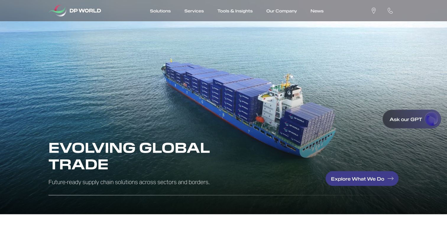
DP World opens with a container-ship image, white headline, and purple service action. The header groups solutions, services, tools, and company information above the scene. An assistant control floats at the right edge. The official case describes an earlier Sitecore XP and SXA implementation; the current public page includes Sitecore layout context. Those observations support the association without asserting that the historical version or architecture is unchanged.
What you can learn
Use a service taxonomy to connect the broad corporate proposition to concrete industry and operational pages. Keep network facts and customer-service tools in maintained records rather than duplicating them across campaign layouts. Test the headline against every video frame or approved still, and provide a stable fallback. The assistant should supplement a discoverable service route and explain its boundaries; this review did not send prompts, track cargo, or test shipping transactions.
Pros
The ship image makes the organization’s physical operations immediately legible.
A single prominent service action gives the large visual opening a concrete destination.
Cons & considerations
Floating assistance and the main action compete for attention near the right edge.
White text over changing maritime imagery needs contrast and motion checks beyond a still screenshot.
ReactAssociated with Next.js; not independently observed
Public source checked November 3, 2026. References may be embedded or legacy—not a complete backend inventory.
Platform source: Sitecore’s named customer case study. Sitecore’s named DP World case links its public website and describes a historical XP 9.3 and SXA implementation. The current public page separately includes Sitecore layout context. This corroborates a Sitecore association while leaving the present installed version, architecture, cargo tools, and private systems unverified. Platform evidence is separate from the direct website screenshot and is not a complete current infrastructure audit.
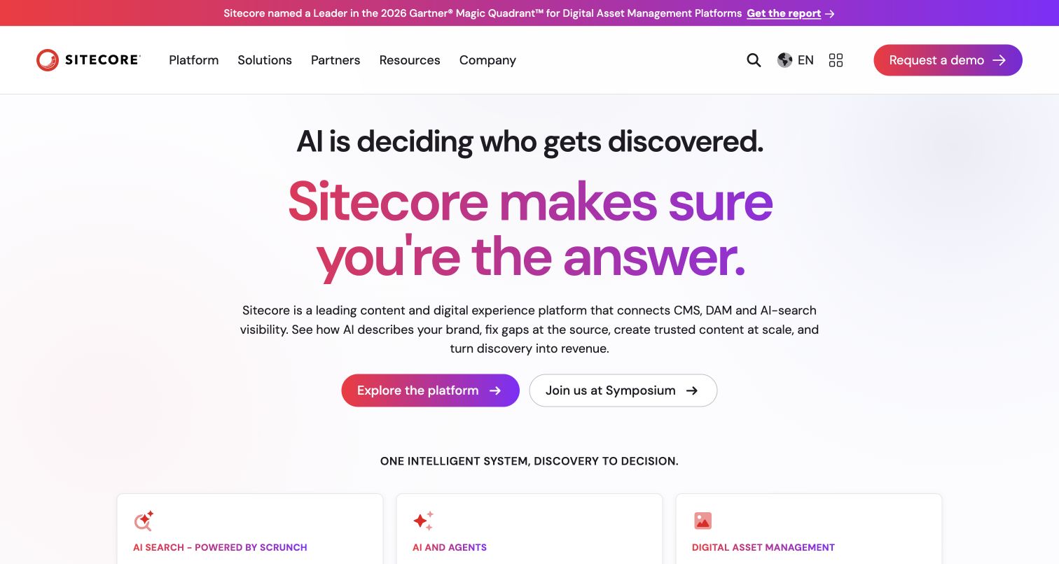
Sitecore’s public homepage uses a centered black premise, a larger gradient headline, and an explanation before two rounded actions. The platform action is visually stronger than the event route. Navigation separates platform, solutions, partners, resources, and company material, while an announcement strip promotes research above the header. Sitecore’s first-party account discusses using its technology for this property; the capture reviews the current marketing presentation separately from that historical 2021 account.
What you can learn
Define the platform proposition and supporting product records separately so a campaign refresh does not leave contradictory language across the website. Give the primary action a stable destination, and retire event promotions when their window ends. A gradient headline should remain readable in all responsive states and alternative contrast settings. Explain category terms through practical product information below the opening rather than expecting the headline alone to establish fit.
Pros
The typographic hierarchy leads from a short premise to the main proposition and action.
Primary platform exploration and the secondary event route have distinguishable visual weights.
Cons & considerations
The large abstract proposition delays concrete product detail below the opening.
Announcements and category claims require ownership and review as products and events change.
Visible tech stack
Earlier / documented evidence
Sitecore
Earlier cited evidence retained; no current scan result. References may be embedded or legacy—not a complete backend inventory.
Platform source: Sitecore’s first-party account of its own website. Sitecore’s first-party account describes its own public website as a case study and discusses a 2021 digital-experience refresh. The current public opening was separately captured in November 2026. The historical account does not establish an unchanged version, frontend, or complete current architecture. Platform evidence is separate from the direct website screenshot and is not a complete current infrastructure audit.
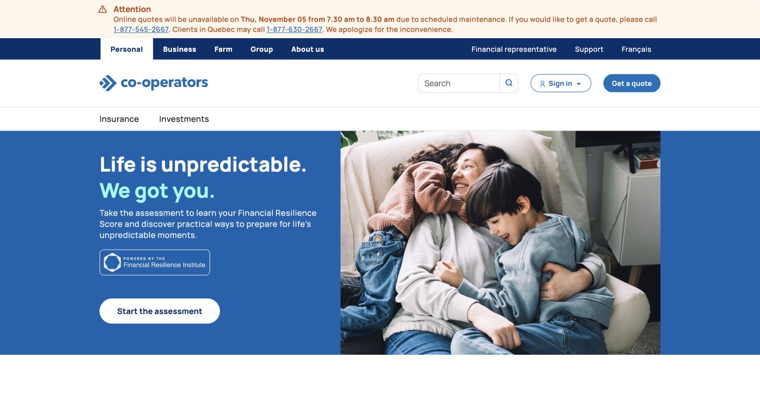
Co-operators places a maintenance notice above audience tabs for personal, business, farm, and group services. Search, sign-in, and quotation routes form a separate utility row. The opening campaign combines a blue text panel with a family photograph and a white assessment action. The named Sitecore case documents Experience Platform supporting this public website. This review concerns the visible information design, without completing an assessment or evaluating financial products, accounts, or quotations.
What you can learn
Keep service-status notices in a shared, dated record with a clear owner and removal rule. Audience navigation should remain consistent across campaigns so existing clients can reach support without entering a marketing journey. Separate explanatory content from regulated product details and transaction systems. Preview notices alongside long campaign copy at narrow widths, and ensure assessment links explain what information the visitor will need before any personal data is requested.
Pros
Audience tabs give the broad organization a clear first level of navigation.
The operational notice is visible before the campaign and includes alternative contact routes.
Cons & considerations
Several stacked header layers push the campaign downward and complicate mobile prioritization.
An assessment-oriented action needs clear expectations and accessible explanatory content before participation.
Public source checked November 3, 2026. References may be embedded or legacy—not a complete backend inventory.
Platform source: Sitecore’s named customer case study. Sitecore’s named Co-operators case explicitly links cooperators.ca and describes Experience Platform hosted on Sitecore Managed Cloud, connected to marketing systems. The public root redirected to the personal-services landing page. Evidence concerns the public marketing website, not insurance decisions, assessments, accounts, quotations, or financial transactions. Platform evidence is separate from the direct website screenshot and is not a complete current infrastructure audit.
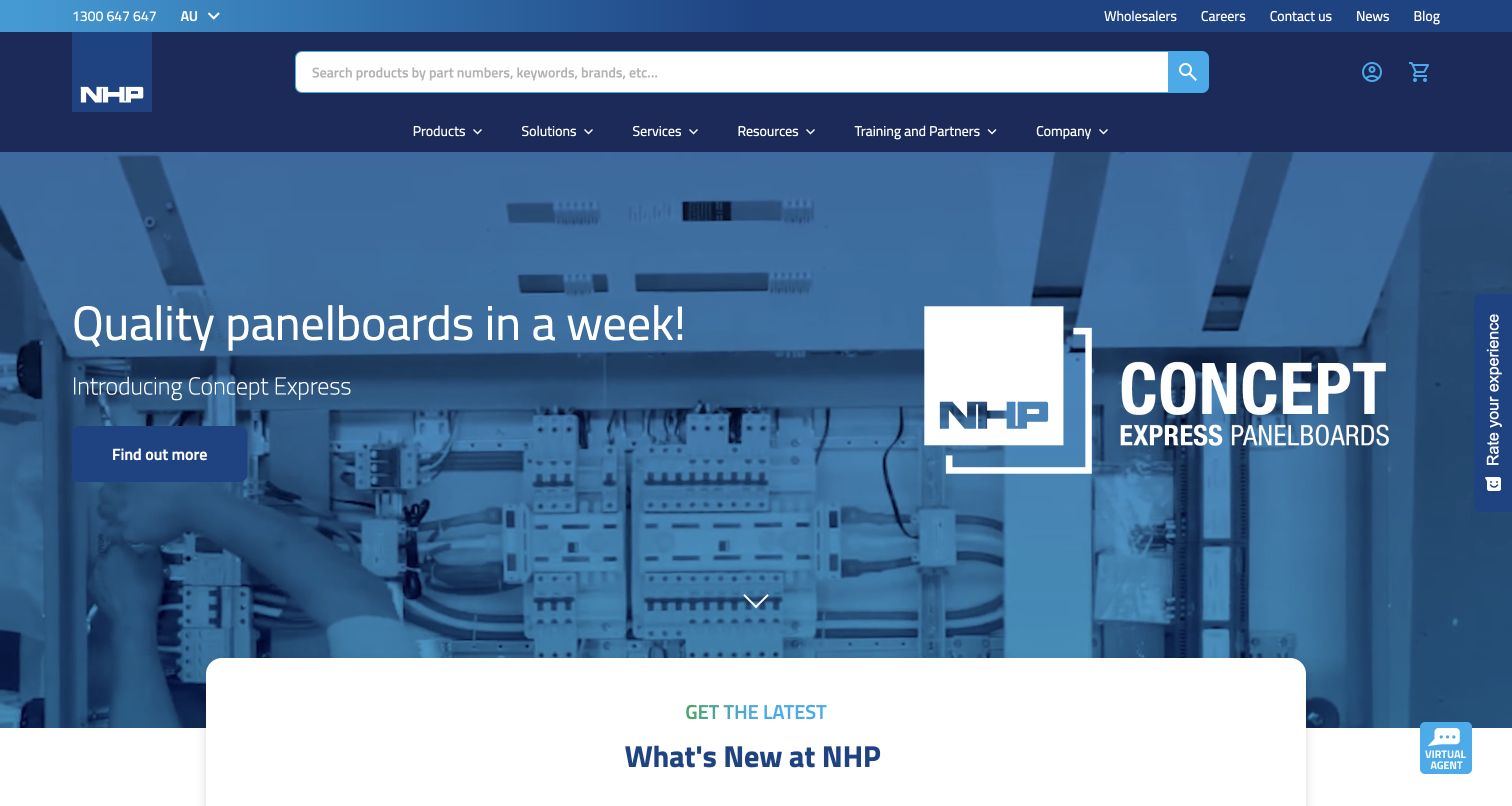
NHP gives product search a central position within its blue header, explicitly inviting part numbers, keywords and brands. The main feature promotes a panelboard range with equipment imagery, followed by a news panel and product-oriented sections. Resources and training remain distinct navigation choices. Sitecore’s case study describes XM Cloud content management with customer-data and personalization tools, and links the Australian property. That documented relationship does not independently verify account, price, availability or order-processing behavior.
What you can learn
Let a technical buyer search in the vocabulary they already use. Pair the catalog route with resources and training for visitors still investigating a solution. Keep temporary product campaigns separate from permanent account and product navigation, and test how long part numbers, empty results and unavailable items are explained.
Pros
The search prompt explicitly supports several common ways of identifying a product.
Product browsing, services, resources and training occupy recognizable navigation categories.
Cons & considerations
The substantial header and campaign consume most of the opening viewport.
A time-based product promise needs current conditions and ownership beyond the visual promotion.
ReactAssociated with Next.js; not independently observed
Public source checked November 3, 2026. References may be embedded or legacy—not a complete backend inventory.
Platform source: Official Sitecore customer case study. Sitecore’s official NHP case links the Australian website and describes migration to XM Cloud for content management, with CDP and Personalize. This documents the named public property’s platform relationship. Planned commerce and search changes in the case are not treated as independently verified current features. Platform evidence is separate from the direct website screenshot and is not a complete current infrastructure audit.
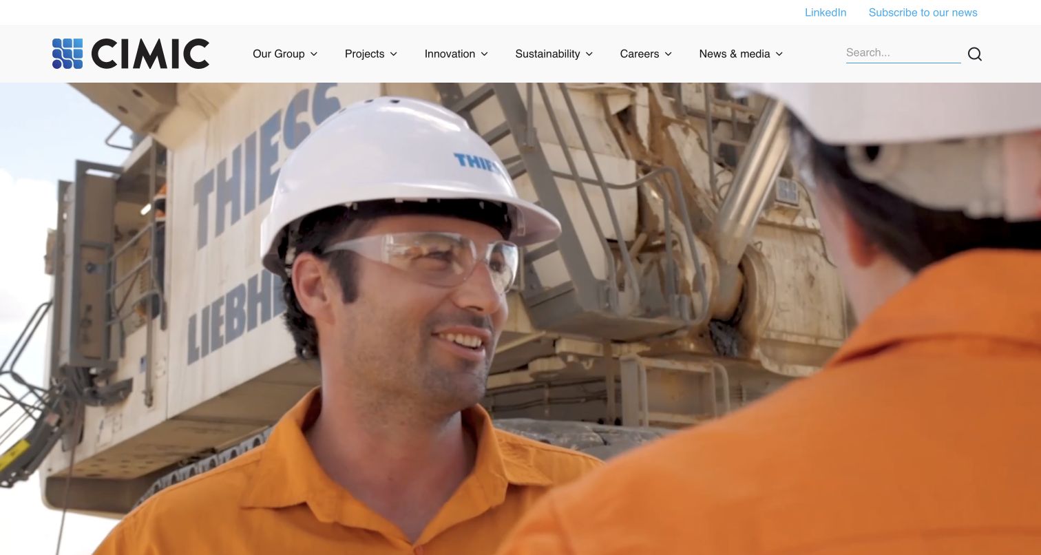
CIMIC Group gives the opening to a large construction-work video beneath a clean white header. Group information, projects, innovation, sustainability, careers and news form the main navigation. The following content introduces the organization and separates financial reporting, recruitment and current project news. Sitecore documents a migration of the group’s website estate to XM Cloud and Search, with this corporate site linked as the project. The case supports that website relationship without proving each subsidiary’s current implementation or operational results.
What you can learn
Use working imagery to establish the field, then organize corporate information around distinct visitor tasks. Give reports, projects and careers their own maintained records and dates. Shared components can provide consistency across a group, but each company still needs clear identity, ownership and a reliable route back to the parent organization.
Pros
The header separates major corporate topics without placing promotional text inside the menu.
Financial and careers content receive explicit destinations beyond the main project story.
Cons & considerations
The first view relies heavily on video and offers little detailed explanation.
Multiple related companies require consistent labels so visitors know which organization owns a project or report.
ReactAssociated with Next.js; not independently observed
Public source checked November 3, 2026. References may be embedded or legacy—not a complete backend inventory.
Platform source: Official Sitecore customer case study. Sitecore’s official CIMIC Group case links the corporate website and describes upgrading the group’s website estate from XP to XM Cloud with Sitecore Search. The association is qualified to the linked corporate property; this review does not independently audit every subsidiary, implementation version or reported performance result. Platform evidence is separate from the direct website screenshot and is not a complete current infrastructure audit.
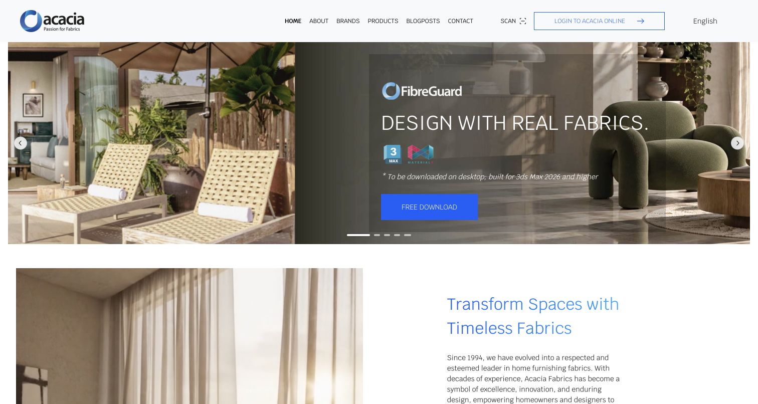
Acacia Fabrics uses a compact white header above a wide campaign carousel, with interiors and fabric-related imagery supplying most of the visual character. Brand, product and editorial routes are separated, while language and trade-account access sit in the utility area. The page then moves into a calmer image-and-text introduction. Sitecore’s Bru Textiles case explicitly names and links Acacia Fabrics as an XM Cloud example; the association is to this brand property, not a claim about every manufacturer or linked design tool.
What you can learn
Give a multi-brand catalog a clear structure before adding campaign imagery. Keep product browsing, inspiration and account access distinguishable, and explain when a link moves to another brand’s site. Model each campaign’s image, title, destination and expiry so a new collection can replace it without disrupting the rest of the page.
Pros
The pale navigation stays visually separate from the changing campaign photography.
Brand and product destinations offer different routes into the supplier’s range.
Cons & considerations
A carousel can hide choices and needs usable controls and a stable alternative.
External brand and software destinations require clear labeling to prevent unexpected handoffs.
ReactAssociated with Next.js; not independently observed
Public source checked November 3, 2026. References may be embedded or legacy—not a complete backend inventory.
Platform source: Official Sitecore customer case study. Sitecore’s Bru Textiles case explicitly names Acacia Fabrics as an XM Cloud website and directly links that brand property. The linked /en address redirects to the captured homepage. This evidence concerns Acacia Fabrics, not a generic Bru Textiles root or the architecture of external brand and design-tool destinations. Platform evidence is separate from the direct website screenshot and is not a complete current infrastructure audit.
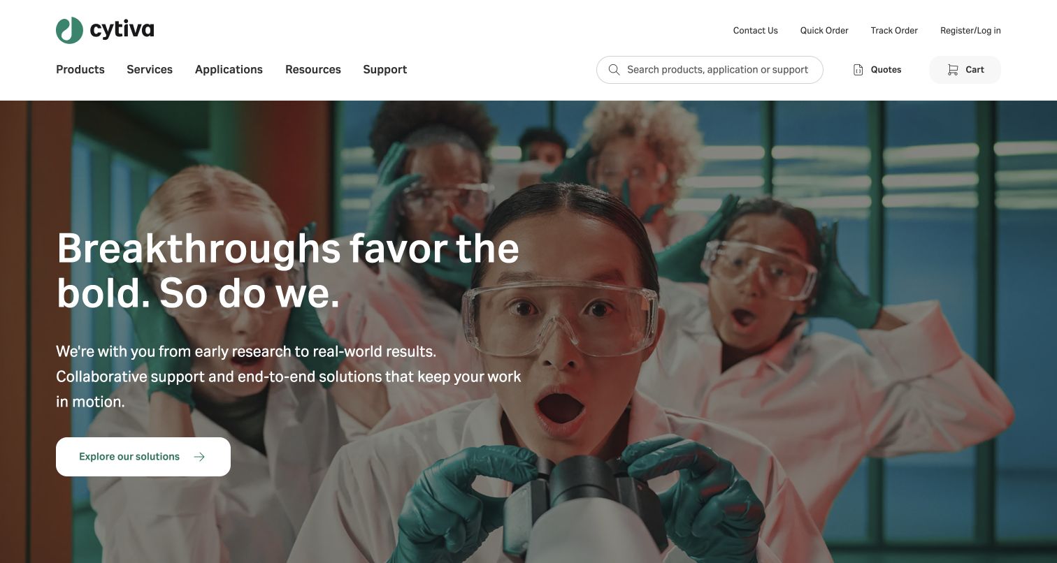
Cytiva combines a laboratory photograph with a short research-oriented message, while the white header exposes product search, quick ordering, order tracking and account access. Below the hero, product categories and technical resources provide more specific routes. The captured page is the US English property reached from Sitecore’s case link. The vendor describes a phased move from XP toward XM Cloud with Content Hub DAM, so the evidence supports a documented mixed migration rather than a claim that every current component uses one product.
What you can learn
Keep exploratory storytelling and practical catalog tasks available together. A returning buyer may know a product identifier, while a researcher may need application guidance. Separate technical documentation from promotional summaries and make locale selection explicit before presenting availability or account-related information.
Pros
Quick ordering and tracking remain visible alongside ordinary product discovery.
Product categories and support resources make the broad scientific message more actionable.
Cons & considerations
The busy laboratory image needs deliberate text contrast across responsive crops.
Several commerce utilities require clear account and regional boundaries that a homepage screenshot cannot verify.
Visible tech stack
Earlier / documented evidence
Sitecore
Earlier cited evidence retained; no current scan result. References may be embedded or legacy—not a complete backend inventory.
Platform source: Official Sitecore customer case study. Sitecore’s official Cytiva case links the public domain and describes a phased replacement of components within an XP website using XM Cloud, alongside Content Hub DAM. The capture is the US English property reached from that link. The source supports a documented mixed migration, not proof that all current components use XM Cloud. Platform evidence is separate from the direct website screenshot and is not a complete current infrastructure audit.
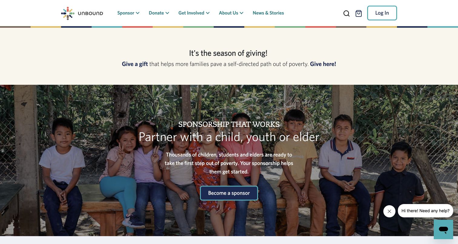
Unbound places a sponsorship invitation over a group photograph, with sponsorship, donations, involvement and stories clearly separated in the header. A seasonal giving strip sits above the main feature. The following sections explain expense allocation with a stated reporting year and outline the stages of becoming a sponsor. Sitecore’s official case describes the organization’s XP-based website and personalized supporter content. That vendor evidence concerns the web experience; the public capture does not verify financial outcomes or the private sponsor relationship.
What you can learn
Explain an ongoing commitment as a sequence rather than only a prominent button. State what the first action begins, how the relationship continues and where a reader can find organizational reporting. Keep a one-time donation distinguishable from sponsorship, and preserve the dignity and consent requirements behind personal stories and photography.
Pros
The navigation distinguishes sponsorship from other forms of giving and participation.
The financial-information section identifies its reporting period and a destination for detail.
Cons & considerations
Seasonal and continuing appeals compete for attention in the opening.
Chat and supporter controls add interface layers that need careful mobile and keyboard review.
Public source checked November 3, 2026. References may be embedded or legacy—not a complete backend inventory.
Platform source: Official Sitecore customer case study. Sitecore’s official Unbound case links unbound.org and describes the organization’s 2023 upgrade to Experience Platform for its website and tailored supporter content. This establishes a documented website association; the review does not verify private sponsor accounts, payment behavior or the vendor’s fundraising outcome claims. Platform evidence is separate from the direct website screenshot and is not a complete current infrastructure audit.
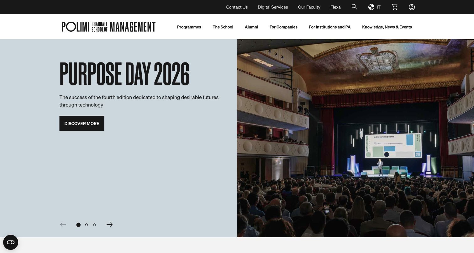
POLIMI Graduate School of Management pairs a pale text panel with an event photograph in a large opening carousel. A black utility strip separates digital services and faculty links from the white program-and-audience navigation. Program cards below distinguish degree routes, executive education and organizational offerings. Sitecore’s case identifies XM Cloud, Search, Personalize and OrderCloud in the school’s unified digital project and links this English property. The evidence does not attribute the wider university or private student systems to the same implementation.
What you can learn
Give program families concise descriptions and keep professional audiences visible alongside individual applicants. A changing event feature should lead into permanent course information, with dated campaigns maintained separately. Review the handoff between learning about a program, entering a digital service and making an application or payment.
Pros
The two header layers separate recurring utilities from program exploration.
Program cards explain the intended audience instead of relying entirely on degree abbreviations.
Cons & considerations
The event-led opening postpones detailed program comparison until the next section.
Multiple carousel items require clear controls and a predictable reading order on smaller screens.
ReactAssociated with Next.js; not independently observed
Public source checked November 3, 2026. References may be embedded or legacy—not a complete backend inventory.
Platform source: Official Sitecore customer case study. Sitecore’s official POLIMI Graduate School of Management case links the school’s English website and identifies XM Cloud, Search, Personalize and OrderCloud in its digital project. The association is scoped to the linked business-school property, not the wider university, private learning systems or independently verified payment infrastructure. Platform evidence is separate from the direct website screenshot and is not a complete current infrastructure audit.
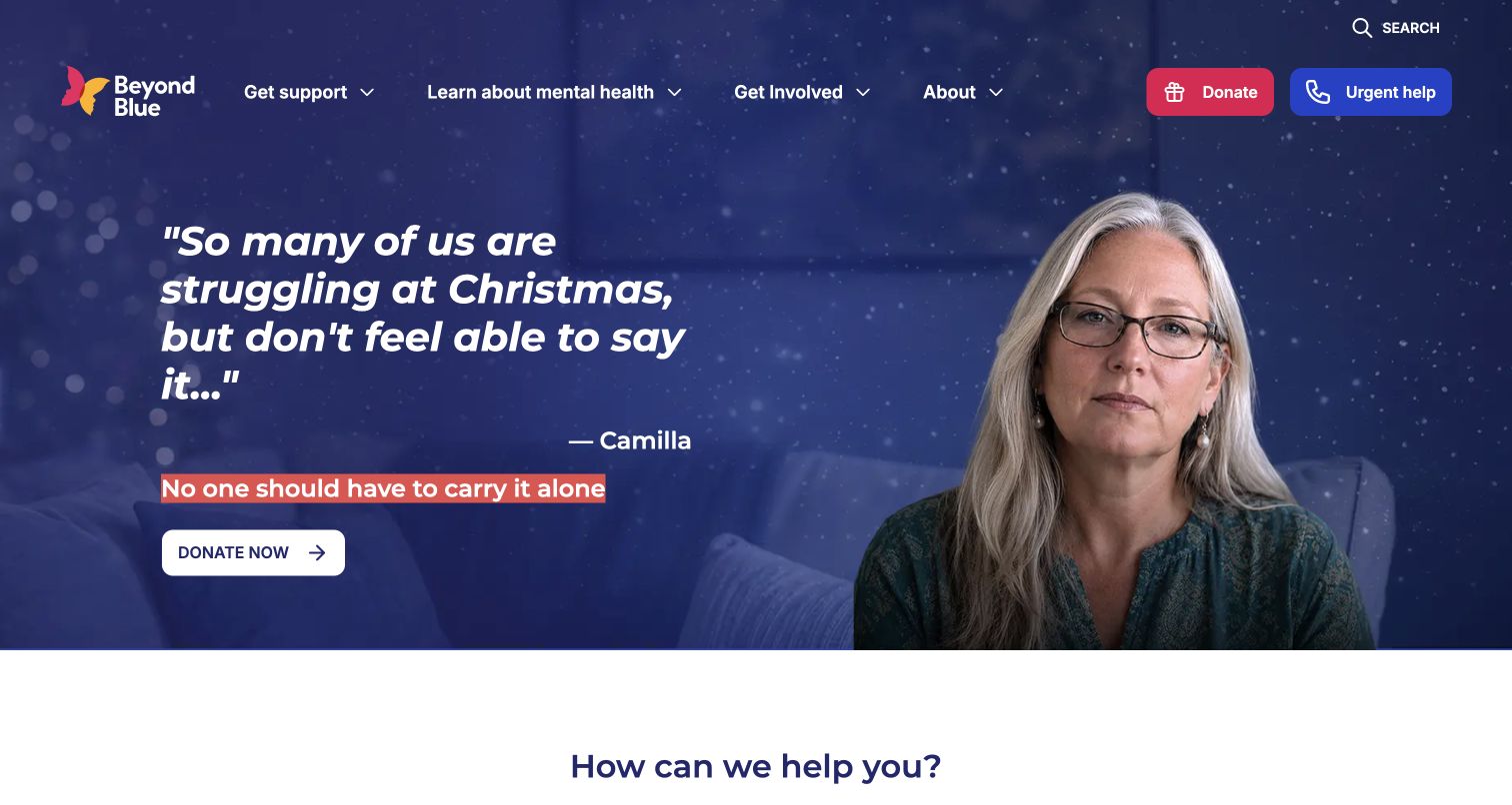
Beyond Blue uses a dark blue seasonal campaign with a portrait and a prominent donation action. The header keeps urgent help separate from donating, while the next section asks what kind of assistance the visitor needs and offers several task routes. The visual system distinguishes the emotional appeal from practical support discovery. Sitecore’s case documents an XM Cloud website project and links this public property; it does not establish the operation of counselling, forums or other separately accessed services.
What you can learn
Keep help-seeking routes stable when fundraising campaigns change. Use plain task labels and clarify the destination before someone shares personal information. Treat support, self-guided information and community participation as different journeys, and evaluate the public site’s accessibility separately from any vendor-reported performance figures.
Pros
Urgent help remains visible in the header alongside the fundraising action.
The assistance section offers several explicit intentions rather than one generic contact button.
Cons & considerations
The seasonal appeal dominates the opening for visitors who arrive seeking support.
Long quotation-style headlines need careful wrapping and readable contrast on narrow screens.
Public source checked November 3, 2026. References may be embedded or legacy—not a complete backend inventory.
Platform source: Official Sitecore customer case study. Sitecore’s official Beyond Blue case links the public website and describes an XM Cloud content-management project. This documents the named public property’s platform association. Proposed personalization and separately accessed counselling or forum services are not assumed to share the captured website’s current implementation. Platform evidence is separate from the direct website screenshot and is not a complete current infrastructure audit.
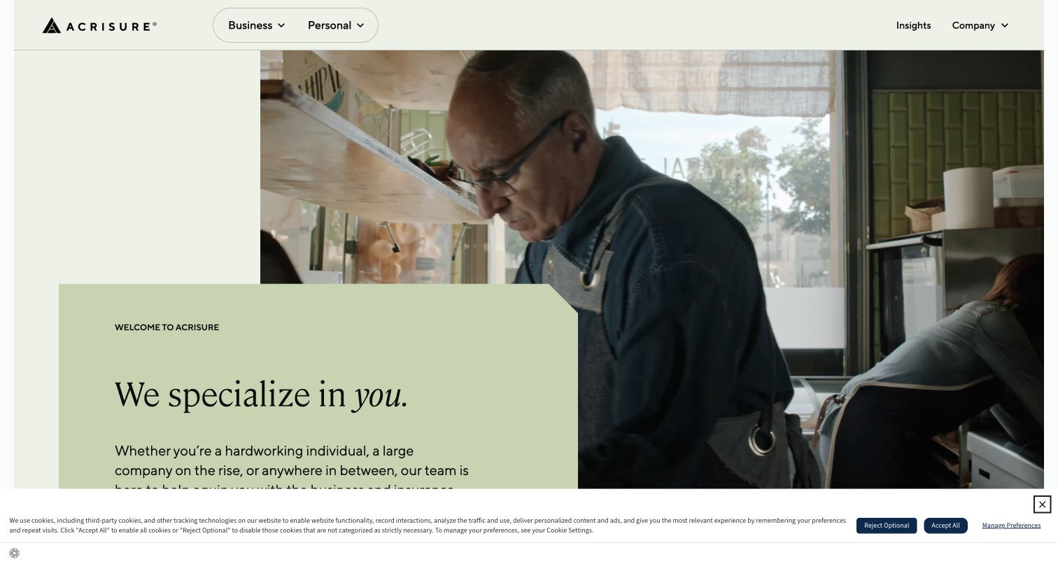
Acrisure places a pale green introduction card over a large people-focused photograph, with business and personal routes repeated in the header and main actions. The introductory copy explains the breadth of insurance and business services before the page moves into separate solution groups. The composition is calm despite the broad offering. Sitecore’s customer case links this property and documents an XM Cloud website with Personalize; it does not verify insurance suitability, quoted prices or the technology behind every related service.
What you can learn
Make the audience distinction explicit before presenting a large service catalog. Reuse that distinction in navigation, introductory actions and later sections so visitors can keep their place. Test overlapping cards with longer text and smaller screens, and provide clear context before moving from information into a quote or consultation.
Pros
Business and personal routes are repeated consistently in the first view.
The solid text card keeps the introduction independent from the photograph’s brightness.
Cons & considerations
The card overlaps a large image and can delay the primary actions on shorter screens.
A broad service promise needs more specific product explanations before a visitor can compare options.
Visible tech stack
Earlier / documented evidence
Sitecore
Earlier cited evidence retained; no current scan result. References may be embedded or legacy—not a complete backend inventory.
Platform source: Official Sitecore customer case study. Sitecore’s official Acrisure case directly links the public corporate property and describes a consumer website project using XM Cloud and Personalize. This is vendor-documented website evidence; it does not independently establish the current installed configuration, insurance suitability, pricing or the systems behind every linked service. Platform evidence is separate from the direct website screenshot and is not a complete current infrastructure audit.
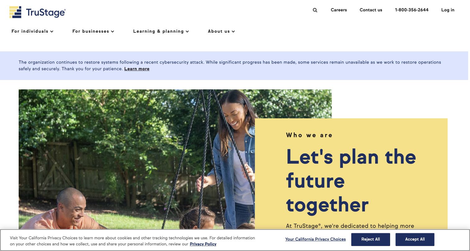
TruStage combines a white audience-based header with a family photograph and a yellow introduction panel. A service-restoration notice appears above the hero, making a current operational limitation visible before the promotional message. Individual, business, learning and account routes remain distinct. Sitecore’s 2021 case documents an XP, XM and xDB implementation and links this domain. This is a historical vendor association paired with a current public capture, not independent proof of today’s complete platform or service availability.
What you can learn
Give operational notices a maintained place outside ordinary campaign content. State the limitation and provide a clear information route, then keep audience navigation predictable underneath. Separate insurance and financial-service categories carefully so a general brand introduction does not imply that every product follows the same journey or conditions.
Pros
The operational notice is prominent without replacing the entire information structure.
Individual, business and educational routes provide recognizable starting points.
Cons & considerations
The notice, navigation and privacy strip reduce the space available to the opening content.
The older case study cannot establish the current version, configuration or health of the website platform.
ReactAssociated with Next.js; not independently observed
Public source checked November 3, 2026. References may be embedded or legacy—not a complete backend inventory.
Platform source: Official Sitecore 2021 customer award case. Sitecore’s 2021 TruStage customer award case links trustage.com and identifies Experience Platform, Experience Manager and xDB in that historical implementation. The current homepage is captured separately on November 3, 2026 UTC. This is a historical vendor association, not independent proof of today’s complete platform, configuration or service availability. Platform evidence is separate from the direct website screenshot and is not a complete current infrastructure audit.
Create stable records for services, locations, corporate information, and documents, then let campaigns reference those records through a limited component library. Preserve useful routes to investors, careers, support, or trade audiences when the hero changes. Give temporary announcements a publication window and an owner so urgent notices do not remain indefinitely.
A public service entrance with operational integrations
Keep public explanations, service discovery, and support content understandable while operational systems manage accounts, availability, transactions, or private data. The page can feel visually continuous without pretending every function belongs to the CMS. Define what happens when a connected system is unavailable, when a visitor lacks an account, and when a link leaves the public information property.
Multiple regions or audiences on shared foundations
Share content structures and components where the information is truly common. Assign local ownership to language, service conditions, contact details, legal text, and destination links. Test language versions and fallback behavior with realistic missing content. A brand appearing in several markets does not mean every website has the same implementation or editorial responsibilities.
Plan a Sitecore project around decisions the team can maintain
Specify the product and boundaries
Record the selected Sitecore product, deployment approach, frontend responsibilities, and connected systems. Do not turn a reference case into an architecture assumption. Identify which system owns editorial content, product facts, assets, search, accounts, and transactions. Make the ownership of each integration explicit before designing a page that depends on it.
Ask editors to build representative pages using long titles, several languages, imperfect imagery, and changing service information. Test whether component names and field labels make sense without developer translation. Include an urgent correction, a campaign expiry, a replaced document, and an unavailable connected service. These situations expose gaps that ideal homepage mockups conceal.
Make review and release visible
Assign draft, factual review, approval, publication, and correction responsibilities. Use appropriate versioning and compare changes before release. Verify linked records, navigation, public URLs, metadata, and actual frontend updates. Keep a clear recovery process for stale content or a failed integration. The ability to press publish is only one part of a dependable release.
Review navigation labels, unused components, service notices, and campaign destinations regularly. Keep accessibility, performance, asset rights, and content quality in the maintenance process. Evaluate personalization against a useful default experience and a stated visitor benefit. Do not hide critical information behind an inferred audience segment or assume an AI feature removes the need for human editorial accountability.
A useful handover demonstration
Ask the actual team to carry out its routine job: publish a realistic update, correct a mistake, preview a narrow screen, and identify who owns an integration failure. For a library or frontend framework, also ask who maintains the content source and deployment. A polished screenshot does not answer those operational questions.
Beyond the screenshot
Sitecore content and release checklist
Record the exact Sitecore product and the boundaries of connected systems.
Assign owners to products, services, locations, documents, and campaign facts.
Give components clear editorial purposes and tested content limits.
Keep practical visitor tasks available when campaigns change.
Test language versions, fallbacks, and local destination links.
Review related content, assets, approvals, and publication dependencies.
Verify keyboard navigation, narrow layouts, contrast, and motion controls.
Give temporary notices and promotions expiry rules and named owners.
Check canonical URLs, redirects, metadata, navigation, and sitemap coverage.
Verify public publication and maintain a documented correction process.
Test with real content, a keyboard, a small screen, slow or failed requests, and the people who will maintain the system. These are planning checks, not an accessibility, security, performance, or search-ranking certification.
Sources & editorial method
How this Sitecore collection was reviewed
Twenty distinct public website properties were captured directly in the browser on November 3, 2026 UTC and matched to official named Sitecore cases or Sitecore’s first-party account of its own website. Every review addresses the visible page and preserves the evidence scope. Tourism Ireland, TruStage, and Sitecore’s own account include historical 2021 references; their current screenshots are separately dated observations. Other cases also describe specific implementation periods or phased migrations. Public markup was checked where available, but asset-CDN names alone are not CMS proof. No private account, form submission, financial assessment, patient workflow, or transaction was tested, and vendor outcome metrics are not independent measurements.
Every image is an unmodified capture from the actual website, with its source and capture date. Some captures are reused from our shared catalog; their dates remain the original capture dates. None comes from a vendor gallery or a generated reconstruction. Moving imagery and live content can change.
Technology attribution uses public page assets or metadata, official platform documentation, or a cited first-party project case study. Documentary and framework-relationship evidence is identified where used; it is not a complete current backend inventory. A CMS image CDN alone does not establish a full CMS deployment. A library’s presence does not prove which individual controls use it, and a platform label does not establish AI authorship.
The composition notes, lessons, pros and tradeoffs are original editorial observations. We have not measured conversion, traffic, security, performance or accessibility conformance. Website owners retain their brands and imagery; these examples are not our client portfolio. Written, Edited and Curated are independent records, not dates advanced by a build. See our editorial standards or suggest a correction.
Questions worth asking
Sitecore website development FAQs
Do all these examples use the same Sitecore product?
No. Sources describe different products, implementation periods, and integration patterns. Read the evidence for the exact property. A case mentioning XP, XM, XM Cloud, or SitecoreAI does not establish a uniform current configuration across the collection.
Does a recognizable brand prove that every regional site uses Sitecore?
No. The association applies to the property named by the source and captured in the example. Other markets, subsidiaries, private applications, and partner services require their own evidence.
Can a Sitecore website also contain another vendor’s assets or services?
Yes. Content management, digital assets, search, commerce, and accounts may have separate responsibilities. A media URL does not identify the entire CMS or operational architecture. Plan and document those boundaries explicitly.
What should we test before approving a component library?
Real publishing tasks: long copy, translations, unusual records, missing assets, expired campaigns, and service outages. Have editors build, review, publish, correct, and retire representative content before declaring the workflow ready.
How should historical customer cases be used?
Treat them as dated implementation evidence and design context. Review the current public property separately and qualify any uncertainty. Do not present historical product versions, commercial metrics, or old screenshots as verified current facts.
Build the content responsibilities and visitor routes first, then use reusable components and a tested publishing process to keep the website coherent as the organization changes.