Adobe Commerce and Magento Open Source appear in a wide range of public storefronts. Their flexibility is most useful when a team can explain its catalog rules, market structure, integrations, and long-term maintenance responsibilities clearly.
This collection covers documented Adobe Commerce and Magento-family implementations, not a claim that the products are interchangeable. The commercial Adobe Commerce product and Magento Open Source have different licensing, services, and capabilities. Where public evidence does not establish an edition, the examples do not invent one.
The named property matters. A museum’s merchandise shop can run independently of its editorial website. A manufacturer may use Adobe Commerce in one region and another platform elsewhere. A composable storefront may use Adobe Commerce for transactions while a separate CMS and frontend own the public presentation.
Before the examples
What makes good Adobe Commerce / Magento website development in 2026?
Model the difficult product before designing the easy one
Use a configurable item, a compatibility-dependent component, an unusually large order, and an unavailable option in the prototype. Decide which attributes drive selection, filtering, and fulfillment. A polished template with an incomplete product model can make a complex catalog harder to operate rather than simpler.
Treat market structure as a data decision
Adobe’s website, store, and store-view hierarchy controls the scope of content and settings. Map the actual brands, catalogs, languages, and regional differences before implementation. Not every campaign needs a new store, and not every business difference should be hidden inside a frontend condition.
Distinguish product data, pricing, content, search, customer identity, orders, and presentation. Several examples use an additional CMS or headless frontend. Give each system an accountable owner, a change process, and a failure plan; composable architecture does not remove the need for coordination.
Compare how these public properties organize broad catalogs, product education, regional shopping, and brand identity. The screenshots reveal presentation decisions; source notes explain the documented commerce association without pretending to expose the complete private architecture.
We start with five recognizable brands or organizations: HP India Store, The Met Store, Coca-Cola Store, OXO, Hydro Flask. Each attribution applies to the named website property, not every product or website belonging to its organization. This is a curated reading sequence, not a measured ranking.
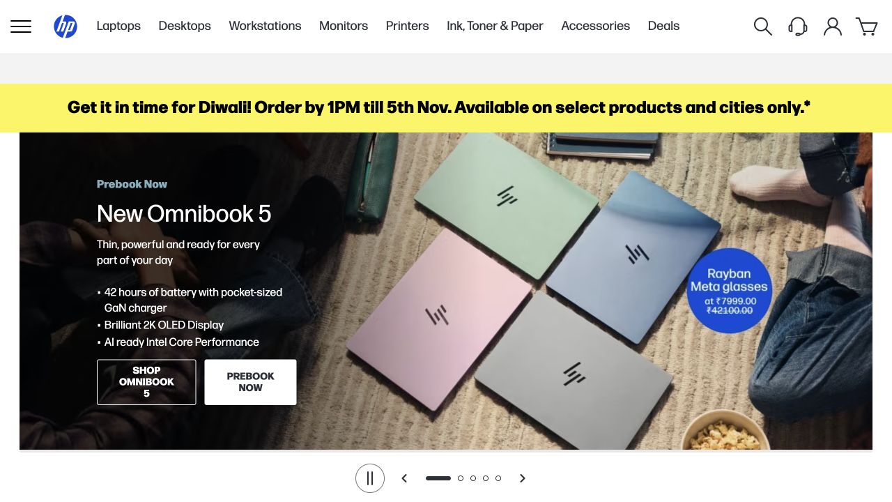
HP India places its shopping experience beneath a white header with recognizable computer and printer categories. In the captured opening, a yellow delivery announcement separates store operations from a colorful laptop campaign. Several computers appear together in a domestic setting, while the left panel identifies an OmniBook range and provides short product facts. A smaller blue offer occupies the right side. Carousel controls are visible below the artwork. This is explicitly the Indian retail storefront, with local promotional context rather than a generic corporate introduction.
What you can learn
A regional storefront can speak to local buying occasions without making its permanent navigation dependent on a campaign. Keep delivery conditions, product families, and product details distinguishable. Adobe documents HP’s Asia-Pacific commerce program and specifically its India Click & Collect work; this is not evidence that every HP country or the US store uses the same implementation.
Pros
Literal product families remain available above the seasonal artwork.
The operational delivery strip has its own recognizable position outside the main offer.
Cons & considerations
The smaller secondary offer competes with the laptop range for attention.
Campaign photography cannot explain the specifications and compatibility differences between individual models.
Visible tech stack
Earlier / documented evidence
Adobe Commerce / Magento
Earlier cited evidence retained; no current scan result. References may be embedded or legacy—not a complete backend inventory.
Platform source: Primary platform or implementation reference. Adobe documents the HP Asia-Pacific commerce platform and specifically describes its India Click & Collect implementation. Scope: Do not label the US store, corporate homepage or every HP region as Adobe Commerce. Confirm current runtime on this regional shop. The association applies to the named public property; it is not a complete technology inventory or an edition/version audit. Platform evidence is separate from the direct website screenshot and is not a complete current infrastructure audit.
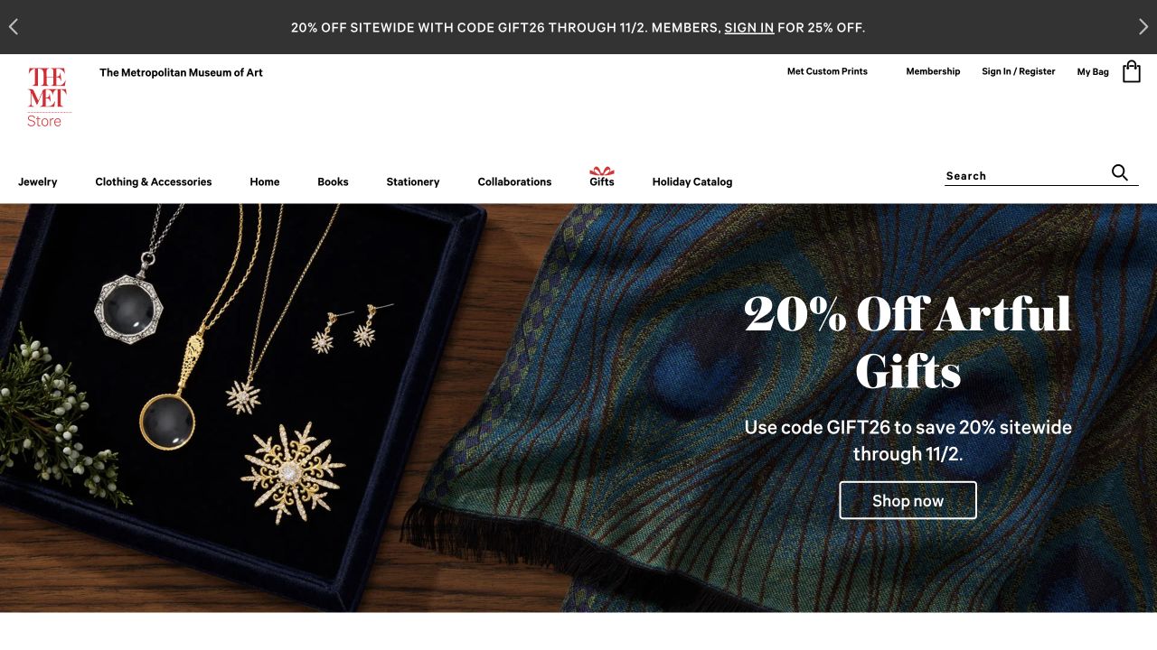
The Met Store uses its distinctive red institutional mark within a restrained white shopping header. A dark promotion strip occupies the very top, while categories and search remain separate from the large gift campaign. The opening photograph juxtaposes gold jewelry with patterned blue fabric, creating a clear sense of material and collection without displaying dozens of product cards. A serif offer introduces artful gifts and a shopping action. The store feels connected to a museum, but the interface still describes merchandise rather than presenting an exhibition calendar.
What you can learn
An institutional shop needs its own shopping hierarchy even when it inherits a powerful parent identity. Use recognizable artwork and materials to establish context, then let categories and search carry practical discovery. The implementation source is specifically The Met Store’s Adobe Commerce work, not the museum’s separate editorial website, ticketing platform, or complete digital infrastructure.
Pros
The red institutional logo stays distinct from temporary promotional typography.
Large, closely cropped merchandise photography communicates texture and detail.
Cons & considerations
A broad gift campaign does not immediately explain price ranges or collection availability.
The discount message and gift headline introduce overlapping reasons to shop before product comparison.
Visible tech stack
Referenced on the public page
Adobe Commerce / Magento
Public source checked November 3, 2026. References may be embedded or legacy—not a complete backend inventory.
Platform source: Primary platform or implementation reference. The implementing agency's 2025 case expressly identifies The Met Store as the Metropolitan Museum of Art's Magento/Adobe Commerce merchandise property. The association applies to the named public property; it is not a complete technology inventory or an edition/version audit. Platform evidence is separate from the direct website screenshot and is not a complete current infrastructure audit.
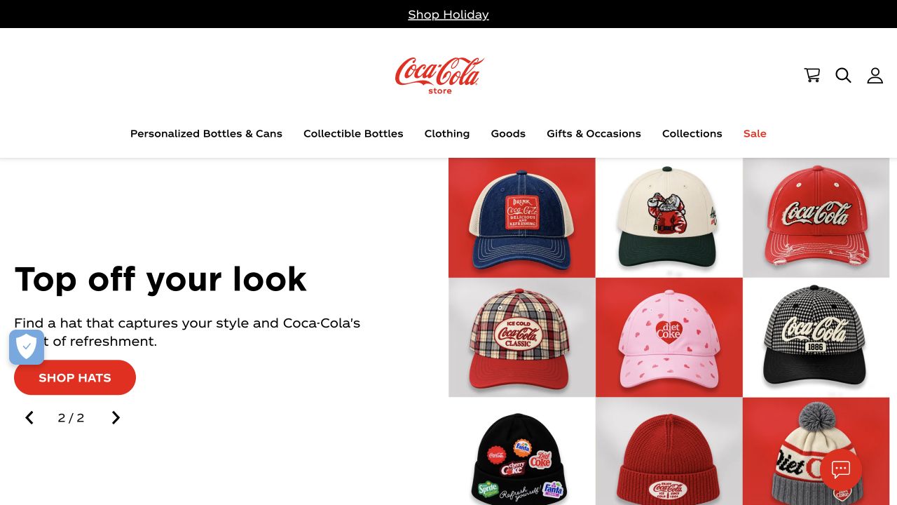
Coca-Cola Store centers the familiar red wordmark in a spacious white header. Its navigation distinguishes personalized bottles, apparel, gifts, and other merchandise, rather than relying on brand recognition alone. The captured campaign shows a tidy arrangement of colorful caps beside the short headline “Top off your look.” A red Shop Hats button describes a specific next step. Carousel arrows indicate that other campaigns are available. The restrained composition makes the product assortment, not an abstract corporate brand statement, the substance of the opening screen.
What you can learn
A famous brand still benefits from literal product categories and an unmistakable action. Use the brand’s recognizable visual language to connect the collection, while giving each campaign a concrete destination. Adobe’s case distinguishes its Latin American consumer program from the US Coca-Cola Store rollout; the association here is the named merchandise property, not every Coca-Cola website or regional shop.
Pros
The campaign pairs a simple product photograph with a clearly named category action.
Shopping categories remain readable above the large promotional area.
Cons & considerations
Carousel alternatives are not explained by their arrows alone.
The clean opening delays details about personalization, delivery, and individual product prices.
Visible tech stack
Referenced on the public page
Adobe Commerce / Magento
OneTrust
Public source checked November 3, 2026. References may be embedded or legacy—not a complete backend inventory.
Platform source: Primary platform or implementation reference. Adobe's case distinguishes the Latin American En Tu Hogar implementation from an Adobe Commerce rollout and product discovery work at the US Coca-Cola Store. The association applies to the named public property; it is not a complete technology inventory or an edition/version audit. Platform evidence is separate from the direct website screenshot and is not a complete current infrastructure audit.
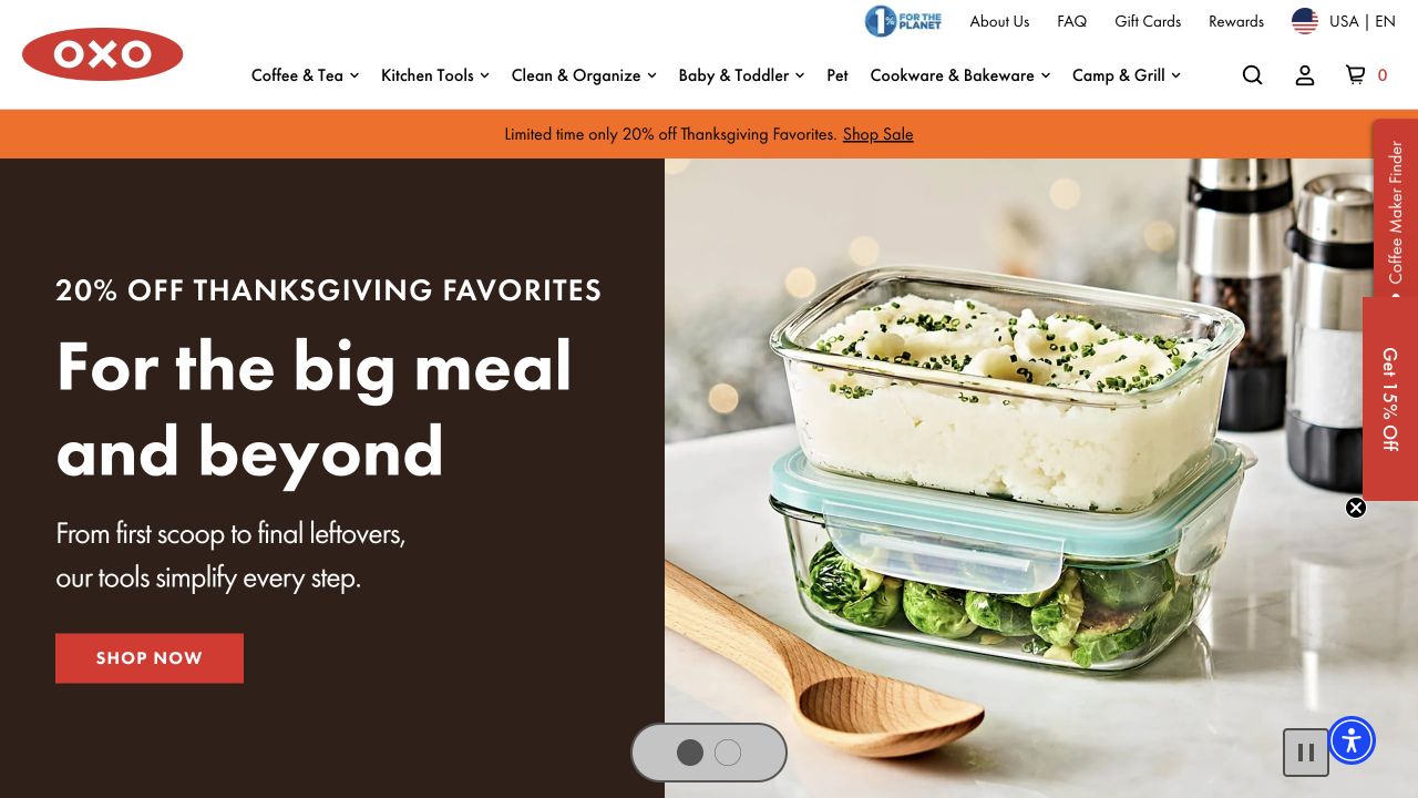
OXO’s opening pairs a dark-brown text panel with a close photograph of glass food containers holding leftovers. A large white headline connects a holiday meal with the work that follows it. The shopping button is red, matching the logo without turning every interface element into an accent. Product families such as coffee, kitchen tools, cleaning, and cookware remain across the white header. A thin orange sale strip is separate from the hero. The visible carousel pause control makes the movement explicit rather than leaving the campaign entirely automatic.
What you can learn
A useful campaign explains an occasion and shows the objects that support it. Keep the household task understandable before introducing product names or feature lists. Hyvä’s live-site showcase and current Magento-related public markers support this storefront association; they do not independently establish whether the merchant licenses Adobe Commerce or uses Magento Open Source.
Pros
The containers are photographed in use, making their purpose immediately understandable.
A clearly visible pause control acknowledges that the campaign is a rotating presentation.
Cons & considerations
Floating finder and discount tabs occupy the edge of the product photograph.
The opening offer still requires deeper pages for dimensions, materials, and care instructions.
Visible tech stack
Earlier / documented evidence
Adobe Commerce / Magento
Earlier cited evidence retained; no current scan result. References may be embedded or legacy—not a complete backend inventory.
Platform source: Primary platform or implementation reference. The Magento/Adobe Commerce frontend vendor's 2026 live-site showcase directly links oxo.com. The association applies to the named public property; it is not a complete technology inventory or an edition/version audit. Platform evidence is separate from the direct website screenshot and is not a complete current infrastructure audit.
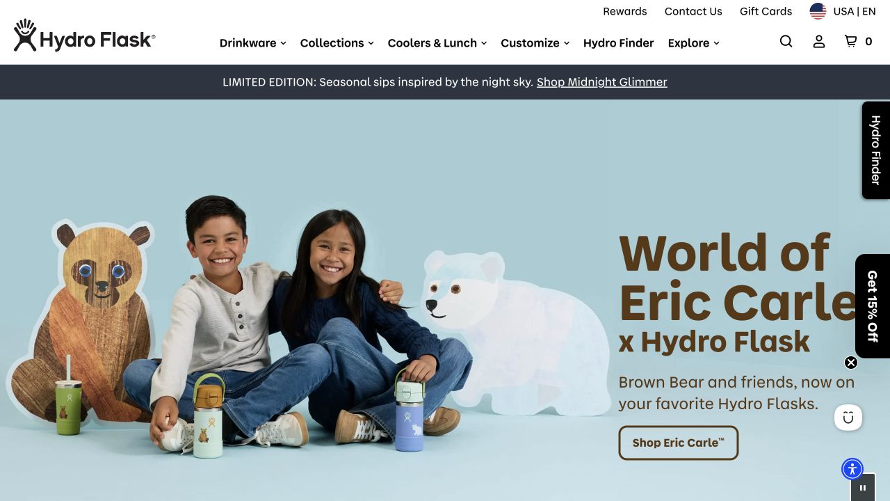
Hydro Flask’s white header keeps drinkware, collections, coolers, customization, and its product finder visible above a pale-blue collaboration campaign. The opening shows children, illustrated Eric Carle characters, and the actual branded bottles together. The right-hand headline names the collaboration, followed by a specific shopping button. A narrow dark announcement strip introduces another collection without altering the permanent navigation. The result is a recognizable product store that can temporarily borrow an illustrator’s visual language without losing its own identity or the usual shopping routes.
What you can learn
A collaboration should show both what makes the collection different and what customers can actually buy. Retain straightforward product and customization routes around the campaign. The current public storefront exposes Magento-related markers and appears in Hyvä’s live-site showcase; neither observation proves every corporate property uses this platform or identifies the store’s licensed commerce edition.
Pros
The merchandise appears alongside the campaign’s characters and intended use context.
Customization and product-finder routes remain visible outside the temporary artwork.
Cons & considerations
Edge-mounted promotional and finder tabs compete with some campaign content.
The opening photograph does not establish individual bottle sizes, prices, or stock availability.
Visible tech stack
Earlier / documented evidence
Adobe Commerce / Magento
Earlier cited evidence retained; no current scan result. References may be embedded or legacy—not a complete backend inventory.
Platform source: Primary platform or implementation reference. Hyvä's 2026 live Magento/Adobe Commerce storefront showcase directly lists this exact US property. The association applies to the named public property; it is not a complete technology inventory or an edition/version audit. Platform evidence is separate from the direct website screenshot and is not a complete current infrastructure audit.
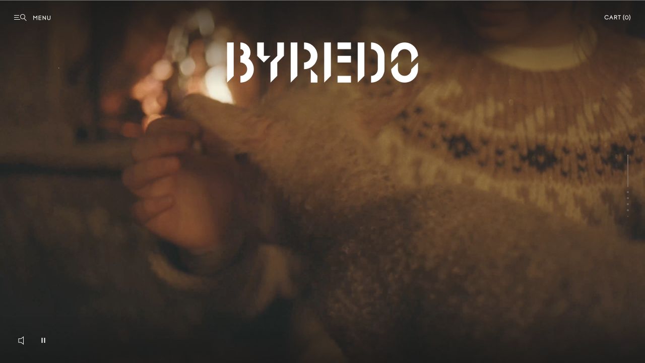
Byredo’s opening is dominated by moving imagery, with an oversized wordmark spread across the upper area. Menu and cart controls are small, and vertical slide indicators sit near the edge. Sound and playback controls appear below. Instead of beginning with a product grid or a discount strip, the page establishes a cinematic mood. That choice creates a strong visual identity, but asks visitors to seek out the catalog rather than placing many merchandise options directly into the first frame. The captured view is the US-facing public storefront.
What you can learn
Editorial presentation can be a deliberate retail choice when customers recognize the brand and navigation remains operable. Make playback optional and provide clear routes to products for visitors who do not want the story. The implementing agency documents Adobe Commerce behind a Contentful and Next.js/Alokai frontend, demonstrating why a public interface need not look like a default Magento theme.
Pros
The large wordmark remains a strong identifying element within changing imagery.
Visible playback and sound controls acknowledge the media-led presentation.
Cons & considerations
Minimal menu labeling postpones the visitor’s view of product categories.
Large moving imagery introduces accessibility and delivery considerations beyond a static product layout.
Visible tech stack
Earlier / documented evidence
Adobe Commerce / Magento
Earlier cited evidence retained; no current scan result. References may be embedded or legacy—not a complete backend inventory.
Platform source: Primary platform or implementation reference. The implementing agency documents Adobe Commerce as commerce, Contentful as CMS and Next.js/Alokai as frontend for Byredo. The association applies to the named public property; it is not a complete technology inventory or an edition/version audit. Platform evidence is separate from the direct website screenshot and is not a complete current infrastructure audit.
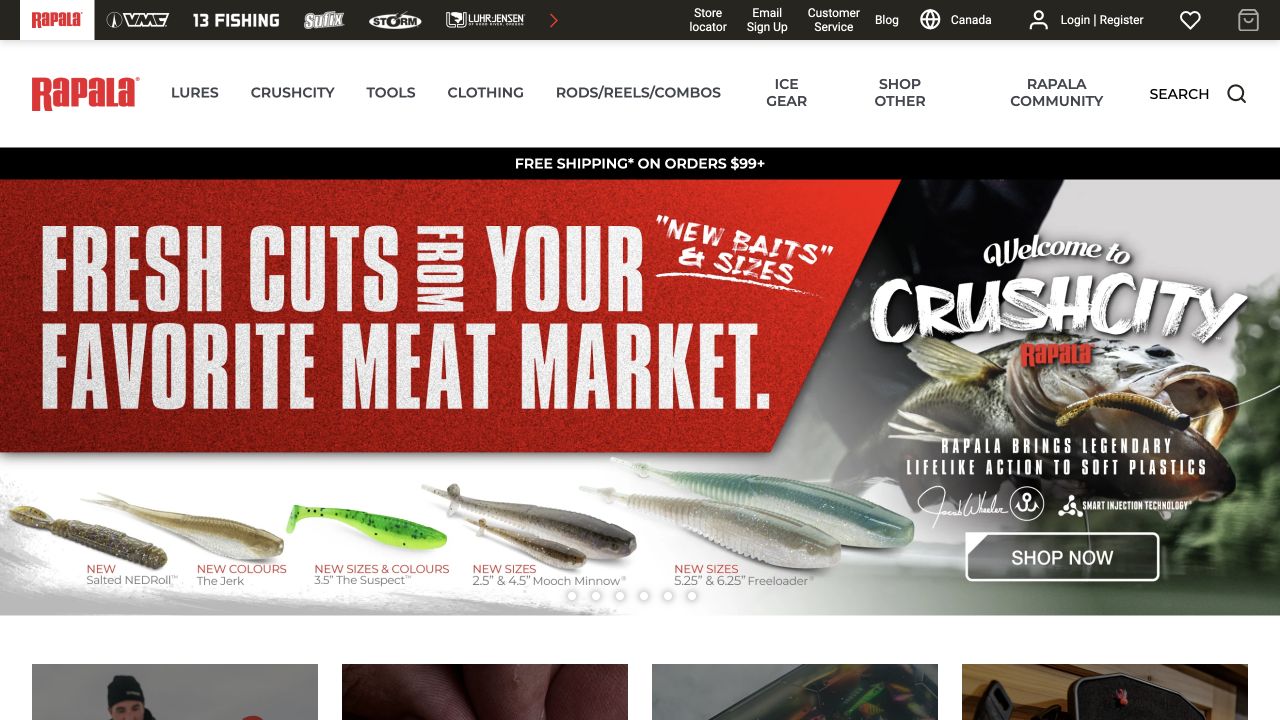
Rapala Canada places fishing-brand marks above a white merchandise header. The navigation describes tackle categories, while a red campaign introduces soft-bait products through large product and fishing imagery. This makes brand-level orientation different from product-level shopping. The opening is energetic but uses a consistent hierarchy: parent brands, shopping routes, then the temporary launch. A buyer who knows a specific brand has a route that differs from a visitor browsing by the kind of equipment needed for a fishing trip.
What you can learn
Multi-brand stores should decide whether brand and product are separate customer tasks, then expose both without making them identical menus. A campaign can use specialist vocabulary if the permanent categories remain understandable. The agency case directly identifies the Canadian property and its Adobe Commerce Cloud engine with an Alokai frontend; the evidence should not be extended to every Rapala regional website.
Pros
The brand rail gives experienced buyers a recognizable shortcut into the assortment.
The campaign shows the physical lure products rather than relying only on a lifestyle slogan.
Cons & considerations
Several stacked navigation layers leave less space for product explanation.
Specialist campaign terminology may need supporting guidance for new anglers.
Visible tech stack
Referenced on the public page
Cloudflare Turnstile
Earlier / documented evidence
Adobe Commerce / Magento
Public source checked November 3, 2026. References may be embedded or legacy—not a complete backend inventory.
Platform source: Primary platform or implementation reference. The agency directly links rapala.ca and identifies Adobe Commerce Cloud as commerce engine with Alokai frontend. Scope: Scope is the Canadian property in the case, not all Rapala country websites. The association applies to the named public property; it is not a complete technology inventory or an edition/version audit. Platform evidence is separate from the direct website screenshot and is not a complete current infrastructure audit.
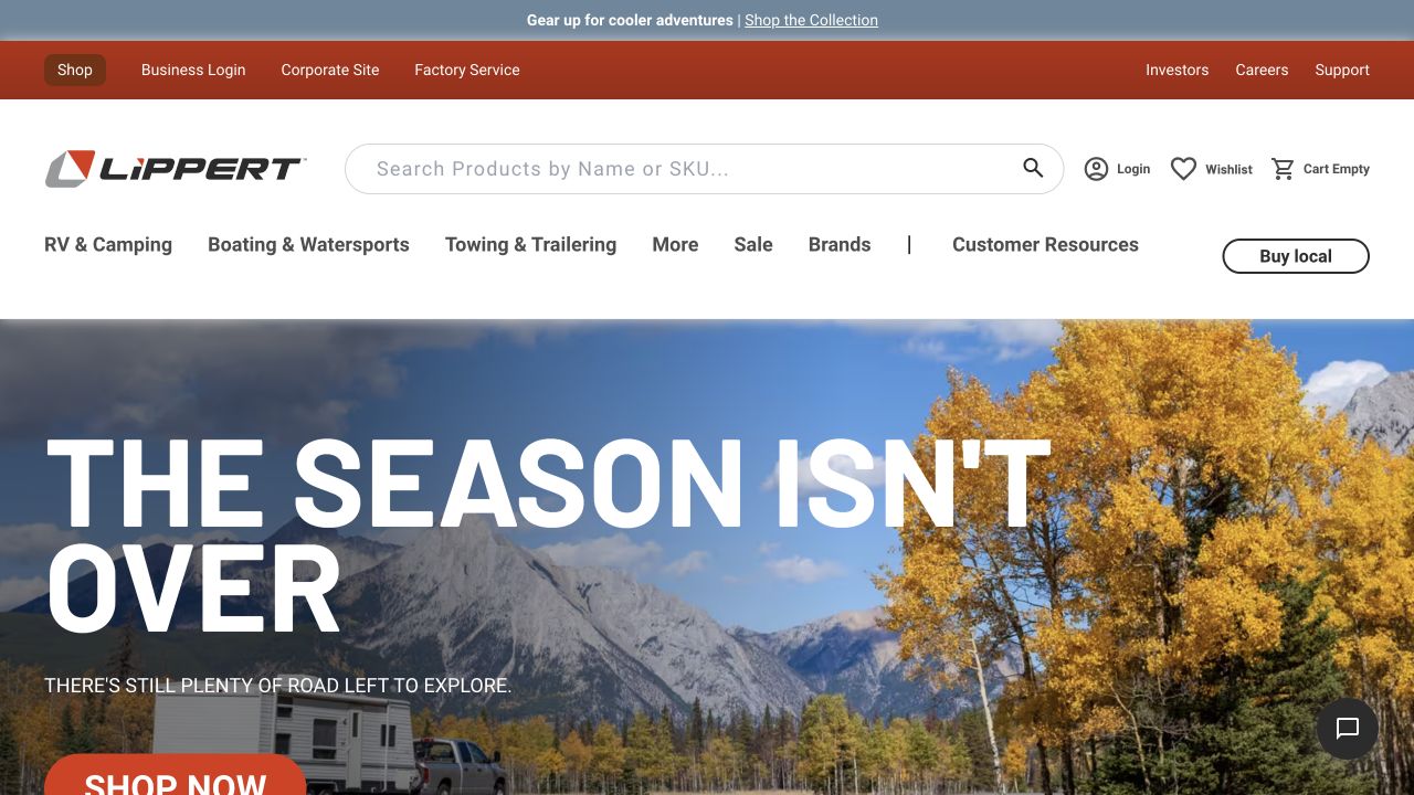
Lippert’s header distinguishes the public shop from business login, corporate information, factory service, and support. A wide search field explicitly accepts product names or SKUs. Product navigation then divides RV and camping, boating, towing, brands, and customer resources. The captured seasonal hero places a recreational vehicle beneath mountain scenery with a large message about extending the travel season. This combination recognizes different visitors: an owner looking for a replacement item, a shopper considering an upgrade, and a business user seeking a separate account destination.
What you can learn
When a manufacturer serves multiple audiences, make the destinations legible before adding campaign storytelling. Search by identifier is especially useful when customers already know a part. The agency explicitly documents Lippert.com on Adobe Commerce and Hyvä while describing other group brands on Shopify, so the platform association belongs to this property rather than the entire corporate group.
Pros
SKU-oriented search describes a concrete route for replacement-part shoppers.
Corporate and factory-service links are separated from product categories.
Cons & considerations
The many audience and product routes create a substantial header to maintain.
The scenic campaign does not yet answer compatibility, installation, or fit questions.
Public source checked November 3, 2026. References may be embedded or legacy—not a complete backend inventory.
Platform source: Primary platform or implementation reference. The agency specifically documents replatforming Lippert.com on Adobe Commerce and Hyvä, while identifying other group brands as separate Shopify builds. The association applies to the named public property; it is not a complete technology inventory or an edition/version audit. Platform evidence is separate from the direct website screenshot and is not a complete current infrastructure audit.
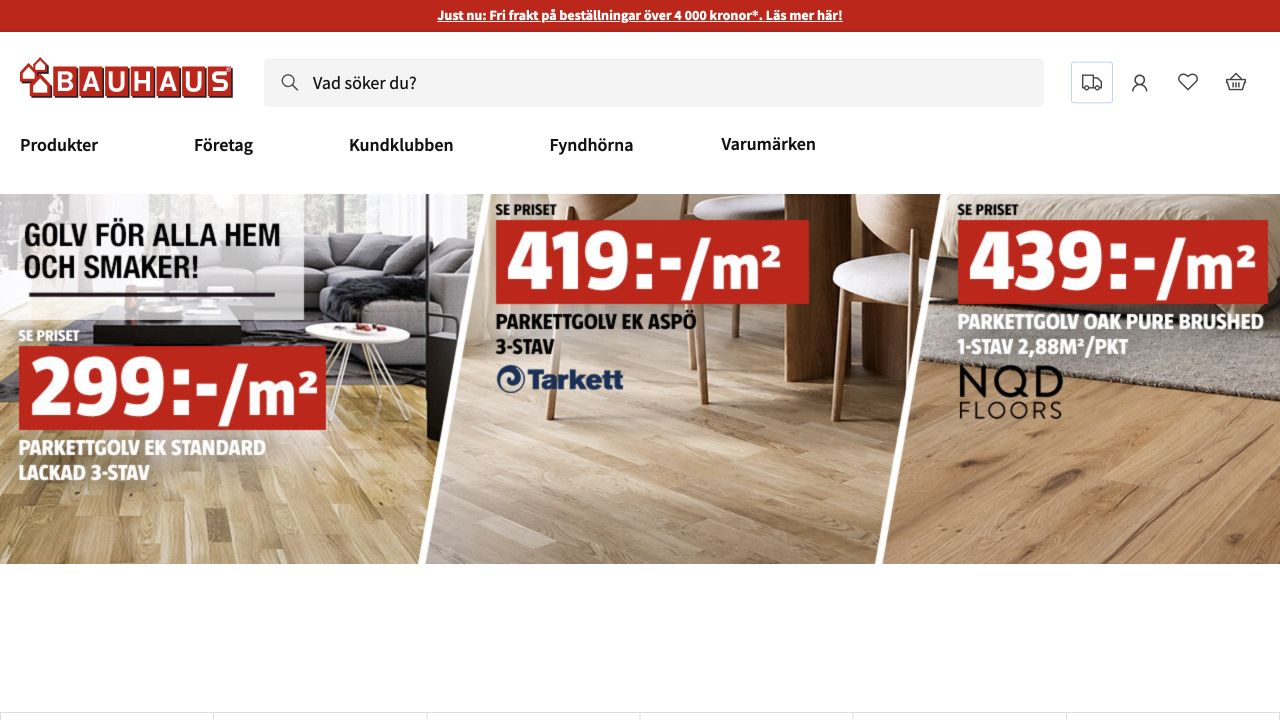
BAUHAUS Sweden uses a red service strip above a white header with a large product-search field. Product browsing is separated from business shopping, the customer club, brands, and clearance. The captured campaign is divided into several flooring panels with large prices and per-square-meter units. It foregrounds an actual buying category and the way that category is priced, rather than showing only an inspirational room. Red accents connect the retailer’s identity to offer details while the product photographs retain their own material colors and textures.
What you can learn
For building products, units matter as much as promotional amounts. Present the measurement context clearly, then provide routes to specifications and project calculations. The implementation evidence concerns the Swedish storefront’s Magento order flows and Adobe integrations; it does not establish that all BAUHAUS country businesses use the same commerce platform or have identical fulfillment arrangements.
Pros
The visible square-meter units make the flooring offers less ambiguous.
Search has prominent placement for shoppers arriving with an item or material in mind.
Cons & considerations
Multiple simultaneous offers create a dense first-screen comparison.
A promotional price still needs detailed product, delivery, and quantity conditions on deeper pages.
Visible tech stack
Referenced on the public page
Adobe Commerce / Magento
Public source checked November 3, 2026. References may be embedded or legacy—not a complete backend inventory.
Platform source: Primary platform or implementation reference. The implementing agency documents Magento order flows and Adobe Commerce integrations for the Swedish retailer. Scope: Regional Swedish storefront only; do not infer the platform of every BAUHAUS country. The association applies to the named public property; it is not a complete technology inventory or an edition/version audit. Platform evidence is separate from the direct website screenshot and is not a complete current infrastructure audit.
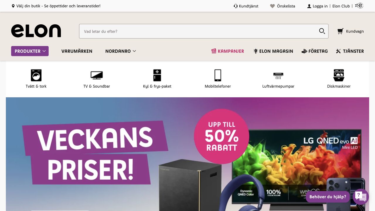
Elon Sweden puts a wide search field beside its large black wordmark, with account, wishlist, store, and cart routes around the header. A row of illustrated category shortcuts introduces washing, television, refrigeration, phones, heating, and dishwashers before the main campaign. The seasonal offer below uses bold promotional typography and strong color rather than replacing those steady entry points. Product shopping is also distinct from brands, inspiration, business customers, and services. The opening therefore combines a changing retail calendar with categories that remain useful throughout the year.
What you can learn
A broad appliance range benefits from persistent task shortcuts above a temporary promotion. Keep local-store context visible without assuming every visitor has selected a branch. The named implementation source links elon.se and describes Adobe Commerce; this public review does not test individual stores’ stock, delivery coverage, installation pricing, or authenticated account functionality.
Pros
Recognizable product icons give the core appliance categories an immediate presence.
Services and business shopping have separate labels from the ordinary product catalog.
Cons & considerations
Several header and category rows reduce the space available to the main campaign.
Large sale artwork can postpone practical differences between appliance models.
Public source checked November 3, 2026. References may be embedded or legacy—not a complete backend inventory.
Platform source: Primary platform or implementation reference. The agency directly links elon.se and describes the retailer's Adobe Commerce online-store implementation. The association applies to the named public property; it is not a complete technology inventory or an edition/version audit. Platform evidence is separate from the direct website screenshot and is not a complete current infrastructure audit.
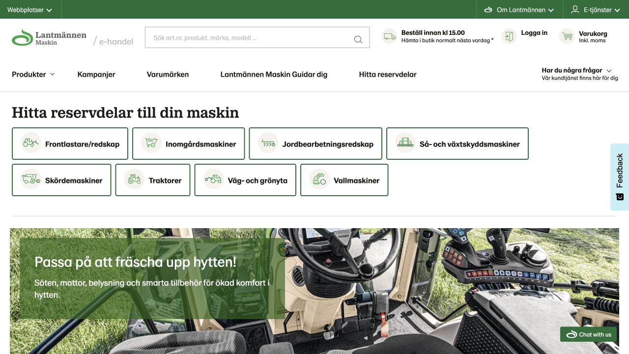
Lantmännen Maskin Shop opens with a direct task: find spare parts for a machine. Eight outlined green category buttons pair machinery names with simple illustrations. A wide header search accepts article numbers, products, brands, and models, while account and cart controls remain nearby. Only after the compatibility-oriented introduction does a large cabin-accessory campaign appear. Green, white, and restrained serif headings connect the page to the organization’s identity without turning the technical categories into decorative tiles. The reviewed property is the dedicated machinery-parts shop subdomain.
What you can learn
A parts store should reflect how buyers identify what fits, not merely the seller’s promotional priorities. Introduce machine or model selection before asking visitors to browse a large generic assortment. The implementation agency explicitly documents Magento Commerce B2B work on this shop; the public view does not establish customer-specific pricing, machine compatibility accuracy, or permissions inside a business account.
Pros
Machine categories are visibly named and differentiated with supporting illustrations.
The search prompt accepts identifiers as well as ordinary product language.
Cons & considerations
Several category labels require familiarity with agricultural equipment terminology.
The opening does not yet explain the steps or information needed to confirm a precise fit.
Visible tech stack
Referenced on the public page
Adobe Commerce / Magento
Public source checked November 3, 2026. References may be embedded or legacy—not a complete backend inventory.
Platform source: Primary platform or implementation reference. The agency directly links this shop subdomain and names Magento Commerce B2B functionality for its machinery-parts storefront. The association applies to the named public property; it is not a complete technology inventory or an edition/version audit. Platform evidence is separate from the direct website screenshot and is not a complete current infrastructure audit.
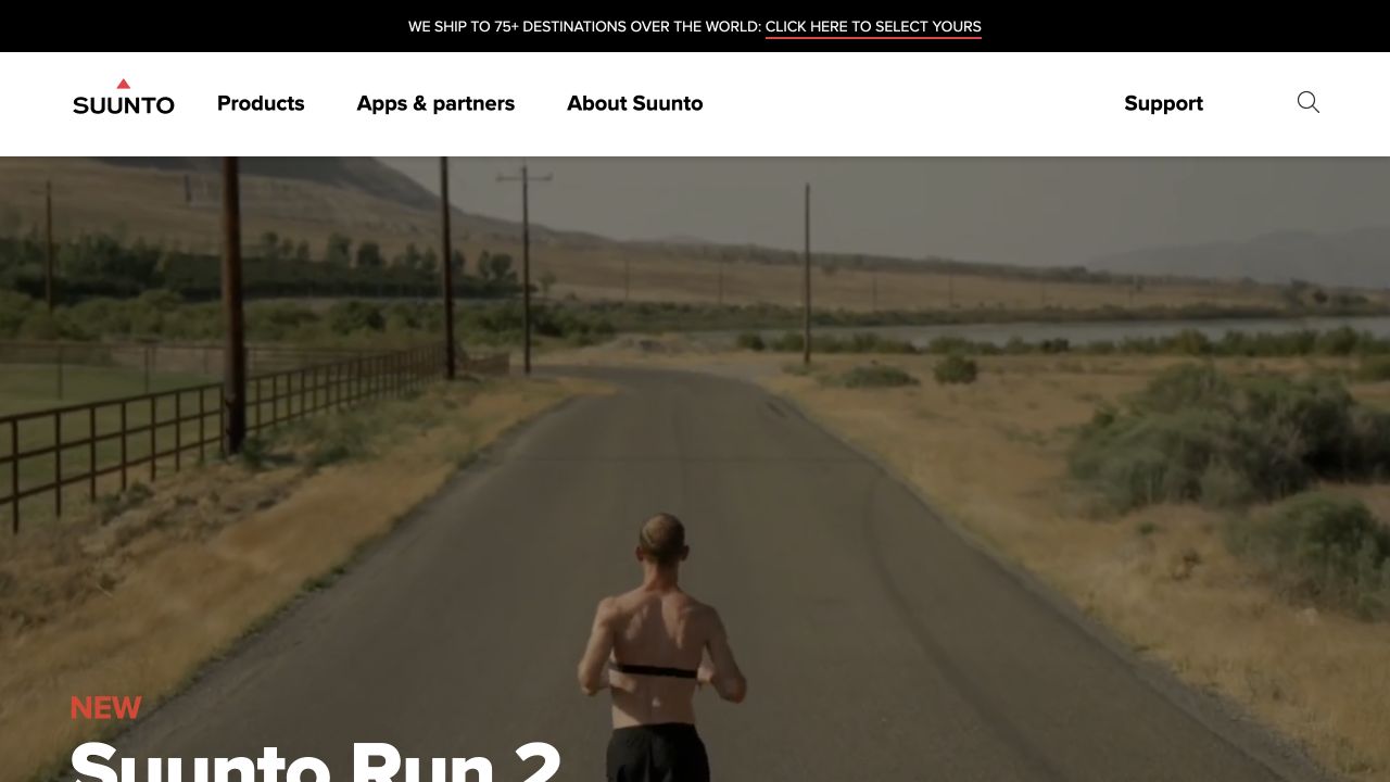
Suunto combines a minimal white header with product, app, brand, and support destinations. A narrow dark service strip separates store information from the large outdoor-product campaign below. The imagery places its equipment within an active outdoor setting rather than reducing the opening to a specification table. Search remains alongside the permanent brand navigation, with a shipping-destination notice above. This provides space for an expressive campaign while keeping the relationship between the physical device, its companion software, and after-purchase help visible within the permanent page structure.
What you can learn
Technical products often need more than one kind of explanation. Preserve routes to the product, companion app, and support even when the homepage leads with a performance story. The agency distinguishes Adobe Commerce backend and cart work from an Optimizely-driven frontend; the page’s appearance alone would not reveal those responsibilities, and this review does not test device performance or account services.
Pros
Product, app, and support destinations acknowledge different stages of ownership.
Store notices have a separate location from the immersive campaign imagery.
Cons & considerations
The opening story cannot replace specifications, compatibility, or battery-use details.
Large campaign media requires deliberate loading and accessible alternatives on slower devices.
Public source checked November 3, 2026. References may be embedded or legacy—not a complete backend inventory.
Platform source: Primary platform or implementation reference. The agency directly links suunto.com and distinguishes its Adobe Commerce backend/cart from its Optimizely CMS-driven frontend. The association applies to the named public property; it is not a complete technology inventory or an edition/version audit. Platform evidence is separate from the direct website screenshot and is not a complete current infrastructure audit.
Läderach’s opening presents chocolate Christmas figures against a deep-red background. A serif headline announces the seasonal arrival, with a white shopping action below. The brand mark sits centrally in a white header, while shopping categories, gifts, search, account, and cart remain separate from the artwork. Practical announcements occupy dark strips above. Rather than filling the opening with many boxes and prices, the composition makes the seasonal range visually coherent and gives the chocolate figures enough scale to show their shape and packaging.
What you can learn
Seasonal retail can use a distinctive scene to introduce a collection, provided visitors can still reach gifts and ordinary shopping categories. Keep delivery and order conditions explicit outside the image. The implementation source documents this property’s Adobe Commerce and Hyvä work; the visual review does not verify ingredient claims, delivery suitability, or current availability for a particular destination.
Pros
The dark-red palette creates a clear seasonal setting around the actual products.
A restrained shopping button leaves the merchandise photograph as the main visual subject.
Cons & considerations
The opening does not expose individual prices or the contents of gift assortments.
Stacked announcement strips add reading overhead before the main shopping message.
Public source checked November 3, 2026. References may be embedded or legacy—not a complete backend inventory.
Platform source: Primary platform or implementation reference. The implementing agency specifically documents laderach.com moving content into Adobe Commerce with a Hyvä storefront. The association applies to the named public property; it is not a complete technology inventory or an edition/version audit. Platform evidence is separate from the direct website screenshot and is not a complete current infrastructure audit.
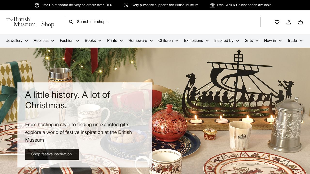
The British Museum Shop places product search inside a white retail header. Its navigation offers merchandise categories rather than copying a museum’s visitor-information menu. A dark utility strip carries practical store messages. The gift campaign uses homeware and decorative-object photography, connecting the collection to everyday objects people might purchase. This is a separate merchandise property, with its own shopping hierarchy, not the museum’s main editorial website. The opening balances cultural identity with the tasks of finding a gift, browsing a category, and managing a cart.
What you can learn
A cultural retailer can use collection-inspired imagery without asking shoppers to understand the institution’s entire curatorial structure. Keep object stories available while using familiar retail navigation. Hyvä’s live-site showcase specifically links the shop domain; that supports a Magento-family storefront association, not a complete audit of the museum’s systems or proof of a particular licensed commerce edition.
Pros
The prominent search field gives visitors a direct route to a known object or gift.
Merchandise navigation is distinct from the parent institution’s wider visitor services.
Cons & considerations
The broad seasonal campaign delays individual product prices and collection details.
A large range of categories needs careful prioritization on smaller screens.
Visible tech stack
Earlier / documented evidence
Adobe Commerce / Magento
Earlier cited evidence retained; no current scan result. References may be embedded or legacy—not a complete backend inventory.
Platform source: Primary platform or implementation reference. Hyvä's 2026 live-site showcase directly identifies this museum merchandise property, distinct from britishmuseum.org. The association applies to the named public property; it is not a complete technology inventory or an edition/version audit. Platform evidence is separate from the direct website screenshot and is not a complete current infrastructure audit.
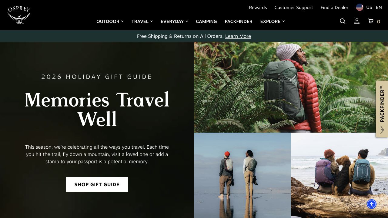
Osprey’s opening places its white bird-and-wordmark identity in a dark header, followed by clearly labeled Outdoor, Travel, Everyday, and related shopping destinations. The captured campaign uses a green text panel beside a collage of people outdoors, linking the collection to experiences rather than only isolated backpacks. A gift-oriented message introduces a temporary shopping occasion. Pack-finder and exploration routes remain available in the main navigation. The layout gives the seasonal story a large visual presence while retaining the core distinction between product environments and assisted product discovery.
What you can learn
Organizing equipment by use can give visitors a useful first decision before they learn model names. Pair lifestyle campaigns with a permanent finder or comparison route when fit and carrying needs matter. Hyvä’s current showcase names this US storefront, with Magento-related public markers also present; neither establishes the technology of every regional property or validates individual product performance claims.
Pros
Use-environment categories remain explicit above the seasonal campaign.
The pack finder provides a visible alternative to browsing lifestyle imagery.
Cons & considerations
The opening scene offers limited detail about pack capacity, adjustment, or dimensions.
Several different category and editorial routes can compete for first-time visitors’ attention.
Visible tech stack
Earlier / documented evidence
Adobe Commerce / Magento
Earlier cited evidence retained; no current scan result. References may be embedded or legacy—not a complete backend inventory.
Platform source: Primary platform or implementation reference. Hyvä's 2026 live Magento/Adobe Commerce storefront showcase directly lists this exact US property. The association applies to the named public property; it is not a complete technology inventory or an edition/version audit. Platform evidence is separate from the direct website screenshot and is not a complete current infrastructure audit.
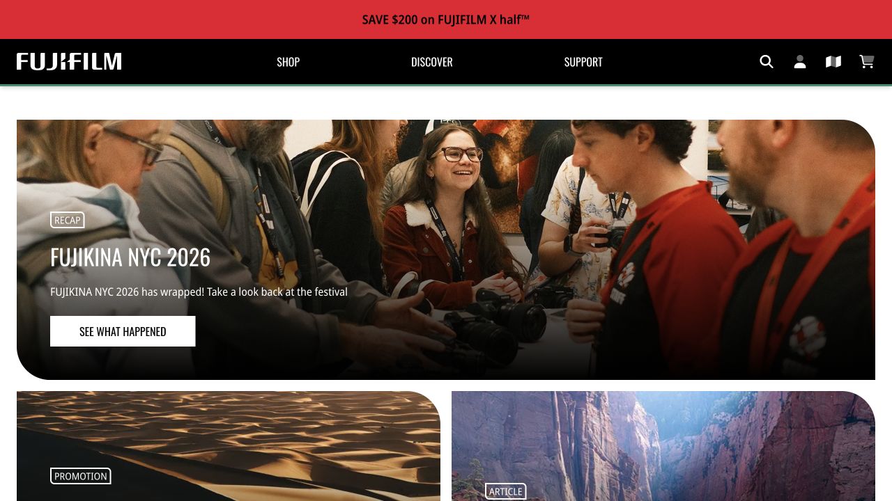
Fujifilm’s US shop uses a dark header with Shop, Discover, and Support routes. A red offer strip sits above a rounded campaign panel showing a group photograph from a photography event. White lettering introduces the event recap, and an action points into that story. Smaller panels begin beneath it, suggesting additional campaigns without crowding the principal image. The page treats photography as a community activity, while the permanent navigation still separates shopping from discovery and help after a purchase.
What you can learn
A specialist store can make room for community material when its practical product and support routes remain obvious. Use a specific event or story rather than a vague claim about belonging. The primary frontend vendor directly lists this US shop as a live Magento-family storefront; the screenshot does not reveal every service behind checkout or the platform of Fujifilm’s separate corporate and regional sites.
Pros
Three short navigation labels distinguish shopping, learning, and support.
The event photograph gives the editorial campaign a concrete subject and human context.
Cons & considerations
An event-led opening postpones detailed camera and lens discovery.
Large editorial imagery needs accompanying product routes for buyers who arrive ready to compare equipment.
Visible tech stack
Earlier / documented evidence
Adobe Commerce / Magento
Earlier cited evidence retained; no current scan result. References may be embedded or legacy—not a complete backend inventory.
Platform source: Primary platform or implementation reference. Hyvä's 2026 live-site showcase directly lists this US Fujifilm storefront. The association applies to the named public property; it is not a complete technology inventory or an edition/version audit. Platform evidence is separate from the direct website screenshot and is not a complete current infrastructure audit.
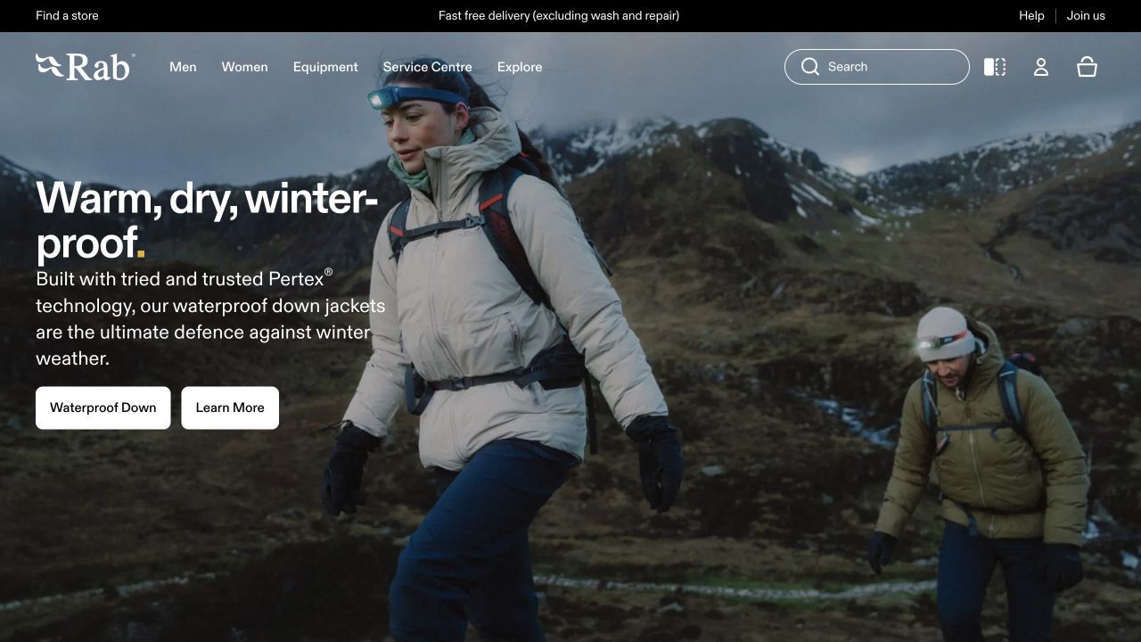
Rab’s opening uses a photograph of people in mountain conditions, with clothing visible in context. A light header separates men, women, equipment, services, and exploration. On the photograph, white type introduces winter protection, followed by a concise description and two distinct actions: a product-category route and further information. The composition makes the setting do much of the introductory work. It presents clothing as equipment for a particular environment rather than relying entirely on a studio product image or a fashion-season slogan.
What you can learn
A technical campaign should connect the conditions, the product category, and the next action. Let visitors choose between shopping and learning more when product construction needs explanation. Hyvä directly lists this public storefront in its live-site showcase; that establishes a documented Magento-family association, not an independent test of waterproofing, warmth, sustainability, or every technology in the company’s operation.
Pros
The photograph shows the garments within a recognizable outdoor setting.
Separate shopping and information actions acknowledge different levels of product knowledge.
Cons & considerations
White text over changing landscape photography needs careful contrast and crop testing.
The opening context does not replace fit, fabric, repair, or care information on product pages.
Public source checked November 3, 2026. References may be embedded or legacy—not a complete backend inventory.
Platform source: Primary platform or implementation reference. Hyvä's 2026 live-site showcase directly lists this outdoor apparel storefront. The association applies to the named public property; it is not a complete technology inventory or an edition/version audit. Platform evidence is separate from the direct website screenshot and is not a complete current infrastructure audit.
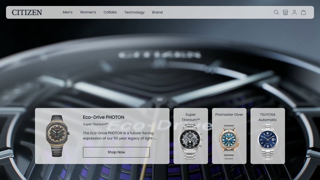
Citizen UK uses a rounded navigation panel over a close-up watch campaign. Men, Women, Collaborations, Technology, and Brand are short permanent choices, with shopping controls nearby. Along the lower opening, collection panels introduce additional watches and a named Eco-Drive range. This gives the cinematic product image a concrete shopping counterpart before the visitor reaches a conventional product grid. The layout emphasizes the scale, finish, and mechanical detail of a watch while keeping the brand’s technical and collection-based discovery routes distinct.
What you can learn
For a detail-oriented product, a large close-up can communicate material character, but it needs named routes into the range. Keep technology explanations different from audience categories. Hyvä’s live-site showcase directly lists the UK property; the association is documented even where a composable frontend reveals fewer obvious Magento markers. This is not a verification of the watch specifications or every regional Citizen store.
Pros
Large macro imagery makes the featured watch the unmistakable visual subject.
Collection panels provide more specific choices alongside the broad audience navigation.
Cons & considerations
A moving campaign can make small overlaid controls harder to follow.
The first frame does not offer direct price or specification comparison between models.
Visible tech stack
Earlier / documented evidence
Adobe Commerce / Magento
Earlier cited evidence retained; no current scan result. References may be embedded or legacy—not a complete backend inventory.
Platform source: Primary platform or implementation reference. Hyvä’s 2026 live-site showcase directly links this exact UK storefront as a Magento-family implementation. A composable storefront can hide server-platform markers; this documents the named property rather than an edition or all Citizen regions. The association applies to the named public property; it is not a complete technology inventory or an edition/version audit. Platform evidence is separate from the direct website screenshot and is not a complete current infrastructure audit.
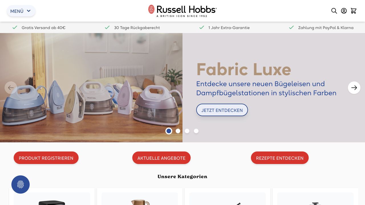
Russell Hobbs Germany centers its wordmark in a white header, with menu, search, account, and cart controls. A benefits strip uses green checks to separate service information from the campaign. The hero shows pastel-colored irons on a wooden surface, beside a pale text panel. This gives a familiar product room to be understood without an elaborate lifestyle scene. Category tiles begin below, providing shopping choices after the featured product family rather than cramming every appliance into the opening image.
What you can learn
A simple product arrangement can work well when the object is familiar and customers need to identify a relevant range. Keep service benefits outside the artwork so they remain consistent across campaigns. The live Hyvä showcase names this German storefront; the association should not be generalized to every Russell Hobbs region or interpreted as proof of a particular Adobe Commerce license.
Pros
The actual appliance range receives a clear, uncluttered photographic treatment.
Service benefits occupy a distinct strip rather than interrupting the main product message.
Cons & considerations
A collapsed menu hides the full category structure until visitors choose to explore.
The opening photograph cannot establish differences in steam output, care, or individual model suitability.
Public source checked November 3, 2026. References may be embedded or legacy—not a complete backend inventory.
Platform source: Primary platform or implementation reference. Hyvä’s 2026 live-site showcase directly links this exact German storefront; current public Magento-related markers were also observed. This does not distinguish Adobe Commerce from Magento Open Source. The association applies to the named public property; it is not a complete technology inventory or an edition/version audit. Platform evidence is separate from the direct website screenshot and is not a complete current infrastructure audit.
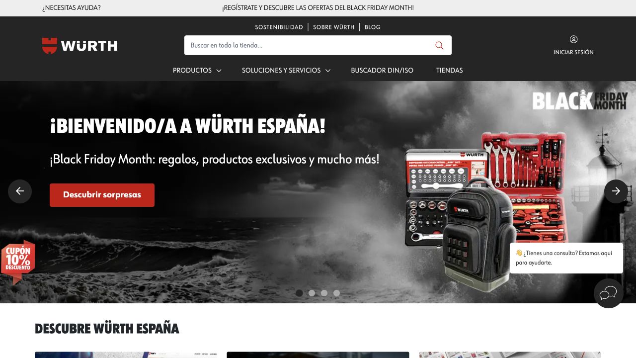
Würth Spain puts search at the center of its dark header, with the red brand mark and customer controls nearby. The navigation separates products, services, standards-related browsing, and local-store discovery. The campaign uses a tool-and-equipment photograph with a seasonal offer and a red shopping action. It is promotional, but the persistent search and catalog routes still support visitors arriving with a precise item in mind. The structure feels like a working supplier storefront rather than a corporate brochure with an isolated contact button.
What you can learn
Professional buyers may need a standard, identifier, or replacement item more than a brand story. Keep those routes stable while allowing the promotion to change. The frontend vendor directly lists this Spanish storefront as a live Magento-family implementation, and current public markers support the association; this does not verify private account pricing, trade permissions, inventory, or other national Würth properties.
Public source checked November 3, 2026. References may be embedded or legacy—not a complete backend inventory.
Platform source: Primary platform or implementation reference. Hyvä’s 2026 live-site showcase directly links the Spanish Würth storefront; current public Magento-related markers were also observed. The association is not a claim about other regional properties or the licensed commerce edition. The association applies to the named public property; it is not a complete technology inventory or an edition/version audit. Platform evidence is separate from the direct website screenshot and is not a complete current infrastructure audit.
Write requirements for merchandising, business accounts, support, hosting, extensions, integrations, and security maintenance. Confirm which product and services actually meet them. Do not build a budget around the assumption that a Magento-family example proves an identical feature set is available in every edition.
Use a theme-based frontend when it serves the journey
A familiar storefront structure can still support a distinctive design. Evaluate representative products, filters, content modules, and checkout changes with the proposed theme. Compare extension compatibility and upgrade ownership before selecting a frontend primarily for its demo appearance.
Separate the frontend for a specific, funded requirement
A headless approach can provide control over presentation and content delivery, but requires a deployment, preview, caching, testing, and monitoring strategy. Prototype identity, carts, pricing, and regional transitions early. A separate CMS or frontend is a responsibility to plan, not an automatic maturity upgrade.
From references to requirements
De-risk the catalog and integrations before a redesign
Inventory customization and extensions
Identify the purpose, owner, version, business dependency, and replacement options for each extension and custom feature. Separate active requirements from historical workarounds. Rebuilding everything without that distinction can preserve expensive complexity that the business no longer needs.
Define the sources of truth and reconciliation rules
For ERP, PIM, warehouse, CRM, search, and commerce data, document who can change each field and what happens when systems disagree. Include failed messages, delayed inventory, duplicate orders, refunds, and partial fulfillment. A clean homepage cannot compensate for contradictory operational records.
Plan release and recovery as part of delivery
Specify staging environments, backups, patching, deployment checks, rollback limits, and emergency ownership. Adobe Commerce on cloud infrastructure provides a particular managed deployment environment, but that is not the same operating model as every on-premises or Magento Open Source installation.
Ask the actual team to carry out its routine job: publish a realistic update, correct a mistake, preview a narrow screen, and identify who owns an integration failure. For a library or frontend framework, also ask who maintains the content source and deployment. A polished screenshot does not answer those operational questions.
Beyond the screenshot
A practical Adobe Commerce and Magento launch review
Confirm the exact product, edition, version, services, and support responsibilities.
Map website, store, and store-view scope to real business requirements.
Exercise complex products, variations, compatibility, and unavailable stock.
Verify search, filters, product information, pricing, and regional context.
Test account access, cart continuity, checkout, errors, and confirmations.
Reconcile orders, payments, inventory, refunds, and fulfillment across systems.
Review accessibility, mobile behavior, redirects, canonical URLs, and metadata.
Rehearse deployment, security updates, restoration, rollback, and incident escalation.
Test with real content, a keyboard, a small screen, slow or failed requests, and the people who will maintain the system. These are planning checks, not an accessibility, security, performance, or search-ranking certification.
Sources & editorial method
How this Adobe Commerce / Magento collection was reviewed
Examples pair direct public storefront captures with official Adobe accounts, first-party implementing-agency documentation, frontend-vendor listings, or property-level signals. The collection distinguishes the named shop from corporate and regional siblings. A documented commerce engine does not establish the frontend, licensed edition, complete extension inventory, or current private infrastructure.
Every image is an unmodified capture from the actual website, with its source and capture date. Some captures are reused from our shared catalog; their dates remain the original capture dates. None comes from a vendor gallery or a generated reconstruction. Moving imagery and live content can change.
Technology attribution uses public page assets or metadata, official platform documentation, or a cited first-party project case study. Documentary and framework-relationship evidence is identified where used; it is not a complete current backend inventory. A CMS image CDN alone does not establish a full CMS deployment. A library’s presence does not prove which individual controls use it, and a platform label does not establish AI authorship.
The composition notes, lessons, pros and tradeoffs are original editorial observations. We have not measured conversion, traffic, security, performance or accessibility conformance. Website owners retain their brands and imagery; these examples are not our client portfolio. Written, Edited and Curated are independent records, not dates advanced by a build. See our editorial standards or suggest a correction.
Questions worth asking
Adobe Commerce / Magento website development FAQs
Are Adobe Commerce and Magento Open Source the same thing?
No. They share a history and ecosystem, but they are distinct products with different licensing and capabilities. Confirm the actual product and services required rather than treating the collection’s broad topic as an edition recommendation.
Why do some examples look unlike a standard Magento storefront?
Their documented commerce engine may sit behind another frontend and content platform. The public appearance does not by itself tell you which system owns products, content, search, identity, or checkout.
Should a smaller store choose the stack used by a major brand?
Not automatically. A large brand may have unusual regional, catalog, organizational, or integration requirements. Match the architecture to a demonstrable need and a realistic maintenance team before adopting the same complexity.
Do these reviews confirm performance or accessibility compliance?
No. They are editorial observations of public pages with sourced platform associations. A performance benchmark, accessibility assessment, security review, and checkout audit are separate activities with their own evidence requirements.
Borrow the way a reference simplifies a difficult buying decision, then budget for the product data, integrations, and maintenance that make that simplicity possible.